This topic is currently marked as "dormant"—the last message is more than 90 days old. You can revive it by posting a reply.
1Felixholt
There are some LEC titles that seem never, or almost never, to come up in discussion, and I wondered (never having seen them myself) whether they are dull and uninteresting, or in some other way unappealing, productions:
Tristram Shandy
The Ring and the Book
The Wall
Barchester Towers
Monsieur Beaucaire
The Monk and the Hangman's Daughter
Daisy Miller
The House of Mirth
Graves: Poems
Tristram Shandy
The Ring and the Book
The Wall
Barchester Towers
Monsieur Beaucaire
The Monk and the Hangman's Daughter
Daisy Miller
The House of Mirth
Graves: Poems
2featherwate
>1 Felixholt:
I can speak up for two of these: Browning's The Ring and the Book and Booth Tarkington's Monsieur Beaucaire. Looked at purely as physical objects both are very attractive.
The relative invisibility of the 1949 Browning lies, I suspect, in the fact that it is a two-volume, twelve-book, 700-page narrative poem based on the evidence given to a murder trial in 17thC Rome (given to rather than at as the witnesses provided their testimony in letters - a sort of justice by correspondence course). Extended narrative verse was very much to the Victorian taste and the poem made, or rather revived, Browning's reputation; it is perhaps less to the taste of late 20thC and contemporary readers. It might well be more successful now as an audiobook: Browning's verse benefits from being heard (as, of course, it would have been by many of his contemporaries)
But its two volumes are good to look at and handle. They're bound in what sounds like the worst possible materials for longevity – died crimson sheepskin and sides of soft Italian paper – but my set is in remarkably good condition (I do wonder if its original owner ever read it...). The pages, too, are on a soft tactile paper and the typography and printing by Lillian and Saul Marks of The Plantin Press could hardly be bettered. In addition there are 16 fine full-page etchings by Carl Schultheiss, printed by hand from his original copper plates (at great expense, as George Macy reminds his subscribers in the Monthly Letter).
The set doesn't command high prices so, all in all, it's definitely an affordable treasure, at least in the USA.
M. Beaucaire (1961) is a much lighter work. A short novel by Booth Tarkington set in the English spa city of Bath in the 18thC, it's an easy-on-the-brain romantic adventure whose hero is a gallant young French barber (or is he?). There are duels, flirtations, disguises, aristocrats good and bad, and highwaymen. All very Anthony Hope-like. The book has a handsome, tactile damask binding, enjoyable watercolour illustrations by T M Cleland, including one of his spectacular double-page title spreads, and a chemise (and for this book an item of Frenchwomen's underwear is as appropriate an accessory as you could hope for).
The only drawback I've found is Tarkington's relentless phonetic reproduction of a Frenchman speaking English. It makes him sound like a ghastly cross between Hercule Poirot (Beaucaire, too, twirls his moustaches) and a 1930s movie parody of black speech (“Quite not so. You shall have nothing to worry you, nothing in the worl'. I am goin' to assassinate my poor mustachio—also remove this horrible black peruke, and emerge in my own hair. Behol'!”). This is definitely a barrier to real enjoyment of the story. In addition, it may have suffered from the LEC subscribers' preference, recently mentioned by Django, for historical fiction written before 1900 (though it was actually first published in 1900).
And perhaps Booth Tarkington isn't the draw he once was; not every big literary prize winner's reputation survives intact (John Galsworthy, anyone?).
That hasn't stopped its being filmed several times, with stars as varied as Valentino and Bob Hope!
There are Monthly Letters for both these titles in the Dropbox. Apparently the Browning letter came with a leaflet reprint of an essay by Schultheiss on his approach to engraving, but unfortunately it wasn't in my copy. If anybody does have it, it would be interesting to see a scan in the Dropbox.
There are other even less visible LECs, such as the wonderful Lavengro (I think Django would agree) and The Rise of Silas Lapham. Wendell Willkie's One World is very rarely discussed, but perhaps understandably so, as its very much a book of its time (1944).
The least visible LEC, of course, the truly invisible, is Hans Staden: The True History of his Captivity among the Cannibals of Brazil.
3WildcatJF
1) featherwate does a fine job detailing Beaucaire, but I thought it may help to see it, too, so here's my post on it: http://georgemacyimagery.wordpress.com/2011/09/24/limited-editions-club-monsieur....
I don't own any of the others listed as LEC's, but I have seen The Ring and the Book (which looks quite nice in my opinion) and Barchester Towers (if you like Fritz Kredel's work, you may be interested in this one, as it's some of his best work in my opinion).
I'll try to come back this weekend to discuss a few LEC's in my collection I feel are underrated.
4Django6924
On lunch break in my new job training right now, so this will be brief.
I can't add anything to what featherwate has said about The Ring and the Book; I had a course in Browning as a grad student and read this work there, and though it takes a bit to get into, is really unjustly neglected--a very gripping story. My copy is also in superb condition with ML and Announcement Card but also missing the Schultheiss essay, alas.
Tarkington is not the force he once was, which is a pity; it is also a pity that the LEC chose Beaucaire rather than what, for me, is Tarkington's masterpiece--The Magnificent Ambersons. Welles' great film version has meant that most people have felt that if they saw the movie they didn't need to read the book, but that is unfortunate--it really deserved its Pulitzer Prize. He won another for Alice Adams but although I've seen the movie, I haven't read the book. When I was an adolescent I loved the Penrod books--when I read them I thought they were on the same plane as Tom Sawyer,though not Huckleberry Finn; I don't know how well they would hold up if I read them today.
Tristram Shandy is one of the funniest, most original works in the English language, but I have an edition published by George Harrap that I prefer to Cleland's illustrated LEC, so I don't own the LEC or Heritage version of this work. (I've mentioned elsewhere that the Heritage Press edition of Sterne's A Sentimental Journey is even better that the LEC version which Gill designed and Tegetmeier illustrated--my opinion, of course.)
Daisy Miller is a little masterpiece--a flawless novelette, flawlessly illustrated by Gustave Nebel, sumptuously bound in red leather with lots of gilt. It's kind of like an Easton Press book if the EP used better leather and printing, so perhaps that's why it isn't held in higher regard by true LEC aficionados.
(More to come on the others.)
5Django6924
The House of Mirth is, after The Age of Innocence and Ethan Frome, Wharton's most successful novel, and it received, as did the other 2 mentioned, a tony treatment in the LEC edition. The binding features a lovely floral pattern damask on the front and rear covers with buckram spine and corner protectors. This edition is from the Cardovan era and was issued in an edition of 2000 copies. Lily Harmon's watercolor illustrations in an impressionist style are OK, but seem a little lightweight and cheery considering the novel's overall sense of how a life can be blighted by a few bad choices. A knowledgeable portrait of upper-class society in the late 19th century by one of its members. (Incidentally, a few years ago when I was dating an architect, we went to the Tanglewood music festival and took a side trip to The Mount, the elaborate and palatial home in Lenox Wharton designed herself--quite a joint!) The book probably suffers, as does some of the others on FelixHolt's list, from coming post-Macy and pre-Shiff. Still, an important novel and easily the nicest edition of it.
The Wall--why John Hersey's novel about the Warsaw Ghetto and its destruction never achieved the fame of Hiroshima or A Bell for Adano is a mystery to me. Perhaps it's too long and a little too grim for many (Hiroshima compressed its horrors into a third of the length of The Wall and was straight reportage--not fact-based fiction). Plain and sober binding (very like a textbook), beautiful production values (one imagines this 1957 publication to have been planned by George Macy, though not designed by him), and features original aquatints by William Sharp (who did the LEC Pepys and Poe, among others). Definitely undervalued usually.
The Monk and the Hangman's Daughter. I don't own the LEC of this; I have the Heritage Press edition, and it is rather beautiful and substantial, but I have to confess I haven't read past the first 15 pages. The paintings by Michael Ciry are lovely, albeit a tad kitschy (my opinion), and the text is not broken into indented paragraphs, but uses paragraph markers--
which sometimes I don't mind, but which annoyed me for some reason. The Sandglass explains the book's designer did this because the story, adapted from the German original by Ambrose Bierce, has so many short paragraphs the result if indented would look "spotty and stringy"--perhaps, but it just looked like a block to me. I should go back and give this another chance some day.
Robert Graves' Poems. Beautiful watercolors by Paul Hogarth, nice binding and LEC's usual fine production values. All I can say is that while I am a huge fan of Graves' prose fiction, his poetry doesn't seem to merit this substantial a volume. Not one of the poems in it is on the level of achievement of Eliot's "Ash Wednesday" or "The Wasteland"--let alone "Prufrock" or "Four Quartets." Comparisons are odious, and other people may think Graves deserves a monumental LEC on a par with Frost's Poetry, or the earlier volumes of Wordsworth, Tennyson, Shelley and Yeats, but I'm not one who does. I only mention this to account for the apparent lack of interest in it as an LEC offering.
6Felixholt
Thank you all - that is very helpful and contributions are much appreciated. I have fished happily for several years in the shallows of the River Macy, usually in the reaches of $40 to $50, only once or twice above $100, and have been startled by the quality and beauty of some of the catches that have landed in my net - Lavengro is one of them. But I rather think my collection may have plateaued, without spending a lot more on individual books, which I shan't do. I am interested to note that two other Folio Society apostates, Featherwate and HuxleyTheCat, who began buying LECs at about the same time, seem to have reached similar ceilings (or are you merely drawing breath, FW?). For the first time recently I bought an LEC that I regretted - Dombey and Son. I hadn't previously read it and didn't like it - it seemed stale and forced. I can't fathom why Macy would have chosen it above others. The LEC production is a little dull, I thought - and at one point suffers a major tyographical catastrophe crashing into mumbo-jumbo where some lines from the original have been left out. All in all I did wish I hadn't laid out good money on it.
I hope I don't appear ungrateful (the opposite is true) if I say that your comments incline me against any on the list. The Graves almost tempts - it looks a lovely book, and I admire Hogarth. But like Django, I am underwhelmed by Graves's poetry (although AS Byatt thinks that he is one of the three finest love poets in the English language - high praise) and while I know that Graves and Hogarth were neighbours on Majorca, the Majorcan landscape seems an odd accompaniment to the poems. I can't help wondering if Hogarth's illustrations were intended for something else and pressed into service of Graves.
This is a thread that I have found very helpful for charting the George Macy years: http://www.librarything.com/topic/68034. If ever Django could be persuaded to do a similar overview of the post-George Macy titles, that would be enormously interesting. But time is always scarce, one understands that.
7EclecticIndulgence
This message has been deleted by its author.
8leccol
I have all the LECs you have listeed and have read all except The Ring and the Book and Robert Graves Poems. the reason these are not commented on or about is that many of the newer members just haven't read them. To get a fair review of these, one must go to some of the older members such as our old, highly-reliable django.
A brief word on the ones I have read. Tristram Shandy is probably one of the funniest novels to come out of the 18th century. The binding is prosaic, but the illustrations by T. M. Clelland who did the second Tom Jones fit right in with the 18th century. I rebound my copy in 1/2 royal purple goatskin and hand marbled paper so now the binding equals the remarkable text of the book. A picture is shown on my members page. You cannot be cosidered well-read if you haven't read Tristram Shandy.
The Wall by John Hersey, who passed away recently, is a novel of the holocast. Probably the best to be published. Entails the story of the Warsaw ghetto.
Barchester Towers is classic Trollope, and is the second of a two- volume non-matching set. The first is the Warden, which quite logically should be read first before attacking Towers. Masterpiece Theatre produced both books as a compilation.
Monsieur Beaucaire is a French romance novel written by an American, Booth Tarkington. The movie with Bob Hope was a slap-stick comedy so after seeing it, I didn't read the book for a long time. However, it is more in the style of Orczy's The Scarlet Pimpernel. Like Django, I enjoyed Tarkington's Penrod books which were like an early 20th-century Tom Sawyer.
The Monk and the Hangman's Daughter is a translation - compilation by Ambrose Bierce, an American author and journalist who disappeared in Mexico and was never heard of again. I liked his writing style in the LEC Soldiers and Civilians, but this book is different. It has been too long ago that I read it to comment further. The poster who said this book was bound in two slipcases must be a novice collector. the wrap-around second surrounding card-board is called a chemise. Today, we no longer use these on thin books, but instead house them in solanders or clam-shell boxes.
Daisy Miller gives you a dose of Henry James in a small novel very nicely bound. If you are like I am, small doses of James are as much as I can take, although I finally got through The Portrait of a Lady.
House of Mirth is a tedious novel by a good novelist. Read the LEC The Age of Innocence and see the movie with Daniel-Day Lewis first.
Robert Graves led an interesting life and if you haven't read him read his short biography Goodbye to All That and his tremndous and popular historical novels I, Claudius and Claudius the God. These were compiled together to make the laudable Masterpiece Theatre production I, Claudius. It is a first century muder mystery in which the Julian Clan is steadfastly done away with, purportedly says Graves, to make room for Livia's son, Tiberius, to become emperor of the Roman Empire. Read the books and see the Masterpiece Theatre production which is now on a dvd.
A little story about Graves: At the time his novels were becoming very popular, his current girlfriend, Laura Riding, talked Graves into a suicide pact. They went up to the top of the buiding in which they lived and jumped off. However, the awning which stretched over the street broke their fall and they were just bruised a bit. Laura Riding wanted to jump again, but Graves vetoed this second plan. It is said that Graves' popularity was on the rise and Riding wanted to destroy him through jelousy. Graves lived to be in his eighties. I don't know what happened to Riding, but I think she went out of Graves' life.
9EclecticIndulgence
This message has been deleted by its author.
10Felixholt
>8 leccol: Thank you very much, that is helpful. It is not so much that I haven't read them, although admittedly I have never read the Browning, the Ambrose Bierce or the John Hersey. I read English at university and encountered Tristram Shandy then, and I have a nearly complete set of Folio Trollopes - in fact, I am reading at this moment Castle Richmond. Ditto The House of Mirth, which I own in Folio, and have read at least twice. I was more interested in the books as examples of fine press productions.
A quick cross-check with John Sutherland's masterly Lives of the Novelists (does anyone else have this wonderful book? - perfect for the insomniac, 3 or 4 page sketches of lives of several hundred novelists): JS concurs with Django that the Must Read Text for Booth Tarkington is The Magnificent Ambersons, cites A Bell for Adano as the MRT for John Hersey.
>3 WildcatJF:: look forward very much to your take on underrated LECs.
>7 EclecticIndulgence:: and to your take on The Monk and the Hangman's Daughter. As time permits, naturally.
11leccol
eclectic Indulgence.
Didn't mean to be sarcastic. The LECs with a chemise were a bad idea. Probably a way to save money for many of the LECs. A solander box is a much better idea.
Felixholt
Sorry I didn't understand what you wanted. I only collect LECs now, although I have collected books from many different publishers n the past. With around 600 different titles to choose from, the LECs satisfy my needs at the present time. All LECs from the start of the club until 1950 are desirable, but you must be willing to repair and rebind as necessary. There are only a handful of titles which are available in Fine condition or better.
12Felixholt
>11 leccol: Thank you. I am afraid I am not a collector to your very high standard. Near fine is about my mark - and, to be frank, I buy them (as I am sure you do) to read and enjoy, and the responsibility of custody of books in fine or mint condition would ruin it for me. I generally hang out for a slipcase, but if the affordability of a much desired book depends upon want of a slipcase, I'll sacrifice the slipcase. As for glassines, monthly letters - I am agnostic; but I rather like a tasteful bookplate. In fact, I sometimes find the monthly letters a little cloying, a little too arch, and occasionally I can't help feeling that I am being talked down to a little. Disagree anyone? It would interesting to see how, indeed if, the style of the monthly letter changes over the life of the LEC.
13Django6924
>12 Felixholt:
Felixholt, some have felt the tone of the Sandglasses and Monthly Letters to be condescending, and I can see where some of them may arouse those feelings. I have read so many over the years and have gotten such a feel for Macy's personality, that I don't think it is anything more than an unrestrained enthusiasm for his books, and a rather idiosyncratic sense of humor that is coming across. When he goes on and on about how lucky the members of the club are, I feel he really means it, and even when he waxes over-enthusiastically about the LEC or Heritage Press, there is a good bit of sly self-deprecation underlying the praise. Macy was known as "George Jester" to his Columbia classmates (and brought out a privately-printed volume of verse under that name that he surely knew was, as Harry Bailey said of Chaucer's tale of Sir Thopas,"rime doggerel").
So if the heavy handed humor is too much for you, I suggest you skip over those parts and just enjoy the production details about the books--this is why I treasure these "ephemera"--I consider most of what I know about fine press printing is owing either directly to information from the Sandglasses and/or Monthly Letters, or from further research motivated by something I read in those publications. (The detail in those letters about the designers, the presses, the paper, the font, the reproduction of the illustrations, the materials and methods of binding--an amazing amount of detail compared to that provided by any other publisher in describing their books--is just another example of that pride and enthusiasm that sometimes leads Macy the humorist astray.)
As to the question of the tone of the letters, I would say that after the Club was sold, the Letters and Sandglasses were much less personal, and much less interesting. The ML continued to provide a good bit of information on production details up to the latest LEC I own, The Secret Sharer, but the last years of the Heritage Club found the Sandglasses for new publications to be somewhat sparse about these matters.
14andrewsd
The House of Mirth is really quite beautiful. A large, dark navy volume with top gilding and a a nice texture. The illustrations are nice but not exceptional. Still, I love both of my Wharton LECs.
15Felixholt
> 13 Indeed, all you say is true. To confound my own argument, the ML may sometimes give the key to an aspect of the book. In Jekyll and Hyde the illustrations in which Hyde appears are coloured cerise; without the benefit of the ML it would have taken me a long time to tumble to that. Just as an aside - was the ML received in advance of the book? and if so, what role did the announcement card play?
> 14 You press on an old wound - I thought I had reconciled myself to not owning the Whartons - now I find I am not.
> 14 You press on an old wound - I thought I had reconciled myself to not owning the Whartons - now I find I am not.
16leccol
I have all the LEC Wharton books, but I enjpyed The Age of Innocence much more than the House of Mirth, especially after watching the very good movie of "Innocence" with Daniel-Day Lewis. I would urge all to see this enjoyable movie. I wonder what Django thinks of the cinematography?
I found the House of Mirth a bit tedious so I listened to a cd of the book. No matter how you gild it, you can't make a tedious novel into a more enjoyable one with production values. I am probably showing my age by avoiding novels interlaced with tedium.
The last Wharton LEC, Ethan Frome, is a dark, depressing tale, and the capable actor Liam Neeson, couldn't pull the novel out of its gloom. But maybe he wasn't supposed to.
Felixholt >
I haven't received a book and ML since 1985 when Shiff took over the Club. If my memory serves me correctly, the ML accompanied the book with the announcement card preceeding them.
I love the Jekyll and Hyde illustrations, but not the binding so I am going to have the book rebound in 1/2 black goatskin with sturdy linen boards. I don't like displaying the full title on the spine so I will cut it down to the basics. What color linen? Why cerise of course.
17Django6924
>15 Felixholt:
Yes, the ML was received in advance of the book, and the Announcement Card, I believe was received shortly before that. I think the reason for this is that the Monthly Letter had to be printed very close to the same time the book was being produced, and when there were delays in production, the Announcement Card, which could be printed very quickly in comparison to the Monthly Letter, could be rushed out if a change in schedule became mandatory. (An example of this was when The Thousand Nights and a Night had to be rushed into the subscribers' hands because the last 2 planned books of the Fifth Series, which were listed in that Prospectus--the first LEC Canterbury Tales and Tristram Shandy were running far behind schedule and weren't going to make it that year. Cleland's illustrations were only half-completed for the Sterne and Frank Hill's verse translation of Chaucer was taking much longer than Mr. Hill had thought it would. This had happened also with the Russian Anna Karenina which took 4 years to complete instead of the planned two; Batouala was substituted at the last minute on that occasion. This is only a guess on my part, but because the details on the Announcement Card do not always square with the details on the ML or on the volume itself (color of binding or slipcase most usually), I suspect the Announcement Card provided a quick change when one became necessary.
Incidentally, Felixholt, while I was reading the Monthly Letter for 1001 Nights to refresh my memory of the chronology of its publication, I read a printed comment from a member demanding: "don't, don't call this a too monthly letter; these letters are like a liberal education in themselves." I pretty much agree with that!
18Django6924
>16 leccol:
Don, the cinematography by Michael Ballhaus was scrumptious (as was Michelle Pfeiffer as Ellen!). An excellent version of the novel, which rather surprised me as I am not an unreserved fan of Scorsese, and this story did not seem to be well-suited to his sensibilities.
I did not see the Liam Neeson Ethan Frome, but concur it is a mighty grim story (and illustrated appropriately by Henry Varnum Poor, who, for me anyway, acquitted himself much better here than he did in The Scarlet Letter). But I like the book anyway--sometimes it's good to read something grim to remind yourself that though things in your life may be bad, they aren't that bad! I still remember a wonderful TV production of this novel on live TV back in the late 1950s, with Julie Harris as Mattie and Sterling Hayden as Ethan. It was my first exposure to Wharton and it has stuck with me all these years.
19leccol
I thought you would be appeciative of the Age of Innocence. Scorsese's NY gangster movies didn't give me the opinion that he would do so well with "Innocence".
What didn't you like about Poor's Scarlet Letter? This is one of my favorite LECs, but perhaps not so much because of Poor's illustrations. I think the cover design with the cartouche of the scarlet "A" on the cover is one of the best. When I rebound the book, I preserved the cartouche and, consequently, the red sheepskin "A". It shows up a little darker, but I was well satisfied with it. Many of the LEC cover designs were done as an after thought, or so it seems to me. This one and the two soldiers on the cover of The Red Badge of Courage, I fortunately preserved. The soldiers look a little dark on my photo on my member's page, but they look a lot better in reality.
The titling on the black spine label seemed out of proportion to me, so I eliminated Poor's name. I am not in favor of an illustrator's name appearing on the titling. This seems to me to put the illustrator on a par with the writer and should be only on the title page. In general, I like to keep the titling fairly simple. The LECs are all classics and overly long titles can be shortened, as well as delegating the illustrator's name to the title page. Look at the rebinding on my member's page.
20Django6924
Don, the book on the whole is excellent, and I was lucky enough to find a copy in As New condition. I also think the front cover cartouche is a brilliant design feature (and I don't mind the design of the spine label).
My issue is with the consistency of Poor's illustrations. Perhaps the lithographic process wasn't the most congenial medium for him--his paintings and sketches and murals (the ones I've seen) are all superb. Likewise, his full-page portraits of Hester and Dimmesdale, and especially Hester's husband, a brilliantly-realized depiction, in the first few chapters of the story (not including "The Custom-House") and the small inlaid closeup illustration of Hester's hand clutching the "A" she is wearing next to her baby, are all first-rate. Most of the work in the second half of the book seems unrealized, almost like sketches for the final illustration: faces are without detail, the anatomy of figures is very odd at times (and I realize that the severe elongation of arms or hands in some of the pictures may be a designed characteristic of Poor's art, though I've never seen it in his paintings), and sometimes, I doubt the artist's inspiration--as in the illustration of Dimmesdale's self-mortification.
Perhaps Poor simply did have enough time to do all he had originally intended, and was forced by the publishing schedule to include work he was less-than-happy with himself. Whatever the reason, in Ethan Frome he remains consistently excellent all through the book. In a way, it's unfortunate that he was able to apply the full measure of his skill to a work which was not up to the standard of one of the half-dozen greatest American novels.
21featherwate
>4 Django6924:
The dropbox folder for the 1949 The Ring and the Book now has a .pdf of the magazine original of the Schultheiss essay of which a copy was sent out with the book's Monthly Letter. At the end, he is said to be currently (October 1946) "engaged with the illustration of The Ring & the Book". The LEC finally came out in January 1949!
The magazine carries a nice cover portrait by Edward A. Wilson of John Paul Jones, remembered I suppose in the US as one of their first naval heroes for his mastery of battles at sea. The British naturally prefer to remember him (if they remember him at all) as a privateer whose failed attempt to set fire to several hundred ships in the English port of Whitehaven 236 years ago next week was possibly the most farcical coastal raid ever carried out.
In Wilson's 1946 portrait:
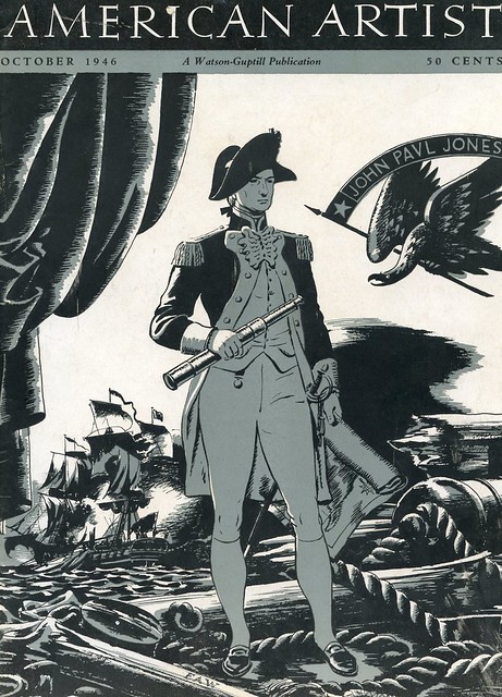
he looks quite uncannily like Gregory Peck's 1951 film portrayal of Horatio Hornblower :

(Wrongly posted under the 'Lost LEC' thread and transferred here)
22parchment-
Thank you for sharing the Schultheiss essay. This set of books has, as an object of book art, always been one of my favourites (I have not yet read the poem). The engravings are absolutely great, the typography, presswork and paper is excellent, and the bindings of good taste. I can't understand why this LEC title is not more popular among collectors. (In the back of my mind, I believe that I once read somewhere that Emil Schultheiss, as well as Hugo Steiner-Prag, stopped in Stockholm at Akke Kumlien's school of book arts for a year or two, before they continued on to the former colonies.) I hope that there will be a change of recommendation among analysts from "underperform" to "strong buy" for this LEC.
23Django6924
>featherwate
Thank you for adding the Schultheiss essay--I am still trying to access it as it seems Dropbox doesn't like me, but I'm sure I will be able to get it. And thank you also for the E.A. Wilson artwork--he does look very much like Mr. Peck as Captain Hornblower, a favorite film of mine. I had hopes that the movie might breed a few sequels (can you believe there was a time when Hollywood didn't sequelize a hit ad nauseum?), but such was not to be. Actually, I think several illustrators were influenced by the movies. I always thought Franz Masereel's Quasimodo owed a lot to Chaney, Sr.'s portrayal of the Hunchback, and I cannot look at John Groth's depictions of Rhett Butler and not see Clark Gable.
parchment, I agree that The Ring and the Book is a splendid LEC--one of the finest from the post-war period when Macy was still Director. As for its failure to generate much enthusiasm among collectors, I can only ascribe to the fact that very long narrative poems are not that appealing to today's readers--a situation that also afflicts an even greater poem, in my opinion: Byron's Don Juan, which never even made it to an LEC but is , in its original Heritage Press edition, a masterpiece. It's too bad, because The Ring and the Book is a gripping story--once you get into it. It's a little slow getting started, but once you are into the testimony of the principals, it's hard to put down, and the section where Pope Innocent ponders Franceschini's fate, and the nature of good and evil, may have have some influence on Melville when he was working on Billy Budd (at least I see similarities in theme). Franceschini's second monologue is unforgettable.
24Django6924
In light of this thread, there is currently a copy of the LEC The Ring and the Book on eBay now with a Buy It Now price of $10! The condition of the binding is rather sad, but $10 for 2 gorgeously printed volumes with original etchings (and super ones at that!) signed by the artist, printed letterpress on gorgeous paper. You have to shake your head....
(If Don Floyd didn't already have this, I'd bet he'd snap it up for a rebinding project, as it describes the interior as "unread.")
(If Don Floyd didn't already have this, I'd bet he'd snap it up for a rebinding project, as it describes the interior as "unread.")
25leccol
Thanks for thinking of me. But last year, I latched onto a copy of The Ring and the Book in its original binding and slipcase which are both Fine. So no rebinding required on this one.
The book I am looking for now is The Golden Cockerel illustrated by Dulac. I just about had a copy last week, but was outbid. Also, still loooking for The Four Gospels.
The book I am looking for now is The Golden Cockerel illustrated by Dulac. I just about had a copy last week, but was outbid. Also, still loooking for The Four Gospels.
26featherwate
>22 parchment-:
>23 Django6924:
I agree that Hugo Steiner-Prag's work in the Heritage Don Juan is first class (Akke Kumlien must have been an inspiring teacher). I don't know of a more enticing edition in which to read the poem. But to be enticed one has to put oneself in the way of the enticer and as django says, there doesn't seem to be much enthusiasm now for seeking out, or encouraging others to seek out long narrative poems. Or not old ones; since the late 1990s there has been a revival of the verse-novel, this time in the form of narratives aimed squarely at young adult readers. Here is a typical review of one of them, The Realm of Possibility by David Levithan:
“OMG! Levithan is a genius. This book, a novel in verse, has 20 narrators, all students at the same high school. Each tells his or her own story, and they all are inter-related. Some are friends, some are enemies, some are romantic interests. As always, Levithan includes gay and lesbian characters with respect and affection. Each student has a distinctive voice and we grow to love all of them. To fully see the relationships, I created a chart to show whose story was whose, who they liked and didn't...”
And these aren't, on the whole, short books. The Realm of Possibility is over 200pp long, there are others as long as Byron's 'satiric epic of (what was once) modern life'. Obviously prose usually has more words to the page (as some book designer wrote: “A poem on the page is a deep river with wide banks.”), but that's rather the point, one made by another teen enthusiast: "I'm not sure what it is about these books in verse that really does it for me but I'm yet to be disappointed by one. {Books written} in verse only added to the emotions I felt as a reader. Maybe it's because it hones in on the point and it's all laid out within a few stanzas instead of meandering about.”
Nor are these verse stories confined to the 'A boy. A girl. A bump. A troll.' school of Facebook fiction. There are others that seek to extend their readers' horizons. My daughter introduced me some years ago to Karen Hesse's Out of the Dust, a teenage girl's grim but ultimately hopeful story of Dust Bowl life. It's beautiful and memorable, and has one of the most arresting openings of any novel:
As summer wheat came ripe,
so did I,
born at home, on the kitchen floor.
Ma crouched,
barefoot, bare bottomed
over the swept boards,
because that’s where Daddy said it’d be best.
Beat that, Ms Austen/Mr Dickens/Brother Orwell!
>23 Django6924:
"I think several illustrators were influenced by the movies"
And vice versa, of course. Apparently Clare Leighton's wood-engravings for the 1931 Duckworth/Random House Wuthering Heights:


influenced the art direction of the 1939 film. (I say 'apparently' because I haven't traced the origin of the suggestion.)
The studio's (distributors'?) poster artists certainly reinterpreted the spirit of Ms Leighton's engravings.
In their own way, of course. They knew their audience:

>23 Django6924:
I agree that Hugo Steiner-Prag's work in the Heritage Don Juan is first class (Akke Kumlien must have been an inspiring teacher). I don't know of a more enticing edition in which to read the poem. But to be enticed one has to put oneself in the way of the enticer and as django says, there doesn't seem to be much enthusiasm now for seeking out, or encouraging others to seek out long narrative poems. Or not old ones; since the late 1990s there has been a revival of the verse-novel, this time in the form of narratives aimed squarely at young adult readers. Here is a typical review of one of them, The Realm of Possibility by David Levithan:
“OMG! Levithan is a genius. This book, a novel in verse, has 20 narrators, all students at the same high school. Each tells his or her own story, and they all are inter-related. Some are friends, some are enemies, some are romantic interests. As always, Levithan includes gay and lesbian characters with respect and affection. Each student has a distinctive voice and we grow to love all of them. To fully see the relationships, I created a chart to show whose story was whose, who they liked and didn't...”
And these aren't, on the whole, short books. The Realm of Possibility is over 200pp long, there are others as long as Byron's 'satiric epic of (what was once) modern life'. Obviously prose usually has more words to the page (as some book designer wrote: “A poem on the page is a deep river with wide banks.”), but that's rather the point, one made by another teen enthusiast: "I'm not sure what it is about these books in verse that really does it for me but I'm yet to be disappointed by one. {Books written} in verse only added to the emotions I felt as a reader. Maybe it's because it hones in on the point and it's all laid out within a few stanzas instead of meandering about.”
Nor are these verse stories confined to the 'A boy. A girl. A bump. A troll.' school of Facebook fiction. There are others that seek to extend their readers' horizons. My daughter introduced me some years ago to Karen Hesse's Out of the Dust, a teenage girl's grim but ultimately hopeful story of Dust Bowl life. It's beautiful and memorable, and has one of the most arresting openings of any novel:
As summer wheat came ripe,
so did I,
born at home, on the kitchen floor.
Ma crouched,
barefoot, bare bottomed
over the swept boards,
because that’s where Daddy said it’d be best.
Beat that, Ms Austen/Mr Dickens/Brother Orwell!
>23 Django6924:
"I think several illustrators were influenced by the movies"
And vice versa, of course. Apparently Clare Leighton's wood-engravings for the 1931 Duckworth/Random House Wuthering Heights:


influenced the art direction of the 1939 film. (I say 'apparently' because I haven't traced the origin of the suggestion.)
The studio's (distributors'?) poster artists certainly reinterpreted the spirit of Ms Leighton's engravings.
In their own way, of course. They knew their audience:

27parchment-
I don't think that Akke Kumlien had so much to teach Hugo Steiner-Prag. I believe that both he and Emil Schultheiss were teaching, not studying, for a while at his school. Steiner-Prag made some superb lithographs for Der Golem already before the Great War.
28Django6924
Art direction absolutely! Jim Basevi, who did the art direction (and who is one of those early masters of visual effects to whom those of us who don't believe great visual effects started with "Lord of the Rings" pay deep obeisance) was born in Plymouth, England, and anyone who has seen "Wuthering Heights" can easily pick put the similarities to Ms. Leighton's work (although I think the illustration of Heathcliff leaning against the tree is from the later Random House edition illustrated by Fritz Eichenberg).
And speaking of Eichenberg and the influence of illustrators upon Hollywood, anyone who has seen the cover illustration from Eichenberg's Random House edition of Jane Eyre can't help but to recognize the similarities to the orphanage scenes in the Joan Fontaine-Orson Welles movie (with an adolescent Elizabeth Taylor as Jane's friend Helen). The art director of this movie was...Jim Basevi! (he apparently had a lock on the Brontes). Both the movie and the Random House edition came out in 1943, so who influenced whom?
And speaking of Eichenberg and the influence of illustrators upon Hollywood, anyone who has seen the cover illustration from Eichenberg's Random House edition of Jane Eyre can't help but to recognize the similarities to the orphanage scenes in the Joan Fontaine-Orson Welles movie (with an adolescent Elizabeth Taylor as Jane's friend Helen). The art director of this movie was...Jim Basevi! (he apparently had a lock on the Brontes). Both the movie and the Random House edition came out in 1943, so who influenced whom?
29featherwate
>27 parchment-: >28 Django6924:
Thanks both for the clarifications! I hadn't given any thought to the relative ages and career arcs of Akke Kumlien and the other two. Certainly the illustrator of The Golem was hardly in need of formal tuition 10 or more years later by Kumlien at the Konsthögskolan. And I should have noticed the differences of technique between Eichenberg and Leighton! (I've changed the picture.)
Reverting to undeservedly obscure LECs, I'll again urge the merits of Lavengro. It comes in two quite small volumes, teg, plainly bound in a muted purple cloth with the title stamped in gold and black on the spines. This does not prepare for you for the dramatic endpapers within, or for the glowing colours of Barnett Freedman's 16 lithographs (he also provides several monochrome vignettes). Paper and printing (done at The Curwen Press) are of high quality. The story itself is a fictionalised autobiographical adventure, whose protagonist takes to the road and becomes involved with a succession of memorable people with stories to tell and - for they are not always amiable - punches or curses to throw. They are not people with whom the polite middle class Victorian reader would ever want to meet let alone fraternize. His style is sometimes high-flown, declamatory, sometimes down-to-earth with rapid realistic dialogue. He writes like no-one else, as much his own man as Daniel Defoe was.
30Django6924
featehrwate, I have been an advocate for Lavengro for many years, and like you, can't understand the relative obscurity of this title. In his survey of the first 10 years of the LEC, Macy wrote "this is one of the ten finest books we have ever published, and one of the ten least popular." I am really sorry this was the case as it doomed the publication of Borrow's sequel, The Romany Rye.
31Felixholt
I have just finished reading John Carey's memoir of academic life, The Unexpected Professor, and can throughly recommend it. He applauds Browning's The Ring and the Book, but deplores Tennyson's Idylls as late period mush.
As an addendum to the opening post, one of the Invisibles has ceased to be so, for me at least, with the acquisition of Tristram Shandy. I like it a lot, though I know it is not the most highly prized LEC. It is of the same size as Lavengro, another favourite, I concur, a size much easier on the arm and wrist than, say, Simplicissimus.
As an addendum to the opening post, one of the Invisibles has ceased to be so, for me at least, with the acquisition of Tristram Shandy. I like it a lot, though I know it is not the most highly prized LEC. It is of the same size as Lavengro, another favourite, I concur, a size much easier on the arm and wrist than, say, Simplicissimus.
32featherwate
>31 Felixholt:
Yes I believe that BUGG!, the lateral-thinking UK NGO responsible for synchronising inter-discplinary muscle development in strength-dependent athletes, is encouraging its fledgling Olympians to incorporate heavyweight books such as the LEC Simplicissimus and the Folio Society facsimile of the Eric Gill Canterbury Tales into their training regimes for the 2024 Summer Games. Thus the weightlifters empower their hamstrings by straight leg deadlifting multiple Simplicissimi while the wrestlers chant A strong posterior chain is essential for fast and powerful takedowns as they maximise their glutes by practising explosive duck walks with a couple of Erics in a bumbag.
Participants in both disciplines are also encouraged to walk about with an LEC Dubliners balanced on their heads. This not only strengthens their neck muscles but improves their deportment so allowing them to 'walk tall' as they mount the podium to receive their medals. (Podium-mounting is rehearsed on stepped piles of the same books now back in their slipcases or solanders after, of course, having been carefully wiped clean of sweat etc.)
33leccol
Simplicissmus is just for warming up to exercising with the de Kooning O'Hara poems which is 21" in height and weighs a full 26 pounds.
On Lavengro, I haven't touched it since I bought it and read it 35 years ago. I stood for some minutes gazing at my LECs until I espied its nondescript cover. I had forgotten all about it being illustrated by Barnett Freedman with his illustated endpages. I did read it, but then I forgot about it. It is too late in life to attempt to reread it. As George Burns said, "At my age, you don't buy green bananas."
Before pening his story "Carmen", Prosper Merimee only took a cursory trip to Spain. He said he learned all he needed to know about gypsies by reading Lavengro.
On Wuthering Heights, the Balthus illustrated Shiff LEC doesn't impress me as much as the movie posters did. The Balthus characters seem oddly disproportionate. I actually like the Easton reprints (Heritage Press reprints?) illustrated by Barnett Freedman better than the Balthus illustrations. The best thing the movie did for this classic gothic romance was to eliminate all the second generation chidren who actually cluttered up the book. The movie made the romance of Cathy and Heathcliff stronger without the second-generation clutter. It's not often that the movie improves upon the book, but in this case, I believe it did.
34parchment-
This reminds me about how very different we all are. Balthus' illustrations belong to my absolute favourites. They virtually vibrate with emotion. His Paz, Rilke and Mozart leave me cold, though.
35leccol
The only thing I liked about the Balthus Wuthering Heights was the price I got from Jeanne Shiff. The Swann auction price was considerably more than Ms Shiff's price. There must be another US auction house which is not a rip off. A 25% buyer's premium makes me cringe at the thought of doing business with Swann. Their prices for any service are outrageous. I would not recommend that anyone do business with Swann.
I collect LECs so not liking the Balthus Wuthering Heights doesn't mean I don't want this book in my collection. It just means that I find the illustrations not among my favorites. I have the Barnett Freedman illustrations of the Easton Press to fall back on as a secondary choice. Not Fine Press, but acceptable.
I collect LECs so not liking the Balthus Wuthering Heights doesn't mean I don't want this book in my collection. It just means that I find the illustrations not among my favorites. I have the Barnett Freedman illustrations of the Easton Press to fall back on as a secondary choice. Not Fine Press, but acceptable.
36parchment-
Auction houses in Sweden are even worse, I believe. They usually charge the seller 20%, the buyer 20%, and there is a photo fee. On top of the fees, they charge 25% VAT. This means that often over 50% of the total ends up in their pockets.
37leccol
The only way you can beat an auction house is to bid the reserve, which is usually 50% of the low estimate, and be lucky enough to win. When they say they are in business to make money, they are not kidding. Swann charges 25% buyers premium plus a lot of extras. Their is no VAT in the US, but if you live in NY, the tax is about what the VAT is in Europe.
I would not recommend Swann to anyone. They are out to gouge both buyers and sellers. Jeanne Shiff is the only one I have been able to buy LECs from who is honest and forthright. I just ordered Paysun de Paris and Arabian Nights and Days from her. This is five LECs I have purchased from her, and she is a pleasure to do business with.
I would not recommend Swann to anyone. They are out to gouge both buyers and sellers. Jeanne Shiff is the only one I have been able to buy LECs from who is honest and forthright. I just ordered Paysun de Paris and Arabian Nights and Days from her. This is five LECs I have purchased from her, and she is a pleasure to do business with.
Join to post

