1humouress
To be honest, most of my favourite covers were issued in the 80's and tend to be the UK Corgi editions. I'll be back with some covers and I'll try to hunt down the illustrators' names - not an easy task!
2humouress
Actually, I'm starting with a series I've read recently; Shannon Hale's Books of Bayern series. I love the organic look of these covers. Unfortunately, I couldn't get Forest Born with a similar cover as it was already out of print.
Cover art is by Hennie Haworth. http://www.henniehaworth.co.uk/book-covers/bloomsbury


If you want to know, my copy of Forest Born has the cover from these editions:
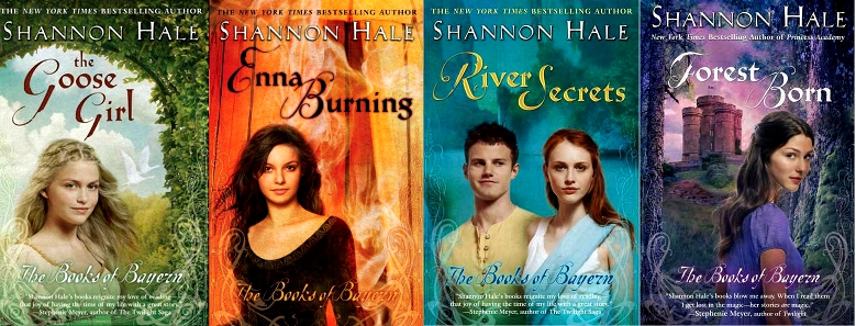
Cover art is by Juliana Kolesova. https://julianakolesova.crevado.com
Cover art is by Hennie Haworth. http://www.henniehaworth.co.uk/book-covers/bloomsbury


If you want to know, my copy of Forest Born has the cover from these editions:

Cover art is by Juliana Kolesova. https://julianakolesova.crevado.com
3brodiew2
Very cool, humoress. The color in both sets is outstanding and definitely catches the eye. It makes me wonder if the demographic has changed or the sensibilities of the demographic change over time. Thanks for sharing.
42wonderY
That first set is lovely, lovely. I do like that the characters depicted in the second set look out with modern practicality. They seem relatable.
5humouress
>3 brodiew2: >4 2wonderY: Thank you. I love the silhouettes of the flora and the limited colour palette of the first set.
6humouress
Which reminds me; I said I would add more covers. Please add your own, too, of course. It's nice to see what catches other people's eyes.
This is a series from, I think, the '80s. I only have the last one myself, though.


ETA: Sheila Gilluly's Greenbriar Queen trilogy published by Headline in the UK in 1989. Cover illustration by Stephen Bradbury https://www.stephenbradbury.com/FANTASY-ART.html. Somehow, the ethereal-looking castles and the colours of dusk and twilight embodied 'fantasy' to me.
7brodiew2
 ,
,  ,
, 
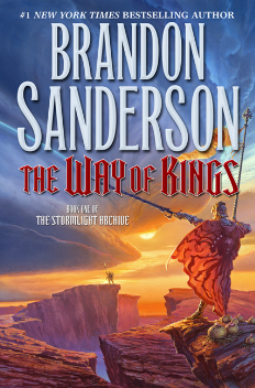
The covers of the first three volumes of Brian Sanderson's Stormlight archive are brilliant in my estimation. They are simple, but at the same time there is beckoning in the simplicity, something drawing me in wanting to know more. I think the words that come to mind are heroic, epic, honor.
They are monster tomes and I have not read them, but I am constantly toying with starting the fist one.
8humouress
>7 brodiew2: I like that half-glimpsed sun and the open vistas, hinting at possibilities.
9humouress
I'm currently re-organising my bookshelves and am coming across more of my favourite covers / series (the two are sometimes linked).
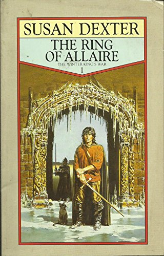
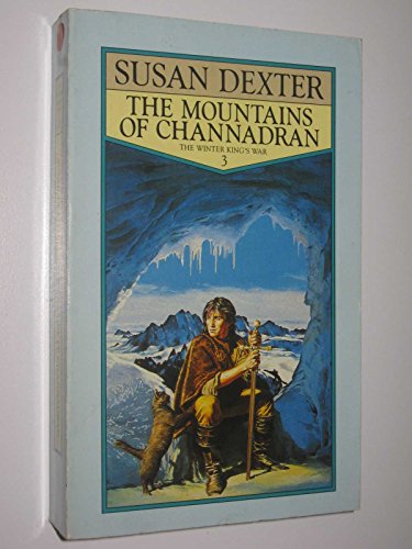

Susan Dexter's The Winter King's War published by Fontana/ Collins in the UK in 1987/ 88. Unfortunately, I cannot seem to find the illustrator's name. Sadly (for me) I only have the first of these. These are gentle fantasy adventures and Tristan did always tweak my heartstrings.
ETA: I cannot find anything about the illustrator. Even Susan Dexter, on her website, says she doesn't know. :0(
10humouress
Patricia McKillip's Riddle Master trilogy published by Orbit in 1979/ 85/ 86 in the UK. Again, unfortunately, I cannot find the illustrator's name although Kathy McKillip drew the map inside the books.


I love the long vista on the first, the colours and the granite borders.
I wish I had these covers, but I only have the first. I have these, though:


Cover art is by Romas; but these look more like science fiction (the architechture) than fantasy to me.
ETA: published by Del Rey in 1993.


I love the long vista on the first, the colours and the granite borders.
I wish I had these covers, but I only have the first. I have these, though:


Cover art is by Romas; but these look more like science fiction (the architechture) than fantasy to me.
ETA: published by Del Rey in 1993.


13calm
Thanks for the full pictures including the back covers. I have that copy of In the Forests of Serre as well. I haven't got Bards of Bone Plain yet.
Kinuko Craft is a woman. I think the covers she has created are beautiful.
Kinuko Craft is a woman. I think the covers she has created are beautiful.
14brodiew2
>10 humouress: It is interesting how the different editions also focus on different individuals in the story (I think). then again the two in the third book below could be the same two in the second book above. :-P
>11 calm: Very mystical cover art on these calm.
>11 calm: Very mystical cover art on these calm.
15Cecrow
I've read most of Guy Gavriel Kay, and while his Fionavar Tapestry isn't among my favourites I do appreciate the cover art. Good description of how the artist developed the tapestry-like approach (with images): http://www.fantasybookreview.co.uk/blog/2011/09/28/fantastic-fantasy-artwork-1-t...
16humouress
>13 calm: You're welcome. It's nice when the illustration continues around the back too.
>14 brodiew2: Hmm; I think I'll have to re-read the series and work it out. :0)
>15 Cecrow: Interesting. (I'm still reading the article because I started it on my phone while I was out.)
>14 brodiew2: Hmm; I think I'll have to re-read the series and work it out. :0)
>15 Cecrow: Interesting. (I'm still reading the article because I started it on my phone while I was out.)
17humouress
Oh, I missed these. The Second Sons trilogy by Jennifer Fallon, published by Voyager in 2003 with cover art by Stephanie Pui-Mun Law.


I like the vivid colours, especially of the first two, and - though it's not my usual style - I do like the modern, slightly angular style of the drawing. And again *sigh* I don't have the entire series, just the first two. I have the third in this cover:

which was published in 2009 by Harper Voyager. It says that the cover and internal design are by Darian Causeby but the illustration is by Stephanie Pui-Mun Law.
18humouress
And The Liveship Traders trilogy by Robin Hobb, published by Voyager in 1999. Cover illustration by John Howe.


I like the ethereal quality of the covers with the pale colours and the way the faint shadow behind the titles give an effect as though you're seeing it through tracing paper; somehow it's reminiscent of drawing / tracing maps, to me. Maybe even drawn on parchment, though I wouldn't really know what that looks like. For once, I have the whole trilogy in one style of cover.


I like the ethereal quality of the covers with the pale colours and the way the faint shadow behind the titles give an effect as though you're seeing it through tracing paper; somehow it's reminiscent of drawing / tracing maps, to me. Maybe even drawn on parchment, though I wouldn't really know what that looks like. For once, I have the whole trilogy in one style of cover.
19humouress
I know I've put a cover from this series in another Cover Love thread, but I think they're clever.
I like the way the covers for Marie Brennan's Lady Trent's Memoirs series has her dragons illustrated in the way anatomy and structure are traditionally done (scientifically), with annotations. It gives the conceit that dragons truly exist (and can be disected). I have all five of the books in the series that have been currently published and put together on my shelf (although the illustrations on the spine have been faded out behind the titles), they form part of a dragon.


Published by Titan Books in 2014 (onwards), illustrated by Todd Lockwood. I got the first book based on rave reviews on LT but I was so fascinated by the covers that I got the whole series though I haven't read any yet. Usually I try to wait until I know if I like the writing before I commit to buying a series but I didn't want to be caught (as I have so many times before!) with only part of the series in these covers.
20humouress
Speaking of annotated diagrams on covers, I have the series of Jane Austen novels annotated by David M. Shapard; I think annotated diagrams appeal to the scientist in me.


I love Austen and i like the way they've taken what are presumably illustrations contemporary to her time and annotated them.
I love Austen and i like the way they've taken what are presumably illustrations contemporary to her time and annotated them.
21humouress
One more set for now; going back to the 1980s and fantasy published in the UK. And (again) I didn't manage to get the whole series in one style of cover, it being early on in my collecting days when I was at school and had to watch how I assigned my spending money. I have three styles on my shelves; they're all nice but my favourites are the UK Corgi editions.
Jennifer Roberson's Chronicles of the Cheysuli.
1) Published by Corgi in the UK/ Australia/ New Zealand from 1987 onwards. Cover illustration, at least for Daughter of the Lion by Fred Gambino. (I cannot find images for the last two books, not have I any memory of having seen them. My copies are DAW editions. If you happen to come across any images, I'd be grateful if you could point me in the right direction.)


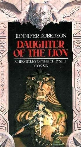
2) Published by DAW in the USA at around the same time as 1). Cover illustration for A Pride of Princes by Julek Heller and for A Tapestry of Lions by Jody A. Lee.


The Corgi editions in 1) were the ones I first read. I feel the women (despite their skimpy clothes in some instances) are depicted as strong characters.
Of the two illustrators whose names I have for the DAW editions in 2), I prefer the style of A Tapestry of Lions.
Jennifer Roberson's Chronicles of the Cheysuli.
1) Published by Corgi in the UK/ Australia/ New Zealand from 1987 onwards. Cover illustration, at least for Daughter of the Lion by Fred Gambino. (I cannot find images for the last two books, not have I any memory of having seen them. My copies are DAW editions. If you happen to come across any images, I'd be grateful if you could point me in the right direction.)


2) Published by DAW in the USA at around the same time as 1). Cover illustration for A Pride of Princes by Julek Heller and for A Tapestry of Lions by Jody A. Lee.


The Corgi editions in 1) were the ones I first read. I feel the women (despite their skimpy clothes in some instances) are depicted as strong characters.
Of the two illustrators whose names I have for the DAW editions in 2), I prefer the style of A Tapestry of Lions.
22humouress
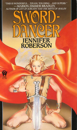
I must say that the Corgi edition of Daughter of the Lion with cover art by Fred Gambino is similar to another cover I like of a Roberson book; Sword Dancer with cover art by Kathy Wyatt.


23humouress
Oh, wait. And there's more. Carole Nelson Douglas's Irissa & Kendric series (including the Sword & Circlet trilogy. Cover illustration (for Seven of Swords by Steve Crisp.


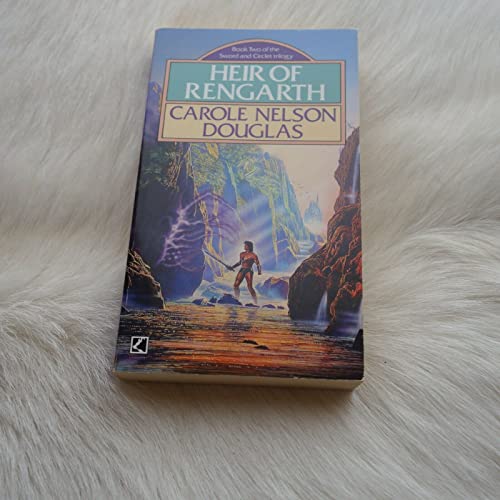

I like the colours of these. Admittedly there's a half naked barbarian spoiling the view in the third one but otherwise these embody fantasy covers for me.


I like the colours of these. Admittedly there's a half naked barbarian spoiling the view in the third one but otherwise these embody fantasy covers for me.
24humouress
I think it's something about twighlight colours that grabs my attention.
Barbara Hambly's Unschooled Wizard (or Sun Wolf and Starhawk series published by Unwin in UK/ Australia in the 1980s.


The cover art on the last two is by Mark Salwowski.

Barbara Hambly's Unschooled Wizard (or Sun Wolf and Starhawk series published by Unwin in UK/ Australia in the 1980s.


The cover art on the last two is by Mark Salwowski.

25humouress
Elizabeth H. Boyer's World of the Alfar series published by Corgi in the UK in the 1980s, cover art for books 1-4 by Geoff Taylor and for books 5 and 6 by Mark Salwowski.


ETA: correct artists(Geoff Taylor & Mark Salwowski) and links


ETA: correct artists(Geoff Taylor & Mark Salwowski) and links
26humouress
>25 humouress: These are more covers that wrap around.

Hmm; I'm sensing a theme here. I seem to have a few by Mark Salwowski. There are more of his covers here https://www.salwowski.com/Gallery1

Hmm; I'm sensing a theme here. I seem to have a few by Mark Salwowski. There are more of his covers here https://www.salwowski.com/Gallery1
27Cecrow
>21 humouress:, I have the DAW covers for the Cheysuli series, and it never occurred to me that it was two different artists. You're right, clearly the last one at least is different.
My copy of Legacy of the Sword fell apart (bad glue); years later I stumbled across exactly the same edition of this series in a book sale and replaced my third volume copy. Ever since, I've been doomed by the near certainty that nobody else ever bought the rest of the books and discovered this series because the third volume was mysteriously missing ...
My copy of Legacy of the Sword fell apart (bad glue); years later I stumbled across exactly the same edition of this series in a book sale and replaced my third volume copy. Ever since, I've been doomed by the near certainty that nobody else ever bought the rest of the books and discovered this series because the third volume was mysteriously missing ...
28brodiew2
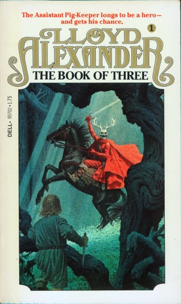


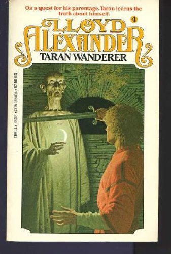

The Prydain Chronicles was my favorite fantasy series as young man. These are the Dell edition I read back then. Though the color doesn't pop, these covers hold a special place in my heart.
29Cecrow
>28 brodiew2:, those are what I have. Superb detail in those paintings. I've never seen an edition I liked more.
30macsbrains
>18 humouress: I actually have the full version of the art in the Ship of Destiny cover set as my desktop wallpaper, and have for ages. I never got around to finding out who the artist was, but I'm very glad to find out because that art make that series look IRRESISTABLE. I have some Robin Hobb in my library, but I haven't gotten around to reading any of them yet. But these... these look like they need to be gotten. I'm already a sucker for sentient ships...
31brodiew2


Hello all. I stumbled on this series while searching my library website. The covers are fantastic! I may just check out In the Eye of Heaven later this year.
32humouress
>31 brodiew2: I like the play of light and shadow on those, including the ghost ship. Let us know if they’re good!
33humouress
Hmm; a lot of pictures that I posted have disappeared. I'm just going through and trying to find replacements.
And while I'm at it, I'll try and add artists' names (and websites). I'll even try and update the books on my catalogue with the artists' names.
And while I'm at it, I'll try and add artists' names (and websites). I'll even try and update the books on my catalogue with the artists' names.
34Karlstar
>12 humouress: I am a big fan of The Book of Atrix Wolfe. I like the book but I really love the small hardcover format and the cover art. Its one of the few books (ok, maybe 200) that I made sure got unpacked.
352wonderY
>31 brodiew2: Those are beautiful!
>34 Karlstar: This is an example of why I'd like to have a covers option for the author page.
>34 Karlstar: This is an example of why I'd like to have a covers option for the author page.
36Cecrow
>35 2wonderY:, even supposing there was a covers option, I'd guess there's no guarantee you'd see the prettiest covers (and noting how "pretty" is subjective).
372wonderY
>36 Cecrow: True. I guess I'm just pie in the skying. I can't even get an old series page to look right, what with the generic ebook and print on demand covers.
38humouress
>34 Karlstar: Is that another Kinuko Craft cover? (As in >11 calm:)
>36 Cecrow: >37 2wonderY: *sigh* True.
>36 Cecrow: >37 2wonderY: *sigh* True.
39Cecrow
Speaking of attractive covers: when you add a book to LT, do you choose the cover that actually matches the copy you read, or do you choose the one you *wish* you had?
I've been going the honest route in LT, but using whatever I like in Goodreads - my idea of compromise, lol
I've been going the honest route in LT, but using whatever I like in Goodreads - my idea of compromise, lol
40macsbrains
>39 Cecrow: For a book I actually own, it's the actual cover no matter how horrid. If it's on my wishlist though -- there I sometimes choose the one I like best.
41skullduggery
I am a huge fan of Kinuko Craft's fantasy covers too - she has also done some beautiful ones for Juliet Marillier (which reflect the beautiful contents of the book, btw):


And Juliet Marillier's gorgeous Blackthorn and Grim series has gorgeous covers by Arantza Sestayo


And Juliet Marillier's gorgeous Blackthorn and Grim series has gorgeous covers by Arantza Sestayo


42skullduggery
On a darker note, I think these covers for The Cardinal's Blades series by Pierre Pevel, illustrated by Jon Sullivan are quite cool:


43skullduggery
And the covers for Leigh Bardugo's Grisha series are also lovely, there are several different designs to choose from - these architectural ones are by Jen Wang... (and yes, I'll stop now, I'm just overly excited to find this thread as you might have noticed!)


