LT2: LibraryThing Design Updates, Draft
See Talk for discussion on these drafts.
1
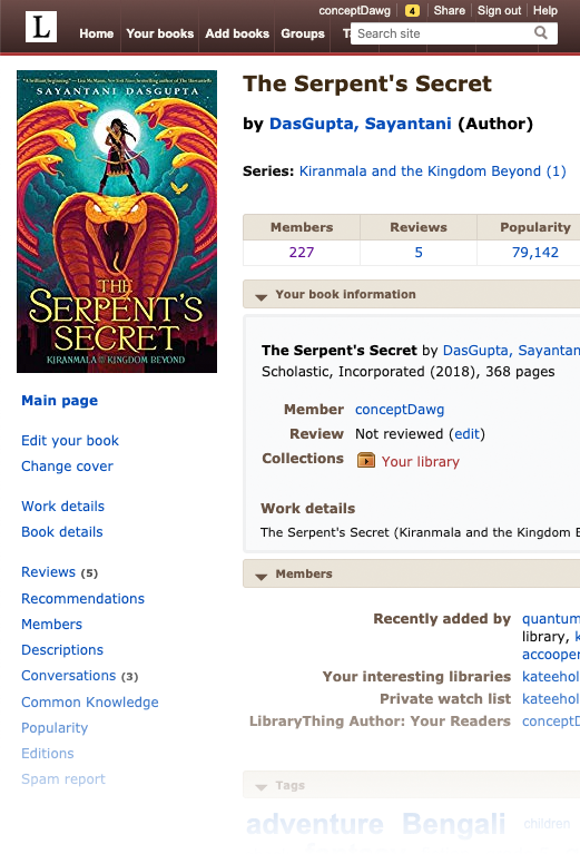
Old Design, Fullscreen
The old design only really worked with full-size computer screens—up to 1,300 pixels wide to really work! Even with a full-sized screen, the 8 normal tabs, plus a search box with four more links above it, took up a lot of room.
2
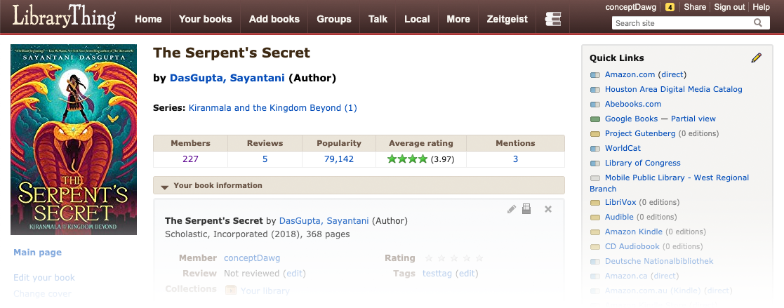
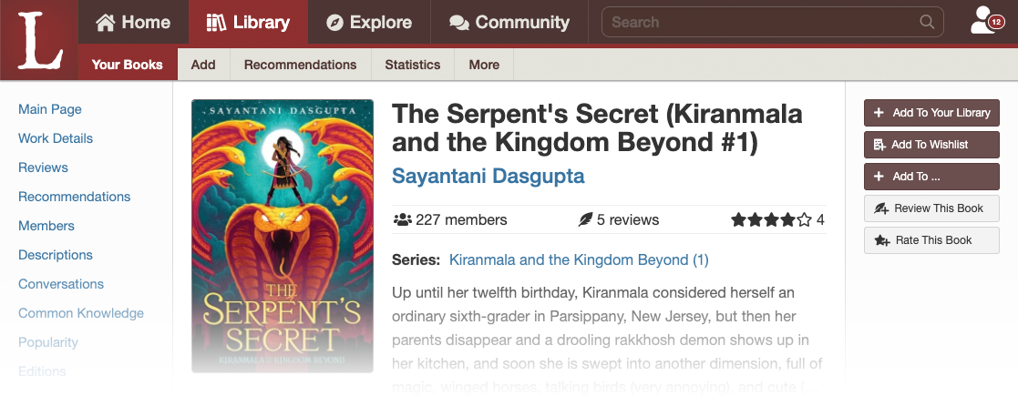
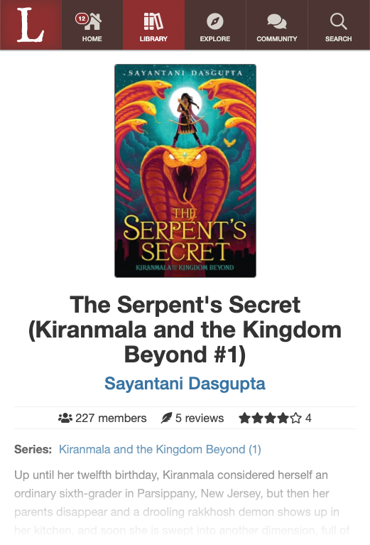
LT2 New Design, Fullscreen
The new design reduces everything to four tabs—home, library, explore and community. This is followed by a search box and a single account button, which is also a drop-down. What we lose in instant access to eight different things, we gain in simplicity and the ability to work on tablet and mobile, where there isn't acres of horizontal page.
We're not really getting into the content area here, but you can also see that Chris has divided the content into a left area for navication, a center area for content, and a right area for things you can do. This moves the book cover from above the navigation to the content.
3
Old Design, Tablet-width
As you can see, even a slight narrowing kills the right-hand side of the page. The tabs just fit because of squeezing the logo, but they get small. Or, on some systems, see X for what it does—shrinking everything down.
4
LT2 New Design, Tablet-width
The new design works well with tablet width. The four main tabs remain, but the icons go above them. The right side is not cut off—nothing will ever be cut off in the new design—but we are still working on the order of the elements.
5
Old Design, Mobile (view 1)
The old design didn't work on mobile at all. The tabs are messed up and the content is cut off.
6
Old Design, Mobile (view 2)
On some systems, the content shrinks overall, making for a site with most of the content but hardly "mobilized." Using it requires zooming in and out of a window onto a page sized for the web, not mobile.

7
LT New Design, Mobile
As you can see, the new design mobilizes all the way down to a tiny divice. The tab structure remains, now with the icons larger than the text. The content below is reformatted for a single long column of readable text.
You'll note that the "account" option has been subsumed under "home" in the mobile version.
8
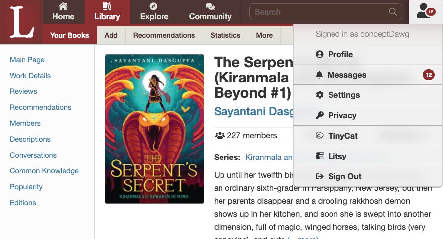
LT New Design, full screen account menu.
We rejected using menus a lot, but an "account" menu at the top right, has become common (e.g., Facebook, Twitter). The account menu also has your messages. (We chose this rather than the three alert centers on Facebook, or four on a competitor.)
9
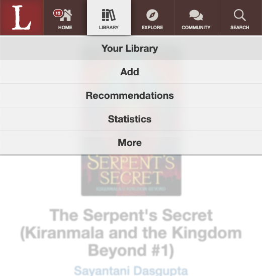
LT New Design, mobile subnav
Subnav navigation is one with a menu on mobile.
10
LT New Design, searching

That's it!


