
Visual Explanations: Images and Quantities, Evidence and Narrative
by Edward R. Tufte 
On This Page
Description
This book describes design strategies - the proper arrangement in space and time of images, words, and numbers - for presenting information about motion, process, mechanism, cause and effect.Tags
Recommendations


Member Recommendations
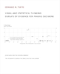
cfranco The booklet "Visual and Statistical Thinking : Displays of Evidence for Making Decisions" is a reproduction of the chapter 2 of the book "Visual Explanations: Images and Quantities, Evidence and Narrative".
Therefore, there is no need to read both of them, read only the "Visual Explanations" book.
30
Member Reviews
“A picture is worth a thousand words,” so the saying goes. Thus, an effective visualization, enriched by information, must count for so much more. But a misconstrued visualization, unfortunately, can lead to horrific outcomes from misinterpretations. How can we refine our visual thinking so that we can infer correct deductions while ignoring misplaced sketches? Visualization guru Edward Tufte teaches us how to reason about our world through informative displays in this helpful guide, replete with engaging prose, topics, and images. He instructs designers and readers of visualizations (which includes almost everyone today!) how to hone their interpretive crafts.
Tufte is the all-time great in the art of visualization. Alongside show more graphical skill, he brings a love of intellectual history and art history to make readers’ minds spin. Even though his original field was political science, his interests span every form of scientific knowledge garnered by humans throughout the centuries. Therefore, even 25+ years later, the weight of his words surpasses the judgments of everyone else in the field.
This specific book addresses how to interpret complex images (“visual explanations”) to help everyday life and professional work. He harkens to great intellectual discoveries like the rings of Saturn and the wave nature of light to illustrate foundational principles of information visualization. Although his insights about the computer have become dated because of the quickly evolving technology, his philosophy has stood the test of almost three decades of time. In fact, in an era of big data, his wisdom about interpreting complex displays pertains more, not less, to today, and his principles likewise become more prescient.
Visual Explanations contains chapters on topics like: magic (the ultimate form of graphical deception), micro/macro effects, “visual confections” (a series of images to tell a complex story), parallel displays, and statistics in visuals. His thoroughness in his entire series of four visualization books will stand for generations as the classic works in the field. After reading them, all practitioners need do is to spruce up on recent technological developments in display.
Obviously, those involved in the production of visualizations will glean the most from this book. Those in scientific discourse will benefit the most, but those in communication fields will also benefit from being able to mentally clean up others’ mistakes. With computing’s advance, visualizations increasingly convey key parts of life to the general public, so interpretive literacy has become key to the general reader. Business folks, who might be slightly put off by the scientific nature of the content, will nonetheless find many pearls of wisdom to take home. Each of Tufte’s works distill years, if not decades, of work into less than 200 pages, and his rich insight deserves to be pondered for generations. show less
The troublesome part of Visual Explanations (and all of Tufte's books really) is that it's so pleasurable you forget that you're supposed to be learning something. As distinct from the other two books in the series, Visual Explanations focuses on the manner in which images can tell a story and thereby render "reading and seeing and thinking identical". The images selected for the book are delightful and engaging - I've never before wanted to hang a data chart on my wall for the sheer artistry of it! Though it should be noted that Tufte has forever dispelled any remaining belief I harbored in magic.
As a series, The Visual Display of Quantitative Information, Envisioning Information and Visual Explanations largely cover the same material show more - some illustrations are even discussed in multiple books - and the differences are really a matter of the degree of emphasis. If they weren't all so enchanting my advice would be to just pick one, but... they're just THAT good show less
As a series, The Visual Display of Quantitative Information, Envisioning Information and Visual Explanations largely cover the same material show more - some illustrations are even discussed in multiple books - and the differences are really a matter of the degree of emphasis. If they weren't all so enchanting my advice would be to just pick one, but... they're just THAT good show less
The third of Tufte's series on information display, this book centers on visually explaining things (in Tufte's words, "pictures of verbs".)
Often quoted as indispensable in the field, it doesn't disappoint. The content is, of course, fantastic, but the book reaches much farther beyond. Every page is carefully crafted to provide itself the best example of the explained concepts. The text flows together with the images in a way not seen in any other book (forget computer algorithms to position images, either smart -LaTeX- or bad ones -Word-). Illustrations perfectly integrate into the text and are carefully reproduced without being restricted by page size or text, footnotes are transformed to "sidenotes" so that the flow of reading is not show more disturbed... every detail is *designed* and *crafted*, unlike so many books on design that break most rules they are themselves advocating.
Each chapter is devoted to a single or a few related ideas, but they are presented and explained using wonderful, memorable, stories. Thus, beatifully illustrated examples replace long academic paragraphs, resulting in vivid descriptions that shall not be forgotten. And although these examples show Tufte's erudition, they are wonderfully presented so that everyone can follow and understand the principles.
The author follows its own recommendations for presenting: go to the specific, then to the general, then back to the specific.
The best comes when a given illustration is redesigned to provide a better explanation of the displayed information. Wow.
A book to remember and re-read from time to time. 5 stars. show less
Anyone, in any field, that requires them to convey information to others, should read all of Tufte's books on information design. Book 3, Visual Explanations (how to convey "verbs", companion to "numbers" and "nouns") demonstrates through both good and bad examples, how to distill ideas down to convey the maximum amount of information with the least amount of ink in a manner that not only gets your point across, but does so in a visually pleasing and artistic manner.
Tufte practices what he preaches, too. Unhappy with the way various publishers proposed to print his manuscript, he self-publishes all of his books to incorporate his theories on information design. The result is an incredibly easy to read and understand book with footnotes show more and diagrams that meld seamlessly with the text. show less
Tufte practices what he preaches, too. Unhappy with the way various publishers proposed to print his manuscript, he self-publishes all of his books to incorporate his theories on information design. The result is an incredibly easy to read and understand book with footnotes show more and diagrams that meld seamlessly with the text. show less
It's been a while since I read anything by Tufte; luckily, this volume lives up to the fond remembrance I have of his earlier works. As with his other books, this work explores various aspects of the visual display of quantitative (or otherwise factual) infomation. More than a style guide, this book seeks to be an archetypal instance of the qualities praised within it - it succeeds with aplomb, and is invaluable to anyone who cares about honest, high-quality visual work.
I got a lot less out of this than I did from The Visual Display of Quantitative Information, which is to say still a fair amount. I thought it was an enjoyable read nonetheless and certainly worth spending a few evenings on. The main thrust of the book seemed to be that it's important to show the reader information in a way that maximally enhances their understanding. Beyond that there's a list of examples of what to do and not do, and I'll remember those down the line when I'm looking at or making pictures.
Wow, is this an excellent book. It helped my presentation of data skills, and beefed up the Power Point approach as well. I abhor presentations, as the facts are what I am after. The ability to marry up prose with data and present, this is an important skill for all today. The nicest surprise was the ability to understand how to maximize color in a presentation of information.
Members
- Recently Added By
Lists

Bret Victor's Five-Star List
46 works; 5 members

Books referenced in History by Numbers by Pat Hudson
88 works; 1 member
Author Information

21 Works 16,783 Members
Edward Tufte is Professor Emeritus at Yale University where he taught courses in statistical evidence and information design. He also served as Professor of Public Affairs at Princeton University
Edward R. Tufte is a LibraryThing Author, an author who lists their personal library on LibraryThing.
Awards and Honors
Awards
Work Relationships
Common Knowledge
- Canonical title
- Visual Explanations: Images and Quantities, Evidence and Narrative
- Original publication date
- 1997-02
- Epigraph
- Categories such as time, space, cause, and number represent the most general relations which exist between things; surpassing all our other ideas in extension, they dominate all the details of our intellectual life. If humank... (show all)ind did not agree upon these essential ideas at every moment, if they did not have the same conception of time, space, cause, and number, all contact between their minds would be impossible - Emile Durkheim, Les formes elementaires de la vie religieuse (Paris 1912), pp. 22-23
- Dedication
- For my teachers, for many years Virginia James Tufte, Raymond E. Wolfinger, Lincoln Moses, Richard A. Brody, Paul Ekman, Robert A. Dahl, Stanley Kelley Jr. John W. Tukey, Frederick Mosteller, Robert K. Merton, Cuthbert Daniel... (show all), Howard I. Gralla, Inge Druckrey, Tom Prichard
- First words
- Our thinking is filled with assessments of quantity, an approximate or exact sense of number, amount, size, scale.
- Quotations
- In the study of perception, just noticeable differences measure the very limits of human abilities to detect the faintest of differences between, say two adjacent colors almost exactly alike in a continuous spectrum of 100,00... (show all)0 colors. Ad Reinhardt’s paintings rely on these vaporous distinctions, with some gradations revealing themselves only after many minutes of focused viewing. This is fine for art but not for data. Rather than operating at such an exquisite threshold of perceptual acuity, data displays must be clear, assured, reliable, sturdy. In designing information, then, the idea is to us just notable differences, visual elements that make a clear difference by no more – contrasts that are definite, effective, and minimal.
- Last words
- (Click to show. Warning: May contain spoilers.)And, by virtue of the architecture of their arguments, confections make reading and seeing and thinking identical.
Classifications
- Genres
- Art & Design, Nonfiction, General Nonfiction, Science & Nature
- DDC/MDS
- 302.23 — Society, government, & culture Social sciences, sociology & anthropology Mass Communication & Media Communication Media (Means of communication)
- LCC
- P93.5 .T846 — Language and Literature Philology. Linguistics Communication. Mass media
Statistics
- Members
- 3,463
- Popularity
- 4,827
- Reviews
- 16
- Rating
- (4.29)
- Languages
- English, German
- Media
- Paper
- ISBNs
- 2
- ASINs
- 5