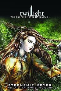
Twilight: The Graphic Novel, Volume 1
by Young Kim (Illustrator), Stephenie Meyer (Author)
Twilight: The Graphic Novel (1: Vol. 1)
On This Page
Description
When seventeen-year-old Bella leaves Phoenix to live with her father in Forks, Washington, she meets an exquisitely handsome boy at school for whom she feels an overwhelming attraction and who she comes to realize is not wholly human.Tags
Recommendations


Member Reviews
You know the story. This is the graphic novel version. I confess I was a little leery about reading this one, but my friend insisted. I haven't always been impressed with the results that come with the translation of one form to the other (take Laurel K. Hamilton's Guilty Pleasures, for example). Artist and adapter Young Kim did an amazing job, however. The artwork is beautiful. The story holds true to the original book for the most part, with minor changes here and there for the sake of brevity. Dare I say I liked the graphic novel a bit more than I liked the original version? Volume 1 is the first of three that will retell the story in Stephanie Meyer's Twilight.
I figure most everybody knows the Twilight story so I'm just going to talk about the graphic novel in particular. The illustrator is Young Kim and she does a wonderful job. The characters seem almost magical in the drawings. She also has a very selective use of color that I find very interesting. I was also impressed with how well she told the story with so few words. I didn't feel like anything was missing or left out. I say if you're a Twilight fan, give the graphic novel a try. Although I must warn you, it doesn't cover the whole book. Looks like a second volume isn't too far down the road.
In this graphic novel adaption of New York Times bestselling novel, Twilight, Young Kim illustrates the meeting of Edward Cullen and Bella Swam. And by now YA book readers have probably know something about this series from movies or just friends so there is no point behind writing summaries. However, if you have not yet read the series (or watched the movie) and only know the general gist do not start with the graphic novel. There are scenes that will not make any sense because some of the inner monologue is missing. Even then the tension, anguish and self-doubt will not be as prominent as it was in the book (and for some that might be a positive aspect). I do feel that the graphic novel will get more people interested in Twilight show more since I already managed to get about two people to read the graphic novel. (Though when they finished I asked if they would like to continue the [graphic] novel to which they replied ‘no’.) The Twilight: the Graphic Novel is something you might read to pass the time that does not add much to the series.
While visually pretty, the artist Kim seems to favor stoic features on faces. There is nothing dynamic that compels the reader to stay interested. I wanted Kim to ‘ugly’ the faces up with more emotions—exaggerate the face—that does not seem to say ‘look I’m so pretty; I’m pretty from this and that angle’ and not seem so monotone (without relying so much on the thick effect lines). I would like to mention that I love the color pages. Amazon has a example of this with the scene where Edward sparkles (several of my friends laughed when they saw that picture).
For the price of the graphic novel—a whopping twenty dollars—and the chapters covered, around 14 chapters based off the original novel which is about halfway through the book, I feel like it is not worth it. The graphic novel reads and looks more like an American comic than a manwha* and the fact that it is first published as a hardback instead of a typical paperback shocks me. It is not a very thick comic and can easily be read under an hour. If you are a huge die-hard Twilight fan I would say go for it because it is a stunning piece of artwork, but if you are just curious about it, it’s not worth buying (at least until the paperback version releases).
*A Korean comic/“manga” show less
While visually pretty, the artist Kim seems to favor stoic features on faces. There is nothing dynamic that compels the reader to stay interested. I wanted Kim to ‘ugly’ the faces up with more emotions—exaggerate the face—that does not seem to say ‘look I’m so pretty; I’m pretty from this and that angle’ and not seem so monotone (without relying so much on the thick effect lines). I would like to mention that I love the color pages. Amazon has a example of this with the scene where Edward sparkles (several of my friends laughed when they saw that picture).
For the price of the graphic novel—a whopping twenty dollars—and the chapters covered, around 14 chapters based off the original novel which is about halfway through the book, I feel like it is not worth it. The graphic novel reads and looks more like an American comic than a manwha* and the fact that it is first published as a hardback instead of a typical paperback shocks me. It is not a very thick comic and can easily be read under an hour. If you are a huge die-hard Twilight fan I would say go for it because it is a stunning piece of artwork, but if you are just curious about it, it’s not worth buying (at least until the paperback version releases).
*A Korean comic/“manga” show less
The artwork is stunning and the storyline a very true, but abbreviated version of the original. I was delighted to see the story through another medium, but disappointed by the split into volumes. Seems like a money-making gimmick. The novel in its entirety could have been placed into one book.
While not as avid a fan as some people I know, I do enjoy the Twilight books and movies. Bella has a real tendency to annoy me quite a bit though. So, I was surprised when she didn't irritate me at all in this graphic novel. In fact, she seems a lot smarter, and more in control of her emotions than the Bella from either the books or movies. Edward, too, seemed changed. His manner of speech was better, and his overall character was more believable. Their whole relationship seems more believable.
I really expected to only think this book was so-so, but it was very easy to "sink my teeth into," and I found myself enjoying this book far more than the original novel! The graphics were great, and really enhanced the story. It was amazing!
I really expected to only think this book was so-so, but it was very easy to "sink my teeth into," and I found myself enjoying this book far more than the original novel! The graphics were great, and really enhanced the story. It was amazing!
So we all know that it is trendy to bash on Twilight and its fanatics, which is easy enough to do given the caliber of the writing and the characters in the book and cast in the movie. This particular review, though, is for the graphic novel adaptation of the first novel, and only the first volume at that.
Everyone knows the story of Twilight (and if you don’t, what rock have you been living under), so I will be brief in addressing plot elements. The text is easily summarized within the limitations of text boxes, speech bubbles, and letterboxing. The story is told primarily through dialogue, with narrative used sparingly. Bella’s inner monologue, reduced to a few scattered sentences here and there, makes her almost seem like a show more multi-dimensional, sympathetic character, until about halfway through, when she begins her research on vampires, and recklessly decides, whether he is interested or not, that she will sacrifice herself to be with him. Still, in this format, the high school drama and inner life of the teen girl seems to flow better than in the novel.
The story is beautifully illustrated, primarily in monotones, with color used to mark particularly pivotal scenes. The drawings are mostly realistic (if one can say that about a fantasy involving vampires and werewolves), and convey movement, motion, and emotion. If one must read Twilight, this should be the format chosen. show less
Everyone knows the story of Twilight (and if you don’t, what rock have you been living under), so I will be brief in addressing plot elements. The text is easily summarized within the limitations of text boxes, speech bubbles, and letterboxing. The story is told primarily through dialogue, with narrative used sparingly. Bella’s inner monologue, reduced to a few scattered sentences here and there, makes her almost seem like a show more multi-dimensional, sympathetic character, until about halfway through, when she begins her research on vampires, and recklessly decides, whether he is interested or not, that she will sacrifice herself to be with him. Still, in this format, the high school drama and inner life of the teen girl seems to flow better than in the novel.
The story is beautifully illustrated, primarily in monotones, with color used to mark particularly pivotal scenes. The drawings are mostly realistic (if one can say that about a fantasy involving vampires and werewolves), and convey movement, motion, and emotion. If one must read Twilight, this should be the format chosen. show less
My initial reaction to this volume, when I flipped through it, was "ooh, pretty artwork." That's one thing this adaptation has over, say, the movie - the Cullens don't look like pale plastic Barbie people, they look like the inhumanly gorgeous creatures they're supposed to be. Unfortunately, the super-gorgeous character designs include Bella, who, rather than looking like an ordinary girl, has a tendency to look like a manga (or is manhwa the better word to use here?) princess - what's going to happen when the story gets to the point where Bella gets turned into a vampire and she's supposed to become inhumanly beautiful? I'm not sure it's possible to draw her more beautiful than this.
Had I been a newcomer to this series, I don't know show more that I would have liked this adaptation all that much. While Bella's narration can get a bit...trying...in the original novel, this graphic novel condensed things almost a little too much. The worst part is, the annoying aspects of Bella's narration are still there, so it's not like that particular weakness is overcome (it's still incredibly dramatic in an unintentionally amusing way, and Bella still doesn't "sound" like a teenage girl to me). Anyway, it's probably a good thing that I didn't read this for the story. I already knew the story, what I wanted was to see the artwork and take a look at the visuals for any scenes I remembered enjoying in either the novel or the movie.
While I, for the most part, enjoyed the artwork, with its gorgeous character designs (although I thought Jasper actually looked better than Edward), dreamy shading, and clever use of color (only a few pages in this volume have any color), there are still things about the look of this volume that I hated. For now, this is only a minor weakness, although it'll become a greater weakness if this graphic novel series ever makes it to the more Jacob-heavy parts of the series: while the first wolf depicted in this volume looked really good, the second one looked off and bothered me. A more generalized problem I had with the artwork involved characters' facial expressions. While some subtle facial expressions were well-done, other times (quite a few times actually) characters' facial expressions were so subtle that they seemed to be non-existent, at least to me. Also, is it too much to ask that not all facial expressions be subtle? It was rare for characters' facial expressions to be more pronounced or to involve their whole face. Maybe they all got Botox treatments?
All those complaints feel kind of nitpicky in comparison with my hatred of the conversation bubbles, lettering, and "trembling" lines used, although at least the "sweat drops" weren't overdone (unlike in In Odd We Trust). The conversation bubbles tended to be large, perfect, translucent things, with a scraggly little line pointing in the direction of whoever was saying the text. The lettering used throughout the entire volume was perfect, the kind of thing you'd see in a Word document. The overall effect, combined with the inhumanly lovely characters and smooth shading, was one of lots and lots of perfection. A little hand-lettering, or at least a font that would give the illusion of hand-lettering, might have broken up that perfection somewhat. The translucent conversation bubbles just annoyed me - they screamed "lookit what we can do with the computer!" more than anything else to me.
The "trembling" lines (such as when Edward is shaking from the effort of being around Bella at the beginning of the volume) had a look that was similar to the weird scraggly lines coming out of the conversation bubbles. The lines were too strong (especially when outlined in white while on a dark background), making them stand out way too much, I hated that the look screamed "we did this on the computer, after everything else had already been drawn" (making the trembling less a part of the artwork and more something like a sound effect), and there was something about them that didn't seem quite right to me. When I first saw the "trembling" lines, I had a second where I couldn't figure out what they were. That shouldn't happen. Things like these lines need to perfectly follow conventions, which will allow them to be interpreted by readers as being certain emotional cues, all without the reader ever necessarily being aware of what's going on. If you're actually seeing the lines, the way I did, and not feeling them as emotional cues, then something's not right.
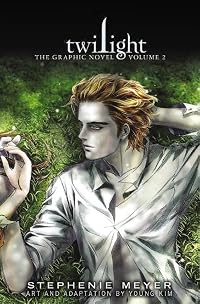
I already wrote a lot about the original novel in a separate post, so I don't think I need to say too much about what I thought about the story. I still think Bella's a bit too masochistic. I think this adaptation proves that there is no way to do Meyer's "sparkling vampire" look without it seeming stupid - it was stupid in the movie, and, although it's marginally better in this graphic novel (the bit where Edward walks out into the sunlight is absolutely gorgeous and one of several instances of the book's really effective use of limited color), it's still pretty lame. In addition, because of Young Kim's style, I couldn't help but think "shojo sparklies!" when I saw the sparkles shining in Edward's hair.
If I had bought this instead of getting it via ILL, I would probably consider this a keeper for the artwork alone - despite various shortcomings, the artwork is still lovely. As far as its story goes, though, it's pretty meh. If you want the story, I'd recommend the book or even the movie over this graphic novel any day.
(Original review, with read-alikes, posted on A Library Girl's Familiar Diversions.) show less
Had I been a newcomer to this series, I don't know show more that I would have liked this adaptation all that much. While Bella's narration can get a bit...trying...in the original novel, this graphic novel condensed things almost a little too much. The worst part is, the annoying aspects of Bella's narration are still there, so it's not like that particular weakness is overcome (it's still incredibly dramatic in an unintentionally amusing way, and Bella still doesn't "sound" like a teenage girl to me). Anyway, it's probably a good thing that I didn't read this for the story. I already knew the story, what I wanted was to see the artwork and take a look at the visuals for any scenes I remembered enjoying in either the novel or the movie.
While I, for the most part, enjoyed the artwork, with its gorgeous character designs (although I thought Jasper actually looked better than Edward), dreamy shading, and clever use of color (only a few pages in this volume have any color), there are still things about the look of this volume that I hated. For now, this is only a minor weakness, although it'll become a greater weakness if this graphic novel series ever makes it to the more Jacob-heavy parts of the series: while the first wolf depicted in this volume looked really good, the second one looked off and bothered me. A more generalized problem I had with the artwork involved characters' facial expressions. While some subtle facial expressions were well-done, other times (quite a few times actually) characters' facial expressions were so subtle that they seemed to be non-existent, at least to me. Also, is it too much to ask that not all facial expressions be subtle? It was rare for characters' facial expressions to be more pronounced or to involve their whole face. Maybe they all got Botox treatments?
All those complaints feel kind of nitpicky in comparison with my hatred of the conversation bubbles, lettering, and "trembling" lines used, although at least the "sweat drops" weren't overdone (unlike in In Odd We Trust). The conversation bubbles tended to be large, perfect, translucent things, with a scraggly little line pointing in the direction of whoever was saying the text. The lettering used throughout the entire volume was perfect, the kind of thing you'd see in a Word document. The overall effect, combined with the inhumanly lovely characters and smooth shading, was one of lots and lots of perfection. A little hand-lettering, or at least a font that would give the illusion of hand-lettering, might have broken up that perfection somewhat. The translucent conversation bubbles just annoyed me - they screamed "lookit what we can do with the computer!" more than anything else to me.
The "trembling" lines (such as when Edward is shaking from the effort of being around Bella at the beginning of the volume) had a look that was similar to the weird scraggly lines coming out of the conversation bubbles. The lines were too strong (especially when outlined in white while on a dark background), making them stand out way too much, I hated that the look screamed "we did this on the computer, after everything else had already been drawn" (making the trembling less a part of the artwork and more something like a sound effect), and there was something about them that didn't seem quite right to me. When I first saw the "trembling" lines, I had a second where I couldn't figure out what they were. That shouldn't happen. Things like these lines need to perfectly follow conventions, which will allow them to be interpreted by readers as being certain emotional cues, all without the reader ever necessarily being aware of what's going on. If you're actually seeing the lines, the way I did, and not feeling them as emotional cues, then something's not right.
I already wrote a lot about the original novel in a separate post, so I don't think I need to say too much about what I thought about the story. I still think Bella's a bit too masochistic. I think this adaptation proves that there is no way to do Meyer's "sparkling vampire" look without it seeming stupid - it was stupid in the movie, and, although it's marginally better in this graphic novel (the bit where Edward walks out into the sunlight is absolutely gorgeous and one of several instances of the book's really effective use of limited color), it's still pretty lame. In addition, because of Young Kim's style, I couldn't help but think "shojo sparklies!" when I saw the sparkles shining in Edward's hair.
If I had bought this instead of getting it via ILL, I would probably consider this a keeper for the artwork alone - despite various shortcomings, the artwork is still lovely. As far as its story goes, though, it's pretty meh. If you want the story, I'd recommend the book or even the movie over this graphic novel any day.
(Original review, with read-alikes, posted on A Library Girl's Familiar Diversions.) show less
Members
- Recently Added By
Lists

Graphic Novels Adapted from Other Books
206 works; 1 member
Author Information

Stephenie Meyer was born in Hartford, Connecticut on December 24, 1973. She received a bachelor's degree in English from Brigham Young University. Her first novel, Twilight, was published in 2005 and was the beginning of the popular Twilight Saga, which includes New Moon, Eclipse, and Breaking Dawn. All the books within the Twilight Saga were made show more into feature-length films. Her first novel for adults, The Host, was published in 2008. Meyer's novel The Chemist has been on several best seller lists including USA Today, Barnes and Noble and New York Times. (Bowker Author Biography) show less
Some Editions
Awards and Honors
Awards
Series

Work Relationships
Is contained in
Is an adaptation of
Common Knowledge
- Canonical title
- Twilight: The Graphic Novel, Volume 1
- Original publication date
- 2010-03-16
- People/Characters
- Isabella 'Bella' Swan; Edward Cullen; Jacob Black
- Important places
- Forks, Washington, USA
- First words
- I'd never given much thought to how I would die -- though I'd had reason enough in the last few months...
- Last words
- (Click to show. Warning: May contain spoilers.)Before I realized, we were back at the truck... and by the time we got back to my house, the world had turned quiet and dark...
- Original language
- English
Classifications
- Genres
- Teen, Graphic Novels & Comics
- DDC/MDS
- 741.5973 — Arts & recreation Drawing & decorative arts Drawing Comic books, graphic novels, fotonovelas, cartoons, caricatures, comic strips History, geographic treatment, biography North American United States (General)
- LCC
- PZ7.7 .M49 .T — Language and Literature Fiction and juvenile belles lettres Fiction and juvenile belles lettres Juvenile belles lettres
- BISAC
Statistics
- Members
- 1,738
- Popularity
- 12,732
- Reviews
- 88
- Rating
- (3.71)
- Languages
- 11 — Danish, Dutch, English, Estonian, Finnish, French, German, Italian, Norwegian (Bokmål), Spanish, Swedish
- Media
- Paper, Ebook
- ISBNs
- 27
- ASINs
- 12
