This topic is currently marked as "dormant"—the last message is more than 90 days old. You can revive it by posting a reply.
1Django6924
A recent thread examined "the 'worst' illustrations" for an LEC. It would be interesting to try to derive, from the consensus of the group, what are the criteria used in determining whether an illustration is "good" or "bad."
Speaking from my own perspective, some illustrations may be pleasing as art, but they seem to lack a quality I find necessary in an illustration. The examples that come immediately to mind in this context are Marie Laurencin's illustrations for Camille--beautiful to look at, but they neither depict scenes in the novel nor show any variation in expression on the part of the only character depicted, Marguerite, which would reflect on her changing condition. They are, in fact, like those paper doll cutouts on which you could pin various other costumes (girls in my day all seem to have these but I don't know if they still make them). Matisse's illustrations for Ulysses are likewise pleasing to look at, but show no insight whatever into the novel itself (in fact are excellent proof the illustrator never read the work at all).
For me, illustrations need to show an understanding of the author's intentions. Mere depictions of scenes or characters may be sufficient as illustrations, or at the least may not be obtrusive and irritating, and the most technically accomplished of these, such as Wilson's Ivanhoe and Falke's The Three Musketeers are very enjoyable. But I believe the very finest illustrations have to mirror the intent of the author. In this respect, I reserve the place of honor for the illustrations of Eichenberg for Crime and Punishment, Agnes Miller Parker for the Hardy novels, Lynd Ward for For Whom the Bell Tolls, and pre-eminently, Grant Wood for Main Street. There are some others, but these are the illustrations where it seemed to me the artist and the author were of the same mind, and are the ones I would point out as examples of what makes a good illustration.
Speaking from my own perspective, some illustrations may be pleasing as art, but they seem to lack a quality I find necessary in an illustration. The examples that come immediately to mind in this context are Marie Laurencin's illustrations for Camille--beautiful to look at, but they neither depict scenes in the novel nor show any variation in expression on the part of the only character depicted, Marguerite, which would reflect on her changing condition. They are, in fact, like those paper doll cutouts on which you could pin various other costumes (girls in my day all seem to have these but I don't know if they still make them). Matisse's illustrations for Ulysses are likewise pleasing to look at, but show no insight whatever into the novel itself (in fact are excellent proof the illustrator never read the work at all).
For me, illustrations need to show an understanding of the author's intentions. Mere depictions of scenes or characters may be sufficient as illustrations, or at the least may not be obtrusive and irritating, and the most technically accomplished of these, such as Wilson's Ivanhoe and Falke's The Three Musketeers are very enjoyable. But I believe the very finest illustrations have to mirror the intent of the author. In this respect, I reserve the place of honor for the illustrations of Eichenberg for Crime and Punishment, Agnes Miller Parker for the Hardy novels, Lynd Ward for For Whom the Bell Tolls, and pre-eminently, Grant Wood for Main Street. There are some others, but these are the illustrations where it seemed to me the artist and the author were of the same mind, and are the ones I would point out as examples of what makes a good illustration.
2BuzzBuzzard
For me on top of the list of successful book illustrations is Zhenya Gay with her illustrations for Confessions of an English Opium Eater. Even John Austen who is not universally appreciated (to say the least) did a great job for the HP Vicar of Wakefield.
3HuxleyTheCat
"What makes a good illustration?"
Tough question, and I think many an academic theses could probably be written about such a thing, but for me a good illustration is one (or a series) which adds positively to my experience when reading a book. Something can add positively simply by being an enjoyable break from the text, or, at the other extreme, it can combine with the other elements of the book to create something beyond the sum of parts (I think the Gregynog Wilfred Owen poems is an example of where this happens, likewise the LEC Toilers of the Sea). An illustration can make one think about the text in a very different way (compare Marangoni and Hugo's own illustrations for Toilers for example), or provide an accompanying atmosphere akin to the score of a film - Kenna's photographs for Arion's Hound of the Baskervilles, or Uelsmann's for the Centipede Press Salem's Lot; Covarrubias stimulates perceptions of the (to my contemporary British eyes) exotic, while Agnes Miller Parker (in her work for the H.E. Bates books) perfectly evokes the countryside of my youth; Jane Joseph in her etchings for the Folio Society 'If This is a Man' works with sensitivity and pathos while to my mind Hafftka produces self-indulgent obscurity for the LEC 'In the Penal Colony'.
Tough question, and I think many an academic theses could probably be written about such a thing, but for me a good illustration is one (or a series) which adds positively to my experience when reading a book. Something can add positively simply by being an enjoyable break from the text, or, at the other extreme, it can combine with the other elements of the book to create something beyond the sum of parts (I think the Gregynog Wilfred Owen poems is an example of where this happens, likewise the LEC Toilers of the Sea). An illustration can make one think about the text in a very different way (compare Marangoni and Hugo's own illustrations for Toilers for example), or provide an accompanying atmosphere akin to the score of a film - Kenna's photographs for Arion's Hound of the Baskervilles, or Uelsmann's for the Centipede Press Salem's Lot; Covarrubias stimulates perceptions of the (to my contemporary British eyes) exotic, while Agnes Miller Parker (in her work for the H.E. Bates books) perfectly evokes the countryside of my youth; Jane Joseph in her etchings for the Folio Society 'If This is a Man' works with sensitivity and pathos while to my mind Hafftka produces self-indulgent obscurity for the LEC 'In the Penal Colony'.
4leccol
I wondered when someone would mention "In the Penal Colony". Self-indulgent obscurity says it all.
The single frontispiece illustration for the LEC The Leopard ruins an otherwise beautiful book.
I agree with Django's illustration philosophy. I think this is why so many of the Arion illustrations fail, especially the photos within the Chandler The Big Sleep.
The single frontispiece illustration for the LEC The Leopard ruins an otherwise beautiful book.
I agree with Django's illustration philosophy. I think this is why so many of the Arion illustrations fail, especially the photos within the Chandler The Big Sleep.
5dlphcoracl
Interesting question, but I side much more with HuxleyThe Cat's feelings (>3 HuxleyTheCat:) than I do with Django6924's (>1 Django6924:).
As I interpret their comments - Django6924 favors illustrations which are quite literal and very specific, designed to do what illustrations are nominally supposed to do, and that is - create a lasting visual impression of key scenes and events in a great work of literature. Put another way, Django6924 wants his illustrations to have a cinematic emotional impact and subtlety, at least I think that is what he is saying.
HuxleyTheCat has a much broader and far-reaching criteria of what constitutes a good set of book illustrations. If I interpret her post (>3 HuxleyTheCat:) nearly anything which enhances her reading experience or creates a mood in harmony with the work of literature works for her.
I can appreciate and enjoy both the very specific and very literal although the "literal" is truly subjective and is often a hit-and-miss affair for a private press to execute properly. The Arion Press' use of modern art to illustrate several books, both vintage and more recent, illustrates this better than anything I can state and it is truly a case of "Beauty is in the Eye of the Beholder". Some examples:
1) Poetry of Sappho:
This was a thread on LibraryThing some time ago (when the book was originally published) and LT-ers were split down the middle, each vehemently defending his/her like or dislike of Julie Mehretu's illustrations. Originally, I was firmly in the "don't like" camp despite being a fan of her artwork in the gallery and museum context. Strangely, I have grown to appreciate these illustrations over time. They create a delicate, feminine/feminist mood that is in perfect harmony with Sappho's poetry. In fact, I have turned 180 degrees on this one, so much so that I have purchased the book.
http://www.arionpress.com/catalog/images/093Mehretu-spread-big.jpg
2) What the End is For, a selection of poetry by Jorie Graham:
This was an Arion Press book that I eagerly anticipated because Jorie Graham is one of the foremost poets on the current poetry scene and this would be her first publication in a fine private press edition. A generous collection of fifty-five poems written between 1977 to 2011 were included, spanning the most important periods of her career, with an excellent and sympathetic introductory essay by Prof. Helen Vendler (Harvard University). The book is illustrated with sixteen color relief prints by Julian Lethbridge.
Aside from not appreciating his art, the prints have absolutely nothing to do with this important collection of poems. Not only do they NOT elevate or complement this edition they actually work against it, creating a discordant and jarring note to her insightful poetry. This was a major opportunity missed and I was frustrated and angered when I received the prospectus from Arion, so much so that it has prevented me from buying a book I would have normally purchased in a heartbeat.
http://www.arionpress.com/catalog/images/101-red.jpg
Interestingly, in their edition of James Joyce's 'Ulysses', Arion Press printed ten copies (called Printers Copies) without the suite of Robert Motherwell's Abstract Expressionist illustrations. Andrew Hoyem mentioned that he did so because it reduced the thickness of an already mammoth book by nearly one inch and made reading the book easier. Because the paper selected for proper reproduction of Motherwell's illustrations was thicker and stiffer than the French Johannot paper used for the text (gorgeous, I might add) it interfered with one's reading - necessitating that one hand be used to hold down the thicker, stiffer page with the illustration while turning the text page with the other. Frankly, I wish the Arion Press would include 10 to 12 Printers Copies sans illustrations for ALL of their important editions illustrated by modern and abstract art. I'll bet they would disappear from their inventory faster than a bottle of Gatorade at the conclusion of the Boston Marathon.
As I interpret their comments - Django6924 favors illustrations which are quite literal and very specific, designed to do what illustrations are nominally supposed to do, and that is - create a lasting visual impression of key scenes and events in a great work of literature. Put another way, Django6924 wants his illustrations to have a cinematic emotional impact and subtlety, at least I think that is what he is saying.
HuxleyTheCat has a much broader and far-reaching criteria of what constitutes a good set of book illustrations. If I interpret her post (>3 HuxleyTheCat:) nearly anything which enhances her reading experience or creates a mood in harmony with the work of literature works for her.
I can appreciate and enjoy both the very specific and very literal although the "literal" is truly subjective and is often a hit-and-miss affair for a private press to execute properly. The Arion Press' use of modern art to illustrate several books, both vintage and more recent, illustrates this better than anything I can state and it is truly a case of "Beauty is in the Eye of the Beholder". Some examples:
1) Poetry of Sappho:
This was a thread on LibraryThing some time ago (when the book was originally published) and LT-ers were split down the middle, each vehemently defending his/her like or dislike of Julie Mehretu's illustrations. Originally, I was firmly in the "don't like" camp despite being a fan of her artwork in the gallery and museum context. Strangely, I have grown to appreciate these illustrations over time. They create a delicate, feminine/feminist mood that is in perfect harmony with Sappho's poetry. In fact, I have turned 180 degrees on this one, so much so that I have purchased the book.
http://www.arionpress.com/catalog/images/093Mehretu-spread-big.jpg
2) What the End is For, a selection of poetry by Jorie Graham:
This was an Arion Press book that I eagerly anticipated because Jorie Graham is one of the foremost poets on the current poetry scene and this would be her first publication in a fine private press edition. A generous collection of fifty-five poems written between 1977 to 2011 were included, spanning the most important periods of her career, with an excellent and sympathetic introductory essay by Prof. Helen Vendler (Harvard University). The book is illustrated with sixteen color relief prints by Julian Lethbridge.
Aside from not appreciating his art, the prints have absolutely nothing to do with this important collection of poems. Not only do they NOT elevate or complement this edition they actually work against it, creating a discordant and jarring note to her insightful poetry. This was a major opportunity missed and I was frustrated and angered when I received the prospectus from Arion, so much so that it has prevented me from buying a book I would have normally purchased in a heartbeat.
http://www.arionpress.com/catalog/images/101-red.jpg
Interestingly, in their edition of James Joyce's 'Ulysses', Arion Press printed ten copies (called Printers Copies) without the suite of Robert Motherwell's Abstract Expressionist illustrations. Andrew Hoyem mentioned that he did so because it reduced the thickness of an already mammoth book by nearly one inch and made reading the book easier. Because the paper selected for proper reproduction of Motherwell's illustrations was thicker and stiffer than the French Johannot paper used for the text (gorgeous, I might add) it interfered with one's reading - necessitating that one hand be used to hold down the thicker, stiffer page with the illustration while turning the text page with the other. Frankly, I wish the Arion Press would include 10 to 12 Printers Copies sans illustrations for ALL of their important editions illustrated by modern and abstract art. I'll bet they would disappear from their inventory faster than a bottle of Gatorade at the conclusion of the Boston Marathon.
6skyschaker
The criteria for labeling an illustration as “perfect match” are not universal. Different approaches can be used. Django’s point of view is very clear and reasonable, but it closes the way for the artist to show his understanding, his interpretation, his vision of the content of the book. I would not agree with the example about the pictures of Marguerite by Marie Laurencin. All of them show different moments of her life, and help to create a multidimentional portrait of this character, as long as the novel is concentrated around her love and emotions.
Another artist who I like as well is Mariette Lydis. I am sure Marie and Mariette knew each other, as they were about the same age and spent many years of their lives in Paris and had the similar lifestyle. I spent a few days researching the internet resources about Lydis, and found her other works. She illustrated The Beggar's Opera and The Turn of the Screw. I wish she were more prolific for LEC.
A few more artist were, on my view, a great find of Macy. Alexander King, making pix for Gulliver and Villon, is a wonderful match. Eichenberg is a genius of xilography, his gravures are ALWAYS incredible.
My very favorite illustrators are Valenti Angelo, Arthur Szyk, Eric Gill.
Another artist who I like as well is Mariette Lydis. I am sure Marie and Mariette knew each other, as they were about the same age and spent many years of their lives in Paris and had the similar lifestyle. I spent a few days researching the internet resources about Lydis, and found her other works. She illustrated The Beggar's Opera and The Turn of the Screw. I wish she were more prolific for LEC.
A few more artist were, on my view, a great find of Macy. Alexander King, making pix for Gulliver and Villon, is a wonderful match. Eichenberg is a genius of xilography, his gravures are ALWAYS incredible.
My very favorite illustrators are Valenti Angelo, Arthur Szyk, Eric Gill.
7astropi
Honestly, there's not much difference in "what makes a good illustration" versus "what makes a bad illustration". I'm sure people have written thesis after thesis about this, but ultimately it's in the eye of the beholder.
8featherwate
>6 skyschaker:
Alexander King would not have been pleased to hear he had been discovered by George Macy! By the late 1920s he was one of a handful of artists (Rockwell Kent, Cleland and Dwiggins were others) whom publishers were desperate to commission to illustrate classics because the artists, being alive, were more famous than the authors (mostly dead, so beyond interfering or claiming royalties). Random House's initial publicity for their trade edition of Kent's Moby Dick, for example, did not even mention Melville, and Macy established his new The Brown House imprint solely to attract Alexander King:

Certainly King for Gulliver's Travels was a good choice (as was John Held for Munchausen, and Howard Simon for Villon - the latter a better book I think than King's two-volume Villon for Covici-Friede 1928, but as astropi says "ultimately it's in the eye of the beholder").
Alexander King would not have been pleased to hear he had been discovered by George Macy! By the late 1920s he was one of a handful of artists (Rockwell Kent, Cleland and Dwiggins were others) whom publishers were desperate to commission to illustrate classics because the artists, being alive, were more famous than the authors (mostly dead, so beyond interfering or claiming royalties). Random House's initial publicity for their trade edition of Kent's Moby Dick, for example, did not even mention Melville, and Macy established his new The Brown House imprint solely to attract Alexander King:

Certainly King for Gulliver's Travels was a good choice (as was John Held for Munchausen, and Howard Simon for Villon - the latter a better book I think than King's two-volume Villon for Covici-Friede 1928, but as astropi says "ultimately it's in the eye of the beholder").
9HuxleyTheCat
>7 astropi: >8 featherwate: I spend far too long every day looking at photographic images. Very often I will look at one and think 'there's something about that I like' and it leaves a positive impression, but if I look at it with a more critical eye then I can see that it is objectively a 'bad' photograph for all sorts of reasons, and all too often some work in processing has been used to disguise the fact or fool the eye, with the outcome being rather more luck than intent. I think it is true that all arts, from music through literature to the visual arts, or indeed many other things which are viewed as subjective, can be made up of objectively good and/or bad elements, and I think it is absolutely valid to try and establish what might constitute those good parts. Surely that's the essence of why we have so many pages of critical review of such subjects and is how we grow and develop our own knowledge. If everything boiled down to 'it's in the eye of the beholder', then there's nothing more that need be written about any artistic output at all. I know more than one person who holds that exact view, but it's not one I can to subscribe to.
10Django6924
>5 dlphcoracl: "- Django6924 favors illustrations which are quite literal and very specific, designed to do what illustrations are nominally supposed to do, and that is - create a lasting visual impression of key scenes and events in a great work of literature."
In fact, I believe my position was stated in the following: "Mere depictions of scenes or characters may be sufficient as illustrations, or at the least may not be obtrusive and irritating... but I believe the very finest illustrations have to mirror the intent of the author."
Now these illustrations may mirror the author's intentions by depicting scenes or characters, but it isn't necessary that they do as long as they are true to the artist's intentions or spirit. Some of the illustrations that have I have not cared for at all were indeed "quite literal" depictions--the Arion Press The Big Sleep for example. Others were true to the author's intent, but these did not represent scenes in the book or characters--the aforementioned The Hound of the Baskervilles, the period photographs in Call it Sleep, and Laurie Simmons' photos of dolls and dollhouses for Mrs. Bridge (all by the Arion Press). All these mirrored the authors' intentions by creating a world, an atmosphere, wherein the reader could have a visual stimulus which enabled him to more fully appreciate and understand the author's intentions.
>6 skyschaker: "All of them show different moments of her life, and help to create a multidimentional portrait of this character, as long as the novel is concentrated around her love and emotions."
In fact, I do not see different moments of her life nor conflicting or changing emotions--only different articles of her wardrobe. Her expression in the last of the illustrations, (helpfully subtitled, though, to her credit, not by Mme. Laurencin, "feeling as she did now, Marguerite would rather die than accept another lover"), is the same expression she has worn in each of the previous ones, and does not show any emotional conflict I can perceive. I will say that I like these portraits a lot, but I find they fall short of what I look for in the finest illustration.
>9 HuxleyTheCat:
I agree, Fiona. To hold the philosophy "to each his own" pretty much negates the value of those artists who toiled, often to great personal sacrifice, to achieve something great, and renders all criteria for excellence irrelevant.
Incidentally, if I had given more thought on the matter before I titled this post, I would have perhaps called it "What does it mean, to 'illustrate' a book? " Coming off the post about the "Worst" illustrations, I was foolishly led into that trap of "good" versus "bad," which is detrimental to achieving better understanding.
In fact, I believe my position was stated in the following: "Mere depictions of scenes or characters may be sufficient as illustrations, or at the least may not be obtrusive and irritating... but I believe the very finest illustrations have to mirror the intent of the author."
Now these illustrations may mirror the author's intentions by depicting scenes or characters, but it isn't necessary that they do as long as they are true to the artist's intentions or spirit. Some of the illustrations that have I have not cared for at all were indeed "quite literal" depictions--the Arion Press The Big Sleep for example. Others were true to the author's intent, but these did not represent scenes in the book or characters--the aforementioned The Hound of the Baskervilles, the period photographs in Call it Sleep, and Laurie Simmons' photos of dolls and dollhouses for Mrs. Bridge (all by the Arion Press). All these mirrored the authors' intentions by creating a world, an atmosphere, wherein the reader could have a visual stimulus which enabled him to more fully appreciate and understand the author's intentions.
>6 skyschaker: "All of them show different moments of her life, and help to create a multidimentional portrait of this character, as long as the novel is concentrated around her love and emotions."
In fact, I do not see different moments of her life nor conflicting or changing emotions--only different articles of her wardrobe. Her expression in the last of the illustrations, (helpfully subtitled, though, to her credit, not by Mme. Laurencin, "feeling as she did now, Marguerite would rather die than accept another lover"), is the same expression she has worn in each of the previous ones, and does not show any emotional conflict I can perceive. I will say that I like these portraits a lot, but I find they fall short of what I look for in the finest illustration.
>9 HuxleyTheCat:
I agree, Fiona. To hold the philosophy "to each his own" pretty much negates the value of those artists who toiled, often to great personal sacrifice, to achieve something great, and renders all criteria for excellence irrelevant.
Incidentally, if I had given more thought on the matter before I titled this post, I would have perhaps called it "What does it mean, to 'illustrate' a book? " Coming off the post about the "Worst" illustrations, I was foolishly led into that trap of "good" versus "bad," which is detrimental to achieving better understanding.
11featherwate
>1 Django6924:,
>6 skyschaker:
Django actually reflects a view of Marie Laurencin widely held in her lifetime: that she painted the same face in every picture and the face was her own! (I have to say that many of Mariette Lydis's faces are similar too, even non-human ones; but I enjoy her work.)
Laurencin and Lydis certainly would have met; they moved in similar avant garde, sexually tolerant circles, such as FAM (Société des Femmes Modernes).
>6 skyschaker:
Django actually reflects a view of Marie Laurencin widely held in her lifetime: that she painted the same face in every picture and the face was her own! (I have to say that many of Mariette Lydis's faces are similar too, even non-human ones; but I enjoy her work.)
Laurencin and Lydis certainly would have met; they moved in similar avant garde, sexually tolerant circles, such as FAM (Société des Femmes Modernes).
12astropi
9: I don't think that saying "what ultimately you like is in the eye of the beholder" invalidates artistic study. For example, someone may really hate Cubism. Maybe 99% of the work they have seen they think are atrocious. That does not mean studying Cubism is a waste, and interesting theories, ideas, conversations that come from such study are certainly not a waste. Similarly someone may love Deco. That does not mean they love every piece of art related to Deco. Also, can you really look at every piece of art you like and/or dislike and state specifically what you like/don't like? If you can, wow! While sometimes I study a piece in great depth, other times I simply enjoy it and try not to think about it too much. Same goes for a piece I may not like.
13HuxleyTheCat
>12 astropi: "I don't think that saying "what ultimately you like is in the eye of the beholder" invalidates artistic study." No, of course it doesn't, but that's not how I read your post at >7 astropi:, as the subjective 'like' element was missing, and such a reply seemed to brook no further discussion. Although I don't wish to put my own meaning on Robert's original post, I read the intent of that as trying to kick off a bit of an academic debate, rather than the simple 'Yeah, I like so-and-so's work, but so-and-so other does nothing for me'. We all feel like that about certain styles or artists, but is it not interesting to try and understand why?
14skyschaker
Art is a language that one gotta learn before pronouncing a binary message "like / not like". We certanly cannot ignore the emotions created by an illustration, but some additional knowledge about the artist, about his other works, about his aesthetics, about the fashion and popularity of a certain style etc. It certainly helped me to enjoy the illustrations. As an example, I spent many hours, researching the work and life of Arthur Szyk. The discovery of his achievements was very rewarding. I found the museum of Szyk here in Birlingame,California, created by a great admirer of his work. I got acquainted with the guy, (he has a website, www.szyk.com and www.szyk.net) and promotes Szyk's art in US and in Europe. I could not stop myself from buying a few albums of his works of different types, like WWII, Judaica, Middle East type of miniatures etc. The work that impressed me the most was huge project that he was involved (I'd rather say, did it alone). This project is called "Statut of Kalisz".
Wiki:
In the 1920s, Polish-Jewish artist and activist Arthur Szyk (1894–1951) illuminated the Statute of Kalisz in a cycle of 45 watercolor and gouache miniature paintings. In addition to the original Latin, Szyk translated the text of the Statute into Polish, Hebrew, Yiddish, Italian, German, English, and Spanish. In 1929, Szyk's Statute miniatures were exhibited throughout Poland, namely in Lodz, Warsaw, Kraków, and Kalisz. With support from the Polish government, selections of the Statute miniatures were exhibited in Geneva in 1931, once again in Poland as part of a 14-city tour in 1932, in London in 1933, in Toronto in 1940, and in New York in 1941 and then, without government patronage, in New York in 1944, 1952, and 1974-75. In 1932, the Statute of Kalisz was published by Éditions de la Table Rode de Paris as a collector's luxury limited edition of 500. Szyk's original miniatures are now in the holdings of the Jewish Museum (New York).
Poland made a 1-to-1 luxury reprint of tis amazing work in 2012, you can still order it from the publishers for very reasonable price.
I assume this approach in evaluation of an illustrator can be helpful for a reasonable decisions for like / not like.
Wiki:
In the 1920s, Polish-Jewish artist and activist Arthur Szyk (1894–1951) illuminated the Statute of Kalisz in a cycle of 45 watercolor and gouache miniature paintings. In addition to the original Latin, Szyk translated the text of the Statute into Polish, Hebrew, Yiddish, Italian, German, English, and Spanish. In 1929, Szyk's Statute miniatures were exhibited throughout Poland, namely in Lodz, Warsaw, Kraków, and Kalisz. With support from the Polish government, selections of the Statute miniatures were exhibited in Geneva in 1931, once again in Poland as part of a 14-city tour in 1932, in London in 1933, in Toronto in 1940, and in New York in 1941 and then, without government patronage, in New York in 1944, 1952, and 1974-75. In 1932, the Statute of Kalisz was published by Éditions de la Table Rode de Paris as a collector's luxury limited edition of 500. Szyk's original miniatures are now in the holdings of the Jewish Museum (New York).
Poland made a 1-to-1 luxury reprint of tis amazing work in 2012, you can still order it from the publishers for very reasonable price.
I assume this approach in evaluation of an illustrator can be helpful for a reasonable decisions for like / not like.
15BuzzBuzzard
>14 skyschaker: You made a good point. Similarly I value the LEC monthly letters because learning specifics about the production of a book helps me appreciate it better.
16astropi
I am a big fan of Arthur Szyk by the way! I do agree it's always worth learning about artists and art. To a certain extent, sure that affects our evaluation and perception. Let me ask this, how many people have seen one of Wagner's opera? How many people enjoy the arias (such as Ride of the Valkyries)? Do you get less pleasure from it knowing that Wagner was anti-Semitic? Here's an interesting article about this:
http://www.newrepublic.com/article/118331/forbidden-music-michael-haas-reviewed-...
http://www.newrepublic.com/article/118331/forbidden-music-michael-haas-reviewed-...
17Django6924
>13 HuxleyTheCat:
Fiona, that was indeed my intention. I was hoping that the discussion would not be just a matter of like/dislike, but some sort of attempt to characterize what each poster believes to be the purpose of illustrating a book. Although I may not have made my point clearly, I feel that illustrations should not be clearly uninformed about what the author is attempting to do--which is exactly what I think when I see some of the illustrations in various livres d'artistes. While some say that illustrations such as Matisse's for Ulysses represent the artist's own reaction and subjective interpretation of Joyce's story, I can only reply that I have read the novel twice and Matisse apparently never read it at all, and his interpretation is not for me very illuminating (or should i say "illustrative"?) of what Joyce was about.
>16 astropi:
Well, although I deplore Wagner's racial views, I deplore his operas independently.
And while I am also a big fan of Szyk, I'm not an unreserved one. While I feel that some of his illustrations have not been bettered, such as his Canterbury Tales portraits, I feel his ones for Job are too much Szyk and not enough Job. I still admire them and do believe others might find them perfect, but for me they don't convey the grandeur of the poetry. They are too much of the earth and too little of the Cosmos.
Fiona, that was indeed my intention. I was hoping that the discussion would not be just a matter of like/dislike, but some sort of attempt to characterize what each poster believes to be the purpose of illustrating a book. Although I may not have made my point clearly, I feel that illustrations should not be clearly uninformed about what the author is attempting to do--which is exactly what I think when I see some of the illustrations in various livres d'artistes. While some say that illustrations such as Matisse's for Ulysses represent the artist's own reaction and subjective interpretation of Joyce's story, I can only reply that I have read the novel twice and Matisse apparently never read it at all, and his interpretation is not for me very illuminating (or should i say "illustrative"?) of what Joyce was about.
>16 astropi:
Well, although I deplore Wagner's racial views, I deplore his operas independently.
And while I am also a big fan of Szyk, I'm not an unreserved one. While I feel that some of his illustrations have not been bettered, such as his Canterbury Tales portraits, I feel his ones for Job are too much Szyk and not enough Job. I still admire them and do believe others might find them perfect, but for me they don't convey the grandeur of the poetry. They are too much of the earth and too little of the Cosmos.
18astropi
This is nice:

I wouldn't have a problem if it was used in illustrating a book. But, it's not something I particularly care for. It doesn't strike me as particularly memorable. In fact, I personally much prefer Szyk's work as well as numerous other illustrators. Oh, it recently sold for $170.4 Million.
www.nytimes.com/2015/11/10/arts/with-170-4-million-sale-at-auction-modigliani-work-joins-rarefied-nine-figure-club.html

I wouldn't have a problem if it was used in illustrating a book. But, it's not something I particularly care for. It doesn't strike me as particularly memorable. In fact, I personally much prefer Szyk's work as well as numerous other illustrators. Oh, it recently sold for $170.4 Million.
www.nytimes.com/2015/11/10/arts/with-170-4-million-sale-at-auction-modigliani-work-joins-rarefied-nine-figure-club.html
19Django6924
I'm not sure of its relevancy to the topic.
20starkimarki
>16 astropi:. 'Ride of the Valkyries' is not an aria. 'Die Walküre' is not an opera. Artists are often reprehensible, if I held them to my own high moral standards my shelves would once more have space.
There is no anti-semitism in 'Die Walküre'.
I find it best stick to 'post-Schopenhauerian' Wagnerian music-dramas (Ring; Tristan+Isolde; Parsifal).
There is no anti-semitism in 'Die Walküre'.
I find it best stick to 'post-Schopenhauerian' Wagnerian music-dramas (Ring; Tristan+Isolde; Parsifal).
22HuxleyTheCat
Illustrated books being one of my biggest interests, I've given this topic quite a bit of thought since Robert posed the question, and I've come up with some criteria, all of which are based upon the concept of 'the reasonable person' being the judge:
The illustration must bear some connection with the text.
The illustration must be sympathetic to the design concept of the book.
The illustration must engage the reader in an appropriate way.
The illustration must enhance the reader's experience of the text.
I think if an illustration (or series of illustrations) does all that to varying degrees, I think it could rightly be called good. Please feel free to agree, disagree or rip to shreds.
The illustration must bear some connection with the text.
The illustration must be sympathetic to the design concept of the book.
The illustration must engage the reader in an appropriate way.
The illustration must enhance the reader's experience of the text.
I think if an illustration (or series of illustrations) does all that to varying degrees, I think it could rightly be called good. Please feel free to agree, disagree or rip to shreds.
23aaronpepperdine
I very much like Fiona's list (also, as an attorney, it reminds me of memorizing the elements of various causes of action in first-year Torts class).
I'm probably a bit late, but I'll also add my two cents: for me, the best illustrations always occur in their original form in the book. What I mean is that the book is not illustrated with a reproduction of an artwork that exists elsewhere, but rather (for example, intaglio and relief prints) the physical image on the page in each and every volume is the final result.
This is obviously not always practical or possible, but personally, I always prefer books illustrated in this sort of method, as it feels to me like I am holding an original of every illustration.
I'm probably a bit late, but I'll also add my two cents: for me, the best illustrations always occur in their original form in the book. What I mean is that the book is not illustrated with a reproduction of an artwork that exists elsewhere, but rather (for example, intaglio and relief prints) the physical image on the page in each and every volume is the final result.
This is obviously not always practical or possible, but personally, I always prefer books illustrated in this sort of method, as it feels to me like I am holding an original of every illustration.
24astropi
19: Admittedly weak at best. Still, I think this shows that art is subjective, and I'm also amazed people spend such insane amounts of money on paintings! Of course, some people probably think spending $300 on a book is crazy when you can get the paperback for a couple of bucks.
20: Um, look here
https://en.wikipedia.org/wiki/Die_Walk%C3%BCre
"Die Walküre (The Valkyrie), WWV 86B, is an opera in three acts by Richard Wagner"
22: Have you ever purchased a book for the illustrations which you thought were beautiful, only to have read the book and felt the illustrations had no connection with the text?
20: Um, look here
https://en.wikipedia.org/wiki/Die_Walk%C3%BCre
"Die Walküre (The Valkyrie), WWV 86B, is an opera in three acts by Richard Wagner"
22: Have you ever purchased a book for the illustrations which you thought were beautiful, only to have read the book and felt the illustrations had no connection with the text?
25Django6924
Fiona's list is exactly what I was hoping would result from this topic. I agree with points 1, 3, and 4 wholeheartedly, and am in a bit of a quandary over point 2: obviously an ideally realized book would be one wherein the illustrations would be congenial to the overall design concept of the book, but this can be a chicken--egg situation. Which should come first, the illustrations or the design? Or should it be a simultaneously occurring and collaborative effort? It would seem obviously the latter, but I would bet that hardly ever happens, and I'm not sure it's the best way.
I also applaud Aaron's criteria of an illustration for a book being an original art print of some kind, although I can't accept it entirely as some of the books I think are ideally illustrated use reproductions of paintings--I'm especially thinking about The Odyssey, Treasure Island and Robinson Crusoe in the editions which use reproductions of N.C. Wyeth's oil paintings. And there are the splendid illustrations which are sort of a mixture of reproductions and originals--specifically the books which feature hand-colored artwork using the pochoir process. In these cases, it's more a question of what type of art best suits the book. Although I believe wood engravings are ideally suited (especially when done by Eichenberg) for most Dostoevsky novels, I can't imagine any wood engravings being as well suited to capture the delicacy of Madame de La Fayette's The Princess of Cleves as Hermine David's hand-colored drawings.
So I would like to add (with her permission) a 5th requirement to Fiona's list: That the art medium chosen for the work is consonant with the text. To go back to a phrase often used in my college days, "the medium is the message," and one's choice of media has a great deal to do with the aptness of the illustrations. Some illustrators seem to have an innate awareness of this and change the medium they use for each assignment. Though Lynd Ward was one of the few great wood engravers working in book illustration in the 20th century, he used a variety of media for his various book assignments. Barnett Freedman, at the opposite end of the pole, never, to my knowledge varied from the lithographic medium. Both were capable of achieving outstanding results, but Freedman's lithographs for the Bronte books are certainly less well-suited than Eichenberg's engravings for the same.
I also applaud Aaron's criteria of an illustration for a book being an original art print of some kind, although I can't accept it entirely as some of the books I think are ideally illustrated use reproductions of paintings--I'm especially thinking about The Odyssey, Treasure Island and Robinson Crusoe in the editions which use reproductions of N.C. Wyeth's oil paintings. And there are the splendid illustrations which are sort of a mixture of reproductions and originals--specifically the books which feature hand-colored artwork using the pochoir process. In these cases, it's more a question of what type of art best suits the book. Although I believe wood engravings are ideally suited (especially when done by Eichenberg) for most Dostoevsky novels, I can't imagine any wood engravings being as well suited to capture the delicacy of Madame de La Fayette's The Princess of Cleves as Hermine David's hand-colored drawings.
So I would like to add (with her permission) a 5th requirement to Fiona's list: That the art medium chosen for the work is consonant with the text. To go back to a phrase often used in my college days, "the medium is the message," and one's choice of media has a great deal to do with the aptness of the illustrations. Some illustrators seem to have an innate awareness of this and change the medium they use for each assignment. Though Lynd Ward was one of the few great wood engravers working in book illustration in the 20th century, he used a variety of media for his various book assignments. Barnett Freedman, at the opposite end of the pole, never, to my knowledge varied from the lithographic medium. Both were capable of achieving outstanding results, but Freedman's lithographs for the Bronte books are certainly less well-suited than Eichenberg's engravings for the same.
26HuxleyTheCat
>25 Django6924: "Which should come first, the illustrations or the design?"
I would say unequivocally the design should come first, and the illustrator then be commissioned to fit. If I was a publisher I'm afraid I'd be quite dictatorial on that. Consequently, I think I'd see your 5th requirement as part of my 2nd, but it is a point upon which I absolutely concur.
>23 aaronpepperdine: Aaron, many years ago I was Law Librarian in a Government Department and I did a night school course on Law for Law Librarians, which I thoroughly enjoyed. The concept of the reasonable person was something I learned about on that course and it has stayed with me since, being a very useful guide when the various parts of my character are debating with each other...
I agree with you about original works usually being the best, but there is one exception which I can think of; I don't know how original works could have been more appropriate for the LEC Decline and Fall of the Roman Empire than the Piranesi etchings which the book contains.
I would say unequivocally the design should come first, and the illustrator then be commissioned to fit. If I was a publisher I'm afraid I'd be quite dictatorial on that. Consequently, I think I'd see your 5th requirement as part of my 2nd, but it is a point upon which I absolutely concur.
>23 aaronpepperdine: Aaron, many years ago I was Law Librarian in a Government Department and I did a night school course on Law for Law Librarians, which I thoroughly enjoyed. The concept of the reasonable person was something I learned about on that course and it has stayed with me since, being a very useful guide when the various parts of my character are debating with each other...
I agree with you about original works usually being the best, but there is one exception which I can think of; I don't know how original works could have been more appropriate for the LEC Decline and Fall of the Roman Empire than the Piranesi etchings which the book contains.
27featherwate
>26 HuxleyTheCat:
Wise guides at 22, but I must admit I couldn't be as assured as you in your answer to Robert's "Which should come first" question. There are several LECs that came about because an artist approached Macy with preliminary sketches for a book that s/he wished to illustrate, or was asked by Macy to suggest the title s/he would most like to work upon. And where Macy chose to commission artists on the basis of their entries for one of the LEC's competitions, he was setting the designer (sometimes himself) the task of accommodating the book to the illustrator.
The sudden introduction of Modigliani's magnificent "Nu Couché" into this discussion has made me realise why I find Arthur Szyk, for all his incredible craftsmanship, an unsatisfactory illustrator. Unlike Modigliani, he leaves nothing to the reader's imagination, thus failing your fourth criterion.
Wise guides at 22, but I must admit I couldn't be as assured as you in your answer to Robert's "Which should come first" question. There are several LECs that came about because an artist approached Macy with preliminary sketches for a book that s/he wished to illustrate, or was asked by Macy to suggest the title s/he would most like to work upon. And where Macy chose to commission artists on the basis of their entries for one of the LEC's competitions, he was setting the designer (sometimes himself) the task of accommodating the book to the illustrator.
The sudden introduction of Modigliani's magnificent "Nu Couché" into this discussion has made me realise why I find Arthur Szyk, for all his incredible craftsmanship, an unsatisfactory illustrator. Unlike Modigliani, he leaves nothing to the reader's imagination, thus failing your fourth criterion.
28HuxleyTheCat
>27 featherwate: The approach was clearly successful for Macy, as I can't think of too many clunkers (with the one obvious exception), but to me it seems a little like selecting the rest of the team and determining the style of play and strategy simply to accomodate the talents of one player. Having said that, if the player is Gareth Bale...
29featherwate
>28 HuxleyTheCat:
Gareth who?
Gareth who?
31featherwate
>28 HuxleyTheCat:
There's a new Charles van Sandwyk coming from Folio..
There are 11 plates printed full colour, 9 ‘scraps’, around 50 line-drawings and numerous hand-drawn initials. The limitation spread is inset with a hand-printed etching signed and numbered by the artist and the endpapers are printed letterpress with an array of images from the most famous scenes.
There's a new Charles van Sandwyk coming from Folio..
There are 11 plates printed full colour, 9 ‘scraps’, around 50 line-drawings and numerous hand-drawn initials. The limitation spread is inset with a hand-printed etching signed and numbered by the artist and the endpapers are printed letterpress with an array of images from the most famous scenes.
32Django6924
>28 HuxleyTheCat: " it seems a little like selecting the rest of the team and determining the style of play and strategy simply to accomodate the talents of one player"
In fact, many successful sports teams have been built this way (and many fine books); the risk in this is that if the player has an off day, or if the illustrator is not well-suited for the task, you have neither fish nor fowl nor good red herring. (I'm thinking of the Anna Karenina illustrated by Eichenberg, not with his usual wood engravings but, as I remember, colored drawings.) On the other hand, you can have a first-rate designer who supervises every aspect of the book but who comes a cropper--take the LEC's Two Medieval Tales designed by C.B. Falls. Tricky business, designing fine illustrated books.
Gareth Bale? Wood engraver for some Imprint Society books?
>31 featherwate:
The new Alice looks splendid...but I would rather have the Folio LE of Rupert Brooke, who is currently not represented in my library.
In fact, many successful sports teams have been built this way (and many fine books); the risk in this is that if the player has an off day, or if the illustrator is not well-suited for the task, you have neither fish nor fowl nor good red herring. (I'm thinking of the Anna Karenina illustrated by Eichenberg, not with his usual wood engravings but, as I remember, colored drawings.) On the other hand, you can have a first-rate designer who supervises every aspect of the book but who comes a cropper--take the LEC's Two Medieval Tales designed by C.B. Falls. Tricky business, designing fine illustrated books.
Gareth Bale? Wood engraver for some Imprint Society books?
>31 featherwate:
The new Alice looks splendid...but I would rather have the Folio LE of Rupert Brooke, who is currently not represented in my library.
33astropi
32: The Rupert Brooke LE is wonderful! It's very much an LEC book. Although no artist signature which is unfortunate. A fairly high limitation number, but then again similar to most Macy-era LECs (correct me if I'm wrong there). Also, not cheap but reasonably priced, especially compared to the $845+70 shipping that is Alice. Arguably most importantly, I don't know of many (or any) recent fine press Rupert Brooke volumes, so this is indeed a wonderful volume to add to your collection -plus, I always thought Brooke was a wonderful poet and speaking of World War I (your Nov 11 post), Brooke met an unfortunate and tragic death while sailing toward Antwerp in 1915.
34Constantinopolitan
>29 featherwate: "What are The Beatles?"
36Constantinopolitan
>26 HuxleyTheCat:
I can't be sure, but I think it was Charles Mozley who replied to criticism of an ill-judged dust jacket that he had illustrated, by saying that if he was paid enough he'd read the damn thing, but as it was...
I can't be sure, but I think it was Charles Mozley who replied to criticism of an ill-judged dust jacket that he had illustrated, by saying that if he was paid enough he'd read the damn thing, but as it was...
37Constantinopolitan
>35 EclecticIndulgence:
Goodness. Back in ancient history they were "a popular music combo", as the barrister described them to the High Court judge (or so popular mythology has it).
Goodness. Back in ancient history they were "a popular music combo", as the barrister described them to the High Court judge (or so popular mythology has it).
38featherwate
>34 Constantinopolitan:
Back when the mania was about to burst on the universe my question would more likely have been "WGAF who these Beatles are?". I was never any good at recognizing when the world was about to be turned on its head.
Back when the mania was about to burst on the universe my question would more likely have been "WGAF who these Beatles are?". I was never any good at recognizing when the world was about to be turned on its head.
39HuxleyTheCat
>31 featherwate: I'll hopefully get to see the pre-production 'Alice' next week when I'm up in the metropolis for a meeting. Should it pass muster then I think I'll order this one as it does look very nice indeed. I've also just ordered a trade edition of Alice with the Dali illustrations - the format is smaller than I would like, but the production standard is supposedly high.
>32 Django6924: I have some reservations about the quality of the printing in the Brooke LE.
Beatles? Give me the Stones any day.
>32 Django6924: I have some reservations about the quality of the printing in the Brooke LE.
Beatles? Give me the Stones any day.
40Django6924
>39 HuxleyTheCat:
Interesting! Then you've seen it in the, er, paper? The Brooke sounded too good to be true--letterpress, commissioned illustrations, at a very reasonable price for a limited edition these days.
Interesting! Then you've seen it in the, er, paper? The Brooke sounded too good to be true--letterpress, commissioned illustrations, at a very reasonable price for a limited edition these days.
41astropi
40: Nope, not too good to be true. Not sure what Huxley's gripe is. However, I have seen the book in person, and it is basically an LEC, minus the signature. While I didn't flip all the papers and hold each one to the light for inspection, I have to say this is easily as good as most LECs I have seen in terms of quality and craftsmanship.
42HuxleyTheCat
>40 Django6924: Only the publishing blurb plus what's on the website, but Russell (cronshaw) has seen it and gave a very positive report, so, I'll have a look myself, but the probablility is that I'll be buying.
Lots of people love the Brooke, so I wouldn't wish to put you off it unnecessarilly, but the copy I saw in the shop showed a marked variation in the black levels of the print from page to page. There are those who have said 'well, it's letterpress. it's to be expected', but I have a lot of letterpress books and I've never seen that level of variation before.
Lots of people love the Brooke, so I wouldn't wish to put you off it unnecessarilly, but the copy I saw in the shop showed a marked variation in the black levels of the print from page to page. There are those who have said 'well, it's letterpress. it's to be expected', but I have a lot of letterpress books and I've never seen that level of variation before.
43HuxleyTheCat
>41 astropi: No 'gripe' just a personal observation which made me, personally, not wish to purchase the book.
44gmacaree
>42 HuxleyTheCat: I have it and have read it cover to cover. There's some variation (more than any other letterpress book I own), but I only noticed because I was looking for it when others brought it up.
It's possible that my eye isn't very good at picking up these things, however.
It's possible that my eye isn't very good at picking up these things, however.
45astropi
I have to say that first I LOVE the cover (hand marbled)! Higher quality cover than most of the LECs I own believe it or not. Secondly, the illustrations are gorgeous, and it's letterpress = WIN! However, while reasonably priced it's still not cheap, but certainly worth the Save up for it :)
I don't know if the FS would continue publishing such books, but I really really hope they do (personally I much prefer this than their $900 Alice).
I don't know if the FS would continue publishing such books, but I really really hope they do (personally I much prefer this than their $900 Alice).
46HuxleyTheCat
>44 gmacaree: I guess we all have individual tolerance levels and some things will bother us more than others - I laugh to myself about the 'I've got a 1 mm ding in my slipcase, should I ask for a replacement?' posts which sometimes appear on the FSD, as personally a rather more substantial 'ding' in the slipcase would not bother me enough to seek a replacement. Printing affects me differently though, and I was genuinely surprised to notice the variation in the Brooke, and it bothered me sufficiently to decide against purchase - although, I must admit the illustrations don't really do it for me either, so perhaps I was already disinclined.
47HuxleyTheCat
As an adjunct to this discussion, perhaps someone with rather more experience of the printing world than I have, could give an opinion on whether my expectation that high quality print work should make the print as smooth and consistent as possible through even inking and not printing more copies than the physical type can bear, is a valid one?
48astropi
47: I have some letterpress experience, although it would certainly not surprise me to find that others here have more. But, I'm not sure what you're asking by "whether my expectation that high quality print work should make the print as smooth and consistent as possible through even inking and not printing more copies than the physical type can bear"? I always thought that one of the beautiful things about letterpress is that each page is ever so slightly different than the next. However, supposedly really "good" letterpress printers can make each page seem as crisp and sharp as the previous. By the way, also really "good" letterpress printers supposedly kept the punch to a bare minimum, which I never agreed with. I like my punch :P
Still, if you look through letterpress books, you will always find some discontinuities between pages. I'm not familiar with this supposed "variations" that occur in the Brooke. I'm not saying they are not unfounded, but I would like to see some pics.
Still, if you look through letterpress books, you will always find some discontinuities between pages. I'm not familiar with this supposed "variations" that occur in the Brooke. I'm not saying they are not unfounded, but I would like to see some pics.
49HuxleyTheCat
>48 astropi: I have 'some' letterpress experience, too, if you mean by owning letterpress books, and I repeat that I have never seen variations as clear and obvious as those in the copy I saw in the former members' room. I also studied typography and printing briefly as part of my postgrad qualification in Librarianship (along with such subjects as Medieval Libraries, and some rather more useful stuff such as cat and class). If you think my observations are unfounded then that's entirely your prerogative. As someone (whose opinion I take as gospel as he's forgotten more about fine press printing and typography than most people will ever learn) once said to me "Don't get hung up on it being letterpress, as there's letterpress and then there's letterpress."
50astropi
49: No, by "letterpress experience" I actually meant operating a letterpress and producing a work from start to finish -from setting the type to adding the ink to printing to cleaning up. Also, I do take a big exception to letterpress, since letterpress necessitates work done by hand which can not be achieved by modern printing methods. Thus, it's almost always of superior quality. I still don't understand what these supposed "variations" are? If they're in the FS member's room, can you (or someone else) take pictures and share?
51Django6924
>50 astropi: Having a certain amount of letterpress experience myself, there are several things which could account for the variations mentioned.
1) While handset movable type is what is generally thought of when using the term "letterpress," a great percentage of the LEC books we admire, used freshly-created Monotype or Linotype type, rather than existing movable type. Having set and printed some broadsides just recently using existing cast type, I can tell you that older cast type can become worn, damaged, and can often exhibit dimensional irregularities. While this may not cause much of a variation on the printed page if a deeper "bite" impression is used, especially on dampened paper, printing a "kiss" impression on dry paper, I found that I normally had to pull several samples of certain letters from the type drawer and test them on a Vandercook proof press before setting the final page and printing multiple copies on a Chandler & Price motorized platen press. Lead type will become flattened if it is often required to make a deep impression, and since by the luck of the draw, some pieces of type will get used more often than others in the type drawer, it will over time create a lighter impression than its less-frequently used fellows.
2) The type of ink used and the inking process itself can cause density variations, especially on fairly large runs.
3) The paper itself can cause density variations. Again, on so many of the best letterpress books, the all-rag papers used, often printed damp, had a "tooth" that helped maintain a dense impression; modern alpha cellulose papers tend to be very smooth, ideal for offset lithography but unforgiving for letterpress.
4) The press itself must be meticulously maintained--bed flatness, roller evenness, and platen parallel and level.
Actually, it seems these days that good offset lithography provides a evenness of print density that is hard to match when it comes to large scale print runs. When you consider all the possible reasons for uneven print density with letterpress machines that are often a half-century or more old, it's a tribute to the best printers who still use the method when you have a perfectly even page off the press.
1) While handset movable type is what is generally thought of when using the term "letterpress," a great percentage of the LEC books we admire, used freshly-created Monotype or Linotype type, rather than existing movable type. Having set and printed some broadsides just recently using existing cast type, I can tell you that older cast type can become worn, damaged, and can often exhibit dimensional irregularities. While this may not cause much of a variation on the printed page if a deeper "bite" impression is used, especially on dampened paper, printing a "kiss" impression on dry paper, I found that I normally had to pull several samples of certain letters from the type drawer and test them on a Vandercook proof press before setting the final page and printing multiple copies on a Chandler & Price motorized platen press. Lead type will become flattened if it is often required to make a deep impression, and since by the luck of the draw, some pieces of type will get used more often than others in the type drawer, it will over time create a lighter impression than its less-frequently used fellows.
2) The type of ink used and the inking process itself can cause density variations, especially on fairly large runs.
3) The paper itself can cause density variations. Again, on so many of the best letterpress books, the all-rag papers used, often printed damp, had a "tooth" that helped maintain a dense impression; modern alpha cellulose papers tend to be very smooth, ideal for offset lithography but unforgiving for letterpress.
4) The press itself must be meticulously maintained--bed flatness, roller evenness, and platen parallel and level.
Actually, it seems these days that good offset lithography provides a evenness of print density that is hard to match when it comes to large scale print runs. When you consider all the possible reasons for uneven print density with letterpress machines that are often a half-century or more old, it's a tribute to the best printers who still use the method when you have a perfectly even page off the press.
52astropi
51: I assumed the Brooke was printed using moveable type. As you said, that's what we think of when we hear "letterpress". It's also true, there is room for variations. I noticed when I did my letterpress printing there was always some variation between each print. However, I am not particularly experienced nor was I producing something for market. Still, I think we should see these "variations" before jumping to conclusions. All I can say is from what I've seen the Brooke is spectacular. I'll see if I can get you some pics. Actually, perhaps Chris already owns this edition and can help?
53featherwate
The FSD were discussing print and other problems with the Brooke LE as far back as April. See FSD discussion headed Rupert Brooke, Message 102 onwards. Not much visual back-up, unfortunately.
54HuxleyTheCat
>51 Django6924: I'd say that either 2) or 3) were the cause of the variations in density which I saw in the Brooke. Density seemed even over each page, but not from page to page. On a scale of 0 to 10 of density, one page was say a 6 where the next may have been a 4, then the next a 7 etc. As I say, I have never seen this sort of variation previously, even in my own letterpress printed books, nor in those which I have looked at in such places as Collinge and Clark, Blackwell's etc. My immediate impression (excuse the pun) was that inadequate quality control over the inking process was the cause. This is what I wrote in a pm on 17th April to someone who solicited an opinion:
"I saw a copy a couple of days ago in the Eagle Street shop. I decided not to buy, for two main reasons:
I don't like the illustrations.
I thought the quality of the printing of the text to be noticeably uneven from page to page, with one page having a heavier imprint than the next, back to lighter etc.
Illustrations are, of course, subjective and they seem to be well printed. The binding is also very nicely done, as is the general design of the book. The book is printed letterpress and clearly so - fingertips run over the page reveal the indentations of the type - so one cannot expect absolute uniformity of print: however, I collect LEC and also have a small collection of private press books and I don't believe that any of the other letterpress books I have show such a disparity. It's not glaring and I suppose many people would not notice it, which is why I didn't wish to write anything in the open forum as many there will have already ordered the book and will either be pleased with it or not. Also, being letterpress there will be minor differences from copy to copy and it may be that the display copy revealed more lack of uniformity than others from the run.
My view on the book may also be influenced by comparison with a book of Wilfred Owen poems which I have, http://www.abebooks.co.uk/Mapping-Golgotha-Wilfred-Owen-Letters-Poems/9559947459.... which is a very similar concept. I paid £245 (inclusive of p&p) directly from the publisher who had applied a small discount for me. The limitation is 200, the book is signed by the artist and the quality of print, materials and design is impeccable."
And, with that, I'm done commenting on the quality of printing in this particular book.
"I saw a copy a couple of days ago in the Eagle Street shop. I decided not to buy, for two main reasons:
I don't like the illustrations.
I thought the quality of the printing of the text to be noticeably uneven from page to page, with one page having a heavier imprint than the next, back to lighter etc.
Illustrations are, of course, subjective and they seem to be well printed. The binding is also very nicely done, as is the general design of the book. The book is printed letterpress and clearly so - fingertips run over the page reveal the indentations of the type - so one cannot expect absolute uniformity of print: however, I collect LEC and also have a small collection of private press books and I don't believe that any of the other letterpress books I have show such a disparity. It's not glaring and I suppose many people would not notice it, which is why I didn't wish to write anything in the open forum as many there will have already ordered the book and will either be pleased with it or not. Also, being letterpress there will be minor differences from copy to copy and it may be that the display copy revealed more lack of uniformity than others from the run.
My view on the book may also be influenced by comparison with a book of Wilfred Owen poems which I have, http://www.abebooks.co.uk/Mapping-Golgotha-Wilfred-Owen-Letters-Poems/9559947459.... which is a very similar concept. I paid £245 (inclusive of p&p) directly from the publisher who had applied a small discount for me. The limitation is 200, the book is signed by the artist and the quality of print, materials and design is impeccable."
And, with that, I'm done commenting on the quality of printing in this particular book.
55cronshaw
I ordered the Folio LE Rupert Brooke but returned it as I was so disappointed with the quality of the letterpress Fiona mentions above. On a couple of pages there was even a little bleeding through the page, causing spotting on the other side. This was admittedly minute, but it was nonetheless irritating as it disturbed the clear white space around the verse on the other side of the page. I didn't care for the overly dense letterpress tailpieces, and the main colour illustrations in general didn't quite win me over, despite my trying my best to like them as a fan of Brooke. I also felt the letterpress frontispiece 'portrait' of Brooke was a poor likeness. It's the only Folio Limited Edition I've ordered that I've not wanted to keep. In consolation, I bought myself the 1955 Folio edition Poems of Rupert Brooke (with better type and setting, and a far more attractive dustjacket than the original 1948 edition) at a fraction of the cost. I like the old scraper-board illustrations and the volume contains far more of Brooke's poems than the LE to boot!
56Django6924
All of the above has dissuaded me from buying the Brooke. It's too bad because I would have liked to encourage the FS to do more letterpress work, and from the brochure, this looked like a beautiful volume, but there is no point in buying a letterpress edition with the flaws mentioned here.
I do not subscribe to the idea that variations in print density are a desirable feature in letterpress work because I have many letterpress books--even from the apparently despised, because it is not limited, Heritage Press--wherein the print density is consistent throughout to the point there is no noticeable difference. Macy once remarked, in explaining why John Nash's work was considered so far superior to other printers, even though Nash was not as gifted a designer:
There is no secret way to achieve excellence in printing. The only qualities required are knowledge and care. Mr. Nash exercises care: stopping his presses frequently, to check the inking and the make-ready. So his books are preëminent in the excellence of their impression.
There is of course a cost involved in this type of printing. At the university printer where I worked when I was an undergraduate, the owner, who was the only person in the shop who ran the Heidelberg "Windmill," would snatch a page (which I almost couldn't stand to watch!) every 50--70 impressions to check on the evenness of the print density compared to the original proof, and would stop the press when the density fell below a certain level. This would mean adjusting the inking fountain and wasting several more sheets of of paper until the density was right when he would resume the print run.
I don't know whether the printers of the Brooke fell short in their care,or in their knowledge, but it is obvious to anyone who has ever seen a letterpress machine in action that this old technology required years to master and dedication to one's craft, and the less it is being done, the less optimal the results are likely to be.
I do not subscribe to the idea that variations in print density are a desirable feature in letterpress work because I have many letterpress books--even from the apparently despised, because it is not limited, Heritage Press--wherein the print density is consistent throughout to the point there is no noticeable difference. Macy once remarked, in explaining why John Nash's work was considered so far superior to other printers, even though Nash was not as gifted a designer:
There is no secret way to achieve excellence in printing. The only qualities required are knowledge and care. Mr. Nash exercises care: stopping his presses frequently, to check the inking and the make-ready. So his books are preëminent in the excellence of their impression.
There is of course a cost involved in this type of printing. At the university printer where I worked when I was an undergraduate, the owner, who was the only person in the shop who ran the Heidelberg "Windmill," would snatch a page (which I almost couldn't stand to watch!) every 50--70 impressions to check on the evenness of the print density compared to the original proof, and would stop the press when the density fell below a certain level. This would mean adjusting the inking fountain and wasting several more sheets of of paper until the density was right when he would resume the print run.
I don't know whether the printers of the Brooke fell short in their care,or in their knowledge, but it is obvious to anyone who has ever seen a letterpress machine in action that this old technology required years to master and dedication to one's craft, and the less it is being done, the less optimal the results are likely to be.
57booksforreading
I have just now seen this very interesting discussion… I love illustrated books and, as I read, I anticipate finding another illustration with pleasure; however, I think that illustrations generally interfere with my imagination, so, probably it would not be a bad idea to have no illustrations at all, at least when we read a book for the first time.
I have had the following experience happen to me repeatedly in the past: after reading a work without illustrations, I see the same work in another edition that is illustrated, and illustrations there almost never seem to appeal to me, just because I had imagined everything so differently. For example, I do not particularly like Eichenberg’s illustrations for Russian novels, because I read these novels years ago (in Russian) without illustrations, and, when I see Eichenberg’s visions of these works, they look no more than caricatures to me.
My very best experience with an illustrated book was when I read A Venetian Story in Allen Press’s version. In this edition, one side of each spread is taken by an illustration – some view of Venice from eighteenth-century engravings and, on the other side, a few lines of Byron’s poem. I took three or four days to read this short poem, because, after reading each portion of the poem, I spent a lot of time studying each engraving in great detail. While not directly related to the poem, the illustrations have helped me to absorb the atmosphere of the city, and, when I finished, I felt like I had lived through the poem.
In summary, if there are illustrations, I agree with Fiona’s list in the post 22; however, I think that I would prefer a beautiful, well designed book without illustrations, especially if I am reading a work for the first time.
I have had the following experience happen to me repeatedly in the past: after reading a work without illustrations, I see the same work in another edition that is illustrated, and illustrations there almost never seem to appeal to me, just because I had imagined everything so differently. For example, I do not particularly like Eichenberg’s illustrations for Russian novels, because I read these novels years ago (in Russian) without illustrations, and, when I see Eichenberg’s visions of these works, they look no more than caricatures to me.
My very best experience with an illustrated book was when I read A Venetian Story in Allen Press’s version. In this edition, one side of each spread is taken by an illustration – some view of Venice from eighteenth-century engravings and, on the other side, a few lines of Byron’s poem. I took three or four days to read this short poem, because, after reading each portion of the poem, I spent a lot of time studying each engraving in great detail. While not directly related to the poem, the illustrations have helped me to absorb the atmosphere of the city, and, when I finished, I felt like I had lived through the poem.
In summary, if there are illustrations, I agree with Fiona’s list in the post 22; however, I think that I would prefer a beautiful, well designed book without illustrations, especially if I am reading a work for the first time.
58Django6924
>57 booksforreading:
If I read a book without illustrations first, I inevitably draw my own mental pictures; then, sometimes I'm disappointed and sometimes I'm not. I first read Homer's Odyssey in an edition with only a map of Odysseus' wanderings by way of illustration, but when I later read Palmer's translation, with N.C. Wyeth's illustrations, I thought "this is how I imagined it!"--albeit with less artistry on my part. The Iliad is another matter, and I have yet to see an illustrated edition that sees the Iliad the same way I did when I first read it in W.H.D. Rouse's prose translation, in a Mentor paperback without any illustrations. So the Iliad is a book I would probably prefer to have in a beautifully printed edition of Lattimore's translation sans illustrations.
If I first read a book with illustrations, and I find them evocative, I am very pleased. If I read a book with illustrations which don't appeal to me or see the story how I imagine it, they don't really diminish the reading experience for me at all, I just flip past them and keep reading. If the illustrations seriously annoy me, then I must make an effort to get past them, and in that case I probably wish the book had not been illustrated (at least by that illustrator).
If I read a book without illustrations first, I inevitably draw my own mental pictures; then, sometimes I'm disappointed and sometimes I'm not. I first read Homer's Odyssey in an edition with only a map of Odysseus' wanderings by way of illustration, but when I later read Palmer's translation, with N.C. Wyeth's illustrations, I thought "this is how I imagined it!"--albeit with less artistry on my part. The Iliad is another matter, and I have yet to see an illustrated edition that sees the Iliad the same way I did when I first read it in W.H.D. Rouse's prose translation, in a Mentor paperback without any illustrations. So the Iliad is a book I would probably prefer to have in a beautifully printed edition of Lattimore's translation sans illustrations.
If I first read a book with illustrations, and I find them evocative, I am very pleased. If I read a book with illustrations which don't appeal to me or see the story how I imagine it, they don't really diminish the reading experience for me at all, I just flip past them and keep reading. If the illustrations seriously annoy me, then I must make an effort to get past them, and in that case I probably wish the book had not been illustrated (at least by that illustrator).
59ultrarightist
>58 Django6924: I find the decorations (so named rather than illustrations) of Fritz Kriedel for the Nonesuch Press edition of the Iliad to be apropos.
60BuzzBuzzard
>59 ultrarightist: Lovely book but where did you read that Kredel made decorations for it?
61parch-ment
From Fritz Kredel 1900-1973, ”A comprehensive list…by Mathilde Kredel Brown” Odenwald Museum et al 2000, page 58, books illustrated by Fritz Kredel:
”14, Homer; Alexander Pope (translator) - The Iliad (1725), with Rudolf Koch, 1450 copies…”
”14, Homer; Alexander Pope (translator) - The Iliad (1725), with Rudolf Koch, 1450 copies…”
62BuzzBuzzard
>61 parch-ment: Hello and welcome back! Either Mathilde or the colophon is in error. I wonder who.
63parch-ment
My bet is that the colophon is wrong.


64Django6924
It was always my understanding that though Koch supervised all the ornaments, much of the actual work was done by Kredel. This is consistent with practices in many shops wherein the design head does comparatively little of the actual labor-intensive work. (Those who are familiar with Renaissance art are aware that even the great masters frequently used their apprentices to perform time-consuming tasks.)
As ornaments, yes, the Nonesuch Iliad is quite lovely, but I don't consider these illustrations, just as I don't consider most of Valenti Angelo's work as illustrations. I think that such ornaments are usually superior to illustrations unless the illustrations achieve what only the greatest illustrations are capable of: creating an indelible image of an aspect of the literary content so persuasive that it convinces the reader that this is what the author intended.
As ornaments, yes, the Nonesuch Iliad is quite lovely, but I don't consider these illustrations, just as I don't consider most of Valenti Angelo's work as illustrations. I think that such ornaments are usually superior to illustrations unless the illustrations achieve what only the greatest illustrations are capable of: creating an indelible image of an aspect of the literary content so persuasive that it convinces the reader that this is what the author intended.
65kdweber
>58 Django6924: Robert, what do you think of the Chester River Press Iliad and Odyssey illustrated in the style of Greek vases?
66Django6924
>65 kdweber:
Ken, they are very nice, as is the edition, but I still consider them more as ornaments than illustrations. An ideal illustration for me is like Boardman Robinson's portrait of Ahab and Lear, or any of Grant Wood's illustrations of Main Street, or Marietta Lydis' Beggar's Opera and Turn of the Screw, or Wyeth's illustrations of The Odyssey, Treasure Island. And though all these are depictions of characters and/or events, the abstract illustrations of Landcare in Lucretius' On the Nature of Things, Elise's for Looking Backward, and John Fairleigh's for Back to Methuselah are all illustrations and not just ornaments.
Ken, they are very nice, as is the edition, but I still consider them more as ornaments than illustrations. An ideal illustration for me is like Boardman Robinson's portrait of Ahab and Lear, or any of Grant Wood's illustrations of Main Street, or Marietta Lydis' Beggar's Opera and Turn of the Screw, or Wyeth's illustrations of The Odyssey, Treasure Island. And though all these are depictions of characters and/or events, the abstract illustrations of Landcare in Lucretius' On the Nature of Things, Elise's for Looking Backward, and John Fairleigh's for Back to Methuselah are all illustrations and not just ornaments.
67ultrarightist
>62 BuzzBuzzard: and >63 parch-ment: I own both the Iliad and the Odyssey from Nonesuch Press. I reviewed the colophons after I read your comments. While Koch's name is on the colophon of both, Kredel's name is only on the colophon of the Odyssey. Given the information that parch-ment provided, I think it is safe to conclude that Kredel also executed the decorations of the Iliad.
68featherwate
Interesting discussion. One of my November LECs is a Koch-Kredel collaboration, Fairy Tales by the Brothers m, dating from the same year as the Nonesuch Iliad. This time the division of labour is clearly acknowledged in the colophon:
It's an attractive small, thin quarto volume of under a 100 pages, bound in the same niger goatskin as the Iliad. Inside and out it's in pristine condition and as it came from within Europe the postage was minuscule compared to the usual transatlantic shipping costs.

69kdweber
>68 featherwate: I was just thinking the same thing. Incidentally, I received my copy of the Grimm two days ago.
70featherwate
>69 kdweber:
Its size and Kredel's pictures make it a charming book, in essence a children's Grimm - or rather a book to remind the LEC subscribers of what it was like to be a child absorbed in an exciting and bearably frightening world of adventure. The Monthly Letter is explicit about this, referring to it as a light relief from the adult world of such as De Quincy's opium eater; "a blithe book of childhood gaiety" intended to cater for the kid still present in our "crusted and steadily aging shells".
Incidentally, it was issued a month late, in May 1931. Could be that Koch and Kredel had had to give priority to finishing the Nonesuch Iliad, which came out in March of the same year.
Its size and Kredel's pictures make it a charming book, in essence a children's Grimm - or rather a book to remind the LEC subscribers of what it was like to be a child absorbed in an exciting and bearably frightening world of adventure. The Monthly Letter is explicit about this, referring to it as a light relief from the adult world of such as De Quincy's opium eater; "a blithe book of childhood gaiety" intended to cater for the kid still present in our "crusted and steadily aging shells".
Incidentally, it was issued a month late, in May 1931. Could be that Koch and Kredel had had to give priority to finishing the Nonesuch Iliad, which came out in March of the same year.
71starkimarki
>21 dlphcoracl: dlphcoracl:
Die Walkure is not an opera? Really??
Wagner, having reached the limits of opera, determined that it was necessary to find a medium worthy of his audience and subject matter; reinvented the tragedy of Aeschylus. The theory is in his notoriously unreadable theoretical works, but the spirit may be investigated in Nietzsche's 'The Birth of Tragedy'.
The structural foundation for 'The Ring' is The Oresteia, with Das Rheingold taking the place of the lost satyr play. Thus the works are 'Stage Festival Plays'. The genre was smothered very early on, just a bit of R.Strauss and Debussy tagging on, due to the rise of cinema which soon appropriated Wagnerian music.
I personally avoided Wagner till quite recently, due to the plethora of snarks (see Django's remark), which I rather regret. I see now that what I envisaged as Wagner was in fact a sort of Terry Pratchett pastiche.
Schopenhauer (Wagner's own guru) remarked that from the age of 42 (!) we will no longer discover new and wonderful things but will at best be able to synthesise from that which we already know. Fortunately my decades of bookwormery have given me a great basis to engage with The Ring - Aeschylus, Schopenhauer, Feuerbach, Nietzsche, Shakespeare ( the only Wagner-approved dramatist), mediaeval literature, saga, myth, fluency in German... - it's all in there.
It was in fact Arthur Rackham's illustrations that made me realise that there was a considerable mismatch between the content and my imagined perception of it.
Here is G.B Shaw (a great favourite of my youth):
"There is not a single bar of "classical music" in The Ring—not a note in it that has any other point than the single direct point of giving musical expression to the drama. In classical music there are, as the analytical programs tell us, first subjects and second subjects, free fantasias, recapitulations, and codas; there are fugues, with counter-subjects, strettos, and pedal points; there are passacaglias on ground basses, canons ad hypodiapente, and other ingenuities, which have, after all, stood or fallen by their prettiness as much as the simplest folk-tune. Wagner is never driving at anything of this sort any more than Shakespeare in his plays is driving at such ingenuities of verse-making as sonnets, triolets, and the like. And this is why he is so easy for the natural musician who has had no academic teaching. The professors, when Wagner's music is played to them, exclaim at once "What is this? Is it aria, or recitative? Is there no cabaletta to it—not even a full close? Why was that discord not prepared; and why does he not resolve it correctly? How dare he indulge in those scandalous and illicit transitions into a key that has not one note in common with the key he has just left? Listen to those false relations! What does he want with six drums and eight horns when Mozart worked miracles with two of each? The man is no musician." The layman neither knows nor cares about any of these things. If Wagner were to turn aside from his straightforward dramatic purpose to propitiate the professors with correct exercises in sonata form, his music would at once become unintelligible to the unsophisticated spectator, upon whom the familiar and dreaded "classical" sensation would descend like the influenza. Nothing of the kind need be dreaded. The unskilled, untaught musician may approach Wagner boldly; for there is no possibility of a misunderstanding between them: The Ring music is perfectly single and simple. It is the adept musician of the old school who has everything to unlearn: and him I leave, unpitied, to his fate."
Die Walkure is not an opera? Really??
Wagner, having reached the limits of opera, determined that it was necessary to find a medium worthy of his audience and subject matter; reinvented the tragedy of Aeschylus. The theory is in his notoriously unreadable theoretical works, but the spirit may be investigated in Nietzsche's 'The Birth of Tragedy'.
The structural foundation for 'The Ring' is The Oresteia, with Das Rheingold taking the place of the lost satyr play. Thus the works are 'Stage Festival Plays'. The genre was smothered very early on, just a bit of R.Strauss and Debussy tagging on, due to the rise of cinema which soon appropriated Wagnerian music.
I personally avoided Wagner till quite recently, due to the plethora of snarks (see Django's remark), which I rather regret. I see now that what I envisaged as Wagner was in fact a sort of Terry Pratchett pastiche.
Schopenhauer (Wagner's own guru) remarked that from the age of 42 (!) we will no longer discover new and wonderful things but will at best be able to synthesise from that which we already know. Fortunately my decades of bookwormery have given me a great basis to engage with The Ring - Aeschylus, Schopenhauer, Feuerbach, Nietzsche, Shakespeare ( the only Wagner-approved dramatist), mediaeval literature, saga, myth, fluency in German... - it's all in there.
It was in fact Arthur Rackham's illustrations that made me realise that there was a considerable mismatch between the content and my imagined perception of it.
Here is G.B Shaw (a great favourite of my youth):
"There is not a single bar of "classical music" in The Ring—not a note in it that has any other point than the single direct point of giving musical expression to the drama. In classical music there are, as the analytical programs tell us, first subjects and second subjects, free fantasias, recapitulations, and codas; there are fugues, with counter-subjects, strettos, and pedal points; there are passacaglias on ground basses, canons ad hypodiapente, and other ingenuities, which have, after all, stood or fallen by their prettiness as much as the simplest folk-tune. Wagner is never driving at anything of this sort any more than Shakespeare in his plays is driving at such ingenuities of verse-making as sonnets, triolets, and the like. And this is why he is so easy for the natural musician who has had no academic teaching. The professors, when Wagner's music is played to them, exclaim at once "What is this? Is it aria, or recitative? Is there no cabaletta to it—not even a full close? Why was that discord not prepared; and why does he not resolve it correctly? How dare he indulge in those scandalous and illicit transitions into a key that has not one note in common with the key he has just left? Listen to those false relations! What does he want with six drums and eight horns when Mozart worked miracles with two of each? The man is no musician." The layman neither knows nor cares about any of these things. If Wagner were to turn aside from his straightforward dramatic purpose to propitiate the professors with correct exercises in sonata form, his music would at once become unintelligible to the unsophisticated spectator, upon whom the familiar and dreaded "classical" sensation would descend like the influenza. Nothing of the kind need be dreaded. The unskilled, untaught musician may approach Wagner boldly; for there is no possibility of a misunderstanding between them: The Ring music is perfectly single and simple. It is the adept musician of the old school who has everything to unlearn: and him I leave, unpitied, to his fate."
72parch-ment
Hear, hear! And my favourite Wagner conductor:
https://www.youtube.com/watch?v=y718_f3ezpc
https://www.youtube.com/watch?v=NxLdDNNEc1k
who said about his critics something along the line: "Does a cathedral care if the dogs piss on it?"
https://www.youtube.com/watch?v=y718_f3ezpc
https://www.youtube.com/watch?v=NxLdDNNEc1k
who said about his critics something along the line: "Does a cathedral care if the dogs piss on it?"
73Django6924
Well, I'm perfectly willing to admit Wagner has a great appeal to many, and that he may be more gifted than someone with no musical training (such as myself) is able to appreciate. That said, I don't enjoy his musical drama at all. De gustibuus non disputandum est.
Shaw certainly knew a lot more about music than I, but he has his own vile prejudices as well; consider his judgement of Rossini (whose music I do enjoy):
... enough of Rossini ... I cannot say "Rest his soul," for he had none; but I may at least be allowed the fervent aspiration that we may never look upon his kind again.
But before this gets too far off topic, I wanted to elaborate on my comment regarding Valenti Angelo's (and Rudolf Koch's) work for the Nonesuch Homer. As is the case with his Song of Roland for the LEC, I don't see these as illustrations, but as illuminations or ornaments. Although most of Angelo's work is in this vein, he did in fact illustrate some books, according to my own concept of what makes an illustration. Later I will post some pictures of a sample of such, his illustrations for South Wind, which will make, I think, an interesting comparison with those Ms. Petrina did for Macy.
Shaw certainly knew a lot more about music than I, but he has his own vile prejudices as well; consider his judgement of Rossini (whose music I do enjoy):
... enough of Rossini ... I cannot say "Rest his soul," for he had none; but I may at least be allowed the fervent aspiration that we may never look upon his kind again.
But before this gets too far off topic, I wanted to elaborate on my comment regarding Valenti Angelo's (and Rudolf Koch's) work for the Nonesuch Homer. As is the case with his Song of Roland for the LEC, I don't see these as illustrations, but as illuminations or ornaments. Although most of Angelo's work is in this vein, he did in fact illustrate some books, according to my own concept of what makes an illustration. Later I will post some pictures of a sample of such, his illustrations for South Wind, which will make, I think, an interesting comparison with those Ms. Petrina did for Macy.
74BuzzBuzzard
>69 kdweber: >70 featherwate: Have you seen the 1956 Grimms' Other Tales by The Golden Cockerel Press? Nicely illustrated with wood-engravings by Gwenda Morgan, who is unknown to me.
75featherwate
>74 BuzzBuzzard:
She was an English artist (of Welsh descent), who led a very quiet life (1908-1991). Her work was (and still is) much admired by collectors and her fellow-engravers, among them Simon Brett who wrote the following obituary tribute:

I am one of her admirers and have a few of her books, including two from The Golden Cockerel Press: the Gray's Elegy mentioned by Simon Brett, and Tapster's Tapestry, which obviously appealed to the more macabre side of her imagination: as indeed did Grimm's Other Tales, which I know only from the odd illustration on the net, such as
but would very much like to have if ever an affordable copy turns up...
She was an English artist (of Welsh descent), who led a very quiet life (1908-1991). Her work was (and still is) much admired by collectors and her fellow-engravers, among them Simon Brett who wrote the following obituary tribute:

I am one of her admirers and have a few of her books, including two from The Golden Cockerel Press: the Gray's Elegy mentioned by Simon Brett, and Tapster's Tapestry, which obviously appealed to the more macabre side of her imagination:
 as indeed did Grimm's Other Tales, which I know only from the odd illustration on the net, such as
but would very much like to have if ever an affordable copy turns up...
76BuzzBuzzard
>75 featherwate: Thanks for the info. A copy of her Grimms' Tales recently sold on eBay for GBP 205. It is till listed under sold listings with a dozen pictures. A beautiful book with beautiful illustrations. It looks like her venturing into book illustrations was very occasional.
77Django6924
As promised, here is a look at a Macy favorite, and a favorite of many of us here. Valenti Angelo had been de facto house illustrator for the Grabhorn Press, but shortly after the acrimonious relations between Macy and the Grabhorns over Robinson Crusoe, Angelo left the West Coast and came to New York, and proceeded to do several assignments--several LARGE assignments--for both the LEC and the Heritage Press. Although there are unsubstantiated rumors that Macy "stole" Angelo from the Grabhorns, New York was already beckoning Angelo and New York publishers were giving him major assignments in 1928, before the LEC/Grabhorn Robinson Crusoe project began.
Among those assignments, were a couple of notable commissions from Dodd, Mead. These are true "illustration" jobs, as I consider them, rather than the purely decorative ornaments and illuminations that characterize Angelo's most famous work. The one I'd like to share is the 1928 South Wind, which according to some authorities, is the first illustrated edition of this one-time often-illiutrated book--beating out by one year John Austen's illustrated South Wind (perhaps those familiar with Austen's work will provide some samples of his take on South Wind; I have to say I find Angelo's illustrations here very much like Austen's usual style).
There is an engaging Art Deco quality to these illustrations, and for once Angelo is really illustrating: depicting the queasy Bishop of Bampopo aboard ship, the free-spirited Miss Wilberforce--not nude as she is on frequent occasions, but wearing her neckline dangerously low; the splendidly realized Cave of Mercury, and the ash plume from the mainland volcano.
Still, I prefer Ms. Petrina's illustrations on the whole: Angelo's style strips away the bustle and "blooming, buzzing confusion" of life on Nepenthe, and what this gains in architectural simplicity and strength of form, does not compensate for the loss in suggesting the bacchanalian rites that make up life on Nepenthe (compare Angelo's depiction of the religious procession with Ms. Petrina's.) Although Angelo's illustrations have great charm and beauty, he still falls short, in my opinion, of being a great illustrator, and may have realized his greatest talent was in his incomparable illuminations and ornaments.
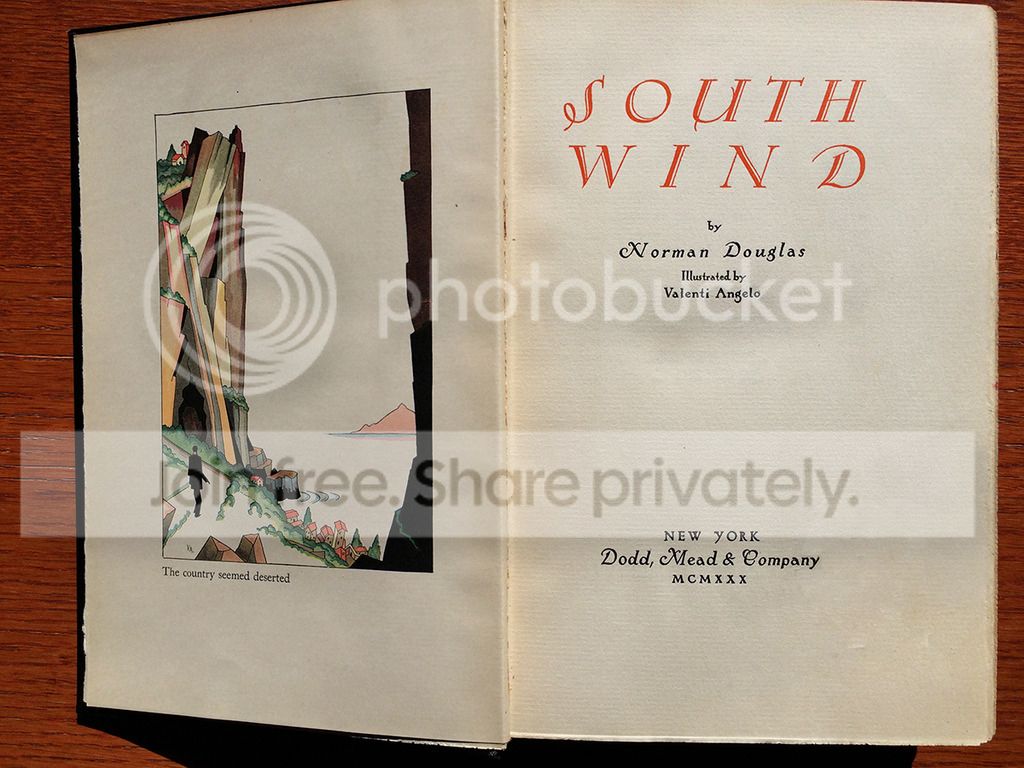
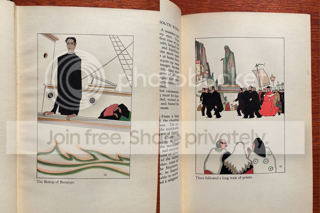
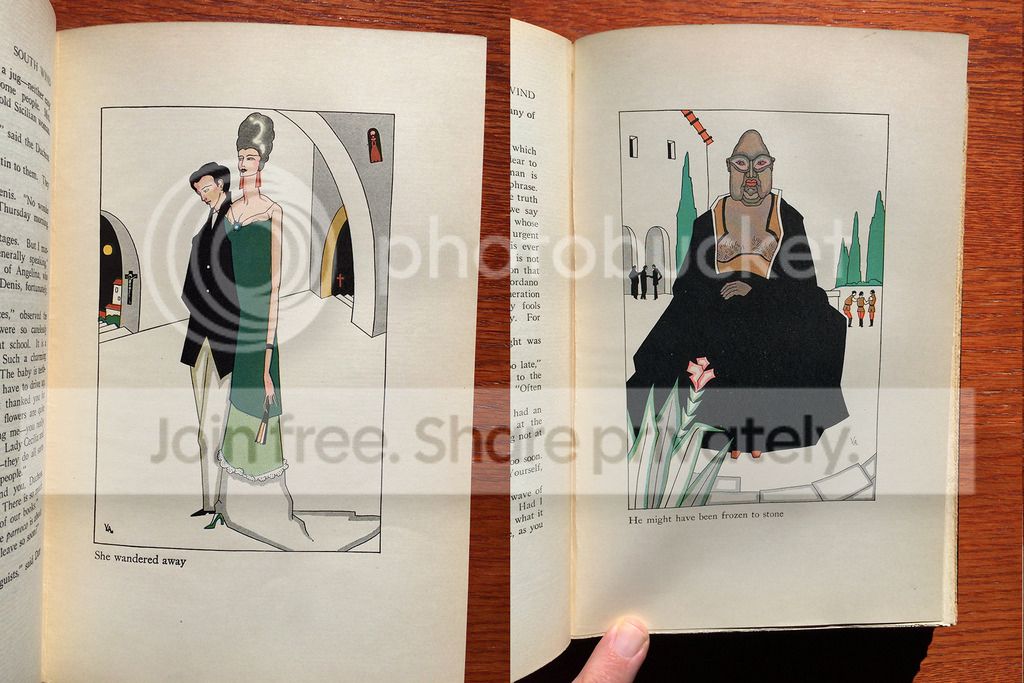
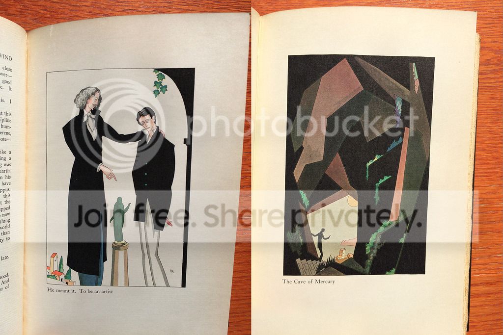
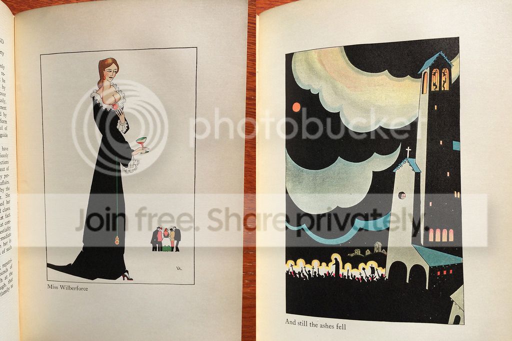

Among those assignments, were a couple of notable commissions from Dodd, Mead. These are true "illustration" jobs, as I consider them, rather than the purely decorative ornaments and illuminations that characterize Angelo's most famous work. The one I'd like to share is the 1928 South Wind, which according to some authorities, is the first illustrated edition of this one-time often-illiutrated book--beating out by one year John Austen's illustrated South Wind (perhaps those familiar with Austen's work will provide some samples of his take on South Wind; I have to say I find Angelo's illustrations here very much like Austen's usual style).
There is an engaging Art Deco quality to these illustrations, and for once Angelo is really illustrating: depicting the queasy Bishop of Bampopo aboard ship, the free-spirited Miss Wilberforce--not nude as she is on frequent occasions, but wearing her neckline dangerously low; the splendidly realized Cave of Mercury, and the ash plume from the mainland volcano.
Still, I prefer Ms. Petrina's illustrations on the whole: Angelo's style strips away the bustle and "blooming, buzzing confusion" of life on Nepenthe, and what this gains in architectural simplicity and strength of form, does not compensate for the loss in suggesting the bacchanalian rites that make up life on Nepenthe (compare Angelo's depiction of the religious procession with Ms. Petrina's.) Although Angelo's illustrations have great charm and beauty, he still falls short, in my opinion, of being a great illustrator, and may have realized his greatest talent was in his incomparable illuminations and ornaments.

78featherwate
>77 Django6924:
As requested some pictures from the two-volume Argus Books South Wind illustrated by John Austen:


There are also small b&w drawings at the head of each chapter.
As requested some pictures from the two-volume Argus Books South Wind illustrated by John Austen:


There are also small b&w drawings at the head of each chapter.
79Constantinopolitan
>77 Django6924: >78 featherwate:
Norman Douglas died in 1952. Is there any record of his reaction to Austen's & Angelo's illustrations?
If I was an illustrator I would be very nervous about considering the work of a man who could write as trenchantly as he did about the citizens of Lucera in Old Calabria.
"As for myself, wandering among that crowd of unshaven creatures, that rustic population, fiercely gesticulating and dressed in slovenly hats and garments, I realized once again what the average Anglo-Saxon would ask himself: Are they all brigands, or only some of them? That music, too--what is it that makes this stuff so utterly unpalatable to a civilized northerner? A soulless cult of rhythm, and then, when the simplest of melodies emerges, they cling to it with the passionate delight of a child who has discovered the moon. These men are still in the age of platitudes, so far as music is concerned; an infantile aria is to them what some foolish rhymed proverb is to the Arabs: a thing of God, a portent, a joy for ever."
Norman Douglas died in 1952. Is there any record of his reaction to Austen's & Angelo's illustrations?
If I was an illustrator I would be very nervous about considering the work of a man who could write as trenchantly as he did about the citizens of Lucera in Old Calabria.
"As for myself, wandering among that crowd of unshaven creatures, that rustic population, fiercely gesticulating and dressed in slovenly hats and garments, I realized once again what the average Anglo-Saxon would ask himself: Are they all brigands, or only some of them? That music, too--what is it that makes this stuff so utterly unpalatable to a civilized northerner? A soulless cult of rhythm, and then, when the simplest of melodies emerges, they cling to it with the passionate delight of a child who has discovered the moon. These men are still in the age of platitudes, so far as music is concerned; an infantile aria is to them what some foolish rhymed proverb is to the Arabs: a thing of God, a portent, a joy for ever."
80featherwate
>79 Constantinopolitan:
In the Monthly Letter for the 1932 LEC South Wind, Douglas is quoted as hoping that the LEC illustrations will be at least "a bit realistic". This could be a clue to what he thought of the work of Angelo (1928) and Austen (1929)! (The ML is silent on whether Carlotta Petrina's artwork satisfied him.)
Over the years I must have read most of Douglas's collected essays, reviews, erudite observations, querulous recollections and malevolent musings, but the only other reference I can recall to an illustrator is a brusque dismissal of the drawings in his Summer Islands: Ischia and Ponza. This slim quarto was published on behalf of The Colophon, a book collectors' quarterly founded by Elmer Adler, owner of Pynson Printers of New York. It was a limited edition, signed by Douglas and illustrated by a fairly well-regarded American commercial artist, Howard Willard. Willard's pen and ink sketches are hardly inspired but they are sufficiently atmospheric. Douglas, however, seemed to think they were so inadequate, or inadequately reproduced, that they ruined the book's chances of success. Tame enough criticism from the master of invective!
It's interesting that George Macy gave the contract for designing and printing the South Wind LEC to Adler at or about the same time the latter was producing Summer Islands. Did one project lead to the other? Summer Islands came out in November 1931, South Wind in July 1932 (although Macy had begun negotiations with Adler, Douglas and Petrina in 1930).
BTW, Douglas's essays on Ischia and Ponza are enjoyable and knowledgeable, and contain one of his best rants, this time on the local food rather than the local citizenry:
In the Monthly Letter for the 1932 LEC South Wind, Douglas is quoted as hoping that the LEC illustrations will be at least "a bit realistic". This could be a clue to what he thought of the work of Angelo (1928) and Austen (1929)! (The ML is silent on whether Carlotta Petrina's artwork satisfied him.)
Over the years I must have read most of Douglas's collected essays, reviews, erudite observations, querulous recollections and malevolent musings, but the only other reference I can recall to an illustrator is a brusque dismissal of the drawings in his Summer Islands: Ischia and Ponza. This slim quarto was published on behalf of The Colophon, a book collectors' quarterly founded by Elmer Adler, owner of Pynson Printers of New York. It was a limited edition, signed by Douglas and illustrated by a fairly well-regarded American commercial artist, Howard Willard. Willard's pen and ink sketches are hardly inspired but they are sufficiently atmospheric. Douglas, however, seemed to think they were so inadequate, or inadequately reproduced, that they ruined the book's chances of success. Tame enough criticism from the master of invective!
It's interesting that George Macy gave the contract for designing and printing the South Wind LEC to Adler at or about the same time the latter was producing Summer Islands. Did one project lead to the other? Summer Islands came out in November 1931, South Wind in July 1932 (although Macy had begun negotiations with Adler, Douglas and Petrina in 1930).
BTW, Douglas's essays on Ischia and Ponza are enjoyable and knowledgeable, and contain one of his best rants, this time on the local food rather than the local citizenry:
"Copious libations may help to get the zuppa di pesce down, but it is a sadly overrated dish and compares unfavorably with the nobler Marseillaise bouillabaisse. What can be expected, considering its ingredients? Green and golden scales, and elaborately dorsal fins, will satisfy neither a hungry man nor an epicure, and if Neapolitans pay untold sums for the showy Mediterranean seaspawn, it only proves that they eat with their eyes, like children who prefer tawdry sweets to good ones. They have colour and shape, these fish of the inland sea, but not taste; their flesh is either flabby and slimy, and full of bones in unauthorized places, or else they have no flesh at all – heads like Burmese dragons but no bodies attached to them; or bodies of flattened construction on the magnum-in-parvo principle, allowing of hardly room for a sheet of paper between their skin and ribs; or a fine serpentine framework, with long-slit eyes that leer at you while you endeavour to scratch a morsel off the reptilian anatomy. There is not a cod, or turbot, or whiting, or salmon, or herring in the two thousand miles between Gibraltar and Jerusalem; or if there is it never comes out; its haddocks (haddocks!) taste as if they had been fed on decayed seaweed and died from the effects of it… The fact is, there is hardly a fish in the Mediterranean worth eating."
81Constantinopolitan
>80 featherwate: Thanks for that information Jack. How we could do with Norman Douglas in these mealy-mouthed days. His "there is hardly a fish in the Mediterranean worth eating." would be unremarkable but for the splendid supporting evidence that precedes the guilty verdict.
"Get those fucking nuns out of here!" were his death-bed words, which while perhaps lacking the quaintness of reference of "Bugger Bognor" or "either that wallpaper goes..." at least retain his unflagging contempt for what he saw as cant.
"Get those fucking nuns out of here!" were his death-bed words, which while perhaps lacking the quaintness of reference of "Bugger Bognor" or "either that wallpaper goes..." at least retain his unflagging contempt for what he saw as cant.
82Django6924
Jack, I find I rather like Austen's illustrations here, although marginally less so than Angelo's, which in turn I find substantially less persuasive than Carlotta Petrina's.
Still, all conform to my idea of what makes a successful illustration. Although the takes are very different, all the illustrators seem to have gotten into the spirit of the author and conjured a world that seems very evocative of Douglas' Nepenthe.
Since this discussion seems to have run out of steam, I'd like to add my final comments on the original topic. I think Fiona's list pretty much summarized what the majority of us feel, and I would like to add perhaps my ultimate criterion: when you see the illustration, does it make you think exclusively of the work it illustrates? This is why so much of Valenti Angelo's work for the LEC doesn't qualify, for me, as illustration; nor do the Greek vase ornaments in the Chester River press Homer nor the Greek style motifs in the Nonesuch Homer--these don't satisfy me the way N.C. Wyeth's illustrations for The Odyssey do--I find no one who has read The Odyssey can look at those illustrations and fail to identify them with the scenes they depict. When I see Matisse's illustrations for Ulysses, which he felt was a retelling of The Odyssey, I don't think of either Joyce or Homer, just of Matisse. Not that Matisse wasn't the greater artist--he just wasn't the greater illustrator.
Still, all conform to my idea of what makes a successful illustration. Although the takes are very different, all the illustrators seem to have gotten into the spirit of the author and conjured a world that seems very evocative of Douglas' Nepenthe.
Since this discussion seems to have run out of steam, I'd like to add my final comments on the original topic. I think Fiona's list pretty much summarized what the majority of us feel, and I would like to add perhaps my ultimate criterion: when you see the illustration, does it make you think exclusively of the work it illustrates? This is why so much of Valenti Angelo's work for the LEC doesn't qualify, for me, as illustration; nor do the Greek vase ornaments in the Chester River press Homer nor the Greek style motifs in the Nonesuch Homer--these don't satisfy me the way N.C. Wyeth's illustrations for The Odyssey do--I find no one who has read The Odyssey can look at those illustrations and fail to identify them with the scenes they depict. When I see Matisse's illustrations for Ulysses, which he felt was a retelling of The Odyssey, I don't think of either Joyce or Homer, just of Matisse. Not that Matisse wasn't the greater artist--he just wasn't the greater illustrator.
83BuzzBuzzard
If there is a model amongst LECs for successful illustrations it has to be "The Betrothed". Real pity that less than a quarter of the original illustrations were reproduced. Everybody that has read the story knows that I am right.
84parch-ment
>83 BuzzBuzzard: V Danchev wrote ”If there is a model amongst LECs for successful illustrations it has to be "The Betrothed". Real pity that less than a quarter of the original illustrations were reproduced. Everybody that has read the story knows that I am right.”
Wrong. I have read the story and I do not KNOW that you are right. As a matter of fact, I SUSPECT that you do not have much of an opinion yourself, but that you wrote your post because Django has written about his admiration for that LEC several times. I GUESS that you simply want to be recognized by him as a person of great literary taste.
Wrong. I have read the story and I do not KNOW that you are right. As a matter of fact, I SUSPECT that you do not have much of an opinion yourself, but that you wrote your post because Django has written about his admiration for that LEC several times. I GUESS that you simply want to be recognized by him as a person of great literary taste.
85BuzzBuzzard
>84 parch-ment: I forgive you and wish you may have a season full of love and joy!
87JustinTChan
I personally prefer it when the illustrations (and decorations) take over the book. If all I wanted was the text, I would
get a 99 cent reading copy.
Sometimes the illustrations can even save the Work. I'm thinking the Barbarian Press 'Pericles' (I don't own a copy).
The play, itself, is a mess. But that's gotta be one of the finest 'fine editions' I've seen.
get a 99 cent reading copy.
Sometimes the illustrations can even save the Work. I'm thinking the Barbarian Press 'Pericles' (I don't own a copy).
The play, itself, is a mess. But that's gotta be one of the finest 'fine editions' I've seen.
88astropi
87: Ah indeed, that would be a nice edition to have!! What was the original price? $2000 I believe :O
I also agree that illustrations are largely (not entirely) what make a book "special". There are exceptions. The Arion Press "Leaves of Grass" has no illustrations, but is beautifully done letterpress on exquisite paper. In fact, I think that illustrations are part of it. Also the paper, construction, etc all really matter. However, for the most part illustrations are what catches the eye.
I also agree that illustrations are largely (not entirely) what make a book "special". There are exceptions. The Arion Press "Leaves of Grass" has no illustrations, but is beautifully done letterpress on exquisite paper. In fact, I think that illustrations are part of it. Also the paper, construction, etc all really matter. However, for the most part illustrations are what catches the eye.
Join to post

