This topic is currently marked as "dormant"—the last message is more than 90 days old. You can revive it by posting a reply.
1Django6924
For the New Year, I thought I would post, in the words of the Python group, "something completely different." Actually, it's not terribly different and at one point I was going to post this in The Kid Brother thread on Heritage Press exclusives,but this really is, even in the tangled and recondite history of the Heritage Press, something out of the ordinary.
Although there have been incidences of the HP publishing a work with completely different illustrations than its LEC predecessor--think Gulliver's travels and Green Mansions--or even publishing a second version of an original HP exclusive with a different illustrator--think Two Years Before the Mast, A Connecticut Yankee in King Arthur's Court, and Rime of the Ancient Mariner--you will have to do a bit of research to come up with another example of where the original artist for a Heritage exclusive redid his own previous work in a later Heritage edition.
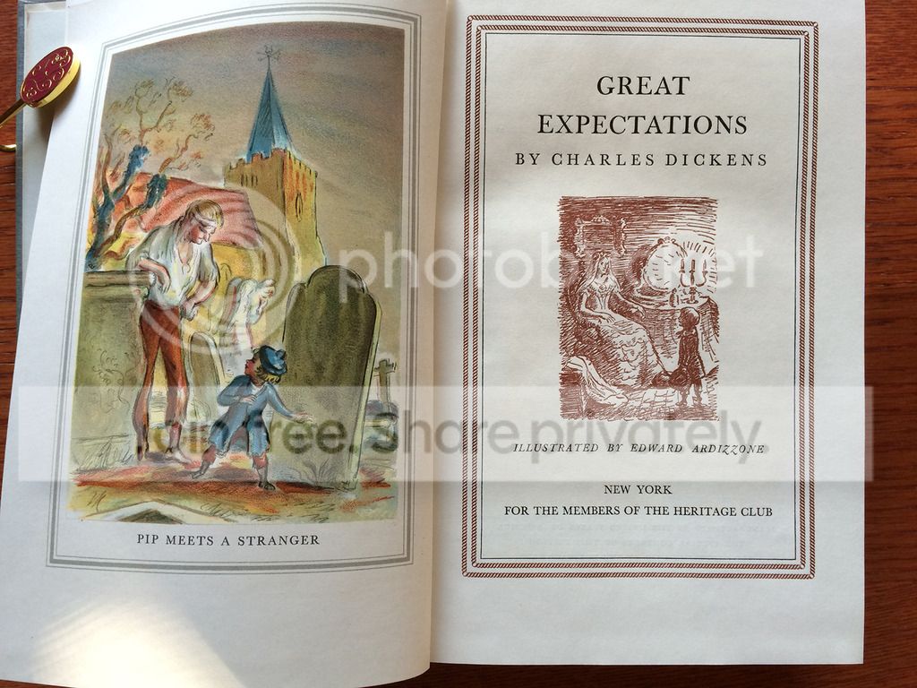
The work I'm talking about is Dickens' Great Expectations and the artist is Edward Ardizzone, which was published as a Heritage Club/Heritage Press offering in 1939. Two years earlier the LEC had published the novel with illustrations by the wonderful Gordon Ross. I do not have the LEC, and although I greatly admire Ross's illustrations for Jorrocks Jaunts, the DeCoverly Papers and The Merry Wives of Windsor, I would not have thought of him as the ideal artist for this rather grim story of ruined and nearly ruined lives (perhaps if a member here who has the LEC edition would post some pictures, I might find I need to change my mind). For whatever reason, when Macy decided to offer GE as the 10th book in the 2nd series of the Heritage Club, he commissioned Ardizzone, who was best known as an illustrator of children's books prior to this (though oddly, his first published illustrations were for Sheridan LeFanu's In a Glass, Darkly, containing two of the author' finest achievements in the genre of gooseflesh literature: "Mr Justice Harbottle" and "Carmilla." Ardizzone would later do another Dickens, and a Thackeray for Macy, and several Folio Society books, but by the time Great Expectations was sent to Heritage Club members, he was an Official War Artist until the end of the hostilities.
I have to say that he is not one of my favorite illustrators--at least of other writer's books; his Tim books for children are quite superb, judging from the pictures I've seen. His work on the Dickens Short Stories for the LEC seems very loose in depicting features and overelaborate in the use of crosshatching. The Newcomes is better, at least more pleasing to my eye, though still very sketchy in depicting the characters. His illustrations for the Folio Society Travels with a Donkey are so much less satisfying the Voisin's for the same work for the LEC, that I gave that book away.
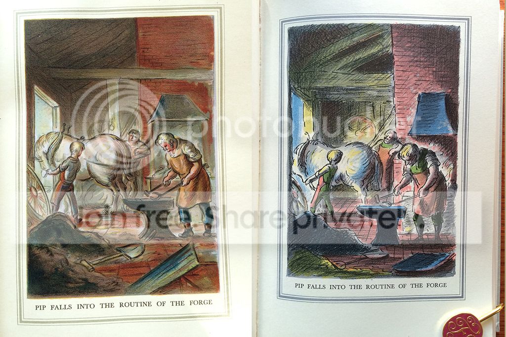
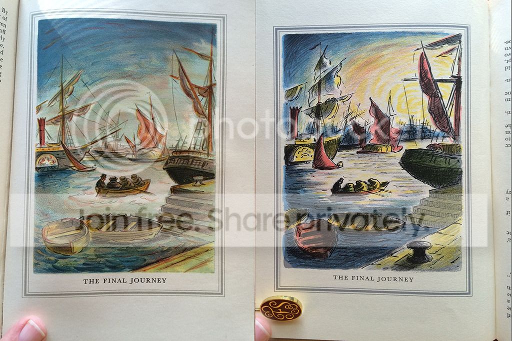
What is interesting, about his work on Great Expectations is that he had the unique opportunity to revisit the work a decade later with a different take, and in a different medium. In 1939, in addition to 51 pen and ink drawings (used as chapter headings and which are identical in the later edition), he did 8 watercolor paintings, reproduced by Mourlot Frères in Paris "with a vivacity of color, a brilliance of effect, transcending anything which has yet appeared in the Heritage books," --a quote from the Sandglass. In 1949, he redid these 8 color plates entirely as color lithographs, drawing directly on the stones, creating a separate element for each color; These lithographs were pulled by the Curwen Press in London.
When you compare the two sets, it seem obvious that the later work is much darker and grimmer than the watercolors. Is the difference just attributed to the differences in the media used, or did subsequent reflection (and his wartime experiences) lead him to an awareness of the essentially grim nature (despite the numerous humorous characters) of the novel? Judge for yourself which approach you prefer:


EDITED: to fix some of Autocorrect's corrections.
Although there have been incidences of the HP publishing a work with completely different illustrations than its LEC predecessor--think Gulliver's travels and Green Mansions--or even publishing a second version of an original HP exclusive with a different illustrator--think Two Years Before the Mast, A Connecticut Yankee in King Arthur's Court, and Rime of the Ancient Mariner--you will have to do a bit of research to come up with another example of where the original artist for a Heritage exclusive redid his own previous work in a later Heritage edition.
The work I'm talking about is Dickens' Great Expectations and the artist is Edward Ardizzone, which was published as a Heritage Club/Heritage Press offering in 1939. Two years earlier the LEC had published the novel with illustrations by the wonderful Gordon Ross. I do not have the LEC, and although I greatly admire Ross's illustrations for Jorrocks Jaunts, the DeCoverly Papers and The Merry Wives of Windsor, I would not have thought of him as the ideal artist for this rather grim story of ruined and nearly ruined lives (perhaps if a member here who has the LEC edition would post some pictures, I might find I need to change my mind). For whatever reason, when Macy decided to offer GE as the 10th book in the 2nd series of the Heritage Club, he commissioned Ardizzone, who was best known as an illustrator of children's books prior to this (though oddly, his first published illustrations were for Sheridan LeFanu's In a Glass, Darkly, containing two of the author' finest achievements in the genre of gooseflesh literature: "Mr Justice Harbottle" and "Carmilla." Ardizzone would later do another Dickens, and a Thackeray for Macy, and several Folio Society books, but by the time Great Expectations was sent to Heritage Club members, he was an Official War Artist until the end of the hostilities.
I have to say that he is not one of my favorite illustrators--at least of other writer's books; his Tim books for children are quite superb, judging from the pictures I've seen. His work on the Dickens Short Stories for the LEC seems very loose in depicting features and overelaborate in the use of crosshatching. The Newcomes is better, at least more pleasing to my eye, though still very sketchy in depicting the characters. His illustrations for the Folio Society Travels with a Donkey are so much less satisfying the Voisin's for the same work for the LEC, that I gave that book away.
What is interesting, about his work on Great Expectations is that he had the unique opportunity to revisit the work a decade later with a different take, and in a different medium. In 1939, in addition to 51 pen and ink drawings (used as chapter headings and which are identical in the later edition), he did 8 watercolor paintings, reproduced by Mourlot Frères in Paris "with a vivacity of color, a brilliance of effect, transcending anything which has yet appeared in the Heritage books," --a quote from the Sandglass. In 1949, he redid these 8 color plates entirely as color lithographs, drawing directly on the stones, creating a separate element for each color; These lithographs were pulled by the Curwen Press in London.
When you compare the two sets, it seem obvious that the later work is much darker and grimmer than the watercolors. Is the difference just attributed to the differences in the media used, or did subsequent reflection (and his wartime experiences) lead him to an awareness of the essentially grim nature (despite the numerous humorous characters) of the novel? Judge for yourself which approach you prefer:


EDITED: to fix some of Autocorrect's corrections.
2featherwate
>1 Django6924:
Fascinating comparison, Robert, but only as a demonstration of an artist re-working earlier material. I can't say I find either set adequate. Both frontispieces, for example, are risible. Dickens describes Magwitch as "sudden and strong" and
[a] fearful man, all in coarse gray, with a great iron on his leg. A man with no hat, and with broken shoes, and with an old rag tied round his head. A man who had been soaked in water, and smothered in mud, and lamed by stones, and cut by flints, and stung by nettles, and torn by briars; who limped, and shivered, and glared, and growled; and whose teeth chattered in his head as he seized me by the chin.
whereas neither of Ardizzone's versions is dressed in gray or has a great iron on his leg or shoes of any kind - or any traces of mud. And while an escapee from the Hulks might well be emaciated, these two seem as positively enfeebled as victims of the workhouse and quite incapable of suddenly turning even a small boy upside down and shaking out the contents of his pockets.
I'm sure you are right to say that his second set of illustrations reflect his time as a war artist, which was extensive:
From the period in France up to the fall of Dunkirk, during the early London blitzes and Britain's preparations against invasion, to North Africa and the Western Desert and then on to Sicily, ltaly, Normandy and Germany he poured out a long succession of drawings and paintings. He depicts the hardships of civilian life with the sudden interruptions of peacetime existence, the soldiers' training, the frequent periods of waiting and inactivity and then the almost uninterrupted fast-moving warfare of the latter years. Ardizzone was never far behind the battle, and at times he can produce a grim picture of recent fighting...
But I think the legacy of his war was not so much a deeper understanding of the grimmer side of Dickens's story, but a more economical (i.e., rapid) way of conveying a scene. Miss Havisham aside, the characters in the lithographs aren't markedly different to those in the watercolours, but the illustrations are much looser in style - no room for mere prettiness. Combined with a more muted palette (similar to that used by his friend and fellow-lithographer Barnett Freedman) this does invoke a less cheerful atmosphere.
Even though I think this approach still doesn't make the later edition really worthy of Dickens, I am tempted to look for a copy - the lure of original lithographs run off by the Curwen Press is always strong, and I do really like one of them: Pip has a visitor by night (presumably the returning Magwitch). This seems a fine piece of work compared to the previous watercolour, particularly in the way Ardizzone extends the stairway down to allow a second source of light to balance Pip's candle and, bizarrely, to turn Magwitch's shadow from an indeterminate shape into the silhouette of Mr Punch, always a sinister figure and maker of mischief.
3featherwate
>1 Django6924:
PS Great title!
PS Great title!
4Django6924
Jack, I have to agree that I was disappointed in both sets of illustrations--and for many of the reasons you mention. One has to wonder how carefully the illustrator read the work. But as I mentioned, Ardizzone is not an illustrator I would place in the first rank based on all of the work of his I've seen, which is a pity considering this work is one which deserves an illustrator of the highest rank.
I'm sure you've seen David Lean's adaptation, which although James Agee criticized (with some justice) as being an "over-sunny transcription" certainly got the visuals exactly right--at least in my opinion.
I'm sure you've seen David Lean's adaptation, which although James Agee criticized (with some justice) as being an "over-sunny transcription" certainly got the visuals exactly right--at least in my opinion.
5featherwate
I remember the film well. I was very young when I saw it, and Pip's first encounter with the hulking Finlay Currie scared the bejasus out of me (not least because I lived next door to a churchyard). Seeing five screenwriting credits on a film doesn't usually make the heart bound with joy, but GE had a dream team of talent before and behind the camera.
I like the Folio Society's Travels with a Donkey. Obviously it doesn't match the quality of the LEC, but then it doesn't aspire to: it's a handy little volume, well laid out, and I find [most of] Ardizzone's drawings evocative. But that's just personal taste, and I agree that he has severe limitations as an illustrator of books for adults: he doesn't have the psychological insight of, say, Eichenberg (I hate to say it was a good thing for the LEC Shakespeare that his watercolours for Richard the Third ended up as food for the fishes, but if they hadn't we would never have had Eichenberg's set of superb pictures).
Talking of the FS Donkey, an ebay seller is asking $60 for a copy. Admittedly he claims it is in fine condition (and it looks as if it is), but his assertion that it is "A very scarce title in any condition... as only a limited number of them were ever published" is somewhat undermined by his disarmingly honest statement that it 's from the 10th printing of the first (1967) edition. He could have added that it is still in the current FS catalogue, price $30...
6Django6924
>5 featherwate: "his assertion that it is "A very scarce title in any condition... as only a limited number of them were ever published" is somewhat undermined by his disarmingly honest statement that it 's from the 10th printing of the first (1967) edition. He could have added that it is still in the current FS catalogue, price $30..."
Some eBay sellers are the Electronic Age's equivalent of the used car dealer of the mid-20th century.
Some eBay sellers are the Electronic Age's equivalent of the used car dealer of the mid-20th century.
Join to post

