1Django6924
In another thread, featherwate posted a picture of a very attractive Folio Society edition of The Castle of Otranto, a book which I own in addition to the LEC version. The size difference between the two is, as you can see, considerable, given that both editions use the complete text and have similar critical apparatus.
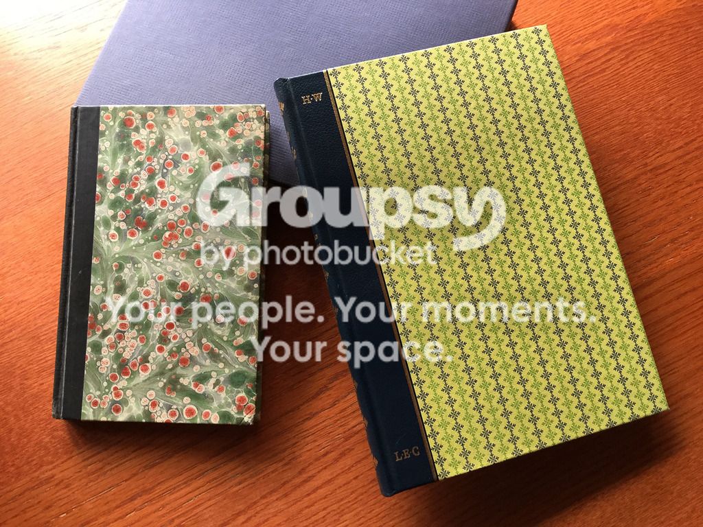
These days, I generally prefer larger books mostly because they have larger type--my eyes don't like small fonts and dense pages with scant leading. That said, the 12 point Bulmer with 1 point of leading used by the FS edition is easy to read, comparing favorably to the Van Dyck font (in what appears to be 14 point with 1 point of leading--the ML is not forthcoming in these particulars), used by designer Ruari McLean for the LEC. The LEC has only 99 pages of text compared to the FS 138 pages, so the larger page size probably means more text on each page due to the longer line width of the larger page.
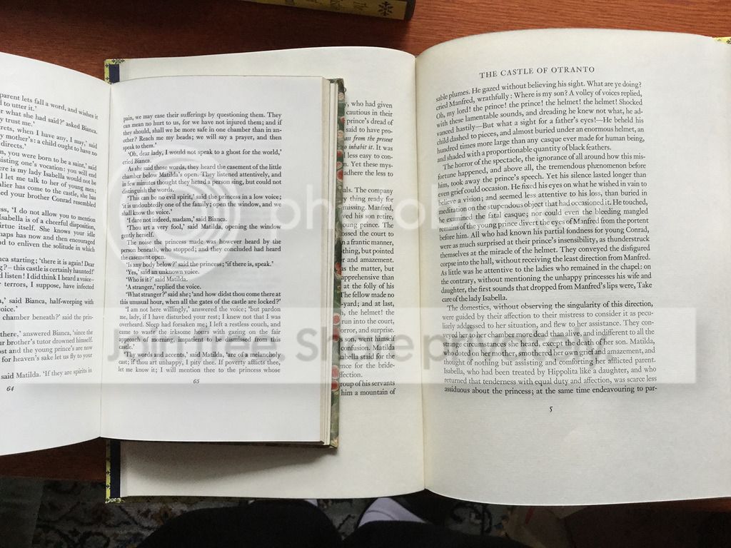
Leaving aside differences in production quality and illustration preference, was it necessary--or more to the point, desirable--to print Walpole's scant text in as large a format as the LEC? Early in the Club's history, several works were issued in small sized volumes, often designed by W.A. Dwiggins, who definitely had a penchant for small, almost pocket-sized volumes, even when the length of the works themselves required multiple small volumes--Tartarin of Tarascon, Gangantua and Pantagruel, Plutarch's Lives and Droll Stories. But feedback from the members seemed to favor the larger volumes such as Vanity Fair and Pickwick Papers. By the post-WWII period, duodecimo-sized books were a thing of the past. Granted, when reproducing original artwork the size of the book is dictated by the size of the illustrations, I often wish some of the novels issued were in a size more pleasant and convenient to hold in the hand. Recently, jveezer's excellent Whole Book Experience showcased the early LEC Madame Bovary, which is, as he has posted, a delight to hold and read. Needless to say, the later LEC Bovary showed a substantial increase in size.
http://www.thewholebookexperience.com/2017/01/02/madame-bovary-by-gustave-flaube...
What are the preferences of the members here when it comes to volume size?
These days, I generally prefer larger books mostly because they have larger type--my eyes don't like small fonts and dense pages with scant leading. That said, the 12 point Bulmer with 1 point of leading used by the FS edition is easy to read, comparing favorably to the Van Dyck font (in what appears to be 14 point with 1 point of leading--the ML is not forthcoming in these particulars), used by designer Ruari McLean for the LEC. The LEC has only 99 pages of text compared to the FS 138 pages, so the larger page size probably means more text on each page due to the longer line width of the larger page.
Leaving aside differences in production quality and illustration preference, was it necessary--or more to the point, desirable--to print Walpole's scant text in as large a format as the LEC? Early in the Club's history, several works were issued in small sized volumes, often designed by W.A. Dwiggins, who definitely had a penchant for small, almost pocket-sized volumes, even when the length of the works themselves required multiple small volumes--Tartarin of Tarascon, Gangantua and Pantagruel, Plutarch's Lives and Droll Stories. But feedback from the members seemed to favor the larger volumes such as Vanity Fair and Pickwick Papers. By the post-WWII period, duodecimo-sized books were a thing of the past. Granted, when reproducing original artwork the size of the book is dictated by the size of the illustrations, I often wish some of the novels issued were in a size more pleasant and convenient to hold in the hand. Recently, jveezer's excellent Whole Book Experience showcased the early LEC Madame Bovary, which is, as he has posted, a delight to hold and read. Needless to say, the later LEC Bovary showed a substantial increase in size.
http://www.thewholebookexperience.com/2017/01/02/madame-bovary-by-gustave-flaube...
What are the preferences of the members here when it comes to volume size?
2wcarter
My preference for volume size depends on the content and where I read it.
Small volumes for reading in bed or while traveling, medium size for reading in a chair and for reasonable size illustrations, and large size for the pleasure of their presence and reproducing significant illustrations or maps at full size.
The cover marbling of the FS edition above looks far more impressive than the LEC cover, regardless of size.
Small volumes for reading in bed or while traveling, medium size for reading in a chair and for reasonable size illustrations, and large size for the pleasure of their presence and reproducing significant illustrations or maps at full size.
The cover marbling of the FS edition above looks far more impressive than the LEC cover, regardless of size.
4kdweber
Which of your children do you like better? Seriously, it's nice having variety but I find it easier and more comfortable to read larger volumes (larger octavos or smaller folios, not elephant folios). For example, the LEC The Kasidah of Haji Abdu El-Yezdi is a gem but I find it easier to read the 1919 edition by the Book Club of California.
5Django6924
>2 wcarter:
The marbled paper is the main reason i bought it!
>3 EclecticIndulgence:
There is no comparison between the paper used in the LEC and that in the FS. The FS paper is nice, but the laid paper, specially made for the LEC, by Grosvenor, Chater & Co., Abbey Mills in northern Wales, is just sumptuous--thick, crisp, with a nice textured finish. The leather spine on the LEC is also very nice, and I like the gilt H.W. and LEC placed in an area usually void of ornamentation.
The marbled paper is the main reason i bought it!
>3 EclecticIndulgence:
There is no comparison between the paper used in the LEC and that in the FS. The FS paper is nice, but the laid paper, specially made for the LEC, by Grosvenor, Chater & Co., Abbey Mills in northern Wales, is just sumptuous--thick, crisp, with a nice textured finish. The leather spine on the LEC is also very nice, and I like the gilt H.W. and LEC placed in an area usually void of ornamentation.
6featherwate
The responses so far have discussed size in relation to legibility (leading, type size), visibility (size of illustrations) and circumstance (Tell me where your books are read, In travel, study or in bed). But there are other reasons for preferring one size to another:
I agree with Robert that as one reaches maturity, large pages with large type are usually kinder on the eyes than their smaller counterparts. I especially like books that are large but short, as are such LECs as the complete Shakespeare volumes, The Turn of the Screw, The Rime of the Ancient Mariner and Break of Day, and the Cheshire House Georgics and The Legend of Sleepy Hollow. But I'm put off by a book that is not only large but very heavy (unless the combination is the necessary result of the book's subject, such as Warwick Carter's maps, or photographs and paintings printed on heavy stock). I'd rather have long books split into at least two volumes. Not necessarily duodecimos – the splendid Westward Ho! LEC comes in two tall quite slender quartos, Lavengro, The Ring and the Book, and Hajii Baba are split into smaller quartos, and the 1940 Ivanhoe is an octavo twin-set, all very comfortable to handle, which sadly is more than I can say for the Junoesque The Diary of a Country Priest.
“Not all book collectors like small books. Théophile Gautier disliked octavos, because when stacked up on the floor they made less successful footstools than folios; and taken separately, octavos were less suitable than folios for putting under children who would not otherwise be able to sit at table—besides which, as Gautier pointed out, a good, big folio volume makes an admirable book press for flattening out creased and rumpled engravings.”Belanger adds that Charles Darwin, on the other hand, did not like large books. He found it more convenient to cut or tear them in half—vertically, presumably, unless in paterfamilias mode he occasionally found it expedient to impress his children with his strength. His legacy libraries on LT, admittedly incomplete, appear devoid of fiction and other frivolities: for him most books of any size were simply tools of his trade, and when his enthusiastic handling led them to fall to pieces he simply clamped them together with metal clips (even the most louche of AbeBooks dealers might blanch at trying to flog any of them with the usual evasive euphemisms—VG++/Near Fine for its age, the integrity of boards and text block lovingly maintained by PO sourcing only the most long-lasting materials).
Terry Belanger, 'Lunacy and the Arrangement of Books', Oak Knoll Books, 1985 (Second Printing)
I agree with Robert that as one reaches maturity, large pages with large type are usually kinder on the eyes than their smaller counterparts. I especially like books that are large but short, as are such LECs as the complete Shakespeare volumes, The Turn of the Screw, The Rime of the Ancient Mariner and Break of Day, and the Cheshire House Georgics and The Legend of Sleepy Hollow. But I'm put off by a book that is not only large but very heavy (unless the combination is the necessary result of the book's subject, such as Warwick Carter's maps, or photographs and paintings printed on heavy stock). I'd rather have long books split into at least two volumes. Not necessarily duodecimos – the splendid Westward Ho! LEC comes in two tall quite slender quartos, Lavengro, The Ring and the Book, and Hajii Baba are split into smaller quartos, and the 1940 Ivanhoe is an octavo twin-set, all very comfortable to handle, which sadly is more than I can say for the Junoesque The Diary of a Country Priest.
7Django6924
>6 featherwate:
Jack, I too feel that the designer of The Diary of a Country Priest missed the mark by making it too large--although in his defense, Eichenberg's illustrations probably dictated the size. I would like to think that had George Macy been alive, he would have requested the illustrator to size the illustrations to a small quarto, which seems more diary-sized to my mind.
Indeed, as you say, in addition to size in relation to legibility (leading, type size), visibility (size of illustrations) and circumstance (Tell me where your books are read, In travel, study or in bed), there are other reasons: the subject matter of the book itself should, to my way of thinking anyway, have some appropriateness to the size of the book. As I mentioned earlier, jveezer's excellent post about the first LEC Madame Bovary pinpointed the pleasure of this smallish volume, whose size seems rather appropriate to the book itself--an intimate study of a romance addict (who got many of her ideas from reading popular novels which were probably the same size or smaller than this LEC). Some books have subject matter that seems suited to a smaller size volume, while others require something more monumental. I can't conceive of Don Quixote in even a series of several small octavos or duodecimos. But I prefer even monumental works (aside from reference volumes) to be not be so heavy that they require a desk for comfortable reading.
Jack, I too feel that the designer of The Diary of a Country Priest missed the mark by making it too large--although in his defense, Eichenberg's illustrations probably dictated the size. I would like to think that had George Macy been alive, he would have requested the illustrator to size the illustrations to a small quarto, which seems more diary-sized to my mind.
Indeed, as you say, in addition to size in relation to legibility (leading, type size), visibility (size of illustrations) and circumstance (Tell me where your books are read, In travel, study or in bed), there are other reasons: the subject matter of the book itself should, to my way of thinking anyway, have some appropriateness to the size of the book. As I mentioned earlier, jveezer's excellent post about the first LEC Madame Bovary pinpointed the pleasure of this smallish volume, whose size seems rather appropriate to the book itself--an intimate study of a romance addict (who got many of her ideas from reading popular novels which were probably the same size or smaller than this LEC). Some books have subject matter that seems suited to a smaller size volume, while others require something more monumental. I can't conceive of Don Quixote in even a series of several small octavos or duodecimos. But I prefer even monumental works (aside from reference volumes) to be not be so heavy that they require a desk for comfortable reading.
8BuzzBuzzard
>7 Django6924: I think that when books were a main form of entertainment, splitting one in multiple volumes allowed for more simultaneous readers. Too it was easier to carry your reading material around. The LEC Don Quixote is beautiful but will break your back.
9featherwate
>7 Django6924: I absolutely agree about Gunter Böhmer's Madame Bovary. It's been one of my favourite Macy books since I bought it a couple of years ago. If anyone wants more information about it the Monthly Letter is on Google Drive.
>8 BuzzBuzzard: And, of course, multiple volumes enabled the circulating libraries to increase their profits!
>8 BuzzBuzzard: And, of course, multiple volumes enabled the circulating libraries to increase their profits!
10kermaier
I generally prefer octavo or small quarto - both as a matter of comfort while reading, and as matter of aesthetics. In a few cases, I prefer folio or large quarto (Shakespeare, Homer, Cervantes). Some of the LEC large quartos just don't do it for me, though they're very nicely produced, just due to size: Tender is the Night, The Anabasis of Xenophon, The Trial and Death of Socrates, Youth/Typhoon/The End of the Tether, A Connecticut Yankee, some others.
11Django6924
Many years ago, before I acquired it in an LEC edition, I had a copy of The Life of Benvenuto Cellini in an edition published by Brentano's. It was in 2 volumes, both octavos. When I acquired the LEC, I gave away my Brentano's editions--and despite the beautiful production qualities of the Mardersteig LEC, I have regretted that decision. The huge, single folio with its double columns of text is not nearly as convenient as a reading copy, and despite my admiration for Fritz Kredel's consummate skill in his little illustrations, I preferred seeing the black & white photos of Cellini's Perseus and other extant works in the Brentano's books.
12dlphcoracl
>11 Django6924:
I know just what you are talking about.
I have this 2-volume set, published in 1906, in custom morocco leather and elaborate gilt bindings. It is a small treasure. The type is large, legible, and uncomplicated and the B&W illustrations (they look like copper engravings) are small jewels. This is my go-to copy for reading this work.
I know just what you are talking about.
I have this 2-volume set, published in 1906, in custom morocco leather and elaborate gilt bindings. It is a small treasure. The type is large, legible, and uncomplicated and the B&W illustrations (they look like copper engravings) are small jewels. This is my go-to copy for reading this work.
13ManishBadwal
I love oversized books since I find that they greatly enhance the reading experience.
I always read while seated and don't read on bed. While traveling I prefer reading cheap paperbacks to reduce weight and for my peace of mind since otherwise I would be perpetually worried about damaging my hardcover books. So, practicality is not an issue.
I have recently started collecting LEC books. The largest one I have is The Memoirs Of Casanova (1972) and I just love it.
Is there anywhere I can find the size of the LEC books ? Alternately, I would appreciate greatly if members on this forum could share list of large sized LEC books.
Below is the list based on earlier posts on this thread. Kindly do share your inputs on updating the list. Thank you.
- The Castle of Otranto
- Vanity Fair
- Pickwick Papers
- Madame Bovary (1950)
- Complete Shakespeare volumes
- The Turn of the Screw
- The Rime of the Ancient Mariner
- Break of Day
- Cheshire House Georgics
- The Legend of Sleepy Hollow
- Westward Ho!
- Lavengro
- The Ring and the Book
- Haji Baba
- Ivanhoe (1940)
- The Diary of a Country Priest
- Don Quixote (not sure which edition ?)
- Tender is the Night
- The Anabasis of Xenophon
- The Trial and Death of Socrates
- Youth/Typhoon/The End of the Tether
- A Connecticut Yankee
- The Life of Benvenuto Cellini
- The Memoirs Of Casanova (1972)
- A Voyage to Brobdingnag
- A Voyage to the South Seas
- Horace Odes and Epodes
- Confessions of an English Opium Eater
- Simplicissimus
- A Streetcar Named Desire
- The Life and Voyages of Christopher Columbus
- Quarto-Millenary
- Tartuffe (1930)
- Oedipus (1989)
- Our Grandmothers
- Lives of the Most Eminent Painters
- The Divine Comedy
- Poor Richard's Almanacks
- Le Morte d'Arthur
- Francis Bacon's Essays
- LEC bibliography
I always read while seated and don't read on bed. While traveling I prefer reading cheap paperbacks to reduce weight and for my peace of mind since otherwise I would be perpetually worried about damaging my hardcover books. So, practicality is not an issue.
I have recently started collecting LEC books. The largest one I have is The Memoirs Of Casanova (1972) and I just love it.
Is there anywhere I can find the size of the LEC books ? Alternately, I would appreciate greatly if members on this forum could share list of large sized LEC books.
Below is the list based on earlier posts on this thread. Kindly do share your inputs on updating the list. Thank you.
- The Castle of Otranto
- Vanity Fair
- Pickwick Papers
- Madame Bovary (1950)
- Complete Shakespeare volumes
- The Turn of the Screw
- The Rime of the Ancient Mariner
- Break of Day
- Cheshire House Georgics
- The Legend of Sleepy Hollow
- Westward Ho!
- Lavengro
- The Ring and the Book
- Haji Baba
- Ivanhoe (1940)
- The Diary of a Country Priest
- Don Quixote (not sure which edition ?)
- Tender is the Night
- The Anabasis of Xenophon
- The Trial and Death of Socrates
- Youth/Typhoon/The End of the Tether
- A Connecticut Yankee
- The Life of Benvenuto Cellini
- The Memoirs Of Casanova (1972)
- A Voyage to Brobdingnag
- A Voyage to the South Seas
- Horace Odes and Epodes
- Confessions of an English Opium Eater
- Simplicissimus
- A Streetcar Named Desire
- The Life and Voyages of Christopher Columbus
- Quarto-Millenary
- Tartuffe (1930)
- Oedipus (1989)
- Our Grandmothers
- Lives of the Most Eminent Painters
- The Divine Comedy
- Poor Richard's Almanacks
- Le Morte d'Arthur
- Francis Bacon's Essays
- LEC bibliography
14wcarter
>13 ManishBadwal:
A Voyage to Brobdignac is also huge (and extremely small). See https://www.librarything.com/topic/270797
Other large LEC books include A Voyage to the South Seas (see https://www.flickr.com/photos/warwick_carter/37935006845/in/photolist-ZNbPUa); Horace Odes and Epodes (see https://www.librarything.com/topic/339228); Confessions of an English Opium Eater (see https://www.librarything.com/topic/350588); Cawdor (see https://www.flickr.com/photos/warwick_carter/24964468599/in/photolist-E32qLp); Simplicissimus (see https://www.librarything.com/topic/282619) and A Streetcar Named Desire (see https://www.flickr.com/photos/warwick_carter/49032570482/in/photolist-2hGQJWf).
A Voyage to Brobdignac is also huge (and extremely small). See https://www.librarything.com/topic/270797
Other large LEC books include A Voyage to the South Seas (see https://www.flickr.com/photos/warwick_carter/37935006845/in/photolist-ZNbPUa); Horace Odes and Epodes (see https://www.librarything.com/topic/339228); Confessions of an English Opium Eater (see https://www.librarything.com/topic/350588); Cawdor (see https://www.flickr.com/photos/warwick_carter/24964468599/in/photolist-E32qLp); Simplicissimus (see https://www.librarything.com/topic/282619) and A Streetcar Named Desire (see https://www.flickr.com/photos/warwick_carter/49032570482/in/photolist-2hGQJWf).
15mr.philistine
>13 ManishBadwal: In addition to >14 wcarter: The Life and Journals of Christopher Columbus reviewed on the B&V website here: https://booksandvines.com/2012/10/08/the-life-and-journals-of-christopher-columb...
16Lukas1990
>15 mr.philistine: My first LEC and highly highly recommended!
18ManishBadwal
>14 wcarter: Thank you ! Have updated the list above. I could not find Cawdor in the list of LEC books at https://www.majure.net/LECLISTOFTITLES.htm which is weird.
>15 mr.philistine: Thank you ! Have updated the list above.
>15 mr.philistine: Thank you ! Have updated the list above.
19WildcatJF
>18 ManishBadwal: Cawdor is not a Limited Editions Club release; it was from the Yola Bolly Press.
Two very tall LECs I have that haven't been mentioned yet: Tartuffe in 1930 and Oedipus (Dürrenmatt, 1989).
https://georgemacyimagery.wordpress.com/2011/01/20/limited-editions-club-tartuff...
https://georgemacyimagery.wordpress.com/2022/05/01/limited-editions-club-oedipus...
Two very tall LECs I have that haven't been mentioned yet: Tartuffe in 1930 and Oedipus (Dürrenmatt, 1989).
https://georgemacyimagery.wordpress.com/2011/01/20/limited-editions-club-tartuff...
https://georgemacyimagery.wordpress.com/2022/05/01/limited-editions-club-oedipus...
20PBB
>13 ManishBadwal: The Quarto-Millenary is large and I think important to get early on as a LEC collector as an introduction to the Macy era.
Pretty much everything post 1985 is oversized in at least one dimension, and plenty of the earlier Shiff books from 1979-1985 are large as well. Our Grandmothers is an interesting one, about 22x18 but maybe an inch thick since its just one poem. Sold mine so can't get you exact measurements.
Lives of the Most Eminent Painters is two volumes, about 12"x9"x2" each, which aren't the craziest measurements on their own, but the weight of that set has always stood out to me. About 10.5 pounds/4.8kg in the slipcase. The Divine Comedy, Poor Richard's Almanack, Le Morte d'Arthur are also quite large.
Pretty much everything post 1985 is oversized in at least one dimension, and plenty of the earlier Shiff books from 1979-1985 are large as well. Our Grandmothers is an interesting one, about 22x18 but maybe an inch thick since its just one poem. Sold mine so can't get you exact measurements.
Lives of the Most Eminent Painters is two volumes, about 12"x9"x2" each, which aren't the craziest measurements on their own, but the weight of that set has always stood out to me. About 10.5 pounds/4.8kg in the slipcase. The Divine Comedy, Poor Richard's Almanack, Le Morte d'Arthur are also quite large.
21ManishBadwal
>19 WildcatJF: Thank you ! I have removed Cawdor and added the other two to the list.
>20 PBB: Thank you ! Have updated the list.
>20 PBB: Thank you ! Have updated the list.
22Glacierman
Sir Francis Bacon's Essays designed by Bruce Rogers is another outsized book from the LEC at 12.75 x 8.75 inches. Lovely volume, though.
And of course, the LEC bibliography is massive at 13.75 x 9.75 inches.
But to address the original question, I prefer smaller sized books as they are easier to handle while reading. The big ones I find I must lay on a flat surface for ease of reading and that is, in my current circumstances, not a simple thing to do. I prefer to hold the book when reading.
And of course, the LEC bibliography is massive at 13.75 x 9.75 inches.
But to address the original question, I prefer smaller sized books as they are easier to handle while reading. The big ones I find I must lay on a flat surface for ease of reading and that is, in my current circumstances, not a simple thing to do. I prefer to hold the book when reading.
23ManishBadwal
>22 Glacierman: Thank you ! Have updated the list.
24elladan0891
Well, while I do have special fondness for two particular sizes, first I have to say that I like having some variety in my library. And that occasions at times do call for different sizes. When sitting comfortably in an armchair at home, sometimes it does feel nice to read a beautiful large book - as long as it's not too heavy. Like some others here, I don't like books that are very heavy/bulky.
I also have a need for books on the opposite end of the size spectrum: I usually have more than one book going, one of them being an on-the-go book - a pocket-sized hardcover like Slightly Foxed or Notting Hill Editions that is easy to put, well, in a pocket and carry around town, take with me during travels, or even read while walking in the areas with little foot traffic (their small size allowing for unobstructed peripheral vision to prevent tripping, stepping into something undesirable or running into something or someone).
But there are still two book formats I particularly like:
1) Fairly tall books with narrower boards. Somehow the resulting slender rectangular profile looks particularly elegant and attractive to me. Examples: LEC The Bridge of San Luis Rey, LEC Zuleika Dobson, FS The New York Trilogy. The Bridge of San Luis Rey is particularly pleasant and elegant as it's not thick.
2) Books that are on the smaller side but not too small, and not too thick - under 200 pages, like FS editions of The Postman Always Rings Twice, Of Mice and Men, The Girls of Slender Means, Breakfast at Tiffany's, etc. I really like the the size, weight, and overall feel of these books that can be comfortably read anywhere - in the armchair, in bed, on a plane, train, etc.
Now, if I didn't miss the original posts from 2017 and replied back then, that would have been the end of my answer. But now for a little over a month I've been having some problems with vision, so I got a new appreciation for the larger volumes with larger print sizes :) While I still can and do read smaller print like in my Slightly Foxed on-the-go books, these past weeks I've been naturally gravitating more towards bigger print that is currently easier on the eyes. So I finished a few LECs like The History of Amleth (lovely woodcuts!), an AP, and a couple of larger Folios like the 2012 Fine edition of the Rubaiyat and Mr Norris Changes Trains.
Also, it's a bit ironic that September, the month of vision issues (for the first time in my life), was also the month I've read the highest number of books in a very long time, probably in a couple of decades. Of course, one of the reasons is that books with larger type tend to be shorter, but nevertheless.
As the ophthalmologist swears that there is very little wrong with my eyes themselves, I'm hoping to overcome the vision issues and be as comfortable with the smaller print as I had been practically my whole life. But I suspect that my appreciation of the large print will stay and that certain LECs will be picked up more frequently than before to be enjoyed being read in my armchair.
I also have a need for books on the opposite end of the size spectrum: I usually have more than one book going, one of them being an on-the-go book - a pocket-sized hardcover like Slightly Foxed or Notting Hill Editions that is easy to put, well, in a pocket and carry around town, take with me during travels, or even read while walking in the areas with little foot traffic (their small size allowing for unobstructed peripheral vision to prevent tripping, stepping into something undesirable or running into something or someone).
But there are still two book formats I particularly like:
1) Fairly tall books with narrower boards. Somehow the resulting slender rectangular profile looks particularly elegant and attractive to me. Examples: LEC The Bridge of San Luis Rey, LEC Zuleika Dobson, FS The New York Trilogy. The Bridge of San Luis Rey is particularly pleasant and elegant as it's not thick.
2) Books that are on the smaller side but not too small, and not too thick - under 200 pages, like FS editions of The Postman Always Rings Twice, Of Mice and Men, The Girls of Slender Means, Breakfast at Tiffany's, etc. I really like the the size, weight, and overall feel of these books that can be comfortably read anywhere - in the armchair, in bed, on a plane, train, etc.
Now, if I didn't miss the original posts from 2017 and replied back then, that would have been the end of my answer. But now for a little over a month I've been having some problems with vision, so I got a new appreciation for the larger volumes with larger print sizes :) While I still can and do read smaller print like in my Slightly Foxed on-the-go books, these past weeks I've been naturally gravitating more towards bigger print that is currently easier on the eyes. So I finished a few LECs like The History of Amleth (lovely woodcuts!), an AP, and a couple of larger Folios like the 2012 Fine edition of the Rubaiyat and Mr Norris Changes Trains.
Also, it's a bit ironic that September, the month of vision issues (for the first time in my life), was also the month I've read the highest number of books in a very long time, probably in a couple of decades. Of course, one of the reasons is that books with larger type tend to be shorter, but nevertheless.
As the ophthalmologist swears that there is very little wrong with my eyes themselves, I'm hoping to overcome the vision issues and be as comfortable with the smaller print as I had been practically my whole life. But I suspect that my appreciation of the large print will stay and that certain LECs will be picked up more frequently than before to be enjoyed being read in my armchair.
25elladan0891
And to throw a bit of a curve ball: there is one book format that I actively dislike - those books where boards and pages are landscape-oriented rectangles. I dislike it even for coffee table books that feature landscape-oriented photographs/pictures, but at least I can understand the purpose in this case. But books for reading? Really don't like it. Fortunately, few LECs were done this way.
Anyone else dislikes any certain book sizes/formats?
Anyone else dislikes any certain book sizes/formats?
26EdmundRodriguez
>25 elladan0891:
I am the same. I don't really know why, but I just actively dislike landscape oriented books. A square book I could probably stomach, but that's definitely the limit.
I am the same. I don't really know why, but I just actively dislike landscape oriented books. A square book I could probably stomach, but that's definitely the limit.
27PartTimeBookAddict
>25 elladan0891: Agree. Not so bad for reading, but I can never find a way to store them easily in a bookshelf. “Three Men on a Boat” is a great production, but I have it tucked away unfortunately.
28blue.eyes2
one oversized volume not mentioned so far in this thread is the LEC Rights of Man. all else being equal I prefer a larger volume because usually a larger volume signifies a larger, generally more readable, font size. but then there is the question of typography. The LEC Book of proverbs is significantly larger than the LEC Book of psalms, but I prefer the psalms book more (from a design perspective) because as a reader I prefer the font type used in the psalms book. It's better designed for reading in my opinion. The font type used in the LEC Book of proverbs seems to come in the way of the reading experience. Now I am sure this is very subjective and I am quite aware that a font type I prefer--as a reader-- may not always be preferred by someone else.
Another example: I prefer the larger size and the binding of the 1950 LEC Madame Bovary over the 1938 LEC Madame Bovary. I like the illustrations in both editions. But I prefer reading the 1938 edition because I much prefer the typography (by which I am primarily referring to the font type) used. There is also the fact that the two editions have different translations, and the 1938 edition's translation has been used a lot more often by other publishers. And I was intrigued when I learnt that the 1938 edition's translator committed suicide because of a failed love affair--like Madame Bovary did.
Another example: I prefer the larger size and the binding of the 1950 LEC Madame Bovary over the 1938 LEC Madame Bovary. I like the illustrations in both editions. But I prefer reading the 1938 edition because I much prefer the typography (by which I am primarily referring to the font type) used. There is also the fact that the two editions have different translations, and the 1938 edition's translation has been used a lot more often by other publishers. And I was intrigued when I learnt that the 1938 edition's translator committed suicide because of a failed love affair--like Madame Bovary did.
29laotzu225
>28 blue.eyes2: Your mention of The Rights of Man reminded me of a recent happening. I was visited a couple of months ago by a non-bibliophile friend, just after having received the book. I showed it to him and his unappreciative comment was "Why would you want a book so large? It's difficult to hold and read."
My answer was -and would be here - it is a handsome book in all respects. The principal excuse for the size is providing space for Lyns Ward's dramatic illustrations which wouldn't have the same effect in a smaller volume.
Having said that, I never would have bought the Folio Society's The Door in the Wall -stories by H.G. Wells, photographs by Alvin Coburn, fine facsimile production though it be, if I had converted centimeters into inches and realized how big it is!
My answer was -and would be here - it is a handsome book in all respects. The principal excuse for the size is providing space for Lyns Ward's dramatic illustrations which wouldn't have the same effect in a smaller volume.
Having said that, I never would have bought the Folio Society's The Door in the Wall -stories by H.G. Wells, photographs by Alvin Coburn, fine facsimile production though it be, if I had converted centimeters into inches and realized how big it is!
30cartographer144
>28 blue.eyes2: I just received Proverbs and will have Psalms delivered next week. I agree that the font misses the mark for me, and the page borders, while very beautiful, I think also take away from the reading experience. Perhaps an even larger volume would better accommodate some of the design elements, it feels cramped and busy. Maybe the book will grow on me as I spend some time with it.
The multi volume design/size of Count of Monte Cristo/Les Miserables really appeals to me for a very long novel. That said, variety is a big part of the fun and it seems like after I finish a very large volume I find relief in handling a smaller volume and vice versa.
The multi volume design/size of Count of Monte Cristo/Les Miserables really appeals to me for a very long novel. That said, variety is a big part of the fun and it seems like after I finish a very large volume I find relief in handling a smaller volume and vice versa.
31blue.eyes2
>29 laotzu225: I had a relative visiting me who is more of a bibliophile than I am, but with no appreciation of fine press books. He had read the Rights of Man before, but when he saw the LEC Rights of Man, his question was: "Why is this book so big?" I didn't know what to say and so said something along the lines of "it is what it is". But I agree with your assertion that the dramatic illustrations are an important justification for the size of the book. The same Lynd Ward has illustrated the LEC edition of the writings of Thomas Jefferson and I wish--for the sake of better appreciating the illustrations--that the Jefferson book was as large as Rights of Man.
32blue.eyes2
>30 cartographer144: If you are interested in the subject of typography, this is an interesting lecture on the subject:
https://www.youtube.com/watch?v=UDwOx_CpzrE&t=1s
The talk is about George Salter who did the typography for several LEC volumes. Sadly the speaker did not refer to LEC books in her lecture. The lecture starts at about 5:35.
https://www.youtube.com/watch?v=UDwOx_CpzrE&t=1s
The talk is about George Salter who did the typography for several LEC volumes. Sadly the speaker did not refer to LEC books in her lecture. The lecture starts at about 5:35.
Join to post

