This topic is currently marked as "dormant"—the last message is more than 90 days old. You can revive it by posting a reply.
1asburytr
Over on the FSD page they have a pretty enjoyable thread devoted to "shelfies", photos of members book collections, which I know some here have posted on. I'd love to seee everyone's shelfies, though, so I thought I'd start such a thread here!
2asburytr
Well, I thought I had attached three photos to inaugurate the thread... shelfies to come once I figure this out!
3wcarter
>2 asburytr:
Instructions on how to add pictures to a post can be found on the Fine Press Forum wiki page at:-
http://www.librarything.com/wiki/index.php/Groups:Fine_Press_Forum#How_to_add_a_...
Scroll to near the bottom of the page to find the entry.
Instructions on how to add pictures to a post can be found on the Fine Press Forum wiki page at:-
http://www.librarything.com/wiki/index.php/Groups:Fine_Press_Forum#How_to_add_a_...
Scroll to near the bottom of the page to find the entry.
4asburytr
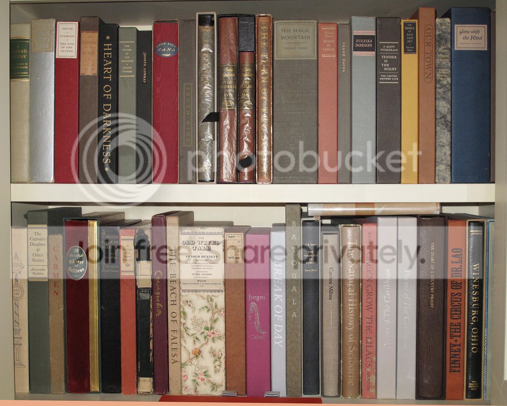
First, my LEC and fine press collection, including :

Below is my grandfather's old barrister book shelf with HPs, folios, and others. The highest sentimental value goes to my massive complete poetry and selected prose of Milton from what was probably my best undergraduate class:

Now a close up of the Nonesuch/HP French romances! Old Goriot is on the way but I'm still searching for a Nonesuch Charterhouse of Parma. I've had trouble finding copies with pristine spines but am lucky to have clean boards and crisp interiors, all first printings with hand colored illustrations (where applicable). If I come across copies with bright lettering I may swap them out but I'm happy enough with them. I hope to begin the search for the signed very earliest Heritage books soon!

Not pictured: some fun victorian novels, art books, and boarding school narratives, rows and rows of trade hardback and even more paperback books... I've always thought it advisable to have enough books to rebuild civilization with in a dystopian or apocalyptic scenario and my residence reflects this but order is mostly maintained.
Edited to correct error in posting the photos
7Django6924
>6 asburytr:
Very nice! I do love the Nonesuch/HP French Romances series. I wish there had been more, as the value of these books is pretty much unsurpassed (rag paper, hand-colored illustrations, letterpress printed--I mean, come on! These books should be selling for 5--10 times what they usually cost a buyer today).
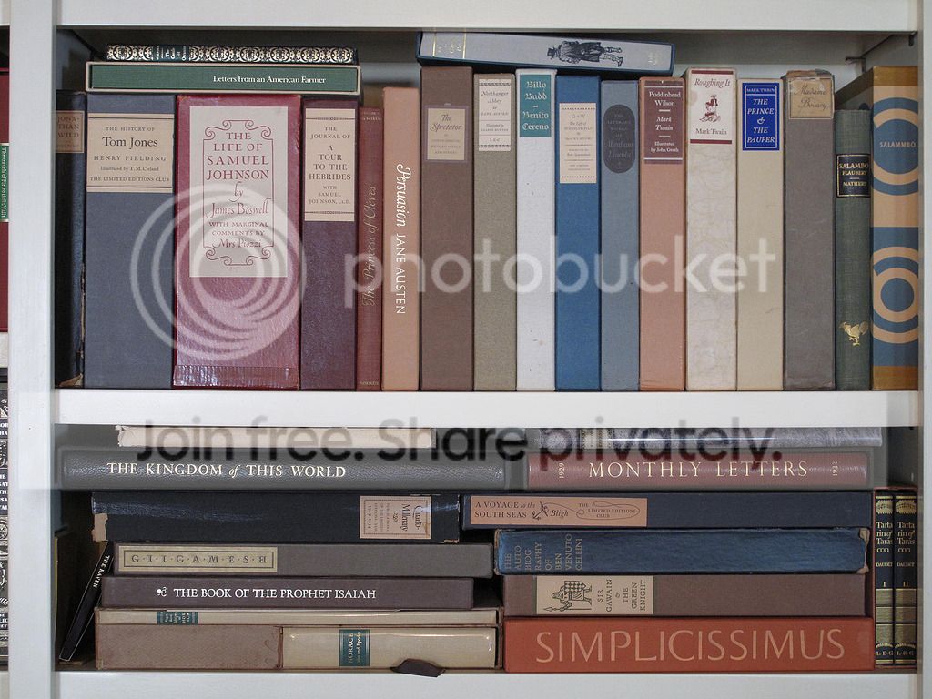
I had better pictures than the ones I'm posting, but I can't find them, and there have been changes in the shelf contents since these were taken, so I'm using these to set the location, and when I have time I'll do some closer shots of the most interesting shelves.


Very nice! I do love the Nonesuch/HP French Romances series. I wish there had been more, as the value of these books is pretty much unsurpassed (rag paper, hand-colored illustrations, letterpress printed--I mean, come on! These books should be selling for 5--10 times what they usually cost a buyer today).
I had better pictures than the ones I'm posting, but I can't find them, and there have been changes in the shelf contents since these were taken, so I'm using these to set the location, and when I have time I'll do some closer shots of the most interesting shelves.


8Jan7Smith
>7 Django6924: I think your books are the envy of many of us book lovers. Look forward to seeing your close ups.
9Jan7Smith
>4 asburytr: Love the pictures...nice books.
10ultrarightist
>7 Django6924: Very nice. Which edition of the Bible is that in the third picture? Also, who is the manufacturer of the barrister bookcase? Are leaves painted on or is that actual marquetry?
11Django6924
>8 Jan7Smith:>9>10
Thanks, these pictures are a few years old, and in the meantime I've added a few more long-desired books to the shelves and moved others to additional rooms.
The edition of the Bible is the 5 volume LEC edition designed by George Macy, which has been the only time to date where I have rebound the original. When I purchased it, the interiors were flawless, but the spines were sunned to illegibility. This was over 20 years ago, and a complete set was very hard to find at all, so I had them rebound at Kater-Crafts in Southern California. I really wanted the set, and the price on this one was exceedingly low (due to the spine condition). These days, I would have waited for a set in better condition, for although the rebinding job was superb, I miss not having a set in the original bindings, which, though nothing spectacular, were the designer's intentions, and I always prefer not to violate the original design, if possible.
Edited to add: I don't know who was the manufacturer of the tole-painted bookcase. My late wife found it at a second-hand store in Kansas City back in the 1970s. Even back then we were tending to run out of shelf space.
12dlphcoracl
>7 Django6924:
That is one of the nicest and most inviting reading rooms I have seen. A wonderful collection of books doesn't hurt either. In particular, the bottom shelf of the tole-painted bookcase has some Russian gems - the 6-volume LEC War and Peace, the 2-vol. LEC Anna Karenina and the 3-vol. set of Tolstoy's shorter works from the Folio Society.
That is one of the nicest and most inviting reading rooms I have seen. A wonderful collection of books doesn't hurt either. In particular, the bottom shelf of the tole-painted bookcase has some Russian gems - the 6-volume LEC War and Peace, the 2-vol. LEC Anna Karenina and the 3-vol. set of Tolstoy's shorter works from the Folio Society.


15dlphcoracl
A cabinet with two sets of closed white doors, each containing two shelves of books. Two rows of books at the bottom. Next set of photos will show the books behind the left-hand set of closed doors.


16dlphcoracl
Left-hand shelves of books:


17dlphcoracl
Top shelf, left half:


18dlphcoracl
Top shelf, right half:


19dlphcoracl
Bottom shelf, left half:


20dlphcoracl
Bottom shelf, right half:


21booksforreading
>15 dlphcoracl:
>16 dlphcoracl:
>17 dlphcoracl:
>18 dlphcoracl:
>19 dlphcoracl:
>20 dlphcoracl:
Beautiful and impressive!
>16 dlphcoracl:
>17 dlphcoracl:
>18 dlphcoracl:
>19 dlphcoracl:
>20 dlphcoracl:
Beautiful and impressive!
22booksforreading
>13 kdweber:
Looks like an amazing library! Unfortunately, the pictures look a little too small on my computer.
Looks like an amazing library! Unfortunately, the pictures look a little too small on my computer.
23booksforreading
>7 Django6924:
Gorgeous! Congratulations!
Gorgeous! Congratulations!
24ultrarightist
>19 dlphcoracl: Which edition of Goethe's Faust is that?
25dlphcoracl
>24 ultrarightist:
It is one of the 100 deluxe copies (total edition of 1000) on large paper with full vellum and gilt binding by the Ernst Ludwig Presse (Darmstadt, 1922). The press was similar in style to the Doves Press with a severe, no-nonsense approach to book design, use of beautiful type, and superlative letterpress printing.
Photos are seen below.
26dlphcoracl
Faust #1


27dlphcoracl
Faust #2


28dlphcoracl
Faust #3


29dlphcoracl
Faust #4


30booksforreading
German is one of many languages I cannot read! (yet)
:(
:(
31ultrarightist
Thanks. A magnificent edition!
32busywine
Quite dark, and mot sure if the pain really works well...but here it is! I will do one tomorrow when it is light out.


33Django6924
A promised, closer views of the East wall's shelves:


And the top shelf of the barrister bookcase in my bedroom:


And the top shelf of the barrister bookcase in my bedroom:

34wcarter
>33 Django6924:
An extraordinary collection, of which I own but a handful.
An extraordinary collection, of which I own but a handful.
35Django6924
>34 wcarter:
I started with just a handful myself--but I've had the advantage of having worked at increasing it for over 50 years!
I started with just a handful myself--but I've had the advantage of having worked at increasing it for over 50 years!
37Jan7Smith
>33 Django6924: Words can't describe my desire to have a collection such as this. A beautiful show of the best in literature. Thanks for sharing.

39dlphcoracl
Top shelf, left half:


40dlphcoracl
Top shelf, right half:


41dlphcoracl
Bottom shelf, left half:


42dlphcoracl
Bottom shelf, right half:


43BuzzBuzzard
>42 dlphcoracl: What edition of The Golden Ass is this?
44dlphcoracl
>43 BuzzBuzzard:
It is the Golden Cockerel Press edition (1923).
It is one of the earliest GCP books, so much so that it does not contain ANY wood-engravings or illustrations. The GCP first became a showcase for the finest wood-engravers in the U.K. when Robert Gibbings, himself an excellent wood-engraver, purchased the GCP from its founder Hal Taylor in 1924. Taylor had become terminally ill with tuberculosis and had to put the GCP up for sale. In 1925, Gibbings was joined by Eric Gill and the GCP then began publishing books with exceptional wood-engraved illustrations in 1925 with Eric Gill, David Jones, Noel Rooke, John Nash, and John Farleigh. All that said, this is a very undistinguished GCP book and edition of The Golden Asse.
Why then did I purchase it? Because a prior owner had given it a new binding and slipcase designed and executed by Donald G. Etherington in 1970. This is definitely something I would NOT have done for this particular book as it is akin to "putting lipstick on a pig", i.e., it is not a book worthy of a costly rebinding job. However, Don Etherington is a legendary bookbinder (see links below) and the new binding is drop-dead gorgeous. The price I paid for this book did not reflect the cost of the rebinding - not even close.
Etherington:
http://www.donetheringtonfinebinding.com
http://library.syr.edu/find/scrc/conservation/series/Etherington.php
45kdweber
>42 dlphcoracl: What edition is the vellum bound Chaucer?
46BuzzBuzzard
>44 dlphcoracl: Thanks for sharing this story. The binding looks nice indeed! I have often wondered why George Macy did not contract many of the excellent wood engravers that were often commissioned by GCP and the Nonesuch Press at the time.
47dlphcoracl
>42 dlphcoracl:
Hi, Ken:
The 3-vol. set of Chaucer's Canterbury Tales in limp vellum bindings is an example of a fine private press that is severely undervalued and under appreciated in the marketplace . It is known under the name "Philip Lee Warner; Publisher to the Medici Society." It is sometimes called simply 'the Medici Society' or listed as 'the Riccardi Press' because Riccardi did all of the fine letterpress printing for the Medici Society. If you look closely at my shelfies, you will note other books from the Medici Society in their deluxe limp vellum bindings:
1. The Thoughts of Marcus Aurelius.
2. The Heroes by Charles Kingsley
3. The Book of Genesis (Authorized Version)
4. The 4-vol. set of Le Morte D'Arthur
5. The Song of Songs Which is Solomon's
6. Everyman: A Morality Play
All of these books feature exceptional watercolour illustrations which are tipped in, many by Sir W. Russell Flint. Beautiful reproduction of watercolour illustrations and paintings was something the Medici Society was especially noted for. All of these books are printed on handmade paper and they use an elegant and very user friendly type known as the Riccardi fount. The presswork by the Riccardi Press is exceptional, with a nice impression or "bite" into the handmade paper.
Similar to the Allen Press books Chris and I have repeatedly featured on Books and Vines, the current prices for these book do not reflect their quality, especially in the vellum bindings. Sometimes Mr. Market doesn't get it right - take advantage of this price discrepancy. That is, of course, unless you wish to pay thousands of dollars more for Kelmscott Press books - which the Medici Society books come reasonably close to in quality ;) .

49dlphcoracl
Etherington binding:


50dlphcoracl
Etherington binding:


51kdweber
>47 dlphcoracl: Ah, I believe I have lusted over this edition of yours before as it is already on my wish list. Published in 1913, yes?
>48 dlphcoracl: Thanks for showing the full binding as the spine didn't look particularly special.
>48 dlphcoracl: Thanks for showing the full binding as the spine didn't look particularly special.
52dlphcoracl
>51 kdweber::
Yes. It is published in 1913.
This edition was issued in 500 copies, printed in the Riccardi fount on handmade Riccardi paper. It has 12 exceptional watercolour illustrations (tipped in) by Sir W. Russell Flint in each of the three volume, protected with captioned tissue guards. Of the 500 copies, I do not know how many were issued in the deluxe limp vellum bindings and how many were issued in the standard holland bindings. Frankly (imho), this is a set in which only the limp vellum bindings will do.
53asburytr
So many lovely books!
>7 Django6924: I too would have appreciated more! Also perhaps you might be able to help me decide on something. I've been trying to make up my mind between he HP Eugenie Grandet which matches the series or the LEC. Have you (or anyone else) ever had the opportunity to examine both? If the quality isn't great then I'll probably get the LEC instead but if it's comparable or approaches the series I wouldn't mind adding another book to the colorful row of them.
Edited for typo
54Django6924
>53 asburytr:
I have them both (or did, can't find the HP version at the moment). Unlike the other books in the series, Eugenie Grandet was not on the original pre-WWII slate of Ten Great French Romances (the Balzac representative being Old Goriot) under Meynell's master plan). Now this plan changed early on--check on Jerry's (WildcatJF) George Macy Imagery blog for a history of this enterprise--but Eugenie was never one of the group, and the HP edition is, in this case, a reprint of the LEC (also designed by Meynell). I suppose that in the post-George Macy period, it was felt that putting the HP reprint in the same series binding would encourage those who had some or all of the others to want to extend the collection, as you mentioned.
The HP Eugenie is a fine addition to the series, although it doesn't feature hand-colored illustrations of the original group, to the best of my memory, the colors applied via hand-cut rubber plates were excellent. I prefer the fleur-de-lys binding of the HP to the LEC's khaki-colored buckram with black-leather labels made to resemble some sort of medievalesque binding hinges. The true superiority of the LEC is in the paper, a thick, rich paper that must be 100% rag; I say "must be" because the Monthly Letter doesn't mention a word about the paper.
Is the paper sufficient reason to get the LEC over the HP? Well, I see a "pristine" HP copy with Sandglass can be purchased for about $30, and a "Fine" LEC copy (no mention of ML) for about $75. I personally would not pay over double the price of a pristine HP to have the LEC version (and I can almost hear some of you asking "well, why did you?"--and I didn't because I got it as part of a lot with other LECs). I think if I loved the illustrations I might go for the LEC, but although I like ben Sussan very much, I don't feel particularly excited about his work here. (Now i just saw online a seller asking $25 for an LEC version "with original tissue and Monthly Letter...both book and slipcase are in fine condition." Sounds to good to be true, but if it is, that's how I would go.
55featherwate
>40 dlphcoracl:
Top shelf, right half: do the two Shelleys frame another Adonais? If it's in an inward-facing slipcase it looks as if it might be the limited edition which John Henry Nash printed for the poet's mortuary anniversary in 1922.
Top shelf, right half: do the two Shelleys frame another Adonais? If it's in an inward-facing slipcase it looks as if it might be the limited edition which John Henry Nash printed for the poet's mortuary anniversary in 1922.
56WildcatJF
53 and 54) The post Robert refers to is here: https://georgemacyimagery.wordpress.com/2014/05/15/of-interest-the-history-of-th...
I've paused seeing the second Balzac styled in the French Romances series but never pushed the notion to actually question the book's design. Interesting! I suppose I can actually amend that post with this bit of info.
I've paused seeing the second Balzac styled in the French Romances series but never pushed the notion to actually question the book's design. Interesting! I suppose I can actually amend that post with this bit of info.
57dlphcoracl
>55 featherwate:
The book framed by the two copies of Shelley's 'Adonais' is 'Some Poems by Robert Browning' from the Eragny Press.
Regarding the two copies of Shelley's 'Adonais':
I first collected the copy in the limp vellum binding with silk ribbon ties. It was published by the Reed Pale Press (edition of 250) on handmade paper with presswork by the Chiswick Press (1935). The binding was crafted by Sangorski and Sutcliffe. The book is a gem and very inexpensive for what it is - well worth seeking out.
Years later, this same book became available in the deluxe black oasis Nigerian goatskin binding (also by Sangorski & Sutcliffe) in mint condition. It is one of only 25 deluxe copies and I could not pass on it.
59dlphcoracl
>58 johnaba:
No.
The copy you are referring to was published by Chatto and Windus in 1909 with printing done by the Florence Press (edition of 500). My copy is unique with a deluxe binding from Brugalla of Italy with 1/4 morocco leather spine, leather band along the front of the boards, with the boards made of oak veneer. The standard copies of this book were issued in either a limp vellum binding (greatly preferred) or a holland binding.
The book is superb and is VERY undervalued. It is printed on Batchelor handmade paper, the same paper used by Wm.Morris at the Kelmscott Press. The letterpress printing by the Florence Press is superb. Best of all, this edition is noted for inclusion of reproductions (29 plates) from a famed medieval manuscript in the Laurentian Library of Florence, Italy - the Codice Laurenziano Gaddiano. It also features a beautiful wood-engraved title page by Noel Rooke, who would later do wood-engraved illustrations for Robert Gibbings at the Golden Cockerel Press.
There are several copies of this book currently available on abebooks.com ranging in price from $40 to $115, including several in the limp vellum binding. I strongly suggest you snap up one of these copies.
All that said, I also own the LEC edition and it, too, is superb. It was designed and printed by Hans Mardersteig at his Officina Bodoni. It has an elegant embroidered cloth binding from Fortuny of Venice with beautiful wood-engraved illustrations by Paolo Molnar. As with all books from the Officina Bodoni, the presswork is outstanding, printed on handmade paper.
Collectors note:
Hans and Giovanni Mardersteig printed and published approximately 20 titles for George Macy and the LEC. Many of these are high points of the LEC bibliography and nearly all are worth collecting. You can rarely go wrong buying an LEC book published at the Officina Bodoni.
dlphcoracl
60kdweber
>59 dlphcoracl: Although I'm not too thrilled with Martino Mardersteig's Stamperia Valdonega edition of The Renaissance: Studies in Art and Poetry (1976).


62kdweber
Nice! I notice a number of replaced/new slipcases. Did you rebind your LEC Decline and Fall, and what's that slipcase made of?
64busywine
>62 kdweber: - I did not rebind my D&F, actually found one that was in pretty good condition with complete spines in decent shape (see below) - though it is fragile as hell and did have minor restoration done.
As for the slipcase, I had Starr Bookworks create it with a marbled paper I selected. They then scanned the spines and overlaid it.

Thanks
As for the slipcase, I had Starr Bookworks create it with a marbled paper I selected. They then scanned the spines and overlaid it.

Thanks
65busywine
>63 ironjaw: Thanks! I will say that for many/most of these slipcases, I did keep to a pretty strict budget....so all really did not try to attempt anything fancy, I really just wanted to have the spines of all books in, and I hate having no slipcase, or completely dilapidated slipcases (like many of the inexpensive lec paper slipcases), so slowly just had slipcases made for pretty much everyone that needed one using just a better box, cloth instead of paper and a basic label. Tried to use the same color as the original (or close) and recovered original labels whenever possible and re-used them. In any case, not fancy or elaborate, just as inexpensively as possible meet my objective!
67dlphcoracl
>60 kdweber::
You are comparing apples with oranges.
The Stamperia Valdonega is not the same as the Officina Bodoni. It's books are printed on a mechanized press, not a letterpress or hand press and the Stamperia Valdonega was intended for more commercially oriented publications with much larger limitations. Additionally, Martino Mardersteig (Giovanni's son) does not produce the same quality of typography as his father. My comment refers only to Officina Bodoni LEC publications.
68busywine
>66 EclecticIndulgence:, great question! In many cases I just had them do a repair, especially if there was any fancy sort of design on the original slipcase (such as Old Wives Tale, complete Andersen, Lavengro, etc). They were able to strengthen many in that way.
70kdweber
>67 dlphcoracl: I realize that (which is why I specifically called out the Stamperia Valdonega) , I just commented because Martino is Giovanni's son.
71BuzzBuzzard
>58 johnaba: >59 dlphcoracl:
Here is some information from the inestimable feathewate on the translation, which I happen to agree with:
Prof Arnold's Chatto translation first appeared in 1898/9. It was the work of a young man since he was born in 1864 - as it happened, the same year which saw the publication of Lady Georgiana Fullerton's translation, which Dom Roger Hudleston (1875-1936) revised for the LEC. Although Arnold's was therefore the newer basic translation it seems to be the more florid of the two.


73dlphcoracl
>58 johnaba:
>71 BuzzBuzzard:
Now THAT is what I am talking about !!
>58 johnaba:: If you do not think this edition is worth $100 in a full limp vellum binding, you need to get your reading material from Barnes & Noble ;-) .
>71 BuzzBuzzard:
Now THAT is what I am talking about !!
>58 johnaba:: If you do not think this edition is worth $100 in a full limp vellum binding, you need to get your reading material from Barnes & Noble ;-) .
74johnaba
>71 BuzzBuzzard:
>73 dlphcoracl:
Thank you both for the info! This board is such a wonderful resource.
I own a fine copy of the LEC edition which is beautiful enough, but now I'm hunting down the Chatto and Windus. Absolutely incredible you can buy this book for around $100.
Definitely better than Barnes and Noble! :)
75BuzzBuzzard
>74 johnaba: >73 dlphcoracl: I did not know anything about Chatto & Windus when I bought this book. I bought it because of the Batchelor's hand-made paper and it cost me less than $30.
76Jan7Smith
>61 busywine: I don't have the vocabulary to express how beautiful and extensive your library of fine books pictured here represents. Thanks for sharing.
77wcarter
>61 busywine:
Is this the best private collection of fine press books on the planet? Certainly looks like it to me.
Is this the best private collection of fine press books on the planet? Certainly looks like it to me.
78elladan0891
>42 dlphcoracl:
Is it the LEC edition of The Red Badge of Courage, or is it something else?
Is it the LEC edition of The Red Badge of Courage, or is it something else?
79busywine
>76 Jan7Smith:, >77 wcarter: -- Thank you, very kind! However, I think dlphcoracl may top the Library of Congress, what great stuff! And, what beautiful books and set-ups all who have posted have! I remember 30 years ago when my 'library' consisted of a few hundred tattered soft backs of mostly classics, I thought it was wonderful also as, let's face it, content, the desire for having the written word, is at the core of what we love. Getting fine press treatment is huge icing on the cake!
80BuzzBuzzard
>79 busywine: True words. I have found that the fine press books that I love the most are the ones that I have read.
81dlphcoracl
>78 elladan0891:
The edition of The Red Badge of Courage was printed at the Gwasg Gregynog (Wales) and published by the Land Press (London,1988). It features eleven collotype illustrations made from historical photographs of the American Civil War taken by Alexander Gardner, James F. Gibson, Timothy O'Sullivan, Andrew J. Russell and other unidentified photographers. The photographs are from the archives of the U.S. Library of Congress, Washington D.C. and they were "selected to illustrate the mood of the scenes described in the book rather than to record precise historical events."
The edition of The Red Badge of Courage was printed at the Gwasg Gregynog (Wales) and published by the Land Press (London,1988). It features eleven collotype illustrations made from historical photographs of the American Civil War taken by Alexander Gardner, James F. Gibson, Timothy O'Sullivan, Andrew J. Russell and other unidentified photographers. The photographs are from the archives of the U.S. Library of Congress, Washington D.C. and they were "selected to illustrate the mood of the scenes described in the book rather than to record precise historical events."
82dlphcoracl
Shelfies du Jour:
Photos of books in a small(er) standing cabinet with two shelves with the lower shelf specifically for shelving folio-sized books. Overview photo of the two shelves below, followed by more detailed photos.

Photos of books in a small(er) standing cabinet with two shelves with the lower shelf specifically for shelving folio-sized books. Overview photo of the two shelves below, followed by more detailed photos.

83dlphcoracl
Top shelf, left 1/3 of shelf:


84dlphcoracl
Top shelf, middle 1/3:


85dlphcoracl
Top shelf, left 1/3 of shelf:


86ironjaw
I have no words to express my sheer excitement seeing the collections from both you. Thank you for sharíng this with us
87dlphcoracl
Lower shelf, left half:


88dlphcoracl
Lower shelf, right half:


89gmacaree
>61 busywine: I am available for adoption should you be interested.
90busywine
>89 gmacaree:, her I already have 5, what's one more! :-)
> dlphcoracl - OMG!!! Those last pictures are incredible. The condition of your collection is incredible! Among the treasures, that Quixote would be so marvelous.
> dlphcoracl - OMG!!! Those last pictures are incredible. The condition of your collection is incredible! Among the treasures, that Quixote would be so marvelous.
91howpim
>7 Django6924:
There is something tasteful about the appointment of your library, it is a very fine and comfortable display. I can imagine an efficient Hi-Fi and CD library lie somewhere just out of eyeshot.
There is something tasteful about the appointment of your library, it is a very fine and comfortable display. I can imagine an efficient Hi-Fi and CD library lie somewhere just out of eyeshot.
92busywine
>91 howpim:, I agree. It looks very inviting, comfortable and a huge amount of great stuff to keep one busy for years.
93Django6924
>91 howpim:, >92 busywine:
Thanks, I'm looking forward to the time I can scale back from work to devote more time to the TBR backlog!
The Hi-Fi is in the middle two cabinets behind the closed doors. A few CDs, but mostly the Sony system therein plays FM and Sirius broadcasts, as well as streamed music from computers. The real Hi-Fi setup is in the back room where the rest of my library is kept (mostly history, Folio Society history, and mysteries). Since I started collecting music about the same time I started collecting books, most of my music is on LP and reel-to-reel tape.
94Django6924
If the photos of dlphcoracl's wonderful books has raised the question of what is vellum and how is it used in binding, Richard Norman's Bookbinders Digest for this month is just the ticket:
http://us1.campaign-archive1.com/?u=24c10645640d6810712e53083&id=341506ab98&...
http://us1.campaign-archive1.com/?u=24c10645640d6810712e53083&id=341506ab98&...
95dlphcoracl
Another round of Shelfies du Jours, this time a tall closet with five shelves of books. Overview photo is attached below, then the usual series of two photos per shelf - first left half, then right half of shelf.


96dlphcoracl
Top shelf, left half:


97dlphcoracl
Top shelf, right half:


98dlphcoracl
2nd shelf (from top), left half:


99dlphcoracl
2nd shelf, right half:


100dlphcoracl
3rd (middle shelf), left half:


101asburytr
>99 dlphcoracl:
Lovely! Who put out the porns of Li Po?
Lovely! Who put out the porns of Li Po?
102dlphcoracl
3rd shelf (middle shelf), right half:


103dlphcoracl
4th shelf, left half:


104dlphcoracl
4th shelf, right half:


105dlphcoracl
Bottom shelf, left half:


106dlphcoracl
Bottom shelf, right half:


107Jan7Smith
>95 dlphcoracl: The pictures just keep getting better and the books are awe-inspiring. Many of the books seem to have a clear protective cover without a dust jacket. Could you please let me know what cover you use? I cover all my books that have a dust jacket, but I haven't found a product that is easy to use on books without a jacket.
108dlphcoracl
>107 Jan7Smith:
If a paper dust jacket is present and in decent condition, I keep it. I then apply a clear dust wrapper over all books (with and without original paper dust wrappers). The clear material I use is called Grafix Dura-Lar and it is a modern alternative to clear acetate. It is archival (museum quality) and will not interact with binding materials, e.g. buckram, linen, marbled papers, leathers, vellum, etc. Unlike acetate, it is crystal clear and does not curl, yellow or crack with age.
I order it in the 25 x 40 inch sheets using .003" thickness for most books and a slightly thicker .005" thickness for extremely heavy or large folio-sized books. Each sheet has a layer of tissue paper over it making it easy to mark out the proper size with a pencil and then cut along these lines with a scissor. I obtain these Dura-Lar sheets from an artists and hobby supply shop named Dick Blick. The item numbers are as follows:
.003" thickness / 25 x 40 inch sheet: no. 55506-1103
.005" thickness / 25 x 40 inch sheet: no. 55506-1205
You can easily order these sheets from Dick Blick online and have them sent to you rolled up in a long stiff cardboard tube. See link below:
http://www.dickblick.com/products/grafix-dura-lar-clear-acetate-alternative/
109BuzzBuzzard
>107 Jan7Smith: >108 dlphcoracl: I use the .003 Dura-Lar as well. Instead of sheets I get a 20inX50ft roll. It is under $20 and it goes a long way. Love it. However I will recommend getting a cutting board, ruler an a cutting knife. Makes cutting a lot easier and precise. Cheers.
110Jan7Smith
>108 dlphcoracl: >109 BuzzBuzzard: Thanks for the information. I hope to try this. I assume it has to be taped to secure the corners.
111BuzzBuzzard
>110 Jan7Smith: Negative.
112dlphcoracl
>110 Jan7Smith:
No.
Folding it tightly and creasing it over the front edge of the boards will suffice.
No.
Folding it tightly and creasing it over the front edge of the boards will suffice.
113Jan7Smith
>111 BuzzBuzzard:>112 That is good...thanks.
114Django6924
I have never been one to envy other people's possessions--except in rare cases, such as your LEC edition of The Thousand Nights and a Night; I have only seen one other copy in such fine condition.
115dlphcoracl
>114 Django6924:
Surprisingly, I cannot remember any details with regard to that purchase - somewhat unusual for me.
That said, many of my favorite George Macy LEC books are the multi-volume sets of small, elegant books, e.g., Gargantua and Pantagruel, Grimm's Fairy Tales, the 6-volume War and Peace, etc.
Lovely books to hold and read.
116wcarter
Many magnificent book collections have been featured here, and I cannot hope to compete, but I do own some quite nice editions.
I was tempted to post my own shelfies, but as my books are arranged by genre, and my fine and limited editions are scattered amongst other not quite so fine (but still quality) books, I felt it was better to direct those interested to my illustrated catalogue rather than my shelves.
My collection of fine and limited editions can be seen at:-
https://www.flickr.com/photos/warwick_carter/albums/72157664291435999
My quality editions can be seen at:-
https://www.flickr.com/photos/warwick_carter/albums/72157663321725644
Click on each picture to enlarge.
117gmurphy
busywine/dlphcoracl
Amazing collections!! dlpcoracl-what filing system are you using? How do you locate a specific book??
Quick question-what do you think are the most impressive publications (fine press or otherwise) of:
-Ingoldsby Legends
-Sir Gawain & The Green Knight
Amazing collections!! dlpcoracl-what filing system are you using? How do you locate a specific book??
Quick question-what do you think are the most impressive publications (fine press or otherwise) of:
-Ingoldsby Legends
-Sir Gawain & The Green Knight
118dlphcoracl
>117 gmurphy:
1. "What filing system are you using?"
Sadly, none. The placement and location of my books is more a function of "where will they fit", i.e., books of a certain height cannot fit on many of my shelves. You may then ask: "How do you find a particular book you are interested in?" Answer: for most of them, I have a crude idea of where they are located. However, it is not unusual for me to spend 45-60 minutes searching repeatedly for an occasional book and, frankly, this drives me crazy!! (-:
2. Ingoldsby Legends: No brainer. The classic signed, limited edition of 560 copies illustrated and signed by Arthur Rackham published by J.M. Dent and Co. (London), 1907. Many copies of this book have been given sumptuous new bindings from the finest binderies in the U.K., e.g., Bayntun Riviere. Whether one insists on the original stiff vellum with elaborate gilt decoration and silk ribbon ties binding or a tasteful full leather rebinding is a matter of taste.
3. Sir Gawain and the Green Knight:
https://booksandvines.com/2013/09/26/sir-gawain-and-the-green-knight-by-the-pear...
119Django6924
>117 gmurphy: "Sir Gawain and the Green Knight"
I still find the LEC with Cyril Satorsky's illustrations the preferred edition. The illustrations are no better (nor worse), in my opinion, than those of Artemis Rodriguez. The LEC translation by Rosenberg, is, like John Ridland's, very good as a crib, but nothing much considered as poetry. The LEC has the principal advantage of having the Middle English original text en face, and this alone puts the other editions out of the running for me. I first read the work in the original and still prefer to read it that way.
And despite the statement in the prospectus that the green paper in the Taller Martin Pescador edition is "neither too dark for legibility nor too coy for seriousness," I prefer black type on white paper and find the pages a strain on my (admittedly) aging eyes, and to use green paper seems just a bit too coy for my taste. Still, just as an example of what contemporary fine presses can achieve, the Taller Martin Pescador edition is heartening to those of us who don't prefer to read on electronic screens.
120gmurphy
>118 dlphcoracl:
Thank you. I thought the recommendation would be for the Rackham 'Ingoldsby'. I have a few of the Rackham gift books,but not this one.
>119 Django6924:
I've had a look at the LEC 'Sir Gawain...'.The two texts is certainly an attraction and copies on the secondary market are reasonably priced...so ordered!
122dlphcoracl
>121 howpim:
The Samuel Becket in the black cloth-covered clamshell box in >41 dlphcoracl: is:
Nohow On, published by the Limited Editions Club (1989). This is one of the Sidney Shiff LEC livres d'artiste books with six original white-on-white aquatints by Robert Ryman, famous for his minimalist and conceptual art.
123howpim
>122 dlphcoracl:
Thanks. I wish there was an LEC quality edition of one or all of Molloy, Malone Dies and The Unnameable.
Thanks. I wish there was an LEC quality edition of one or all of Molloy, Malone Dies and The Unnameable.
124BuzzBuzzard
My very favorite HP books among the growing LEC collection. Had I only had enough shelves.


126varielle
Mini-shelfies. Major shelfies are not quite ready for their close-up. These are mostly Folio Society & Lakeside Press.


127Django6924
>126 varielle:
I have all those Folios, too, Phyllis! Isn't Towers of Trebizond a fun read? After I read it I found 2 other Macaulay novels--Staying with Relations and Going Abroad--and they are entertaining but Towers is by far the best.
My old eyes can't make out the titles on the blue and gold set in the bottom picture--what are those attractive little tomes?
129dlphcoracl
>101 asburytr:
Sorry I am responding nearly two weeks after your post. I simply missed it hiding between the shelfies.
The 'Poems by Li Po' was published by the Anvil Press (Lexington, Kentucky) in 1984, limited edition of 150 copies. The book is also accompanied by a slim volume of notes written by the translator Elling Eide. Finally, there is a pocket inside the rear cover of the book with a phonograph record entitled "Tunes from the Tang" performed by the Jesus College Chinese Band from Cambridge University.
For this book, 50 of Li Po's poems were translated by Elling Eide, a summa cum laude graduate of Harvard University (Class of 1957) with a degree in Far Eastern Language. Eide was also one of the original members of the T'ang Studies Society. His translations in this volume are amongst the best translations of Tang poetry ever published.
The Anvil Press was founded by Victor Hammer, an Austrian born painter, sculptor, typographer and printer, after he emigrated to the United States from Vienna. Hammer designed five of his own typefaces, the best known of which is American Uncial, a type that has a distinctly medieval look. He built and used his own wooden press based on a similar wooden press found in the Laurentian Library of Florence, Italy. His Anvil Press books are known for superb handset letterpress printing with a deep "bite" into handmade papers.
130Django6924
>128 varielle: "The blue ones are the Patrick O'Brian Master and Commander series."
Ah, those are the Folios I don't have (I do have the paperbacks, though I loaned them all to a friend.)
Ah, those are the Folios I don't have (I do have the paperbacks, though I loaned them all to a friend.)
131Auriger
dlphcoracl, you have a very fine collection there.
Forgive me if you've discussed this already, but are your books behind glass or on open shelves, and do you keep light levels low?
I notice a good number of your books are boxed. I don't know whether that's how they came when you bought them or you've commissioned the boxes yourself after purchase. I'd box the Ashendene Quixote if it was mine, and a few others I can see.
132dlphcoracl
Auriger:
To answer your questions in order:
1. Most of my important private press books are shelved in closets or cabinets behind closed doors. They are not exposed to sunlight tor dust. The handful that are on open shelves are in dark rooms without exposure to sunlight.
Fine press books (Folio Society) and roughly 1/3 of my LEC books are on open shelves. The LEC books are turned so that the spines of the slipcases, not the books, are exposed.
In no instance is a fine press or private press book exposed to direct sunlight.
2. Regarding slipcases and clamshell boxes - it is a mixed bag. Many came that way and, in other instances, I have had slipcases or clamshell boxes made.
3. The Ashendene Don Quixote is in a cabinet behind closed doors. It is not exposed to sunlight or dust. They are too large for slipcases and too heavy to place in a single clamshell box. Having a clamshell box made for each of the two volumes takes up far too much valuable shelf space for folio-sized books, of which I have precious little remaining. The decision to leave them as they are is a careful, well-considered decision.
133Auriger
Thanks for the information. I'm reassured.
I'm toying with buying an Ashendene Thucydides. Could I ask you the dimensions of this? I believe it is smaller than the Quixote and Faerie Queene, for example. And is it uncut on all three sides (i.e. head ungilt)? Can I take it yours is in white pigskin? If there are any images of the book on this site I'd be interested to have a link to them.
I'm toying with buying an Ashendene Thucydides. Could I ask you the dimensions of this? I believe it is smaller than the Quixote and Faerie Queene, for example. And is it uncut on all three sides (i.e. head ungilt)? Can I take it yours is in white pigskin? If there are any images of the book on this site I'd be interested to have a link to them.
136dlphcoracl
>133 Auriger:
The top edge of the Ashendene Press 'Thucydides' is not TEG. My copy is also in white pigskin. Unlike nearly all of the other Ashendene folios, this book has only one type of binding - the full white pigskin.
The top edge of the Ashendene Press 'Thucydides' is not TEG. My copy is also in white pigskin. Unlike nearly all of the other Ashendene folios, this book has only one type of binding - the full white pigskin.
137Jan7Smith
>61 busywine: Just looking at the pictures which are both exhilarating and depressing. An amazing collection that I can never hope to achieve. I really love the multiple volumes such as Don Quixote and Moby Dick. I am sure this library is an awesome sight to behold in person. Amazing!
138dlphcoracl
>137 Jan7Smith::
Busywine's library is in a class by itself. If the book is not on one of his shelves, it is probably not worth reading.
Busywine's library is in a class by itself. If the book is not on one of his shelves, it is probably not worth reading.
139Jan7Smith
>138 dlphcoracl: Your library is high class also as are several others on this site. I love the pictures of all of the wonderful books. The pictures and comments are something I really look forward to every day. Thanks to all who contribute.
140dlphcoracl
A Shelfie A Day:
Or, in this case, a few more shelfies. These are the books on the bottom (open) shelves of the oak and white-door cabinet in photo >15 dlphcoracl:. Four shelfies, two on left side and two on the right. Photos to follow.
Or, in this case, a few more shelfies. These are the books on the bottom (open) shelves of the oak and white-door cabinet in photo >15 dlphcoracl:. Four shelfies, two on left side and two on the right. Photos to follow.
141dlphcoracl
Left lower shelf, left half:


142dlphcoracl
Left lower shelf, right half:


143dlphcoracl
Right lower shelf, left half:


144dlphcoracl
Right lower shelf, right half:


145Jan7Smith
>141 dlphcoracl: The Robinson Crusoe pictured is another of my lustful desires. I just read The Moonstone and Betteredge consulted this book much as others consult the bible when he needed guidance to solve a problem.
146dlphcoracl
>145 Jan7Smith:
The LEC Robinson Crusoe is one of the oldest LECs (1930) and one of my faves. It is very difficult to find in decent condition because the spine is almost always badly faded and the cloth binding is delicate and easily worn and abraded.
The LEC Robinson Crusoe is one of the oldest LECs (1930) and one of my faves. It is very difficult to find in decent condition because the spine is almost always badly faded and the cloth binding is delicate and easily worn and abraded.
147busywine
>146 dlphcoracl:, I agree it is one of my faves. I know some do not care for a few of these floppy bindings of the LEC, but I like it in this case in particular.
You all are very kind on your comments -- George Macy would be happy since most are his creations!
You all are very kind on your comments -- George Macy would be happy since most are his creations!
148Jan7Smith
>146 dlphcoracl: I have both of the Heritage Press editions which are pretty nice. I will keep a lookout for a nice LEC copy.
149dlphcoracl
>148 Jan7Smith:
That might be overkill :-).
Better yet, put that money into another of the nicer George Macy LEC books. A good starting point is to look at the nearly twenty books designed and printed by Giovanni Mardersteig at his Officina Bodoni for the LEC. Examples:
1. The Sonnets of Petrarch
2. The Toilers of the Sea
3. Ovid's Metamorphoses.
4. The Georgics
5. The Little Flowers of St. Franics of Assisi
6. I Promessi Sposi
150Jan7Smith
>149 dlphcoracl: I will look at these books. Thanks for the advice. I value help from experienced LEC collectors.
151dlphcoracl
>150 Jan7Smith:
Giovanni Mardersteig and the Officina Bodoni were congenitally incapable of publishing anything other than elegant, beautifully printed books :-) .
Giovanni Mardersteig and the Officina Bodoni were congenitally incapable of publishing anything other than elegant, beautifully printed books :-) .
153dlphcoracl
>152 EclecticIndulgence:
Gilgamesh, King of Erech was published by the Golden Cockerel Press (1948) with 12 wood engravings by Dorothea Braby. It was limited to 500 copies with nos. 1-60 given a special 1/2 morocco leather and golden buckram cloth binding by Sangorski and Sutcliffe. This is one of the sixty "specials".
Grettir and the Volsunga Saga are two volumes from an 8-volume set of works written or translated by William Morris, published by Longmans, Green & Co (London, New York and Bombay) between 1900 to 1903. Some of the other volumes in this set are:
1. The Hollow Land and other Contributions to the Oxford and Cambridge Magazine.
2. A Tale of the House of the Wolfings and All the Kindreds of the Mark.
3. The Aeneid of Virgil done into English Verse.
4. Architecture, Industry and Wealth. The collected papers of William Morris.
5. The Well at the World's End.
Grettir and Volsunga were translated with Eirikr Magnusson. The entire set was printed using the Golden type William Morris designed and used at the Kelmscott Press. The printing was done by the Chiswick Press (superb) on dampened handmade paper. The eight volumes in this set were originally issued in holland bindings, i.e., 1/4 linen-like cloth for the spine with the dull blue-grey paper over boards. These bindings are almost always found with considerable wear and staining, especially because these books are over one hundred years old.
My interest in this set was restricted to the two volumes of Icelandic sagas and I obtained copies with decent bindings that were in fine condition internally. I had both volume rebound in identical fashion using 1/4 dark brown Nigerian goatskin and a Japanese Asahi aqua blue cloth over the boards. Publishing dates for both volumes was 1901.
154elladan0891
>81 dlphcoracl:
How does the Gwasg Gregynog edition compare with the LEC? I can't find much information on the LEC - no reviews in the usual blogs, and it hasn't been coming up on ebay in the past months. Am I right in my assumption that in terms of paper quality and overall feel Gwasg Gregynog > LEC > Westvaco edition with the bullet hole?
How does the Gwasg Gregynog edition compare with the LEC? I can't find much information on the LEC - no reviews in the usual blogs, and it hasn't been coming up on ebay in the past months. Am I right in my assumption that in terms of paper quality and overall feel Gwasg Gregynog > LEC > Westvaco edition with the bullet hole?
155booksforreading
>108 dlphcoracl:
>109 BuzzBuzzard:
I think that this issue has been discussed before somewhere, and, if yes, I apologize for asking this question again... I assume that clear protective covers will reduce fading of book covers if the books are exposed to daylight on regular basis, but is there some research about how effective they are in protection from sunning and color fading?
Due to limitation in shelf space in some of my rooms, I have some books that are in a room where there is a lot of light, and I am concerned about it.
156dlphcoracl
>155 booksforreading:
As far as I know, the Dura-Lar dust wrappers do NOT protect against sun fading of books exposed to daylight or sunlight, nor are they meant to be. I certainly do not use them for that purpose. My Dura-Lar covers are meant to protect against soiling and grime from handling, especially for fine leather and vellum bindings - nothing more.
As far as I know, the Dura-Lar dust wrappers do NOT protect against sun fading of books exposed to daylight or sunlight, nor are they meant to be. I certainly do not use them for that purpose. My Dura-Lar covers are meant to protect against soiling and grime from handling, especially for fine leather and vellum bindings - nothing more.
157booksforreading
>156 dlphcoracl:
OK, thank you! I appreciate this information!
I thought that I read somewhere that acetate jackets did serve as protective layer against sunning, and, in such capacity they worked quite well (for example, LEC books in original wrappers have been preserved almost perfectly VS the books without wrappers), but I guess I was mistaken.
Also, it is good to know that Dura-Lar does not protect against sunning.
158BuzzBuzzard
>157 booksforreading:
My understanding too is that Dura-Lar does not protect against sun fading. Glassine (used on LECs) however is different and I believe prevents from sun fading. One of them is clear and the other one is not...
My understanding too is that Dura-Lar does not protect against sun fading. Glassine (used on LECs) however is different and I believe prevents from sun fading. One of them is clear and the other one is not...
159dlphcoracl
>157 booksforreading:
>158 BuzzBuzzard:
BuzzBuzzard is correct. The LEC books use an opaque glassine as a dust wrapper and this DOES prevent sun fading. The crystal clear Dura-Lar does not.
P.S. The glassine is an ugly eyesore.
>158 BuzzBuzzard:
BuzzBuzzard is correct. The LEC books use an opaque glassine as a dust wrapper and this DOES prevent sun fading. The crystal clear Dura-Lar does not.
P.S. The glassine is an ugly eyesore.
160BuzzBuzzard
>157 booksforreading:
Here is the scientific proof, provided by a GMD that glassine prevents sun fading.

UV/Visible spectrum of old glassine and Canson tracing Paper. Notice the shift in transmittance at approximately 650 nm in both specimens. This leads me to believe that these two papers are essentially the same. The greater transmittance of the old glassine is likely due to some decomposition of the paper over time.
161wcarter
>156 dlphcoracl:
I use Dura-Lar to protect some dust-jacketed books, but never on a leather one. One of the joys of owning a leather bound book is the feel and smell of the leather when handling and reading the book, and any form of covering would reduce that pleasure. I just have minimal natural,light in my library.
I use Dura-Lar to protect some dust-jacketed books, but never on a leather one. One of the joys of owning a leather bound book is the feel and smell of the leather when handling and reading the book, and any form of covering would reduce that pleasure. I just have minimal natural,light in my library.
162dlphcoracl
>154 elladan0891:
Re: The Red Badge of Courage.
I own four editions of this work and I have Good News and Bad News. First, the Bad News:
Bad News: None of these books truly possess the "Wow" factor that 'busywine' describes in separating those private press books that are in some way special.
Good News: None of these books are losers. All four books are attractive in their own unique way and make excellent reading copies.
1. Pennyroyal Editions (NOT Pennyroyal Press): This is the trade edition of the Pennyroyal Press. Note, however, that Red Badge never appeared in a Pennyroyal Press edition. This book is large quarto size with linen cloth-covered boards and matching slipcase. It is not printed letterpress nor is it a limited edition. It is a fine edition book using good quality paper and containing Barry Moser's wood engravings. Cost: easily found on abebooks.com for $30 to $60.
2. Limited Editions Club: Attractive binding in full leather with embossed figures on the front cover. Paper quality and typography are average and this has the look and feel of what I refer to as a "generic LEC book". Illustrations are by a noted American artist, John Steuart Curry, in a brown/sepia monochrome with sketch-like appearance, a matter of taste. Cost: usually between $60-80 for NF or fine condition.
3. Random House: Printing was done by the Grabhorn Press for Bennett Cerf's Random House publishers. Book is large quarto size. Numerous illustrations by Valenti Angelo in his usually tasteful manner. Excellent handmade paper and the usual superb Grabhorn letterpress printing. Cost: $200 to $300, very reasonable for a private press book of this quality.
4. Gwasg Gregynog for the Land Press: Not one of Gwasg's more notable publications but it still has the Gregynog pedigree of fine letterpress printing on excellent handmade paper . The vintage historical photographs taken from the U.S. Library of Congress are a huge plus and they are carefully reproduced. Of the four editions, this one is the highest quality but also the most expensive, typically $400 to $450.
Overview photo of the four editions with photos of each book to follow.
Upper L: Pennyroyal Editions
Upper R: Gwasg Gregynog
Lower L: Random House (Grabhorn)
Lower R: LEC

163dlphcoracl
>161 wcarter::
Warrick:
I am not concerned about the light and fading of leather bindings. Rather, the effects of handling and transferring perspiration and natural skin oils into the leather, resulting in staining and uneven appearance of the leather over time. It is a tradeoff and a matter of personal taste. I do not need the "feel" of the leather to enjoy the leather binding and I am more concerned with protecting it from routine handling. Half a dozen of one, six of the other :-) .
164dlphcoracl
Limited Edition Club: Red Badge of Courage


165booksforreading
>160 BuzzBuzzard:
Thank you for this information!
Thank you for this information!
166dlphcoracl
Pennyroyal Editions: Red Badge of Courage


167dlphcoracl
Random House/Grabhorn : Red Badge of Courage


168dlphcoracl
Gwasg Gregynog: Red Badge of Courage


169wcarter
>162 dlphcoracl:
Another interesting edition of "The Red Badge of Courage" is the one by Westvaco.
See:-
https://www.flickr.com/photos/warwick_carter/24574551564/in/photolist-Drz11U
Another interesting edition of "The Red Badge of Courage" is the one by Westvaco.
See:-
https://www.flickr.com/photos/warwick_carter/24574551564/in/photolist-Drz11U
170dlphcoracl
>169 wcarter:
Thank you to the link for the Westvaco edition. The Westvaco books are a blind spot for me, i.e., I am totally unfamiliar with Westvaco books, but I have heard glowing reports from other collectors. The concept of simulating a bullet hole in the binding and book and the facsimile reprint of Instructions for Cleaning and Maintaining the rifle musket are ingenuous touches.
Thank you to the link for the Westvaco edition. The Westvaco books are a blind spot for me, i.e., I am totally unfamiliar with Westvaco books, but I have heard glowing reports from other collectors. The concept of simulating a bullet hole in the binding and book and the facsimile reprint of Instructions for Cleaning and Maintaining the rifle musket are ingenuous touches.
171elladan0891
>162 dlphcoracl:
Thank you very much! Great information. Really appreciate it.
>169 wcarter:
How do you find the Westvaco edition? How is the paper quality? Is it closer to a regular Folio than a Fine/Limited/Private Press edition?
Thank you very much! Great information. Really appreciate it.
>169 wcarter:
How do you find the Westvaco edition? How is the paper quality? Is it closer to a regular Folio than a Fine/Limited/Private Press edition?
172Django6924
One feels almost intimidated in the light of such fine examples to mention the lowly Heritage Press edition of Crane's novel, but I feel that it merits consideration as well. It is by far the best bargain for a book printed letterpress on high quality paper--not up to the paper in the Grabhorn or, I'm sure the Gwasg Gregynog (although the texture of the paper used therein bothers me a bit, in conjunction with the lightweight type font used, which causes me a bit of eyestrain)--but still fine nonetheless (and incidentally made by the West Virginia Paper Company--ie., Westvaco). The HP has a red buckram spine and blue paper boards imprinted with the Curry drawing of Henry taking the Confederate standards from the dying Reb; it is not as dramatic as the leather-embossed LEC, but qualitatively and stylistically not inferior to some of the others, and has, in my 73 year-old edition held up better than my 73 year-old LEC. I believe my LEC cover is in slightly better condition than dlphcoracl's, but since it is bound in what our late (and much-lamented) friend Don Floyd called "the nefarious sheepskin," three of the book's 4 corners are showing the paper boards beneath.
Curry's work here is not his very best for the LEC--although it is still, after Gwasg Gregynog's period photos, my own favorite of the Crane illustrations I have seen. The Pennyroyal has, from the samples shown, the best typography (but I don't like the illustrations). The Grabhorn is also very fine if you don't mind so deep a bite that the outlines of the previous page are noticeable (which I don't care for, though I know many do). Gwasg Gregynog's type is too skinny for my eyes when used with the rather heavily textured paper. As Macy used to frequently bemoan, first quality presswork was hard to get in the U.S. during the war, and it shows in the LEC where the impression appears untypically uneven for a Macy book. For some reason, the HP edition does not share that trait, and for that reason, so on the whole, I think it is worthy of consideration.
Curry's work here is not his very best for the LEC--although it is still, after Gwasg Gregynog's period photos, my own favorite of the Crane illustrations I have seen. The Pennyroyal has, from the samples shown, the best typography (but I don't like the illustrations). The Grabhorn is also very fine if you don't mind so deep a bite that the outlines of the previous page are noticeable (which I don't care for, though I know many do). Gwasg Gregynog's type is too skinny for my eyes when used with the rather heavily textured paper. As Macy used to frequently bemoan, first quality presswork was hard to get in the U.S. during the war, and it shows in the LEC where the impression appears untypically uneven for a Macy book. For some reason, the HP edition does not share that trait, and for that reason, so on the whole, I think it is worthy of consideration.
173dlphcoracl
Django6924:
And that is indeed what I meant by "The Good News and the Bad News". None of the various editions of 'The Red Badge of Courage" are head and shoulders superior to the others and each has its own selling points, with a wide range of prices.
Personally, I favor the Gwasg Gregynog because the lightweight type doesn't bother me in the slightest, the paper quality (Hahnemuhle mould-made) is top-notch and the historical photographs from the Library of Congress are unique. My second choice is the Grabhorn precisely because I DO prefer the "bite" of letterpress work.
All that said, there is a fine edition here for every taste and wallet - one cannot go wrong with any of these choices. There is no excuse for not having a wonderful copy of this anti-war classic on your bookshelf.
174wcarter
>171 elladan0891:
I would place the Westvaco editions between Folio Society standard and LE editions - more like their older fine editions. Very nice books, often done in an interesting style (ie: bullet holes through book), and very reasonably priced on the secondary market for their quality.
I would place the Westvaco editions between Folio Society standard and LE editions - more like their older fine editions. Very nice books, often done in an interesting style (ie: bullet holes through book), and very reasonably priced on the secondary market for their quality.
175featherwate
In March 2010, the Westvaco series was 'discovered' by the Folio Society Devotees, many of whom (myself included) became very excited by their quality, distinctive design and price - if you put West Virginia Pulp and Paper Company into the FSD search box you'll find a long and informative discussion of the books with many illustrations. And - to bring the topic into line with the subject of the present discussion! - if you go to message 205, you will see a 'shelfie' of a bookcase containing the 50 volumes that make up the set. They look good!
They owe their individuality to the presiding genius of the series, Bradbury Thompson, one of America's greatest 20th century designers/typographers/art directors. This is particular evident in his decision to adopt 'ragged right' typesetting. This suggests he may have been influenced by the 1931 An Essay on Typography by Eric Gill, who argued that it was impossible to maintain truly legible word and character spacing in justified lines.
They owe their individuality to the presiding genius of the series, Bradbury Thompson, one of America's greatest 20th century designers/typographers/art directors. This is particular evident in his decision to adopt 'ragged right' typesetting. This suggests he may have been influenced by the 1931 An Essay on Typography by Eric Gill, who argued that it was impossible to maintain truly legible word and character spacing in justified lines.
176Constantinopolitan
Here is my copy of The Red Badge of Courage from Gwasg Gregynog bound by Constance Wozny.


177dlphcoracl
>176 Constantinopolitan:
That is absolutely stunning. Is this a unique copy that you commissioned with Ms. Wozny or did she do a small number of special bindings for Gwasg Gregynog as part of this edition?
That is absolutely stunning. Is this a unique copy that you commissioned with Ms. Wozny or did she do a small number of special bindings for Gwasg Gregynog as part of this edition?
178Constantinopolitan
>177 dlphcoracl: I bought this copy from a German bookseller. I imagine that Ms Wozny bought the sheets to bind as a project. I so liked the way in which she had bound The Red Badge that I bought another Gwasg Gregynog title that she had also bound: The Lost Children. This copy she was selling on eBay.
179dlphcoracl
>178 Constantinopolitan:
I know exactly which German bookseller you purchased this book from: Antiquariat Peter Ibbetson.
I know exactly which German bookseller you purchased this book from: Antiquariat Peter Ibbetson.
180Constantinopolitan
You're right!
182Constantinopolitan
>181 dlphcoracl: Delphic Oracle indeed.
183Jan7Smith
>181 dlphcoracl: Carnac the Magnificent! Lol...
184elladan0891
>172 Django6924: >173 dlphcoracl: >174 wcarter:
Thank you all! Lots of choices! No idea what I'm going to end up getting yet.
It's fun to get enabled looking at people's shelves )
>175 featherwate:
More enablement! Just ordered Lindbergh's Listen! The wind and going to order a few more to try out their output.
Thank you all! Lots of choices! No idea what I'm going to end up getting yet.
It's fun to get enabled looking at people's shelves )
>175 featherwate:
More enablement! Just ordered Lindbergh's Listen! The wind and going to order a few more to try out their output.
185featherwate
>184 elladan0891:
I used to try to avoid being enabled until I realized that would mean having to get my wife to read every GMD message first and block any that enthused about this book or that.
Strangely, she refused.
So now my conscience is clear.
I used to try to avoid being enabled until I realized that would mean having to get my wife to read every GMD message first and block any that enthused about this book or that.
Strangely, she refused.
So now my conscience is clear.
186Django6924
>184 elladan0891:
Listen! The Wind is a wonderfully designed book--perhaps my favorite of the Westvaco for design. (For content, my favorite is You Know Me, Al.)
Listen! The Wind is a wonderfully designed book--perhaps my favorite of the Westvaco for design. (For content, my favorite is You Know Me, Al.)
187asburytr
Here's an updated photo with the complete NP/HP French Romances, plus Eugenia Grandet. It has been an enjoyable experiences aquiring these books and I have enjoyed (and doubtless will continue to enjoy) reading those I have not already read. As far as I have been able to determine, they are all first printings and I have a majority of the sandglasses so if you want any information on a specifc book let me know! I'm also including the link to the great George Macy Imagery article which can tell you all about the fascinating history of the series and which inspired me to collect them, beginning with Princesse de Cleves.
https://georgemacyimagery.wordpress.com/2014/05/15/of-interest-the-history-of-th...
There are some interesting variations within the series such as a colophon page in the earlier books which they eventually stopped including and slight variances with the buckram. I may put togther a spreadsheet showing where each was printed, bound, etc. as the series shifted from an entirely French production to our shores as the war progressed. If anyone is interested in looking at such comparison, let me know wht details you might like me to include!

188Django6924
>187 asburytr:
I'd love to see this spreadsheet, and I would like it to include the author of the Introductions--some of these by great authors in their own right--and the method of producing the coloring of the illustrations--and if porchoir, by which studio. This would be a very handy reference.
I'd love to see this spreadsheet, and I would like it to include the author of the Introductions--some of these by great authors in their own right--and the method of producing the coloring of the illustrations--and if porchoir, by which studio. This would be a very handy reference.
190BuzzBuzzard
>187 asburytr: Me too!
191NYCFaddict
I'd love to see it too.
192NYCFaddict
Isn't Candide in that series?
193Django6924
>192 NYCFaddict:
Candide was, indeed, one of the first 2 volumes shipped. It's a bit difficult to tell since the title on the spine is usually faded, but I believe it's the volume to the left of Dangerous Acquaintances.
Candide was, indeed, one of the first 2 volumes shipped. It's a bit difficult to tell since the title on the spine is usually faded, but I believe it's the volume to the left of Dangerous Acquaintances.
194asburytr
>193 Django6924: Correct! The faded lettering does not reflect the vibrant Sauvage illustrations within, however, which may be my favorites in the series. Looking around I have yet to see one with bright lettering although a later printing with a dark teal spine can be found in less faded condition.
195featherwate
"and the method of producing the coloring of the illustrations--and if pochoir, by which studio."
Yes, that 's particularly noticeable with A Woman's Life, where there is a marked, indeed startling, difference between the illustrations in the first two editions, immediately apparent in the frontispiece:

The other illustrations follow suit:

The first in each pair above is from the original September 1942 release, whose title page carries the name of The Nonesuch Press only (although it was never published in England!) as does the copyright page. These illustrations are described thus in Sandglass 4F :
And all of the illustrations are colored by hand! The basic sections of the illustrations, which are a grayblack in tone, were printed, as we have said, by lithography. But the water-colors are applied, through stencils in the French manner, in the studio of Charlize Brakely. There can be only a handful of studios in America at which this kind of "French reproduction" can be done....What a result she has achieved! Her result is in each case a picture in water-color, glowing upon the paper "in a manner to shame the hard, flat, mechanical reproductions which appear in ordinary illustrated books."
The second in each pair is from the July 1952 release, whose title page carries the dual imprint of The Nonesuch Press & The Heritage Press; but the copyright (still shown as 1942) is now in the name of The Heritage Press for the George Macy Companies, Inc. These illustrations are described thus in Sandglass II.17:
And all of the illustrations are colored with actual water-colors! The basic sections of the illustrations, which are a gray-black in tone, were printed, as we have said, as gravures. But the various colors, as applied by the brush of M. Legrand, have then been hand-cut in rubber-plates by one of the world's few experts, his name being Herbert Rau; and the printing has been done from these plates with water-colors. What a pleasing result is thus achieved! The result is in each case a picture in watercolor, glowing upon the paper "in a manner to shame the hard, flat, mechanical reproductions which appear in ordinary illustrated books."
There was a third edition from the Norwalk era, which I haven't seen (I haven't seen the Sandglass either), where the copyright reads 1942, 1967, 1993 Heritage Press (MBI, Inc.). The only information I have seen is that Arcata Graphics printed the illustrations; presumably these are hard, flat, mechanical reproductions [of Herbert Rau's originals] of the kind that appear in ordinary illustrated books....
(Jeanne Le Perthuis des Vauds was actually a woman with four lives – she also appeared as an LEC in 1952 with illustrations hand-colored in the atelier of Walter Fischer, who adopted yet another palette:

All of which raises the question:what exactly did Edy Legrand's originals look like?
196Parchment123
>195 featherwate: Perhaps Edy Legrand's originals were just monochrome wash drawings? Most of his illustrations at that time were, such as Shakespeare, Faust, the LEC Hamlet, et cetera.
Not long ago, I picked up this little work by Anatole France. Edy Legrand's style around 1921:


197NYCFaddict
Ah, I see it now that I'm looking on my laptop -- I couldn't make out the lettering when looking on my phone.
198Django6924
>195 featherwate: "All of which raises the question:what exactly did Edy Legrand's originals look like?"
It also raises the question: "which originals"? According to the Monthly Letter, Legrand's "illustrations" were done with a pen and dry brush on coarse paper, then turned over to the printer to be rendered as gravures, then the gravures returned to Legrand who applied "a varied assortment of colors" with the effect that the proofs turned out to be complete paintings.
...that was when we decided an edition of 'A Woman's Life' should be made for you, the lucky members of this Club, in order the M. Legrand's remarkably colored illustrations could then be printed and then colored in by hand in faithful imitation of the originals.
Earlier in the same ML, the history of the Ten Great French Romances is recounted, it is stated "once this edition of A Woman's Life is distributed to the members of this Club, it will be followed by an unlimited edition (in which the illustrations will of course not be colored by hand!) to be included in that series called The Ten Great French Romances."
Now this ML is from September, 1952--ten years after the Nonesuch edition referenced by Jack was issued. So, is it a possibility that a second (or third or?) set of the black and white gravures used for the proofs were still accessible, and that Legrand re-colored them, providing the models for Walter Fischer?
199featherwate
>196 Parchment123:
Both the Sandglasses refer to his having provided Macy with a series of drawings in pen and wash, which were
printed by lithography (1942 Sandglass)
printed as gravures (1952 Sandglass)
Then, on the lithographic or gravure prints, "he placed the delicate colors which have helped to give him his great popularity".
According to In the Monthly Letter, which I didn't look at before:
...Edy Legrand's illustrations for A Woman's Life were done with pen and a dry brush on coarse paper; they were turned over to the printer, to be rendered as gravures; but then, when the illustrations in their first state were completed, proofs were sent to M. Legrand. And then upon these proofs he applied color, a varied assortment of colors: and what a varied assortment of colorsl So vividly did he use his brushes, the proofs turned out to be complete paintings. And that was when we decided that an edition of A Woman's Life should be made for you, the lucky members of this Club, in order that M. Legrand's remarkably-colored illustrations could be printed and then colored by hand in faithful imitation of the originals [...... ] All of the hand-coloring was done in the atelier of Walter Fischer.
Taken at face value, this suggests that Legrand colored three different sets of his illustrations, two delicate and one vivid. This seems unlikely. The Harry Ransom Center records don't seem to suggest there was separate Macy/Legrand correspondence for each HP and LEC edition (but there could have been - it might have been filed under another heading). Perhaps his original 1942 drawings were the vividly colored ones, but because they were intended for a Heritage Press edition had to be reproduced in fewer colours (as happened with Edward Wilson's illustrations for Robinson Crusoe).
Edited to say this was posted before I saw Robert's less convoluted response at 198!
200featherwate
>196 Parchment123:
The Monthly Letter for the 1960 Nibelungenlied quotes some of the comments and instructions he sent after seeing early proofs of his illustrations he has made; Walter Fischer was again the colorist:
"A few tints to make the whites vibrate, to be interspersed in the gray background, which becomes a base and a color.
"It might be necessary to add, here and there, in very small quantity, the bright red as a sixth color. This will enhance the vividness of the rest.
"For Siegfried, the various studies I have made for the coloring will show you that there should be no splash of colors, and that the solution to be adopted ought to be the simplest.
"The effect of majesty, of greatness, which one should endeavor to obtain for the Nibelungenlied cannot be propped up on rich color. Therefore, with the exception of red, blue, and yellow (in small quantities), one must have only gray tints, colored, and deriving from these basic tones."
The finished illustrations are certainly nearer in spirit to his restrained pre-war approach than they are to his Maupassant LEC.
201Parchment123
Most of my library. I need to start making new slipcases for several books…


202kdweber
>52 dlphcoracl: Damn you dlphcoracl, I have finally succumbed and picked up a copy of the Riccardi Press/Medici Society Canterbury Tales in the limp vellum binding (as well as their Everyman: A Morality Play.
203dlphcoracl
>202 kdweber:
Congratulations!
This is a superb set and it is much closer to a Kelmscott Press book than most collectors think. The fabulous watercolor illustrations by Sir W. Russell Flint certainly do not hurt, either.
Congratulations!
This is a superb set and it is much closer to a Kelmscott Press book than most collectors think. The fabulous watercolor illustrations by Sir W. Russell Flint certainly do not hurt, either.
204Parchment123
>202 kdweber: Could you please post a few photos? I have only seen a very few samples online.
Join to post

