This topic is currently marked as "dormant"—the last message is more than 90 days old. You can revive it by posting a reply.
1wcarter
What I have done may be considered sacrilege by some, and totally repugnant to others, but it worked!
My copy of Malleus Maleficarum was purchased second hand and had a very sun faded spine. On the shelf it did not stand out, but when taken out of the slipcase, the contrast between the pure black covers and the pale grey spine was dramatic.
I was prepared to sacrifice this copy if my plan failed, so I took a thick bullet tip black Sharpie, and started colouring the faded grey areas. The title was so fine that it was impossible to colour between the intricate Gothic lettering, so i left this as a contrast title band, which occurs on many books.
I am delighted with the result, and you can check my handiwork in the untouched photos below.
I would be extraordinarily careful doing this with any colour except black, as an exact colour match could be very difficult, and I certainly would not try it on an expensive book.
BEFORE
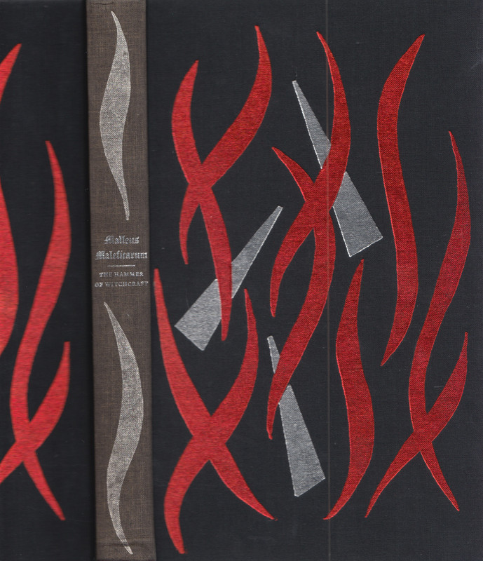
AFTER
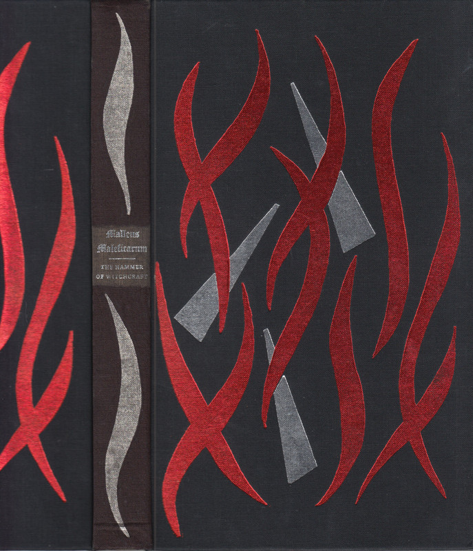

2overthemoon
But black comes in many shades...
I did try to touch up the faded gold lettering on an old book with a gold sharpie but regretted it because it came out wobbly, and it's very apparent in a photo, though not so much to the naked eye.
I've stopped worrying about faded spines (the silk ones are the worst offenders, and especially blue), just part of the aging process, like my wrinkles.
3skullduggery
>1 wcarter: Congrats, looks great! I have tried this sharpie trick before and had great success that has lasted for several years so far. I like your idea of the "band" around the fine lettering - looks very natural.
4wongie
Well done on getting a good outcome from it, these kind of repairs can be hit or miss. I'm with overthemoon on faded colouring being part of the natural aging process and wouldn't dared doing this though I have had tried my hand at the odd repair work involving pva glue to some endpaper corners that started peeling a smidgen or where the head-band was starting to detach from the book signatures, quite minor stuff.
5F.Trier
>1 wcarter: Good attempt on the book restoration and indeed an excellent candidate for performing sacrilege upon.
Yes, the Malleus is particularly prone to fading of its spine when exposed to sunlight. One might think that due to its content, FS had intended for it only being stored in a dark room bereft of sunlight :)
I indeed happen to be in possession of such a dark-kept copy, which not only shows the original black of the spine, but also the flames in their original red colour identical to the ones on the boards. Indeed, as I only have seen this one copy with red flames, I was for a long while under the belief that the flames were supposed to be silver coloured as the truncated triangles on the boards.
I can post some photos later if somebody is interested.
6joco30
I find that very odd. You're prepared to leave a contrast band on the spine, one you'll notice from now on every time you look at your shelves. But the nice contrast that the spine gave as a whole and which didn't look suspicious when looking over the shelves in your library, bothered you.
7folio_books
>1 wcarter:
Not at all repugnant - a visible improvement. It looks great. I might be tempted to try the same on my own copy but I doubt my colouring-in skills, my hands not being as steady as in previous decades. The contrast band works very well.
Not at all repugnant - a visible improvement. It looks great. I might be tempted to try the same on my own copy but I doubt my colouring-in skills, my hands not being as steady as in previous decades. The contrast band works very well.
8RogerBlake
Why not simply cover the spine area to stop it fading further then leave the whole book open in the sun with covers face up and after a while.the front and back will match the spine!
:-)
:-)
9treereader
>1 wcarter:
Just be careful when you read it...the sweat from your hand could reactivate the ink and rub off on your hand and spread to other parts of the book.
Just be careful when you read it...the sweat from your hand could reactivate the ink and rub off on your hand and spread to other parts of the book.
10Cat_of_Ulthar
>1 wcarter:
I'm not sure I would dare to do that myself (I rather like the natural patina of ageing plus my attempts to repaint some much-loved toy cars when I was younger were not a success) but you have done a lovely job :-)
>2 overthemoon:
'But black comes in many shades... '
Indeed it does, as Terry Pratchett once pointed out ('smoke something illegal and take a close look at a starling's wing' or something to that effect), and the ultimate 'none more black' is Vantablack*: apparently it is so black that the human eye is effectively unable to see it. So if it had been used on, for example, Folio's Lovecraft LE, the golden occult symbols would have appeared to float in thin air, which would have been quite an effect.
And you wouldn't even have to smoke anything illegal.
It is, unfortunately, also hideously expensive and can't be touched without destroying it, so not very practical for book covers**.
Or even classic rock sleeves: https://www.youtube.com/watch?v=pAgnJDJN4VA
:-)
*https://en.wikipedia.org/wiki/Vantablack
**https://mentalfloss.com/article/77190/6-facts-about-vantablack-darkest-material-ever-made
11Loki_Lulamen
I must say, I am wholeheartedly disappointed that you did not opt for the epitome of "Black Classic Rock Sleeves"
https://www.youtube.com/watch?v=46kXH6GGtT0
https://www.youtube.com/watch?v=46kXH6GGtT0
12Jayked
>5 F.Trier:
Yes, red is notorious for early fading, though to have it disappear completely is unexpected. Doesn't seem to discourage publishers from using it on expensive books.
Yes, red is notorious for early fading, though to have it disappear completely is unexpected. Doesn't seem to discourage publishers from using it on expensive books.
14wcarter
>5 F.Trier:
I would like to see some photos of your copy with the red flames on the spine, as every other copy I can see pictures on the web show silver flames on the spine. Yours may be the only unfaded copy left alive.
I would like to see some photos of your copy with the red flames on the spine, as every other copy I can see pictures on the web show silver flames on the spine. Yours may be the only unfaded copy left alive.
15F.Trier
>14 wcarter:
Sure thing. Luckily, I acquired some photos yesterday just in case anybody asked. Note that due to the black cloth, it is rather difficult to photograph the red properly, but when compared with the boards it is clear that they are in their original state. Last photo was taken with flash to better show the red, but this makes the black appear greyish which it is not.


Needless to say, it is currently being shelved inwards in a blinded cabinet :)
16wcarter
>15 F.Trier:
Superb copy.
Superb copy.
17folio_books
>14 wcarter:
I had a feeling that this title was reprinted many years later, which might explain the different colours but I can't find any evidence. The prospectus index tells us it appeared only from 1968 (year of first publication) to 1971. Folio 1968-1971 notes there was a second impression in 1969 with the lettering on the spine running vertically instead of horizontally and there's a photograph demonstrating the phenomenon. I myself have never seen a copy of this type. I have only the vaguest recollection of seeling a copy like the above, which I assumed was from my apparently non-existent 1990s/2000s reprint. Frustratingly, the actual prospectuses are no help. The only illustration appears in the 1968 prospectus. It's in black and white and shows only a mock-up of the binding with the spine either blank or obscured - the quality of the photograph makes it hard to tell.
I've searched Abe and eBay. Between them they have surprisingly few copies for sale at surprisingly high prices (Ardis £43.95), all showing the usual (faded) silver spine.
>15 F.Trier:
I assume the illustration of your book which you use for your LT library is a stock image? The book itself is in magnificent condition.
18F.Trier
>17 folio_books: The copyright page states nothing of this copy being a reprint. Indeed, the copyright page is identical to the 1st printing ones with horizontal text printed in 1968:

In my search for this copy, I in fact came across a 2nd printing of the books with the title vertically oriented, however, this also had silver flames on the spine (sorry for the fuzziness of the photo, it was the one provided by the vendor):

With regards to my LT library, then yes, I was using a stock photo previously as I had not gotten to photograph my own copy until now.
19folio_books
>18 F.Trier: The copyright page states nothing of this copy being a reprint.
I didn't ask because Folio have or had a habit of doing that with reprints. Not all the time, but sufficiently often for it to be irritating for bibliophiles. They've covered all traces of this one pretty well. Clearly, your copy exists, but finding a reference to it anywhere eludes me. In case of any doubt, I accept it is a genuine Folio publication. And well done on finding a copy of the second impression in the wild.
>18 F.Trier: I was using a stock photo previously
Yes, as do many people, myself included. If there's a significant difference I try to make time later to take a photo of the real thing but I sure there must be quite a few I've forgotten about.
20adriano77
>15 F.Trier:
What a cool looking book. I'd definitely grab a copy if it were re-released. Amusing subject matter no less.
What a cool looking book. I'd definitely grab a copy if it were re-released. Amusing subject matter no less.

