Folio Archives 283: Three Men in a Boat by Jerome K. Jerome 1992
Talk Folio Society Devotees
Join LibraryThing to post.
1wcarter
Three Men in a Boat by Jerome K. Jerome 1992
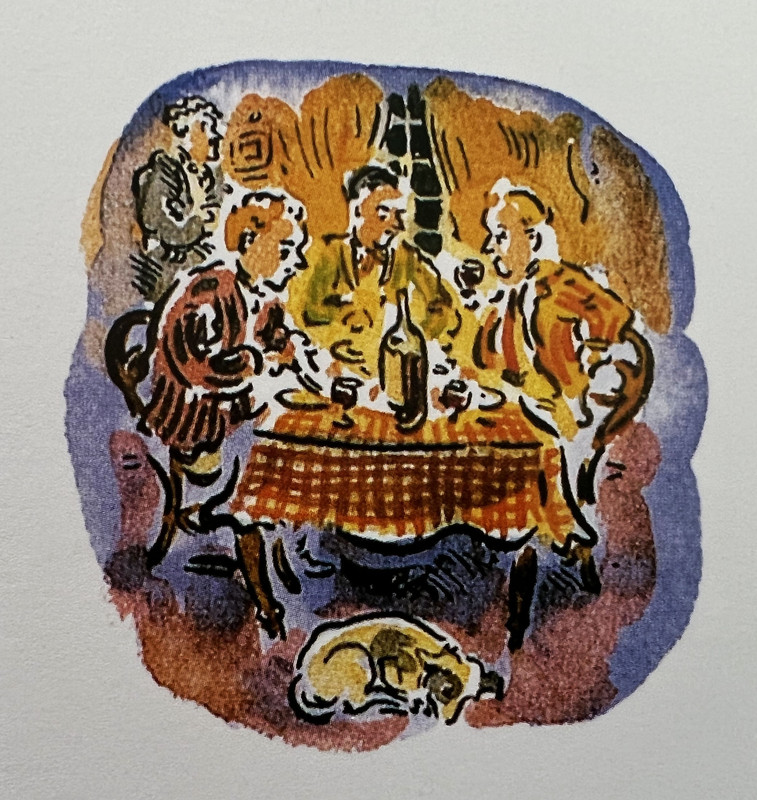
This is the amusing (and purportedly true) story of three men (and a dog) who in 1889 set off to row, tow and sail a small boat up the Thames from London to Oxford. It describes their adventures (accidents), experiences (mishaps) and discussions (arguments) during the journey, with many digressions, side-stories and tales within stories along the way. Because it was written by Jerome, it is of course a jolly tale, and you cannot read it without smiling constantly. It is a lovely insight to the holiday pleasures undertaken over 130 years ago in England.
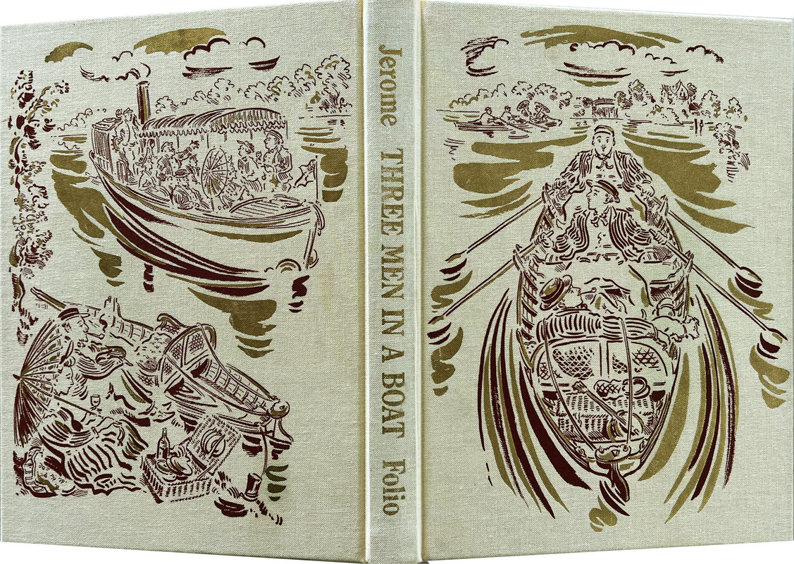
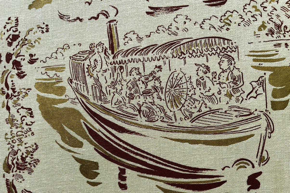
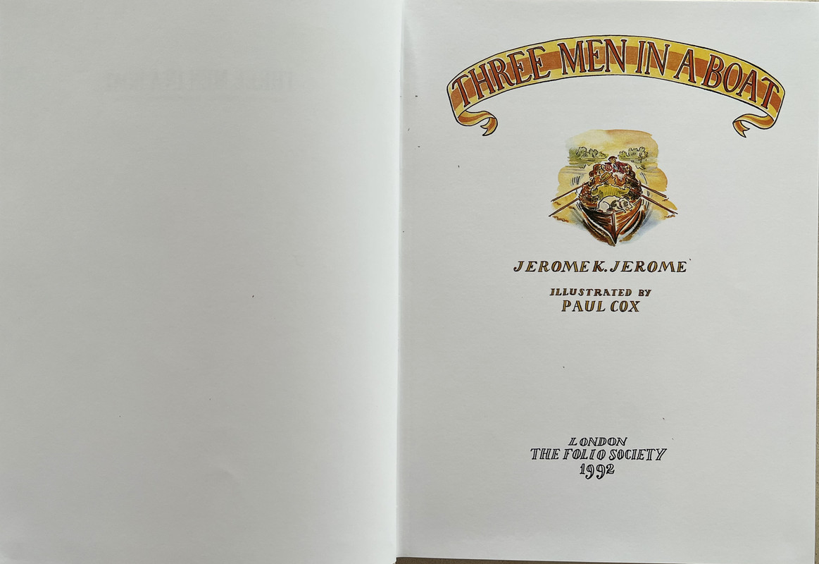
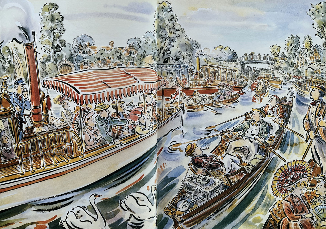
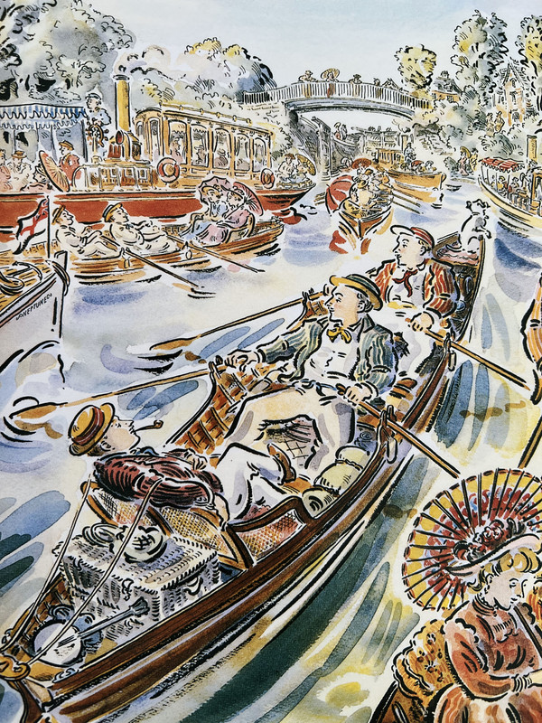
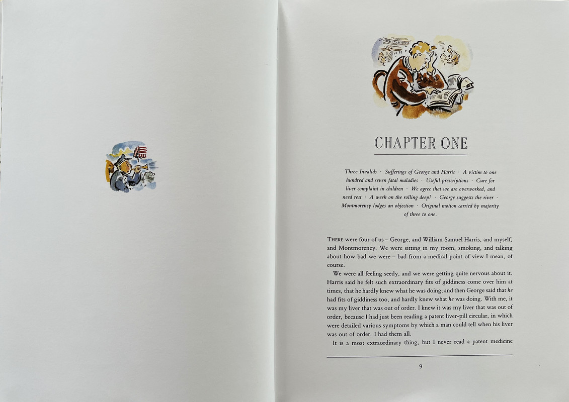
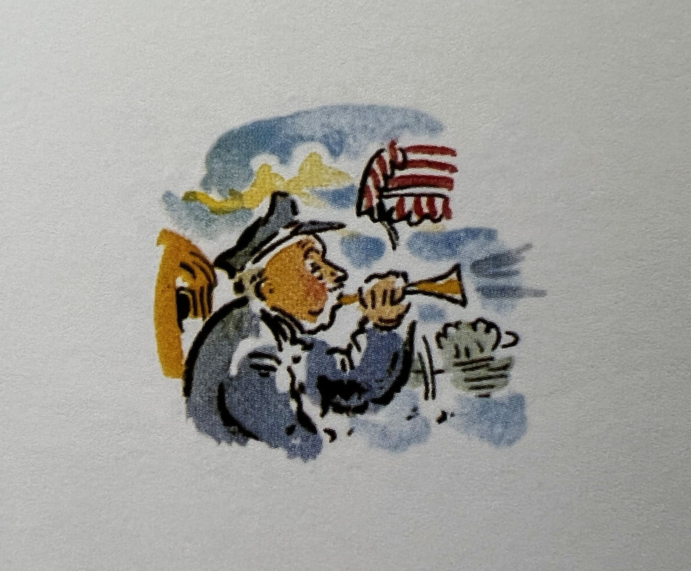
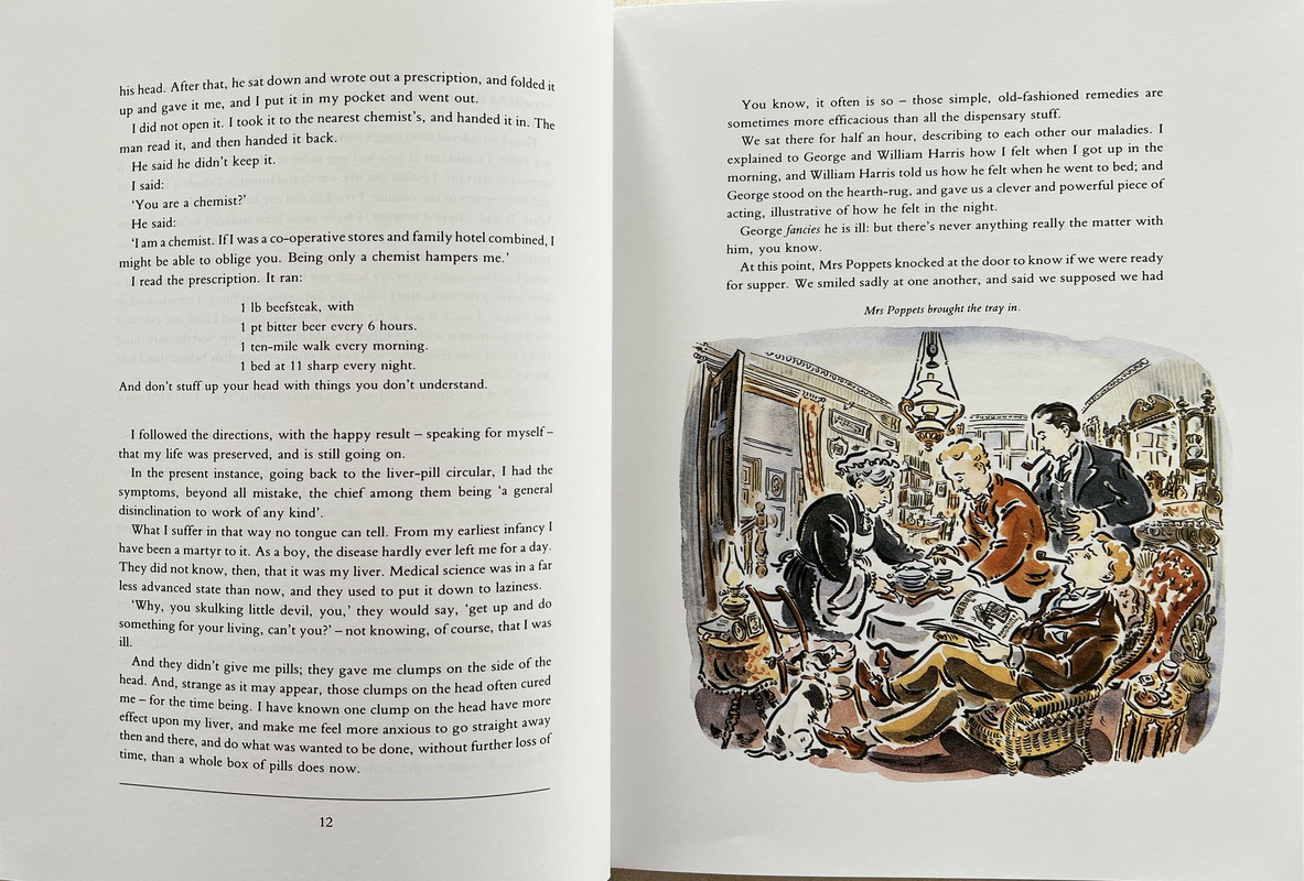
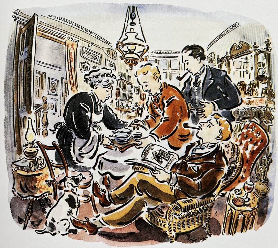
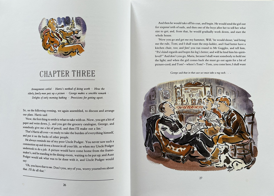
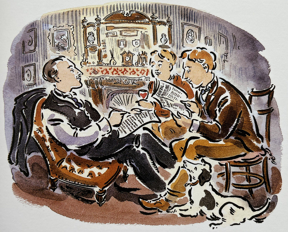
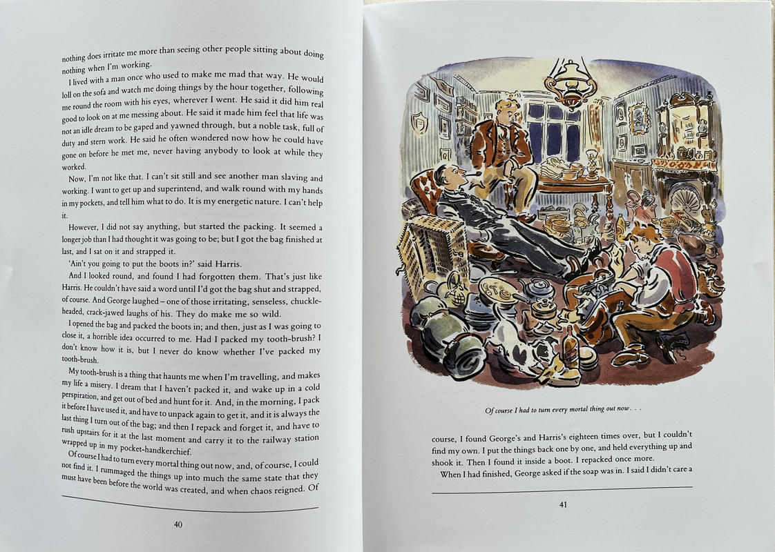
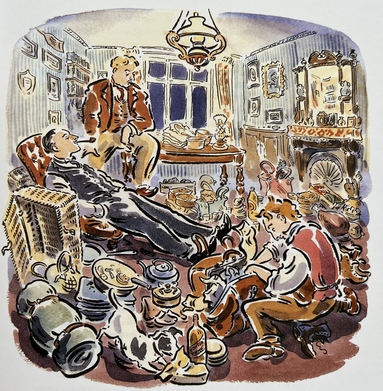
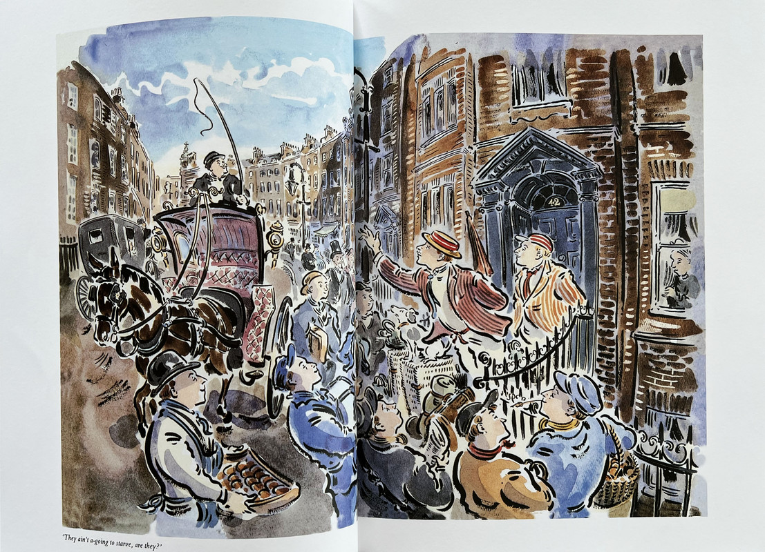
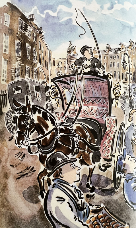
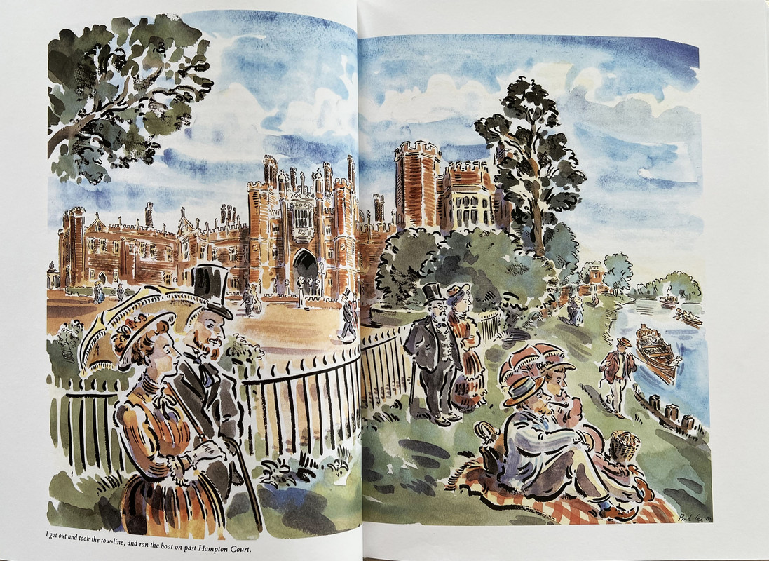
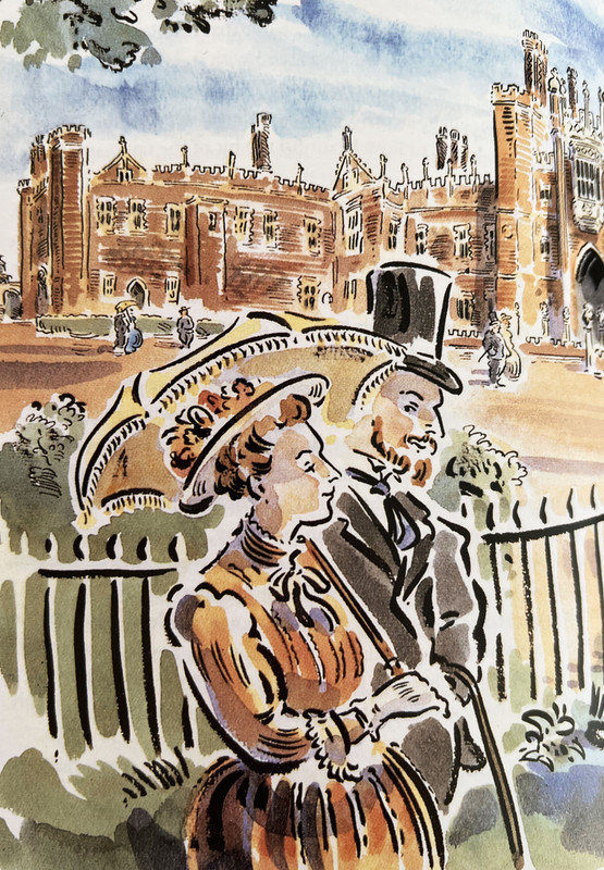
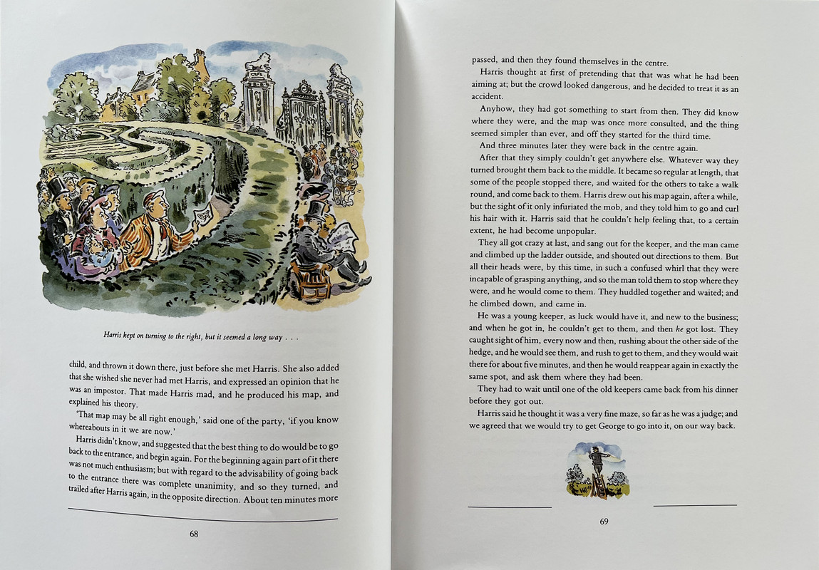
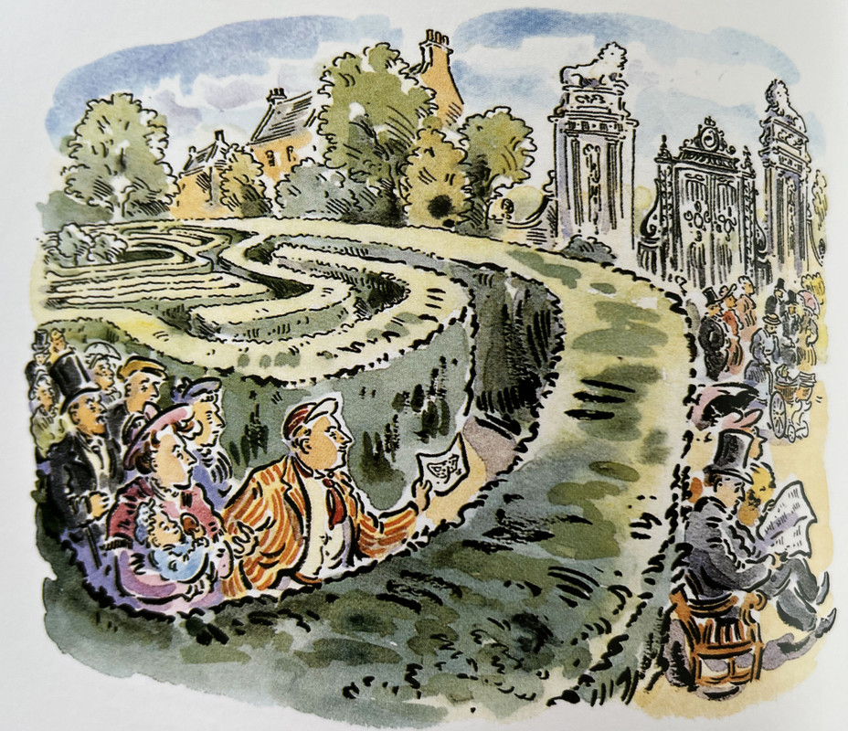
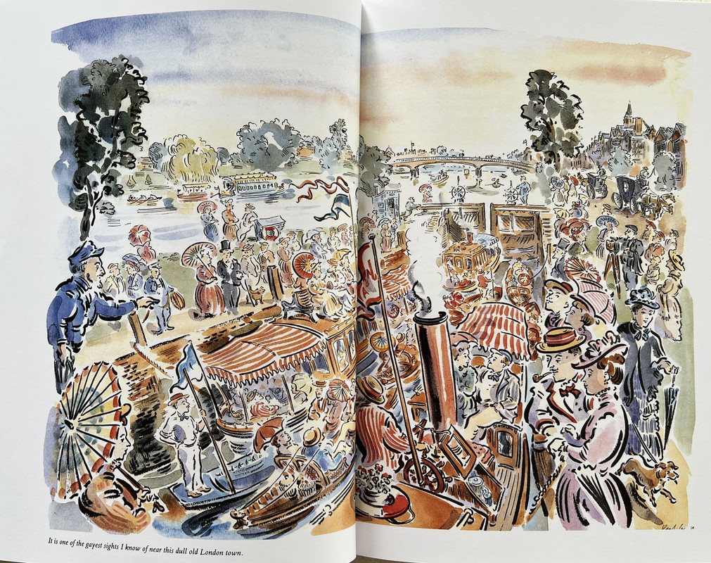
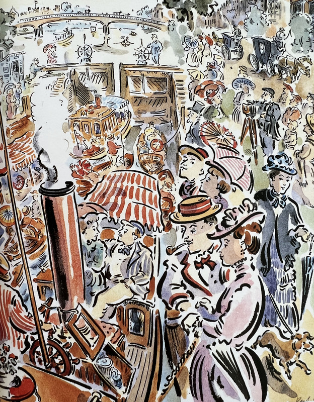
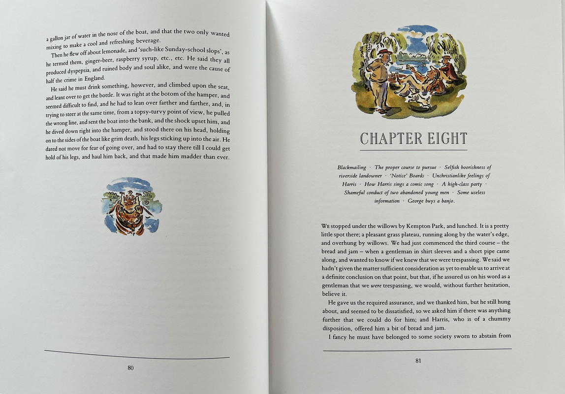
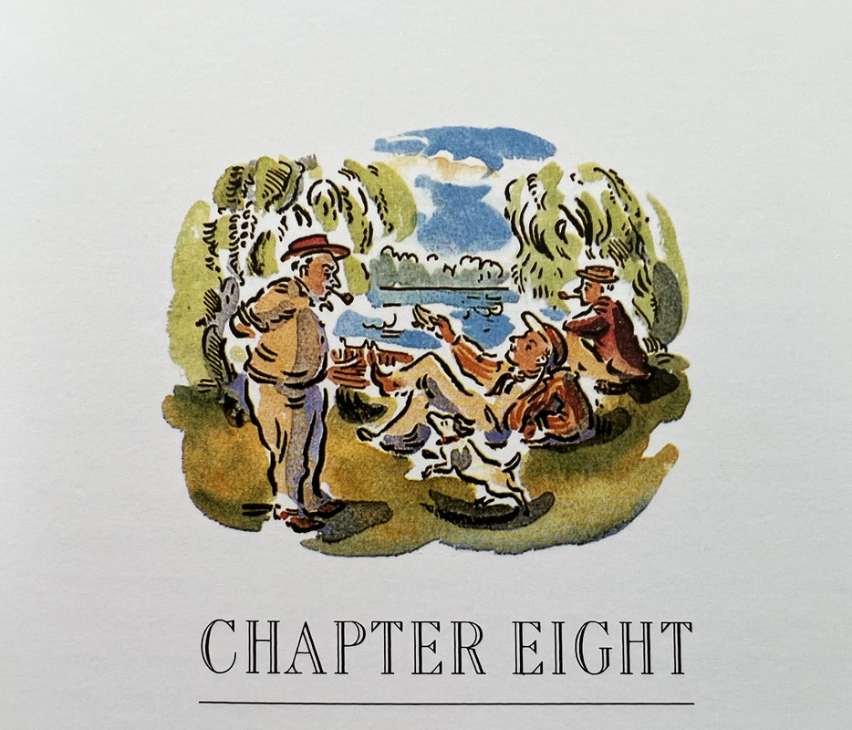
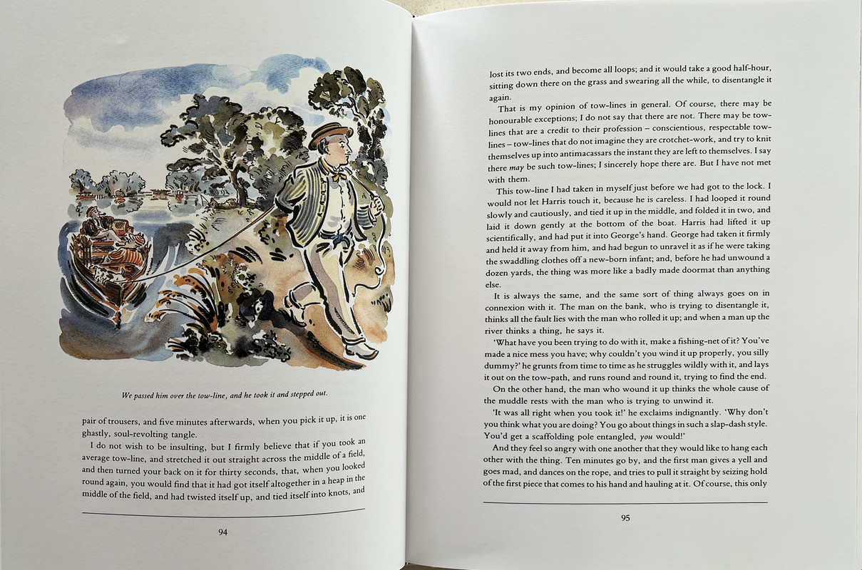
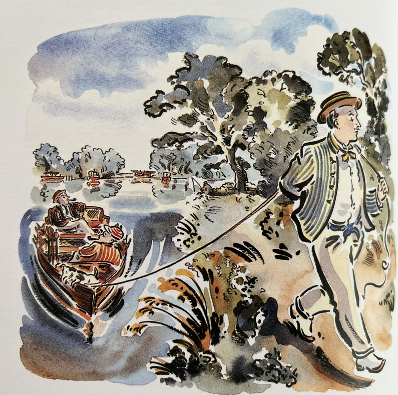
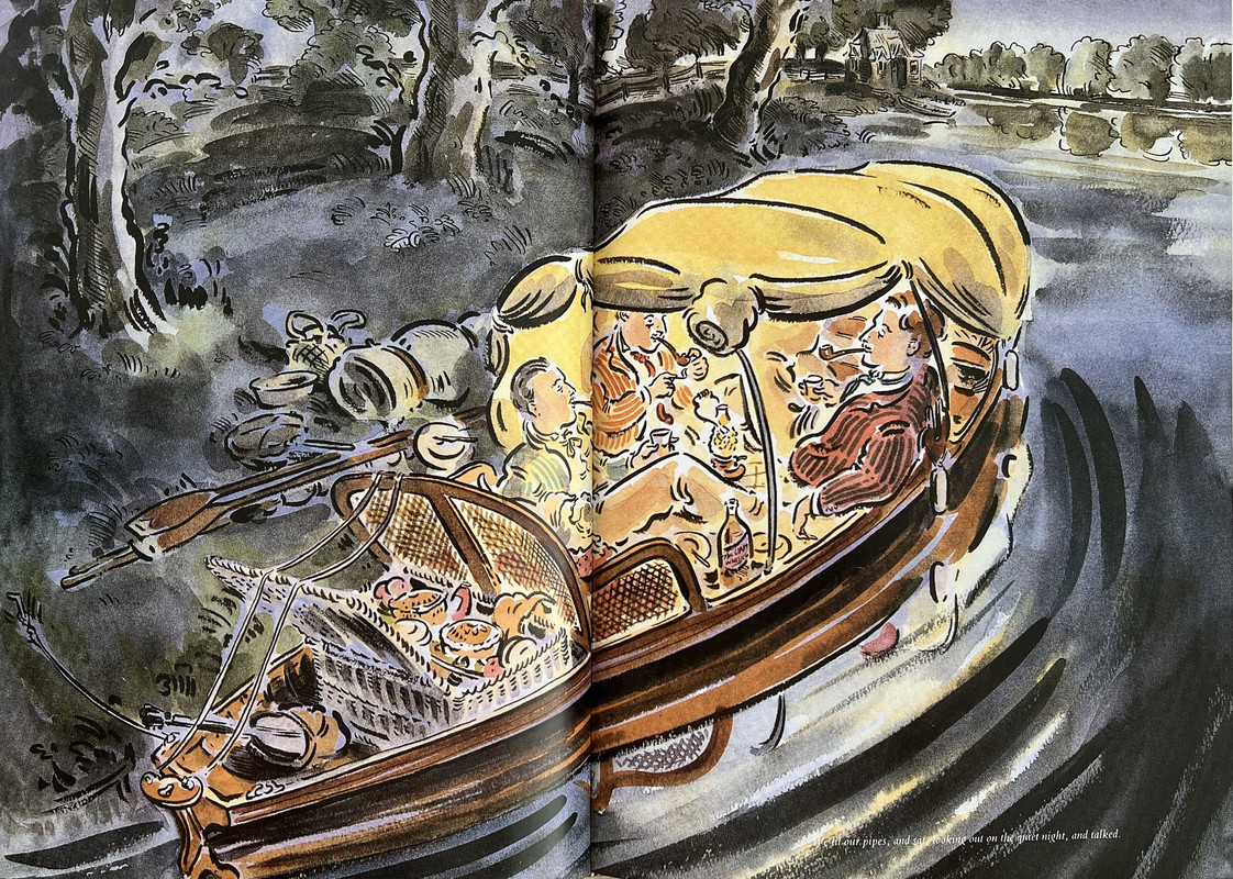
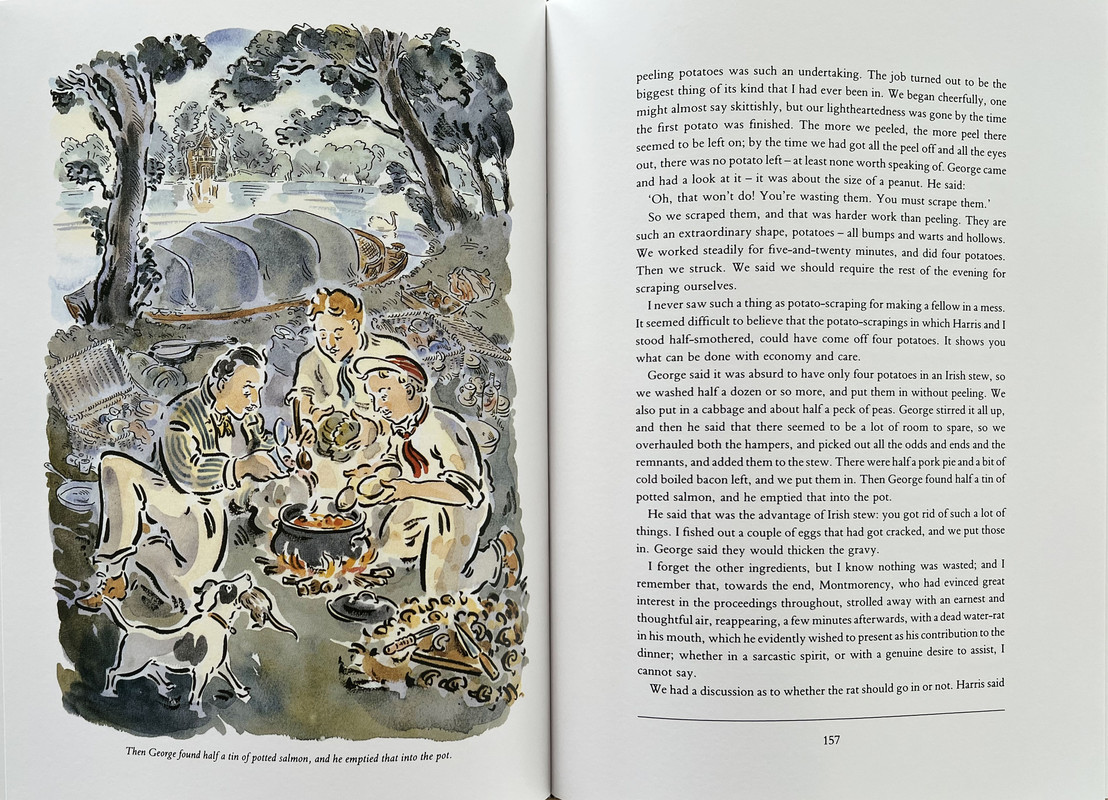
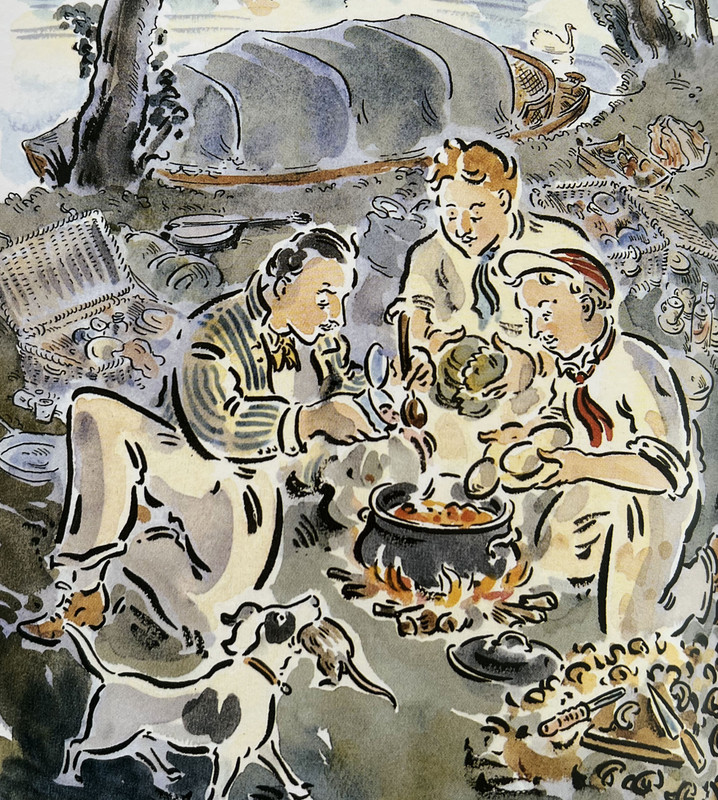
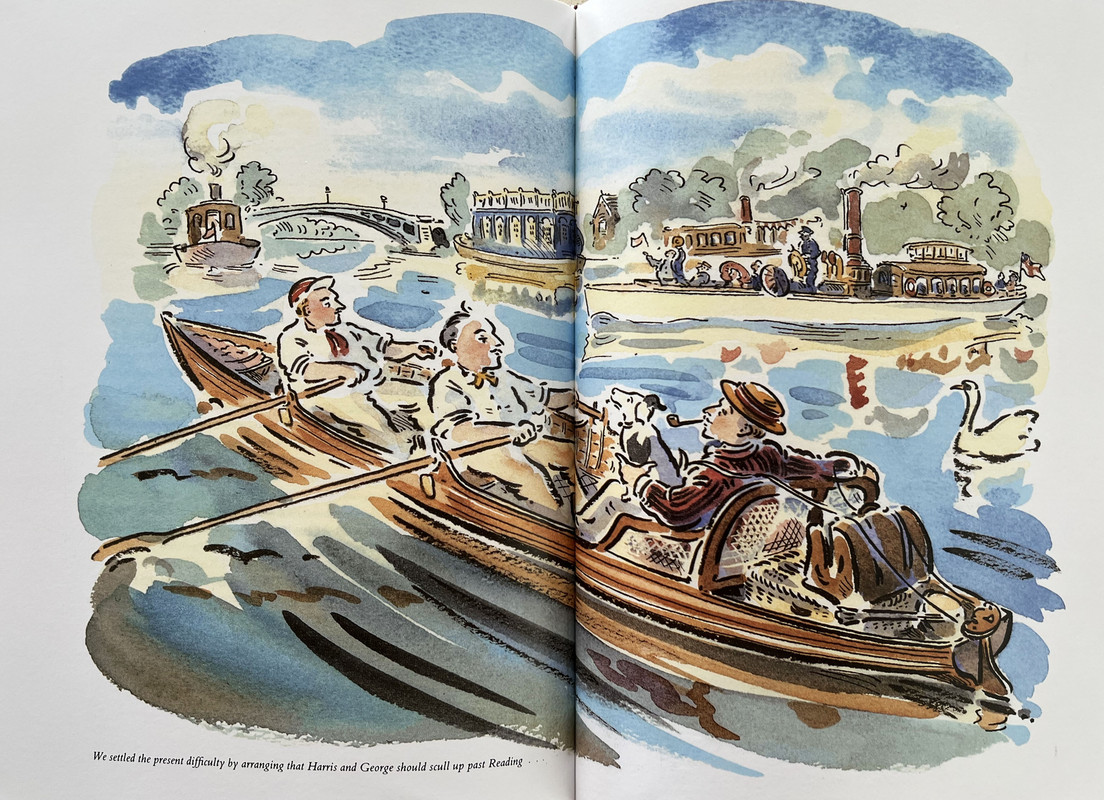
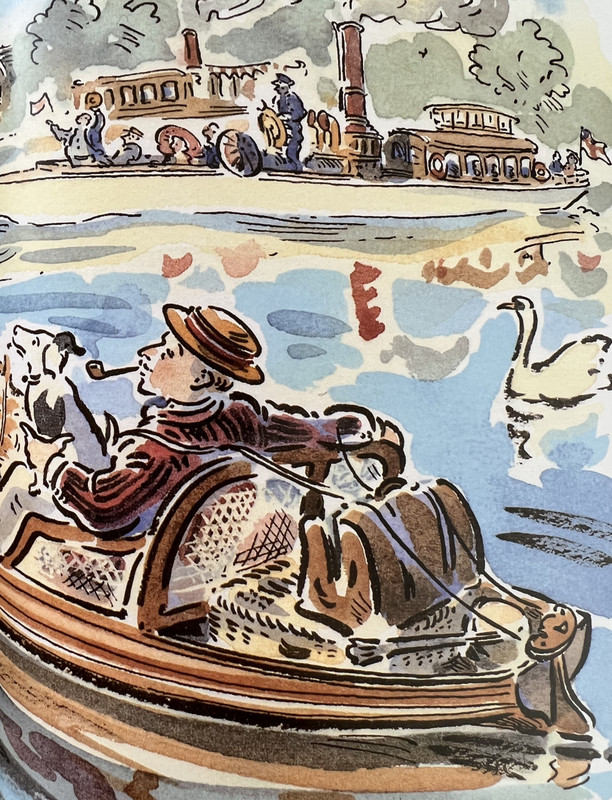
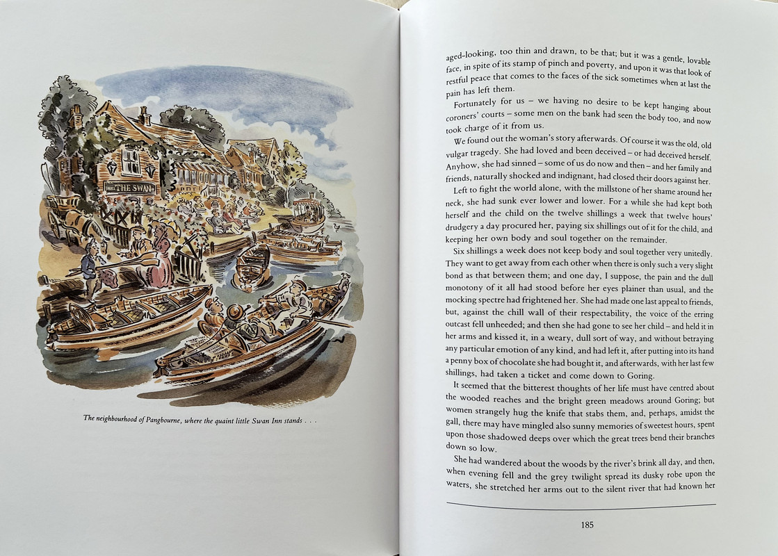
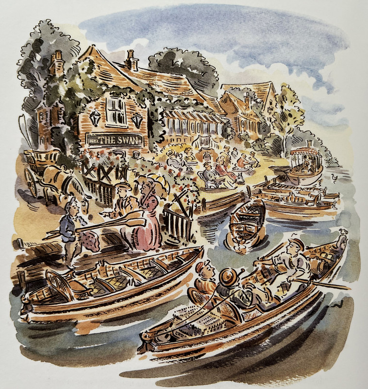
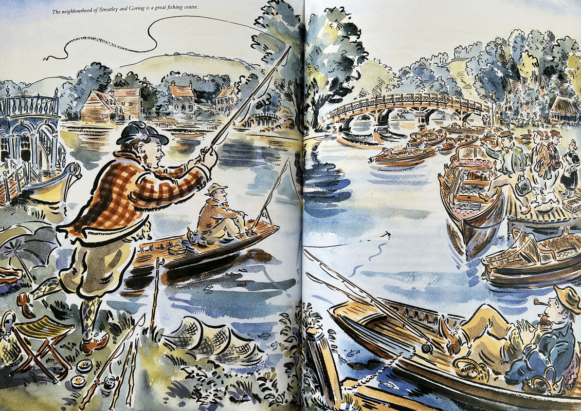
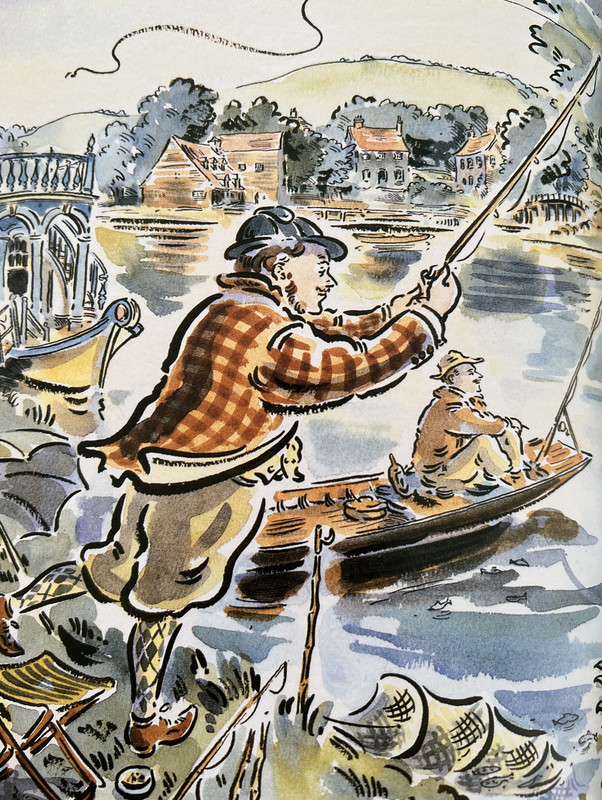
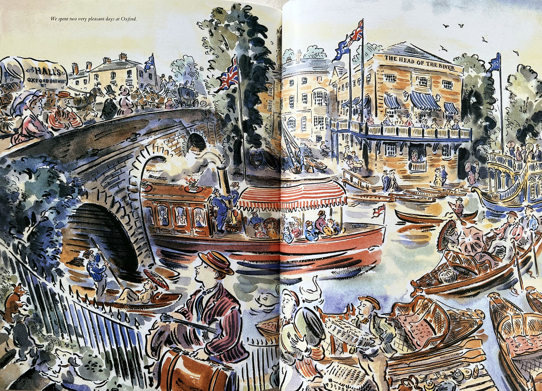
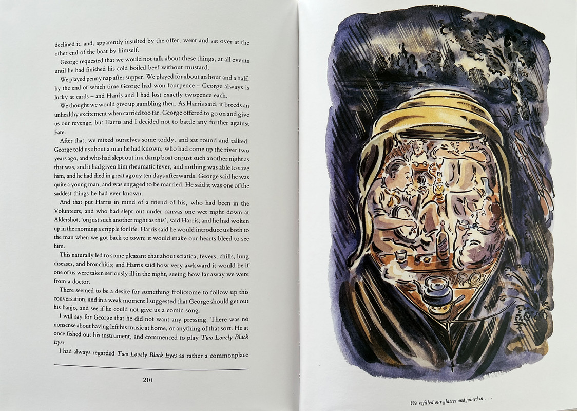
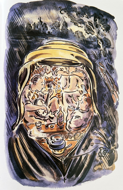
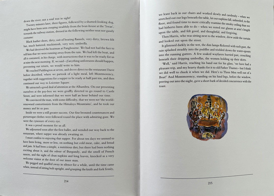
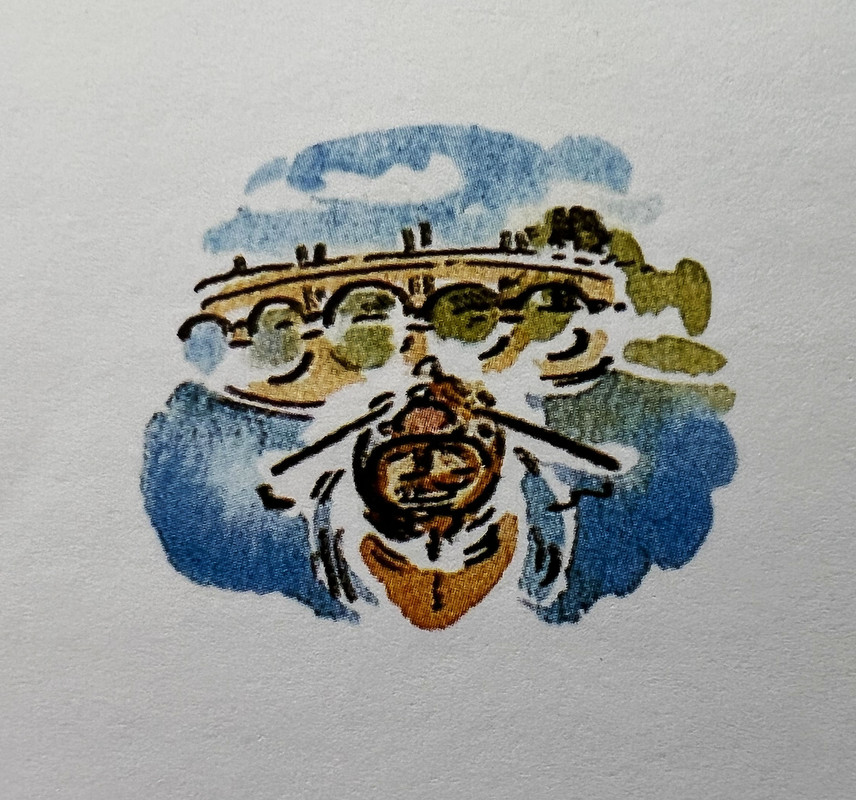
It is a quite large format book (the slipcase is 26.9x20.2cm.) and one of the most lavishly illustrated Folio Society books ever published with 85 brightly coloured illustrations by Paul Cox, twelve being double page spreads, and others varying from full-page and half-page to tiny chapter endings. There is no introduction.
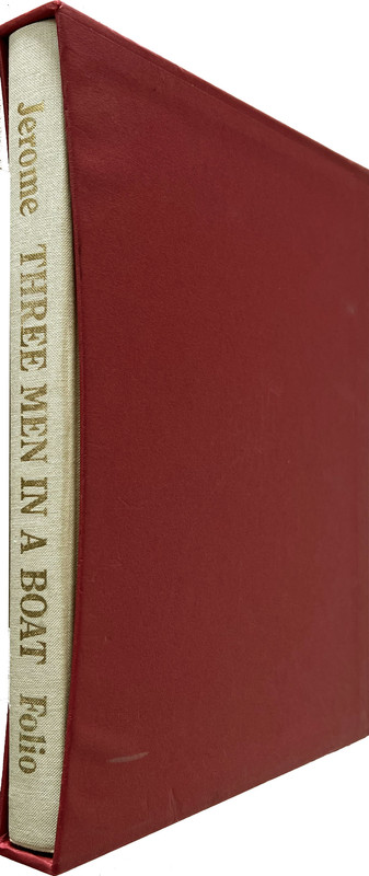
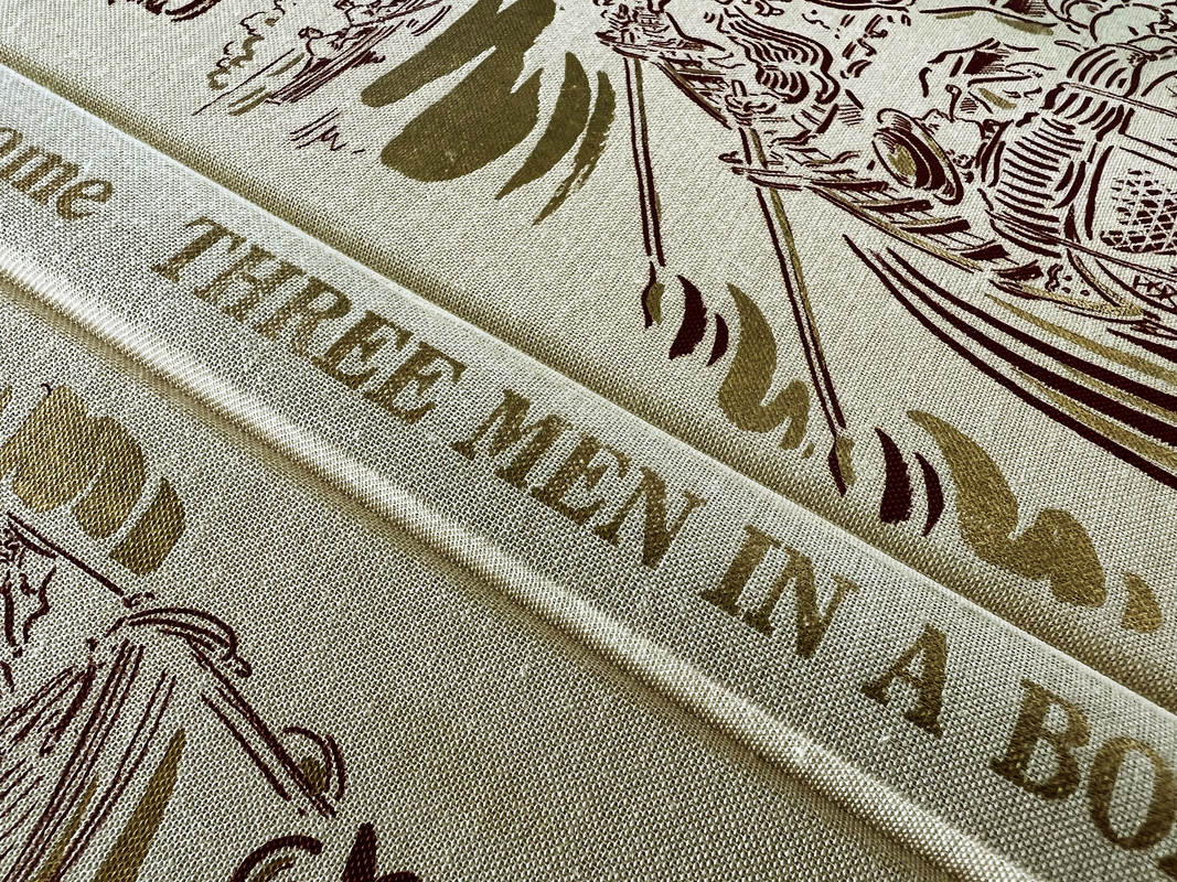
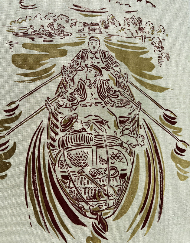
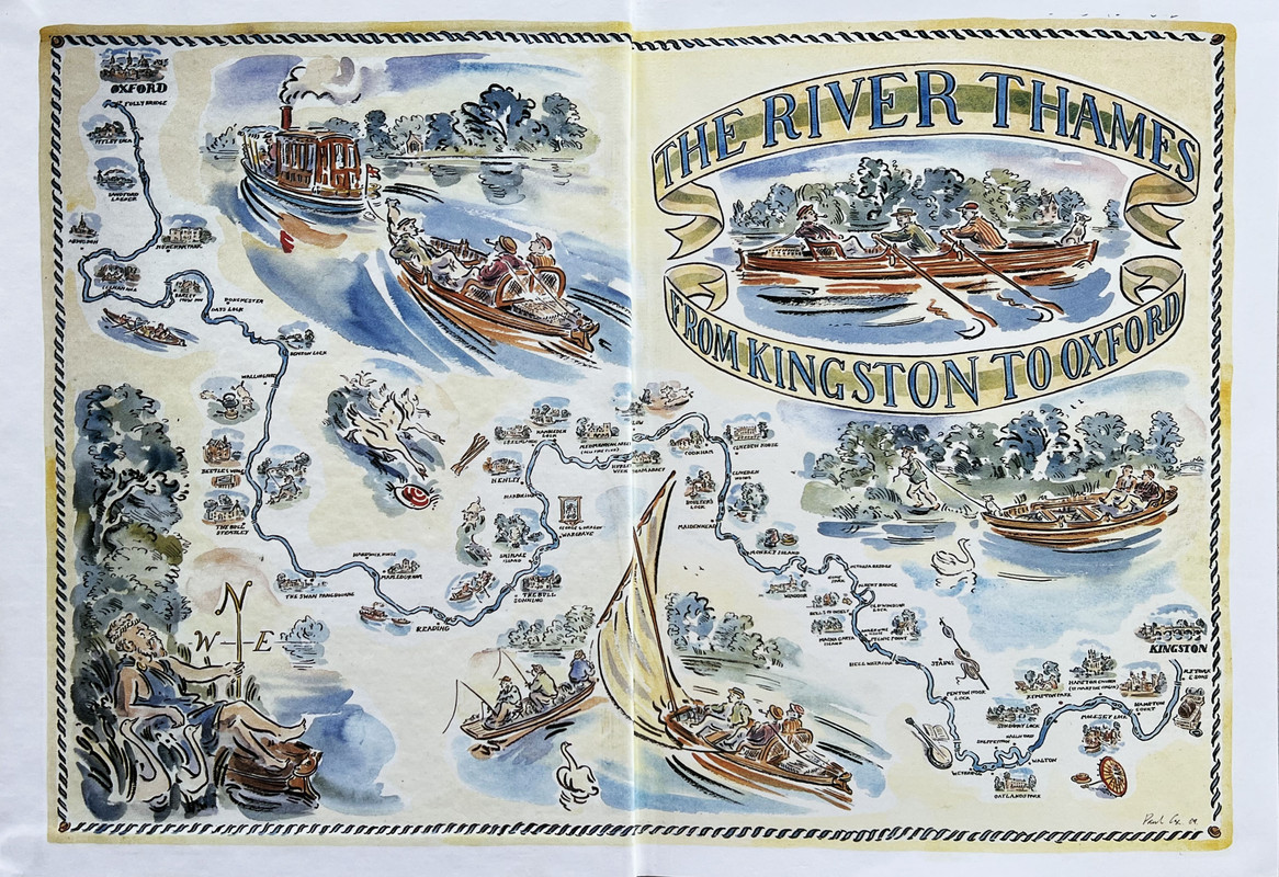
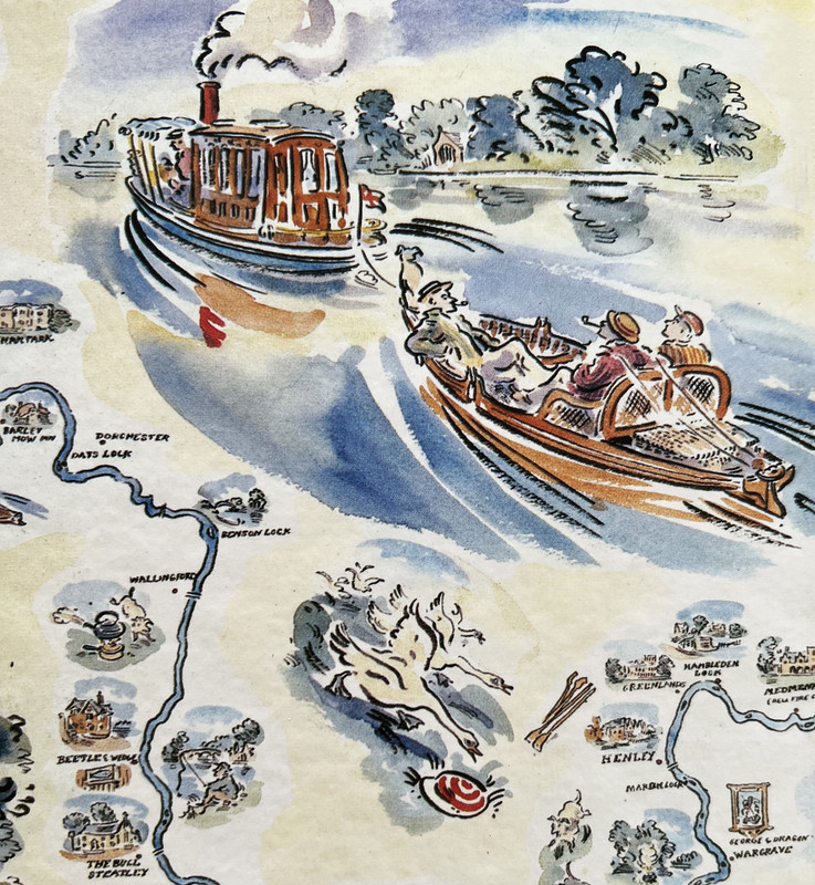
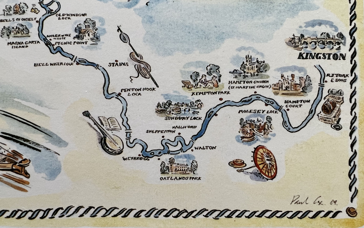
The 216 page book is bound in cream cloth blocked with a wrap-around cover design in dark red and gold by Cox. The endleaves are printed with a magnificently illuminated map of the Thames in its course from Kingston to Oxford. The slipcase is a plain red.
The Folio Society published a quite different edition in 1964 with 8 full-page drawings by Ian Ribbons that was bound in blue canvas with an illustrative design in brown by Ribbons, orange endleaves, a brown slipcase, and was 22.2x13.4cm. with only192 pages.
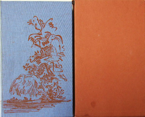
1964 edition - picture from Google.
A revision of the 1992 edition was published in 2007.
The pictures below are from the 1992 edition.


An index of the other illustrated reviews in the "Folio Archives" series can be viewed here.
This is the amusing (and purportedly true) story of three men (and a dog) who in 1889 set off to row, tow and sail a small boat up the Thames from London to Oxford. It describes their adventures (accidents), experiences (mishaps) and discussions (arguments) during the journey, with many digressions, side-stories and tales within stories along the way. Because it was written by Jerome, it is of course a jolly tale, and you cannot read it without smiling constantly. It is a lovely insight to the holiday pleasures undertaken over 130 years ago in England.
It is a quite large format book (the slipcase is 26.9x20.2cm.) and one of the most lavishly illustrated Folio Society books ever published with 85 brightly coloured illustrations by Paul Cox, twelve being double page spreads, and others varying from full-page and half-page to tiny chapter endings. There is no introduction.
The 216 page book is bound in cream cloth blocked with a wrap-around cover design in dark red and gold by Cox. The endleaves are printed with a magnificently illuminated map of the Thames in its course from Kingston to Oxford. The slipcase is a plain red.
The Folio Society published a quite different edition in 1964 with 8 full-page drawings by Ian Ribbons that was bound in blue canvas with an illustrative design in brown by Ribbons, orange endleaves, a brown slipcase, and was 22.2x13.4cm. with only192 pages.

1964 edition - picture from Google.
A revision of the 1992 edition was published in 2007.
The pictures below are from the 1992 edition.


An index of the other illustrated reviews in the "Folio Archives" series can be viewed here.
2CarltonC
Another wonderful post and copiously illustrated.
I love the Paul Cox illustrations, which I think perfectly complement this humorous book, even better than the FS Wodehouse books, and the slightly large size of the book aids appreciation of the pictures.
Off thread, I am always reminded of Boulter’s Lock by Edward Gregory, although a late Victorian, rather than Edwardian, painting.
https://artuk.org/discover/artworks/boulters-lock-sunday-afternoon-102528
3Cat_of_Ulthar
I'm afraid my knowledge of Three Men In a Boat is limited to having read the (beautifully illustrated) comic strip version featured in my brother's copies of Look and Learn when I was much, much younger. I enjoyed it very much but I've never read the original and, while I'm not a huge fan of Paul Cox, this edition looks very tempting.
And is there a little Folio joke there, having a boat trip to Oxford illustrated by somebody called Cox?
Many thanks for these reviews :-)
And is there a little Folio joke there, having a boat trip to Oxford illustrated by somebody called Cox?
Many thanks for these reviews :-)
4mr.philistine
>3 Cat_of_Ulthar: And is there a little Folio joke there, having a boat trip to Oxford illustrated by somebody called Cox?
...and typeset inBimbo Bembo :)
...and typeset in
6dyhtstriyk
This edition has ruined all Paul Cox illustrated books printed only in B&W for me. That's why I haven't bought any of the Folio Wodehouse books: seeing Cox´s art in B&W is a no no.
7mr.philistine
>1 wcarter: Thank you and enabled.
Three Men in a Boat was reprinted again in 2017, but with a pale blue binding; and the sequel Three Men on the Bummel in 2018.
This review on GoodReads is for the sequel:
The Bummel provides too few laughs in comparison to The Boat (say one laugh for every ten pages, instead of ten laughs for every page).
Besides, the linear narrative does not agree with the three men. Yes, the anecdotes were missed (to say nothing of the dog).
Photos below from the Ardis Books Folio Society Archive:

8ubiquitousuk
Is anyone in a position to compare the FS edition to that of the LEC? I have been planning to get the LEC, but the FS seems like it might be much more generously illustrated. Since I am local to this book's setting, I expect I'll put more value than usual on interesting illustrations of familiar sights.
9mr.philistine
>8 ubiquitousuk: https://georgemacyimagery.wordpress.com/2012/05/28/limited-editions-club-three-m...
Scans of the ML and prospectus in the above review state 'dozens of black-and-white sketches scattered in the margins' plus 'a number of color illustrations: twelve full-page and two double-spread'.
Scans of the ML and prospectus in the above review state 'dozens of black-and-white sketches scattered in the margins' plus 'a number of color illustrations: twelve full-page and two double-spread'.
10AMindForeverVoyaging
>8 ubiquitousuk: I am currently reading the LEC "Three Men". While I would recommend it, I do like the looks of the FS illustrations more. The LEC illustrations have a restricted color palette - 3-4 colors used - while the FS, as you can see, has vibrantly colorful illustrations. And I like the style of the FS illustrations more, They feel more evocative of the Victorian Era to me than the LEC, which have too much of a '70s art style to them. That said, the LEC paper is quite nice and I like the design of the book, and even its oblong shape.
11ubiquitousuk
>9 mr.philistine: >10 AMindForeverVoyaging: thanks both, though it doesn't get easier! The thing I like about the Folio edition is that I can see places I recognise in >1 wcarter:'s photographs (not true of the images shown on George Macy Imagery). But I'm also a sucker for nice paper. Hmmm, I might end up needing both.
12AMindForeverVoyaging
>11 ubiquitousuk: Yes, I would say that about the LEC illustrations, that they don't show much of the places visited on the river. The FS illustrations seem less generic in that sense to me.
13mr.philistine
My copy of the 1998 reprint - also reviewed above, arrived today. But I noticed that the entire book is printed on glossy paper. I suppose this fact complements the lighthearted theme of the book while also accommodating the aforementioned '85 brightly coloured illustrations' :|
ETA: Also, no table of contents. Straight to business!
ETA: Also, no table of contents. Straight to business!

