Folio Archives 409: A Connecticut Yankee in King Arthur’s Court by Mark Twain 2013
Talk Folio Society Devotees
Join LibraryThing to post.
1wcarter
A Connecticut Yankee in King Arthur’s Court by Mark Twain 2013
Written in 1889, this is Mark Twain’s great work of satire.
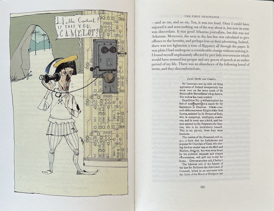
An everyday normal New England factory manager is knocked unconscious and wakes up in King Arthur’s court of Camelot. He decides he can bring modern technology from electricity and bicycles to telephones and other machines into the 5th. century court and brashly decides to modernise the country. As a result, all hell breaks loose. It is one of the earliest novels to imagine time travel and its consequences, and totally different to any other story written by Mark Twain. As well as being wildly imaginative and witty, the novel is also a critical commentary on contemporary society and politics.
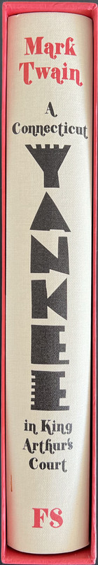
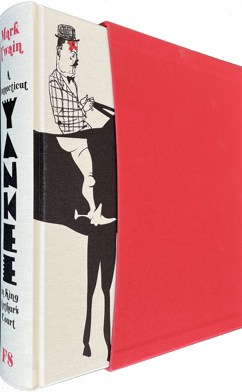
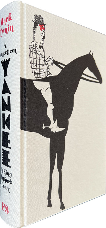
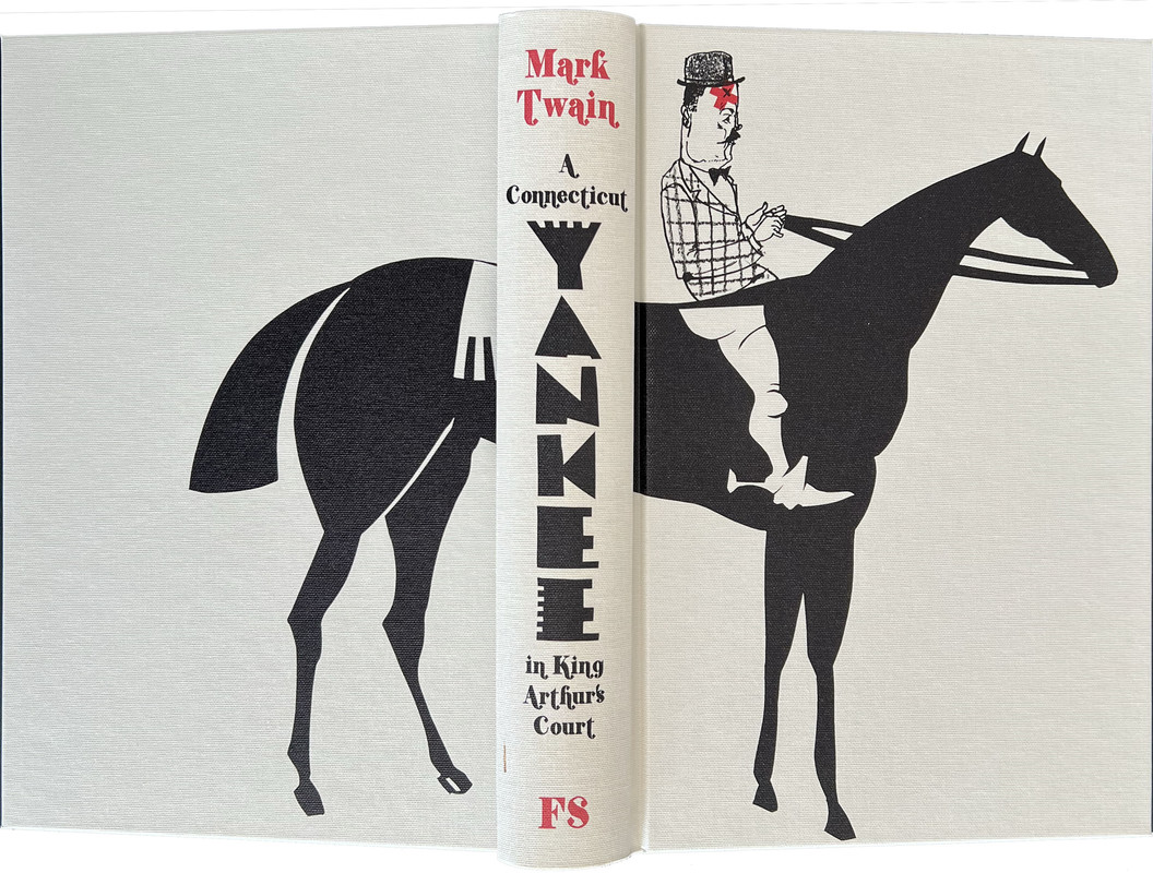
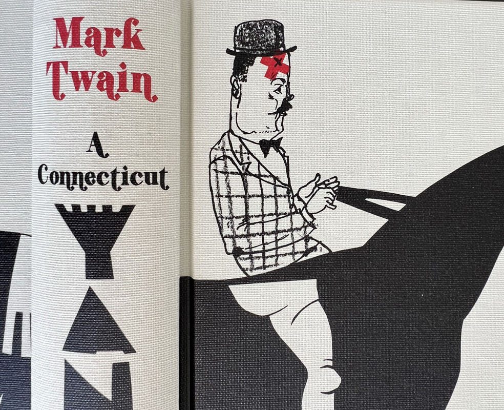
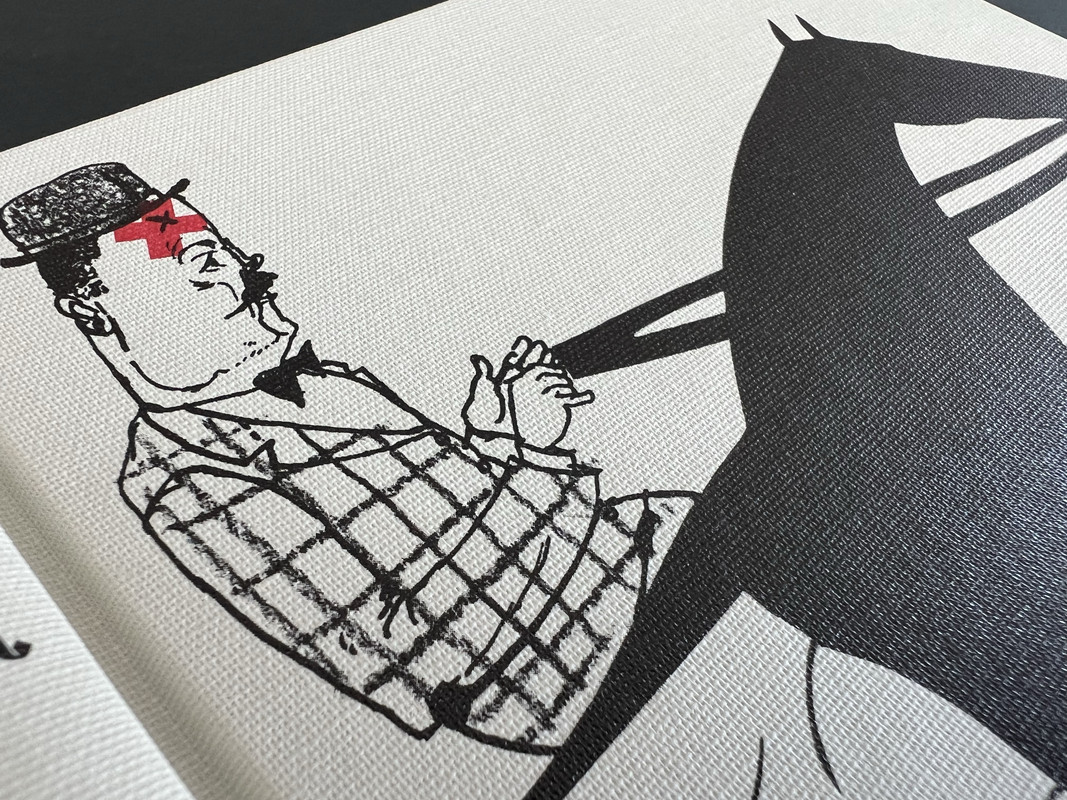
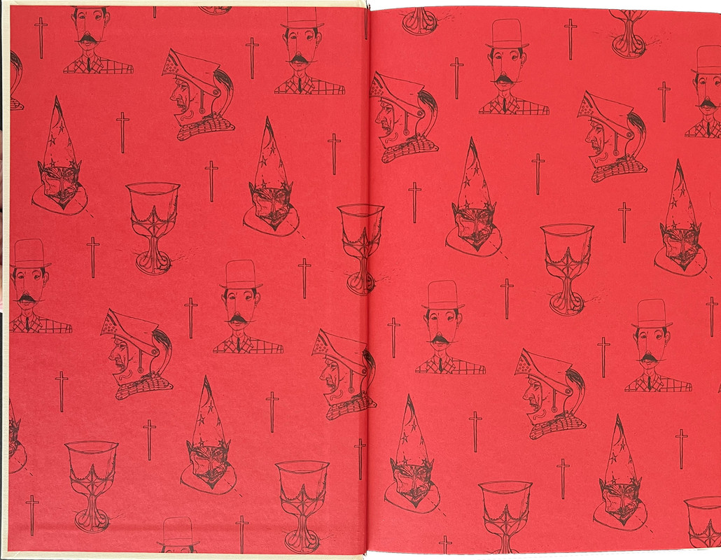
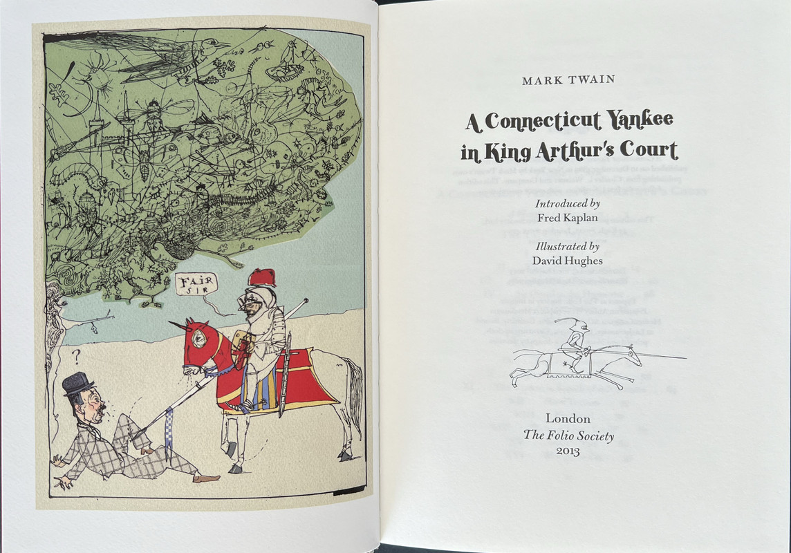
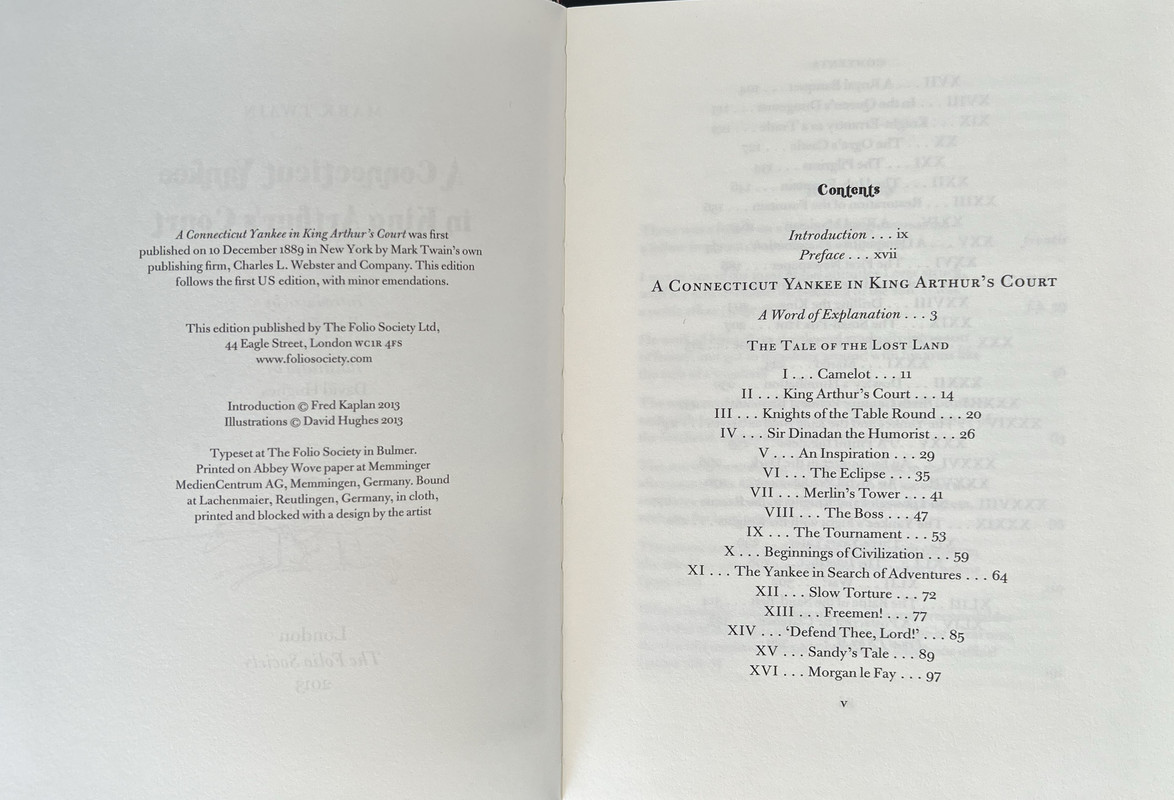
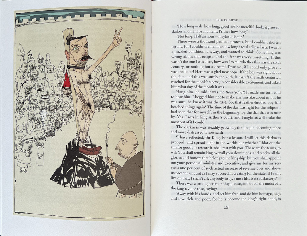
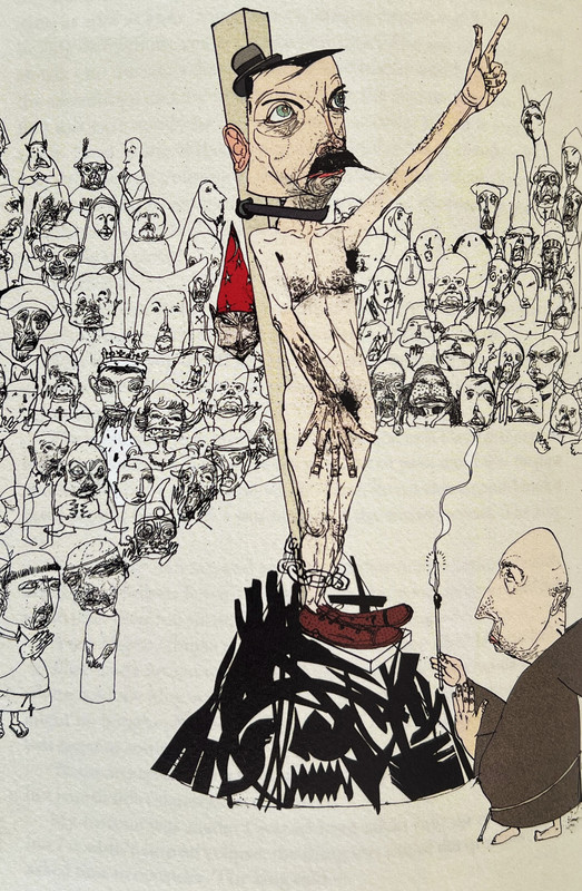
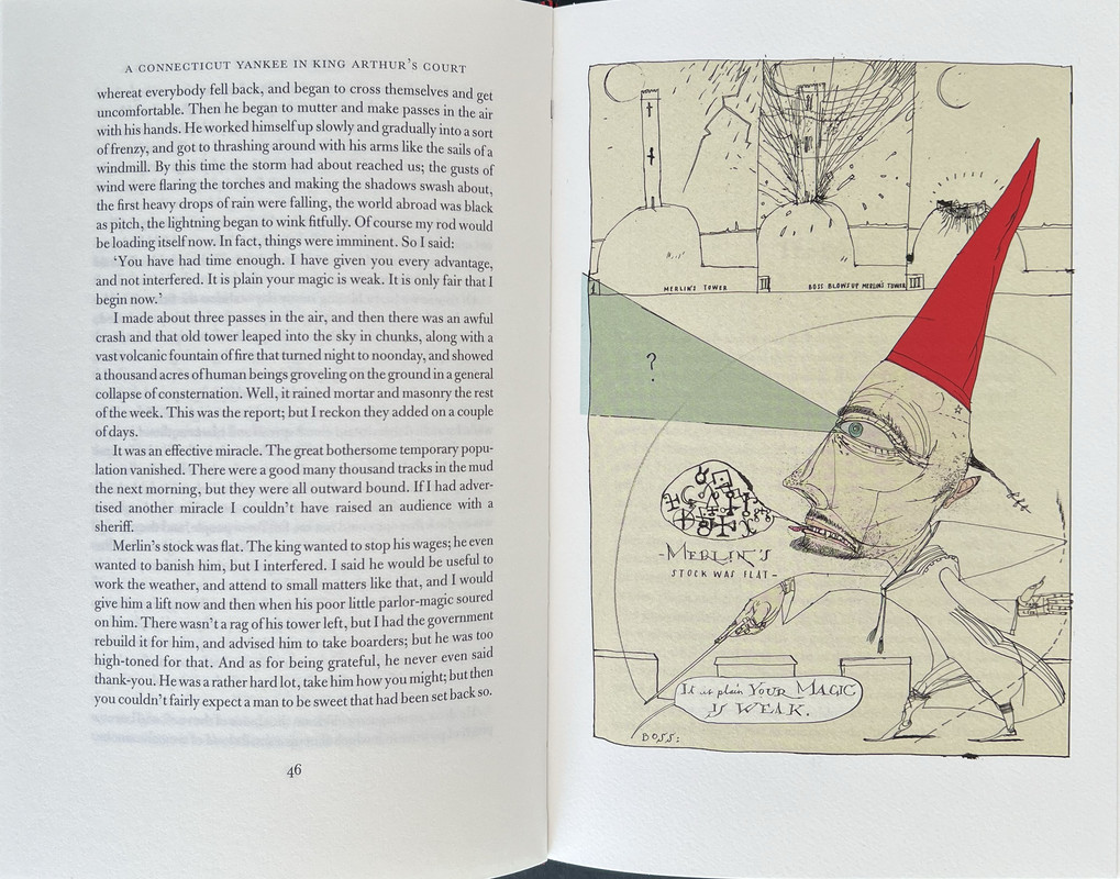
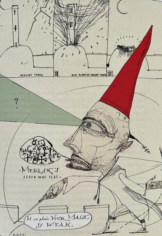
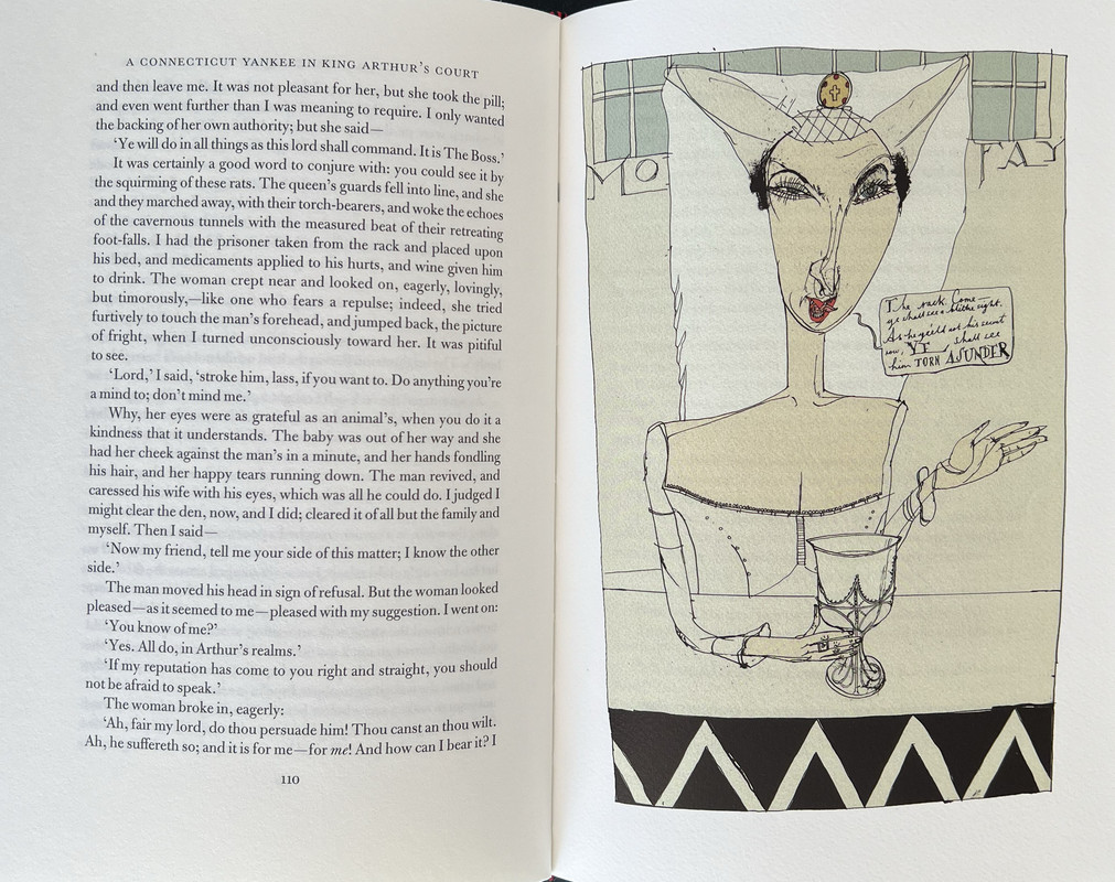
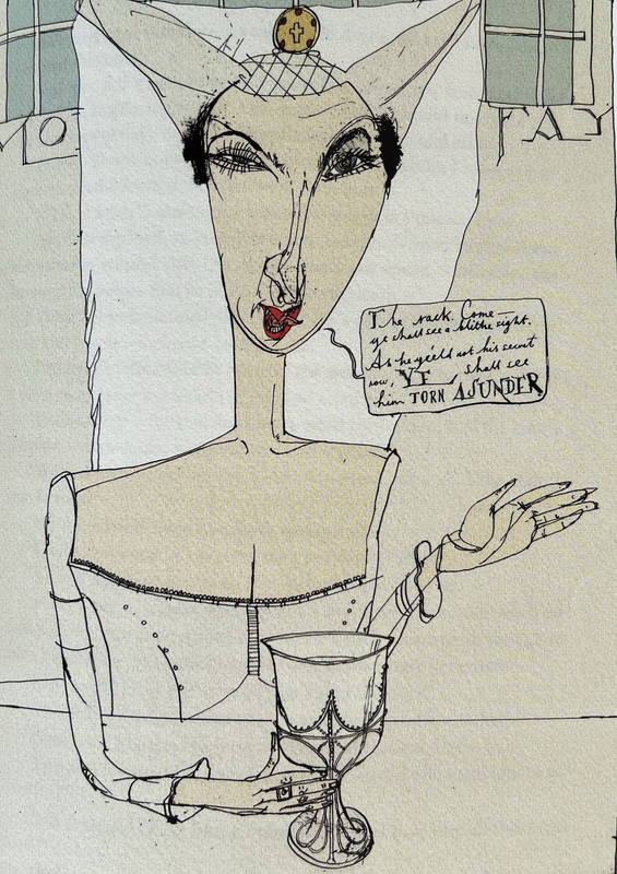
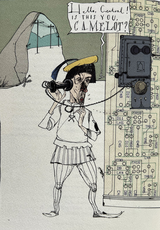
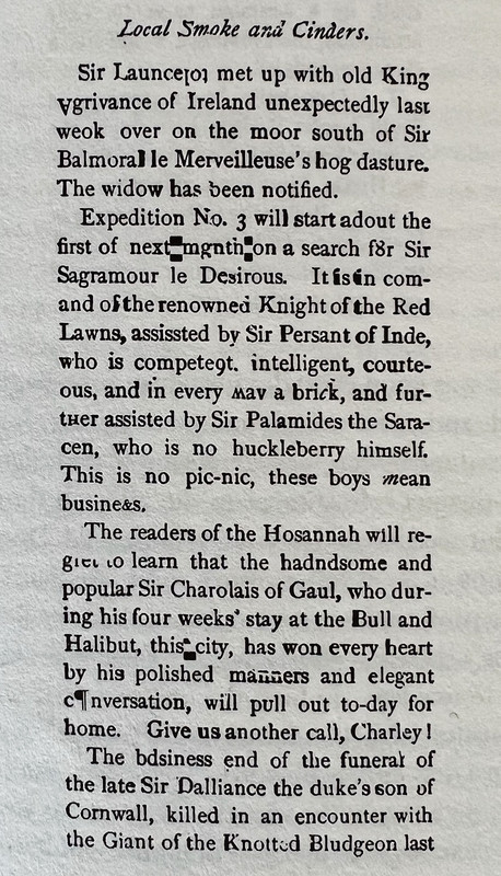
Bound in pale grey cloth printed on all sides with a black and red design by David Hughes, this 352 page novel is introduced by Fred Kaplan and has ten rather weird colour illustrations by David Hughes. It has red endpapers printed in black with repeating drawings. The plain red slipcase measures 24.8x163.9cm.

An index of the other illustrated reviews in the "Folio Archives" series can be viewed here.
Written in 1889, this is Mark Twain’s great work of satire.
An everyday normal New England factory manager is knocked unconscious and wakes up in King Arthur’s court of Camelot. He decides he can bring modern technology from electricity and bicycles to telephones and other machines into the 5th. century court and brashly decides to modernise the country. As a result, all hell breaks loose. It is one of the earliest novels to imagine time travel and its consequences, and totally different to any other story written by Mark Twain. As well as being wildly imaginative and witty, the novel is also a critical commentary on contemporary society and politics.
Bound in pale grey cloth printed on all sides with a black and red design by David Hughes, this 352 page novel is introduced by Fred Kaplan and has ten rather weird colour illustrations by David Hughes. It has red endpapers printed in black with repeating drawings. The plain red slipcase measures 24.8x163.9cm.


An index of the other illustrated reviews in the "Folio Archives" series can be viewed here.
2UK_History_Fan
Thanks for your review. While I hated these illustrations at first, and still don’t love them, I’ve grown a begrudging tolerance towards them. Would never have bought the book except it was in one of the old style sales at a ridiculously low price so snagged it despite owning at least two other copies with much better illustrations. And this absurd logic is why my shelves groan with overstock syndrome! 😱
4anthonyfawkes
I’m torn, I really don’t like this illustration style but I find the pictures artistically very intriguing and think that they work. They remind me a bit of Monty python in the construction.
I think I’ll end up with this book one day and find myself staring at the pictures that I don’t like far more than ones I find pleasing, like I keep doing when I come back to this thread.
I think I’ll end up with this book one day and find myself staring at the pictures that I don’t like far more than ones I find pleasing, like I keep doing when I come back to this thread.
6ubiquitousuk
I had always ignored this edition because the binding looked a bit bland. But I now see that I like the illustrations (there's no accounting for taste...) Might need a second look
8anthonyfawkes
This thread prompted me to go look up David Hughes’s portfolio and it’s quite something.
I think I’d like to see more books illustrated by him: https://centralillustration.com/illustration/david-hughes
I think I’d like to see more books illustrated by him: https://centralillustration.com/illustration/david-hughes
11assemblyman
>8 anthonyfawkes: He has also done Count Belisarius, The Sixteen Satires and One Flew Over the Cuckoos Best for FS.
12David_Mauduit
I'm not a huge fan of the illustrations but in the case of One Flew Over The Cuckoos Nest I think they fit very well.
16cwl
I find it astounding how much discussion there has been regarding the illustrations by those who have casually admitted to not having read the book. Surely the debate should start here? Would one judge the appropriateness of a film poster or trailer without having seen the film? Connecticut Yankee is a very quick and lively read as well.
17Chemren
>16 cwl: Would one judge the appropriateness of a film poster or trailer without having seen the film?
The whole point of a film poster or trailer is to entice one to see the film. Intriguing illustrations could act the same way to draw one into the book.
I am currently reading the FS edition of Consider Phlebas. The illustrations in that one are boring and generic. I don't particularly like the illustrations in Connecticut Yankee, but I have to admit they are interesting to look at.
19drasvola
>16 cwl:
I have the FS edition, have read the book and love this book's illustrations and others done for FS by David Hughes. I guess, "One man's meat is another man's poison."
I have the FS edition, have read the book and love this book's illustrations and others done for FS by David Hughes. I guess, "One man's meat is another man's poison."
20PeterFitzGerald
>16 cwl: "I find it astounding how much discussion there has been regarding the illustrations by those who have casually admitted to not having read the book. Surely the debate should start here?"
I think that only works one way round: it would be difficult to say with much certainty that illustrations are perfect without having read the book, because even if they are visually stunning, they may not fit the tone of the story, accurately reflect how characters/scenes are described, etc. But I think it's perfectly valid to say that one simply does not like illustrations regardless of how they fit the book.
I think that only works one way round: it would be difficult to say with much certainty that illustrations are perfect without having read the book, because even if they are visually stunning, they may not fit the tone of the story, accurately reflect how characters/scenes are described, etc. But I think it's perfectly valid to say that one simply does not like illustrations regardless of how they fit the book.
21folio_books
>19 drasvola:
David Hughes is one of my favourite Folio artists, Antonio. Everything he does is an instant buy for me (are you listening, Marketing Department?) But I can see why he might not appeal to everyone.
David Hughes is one of my favourite Folio artists, Antonio. Everything he does is an instant buy for me (are you listening, Marketing Department?) But I can see why he might not appeal to everyone.
23Cat_of_Ulthar
>15 LT79: The wiki article on Hughes* mentions that he has produced satirical cartoons for a variety of publications but it doesn't give much away about his influences.
I like Hughes' work, too. It's not what I would call 'beautiful', although others might think otherwise, but it's arresting and draws me in.
* https://en.wikipedia.org/wiki/David_Hughes_(illustrator)
Edited to add: I'm sorry I missed this exhibition of his work last year, entitled: 'Why Can't You Draw Something Nice...?'
https://centralillustration.com/news/david-hughes-new-solo-show
24drasvola
>21 folio_books:
Many thanks for your comment, Glenn. Glad to know I'm not alone in the world of fans of some illustrators.
Many thanks for your comment, Glenn. Glad to know I'm not alone in the world of fans of some illustrators.
25podaniel
>21 folio_books:
Ditto--I own all his illustrated editions. I probably wouldn't have picked up the Mark Twain if someone else illustrated it.
Ditto--I own all his illustrated editions. I probably wouldn't have picked up the Mark Twain if someone else illustrated it.
26jillmwo
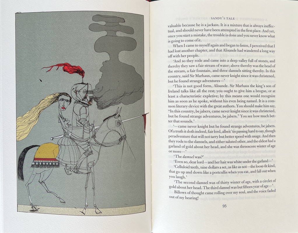
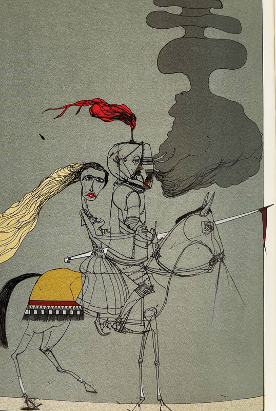
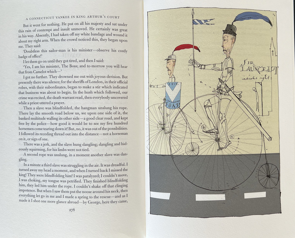
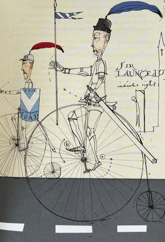
It isn't that one objects to the idea behind the illustration (why this incident? why render it in this fashion?) but rather I object to the execution. My impression is that the illustrator wanted to draw attention to the concept of an unromantic culture being overlaid or imposed onto an absurdly romanticized idea of a culture. Knights on Bicycles rather than on horses. There's a bit of dissonance and the artist's line drawings convey the dissonance. That may or may not be intriguing to the reader. For my taste, I would find it disruptive to my enjoyment of the text.
28folio_books
>22 HonorWulf: Reminds me a little of Egon Schiele
Good call! The similarity hadn't struck me previously, but you're right.
Good call! The similarity hadn't struck me previously, but you're right.
29cwl
>26 jillmwo: The knights on bicycles concept is taken directly from a scene in the book, as indeed is the whole of the juxtaposition between Arthurian and modern technology, so I don’t follow how this would be disruptive to the reading experience?
Cruikshank’s style has roots further back in British political cartoons, from Rowlandson stretching back to early woodcuts. One can certainly argue the aesthetic pros and cons, but one must understand the novel’s plot before discussing the illustrator’s intent and content, I hope we can agree?
Cruikshank’s style has roots further back in British political cartoons, from Rowlandson stretching back to early woodcuts. One can certainly argue the aesthetic pros and cons, but one must understand the novel’s plot before discussing the illustrator’s intent and content, I hope we can agree?
31cwl
>30 LT79: My apologies: early morning autocorrect made a mess of my post. It’s Thomas Rowlandson, not Rawlison. Also important were James Gillray, and of course for his content, though in a more realistic style, Hogarth.
32antinous_in_london
>30 LT79: I’m not sure they did suggest that no-one should discuss the art without reading the book, but that reading the book gives context for illustrations.
One commenter took an illustration of a knight on a bicycle & tried to turn it into a tenuous argument about dissonance & how the illustrator is actively trying to ‘draw attention to the concept of an unromantic culture being overlaid or imposed onto an absurdly romanticized idea of a culture’ & that the illustrations would therefore be ‘disruptive’ to their enjoyment of the book.
Surely it helps to know that the illustrator is simply illustrating a scene that is actually in the book itself so any dissonance/disruption involved is the authors doing. Had the commenter read the book they would have known this context rather than trying to blame the illustrator for being ‘disruptive to my enjoyment of the text’ when the text & the illustrations are actually in alignment.
34antinous_in_london
>33 LT79: Agreed. Anything can be commented on by anyone - but knowledge & context usually lead to a more informed comment.
35cwl
>34 antinous_in_london: Thank you both for understanding and clarifying my original comment. This was indeed my point.

