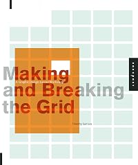
Design Elements: A Graphic Style Manual
by Timothy Samara
On This Page
Description
This updated version of Rockport's best-selling Design Elements covers all the design fundamentals, from working with grids, color application, typography, and imagery to finally how to put it all together.Tags
Recommendations


Member Reviews
I like to consider myself The World's Foremost Expert On Standing Around In Big Chain Bookstores Pawing Through All The Pricey Graphic Design Books, so I can recommend this book without hesitation. It's packed full of info and great examples, all in extremely small fonts, so as to pack more info into the book. Just terrific in every parameter, and at $30 it's about half the price of what it ought to cost.
For having little background in this area, I found this book thorough and thought provoking. In the spirit of creativity, it provides full coverage color, type, structure and other expected elements, enriched by a set of rules to follow or depart from knowingly.
This book covers a lot of the same things that most general graphic design books cover. This isn’t necessarily a bad thing – reading the same information from different sources really helps to reinforce things for the reader. That certainly was the case in this respect.
What this book does really well is with the introduction and the appendix – it explains and illustrates 20 rules that each designer should follow, and then goes into what the best ways to break them are. It goes into why you may want to break these rules and (while breaking these rules may end up being awesome for the project you’re working on) shows what you may be compromising from the other rules when you break one.
The examples that were chosen to illustrate show more everything throughout the book were quite good too – I will definitely be keeping this on my shelves and flipping through it when I need to look for inspiration.
What I really particularly didn’t like about this book was how it made note of paragraphs. You know how these days, there’s a carriage return and potentially the first line of the next paragraph is indented, etc etc. Paragraphs in this book were noted by a square bullet, no carriage return, no indentation, just a square bullet separating two sentences. Yes, I realize that this is how things were done back when print was originally gaining popularity, but when you never see it anymore, it’s hard to get accustomed to and makes it highly distracting when reading. Doesn’t flow nearly as well as it could have if the paragraphs were formatted how we’re used to… That’s one of the things that graphic designers need to remember when designing something. Yeah, it’s all good to be inventive and original and awesome, but you’ve also got to remember that user experience is extremely important and if what you’re doing is getting in the way of communicating with the user then you should reevaluate your solution.
Getting off soapbox.
The Bottom Line
A solid coverage of graphic design principles. Would highly recommend to those new in the field or those looking to revisit and strengthen their grasp on some of the fundamentals of good design. show less
This is an great basic book on graphic design. It covers the basic rules and gives you clues of when it is okay to bend or break the rules depending on what design you are working on. It has a lot of samples which is great for the very visual individuals like me.
Ratings
Members
- Recently Added By
Lists

Quarto
21 works; 1 member
Author Information

21 Works 1,073 Members
Timothy Samara is a graphic designer and educator based in New York City, where he divides his time between teaching at the School of Visual Arts, NYU, and Fashion Institute of Technology; and writing and consulting through STIM Visual Communication
Common Knowledge
- Canonical title
- Design Elements: A Graphic Style Manual
- Original publication date
- 2007-04-01
Classifications
- Genres
- Art & Design, Nonfiction, General Nonfiction, Business
- DDC/MDS
- 686.22 — Applied science & technology Manufacture for specific uses Printing and related activities Printing Typography
- LCC
- Z246 .S225 — Bibliography, Library Science and Information Resources Book industries and trade Practical printing
- BISAC
Statistics
- Members
- 246
- Popularity
- 132,179
- Reviews
- 4
- Rating
- (3.76)
- Languages
- 5 — English, German, Italian, Portuguese, Spanish
- Media
- Paper, Ebook
- ISBNs
- 12
- UPCs
- 2
- ASINs
- 1