This topic is currently marked as "dormant"—the last message is more than 90 days old. You can revive it by posting a reply.
1Chatterbox
Here's where you can post your covers to query if they meet the challenge guidelines, or just generally discuss how and why publishers might use only words to sell a book.
Do words-only covers ever pop out at you on the bookshelves? If so, what makes them do so? The color, the design, the texture of the pages, the type of type (sorry about that!) used?
To recap the rules of this challenge:
Look for books whose cover design relies on letters/typography ONLY.
I'll be reading The Haves and the Have-Nots for this challenge -- if you check out the cover, you'll see what I mean.
The ONLY EXCEPTIONS:
1. When an illustration is used to represent a letter (see the above book).
2. When there is a tiny illustration used to break up the text or accent it, as in the swastika on the cover of A Most Dangerous Book; NB, it can't be more than 1/2 inch in diameter. (State of Wonder does not qualify, because there's a border around the sides that is more than an inch thick and runs the length and width of the book.)
3. When there are abstract lines or patterns that do NOT form a recognizable pattern or image. (See the cover of Montecore.
4. When the publisher puts its logo on the book (such as a Penguin logo on the old Penguin paperbacks).
Places to look for these:
1. Non-fiction
2. Foreign language books (there are a number of French books that don't use illustrations on the cover -- and yes, these count!)
3. Old Penguin crime novels and paperback novels -- the orange and green covers.
4. ARCs -- they count as long as they abide by the above guidelines.
I'll be very interested to see what you all turn up -- and what thoughts you have on cover appeal!

3cushlareads
Suzanne, I think that all the Persephone books with plain grey covers qualify and I'm thrilled because I have 4 to read! They look like this:
(um, back in a second...)

The only thing on the front cover, apart from the title, is a Persephone logo.
(um, back in a second...)

The only thing on the front cover, apart from the title, is a Persephone logo.
4gennyt
Good challenge. 1) because I'm just reading a book about fonts and typefaces, so will be interested to see the designs people choose, and 2) because I have loads of early green penguin classic crimes waiting to be read, as well as one Persephone, so lots of choice. Where to start?
5DeltaQueen50
I have this older Zane Grey sitting on my shelves, I think it's perfect for this challenge.

The Vanishing American by Zane Grey

The Vanishing American by Zane Grey
6Eat_Read_Knit
Ooh, I have a grey-cover Persephone in the TBR pile: Bricks and Mortar. I'll read that if those count.
7gennyt
I may make a start with Miss Marple and the Thirteen Problems, as this is the second Miss Marple book and I have now read the first. Classic early Penguin cover with Gill Sans typeface for title and author.


9swynn
Re: "how and why publishers might use only words to sell a book"
I don't know whether this cover design has helped sales of The Information : a History, a Theory, a Flood. I expect it's a bit too high-concept to provoke impulse sales. But I love it:

In the sea of typographical data, it takes a minute to identify the title, subtitle, and author -- exactly the information the cover ought instantly to convey. It's busy, it's ugly, and it's perfectly evocative of the author's subject.
10Chatterbox
I love some of these! Anne, yes, you're good with that -- it def. falls within the exceptions. Morphy, all you have to do is measure the tiger-like car -- if it's 1/2 inch or less long or high, then you're good to go. If more than that, sorry... (I can't tell from the image, but I'll trust you to be honest about it!)
I'm a bit bummed because Unnatural Selection by Mara Hvistendahl that I do want to read this month has a bunch of tiny images in a row. Each on their own is less than 1/2 inch in diameter -- but collectively, they make up a kind of long frieze across the width of the book! Blech.
I'm a bit bummed because Unnatural Selection by Mara Hvistendahl that I do want to read this month has a bunch of tiny images in a row. Each on their own is less than 1/2 inch in diameter -- but collectively, they make up a kind of long frieze across the width of the book! Blech.
11lahochstetler
I'm going to be reading Dry by Augusten Burroughs- another nice example of using typography to express the ideas of the book.

ETA- confounded images!!!

ETA- confounded images!!!
12kiwiflowa
I have a whole shelf devoted to orange penguins. I love the effect of having them all together. I also love how simple they are, the size, typeset and lack of distracting covers not to mention the price is very appealing to me. Penguin will be releasing another 25 in a month or so I've heard - I can't wait!
13countrylife
Would this cover work for your challenge?

ABC by David Plante
The background looks like stone, but there isn't a 'picture' of stone. The other figures on the stone look like primitive letters or figures.

ABC by David Plante
The background looks like stone, but there isn't a 'picture' of stone. The other figures on the stone look like primitive letters or figures.
14Chatterbox
#13 -- Absolutely! I like the idea of the background accentuating the idea conveyed by the title -- kind of learning to write and scratching words on stones, and the ABC...
15calm
I actually started reading this for last month's "This or That" challenge but didn't manage to finish it in time. Like most of the books that I've got on the shelf that would fit this challenge it's non-fiction and over fifty years old. Maybe they just didn't use pictures then:)

Also I like the fact that a book about books just has words on the cover.

Also I like the fact that a book about books just has words on the cover.
17Chatterbox
Sorry, Morphy...
I own some old ARCs, not a single one of which has a "real" cover image. Today, it seems 90% of the ARCs I get has an elaborate cover designed to convince the recipient to place bulk orders -- or to convince them that the final book will "move" off the shelves quickly. A few covers change; very few (and mostly those I get from Random House) don't have a "real" cover. Makes me wonder whether publishers are keeping tabs on all the online discussions about cover appeal that are going on.
One book that has a fascinating type-only cover is The German Genius byPeter Watson. The designer used a Gothic typeface to have lists of all the fabulous contributions made by Germans to the world during the 19th/20th century as a kind of frieze surrounding the main title. It works as aa big punch, reminding the buyer of this chunkster that Germany was more than just Hitler and Nazis and the Berlin Wall.
18gennyt
I'll be finishing reading a book about fonts and typefaces for this challenge - I failed to finish it in time to qualify for my non-fiction challenge last month, but it fits in very well here. The book is Just my Type: a book about fonts and if anyone is curious to know more about the type of type used on the covers of their book, or inside them for that matter, this is a very readable introduction to fonts, their designers and their influence in our culture. I should say that most of the fonts covered in the book are both more beautiful and simpler than the ones mainly used on this cover design, but the book does have a chapter or two on bad/inappropriate typefaces too.


19Eat_Read_Knit
Since I've just been doing this quiz, I shall definitely wishlist that one, Genny!
20gennyt
#19 Couldn't resist doing the quiz myself. I got 9 out of 12. If I'd finished the book, I might have made that 10 out of 12, but despite what I've learned from the book I still cannot easily distinguish between some of the similar-looking sans serif fonts...
21Eat_Read_Knit
#20 You did better than me - I only got 7!
22SqueakyChu
> 16
The White Tiger won't work. The car is 3/4 of an inch tall.
Can you get a smaller book? ;-)
The White Tiger won't work. The car is 3/4 of an inch tall.
Can you get a smaller book? ;-)
23Chatterbox
I LOVE that image, Genny! I'm intrigued by fonts, although perhaps not enough to read an entire book about them. But if I were, that cover would convince me. And it would make no sense to have a book about fonts with a picture on the cover, really, would it?
If I could think of a suitable prize, Genny would have to win it for reading a book about typography in a challenge that is confined to the cover!
If I could think of a suitable prize, Genny would have to win it for reading a book about typography in a challenge that is confined to the cover!
24gennyt
#23 Well thank you Suzanne, it was just fortunate for the sake of this challenge that I ran out of time to finish the book in the previous month for a different challenge.
The book is very anecdotal, entertaining and easy to read, giving some background on the people who designed various fonts and the different uses to which they get put, and the way some fonts become hugely popular or become associated with particular institutions, companies or products and so become part of a corporate image. It's not just about fonts in printed books, but ranges through the Underground, Paris Metro and NY Subway, considers the font used for motorway and road signage, and in airports - and in Presidential campaigns.
There's also a chapter on do-it-yourself printing: anyone in the UK remember John Bull printing sets? And Dymo printed tape. And - rather more sophisticated - Letraset?
25Chatterbox
Oh, I remember the Dymo printed tape -- I loved that!! Didn't have a printing set, though...
26bell7
Suzanne, I apologize if you've already answered this question, but I was wondering, can I match a book if my copy has cover illustrations, but someone else has put up a copy without one? This is for a book I read yesterday (As You Like It), so I'm not worried if the answer is no. :)
27Chatterbox
I should have been clearer about that before -- yes, matching reads are fine, as long as whoever first posted the book is reading an edition that is typography only. Hey, I can be flexible!
28wandering_star
Hmm, what about this one?

There is only text, but the way the colours are arranged is designed to suggest (to my eyes at least) the packaging on a tin of custard.
(I have a Persephone, The Victorian Chaise-Longue, as backup if this gets vetoed...)

There is only text, but the way the colours are arranged is designed to suggest (to my eyes at least) the packaging on a tin of custard.
(I have a Persephone, The Victorian Chaise-Longue, as backup if this gets vetoed...)
29wandering_star
PS - on my copy there is a small tagline in white at the very bottom, which reads: "Some novels can change your life - this one might change your death..."
30Chatterbox
I think you're good to go on this one! I see what you mean -- it looks like a tin of Bird's custard -- but there isn't a picture of a tin, just a background color design calculated to make informed readers think of it. But there's no image...
For anyone who is still casting around for ideas, when I was in Barnes & Noble today, I spotted a new series of novellas that offer nothing but bold black non-serif titles on rather vivid backgrounds. (An example: look up the cover image of How the Two Ivans Quarrelled by Gogol -- it's a Melville House series, and there doesn't seem to be a touchstone specific to the book. As mentioned previously, when I try to put images on LT vs my blog or FB, unspeakable dreadful things occur to both my desktop and laptop, and I don't have $$ to pay for technical help fixing them again, so I'm not even going to try...)
For anyone who is still casting around for ideas, when I was in Barnes & Noble today, I spotted a new series of novellas that offer nothing but bold black non-serif titles on rather vivid backgrounds. (An example: look up the cover image of How the Two Ivans Quarrelled by Gogol -- it's a Melville House series, and there doesn't seem to be a touchstone specific to the book. As mentioned previously, when I try to put images on LT vs my blog or FB, unspeakable dreadful things occur to both my desktop and laptop, and I don't have $$ to pay for technical help fixing them again, so I'm not even going to try...)
31avatiakh
I first saw the Spanish edition of this book in Buenos Aires and couldn't wait to get my hands on the English edition - I love the cover. I read one of the stories last month for Mike's short narrative TIOLI challenge so had it by my computer when Suzanne posted her challenge.


32bell7
>27 Chatterbox: Oh cool, off to go add it to the wiki! :)
33kidzdoc
>31 avatiakh: I have that issue of Granta on my Kindle, so I'll read it this month, too.
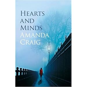
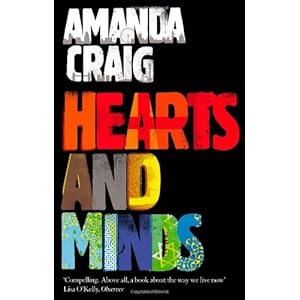
I'll read Hearts and Minds by Amanda Craig, although my copy has a different cover:
I also have a couple of unread Art of the Novella books from Melville House that I might add later in the month.
I'll read Hearts and Minds by Amanda Craig, although my copy has a different cover:


I also have a couple of unread Art of the Novella books from Melville House that I might add later in the month.
34Chatterbox
It's OK, Darryl -- mine has the black cover, so you can piggyback on that one! :-)
Granta on kindle?? *scurries off to get in more book trouble*
Granta on kindle?? *scurries off to get in more book trouble*
35Carmenere
I posted this on the main thread but thought I'd add it here to:
Thanks to Suzanne's Challenge #5 Only Typography on cover I finally read a book I purchased pre-1990, Mikhail Gorbachev's Perestroika. Rather an interesting read consider all that's transpired in the world since 1987. BTW: I really like this quote from the book because GGM is my favorite author "I recently talked with an outstanding Latin-American writer, Gabriel Garcia Marquez. A great mind indeed. His range of thinking is global: reading just one of his books shows this." You go, Mikhail!
Thanks to Suzanne's Challenge #5 Only Typography on cover I finally read a book I purchased pre-1990, Mikhail Gorbachev's Perestroika. Rather an interesting read consider all that's transpired in the world since 1987. BTW: I really like this quote from the book because GGM is my favorite author "I recently talked with an outstanding Latin-American writer, Gabriel Garcia Marquez. A great mind indeed. His range of thinking is global: reading just one of his books shows this." You go, Mikhail!
36gennyt
I've just finished my second book for this challenge, Just My Type - the one which is all about typefaces and fonts and the ways they are used/misused.
I've been reading it quite slowly, a chapter or two at a time, as it would be a bit indigestible read in one sitting. The chapters are interspersed with occasional 'Fontbreaks', a few pages focused on a particular font. The approach is anecdotal and journalistic rather than very in-depth or thorough, which is fine if you are not approaching it as a serious study of the subject. Lots of entertaining and fascinating details. When I write my review eventually for my own thread, I may find a few to highlight, but for now, for a bit of typographical silliness, I would commend the map of the Semicolonial State of San Serriffe, details of which first appeared in the Guardian on 1st April 1977. See further here.
I've been reading it quite slowly, a chapter or two at a time, as it would be a bit indigestible read in one sitting. The chapters are interspersed with occasional 'Fontbreaks', a few pages focused on a particular font. The approach is anecdotal and journalistic rather than very in-depth or thorough, which is fine if you are not approaching it as a serious study of the subject. Lots of entertaining and fascinating details. When I write my review eventually for my own thread, I may find a few to highlight, but for now, for a bit of typographical silliness, I would commend the map of the Semicolonial State of San Serriffe, details of which first appeared in the Guardian on 1st April 1977. See further here.

