1dlphcoracl
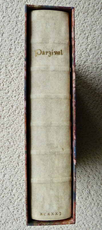
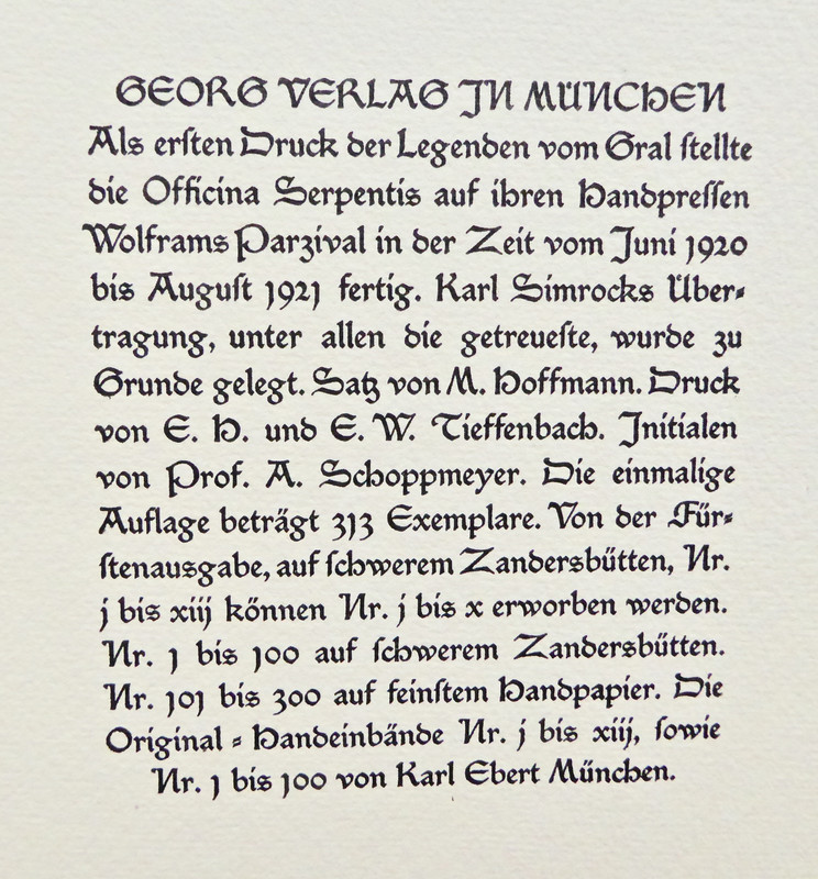
Parzival by Wolfram von Eschenbach, Officina Serpentis, 1920-1921. Translation by Karl Simrock, initial letters by Prof. Ansger Schoppmeyer. Edition of 313 copies, numbers 1-100 printed on heavy Zandersbütten paper (handmade) with full vellum binding by Karl Ebert, Munich. 13 3/4 x 10 1/4 inches (35 x 26 cm).
When one thinks of books which qualify for inclusion in the COVID-19 Coronavirus Eye Candy series, one's mind instantly turns to books with beautiful illustrations. However, this week's selection is a book without illustrations. It is included because it is one of the finest examples of printing, typography and hand illumination I have encountered. First, a bit of historical background.
In the years between the two great wars, several private presses arose in the Weimar Republic of Germany and they would prove to be the high point of private press craftsmanship in Germany for the duration of the twentieth century. The most famous of these German private presses was Count Harry Graf Kessler's Cranach Presse, whose edition of 'The Tragedie of Hamlet, Prince of Denmarke' may well be the most beautiful private press book of the twentieth century. The other major German private press in Weimar was the Bremer Presse.
However, there were 2 or 3 others that are not as well known, producing books of outstanding quality and beauty. One was a private press operated by Dr. Julius Schröder in Munich. Using a 19th century hand press he produced approximately 15 or 16 books in a series entitled: "Meisterwerke der Weltliteratur mit Original-Graphik", i.e., Masterworks of World Literature with Original Artwork. Each book contained a set of original illustrations from German artists, usually living in proximity to Munich where Dr. Schröder printed and published these books. The history of this enterprise and several of the high points of this series were featured many years ago in two articles written for the Books and Vines private press website:
https://booksandvines.com/2011/11/02/hamlet-by-william-shakespeare-1920-edition-...
https://booksandvines.com/2011/12/08/faust-by-johann-wolfgang-von-goethe-from-ju...
NOTE: On the Books and Vines website the articles published from 2011 until January 2017 have a unique property. If one left-clicks once over a photo it will enlarge. Another left-click over the enlarged photo will enlarge the photo even further resulting in a remarkable macro photo, especially useful for appreciating fine letterpress and handpress printing and the quality of various handmade papers.
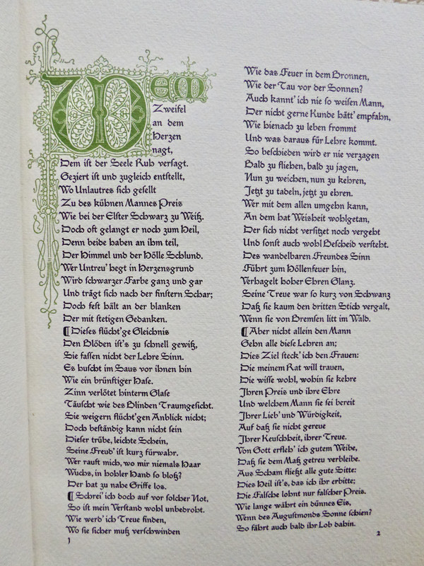
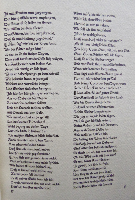
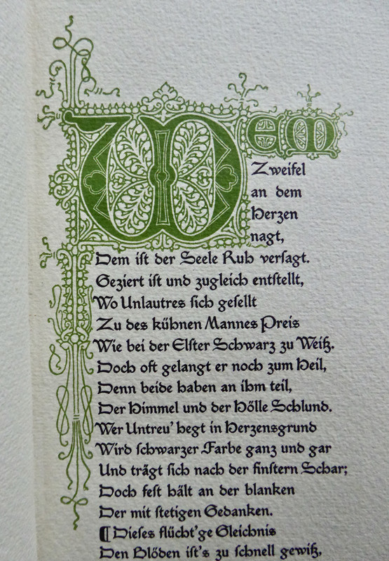
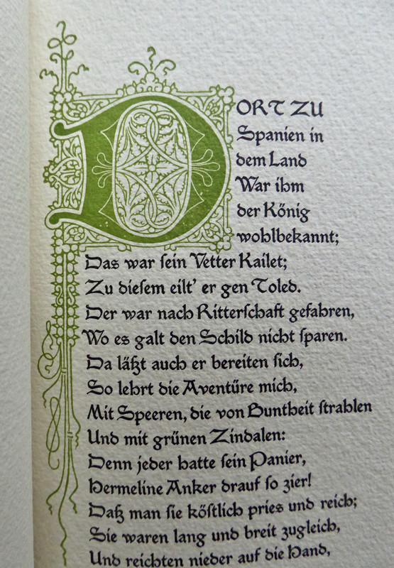
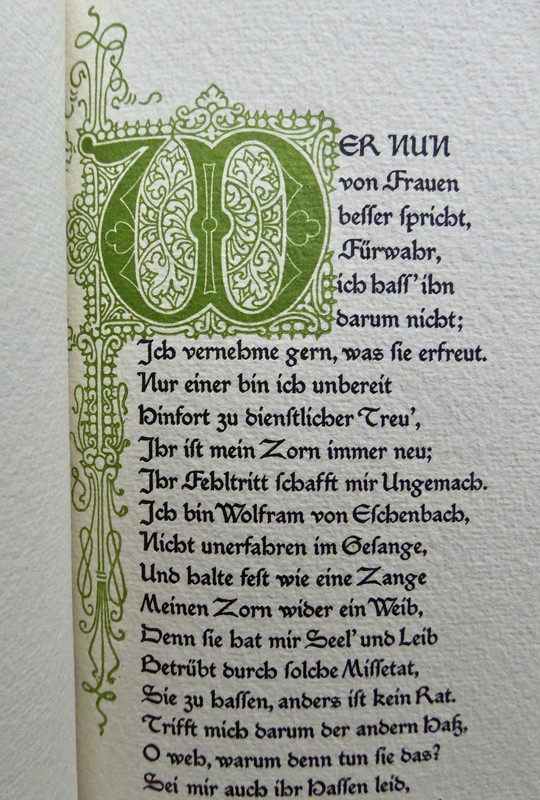
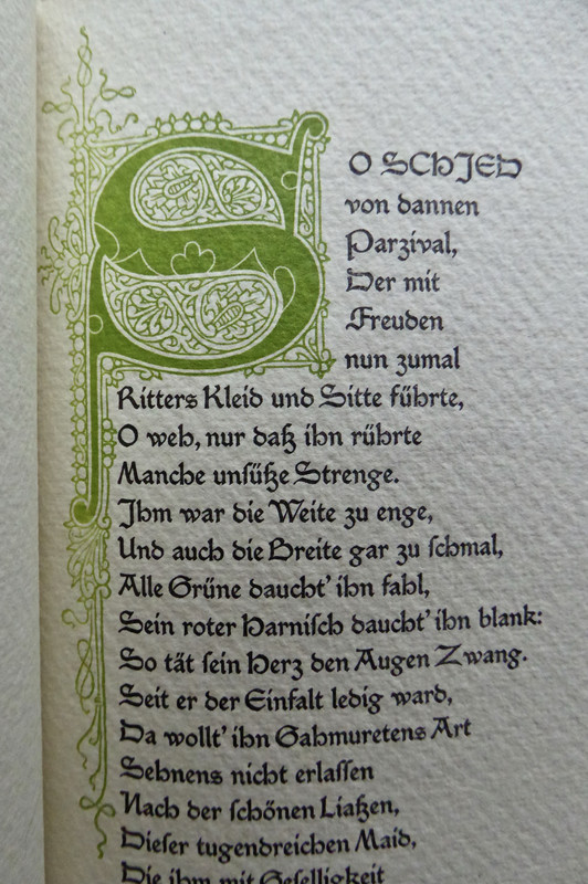
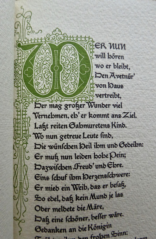
Another much less well known private press was the Officina Serpentis and this edition of Parzival is one of their greatest publications. This edition of Parzival uses the classic translation of Karl Joseph Simrock (1802-1876), a noted 19th century German scholar most famous for his translation of the Nibelunglied in 1827 at the astonishing age of 25. He subsequently translated other classic medieval German works of literature from the Middle High German into modern German language. This 'Parzival' was issued in a limitation of 313 copies and books numbered 1 - 100 were issued as special deluxe editions, printed on thick heavy 'Bütten' paper from the Zander paper mill in Germany with handmade vellum bindings by Karl Ebert (Munich) with gilt lettering on the spine. They were also given stunning hand-drawn green and white initial capital letters throughout by Professor Ansger Schoppmeyer.
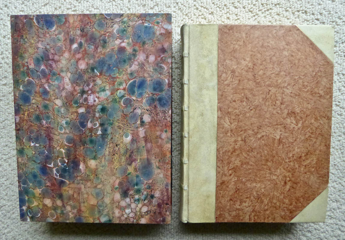
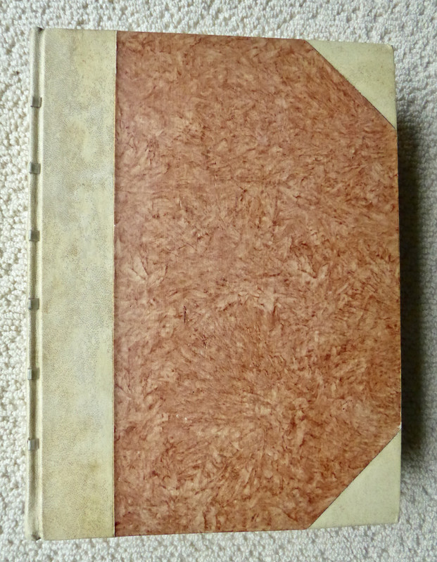
My copy is one of the 100 deluxe editions. However, the original vellum binding was replaced by a bespoke binding made by Gustave Keilig of Munich (1882-1959). Keilig was a master German bookbinder and, along with Otto Dörfner and Frieda Thiersch of the Bremer Press, was considered amongst the finest bookbinders in pre-war Germany between 1910-1939. He was on the faculty of the Munich "Meisterschule für Buchbinders" from 1926-1951 and a member of the Association of Master Bookbinders. He was considered an expert in working with vellum and he subsequently taught generations of young German apprentices the bookbinding craft. This binding is made of one half hairy vellum (so-called because the pores of the animal source of the parchment are readily visible - deliberately so) with six straps or collars worked through the spine, with gilt lettering and handmade paste paper over boards.
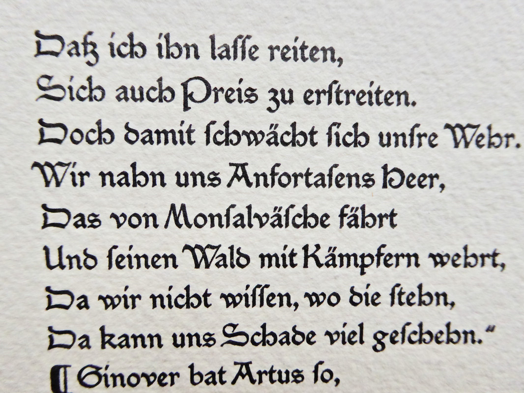
This is indeed eye-candy although of a very different nature from prior examples in this series. The presswork, typography, hand illumination and page composition are flawless, on a par with the Arion Press 'Moby Dick' and the finest editions from Dr. Julius Schröder (see Books and Vines articles linked above).
Macro view of handpress printing:
Colophon:
When one thinks of books which qualify for inclusion in the COVID-19 Coronavirus Eye Candy series, one's mind instantly turns to books with beautiful illustrations. However, this week's selection is a book without illustrations. It is included because it is one of the finest examples of printing, typography and hand illumination I have encountered. First, a bit of historical background.
In the years between the two great wars, several private presses arose in the Weimar Republic of Germany and they would prove to be the high point of private press craftsmanship in Germany for the duration of the twentieth century. The most famous of these German private presses was Count Harry Graf Kessler's Cranach Presse, whose edition of 'The Tragedie of Hamlet, Prince of Denmarke' may well be the most beautiful private press book of the twentieth century. The other major German private press in Weimar was the Bremer Presse.
However, there were 2 or 3 others that are not as well known, producing books of outstanding quality and beauty. One was a private press operated by Dr. Julius Schröder in Munich. Using a 19th century hand press he produced approximately 15 or 16 books in a series entitled: "Meisterwerke der Weltliteratur mit Original-Graphik", i.e., Masterworks of World Literature with Original Artwork. Each book contained a set of original illustrations from German artists, usually living in proximity to Munich where Dr. Schröder printed and published these books. The history of this enterprise and several of the high points of this series were featured many years ago in two articles written for the Books and Vines private press website:
https://booksandvines.com/2011/11/02/hamlet-by-william-shakespeare-1920-edition-...
https://booksandvines.com/2011/12/08/faust-by-johann-wolfgang-von-goethe-from-ju...
NOTE: On the Books and Vines website the articles published from 2011 until January 2017 have a unique property. If one left-clicks once over a photo it will enlarge. Another left-click over the enlarged photo will enlarge the photo even further resulting in a remarkable macro photo, especially useful for appreciating fine letterpress and handpress printing and the quality of various handmade papers.
Another much less well known private press was the Officina Serpentis and this edition of Parzival is one of their greatest publications. This edition of Parzival uses the classic translation of Karl Joseph Simrock (1802-1876), a noted 19th century German scholar most famous for his translation of the Nibelunglied in 1827 at the astonishing age of 25. He subsequently translated other classic medieval German works of literature from the Middle High German into modern German language. This 'Parzival' was issued in a limitation of 313 copies and books numbered 1 - 100 were issued as special deluxe editions, printed on thick heavy 'Bütten' paper from the Zander paper mill in Germany with handmade vellum bindings by Karl Ebert (Munich) with gilt lettering on the spine. They were also given stunning hand-drawn green and white initial capital letters throughout by Professor Ansger Schoppmeyer.
My copy is one of the 100 deluxe editions. However, the original vellum binding was replaced by a bespoke binding made by Gustave Keilig of Munich (1882-1959). Keilig was a master German bookbinder and, along with Otto Dörfner and Frieda Thiersch of the Bremer Press, was considered amongst the finest bookbinders in pre-war Germany between 1910-1939. He was on the faculty of the Munich "Meisterschule für Buchbinders" from 1926-1951 and a member of the Association of Master Bookbinders. He was considered an expert in working with vellum and he subsequently taught generations of young German apprentices the bookbinding craft. This binding is made of one half hairy vellum (so-called because the pores of the animal source of the parchment are readily visible - deliberately so) with six straps or collars worked through the spine, with gilt lettering and handmade paste paper over boards.
This is indeed eye-candy although of a very different nature from prior examples in this series. The presswork, typography, hand illumination and page composition are flawless, on a par with the Arion Press 'Moby Dick' and the finest editions from Dr. Julius Schröder (see Books and Vines articles linked above).


Macro view of handpress printing:

Colophon:

2ultrarightist
That book is truly stunning! Superlative typography and pressmanship. If you hadn't stated that the initials were hand-drawn, I would have thought they were hand-printed from the block or plate. Incredible penmanship or draughtsmanship.
3SebRinelli
>1 dlphcoracl:
Thank you for sharing pictures and your profound knowledge. Is the non-deluxe edition a viable alternative? This book is high on my wish list, but I haven’t come across with an affordable deluxe edition which is currently listed for ten times more than the standard one.
Thank you for sharing pictures and your profound knowledge. Is the non-deluxe edition a viable alternative? This book is high on my wish list, but I haven’t come across with an affordable deluxe edition which is currently listed for ten times more than the standard one.
4dlphcoracl
>2 ultrarightist:
Make certain to investigate the links above to the Books and Vines articles written many years ago on the two masterworks from the press of Dr. Julius Schröder of Munich, also published during this time period (Weimar Republic). Remember to left-click once, and then left-click again a second time, over the photos demonstrating the German Fraktur type and the printing resulting from a 19th-century handpress. The macro photos which result from doing this are astonishing.
Make certain to investigate the links above to the Books and Vines articles written many years ago on the two masterworks from the press of Dr. Julius Schröder of Munich, also published during this time period (Weimar Republic). Remember to left-click once, and then left-click again a second time, over the photos demonstrating the German Fraktur type and the printing resulting from a 19th-century handpress. The macro photos which result from doing this are astonishing.
5dlphcoracl
>3 SebRinelli:
I have never seen the standard edition of this publication. I know that the standard binding is rather ordinary compared to the handcrafted full vellum binding by Karl Ebert in the deluxe edition and the paper in the standard edition is different from the special, thick Zanders Bütten paper in the deluxe although I am not familiar with its quality. Critically, what I do NOT know is whether the standard edition contains the elaborate hand-illuminated green initial letters from Prof. Schoppmayer. If it does not, then the standard edition is (for me) not really an option.
I have never seen the standard edition of this publication. I know that the standard binding is rather ordinary compared to the handcrafted full vellum binding by Karl Ebert in the deluxe edition and the paper in the standard edition is different from the special, thick Zanders Bütten paper in the deluxe although I am not familiar with its quality. Critically, what I do NOT know is whether the standard edition contains the elaborate hand-illuminated green initial letters from Prof. Schoppmayer. If it does not, then the standard edition is (for me) not really an option.
6kermaier
>1 dlphcoracl:
The press-work is amazing! In spite of the heavily textured paper, each letter appears smooth, sharp and black, as if it had been printed on something like Zerkall mould-made wove paper.
The press-work is amazing! In spite of the heavily textured paper, each letter appears smooth, sharp and black, as if it had been printed on something like Zerkall mould-made wove paper.
7kermaier
> By the way, any idea what “Butten” means? I’ve seen that paper description in other places as well.
8dlphcoracl
>6 kermaier:
The presswork (printed on an 19th-century hand press) is flawless, as it is in the editions referenced above from Dr Julius Schröder's 'Meisterwerke der Weltliteratur' series - also printed on an 19th-century hand press - which were discussed and photographed for the Books and Vines website nearly a decade ago.
In the context of a hand made paper, I have no idea what "Bütten" means.
9grifgon
>7 kermaier: >8 dlphcoracl: I believe bütten essentially means "mould-made".
10SebRinelli
>9 grifgon: is right.
>5 dlphcoracl: The initials are there. The differences seem to be limited to the paper used and the binding, which doesn’t make the decision easier. I guess I need to be patient until I find a fair-priced Deluxe Edition to be on the safe side!
>5 dlphcoracl: The initials are there. The differences seem to be limited to the paper used and the binding, which doesn’t make the decision easier. I guess I need to be patient until I find a fair-priced Deluxe Edition to be on the safe side!
11ultrarightist
>4 dlphcoracl: I did. In fact, I remember reading those articles some years ago. Those books deserve to be in the top-tier of modern private press editions, taking their deserved place alongside gems from Kelmscott, Ashendene, and Doves.
12ultrarightist
>5 dlphcoracl: I saw the standard edition once (online, not in person). The binding was rather pedestrian (I cannot recall the specifics), but what I distinctly remember is that it contains the initials, but in orange rather than green. I do not remember anything about the paper.
13Glacierman
Oh, it's in German. Darn.
But seriously, it is a beautifully conceived and executed work.
I just don't read German. *sigh*
But seriously, it is a beautifully conceived and executed work.
I just don't read German. *sigh*
14SebRinelli
Ever since I saw this thread, I wanted to get my hands on this book. Last week, I found a bargain, a copy of the special deluxe for 325€ in NF condition. Thank you for the enablement, >1 dlphcoracl:. Now I need to think about how I can spend the money I saved. Another book or perhaps get it hand-illuminated by her? https://www.instagram.com/bookillumination/

