1wcarter
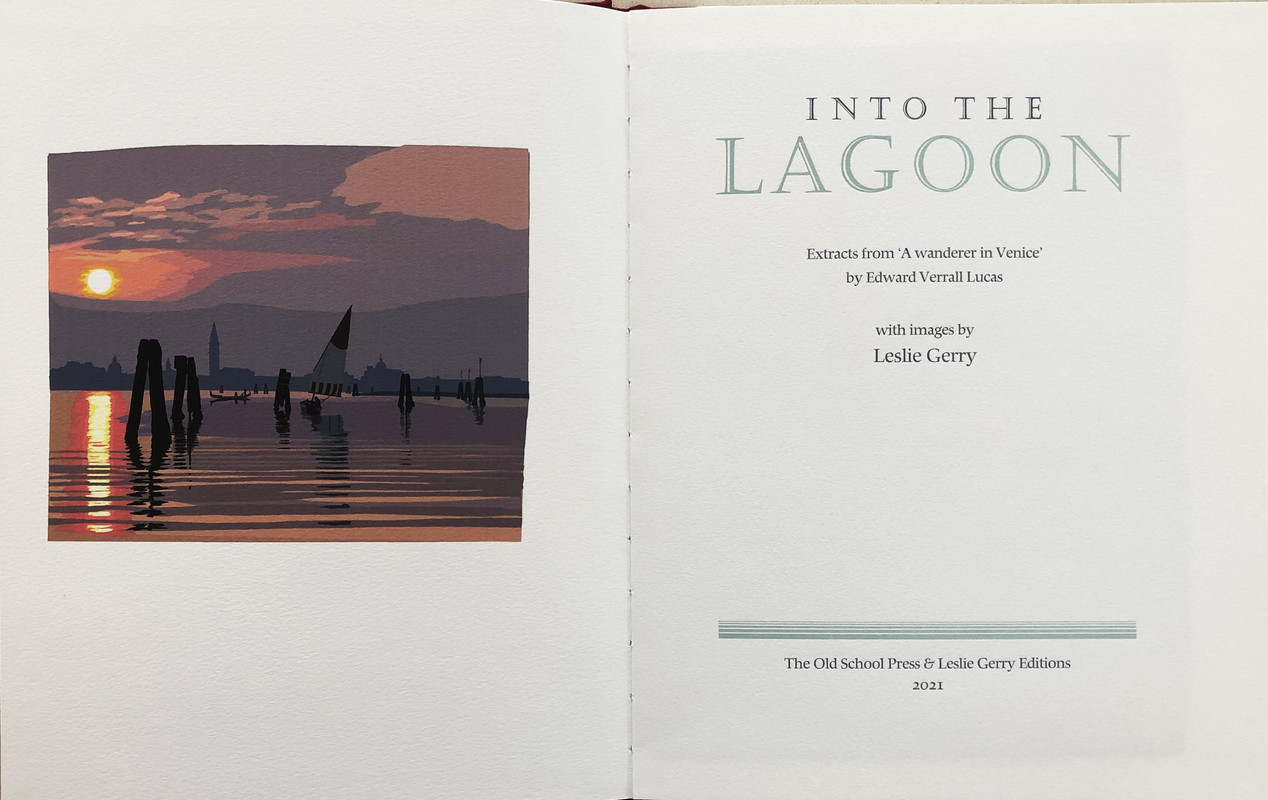
Into the Lagoon, Extracts from “A Wanderer in Venice” by Edward Verrall Lucas – OLD SCHOOL PRESS 2021
A PICTORIAL REVIEW
LIMITED EDITION
No.25 of 60 COPIES
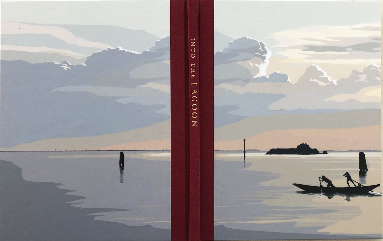
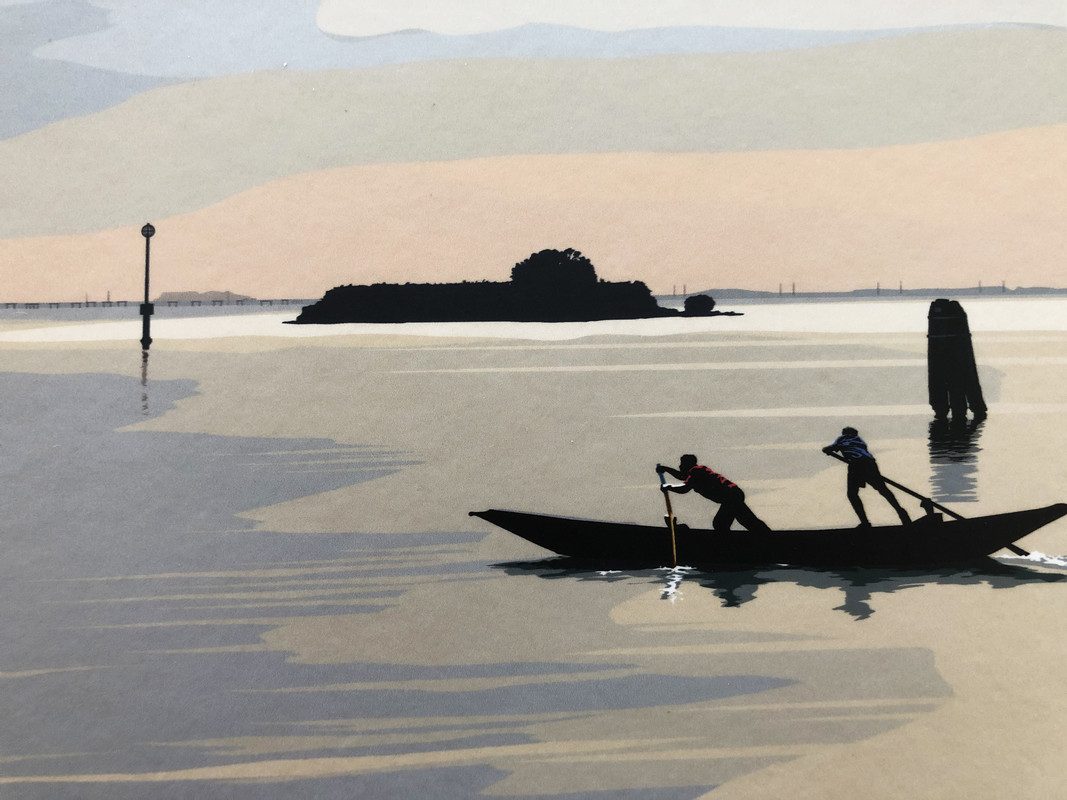
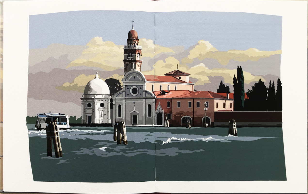
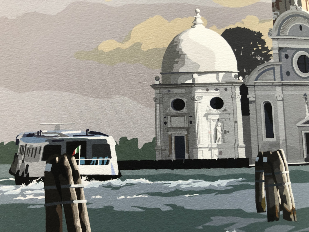
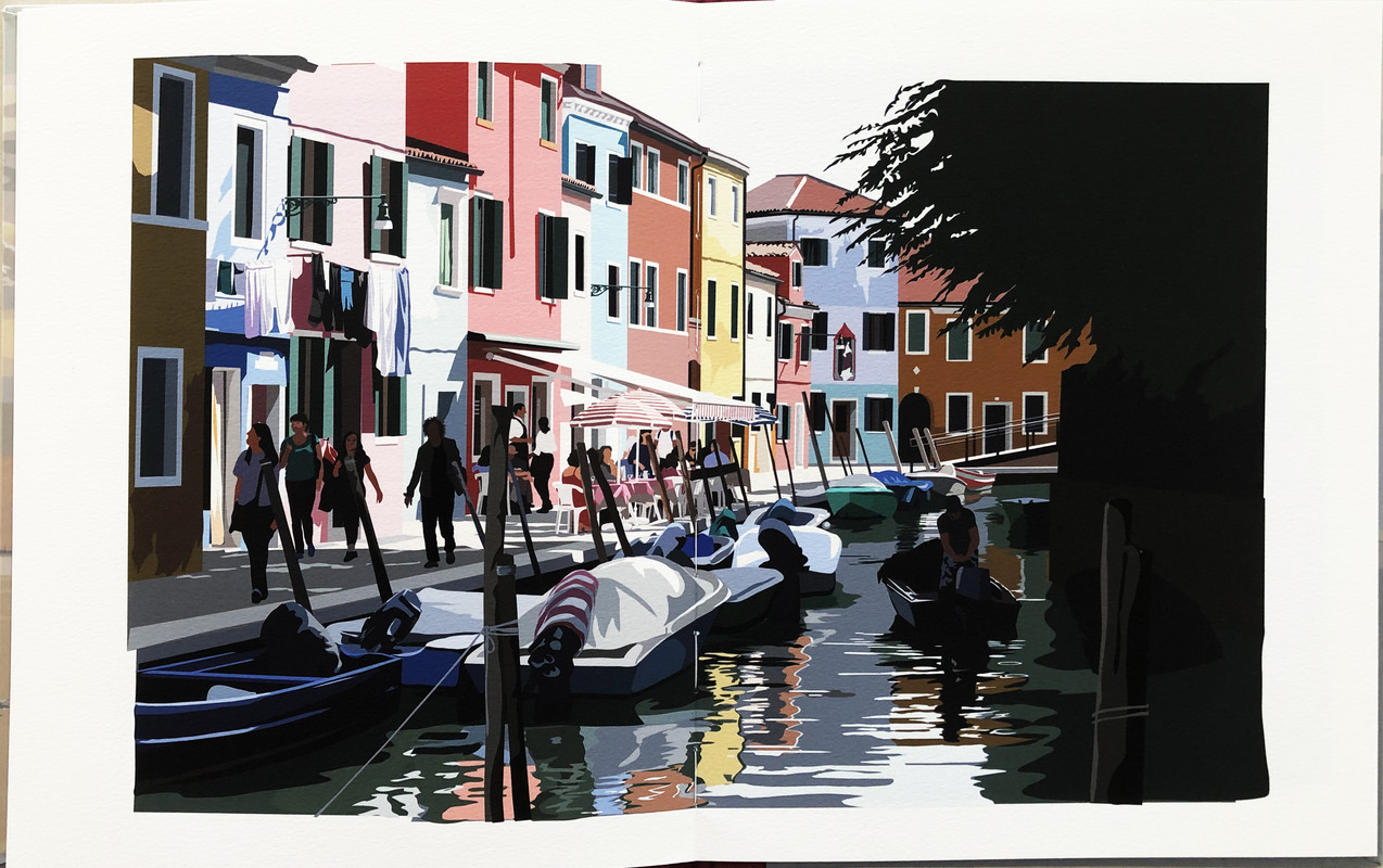
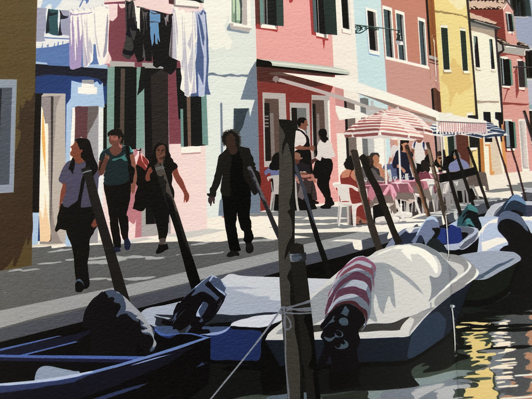
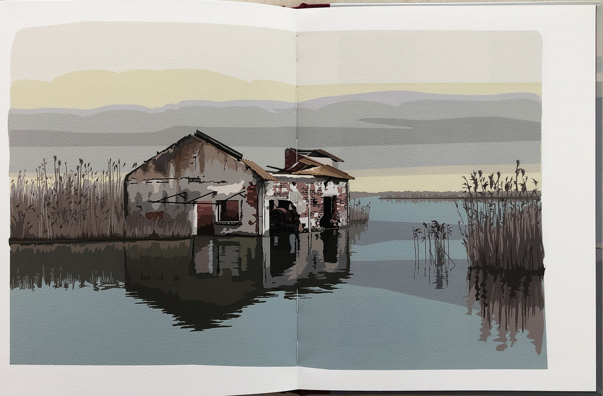
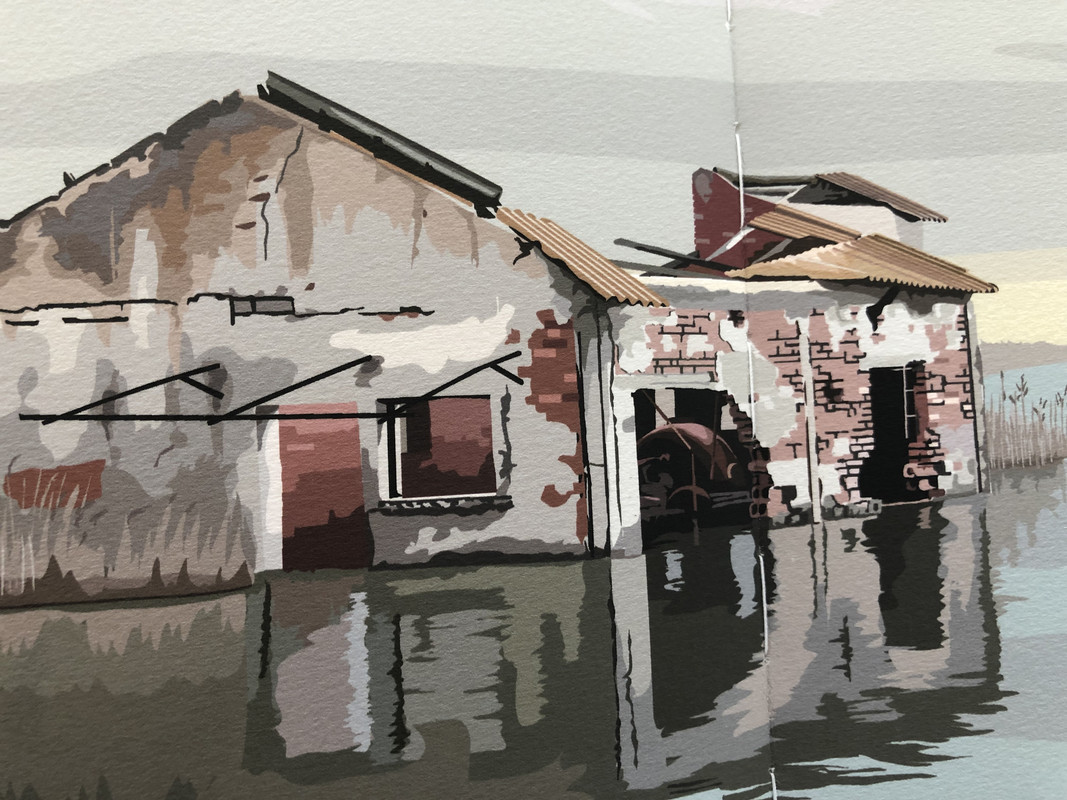
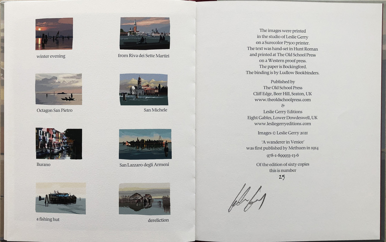
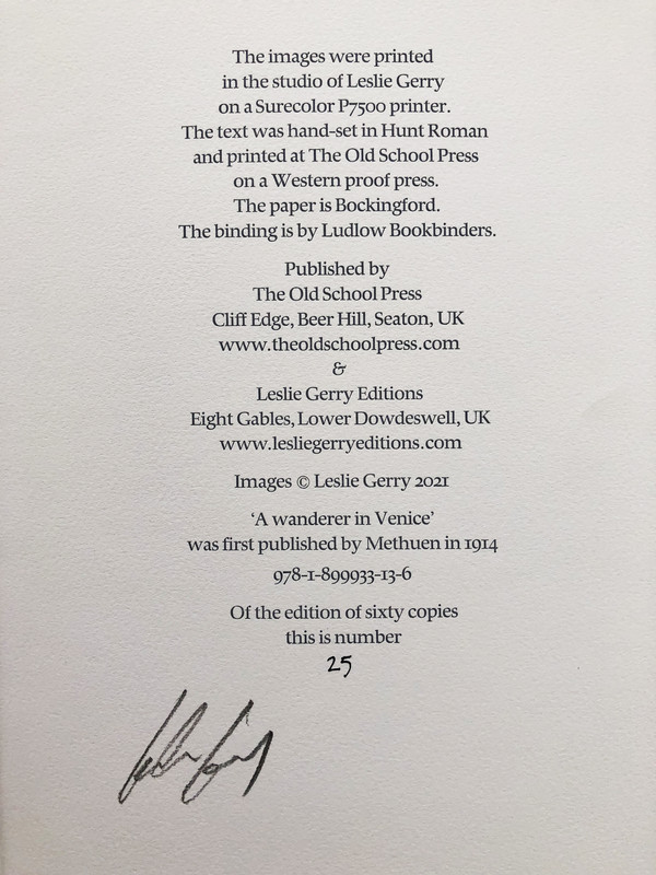
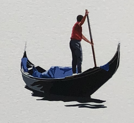
Eight two-page colour paintings of the lagoon by Leslie Gerry who has signed the book.
Printed in mid-grey ink.
Dark red endpapers.
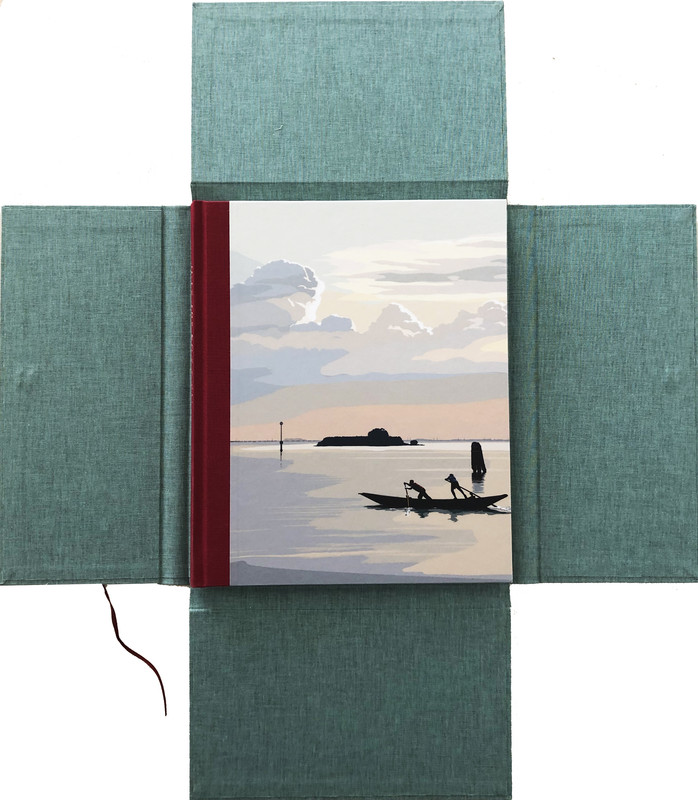
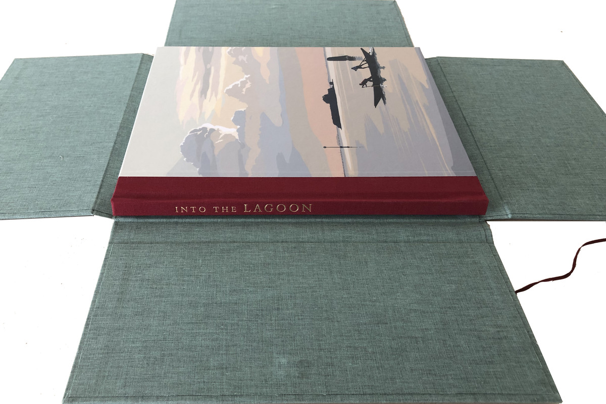
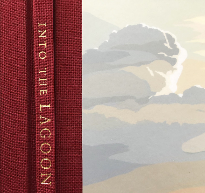
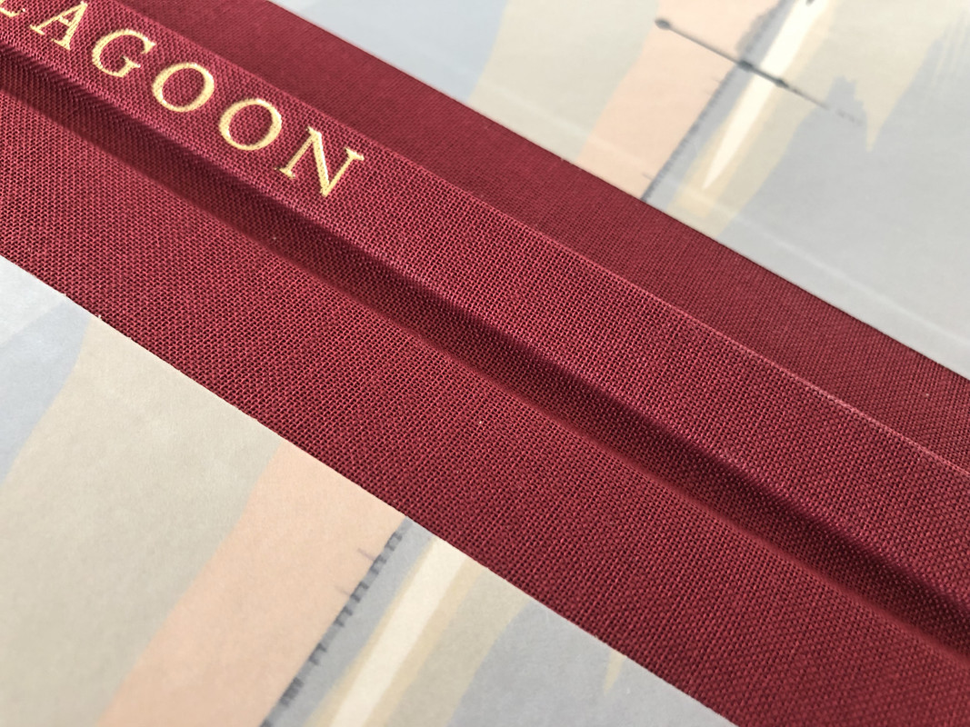
Quarter bound in red cloth with a colour images on the front and back boards.
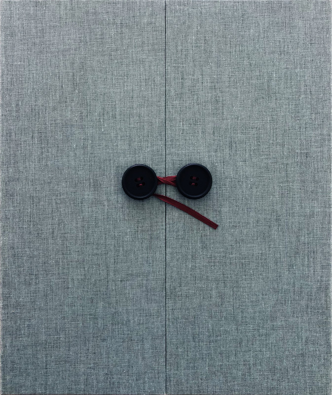
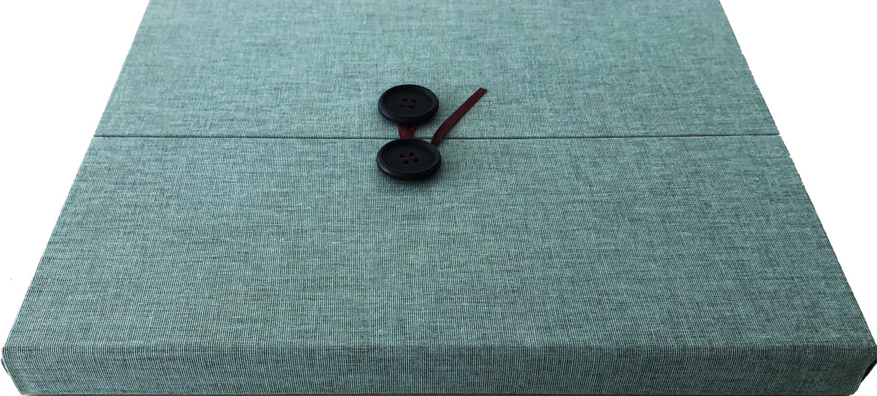
Housed in a dark watery aqua cloth portfolio with four flaps secured with tape around two buttons.
2021
28.2x23.5cm.
40 pages
£290
An index of the other illustrated reviews in the this series can be viewed here.
A PICTORIAL REVIEW
LIMITED EDITION
No.25 of 60 COPIES
Eight two-page colour paintings of the lagoon by Leslie Gerry who has signed the book.
Printed in mid-grey ink.
Dark red endpapers.
Quarter bound in red cloth with a colour images on the front and back boards.
Housed in a dark watery aqua cloth portfolio with four flaps secured with tape around two buttons.
2021
28.2x23.5cm.
40 pages
£290


An index of the other illustrated reviews in the this series can be viewed here.
2dlphcoracl
>1 wcarter:
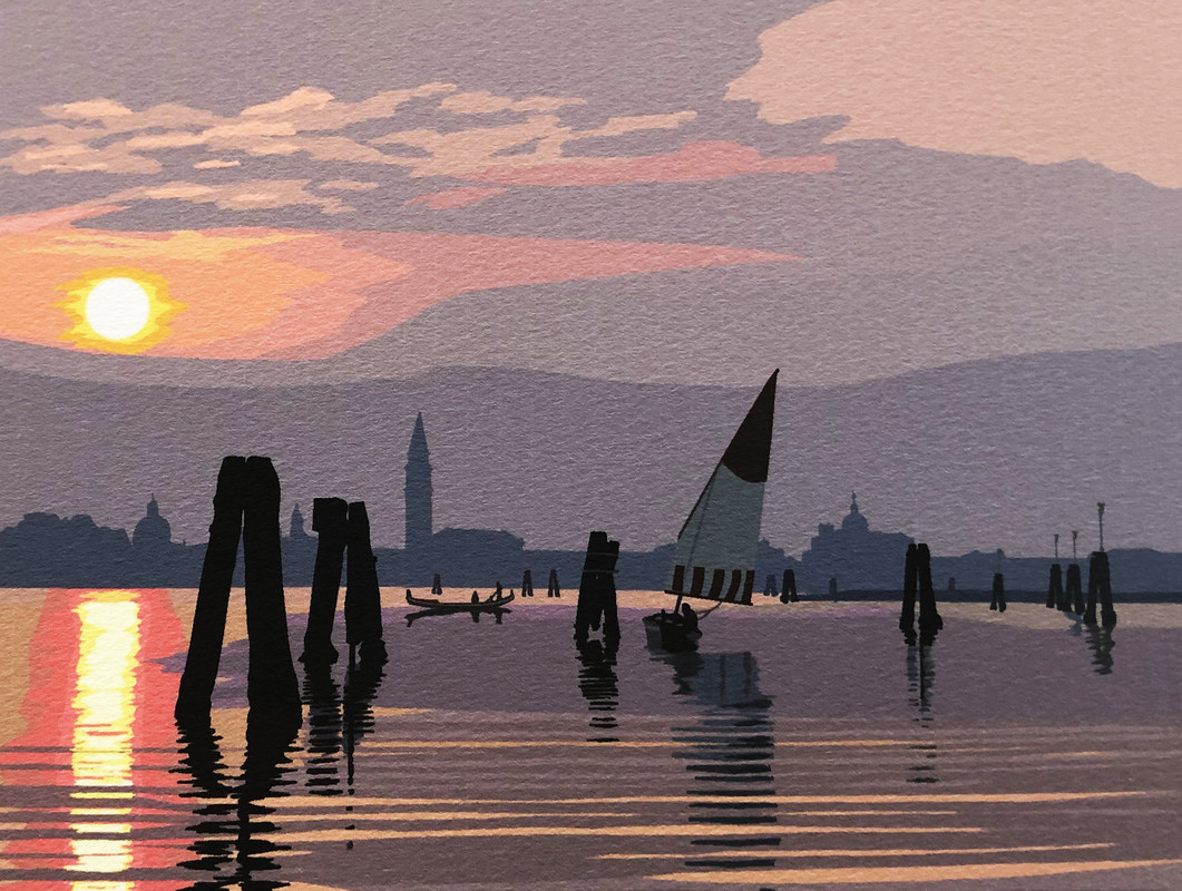
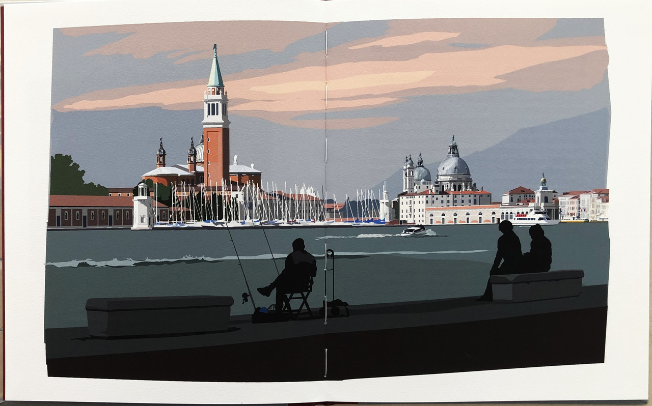
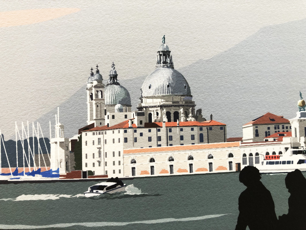
This is the finest Old School Press edition in several years. The colorful paintings by Leslie Gerry are spread across two pages and are luminous. When combined with the equally splendid edition 'Venice' from the Whittington Press with John Craig wood engravings, the reader is transported to and immersed in this unique city.
Note that this is a very small edition of 60 copies and many copies were reserved prior to publication. Word of mouth has spread quickly and it has sold well after publication. If you wish to acquire a copy, do it now and don't dork around.
3kdweber
>1 wcarter: Nice job of presenting this book. If I didn't already have a copy this post would have convinced me.
>2 dlphcoracl: Yes it pairs nicely with the Whittington Press Venice (which has a much larger limitation)
The only thing I don't like are the buttons for closing the case. If they had use rare earth magnets instead this edition would shelve much better.
>2 dlphcoracl: Yes it pairs nicely with the Whittington Press Venice (which has a much larger limitation)
The only thing I don't like are the buttons for closing the case. If they had use rare earth magnets instead this edition would shelve much better.
4ChampagneSVP
Gerry's process is interesting. He describes it on his website:
"With a stylus and Wacom tablet, I paint on the computer in Illustrator. Working only with flat areas of colour (CMYK) and no tone, I “cut out” colour shapes with the stylus, arranging them on different layers, creating a collage. In fact, I first began working this way years ago (before developing my computer skills) by cutting out sheets of coloured paper with scissors, similar to the way Matisse created his paper cut-outs. Matisse described it as “drawing with colour”. The paintings end up as digital files; vector images which can be reduced or enlarged to any size. Therefore there is no scanning, the files can be printed directly from the computer onto a mould-made paper, using a flat-bed UV inkjet printer."
I'll add to the above compliments on this book that the paper is nice and thick and toothy. But I agree with >3 kdweber: that the case's closing mechanism, while pretty, takes up space and also makes me loath to place another book to the side of it for fear of causing an indentation.
5wcarter
Old School Press also did another book on Venice, but this one was much cheaper and unillustrated. See here.
7kronnevik
Also 'The Bricks of Venice' and 'An Italian Dream'. Venice is a favorite topic for Martyn.
8paulm16
The artist for this book has done another large format book on Venice and his similar offering on Marrakesh has recently won some national awards.
https://lesliegerryeditions.com/collections/limited-edition-books
https://lesliegerryeditions.com/collections/limited-edition-books
9What_What
>8 paulm16: Is that the book which Stardust lost to?
12ambyrglow
>10 grifgon: Just a minor note: Leslie Gerry is male.
13grifgon
>12 ambyrglow: I had assumed otherwise! Duly noted, thanks!
14kronnevik
>10 grifgon: I'm not sure how that would work. Leslie uses dozens of colors and fine detail. The digital files can be scaled to any size and he often prints them in multiple sizes. He uses fine papers and ink and pairs the images with letterpress text. Letterpress is great, but I don't see how it would apply here.
15grifgon
>14 kronnevik: Nothing here would prohibit letterpress. Letterpress can easily reproduce the detail of his artworks, and letterpress can certainly be printed in the number of colors he uses. (Though good registration would take some skill.) The scalability too could be solved with polymer plates.
16kronnevik
>15 grifgon: I'll preface this by saying I'm no expert in letterpress, so correct me if I'm wrong. I agree that letterpress can easily reproduce the detail of Gerry's artwork and that there are no restrictions on colors. However, as I understand it, each color would require its own pass on the press and its own polymer plate. At the very least, you're looking at double digits for plates/colors and some of Gerry's images easily use 100 colors. Good registration would be near impossible. Then you potentially need duplicates of all the plates at different sizes (like the thumbnails in Into the Lagoon). In addition, the inkjet printing allows for perfect color matching to the digital image. If done letterpress, each color would have to be carefully mixed and tested to achieve a match. If all this isn't prohibitive, I don't know what is. Perhaps I'm missing something.
17grifgon
>16 kronnevik: You're 100% right that printing these artworks letterpress would be a feat. No disagreement there! In part, I wish Gerry would do letterpress *because* it would be an achievement. But they wouldn't be prohibitively difficult. I think that there are several dozens letterpress printers working today with the skills to do it.
Matching the colors wouldn't be too difficult. The Pantone color matching system is really precise.
Just out of curiosity, I ran a few of Gerry's images from the Marrakesh book through photoshop, which identified 10 colors in each of them. (I saw also that the de luxe copies includes "an A3 set of 10 progressive prints simply bound." — I assume this verifies that 10 colors were used.) Printing 10 colors progressively is certainly difficult, but I think most letterpress printers could do an OK job of it, and some could do it without breaking a sweat. I didn't see any artworks that I thought had more than ~10 colors, but perhaps I'm missing them! Certainly, if any include 100 colors, I agree: That would be pretty crazy.
There's no doubt that printing these artworks digitally is far easier than printing them letterpress. But I think letterpress would totally be doable — unlike, say, reproducing "The Scream" letterpress — so I wish they were!
18wcarter
I like old fashioned letterpress using moveable type,and engraved plates for images, but I am not a fan of polymer plates which somehow seem like a cheating form of letterpress.
19grifgon
>18 wcarter: I agree in spirit, but polymer plates can do some pretty wonderful things. For example, Thornwillow's ability to offer fully letterpress books at under $300 is because of polymer plates. Same with other presses — for example, Hand & Eye's recent "The Wind in the Willows".
In my opinion, hand-set type is categorically different than monotype, linotype, and polymer plates, which are all forms of mechanized typesetting. This is the biggest reason to support Tallone. Who else is producing books of that length using hand-set type?
>17 grifgon: Out of curiosity, I checked to see how many print runs it would take to reproduce "The Scream" letterpress.
Here's 10 print runs:

Here's 50 print runs:

Here's 100 print runs:

20921Jack
>19 grifgon: You probably wouldn't need to do a 100 print runs to get a really precise looking print of the original painting if you carefully overlapped colors as you went since ink is a bit transparent. That could be true of Gerry's work too if he were to get them printed letterpress.
It would still probably require a lot of experimentation to get right though - which isn't necessarily a bad thing.
It would still probably require a lot of experimentation to get right though - which isn't necessarily a bad thing.

