1wcarter
The Nibelungenlied - LIMITED EDITIONS CLUB 1960
A PICTORIAL REVIEW
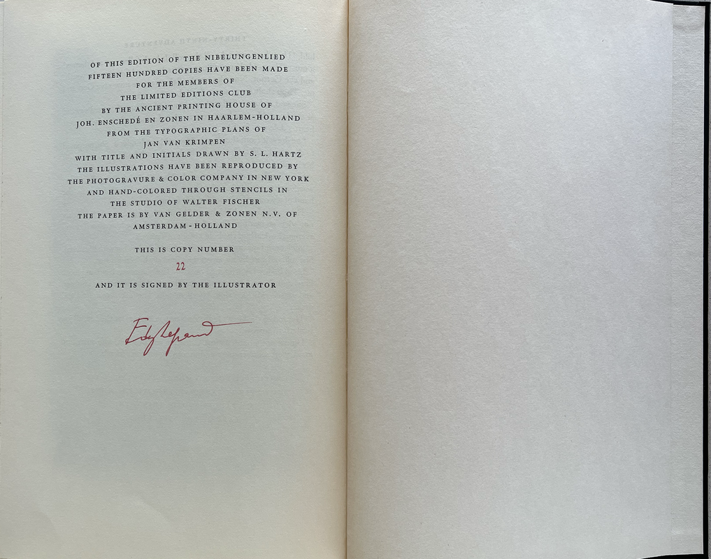
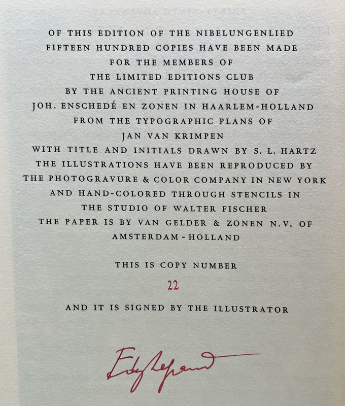
No. 22 of 1500
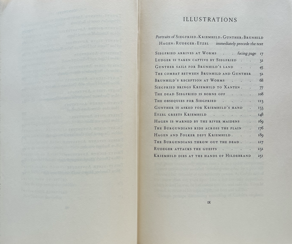
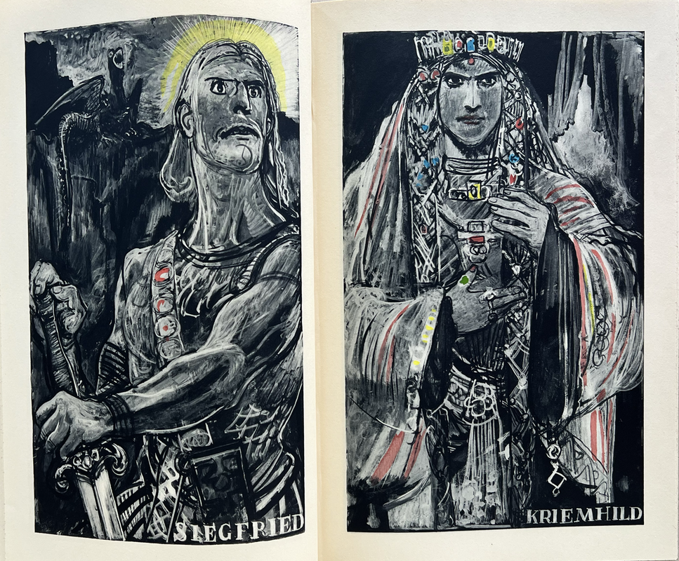
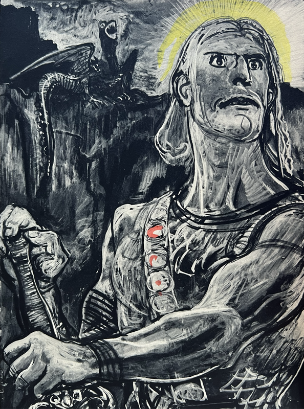
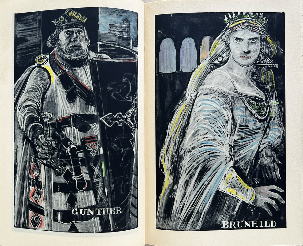
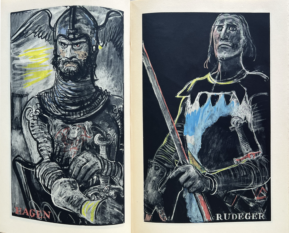
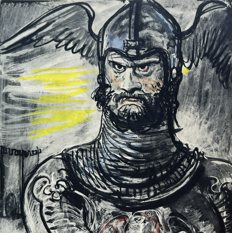
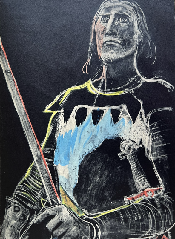
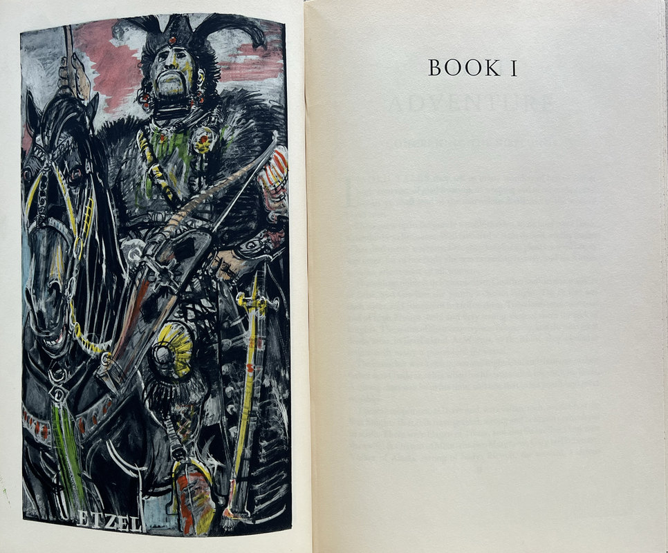
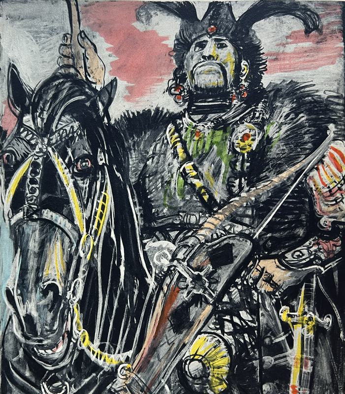
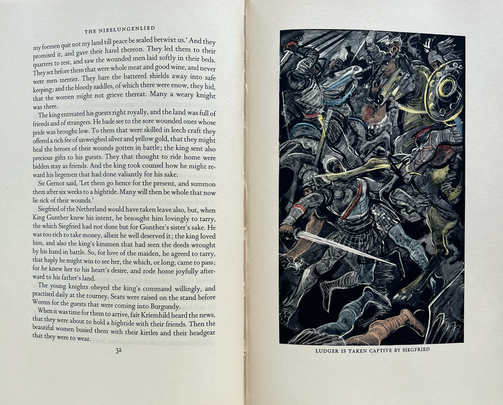
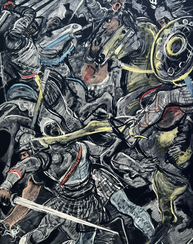
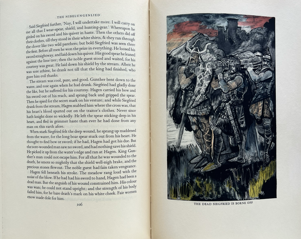
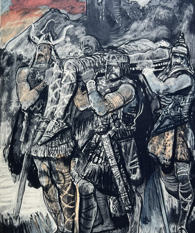
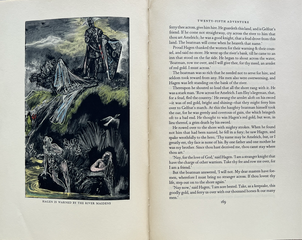
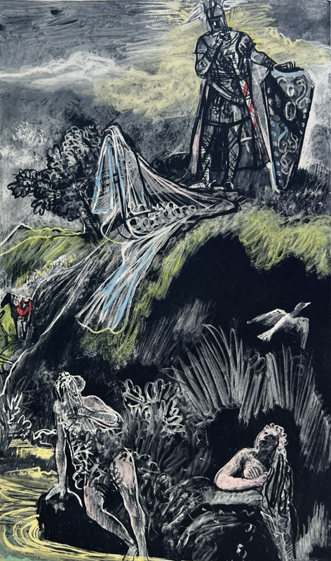
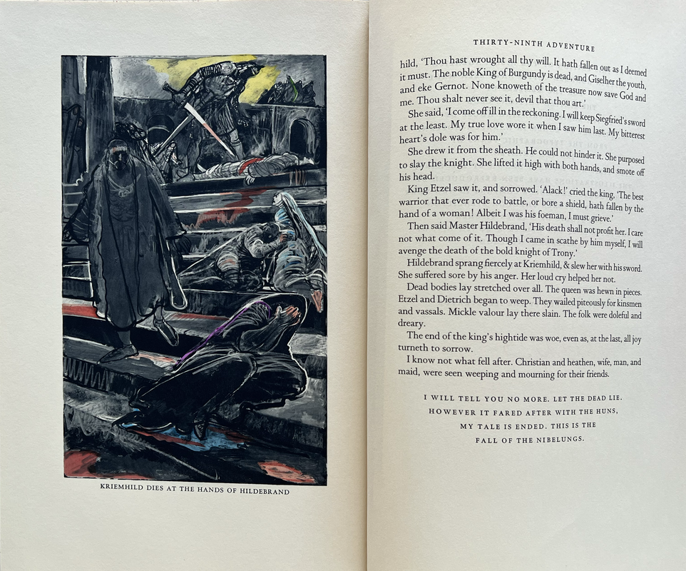
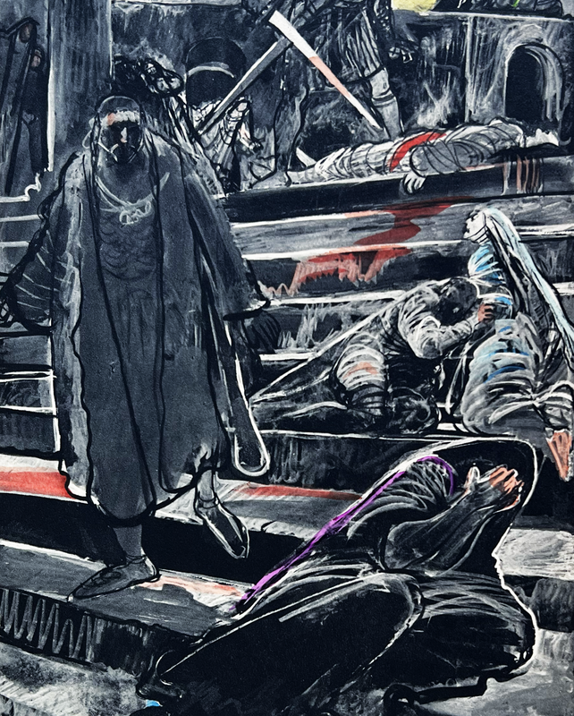
Signed by the illustrator Edy Legrand, who has done 23 full-page line and hand wash drawings.
Hand-colored through stencils in the studio of Walter Fishcer.
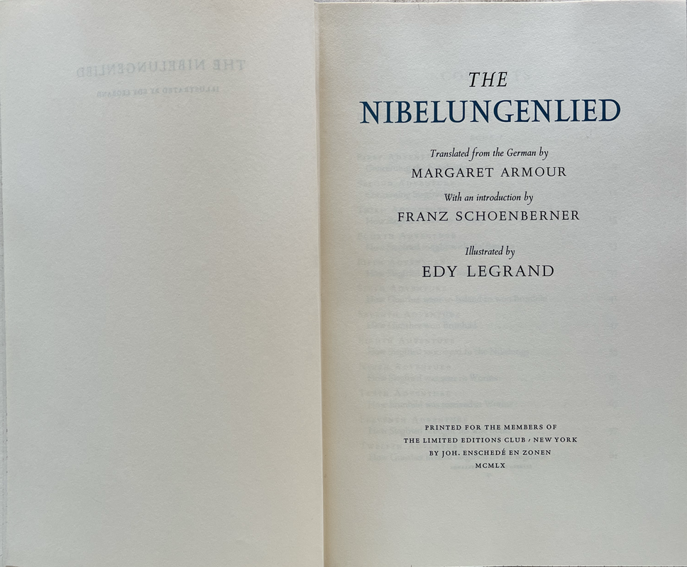
Translated from the German by Margaret Armour with an introduction by Franz Schoenberner.
Introduced by Edy Legrand.
Printed by Joh. Enschede in Holland from the typographic plans of Jan van Krimpen.
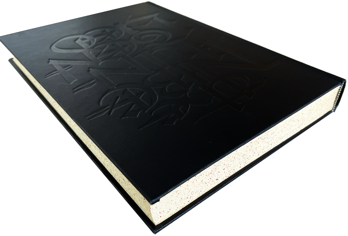
Page edges are stained cream with maroon speckling.
Plain white endpapers.
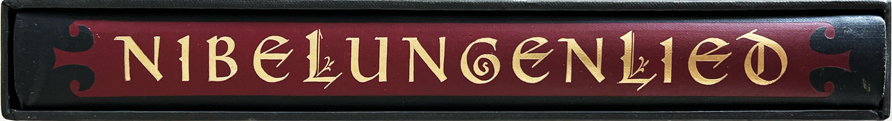
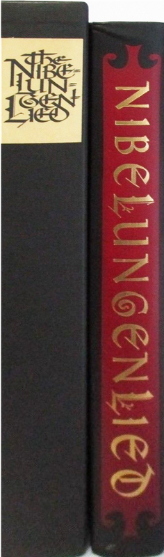
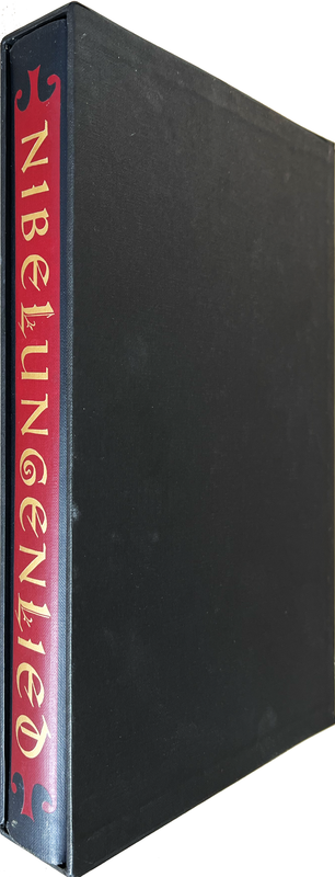
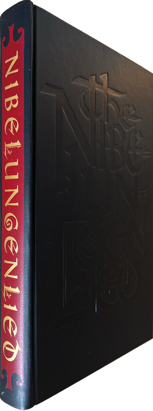
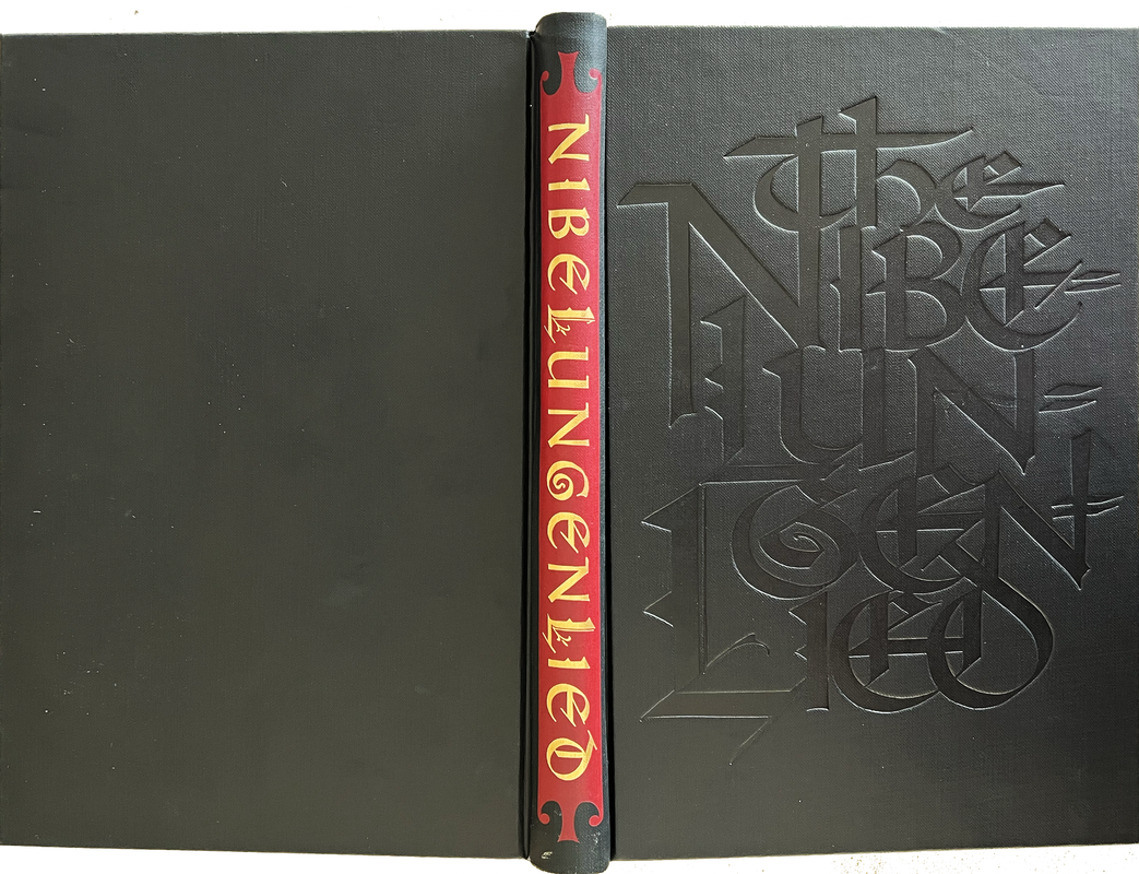
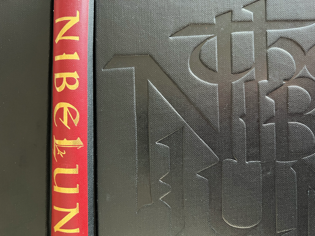
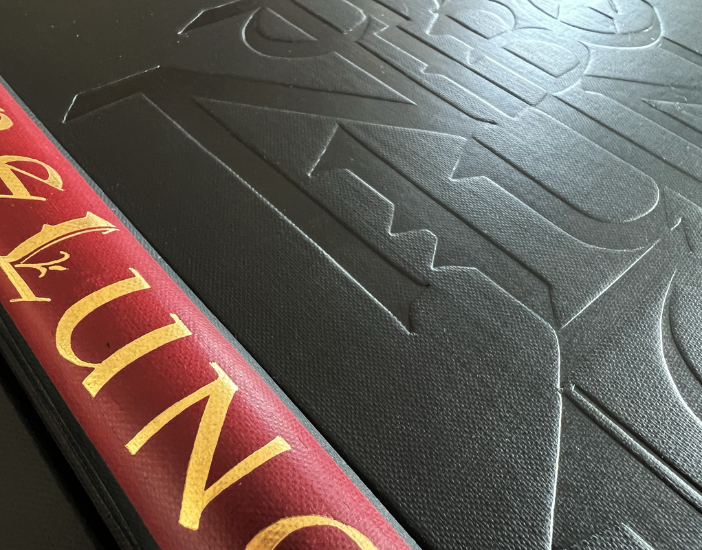
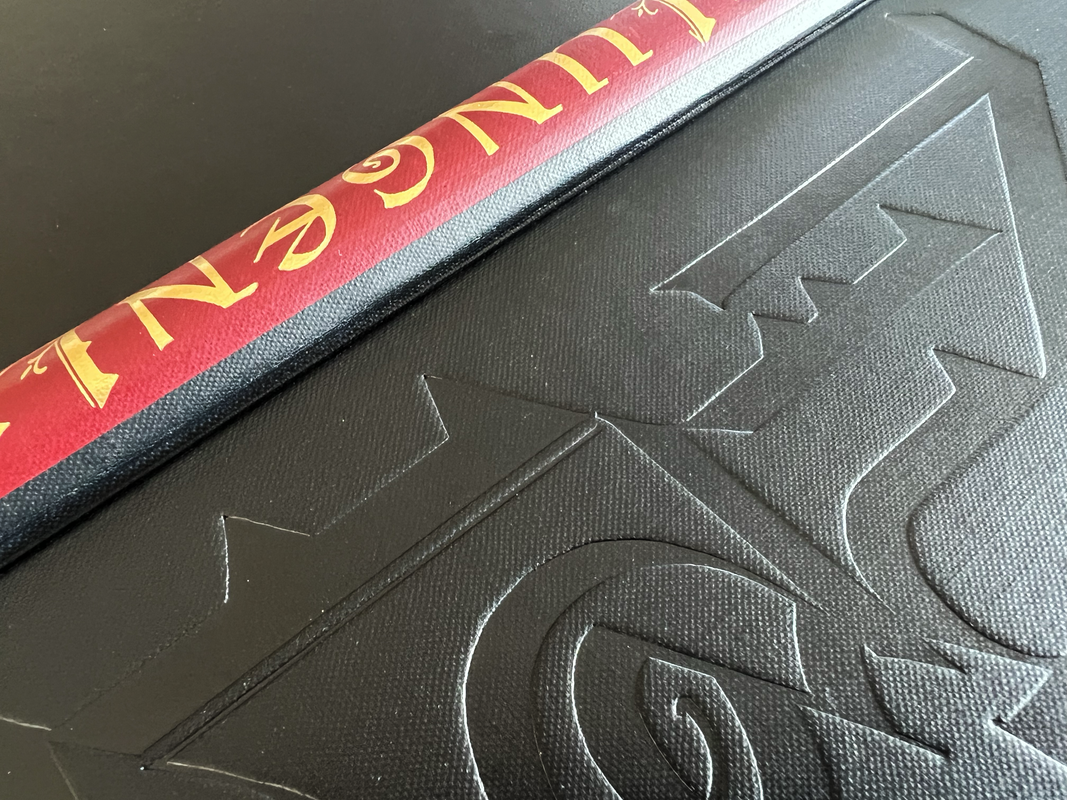
Bound in full black cloth with the title blind-stamped on the front cover and gold-stamped over red on the spine with lettering in medieval style by Arnold Bank.
Black slipcase with cream paper label on spine.
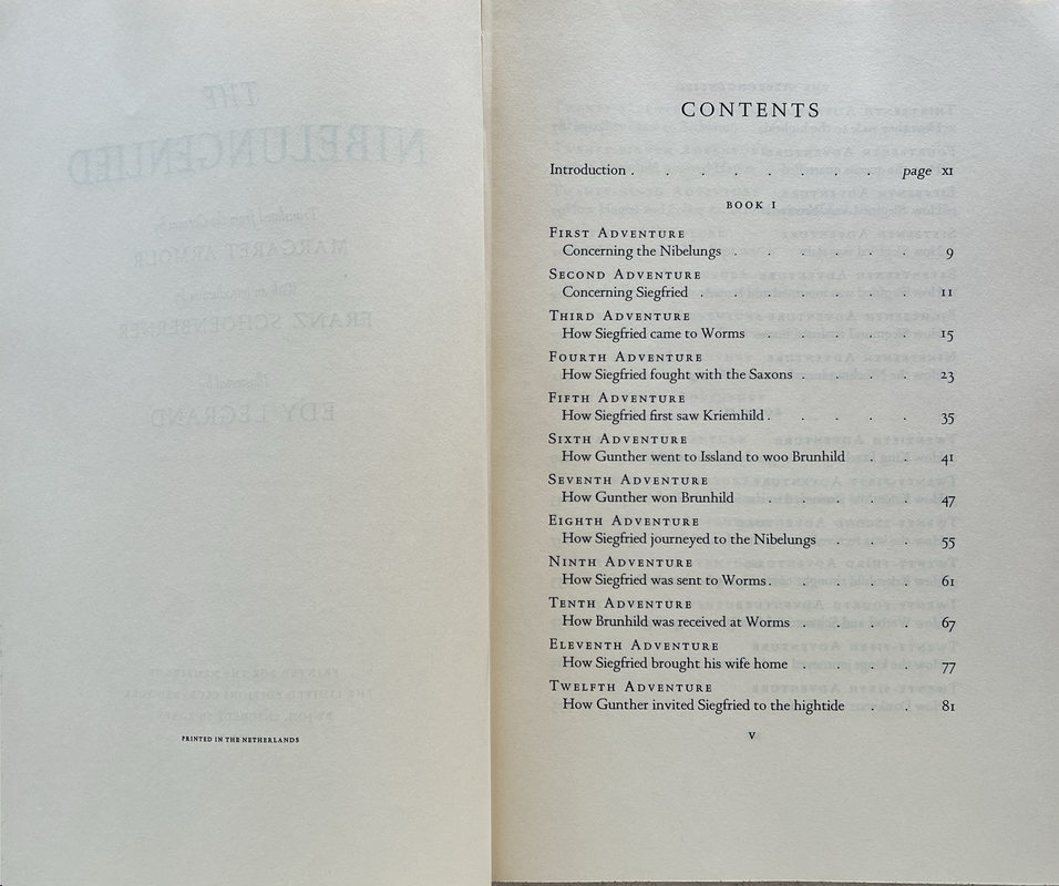
312 pages
31.5x20.9cm.
US$62
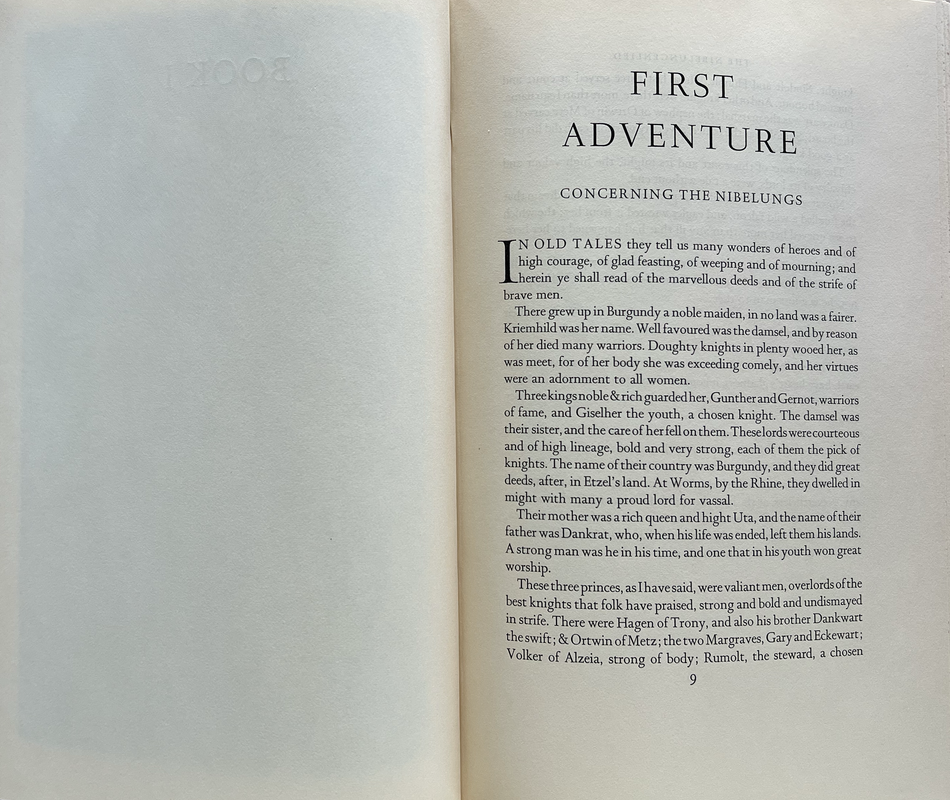
Written by an unknown author in the twelfth century, this powerful tale of murder and revenge reaches back to the earliest epochs of German antiquity, transforming centuries-old legend into a masterpiece of chivalric drama.
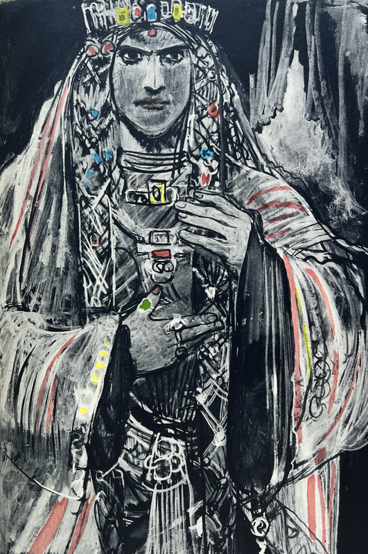
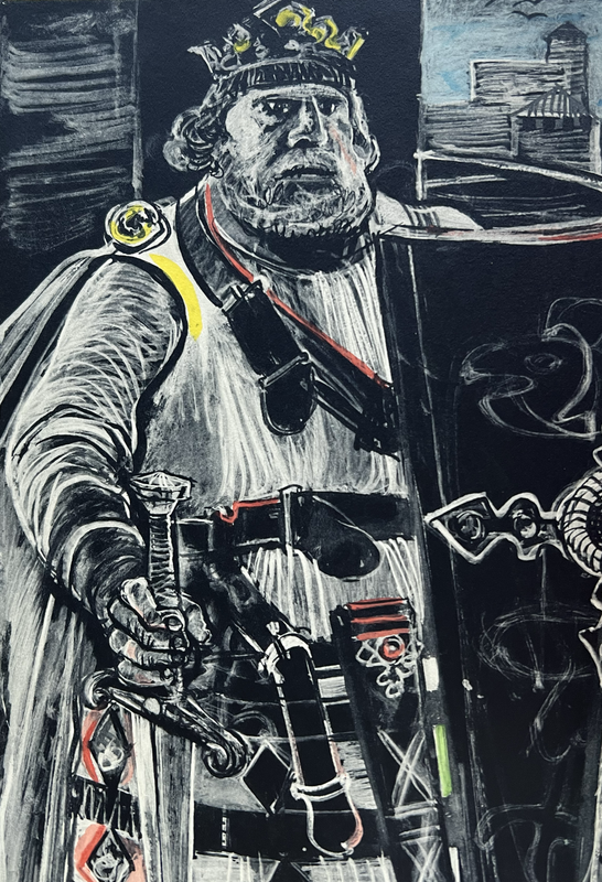
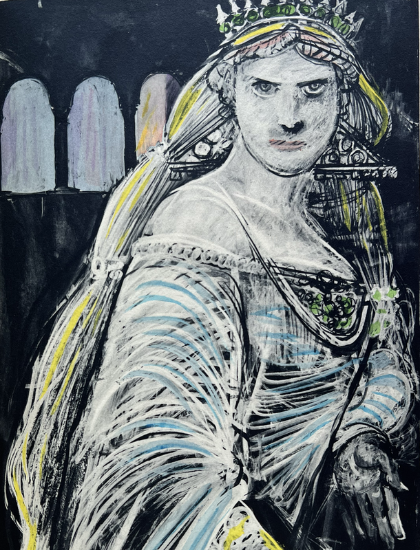
Siegfried, a great prince of the Netherlands, wins the hand of the beautiful princess Kriemhild of Burgundy, by aiding her brother Gunther in his struggle to seduce a powerful Icelandic Queen. But the two women quarrel, and Siegfried is ultimately destroyed by those he trusts the most. Comparable in scope to the Iliad, this skilfully crafted work combines the fragments of half-forgotten myths to create one of the greatest epic poems - the principal version of the heroic legends used by Richard Wagner, in The Ring.

An index of the other illustrated reviews in the this series can be viewed here.
A PICTORIAL REVIEW
No. 22 of 1500
Signed by the illustrator Edy Legrand, who has done 23 full-page line and hand wash drawings.
Hand-colored through stencils in the studio of Walter Fishcer.
Translated from the German by Margaret Armour with an introduction by Franz Schoenberner.
Introduced by Edy Legrand.
Printed by Joh. Enschede in Holland from the typographic plans of Jan van Krimpen.
Page edges are stained cream with maroon speckling.
Plain white endpapers.
Bound in full black cloth with the title blind-stamped on the front cover and gold-stamped over red on the spine with lettering in medieval style by Arnold Bank.
Black slipcase with cream paper label on spine.
312 pages
31.5x20.9cm.
US$62
Written by an unknown author in the twelfth century, this powerful tale of murder and revenge reaches back to the earliest epochs of German antiquity, transforming centuries-old legend into a masterpiece of chivalric drama.
Siegfried, a great prince of the Netherlands, wins the hand of the beautiful princess Kriemhild of Burgundy, by aiding her brother Gunther in his struggle to seduce a powerful Icelandic Queen. But the two women quarrel, and Siegfried is ultimately destroyed by those he trusts the most. Comparable in scope to the Iliad, this skilfully crafted work combines the fragments of half-forgotten myths to create one of the greatest epic poems - the principal version of the heroic legends used by Richard Wagner, in The Ring.


An index of the other illustrated reviews in the this series can be viewed here.
2ChestnutPress
>1 wcarter: A superb volume!
3dlphcoracl
>1 wcarter: An excellent choice!
>2 ChestnutPress: I completely agree, FWIW. Nearly anything printed at Joh. Enschedé et Zonen using Jan van Krimpen's classic typeface is a winner, and the illustrations in this edition are suitably dark and dramatic.
Bottom line: Buy it!!
>2 ChestnutPress: I completely agree, FWIW. Nearly anything printed at Joh. Enschedé et Zonen using Jan van Krimpen's classic typeface is a winner, and the illustrations in this edition are suitably dark and dramatic.
Bottom line: Buy it!!
4ChestnutPress
>3 dlphcoracl: Enschedé’s output during Van Krimpen’s time there was exceptional, thankfully continuing in the same vein in Sem Hartz’s and Bram de Does’s periods there. But JvK was something else and they broke the mould after him!

