The Blade Itself by Joe Abercrombie - CURIOUS KING 2022
Talk Fine Press Forum
Join LibraryThing to post.
1wcarter
The Blade Itself by Joe Abercrombie - CURIOUS KING 2022
A PICTORIAL REVIEW
LIMITED EDITION
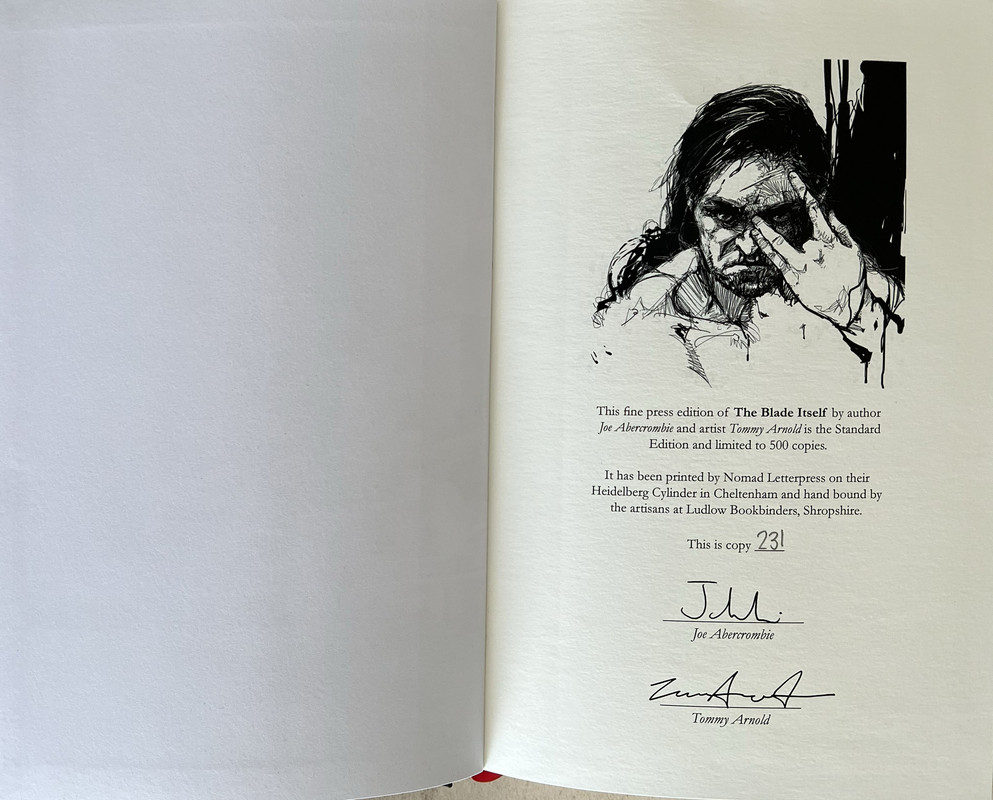
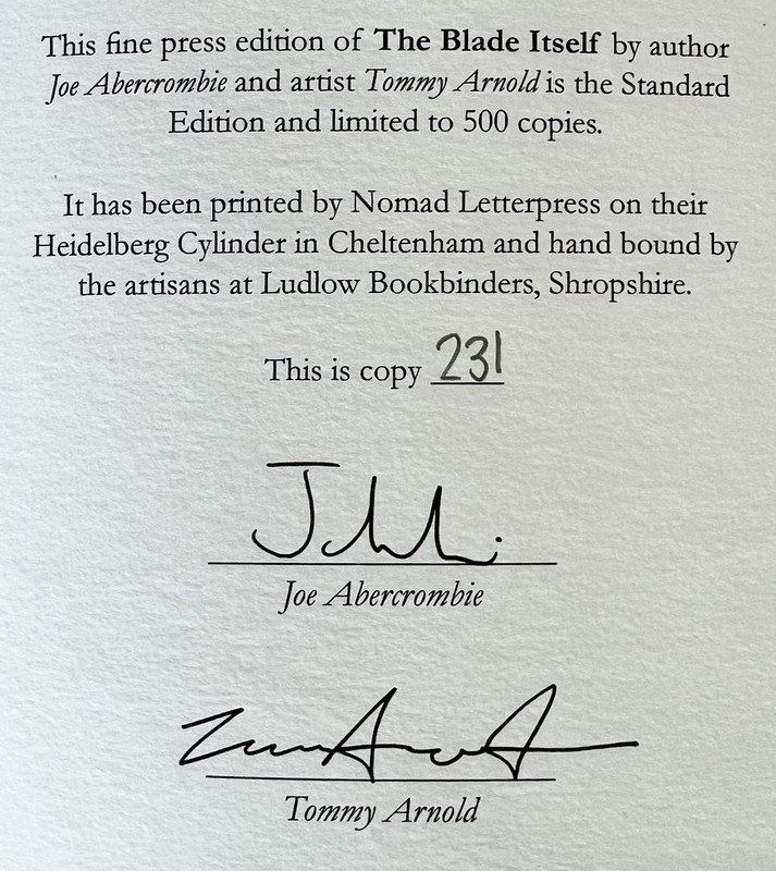
No. 231 of 500 copies
Signed by author and artist.
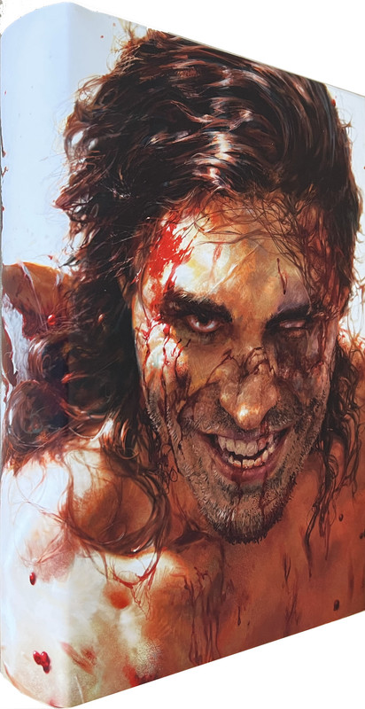
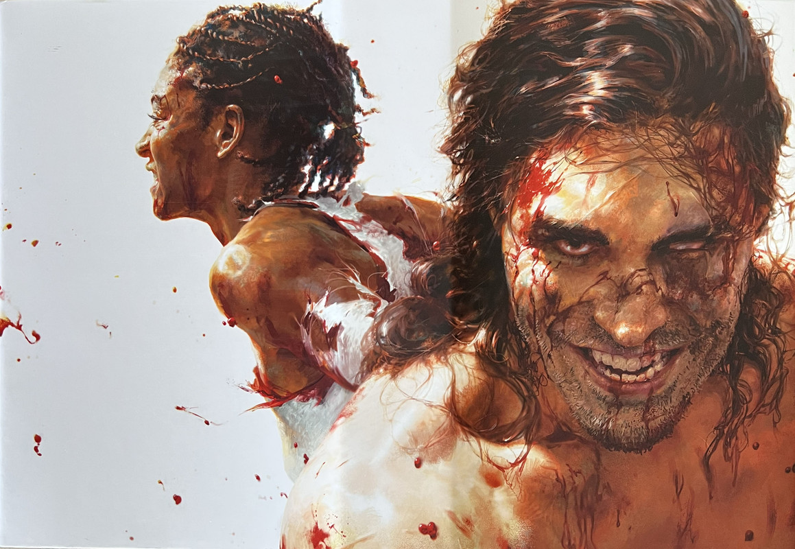
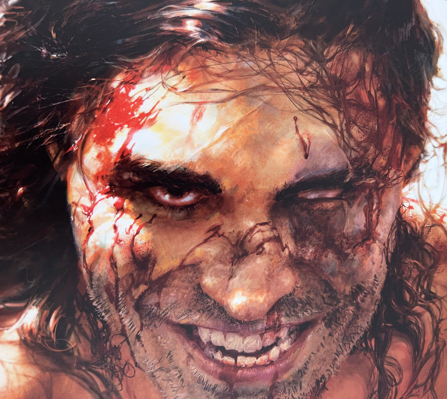
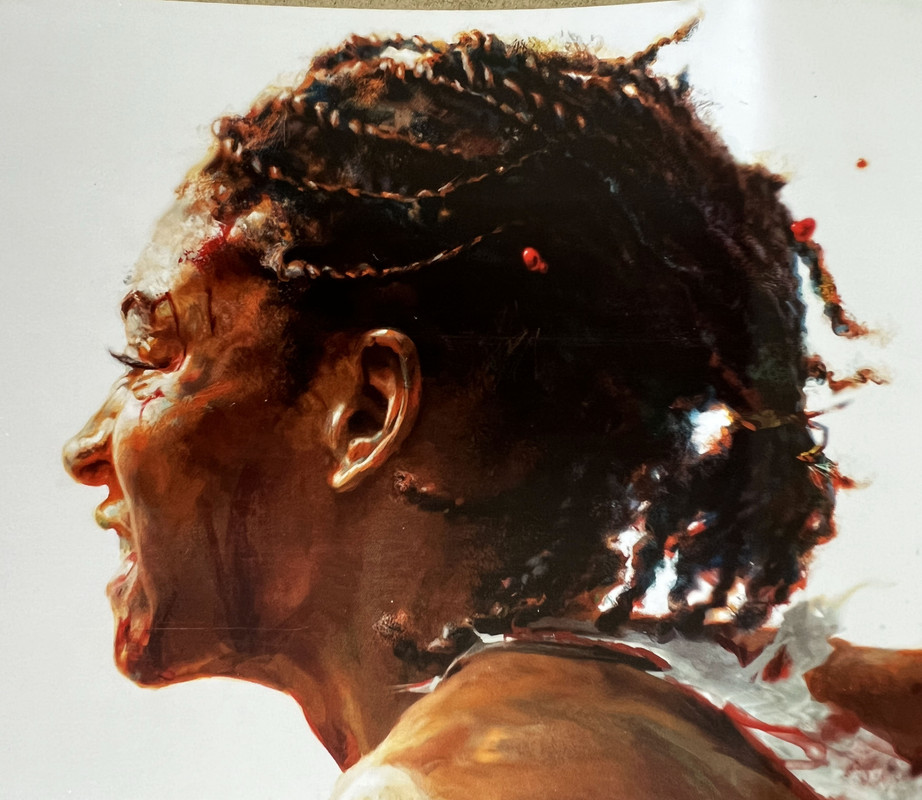
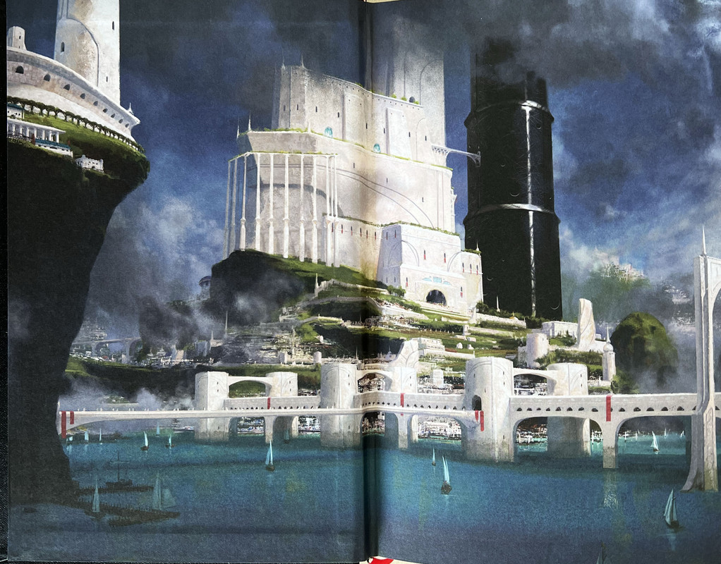
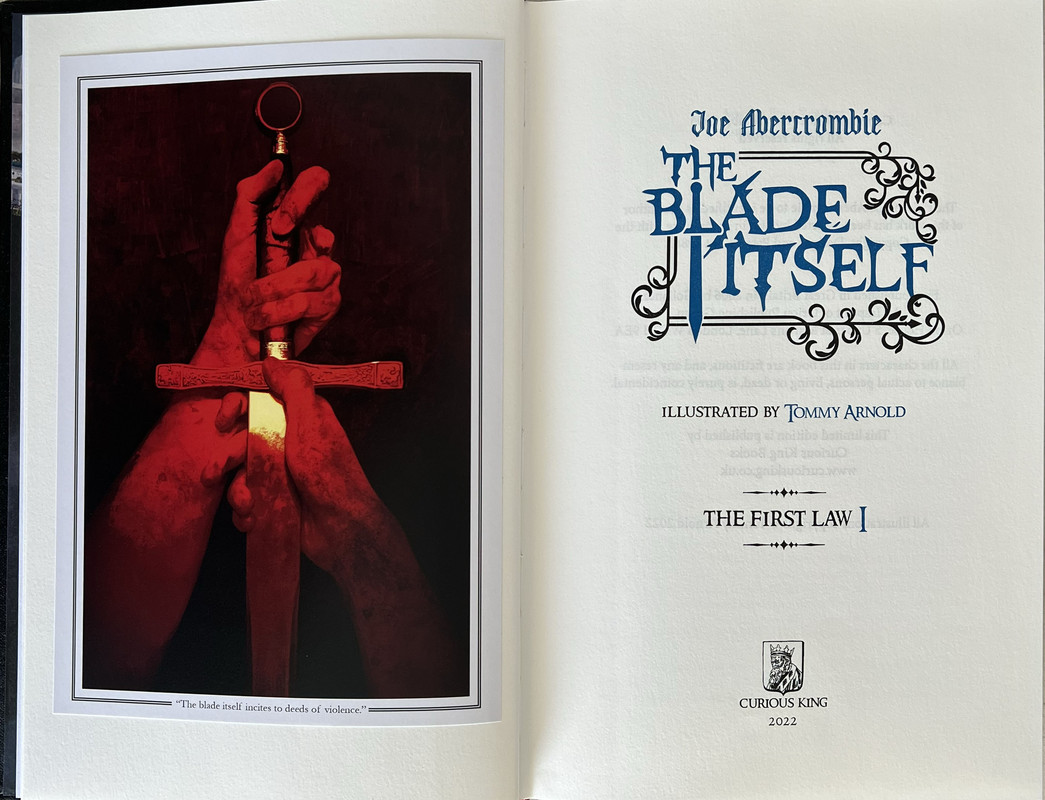
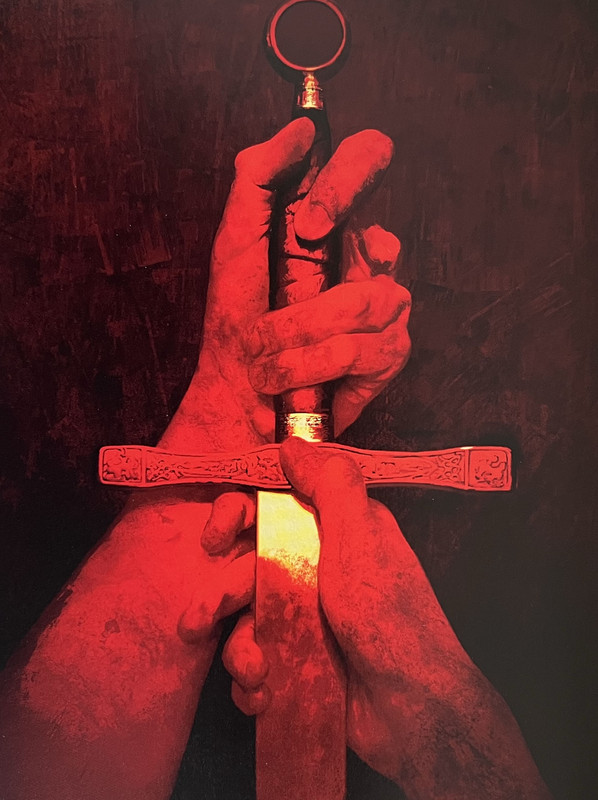
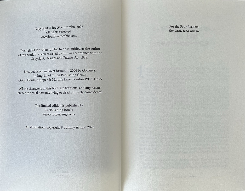
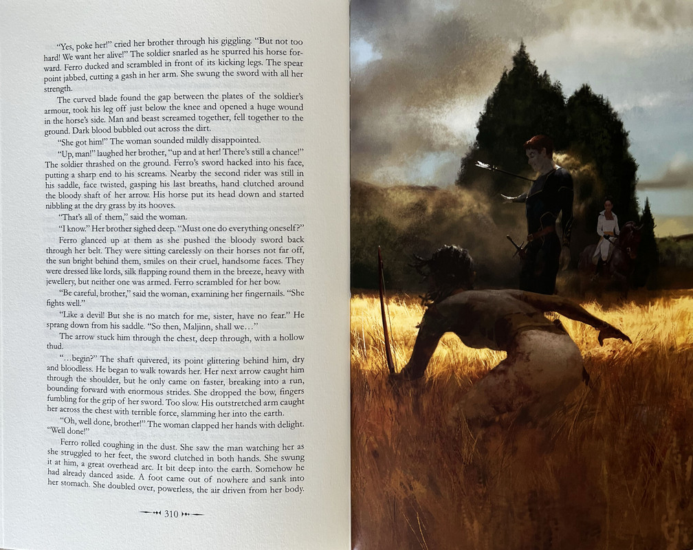
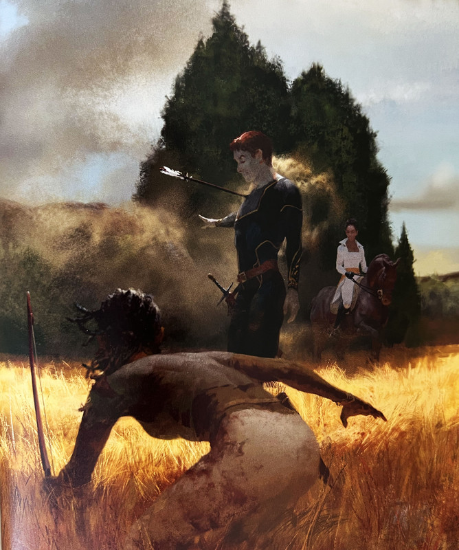
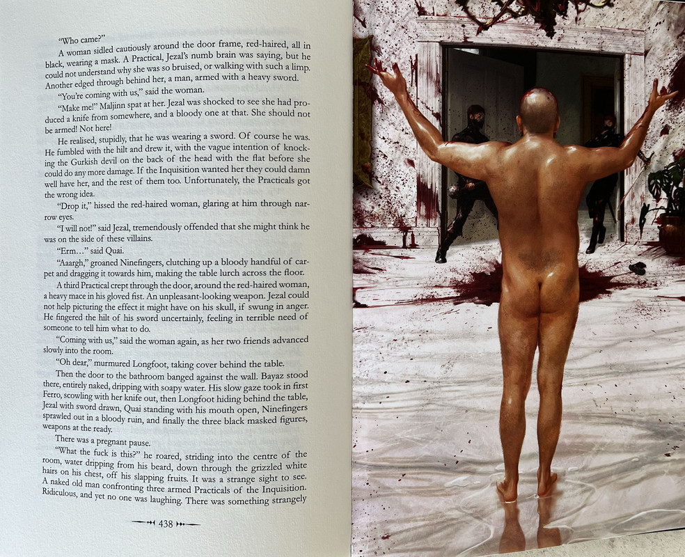
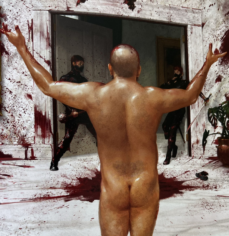
6 tipped in colour plates and frontispiece by Tommy Arnold.
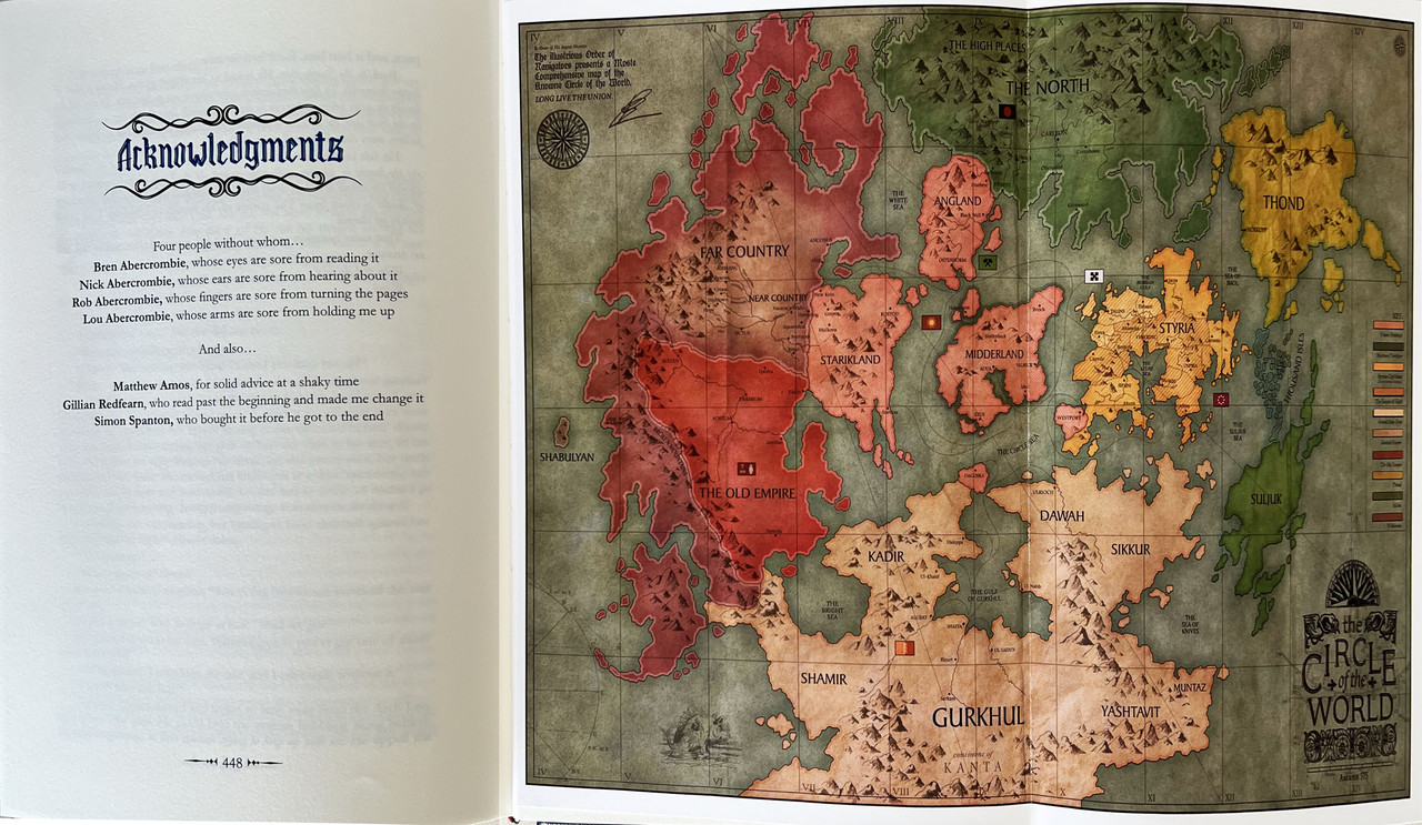
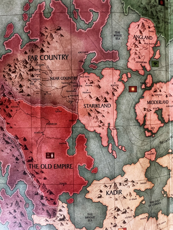
Colour fold out map approved by Joe Abercrombie.
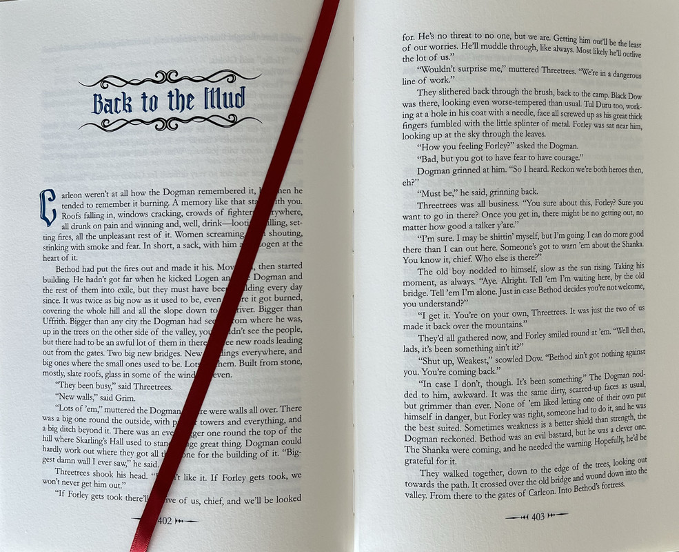
Printed letterpress in black and navy on Omnia Natural 120gsm.
Printed by Pat Randle from Nomad Letterpress on his Heidelberg Press.
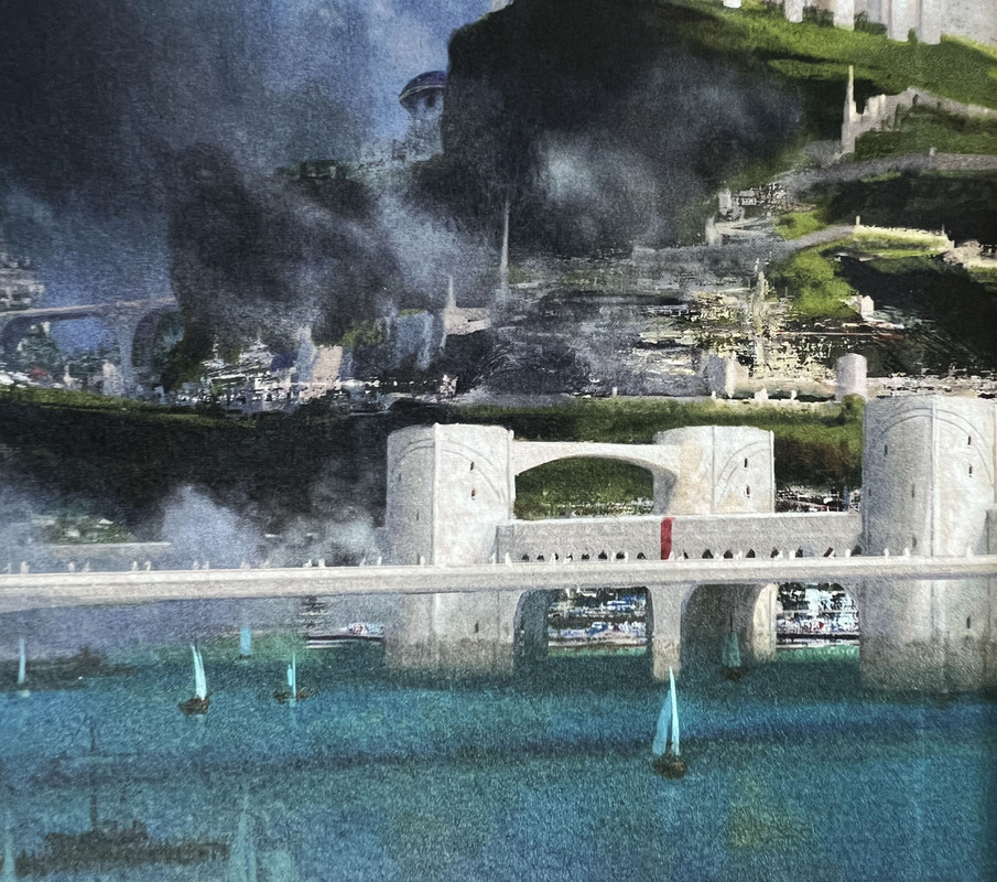
Landscape colour illustrated endpapers by Tommy Arnold.
Red ribbon page marker.
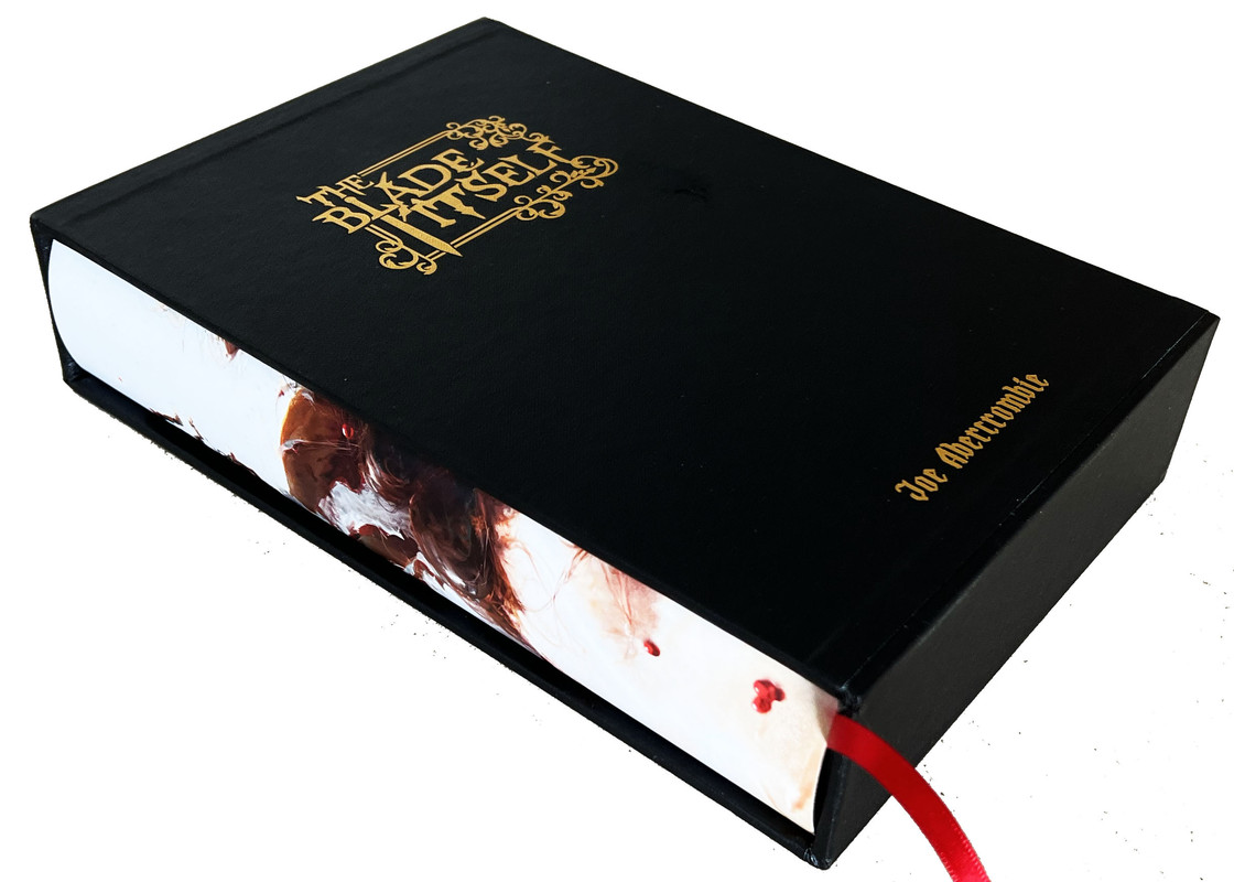
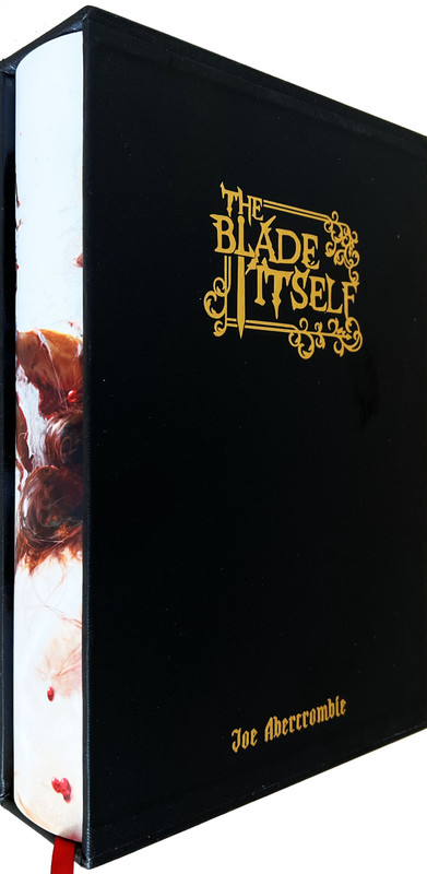
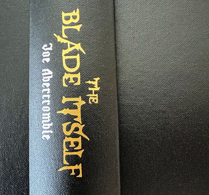
Colour dustjacket of Logen Ninefingers and Ferro Maljinn by Tommy Arnold.
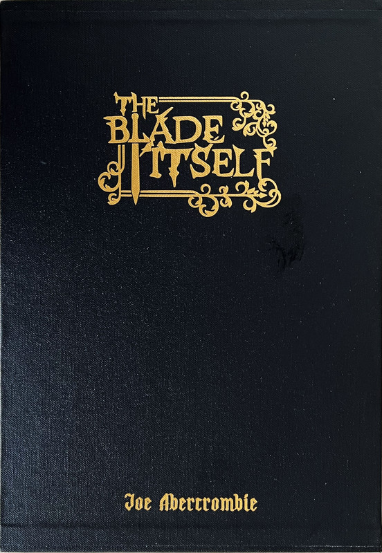
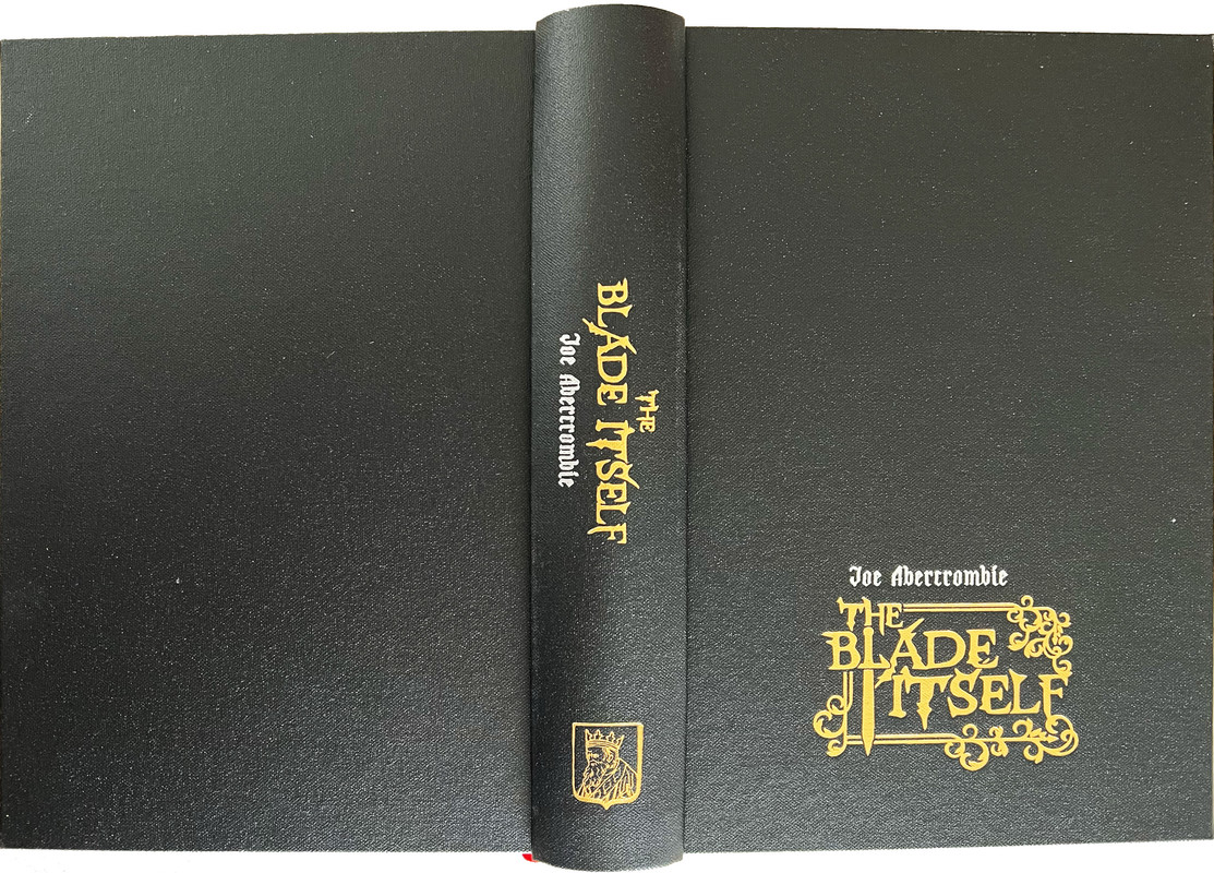
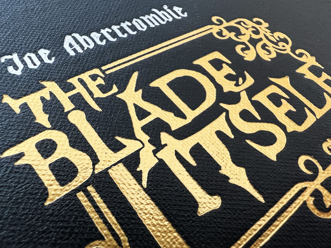
Bound in black buckram cloth with two hit foil stamping to the cover and spine.
Rounded spine and tailband.
Black buckram slipcase with design foil stamped onto the cover, lined with custom printed papers.
25.2x17cm.
480 pages
£200
Curious King initially committed to publishing all three novels by Joe Abercrombie in the First Law trilogy but have diverged to publish other books. They may come back and finish the trilogy in future years, but it is a pity they did not finish this trilogy before embarking on other endeavours.
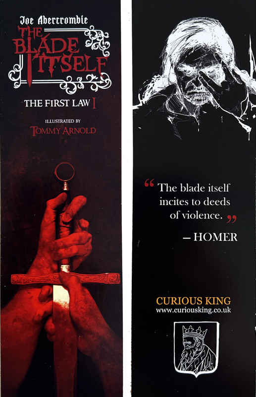
Front and back of enclosed bookmark
An index of the other illustrated reviews in the this series can be viewed here.
A PICTORIAL REVIEW
LIMITED EDITION
No. 231 of 500 copies
Signed by author and artist.
6 tipped in colour plates and frontispiece by Tommy Arnold.
Colour fold out map approved by Joe Abercrombie.
Printed letterpress in black and navy on Omnia Natural 120gsm.
Printed by Pat Randle from Nomad Letterpress on his Heidelberg Press.
Landscape colour illustrated endpapers by Tommy Arnold.
Red ribbon page marker.
Colour dustjacket of Logen Ninefingers and Ferro Maljinn by Tommy Arnold.
Bound in black buckram cloth with two hit foil stamping to the cover and spine.
Rounded spine and tailband.
Black buckram slipcase with design foil stamped onto the cover, lined with custom printed papers.
25.2x17cm.
480 pages
£200
Curious King initially committed to publishing all three novels by Joe Abercrombie in the First Law trilogy but have diverged to publish other books. They may come back and finish the trilogy in future years, but it is a pity they did not finish this trilogy before embarking on other endeavours.


Front and back of enclosed bookmark

An index of the other illustrated reviews in the this series can be viewed here.
2jsg1976
>1 wcarter: my understanding is that Anthony intends to finish the series, but at least as of the April update, he had not secured a commitment from an artist to illustrate the second book yet so hasn’t announced anything.
3NathanOv
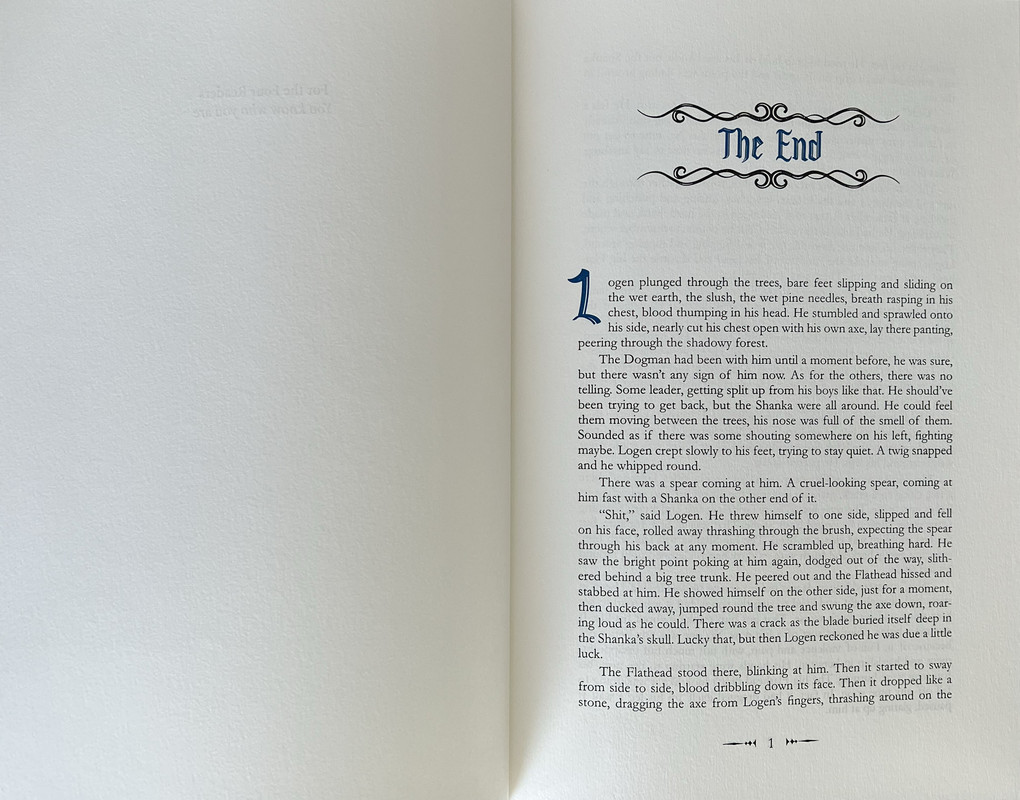
>1 wcarter: I like the general text design, but that looks like a lot of bleed-through through from the opposite side of the page.
If it’s not just a trick of the camera, would you say it’s more a case of thin paper or overly deep impressions?
If it’s not just a trick of the camera, would you say it’s more a case of thin paper or overly deep impressions?
4wcarter
>3 NathanOv:
Bleed through does not seem excessive when being read.
Bleed through does not seem excessive when being read.
5DMulvee
>3 NathanOv: I didn’t notice bleeding. I was impressed with the book, however felt the font size was a little small (of course a larger typeface would have required more pages and so cost more), and some pages had faint text.
6NathanOv
>4 wcarter: Thank you for clarifying! It jumped right out at me in the first few text images.
7abysswalker
I agree, bleed through does not seem like a problem to me.
Additionally, in some quarters I saw some criticism of small typeface but I do not think the typeface is small or hard to read.
I haven't in general been a fan of some of the Curious King designs, but overall I am quite happy with this edition, especially for the price.
Additionally, in some quarters I saw some criticism of small typeface but I do not think the typeface is small or hard to read.
I haven't in general been a fan of some of the Curious King designs, but overall I am quite happy with this edition, especially for the price.
8astropi
>7 abysswalker: I haven't in general been a fan of some of the Curious King designs
I thought The Blade Itself was their real first release -- I believe they rebound and added some illustrations and a traycase to their Ready Player One! but they did not print it -- and in total there were 26 rebound copies available, which of course makes it crazy rare. That said, again, I believe The Blade Itself is their first real work being printed and bound.
At the end of the day, I think most anyone that has the book can attest that this is a fabulous book at a fabulous price. I really do not know of many fine-press fantasy of this caliber. In fact, about the only other edition I can think of that is comparable is Lyra's Stardust. I do hope they publish the remaining two books in the trilogy -- I believe this is their plan.
9Libri_mea_vita_sunt
>7 abysswalker:
The Curious King designs are very commonly in my opinion. Nothing special here compared to other publishers. BUT dont get me wrong. The book is absolutely stunning and I love it.
I have no Conversation Tree Press book so far, atleast not physically, but those and especially the standard editions look absolutely stunning. Some bad tongues say that they look better then the numbered editions.
If i see the books (only the pictures, online ) and compare them with what I have from other publishers, those are by far the most best standard edition I have seen so far.( Design wise)
People have different tastes though...
10astropi
>9 Libri_mea_vita_sunt: The Curious King designs are very commonly in my opinion. Nothing special here compared to other publishers.
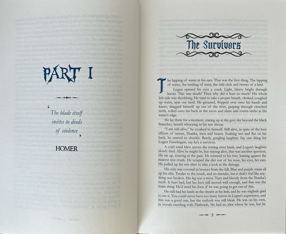
In what sense is it "common"? For example, the flourish at the start of each chapter, as well as the drop capitals are uncommon -- at least certainly by today's fine-press standards. And certainly uncommon for large works such as The Blade Itself -- which apparently has over 191,000 words! For me at any rate, the flourish at the start of each chapter name as well as the drop caps were an unexpected delight :)
In what sense is it "common"? For example, the flourish at the start of each chapter, as well as the drop capitals are uncommon -- at least certainly by today's fine-press standards. And certainly uncommon for large works such as The Blade Itself -- which apparently has over 191,000 words! For me at any rate, the flourish at the start of each chapter name as well as the drop caps were an unexpected delight :)
11Libri_mea_vita_sunt
I just talked about the overall design.
It's nothing special compared to the mockups from CTP and Amaranthine.
The text is top notch, but so is the book.
That doesn't mean, that this is not an extremely well made book and it's just my personal opinion.
It's nothing special compared to the mockups from CTP and Amaranthine.
The text is top notch, but so is the book.
That doesn't mean, that this is not an extremely well made book and it's just my personal opinion.

