The Holy Bible: Containing the Old and New Testaments (The World Publishing Company, 1949)
Talk Fine Press Forum
Join LibraryThing to post.
1Lukas1990
This book has never been on my wish-list which is dominated by illustrated books but once again I got a good offer that I couldn't resist. The very low price I paid for the book is due to the ugly 1.5 inch long cut on the spine but this cut doesn't bother me that much as the spine still feels solid. And the inside is immaculate. The book is now in safe and loving home and won't get hurt again.
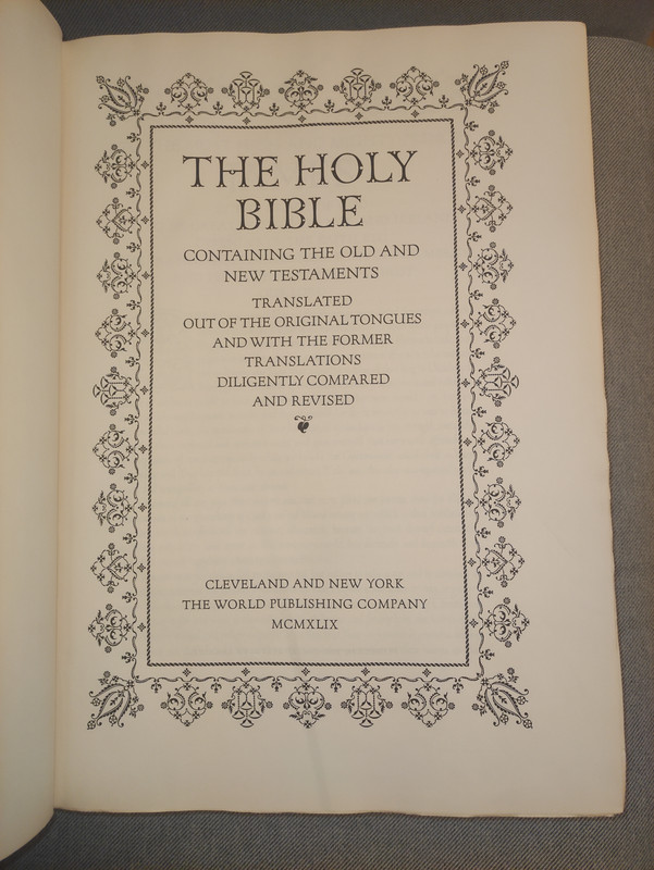
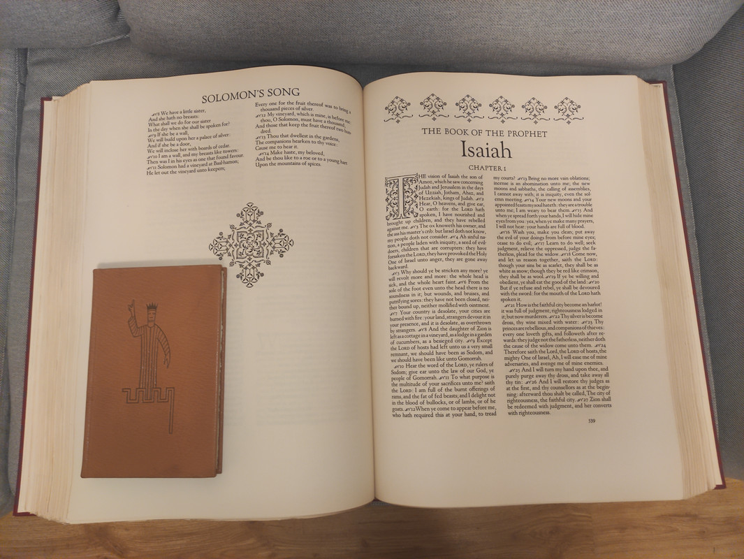
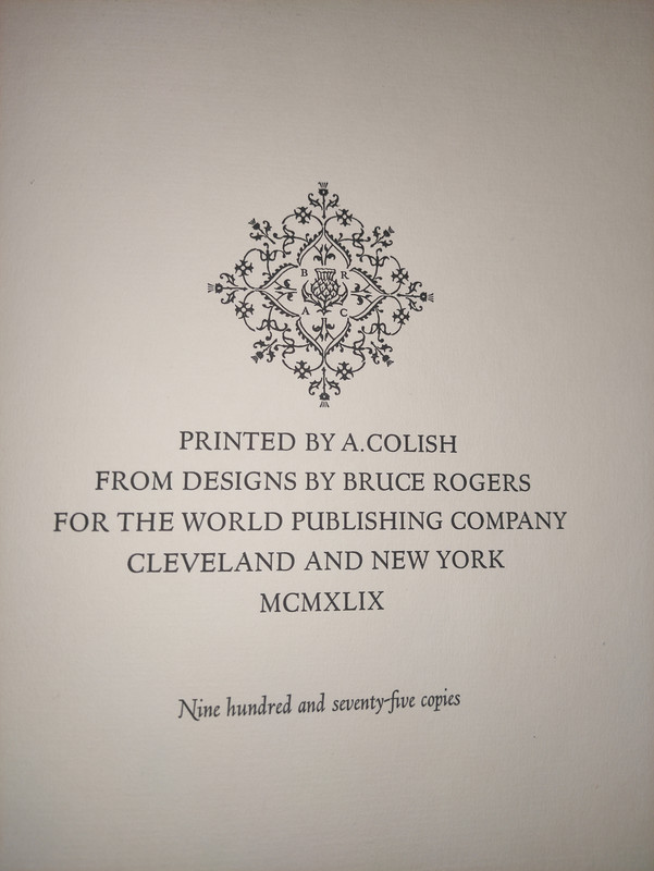
This is the second folio Bible designed by Bruce Rogers, (his first was the Oxford Lectern Bible, published in 1935), using the King James Version. The book measures 13 ½ in. x 19 in. x 3 ¾ in. There are 942 pages, top-edge gilt. It was printed by A. Colish. 975 copies issued.
The Making of the Bruce Rogers World Bible by William Targ (designed by Bruce Rogers and printed by A. Colish for presentation to their friends, edition of 1850 copies) gives insight into how this monumental book was made.
INCEPTION. In 1945 The World Publishing Company was engaged in refurbishing the format of it extensive list of Bibles. As he surveyed the Bible field in preparation for this task, B.D. Zevin, World’s president, was forcibly struck anew by something which had only vaguely disturbed him in the past - the lack of a contemporary American folio Bible of noble proportions and in the great Bible tradition. As he discussed this with his associates over a period of many months he formed a resolve to remedy this lack. Resolve notwithstanding, explorations and discussions revealed some formidable problems. Who could set the type for such an immense work? Who could print it? What plant could bind it? Clearly, such an undertaking could not be entered upon lightly.
Looking back on it now, it turned out that the problem which solved itself most easily was that one that seemed at the time to be the most difficult. The selection of a designer took up the greater part of Mr. Zevin’s thought, arousing alternately high hopes and deep despair. The grandeur and scope of the work contemplated called for a conception and ability whose scale few men could fulfill. A few, very few names were discussed back and forth interminably, but every discussion returned to and ended invariably with the one name brought up at the beginning. Bruce Rogers, of course, was this name. The thought of publishing an American folio Bible fashioned by his hand was an exciting prospect. Yet who could hope that Mr. Rogers would consent to undertake another folio Bible. He had already designed one such work, the Oxford Lectern Bible, and there was no reason to expect that he would wish to assume another task of such magnitude.
The months passed and the discussions continued. Then suddenly and quite unexpectedly the problem solved itself. Through Philip C. Duschnes, the New York bookseller, World learned, in September of 1945, that Bruce Rogers would like to make another folio Bible.
Here was news, and news of a most provocative nature. It was quickly communicated to Mr. Zevin in Cleveland. Within a week the first meeting took place with Mr. Rogers. On October 19 the first cost estimates were submitted and the decision to publish was made. In November and early December of 1945, correspondence between Mr. Rogers and Mr. Zevin formalized the agreement whereby Bruce Rogers would design a folio Bible for The World Publishing Company, to be printed in an edition of close to 1,000 copies, and to be sold for just under $200 per copy (in mid-1940’s dollars, which is about $3,500 in 2023 dollars).
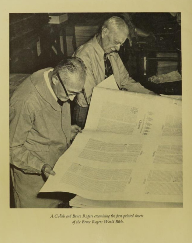
One of the important factors making such action possible was the participation, from the beginning, of Mr. A. Colish, one of our country’s great printers. This solved the problem of who was to set and print the work. It was Mr. Colish who worked with BR on the preparation of the numerous sample pages before the final selection of the typeface and decorative treatment. His subsequent supervision of the work, from typesetting through presswork, which consumed more than three years’ time and taxed his highest standards of craftsmanship, is among the great contributions made to the World Bible.
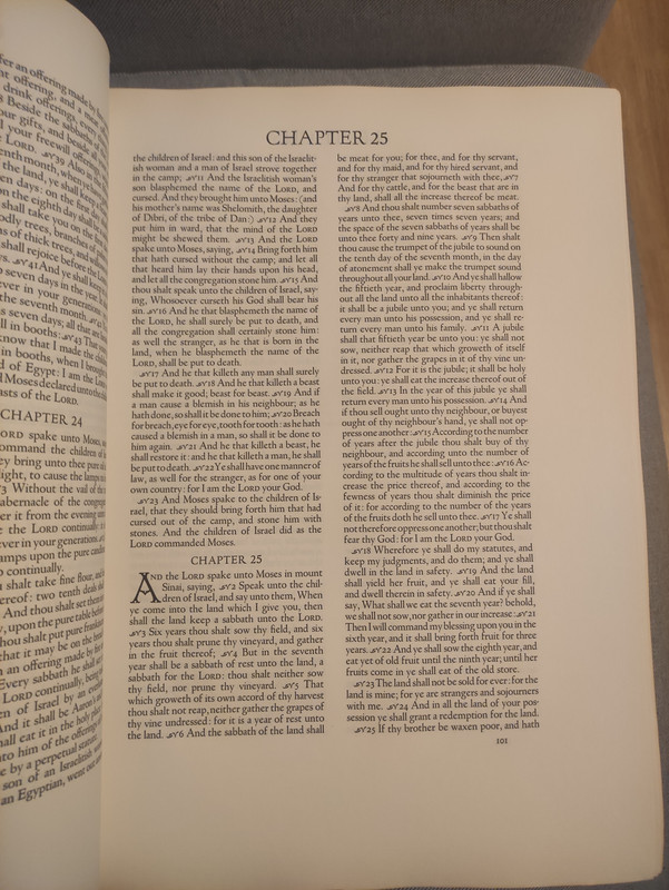
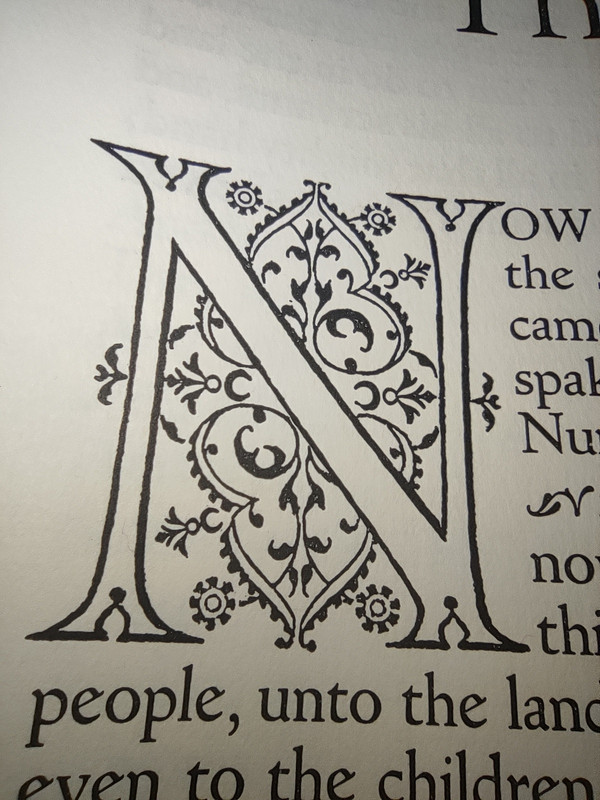
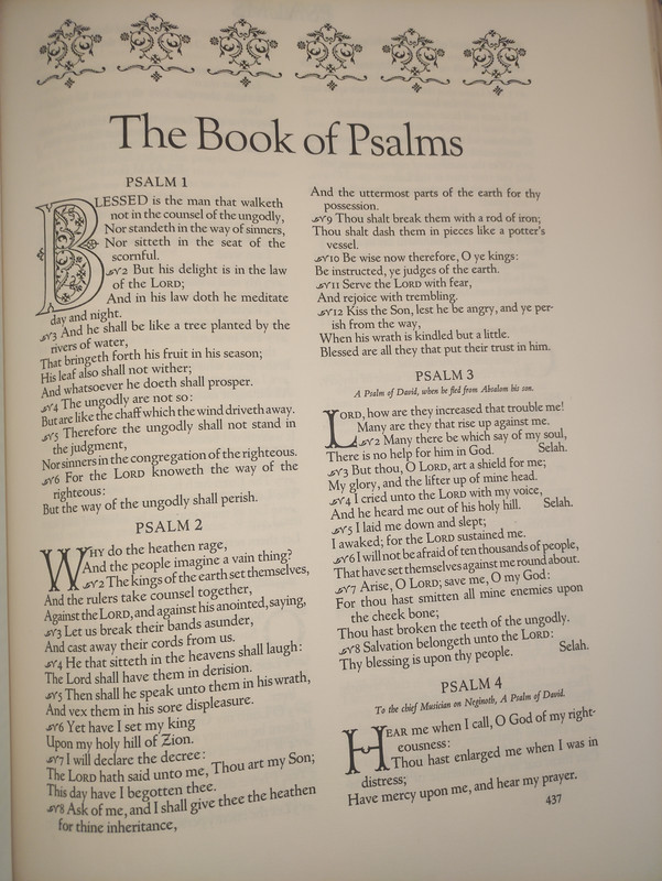
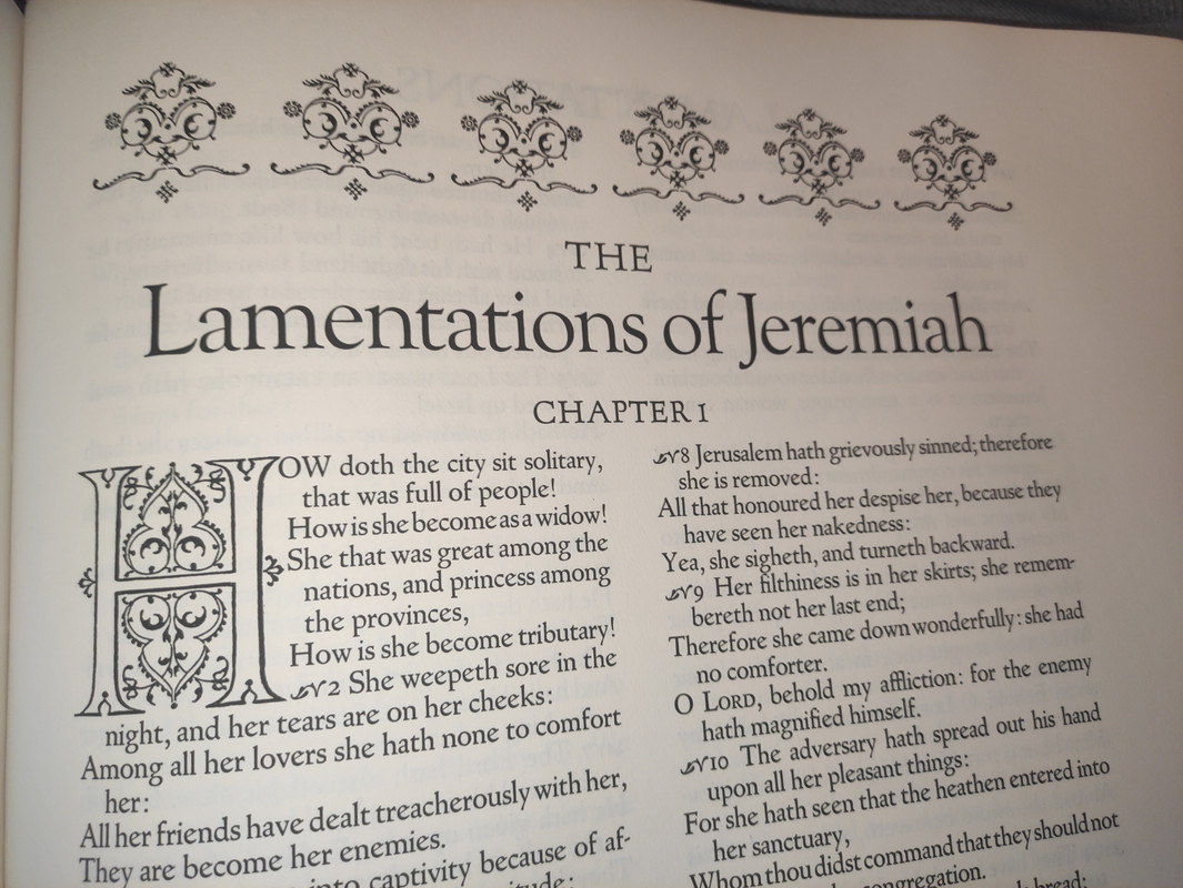
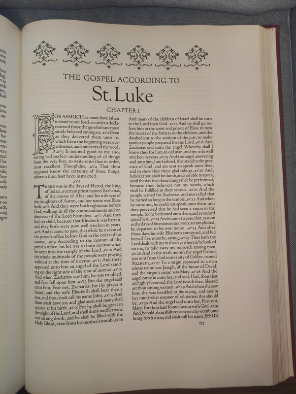
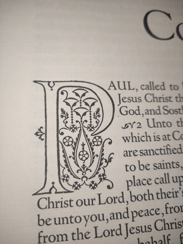
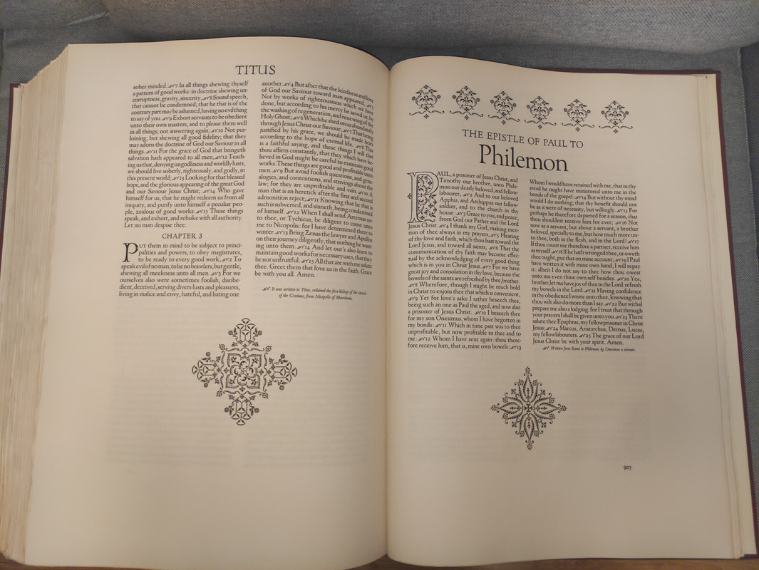
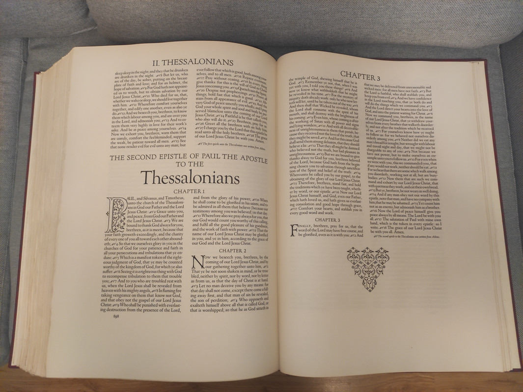
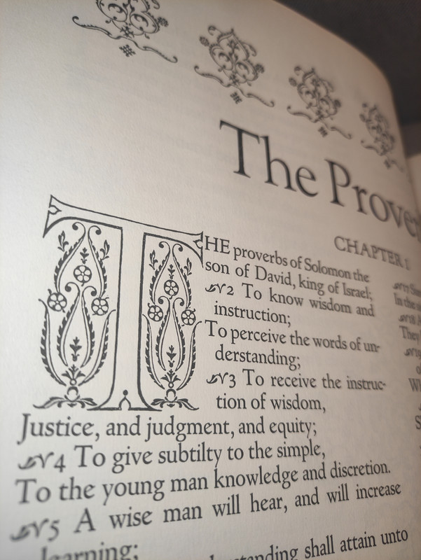
TYPE. The preparation of the type had consumed one and a half years time. The Goudy Newstyle, slightly modified by Bruce Rogers with Mr. Goudy's permission for the Bruce Rogers World Bible, was re-issued for machine composition and re-named Goudy Bible. As a personal tribute to his friend, BR used only Goudy types-Deepdene Italic, Forum, and Old Style-throughout the volume, so that typographically it is as much a Goudy as a Rogers Bible.
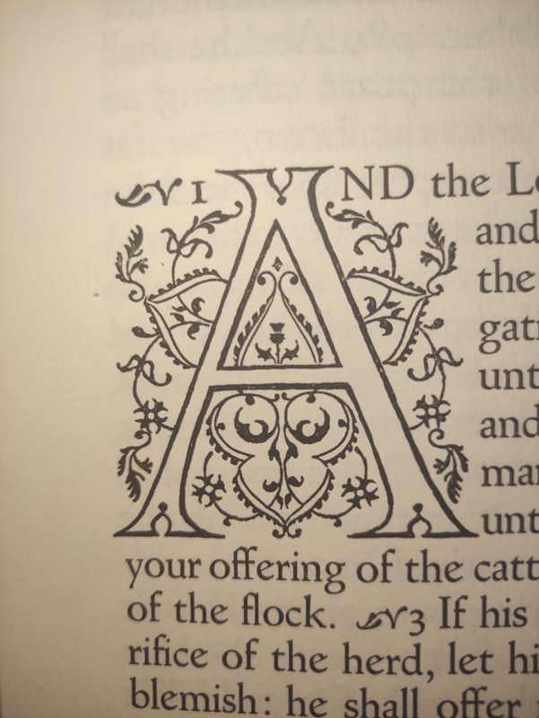
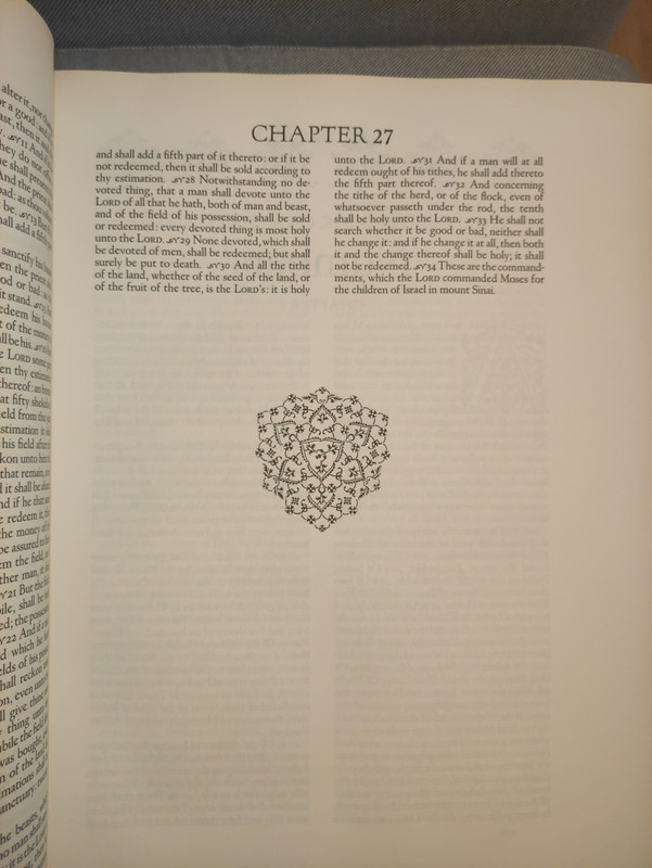
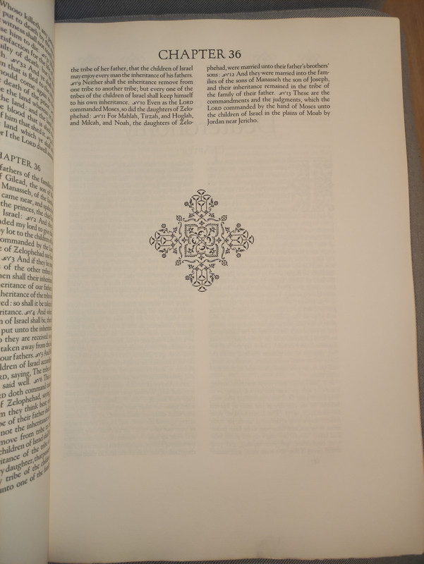
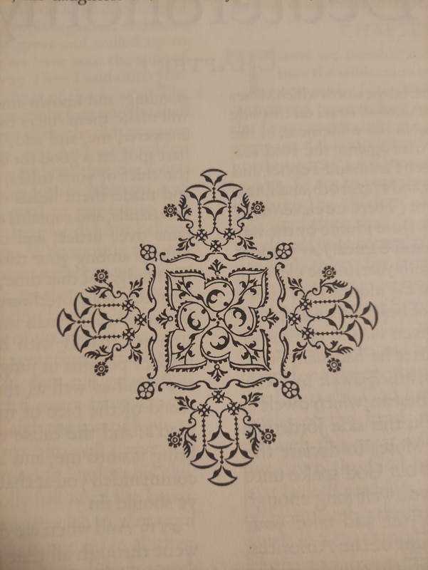
The decorative treatment of the book openings, tail-pieces, and initial letters is explained by BR in the Pro-spectus issued by the publishers in announcing the work: "The first edition of the King James Bible in 1611 was lavishly decorated with fairly good woodcuts. There were four varieties of headbands, featuring the emblems of royalty-the rose, thistle, harp, and fleur-de-lis-and two sets of initial letters, the large ones, very handsome, like the Z above, the smaller inferior. A very elaborate tail-piece was introduced occasionally. The ornate historiated title pages confirm the impression that no pains were spared to make the first edition of the new translation as handsome and elaborate as possible.
The new World Bible, in its turn, will be fittingly decorated, with headings to the sixty-six books, initial letters, and a bordered title page made up from type ornaments or flowers. These, together with the type selected, are intended to give a slightly oriental flavor to the volume, indicative of the Syriac and Hebrew sources of the text on which the King James translators based their version."
PAPER. The paper for the World Bible was made by the Worthy Paper Association before just before that fine mill was dismantled. Both Mr. Rogers and Mr. Colish felt that a rag content of less than 100 per cent would provide a better printing surface than a full rag sheet, and without any loss of beauty or permanence. The important factor was that the rags should be pure linen.
BR wrote to Mr. Zevin: "I myself am in favor of 75 percent (or even 50 percent) as it prints better than all-rag paper, and will last practically as long when made by experts, as this will be. Any of them will last 200 or 300 years-by which time printing will probably be obsolete replaced by other processes, as much of it is, even now..."
Out of twenty-nine different surfaces and shades of white paper examined, five were selected and printed upon before a decision was made. The final choice was a 74 lb. basis sheet with a 75 percent white linen rag con- tent. The shade is off-white, chosen because of its suitability for reading under artificial light. It was specially sized for letterpress printing with heavy ink. Shipment of the paper to the press was made on May 11, 1948.
When a watermark was proposed incorporating BR's initials and those of Mr. Colish with the World emblem, BR replied: "... I think your sketch and plan for the watermark is excellent and I don't need to revise it or redraw it in any way. Jack Green, of the Barcham Green Mill in England always used to draw his watermarks as well as he could with his left hand to prevent their being too perfect. I think it should be placed so as to come in the center (or about) of the lower margin of a page - every eight pages, as you suggest."
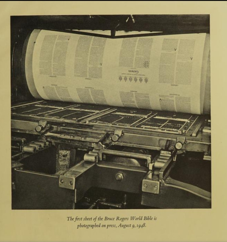
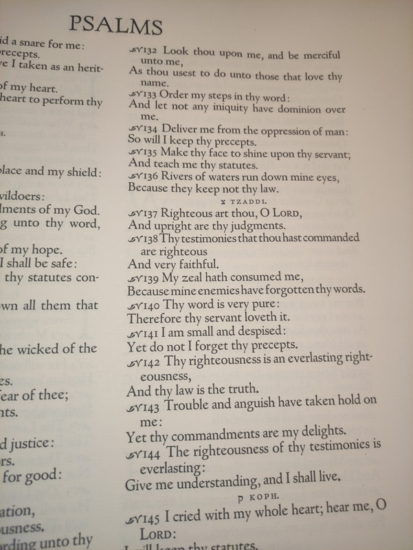
COMPOSITION. It was begun in Mr. Colish's shop soon after the mats were received from Lanston. Keyboarding and casting are, of course, machine operations, but so many lines in the text were respaced by hand that it is hardly accurate to consider the World Bible a machine-set job. The large size of type, 18 point, made bad division of words and extremely wide spacing between words a constant problem. Close spacing was used, and many lines were found to be a little too tight for comfortable reading. Mr. Colish then resorted to an unusually slow and costly method of respacing. This amounted to hand composition in a very large portion of the work. Altogether, the time required for composition, make-up of pages, proof reading, and correcting was two years.
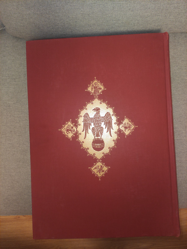
BINDING. As with the other problems, the choice of a binder A narrowed down to just one firm, the Russell-Rutter Company. The binding of so large a book is no job to envy, most of the operations having to be executed by hand. But here again idealism and love of fine craftsmanship came into play, Russell-Rutter's president, Mr. Frank Fortney, personally supervising all the laborious details of this great work.
Feeling that a fine cloth would be sturdier than leather, Mr. Rogers selected the very heavy Legal Buckram manufactured by Joseph Bancroft and Sons. A special run of the cloth was made and a special shade of red secured to fill BR's specifications.
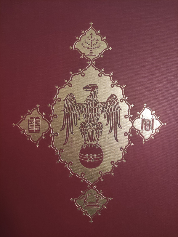
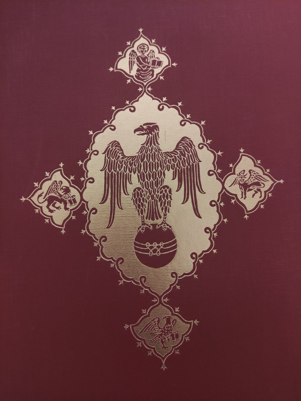
The rounding and backing of the spine was formed by hand, there being no machine big enough for this size of book. The top edge of the pages was finished in gold leaf, but the other edges were left untrimmed. The cover stamping designs by BR show the symbolic eagle associated with the pulpit. On the front cover, surrounding the eagle, are four Old Testament signs, while the eagle on the back is surrounded by the symbols of the Four Apostles.
Photos of my copy:
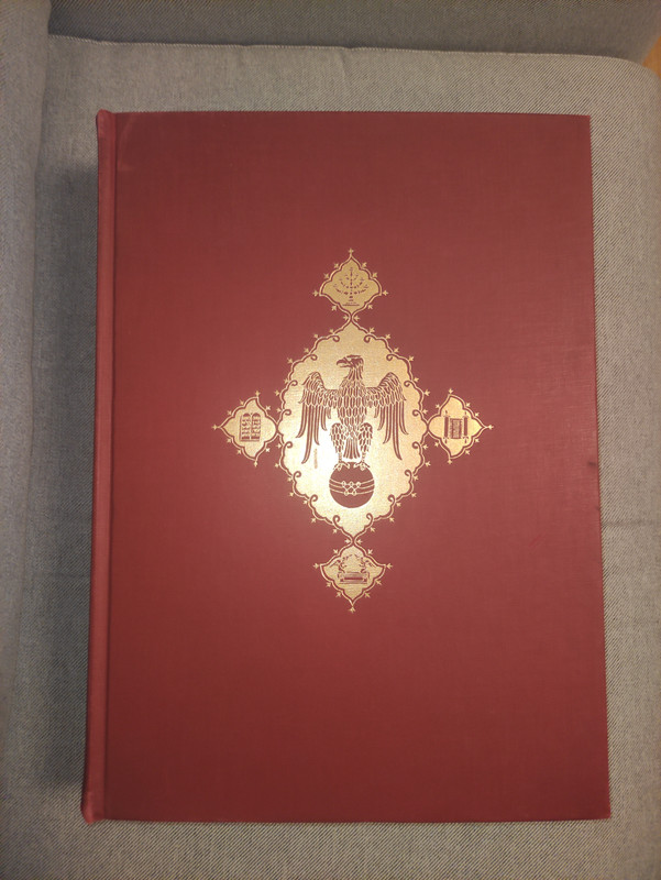
This is the second folio Bible designed by Bruce Rogers, (his first was the Oxford Lectern Bible, published in 1935), using the King James Version. The book measures 13 ½ in. x 19 in. x 3 ¾ in. There are 942 pages, top-edge gilt. It was printed by A. Colish. 975 copies issued.
The Making of the Bruce Rogers World Bible by William Targ (designed by Bruce Rogers and printed by A. Colish for presentation to their friends, edition of 1850 copies) gives insight into how this monumental book was made.
INCEPTION. In 1945 The World Publishing Company was engaged in refurbishing the format of it extensive list of Bibles. As he surveyed the Bible field in preparation for this task, B.D. Zevin, World’s president, was forcibly struck anew by something which had only vaguely disturbed him in the past - the lack of a contemporary American folio Bible of noble proportions and in the great Bible tradition. As he discussed this with his associates over a period of many months he formed a resolve to remedy this lack. Resolve notwithstanding, explorations and discussions revealed some formidable problems. Who could set the type for such an immense work? Who could print it? What plant could bind it? Clearly, such an undertaking could not be entered upon lightly.
Looking back on it now, it turned out that the problem which solved itself most easily was that one that seemed at the time to be the most difficult. The selection of a designer took up the greater part of Mr. Zevin’s thought, arousing alternately high hopes and deep despair. The grandeur and scope of the work contemplated called for a conception and ability whose scale few men could fulfill. A few, very few names were discussed back and forth interminably, but every discussion returned to and ended invariably with the one name brought up at the beginning. Bruce Rogers, of course, was this name. The thought of publishing an American folio Bible fashioned by his hand was an exciting prospect. Yet who could hope that Mr. Rogers would consent to undertake another folio Bible. He had already designed one such work, the Oxford Lectern Bible, and there was no reason to expect that he would wish to assume another task of such magnitude.
The months passed and the discussions continued. Then suddenly and quite unexpectedly the problem solved itself. Through Philip C. Duschnes, the New York bookseller, World learned, in September of 1945, that Bruce Rogers would like to make another folio Bible.
Here was news, and news of a most provocative nature. It was quickly communicated to Mr. Zevin in Cleveland. Within a week the first meeting took place with Mr. Rogers. On October 19 the first cost estimates were submitted and the decision to publish was made. In November and early December of 1945, correspondence between Mr. Rogers and Mr. Zevin formalized the agreement whereby Bruce Rogers would design a folio Bible for The World Publishing Company, to be printed in an edition of close to 1,000 copies, and to be sold for just under $200 per copy (in mid-1940’s dollars, which is about $3,500 in 2023 dollars).
One of the important factors making such action possible was the participation, from the beginning, of Mr. A. Colish, one of our country’s great printers. This solved the problem of who was to set and print the work. It was Mr. Colish who worked with BR on the preparation of the numerous sample pages before the final selection of the typeface and decorative treatment. His subsequent supervision of the work, from typesetting through presswork, which consumed more than three years’ time and taxed his highest standards of craftsmanship, is among the great contributions made to the World Bible.
TYPE. The preparation of the type had consumed one and a half years time. The Goudy Newstyle, slightly modified by Bruce Rogers with Mr. Goudy's permission for the Bruce Rogers World Bible, was re-issued for machine composition and re-named Goudy Bible. As a personal tribute to his friend, BR used only Goudy types-Deepdene Italic, Forum, and Old Style-throughout the volume, so that typographically it is as much a Goudy as a Rogers Bible.
The decorative treatment of the book openings, tail-pieces, and initial letters is explained by BR in the Pro-spectus issued by the publishers in announcing the work: "The first edition of the King James Bible in 1611 was lavishly decorated with fairly good woodcuts. There were four varieties of headbands, featuring the emblems of royalty-the rose, thistle, harp, and fleur-de-lis-and two sets of initial letters, the large ones, very handsome, like the Z above, the smaller inferior. A very elaborate tail-piece was introduced occasionally. The ornate historiated title pages confirm the impression that no pains were spared to make the first edition of the new translation as handsome and elaborate as possible.
The new World Bible, in its turn, will be fittingly decorated, with headings to the sixty-six books, initial letters, and a bordered title page made up from type ornaments or flowers. These, together with the type selected, are intended to give a slightly oriental flavor to the volume, indicative of the Syriac and Hebrew sources of the text on which the King James translators based their version."
PAPER. The paper for the World Bible was made by the Worthy Paper Association before just before that fine mill was dismantled. Both Mr. Rogers and Mr. Colish felt that a rag content of less than 100 per cent would provide a better printing surface than a full rag sheet, and without any loss of beauty or permanence. The important factor was that the rags should be pure linen.
BR wrote to Mr. Zevin: "I myself am in favor of 75 percent (or even 50 percent) as it prints better than all-rag paper, and will last practically as long when made by experts, as this will be. Any of them will last 200 or 300 years-by which time printing will probably be obsolete replaced by other processes, as much of it is, even now..."
Out of twenty-nine different surfaces and shades of white paper examined, five were selected and printed upon before a decision was made. The final choice was a 74 lb. basis sheet with a 75 percent white linen rag con- tent. The shade is off-white, chosen because of its suitability for reading under artificial light. It was specially sized for letterpress printing with heavy ink. Shipment of the paper to the press was made on May 11, 1948.
When a watermark was proposed incorporating BR's initials and those of Mr. Colish with the World emblem, BR replied: "... I think your sketch and plan for the watermark is excellent and I don't need to revise it or redraw it in any way. Jack Green, of the Barcham Green Mill in England always used to draw his watermarks as well as he could with his left hand to prevent their being too perfect. I think it should be placed so as to come in the center (or about) of the lower margin of a page - every eight pages, as you suggest."
COMPOSITION. It was begun in Mr. Colish's shop soon after the mats were received from Lanston. Keyboarding and casting are, of course, machine operations, but so many lines in the text were respaced by hand that it is hardly accurate to consider the World Bible a machine-set job. The large size of type, 18 point, made bad division of words and extremely wide spacing between words a constant problem. Close spacing was used, and many lines were found to be a little too tight for comfortable reading. Mr. Colish then resorted to an unusually slow and costly method of respacing. This amounted to hand composition in a very large portion of the work. Altogether, the time required for composition, make-up of pages, proof reading, and correcting was two years.
BINDING. As with the other problems, the choice of a binder A narrowed down to just one firm, the Russell-Rutter Company. The binding of so large a book is no job to envy, most of the operations having to be executed by hand. But here again idealism and love of fine craftsmanship came into play, Russell-Rutter's president, Mr. Frank Fortney, personally supervising all the laborious details of this great work.
Feeling that a fine cloth would be sturdier than leather, Mr. Rogers selected the very heavy Legal Buckram manufactured by Joseph Bancroft and Sons. A special run of the cloth was made and a special shade of red secured to fill BR's specifications.
The rounding and backing of the spine was formed by hand, there being no machine big enough for this size of book. The top edge of the pages was finished in gold leaf, but the other edges were left untrimmed. The cover stamping designs by BR show the symbolic eagle associated with the pulpit. On the front cover, surrounding the eagle, are four Old Testament signs, while the eagle on the back is surrounded by the symbols of the Four Apostles.


Photos of my copy:


2ChestnutPress
>1 Lukas1990: That’s a very handsome volume, Lukas. The tear in the spine cloth is really of little consequence when taken into the grander scheme of things. It looks otherwise impeccable
3wcarter
>1 Lukas1990:
You obviously like absolutely massive books! Extraordinary publication.
You obviously like absolutely massive books! Extraordinary publication.

