The Works of Geoffrey Chaucer - Shakespeare Head Press (1928)
Talk Fine Press Forum
Join LibraryThing to post.
1a.friend
The Kelmscott Chaucer worthily stands as perhaps the tallest giant in the realm of fine press. It looms so largely over the field that various facsimiles have spawned in its afterglow, with some received as highly accomplished fine press themselves. Though Morris's magnum opus is beyond reproach in good faith, the blanketing shadow it casts sometimes diminutizes the triumphs of other presses—to the disservice of their proprietors, but potentially to the advantage of discerning patrons. I submit that the many tales of Chaucer printed by Shakespeare Head—under the supervision of Basil Blackwell and Bernard Henry Newdigate, using one of the very presses which printed the Kelmscott Chaucer (Pirages catalogue for The Works of William Shakespeare, 2024; "Fine Presses of Great Britain," University of Oregon, 2024)—summits as a point of pride in any literary collection.
The standard version of this set comprises 8 quarto volumes in Holland-linen-backed sea green boards and beige linen spines with pasted paper labels. The text is tri-color letterpress set in Caslon Old Face on Batchelor's handmade Kelmscott—some of the finest paper in the world; the vital headings, drop-caps and ornaments are original designs; multiple artists and typographic plans are deployed, exhibiting the creativity and vivacity of the Press and making for a bracing read. Interestingly, the fifty or so pilgrims wandering around the margins of the Canterbury Tales, drawn free-hand and hand-colored by Hugh Chesterman, pay homage to the seminal Ellesmere transcript. Most delightfully, Shakespeare Head opted to use a wide palette of rich colors for the 100+ illustrations, including several instances of silver, gold, and what appears to my eyes to be lapis lazuli, vermilion and emerald (if anyone knows more about this, your insights would be most welcome).
Colin Franklin, an influential bibliographer, book-collector and bookseller, remarked on the special set of Shakespeare Head's Chaucer on vellum, of which there exist a maximum of eleven copies: "Nothing in the private press movement gives quite such jeweled splendor as this" (Sotheby's auction, 1989). I offer, then, that this Chaucer, of which there exist a maximum of 386 copies between the two editions, is Shakespeare Head's magnum opus, and that even the standard edition by itself transcends the Press's well-earned position in the second tier of great private presses, alongside luminaries such as the Golden Cockerel Press—it belongs in the first tier of great private press achievements, galloping apace with all but the most exemplary few works of the Presses Ashendene, Doves and Kelmscott. (As for the SH Chaucer on vellum... perhaps some of us have had or will have the good fortune of judging it against the masterpieces of the other Presses.)
And what joyous news, my friends! The complete standard set can be found on the secondhand market for around $2,000 USD—absolutely a substantial sum but relatively an extraordinary bargain.
Regardless, I hope you all enjoy the pictures herein despite the pain of my shoddy photography. You can click on any image to visit the source page and view it in its native resolution.


The standard version of this set comprises 8 quarto volumes in Holland-linen-backed sea green boards and beige linen spines with pasted paper labels. The text is tri-color letterpress set in Caslon Old Face on Batchelor's handmade Kelmscott—some of the finest paper in the world; the vital headings, drop-caps and ornaments are original designs; multiple artists and typographic plans are deployed, exhibiting the creativity and vivacity of the Press and making for a bracing read. Interestingly, the fifty or so pilgrims wandering around the margins of the Canterbury Tales, drawn free-hand and hand-colored by Hugh Chesterman, pay homage to the seminal Ellesmere transcript. Most delightfully, Shakespeare Head opted to use a wide palette of rich colors for the 100+ illustrations, including several instances of silver, gold, and what appears to my eyes to be lapis lazuli, vermilion and emerald (if anyone knows more about this, your insights would be most welcome).
Colin Franklin, an influential bibliographer, book-collector and bookseller, remarked on the special set of Shakespeare Head's Chaucer on vellum, of which there exist a maximum of eleven copies: "Nothing in the private press movement gives quite such jeweled splendor as this" (Sotheby's auction, 1989). I offer, then, that this Chaucer, of which there exist a maximum of 386 copies between the two editions, is Shakespeare Head's magnum opus, and that even the standard edition by itself transcends the Press's well-earned position in the second tier of great private presses, alongside luminaries such as the Golden Cockerel Press—it belongs in the first tier of great private press achievements, galloping apace with all but the most exemplary few works of the Presses Ashendene, Doves and Kelmscott. (As for the SH Chaucer on vellum... perhaps some of us have had or will have the good fortune of judging it against the masterpieces of the other Presses.)
And what joyous news, my friends! The complete standard set can be found on the secondhand market for around $2,000 USD—absolutely a substantial sum but relatively an extraordinary bargain.
Regardless, I hope you all enjoy the pictures herein despite the pain of my shoddy photography. You can click on any image to visit the source page and view it in its native resolution.


2abysswalker
The Parson's Tale page in particular is lovely.
Thanks for posting.
Thanks for posting.
3Sport1963
>1 a.friend: Magnificent indeed, thank you for posting, and your photography is quite good. The Shakespeare Head Press (SHP) is often lumped into the second tier of British Fine Press ranks but there are nine titles that arguably deserve consideration in the first tier. I agree with you that the SHP "Chaucer" is its magnum opus, and sits in first place among the SHP magic "Nonet". These are titles which any Fine Press collector would be proud to have in their collection. While these titles are not cheap, near fine copies are still within reach for most collectors. You can read more about this series of fine books in David Butcher's "Pages From Presses II".
The titles in chronological order are:
"Froissarts Cronycles" (1928), 8 vols
Plutarch's "Lives of the Noble Grecians and Romanes" (1928), 8 vols
"The Works of Geoffrey Chaucer" (1929), 8 vols
"The Whole Works of Homer" (1930-31), 5 vols
"The Works of Edmund Spenser" (1932), 8 vols
"Pindar's Odes to Victory" (1928, 1932), 2 vols
Bede's "History of the Church of Englande" (1932)
Malory's "The Noble & Joyous Boke Entytled Le Morte Darthur" (1933), 2 vols
Boccaccio's "Decameron" (1934-5), 2 vols
You will need a lot of shelf space, but these titles all bear Bernard Newdigate's excellent typographical design and are expertly printed on Batchelor handmade papers. My only criticism is that some of the earliest titles were not bound in a style befitting their contents. To be fair, the SHP expected many of the sets would be rebound by their owners in a more sumptuous fashion according to their taste. To that end, it makes collecting these titles interesting for some of the unique rebinds that occasionally come to market.
The titles in chronological order are:
"Froissarts Cronycles" (1928), 8 vols
Plutarch's "Lives of the Noble Grecians and Romanes" (1928), 8 vols
"The Works of Geoffrey Chaucer" (1929), 8 vols
"The Whole Works of Homer" (1930-31), 5 vols
"The Works of Edmund Spenser" (1932), 8 vols
"Pindar's Odes to Victory" (1928, 1932), 2 vols
Bede's "History of the Church of Englande" (1932)
Malory's "The Noble & Joyous Boke Entytled Le Morte Darthur" (1933), 2 vols
Boccaccio's "Decameron" (1934-5), 2 vols
You will need a lot of shelf space, but these titles all bear Bernard Newdigate's excellent typographical design and are expertly printed on Batchelor handmade papers. My only criticism is that some of the earliest titles were not bound in a style befitting their contents. To be fair, the SHP expected many of the sets would be rebound by their owners in a more sumptuous fashion according to their taste. To that end, it makes collecting these titles interesting for some of the unique rebinds that occasionally come to market.
4Lukas1990
This set was always very high on my wishlist and only limited shelf space and, to some degree, antiquated English prevents me from buying it.
I own "The Whole Works of Homer", one volume of "Pindar's Odes to Victory" and "Confessions of an English Opium Eater" (Limited Editions Club). These are some of the most finely printed books in my modest collection. The price of Chaucer or Froissart on the secondary market still amazes me. It's way too low for such quality production. Hope it stays so until I buy both sets...
I own "The Whole Works of Homer", one volume of "Pindar's Odes to Victory" and "Confessions of an English Opium Eater" (Limited Editions Club). These are some of the most finely printed books in my modest collection. The price of Chaucer or Froissart on the secondary market still amazes me. It's way too low for such quality production. Hope it stays so until I buy both sets...
5ChestnutPress
>3 Sport1963: I think it fair to at least mention a couple of the Cresset Press editions that SHP printed, namely their Essays of Francis Bacon, Paradise Lost & Paradise Regained, and Pilgrim’s Progress.
6BillWoodbridge
>3 Sport1963: Thank you, this is a very useful list, since among the other unusual aspects of the SHP for fine press collectors is the constant need to discriminate between its fine printing and its more day-to-day (although still high quality) work. It aligns pretty closely with Franklin and Cave’s views.
Personally I’d make just two additions, admittedly towards the modest end of the scale, which are the two early Newdigate books:
The Loves of Clitophon and Leucippe (1923)
Ovyde, Hys Booke of Metamorphose (1924)
I’d also raise the bar for the Plutarch and specify the handmade paper limitation of 100 copies – I think the only one of these titles that consideration applies to (ignoring the vellum limitations of course). And perhaps finally add the Bullen-era complete works of Shakespeare set, although of course that’s outside the spirit of this Newdigate-centric list.
I agree 100% with the comments regarding the undervaluing of SHP on the market, although this isn’t quite as pronounced as a few years ago I feel. My theory is that this could be partly due to the SHP's slightly odd status as an entity that did all its own printing but wasn’t a publisher (they used Basil Blackwell's imprint), as opposed to the more usual phenomenon of a ‘Private Press’ that in fact acted principally as a publisher while outsourcing its own printing (eg Nonesuch and Golden Cockerel post-Gibbings).
Personally I’d make just two additions, admittedly towards the modest end of the scale, which are the two early Newdigate books:
The Loves of Clitophon and Leucippe (1923)
Ovyde, Hys Booke of Metamorphose (1924)
I’d also raise the bar for the Plutarch and specify the handmade paper limitation of 100 copies – I think the only one of these titles that consideration applies to (ignoring the vellum limitations of course). And perhaps finally add the Bullen-era complete works of Shakespeare set, although of course that’s outside the spirit of this Newdigate-centric list.
I agree 100% with the comments regarding the undervaluing of SHP on the market, although this isn’t quite as pronounced as a few years ago I feel. My theory is that this could be partly due to the SHP's slightly odd status as an entity that did all its own printing but wasn’t a publisher (they used Basil Blackwell's imprint), as opposed to the more usual phenomenon of a ‘Private Press’ that in fact acted principally as a publisher while outsourcing its own printing (eg Nonesuch and Golden Cockerel post-Gibbings).
7TomsRiverNJ
>1 a.friend: A crown jewel. The typography ranks among the best of any press.
>3 Sport1963: >4 Lukas1990: >6 BillWoodbridge: The fine press market is pretty small. Methinks spotlighting SHP will have a similar effect as this forum had for the Allen Press. But this is even greater highway robbery. I wonder what a 2024 production with these exact specifications would run today. 10 grand at minimum? You have pop culture shops selling leather and offset printing with 10 pictures on Mohawk superfine for 4-5 digits. Of course publishers bow to market variables but that's not all it is. Any way you cut it it is crazy as hell that I can buy the SHP Decameron today for about 500 bucks.
>3 Sport1963: >4 Lukas1990: >6 BillWoodbridge: The fine press market is pretty small. Methinks spotlighting SHP will have a similar effect as this forum had for the Allen Press. But this is even greater highway robbery. I wonder what a 2024 production with these exact specifications would run today. 10 grand at minimum? You have pop culture shops selling leather and offset printing with 10 pictures on Mohawk superfine for 4-5 digits. Of course publishers bow to market variables but that's not all it is. Any way you cut it it is crazy as hell that I can buy the SHP Decameron today for about 500 bucks.
8Sport1963
>5 ChestnutPress: I agree. The Cresset Press "Paradise Lost and Paradise Regain'd" beautifully designed by Dennis Cohen is a favorite. I wanted to highlight the SHP titles that were designed by Newdigate at SHP (which I believe "Pilgrim's Progress" was, but published by Cresset) .
BTW, I still love the LEC "Opium Eater" and think it is one of the Club's best productions.
BTW, I still love the LEC "Opium Eater" and think it is one of the Club's best productions.
9edkennedy
>7 TomsRiverNJ: You are right that some of the older fine press books are undervalued, especially compared with some of what's put out today in the vein you mention, but also today the highest crafts are more rarified. An edition to these specifications today might cost $10,000 or more indeed and it should, given how few handmade paper makers or handprinters there are left.
10booksforeveryone 
This message has been flagged by multiple users and is no longer displayed (show)
>7 TomsRiverNJ: "You have pop culture shops selling leather and offset printing with 10 pictures on Mohawk superfine for 4-5 digits."
Are you going to bring your gate-keeping into every thread? Some of those "publishers" and "pop culture shops selling leather and offset printing" who are "jumping into the rat race" also support the very crafts whose demise you're rueing on one hand while you demean the press on other.
Suntup, for example, prints both offset books and letterpress printed books, employing dozens of letterpress printers, hand binders, paper marblers, handmade paper makers, etc.
Many of the collectors who shell out "4-5 digits" for the "offset printing" are also exposed to these makers and types of books, and would never have been exposed otherwise.
It must be nice to turn your nose up to books that don't offer "great value" to you personally, but there are many ways to make a book.
It's possible to praise something without putting something else down at the same time. You should try it sometime.
Are you going to bring your gate-keeping into every thread? Some of those "publishers" and "pop culture shops selling leather and offset printing" who are "jumping into the rat race" also support the very crafts whose demise you're rueing on one hand while you demean the press on other.
Suntup, for example, prints both offset books and letterpress printed books, employing dozens of letterpress printers, hand binders, paper marblers, handmade paper makers, etc.
Many of the collectors who shell out "4-5 digits" for the "offset printing" are also exposed to these makers and types of books, and would never have been exposed otherwise.
It must be nice to turn your nose up to books that don't offer "great value" to you personally, but there are many ways to make a book.
It's possible to praise something without putting something else down at the same time. You should try it sometime.
11Lukas1990
>5 ChestnutPress: I forgot to include Essays of Francis Bacon into the list of books printed by SHP that I own. Fantastic production! Looks and feels as if it was printed by Froben in 1510. Those of us who still don't own all the books they want from SHP will regret their comments in the future because of the 'Allen Press effect'.

13PBB
Thanks for sharing, great photos. This is probably the closest I'll get to seeing this one.
The only SHP book I have is LEC Confessions of an English Opium Eater, also my only book with Kelmscott Batchelor paper. Have not had it for very long but is already a favorite in my collection.
The only SHP book I have is LEC Confessions of an English Opium Eater, also my only book with Kelmscott Batchelor paper. Have not had it for very long but is already a favorite in my collection.
14a.friend
I am glad to know this overview has delighted the community. If there is an "Allen Effect," we can happily assume market factors are being driven by a passion for private press.
>13 PBB: Never say never, my friend—I'm often surprised by irresistible deals I stumble upon (a phenomenon that certainly isn't exclusive to me). Just last week, I bought a fine/as-new copy of the LEC-Shiff Penal Colony, including the drop-spine enclosure, for $75. I also acquired the SHP Chaucer for below the current market rate. And believe it or not, the Pennyroyal Frankenstein just sold for around $1,100 on public auction (unfortunately, I was knee-deep in work and missed this one by minutes). Keep an eye out, and enjoy your collection! I wish you happy hunting.
>13 PBB: Never say never, my friend—I'm often surprised by irresistible deals I stumble upon (a phenomenon that certainly isn't exclusive to me). Just last week, I bought a fine/as-new copy of the LEC-Shiff Penal Colony, including the drop-spine enclosure, for $75. I also acquired the SHP Chaucer for below the current market rate. And believe it or not, the Pennyroyal Frankenstein just sold for around $1,100 on public auction (unfortunately, I was knee-deep in work and missed this one by minutes). Keep an eye out, and enjoy your collection! I wish you happy hunting.
15newdigate
I was fortunate enough to see a copy of the Chaucer on vellum at the Bridwell Library last month. I hope these photos come through--you can see a bit of the "jeweled splendour" that Franklin praised!


16ubiquitousuk
>15 newdigate: looks stunning. And also, the most appropriate possible user name!
17ChestnutPress
>15 newdigate: There is no way anyone seeing this could possibly think SHP were ‘second tier’ in the world of fine press. Utterly beautiful work of the highest order.
That edition even surpasses the SHP Milton on vellum, and that’s a beauty
That edition even surpasses the SHP Milton on vellum, and that’s a beauty
18SebRinelli
>15 newdigate: wow, utterly stunning. Thanks for sharing!
19Sport1963
>15 newdigate: These are awesome. I am going to set aside an afternoon next time I am in Dallas and make arrangements with the SMU folks. Bridwell also has one of the best, if not the best Ashendene collections in the world.
>17 ChestnutPress: Ditto what you said.
>17 ChestnutPress: Ditto what you said.
20ultrarightist
>15 newdigate: Now that is a thing of beauty
21a.friend
>15 newdigate: The richness and depth of color that vellum adorns never fails to stagger. I hope all eleven Garden copies remain safeguarded!
22ChestnutPress
>19 Sport1963: Bridwell has some amazing volumes. I will always be incredibly impressed with them having the Doves Press Bible on vellum.
23Lukas1990
My wishlist consists of Froissarts Cronycles" (1928), 8 vols, "The Works of Geoffrey Chaucer" (1929) 8 vols, and "The Works of Edmund Spenser" (1932), 8 vols. I need some oak shelves as soon as possible... and a good dictionary.
24GusLogan
>23 Lukas1990:
If you find a copy of the latter I wager it will be largely unread at least!
If you find a copy of the latter I wager it will be largely unread at least!
25Chemren
>23 Lukas1990: Those are the three that Colin Franklin called out as the peaks of the press. I managed to get Chaucer at a reasonable price at auction last year, but lost out twice on the Cronycles. I haven’t seen Spenser come up recently.
26sanvito
>25 Chemren: As someone that has all three of the sets you mentioned, all are subtly different and equally impressive, but the Chaucer is the most diverse in typography. The Spenser is probably my favourite edition of his works (even more than the Ashendene edition). However -- I think my favourite book from the Shakespeare head press is probably Bede's History. Something about the size of the volume, the paper, and the page proportions, as well as the binding, seems nearly perfect to me.
27ChestnutPress
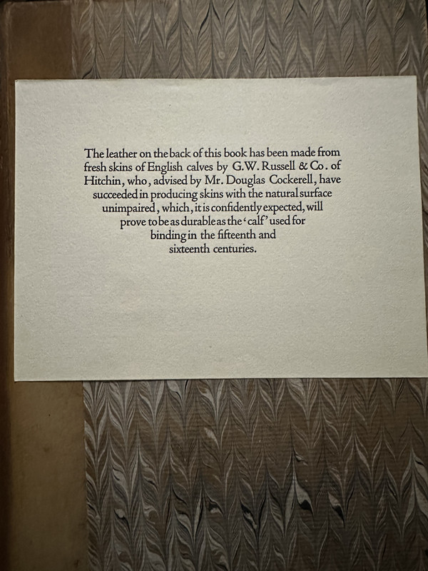
>26 sanvito: The Bede is a beautiful volume. I love the Batchelor Kelmscott paper. Does your copy have the note about the binding calf leather coming from Hitchin (my hometown)?
28sanvito
>27 ChestnutPress: indeed it does! I’ve not had the pleasure of visiting Hitchin before, I think the first time I heard of it was probably in reading the note in the Bede. It’s a lovely and somewhat intriguing notice. For those interested:
29ChestnutPress
>28 sanvito: It’s a lovely historic market town with lots of surrounding countryside.
30newdigate
It’s wonderful how Newdigate and team aimed to make the Bede something tied to the time and place of the original version of this edition from 365 years before. The vellum copies are bound in quarter pigskin with oak boards hewn from the beams of Brasenose College, Oxford.
31newdigate
>16 ubiquitousuk:
It’s not a coincidence! I collect all of Newdigate’s work beginning with the Arden Press and continuing to the SHP. Some of the early Arden Press books are magnificent, especially the huge catalogues of silver collections (Windsor, Rothschild). As you can see in the photos they’re grand, and more than hold their own with Ashendene folios…

It’s not a coincidence! I collect all of Newdigate’s work beginning with the Arden Press and continuing to the SHP. Some of the early Arden Press books are magnificent, especially the huge catalogues of silver collections (Windsor, Rothschild). As you can see in the photos they’re grand, and more than hold their own with Ashendene folios…


33ChestnutPress
>31 newdigate: Some of the Arden Press (I used to work overlooking their old premises) is superb. I’m partial to the first ten or so Florence Press editions that were printed there, with my vellum-bound 2-vol Keats a favourite.
34GardenOfForkingPaths
Thanks to >1 a.friend: and everyone else for posting about these beautiful books. This thread will be an excellent resource for people like me who are new to this press!
I'm curious, is the editing (or lack of) of the text a consideration in your buying decisions, and do you guys collect these editions of classic works as your reading copies or more so as examples of exceptional fine press work?
I ask as I note that the SHP editions like the Plutarch and the Froissart seem to retain the archaic vocabulary and spelling from the original Tudor and Elizabethan translations. I guess in some respects that's an advantage for a very 'pure' presentation of the text, and I can certainly see a strong argument for that. Do you still find these works enjoyable and readable in that form, especially over 8 large volumes?
I'm in the market for a fine press Plutarch and was deciding between the LEC, the Nonesuch, and - thanks to his thread - the Shakespeare Head Press. All three use the North translation, which is fine by me. It strikes me that the Nonesuch and SHP are probably superior fine press books, but the LEC has been thoroughly edited to make the text a bit more accessible for a modern reader.
When I read the Canterbury Tales, I could immediately see the value and richness of reading it in the Middle English rather than a modern translation, so would love to own the SHP edition one day. (Though I must admit I still appreciated having a modern English version on facing pages to smooth the process when required!).
I'm curious, is the editing (or lack of) of the text a consideration in your buying decisions, and do you guys collect these editions of classic works as your reading copies or more so as examples of exceptional fine press work?
I ask as I note that the SHP editions like the Plutarch and the Froissart seem to retain the archaic vocabulary and spelling from the original Tudor and Elizabethan translations. I guess in some respects that's an advantage for a very 'pure' presentation of the text, and I can certainly see a strong argument for that. Do you still find these works enjoyable and readable in that form, especially over 8 large volumes?
I'm in the market for a fine press Plutarch and was deciding between the LEC, the Nonesuch, and - thanks to his thread - the Shakespeare Head Press. All three use the North translation, which is fine by me. It strikes me that the Nonesuch and SHP are probably superior fine press books, but the LEC has been thoroughly edited to make the text a bit more accessible for a modern reader.
When I read the Canterbury Tales, I could immediately see the value and richness of reading it in the Middle English rather than a modern translation, so would love to own the SHP edition one day. (Though I must admit I still appreciated having a modern English version on facing pages to smooth the process when required!).
35abysswalker
>34 GardenOfForkingPaths: one thing to note about the LEC Plutarch is the slightly smaller page size compared to the others (I believe, though I only currently own the LEC). The binding of the LEC is also quite plain (though not in a bad way, in my opinion).
The LEC is probably best thought of as a W. A. Dwiggins joint and is a design which is eminently readable (from handy volume size to layout choices). The paper will be less impressive (laid, but nothing like a handmade paper). More modern in demeanor over all (in a design sense).
The LEC is probably best thought of as a W. A. Dwiggins joint and is a design which is eminently readable (from handy volume size to layout choices). The paper will be less impressive (laid, but nothing like a handmade paper). More modern in demeanor over all (in a design sense).
36abysswalker
>34 GardenOfForkingPaths: a few photos to illustrate the size/design. You can see the comparison with the folio sized Letterpress Shakespeare volumes.
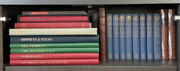
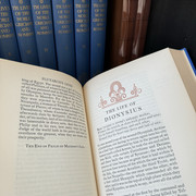
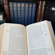
(Click through for full resolution images.)
(Click through for full resolution images.)
37GardenOfForkingPaths
>36 abysswalker: Thank you, I appreciate it! I like the small size, and I like Dwiggins design and ornamentation. As you say, probably lacking the finer paper of the others but eminently readable. Plain bindings are absolutely fine with me. The Nonesuch is also classically plain (brown buckram) and Poulton's illustrations are striking. It's a very affordable set too.
(By the way, I spotted the copy of the Mason Hill Press Revelation on your shelf. Do you like it? I was fortunate to acquire a copy last year. Everything about it is lovely: the woodcuts, the coloured initials, handmade paper, splendid printing. I have been keeping a look out for other Mason Hill titles. A listing for their Joel and Ezekiel popped up last month for a low price but sold by the time I had clicked the link in the bookseller's newsletter!)
(By the way, I spotted the copy of the Mason Hill Press Revelation on your shelf. Do you like it? I was fortunate to acquire a copy last year. Everything about it is lovely: the woodcuts, the coloured initials, handmade paper, splendid printing. I have been keeping a look out for other Mason Hill titles. A listing for their Joel and Ezekiel popped up last month for a low price but sold by the time I had clicked the link in the bookseller's newsletter!)
38ultrarightist
>37 GardenOfForkingPaths: I had not previously known about Mason Hill Press. Their output looks outstanding, but elusive on the secondary market. Their editions of the Psalms and Revelation look amazing.
39GardenOfForkingPaths
>38 ultrarightist: Very elusive! They do pop up from time to time - I saw a Psalms and another Revelation briefly last year - but they don't hang about. There's definitely just an element of luck in terms of looking at just the right time. Revelation is a stated limitation of 135 but apparently only about 90 were completed.
40dotman
>34 GardenOfForkingPaths: There's actually a brilliant 1989 publication from Folio Society (though I think it had a few runs) with Middle and Modern English en face. I found it very helpful & super easy to reference when Middle English confusion inevitably overwhelmed my feeble modern mind:

Also, what a fantastic run of images on this edition as well as the limited vellum shots - superb throughout & thank you. I'll echo the sentiment of undervalue & of the disappointment of the issued bindings - though I am quite understanding to SHP on their reasonings for it.
I had a Holland set sitting on my shelves for years that I always intended to get rebound & cut - but ultimately given the prohibitive cost of a 8-volume set ($ ouch!) I eventually decided to painfully cut my losses and acquired a duplicate set with an early 20th century Macdonald binding that really brings out its potential:

I think if SHP could have had partial issues in leather (like the SHP Malory) or even just given them something partial or respectably bland (like the SHP Decameron, Plutarch, etc) these sets might have appreciated more in line with expectations.

Also, what a fantastic run of images on this edition as well as the limited vellum shots - superb throughout & thank you. I'll echo the sentiment of undervalue & of the disappointment of the issued bindings - though I am quite understanding to SHP on their reasonings for it.
I had a Holland set sitting on my shelves for years that I always intended to get rebound & cut - but ultimately given the prohibitive cost of a 8-volume set ($ ouch!) I eventually decided to painfully cut my losses and acquired a duplicate set with an early 20th century Macdonald binding that really brings out its potential:

I think if SHP could have had partial issues in leather (like the SHP Malory) or even just given them something partial or respectably bland (like the SHP Decameron, Plutarch, etc) these sets might have appreciated more in line with expectations.
41Lukas1990
Lots of photos of SHP's Player's Shakespeare:
https://www.biblio.com/book/players-shakespeare-newly-printed-first-folio/d/1437...
https://www.biblio.com/book/players-shakespeare-newly-printed-first-folio/d/1437...
42sanvito
>40 dotman: I agree about the binding considerations and market value. Although I quite like the Holland & boards binding, even if they are designed to be provisional. What’s the copy of Lohengrin you have?
43abysswalker
>42 sanvito: that's the Tudor Black Press edition.
44TomsRiverNJ
I have been checking the availability of SHP Chaucer now and then on the main aggregators since this thread popped up. It looks like all the books that were listed under $2,000 have either been snapped up or price changed. There were at least 4 when this thread started. Did anyone here recently buy the set?
https://www.vialibri.net/searches?title=Chaucer&publisher=Shakespeare+Head+P...
I have an ulterior motive for asking. There are SHP books I want to buy which are not the focus of this thread but I am worried that I may no longer have the luxury of pulling the trigger when I feel like it.
https://www.vialibri.net/searches?title=Chaucer&publisher=Shakespeare+Head+P...
I have an ulterior motive for asking. There are SHP books I want to buy which are not the focus of this thread but I am worried that I may no longer have the luxury of pulling the trigger when I feel like it.
45Lukas1990
>44 TomsRiverNJ: THE ALLEN PRESS CURSE IS REAL!!!
46TomsRiverNJ
>45 Lukas1990: At least you already have the Homer... I think it is nicer than any version except the BR Odyssey.
47DMulvee
>44 TomsRiverNJ: I didn’t buy the Chaucer but had been mulling the Spenser set for about a year - my main issue is every set I had seen listed was uncut aside from the first volume which seemed to imply it wasn’t riveting. Once this thread was created I pulled the trigger in case others sought it out
48ubiquitousuk
>47 DMulvee: I have wanted the Froissart since reading about it in my copy of Pages From Presses II last year. But I can't see myself reading an 8-volume medieval chronicle, which is why I've resisted the temptation. Indeed, the fact that many copies remain uncut for a century seems like a bad omen.
49DMulvee
>48 ubiquitousuk: I know the Froissart looks beautiful and is highly regarded, but I’m not sure if I would have any interest in reading it. I picked up the Cresset Press Pilgrim’s Progress and was surprised by how much I enjoyed the story, so I’m hoping that Spenser’s Fairie Queen can live up to that!
50BillWoodbridge
>49 DMulvee: For what it’s worth, here are my notes on my own copies of the SHP Froissart, Chaucer and Spenser. In the great private press tradition I’ve made no comments on the actual content or readability :) However, I would agree the unopened state of the Froissart speaks for itself, and so much scholarly comment is available concerning the merits (or not) of reading the Faerie Queene I wouldn’t dare add to them, other than to say it’s well beyond my own powers of both concentration and comprehension.
FROISSART
The first of the three SHP magna opera makes less of an immediate impact than the Chaucer and Spenser due to its slightly smaller format, the smaller point size of Caslon and the entirely (apart from the title pages) monochrome printing, all combining to give a rather cramped feel. The feature that elevates it beyond the second rank of SHP books (Malory, Boccaccio, Homer ...) is the presence of over 600 marginal hand-coloured crests and other devices as the chivalric knights and families are introduced into the narrative. An effective homage to the various illuminated manuscripts that are the source of the book, the concept and scale of this work were unprecedented, and the presence of a full list of the 21 colourists (and seven compositors) in the colophon is well-deserved. Fortunately the purchase of the American bibliophile Barton Currie's copy did not count as an example of his droll definition of an antiquarian bookseller as someone 'who can charge $1,000 for a ten-dollar item and make you feel that he has done you a favor’.
CHAUCER
'Nothing in the private press movement gives quite such jewelled splendour as this' (Franklin) - although strictly speaking this comment applies to the vellum copies (with gilt highlights to the illustrations), it is not too much of an exaggeration as a description of the ordinary limitation on paper, as here. The most flamboyant of the three SHP magna opera, richly illustrated by Hugh Chesterman (the marginal figures of the Canterbury pilgrims) and Lynton Lamb (the miniatures in the later volumes, inspired by old French manuscripts) and all hand-coloured. Only the copious and rather heavy red woodcut calligraphic headings by Joscelyne Gaskin jar slightly. In the original blue holland-backed boards, a very common format in classic private press books, but only ever intended as a temporary measure prior to customers commissioning a 'proper' binding. Consequently often shabby after having greatly exceeded their intended lifespan - but not on this copy. As often with SHP, undervalued by the market.
SPENSER
The only one of the three SHP magna opera issued in a substantial edition binding rather than holland-backed boards (said to be by Douglas Cockerell in one bookseller's description, but this may well have been erroneous conflation with the Cockerell marbled paper). Very similar in style and concept to the Chaucer with hand-coloured woodcuts, this time by Hilda Quick, the Spenser feels slightly more formal. Again, the rather ugly headings (although not so much the individual initials) by Joscelyne Gaskin detract from the balance a little where they appear.
FROISSART
The first of the three SHP magna opera makes less of an immediate impact than the Chaucer and Spenser due to its slightly smaller format, the smaller point size of Caslon and the entirely (apart from the title pages) monochrome printing, all combining to give a rather cramped feel. The feature that elevates it beyond the second rank of SHP books (Malory, Boccaccio, Homer ...) is the presence of over 600 marginal hand-coloured crests and other devices as the chivalric knights and families are introduced into the narrative. An effective homage to the various illuminated manuscripts that are the source of the book, the concept and scale of this work were unprecedented, and the presence of a full list of the 21 colourists (and seven compositors) in the colophon is well-deserved. Fortunately the purchase of the American bibliophile Barton Currie's copy did not count as an example of his droll definition of an antiquarian bookseller as someone 'who can charge $1,000 for a ten-dollar item and make you feel that he has done you a favor’.
CHAUCER
'Nothing in the private press movement gives quite such jewelled splendour as this' (Franklin) - although strictly speaking this comment applies to the vellum copies (with gilt highlights to the illustrations), it is not too much of an exaggeration as a description of the ordinary limitation on paper, as here. The most flamboyant of the three SHP magna opera, richly illustrated by Hugh Chesterman (the marginal figures of the Canterbury pilgrims) and Lynton Lamb (the miniatures in the later volumes, inspired by old French manuscripts) and all hand-coloured. Only the copious and rather heavy red woodcut calligraphic headings by Joscelyne Gaskin jar slightly. In the original blue holland-backed boards, a very common format in classic private press books, but only ever intended as a temporary measure prior to customers commissioning a 'proper' binding. Consequently often shabby after having greatly exceeded their intended lifespan - but not on this copy. As often with SHP, undervalued by the market.
SPENSER
The only one of the three SHP magna opera issued in a substantial edition binding rather than holland-backed boards (said to be by Douglas Cockerell in one bookseller's description, but this may well have been erroneous conflation with the Cockerell marbled paper). Very similar in style and concept to the Chaucer with hand-coloured woodcuts, this time by Hilda Quick, the Spenser feels slightly more formal. Again, the rather ugly headings (although not so much the individual initials) by Joscelyne Gaskin detract from the balance a little where they appear.
51abysswalker
>49 DMulvee: I find the rewarding way to read Froissart (and other similar chronicles) is not cover to cover, but rather to read the section relevant to something else I am reading or exploring. For example, after reading some of the Henry plays, dip in and read that part.

