Solaris by Stanislaw Lem - CONVERSATION TREE PRESS DELUXE LE 2025
Talk Fine Press Forum
Join LibraryThing to post.
1wcarter
Solaris by Stanislaw Lem - CONVERSATION TREE PRESS DELUXE LIMITED EDITION 2025
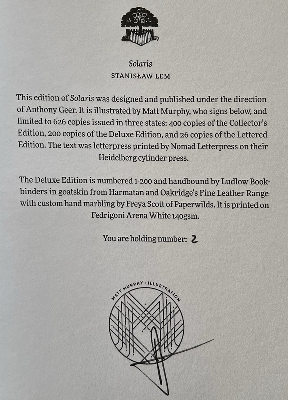
A PICTORIAL REVIEW
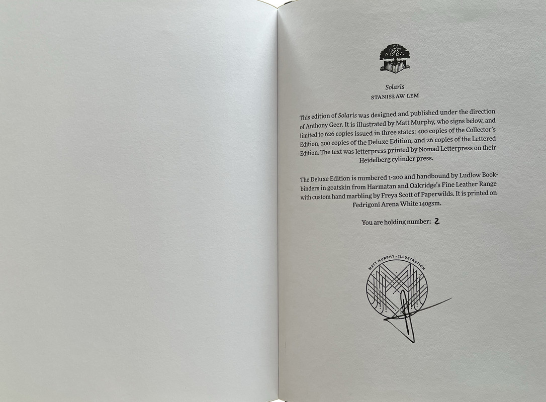
No. 2 of 200 copies
Signed by Matt Murphy.
Translated from Polish by Bill Johnston
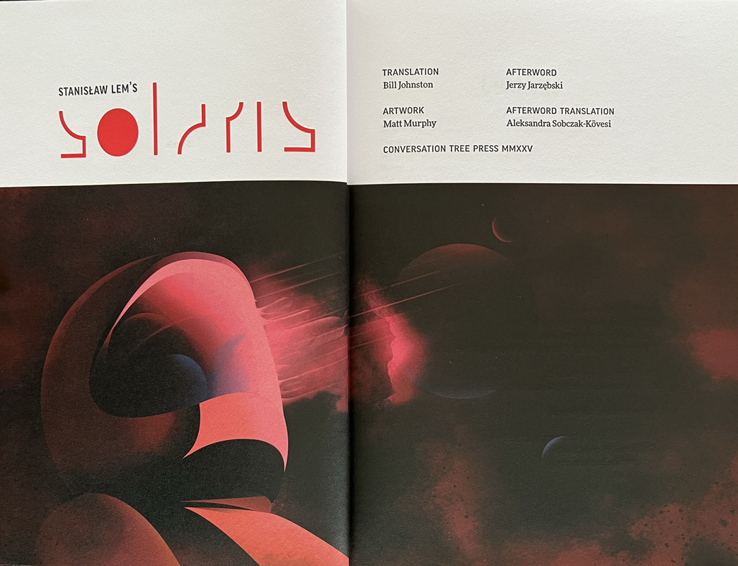
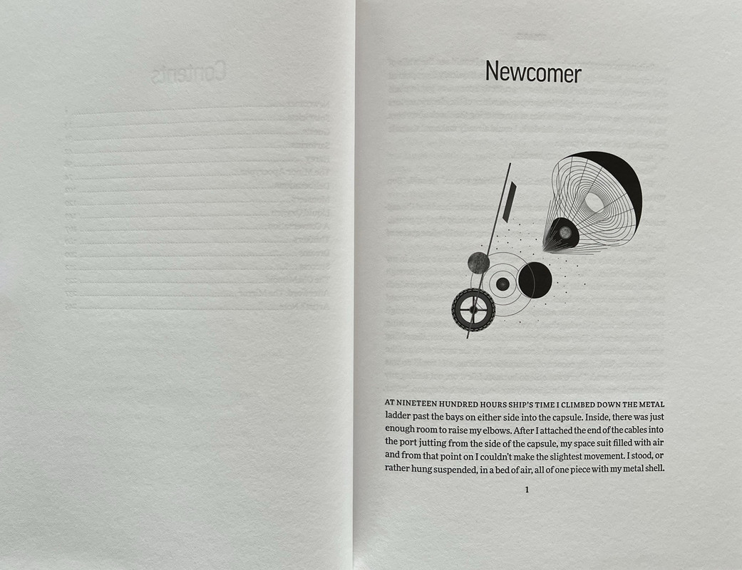
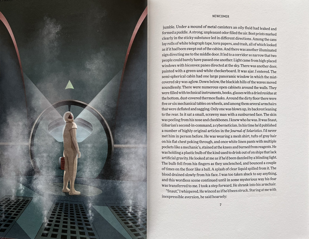
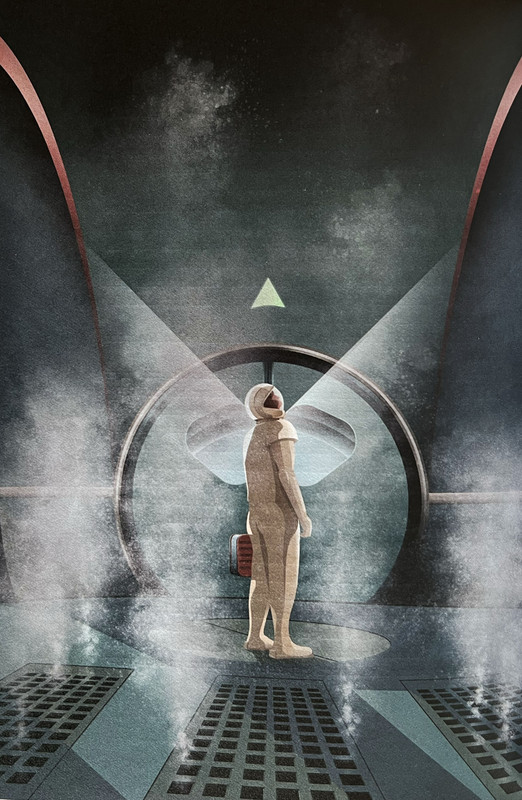
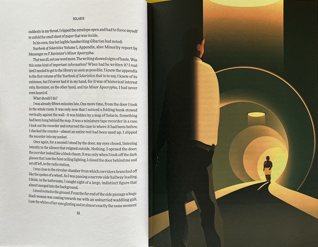
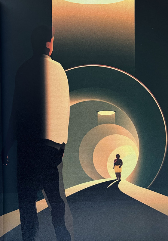
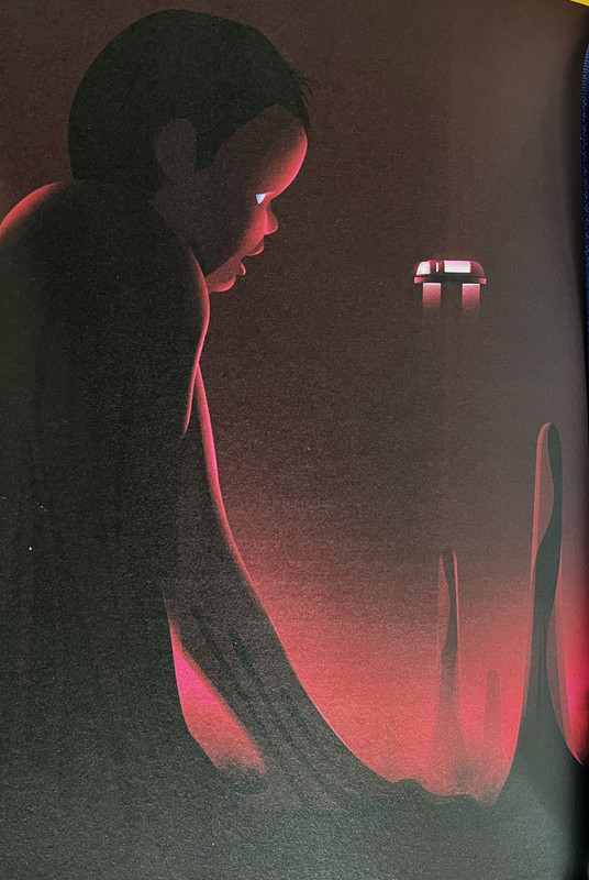
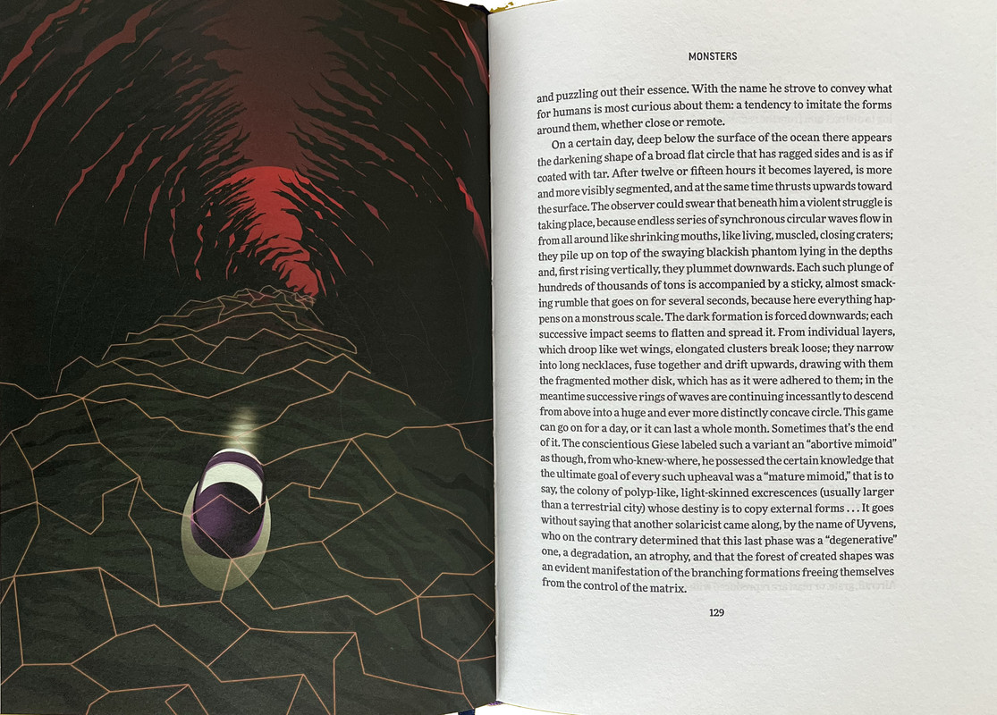
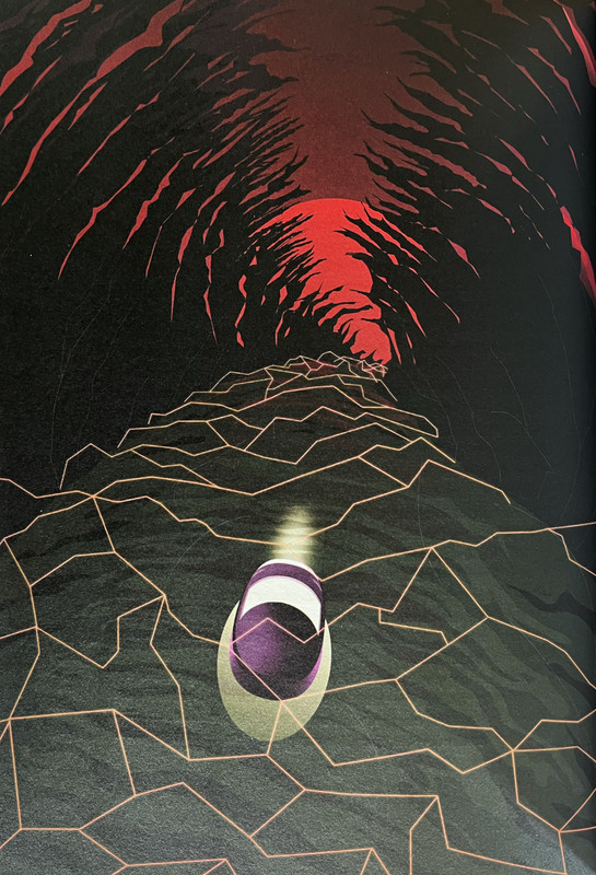
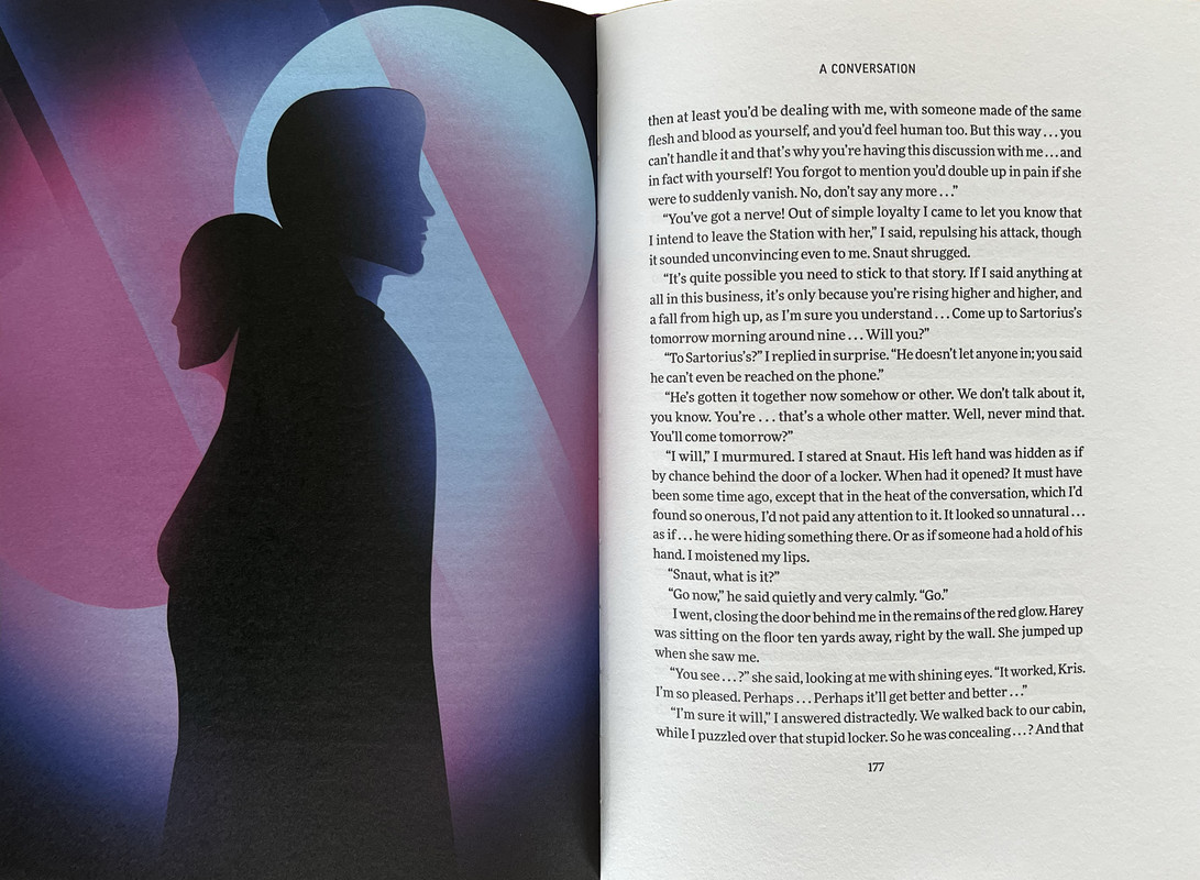
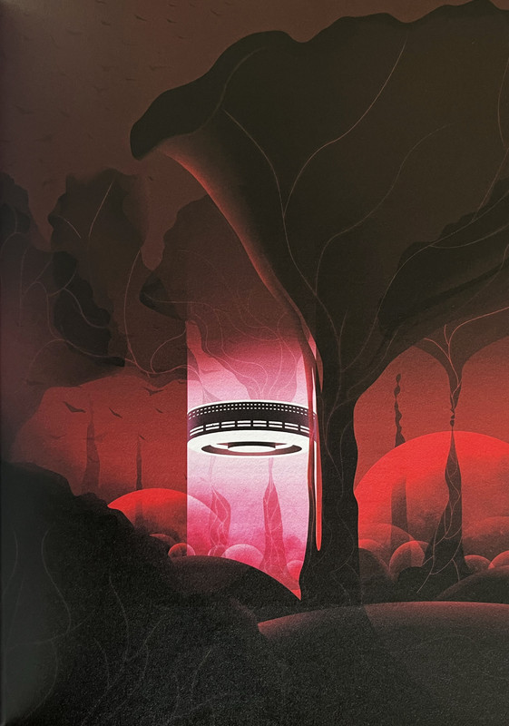
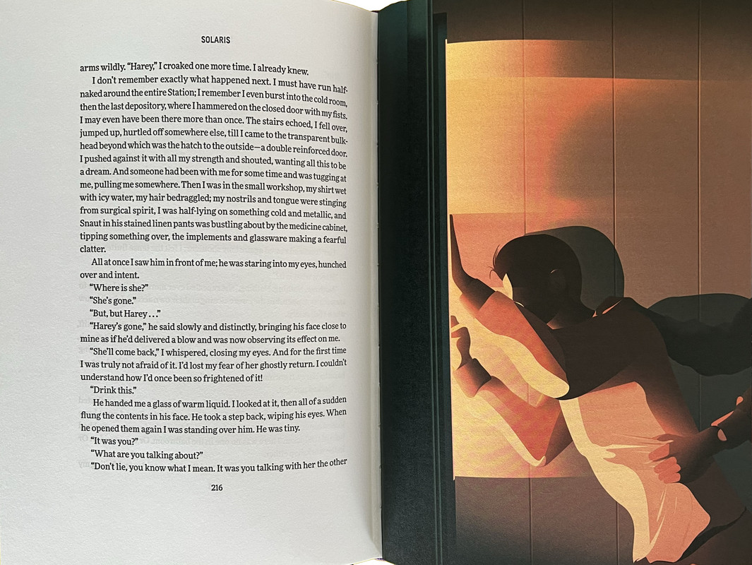
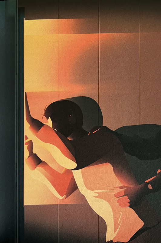
Sixteen full-colour illustrations reproduced using four-colour lithography and fourteen detailed black and white chapter openers by Matt Murphy.
Afterword by Jerzy Jarzębski.
Printed by Nomad Letterpress.
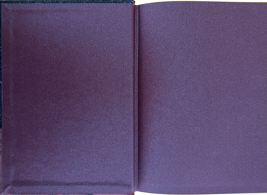
Endsheets are purple Peregrina Majestic with a duo-toned shimmer effect.
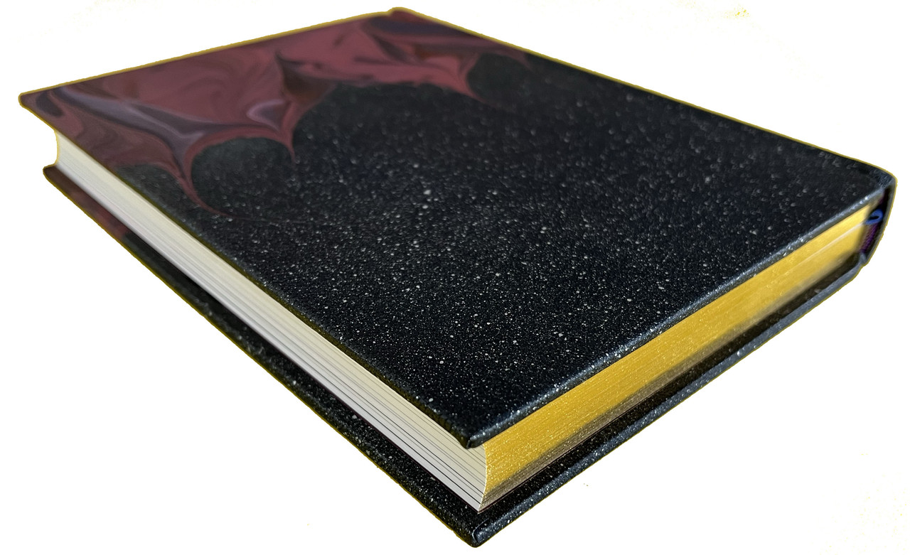
Gilded page tops.
Black ribbon page marker.
Sewn with head and tail bands.
Hand bound by Ludlow Bookbinders.
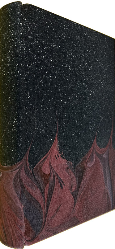
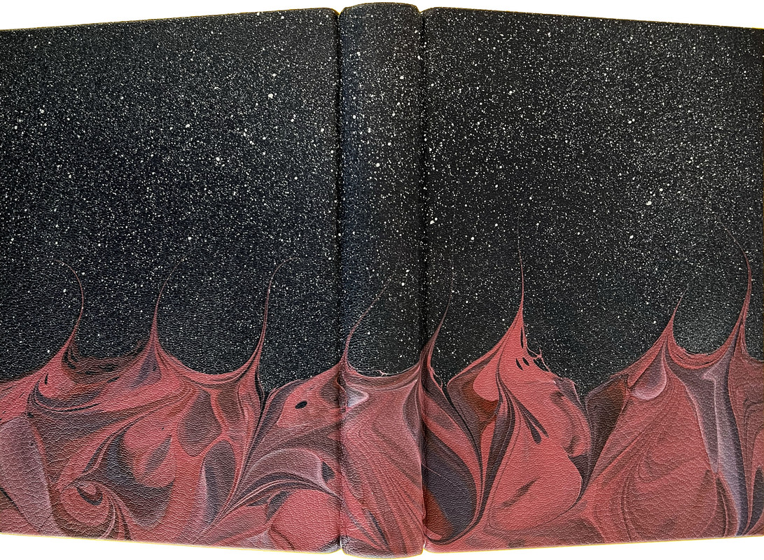
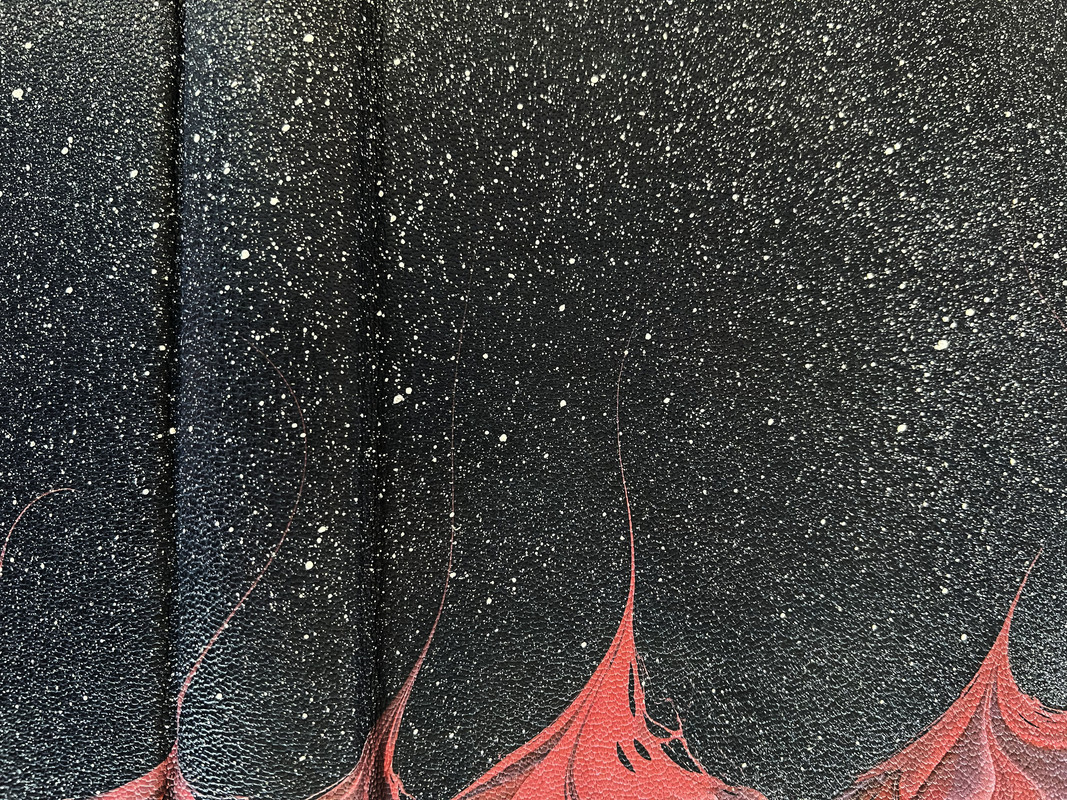
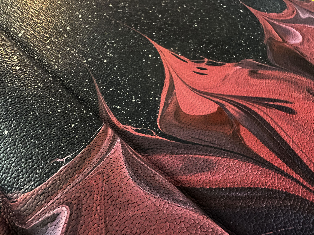
Bound in very dark blue Harmatan & Oakridge goatskin leather, marbled with red on lower half by Freya Scott with a custom wave pattern with silver pigment sprinkled across top half.
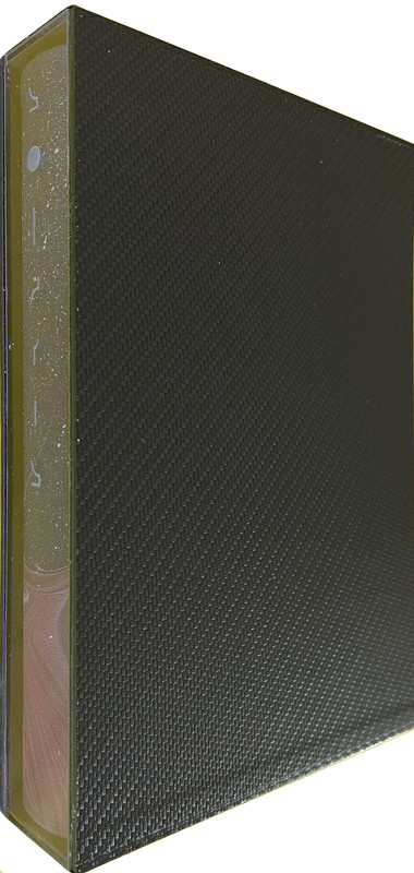
Card slipcase covered in textured and patterned black Corvon Carbon-X, Suedel-lined interior, acrylic spine with the title etched on it.
25.6x18.5cm.
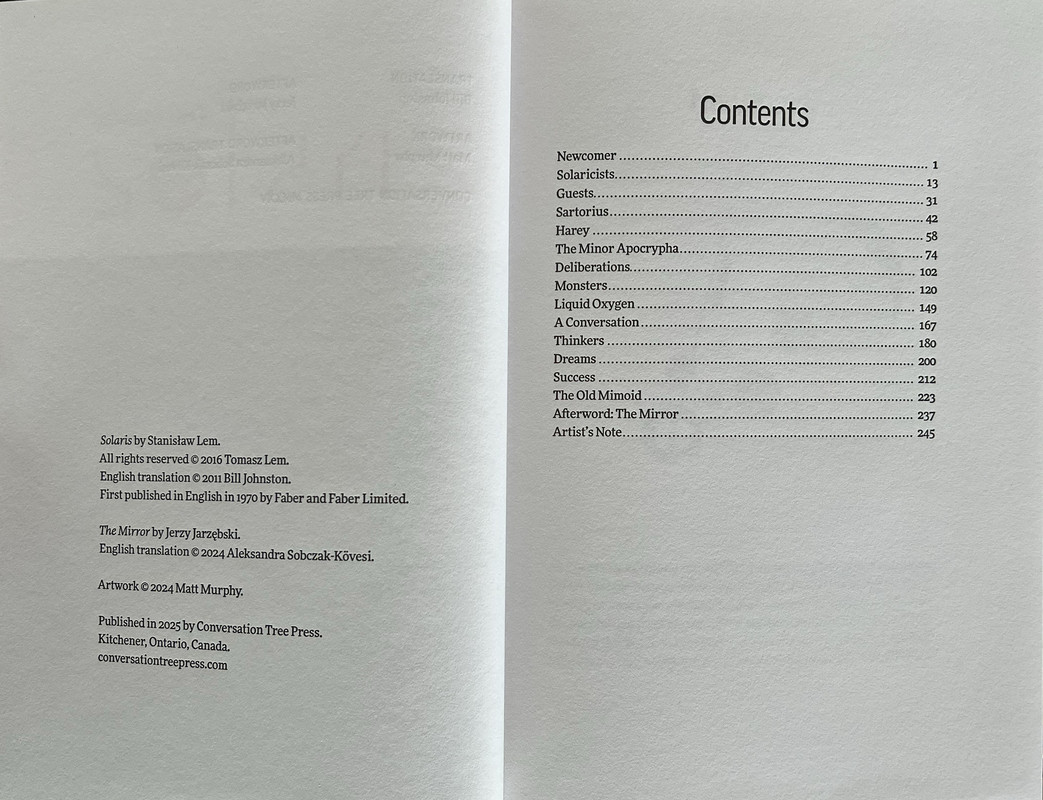
250 pages
US$745
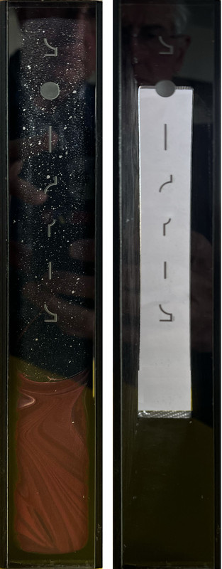
Slipcase from edge, with and without book inserted.

An index of the other illustrated reviews in the this series can be viewed here.
A PICTORIAL REVIEW
No. 2 of 200 copies
Signed by Matt Murphy.
Translated from Polish by Bill Johnston
Sixteen full-colour illustrations reproduced using four-colour lithography and fourteen detailed black and white chapter openers by Matt Murphy.
Afterword by Jerzy Jarzębski.
Printed by Nomad Letterpress.
Endsheets are purple Peregrina Majestic with a duo-toned shimmer effect.
Gilded page tops.
Black ribbon page marker.
Sewn with head and tail bands.
Hand bound by Ludlow Bookbinders.
Bound in very dark blue Harmatan & Oakridge goatskin leather, marbled with red on lower half by Freya Scott with a custom wave pattern with silver pigment sprinkled across top half.
Card slipcase covered in textured and patterned black Corvon Carbon-X, Suedel-lined interior, acrylic spine with the title etched on it.
25.6x18.5cm.
250 pages
US$745

Slipcase from edge, with and without book inserted.


An index of the other illustrated reviews in the this series can be viewed here.
2Nerevarine
Absolutely beautiful, thanks.
Still waiting for my copy. Can’t wait to discover my marbling.
Still waiting for my copy. Can’t wait to discover my marbling.
3abysswalker
This book design is pretty much flawless, for what it is, to my eye, with some of the most distinctive (and appropriate to the story) marbling. Everything from the typography to the illustrations to the decorations fires on all cylinders.
The slipcase design is a bit too cute for me though. I see what they were going for (almost like a space suit or terrarium or something for the book with that transparent spine). But it's just past the edge of clever for me, and seen from the other side with the book in just looks kind of odd. One of the things I appreciate about slipcased books is the ability to shelve spine in (a reason why all slipcases should have the title on the text block edge side); that is impossible here, so the enclosure design leads to a functional deficit. A small point on balance, and I know by now that CTP tends to lean a bit more into the allusive design element for their enclosures than I prefer.
Despite that, the book itself is a triumph and at a level of the littered states (or better) one would generally get from the currently operating competition such as Suntup or CK.
4astropi
Sigh... I'm so sad I missed this! If anyone decides to sell/trade their copy please let me know!
5SDB2012
>3 abysswalker: I agree with your slipcase comments. For me, the lettering doesn't work on the slipcase. You can shelve it spine in and still see the title if you put the book in the opposite way, which is the way mine was delivered. +) 100% agree that all slipcases should have titles as you described.
6What_What
Thanks as always for the photos.
About the slipcase - when you put it in spine first, doesn’t it show the title clearly? And isn’t that how the St. James Animal Farm was done?
About the slipcase - when you put it in spine first, doesn’t it show the title clearly? And isn’t that how the St. James Animal Farm was done?
7Shotcaller
>6 What_What: I'd wondered if that book's slipcase was the inspiration for this.
8Ibkay
>3 abysswalker: Completely agree that all slipcases should have the title and preferably some artwork or logos too on the text block side.
I've observed that some small presses now fully embrace this idea - Centipede, Lividian, Grim Oak, Suntup among others.
I've observed that some small presses now fully embrace this idea - Centipede, Lividian, Grim Oak, Suntup among others.
9kdweber
Don’t understand the complaints against the slipcase. If you want a traditional slipcase just put a blank piece of paper (acid free of course) on the inside and slide the book in. Shelve with the labeled spine of the slipcase facing out.
10SDB2012
>9 kdweber: My opinion only, but the lettering doesn't look great, hard to read, especially with the font choice, and lines up in a way that makes it even more challenging to read. It may be partially due to the fact that my case is already starting to fall apart. The plastic piece is separating from the cardboard. Love the book, though, and this has been my only minor complaint with CTP, other than the paper on the first Weird being too white for my taste. I wish I didn't love CTP so much because I have to cut back on my book spending and it is a difficult choice on where to start slicing.
For what it's worth, I have the same issue with the St James Park Press Animal Farm case.
For what it's worth, I have the same issue with the St James Park Press Animal Farm case.

