2LT79-1
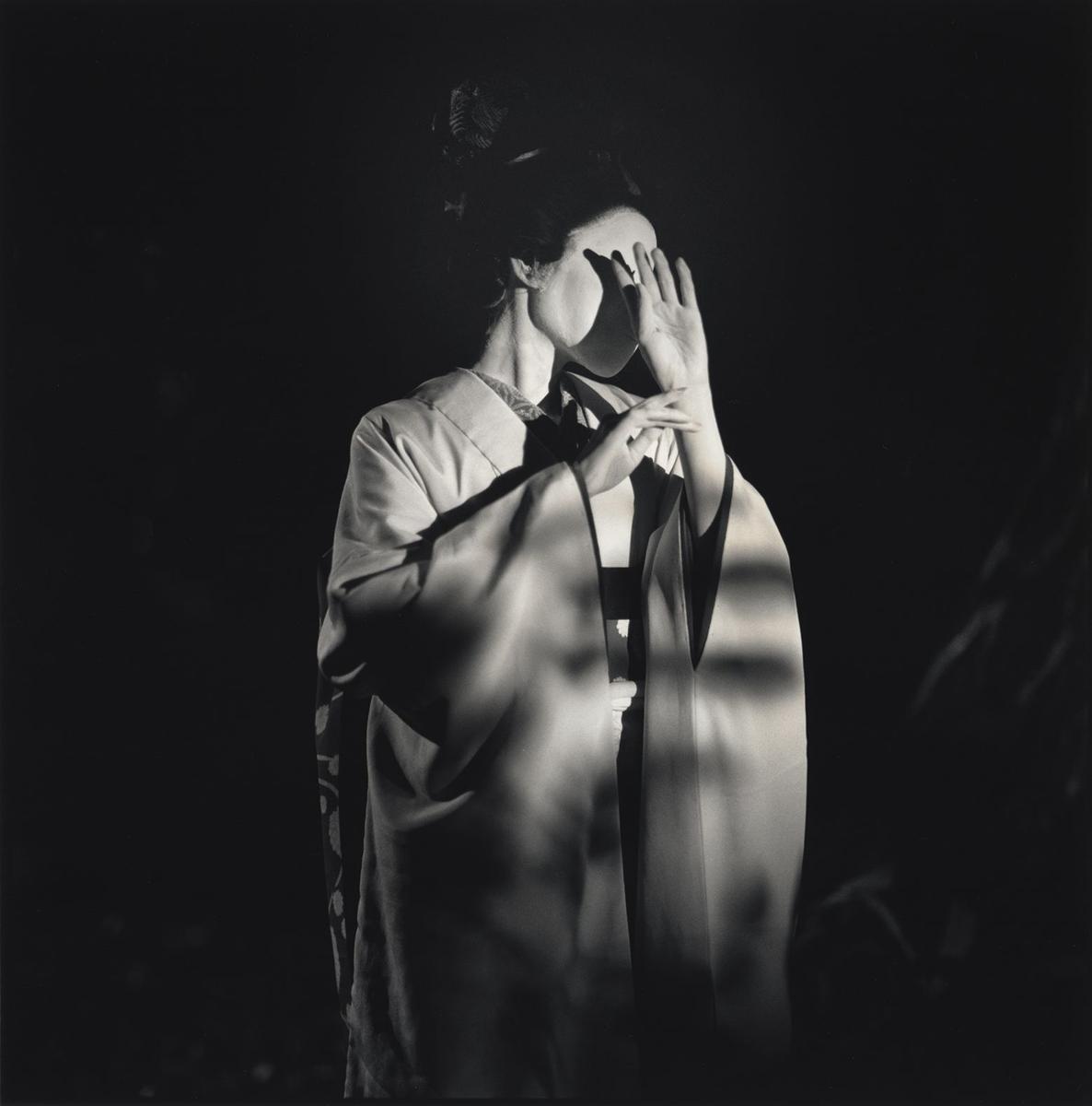
One of the most powerful sections in the book for me was the brothel and the final image of the great dirt/earth spider comparing its thread to a strand of the prostitute's jet black hair. I'd love a photogravure of a spider on, or near, a black strand of hair. The logistics of that would probably be ludicrous. I'm not saying that is what should be done, it's just one idea to kick off discussion. Spiders exist in the shadows and the Japanese mythological connotations of the Tsuchigumo Yokai were quite potent to me. I thought that particular paragraph was the absolute depth of the shadows.
There are loads of images you could pull out of this book though. Many more neutral than the one described above. I'd prefer a photogravure but it could also be richly illustrated too.
There are loads of images you could pull out of this book though. Many more neutral than the one described above. I'd prefer a photogravure but it could also be richly illustrated too.
3grifgon
Questions that need to be answered:
1. The proposal suggests, but does not mandate, a single photogravure frontispiece. Do the members want to adopt this suggestion?
If so, 2. What should the frontispiece be?
3. Should the book include any other non-text ornaments, graphics, artwork?
1. The proposal suggests, but does not mandate, a single photogravure frontispiece. Do the members want to adopt this suggestion?
If so, 2. What should the frontispiece be?
3. Should the book include any other non-text ornaments, graphics, artwork?
6grifgon
Let's also poll the suggestion for ornamentation that Andrew made in his proposal. He suggested red marginal lines around each text block, like so:
https://pics.cdn.librarything.com//picsizes/16/94/16942560-r-h2400-w2400-pv25_63...
Keep in mind that this would add to the cost of printing. My best guess is ~$50 per copy.
Then there's the possibility of adding page numbers and chapter titles in red as well, while we're at it. (Probably negligible cost if we're already doing the margins.)
7elladan0891
>6 grifgon: This is basically the price to introduce the second color, correct? Nothing specific to lines per se? I.e. adding marginal lines in black won't cost extra, but even if you don't do marginal lines at all, printing page numbers and chapter titles in red would cost about $50 extra per copy?
8grifgon
>7 elladan0891: Lines versus titling versus page numbers versus whatever doesn't really make a difference.
It's complicated, and it really depends on the printer. But adding a secondary color on literally every page basically doubles the amount of printing. Now, the printing is a whole lot easier than printing the text, but it's still a significant amount of work (which will also result in some wastage). My $50 estimate is just a gut guess.
It's complicated, and it really depends on the printer. But adding a secondary color on literally every page basically doubles the amount of printing. Now, the printing is a whole lot easier than printing the text, but it's still a significant amount of work (which will also result in some wastage). My $50 estimate is just a gut guess.
9LT79-1
There's not much conversation going on here so maybe starting very broad would help. I think the photogravure would set the tone for the text. In very broad terms would you prefer a photogravure of some architectural space or a close up of something sat within the shadows with an interesting patina/texture?
I think a photogravure in a more spacial context would encourage a more contemplative mood whereas a close up more intimacy like you're sat within the shadows. And this would feed into the 'mood' thread and how you feel about the book. You don't have to give a specific idea just think about the feel you would prefer.
For me personally, I'd prefer the more intimate. The spacial photogravures always look very impressive but it's exactly what you would expect. Also each time I read IPOS I have that much more intimate take. But that's just me, what do you think would be best?
Another point is that I'd even expect the tone of the photogravure to inform the typography.
10GardenOfForkingPaths
>9 LT79-1: Great question. I think you could go in either direction. Sometimes Tanizaki takes a wider architectural view, other times he zooms in right to the fine details. I'm with you in preferring the latter, and I think that can end up being just as contemplative, or perhaps even more so.
Just going back to the colour question: When I look at the picture of the book with the red marginal lines, I can see how, in that instance, it adds structure to the layout with the Japanese text. However, in my mind's eye, I'm a little unsure how well it would work with blocks of English text for this work. I wonder if it will feel like an over-complication? I am sure the designer/technician/consensus-vote will ensure that the text is held in harmony by the proportions of the margins.
The copy of 'In Praise of Shadows' that I read didn't have chapter headings. Are there any, or are we talking about a running header with the book title on every page?
My gut feeling about the use of colour is that restraint (or the atmosphere of 'reticence' and 'understatement' that Tanizaki mentions when he talks about Japanese music) would work well. He notes the use of red a couple of times: red lacquerware appearing too bright in normal use, but taking on a "somber, refined, dignified" look in low lighting; just a pop of red on the cheeks of actors at the theatre.
To that end, I wonder if red on every page might feel like too much? I could see it being used very sparingly on a title page or colophon page.
I'm sure others have different opinions, which I would love to hear, and I'm very much open to having my mind changed!
This has already been spoken about, but the way Tanizaki describes gold, and the mystery of how it can pick up glimmers of light – in even the most dimly lit of rooms – felt very significant for the overall atmosphere of the book. Again, something that could be used very sparingly, perhaps.
11mnmcdwl
I'd love to see a photogravure as the frontispiece. One of my favorites in my own collection is the Limited Editions Club version of Tanizaki's A Portrait of Shunkin, with several photogravure by Hosoe (!) from the original negatives. Here's a picture of the title page and frontispiece on that one:


12LT79-1
>10 GardenOfForkingPaths: I suppose it comes down to, do you want to be in the thick of shadows or observing them from without. I want the shadows to be breathing down my neck. I want to be placed in the deepest part of the shadows where Tanizaki finds those haunting forms, spectres, spiders and pale female faces with black teeth. I also think being within the shadows would lend well to that more intimate candlelight sensibility suggested on the other thread.
But a cooler temperament than mine might want to observe from a bit of a distance and seeing the shadows working together in space. The intimate feel might be too claustrophobic for them.
In terms of your discussion of colour I think you are correct on the red being too much. I see hints of gold and that sand like colour used in alcoves being much more suitable as accents.
>11 mnmcdwl: I love the idea of a female figure in the frontispiece in some way, but maybe the face. There is quite a special relationship in the book with shadows and the idea of female beauty being inseparable from it.
13mnmcdwl
>12 LT79-1: Or we could go architectural, like Yasuhiro Ishimoto's photographs of the Katsura Imperial Villa.
No idea about rights on famous photographers though...
Source: https://aperture.org/editorial/yasuhiro-ishimoto-katsura/

No idea about rights on famous photographers though...
Source: https://aperture.org/editorial/yasuhiro-ishimoto-katsura/
14Shadekeep
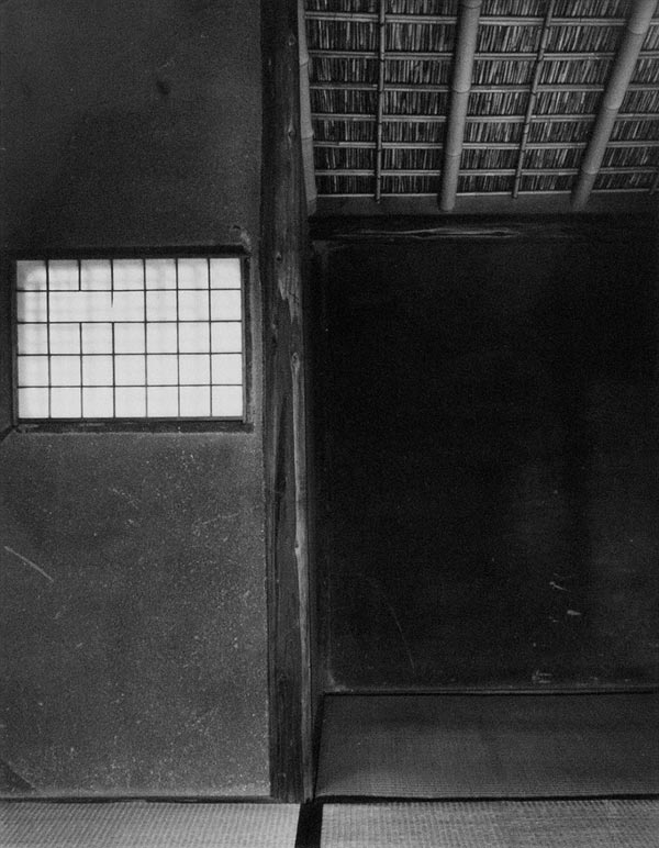
>13 mnmcdwl: This is closer to what I was envisioning, a built space cast in a contrast of light and shadow. We earlier discussed the idea of a photo of a tokonoma, which captures many of the book's concepts at once. I feel like something in that vein might be best.
I don't entirely object to a human figure, but I think an inanimate subject might feel more in tune with the text. Or at least the way that I tend to read it, which I recognize is not universal and an argument can be made for just about any approach.
I don't entirely object to a human figure, but I think an inanimate subject might feel more in tune with the text. Or at least the way that I tend to read it, which I recognize is not universal and an argument can be made for just about any approach.
15LT79-1
>13 mnmcdwl: I'm happy to go either way but I do think the photogravure is key to setting the tone and priming the reader, so should harmonize with the other elements of the book. You open the book and the image will position you in space close or distant. It's not like illustrations where you can incorporate a number of them taking you in and out of the shadows, close and distant and averaging out the feel. One photogravure makes it quite important to choose wisely. It should be interesting to hear what the members on average would prefer.
16LT79-1
Another thing I was thinking about is whether the title page will sit next to the photogravure or whether there will be a dividing page or pause? I was thinking if it sits next to it if some of the colours lost in the black and whites of the photogravures could be pulled into the title page to create that sense of dialogue between the two. I do like the idea of Bungakusha's of having a splash of colour in the title page if sat next to the photogravure and I think that could potentially create harmony between the two in a subtle way.
17zachp
As a photogravure printer myself, I’m excited about the direction this project is taking!
A couple of questions that might help guide the conversation:
• Do we want one photogravure or several? A Portrait of Shunkin—with photography by Hosoe and prints by Jon Goodman—includes three sublime photogravures.
• Do we prefer photography from the same era as IPOS (the 1930s) or contemporary? For vintage, we might find complementary photography through a public-domain search. For example, one of Japan’s earliest modern photographers, Yasui Nakaji, has works in the public domain (see: https://picryl.com/search?original_format_type=photos&q=yasui%20nakaji). Working with living contemporary artists would obviously provide more choices.
18elladan0891
>10 GardenOfForkingPaths: When I look at the picture of the book with the red marginal lines, I can see how, in that instance, it adds structure to the layout with the Japanese text. However, in my mind's eye, I'm a little unsure how well it would work with blocks of English text for this work.
I had exactly the same thought! I was going to post it yesterday, but things got busy. It would be easy to mock up and see how it looks, of course. But right now I have the same concern. What is traditional and looks organic in Far Eastern texts, might look unnatural in Western ones.
I had exactly the same thought! I was going to post it yesterday, but things got busy. It would be easy to mock up and see how it looks, of course. But right now I have the same concern. What is traditional and looks organic in Far Eastern texts, might look unnatural in Western ones.
19LT79-1
>17 zachp:
- three photogravures would be wonderful but I think many members would be concerned about costs.
- my instinct is for contemporary. Not sure what others think but I love the idea of a new creation for this work. It will make it that little bit more unique.
- three photogravures would be wonderful but I think many members would be concerned about costs.
- my instinct is for contemporary. Not sure what others think but I love the idea of a new creation for this work. It will make it that little bit more unique.
20zachp
>19 LT79-1: I wouldn't rule out three photogravures if it fits within the aesthetic direction of the book. Maybe we can find a photogravure printer who has a personal interest in the project. ;)
Regarding artists, would it be worthwhile to assemble a sample gallery from a range of contemporary photographers in order to narrow in on a style that best complements the text? Alternatively, should we begin by focusing on thematic direction—spiders, tokonoma, female figure...? My sense is that identifying the photographer(s) first might be more productive, as it would narrow the selection scope and help inspire one or more artwork choices.
Regarding artists, would it be worthwhile to assemble a sample gallery from a range of contemporary photographers in order to narrow in on a style that best complements the text? Alternatively, should we begin by focusing on thematic direction—spiders, tokonoma, female figure...? My sense is that identifying the photographer(s) first might be more productive, as it would narrow the selection scope and help inspire one or more artwork choices.
21kermaier
>14 Shadekeep: Agreed - an evocative architectural space would be perfect.
22ChestnutPress
>9 LT79-1: A closer, more intimate subject for the photogravure would be my choice by far
23Glacierman
>18 elladan0891: Bruce Rogers used red lines in several of his designs. Unfortunately, I have no examples at hand to illustrate his use of them, but from memory of those that I have seen, they worked just fine.
24bungakusha
>11 mnmcdwl: mnmcdwl: I don't own a copy of this (maybe someday!), but love the Hosoe photogravure. But further to some of the comments further down the thread, I think something architectural would be my preference. (I would include the tokonoma in that category.)
>13 mnmcdwl: mnmcdwl: Katsura is a great example. What an amazing place.
>20 zachp: zachp: zachp, might you be interested in starting a sample gallery of some photogravures? And for the professionals, is the cost associated with them based on the printing process? Acquiring the rights? A combination of both?
25bungakusha
>23 Glacierman: Glacierman: I guess it would not necessarily have to be red, either - there has been mention of, say, gold accents - I feel like I have seen other colors used similarly in Japanese books.
26bungakusha
Another straw poll to get a sense of what people are thinking....
27zachp
>24 bungakusha: Breaking your question into a couple of parts…
We need a photographer that has an archive of work that matches the aesthetic vision for the book.
We need a photogravure printer that is capable of hand pulling however many prints are required for the edition.
These don’t necessarily need to be the same person, and we'll have more artistic freedom if they aren’t.
My previous recommendation was to collect a sample gallery of photography from a variety of Japanese artists, or artists working with Japanese themes. Something we could use to share with the group and vote, similar to what Griffin did with The Ethics of Ambiguity. Of course, someone(s) would need to first do the preliminary search and narrow the selection. I'm honestly not sure the best way to achieve consensus on an artist, so this was just one idea for moving the process forward.
After an artist is selected, all we need are the digital files to create the plates. Someone like Griffin will have a better understand the technicalities of artist releases, rights and compensation.
Regarding the cost of photogravure printing itself, typically the cost is per print and doesn't include licensing the artwork. Photogravure is a time consuming and exacting process. On a good day, I only average two or three prints per hour.
28grifgon
>24 bungakusha: >27 zachp: The cost of including photogravure will be almost entirely be per print. Even an expensive license will be pretty negligible on a per copy basis.
29LT79-1
I've just had another thought on this. If you could push to two photogravures you could satisfy the spacial and the close/intimate. The frontispiece could be a spacial photogravure and a more intimate one could be placed towards the end of the book. This would give the book a sense of depth and a movement from observing the shadows into the very depths of the shadows.
You could even mix a public domain with a newly commissioned one to keep the cost down. There will be an absolute wealth of architectural photogravures in public domain. I like this idea of giving the book depth.
You could even mix a public domain with a newly commissioned one to keep the cost down. There will be an absolute wealth of architectural photogravures in public domain. I like this idea of giving the book depth.
30Shadekeep
>29 LT79-1: I like that idea, if the budget covers it. It provides a kind of "big picture"->"details" transition as well, just as the essay takes in larger concepts along with specific examples.
31abgreens
>29 LT79-1: Thanks LT79-1! Moments like this are what makes this press so appealing to me: how a series of ideas in possible tension (architectural or figural; distant or close, observe or participate) are now combined (architectural first and figural later) in a way that echo the text. Thanks to all.
32LT79-1
>30 Shadekeep: Thinking about it, I think you're correct. Putting the reader in that initial contemplative mood watching the complex of shadows play out in architectural space will then allow for that inward movement as they progress. Hopefully budget can allow for a more intimate inward photogravure bookending the essay. I think that would create a nice balance in the book too and a coherence and overall direction.
I was thinking about your idea of a tokonoma for the architectural as well. I'm not sure about modern times but in the past the tokonoma was the place of honour in a japanese room, guests would bow to it and a special guest will be placed near it. On entering the book what better way to pay respect to the tokonoma and japanese culture than to acknowledge it straight away. Looking at images online of tokonomas they seem to be mostly on the left. Again perfect for a frontispiece on the left most side of the book.
I can't remember what Tanizaki called the part next to the tokonoma. I think he called it a study bay. If the title page is placed next to a tokonoma it could play loosely in some way on this idea of a study bay. Of course these are just some ideas. I'm sure there will be plenty more.
>31 abgreens: I like your enthusiasm :)
33kermaier
I wonder how expensive it would be to license an image from Michael Kenna or Hiroshi Sugimoto?
34LT79-1
>33 kermaier: Looking at their images they look very beautiful but I'm not sure if they are the correct tone for IPOS. There's a cleanliness about them. I could eat my dinner off those images. I see dust, grime, antique patina and an undertone of vice when I read IPOS rather than anything to clean. Just my opinion though. Others might totally disagree. And that was just me doing a quick search rather than trawling through all their work.
35elladan0891
>34 LT79-1: Something more along these lines? In terms of the feel, you can ignore the actual objects photographed in these particular examples:


36ChestnutPress
>35 elladan0891: This kind of approach feels good to me. The egg photo is gorgeous — pity it’s not what we’d really want for the book!!
37elladan0891
>36 ChestnutPress: Yeah, I put these more for the feel/direction. These photos are by the late Czech photographer Josef Sudek. When thinking of the approach, I just thought of his works. I'm not that familiar with Japanese photographers, so couldn't come up with a good example off the top of my head. If I get some free time, I'll do some searching.
38kermaier
>37 elladan0891: I see what you’re after - time to start leafing through my photo books….
39LT79-1
>35 elladan0891: I'd agree with >36 ChestnutPress: in that I'd go for the ones with a bit more clarity, so closer to the egg, rather than obscured view (with the condensation on the windows for example). I see clarity but just not something too clean cut. It's actually quite difficult to articulate but showing images like this definitely helps. I'll try to dig some out myself when I get chance.
40eanson
>33 kermaier: I'd wondered the same, especially from Sugimoto's project that directly engages IPOS, via as he writes it "the life of a candle".
https://www.sugimotohiroshi.com/new-page-44
https://www.sugimotohiroshi.com/new-page-44
41NathanOv
>40 eanson: That would be a phenomenal pairing - especially if we end up with the budget for three photogravure's as has been discussed in the binding thread.
EDIT: Sugimoto's remarks on the series also deserve to be in print. They'd make for an excellent epigraph.
EDIT: Sugimoto's remarks on the series also deserve to be in print. They'd make for an excellent epigraph.
42LT79-1
I might be in the minority here but I think taking someone's wholescale approach and just putting that in the book is very uncreative and uninspiring. It's like switching your brain off and not engaging with the text. With that said I do like his words that you've highlighted and his own original take. I just think it would be nice to have an original reaction to this book though rather than a Sugimoto tribute.
43NathanOv
>42 LT79-1: As a counterpoint, I think we'd be hard-pressed to commission something that surpasses some of the existing, notable works that would be appropriate for this text. Lots of creativity and inspiration has already occured regarding this text, and it would feel like a wasted opportunity not to lean on some of that.
It would be more like building a complete package by printing the text together with notable art that it's inspired from a living master. If it were even possible to license, that is.
It would be more like building a complete package by printing the text together with notable art that it's inspired from a living master. If it were even possible to license, that is.
44consensuspress
>43 NathanOv: Yes, and commissions are never cheap.
45LT79-1
>43 NathanOv: I can see your point of view on this. If others like this approach then it makes sense to go with it and your thoughts about the three photogravures and epigraph are very well considered. It would just be nice if there was a bit more throwing about of ideas before settling an established take. I do like to hear others thoughts.
46ns21
The red borders around the text in the provided example looks nice to me there but I value the negative space of the margins in this case. Not that every aspect of design has to refer to and directly represent the words of the text, but having red or gold chapter headings (essay titles?) seems to me a more useful "allocation" of ornamentation.
Also, this comes purely from my own cultural preconceived notions and I may be way off the mark but the red border makes me think of a Japanese trade edition paperback.
Sparing use of gold text in some way seems cool, the way it would catch the light and contrast with the black text but surely some members here have a better sense of whether that might look good on the handmade washi paper or if it ends up looking chintsy.
47ns21
Michael Kenna took a number of photographs in Japan, mostly trees, but some architectural ones:
https://www.ggibsonprojects.com/wp-content/uploads/2021/12/Kenna_ForestToriiGate...
https://www.ggibsonprojects.com/wp-content/uploads/2021/12/Kenna_TempleLanternsS...
http://www.artunlimited.co.jp/31.Mountain%20Temple%2C%20Maegamiji%2C%20Ehime%2C%...
A tree, but like the contrast of highlights and shadows:
http://www.artunlimited.co.jp/sample/2e1c600.jpg
48Shadekeep
I have a mental image of what I'm looking for in a tokonoma image, but haven't discovered a realised version yet.
I did stumble across the Tokonoma series by Muga Miyahara in my search. Not what we're after, but interesting works all the same.
I did stumble across the Tokonoma series by Muga Miyahara in my search. Not what we're after, but interesting works all the same.
49zachp
Another photographer worthy of consideration: Hiroshi Watanabe
Noh Masks of Naito Clan
Kabuki Players
Japanese Studies
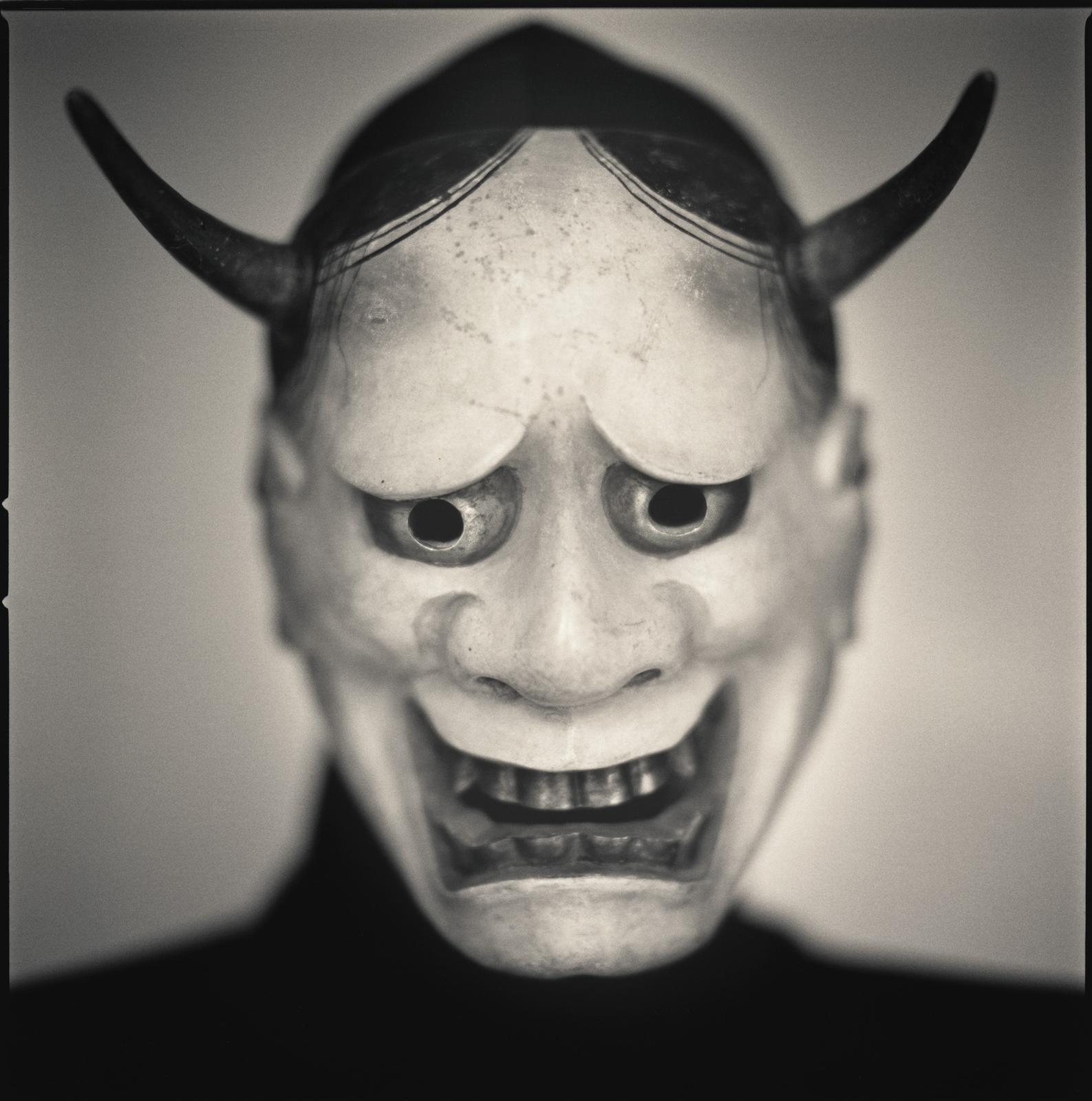
Noh Masks of Naito Clan
Kabuki Players
Japanese Studies


50NathanOv
>49 zachp: his "summer bugs" from your third link is the style I like best for this edition if we avoid straight architectural photos.
I think photographic studies on light and shadow from a Japanese photographer would fit the themes without being overly literal.
I think photographic studies on light and shadow from a Japanese photographer would fit the themes without being overly literal.
51LT79-1
Depending on whether you go with one, two or three photogravures will affect the tone of the book and the specific photogravure selection.
One photogravure would lend well to unity or a unifying theme in the book. I think the idea of tranquility/contemplation is a big one. So a more spatial images, not zoomed in.
Two photogravures would lend well to a polarity such as spatial/intimate east/west. The sacred/profane is quite a strong theme in the book. You have a sacred space like a tokonoma but then as you progress in the book Tanizaki elevates the profane to the sacred/beautiful e.g. Monastery/toilet, brothel/idea of beauty.
Three photogravures you can tell more of a story with sequencing- beginning/middle/end. This fits in well with the the idea of transience (a strong theme in the book) . To be fair to those above who suggested Sugimoto, he explores transience with his life cycle of the candle but you could do your own take on transience.
I'm just trying to think of structuring ideas for the specific tone of 1,2 or 3 photogravures. It's difficult otherwise trying to pull out random photogravures with no underlying structure or theme. The above are just some suggestions.
52Shadekeep
>51 LT79-1: I think it's also possible for each photogravure to feel like a realisation of one of the notions of the essay, as opposed to being a narrative in themself. For example, a tokonoma photo would be an example of shadow in space, a lacquer photo would be shadow on surface (or decoration), and perhaps a third photo with a human subject would be shadow on mood (or the like). Not well stated here, but hopefully you get what I'm going for - the effect of shadow in various contexts.
53LT79-1
>52 Shadekeep: I think I understand what you mean and I do like that nice selection of a spacial, a surface and a figural to experience the various aspects of the essay. That appeals to me a lot. There certainly doesn't need to be any connection between the three or sense of direction. I just always associate three in my mind as a triptych. I assemble them together even if seperated and inevitably look for connections.
54Shadekeep
>53 LT79-1: I certainly think they could be viewed that way as well, since they all refer back to elements of the essay and so are connected in that fashion. There should be an underlying thread, even if not an explicit one.
55LT79-1
>54 Shadekeep: The connections could be quite interesting and loose like you said moving from open inanimate (space) to closer inanimate (surface) then to a closer figural (animate) taking the reader on a journey towards a much more intimate and personal space. There's also a tactility to it as with a detailed surface you almost want to reach out and touch it. I think this mirrors the structure of the book too with people appearing more in the second half with the theatre and the brothel for example.
It would also be quite an interesting project for a photographer to tackle this wider range of composition.
It would also be quite an interesting project for a photographer to tackle this wider range of composition.
56cascabelpress
As another member who is a photogravure printmaker I am very pleased to be reading about the interest in including photogravure prints it this edition. I suspect like zachp mentioned it could workout and be beautiful. One photographer we might consider is Masao Yamamoto.
57cascabelpress
>20 zachp: Indeed, it seems possible ;)
58abysswalker
>56 cascabelpress: yes Yamamoto would be a wonderful choice, though most of his work seems to be of nature subjects. If he has done some interiors or architectural subjects, that would be ideal (perhaps a new commission could satisfy that brief). The play of light and shadow would fit perfectly.
Join to post

