2LT79-1
A Miscellany of Type - Whittington Press.
This year I'm hoping to acquire a range of books focusing on type. I think this is a very good start.
This year I'm hoping to acquire a range of books focusing on type. I think this is a very good start.
3ChestnutPress
>2 LT79-1: A very good start indeed!!
4yikou
>2 LT79-1: Are you specifically focusing on fine press takes on type (a la Specimens of Diverse Characters) or does antiquarian (such as vintage type specimens) count?
5BuzzBuzzard
I was not aware of Kurt H. Volk until his name was mentioned on this forum. Thanks for that! He has a couple of editions of interest to me, and The Happy Prince is one of them. The book is about 6" x 8" and comes in black presentation box. The dark red moiré silk binding is exactly the same as in The Oldest Christmas Story. Somewhat unusual as it appears to be cushioned and is bulky. Printed on very nice Japanese Okawara handmade paper. Sheets folded French style. Interesting title page design. The more I look at it the more I seem to like it. My copy is just about perfect.


6Transfixed
>5 BuzzBuzzard: Glad to be of help. Such a beautiful book merits a new home. And I guess Oscar Wilde would enjoy this edition.
7LT79-1
>4 yikou: Thanks, Specimens of Diverse Characters looks wonderful although 20k is a little outside my budget! I'm quite open minded at this point and open to suggestions but I'm looking more for hefty books which can take me on a journey with a variety of typefaces in various sizes in different contexts rather than a deep dive into a specific one.
8dotman
>7 LT79-1: A Goudy Memoir by the Yellow Barn Press is a wonderful & relatively cheap exploration of American typography from a single (if somewhat controversial) individual. Highly recommend the press too - a well regarded book on book publisher.
9duncjl
>7 LT79-1: I'm guessing you might be familiar with them but, if not, check out the books on type, ornaments, fleurons etc written and splendidly printed by Mark Arman at his Workshop Press. An author/publisher search on ABE will provide food for thought and sufficient photos to get a feel for them. Not 'hefty' by any means, but meeting your other criteria.
10Chemren
>7 LT79-1: You might enjoy Stanley Morison’s book on the Fell types. Published by the Oxford University Press in 1967. That thing is the very definition of a hefty tome and can still be purchased quite reasonably in spite of its citation in the Century for a Century book.
11Shadekeep
>5 BuzzBuzzard: Lovely edition! The binding reminds me of the one for Spanking the Maid. Interesting texture and plushness to it.
12Glacierman
>2 LT79-1: Cast a wide net with Updike's Printing Types: Their History, Forms and Use.
13LT79-1
>8 dotman: >9 duncjl: >10 Chemren: Thanks all, great recommendations!
>12 Glacierman: I'm halfway through volume two of this and it is what has sparked my interest in type. It's a fantastic book and it clicked just how interesting the development of type is. Before reading this book I couldn't understand why a collector would purchase type specimen books, now I totally get it. I also think the online resource for this is superior to the paperback and it's free.
>12 Glacierman: I'm halfway through volume two of this and it is what has sparked my interest in type. It's a fantastic book and it clicked just how interesting the development of type is. Before reading this book I couldn't understand why a collector would purchase type specimen books, now I totally get it. I also think the online resource for this is superior to the paperback and it's free.
14duncjl
>10 Chemren: That is a beast of a book and really quite magnificent (but not to be read on the lap!) When it was was first published, Colin Franklin urged my late father to buy a copy but it was prohibitively expensive for his then salary. The published price of £25 is equivalent to about £400 now, which given the book took 18 months to hand-set and print seems exceptional value. I am happy to have a deep enough shelf to accommodate it!
15ChestnutPress
>2 LT79-1: Now, you REALLY need to pick up a copy of the magnificent ‘Typefoundries in the Netherlands from the Fifteenth to the Nineteenth Century’. It is an incredible volume, impeccably designed (by Bram de Does) and printed. It was the last great book to be printed at Joh Enschede en Zonen and likely the last book of its size to ever be printed letterpress.
16LT79-1
>15 ChestnutPress: ssshhh, keep it down. I'm on the look out for that one. You'll clear the stock :). But no seriously it's definitely on the radar after you mentioned it.
17duncjl
2026 is off to a good start! I'm particularly pleased to acquire my first book from the Red Howler Press.


18ChestnutPress
>17 duncjl: A nice haul!
19Glacierman
Just arrived from the UK: Grounding by Laura M. R. Harrison from Helen Moss' Awen Press.
A minor piece, being a single, short poem with an engraving by Helen, but it is well executed. The engraving is delightful. I'm pleased.
I'm looking forward to see what the future holds for this press.
A minor piece, being a single, short poem with an engraving by Helen, but it is well executed. The engraving is delightful. I'm pleased.
I'm looking forward to see what the future holds for this press.
20Transfixed
Inspired by the kermaier's favourite acquisitions of 2021, I've obtained the chapbook We'll be Watching You of Greta Thunberg's 2019 speech to the UN Climate Action Summit from Contre Coup Press, 2019.
I like prophetic literature & the chapbook is wonderfully made. "Set by hand in Centaur type and printed on Rives paper using a Vandercook SP20 press. 25 copies printed", states the colophon.
It goes to the same box with Ferlinghetti's Pity the Nation.

I like prophetic literature & the chapbook is wonderfully made. "Set by hand in Centaur type and printed on Rives paper using a Vandercook SP20 press. 25 copies printed", states the colophon.
It goes to the same box with Ferlinghetti's Pity the Nation.

21Shadekeep
Picked up an unusual title that I've had my eye for a while. It's Morgan Library Ghost Stories (1990) from the Stone House Press. A collection of original ghost tales inspired by the Morgan Library and written in the style of M.R. James. Hoping to make it my weekend reading.
Photos below of the included prospectus and the colophon, and they can be clicked to enlarge.


Photos below of the included prospectus and the colophon, and they can be clicked to enlarge.


22Shotcaller
>21 Shadekeep: Very interesting. I'd love to hear what you make of the stories.
23duncjl
>19 Glacierman: Mine arrived today and it is nicely done. Assuming copies are being distributed sequentially the edition must be almost sold out, which is very encouraging for her new enterprise.
24dotman
>21 Shadekeep: very cool subject matter. Thanks for the plug
25kermaier
>21 Shadekeep: Enabled! I’m a fan of DePol so couldn’t resist.
26Shadekeep
>25 kermaier: Excellent! I'm a DePol fan as well, so this cinched it for me too. Hope you enjoy!
Anyone looking for a unique version of this title might want to check out the one on offer from James Cummins Bookseller. I only discovered it after having ordered my copy from Peter Keisogloff Rare Books (which was also a bargain). This particular edition appears to include an extra story intended for the book but which wasn't included.
EDIT: Wow, sold already!
27kermaier
>26 Shadekeep: yes, I saw that one too, but passed at 4-5x the price of regular copies. :-)
28zorg2099
Completely new to the world of fine press here. I believe this, Rupert Brooke: Selected Poems from Folio Society which I grabbed for half off during the New Year sale might be my first proper fine press book.


As an aside I'm not sure if the cloth bound Sark Edition of Mervyn Peake's Mr Pye seen above and which I received earlier this month also counts. I've read some discussion in other threads here and it seems quite a few of the members don't feel that letterpress is strictly necessary. The higher states of Mr Pye are hand bound while the Sark Edition is not though. However, the typesetting, the paper selection and the overall thought and consideration that has gone into the whole production is quite Extraordinary (hehe).

In any case I'm quite delighted with both books and am looking forward to adding more (and getting new bookshelves!). I do have Twenty Thousand Leagues Under the Seas from Conversation Tree Press and The Hellbound Heart from Suntup on order but there is a while to wait. In the meantime I am trying to get hold of the other two books in the war poets series from Folio as well as get a start on Letterpress Shakespeare.
29wcarter
>28 zorg2099:
The definition of fine press varies, but I consider Mr.Pye to be fine press.
The FS poet LEs are beautiful books and well worth acquiring.
The FS letterpress Shakespeare volumes are, in my opinion, the best editions of Shakespeare ever published. I reviewed them at https://www.librarything.com/topic/337728. They seem to be getting steadily more expensive on the secondary market.
Enjoy your collecting!
30zorg2099
>29 wcarter: Thank you! I've seen a few of your reviews in the FSD group but not the LP Shakespeare one, very helpful to see things summarised in that link. I will probably try to start with Hamlet and then take it from there.
31ChestnutPress
>28 zorg2099: That Robert Brooke is the only Folio Society book I own and it’s a wonderful volume.
32dlphcoracl
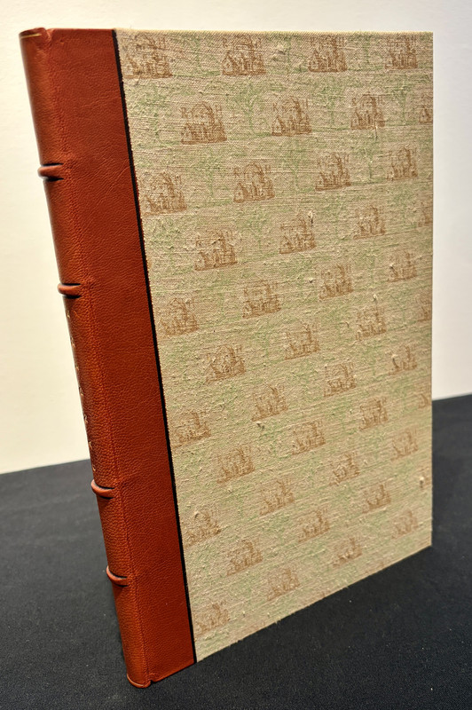
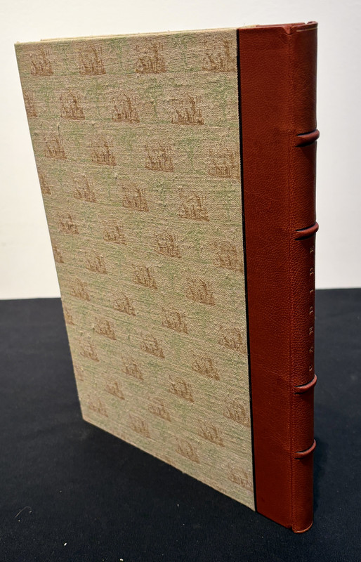
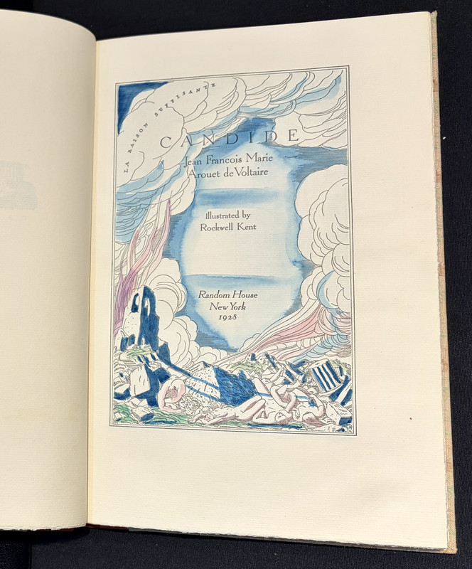
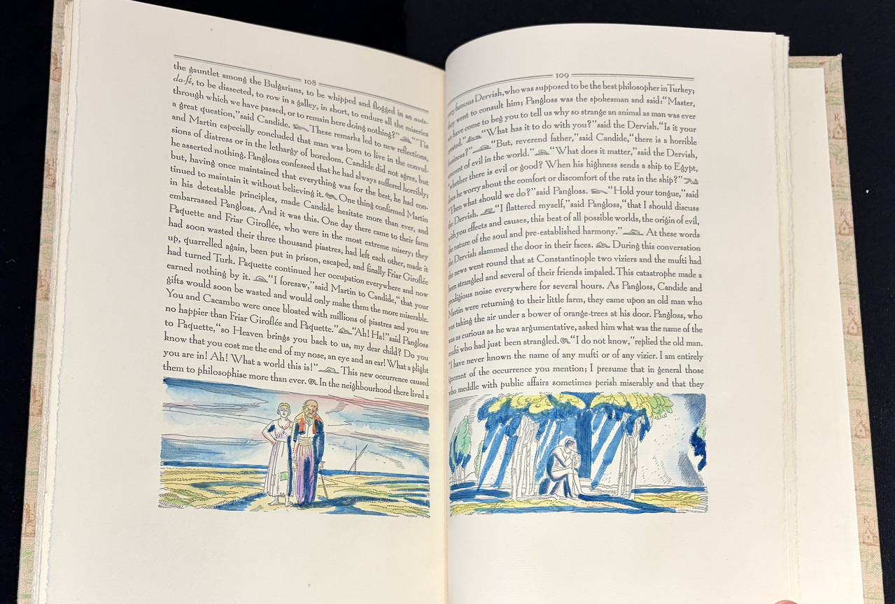
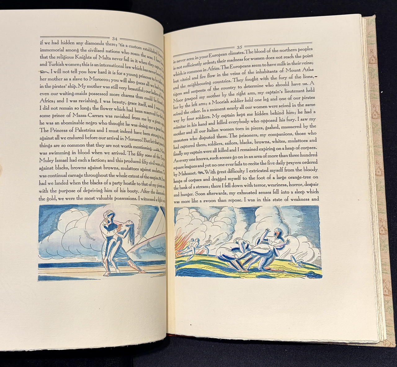
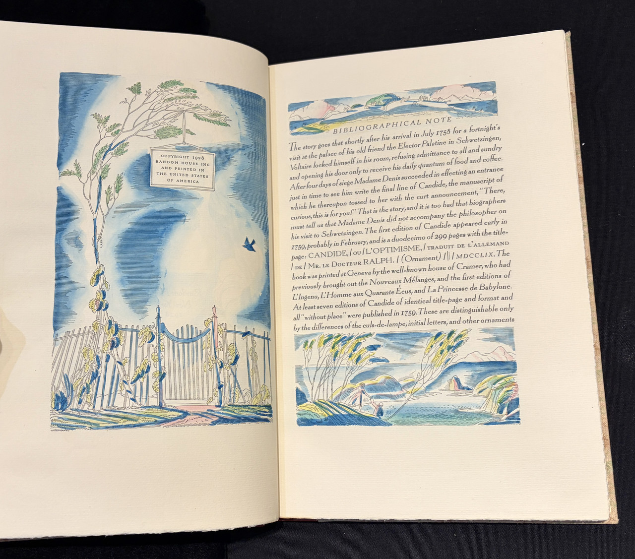
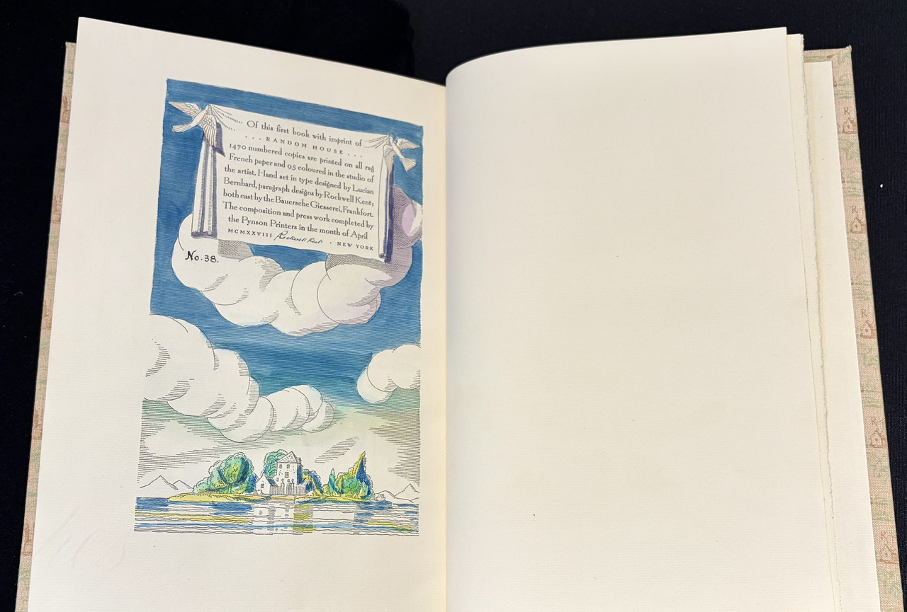
Candide by Jean Francois Marie Arouet de Voltaire, printed by Elmer Adler's Pynson Printers for Random House, 1928. One of 95 copies with hand-colored illustrations by Rockwell Kent.


33Lukas1990
>32 dlphcoracl: Congratulations!
34wcarter
>32 dlphcoracl:
VERY NICE!
VERY NICE!
35ChestnutPress
>32 dlphcoracl: Good to see you posting — I love the binding of that volume!
36dlphcoracl
>35 ChestnutPress:
Interesting factoid: Bennett Cerf, who was co-founder of Random House one year earlier in 1927, was so taken by the charming country house seen in the patterned cloth binding covers as well as being part of the final Rockwell Kent illustration for the book, that he adopted the quaint country house as the logo or symbol for his new Random House publishing company.
Interesting factoid: Bennett Cerf, who was co-founder of Random House one year earlier in 1927, was so taken by the charming country house seen in the patterned cloth binding covers as well as being part of the final Rockwell Kent illustration for the book, that he adopted the quaint country house as the logo or symbol for his new Random House publishing company.
37ChestnutPress
>36 dlphcoracl: Excellent!! Gotta love an interesting fact!
It makes me think of the Cassell publishing house ‘belle sauvage’ logo that Eric Gill drew. Turns out the naked model for it was Beatrice Warde!
It makes me think of the Cassell publishing house ‘belle sauvage’ logo that Eric Gill drew. Turns out the naked model for it was Beatrice Warde!
38Nightcrawl
>32 dlphcoracl: Congrats! This is arguably my favorite book in my collection; from the binding to the elegant typography, print quality, and of course the wealth of beautiful, hand-colored Kent illustrations adorning every single page. The colophon is especially striking. (I’m also a sucker for illustrated drop caps.)…IMO one of the greatest illustrated books of the 20th century.
I’d love to hear your thoughts. Your copy appears pristine!
I’d love to hear your thoughts. Your copy appears pristine!
39duncjl
Candide offers such fertile ground for an artist's imagination. Peter Tucker in his excellent book on the illustrated editions (Previous Parrot Press, 1993) lists no fewer than 108 editions with distinct interpretations of the work, though he'd not had the opportunity to examine the coloured Kent version; though he does borrow the Kent colophon for the similar page in his own book.
40LT79-1
>39 duncjl: that would make quite an interesting topic in itself. The book titles with the most fine press editions.
41dlphcoracl
>40 LT79-1:
I have often referred to works of literature or poetry that appear most frequently in private press editions as 'Private Press Royalty'. Interestingly, the works that appear in the greatest number of private press editions are almost always done well. Some classic examples of 'Royalty':
1. Shakespeare's sonnets.
2. The Fables of Aesop
3. The Rubaiyat of Omar Khayyam
4. Hamlet
5. The Grimm Brothers fables
6. King Lear
7. Gulliver's Travels
8. The Revelation of Saint John
9. The Book of Job
10. The Canterbury Tales
11. A Christmas Carol (Dickens)
12. Le Morte DArthur
13. The Thousand and One Nights
14. Genesis
15. The Ballad of Reading Gaol
42duncjl
>41 dlphcoracl: Add to that list Alice in Wonderland, Paradise Lost and Sonnets From The Portuguese and together you have almost the entire inventory of the average secondhand bookshop of 40 years ago (though not necessarily or even particularly in their private press manifestations).
43LT79-1
>41 dlphcoracl: Shockingly I don't own any of the Royalty in fine press editions but I'd like to! I'm surprised Odyssey isn't on the list.
45Opinacus
>32 dlphcoracl: The illustrations are undoubtedly lovely, and far be it from me to denigrate an edition like this, but I have to query the elegance of the text design choices here - at least on the two images where it appears in your post. The undifferentiated lines and lack of breaks even for direct speech seem to me to sacrifice readability for conformity to the almost square shape of the text block. It is like trying to read a brick (or a Saramago novel)!
I also personally find that the ascenders on the font are too long. It makes the remainder of the type look too small and means you are constantly smashing into capital letters (particularly like in that Bibliographical Note). I do not find it easy on the eye.
What do others think? Perhaps there are some paragraph breaks on other pages?
46Nightcrawl
>45 Opinacus: Different strokes for different folks I suppose, but I could not disagree more. The continuous, unbroken text is quite common in fine & private press books, especially with handset type, and I find that the paragraph indicators, designed by Kent in the form of figures in various dramatic poses, are not only charming, but make for easy reading. I don’t find it any more difficult than reading something with line breaks and/or indentations. May take a moment to get used to for some, but you acclimate very quickly.
As to the font, I think it’s the perfect choice for this work. In fact, if I’m not mistaken, the type was newly designed specifically for this book. Echoing my sentiments above, I find it elegant and charming. While still perfectly legible, the font is just playful enough to convey the satirical & ironic nature of the story. Being as slender as it is, I don’t find it at all overcrowded either.
All of that said, I appreciate your perspective and totally understand that the design isn’t going to appeal to everyone. When I purchased my copy it wasn’t even on my radar. I came across it at the Antiquarian Book Fair in Manhattan last year and had an immediate emotional reaction upon paging through. It checked every box for me in a big way and I knew it was coming home with me.
47LT79-1
>46 Nightcrawl: I totally agree here from what I can see.
Candide is exactly the kind of text to support that fast paced uninterrupted wall of text style and Saramago does that for a reason. You're not meant to break every minute but move forward. The text shouldn't always conform to reader's comfortable preconceptions. Obviously this isn't a rule but to me it seems appropriate in this instance. Also the illustrations look very expansive to me horizontally and vertically, and the text framing means text and image work well together. The ascenders work well with that vertical expansiveness. There's a touch of William Blake about it.
Candide is exactly the kind of text to support that fast paced uninterrupted wall of text style and Saramago does that for a reason. You're not meant to break every minute but move forward. The text shouldn't always conform to reader's comfortable preconceptions. Obviously this isn't a rule but to me it seems appropriate in this instance. Also the illustrations look very expansive to me horizontally and vertically, and the text framing means text and image work well together. The ascenders work well with that vertical expansiveness. There's a touch of William Blake about it.
48duncjl
>47 LT79-1: The suggestion of William Blake is a good call; not so much in artistic style but in the general mise-en-page. Compare for instance with pages from Young's Night Thoughts as illustrated by Blake.
49LT79-1
>48 duncjl: I'd go so far as to say Night Thoughts is an influence in the design of this book. If you framed the text on the left and right (and not just above and below) with illustration you wouldn't be far off.
Btw, the only FS LE I refuse to sell is NT.
Btw, the only FS LE I refuse to sell is NT.
50DenimDan
>46 Nightcrawl: The typeface is a precursor to Bernhard Modern, which was later cast by ATF in 1937. This one may be Bernhard Booklet, but I am not sure. I thought Booklet was another ATF face, but the colophon notes that this face was cast by Bauer.
51Nightcrawl
>50 DenimDan: Thank you for the info!
52astropi
>28 zorg2099: One of my favorite publications from the Folio Society! Congrats, it's a beauty, and they truly captured the spirit of fine books from the 20th century. I will say, in my opinion "fine press" does mean letterpress -- not everyone will agree with me and that's fine. Now, you'll need to get the two other books in the War Poets series :)
53zorg2099
>52 astropi:
Thank you and yes definitely agreed!
Being new to fine press collecting, I had been reading around and have seen that opinion expressed. I am also inclined to agree but wasn't sure how widely accepted that definition was. Mr Pye certainly feels very special even in the entry level cloth binding for all the reasons I mentioned.
Already on it haha.
Congrats, it's a beauty, and they truly captured the spirit of fine books from the 20th century
Thank you and yes definitely agreed!
"fine press" does mean letterpress
Being new to fine press collecting, I had been reading around and have seen that opinion expressed. I am also inclined to agree but wasn't sure how widely accepted that definition was. Mr Pye certainly feels very special even in the entry level cloth binding for all the reasons I mentioned.
Now, you'll need to get the two other books in the War Poets series :)
Already on it haha.
54wcarter
>53 zorg2099:
A survey on the FPF a few years ago showed 60% of members did not require a book to be letterpress printed to be considered fine press, while the other 40% were very definite that it did, so fairly evenly divided.
I am in the camp where if you cannot tell if it is letterpress or not then offset is just as good. I have many "fine press" books that are not letterpress.
The criteria for a fine press book include a combination of:-
Binding
Illustrations
Design and presentation
Paper
Letterpress or typesetting
Slipcase/box
Endpapers
Page edge gilding or illustration
Limitation
GIVENS : Sewn, tail pieces.
It is all very subjective and impossible to define objectively. Like pornography, you know it when you see it but can't define it.
55zorg2099
>54 wcarter: I do understand the desire for letterpress of course, the act of printing is one of the key steps that makes a book a book and letterpress makes it a craft and not just a mechanised process. However, a more holistic definition of fine press as you laid out feels more comfortable to me. Interesting to note the split in opinion among the membership here.
Well put haha. And its not like the Fine Press Police will hunt you down if you have a slightly different definition to others... or will they???
It is all very subjective and impossible to define objectively. Like pornography, you know it when you see it but can't define it.
Well put haha. And its not like the Fine Press Police will hunt you down if you have a slightly different definition to others... or will they???
56Opinacus
>46 Nightcrawl: I came across it at the Antiquarian Book Fair in Manhattan last year and had an immediate emotional reaction upon paging through.
I know what you mean and it is undoubtedly a fine book. Perhaps I am taking the text too much in isolation.
Also, I think I feel envious too, having recently picked up the less colourful Libanus Press version of Candide. But that too is wonderful in other ways: paragraph breaks, fine chapter headers, cheeky illustrations, and a satisfying heft to the whole. It also has something I greatly value, namely parallel French-English text. Amusingly this alternates, so that the French is on the left on the verso and on the right on the recto. Truly shot through with humour!
57imaginarydata
>54 wcarter: I would add to the GIVENS: archival paper.
There's no point in spending a lot of money on a book if the pages are going to become yellow and brittle in a few years.
There's no point in spending a lot of money on a book if the pages are going to become yellow and brittle in a few years.
58Glacierman
>57 imaginarydata: That would be any quality hand or mould-made paper. "Yellow and brittle" applies to paper with a high lignin content which is usually machine made from wood pulp. Wood pulp can be processed to reduce the lignin content, however, to produce archival quality paper. The papers used in fine presswork are processed in such a way as to severely reduce lignin content (it is present in all plant fibers), so any fine press using quality papers should not have the problems of yellowing and brittleness, which is caused by the deterioration of the lignin as it becomes acidic and destroys the paper.
It is interesting to note that books printed in the early years of printing in Europe (incunabula) were made with paper that is still in superb condition. I once had the pleasure of handling a book printed in Switzerland in 1578 whose paper was as crisp and white as if new, a lovely laid paper.
It is interesting to note that books printed in the early years of printing in Europe (incunabula) were made with paper that is still in superb condition. I once had the pleasure of handling a book printed in Switzerland in 1578 whose paper was as crisp and white as if new, a lovely laid paper.
59ensuen
>58 Glacierman: "That would be any quality hand or mould-made paper"
I'll take the chance to be pedantic and note the paper for the Bird and Bull book, was handmade by Henry Morris but ended up way too acidic to the point that most copies are a little bit crispy on the edges. this actually annoyed him to such a degree that he got rid of his personal copy, and discussed it in at least two of his publications - I think their might be a couple more references but they blend together a little
I'll take the chance to be pedantic and note the paper for the Bird and Bull book, was handmade by Henry Morris but ended up way too acidic to the point that most copies are a little bit crispy on the edges. this actually annoyed him to such a degree that he got rid of his personal copy, and discussed it in at least two of his publications - I think their might be a couple more references but they blend together a little
60Glacierman
>59 ensuen: Allow me to add a small modifier: "That would be most quality hand or mould-made paper."
Folks making their own papers by hand in small batches might take a while to get to where their process eliminates most of the lignin, thereby reducing its acidity as it ages. Call it a learning curve.
Folks making their own papers by hand in small batches might take a while to get to where their process eliminates most of the lignin, thereby reducing its acidity as it ages. Call it a learning curve.
61LT79-1
The Gogmagog deluxe bibliography recommended by a few members on another thread arrived. I've started to read it. What a character Morris Cox was. Right up my street. Really enjoying it!
Also the latest Chestnut arrived. It's small but perfectly formed with glorious paper. It just goes to show not a lot of text is necessary to make an impact. Very nice!
Also the latest Chestnut arrived. It's small but perfectly formed with glorious paper. It just goes to show not a lot of text is necessary to make an impact. Very nice!
62ChestnutPress
>61 LT79-1: Cheers!!
63DenimDan
>61 LT79-1: Glad to hear you're enjoying the Gogmagog bibliography. It's extremely well done, and I only have the trade edition, without all the choice extras of the deluxe! Morris Cox was sui generis; the letters and excerpts in the bibliography are a treasure trove.
64LT79-1
>63 DenimDan: indeed sui generis is a great way to put it. Just flicking through the illustrations before a deep dive I can see this.


66Shadekeep
>22 Shotcaller: The snowbound weekend made it a perfect time to read Morgan Library Ghost Stories, and I devoured the whole book in one sitting. It's really quite good, though as you might expect the degree in which each channels the voice of M.R. James varies. Each of the stories has a different thematic slant (one on books, another on ephemera, or typography, or history, etc), making them an enjoyable panorama of the scope and history of the library. And all tales end in a suitably Jamesian manner, whether happily or not. The DePol illustrations add to the immersion, as one would expect.
I found it a nice escape from the weather and other calamities, nesting into a microcosm of the library and its bookish concerns.
I found it a nice escape from the weather and other calamities, nesting into a microcosm of the library and its bookish concerns.
67Shotcaller
>66 Shadekeep: Thanks for letting me know! It sounds like a wonderful book, and one I'd find very appealing. Ghosts and books: what else could you want?
68Glacierman
>21 Shadekeep: And for the impecunious amongst us, Fordham University Press published the trade edition of 1000 copies available at a vast range in prices. . . .
69Shotcaller
>65 zorg2099: That's a beautiful book (I have it and The Tempest). The only trouble with that series is it cries out for more shelves than I have.
70zorg2099
>69 Shotcaller:
And sturdy ones at that! I do have Macbeth and Julius Caesar on the way too but will be taking a little breather after that and recuperate so to speak.
The only trouble with that series is it cries out for more shelves than I have.
And sturdy ones at that! I do have Macbeth and Julius Caesar on the way too but will be taking a little breather after that and recuperate so to speak.
71Shadekeep
>68 Glacierman: Glad to hear that! The stories do deserve a wider reach than the limited editions produced. Cheers mate!
72kermaier
>66 Shadekeep: I haven't read my copy yet, but (speaking of ephemera) it included, along with the prospectus, a small folder of "Three letterheads for the Stone House Press" engraved by John DePol:


73Pendrainllwyn
>66 Shadekeep: Nothing better than bunkering down and reading a good book when the weather is hostile. Perhaps because I have never actively sought out ghost stories to read I had never heard of M.R. James until your post. Then strangely enough, today I come across his name again in the book I am reading: "He would come to our dormitory late at night and read M.R. James's ghost stories by the light of the full moon." LT suggests his work is well regarded, I may give it a try. I'll add it to another recent recommendation of yours: Hodgson's "The Boats of the Glen Carrig". Thank you!
74Opinacus
A couple of M R James's stories were brilliantly adapted by Mark Gatiss into half-hour episodes for the BBC over Christmas. There were a series of six, most by different writers, but two (at least, from memory) by M R James, all under the title 'A Ghost Story for Christmas'. Unfortunately, only one of the six remains on BBC's iPlayer - an EF Benson story called The Room in the Tower. Recommended!
75Shadekeep
>72 kermaier: How excellent! Those are lovely, and a wonderful set of ephemera to have with the book. A nice bonus for a DePol fan.
>73 Pendrainllwyn: I hope you enjoy! M.R. James you might consider as a writer alongside Charles Dickens and Henry James, in that ghosts touch on matters in his stories but the stories themselves deal strongly with the humanist elements, such as memory, loss, and longing. And if you like the Hodgson book you may further find interesting his Carnacki The Ghost Finder tales, which are a mixture of supernatural and detective fiction, with some ghosts proving genuine and others confected.
>73 Pendrainllwyn: I hope you enjoy! M.R. James you might consider as a writer alongside Charles Dickens and Henry James, in that ghosts touch on matters in his stories but the stories themselves deal strongly with the humanist elements, such as memory, loss, and longing. And if you like the Hodgson book you may further find interesting his Carnacki The Ghost Finder tales, which are a mixture of supernatural and detective fiction, with some ghosts proving genuine and others confected.
76Shadekeep
>74 Opinacus: Great stuff, those adaptations. The Internet Archive has most of them as well: https://archive.org/details/a-ghost-story-for-christmas-1971
77Pendrainllwyn
>75 Shadekeep: "in that ghosts touch on matters in his stories but the stories themselves deal strongly with the humanist elements, such as memory, loss, and longing."
Oh good, that's much more interesting to me than a pure ghost story.
Oh good, that's much more interesting to me than a pure ghost story.
78Shotcaller
>77 Pendrainllwyn: A description that could be applied to much of Peter Straub's work, too.
79Shadekeep
>78 Shotcaller: Agreed, and Michael McDowell as well.
80Shotcaller
>79 Shadekeep: Boy, no kidding.
81Opinacus
>76 Shadekeep: Oooo yes. Thanks for this. More episodes to watch with Mrs Opinacus!
82duncjl
>64 LT79-1: I don't have a copy of the bibliography but am broadly familiar with the style of Cox's later artwork. I have the engraving below by Cox, which dates from the early 1920s but was printed from the block much later, that seems very atypical to the later work and much more conventional in nature. It would be interesting to learn if there was much in this vein.


83LT79-1
>82 duncjl: I'm working away this week. I don't have the book with me but from what I can remember the artwork was dated much later, 50s and 60s, and much more idiosyncratic. I'm sure there will be more conventional work like this. But even in that illustration the hand is already quite prominent and distinctive. The hands seem to be foregrounded in many of his pictures.
84LBShoreBook
A few new ones for me in the Gehenna/Baskin theme: Deluxe Flosculi Sententiarum, Gehenna Press, ornaments printed on 1905 French handmade paper. Exquisite and probably right into top 5 in my collection. Pursuit, Rainbow Press, Sylvia Plath poems published by Ted Hughes with Baskin drawings and signed etching.


85greenwald1
>17 duncjl: nice! The Esslemont On Folly and Wickedness of War has a great look and interesting essays.
86greenwald1
>41 dlphcoracl: I’d add Sir Gawain and the Green Knight
87LT79-1
>82 duncjl: do you own any of the photocopy library books? I was reading in the bibliography how Cox struggled with printing in his 80s and could only continue on a photocopier. But continue he did. Right till the end. That's the real deal right there. I noticed Previous Parrot Press reprinted one of these.
88duncjl
>87 LT79-1: I'm afraid I haven't any of them. There does seem to be a correlation between printing ink and longevity. If you are wanting an example of Cox's work at a reasonable price check out The Narrow Boat by Alan Tucker, printed at the latter's Stilt Press. It has a frontispiece printed by Cox at Gogmagog. There is a copy on ABE which bizarrely comes with 6 copies of the illustration!
89Lukas1990
Eschyle - Prométhée enchaîné (Société des Médecins Bibliophiles, Paris, 1941). One of 150 copies. With 38 wood-engraved pochoir illustrations (17 full-page) by François - Louis Schmied. Schmied's last work, engraved and printed by his son Theo after his death in January 1941. Still waiting for the book to arrive (photos of another copy which has much more foxing than mine).


90Transfixed
>89 Lukas1990: I like F.-L. Schmied's work.
I have only 3 reprints/facsimiles printed in c. 99 copies by Javier Martín Santos, and even they are nice:
Le Cantique des Cantiques,
Histoire de la Princesse Boudour,
Histoire charmante de l'adolescente Sucre d'amour (this one is a facsimile of the original hand-coloured exemplar # IV of XXV).
I have only 3 reprints/facsimiles printed in c. 99 copies by Javier Martín Santos, and even they are nice:
Le Cantique des Cantiques,
Histoire de la Princesse Boudour,
Histoire charmante de l'adolescente Sucre d'amour (this one is a facsimile of the original hand-coloured exemplar # IV of XXV).
91Lukas1990
>90 Transfixed: I've seen some of those facsimiles online. They look stunning. Hard to tell from the originals!
92Transfixed
>91 Lukas1990: I'd call them 2nd editions. They are only facsimiles, not fine press, but finely crafted and worthy in the absence of the original. You can actually show them to somebody without much fear. Javier Martín Santos is himself a master-crafter who has my full respect.
Histoire de la Princesse Boudour was issued by Schmied in 20 exemplars. You'll hardly handle the original. It's improbable to obtain one of the special hand-coloured copies of the Histoire charmante de l'adolescente Sucre d'amour. And Le Cantique des Cantiques, issued by Schmied in 110 copies, is a particulary original rendition of a famous book, where I appreciate the possibility to show the reprint to my friends.
Histoire de la Princesse Boudour was issued by Schmied in 20 exemplars. You'll hardly handle the original. It's improbable to obtain one of the special hand-coloured copies of the Histoire charmante de l'adolescente Sucre d'amour. And Le Cantique des Cantiques, issued by Schmied in 110 copies, is a particulary original rendition of a famous book, where I appreciate the possibility to show the reprint to my friends.
93DenimDan
>87 LT79-1: >88 duncjl: The Photocopy Library books from Cox are so rare as to be almost unobtainable. "In Line" and "20 Collages" are the only ones I've seen retail. About 15 years ago, Bloomsbury Auctions in the UK had a complete run of all Gogmagog Press books (including 10 of the Photocopy Library ones). The opening bid was 22,000 pounds and the lot passed. I assume most if not all are in institutional collections, though there might be one or two personal libraries in the UK with them. Somebody with the PLA might have a census.
94LT79-1
>88 duncjl: thanks, I picked one of the copies up on Abe. Can't go wrong at that price can you. Whether it will arrive with 6 copies of the illustration is another story!
>93 DenimDan: It's a shame because I'd like to read one of his novels, even if it was scanned and pdf. It's more it not being accessible to read than access to original copies.
>93 DenimDan: It's a shame because I'd like to read one of his novels, even if it was scanned and pdf. It's more it not being accessible to read than access to original copies.
95LT79-1
>88 duncjl: it arrived with six separate Cox frontispieces! I've been learning book binding so I'm going to tip one of them into a chapbook I'll make with a poem inspired by the frontispiece. Just to keep for myself. But then in my head I can pretend I collaborated with Cox. As for the other five I've no idea what I'll do with them.
96duncjl
>95 LT79-1: I'm glad you're pleased with it. I've been buying occasionally from Hannah for several years (though my copy came from elsewhere) and was confident that she would deliver as described.
97JamesFreemantle
>93 DenimDan: >95 LT79-1: The best place to see the complete collection including the photocopy library books is the V&A, where a full set was donated. Myself and one other person in the UK have a complete set in their private collections, and with the photocopy library being only around 5 copies each, the remaining two or more of each book have been dispersed randomly with some in institutional libraries which is easily checked via WorldCat. Finding Cox’s main editions outside of the Photocopy Library isn’t as difficult though. Let me know if you want any details and I’ll help where I can.
98LT79-1
>97 JamesFreemantle: Thanks for the useful information and it's great you have the full collection of this unique individual! I would like to visit V&A but it's only going to be useful if I can actually sit and go through all the books for a couple of hours. I'm not sure if they allow that kind of access but I can certainly enquire.
99duncjl
>98 LT79-1: Without wishing to seem their recruiting officer, you could consider membership of the Friends of the Nations' Libraries (FNL) which I believe will grant you reading privileges at the V&A library, as well as elsewhere.
100DenimDan
>97 JamesFreemantle: I appreciate your information. On this side of the pond, the only institution with more than one Photocopy Library volume is the University of North Carolina, Greensboro, which has a complete collection of Gogmagog Press books and a few of the Photocopy ones. I am glad that the V&A has one of everything; Morris Cox was a national treasure!
101LT79-1
>99 duncjl: Thanks, I'll sort all this in time for a visit to London in early summer. I'll visit V&A, Collinge and Clarke and Shepherds and any other fine press landmarks I can think of in the city.
102ensuen
A couple Codex purchases:
- Suntup Morris book
- Ann Covell - Sea Change, The Record
- Russel Maret - ORNAMENTAL DIGRESSIONS
- foolscap - Despatches
- Pie in the Sky - Listen to the Corvids
- salvage press - sworn states and plague poems. Technically I ordered it a while ago, but the Carbon copy on display was very nice and it was cool to talk through all the elements.
- Sol Rebora - a copy of Coplas (she did a couple one-off variations of the title) mine having a detachable segment with an additional illustration + picking up a commission binding of Specimens, which is a catalogue of papers offered by the Steven's Nelson Paper Company.
Coplas


specimens


It was really cool to see everybody at Codex, it was my first time at any sort of book event and it was fun to chat a little bit with people that I have interacted with online + see books in person before making a decision.
103mr.philistine
>73 Pendrainllwyn: ...I had never heard of M.R. James...
The Folio Society have a couple of collections of M.R. James. The 2007 Collected Ghost Stories appears to be the complete anthology by the author. Discussion on the FSD forum here: https://www.librarything.com/topic/160952
The Folio Society have a couple of collections of M.R. James. The 2007 Collected Ghost Stories appears to be the complete anthology by the author. Discussion on the FSD forum here: https://www.librarything.com/topic/160952
104greenwald1
Was extremely fortunate (and grateful to Griffin!) to get my hands on a presentation copy of The Death of Ivan Ilyich. The King in Yellow also came in well above my expectations. I have the first HPL and this is a step up from that.
Note the King in Yellow blue cloth is quite a bit darker than in my photos


Note the King in Yellow blue cloth is quite a bit darker than in my photos


105NathanOv
>102 ensuen: I've been mulling over Covell's Sea Change for a while but haven't been able to determine how substantial the text is. I'd love to hear your opinion of it!
106kermaier
>104 greenwald1: I see a major Allen Press book there too, along with the Taller Martin “Sir Gawain”….
107greenwald1
>106 kermaier: Yup! I figure the Taller Martin has been discussed enough already but I love it. I wasn't sure about the brown boards before I ordered it, but very happy in person, gives a real feeling of nature.
And the Poeticon Astronomicon has been on my grail list for a while, my post just started to run long.
And the Poeticon Astronomicon has been on my grail list for a while, my post just started to run long.
108GardenOfForkingPaths
>104 greenwald1: That’s a fabulous stack of books, congrats!
109ensuen
>105 NathanOv: I would reach out since I bought the second to the last copy at codex + my copy is actually in the mail still. But from memory there's not a lot of text, aside from where it relates to the maps or their interpretation.
The book is basically tracking projected shoreline changes over time + sea level rising, mimicking the style of pasted over changes. I found the construction of it to be really interesting, but there's not a huge amount of text.
The book is basically tracking projected shoreline changes over time + sea level rising, mimicking the style of pasted over changes. I found the construction of it to be really interesting, but there's not a huge amount of text.
110NathanOv
>109 ensuen: hmm, I've been fascinat dby the art project since I first heard about it but if it's minimal text then it might not be right for my collection. Thank you regardless!
111Shadekeep
>104 greenwald1: Top notch acquisitions! And The King in Yellow does seem to have turned out quite well, happily.
112Opinacus
Since the beginning of the year, and following a slightly disappointing Christmas, I have been on a rather avaricious spree, resulting the acquisition of the following:
Libanus Press - Candide, Symposium (leather standard)
Jericho Press - The Church's Bridal Feast (incl Syriac text)
Arion Press - Paradise Lost
Stanbrook Abbey Press - Patriarch Tree
Kelly-Winterton Press - Sappho, Coleridge The Devil's Thoughts, and Aeneid VI
Allen Press - Montaigne and RLS Across the Plains
Rampant Lions Press - Psalms of David
At the moment, my aim is to achieve a good representative sample of different presses. I am clearly heavily influenced by the consensus views of this forum and blame - I mean, thank - Mr Greenwald for his recent picture of the Libanus Symposium which spurred me on to that acquisition, and to Mr DelphicOracle for the Psalms of David, in particular. I was sceptical, but The Psalms arrived only today and is a tremendous book, although as I think Mr Oness said recently in the title page thread, the title page is a bit "puzzling". It sets a rather bland tone, to my eyes.
My personal favourite of these at the moment is Kelly-Winterton's Sappho. A very elegant, simple little book which does everything right.
113duncjl
>112 Opinacus: Happy to see Chip Coakley (Jericho) getting some love; surely one of the finest, under-the-radar, currently active printers.
114Transfixed
>112 Opinacus: I think you are right to recommend particularly the Ψαπφω: Poems of Sappho, designed by Jerry Kelly and issued in 2007 by Kelly-Winterton Press. It's a bilingual edition with a nice new translation by Sandra & David Sider, including also the recently discovered/completed Tithonus poem.
It's a gem of a book. It's also largely undervalued.
It's a gem of a book. It's also largely undervalued.
115greenwald1
>112 Opinacus: nice glad you like the Symposium!
I don’t have The Psalms but Rampant Lions made some great books. My favorite of theirs is the special edition of The Unknown Masterpiece.
I don’t have The Psalms but Rampant Lions made some great books. My favorite of theirs is the special edition of The Unknown Masterpiece.
116Opinacus
>114 Transfixed: Yes indeed. You'll note that quite a few of them are parallel texts, which I enjoy. I like their arrangement of the poems, which is out of the canonical number order. I have the FS Sappho if I want some scholarly commentary on each poem.
It was very good value. In fact, all of the above, except for the Arion Press Paradise Lost were £200 or less, and found on Abebooks, eBay and through Blackwell's Rare Books.
It was very good value. In fact, all of the above, except for the Arion Press Paradise Lost were £200 or less, and found on Abebooks, eBay and through Blackwell's Rare Books.
117Glacierman
>112 Opinacus: Re: Rampant Lions Psalms, ". . . the title page is a bit 'puzzling'. It sets a rather bland tone, to my eyes."
Yes, it is a bit odd and doesn't really fit well with the rest of the book. Still, it is a marvelous book.
Yes, it is a bit odd and doesn't really fit well with the rest of the book. Still, it is a marvelous book.
118Opinacus
>113 duncjl: I certainly cannot fault this production. It’s more of a chapbook really and is subtitled ‘A Syriac Hymn for Epiphany’, appropriately enough, as that was the day I bought it.
Apparently the Syriac type used “was produced for the Cambridge University Press in 1898, following drawings made by FC Burkett. The script resembles Burkitt’s own fine Syriac handwriting…What is probably the only surviving type came to the present printer in 1987”. The chapbook was published in 1992.
Apparently the Syriac type used “was produced for the Cambridge University Press in 1898, following drawings made by FC Burkett. The script resembles Burkitt’s own fine Syriac handwriting…What is probably the only surviving type came to the present printer in 1987”. The chapbook was published in 1992.
119duncjl
>118 Opinacus: Yes, the press has a remarkable range of non-Latin types. If you haven't seen it, check out the photo I posted in the Judging Type thread of a broadsheet printed by Coakley in 1990 of the types held: Syriac, Coptic, Arabic, Hebrew, Hellenic Greek, Armenian and more.
120LT79-1
I quite like the title page on the RLP Psalms. I like the way the subtle green hue leaches into the grey. There's a very nice tactility to that block of grey and something monumental about it like stone. There's a lightness to the design of the book and this title page creates a nice counterpoint, giving a solidity to it while drawing in the covers and the text block.
121Sport1963
>107 greenwald1: Curious about the title page of your "Sir Gawain". I have the brown board variant with the La Mano Press imprint instead of Taller Martín Pescador. It is believed that it is in fact a small number of copies (20) were issued with the limitation number penciled in Roman numerals on the colophon. Would be interested if this is the case with your copy. Coincidentally just purchased the more prevalent green board variant yesterday. This title does not come up for sale often, and I would love to see the slip-cased deluxe version, bound by Jace Graf in quarter vellum with vellum tips, with sage green Japanese cloth sides and black Canson doublures. There are 26 of these deluxe copies lettered A-Z.
122GardenOfForkingPaths
>121 Sport1963: I have the brown board La Mano Press variant. My copy is numbered in Roman numerals, in pen, number 24. So it seems there might be just a few more than 20 copies.
A lovely book, and I’m very happy to have it. I would like to see the Deluxe edition too.
A lovely book, and I’m very happy to have it. I would like to see the Deluxe edition too.
123AdPacem
>121 Sport1963: >122 GardenOfForkingPaths: I was lucky enough to acquire one of them a couple years back, will try to take some pictures in the evening
124AdPacem
>121 Sport1963: >122 GardenOfForkingPaths:
As promised, including an example of the dark green illustrations:


As promised, including an example of the dark green illustrations:


125duncjl
L-R Rocket Press (for the Acorn Press), Libanus Press (for the Salubrious Press), Hillside Press SF, Old Stile Press and Strawberry Press.


126Sport1963
>124 AdPacem: A very handsome book. Thanks for posting the pics.
127ensuen
>102 ensuen:
My copy of Ornamental Digressions arrived today from Codex. Really stunning. I loved it at Codex, but the nature of a con flattens my perception of a book (lights, noise etc) and seeing it in person in my home really elevates things. Strong recommendation for it if you have the budget. Love the use of colors and patterns.
My copy of Ornamental Digressions arrived today from Codex. Really stunning. I loved it at Codex, but the nature of a con flattens my perception of a book (lights, noise etc) and seeing it in person in my home really elevates things. Strong recommendation for it if you have the budget. Love the use of colors and patterns.
128GardenOfForkingPaths
>124 AdPacem: Very nice indeed, thank you for posting.
129dotman
>124 AdPacem: magnificent! Rare bird indeed
130duncjl
Very pleased to have acquired this set of the Gregynog Poets: 12 volumes (7 in English, 5 in Welsh) each with a specially commissioned wood engraving and the whole contained in a cloth-covered solander box. The artists are a roll call of many of the finest wood engravers of recent years, including Peter Reddick, Harry Brockway, Colin Paynton, Hilary Paynter, Miriam Macgregor et al.


131LT79-1
>130 duncjl: that's a nice set. I was looking for that a while back at a reasonable price. You get the box to store them too.
132Transfixed
Papermaking by Hand: A Book of Suspicions by Walter Hamady, The Perishable Press Limited, 1982.
Number 87 of the Grolier Club list: A Century for the Century, 1900-1999.
From an eBay charity, offer accepted: $900. Including a custom-made solander box. Here is the listing with photos.
The title page is striking:

Number 87 of the Grolier Club list: A Century for the Century, 1900-1999.
From an eBay charity, offer accepted: $900. Including a custom-made solander box. Here is the listing with photos.
The title page is striking:

133Lukas1990
>132 Transfixed: Nice find! And yeah, the title page is perfection!
134LT79-1
>132 Transfixed: I didn't realise Hamady made his own paper. I knew he did a lot though. 'Suspicions' in the title sounds intriguing.
135Another_Bibliomane
Any idea what typeface that is? It’s gorgeous!
136duncjl
I wonder if any correspondence exists between Hamady and Henry Morris; that could make for fascinating reading.
137Transfixed
>135 Another_Bibliomane: It should be, according to the colophon, Palatino from the Stempel Type Foundry, designed by Hermann Zapf.
Some of the characters used are the Zierbuchstaben, the less common decorative letter forms of that font.
Some of the characters used are the Zierbuchstaben, the less common decorative letter forms of that font.
138greenwald1
>121 Sport1963: sorry I saw your post and then totally forgot before I got home to check. Mine is Roman numeral XXI. The colophon doesn’t indicate how many were produced with brown boards.
139DenimDan
>135 Another_Bibliomane: The (first) title page, i.e., the one in >132 Transfixed: , is calligraphed by Hermann Zapf. Apparently, Zapf got the title slightly wrong, but Hamady didn't want to tell him! It's a great book, with a wide selection of handmade papers, including Hamady's own "Shadwell." The coolest part might be that in the 600-800 lines of text, there are no hyphenated end-lines, which is crazy.
>136 duncjl: You would think so, but I can't imagine they would've seen eye-to-eye too much: Morris was a libertarian and Hamady was an environmentalist lefty. Hamady got NEA grants for a lot of his books in the 1960s-70s; Morris basically hated the government. In the Private Presses of San Serriffe, there might even be one that's a light-hearted dig at Hamady. They were both described separately as "irascible," which is probably putting it kindly! I don't recall seeing any correspondence between them in Hamady's stuff in the Library of Congress, but the cataloging isn't complete yet.
>136 duncjl: You would think so, but I can't imagine they would've seen eye-to-eye too much: Morris was a libertarian and Hamady was an environmentalist lefty. Hamady got NEA grants for a lot of his books in the 1960s-70s; Morris basically hated the government. In the Private Presses of San Serriffe, there might even be one that's a light-hearted dig at Hamady. They were both described separately as "irascible," which is probably putting it kindly! I don't recall seeing any correspondence between them in Hamady's stuff in the Library of Congress, but the cataloging isn't complete yet.
140duncjl
>139 DenimDan: Roger Bogus methinks? I hadn't made any connection before, but now it's mentioned...
141Transfixed
>139 DenimDan: Thanks. Are you really sure the title page isn't set from movable types including ligatures and decorative alternatives? Can you tell me a source of your information about the calligraphy?
142ensuen
>139 DenimDan: Morris has a line in The Private Pressmans Tale: "Grant Application I need $200,000 to print my book which tells how I print my books" as a section in an illustration.
143ensuen
>102 ensuen: The binder for my copy of Specimens uploaded a video of the binding + flipping through the book. It's probably also the best video at presenting flipping through the book itself.
I'd really recommend commissioning something from her if you like her style. I'm very happy with how it turned out.
Timeline was pretty short (and as projected): Initial talks in June 2025 with the work scheduled to start in October, final delivery March 2026.
Link: https://www.instagram.com/solrebora/reel/DVYwl4hgE99/?hl=en
144LT79-1
>143 ensuen: I think it was you who originally recommended this book to me. It's a book more than worthy of a wonderful bespoke binding like this. Thanks for sharing!
145ensuen
>144 LT79-1: Thanks!
I think I found it after a lot of hunting on Abe, but dlphcoracl (IIRC) actually has a couple books (which include specimens) on paper threads that can be nice to hunt through.
I think I found it after a lot of hunting on Abe, but dlphcoracl (IIRC) actually has a couple books (which include specimens) on paper threads that can be nice to hunt through.
146DenimDan
>141 Transfixed: There's a few sources on this one. The calligraphy on the title-page is mentioned in the entry for this book (Hamady 102) in Two Decades of Hamady and the Perishable Press: "The four-color title page was pen-crafted by Hermann Zapf and the typeface throughout the book is his Palatino." The entry lists Calligraphy by Hermann Zapf.
Hamady also noted it in at least one interview (Alastair Johnston, "Life and Death in Driftless, Wisconsin" from Parenthesis 27 (Autumn 2014): "Hamady also had Hermann Zapf calligraph a title-page, but Zapf got the title wrong. 'You can't tell the world's greatest calligrapher he screwed up,' says Hamady, so there is a second typographic title-page" with a much longer title in multiple sizes of Palatino. I can't recall where, but I think Hamady may have repeated this version in another interview.
Jerry Kelly continued the story of the two title-pages in a delightful article, "You say tomato, I say..." in Parenthesis 33, in which he tries to ascertain whether Hamady gave Zapf the wrong title or had in fact had settled on a title, whether Zapf simply messed it up, or whether Hamady decided to create an additional, equally impressive, typographic title page and concocted the story after the fact. Kelly's guess seems to be the latter, and he notes that Hamady and Zapf laughed the whole thing off (they collaborated on 2 more projects after this). here's the article link: https://fpba.com/parenthesis/selected-articles/you-say-tomato-i-say/
Congratulations on the book! What a deal! It's a masterpiece. I can see why it was the Perishable Press selection for Century for a Century. Apart from some of the Gabberjabbs and and maybe John's Apples, it's his most widely revered book.
147LT79-1
>145 ensuen: I'll check out the Oracle's previous posts. Shame he's not on the forum much these days. I enjoy the erudition.
>146 DenimDan: "and concocted the story after the fact." Brilliant!
>146 DenimDan: "and concocted the story after the fact." Brilliant!
148DenimDan
>140 duncjl: Bacchus on Bogus! The first "Bogus" sample is a nice dig at Hamady's typography in the Guillem de Poitou book.
>142 ensuen: The truth cuts deeply!
>142 ensuen: The truth cuts deeply!
149LBShoreBook
Gehenna Press Othello arrived today. Huge folio book, one of 100 that were bound (colophon incorrectly states 200), this one by Gray Parrot. Another 200 were unbound with an additional suite of engravings.


![]()


150Lukas1990
Had a lot of modern fine press books on my radar recently but ended up with... Anakreontos Teiou Mele Anacreontis Teii Odaria (Parmae: Ex Regio Typographeio,1785). One of just 50 copies on fine paper of The Odes of Anacreon, bound in contemporary half-calf with marbled boards. The book is in beautiful condition. Got it for a real bargain price.
Pirages has a long description:
https://www.pirages.com/pages/books/ST11935/bodoni-imprint-anacreon/in-greek-ana...
Pirages has a long description:
https://www.pirages.com/pages/books/ST11935/bodoni-imprint-anacreon/in-greek-ana...
151duncjl
>149 LBShoreBook: That's very handsome. I really need to acquire some more Gehenna Press books, but not much reaches the UK market besides Conrad's Manifesto. There might be thought to be much scope for a clash between Baskin's artistic style and the restrained (but not austere) typography, but in fact they always seem in harmony.
152LBShoreBook
>151 duncjl: Interestingly, there is a copy of Othello in the UK at the moment, one of the 200 unbound with additional suite of prints. https://www.abebooks.com/signed-first-edition/Othello-BASKIN-Leonard-SHAKESPEARE...
Depending on your collecting interests, an early book that is pretty small (so presumably cheap to ship overseas) and has some interesting features is Voyages, with six poems by Hart Crane (1957). It had a high limitation of 1,000 and can be found for relatively cheap ($150-ish). Six boxwood engravings and a cherry woodcut printed on paper handmade in Japan. It's a great little book although definitely an early example of Baskin's art.

Depending on your collecting interests, an early book that is pretty small (so presumably cheap to ship overseas) and has some interesting features is Voyages, with six poems by Hart Crane (1957). It had a high limitation of 1,000 and can be found for relatively cheap ($150-ish). Six boxwood engravings and a cherry woodcut printed on paper handmade in Japan. It's a great little book although definitely an early example of Baskin's art.

153TheTotalLibrarian
My first ever books from No Reply Press arrived. I couldn't hit the buy button fast enough on Umberto Eco's Ur-Fascism. I also took the opportunity to get Ursula K Le Guin's The Ones Who Walk Away from Omelas. They've made my week!
154Shadekeep
>153 TheTotalLibrarian: Congrats! NRP puts out amazing stuff.
155LT79-1
I thought now is the time of year to look for gardening books as I have a very large unruly garden to plan and sort out. My thinking was to cultivate my bookshelves in preparation for cultivating the land. I received another pleasant oversized Inky Parrot book called Advice on Gardening and an Incline Press book Layers of Concord is on the way for motivation.
156dotman
>155 LT79-1: some other titles:
Flowers & Faces by HE Bates - Golden Cockerel
Pleasures of Planting by George Booth - Cranbrook Press
The Man Who Created Paradise by Gene Logsdon - Press on Scroll Road
Flowers & Faces by HE Bates - Golden Cockerel
Pleasures of Planting by George Booth - Cranbrook Press
The Man Who Created Paradise by Gene Logsdon - Press on Scroll Road
157LT79-1
>156 dotman: thanks for the recommendations! It would be nice to find one on Japanese gardens. Surely a fine press has tackled this topic. If not they should do.
158wcarter
>157 LT79-1:
Taschen has done a very nice book on Japanese gardens, although not fine press.
Taschen has done a very nice book on Japanese gardens, although not fine press.
159duncjl
>155 LT79-1: A couple more to consider, though simply related and not exactly of practical help except philosophically, are Francis Bacon's On Gardens (Libanus Press) and John Carey's Vegetable Gardening (Rampant Lions) with beautiful coloured linocuts.
I don't have a copy of Layers of Concord but do have a duplicate prospectus for it, so if your copy doesn't have one I'll be happy to send it to you.
I don't have a copy of Layers of Concord but do have a duplicate prospectus for it, so if your copy doesn't have one I'll be happy to send it to you.
160ChestnutPress
>155 LT79-1: The classic ‘Four Hedges’ by Claire Leighton, who also illustrates it with her gorgeous engravings, is a must. While not ‘fine press’ in the limited edition sense, it is a beautiful, finely printed book, and sought after in the original edition.
161LT79-1
Thanks >158 wcarter: Phaidon and Thames & Hudson have produced nice photography books on the topic too.
>159 duncjl: that would be very kind of you. I'll PM you. A nice prospectus to tuck inside the book is always a good thing. Especially from Incline!
>160 ChestnutPress: excellent thanks. Claire Leighton's engravings in The Farmer's Year look absolutely delightful too.
>159 duncjl: that would be very kind of you. I'll PM you. A nice prospectus to tuck inside the book is always a good thing. Especially from Incline!
>160 ChestnutPress: excellent thanks. Claire Leighton's engravings in The Farmer's Year look absolutely delightful too.
162ChestnutPress
>161 LT79-1: Claire’s work in The Farmer’s Year is awesome (hence the relatively high price original copies fetch). Her writing in ‘Four Hedges’, which is all about her garden, is the prose equal of her engravings. It’s a simply wonderful read.
163ChestnutPress
Today’s post brought me my first book from TOC Berlin: Richard Sennett’s ‘The Craftsman’. It is quite unlike most other books on my shelves in that it is purposefully very modern in its design and finished look — very much like a really well designed trade book. But it is a limited letterpress edition and the presswork is, on my initial brief dippings, pretty much flawless. TOC Berlin have successfully made a truly modern book of today, but using letterpress. And it is seriously impressive. While most of their other works aren’t my thing, there is at least one other that floats my boat and I shall definitely be getting a copy. I can only humbly suggest that other members here have a look at their website and consider picking up something. They are very good value in my opinion.
https://www.toc.berlin/?fbclid=PARlRTSAQid-tleHRuA2FlbQIxMABzcnRjBmFwcF9pZA8xMjQ...
https://www.toc.berlin/?fbclid=PARlRTSAQid-tleHRuA2FlbQIxMABzcnRjBmFwcF9pZA8xMjQ...
164LT79-1
>163 ChestnutPress: I was tempted by Time of the Magicians. I definitely keep an eye out for a title I will reread. The price point is good too compared to other fine press offerings.
165LT79-1
Another book arrived this weekend. My first Libanus Press book called The Testament of Charlotte B. I picked it up in a sale for 30 quid. Printed on delightful handmade Amatruda paper. Pages are deckled at the bottom. Really nice pastel colours on this book with detailed head and tail illustrations between chapters which tie in with the binding. Very nice title page. Even the tipped in note on the erratum page is very well presented. Just started reading it but it has an excellent introduction and presents the 18th century experiences and letters of a strange lady called Charlotte Biggs. Impressed with the overall quality.
166ChestnutPress
>164 LT79-1: The price point is really good for these sizeable volumes.
167Shadekeep
>165 LT79-1: It is a good book. Interestingly, my only Libanus title so far as well.
168duncjl
>167 Shadekeep: Quarter leather bindings with their abundance of shades from the red and brown spectrum can seem austere, so an unusually dyed leather is particularly satisfying and almost has a shock effect. The lilac of the Testament of Charlotte B is one of my favourites.


169Shadekeep
>168 duncjl: It is indeed a handsome color and works wonderfully with the marble-effect artwork of the boards.
170LT79-1
>168 duncjl: I have the cloth version which is more muted than this one. But I agree it's nice to have more vibrant colours now and again.
171kcshankd
>163 ChestnutPress:
>164 LT79-1:
Updated in the TOC thread, but there is a price increase coming 1 May and current coupon code.
>164 LT79-1:
Updated in the TOC thread, but there is a price increase coming 1 May and current coupon code.
172SuttonHooPress
>156 dotman: I love Gene Logsdon!
173ChestnutPress
>171 kcshankd: Thank you for the heads up!
174DMulvee
Two new arrivals, both de luxe versions, firstly Oxford's Ornaments by the Old School Press, and secondly A House in the Country by Midnight Paper Sales
175Lukas1990
Shakespeare's Sonnets (Golden Cockerel Press, 1960). One of 100 special copies bound in maroon full morocco by Hiscox.
176Transfixed
The Dream of the Rood, translated by John Porter, Tern Press, 1992, "set, printed, illustrated & bound … by Nicholas & Mary Parry", 14 etchings printed in relief, text printed in 22pt Caslon type on T.H. Saunders paper, not paginated, signed by Nicholas & Mary Parry, 4.75 × 8.5 in, bound in cork boards with a hessian cloth spine, # 13 of 140 copies (of which 10 were special copies bound in full silk, not mentioned in the colophon). Cf. www.ternpress.co.uk/tpbib1992-1993.htm.
178duncjl
The Deconstructed Man by James Laughlin (Windhover Press, 1985). One of 240 copies on a splendid handmade Iyo paper. With a presentation inscription from Laughlin to the poet Charles Tomlinson and his wife.
179duncjl
>176 Transfixed: How do you find the cork binding on this title? I've several books where the Parry's used (experimented!) with this material on the covers, and it seems to succeed where the cork is basically as smooth as a paper; but where it is coarse it has a habit of chipping away.
180Transfixed
>179 duncjl: It's still on its way. I may let you know when it arrives.
But in the photo, the cork cover looks good:

But in the photo, the cork cover looks good:

181duncjl
>180 Transfixed: Yes, I think that'll be fine. It seems to work well when it is like a patchwork of cork veneers


182Shadekeep
>176 Transfixed: Ah, kudos! That one's been on my list for a while, perhaps some day.
183sanvito
>181 duncjl: I collect quite a lot of Tern press works, and this one, The Ruin, is easily one of my favourites. The paper, type, and most of all Parry’s Woodcuts especially in this volume, I think, are perfectly matched.
184sanvito
>178 duncjl: I was considering this one, good to know who beat me to it!
185duncjl
>183 sanvito: I agree, given their rather idiosyncratic style it can often result in a misstep but in this title, especially considering how early it is in their catalogue, nothing strikes a wrong note. They used this delightful Barcham Green paper on the even earlier Eighteen Poems of Dante, which is also in a cork binding.
186Transfixed
>181 duncjl: Oh, The Ruin, which looks at me from my mirror …
187sanvito
>186 Transfixed: Have you read Whitman’s rather shocking short poem “A Hand-Mirror” ?
188Transfixed
>187 sanvito: I didn't know that piece of poetry, but went and read it just now. Nice! And here is my response:
I have got recently a beautiful edition of Bryant's Thanatopsis, issued in 1909 in New York by The Tandy-Thomas Company.
It is a fine press production set without movable types, just in etchings, which incorporate calligraphy. The etchings are from sketches by Walworth Stilson: title page + alternating 13 full-page illustrations & 16 illustrated pages incorporating the text of the poem.
Every page had been printed by hand from intaglio copper plates upon Japanese silk paper, then mounted upon thick and stiff French-folded Italian handmade paper.
The New York Times, 1909-05-15: "A unique edition of Bryant's “Thanatopsis” is being published by the Tandy-Thomas Company. Both text and illustrations are printed from intaglio copper plates, the work of Walworth Stilson. There are thirty full-page etchings, of which one-half are illustrations, the other half containing the text surrounded with appropriate designs. Every plate is printed on silk tissue, hot pressed upon hand-made paper."
The New York Times, 1909-12-05: "there are thirty full-page etchings, of which fifteen are illustrations, out-of-door scenes, and the others, set on opposite pages, are more in the nature of decorative designs containing each a few lines of the poem. Both the text and the illustrations are printed from intaglio copper plates, every page by hand upon Japanese silk tissue, and then mounted upon Italian handmade linen paper of a soft, light-brown tone."
The book itself states: "Designed and etched by The Harwell-Evans Co. N.Y.", "Copyright 1909 by The Harwell-Evans Co. N.Y."
It has vellum spine & corner tips over paper-covered boards, with a gilt decorative title on the front board.
This is the true first edition in this form.
The original price in 1909 was $10, rough equivalent of c. $350 today.


189sanvito
>188 Transfixed: This is brilliant - less so for future outgoings. Quite the unusual production, the shade of that handmade paper looks wonderful with the etchings. Neither have I read this poem before, despite reading about it. I'm not the greatest fan of most fin-de-siècle art-nouveau aesthetic, except when it's done surprisingly well, and then it seems to work very well. Seems hard to locate online.
190Transfixed
>189 sanvito: Yes, this book is a pleasure. Thanatopsis is not a long poem, and I like it quite much. I had already read it before discovering this edition.
There are some less sophisticated reprints available, but not this special edition. I got it for $99 from a private seller, who was happy that the book had found a new home.
There are some less sophisticated reprints available, but not this special edition. I got it for $99 from a private seller, who was happy that the book had found a new home.
191Transfixed
Prayer for the 70s by Norman Corwin (see Wikipedia), first published in 1969, this a special edition issued in 1972 as "one hundred copies printed for Joyce Reed Rosenberg by Saul and Lillian Marks at The Plantin Press", 4to: 9 × 12 in.
A brilliant poem indeed!
A brilliant poem indeed!
192Transfixed
Instead of a Christmas Carol: Including the text of President Roosevelt’s United Flag Day Address, The Oriole Press (of Joseph Ishill & Rose Florence Freeman-Ishill), 1942. A 16pp chapbook from a private limited edition of 160 copies.
A refreshing reading in these comical times.
A refreshing reading in these comical times.
193LT79-1
I picked up a delightful little book called Three Gems in One Setting - Anne Lydia Bond. This isn't a fine press book as I think it's from 1860s but I do enjoy collecting illuminated chromolithography books now and again as the colours are alway vibrant.
194duncjl
A quartet of big UK hitters for early March: Rampant Lions Press (in a custom quarter morocco binding), Stanbrook Abbey Press, Gwasg Gregynog ( with a Simon Brett wood-engraving accompanying each of the nine poems) and a Whittington Press miniature for Lorson's Books:


195duncjl
>193 LT79-1: That seems to be an uncommon title. I was searching to see how it looked and, apart from the ubiquitous print on demand copies on ABE, I could only trace one original copy (sadly not illustrated in the listing) on a German site.
196Another_Bibliomane
>194 duncjl: we don’t see a lot of minis around here. More info please.
Since I’ve run out of room I’ve pivoted to collecting fine press and finely bound minis.
I bought a couple of miniatures at the SF Antiquarian Book Fair including a copy of Blake’s Songs of Innocence in a design binding but it went back to the binder for his signature.
The other was “Half Dome” from Peter and Donna Thomas, letterpress printed on their handmade paper with wooden boards in a Coptic binding.
197duncjl
>196 Another_Bibliomane: Apologies, it is rather an indistinct photo. The miniature is Good Babies, Bad Babies, published in 1986; essentially a book of John Lawrence's characteristic (and charming) wood-engravings. 140 copies in quarter cloth, as here, and 35 in full leather and hand-coloured.
(There was a later trade edition, published elsewhere).
(There was a later trade edition, published elsewhere).
198LT79-1
>195 duncjl: I didn't buy this particular copy but this seller has a few pictures online. It is very whimsical so probably not to your taste. A few are shown here
That's a nice collection you have there by the way. I like the idea of the potrait engravings in Nine Poets.
That's a nice collection you have there by the way. I like the idea of the potrait engravings in Nine Poets.
199LT79-1
There are a couple of nice deals still in the Oxfam books 60% off sale tucked away if you look around. I just picked up some printing and typography books and a nice Whittington Press book called Pub Signs for Samuel Webster, hand set with 41 woodcuts and the colophon has the Samuel Webster logo on for something unique. Nice piece of northern English culture. I also noticed a Fleece Press book. It's mostly a facsimile but does have a nice binding, tipped in images with a letterpress introduction. The facsimile part looks charming. Must be worth £20:
https://onlineshop.oxfam.org.uk/while-daddys-away-at-the-war-limited-edition-1st...
https://onlineshop.oxfam.org.uk/while-daddys-away-at-the-war-limited-edition-1st...
200duncjl
>199 LT79-1: The Samuel Webster is a nice book; unfortunately my copy has a binding fault (I assume it's not across the whole edition) where several gatherings are repeated, I guess just a collation error.
I was looking at the other items and it sparked my longstanding criticism with Oxfam bookshops. People donate in the expectation of raising funds for the charity, not to have the books they have given sitting on a shelf (or worse not even on display) for months or years awaiting a sale that because of the price or lack of marketing might never come.
Thus I noticed a Kelmscott Press for sale for £5000. Now I don't doubt it's a fair price ( I've not done any research prior to writing) but the likelihood of its presence reaching a potential buyer seems rather remote without the charity being more proactive and taking the initiative.
It's for sale from a London branch; if it was me I'd simply take it down the road to Maggs or Quaritch and ask "what will you give me?" (and it would be a fair offer). Then everybody is happy: bookseller, charity, the original donor. But it just sits on the shelf...
Edit: I checked and it is market price, so probably even less prospect of it selling when in competition with properly marketed copies from bookseller rivals.
201LT79-1
>200 duncjl: hopefully I won't get the same binding fault but I'll have a good check when it arrives and let you know.
I did notice the Kelmscott book. I agree for high value books like this Oxfam should try a little harder. It's not really the best place to sell a book like that and Oxfam can be hit and miss with their valuations.
But for lower value books like the ones I highlighted, it is quite nice to find these unusual books tucked away. There's an element of surprise and in the sales they can be good value. I'm not saying this is the best thing for them to do but I've always shopped at Oxfam for that reason, to find hidden treasures and good bargains. Everything is so easy to find on ebay and vialibri book search, so when you get these sites which evade the Eye of Sauron it's quite nice. Same kind of thing with car boot sales, 99% tat but then you find some guy selling a fine press book for 50p mixed in with cheap paperbacks.
202duncjl
>201 LT79-1: One other book I did notice there, which I think might be right up your street given your current deep dive into printing history, is Harry Carter's history of the Oxford University Press. It is scholarly (but accessible) by an expert in his field and I highly recommend it.
203LT79-1
>202 duncjl: thanks for the recommendation! I'll add it to the cart and see if there are any other interesting books. You get free delivery over a certain amount.
204Glacierman
Just added an interesting essay by Andrew Steeves of the Press of the Varying Hare in Nova Scotia, Handmade (short title). A 4 pg chapbook of 170 copies, Linotype Sabon type, Stella Text paper made from cotton; black endpapers with "HANDMADE OR MACHINE" printed in blue; hand sewn into printed wrappers.
The book was printed in 2024 but released only now. Andrew was formerly associated with Gaspereau Press.
The full title is Andrew Steeves on the use of that questionable term Handmade as it relates to contemporary letterpress books. I find I concur with his conclusion. What is it? Well, get a copy and see for yourself!
205LT79-1
>204 Glacierman: I'd like to read all these essays including the recent NRP one on handmade and do a review of them as one. I'm just holding off ordering books from the US at the minute.
I think handmade objects will become more and more important with the level of automation and AI supported thinking that's being utilized. It's a bit like the value of the real animal vs the synthetic in PKD's Do Androids Dream of Electric Sheep? But all these boundaries become blurred when you start to think about it.
I think handmade objects will become more and more important with the level of automation and AI supported thinking that's being utilized. It's a bit like the value of the real animal vs the synthetic in PKD's Do Androids Dream of Electric Sheep? But all these boundaries become blurred when you start to think about it.
206Lukas1990
Songs & Fables (New York: The Inkwell Press, 1990). One hundred fifty copies of this book have been printed on American etching paper, the type is Garamond, set by hand, the 21 illustrations are cut in wood and printed from the blocks, with each copy bound by hand.
207duncjl
The Garden by Vita Sackville-West. One of 180 copies (plus 15 specials) set in 18pt Perpetua on a heavy Fabriano paper, with 5 coloured linocuts by the printer, Owen Legg, at his Woodcraft Press. A beautiful book, two years in the making.
208PBB
The limited edition of American Iron Hand Presses by Stephen O. Saxe. Wood engravings by John Depol. Signed by both. Printed by Neil Shaver at The Yellow Barn Press. An early birthday gift from my mom.
Did you know there was an Albion #6551 that went from Kelmscott to Essex House Press to Old Bourne Press to Pear Tree Press, then the Goudys, Aries Press, and finally Press of the Woolly Whale?
Paperback available here: https://www.oakknoll.com/pages/books/108590/stephen-o-saxe/american-iron-hand-pr...
209duncjl
>208 PBB: And after Woolly Whale #6551 went to Elizabeth and Ben Lieberman's Herity Press. The story is told in another Yellow Barn Press book (by Lieberman) called The Liberty Bell on the Kelmscott Goudy Press. This also has DePol's engraving of the press.
210greenwald1
Picked up a copy of Freedom of Religion & Separation of Church and State by A. Colish.
Hardcover with leather title/spine labels containing a portfolio of 16 broadsides from various authors including Thomas Paine, Jefferson, James Madison, George Washington, JFK, Ulysses S. Grant etc. Each printed on different paper with different typefaces. It’s big, ~18x13 inch. $50 from AbeBooks.
Hardcover with leather title/spine labels containing a portfolio of 16 broadsides from various authors including Thomas Paine, Jefferson, James Madison, George Washington, JFK, Ulysses S. Grant etc. Each printed on different paper with different typefaces. It’s big, ~18x13 inch. $50 from AbeBooks.
211Transfixed
>210 greenwald1: Congratulations. I had noticed this collection. It's entirely relevant today.
I picked recently two somewhat similar pieces:
President Roosevelt’s United Flag Day Address, printed in 1942 by The Oriole Press.
Charter of the United Nations, printed in 1948 by Kurt H. Volk & Meyer Wagman.
I picked recently two somewhat similar pieces:
President Roosevelt’s United Flag Day Address, printed in 1942 by The Oriole Press.
Charter of the United Nations, printed in 1948 by Kurt H. Volk & Meyer Wagman.
212Shadekeep
Received the first Lasting Echoes chapbook series from Copperhead Press. Lovely work as usual from this press, with pleasing typography inside and well-executed illustrations.


214LT79-1
>200 duncjl: I checked my copy of the Samuel Webster book and it's all fine, no collation errors. Unfortunately you must have just been unlucky. Very nice engravings. The woodlands seasons are charming along with the unique colophon.
215duncjl
>214 LT79-1: Yes I like the woodlands engravings too: foxes are meant to be sly, but I'm not sure I'd trust the badger from its expression! Quick favour, my copy has 48 engravings (excluding the frontispiece) of which 8 are repeated. Can you check the number of distinct engravings in your copy: I want to see if I just have extra repeated ones, or if they are there in lieu of others which are missing?
216LT79-1
>215 duncjl: there are 40 excluding the windmill frontispiece. It looks like you have the correct amount with some duplicated. Yours must be the post pub edition where you start seeing things in twos and threes.
217duncjl
>216 LT79-1: Thanks very much, that's the best answer I could hope for.
218duncjl
Parvus by Sven Ljungberg, engravings throughout by the author, monotype Bodoni on Zerkall paper, 1 of 200 copies printed by Incline Press in 2000. Presentation inscription from Graham Moss on front endpaper. Totally delightful.
My 104th book/chapbook from the press.
Much is written about postage costs these days, this is an example of what can be possible. The book is broadly standard for a hardback both in dimensions and weight, postage was under $10 for shipping (via DHL) from Texas to the UK and it's in my hands 6 days after ordering!
219LT79-1
>218 duncjl: you did well with the postage there. I own a handful of Incline books and have really enjoyed them. They always have a warmth to them. Do you have any favourite Incline books? I hope to acquire Memento Mori at some point.
220duncjl
>219 LT79-1: My favourites are Hung Out to Dry and Forty Sheets to the Wind. These are a hybrid of type specimen, ephemera collection and press history demonstrating the full range of craft and design to be found applied in the catalogue as a whole.
221What_What
>218 duncjl: Did the shipper subsidize the cost? $10 Is unheard of.
222duncjl
>221 What_What: There was no postage cost shown on the packaging but I doubt it was subsidised, the book itself was cheap enough not to afford any scope to he generous. I think they perhaps are just such a major customer of the courier (4million+ items on eBay/Abe) that they can negotiate a great deal for themselves and the customer.
The only problem with their listings are that descriptions are so cursory (presumably because of the bulk) that it is almost impossible to search sensibly and desirable items are encountered more by chance.
Having on an earlier occasion (amongst other things) purchased the Arion Press bibliography of their first 100 books for under £10 sterling (it's about $900 generally) I can only wonder what other treasures are lurking in the stock!
223LT79-1
>220 duncjl: I like the idea of hybrid books. It would be interesting to see presses experiment more with this.
224Shadekeep
>219 LT79-1: I know you weren't asking me, but I can't resist being a booster for my favorite Incline titles, which are Layers of Concord, Punch & Judy, and The Charm of Magpies. The last is a series of pieces by Nick Wonham, whom Helen Moss at Awen is working on a new book with.
225LT79-1
>224 Shadekeep: I recently acquired Layers of Concord. It's a real pleasure to read with the large trim size, the thick Zerkell paper and the 16pt Centaur typeface described on the colophon as typographically sublime on the uninterrupted page. I totally agree. I didn't have to fight with this book in any way. I'm in the process of designing the layout and landscaping of my garden so it's been inspiration for that too. There's a practicality in this book but also an underlying philosophy which I think is needed to plan a garden which will mature into something quite special. The other two books you mentioned display that idiosyncratic character and warmth of the press.
226ChestnutPress
>224 Shadekeep: Well, if you’re doing it, then so shall I! 😁 My favourite Incline Press book is ‘Urban Birds’ — utterly charming!
227Shadekeep
Hurrah, The Music of Erich Zann from Nepenthe Press arrived at last. And within a matryoshka of packaging that initially made the book appear as though it were going to be much larger. But all the same a nice piece and glad it finally made it out.
228kermaier
>227 Shadekeep: it is a nice piece, but the typesetting seems a bit odd to me. For example, I’m noticing that every time “a” is followed by “t” in a word, it looks like there’s too much space between them. Is this a “feature” of the font used, my eyes deceiving me, or a systematic typesetting error?
229Shadekeep
>228 kermaier: My guess would be that it's intrinsic to the typeface. Certain letter pairings can have too much "air" between them unless they are carefully designed. Though sometimes it's more of a personal effect, noticing something that seems a little off to you and then becoming unable to unsee it. I've had similar experiences with other typefaces where some pairings seem too gapped or, conversely, too tight. It is annoying, unfortunately.
230Another_Bibliomane
It isn’t helped by the justification. The ‘t’ does seem to have a bit too much room on the fore-edge but there are also many places where there’s extra letter spacing added just to make the justification work.
231Transfixed
For Jean Grolier & His Friends: 125 Years of Grolier Club Exhibitions and Publications, 1884-2009, New York : The Grolier Club, 2009, George Ong & Eric J. Holzenberg, x, 460, 1 pp, thick 4to, richly illustrated including several tip-ins, design and production by Jerry Kelly, typeset in a modified version of Giovanni Mardersteig's Monotype Dante, printed on Hahnemühle Schiller paper made in Germany, letterpress printing by Bradley Hutchinson, offset printing by Thames Printing Company, bound by Campbell-Logan Bindery in quarter dark wine-colored cloth, gilt spine title, terra cotta paper sides debossed with an array of different Grolier Club devices used over the club's 125-year history, issued in 250 numbered copies (+ 26 lettered + 3 hors commerce) in connection with the 125th anniversary of the founding of the Grolier Club, accompanying an exhibition bearing the same title.
This history, catalogue & checklist includes two main parts:
Exhibitions at the Grolier Club 1884-2009: An overview of 125 years of book and print exhibitions held at the Grolier Club, followed by an annotated chronology of public, member and small exhibitions (by George Ong).
Publications of the Grolier Club 1884-2009: A history of the Grolier Club publications program, with a comprehensive checklist of items published by the Club since its foundation, or by others in connection with Grolier Club activities (by Eric J. Holzenberg).
A beautiful production by Jerry Kelly.
232BuzzBuzzard
Some John Henry Nash bits and pieces I acquired over the last couple of months. They never disappoint. The Silverado Squatters is especially delightful.


233GardenOfForkingPaths
>232 BuzzBuzzard: Lovely acquisitions, congratulations! I especially like The Silverado Squatters too. I think it's my favourite edition of that work. JHN's printing on the Van Gelder paper is so good.
The binding can be somewhat delicate with lots of copies showing deterioration to the spine. It took some time to find a copy in nice condition.
The binding can be somewhat delicate with lots of copies showing deterioration to the spine. It took some time to find a copy in nice condition.
234greenwald1
Couple new additions:
- A Ghost Story of Christmas (Being a Christmas Carol) by Caliban Press. Can’t recommend this enough, instantly one of my favorites.
- Duino Elegies by Kelly-Winterton Press. This has an alternate binding (red) vs the edition I previously owned (white), which intrigued me. Interiors are exactly the same, even the colophon error.
235Lukas1990
The Life of Saint David (Gregynog Press, 1927). Will make a short review in a separate thread when it arrives.
Thanks to our forum member Bill Woodbridge for this book, one of my white whales and Holy Grails! Highly recommend him as a bookseller.
Thanks to our forum member Bill Woodbridge for this book, one of my white whales and Holy Grails! Highly recommend him as a bookseller.
236greenwald1
April/May has been good to my collection and terrible for my wallet lol
Theseus, Andre Gide (Yolla Bolly Press)
A Ghost Story of Christmas (Caliban Press)
Youth (Allen Press)
Beauty in Use (Janus Press)
The Tell-Tale Heart (No Reply)
Chimneys (No Reply)
The Puzzling of the Grammarian (Kelly-Winterton)
Duino Elegies (Kelly-Winterton)
Theseus, Andre Gide (Yolla Bolly Press)
A Ghost Story of Christmas (Caliban Press)
Youth (Allen Press)
Beauty in Use (Janus Press)
The Tell-Tale Heart (No Reply)
Chimneys (No Reply)
The Puzzling of the Grammarian (Kelly-Winterton)
Duino Elegies (Kelly-Winterton)
237duncjl
A Trip to Paris in July & August 1792 by Richard Twiss ( Bird & Bull Press, 2012).
First substantive B & B acquisition of the year. A reasonably modest affair by Henry Morris's standards, but with 4 fine wood engravings by Wesley Bates. Also an unusual design of red and blue chevrons randomly in the top margin throughout the book, suggestive (with the white of the paper) of the French tricolour.
Things are not particularly well documented towards the end of the press's life, but presumably the penultimate Bird & Bull book.
Now on tenterhooks for the arrival of a much more significant title wending its slow way from Bakersfield to the UK.
238BuzzBuzzard
The 1937 Nonesuch Dickens set designed by Francis Meynell, is limited to 877 copies. The text has been printed in Great Britain by R. & R. Clark Ltd, in specially-cut version of Martin's type. The illustrations have been pulled by hand from the original plates by A. Alexander and Sons. The binding is executed by the Leighton-Straker Bookbinding Co., Ltd. The paper was made by the Worthy Paper Company. If $6k for Sir Mandeville is realistic price, $10k for the Nonesuch Dickens set in excellent condition is a steal. Added bonus to the set, though somewhat controversial, is the addition of an original plate. Them being 877 determined the limitation of the set. Each book in the set is bound in a different color material, and when the set is well preserved it looks very attractive. I bought the Pickwick Papers individually and it came with paper dust wrapper. This could be after market as I have not seen sets with dust wrappers. It preserved the original green color binding rather well, which otherwise would have turned brownish. I think this Dickens set is the best there is and probably there will ever be.


239duncjl
My Log & Diary 1994-2005 by Henry Morris (Bird & Bull Press 2005).
Splendidly entertaining and informative successor to Two Birds with One Stone, and a much grander affair. Already learned of a B & B printing (for a third party) of which I was previously unaware: my Wants list is supposed to be getting shorter, not added to!
Thanks to the forum member whose name I forget, who had written about acquiring Harvesting Colour (Incline Press) from this eBay seller, and who thus unbeknowingly led me to check their current stock and this purchase.
240Transfixed
>239 duncjl: I'm glad I could be of some use. Well bought!
241yikou
>239 duncjl: This one always confuses me on my shelf because the spine title is "Bird & Bull Log" and then I have to pull it off the shelf to make sure it is in fact My Log & Diary. Glad you were able to find a copy :) I've been remiss in my Henrymorrisiana pursuits this year... (Is the year I finally find a perfectly priced Handmade Papers of Japan??)
242duncjl
>241 yikou: Good luck with finding a copy. It seems rather ironic that the B & B volume should be so much scarcer than Tindale's original 1952 title.
243yikou
>242 duncjl: My thoughts exactly... & that one copy that's been on ABE forever and a day is not giving me good vibes (let alone the price being what it is).
244ensuen
>239 duncjl: congrats! It's one of my favorite books from the press.
>241 yikou: Bird and Bull prices are in a weird spot IMO, a couple one off high prices sort of trap books a thousand or so above what a reasonable price is. The opposite happening is the real joy of collecting the set.
I like my copy a lot, but IMO the money is spent better on other works they have unless it's a chase item for you.
245jbrnewman
Through a substantial amount of providence, I've managed to make a number of recent additions to my library (a few even through trade). This has been the best few months likely ever for managing to find those rare books I seek. In the order in which I received them, they are:
One of the five lettered copies of Two Rivers by Wallace Stegner from Yolla Bolly Press,
Prairie by Barbara Korbel from Sherwin Beach Press,
One of the 'A' editions of John Craig's Venice from Whittington Press, which perhaps miraculously ends my Whittington Press searches,
A deluxe edition of Sea Asters by Michael Longley from Andrew Moorhouse's Fine Press Poetry, leaving only Birds and Flowers for me to acquire from this lovely press,
A Countrywoman's Notes by Rosemary Verey from Gryffon Publications, and
Two Kitchens in Provence from Yolla Bolly Press
246yikou
>244 ensuen: agreed 100% – only infrequently have I regretted not getting a pricer version than I would expect edition (Greg Walters' copy of So Long Hot Metal Men comes to mind, priced, iirc, at ~$1000), since so far if I've waited long enough, a reasonably priced item comes along. Hopefully I'll have occasion to post a successful purchase here this year.
247dotman
>245 jbrnewman: an impressive list! We must have collectively cornered the Gryffon market recently as I just got the Verey title last week myself. An impressive way to spend less than 200 USD. I was surprised it's taken me this long to become aware of it, as a material portion of my books are geared toward agricultural journals. Although its value seems to match books costing much more. Appreciate the poster who recommended it in another thread in reference to being similar to Ask the Fellows Who Cut the Hay (another great publication)
248duncjl
Iain Bain 1934-2018, Remarks given at his Memorial Service ( Fleece Press 2022).
An excellent tribute to IB, tipped-in colour and black & white illustrations throughout, and also his ex libris including those by Reynolds Stone and Richard Shirley Smith.
The frontispiece is a Thomas Bewick engraving printed from the original block by Graham Williams at the Florin Press.
Bound at Ludlow Bookbinders in quarter cloth and boards covered in an Enrico Ricciardi marbled paper. The whole very nice indeed.
249ChestnutPress
>248 duncjl: This is indeed a lovely edition!!
250jbrnewman
>247 dotman: It's likely there's a great deal of overlap in our collections. I have made an effort to get quite a bit of agriculturally-focused work and books by agrarian writers. Wendell Berry is my favorite and his books from Gray Zeitz's Larkspur Press and Bob Baris's Press on Scroll Road were my inroad into private and fine press.
Ask the Fellows Who Cut the Hay is among my favorite books in my library. Do you have any other suggestions of agricultural works in fine press? I'm always interested in expanding my collection in this area. The Verey title is lovely, I finally pulled the trigger after someone (likely you) purchased one of the copies I had been monitoring.
Ask the Fellows Who Cut the Hay is among my favorite books in my library. Do you have any other suggestions of agricultural works in fine press? I'm always interested in expanding my collection in this area. The Verey title is lovely, I finally pulled the trigger after someone (likely you) purchased one of the copies I had been monitoring.
251ensuen
>250 jbrnewman: the Whittington press printing of "Lost days / poems of the Cotswolds" is a mix of farming / country / coming of age.
252dotman
>250 jbrnewman: Yeah.. I own a few of the Scroll Road LE's from Berry - really whatever I can find - and they are of extraordinary quality. I've only collected Berry's Sabbath's series LE's from Larkspur - but they've also been impressive.
Baris put out Coincidental Pleasures from Warwick Press & that's a great, meandering title focused on a quiet, simple & elegant life (Baris' own bookmaking philosophy) - there's an LE released in limp sheep vellum but they only come up rarely.
For other ag stuff, it really depends on how you want to wedge the topic into books. You can approach from a classical angle w Virgil's Georgics (many fine press options) & Hesiod's Work & Days (I have a Central School for Arts & Crafts student bound edition with handmade paper & elegeant woodcut initial work in Morocco - so fine press do exist as one-offs for that). Daphnis and Chloe is another prominent example (both Elston Press & Ashendene have done this one)
John Clare's 19th century poems were a watershed for the topic. His 1e's are very respectable from an antiquarian angle, though not fine press.
Here's a few more that touch on the rural pastoral angle:
the praise and happinesse of the countrie-life the gregynog press, montgomeryshire, wales 1938
venus and adonis doves press, hammersmith, london 1912 (a small reach, but a classica rural tragedy)
the pleasures of planting cranbrook press, detroit 1902 (similar vain as the Baris title)
four poems: l'allegro, il penseroso, arcades, lycidas the gregynog press, montgomeryshire, wales 1933
farmers midnight paper sales, stockholm wi 1989 (very similar to Ask the Fellows..)
a house in the country midnight paper sales, stockholm wi 1994
the seasons, or life in the country press of the iron horse, flushing ny 1953 (no text, but great DePol woodcuts)
moortown elegies rainbow press, london 1978 (highly recommended, outstanding binding variants)
a country book of days old stile press, london 1986 (Robin Tanner's journal - a great value)
flowers and faces golden cockerel press, london 1935 (similar to the Verey title on English gardening)
pastoral elegies barbarian press, mission bc 2024 (a recent comp)
the diary of a country priest limited editions club, new york 1986 (touches lightly, though respectable)
A final nod goes to the Adrian Bell's Rural Trilogy that was released from Slightly Foxed a few years ago. They also released his Seasonal Quartet - though I've been watching for years & some of those titles just never come to market for whatever reason.
Happy hunting!
253LT79-1
>250 jbrnewman: not strictly fine press but I'm reading Earth Memories by Llewelyn Powys 1934 edition with nice woodcuts by Gertrude Mary Powys. Powys spent time as a farmer and presents his philosophy on the English countryside.
254dpbbooks
>250 jbrnewman: You might be interested in Bloodgood Haviland Cutter, the "Long Island Farmer Poet". The Hart Press published an edition of his Three Poems by the Long Island Farmer in 1948, will illustrations by Lloyd Hoff. A few of his rare original broadsides are currently available on the secondary market: https://www.rulon.com/pages/books/49849/bloodgood-h-cutter/long-island-farmer-to...
Cutter was immortalized by Mark Twain as the "Poet Lariat" in Innocents Abroad where Cutter is described as "50 years old, and small for his age. He dresses in homespun, and is a simple minded, honest, old-fashioned farmer with a strange proclivity for writing rhymes. He writes them on all possible subjects and gets them printed on slips of paper with his portrait at the head. These he will give to any man that comes along, whether he has anything against him or not."
Cutter was immortalized by Mark Twain as the "Poet Lariat" in Innocents Abroad where Cutter is described as "50 years old, and small for his age. He dresses in homespun, and is a simple minded, honest, old-fashioned farmer with a strange proclivity for writing rhymes. He writes them on all possible subjects and gets them printed on slips of paper with his portrait at the head. These he will give to any man that comes along, whether he has anything against him or not."
255ChestnutPress
>250 jbrnewman: The original V&A-published fine press edition of Ian Niall’s ‘English Country Traditions’, with several wood engravings by Christopher Wormell is a must, in my humble opinion. It is a beautifully printed volume and is easily available at bafflingly cheap prices! Here is an example listing, taken from ABE, just to show the proper version to get as there are a few different versions and all the others are NOT fine press.
https://www.abebooks.co.uk/signed-first-edition/English-Country-Traditions-Niall...
https://www.abebooks.co.uk/signed-first-edition/English-Country-Traditions-Niall...
256jbrnewman
>252 dotman: This list is fantastic (perhaps less so for my savings account)! I have a number of the titles you mentioned, including the Slightly Foxed editions as well as the John Moore trilogy from them (which I recommend). But there are also a few older titles of which I was unaware. Thank you.
I have not been actively looking for a copy of Gaylord Schanilec's Farmers because the price is generally so high. I'm hoping to one day find it at auction (which is how I purchased the much more affordable A House in the Country).
I have not been actively looking for a copy of Gaylord Schanilec's Farmers because the price is generally so high. I'm hoping to one day find it at auction (which is how I purchased the much more affordable A House in the Country).
257jbrnewman
>253 LT79-1: I've read a little Llewelyn Powys (essays exclusively) and will definitely look this up, thank you.
>254 dpbbooks: I'm entirely unfamiliar with Cutter, thank you for the suggestion which has me currently teetering on the edge of a rabbit hole.
>255 ChestnutPress: This is quite a deal and looks great, Mark. Thank you very much.
>254 dpbbooks: I'm entirely unfamiliar with Cutter, thank you for the suggestion which has me currently teetering on the edge of a rabbit hole.
>255 ChestnutPress: This is quite a deal and looks great, Mark. Thank you very much.
258ChestnutPress
>257 jbrnewman: my pleasure. It is genuinely one of my favourite ‘rural life’ reads, so it’ll hopefully float your boat, as they say!
259GardenOfForkingPaths
>258 ChestnutPress: I couldn’t resist ordering a copy too! I’ve been on fine press lockdown saving up for some books on my wish list, but it seemed rude not to! Thank you.
260ChestnutPress
>259 GardenOfForkingPaths: when you can pick up copies from about £20 it would definitely be rude not to!
261dotman
>256 jbrnewman: sometimes you just get lucky on places like eBay. I'd set up an alert for Farmers. I got mine for about 35-40% of asking current retail because of a small brown spot on the cover. I lowballed an offer & it was accepted. That site is filled with non bookish types so every now & then there comes a bargain. I also would not have paid retail - the current prices are very proud.
262jbrnewman
>261 dotman: I believe I remember seeing that edition, I did not have the courage (or the good fortune) to make a lowball offer, however. Congratulations on the acquisition.
263Transfixed
Heroes & Kings, by Charles Williams, London : The Sylvan Press, 1930, with beautiful wood engravings by Norman Janes.
Printed in 18pt Monotype Caslon on Barcham-Green hand-made paper, bound in red hessian cloth with gilt devices to front and rear boards, one of 300 copies.
I am aware of the monograph on Norman Janes published by Evergreen Press, but I am quite surprised that there is so little information about Norman Janes on the internet.
264Lukas1990
One can only appreciate greatness in presence of such masterpieces!
I finally got permission from Italian authorities to export my copy of Anacreontis Teii Odaria printed by Giambattista Bodoni at the Regia Stamperia (Royal Press), Parma 1785. This is one of only 50 copies printed on fine paper (F.P. watermark), in contemporary half-calf.
The book arrived from Florence, Italy, during the weekend. I will make a review. This is fine press after all?

265Transfixed
>264 Lukas1990: That's a beautiful edition!
266SebRinelli
>264 Lukas1990: wow, beautiful! Post more pictures if you can, please
267dotman
>264 Lukas1990: exceptional. Looking forward to that one ...
268duncjl
Dress, An Essay by Eric Gill (Yellow Barn Press, 1986). Frontispiece wood engraving by John DePol.
Bringing my books from the press to a modest baker's dozen and not a misstep to be found among them: Neil Shaver's design judgement and presswork was splendid.
Bringing my books from the press to a modest baker's dozen and not a misstep to be found among them: Neil Shaver's design judgement and presswork was splendid.
269greenwald1
The Iliad, or the Poem of Force by Simone Weil (Lapis Press, 1991)
Really enjoying this essay. Note the red text (Iliad quotes) is much more prominent in person, the contrast works very well.
Really enjoying this essay. Note the red text (Iliad quotes) is much more prominent in person, the contrast works very well.
270Shadekeep
Received Chimneys and This Machine-Made World Conquers One More Rebel from No Reply yesterday, along with the debut offering Be Careful In The Hunt from Meadowrue Press. A good press day indeed!
271Shotcaller
>270 Shadekeep: What do you make of the Meadowrue Press offering? Mine arrives early next week.
272Shadekeep
>271 Shotcaller: It's really nice for a first effort! Looks and feels like a chapbook from more experienced hands. Bodes well for the press.
273BuzzBuzzard
I am reading All the King's Men and enjoying it. We had a discussion about short fiction deserving fine press treatment. I think Chapter 4 - the story of Cass Mastern falls in this category. The copyright might be an issue and the subject matter risky. But, oh boy, I loved it.
274Shotcaller
>272 Shadekeep: Great to hear!
275kermaier
I’ve also received “Chimneys” and “This Machine-Made World…” from No Reply — gorgeous!
I’m also eagerly awaiting “Be Careful In The Hunt” from Meadowrue Press.
I’m also eagerly awaiting “Be Careful In The Hunt” from Meadowrue Press.
276duncjl
A Boy at the Hogarth Press by Richard Kennedy (Whittington Press 1972, their first title) and
Selected Poems by Rainer Maria Rilke (Limited Editions Club, 1981) nicely printed by the Bixler's and with attractive lithographs but a disappointing selection.
Selected Poems by Rainer Maria Rilke (Limited Editions Club, 1981) nicely printed by the Bixler's and with attractive lithographs but a disappointing selection.
277kermaier
>272 Shadekeep: I just received my copy of the Meadowrue Press “Be Careful In The Hunt”. As you note, it’s really nice and doesn’t seem like a first effort at all. The papers are all top-notch, the printing is very good, the design is well-considered and the execution is redolent of attention to detail. I’m very pleased to have it, and I’m looking forward to what’s next!
278Shadekeep
>277 kermaier: Glad you like it! It does augur well for the future of the press.

280MyrddinWyllt
>279 Lukas1990: How's your Latin & Greek (for the Anacreon)?
281ns21
>279 Lukas1990: What draws you to collecting Aldines? I'm generally aware of the historical relevance and his impact on printing and have seen pictures of the page spreads but I'd love to hear what sparks your excitement and pleasure in having them.
282Lukas1990
>280 MyrddinWyllt: Poor. I can actually read the Greek words in Bodoni's typfaces but it is much harder with Aldus Greek type which imitates handwriting... I often use AI to translate passages. It is interesting that the Latin Cicero features a lot of Greek words, phrases or even paragraphs.
>281 ns21: My interest in the Aldine Press is quite specific. I am only interested in books printed during Aldus Manutius' lifetime, not later Aldine productions. To me, these books represent some of the greatest achievements of the Renaissance: the recovery, editing, and dissemination of the classical heritage of Greece and Rome at a pivotal moment in European intellectual history. My broader collecting interests focus on fine press and scholarly editions of classical Greek and Roman authors, biblical texts, and major humanist works. Early Aldines fit naturally within that collection because they they are foundational monuments of Renaissance scholarship.
I also collect books from the Froben Press of Basel from the same period. One of the highlights of my collection is Erasmus' edition of the Letters of St. Jerome, a landmark work of Renaissance humanism and textual scholarship. One can read one letter at a time. The scholarship is extraordinary - sometimes Erasmus explains how a greek word was corrupted over ages of manuscript copying and how he researched and found the 'right' word.
Collecting Aldines is challenging because genuinely desirable copies are increasingly difficult to find. Many surviving examples are incomplete, heavily restored, poorly bound, or otherwise compromised. Finding a copy that is both physically attractive and reasonably priced is hard.
For that reason, my recent acquisition of an Aldine Cicero feels like a genuine bargain. The book survives in very good condition and remains highly appealing as a historical object. While it is not preserved in a contemporary alla greca binding—which would be the ideal—it nevertheless represents an excellent example of an early Aldine at a price that is becoming increasingly difficult to encounter.
The market illustrates this scarcity. Even incomplete or fragmentary Aldine material can command substantial prices. For example, a single volume from the Aldine Greek Aristotle recently sold at Forum Auctions for £7,500, demonstrating how difficult it has become to acquire significant Aldine books at attractive valuations.
https://www.forumauctions.co.uk/bidding/10015-fine-books-manuscripts-and-works-o...
283Another_Bibliomane
>282 Lukas1990: I’m more than a little jealous! I’d collect Aldines if I could.
Last year while I was one a food tour of the Testaccio neighborhood of Rome we came across “Via Aldo Manuzio”. I asked our guide if she knew who that was. She did not. I took a deep breath and said “well, then let me tell you…”
A couple of days later my wife and I visited the Biblioteca Angelica. Learning that they have a relatively lax policy toward access, I thought about what we should ask to view and immediately realized it should be Aldus’s Hypnoteromachia Poliphilii. Just about every history of printing references this title, it’s amazingly influential.
All I had to do was produce my driver’s license and tell them that I am a scholar at the San Francisco Center for the Book (“Il Centro Del Libro a San Francisco”) and voilà! An astonishingly rare and valuable first edition was in our hands.
284Lukas1990
>283 Another_Bibliomane: What a great experience! Did you use gloves?
I own a nice collotype facsimile published by Eugrammia press. It was bound by Zaehnsdorf in full red morocco, a woodcut from the book stamped in gilt on the upper cover, spine gilt; accompanied by a 24-page essay in printed wrappers. This edition is limited to 315 copies, printed on paper specially made by W. & R. Balston.

There is also a nice leaf book that I own published by Los Angeles bookseller Kenneth Karmiole in 1981 - Julius Firmicus Maternus and the Aldine Edition of the Scriptores Astronomici Veteres. With An Original Leaf printed by Aldus Manutius at Venice in 1499.
It was printed letterpress on Arches Text paper in a limited edition of 164 copies.
My leaf has text on one page (one blue and one red initial letters made by hand) and a complete Renaissance astronomical and astrological table titled Climata. It was used to relate geographical latitude zones to astronomical calculations and astrological influences. How cool is that?

285Transfixed
>283 Another_Bibliomane: That's so nice!
I am happy to own the Methuen facsimile of Hypnerotomachia Poliphili, printed in 1904, and even that is a spectacular book. Here is Charles Ricketts' review of this facsimile.
I am happy to own the Methuen facsimile of Hypnerotomachia Poliphili, printed in 1904, and even that is a spectacular book. Here is Charles Ricketts' review of this facsimile.
286ns21
>284 Lukas1990: Cool indeed! And thanks for your earnest reply.
I'm not much of a collector and my interest lies more with the craft of printing and book making/design so I've only needed to buy the work of contemporary or (relatively) recent presses to satisfy my interests. But it's always nice to hear what others gravitate toward and why collectors collect what they do!
I'm not much of a collector and my interest lies more with the craft of printing and book making/design so I've only needed to buy the work of contemporary or (relatively) recent presses to satisfy my interests. But it's always nice to hear what others gravitate toward and why collectors collect what they do!
287wcarter
Black Letter Press did a wonderful facsimile of Hypnerotomachia Poliphili in 2024.
Reviewed at https://www.librarything.com/topic/372843
Reviewed at https://www.librarything.com/topic/372843
288dotman
>279 Lukas1990: fabulous Lukas .. hope you enjoy that for a long time.
289duncjl
Venice Visited by Thomas Coryat (Old School Press, 1999). Set in Caslon Old Face on dampened hand-made Sheepstor paper.
This has been high on the mental Wants list for so many years. The pochoir illustrations by John Thornton are delightful.


This has been high on the mental Wants list for so many years. The pochoir illustrations by John Thornton are delightful.


291duncjl
>290 dlphcoracl: Martyn has previously written that he completely under-estimated the demand for this book, and how the A and B variants were fully reserved within hours. At the time I wasn't too disappointed, as I reckoned on probably already owning copies of most of the ephemera, but I regret not getting a standalone copy of the book itself.
292DMulvee
>289 duncjl: That is very nice, I think this is the first time I have seen this title
>291 duncjl: Reservations first went out to subscribers and then a day later were public, but I am not sure how many A or B variants there were leftover that went to the public, the wording was "A handful of copies" of A copies remained, but I don't know what that means in terms of numbers! For 'Washi Memories' there were 10 lettered copies that were offered to subscribers and these were all taken, so I assume at least 10 of the 'A' or 'B' states of 'Only the Printers Knows' were taken by subscribers but this is a guess
>291 duncjl: Reservations first went out to subscribers and then a day later were public, but I am not sure how many A or B variants there were leftover that went to the public, the wording was "A handful of copies" of A copies remained, but I don't know what that means in terms of numbers! For 'Washi Memories' there were 10 lettered copies that were offered to subscribers and these were all taken, so I assume at least 10 of the 'A' or 'B' states of 'Only the Printers Knows' were taken by subscribers but this is a guess
294ChestnutPress
>289 duncjl: You did well to find a copy. This beauty is not easy to come by!
295DeviousMouse
>289 duncjl: Wow! I immediately started looking for this edition. Thanks for sharing!
296DeviousMouse
I'm looking for a fine press or private press book as a farewell gift for a neighbor.
My family is moving away after many years, and I'd like to thank a neighbor who has been kind to us throughout that time. He was born and raised in Venice, Italy, and still has a strong connection to the city.
I was initially considering An Italian Dream from The Old School Press because of its Venice theme and its links to Venetian printing history, but before deciding I thought I'd ask for suggestions.
If you were choosing a fine press book for someone from Venice, what would you recommend? I'm particularly interested in books related to Venice itself, travel to Venice, Venetian history, Venetian printing, or literary works that capture the spirit of the city.
I'm not looking for a major rarity or a four-figure collectible. Ideally, I'd like something thoughtful, well-made, and obtainable in roughly the same price range as An Italian Dream (around $100–300).
What would you choose?
297dlphcoracl
>296 DeviousMouse:
That is a no-brainer.
https://whittingtonpressshop.com/venice-by-john-craig-2/
Look for a copy of the standard "C" edition.
That is a no-brainer.
https://whittingtonpressshop.com/venice-by-john-craig-2/
Look for a copy of the standard "C" edition.
298LT79-1
>297 dlphcoracl: lovely title page. That same image was used on Lyra's front cover on the numbered edition of Don't Look Now.
>296 DeviousMouse: where do I find neighbours like you?
>296 DeviousMouse: where do I find neighbours like you?
299duncjl
>296 DeviousMouse: If you do decide on An Italian Dream bear in mind that it's still in print so the cheapest copy will probably be one bought direct from the press.
Just to give you further options, and again at the lower end of your price scale (and readily found), I'd suggest checking out A Stranger in Venice by Max Beerbohm. This was published by The Winged Lion, but actually printed at the Stamperia Valdonega in Verona, so that Italian connection might be a nice touch.
Just to give you further options, and again at the lower end of your price scale (and readily found), I'd suggest checking out A Stranger in Venice by Max Beerbohm. This was published by The Winged Lion, but actually printed at the Stamperia Valdonega in Verona, so that Italian connection might be a nice touch.
300dlphcoracl
>296 DeviousMouse:
Another strong candidate for your Venice search:
https://www.theoldschoolpress.com/bookpages/ITL.htm
Another strong candidate for your Venice search:
https://www.theoldschoolpress.com/bookpages/ITL.htm
301DeviousMouse
>297 dlphcoracl: This looks like a stunning edition, although probably a bit beyond my budget for a gift. Having seen the photos, it's definitely a book I'd love to own myself one day. A fascinating recommendation. Thank you!
>298 LT79-1: My thoughts exactly regarding the title page. I'm eagerly awaiting my copy of Don't Look Now - I believe it should arrive next month!
As for neighbors, you should move to Finland. We may be a little reserved and quiet at first, but once you get to know us we're generally quite tolerable. Perhaps it's also the endless summer daylight talking after a long winter now. So our neighbor is fortunate that we're moving during the summer rather than the middle of winter. We are actually celebrating Midsummer tomorrow. In Finland, Midsummer is the festival of the Midnight Sun. In Lapland, the sun does not set at all around midsummer, remaining above the horizon throughout the day and night.
>299 duncjl: I suspect I'll end up buying An Italian Dream regardless. It seems like a lovely production at a very reasonable price. If not as a gift, I'll add it to my own collection.
Thank you also for suggesting A Stranger in Venice. It looks like a lovely edition, and the price seems very reasonable as well.
>300 dlphcoracl: In the Light of Venice is a beautiful edition, thank you for suggesting it! I kept wondering why the illustrations felt so familiar before realizing they're by the same artist who illustrated Lyra's Don't Look Now. The atmosphere in those images is quite magical. I think Rich made an excellent choice in selecting Leslie Gerry as the illustrator.
302What_What
Tallone Editore is an Italian fine press publisher, which offers a different slant on what you could consider. Instead of a fine press book set in Italy, it could be a fine press Italian book.
303LT79-1
>301 DeviousMouse: Sounds fantastic. I think Finland would suit my temperament. Here for the solstice we have Stonehenge of course but I'll probably visit Bryn Celli Ddu.
304Lukas1990
VERGIL. The Eclogues. Boston: Privately Printed by Nathan Haskell Dole, 1904. Athenian Edition, one of only 100 copies printed on Royal Japanese Vellum. Original publisher's quarter vellum over paper-covered boards.
I think that 28 USD for such a book is a steal. Change my mind! I would appreciate more info about the printer. Could it be Merrymount Press (Boston connection)?
I think that 28 USD for such a book is a steal. Change my mind! I would appreciate more info about the printer. Could it be Merrymount Press (Boston connection)?
305astropi
>304 Lukas1990: Can we see pics please!
306LT79-1
>304 Lukas1990: Looks like this is one of a ten volume set:
https://www.jamescumminsbookseller.com/pages/books/255409/breviary-treasures
https://www.jamescumminsbookseller.com/pages/books/255409/breviary-treasures
307Lukas1990
>306 LT79-1: There was a hand-colored Hellenic edition too:
https://www.pirages.com/pages/books/ST19464/bindings-finely-bound-sets-classical...
Looks amazing!
https://www.pirages.com/pages/books/ST19464/bindings-finely-bound-sets-classical...
Looks amazing!
308Lukas1990
>305 astropi: Just ordered and the sellers pics are of bad quality.
309greenwald1
After bouncing around customs for a week Sci-Fi Violence by HM (Heavenly Monkey) showed up out of the blue today and does not disappoint. I’ll try to add some pics later.
This is my second HM book following H.G. Wells’ Epilogue to The War of the Worlds last year and it’s fast becoming one of my favorite presses. I would put Epilogue in my top 5.
This is my second HM book following H.G. Wells’ Epilogue to The War of the Worlds last year and it’s fast becoming one of my favorite presses. I would put Epilogue in my top 5.
310LT79-1
>307 Lukas1990: I'm loving the edition names!
311rogerthat333
>309 greenwald1: Epilogue? Not the actually book? Lol that sounds kinda sad.
312MyrddinWyllt
>309 greenwald1: What are the other 4?
313greenwald1
This message has been deleted by its author.
314greenwald1
>312 MyrddinWyllt: I’d have to think about it more
maybe:
- Animal Farm (SJPP)
- Sir Gawain and the Green Knight (TMP)
- The Ethics of Ambiguity (NRP)
- The Unknown Masterpiece special edition (Rampant Lions)
Possibly Ghost Story (Caliban Press), The Travels of Sir John Mandeville (Foolscap)
I find myself putting more and more weight on how well a book design compliments the material, mood or tone etc. That’s where Epilogue nails it imo.
315Another_Bibliomane
>309 greenwald1: i have most of their Lovecraft work and they’re some of my favorite books.
316Nightcrawl
>309 greenwald1: Would love to see some photos. Roland Milroy is one of the most skilled hand-pressmen working today in my humble opinion.
317greenwald1
This message has been deleted by its author.
318greenwald1
>316 Nightcrawl: when I get home I’ll take some
319MyrddinWyllt
>314 greenwald1: Very nice choices!
320greenwald1
H.G. Wells’ Epilogue to the War of the Worlds by Heavenly Monkey
Hope these do it justice, a bit difficult to capture the effect of the semi-transparent dust jacket on the underlying cover art, and the polymergravures are sharper than this resolution allows.
Hope these do it justice, a bit difficult to capture the effect of the semi-transparent dust jacket on the underlying cover art, and the polymergravures are sharper than this resolution allows.
321greenwald1
Sci-Fi Violence by Heavenly Monkey
322GardenOfForkingPaths
>321 greenwald1: Nice pics! I received a copy of Sci-Fi Violence last week too. It's absolutely incredible work. A wonderful treatment of a strange and endlessly fascinating poem. I think I'm still taking in all the depth and details in the acquaints. It feels like everything I could want from a fine press book.
323greenwald1
This message has been deleted by its author.
324astropi
>320 greenwald1: Beautiful! I wish a publisher like HMP would produce the entire War of the Worlds in such a format -- I know, it would be expensive, ah, but what an edition it would be! As it stands, I think the best edition by far for anyone looking for War of the Worlds or The Time Machine is the LEC.
325ChestnutPress
>320 greenwald1: A typically stunning piece from Rollin!
326Shadekeep
Received Concerning the Work from Thin Ice Press. Well done and interesting contents. The use of digitally printed photos has the curious effect of making the letterpress seem almost like offset. Cover and colophon page below, click for larger versions.


327duncjl
>326 Shadekeep: Those guys in York are really ploughing their own furrow, and have tremendous enthusiasm when one meets them in person. Presumably the competition is at some future date, or does Cope know his successor at the time of writing the book?
328Shadekeep
>327 duncjl: I'm curious about that as well. A cursory web search doesn't turn up an answer, unfortunately, but my guess is that it is still to come.
329Lukas1990
Sophocles – Edipo Re (Oedipus Rex), Officina Bodoni, Verona, 1968. One of only 114 numbered copies. Illustrated with 7 original etchings by Giacomo Manzù, with the colophon signed by the artist.
A very strong acquisition for me this year.
A very strong acquisition for me this year.
330TheTotalLibrarian
Be Careful in the Hunt from Meadowrue Press has just arrived here in deepest Wales. I think that it is really nicely done and I'm very happy to have it in my collection.
331dlphcoracl
>329 Lukas1990:
Congratulations!
A major acquisition, one of the 2 or 3 finest editions from the extensive and storied Officina Bodoni bibliography.
Congratulations!
A major acquisition, one of the 2 or 3 finest editions from the extensive and storied Officina Bodoni bibliography.
332duncjl
Stone & Scorper, Wood Engravings of Churches and Monasteries by Merlin Waterson (2010).
Privately printed for the artist (the engravings from the original blocks) by Hand & Eye Letterpress, doing what they do best.


Privately printed for the artist (the engravings from the original blocks) by Hand & Eye Letterpress, doing what they do best.


333Shadekeep
>332 duncjl: Lovely! Kudos on locating a copy.
334ensuen
Sort of an odd one but (sort of) recently acquired a copy of "Handmade Papers of the World" lots of paper specimens loosely organized by region as well as an attached book. Sort of a beast to store
335duncjl
The More Angels Shall I Paint (Old Stile Press, 1991). Selections from the writings, sketchbooks and commonplace books of Robin Tanner. A quintessential artist of Englishness, the drawings are beautifully reproduced by the Senecio Press.


336GardenOfForkingPaths
>335 duncjl: Very nice. I like the pattern used on the covers.
I'm also envious of you having empty shelf space on which to take photos!
I'm also envious of you having empty shelf space on which to take photos!
337duncjl
>336 GardenOfForkingPaths: The shelves are very deep so is actually part of my vinyl record storage, but the books are muscling-in with no capacity left for them elsewhere!
338Lukas1990
Mediaeval Latin Students' Songs. Rendered into English Verse by John Addington Symonds. Windsor Press, San Francisco, 1928.
A finely executed California private press edition, limited to 150 numbered copies. Printed by the Windsor Press on laid paper in a compact 16mo format (approximately 15.5 × 10 cm / 6⅛ × 4 inches) and comprising 147 pages. The volume is bound in full vellum over boards with gilt spine lettering.
The book is decorated by Howard Simon, featuring two hand-colored full-page miniatures and numerous hand-illuminated initials, evoking the appearance of a medieval illuminated manuscript. The text consists of John Addington Symonds' celebrated English verse translations of selections from the Carmina Burana, the songs of the medieval wandering scholars (goliards).
339dotman
>337 duncjl: vinyl guy here too - turns out books weren’t going to be the only thing I hoarded with strong opinions about the "right" issue
341Shadekeep
>338 Lukas1990: Sounds like a good one! Medieval lyric books is one of the sub-topics I collect as well, always good to hear about additional volumes in fine press.
342Lukas1990
>341 Shadekeep: I will post some photos when I receive it. It is not that scarce on the market and copies are available.
343Shadekeep
>342 Lukas1990: Super, I'll see if I can hunt one up. Thanks!
344duncjl
Steel Horizon, Poems of the North Sea by Jonathan Wonham (Incline Press, 2013).
Illustrated with linocuts by Nick Wonham who did so much good work for Incline Press books. In this particular title, his illustrations are reminiscent in my eye to the work of Ken Ferguson.

Illustrated with linocuts by Nick Wonham who did so much good work for Incline Press books. In this particular title, his illustrations are reminiscent in my eye to the work of Ken Ferguson.

345LT79-1
>344 duncjl: I enjoy poetry on the grim northern experience. Shame there's no fine press Philip Larkin.
346DMulvee
A few titles arrived yesterday and today:
Two Stories from the Corvinus Press, Pastoral from the Gemini Press, The Lottery Ticket (special binding) from the Golden Cockerel and Two Brothers from Tragara Press (special paper)
Two Stories from the Corvinus Press, Pastoral from the Gemini Press, The Lottery Ticket (special binding) from the Golden Cockerel and Two Brothers from Tragara Press (special paper)

