Printing Types by Daniel B. Updike – BELKNAP PRESS 1966
Talk Fine Press Forum
Join LibraryThing to post.
1wcarter
Printing Types; Their History, Forms and Use by Daniel Berkeley Updike – BELKNAP PRESS OF HARVARD UNIVERSITY PRESS 1966
A PICTORIAL REVIEW
This extraordinary book is definitely not fine press (although it is printed letterpress) but goes so much to the heart of fine press publishing that it deserves a place here.
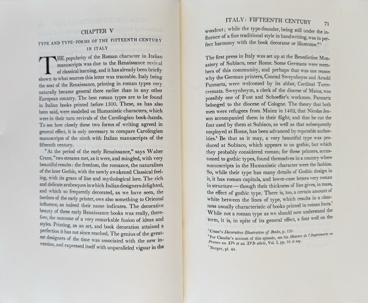
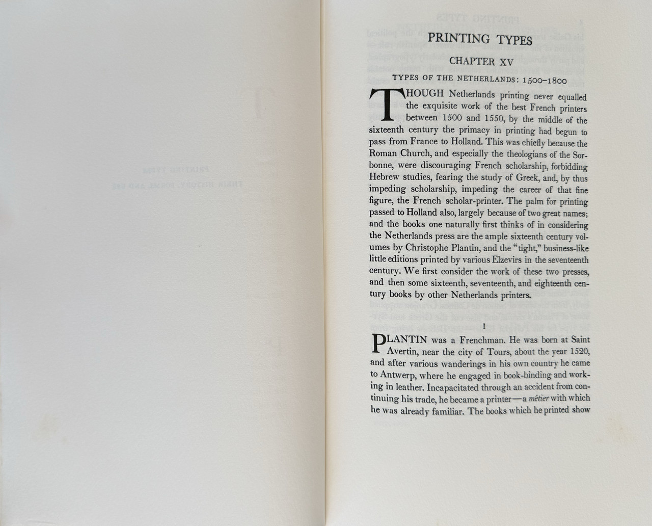
This is an extremely detailed and carefully researched history of type, in all its forms and from everywhere from Germany to Spain and England to America. The information is almost excruciatingly detailed as to how every imaginable form of type was developed and used, but some passages are amazingly enlightening when it comes to why a particular type evolved and became common. There is even discussion on when and how to use specific types.
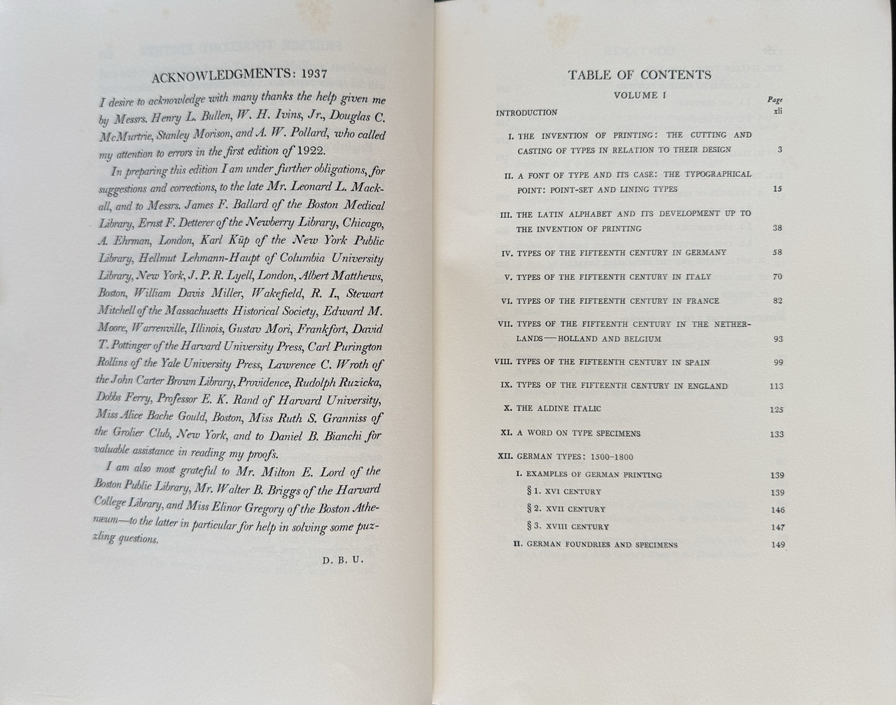
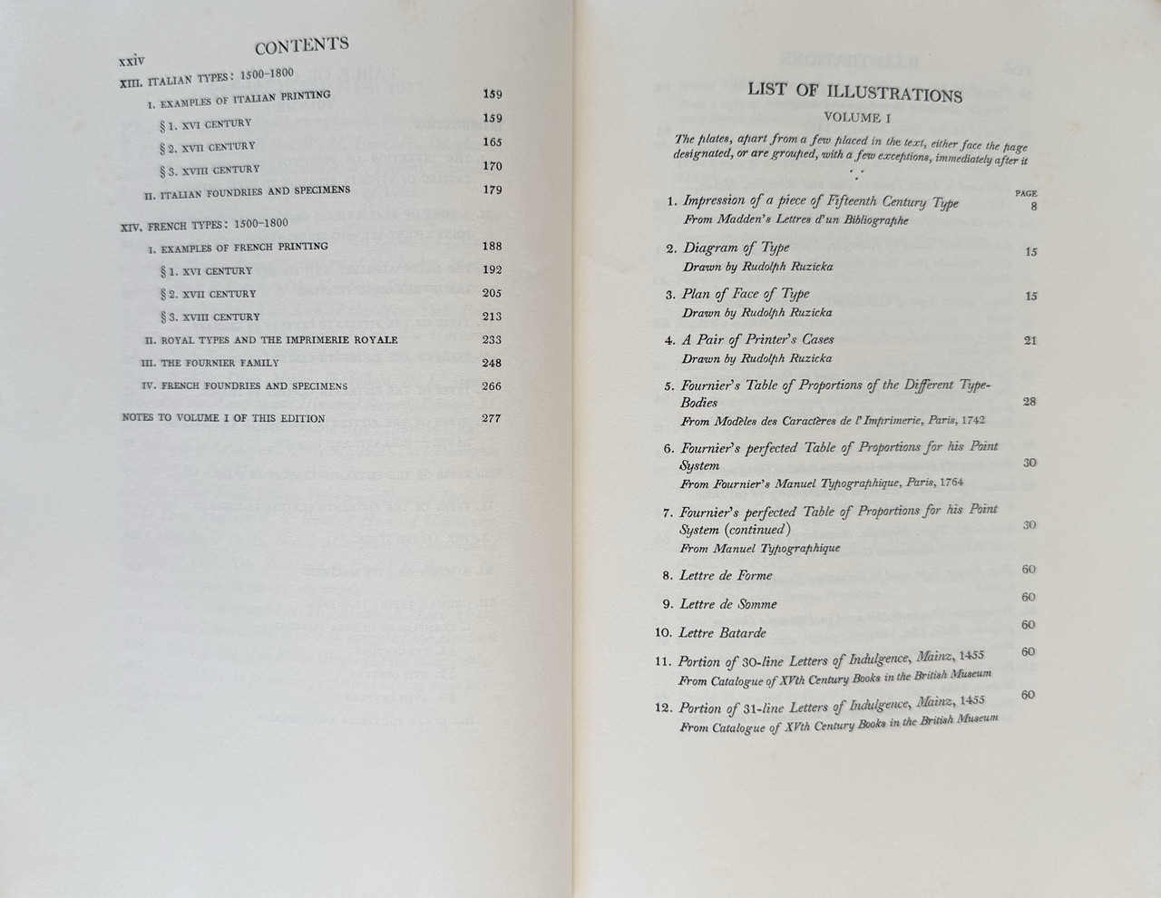
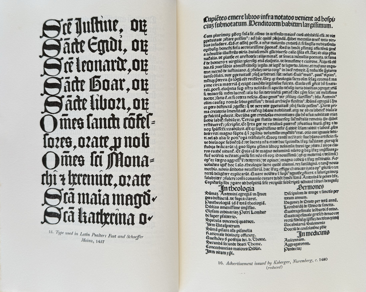
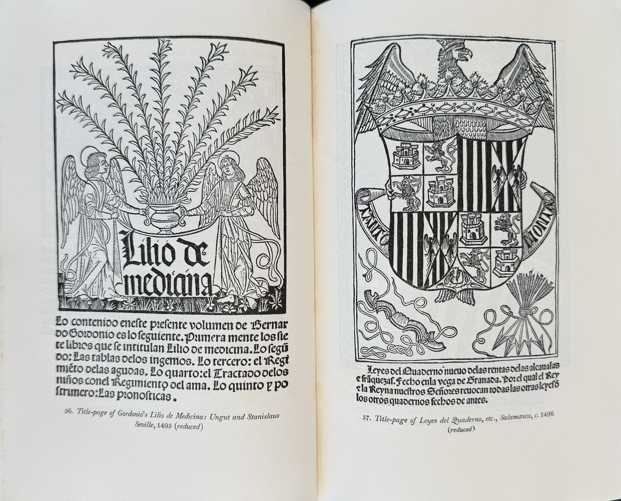
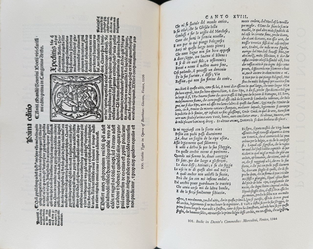
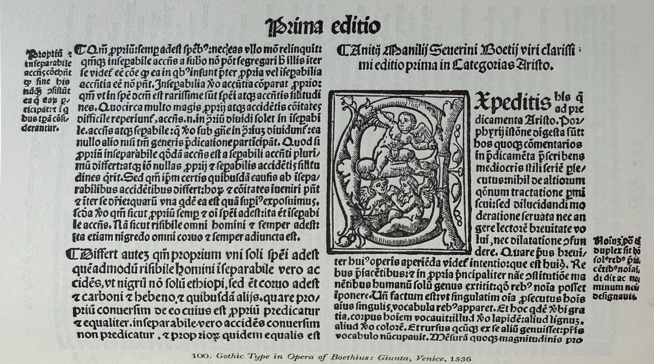
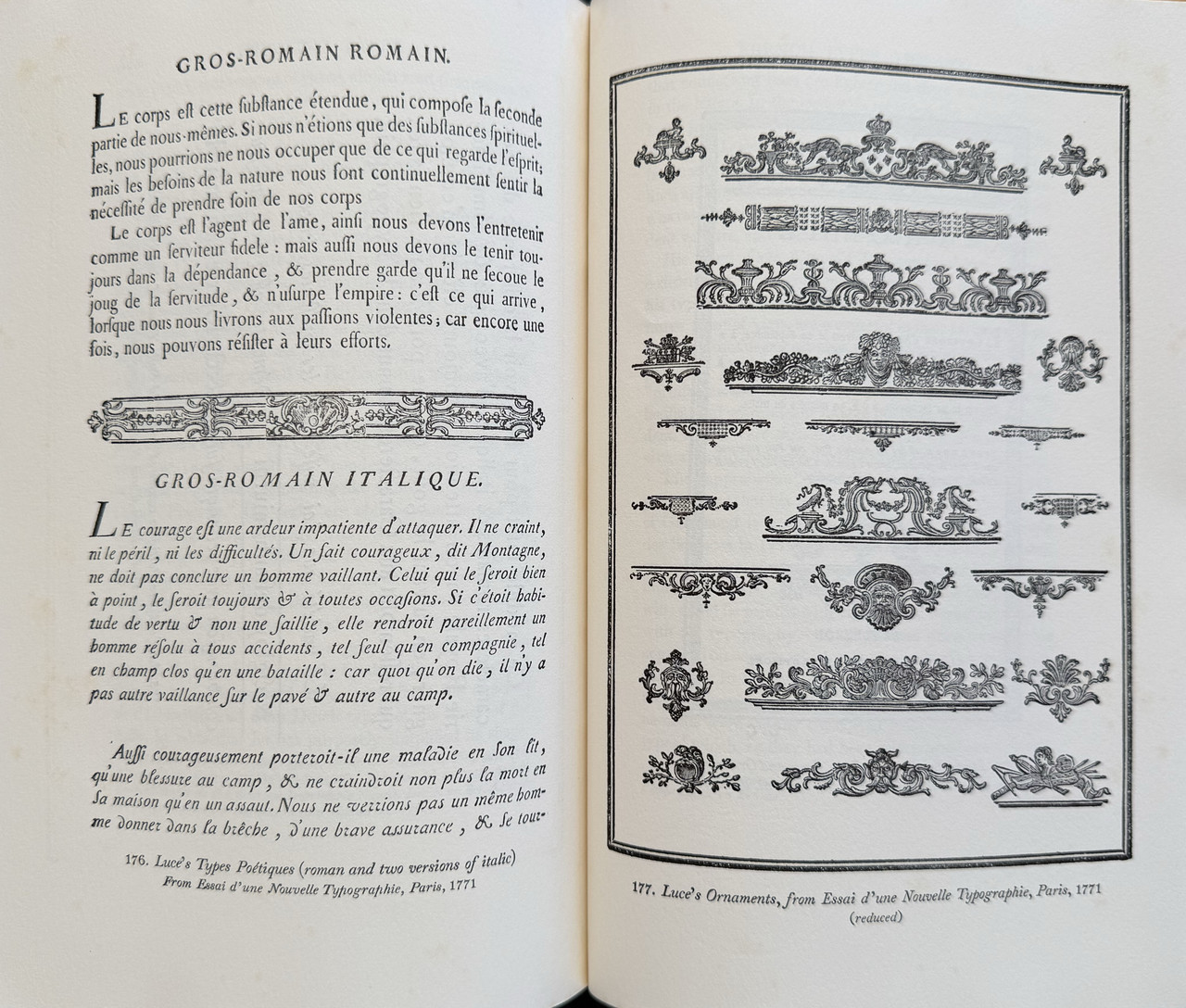
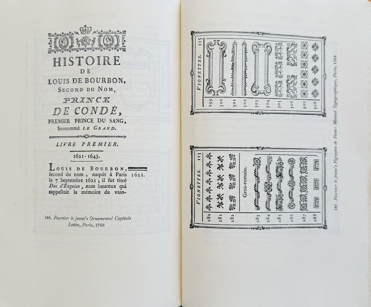
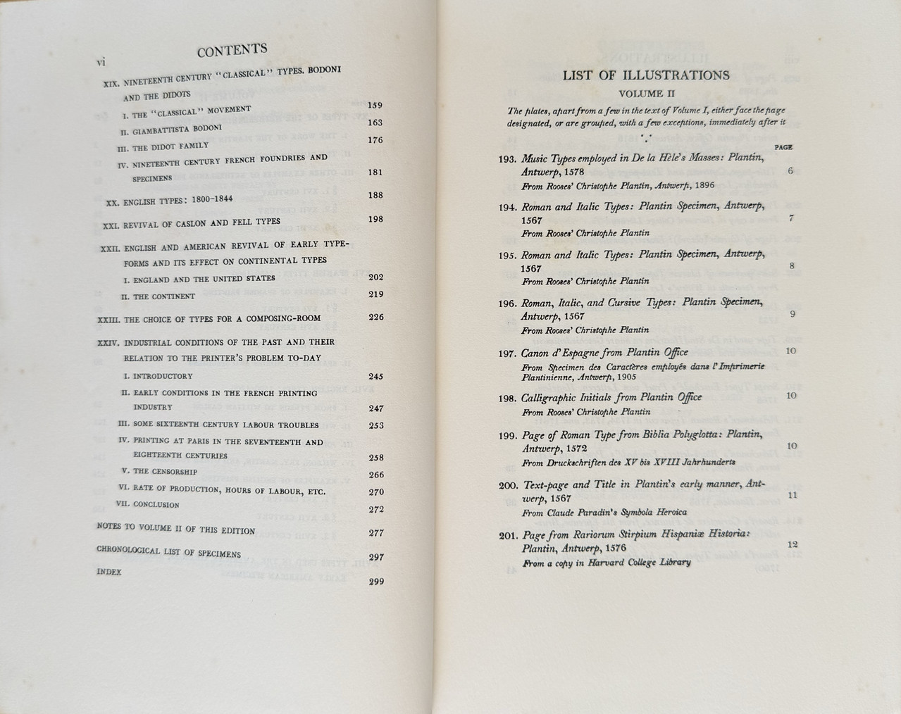
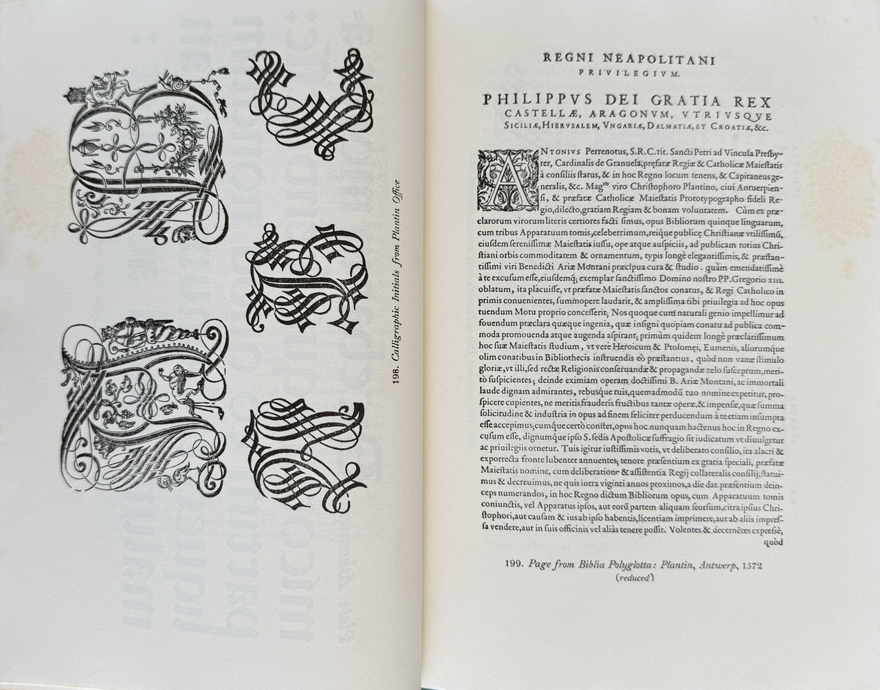
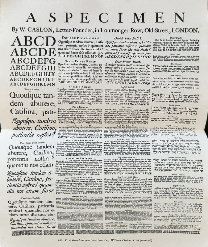
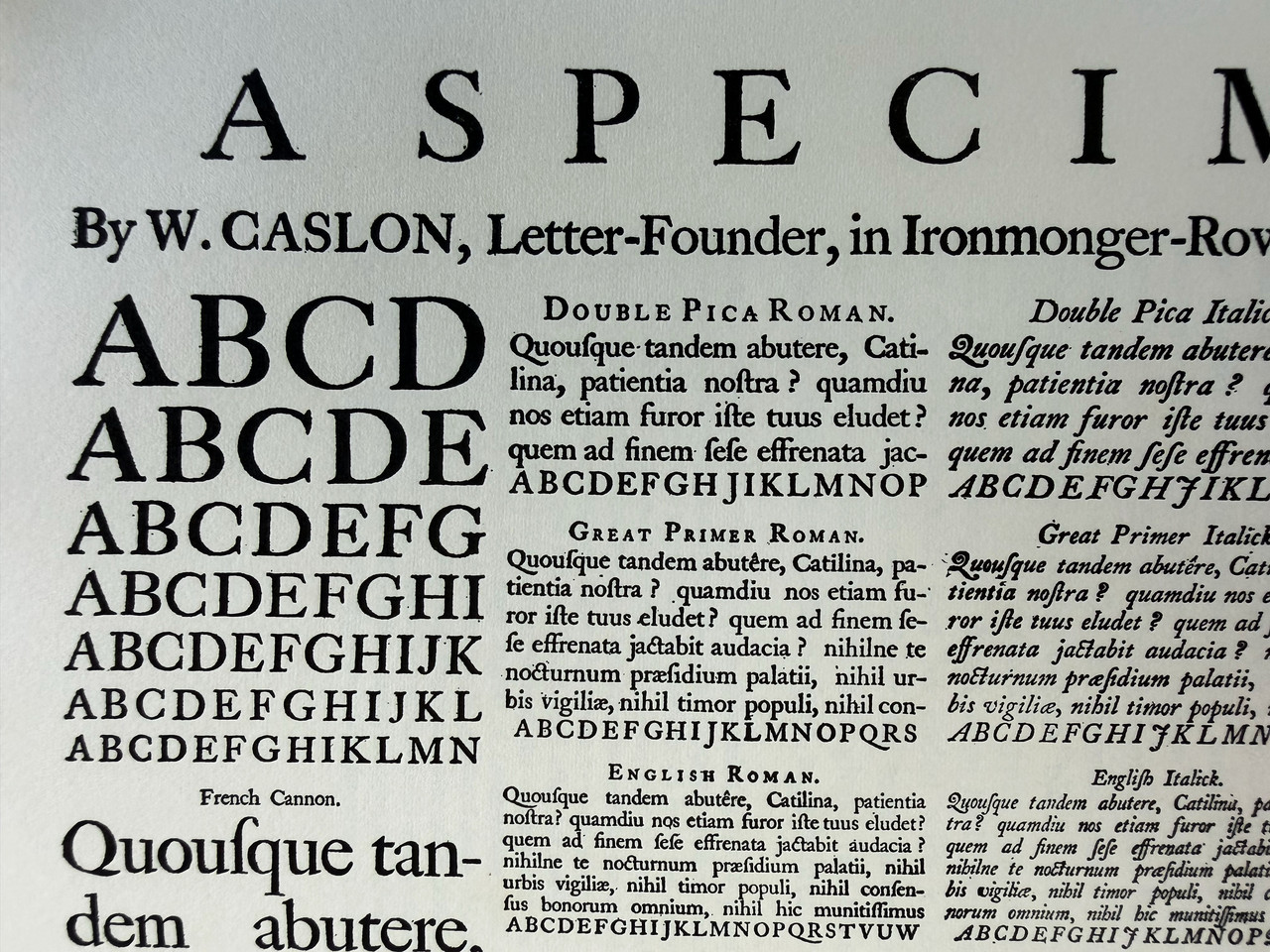
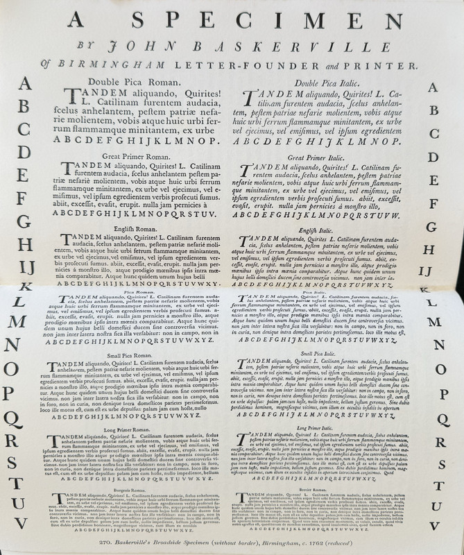
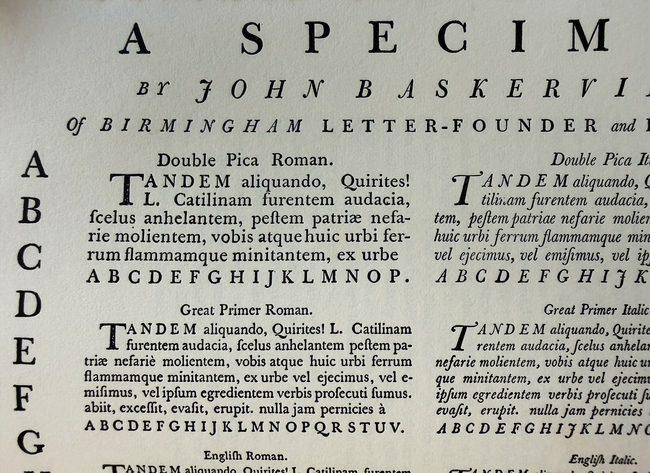
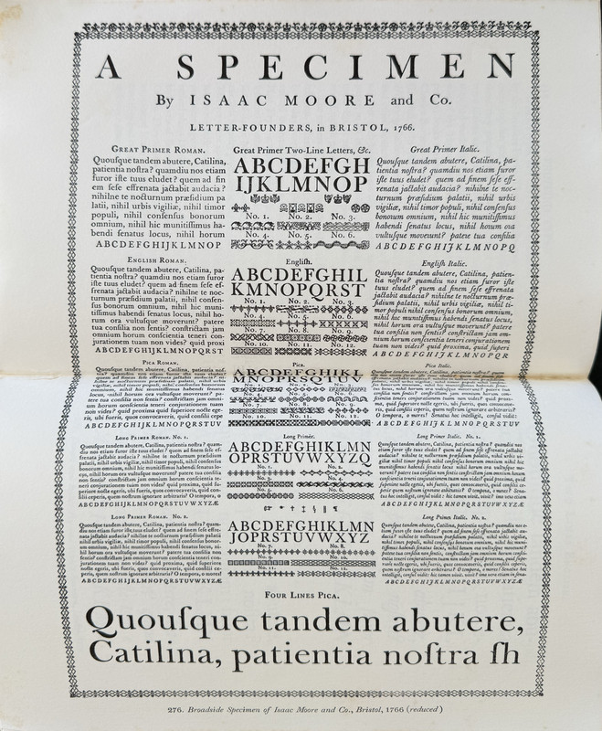
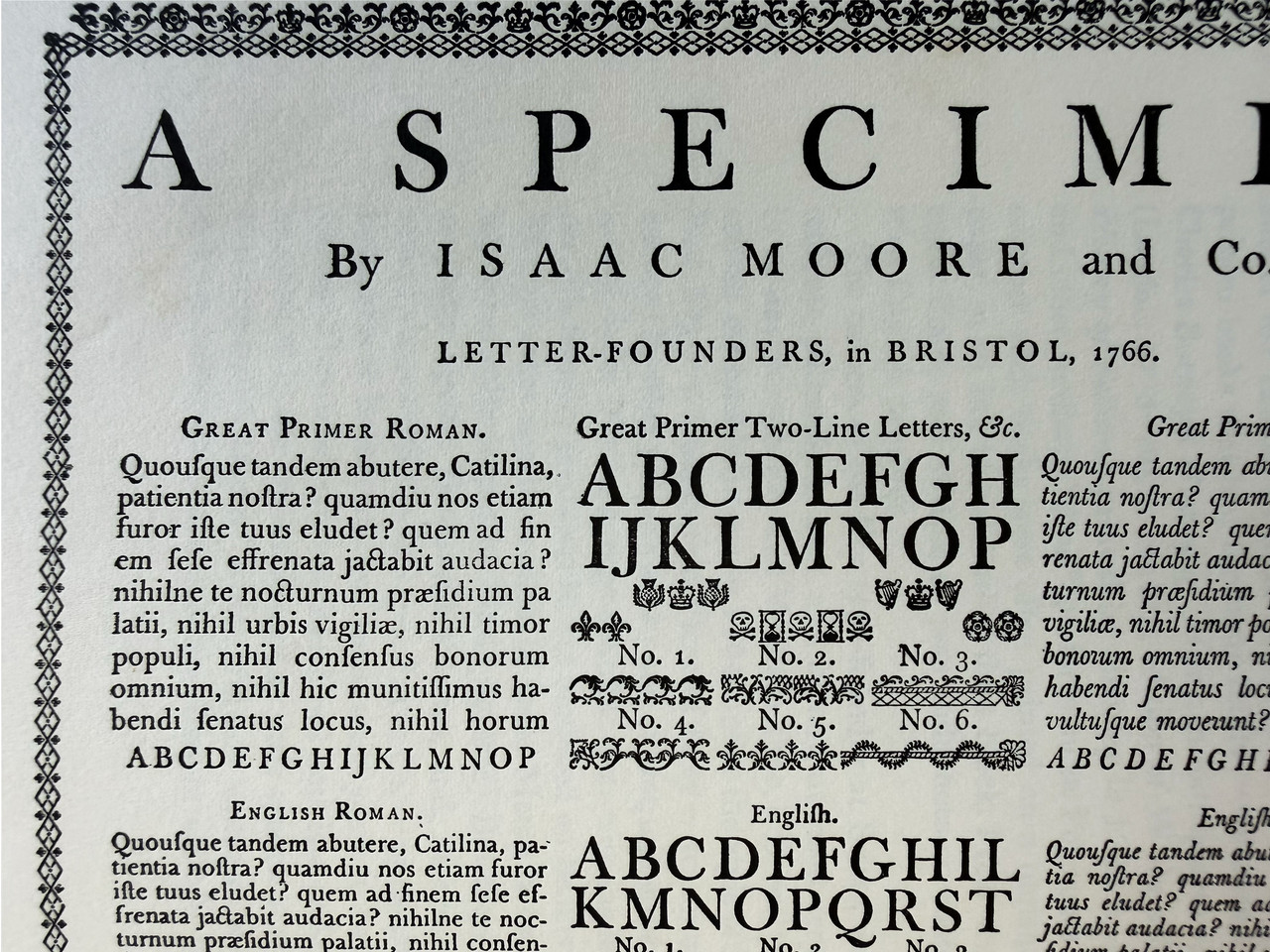
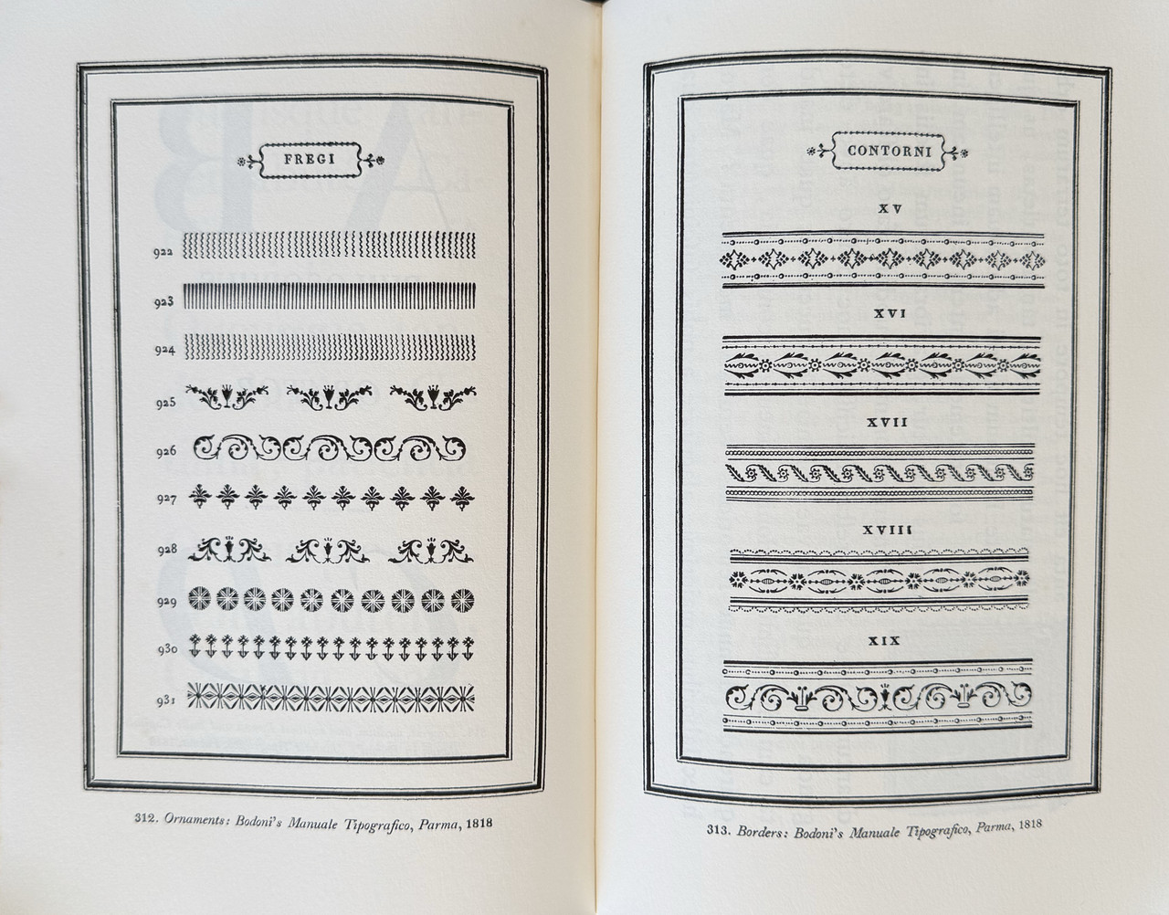
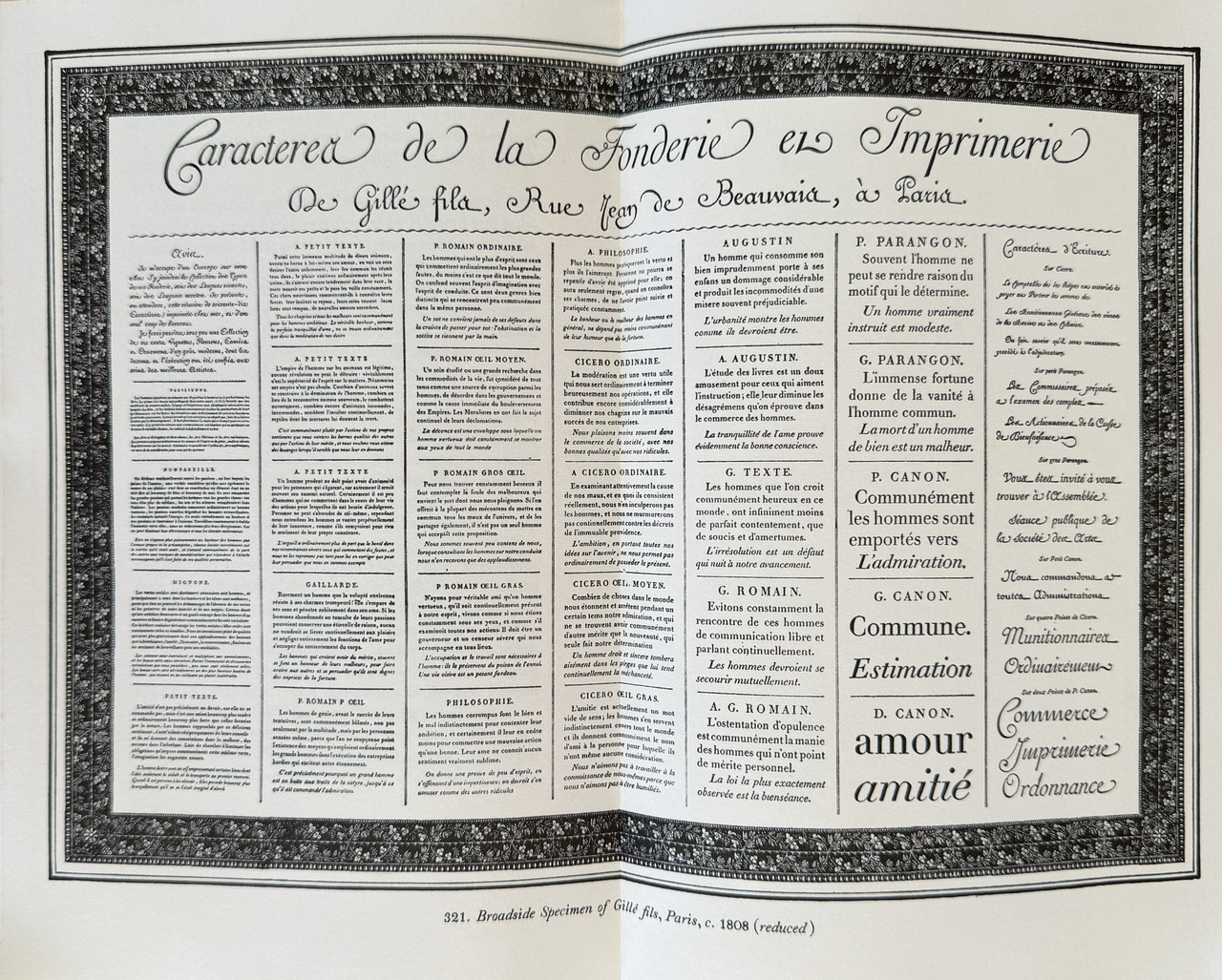
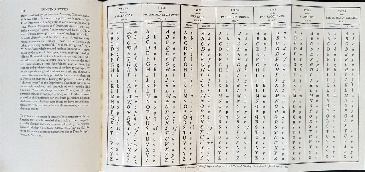
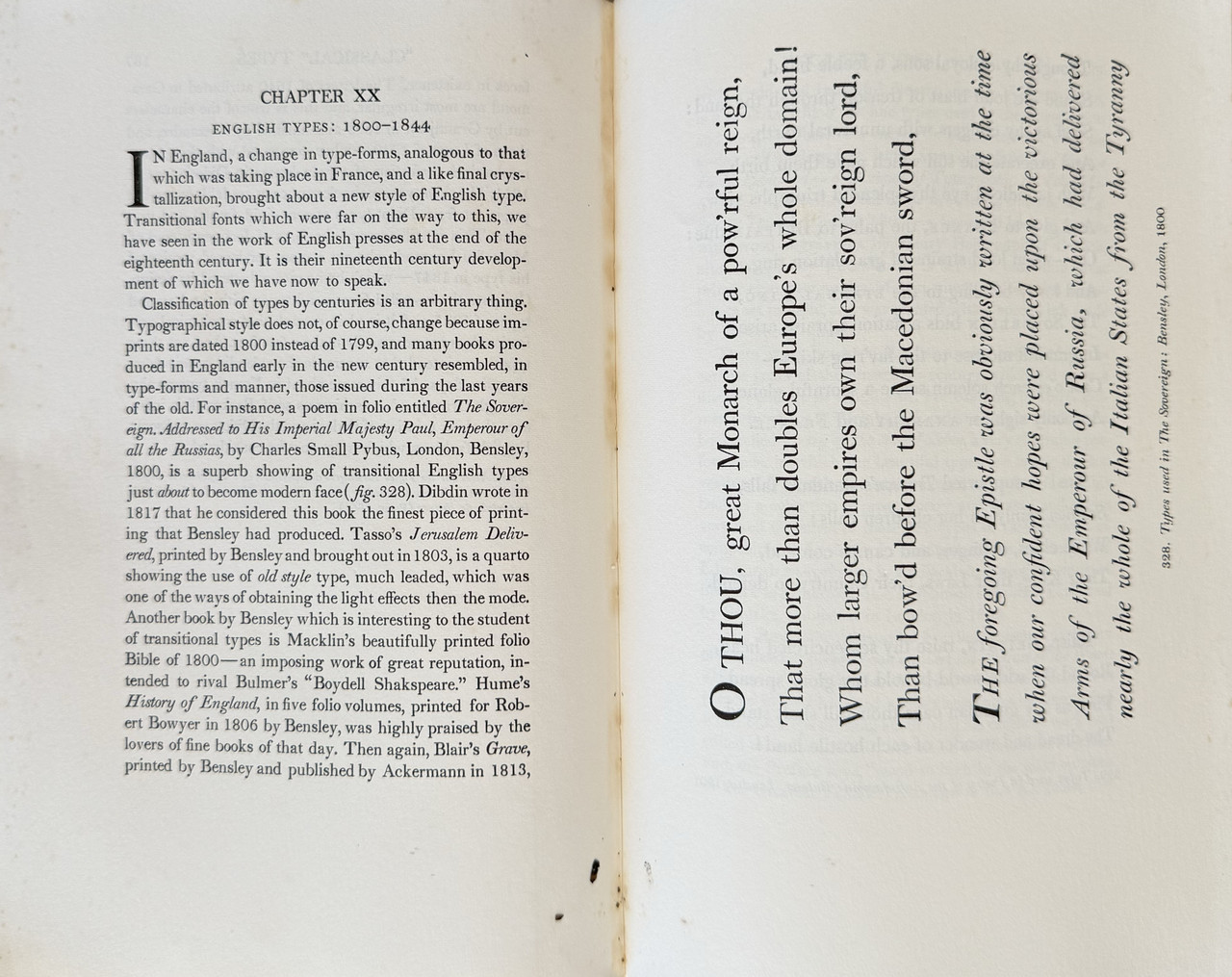
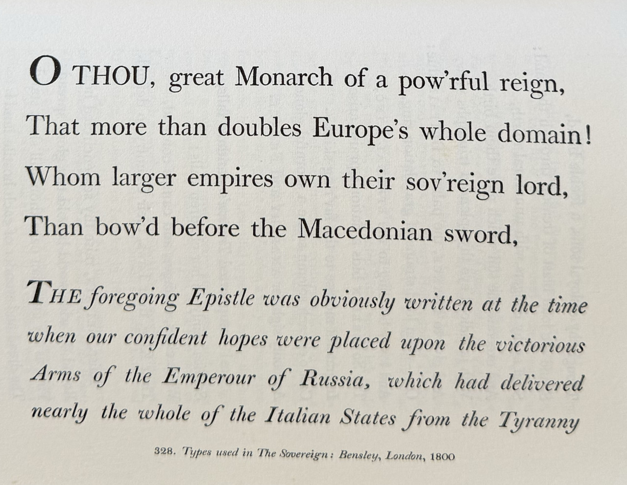
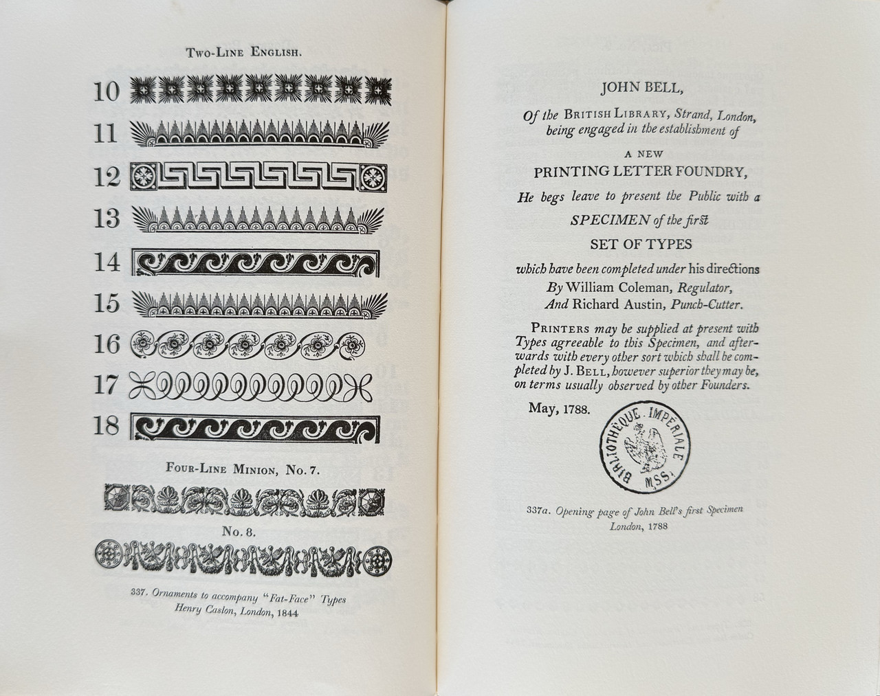
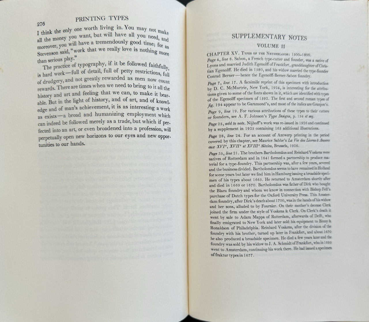
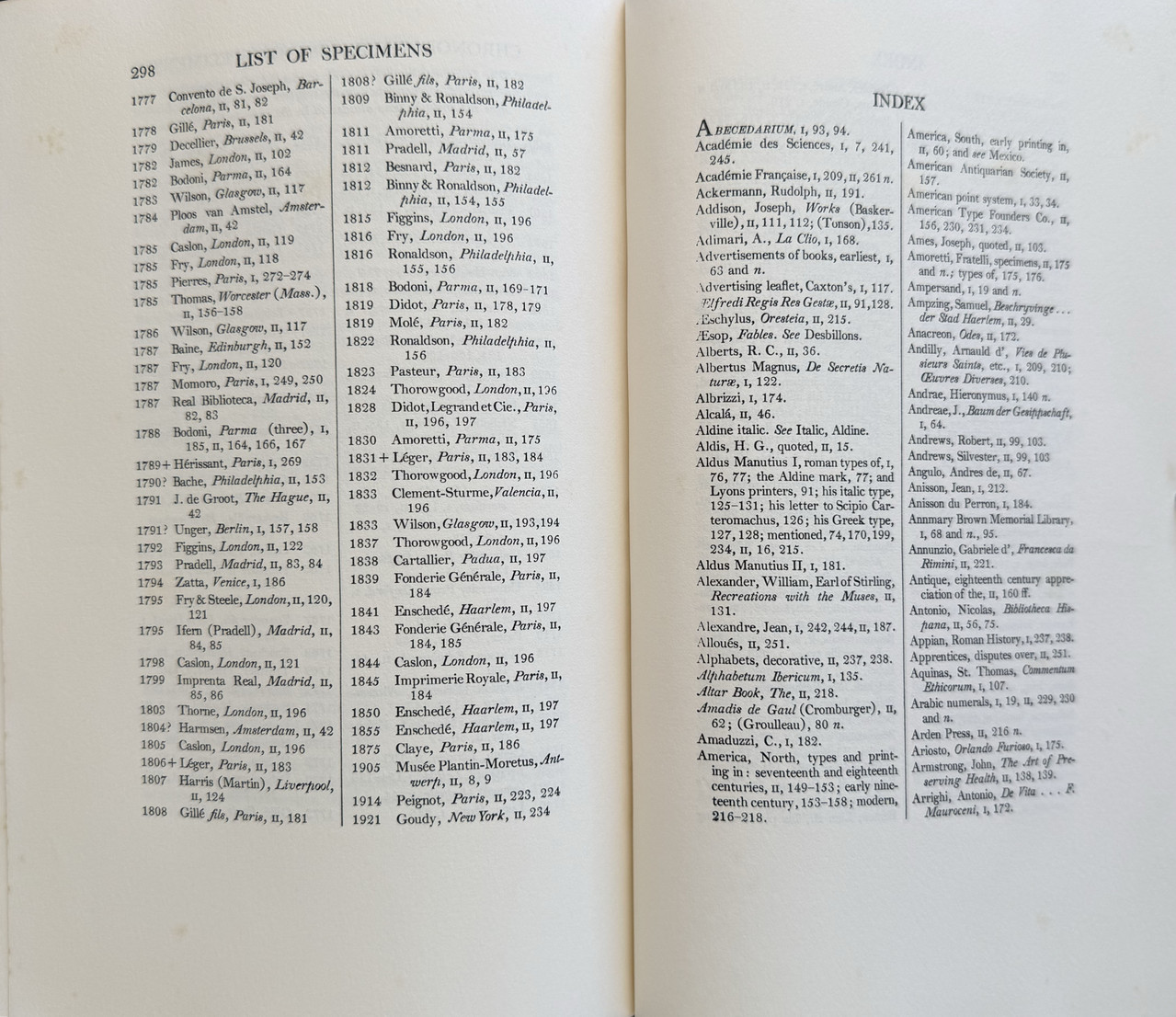
Almost every second page is an example of type, but these pages are not numbered, so the true page count is much greater than that listed. Numerous two-page spreads and the one fold-out page, are tipped in. As well as type examples, there are fleurons, ornaments , copies of numerous specimen sheets and even music notation.
In this pictorial review I can only give a very superficial view of just how comprehensively researched this book has been. It is a book that should be owned by every serious fine book collector and read in detail by every fine press printer.
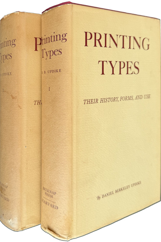
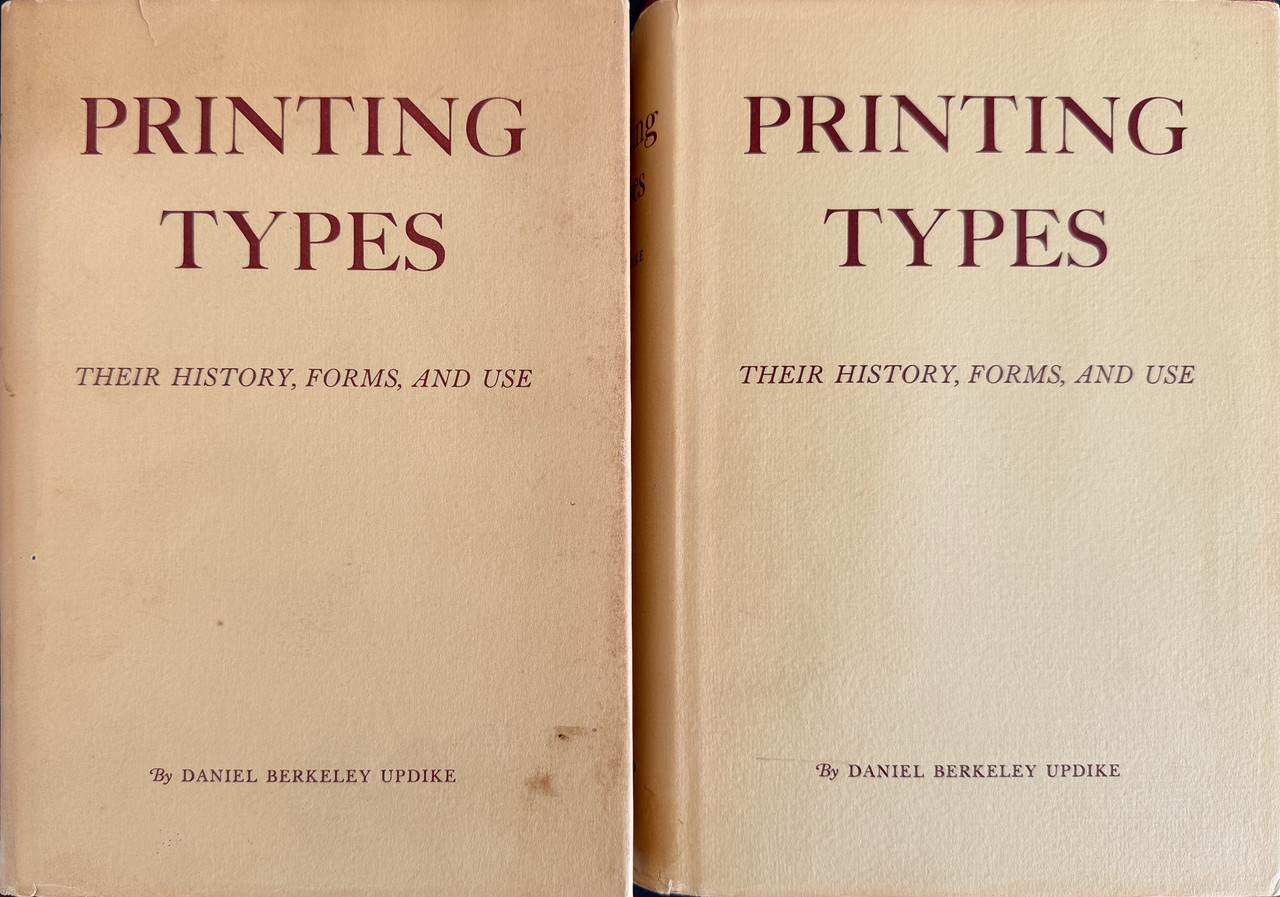
My copy is the third, two-volume 1966 edition. The first edition was published in 1922. Volume one has 292 pages and volume two 326 pages (plus 367 pages of type examples over both volumes). It is bound in standard trade book form in red cloth with a cream dustjacket simply printed in brown with title and author. The books measure 24x17cm. and cost US$95 on the secondary market.
Rear dustjacket flap.
An index of the other illustrated reviews in the this series can be viewed here.
A PICTORIAL REVIEW
This extraordinary book is definitely not fine press (although it is printed letterpress) but goes so much to the heart of fine press publishing that it deserves a place here.
This is an extremely detailed and carefully researched history of type, in all its forms and from everywhere from Germany to Spain and England to America. The information is almost excruciatingly detailed as to how every imaginable form of type was developed and used, but some passages are amazingly enlightening when it comes to why a particular type evolved and became common. There is even discussion on when and how to use specific types.
Almost every second page is an example of type, but these pages are not numbered, so the true page count is much greater than that listed. Numerous two-page spreads and the one fold-out page, are tipped in. As well as type examples, there are fleurons, ornaments , copies of numerous specimen sheets and even music notation.
In this pictorial review I can only give a very superficial view of just how comprehensively researched this book has been. It is a book that should be owned by every serious fine book collector and read in detail by every fine press printer.
My copy is the third, two-volume 1966 edition. The first edition was published in 1922. Volume one has 292 pages and volume two 326 pages (plus 367 pages of type examples over both volumes). It is bound in standard trade book form in red cloth with a cream dustjacket simply printed in brown with title and author. The books measure 24x17cm. and cost US$95 on the secondary market.


Rear dustjacket flap.

An index of the other illustrated reviews in the this series can be viewed here.
2Glacierman
I heartily concur that this should be in the library of every serious private press/fine printing collector. It is a cornerstone work of typography and printing.
There is also the Dover 2 volume paperback edition and Oak Knoll Press reprinted it as a 2-volumes-in-one hardcover with a new Introduction. Harvard/Belknap issued a 2nd edition and reprinted it many times; later printings are available at a surprisingly low price. It is interesting how many copies of only vol. 1 or vol. 2 are being offered for sale. Complete sets are easy to find, though.
If you do not already have this in one version or another, you should get one NOW!
3LT79-1
The online version is very good as many mistakes have been corrected and extra images not available in the paper book are on there along with links to referenced books. Plus it's totally free if you're on a budget.
4Transfixed
>3 LT79-1: Thanks! I didn't know about the Digital edition. That's excellent!
5Glacierman
>3 LT79-1: Thanks! I'd forgotten about the online version even though I have a link to it on my desktop!
7GloriaMundi93
As the great D.B. Updike states in the opening sentence, " The purpose of this book is to supply a basis for the intelligent appreciation of the best printing types through the study of their history, forms and use." This book has continued to deliver what it promised for over a century now. Updike's style is clear and his ability to narrate what he promised captivating. Whether you read cover to cover or dip in here and there, it will be an enjoyable and informative experience.
I'm lucky to own a first printing of the second edition inscribed by Updike at "The Merrymount Press", (his publishing house) in 1940.
I'm lucky to own a first printing of the second edition inscribed by Updike at "The Merrymount Press", (his publishing house) in 1940.

