The Non-Designer's Design Book
by Robin Williams
On This Page
Description
A lot has happened in the world of digital design since the first edition of this title was published, but one thing remains true: There is an ever-growing number of people attempting to design pages with no formal training. This book is the one place they can turn to find quick, non-intimidating, excellent design help from trusted design instructor Robin Williams. This revised classic--now in full color--includes a new section on the hot topic of Color itself. In The Non-Designer's Design show more Book, 3rd Editio n, Robin turns her attention to the basic principles that govern good design. Readers who follow her clearly explained concepts will produce more sophisticated and professional pages immediately. Humor-infused, jargon-free prose interspersed with design exercises, quizzes, and illustrations make learning a snap--which is just what audiences have come to expect from this best-selling author. show lessTags
Recommendations


Member Recommendations
Member Reviews
Don't be a wimp.
At least, that's what Williams tells us just about every other page. You'd think it would get annoying, but it doesn't.
That's premise of the Non-Designer's Design Book, which was written to help us every-day average Joes not make ridiculous layouts that will be so horribly ugly that they will blind passing children and puppies, or something.
I found this book to be a great help, explaining many things I didn't even learn when I was editing (and winning state-wide awards for editing, writing and laying out) a newspaper. Just don't tell anybody, okay?
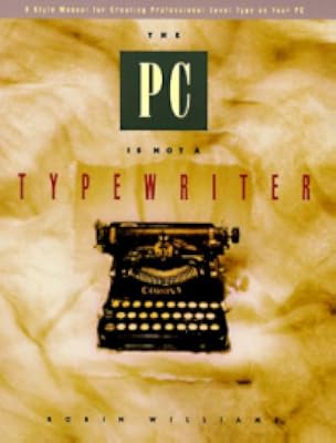
This book, complimenting Williams' "The (computer system you're using) is Not a Typewriter" books, takes your through what makes layout work, and what makes it aesthetic. You show more know an ugly ad when you see it, and after reading this book, you'll not only know WHY it's hideous, but also what they could have done to make it better.
Do you need the Non-Designer's Design Book? Well, if you're a professional designer, you won't. Also, if no other person will ever see your design work, you also won't. But if you're anything less than a professional (or even a professional with some level of curiosity), and you're making things that the public will see, it would benefit you greatly to invest in this book (and for heaven's sake, stop using Comic Sans!). show less
At least, that's what Williams tells us just about every other page. You'd think it would get annoying, but it doesn't.
That's premise of the Non-Designer's Design Book, which was written to help us every-day average Joes not make ridiculous layouts that will be so horribly ugly that they will blind passing children and puppies, or something.
I found this book to be a great help, explaining many things I didn't even learn when I was editing (and winning state-wide awards for editing, writing and laying out) a newspaper. Just don't tell anybody, okay?
This book, complimenting Williams' "The (computer system you're using) is Not a Typewriter" books, takes your through what makes layout work, and what makes it aesthetic. You show more know an ugly ad when you see it, and after reading this book, you'll not only know WHY it's hideous, but also what they could have done to make it better.
Do you need the Non-Designer's Design Book? Well, if you're a professional designer, you won't. Also, if no other person will ever see your design work, you also won't. But if you're anything less than a professional (or even a professional with some level of curiosity), and you're making things that the public will see, it would benefit you greatly to invest in this book (and for heaven's sake, stop using Comic Sans!). show less
This was a very quick read that basically confirmed that common sense applies to visual design: organize your information, line stuff up, repeat some elements and make others different. It's nice to have a framework for this "common sense" stuff, though, and it has helped me think more clearly about why something works or doesn't work.
I really like that it looks super dated. All her finished designs look kind of goofy but I think it actually reinforces the focus on underlying principles - you can tell that if the font faces and art styles were swapped around things would look just fine in a modern setting.
I really like that it looks super dated. All her finished designs look kind of goofy but I think it actually reinforces the focus on underlying principles - you can tell that if the font faces and art styles were swapped around things would look just fine in a modern setting.
A delightful book full of concrete, actionable advice that is perfect for amateurs that want to improve their design skills. This book won't make you a professional designer, but it gives you a vocabulary for thinking about fundamental design principles, including colors, fonts, alignment, repetition, contrast, and proximity. The book includes many examples that show how you can use each of these principles to improve a design step by step. By the time you're done, you've trained your eye a bit, and won't be able to see designs the same way. In fact, within 10 minutes of reading, I was going back to some of my designs and making small improvements.
The only downside is that the book is stronger in some areas than others. For example, show more the discussion of alignment and grouping is very well done, and has tons of examples to make the ideas stick. However, while the discussion of color theory is very clear, there aren't nearly as many examples, and it's not nearly as obvious how to use the information.
Overall, it's a very quick read that can really help the typical person.
Some good quotes from the book:
Lack of alignment is probably the biggest cause of unappealing documents. Our eyes like to see order; it creates a calm, secure feeling in its clarity. Plus it helps to communicate the information.
Nothing should be placed on the page arbitrarily. Every element should have some visual connection with another element on the page.
Avoid using more than one text alignment on the page (that is, don’t center some text and right-align other text). And please try very hard to break away from a centered alignment unless you are consciously trying to create a more formal, sedate presentation. Choose a centered alignment consciously, not by default.
The most practical thing to remember is that cool colors recede into the background, and warm colors come forward.
One of the most important features of an identity package or branding follows the Principle of Repetition: there must be some identifying image or style that carries throughout every piece.
Typography endows human language with visual form.
A design is in conflict when you set two or more typefaces on the same page that are similar—not really different but not really the same. I have seen countless students trying to match a typeface with one on the page, looking for a face that “looks similar.” Wrong. When you put two faces together that look too much alike without really being so, most of the time it looks like a mistake.
If you have trouble seeing what is wrong with a combination of typefaces, don’t look for what is different between the faces—look for what is similar. It is the similarities that are causing the problem.
The major rule to follow when contrasting type is this: Don’t be a wimp!
Start with the focal point. Decide what it is you want readers to see first. show less
What the other reviews don't tell you... is that Robin Williams not only boils the essentials of desktop design down to a handful of sensible and easy-to-grasp concepts, she does so in a most entertaining and engaging way. This is a book you could read and enjoy even if you weren't looking for beginner's design tips! Reading this book has absolutely helped me take my self-taught design skills to the next level. I recommend buying and not borrowing, however, since it has so many tips and tricks, you'll want to have it handy for future reference.
I used this book for a graduate education course toward my masters degree. THis book is a gold mine of tips to make your documents look better and have that quality that makes people want to read them. The author is obviously an authority in her field. I highly recommend this book for anyone wishing to add some visual flair to their documents, such as secretaries or especially teachers.
Robin Willams' (the author, not the actor/comedian) "The Non-Designer's Design Book" provides a decent introduction to the design world for someone who, like me, has some idea of what good design is but doesn't know how to use that information. Her book presents four design principles that everyone already uses subconsciously, giving them names and making them easier to understand and to identify. Contrast, making items or text that are different really stand out from one another on a page; Repetition, using a visual element over and over to create continuity; Alignment, connecting items and text visually on a page to create good flow; and Proximity, placing related items near each other on a page. And rather than simply stating that show more these are the principles, Williams includes dozens of everyday examples to re-enforce their usage.
Typeface-thesis.jpgThe second section of the book deals with typefaces -- the Oldstyles, the Moderns, the Scripts, the differences between Serif and Sans Serif and Slab Serif -- and how to use them effectively to make a newsletter or invitation more eye-catching. Taking the image to the left as an example, those four typefaces look too much alike. Combining them onto a single page makes them almost indistinguishable from one another. Why not increase the size of one typeface to show how different it is? Or change the weight (or boldness)? Or how about a different color? The eye will be drawn to it and then want to read what comes immediately after.
It all seems pretty simple after reading Williams' book. Not that I'm going to drop everything to create a 20-page, 4-color catalog any time soon. But at least I can make my newsletters a cut above the rest. show less
This is an excellent reference work for those who want or need to design something, but who do not have the luxury of going to design school. The information is presented clearly and concisely, and there are many examples of the principles being discussed found throughout the book.
I first got this book for one of my college editing courses, and I still reference it regularly. It's helped to give me more tools to use in explaining why something does or doesn't work from a design standpoint.
I first got this book for one of my college editing courses, and I still reference it regularly. It's helped to give me more tools to use in explaining why something does or doesn't work from a design standpoint.
Members
- Recently Added By
Lists

Books That Changed Me
158 works; 46 members

Sonlight Books
1,487 works; 25 members

The Great Courses: Visual Literacy Skills
53 works; 1 member

Books Read in 2009
464 works; 11 members
Author Information

50+ Works 4,409 Members
Robin Williams is the author or co-author of more than 20 best-selling and award-winning books
Common Knowledge
- Canonical title
- The Non-Designer's Design Book
- Original publication date
- 2008 (3rd Edition) (3rd Edition)
- Dedication
- To Carmen Sheldon, my comrade in Design, my friend in Life, - with great love, R
- First words
- This short chapter explains the four basic principles in general, each of which will be explained in detail in the following chapters.
- Last words
- (Click to show. Warning: May contain spoilers.)Zapf Dingbats
Classifications
- Genres
- Art & Design, Nonfiction, Technology, General Nonfiction, Business
- DDC/MDS
- 686.2252 — Applied science & technology Manufacture for specific uses Printing and related activities Printing Typography Proofreading
- LCC
- Z246 .W634 — Bibliography, Library Science and Information Resources Book industries and trade Practical printing
- BISAC
Statistics
- Members
- 2,145
- Popularity
- 9,543
- Reviews
- 32
- Rating
- (3.97)
- Languages
- 5 — Chinese, English, French, Hungarian, Portuguese
- Media
- Paper, Ebook
- ISBNs
- 16
- UPCs
- 3
- ASINs
- 8