
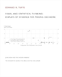
Beautiful Evidence
by Edward R. Tufte 
On This Page
Description
Science and art have in common intense seeing, the wide-eyed observing that generates empirical information. Beautiful Evidence is about how seeing turns into showing, how empirical observations turn into explanations and evidence presentations. The book identifies excellent and effective methods for presenting information, suggests new designs, and provides tools for assessing the credibility of evidence presentations. Here we will see many close readings of serious evidence presentations - show more ranging through evolutionary trees and rocket science to economics, art history, and sculpture. Insistent application of the principles of analytical thinking helps both insiders and outsiders assess the credibility of evidence. show lessTags
Recommendations


Member Reviews
Edward Tufte’s books on data visualization are nothing short of legend among us information geeks. A political scientist by training, he demonstrates how well-conceived visualizations can effectively communicate insights and how shortcomings can create catastrophes. He continues his famous series on visual imagination with this book on the intersection of data and art. He shows how displays of evidence can move readers much like art and how poorly constructed displays can inhibit good judgment.
Tufte’s highly intellectual writing style remains constant across this series. He notices nuance in illustrations that few others would highlight, but then balloons these observed nuances into foundational insights that can transform the way show more we communicate data. For instance, he shows how NASA might have prevented the 2006 Challenger disaster were the updates placed into a technical report instead of a slide format.
This book focuses on other items about the fundamentals of information visualization: “sparklines” to communicate trends, how to show causality and to avoid showing it when it’s not implied, and how to map and not to map insights on illustrations. Personally, I tend to have a tough time translating visuals into words, but reading works like Tufte’s increases my skills dramatically. He makes me think hard about how I communicate my scientific findings. His work is not restricted to science only, though, but encompasses most data-driven fields. Such breadth makes for a fun read that engages the imagination.
I wish that every serious professional who relies on communicating information would read a book (or several!) of Tufte’s to enhance their presentation skills. He’s simply on his own level. I have read other experts in the field, but Tufte’s thoughtfulness surpasses. We live in an age where information is abundant – perhaps too abundant. Books like this one help us filter data’s noise so that we can communicate more effectively… and more beautifully. show less
A masterpiece of beautiful design, but content-wise this book feels a bit like a "Tufte's Greatest Hits" collection. The Powerpoint-hatin' and the appreciation of Minard's "Napoleon marches on Moscow" graphic, for instance, will seem familiar to readers of Tufte's other books. (That's not to say that there isn't a pleasant sort of comfort to encountering them again here.) Of the chapters that felt really fresh, the one on "sparklines" is key: it's the one that best showcases Tufte's endless willngness to fruitfully rethink the ways that we visualize data.
The fourth of Tufte's series of books on the visual display of information. It is the most eccentric of the series and includes a moderate amount of recycled material from the previous volumes. There is remarkable vitriol in an amount that I think you can only see in a self-published book, with an illustrated non-anonymized attack on one economics professor's book, and a prolonged attack on Microsoft Powerpoint that refers to Stalin more than once. There are also, of course, many interesting things, e.g. some discussion of Conway's Law. The book ends with a very odd criticism of some works of landscape architecture, and then photographs of some of the author's sculptures.
It is just possible that if I can't understand it, it is poorly written. The diatribe against the abuse of bullet points in PowerPoint presentations, however, is funny and must be right.
Beautiful Design is Edward Tufte's fourth book in a series discussing and analysing the visual presentation of data. According to the introduction, there is a fifth volume planned.
Beautiful Design is a really lovely and luxurious volume, copiously illustrated throughout. I read this book immediately after The Visual Display of Quantitative Information, and unfortunately I have to say I was a little disappointed by the comparison. Minard's Grande Armee chart makes a reappearance, not once, not twice, but five times in this volume! This is within a nice chapter describing a set of principles of analytical design (there are six in all). As usual, Tufte can get a little didactic, but I found that, while I perhaps disagree with his stonger show more statements, he's always an entertaining read, exemplified by his deconstruction and explanation of Minard's graphics
The major contribution here is the sparkline, small graphics intended to be embedded in text and tables. In fact they are just the sort of thing we see in many genome mapping papers where considerable quantities of data need to be clearly communicated in summary fashion. Tufte's website hosts a forum with an interesting discussion of sparkline implementation.
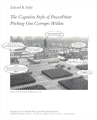
Tufte devotes an entire chapter to the evils of PowerPoint. He absolutely HATES it! Entitled The Cognitive Style of PowerPoint: Pitching Out Corrupts Within, it is available as a separately published pamphlet. Now, while I agree one does sit through some desperately bad PowerPoint presentations, I am not so convinced of the evils of this package as Tufte is. Nevertheless, his design strictures against Autocontent Wizards, design templates, seemingly infinitely hierarchical bullet points make good sense. More about this in a later post.
So, in summary, I'm finding this an interesting read, but rather less informative in an instructional way than Visual Display. Not essential. show less
Beautiful Design is a really lovely and luxurious volume, copiously illustrated throughout. I read this book immediately after The Visual Display of Quantitative Information, and unfortunately I have to say I was a little disappointed by the comparison. Minard's Grande Armee chart makes a reappearance, not once, not twice, but five times in this volume! This is within a nice chapter describing a set of principles of analytical design (there are six in all). As usual, Tufte can get a little didactic, but I found that, while I perhaps disagree with his stonger show more statements, he's always an entertaining read, exemplified by his deconstruction and explanation of Minard's graphics
The major contribution here is the sparkline, small graphics intended to be embedded in text and tables. In fact they are just the sort of thing we see in many genome mapping papers where considerable quantities of data need to be clearly communicated in summary fashion. Tufte's website hosts a forum with an interesting discussion of sparkline implementation.
Tufte devotes an entire chapter to the evils of PowerPoint. He absolutely HATES it! Entitled The Cognitive Style of PowerPoint: Pitching Out Corrupts Within, it is available as a separately published pamphlet. Now, while I agree one does sit through some desperately bad PowerPoint presentations, I am not so convinced of the evils of this package as Tufte is. Nevertheless, his design strictures against Autocontent Wizards, design templates, seemingly infinitely hierarchical bullet points make good sense. More about this in a later post.
So, in summary, I'm finding this an interesting read, but rather less informative in an instructional way than Visual Display. Not essential. show less
Possibly just a fraction less focused than his previous works, but also taking a wider-ranging and more aesthetically driven view of the practice of presenting information. The book certainly satisfies the expectation created by the title; it is indeed beautiful. PowerPoint users beware.
The first of this series of books by Edward Tufte, "The Visual Display of Quantitative Information" was the one that, in my opinion, would be of most practical use to the average scientist. That was six volumes and twenty four years ago. I would recommend the most recent one, "Beautiful Information", as a logical continuation. In it, he provides ideas for annotating and enhancing information in photographs, the use of "sparklines" to highlight tabular data, the use of links and causal arrows, the proper combination of numbers and images, a reprise of the principles of the first volume in a chapter entitled "The Fundamental Principles of Analytical Design", and a criticism of substandard arguments and faulty presentations in "Corruption show more in Evidence Presentations: Effects without Causes, Cherry-Picking, Overreaching, Chartjunk, and the Rage to Conclude". This is a beautiful book (as are all of the others) with high-quality color reproductions of inventive and economical depictions of data and concepts. Tufte has himself quite a racket. He publishes his own books (Graphics Press LLC) which he sells at relatively high prices (but justified by their production values). These provide grist for his relatively expensive seminars for graphic designers. If you can't get to (or afford) one of his design seminars, you can profit by his books. Also, be sure to visit the lively online forums linked from his Web site. show less
Members
- Recently Added By
Published Reviews
ThingScore 100
Lists

Bret Victor's Five-Star List
46 works; 5 members
Author Information

21 Works 16,805 Members
Edward Tufte is Professor Emeritus at Yale University where he taught courses in statistical evidence and information design. He also served as Professor of Public Affairs at Princeton University
Edward R. Tufte is a LibraryThing Author, an author who lists their personal library on LibraryThing.
Work Relationships
Common Knowledge
- Original publication date
- 2006
- Epigraph
- What was observed by us is the nature or matter of the Milky Way itself, which, with the aid of the spyglass, may be observed so well that all the disputes that for so many generations have vexed philosophers are destroyed by... (show all) visible certainty, and we are liberated from wordy arguments. - Gailieo Galilei
Medical statistics will be our standard of measurement: we will weigh life for life and see where the dead lie thicker, among the workers or among the privileged. - Rudolf Virchow
If you look after truth and goodness beauty looks after herself. - Eric Gill - First words
- A colleague of Galileo, Frederico Cesi, wrote that Galileo's 38 hand-drawn images of sunspots "delight both by the wonder of the spectacle and the accuracy of the expression." That is beautiful evidence. (Introduction)
Upon seeing the satellites of Jupiter, Galileo recorded the discovery by means of hundreds of annotated and scaled images. (First chapter) - Quotations
- A good way to assess a display for unintentional optical clutter is to ask "Do the prominent visual effects convey relevant content?"
The PP slide format has the worst signal/noise ratio of any known method of communication on paper or computer screen. - Last words
- (Click to show. Warning: May contain spoilers.)I conclude with my landscape installation sculptures that sit directly on the grass or float free in Birdspace. For support, those works on the land have elaborate structural bases, buried entirely in the earth.
- Publisher's editor
- Williams, Carolyn
Classifications
Statistics
- Members
- 1,948
- Popularity
- 10,962
- Reviews
- 12
- Rating
- (4.18)
- Languages
- English
- Media
- Paper
- ISBNs
- 2
- ASINs
- 4