
Ellen Lupton
Author of Thinking with Type
About the Author
Ellen Lupton is Adjunct Curator at the Cooper-Hewitt National Design Museum and Co-Chair of the Design Department of the Maryland Institute College of Art.
Image credit: Ellen Lupton at ABC American Book Center, Amsterdam, from ThnkingWithType.com
Works by Ellen Lupton
Indie Publishing: How to Design and Publish Your Own Book (Design Brief) (2008) 190 copies, 2 reviews
Extra Bold: A Feminist, Inclusive, Anti-racist, Nonbinary Field Guide for Graphic Designers (2021) 109 copies, 1 review
Type on Screen: A Critical Guide for Designers, Writers, Developers, and Students (Design Briefs) (2014) 83 copies, 1 review
The Senses: Design Beyond Vision (design book exploring inclusive and multisensory design practices across disciplines) (2018) 54 copies
The Bathroom, the Kitchen, and the Aesthetics of Waste (Village Voice Literary Supplement) (1992) 45 copies
Eu Que Fiz (Em Portuguese do Brasil) 6 copies
Never Use Futura 6 copies
Graphic Design and Typography in the Netherlands: A View of Recent Work (Writing/Culture Monograph VI) (1992) 5 copies
Comfort Zone 1 copy
New Design from Israel 1 copy
Pensar com Tipos 1 copy
Associated Works
Feeding Desire: Design and the Tools of the Table, 1500-2005 (2006) — Contributor, some editions — 57 copies
Design Culture: An Anthology of Writing from the AIGA Journal of Graphic Design (1997) — Contributor — 45 copies
Graphic Design in the Mechanical Age: Selections from the Merrill C. Berman Collection (1998) — some editions — 38 copies
One Hundred Great Books on Typography: The Ultimate Typographic Library (2016) — Contributor — 9 copies, 1 review
Tagged
Common Knowledge
- Birthdate
- 1963-12-01
- Gender
- female
- Education
- Cooper Union (BFA|1985)
University of Baltimore (DCD|2008) - Occupations
- graphic designer
curator
professor - Organizations
- Cooper-Hewitt Museum
Maryland Institute College of Art - Awards and honors
- Fellow, American Academy of Arts and Sciences (2019)
AIGA Gold Medal for Lifetime Achievement (2007)
Chrysler Design Award (1993) - Relationships
- Miller, J. Abbott (husband)
Lupton, Julia (sister) - Nationality
- USA
- Birthplace
- Philadelphia, Pennsylvania, USA
- Places of residence
- Baltimore, Maryland, USA
- Associated Place (for map)
- USA
Members
Reviews
Thinking with Type, 2nd revised and expanded edition: A Critical Guide for Designers, Writers, Editors, & Students by Ellen Lupton
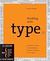
Graphic design is an important help to any venture. In the age of electronic communication, it has become only more important to capture the public’s attention. Distractions abound, but well-thought visuals stand the chance of garnering a glance. Of course, only deeper substance will sustain interest in a written work, but interest will never be piqued without visual appeal. Lupton’s work seeks to enlighten those who deal with type in some format about the graphical principles required show more to display those words pleasingly.
Lupton divides her book into three main sections: Letter, Text, and Grid. Letter covers typefaces and fonts; Text covers practices about forming words into sentences; and Grid covers how to lay them out on a page or screen. The book primarily examines the medium of print, but communication via computers frequently receives mention. Further, many of the concepts of graphical appeal can be translated to this increasingly common mew medium. (Some readers might also benefit from Lupton’s Type on Screen, but this work is the more important seminal work.) Like any graphical design book, frequent use of example images litter the book throughout. Every caption not only cites a source but also informs the reader of its worth.
As the subtitle suggests, multiple potential audiences exist for this classic. Pure graphic designers provide an obvious one, but writers, editors, students, and even web developers (like myself) can benefit from perusing Lupton’s pages. After reading this, I immediately changed a graphic or two in my software’s code. It’s hard not to get thinking creatively about how type is presented after reading this work, both through well-explicated ideas and copious inspirational examples. Reading it is time well spent. show less
Lupton divides her book into three main sections: Letter, Text, and Grid. Letter covers typefaces and fonts; Text covers practices about forming words into sentences; and Grid covers how to lay them out on a page or screen. The book primarily examines the medium of print, but communication via computers frequently receives mention. Further, many of the concepts of graphical appeal can be translated to this increasingly common mew medium. (Some readers might also benefit from Lupton’s Type on Screen, but this work is the more important seminal work.) Like any graphical design book, frequent use of example images litter the book throughout. Every caption not only cites a source but also informs the reader of its worth.
As the subtitle suggests, multiple potential audiences exist for this classic. Pure graphic designers provide an obvious one, but writers, editors, students, and even web developers (like myself) can benefit from perusing Lupton’s pages. After reading this, I immediately changed a graphic or two in my software’s code. It’s hard not to get thinking creatively about how type is presented after reading this work, both through well-explicated ideas and copious inspirational examples. Reading it is time well spent. show less
I've read many, many books on typography and I still learned new things from this one.
The section on individual letters is very strong, including information on the parts of a letter and on the history of typefaces, with more information on 20th century typefaces than I've seen in comparable reference works.
The section on individual letters is very strong, including information on the parts of a letter and on the history of typefaces, with more information on 20th century typefaces than I've seen in comparable reference works.
Type on Screen: A Critical Guide for Designers, Writers, Developers, and Students (Design Briefs) by Ellen Lupton
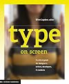
Since Gutenberg, fonts have spent a lot of effort at perfecting how words appears on print. However, in the last several decades, screens have taken over. Thus, there has been a subtle shift in paradigms. For example, humans read text on screens typically further away than print; thus, designs for screens need to have a larger font size. To explore these nuances, Lupton (an established expert in typography) and her students at the Maryland Institute College of Art wrote this book, filled show more with graphical examples to inspire.
First, the good. This book is best considered as an anthology or collection of examples. Because these examples often come from her students, they take on a variety of forms and styles. Anyone looking for a starting point on a topic can find something useful in this book. Oftentimes, references for further research are provided with the example; this provides a treasure-trove to the engaged reader. Details are picked up in the text that can inform anyone engaged in the typography business, whether designers, writers, developers, or students.
However, because this book is a compilation, it lacks a consistent message and can vary thematically too much. Those expecting to see Lupton’s genius at work here might feel disappointed. The graphical examples and the accompanying captions are often stronger than the main text. Such an approach might not hurt this work’s affinity with designers, but other audiences like developers or writers could likely benefit from more theory. The last chapter in particular – on animated text – seemed to lose cohesion as a sequence of exciting examples instead of centrally conveying a theme.
Summary: Great with examples but lacking a strong theoretical message. show less
First, the good. This book is best considered as an anthology or collection of examples. Because these examples often come from her students, they take on a variety of forms and styles. Anyone looking for a starting point on a topic can find something useful in this book. Oftentimes, references for further research are provided with the example; this provides a treasure-trove to the engaged reader. Details are picked up in the text that can inform anyone engaged in the typography business, whether designers, writers, developers, or students.
However, because this book is a compilation, it lacks a consistent message and can vary thematically too much. Those expecting to see Lupton’s genius at work here might feel disappointed. The graphical examples and the accompanying captions are often stronger than the main text. Such an approach might not hurt this work’s affinity with designers, but other audiences like developers or writers could likely benefit from more theory. The last chapter in particular – on animated text – seemed to lose cohesion as a sequence of exciting examples instead of centrally conveying a theme.
Summary: Great with examples but lacking a strong theoretical message. show less
Extra Bold: A Feminist, Inclusive, Anti-racist, Nonbinary Field Guide for Graphic Designers by Ellen Lupton
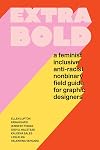
Extra Bold is the inclusive, practical, and informative (design) career guide for everyone!
Part textbook and part comic book, zine, manifesto, survival guide, and self-help manual, Extra Bold is filled with stories and ideas that don't show up in other career books or design overviews.
• Both pragmatic and inquisitive, the book explores power structures in the workplace and how to navigate them.
• Interviews showcase people at different stages of their careers.
• Biographical sketches show more explore individuals marginalized by sexism, racism, and ableism.
• Practical guides cover everything from starting out, to wage gaps, coming out at work, cover letters, mentoring, and more.
A new take on the design canon.
• Opens with critical essays that rethink design principles and practices through theories of feminism, anti-racism, inclusion, and nonbinary thinking.
• Features interviews, essays, typefaces, and projects from dozens of contributors with a variety of racial and ethnic backgrounds, abilities, gender identities, and positions of economic and social privilege.
• Adds new voices to the dominant design canon.
Written collaboratively by a diverse team of authors, with original, handcrafted illustrations by Jennifer Tobias that bring warmth, happiness, humor, and narrative depth to the book.Extra Bold is written by Ellen Lupton (Thinking with Type), Farah Kafei, Jennifer Tobias, Josh A. Halstead, Kaleena Sales, Leslie Xia, and Valentina Vergara. show less
Part textbook and part comic book, zine, manifesto, survival guide, and self-help manual, Extra Bold is filled with stories and ideas that don't show up in other career books or design overviews.
• Both pragmatic and inquisitive, the book explores power structures in the workplace and how to navigate them.
• Interviews showcase people at different stages of their careers.
• Biographical sketches show more explore individuals marginalized by sexism, racism, and ableism.
• Practical guides cover everything from starting out, to wage gaps, coming out at work, cover letters, mentoring, and more.
A new take on the design canon.
• Opens with critical essays that rethink design principles and practices through theories of feminism, anti-racism, inclusion, and nonbinary thinking.
• Features interviews, essays, typefaces, and projects from dozens of contributors with a variety of racial and ethnic backgrounds, abilities, gender identities, and positions of economic and social privilege.
• Adds new voices to the dominant design canon.
Written collaboratively by a diverse team of authors, with original, handcrafted illustrations by Jennifer Tobias that bring warmth, happiness, humor, and narrative depth to the book.Extra Bold is written by Ellen Lupton (Thinking with Type), Farah Kafei, Jennifer Tobias, Josh A. Halstead, Kaleena Sales, Leslie Xia, and Valentina Vergara. show less
Lists
You May Also Like


Associated Authors
Statistics
- Works
- 43
- Also by
- 9
- Members
- 4,378
- Popularity
- #5,728
- Rating
- 3.9
- Reviews
- 36
- ISBNs
- 100
- Languages
- 9
- Favorited
- 1