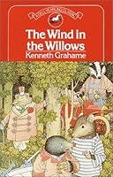
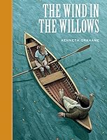
the illustrators of The Wind in the Willows
This topic was continued by the illustrators of The Wind in the Willows - part 2.
Talk Tattered but still lovely
Join LibraryThing to post.
This topic is currently marked as "dormant"—the last message is more than 90 days old. You can revive it by posting a reply.
12wonderY
I've set myself the task of looking at all of the artists who have ever illustrated The Wind in the Willows and keeping notes. (I do go off on strange tangents.)
My daughter recently cleaned her shelves and gave me back Michael Hague's version. It's not quite the one that I remember as perfect, so I'm on a quest.
There are other groups on LT that might be more appropriate, but I haven't found one that feels like home more than here. So please indulge me.
The list is a long one, and I'm ordering several at a time from the library.
I am first going to dismiss Robert J. Lee, who contributed his version to a Dell Yearling publication in 1969. The cover color drawing
is much different from the black & white sketches inside. The cover drawing is acceptable and interesting, but the others are poorly rendered, not catching proper characterizations, and are mostly long shots which just barely hint at the storyline.
edited because I found Lee's original cover, which shows what I'm talking about;

My daughter recently cleaned her shelves and gave me back Michael Hague's version. It's not quite the one that I remember as perfect, so I'm on a quest.
There are other groups on LT that might be more appropriate, but I haven't found one that feels like home more than here. So please indulge me.
The list is a long one, and I'm ordering several at a time from the library.
I am first going to dismiss Robert J. Lee, who contributed his version to a Dell Yearling publication in 1969. The cover color drawing

is much different from the black & white sketches inside. The cover drawing is acceptable and interesting, but the others are poorly rendered, not catching proper characterizations, and are mostly long shots which just barely hint at the storyline.
edited because I found Lee's original cover, which shows what I'm talking about;

2MDGentleReader
I have the Ernest H. Shepard and Dick Cuffari editions, both very nice.
32wonderY
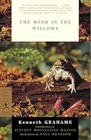
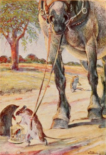
Paul Bransom gives us ten black & white pieces published in 2005 by The Modern Library
I find it odd they would use a photograph on the cover, but oh well...
Bransom's characters are true renderings of real animals, and are mostly only clothed in their own fur. Mole does seem to be wearing boots when running through the woods at night; and oddly, the Sea Rat is clothed while Ratty is not.
In chapter 4 the winter drawing has artistic merit, being a lovely rendering of the Otter against a snowbank. But why spend the effort on a minor character?
The picture of Toad in the dungeon with the gaoler's daughter is quite funny. "He lay prostrate in his misery on the floor." Toad is on his back with legs in the air, very characteristically dramatic.
link
But otherwise, as rendered, character is difficult to portray. There is very little detail of background and even of props, which are scarce.
And I'm editing here because upon further research, I find that Bransom did these pieces in color and they can be found here.
Another cover that contains this art is

by Charles Scribner, and Bransom was one of the first illustrators, first published in 1913. His background is technical drawing and he specialized in drawing animals from life at the zoo, which explains his take on the characters.

I find it odd they would use a photograph on the cover, but oh well...
Bransom's characters are true renderings of real animals, and are mostly only clothed in their own fur. Mole does seem to be wearing boots when running through the woods at night; and oddly, the Sea Rat is clothed while Ratty is not.
In chapter 4 the winter drawing has artistic merit, being a lovely rendering of the Otter against a snowbank. But why spend the effort on a minor character?
The picture of Toad in the dungeon with the gaoler's daughter is quite funny. "He lay prostrate in his misery on the floor." Toad is on his back with legs in the air, very characteristically dramatic.
link
But otherwise, as rendered, character is difficult to portray. There is very little detail of background and even of props, which are scarce.
And I'm editing here because upon further research, I find that Bransom did these pieces in color and they can be found here.
Another cover that contains this art is
by Charles Scribner, and Bransom was one of the first illustrators, first published in 1913. His background is technical drawing and he specialized in drawing animals from life at the zoo, which explains his take on the characters.
42wonderY
Please feel free to insert your evaluations of the illustrations too.
I forgot to mention that the Modern Library edition also includes a short bio of Grahame and a seven page introduction with notes by Jeffrey Moussaieff Masson.
I forgot to mention that the Modern Library edition also includes a short bio of Grahame and a seven page introduction with notes by Jeffrey Moussaieff Masson.
52wonderY
Sterling Publications issued a nice small hardback, also in 2005, with scratchboard etchings by Scott McKowen.
Although these are of a nice quality, they are simply portraits of the four main characters and
a weasel. The portraits are full length, and each is clothed, but lack any other background or details.
The cover is the only color illustration, and the notes say that they were digitally added.
I love the cover illustration, but the portraits inside lack a certain something. Badger's portrait doesn't capture his immense presence; Mole looks slightly ridiculous in glasses and two-toned shoes. Ratty's portrait does in fact capture the sportsman who messes about in boats.
62wonderY
**rubs hands**
Now we get to a good one.
Inga Moore is a lavish illustrator, and though her tiny action sketches aren't usually very interesting, her full page spreads are sometimes gasp-worthy.
Candlewick Press published the US edition in 2003

but the images are copyrighted 1996 and have been in UK editions of abridged versions since then. This is an abridged version too, which is my only complaint.
This webpage serves up some of the best pages. Her use of light and mist are exceptional.
72wonderY
Oh, one of the features I should comment on is how the main characters are depicted compared to humans and other animals. For instance, some artists keep the true size proportions, so they are handling an enormous horse in The Open Road. Others upsize the animals to approximate human proportions.
More after lunch.
More after lunch.
82wonderY
Moore's characters are sized like human children to the human adults and to their environment. Bransom attempts to keep real-life sizes, so this
 looks a bit ridiculous.
There is nothing to make a comparison with in McKowen's drawings, and Lee's vary, as you might expect with a careless artist.
 looks a bit ridiculous.
There is nothing to make a comparison with in McKowen's drawings, and Lee's vary, as you might expect with a careless artist.
9Bjace
I thought I read somewhere that Arthur Rackham illustrated Wind in the Willows at one point in time. Has anyone ever seen that?
10BonnieJune54
>6 2wonderY: Lovely! There is a nice feel for being a small creature in a big beautiful world but still being important. I love her The Secret Garden illustrations also.
12Sakerfalcon
The Inga Moore illustrations are absolutely breathtaking. I'm going to have to try and get my hands on some of the books she has done. Thank you for sharing the link.
132wonderY
>9 Bjace:
Yes, Rackham is on my list. Haven't ordered it yet.
Looking for more online illustrations of Inga Moore, I found an interview where she tells that she never went to art school, because of a withering remark from a Latin teacher. Also, she admits to not being able to let The Wind in the Willows go, and has begun writing a sequel. Something to look forward to!
142wonderY
By the way, I got my worklist from the Kenneth Grahame Society:
http://www.kennethgrahamesociety.net/illustrators.htm
correction - my original list was comprised of "other contributor" names from LibraryThing work page. I finally printed the above list out and I see that I need to create a spreadsheet. I've also started a folder collecting pictures by particular scene, so that I can look at them side by side.
152wonderY
Here's another cover for the Inga Moore book:

This is perhaps not abridged, as the other states that it is on the cover.
And here's another

isbn 9780763642112
both are the abridgement. *Sad*

This is perhaps not abridged, as the other states that it is on the cover.
And here's another

isbn 9780763642112
both are the abridgement. *Sad*
16SaintSunniva
I have the one illustrated by Ernest H. Shephard too...but I'm loving this discussion of the other illustrators.
17SaintSunniva
I always assumed Shephard was the original illustrator of The Wind in the Willows...but was he?
182wonderY
No. The book was first published in 1908, with only a frontispiece by W. Graham Robertson. Paul Bransom's drawings were published in 1913. Ernest H. Shepard had Grahame's blessings, but they were not published until 1931, after Grahame's death.
19MDGentleReader
I've always thought of the Ernest H. Shepard version as the "classic" to which others are compared.
OT, Has anyone read any of the sequels?
OT, Has anyone read any of the sequels?
202wonderY
I've read Return to the Willows, published last year, written by Jacqueline Kelly. I loved it. It has an intrusive narrator who makes side remarks in footnotes.
222wonderY
And the images from movie versions are important too.

I watch these frequently, though they are getting hard to find. Cosgrove Hall Studios made the movie in 1983, and then added some TV films for the next few years.
http://www.awn.com/articles/advanced-art-stop-motion-animation-history-stop-moti...
I have not seen the live action version, but I'd like to.
23MDGentleReader
Return to the Willows is the one I've picked up a couple of times at the bookstore and then put down again. I think for me, it needs to be a library read, at least at first. Thanks for mentioning the title, that was the one I was trying to remember, but apparently there have been others. I found out about the others when I was looking for the Jacqueline Kelly one.
242wonderY
http://www.librarything.com/series/Wind+in+the+Willows
Here's the series list with other authors, but it seems to me there is one missing.
I really really hope that someone does an audio version of Return to the Willows. It deserves a good treatment.
Here's the series list with other authors, but it seems to me there is one missing.
I really really hope that someone does an audio version of Return to the Willows. It deserves a good treatment.
252wonderY
Going all the way back to 1908, I searched for the frontispiece by W. Graham Robertson and it appears that the image is the same as what is gilt applied to the cloth cover of the book.

"the piper at the gates of dawn"

"the piper at the gates of dawn"
26BonnieJune54
>22 2wonderY: The live-action version is a favorite of mine.
272wonderY
Before I leave Inga Moore, I wanted to share the most outstanding plate in the book, but I couldn't find it online, so I had to scan and upload it.

I just love the perspective and the dreaminess it evokes.
After looking at her pictures, I go outside and see the hills through her lens and their beauty is more apparant.

I just love the perspective and the dreaminess it evokes.
After looking at her pictures, I go outside and see the hills through her lens and their beauty is more apparant.
282wonderY
After a thorough search of my library's catalog, I see that I'm going to have to do some online searching for images. My list of illustrators has 29 names, and 12 of those are not in the Ohio library system. I'm most sad about missing Harry Hargreaves and Charles Van Sandwyk's complete works. Van Sandwyk did 85 illustrations for the Folio Society edition. I've seen samples of his work on Pinterest. They are very nice!
292wonderY
I'm starting to look at Michael Hague's version today.

One item I noted is that he offers a respectful reference back to Bransom's title page art:

using the same tree construction in several pictures.
Rackham and Van Sandwyk do this as well, from my brief looks at them.
I love some of Hague's work. His Alphabears is precious, and my family has spent lots of time enjoying those pictures. But some of these just seem too cartoon-y.
His best pages, and there are four of them, are the interiors lit by the fire in the fireplace. They are crowded with animals and the colors are rich, the details are cozy, and you can almost feel the warmth of the fire. link and link
302wonderY
I decided that as I can, I'm going back and add links to some of the pictures that I reference but don't post in the thread.
Sorry if this confuses the reading for you, but I think it will add value to the notes overall.
Sorry if this confuses the reading for you, but I think it will add value to the notes overall.
312wonderY
BTW, there are 550 covers loaded on the work page, and that, of course doesn't include any abridgements not combined in with the main work.
Many repeats, but still quite a collection to gaze upon.
Many repeats, but still quite a collection to gaze upon.
322wonderY
While Moore seems best at sunlight and haze, I think Hague excells in low light scenes. One of his best two page spreads (which I can't find online for you) is the riverside picnic at the end of the day. It evokes how a long day in the sun and in good company makes one want to dawdle till dark to prolong the pleasure.
But here's another picture
http://www.pinterest.com/pin/234327986834656534/
on the river at night
But here's another picture
http://www.pinterest.com/pin/234327986834656534/
on the river at night
33LibraryPerilous
The Wind in the Willows is one of my favorite books, and I prefer the Bransom illustrations. I like their naturalism. Generally, I don't love Rackham's style, but they are lovely for this work. Of the other earlier versions, I enjoy Payne's, too.
Thanks for the link to the other illustrators. I did not know Tasha Tudor had illustrated an edition. The Hargreaves' are pretty, too.
Regarding Hague, I wore out his illustrated edition of Andersen's fairy tales as a child, and those are too beautiful in my memory for me to like his other works.
There are different annotated editions of TWinTW in circulation, but the one edited by Annie Gauger, and from the Norton company's line of special editions, is the best. It has an extensive discussion of the various illustrators.
342wonderY
Oh. that is good to know! I must see if my library has that. what a resource! Thank you Diana!
35LibraryPerilous
>34 2wonderY: You're welcome.
It also has a pretty cover. We like pretty covers around here, don't we?
The Annotated The Wind in the Willows
It also has a pretty cover. We like pretty covers around here, don't we?
The Annotated The Wind in the Willows
362wonderY
I did a chapter comparison in the Moore edition. She skips The Piper at the Gates of Dawn and Wayfarers All entirely, and combines the two last chapters into a re-named chapter The Return of Toad. I'll have to see whether those are included in any other editions she illustrates.
I'm looking at Helen Ward's work now.

I'm dissatisfied with her renderings. They are quite stylized, with profile heads crowding most of the pictures, and very little action indicated.
I ordered another of her books from the library. I'm enraptured by her version of The Town Mouse and the Country Mouse. Her artwork, her conceptual take, her sly humor, are all superlative. I wonder if it's a matter of loving one story and not the other, or if Aesop's story shows her more mature work. (it was published last year.) I highly recommend it.
The only plate in WitW that I really like is this one -

and still, it's a bit stiff.
Her book is also a bit off because the artwork is on different paper, and the double sided plates are bound into the book at regularly paced page counts. So the picture might not correspond with the part of the story being read.
(see comment #78 below, for my re-evaluation of Ward.)
372wonderY
I had a few minutes yesterday to stop in the used book store and I found three illustrators, two who weren't even on my list. I guess the abridgements and adaptations are too numerous to keep track of.
John Worsley illustrated Tales from the Wind in the Willows, which appears to be one chapter at a time in smaller storybooks. His work is reminiscent of Helen Ward, but with less grace. His best is a long shot of the river at sunset. Nice mood and mauvey colors.
Mole's nose is obnoxiously long and prominent. It dominates his face without being cute like the real animal. Ratty's face is too snub and his teeth stick out.
A nice touch - Otter is wearing swim trunks when he emerges from the water at the picnic.
Another note on Worsley. "Wind in the Willows is a 60's Children's TV show, brought to our television screens ... John Worsley did all the paintings for the show, a total of 550 of them." So he is quite the expert on the stories.

Lorna Tomei illustrated the adaptation by Malvina Vogel as one of the Great Illustrated Classics. I recommend you pass these by while holding your nose.
The black & white line drawings are extremely derivative, but so ill-conceived. Rat looks like a monkey from behind and a prosperous self-satisfied burgher from the front.

Badger looks like a cat. Mole is butt ugly! (not evident from the cover) He's wears a bowler hat and spats. And while Tomei is trying to depict fur on his head, it looks more like whiskers in the wrong places, because she gives him a clean shaven face.
ugly!
Let's talk about footwear. Only Toad wears spats or two-toned shoes. I can think of onlythree four appropriate foot styles for Rat - boots, sneakers/boaters or bare feet. Slippers indoors by the fire. Mole would wear something modest and conservative. And he certainly wouldn't look so self-satisfied with his lapels in hand. Wrong gesture, Lorna.
And I figured out why Mole sometimes wears glasses - his eyesight is so poor.
The tree style I showed in >29 2wonderY: bugged me, because it's so distinctive and I couldn't recall anything about them. My daughter helped me to research it. Those are pollarded trees.
http://en.wikipedia.org/wiki/Pollarding
The highlight of the visit was walking out with a 1940 edition with Arthur Rackham plates. The clerk was visibly upset that it hadn't been priced as a rare and vintage book. Those locked case items start at $60. This one was priced $3.
John Worsley illustrated Tales from the Wind in the Willows, which appears to be one chapter at a time in smaller storybooks. His work is reminiscent of Helen Ward, but with less grace. His best is a long shot of the river at sunset. Nice mood and mauvey colors.
Mole's nose is obnoxiously long and prominent. It dominates his face without being cute like the real animal. Ratty's face is too snub and his teeth stick out.
A nice touch - Otter is wearing swim trunks when he emerges from the water at the picnic.
Another note on Worsley. "Wind in the Willows is a 60's Children's TV show, brought to our television screens ... John Worsley did all the paintings for the show, a total of 550 of them." So he is quite the expert on the stories.

Lorna Tomei illustrated the adaptation by Malvina Vogel as one of the Great Illustrated Classics. I recommend you pass these by while holding your nose.
The black & white line drawings are extremely derivative, but so ill-conceived. Rat looks like a monkey from behind and a prosperous self-satisfied burgher from the front.

Badger looks like a cat. Mole is butt ugly! (not evident from the cover) He's wears a bowler hat and spats. And while Tomei is trying to depict fur on his head, it looks more like whiskers in the wrong places, because she gives him a clean shaven face.
ugly!
Let's talk about footwear. Only Toad wears spats or two-toned shoes. I can think of only
And I figured out why Mole sometimes wears glasses - his eyesight is so poor.
The tree style I showed in >29 2wonderY: bugged me, because it's so distinctive and I couldn't recall anything about them. My daughter helped me to research it. Those are pollarded trees.
http://en.wikipedia.org/wiki/Pollarding
The highlight of the visit was walking out with a 1940 edition with Arthur Rackham plates. The clerk was visibly upset that it hadn't been priced as a rare and vintage book. Those locked case items start at $60. This one was priced $3.
382wonderY
There seems to be a movie in production about Kenneth Grahame
It's title is Banking on Mr. Toad.
http://www.theguardian.com/film/filmblog/2013/jul/22/adrien-brody-star-in-kennet...
It's title is Banking on Mr. Toad.
http://www.theguardian.com/film/filmblog/2013/jul/22/adrien-brody-star-in-kennet...
392wonderY
Here is some hard-edge concept board art for a movie that never got made:
http://comicsalliance.com/brendan-mccarthy-wind-in-the-willows-movie-art/
Brendan McCarthy
http://comicsalliance.com/brendan-mccarthy-wind-in-the-willows-movie-art/
Brendan McCarthy
402wonderY
I thought I'd better go back to the beginning, so I'm looking at Ernest H. Shepard today. The liner notes of the 1991 Charles Scribner's edition
 say:
say:
"When he was first asked to make black-and-white drawings for the story, Ernest Shepard visited Kenneth Grahame at his home. There he walked along the riverbank making sketches and seeing where the houses of the animals might be. "I love these little people," Grahame said. "Be kind to them." And later - "I'm glad you made them real." The story has become virtually inseperable from Shepard's delightful pictures. Nearly forty years later Ernest Shepard added color to all of his pictures for The Wind in the Willows, and now they appear in full color for the first time in an American edition."
(The colorized version was actually copyrighted in 1970.)
So, yes, this is more definitive than Bransom's earlier work. Shepard first defined the characters, what they might wear, the setting, which scenes are essentials. I see that everyone since has had to measure against Shepard for validity. His map on the endpapers lays out the real deal.
That said, these pictures don't do a whole lot for me. They are quick sketches all. I prefer many of the later illustrators, while recognizing the debt they owe to him.
 say:
say:"When he was first asked to make black-and-white drawings for the story, Ernest Shepard visited Kenneth Grahame at his home. There he walked along the riverbank making sketches and seeing where the houses of the animals might be. "I love these little people," Grahame said. "Be kind to them." And later - "I'm glad you made them real." The story has become virtually inseperable from Shepard's delightful pictures. Nearly forty years later Ernest Shepard added color to all of his pictures for The Wind in the Willows, and now they appear in full color for the first time in an American edition."
(The colorized version was actually copyrighted in 1970.)
So, yes, this is more definitive than Bransom's earlier work. Shepard first defined the characters, what they might wear, the setting, which scenes are essentials. I see that everyone since has had to measure against Shepard for validity. His map on the endpapers lays out the real deal.
That said, these pictures don't do a whole lot for me. They are quick sketches all. I prefer many of the later illustrators, while recognizing the debt they owe to him.
412wonderY
John Patience is on my list, but my library has only one board book. He is most famous for the Fern Hollow series, most assuredly directly inspired by The Wind in the Willows. He has illustrated a lot of the classics, all pretty much using the same cartoon style.

In his case, Ratty looks like a cat in most of the illustrations, but all the other animals look fine. Rat also wears a white porkpie hat, which I don't like. Otter wears an old fashioned full body swimsuit. There's an occasional nice detail, and I like Rat's house.
The board book is, of course, greatly abridged. No mention of who did the re-write, but the last sentence inadvertantly might give the wrong impression of Mole and Rat's relationship in today's world: "After supper Mole went to sleep with his new-found friend, the river lapping outside his window." The earliest copyright I find on Patience's versions is 1986.
422wonderY
Taking a quick look at the Kenneth Grahame Society list, I see Paul Henning illustrated chapters 2 & 5 in short picture books in 1946 and 1947. It's unlikely I will run across these books.

His technique was to arrange puppets and props in a small stage-set and photograph them.
-This- is his page at KGS, showing a few pages.
I've enjoyed this storybook style with other fairytales, and this is interesting, but not wonderful. Cosgrove Hall stop-action films is, of course, at the top of this short pile.
Here is Mole at his front door.
I give it sympathy points, but looking further at the puppets, I really don't care for them.
432wonderY
The next name on the list is Ralph Pinto, who illustrated an edition for Avon Library
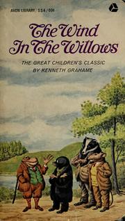
The society has none of his artwork saved, and my library system gives me two other folktale titles, but not WitW.
A Google and a Pinterest search only gave me the cover image.
Crossing him off the list.

The society has none of his artwork saved, and my library system gives me two other folktale titles, but not WitW.
A Google and a Pinterest search only gave me the cover image.
Crossing him off the list.
44Ealhmund
I'll start with the unabridged BBC audio tapes, narrated by Sir Michael Hordern, with the cover illustration by John Burningham. Ordered the tapes through a bookstore in Scarborough while on holiday in the area. Couldn't find them anywhere in the US. Quite nice, but good cassette players are getting hard to find.
Os.

Os.

45Ealhmund
I love Arthur Rakham. Barnes and Noble put out a nice set of cloth-bound classics in a pocket size, including WITW with Rackham's illustrations. Here are the field-mice carolers, just in from the cold. I bought three copies, and have carried one in my back pocket all over west Yorkshire and across Mull and Iona. It's pretty tattered, but I have two more in case I wear this one out.
Os.


Os.


46Ealhmund
Walmart was so proud of this one, that they printed a bargain price image across it, and didn't identify the illustrator.
Os.

Os.

47Ealhmund
Alan Bennett adapted WITW for the stage in the 1980s, and here is a 1991 publication with a cover illustration in water-color by Mark Entwistle (one of my favorite family names - I didn't know Ents could whistle).
Os.
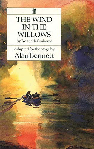
Os.

48Ealhmund
David K. Stone illustrated this edition. Not the best artist, but he does a fine job of getting the story into his illustrations. This is from the chapter "Wayfarers All"
Os.

Os.

49Ealhmund
I have a reprint of the 1908 Charles Scribner's Sons edition with the iconic Ernest Shepard illustrations. I love this image of Ratty and Mole, freezing just outside Badger's place, while Badger shuffles to the door in carpet slippers that were a bit "down in the heel". Note Badger's library! I could live here.
Os.


Os.


502wonderY
Glad you've dropped in Os!
I really like Entwistle's dreamy watercolour.
And Shepard's view of Badger's entryway. I've got my virtual image collection set up by type of view, so that I can look at variations side by side. I can see I need to add a subfolder for underground cut-away views.
I really like Entwistle's dreamy watercolour.
And Shepard's view of Badger's entryway. I've got my virtual image collection set up by type of view, so that I can look at variations side by side. I can see I need to add a subfolder for underground cut-away views.
512wonderY
I had to share this reviewer's article:
http://www.nybooks.com/articles/archives/2009/aug/13/messing-about-with-the-wind...
discussing two annotated versions (and I've got the Gauger version in hand!)
Michael Dirda appears to be a lover of WitW. He seems to know it inside and out, and has this to say:
"Yet is it really for children at all? Yes, its Riverbank characters are anthropomorphized animals—Mole, Rat, Badger, Otter, and Toad—and yes, E.H. Shepard’s famous illustrations (1931) are as gently winsome as those he drew for A.A. Milne’s Winnie-the-Pooh books in the 1920s. Nonetheless, to read The Wind in the Willows aloud to a little boy or girl can be disillusioning. Except for the misadventures of the self-dramatizing Toad, there’s really not much action and the mood music of Grahame’s prose sometimes bores the fidgety young."
I've experienced this - I tried to read it aloud at a Pajama Evening at the library and found it just didn't work.
Later in the article, Dirda exclaims "Really, what could be more…middle-aged?...While The Wind in the Willows certainly has the appearance of a children’s book, this masterpiece nonetheless tends to be most deeply affecting to those past forty."
I have to agree. It's a book whose charms grow as the reader ages.
52LibraryPerilous
>45 Ealhmund: I love doing that, too, with my set of 'traveling' books, plus with books that are what Anne Fadiman termed "You are there" readings. It makes the reading experience even more special for me.
>46 Ealhmund: Aww, I miss the Wal-mart 2 for $1 classics. They were cheaply made and had a foul glue odor, but the covers usually were interesting. You could score a passel of good reads for $5 and then drop them off at your library when you were finished. Plus, they were unabridged!
I haven't trolled the Wal-mart book section for many years. I wonder if they still manufacture them?
532wonderY
Drat! I don't have Gauger's annotated book with me - left it on the couch.
I was excited that, in order to put Toad's fascination with automobiles in perspective, there is an entry discussing other motor car literature of the times. There were perhaps half a dozen title discussed which I can add to my "motoring romances" list.
Before I return the John Patience board book, I wanted to note that I was charmed by the way he framed the prose on each page. It's a simple two line border, but with a couple of leaves growing into the top corners and the lower corners are decorated with cameos of what might be found in the larger picture. For instance, the picture up in >41 2wonderY: has a dragonfly in one corner and an upended duck's butt merging into the water surrounding the prose box.
542wonderY
Liz, the librarian remarked yesterday that Michel Plessix isn't the illustrator I'm looking for. She's right. Plessix is a comic book illustrator and he seems to have spent quite a lot of effort re-making Le vent dans les saules, as it's known in France.
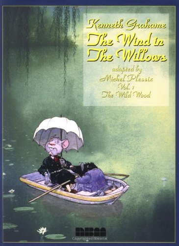
His backgrounds and details are lovely. Rat looks ridiculous though. The tone of the exchanges among the friends is much harsher, and the dialogue balloons are all over the place and difficult to follow who is saying what and in what sequence. None of Grahame's words remain.
Pity.

His backgrounds and details are lovely. Rat looks ridiculous though. The tone of the exchanges among the friends is much harsher, and the dialogue balloons are all over the place and difficult to follow who is saying what and in what sequence. None of Grahame's words remain.
Pity.
55Ealhmund
>51 2wonderY: re: is it for children?
I discovered WITW when I was in my early 30s. It had been in my library for 5-10 years, but it wasn't until my reading 'maturity' allowed me to enjoy the 'day in the life' type stories of ordinary people that I started WITW as a bedtime reading book for myself. It was a nice edition with Arthur Rackham's color and B&W illustrations. 10 years later, WITW was bedtime reading for my children, but to be honest, partly because the dreamy tone helped them wind down and go to sleep.
I combined that with the habit of making up my own rat, mole, badger stories whenever we were driving any distance, and those had the kind of action in them that kept the car-seat trapped toddlers engaged. Now that they're teenagers, and have never read WITW themselves, I suspect they have memories of WITW stories that aren't even in the book.
Bedtime for the kids was mostly from the Inga Moore illustrated edition, which I believe is absolutely the best for the pre-school and elementary age. As often as I read those stories, whenever I got to the point of turning the page to that fabulous image of the great battle at Toad Hall, I would slow down, hold the page corner, and wait (enjoying the nervous excitement in their faces) and then suddenly turn the page and read the battle description quickly and energetically. Of course, this didn't help anyone go to sleep, but it sure was fun.
One more story related to "is it for children" - I was sitting in a pub in Oban one afternoon, reading my ratty (not Ratty) pocket copy of WITW, and a pastor was sitting across from me working on a short message to deliver to a group at an evening gathering. I had just started WITW at page one when the pastor sat back with a frustrated expression. I asked what was wrong and he said he was looking for some new way to tie some kind of everyday experience to the story of Martha and Mary (when Martha was working hard in the kitchen while Mary was sitting at Jesus' feet, listening). I smiled, and showed him my notes which I had just written in the margin of page 1 (Mole and his spring housecleaning >>> "Hang spring-cleaning!". I had written "Martha and Mary?" We both laughed, and he asked me if I would be willing to open his meeting by reading the first page or so of WITW, and he built his message on that opening.
WITW is one of those works that has stories within stories, and what you get out of it changes as you change. I read it over every so often, and find that it applies to my life differently in some way nearly every time. In this regard, I consider it a part (small as it is) of the world of 'wisdom literature'. And the general wisdom tends to be - don't take things so seriously; be a good, dependable friend; you can count on your friends; and have a cup of tea once in awhile and relax.
Os.
56Ealhmund
I highly recommend this work - it's a collection of poems related to WITW by Allen Johnson, Jr., with illustrations for each by Roger Michell that suit the WITW settings quite well (including, 2wonderY, a great cutaway of Badger's entire mansion-cave home in the Wild Wood), accompanying a long poem called "Lost City".
Here is A Breeze in the Willows
Os.
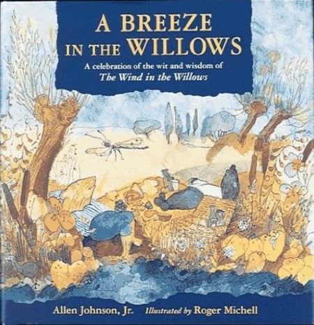

Here is A Breeze in the Willows
Os.


57Ealhmund
>54 2wonderY:
I've never believed that there is any need for an abridged, or adaption of, WITW. The language is not that out of date. If, by abridged, one means not all chapters are present (as with some of the Inga Moore editions), that's fine. Most chapters stand alone quite well anyway. And, if you're concerned about keeping a child's attention, you can read the chapters that grab them. But abridging and adapting just seems like a way to make money of of WITW and get your name on the work.
Now, the stage plays are a different matter.
Os.
58Ealhmund
Thanks, 2wonderY for creating this thread, and all the work you've put into displaying your collection.
I just dropped in yesterday, and now I'm dropping out for 4 days. I'll be without electronic communications until Monday!
I have one or two more illustrators to share, but it will have to till my return.
Os.
I just dropped in yesterday, and now I'm dropping out for 4 days. I'll be without electronic communications until Monday!
I have one or two more illustrators to share, but it will have to till my return.
Os.
59LibraryPerilous
>55 Ealhmund: Lovely, thank you for sharing. TWitW is a wise work, indeed.
I didn't read it until I was in my 30s, either. I don't think the tone of the stories would have struck a chord with me at a different point in my life. (But, I don't have proof of that since I'd never even attempted it at a different reading phase).
E.g., I don't think I would have related to the elegiac tone of "Dulce Domum" when I was in my 20s, nor to the wistful longing of "Wayfarers All." Now that I've had a few years' more experiences, including leaving a city I loved, and deciding to stay put in another instead of traveling again, I feel those chapters keenly. Coincidentally, or perhaps not, the visceral response I had to TWitW occurred around the time I was re-developing my religious faith. It's a story of simpler times and a simpler faith in the goodness of the world, but it also retains a complexity of emotion that raises it from twee to artful, I think.
I also don't think I would have liked Toad when I was younger. But, after going off on my own madcap adventure at the age of 30, I got more out his character. And I recognize my own strong personality in his fierce loyalty. I think part of the charm of reading the book as an adult was that I didn't feel the need to box myself in as one of the characters, the way children who are learning to self-identify do. I already was old enough to know that I have a little bit each of Ratty and Toad in me, and a whole lot of Mole. And I was old enough to be okay with that.
To the general question, "Is this book for children?", I always find that a strange way to view things. Most kids' books are written by adults. Sure, picture books or early readers are for kids, but they have a charm for adults, too. (I can't tell you how much love I have for the Frances and Jenny Linsky books, and I didn't read those growing up.) We can find something to which we relate in a well-written book at any age/stage of life.
I suspect most adults who write novels for children, such as TWitW or Winnie the Pooh, really are writing out of nostalgia for their own childhood--so of course, we adults who have our own wisp of longing can relate, too.
It's the same nostalgia that drives me to mix a Suicide on Opening Day every spring and toast not only MLB, but that awkward kid I was--the one who couldn't hit or field or pitch but who loved the sport just as much as the jock who could. I just add rum to my drink now that I'm old enough.
A good story is a good story, no matter the age level at which it is aimed. I cringe, though, when I look at what is marketed to teens and young adult readers today. I know we had bad series fiction when I was a kid, and I survived reading it without my brain turning to mush, but . . . A Clockwork Princess as literary fiction? Really, amazon and Barnes and Noble?
60Ealhmund
>55 Ealhmund:
yes. yes. and yes!
Os.
Okay, now I'm really gone. My ride arrives in an hour, and I've not packed.
yes. yes. and yes!
Os.
Okay, now I'm really gone. My ride arrives in an hour, and I've not packed.
612wonderY
Bye, Os. Have a great weekend!
Looking for more images online, I stumbled upon this interview of Steve Dooley, who created the images used in this fun ipad app, which you can view about half way down the page:
http://www.bbpcreations.com/appleiphoneipadappscompanyblog/?p=447
Looking for more images online, I stumbled upon this interview of Steve Dooley, who created the images used in this fun ipad app, which you can view about half way down the page:
http://www.bbpcreations.com/appleiphoneipadappscompanyblog/?p=447
62fuzzi
@diana.n, like, LIKE your post!
I read The Wind in the Willows at a fairly young age, by snitching/borrowing my older sister's copy. I loved the stories on a primary level. Upon reading it again as an adult, the deeper meanings become evident, and I can enjoy it for the subtlties I missed as a child.
Thanks for the covers, everyone. I have just discovered that I don't own a bound copy with the Ernest H Shepard illustrations. I need to fix that, NOW... :)
632wonderY
More notes about the characters as drawn by Michel Plessix.
Grahame clearly states in the first chapter that Ratty has "A brown little face, with whiskers. A grave round face, with the same twinkle in its eye that had first attracted his notice. Small neat ears and thick silky hair." Plessix' Rat is more mouse-like. He also never exhibits the warm and caring nature which is so singularly him.
Toad is okay, but his eye-ridges are used occasionally for expressions of sternness and wrath that I don't associate with Toad. Mole is more juvenile than I think appropriate. Badger lacks sufficient reserve and gravitas. Otter plays a much larger part in this version.
I have to say he does justice to the dining hall mess that the weasels and stoats have created. It looks like a Peter Spier mess.
I'm starting my examination of Robert Ingpen's work now. I thought I would like it a lot more than I do, because his cover is very nice!
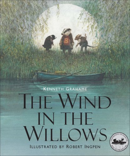
but his full page pictures are dark and fuzzy, with little detail. His inset pieces are much better.
Going back to character, one of the items that bothers me is that Ingpen's Badger wears an old red rugby shirt. He seems much more proper than that. And he dislikes crowds. I doubt he was ever a team sportsman.
Any other opinions on details like this?
64jnwelch
>51 2wonderY: What a good article, Ruth! Thanks for posting the link. The writer was clever to remember that Moly was the name of the magical herb Odysseus used to resist Circe.
I love the WITW excerpt at the end. Mmm, a plate of warm, buttered toast.
Has anyone posted the Inga Moore illustrations?

A theater company here in Chicago, called City Lit, successfully put on a musical Wind in the Willows. It was very good.
I love the WITW excerpt at the end. Mmm, a plate of warm, buttered toast.
Has anyone posted the Inga Moore illustrations?

A theater company here in Chicago, called City Lit, successfully put on a musical Wind in the Willows. It was very good.
652wonderY
Yes, I think we're unanimous in double thumbs up for Inga Moore. There's a link to some of her illustrations in post #6.
I shopped at Salvation Army today and found a Toad sweater! Seriously! It's deep olive green wool, and it has raised knobs like warts all along the shoulders and arms. It couldn't be more perfect for my mood.
I watched an animated cartoon version done in Australia by Burbank Films, released in 1988.
en español
much more fun!
The outside scenery was gorgeous at the beginning of the film. Unfortunately, that was the only positive. The rest was slap-dash pretty awful. Rat was very scruffy looking, and Toad's voice was just too annoying. Lot's of the dialog was changed. I fast forwarded through the second half.
To complete the careless handling, the publicity department misspelled Grahame's last name on the cover blurb.
I shopped at Salvation Army today and found a Toad sweater! Seriously! It's deep olive green wool, and it has raised knobs like warts all along the shoulders and arms. It couldn't be more perfect for my mood.
I watched an animated cartoon version done in Australia by Burbank Films, released in 1988.

en español
much more fun!
The outside scenery was gorgeous at the beginning of the film. Unfortunately, that was the only positive. The rest was slap-dash pretty awful. Rat was very scruffy looking, and Toad's voice was just too annoying. Lot's of the dialog was changed. I fast forwarded through the second half.
To complete the careless handling, the publicity department misspelled Grahame's last name on the cover blurb.
66LibraryPerilous
>62 fuzzi: Thanks, @fuzzi! I think the Dover Thrift Editions version of TWitW has the Shepard illustrations, if you don't mind a cheap version. It looks like an anniversary edition is available, too.
I've read quite a few books, as an adult, that I missed as a child. Most just have struck me as good books and I enjoyed reading them. But a few have hit me as either, "I'm glad I read this for the first time now," or, "I really wish I had read this as a child."
The Narnia books are in the latter category. I just can't, as an adult, find the magic in them. I'm quite certain it would have been there when I was a kid. Maybe I'll try them again in a few years and at least find Half Magic in them!
But probably the book that struck me the most as "Wow! I wish I'd known about this sooner" is Elizabeth Marie Pope's The Perilous Gard. I adored it when I read it as an adult. I can tell from the visceral reaction I had to it, even in my thirties, that I would have found much to which I could relate as a 10- or 13-year old. Who knows?: Maybe it even would have rescued me from my "Disney Sleeping Beauty" phase a year or two early. ;)
67LibraryPerilous
I see that Dover's Calla Editions line is publishing TWitW this fall with Justin Todd's paintings:
I don't particularly like Todd's take. The characters' gestures seem very mechanically-rendered and static, so to speak. And the paintings seem obviously for a children's book, if that makes sense.
Still, if anyone does like his illustrations, the Calla Editions line of books always are very well done and the paper used is of high-quality (unlike their Thrift Editions).
http://www.amazon.com/The-Wind-Willows-Calla-Editions/dp/1606600443/ref=sr_1_1?i...
68fuzzi
@diana.n, I've ordered a copy through abebooks.com. By the description, I believe it is either the 1959 or 1960 edition, the one my sister owned.


692wonderY
>67 LibraryPerilous:
I like Todd's cover art.
I watched the Masterpiece Theatre live version today. Wow! I'm a fan!!

Poop-poop!
Unfortunately, Badger is the smallest actor of the four, but his presence makes up for it. Casting was wonderful, the acting was superb. Photography was magical at times. And Ratty can carry off a casual gentleman's attire, no problem. He carries a slightly dilapidated straw hat that's perfect. It's not one of those straight edge boaters. It suits him just right.
I'm glad the makeup indicators were small. Mole's nose is slightly elongated and pointy, and he wears a fur-like jackets sometimes. Ratty has a moustache that tapers off into a few whiskers that are not over the top. Badger's got the grey and white hair and his own facial magic.
I could wish that the same crew would have done the entire story. The Mole-Rat friendship is not fully told, as the action revolves around Toad.
70Ealhmund
>69 2wonderY:
Re: Masterpiece 'Live' version. What's it called (I found no evidence of it on the Masterpiece website under 'Wind' or 'The')
And what do you mean by 'live'...not animated?
Os.
Re: Masterpiece 'Live' version. What's it called (I found no evidence of it on the Masterpiece website under 'Wind' or 'The')
And what do you mean by 'live'...not animated?
Os.

73guido47
As you can see , I collect him
ETA. Thanks Fuzzi, I knew I had another 2 in my collection. One took me 2 years to get!
ETA. Thanks Fuzzi, I knew I had another 2 in my collection. One took me 2 years to get!
762wonderY
I'm in Kentucky, on the ridgetop, and I have room to spread the books out and compare scenes from one to the next, but internet access is in town. So my notes have to travel in between.
This local library had one choice of illustrators - Peter Barrett - who's edition came out in 1987. It's a smallish book and has detailed half-page pencil sketches at the top of each chapter, and 8 color plates scattered in the book, not necessarily where the text might match.
My book also has a cover painting showing Mole and Rat first seeing each other across a very narrow stream.
This cover shows one of his color plates:
I like his characters. Ratty is wearing appropriately casual boating togs.
His nature details are beautifully rendered, and he does a great job capturing seasonal nuances. You feel as if you've experienced what he's portraying.
One of his best plates shows the mice packing up their summer belongings preparing to move to winter quarters. It's very engaging, and I haven't seen anyone else do it so nicely.
This local library had one choice of illustrators - Peter Barrett - who's edition came out in 1987. It's a smallish book and has detailed half-page pencil sketches at the top of each chapter, and 8 color plates scattered in the book, not necessarily where the text might match.
My book also has a cover painting showing Mole and Rat first seeing each other across a very narrow stream.
This cover shows one of his color plates:

I like his characters. Ratty is wearing appropriately casual boating togs.
His nature details are beautifully rendered, and he does a great job capturing seasonal nuances. You feel as if you've experienced what he's portraying.
One of his best plates shows the mice packing up their summer belongings preparing to move to winter quarters. It's very engaging, and I haven't seen anyone else do it so nicely.

782wonderY
Yeah, you can actually feel the temperature and the breeze.
I’ve got twelve of the illustrators in front of me, and I’ve looked at a few more (dismissively, if I recall correctly), so I’m attempting a spreadsheet documenting the standard scenes and what might stand out as especially good or particularly awful. For example, I’ve noted 3 versions of the map – Shepard, Hague and Foreman, so far. I’d swear though that I’ve seen another.
I’m reevaluating my feelings about Helen Ward. There is really only one picture that turns me off – it’s the load of police and pursuers in the second train chasing after Toad. It’s the one that is too stylized for my taste.
Her characters are all more than acceptable, and they dominate the frame. But she manages to get both Rat’s and Mole’s sitting rooms just right, with details that speak of their interests and character and station in life. She pays particular attention to the script and faithfully records the details. For instance, her picnic spread is the most lavish.
Though her illustrations are few, I’m starring half of them as getting it perfectly and nicely right.
792wonderY
Found the fourth map. Robert Ingpen does an aerial view of the territory at the beginning of chapter 1 that covers most of the features in the maps. There are no labels, but his intention is clear. It’s a full two pages.
Ingpen really only does justice to Toad. He does an excellent Toad; very charmingly drawn in a dress. (Mole looks good in the dress and bonnet too.) But, oddly, you never see the range of emotions and expressions that other illustrators manage. In chapter 8, Toad is shackled in a corner of his cell, and merely looks perplexed. Remembering Bransom ‘s woebegone Toad, I have to subtract points here.
Ingpen suffers from continuity issues. Toad changes size in relation to the other characters. He is Badger-sized while Mole and Rat are removing his motoring togs, and crouches like a real toad, with Rat swarming on top.
link
Ratty’s clothing changes from one panel to the next. In Dulce Domum, he goes from rolled up shirt sleeves and white porkpie hat to no hat, to sweater and visored green hat, all on the same walk. Come to that, Ratty is the most changeable. The skinny long limbed hay-seed Rat predominates, but occasionally there is a more compact mouse-like Rat.
His Badger is well rendered bodily, but he does insist on that rugby shirt and a posture where Badger is resting most of his weight on his left leg, which conveys a more casual Badger than is appropriate. Badger is the de facto squire in this community. His bearing should be slightly more formal. I think Ingpen got Badger to his liking precisely once and just made slight variations from page to page. The end papers treat you to some of the artist’s concept pencil drawings, which reinforces that impression.
I do particularly like Badger’s kitchen, but I can’t decide whether I like Rat’s. Ratty’s kitchen has some nicely rendered tree roots along the ceiling, but the layout seems too stagey, and lacks adequate furniture. There is the occasional random drawing of props, done with great care (a pile of weapons, for example) and then human characters, like the boat woman, are just represented with a smudgy blur.
His exteriors are mostly dark and moody, without the botanical detail of other illustrators. Except for his cover illustration depicting willows, his trees are bare, his colors are autumn or very early spring before leaf out.
(my first notes about Ingpen are up in #63.)
With a name like Inkpen, being an illustrator must have been a given.
822wonderY
In all of this immersion, I've decided my favorite chapter is 1.
Mole's discovery and delight in the outside spring, the newly forged friendship with a very cool Rat, the wonderful picnic, with cameo introductions to all of the main characters. Bliss.
Do you have a favorite chapter?
Mole's discovery and delight in the outside spring, the newly forged friendship with a very cool Rat, the wonderful picnic, with cameo introductions to all of the main characters. Bliss.
Do you have a favorite chapter?
83fuzzi
I like the chapter when Mole and Rat spend the holidays at Mole's house, and are entertained by carolers.
842wonderY
Sadly, my library system lacks editions illustrated by Mark Entwistle, David K. Stone, Justin Todd and Harry Hargreaves.
Also, no A Breeze in the Willows.
It's a sad day.
eta - Trying a different spelling for Mark Entwisle. This IS the correct spelling, but Entwisle created the poster and the program cover for Bennett's stage production, he did not illustrate any version of the book.
Also, no A Breeze in the Willows.
It's a sad day.
eta - Trying a different spelling for Mark Entwisle. This IS the correct spelling, but Entwisle created the poster and the program cover for Bennett's stage production, he did not illustrate any version of the book.
852wonderY
Drat! I meant to bring the Gauger Annotation with me today.
Diana, what appeals to you about Windham Payne's illustrations? He's way at the bottom of my list.
Diana, what appeals to you about Windham Payne's illustrations? He's way at the bottom of my list.
86guido47
Who ever said LT is a 'free site'? Just 'cos of this thread I have ordered A breeze in the willows
Umm. did I get carried away?
Umm. did I get carried away?
872wonderY
I've saved a few scans of Michael Foreman's efforts for comparison's sake, but I'm not at all attracted to his rapid cartoon-y style.
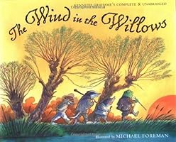
The only innovation Foreman adds is Mole sometimes wears a miner's helmet and light. First when he tumbles out into the sunshine in chapter 1 and then on the way to battle.
Foreman must have loved Inga Moore's out of the boat picture (see it up in comment #27), because his version is very nearly the same, without her detail.
882wonderY
Here's a complete listing of the television series done by Cosgrove Hall Productions in the 1980s:
http://en.wikipedia.org/wiki/The_Wind_in_the_Willows_(TV_series)
I see they did another of my favorites, Brambly Hedge.
http://en.wikipedia.org/wiki/The_Wind_in_the_Willows_(TV_series)
I see they did another of my favorites, Brambly Hedge.
89Ealhmund
>84 2wonderY: It's a sad day.
I'll bet, 2wonderY, you'll think twice before starting another thread like this! :-)
Os.
I'll bet, 2wonderY, you'll think twice before starting another thread like this! :-)
Os.
902wonderY
No! I'm totally enjoying myself. I'm even starting a list of illustrators of the translations.
The internet will supply all of our visual desires if we're just patient enough.
(Looking at Eric Kincaid's work at present. I'm surprised at how uneven his output quality is. Also was disappointed in another of Inga Moore's titles.)
The internet will supply all of our visual desires if we're just patient enough.
(Looking at Eric Kincaid's work at present. I'm surprised at how uneven his output quality is. Also was disappointed in another of Inga Moore's titles.)
912wonderY
Still trying to decide how to rate Kincaid. (see comment #101 for further thoughts.)
In the meanwhile, I ordered a couple of slimmer versions. Troll Illustrated Classics put out a coloring book-sized retelling by Diane Ashachik and illustrated by Laura Lydecker

Firstly, Ashachik dumbs it down considerably, eliminating a lot of the magical phrasing, covering only 6 chapters, the skeleton of the story so to speak.
Lydecker has one or two joyful pages - Mole emerging into the spring, and her boats on the water are nicely done. But otherwise, her art is basic and copies what has already been done by better artists. Her interiors are spare and Ratty looks a lot like a fox.
This one gets kicked to the curb, but not harshly, because Lydecker does not offend.
922wonderY
I've been researching my next illustrator this morning and trying to pull her versions out of the combination morass on Grahame's page.
Beverley Gooding illustrated three chapters of the book for Methuen from 1979 to 1981 or so. Each was published hardback seperately, and then in softcover too. Information is scarce about her, so I can't find whether other chapters were planned but not executed.
It's a shame we only have the three.
I'm looking at Mole's Christmas

and it is so well done.
Her animals, though they are fully equipped with clothes and furnishings, are real sized compared to the rest of the world. So they are much smaller than the sheep, they stand on the windowsill in the village, and climb a tree stump in the woods, by using shelf fungi as steps.
The pictures are rich with botanic detail and Mole's forecourt (shown in cut-away view) is precisely cozy and classical, just as Grahame discribes it. I haven't seen anyone else get it quite right yet.
I'l try to post at least one more picture, her images are nearly impossible to find online. Her nighttime snow scenes are very lovely, with moonlight drenching everything and creating nice shadows.
Oh - and the text is the full chapter, not abridged - another star for that!
And i've ordered the other two from the library.
93jnwelch
Darn, the library says I'm maxed out on holds. That Beverley Gooding Mole's Christmas looks and sounds charming.
94mysterymax
I have a Kenneth Grahame copy too, but it isn't either of the pictures shown here. I also have this which I though you might enjoy. This is just one of my two Wind in the Willows board games.

My brain is quite on backwards today, I meant to say I have a John Worsley (illus.) copy of my book. Aargh!

My brain is quite on backwards today, I meant to say I have a John Worsley (illus.) copy of my book. Aargh!
95fuzzi
Ruth, what a delightful version you posted in post 92. Oh, if I only had a grandchild to give it to...
972wonderY
Researching Methuen & Co., or Methuen Publishing,
http://en.wikipedia.org/wiki/Methuen_Publishing
Kenneth Grahame was in their "stable" along with A. A. Milne, and many other well-knowns.
They've issued and re-issued the book in may ways over the years, relying on Ernest Shepard's illustrations a lot, but also publishing the Paul Henning and Beverley Gooding chapters. Henning (of the puppets) did Dulce Domum, under the title Sweet Home.
They also published First Whisper of The Wind in the Willows
edited by Elspeth Grahame, in 1944.
982wonderY
As I said, Justin Todd's version isn't in my library system, but Amazon lets you peek into his version:
http://www.amazon.com/The-Wind-Willows-Calla-Editions/dp/1606600443/ref=sr_1_1?i...
I do like his cover (the picnic spread is generous and the water is lovely) and the endpapers are interersting, with the willow branches forming a covered tunnel.
But he loses me at the frontispiece. Although his tree technique is interesting, his "place" looks more like a southern bayou than the English countryside.
And not enough interesting going on.
99fuzzi
Ruth, that's a wonderful lament, thank you!
I have similar feelings over modern versions of the Bible...passages removed and changed to "make it easier to read"...and I ask, "why?"
I'm sharing the lament. :)
I have similar feelings over modern versions of the Bible...passages removed and changed to "make it easier to read"...and I ask, "why?"
I'm sharing the lament. :)
1002wonderY
The Open Road : from The Wind in the Willows and Wayfarers All, Beverley Gooding versions, arrived at my home last night.
The item that glares out at my eyes is the white and blue striped rugby shirt that Ratty is always wearing. That's what he's got on under his coat in Mole's Christmas, and that seems to be Gooding's uniform for him. Though Mole wears tops, pants and shoes, and the Sea Rat wears sweater & pants, Rat and Toad get by with just upper body coverings.
The animals dimensions stretch a bit in The Open Road, child-sized compared to the horse and caravan, as opposed to closer to true size in Mole's Christmas.
Again, botanic detail is lovely. but Gooding seems to pass up opportunities. The auto/caravan encounter is missing, though there is a full page picture righting the caravan. And the inside of Toad's boathouse is nice.
I'm not particularly impressed with Toad. He's nicely patterned, but lacks ebulliance and color.
Gooding also passes on field mice activities in Wayfarers All. Most of the illustrations cover the Sea Rat's stories. They're fine, but not emotionally engaging. The other half of the pictures are Ratty pensively wandering his small world, and those are the best of the book.
So, slightly disappointed. Mole's Christmas is her best of the three, by far. It is precise, engaging and completely charming.
1012wonderY
In spite of my text editing gripe, I've decided that I like Eric Kincaid's illustrations. For the most part.
His cover:

is indicative of his strengths and weaknesses.
His Badger is possibly the best so far. (just behind Cosgrove Hall.) Mole is fine, but Ratty's face varies - sometimes looking like a lion cub, sometimes a fox, and then other times like a water rat. (Seems a common issue.) Toad looks sickish ocassionally, but is usually okay.
He manages to convey emotional warmth among the friends. Although some scenes lack that special oomph, there are other that are worth gazing at and some that make me smile. His winter woods scenes are his best. He takes the time to illustrate "snow-castles and snow-caverns had sprung up out of nowhere in the night," something missed by everyone else. The hedgehogs are adorable little guys and the lead-up to and the battle at Toad Hall are very nice and a bit unique. Badger is wearing an old campaign hat like Teddy Roosevelt's. And it suits him.
Here are a few pictures from Kincaid's web page:
http://www.erickincaid.com/?page_id=20
1022wonderY
I've been avoiding rating Arthur Rackham, as I was afraid they might be inferior to my expectations. Rackham is one of the greats of illustration, and I stand in awe of some of his work. The plates in my copy don't do justice. They seem washed out somewhat. Ah, well. For $3, what can one expect?
Here's his KGS page.
Chapter headings get pen & ink sketches which don't add much, but the color pictures are wonderful! There are twelve of them, which should give us one for each chapter, but that's not how it works out.
The River Bank gets three. The Open Road is possibly my favorite, as it shows Mole companionably chatting with the old grey horse, because" he'd complained that he'd been frightfully left out of it." The horse has its head cocked attentively toward Mole. No one else has managed to capture this nicety so well.
Badger and Toad appear only twice, but very satisfyingly. Badger is hosting the coldhungrytired duo of unexpected guests. They are all clad in Badger-sized robes and slippers.
Toad is being dressed by the gaoler's daughter surrounded by the dark stone of his cell. The last two chapters don't get any color pages, which makes me very sad. The last picture is Toad’s brief encounter with the gypsy. I’m not sure why everyone includes a picture of this. Funny thing – the gypsy is nearly identical across all illustrators.
I have only two complaints. Ratty is too dapper in a white linen suit and two toned shoes. (But you’ve heard that one already before.) And Mole is drawn just a bit too dark and rough. He looks more fierce than a cute little mole actually does.
Rackham’s trees are iconic. They have faces and personalities. In Wayfarers All, three of them are having a conversation just beyond the busy mice. That’s another favorite of mine. Rackham does justice to all of the hurly-burly busy-ness of the mice.
Hmmm. Looking at his prints on Pinterest, they all seem to have the same color reproduction issues.
Googling images shows at least two color plates that my 1940 edition lacks. I don't have Pan, and there appears to be another of Toad languishing in his cell wearing stripes.
I'm going home and immerse myself in the Rackhams that I do have.
104jnwelch
Individually, some of the Rackham ones are great, as shown on that link page you posted, but there's something about them collectively that doesn't enchant me. They're almost "muddy" in my eyes, and there's too much sameness in the colors.
I was trying to think of an illustrator who hasn't done The Wind in the Willows yet, but I'd love to see him/her try. One who comes to mind is Jon Muth, who did the Zen Shorts book and others with that wonderful panda.
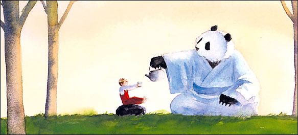
I was trying to think of an illustrator who hasn't done The Wind in the Willows yet, but I'd love to see him/her try. One who comes to mind is Jon Muth, who did the Zen Shorts book and others with that wonderful panda.

1052wonderY
Yes, ocassionally, his colors are very rich though. I'm wondering if the technology of his materials or the reproduction of them was a problem.
106Keeline
For a dozen years from 1988 to 2000 I managed a bookstore that specialized in old children's books. The name of it was The Prince and the Pauper Collectible Children's Books in San Diego, California, USA. We had 30,000-60,000 out of print and collectible editions of books that we though adults would remember or otherwise collect. In serving our clients' interests, I found myself doing a lot of research. It was not unusual to have a single-title collector come in or contact us to seek out as many variations as possible of illustrated editions for an individual story.
One of the ways I assisted with this was to use reference volumes like United States Catalog and, for 1928 and later, Cumulative Book Index from H.W. Wilson. These very large and heavy reference volumes listed books that were first published in a given edition within the year or couple of years covered by that volume. They also featured entries by author, title, and subject in a single alphabetic sequence. Hence, one could use them not only to find editions of titles like Wind in the Willows but also subjects like Horses -- Fiction and Stories. By going through the volumes from earliest (1899) to most recent one could make up useful bibliographies for titles, authors, and subjects. It was also possible to note the original selling price for books, a clue to first printing identification of the jacket is still present. Initially I used the volumes at San Diego State University but later we had our own set which cost a fortune to have shipped to us and we had to build some very heavy duty shelving for them in my office. I couldn't have such a set at home but I miss not having access to them. A few volumes of this are scanned on Archive.org but the files are so big as to make them hard to use with efficiency.
Another thing I did at the bookstore was to begin a collection of books that inspired Disney films and TV programs. I assembled quite a selection and this included, of course, some copies of Wind in the Willows for their film The Adventures of Ichabod and Toad combining Ichabod Crane in one story and Mr. Toad in another. This also led to the popular ride at Disneyland (still there) and Walt Disney World (now gone) called Mr. Toad's Wild Ride.
Here are a few editions still in my collection. The first American printing (Charles Scribner's Sons, 1908) has only a frontispiece illustration signed "G. R." that looks like a bookplate:

This is a 1925 reprint (date on title page) with illustrations by Nancy Barnhart. There is a secondary copyright date of 1913 (as well as the 1908 date) so I think the illustrations may come from that year:

My Ernest Shepard copy of 1933 appears to be a first U.S. printing with corresponding dates (same date on title page and copyright) and the original dust jacket with a "$1.00" price on the flap. Shepard was already known for his illustrations for Milne's stories and poems about Christopher Robin and Winnie the Pooh.

When I was researching the book to Disney film connections, I learned that they secured film rights for not only the novel (or short story collection) of Wind in the Willows by Kenneth Grahame but also the published play called Toad of Toad Hall by A.A. Milne. This is a first U.S. printing from 1929 in a price-clipped dust jacket:
This is the Big Golden Book version based on the film. It doesn't survive well and my copy has the spine damaged as is typical. Someday perhaps I can find a really nice copy.

Since this is a long thread, I have used the small versions of the cover images. Larger ones are available if you click on the links and go to the book page and view the image modal via the magnifying glass icon on the lower right of the image on the book detail page.
James
107fuzzi
Very interesting, James. I'll be watching for the 'fix' of that cover that is not showing up. :(

1092wonderY
The only sources for Wyndham Payne's pictures are in the Gauger annotated edition and random webpages like the one at KGS.
I dislike these pictures as much as I do Robert Lee's. Payne puts animal heads on human bodies and dresses them in strange outfits that have very little to do with character or story. (Mole wears plaid knickers and hose, sometimes with a cut-away coat. He puts them all in tuxedos in the final chapter, and Ratty wears a monacle and smokes a cigar!) (And Badger looks more like a bear or a dog.) Expressions are harsh and sharp. His best picture is the Mice packing in Wayfarers All, and even there, they all look like they want to snap at each other.
And yellow (orange in some versions) with the black illustration is perhaps the least attractive color for this story. Well, red might be worse.
1102wonderY
I've got a pile of single chapter publications I'm trying to organize into a semblance of order.
1112wonderY
ooooh!
I followed a link from the Kenneth Grahame Society to http://childscapes.com/
Fuzzi, they have an article page on My Bookhouse sets.
I followed a link from the Kenneth Grahame Society to http://childscapes.com/
Fuzzi, they have an article page on My Bookhouse sets.
112fuzzi
Ooh, thanks!
They messed up, though, I think. They claim the red series has 12 books, and it doesn't. It has 7, I just counted my set.
I'd love some of those prints, though...
They messed up, though, I think. They claim the red series has 12 books, and it doesn't. It has 7, I just counted my set.
I'd love some of those prints, though...
1132wonderY
I really do need to return Gauger's Annotated to the library. I've got a ton of other materials on the way. As I've spent time in it, I've come to like Shepard's work more and more. The last illustrator to consider in this edition is Nancy Barnhart.
I really like her Badger, and Toad is mostly spot-on. But she does Mole a disservice, making his head round, with small close-set eyes, an abreviated snout and a rather ugly mouth. In some pictures, Ratty looks like his twin.
But then, she does a very lovely profile of the Sea Rat lounging on board a ship with sea and cliffs in the distance.
Her interiors are dim and simple. She has enough detail to be pleasing, and her colours are rich, saturated in an antique way.
There are just a couple of examples of her chapter tailpieces, but they appear as charming as Rackham's.
Here's her page at KGS.
1142wonderY
I've been carrying Patrick Benson around for a while too, but I decided I need to look at his illustrations for William Horwood too. (sequels) He's done a map as endpapers too.
I'm hoping to find some colorized illustrations. His pen & inks are greatly improved with color, if the cover is an indicator.
I'm hoping to find some colorized illustrations. His pen & inks are greatly improved with color, if the cover is an indicator.
1152wonderY
Hi, I'm back.
Pixie O’Harris confuses me. She seems to have a narrow range of excellence. If you search the name on Pinterest you get multiple images from Pearl Pinkie and Sea Greenie and one really gorgeous black & white mermaid. There are a few other titles represented. One reminds me of Kate Greenaway’s work. Another is a very awkward Alice’s Adventures. There is only one WITW illustration – the picnic scene.

Like Wyndham Payne, her clothed animal bodies sometimes stretch to human, lanky dimensions and are no longer appealing. They become anyoldbody wearing a cartoon animal head. But then, on the next page, Ratty will be stretched out in the grass bare-pawed or there will be several adorable sketches of Portly.
She chooses some different costumes. Toad is arrayed in duster, long gloves and goggles, which makes sense, but then he wears a very conservative suit in other scenes. Badger is usually wearing lederhosen (Why?), and in chapter 11, O’Harris goes too far - his disarray is a raggedy pair of overalls without a shirt. Slovenly! Ratty’s loud striped jacket would be better on Toad, but Moley is disserved most, having to wear what looks like casual court dress – white stockings, tight black breeches and a low black pump shoe.
While she uses lots of botanic specimens, they don’t blend well with the landscape. And her interiors are sketchy, almost amateur. She definitely has good days/bad days.
I almost wish she’d skipped re-interpreting Carroll and Grahame.
I rated Payne a -1 for getting everything wrong, Robert Lee a -0- for being careless and slipshod. O’Harris gets a 2. No, make that a 3.
Oh, and here's her page at KGS.
1162wonderY
PS: I've ordered A Breeze in the Willows and am eagerly looking for it in the mail.
117jnwelch
I'll be interested to hear what you think of A Breeze in the Willows, Ruth.
This is a bit of a tangent, but I thought it worth mentioning in this discussion of TWITW illustrators that I'm reading The Secret Garden as illustrated by Inga Moore (a re-read of the book, but the first time with this illustrator). I'm loving it. There are far more illustrations than I expected, and it's charming. I'm going to get her version of The Wind in the Willows, although I wish it wasn't abridged.
This is a bit of a tangent, but I thought it worth mentioning in this discussion of TWITW illustrators that I'm reading The Secret Garden as illustrated by Inga Moore (a re-read of the book, but the first time with this illustrator). I'm loving it. There are far more illustrations than I expected, and it's charming. I'm going to get her version of The Wind in the Willows, although I wish it wasn't abridged.
1182wonderY
I'll surely be letting you know.
In the meantime, has anyone ever read Counselling for Toads?
The Kenneth Grahame Society claims it as a sequel. :@!
In the meantime, has anyone ever read Counselling for Toads?
The Kenneth Grahame Society claims it as a sequel. :@!
1192wonderY
>104 jnwelch:
An illustrator who hasn't yet, but would be great ...
I just realized today that would be Jane Pinkney. I was giving Margaret Greaves credit, but she's a writer, not the illustrator.
An illustrator who hasn't yet, but would be great ...
I just realized today that would be Jane Pinkney. I was giving Margaret Greaves credit, but she's a writer, not the illustrator.
1202wonderY
Received Beyond the Wild Wood from the library. which is a 1982 abridged version of Peter Green's biography of Kenneth Grahame published in 1959.
Lovely photos!! Both portraits and landscapes.
Recommend!
Lovely photos!! Both portraits and landscapes.
Recommend!
121maggie1944
Ruth, I thought I'd drop in to let you know I'm lurking about in this thread. I wish I had time to spend some real quality moments looking at all the links, but you know…. Hawaii calls. I am spending today taking photographs, and will not have much on line time; nevertheless, I love this thread and your discussions.
Also, am curious how your place in the hills is coming along. I've lost track of your thread about it and wonder if you could post a link here?
I hope your Thanksgiving was wonderful and that the run up to the holidays is filled with much joy!
Also, am curious how your place in the hills is coming along. I've lost track of your thread about it and wonder if you could post a link here?
I hope your Thanksgiving was wonderful and that the run up to the holidays is filled with much joy!
1222wonderY
JEALOUS!! of Hawaii trip!
The cold season has put a big slow-down to my ridgetop adventures, but the thread is in Gardens & Books.
Holidays are looking good. Some family issues seem to be resolving. You go and have a GREAT trip and tell us all about it when you return.
The cold season has put a big slow-down to my ridgetop adventures, but the thread is in Gardens & Books.
Holidays are looking good. Some family issues seem to be resolving. You go and have a GREAT trip and tell us all about it when you return.
1232wonderY
Working on Dick Cuffari's contributions today.
His Kenneth Grahame Society page shows three of the five color illustrations in my copy of the book. The rest of the illustrations are simple, but nice, line drawings.
His badger is pretty wonderful, on the cover picture:

I might sound quibbly if I say the spats look awkward.
There are no surprises. His characterizations all fall in with my expectations. Nothing clashes and it's a totally acceptable rendition.
1252wonderY
Yes, I think he took his lead directly from what had already been done. Nothing wrong with that. Others have done it with more style - staying within the old groove but playing improv along side.
I tried to read A Fresh Wind in the Willows by Dixon Scott. Didn't particularly like it. It was faithful to characters, but it lacked the great phrasing of the original and seemed just more re-hashing of Toad's childishness (up until the last chapter when Toad shines.)
Ended just skimming. Starting The Willows at Christmas and have better hopes for it.
127matthewmason
So it appear there might be a steampunk illustrated version of the book, titled Steam in the Willows. Do with that what you will.
1282wonderY
Jerry,
Most of the covers are already available from the Work page. It just takes time and patience to locate the right one. I do scan and add covers as needed.
I try to locate the inside artwork online somewhere because I haven't found a photo storage site I like since my old one went out of business.
I am accumulating my own collection of scans so that I can look at them side by side according to the particular scene.
Thanks for the heads up on Krista Brennan's work, Matthew! It looks interesting.
129maggie1944
2wonderY…. which photo storage site did you use previously? I used Flickr with a good deal of comfort and happiness and then they went and changed it. I need to get outta there. And I'm stuck right now having forgotten how to post things here.
Do you have a link to some directions on how to post my own photographs, and things I might find online that I'd like to bring here? I need to print them and hang them on my bathroom mirror so I won't forget how to do it again. Sgh. I just love the "short term memory loss" which seems to have settled into my brain, to stay.
Do you have a link to some directions on how to post my own photographs, and things I might find online that I'd like to bring here? I need to print them and hang them on my bathroom mirror so I won't forget how to do it again. Sgh. I just love the "short term memory loss" which seems to have settled into my brain, to stay.
130.Monkey.
If anyone is interested in a really great, but paid, photo storage option, I'd be glad to give a link (which would also provide a discount); I've been using the same place for over 8yrs now, no complaints!
>129 maggie1944: <img src="URL OF IMAGE" />
(And you get the URL by right-clicking and "get image source" or however your browser phrases it.)
>129 maggie1944: <img src="URL OF IMAGE" />
(And you get the URL by right-clicking and "get image source" or however your browser phrases it.)
131fuzzi
Karen, I use shutterfly.com for photo storage.
I suffer from CRS ("Can't Remember Stuff"), so I have "favorited" the first post in this thread:
http://www.librarything.com/topic/35356#566877
I also have "favorited" other posts in that thread that have information like how to link to an individual post.
For those who want to know:
1. To "favorite" a post, click on the link "More" at the bottom of the post. Choose "Add to favorites". It will now show up highlighted yellow.
2. To access your favorite posts, click on the "Talk" tab at the top of the page. On the left side are a bunch of links. Choose the "Favorite messages" link, and voila! There will be all the messages you've added to "favorites".
132Ealhmund
>129 maggie1944: Do you have a link to some directions on how to post my own photographs
Go to your profile page, and click on "Your member gallery" on the right sidebar. Then, in the list on the left, you will find a link called "Add another picture". The rest should be self explanatory, but you should make it a point to decide if you want the image in your member gallery or a junk drawer. I use the junk drawer for images that are not particularly interesting except for a specific post, and my memeber gallary for images that might be of interest to the casual visitor (though sometimes I forget to select one, and I end up with junk the my member gallery).
I don't know when I'll get a "gallery full" message.
To get the link to an image for inserting into a post, go to the correct gallery, click on the desired image, and then (in Chrome, at least) you can right click on the image and copy the URL to your clipboard so it can be pasted into your post...like this:
<img src="http://pics.cdn.librarything.com/picsizes/56/a2/56a24cdd06af5f8636a44764167434b41716b42.jpg" width=400>

Merry Christmas
Os.
133guido47
Well #127 @matthewmason, I looked at that site for "Steam in the Willows".
I was prepared to donate but couldn't find a(any) link for that. I realize you only forwarded a link and
thus might not know anything about that site.
I wonder in anyone else knows?
Guido.
I was prepared to donate but couldn't find a(any) link for that. I realize you only forwarded a link and
thus might not know anything about that site.
I wonder in anyone else knows?
Guido.
135guido47
Thanks #134 @JerryMmm,
Boy are they crafty chargers. I wanted the 'colour copy' but that was $90. I settled for a B/W copy.
I like the idea of 'crowd sourcing', BUT...
Boy are they crafty chargers. I wanted the 'colour copy' but that was $90. I settled for a B/W copy.
I like the idea of 'crowd sourcing', BUT...
136matthewmason
Yeah, that's a tad pricy, even for for limited imprint color edition. Very fun illustrations, though!
1372wonderY
Got my copy of The Breeze in the Willows and am finding it delightful. Biggest disappointment is the smallish size. Did I get a gift sized version? It's about 7.5" square. Some of those drawings would be better appreciated with younger eyes than mine! Will try my magnifying light.
That type of poetry is the sort that I imagine Ratty is always thinking up.
One of the re-tellings has Ratty regularly asking Mole for words that rhyme with something or other. Though Grahame never mentions that, I'd bet it would be one of the things that would happen all the time in their friendship. I'll look up which version and post it tomorrow.
1382wonderY
The Wind in the Willows : A Fine Welcome

which doesn't touchstone, because it is blended into the main title (GRRR - a task for tomorrow) is a very simplified version by Susan Hill and illustrated (surprisingly) by Michael Hague.
I guess he had more thoughts on the matter. His illustrations here are simplified to accord with the simplification of the story, but are still charming.
Since Hill adds the rhyming give and take and a few other new details, this is more a riff on the original rather than just an abridgement.
I like it.
eta: Two drawings in particular charm me - the first and the last. Moley's living quarters conform to a real mole's home in some respects - there are multiple levels and mushrooms growing on the slope up to the door, which is reached with a short ladder at the top. I've seen a couple other takes on that (Roger Michell has a short tunnel up - AND a skylight cupola!!!). Hague's last picture is the friends in silhouette against a series of green hills going off into the distance.
1392wonderY
Did someone else seperate Susan Hill's book out of WITW last night? Ya shoulda told me before I plowed through the whole editions list, but Thank You!
1402wonderY
Looking for something else, I stumbled upon this scholarly article by Seth Lerer.
Lerer did 'the other' annotated WITW, which I haven't laid hands on yet.
Title of the article is
Style and the Mole: Domestic Aesthetics in "The Wind in the Willows"
You can read the entire article on-line after a simple registration as an independant researcher.
He quotes Sir Arthur Quiller-Couch's opinion on the changes in prose after 1914. (There seem to be a lot of cut-offs in the world marked by WW1.)
Fuzzi, he goes into a detailed discussion of Dulce Domum right away.
Enjoy.
1412wonderY
I ran across a name not on my longish list, and, sadly, not available from my library system.
Anna Leplar did an unabridged version in 2004:

thanks fuzzi!
Leplar appears to specialize in illustrating bible stories, but she's also done several fairy tales and classics.
I like her water!
Here's a page from her Snow White.
I like her combs scattered along the edges. Now I'm curious to see her WITW work.
142JerryMmm
I checked, and there is no Dutch translation of her WitW version as far as I can find, only the bible stories.
Unabridged text I see via bookfinder.
Unabridged text I see via bookfinder.
1432wonderY
I'm in LOOOVE!
I've been ordering single chapter books, and got around to really looking at The River Bank : from The wind in the willows, illustrated by Adrienne Adams.

I'm sure I've seen her work before, as she was very prolific, illustrating her own books and for authors like Rumer Godden. But the beauty of her work really hits you when you google-search images. Creative and poetic! And then you look at her author picture and just completly melt.
Her images are not all perfection. Her interior pictures have an unsatisfying sketchiness - not enough detail. But her plant and animal life depictions are so rich!
She may have been the original depicter of the boat upset from an underwater perspective. And then we're treated to Moley hanging his wet clothes on a tree afterward. We also see Moley wandering in the spring meadow with plantlife towering above him. My only edit would be to broaden his expression of happiness and surprise. Her characterizations, while not wildly wonderful, are still spot-on.
Very too bad she didn't illustrate any more of the chapters! I may try to own this one, and I'll be checking out more of her work.

145JerryMmm
and I found this one, but can't readily find the illustrator.

They say it's also by Rene Cloke, but they look nothing alike...

They say it's also by Rene Cloke, but they look nothing alike...
1462wonderY
Oh, I like that German Dutch one. Sadly, I doubt I'd be able to view the book itself, unless you'd lend it to me.
My library has 6 Rene Cloke titles, adaptation chapters by Jane Carruth. I've ordered a couple. Thanks for the suggestion. She was not on my list.
My library has 6 Rene Cloke titles, adaptation chapters by Jane Carruth. I've ordered a couple. Thanks for the suggestion. She was not on my list.
1482wonderY
Since I’m stuck at home this weekend with a disabled car, I’m hoping to plow through a pile of library books and maybe address the growing pile of WITW titles.
I’m ready to dismiss Mary Alice Baer who illustrated the first and second chapter heavily edited and shortened by Janet Palazzo-Craig, The Adventures of Mole, Rat, and Toad, from 1982.

The best I can say is that they are energetic.
You know, there are ways to stand out from the crowd beyond dressing these characters oddly. Ratty is not too bad, though he’s burdened with saddle shoes. But Moley has to wear a floppy duster coat and an oversized slouch-hat with a wide floppy brim. Toad is supposedly trying to dress as a gypsy. He’s togged out in a loud shirt and vest, trousers tucked into knee high laced boots and sporting a red bandana on his head.
She does give Moley an appropriately blissful expression on his first outside excursion. Tipping the boat and the dunking in the river are well enough done. The old grey horse, in accord with the extra energy, looks more like a race horse.
Palazzo-Craig has left very little of Grahame’s prose.
see also thread #221 for another chapter reviewed.
1492wonderY
Lulu Delacre illustrated the full text chapter 2, The Open Road in 1985. According to her wiki page, she never did other chapters.

There are two very nice pictures – Ratty tickling the a-dabbling ducks under the water. The water and fleeing minnows are lovely. There is also a moody night boat scene I like.
The animals though are shaped wide and squat but with very long splayed feet. Moley is no more than a wide teardrop shape with pink tipped nose always pointing to the sky. Ratty pouts and frowns through the whole chapter and I’d call him Mouse if I didn’t know better. A very cute and cuddly mouse.
1502wonderY
At the used book sale last month, I picked up John Patience’s board book version of The Open Road.
Can't locate an image just now. May try later.
I like this one less than his The River Bank (see entry 41 above.) I think perhaps because I enjoy this part of the story less. Toad mostly makes me impatient. Patience’s drawings are uniformly adequate, there’s just no particular sparkle to them. Ratty still looks more like a lion cub, Moley is pleasantly done.
1512wonderY
There is very little to be said about Ann Iosa’s contributions. She has done a basic cartoon version to accompany an easy reader adaptation by Laura Driscoll.
They are workman-like acceptable, but don’t stand out in any way. Home Sweet Home is probably the best of the set, depicting a cheerful lot of mice children around the table.

They are workman-like acceptable, but don’t stand out in any way. Home Sweet Home is probably the best of the set, depicting a cheerful lot of mice children around the table.
1522wonderY
I’ve mentioned John Worsley up at the top. He painted 550 illustrations for a television series of WITW in the 60s. At some point, six of the chapters have been paired with his art for publication.
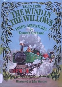
I’m looking at Home Sweet Home and The Further Adventures of Toad. Perhaps it’s the small size of the reproductions, but Toad’s story has no appeal. Home Sweet Home survives the reduction in scale. It is, after all, a cozy story. Moley with his nose up, trying to pick up that tantalizing scent, against a snowy purple sky. Ratty covered in cobwebs but grinning, with bottles of beer under his arms. The diminuitive carolers crowded onto the settee, answering Moley’s eager questions.
edited to replace a gone ebay image with another of the Worsley set.
153JerryMmm
#145 is Dutch, not German. It's available on the national library system here, but not the local one, so it would cost me reservation costs.
When you've exhausted your local resource, lemme know, and I'll see if I can get it.
When you've exhausted your local resource, lemme know, and I'll see if I can get it.
154JerryMmm
This looks fun too: http://www.amazon.com/gp/product/0763665266/
1562wonderY
Seth Lerer makes mention of Three Men in a Boat in his essay, which was a reminder of a very jolly story of messing about in boats, and probably influenced Grahame's writings. Has anyone else read it? There is apparently a film, which my library can't locate for me.
157JerryMmm
There was a series by the BBC about 3 men in a boat. That was fun.
1582wonderY
In passing, I'll point out a Scottish illustrator who will be under-appreciated, because she did the art for some board books.
Maggie Downer
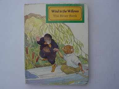


Maggie Downer


159BonnieJune54
I quite like those. Moley has a nice mix of wonder and trepidation. Their personalities and relationships show nicely. I just read The Wind in the Willows for what I think was the first time and thoroughly loved it.
1602wonderY
Yes, I like her a lot too. She seems to have done the whole book back in the 70s or early 80s and they've been re-cycled in British editions of re-tellings over the years. Her images are scarce on-line, but I added a couple of reference pages to her author page. One entry says WITW was her favorite assignment of all time, and it shows.
ps: I didn't mean to make that third picture so big.
ps: I didn't mean to make that third picture so big.
161JerryMmm
you can go back and edit it, put in height="500" inside the img tag, after the url bit. (put a space between url and height).
163fuzzi
Nice illustrations, they don't look "forced", but that they "flowed" from her pen to the page. :)
1652wonderY
For you Willows fanatics, I discovered The Gospel in the Willows
Synopsis
This beautiful book, which may be used as a daily devotional through Lent or any other period of the year, reopens Kenneth Grahame's classic children's novel The Wind in the Willows for a new audience. Combining a daily reading from the literary classic with a gospel passage, a short meditation by Leslie Francis and a prayer, The Gospel in the Willows takes us on a journey through the Christian life, exploring themes such asThe Call, Shaking the Dust, Finding Acceptance, Divided Loyalties, Real Repentance, Facing Temptation, The Lost Son and Accepting Release.The much-loved characters of Mole, Rat and Toad become the perfect allegory for the grand adventure of faith, from our terrifying first steps into and beyond the riverbank, to the challenges, temptations and triumphs that await us as we journey into the world, with Jesus by our side.
1662wonderY
The Kenneth Grahame Society is more active on their FaceBook page nowadays:
https://en-gb.facebook.com/pages/Kenneth-Grahame-Society/320770334685402
They've also been busy publishing a couple of related books
The Wind in the Willows Short Stories, being the best 12 stories entered in a competition sponsored by the Society a few years back.
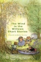
and A Bibliography of the Works of Kenneth Grahame available through Amazon and Lulu. The book contains around 150 colour illustrations of book covers from many of the editions and miscellaneous items of related material.
Both Wishlisted.
167Ealhmund
>156 2wonderY: (re: Three Men in a Boat)
Yes, I read it about three years back. Quite nice, and probably a good match for WITW fans - lazy days, messing about in boats, a bit more incompetence on the part of all parties. Kind of a mix of rat and mole with Bertie Wooster. I think you can see my review here.
Os.
Yes, I read it about three years back. Quite nice, and probably a good match for WITW fans - lazy days, messing about in boats, a bit more incompetence on the part of all parties. Kind of a mix of rat and mole with Bertie Wooster. I think you can see my review here.
Os.
1682wonderY
There. Just cleaned up Jerome K. Jerome's page. Entirely a walk in the park compared to Kenneth Grahame.
169fuzzi
Thank you Ruth. I might tackle Kenneth Grahame. I've been working on Lee Strobel's works page, and that was a mess!
1702wonderY
Fuzzi,
I'm working on it a little bit at a time, as I collect the various adaptations from the library. Unless you have the books in front of you, it's best not to mess with it. For instance, I'm looking at Jane Carruth's abridgements now. She's got six titles, and some of them are the same as chapter titles in the original, but they don't necessarily correspond one to one. Her The River Bank actually covers chapters 1 and 2. I'm seperating accordingly and adding disambiguation notes as I go.
The re-tellings (same story, no original language remaining) I'm shifting main author to the re-teller, with Grahame given credit for "original story," and filling in work-to-work relationships.
There are so many short titles lacking isbns and other data, that it'll never be perfect.
171fuzzi
It never will be perfect, we just try to get it as close as we can.
Since you've got the books, I will leave this cleaning up to your most capable self. :)
Since you've got the books, I will leave this cleaning up to your most capable self. :)
1722wonderY
I finally have all of The Wind in the Willows Library in front of me, adapted by Jane Carruth, with illustrations by Rene Cloke. Cloke seems to have excelled in fairy-tale illustrations, and is easily found on Pinterest in that capacity. Her images here have their charms, obvious just from the covers. The best renditions are of Otter, who wears no clothing, but is sleekly and faithfully drawn, down to the webbed feet. Badger sports a wildly paisley-pattern robe when at home, and his larder is mouth-wateringly depicted. The other animals are cute and cuddly, though Rat looks more like a squirrel than a rat. There are some nice details, like the picnic basket resting on a ledge under water. Her trees are always interested in the action, and there is a satisfying amount of botanic detail represented. Otherwise, the landscapes and interiors are bland. Though two-toned shoes (red & white! for Ratty) are evident, Cloke also allows them to wear boots and Moley has a pair of wooden clogs.
These are nice. I don't know why the books are numbered contrary to the original storyline.
oh, here's her KGS page.
and see Jerry's picture up in #144. Though it doesn't say so, that is probably extensively abridged too, as is claimed on the KGS page.
These are nice. I don't know why the books are numbered contrary to the original storyline.
oh, here's her KGS page.
and see Jerry's picture up in #144. Though it doesn't say so, that is probably extensively abridged too, as is claimed on the KGS page.
174SylviaC
@2wonderY asked me for information about my copy of The Wind in the Willows, with this cover:

It is illustrated by David K. Stone, as mentioned by @Osbaldistone in message #48. Published by Golden Press/Western Publishing in 1968. Here are a few more illustrations:


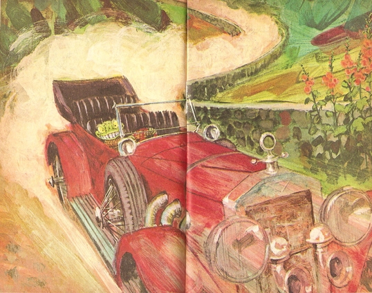

It is illustrated by David K. Stone, as mentioned by @Osbaldistone in message #48. Published by Golden Press/Western Publishing in 1968. Here are a few more illustrations:


176SylviaC
I know! There's no question about Toad's feelings, but I must say the teeth are rather startling!
177.Monkey.
Hahaha, they are, but they totally make that image. I kind of want that book now just for that page! 

178fuzzi
Love those illustrations!
I find it fascinating how many different styles of illustrations are out there...
I find it fascinating how many different styles of illustrations are out there...
179BonnieJune54
Toad looks great in all of them!
1802wonderY
That is the best Wild Toad in the Drivers Seat I've seen!! Laughed out loud.
Thank you so much for sharing that.
Thank you so much for sharing that.
1812wonderY
It occurs to me that it's just as valid to review the illustrator of a sequel, so here I'll talk about Clint Young, who does the illustrations in Return to the Willows by Jacqueline Kelly.

Of course, some of the iconic scenes are absent from this body, but there is still a rowboat long shot and a battle scene, as, of course, the weasels and stoats continue to make trouble.
Young's technique is unusual, as his characters seem to have 3 dimensions, and fur actually appears soft. I researched how it's done, and found it interesting. This page is an interview showing many of the pages in the book, with sketches to finished page. Young is primarily a special effects (FX) artist for the film industry.
That explains why his woods scenes are so nice and mythic.
His character portraits are extremely well done. My favorite is of Humphrey, Toad's nephew, who arrives in a school uniform and wears Harry Potter glasses which magnify his already bulging eyes. I second that with a sweet and soft profile of Moley. I've not seen him drawn more sympathetically. Badger's is especially nice too.
Each chapter heading has a small art piece. Here's one I particularly like -

Though an audio book would dispense with the art, I'm hoping one is made, as Kelly has done such a fine job with narrator's voice. This is a worthy heir and sequel to the classic.
182fuzzi
Wow! Love his work.
I have to admit, I prefer the sketches to the pictures with color. Why? Because you lose some detail when you add the color:

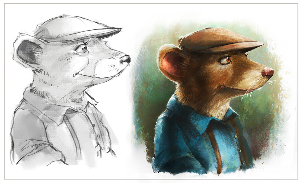
I have to admit, I prefer the sketches to the pictures with color. Why? Because you lose some detail when you add the color:


1842wonderY
I'm looking at a few abridgements now. Don Daily's books seem to cluster in abridgements of the classics published by Courage Books. This one

is heavily, but respectfully, abridged, re-told by G. C. Barrett. There are 9 short chapters, and the story moves along well.
Daily's pictures are enthusiastic, with lots of fun exaggeration and clever details. Toad wears a rosebud of lipstick and his dress has more flounces than you can count. The sun beams with barely contained good wishes. Tree roots and limbs are sturdy and aggressive.
Minor complaint - Badger appear too young and lacks the gravitas and authority which is his.
Moderate complaint - The boys are always arrayed as Edwardian dandies. Mole has been assigned a bowler hat.
Main complaint - This is as ugly a Mole as I've seen. You know, moles are pretty animals, what is so hard?! Daily's Mole looks like a dark snowman with a broken carrot nose. It's hard to ignore, and it spoils the rest of it for me.
1852wonderY
Despite the handsome binding of the Dalmation Press Classics for Children series,

the contents are pretty cheesy. These are corporate rip-offs of famous names. The abridgement is by Clay Stafford and the inside B&W line drawings are by Nick Price. Don't use the cover image to judge, as that is by two other artists altogether - Laura Fernandez and Rick Jacobson.
All twelve chapters are present, but there is little space allowed for a leisurely enjoyment of Grahame's riches.
It's difficult to decide thumbs up or thumbs down, because some scenes are really nicely done - the mice carolers around the supper table, Toad at the barge-woman's washtub. The sketches have vigor.
But
Badger is too cartoon-y
Otter is huge with a chunky snout. No sleekness.
Pan looks jarringly like a pixie-ish 1960's hippy elf.
And poor Moley!! Remember Lulu Delacre's raindrop shape? Repeated here, but more grotesque. Mole has no indication of fur and his exaggerated misshapen snout makes him look like a slug or a worm or some sea creature.
I'll try to scan an example next week.
Hmmm. Nick Price illustrations on Pinterest are much nicer than these. Dalmation Press seems to have ill-used his talents. Makes my judgement against the publisher even more severe.


1872wonderY
The third abridgement this week is a much happier specimen.

Stella Maidment's and illustrator Graham Philpot's efforts are well done!!
There are 6 chapters and an 8 page illustrated introduction to the characters, and they manage to capture the generous spirit of the original.
Full spread color cartoons alternate with smaller black & white silhouettes, rather reminiscent of Arthur Rackham, but with a modern dash of Jan Pieńkowski.
While Mole at first has a blackened snout like a dogs, Philpot eventually corrects that error. One of the nicest features is that the animals limbs are anatomically correct. You will note that Don Daily allowed for this also to a degree, but here it is lovingly done. Mole has paddle-like hands with heavy digger nails. Rat has delicate rodent paws.
Ratty is allowed to wear yachting sweaters, boat shoes and a commodore's hat. He has a pea coat and yellow galoshes for winter wear, and goes about Moley's kitchen in sock feet. Their wet clothes hang on a proper wooden drying rack near the fire.
Inside the snugly attactive gypsy caravan, there is a thunder mug in the corner. Mole and Rat have left their clothes tidily near their respective bunks, while Toad's apparal is left in a messy heap where he undressed. And you can almost hear the hiss of the gas lamp hung from a ceiling hook.
Prepared to dislike it on principle, I'm an enthusiastic fan.
1892wonderY
OH---LOOK!
and
his page at the KGS
and perhaps my favorite is this small portrait that sums up the love:

and
his page at the KGS
and perhaps my favorite is this small portrait that sums up the love:


192BonnieJune54
< 186 I agree that Pan looks way too silly.
194skullduggery
What a delightful thread! Thank you so much 2WonderY for sharing your thoughts and the sample illustrations. I have only just joined this group and now will have to scurry around to find out if there are similar posts on other books that I love!
I have an embarrassingly large number of WITW editions, but I do hope you are able to track down a copy of the Folio Society edition with the Charles Van Sandwyk illustrations. Of all the copies I've read, the CVS one is my favourite (and I do have the Shepard, Moore, Hague, Ingpen and Foreman versions to compare). If you are interested in more information about this edition, I can recommend a couple of great articles, both of which have some of his illustrations as well:
- The Alcuin Society did an interview with CVS about his thoughts in preparing for and illustrating the book: http://www.alcuinsociety.com/amphora/143/Sandwyk.html
- And The Book Blog have done a nice review of the book itself: http://thebookblog.com/review/the-wind-in-the-willows
If you are looking for it second hand, just make sure you don't accidentally pick up the earlier FS publication which was illustrated by James Lynch (easily my least favourite of every edition I've seen).
Let me know if you'd like me to add any illustrations from any of these, or if you are still working your way towards them at a later date!
195fuzzi
Glad you found us, @skullduggery!
Nice article by The Alcuin Society! I especially liked this quote:
“But with a book, you have the choice of working with lovely papers, binding—all the lovely organic tangible parts that are really exciting. ...
Please share/post any illustrations that your heart desires...
Nice article by The Alcuin Society! I especially liked this quote:
“But with a book, you have the choice of working with lovely papers, binding—all the lovely organic tangible parts that are really exciting. ...
Please share/post any illustrations that your heart desires...
196BonnieJune54
>194 skullduggery: What a beautiful book!
1972wonderY
Wow!! Lusting!
Thanks for sharing those links, skullduggery, and so glad you joined us.
Do please start whatever threads you want on your fascinations.
Thanks for sharing those links, skullduggery, and so glad you joined us.
Do please start whatever threads you want on your fascinations.
1982wonderY
Very quick dismissal of shaped board books by Ottenheimer Publishers:
http://www.librarything.com/series/The+Wind+in+the+Willows+Shaped+Board+Books
They lack any value whatsoever. And accordingly, no illustrator or re-teller is even mentioned. (They're hiding their heads in shame.)
We know already that board books can have lovely attributes, as we've looked at John Patience and Maggie Downer's contributions.
These really suck.
How's the loading time for the thread? Shall we stay here or make a continuation? I'd kinda like to keep it all in one place if it's not too cumbersome.
1992wonderY
One more today.
Ladybird Classics has Joan Collins writing adaptations of classics. (possibly not the same Joan Collins you thought of.)

There are nine very short chapters, and a couple have no illustrations.
i wasn't prepared to think very highly of this rendition, but opening to the first page, I found this:

and I melted. Ain't he cute?!
Some of the pictures are nothin' much, but this one

is also excellent. Good detail and vibrant colors.
ETA: I realized I hadn't given the artist credit. It's Cliff Wright and I know him from a book on fantasy illustration, and love his work.
200.Monkey.
Not that it's really an excuse, but given the very young age board books are intended for, I can understand why many that are specially created for the format (rather than merely having some of the illustrations of a version picked out & adapted for use) would be a bit sub-par. At that age a child is really only noticing bright colors and objects, great illustrations will be completely lost on them.
2022wonderY
"great illustrations will be completely lost on them."
Oh, I disagree with you. We shouldn't be working to the lowest denominator, but offering rich examples of illustration so as to allow their eyes to be trained. I've sat with many young toddlers and examined pictures in great detail.
Oh, I disagree with you. We shouldn't be working to the lowest denominator, but offering rich examples of illustration so as to allow their eyes to be trained. I've sat with many young toddlers and examined pictures in great detail.
2032wonderY
I don't want to move to another thread unless it's painful to load this one. I'm not having any troubles yet.
I discovered an ancillary title:

by Charles Scribner's Sons cooperating with Methuen the year copyright ended on the original book.
Ernest Shepard black & white sketches throughout along with snippets of the story.
The recipes are very simple, and are cunningly divided into 5 sections
Food For Staying At Home
Food For Staying In Bed
Food For The Storage Cupboard
Food For Excursions
and the best-
Food For Celebrations.
Many are named plainly, but then there's the ocassional Riverside Sandwich and Toad Hall Trifle.
eta the author link: Arabella Boxer, whose name is famous in England. I'm glad to make her acquaintance.
2042wonderY
I think I want to own the above book. I don't cook much anymore, but these are very pleasant sounding easy meals. It would help to have a British interpreter for a few items. Like "syrup" Is that maple syrup or something else?
I think I want to try Bubble and Squeak, but not Herrings in Oatmeal, which isn't as bad as it sounds - using oatmeal flakes to coat the fish.
Toad-in-a-Bad-Hole made me smile.
I think I want to try Bubble and Squeak, but not Herrings in Oatmeal, which isn't as bad as it sounds - using oatmeal flakes to coat the fish.
Toad-in-a-Bad-Hole made me smile.
205.Monkey.
If I had to guess, I'd say syrup in a British recipe would imply golden syrup, but without any other info, it could probably be any of several things.
206Cynfelyn
In Britain Syrup = Lyle's Golden Syrup (pretty much like "Beanz Meanz Heinz"). There are loads of pictures on Google. My tin of Lyle's describes the contents as "partially inverted refiners syrup".
The http://www.lylesgoldensyrup.com/syrups.php site says "Lyle's Golden Syrup hasn't changed in 127 years and is still made the same way it was all those years ago. The secret to Lyle's is the perfect blend of sugar molecules, which are continually refined throughout the process. This ensures that the highest quality standards are met for consumers to enjoy the sweet glistening syrup that they know and love. For those of you who are scientifically minded ... the sucrose molecule splits in half to give glucose and fructose sugars. This inverted syrup is blended back with the original syrup to give a partially inverted syrup. The secret of Lyle's Golden Syrup is the final blend of sucrose, glucose and fructose, which allows the syrup to be so thick and velvety without crystallizing."
So, an industrial product, but you could probably use maple syrup at a pinch.
208.Monkey.
No, it's not corn syrup, it's sugar syrup. Think molasses, only lighter in color & flavor.
2102wonderY

I found it! The library book had gotten lost under of a stack of my own books which I hadn’t budged for a while. Whew! I was beginning to think I might have to pay the replacement cost. No one else here has too many books at home, eh?
I read the book and I’m still digesting the differences between Horwood and Grahame. It’s a novel rather than a series of tales, and so developed a larger plot and more characters. But I won’t review it here. Patrick Benson’s pen & ink illustrations are mostly just adequate, nothing to write home about. They don’t add much to the experience with a couple of exceptions. Miss Bugle’s parlour is gloriously decorated in the text, and Benson’s sketch is supportive. He also does justice to the portraits confrontation downstairs in the library. The book has occasional glossy color illustrations which I found much superior to the pen & inks. I particularly enjoyed two – Mole helping Toad as scullery maid and then Mole and Toad trying to escape from the coal cellar.
ETA: THE LINK to Benson's KGS page which shows some creditable pen and ink drawings from the original book, which he illustrated in 1994.
211guido47
I thought I would mention an experience I had in my "Usual/Favourite" local book store.
I usually drop in every other day.
Well a Mum and her 12 yo. daughter mentioned they wanted a copy of
"The Wind in the Willows".
Of course I followed the customers, lead by my favourite staff member, to the "chrildens" section.
They had 2 "works". One a $10 paperback. And One a $40 hard back, with illustrations by Robert Ingpen
I really should get some sort of commission for the better (more expensive) work.
Seriously, that is a JOKE
I did like "Ingpen"'s illustrations.
Does anyone know anything about him?
Guido.
213fuzzi
Looking for Robert Ingpen illustrations, I came across this page, with two videos of the carol sung by the field mice:
http://singbookswithemily.wordpress.com/tag/robert-ingpen/
http://singbookswithemily.wordpress.com/tag/robert-ingpen/
214guido47
I did convince the the rubes err. the people , to buy the Hard Back book...
'Cos, which I still believe to be true, is that...
G.
'Cos, which I still believe to be true, is that...
G.
2152wonderY
>213 fuzzi:
Funny you should link to that, as my next review is A Wind in the Willows Christmas illustrated by ...Michael Hague. This version of the chapter Dulce Domum has a very friendly "note on the text" in which the editor clearly points out the paragraphs (5 of them) that have been abridged; probably for clarity as a stand alone publication. These are typical Hague illustrations, more complex than those he did for Susan Hill (see #138 on this thread) but different from his treatment of the entire book. (see #29) I haven't remembered to set them side by side yet, but Rat and Mole seem more juvenile in character here; rounder, cuddlier.
There are several nice features.
Mole End is in the Arts and Crafts style, with beams, woodwork, lighting, furniture, fireplaces all conforming, but with tree roots also winding about walls and ceilings, ocassionally being used architecturally - as a stair rail, for instance.
An interior shot of Mole's courtyard has a lovely set of stairs dug out up to the entrance hole.
The mice are just out-and-out adorably cute - big eyed and expressive. One little guy falls fast asleep at the supper table, noggin on the table and spoon still clutched in hand.
The title page has a holly branch frame in green ink.
ps: interestingly, there are 3 variations of the fireplace throughout the book, two with inglenook, one without.
2162wonderY
Guido, you done the right thing!
Every library, but particularly one being built for a child, should have the classics in hardcover. Paperbacks just don't have the sense of importance needed to allow the love relationship to develop.
Every library, but particularly one being built for a child, should have the classics in hardcover. Paperbacks just don't have the sense of importance needed to allow the love relationship to develop.
2172wonderY
YouTube of The Wayfarers All song from the BBC Cosgrove-Hall TV series:
http://www.youtube.com/watch?v=rn_zNsw98BE
http://www.youtube.com/watch?v=rn_zNsw98BE
2182wonderY
Y'know, after scanning some of Hague's pictures, I'm fairly certain he was paying tribute to Beverley Gooding (see #92) or at least pulling inspiration from her version. His Mole & Rat stand on a windowsill in town, perch on a tree stump in the woods. His Ratty with laden beer bottles reminds me of John Worsley's but the mice all perched in the inglenook seats is Gooding again.
ETA- The other bonus Hague offers on this book is a completely different illustration for the cover which shows the boys singing carols with the young male mice, while the girl mice trim a christmas tree at the other end of the room.
ETA- The other bonus Hague offers on this book is a completely different illustration for the cover which shows the boys singing carols with the young male mice, while the girl mice trim a christmas tree at the other end of the room.
2192wonderY
Yup, His Christmas book is significantly different from his full text illustrations. In the 1980 book, Mole End is typically Olde English hearthside,with a kettle hanging, an oven built in the brick, warming pans and other acoutrements hanging here and there, a grandfather clock, braided rug, slant-top desk, knick-knacks scattered about. Mole and Rat are full size in town, and more adult to the mice children. There is one sleepy-head conked out on the rug. Mole has a "Bless This End" motto above the fireplace.
I like his attention to lighting on the walk through the woods. Everything just glows from moonlight on the snow.
I like his attention to lighting on the walk through the woods. Everything just glows from moonlight on the snow.
2202wonderY
I like this next illustrator so well that I tried to contact the publisher, but apparently they only hold the rights, and their website is not up to date. My inquiry bounced.
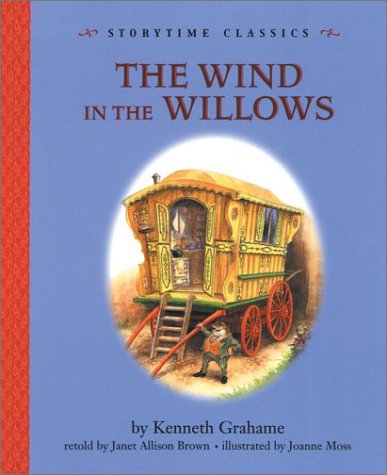
Joanne Moss illustrated the full text in 2000, and some of her art is used for this 2001 very abbreviated Storytime Classic. It’s a good abridgement by Janet Allison Brown, as far as it goes. Six chapters in 14 2-page spreads. The mood and characters are intact, though the story is gone too soon.
Moss is the one who shines here. It’s so obvious that these friends enjoy each other. Badger is especially well done. He is truly the older wiser gentleman. His kitchen and other rooms are full of provision, but neatly so. Everyone gets to wear appropriate casual gentlemans’ wear, even at the dinner at the end. In fact, there are some lovely waistcoats being worn around the table, and it’s the stoats and weasels serving the dinner who have to endure peguin suits. The last two page spreads are especially well placed, as both depict the dining room of Toad Hall – the grand battle and then the celebratory dinner.
Moss does the boat upset from underwater, and it’s interesting because the water surface at the top of the page is not visible except where the boat intersects.
I particularly like her Wild Wood and the scene where Badger is admonishing Toad. Toad is scrunched up on the sofa in stripey sock feet, clutching red cushions against his chest.
Mole and Rat are sweetly done. Mole’s whiskers kind of explode in a happy bloom from his snout.
I cannot find Moss's full text on this side of the pond. If anyone from Europe has a line on it, I'd appreciate.
HERE's her page at KGS.
2212wonderY
I want to return this next one as soon as possible. Ick!
More Adventures with Mr. Toad by Janet Palazzo-Craig.

I'm calling it a waste.
Palazzo-Craig re-tells chapters 6 and 8 here. She re-writes nearly everything, using the story's skeleton and the ocassional phrase to hang it on. Why??? Is this an improvement to toss Grahame's classic phrasing?
Mary Alice Baer's illustrations add nothing to the treasury of riches in our chest.
Nothing new or charming is on offer. Badger is pretty vanilla, lacking particular age and dignity. He is clad in knickers and a matching walking jacket, but is also shod in rubber gardening shoes. Rat also wears knickers and ....golf shoes!!! The only idea that works is that Toad's suit is green.
2222wonderY
I lost steam on the project during that very cold weather. Several books came in from the library interloan, but they were all repeats.
The catalog hasn't been working properly, and kicking it hasn't helped, so I developed a new strategy. 96 print entries on eight pages. I've ordered whatever I didn't recognize on the first two pages. We'll go along from there.
The catalog hasn't been working properly, and kicking it hasn't helped, so I developed a new strategy. 96 print entries on eight pages. I've ordered whatever I didn't recognize on the first two pages. We'll go along from there.
2232wonderY
I finally got a few new versions from the library.
Treasury of Illustrated Classics (2004) is a pedestrian adaptation by Nicole Vittiglio, including all 12 chapters, done on cheap paper, with occasional black and white drawings by Tim Davis.

The drawings don’t add to the story. Rat has angular features, Toad looks like a 2-dimensional cutout, and Moley is again butt-ugly.
Mary Jane Begin (her KGS page) created 36 pieces to illustrate WITW in 2002. There is one full page picture per each chapter, a small chapter beginning detail picture, and a chapter end-piece.

I like the medium and the colors, but the characters are eerily similar to Tim Davis’ interpretation.
DK Young Classics hired Sally Grindley to shorten and present six chapters, with Eric Copeland illustrating.
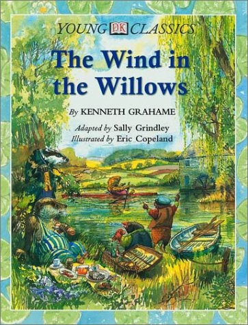
DK adds value with inserted visual footnotes within the text and a three page spread offering photos of the real rivers edge animals. That is surprisingly helpful in appreciating the illustrations.
The characters are portrayed adequately and appropriately; but some of the pictures suffer from a muddiness caused by too many dark watercolor strokes.
Didn't really like any of the three.
2242wonderY
Odd pieces are still drifting in.
I'm looking at Scholastic Junior Classics

adapted by Ellen Miles and "illustrated" by Steven Smallman. I don't appreciate either's efforts. Smallman's black & white sketches are muddy and completely derivative from other artist's ideas. Not one speck of merit. Oh bother! I do like the cover art! But that was done by Hala Wittwer.
2252wonderY
I came across the Classic Starts adaptation at a peddler’s mall

and sat down in a nearby rocker and took some notes. This is probably meant to be used in a classroom, as there are several pages of reflective questions at the back of the book. It’s a small format hardcover and feels good in the hand and uses good quality paper and binding.
Rather than the original 12 chapters, this book has 17 chapters, with several of the originals split in two. The adaptation is authored by Martin Woodside, and some educational expert has a few pages justifying the simplification of language.
Jamel Akib is the illustrator, though I’m uncertain whether the two available covers can be attributed to him. He is limited to 10 pencil sketches, only five of them whole page. Despite that, he does a rather creditable job. Mostly, the pictures are the standards you would expect, no surprises, not much stands out. You’re probably getting tired of me complaining of these artists who over-dress our guys. Here, they wear suits, waistcoats and bow-ties, not too obnoxious. Badger and Mole are spot-on, and Toad is acceptable. Rat’s head is blocky, and more human than rat-like. Eh. The last two sketches are my favorites here. The last one is the crew emerging from the trap door in Toad Hall kitchen. The one before that is a good caricature of the ferret with the club at Toad Hall gate. That one made me smile.
226fuzzi
Bummer...I tried to find the illustrations by Jamel Akib, but came up empty.
You keep right on telling us about other editions of TWITW! I, for one, enjoy them. :)
You keep right on telling us about other editions of TWITW! I, for one, enjoy them. :)
2282wonderY
Searching his name on Pinterest brings up lots of interesting paintings and all of the Classic Starts covers.
http://www.pinterest.com/search/?q=jamel+akib
http://www.pinterest.com/search/?q=jamel+akib
229MrsLee
Sorry, I just read this thread late last night, then I saw this, this morning. An article about Neil Gaiman choosing to be Badger from Wind in the Willows to represent his favorite childhood book.
http://www.tor.com/blogs/2014/03/neil-gaiman-is-a-badger-now
http://www.tor.com/blogs/2014/03/neil-gaiman-is-a-badger-now
230matthewmason
>229 MrsLee: Not sure how I feel about this.
2322wonderY
I’ve been reading a few pages every evening of Beyond the Wild Wood, Grahame’s biography by Peter Green. It’s been hard slogging because Green reads almost everything as tragic. Quite a downer!
He’s right; Grahame was deprived of parents early, was unable to go to college as he desperately wished, and was shoehorned into clerical work which didn’t suit his temperament. And then later, he made a poor choice of spouse and his son’s issues grew in severity till ending in tragedy. HOWEVER, as I know from personal experience, periodic sorrow does not equate to a sad existence. Grahame made a successful career, was able to travel and have large spans of leisure-time, associated with some of the freshest, most fun people of the time, and had more than moderate success as a writer. Not too bad. My sense, despite Green, is that Grahame enjoyed himself more than most people are able.
Not having read Kenneth Grahame's earlier works yet, I’m unable to comment there, but Green does a creditable job of discussing the influences, characters, locales and themes of The Wind in the Willows. Those few chapters were fun to read, and worth reading again. I'll be referring to them here in the next week.
2332wonderY
Researching today, I came upon this celebration of "varmints."
http://www.britannica.com/blogs/2008/01/the-wind-in-the-willows-turns-100/
with a correct drawing of the European Mole:

http://www.britannica.com/blogs/2008/01/the-wind-in-the-willows-turns-100/
with a correct drawing of the European Mole:

2342wonderY
And a Rock Concert based on the book:
http://spaceritual.net/hardin/solo.htm
about a third of the way down the page.
http://spaceritual.net/hardin/solo.htm
about a third of the way down the page.
2362wonderY
musical??
http://www.youtube.com/watch?v=TPkYN79RyWU
Does anybody know if this is from a full production?
Ooooh! It's from a 1996 film titled Mr. Toad's Wild Ride.
Just ordered it.
http://www.youtube.com/watch?v=TPkYN79RyWU
Does anybody know if this is from a full production?
Ooooh! It's from a 1996 film titled Mr. Toad's Wild Ride.
Just ordered it.

2382wonderY
I was excited to find a new illustrator. The back book jacket says: “The best classics deserve to be made contemporary.” I’m not sure what is meant by that, but I was willing to be thrilled. The cover is in rich and deep blues with umbels of flowers glowing silvery with moonlight.

for the full dustjacket: http://saahub.files.wordpress.com/2012/09/wind_willows_cvr_hb_jkt_.jpg
David Roberts’ 2012 edition gives one plenty to examine. He is surely creative and innovative. There are lots of details to appreciate. I really like his interiors and his objects, like the kitchen tools and the picnic spread. He does a nice underwater view of the boat upset and the tunnel trip into Toad Hall.
But (and you knew there was a but) I can’t like his characters. They are all shaped funny, with massive rotund bodies on miniscule legs tapering down to even tinier feet. Poor Badger has a huge bum, wears a lavender! cardigan and a green & white polkydot neck scarf, and lacks gravitas and authority. He appears ready to tippy-toe across the stage. Mole has a purple (plum) face, year-round wears a balaclava and red pointy shoes. Toad has hair, usually parted down the middle, but occasionally it stands straight up. Ratty is my least favorite rendition. His face is squashed flat and his whiskers droop in a fashionable moustache and his front teeth are prominent. Except for his looong skinny tail he looks more like a beaver. Okay, I may like Otter even less. Otter wears a cheesy moustache and a pomaded hairdo with a spit-curl.
Dag-nab! Roberts is creative and complex!
I like the way birds and rabbits and bees and accessories spill over the page. I like the chapter heading graphics, especially chapter 8. I love all the details and detritus – the teapots, sugar tongs, trivets, etc. etc.
I love the Toad Hall interiors with their sometimes outlandish furnishings and stunning art work.
I like the landscapes, especially the way the light falls between the trees along the river. Toad Hall’s exterior is imposing. The moonlit scene on the cover is stunning, but the caravan is awful, just a bloated yellow object.
I don’t like Rat’s parlour, with its soaring art deco walls, but his cabana style porch is genius.
Pan’s chapter is missing, but Pan can still be spotted several times if you’re quick.
The hedgehogs are adorable, with their prickles penetrating their clothes.
I just can’t reconcile to his cavalier treatment of the crew, especially Ratty. Ratty is just all wrong, and seems handicapped expressing his emotions.
Roberts is well worth a long look. There is much to appreciate and debate here.
Here are some of the illustrations om Pinterest: http://www.pinterest.com/search/pins/?q=david%20roberts%20wind%20in%20the%20will...
2392wonderY
This link will probably expire, because it's an ebay offer. But meanwhile you can examine a few of the illustrations in great detail with the zoom-in feature.
This is the first Folio Society edition, illustrated by James Lynch.
eta the link: http://www.ebay.com/itm/Folio-Society-The-Wind-In-The-Willows-Kenneth-Grahame-Ja...
duh
This is the first Folio Society edition, illustrated by James Lynch.
eta the link: http://www.ebay.com/itm/Folio-Society-The-Wind-In-The-Willows-Kenneth-Grahame-Ja...
duh
240JerryMmm
Have you checked out Willows in Winter yet? I don't see it mentioned in this thread.
You do have the artists here already
I just got it from another library here, in English even. I also have a Dutch version with what looks like a Dutch artist illustrating coming. I can now order from the outside my region for nothing, but you've covered most if not all that are available already.
You do have the artists here already
I just got it from another library here, in English even. I also have a Dutch version with what looks like a Dutch artist illustrating coming. I can now order from the outside my region for nothing, but you've covered most if not all that are available already.
2412wonderY
>240 JerryMmm: I decided to read the sequels in the order of storytime, so, I've read The Willows at Christmas but none of the other Horwood's yet.
242JerryMmm
I still have to get the Wind in the Willows in English myself actually .
My problem is it's in English, so it's an adult book, and I can't order it on my kid's (free) card. will have to swipe my wife's next time...
My problem is it's in English, so it's an adult book, and I can't order it on my kid's (free) card. will have to swipe my wife's next time...
2452wonderY
One of the benefits we never even think about is free public libraries here. Thanks for the reminder to be thankful.
2462wonderY
Posting this list here for future reference
http://www.ebay.com/gds/The-Wind-in-the-Willows-Illustrated-Versions-/1000000000...
It's probably mostly a duplication of the information at the Kenneth Grahame Society website, but it collects the data (especially ISBNs) a bit more accessibly.
http://www.ebay.com/gds/The-Wind-in-the-Willows-Illustrated-Versions-/1000000000...
It's probably mostly a duplication of the information at the Kenneth Grahame Society website, but it collects the data (especially ISBNs) a bit more accessibly.
2472wonderY
The sun is shining as brightly as it can, but the wind is keeping it too cold to get outside and dig. Waiting for it to warm up, I'll give my impressions of the film Mr. Toad's Wild Ride.
The jacket blurb is right, this is a classic Disney tale. It's a serious corruption of the original story. The weasels begin by excavating the field containing Mole End, and Mole wanders around trying to get someone - anyone - to take his dilemma seriously. Everyone brushes him off as if the loss of home is not a big deal, if you're a humble mole.
Written by Terry Jones. Directed by Terry Jone. Oh, and starring Terry Jones as Toad. It's really his vehicle. Everyone else is just along for the ride. The weasel musical number was okay, but on the whole, I give it a C- or a D.
I haven't had much exposure to Monty Python.
ETA: Some of the photography was pretty nice. The moment when Mole meets the river was lovely. It almost promised to develop the river as a full character. Also, the actor playing Ratty was so obviously a man who has led a dissipated life. You can't erase those lines, those eyes - and it was out of character for Grahame's gentle Rat.
248SaintSunniva
Just saying hello and I am continuing to enjoy this thread, although I have nothing new to contribute: I have the small-sized, tiny-print Methuen that my mother read to us over fifty years ago, and a slightly newer version in hardcover (with a preface by Charles Scribner), both with Shepherd's illustrations. But after saying I had nothing new...I found Toad of Toad Hall, a Play from Kenneth Grahame's Book in my library. Has it been mentioned yet? It has an illustrated cover of Shepherd's drawings, but no illustrations in the text.
249JerryMmm
I just got a version for Stage 3 (1000 headwords), whatever that actually means, from the library, with an illustrator you haven't mentioned yet.

Oxford Bookworms
Retold by Jennifer Bassett
Illustrated by Jan McCafferty

Oxford Bookworms
Retold by Jennifer Bassett
Illustrated by Jan McCafferty
250JerryMmm
also, through that work, found the website of Jonathan Langley
2512wonderY
I think I've been unsuccessful finding both of those, though Langley has a few pictures on the KGS site:
http://www.kennethgrahamesociety.net/illustrators/jonathanlangley.htm
and nicely, they don't repeat those on Langley's website.
I DO like his Ratty! What a handsome fellow, if a trifle too somber.
Tell us what you think of McCafferty. S/he seems not readily available in my corner of the world.
http://www.kennethgrahamesociety.net/illustrators/jonathanlangley.htm
and nicely, they don't repeat those on Langley's website.
I DO like his Ratty! What a handsome fellow, if a trifle too somber.
Tell us what you think of McCafferty. S/he seems not readily available in my corner of the world.
252MrsLee
I skimmed through this thread a few days ago, can't remember, did anyone mention Mr. Toad's Wild Ride at Disneyland? Not sure who the artists were for the conception, but it has always been one of my favorite rides there. The first time I rode it, and realized that at the end of a child's ride, you are shot into Hell, well, how could you not love that?
2532wonderY
Does it look like the cartoon book that Disney published?
The Adventures of Mr. Toad
A fan has scanned in some or all of the pages:
http://kalikazoo.blogspot.com/2008/10/adventures-of-mr-toad.html
Oh! I like their Mole End.
The Adventures of Mr. Toad
A fan has scanned in some or all of the pages:
http://kalikazoo.blogspot.com/2008/10/adventures-of-mr-toad.html
Oh! I like their Mole End.
254MrsLee
>253 2wonderY: Thank for that link, it says John Hench was the illustrator. I do think the ride was modeled after them, but seriously, the dump into Hell is so burned on my brain I rather forget the rest, I think you "fly" at one point. It has been 20 years since I've been to Disneyland, which is sad.
255JerryMmm
>251 2wonderY: I'm scanning the book, when I'm done I'll send you a link ;)
256guido47
> 249
I do really love that picture. A bit dark & muddy and I do wonder how the rest of the 'Gang' would be shown...
Guido.
I do really love that picture. A bit dark & muddy and I do wonder how the rest of the 'Gang' would be shown...
Guido.


2582wonderY
>257 JerryMmm: *like*
259JerryMmm
question about the text:
In dulce domum, mole goes back to his home, and starts talking about how he planned his home to Ratty. There is a line that I can't parse:
Is this an typo/error or some olde english grammar?
(library book, mammoth classic version 2002, full text, ill. Shepard)
In dulce domum, mole goes back to his home, and starts talking about how he planned his home to Ratty. There is a line that I can't parse:
... and a certain amount of "going without". His spirits quite restored, he must needs go and caress his possessions, and take a lamp and show off their points to his visitor, and ...
Is this an typo/error or some olde english grammar?
(library book, mammoth classic version 2002, full text, ill. Shepard)
2612wonderY
Good day all!
Everybody cozy? Found the snacks table? Good!
This won't take long.

Chick-fil-A had Maggie Downer illustrate some of their other adaptations, but not this one. Too bad! Instead, Isidre Mones was drafted. Her claim to fame is the children’s Tonka truck series.
Isidre’s illustrations are just adequate. Nothing new, nothing exciting. She wastes opportunities. It’s mostly run of the mill. For once though, Ratty is done satisfactorily and comfortably. Again a minor complaint for giving Badger too casual a look and betraying his reclusiveness on the cover picture. Saddle shoes? Badger would never! And inside he is portrayed with a shoelace come undone. Out of character.
The best picture is of the team emerging from the tunnel into the butler’s pantry. Each is wearing one piece of armor and Badger’s is a Kaiser Wilhelm helmet, which suits.
2622wonderY
Cleaning up Grahame's page today and found this series of sequels, corresponding to episodes of the Cosgrove-Hall television series:
http://www.librarything.com/series/The%20WITW%20Stories
http://www.librarything.com/series/The%20WITW%20Stories
263JerryMmm
It took some time to come to me, but then I got a lovely antique book from the library:

It's the Dutch translation of The Wind in the Willows from 1930, it looks unabridged, all chapters (on cursory inspection) are there - I just finished the original KG+AS one), with several illustrations throughout:

I'll scan them all for you. Have to be careful, it's a special library book.

It's the Dutch translation of The Wind in the Willows from 1930, it looks unabridged, all chapters (on cursory inspection) are there - I just finished the original KG+AS one), with several illustrations throughout:

I'll scan them all for you. Have to be careful, it's a special library book.
266JerryMmm
I had to return the Willows in Winter btw, didn't scan anything. Newborn and buying a house got in the way of the important stuff...
2682wonderY
>266 JerryMmm: Yeah right! Congratulations!! We love babies here. I got to cuddle my sister's new grandbabies this past weekend. It's been 4 years since mine was that small.
2702wonderY
I had skipped Graham Percy because I couldn't find a copy of his book, but I stumbled upon him for my next project, looking at The Town Mouse and the Country Mouse. I found his work middle of the pack, okay, but slightly boring, and decided to look at what images I could find.
His page at the Kenneth Grahame Society confirms my impression of his work.
It's bland. There is some nice detail in the background, but his characters are human shaped with animal heads. Not charming at all. His pencilled colors almost put me to sleep.
The Kirkus review agreed with me: "Despite the attractive large format of this pleasant complete edition of the 1908 classic, the illustrations seem bland in comparison with either the lively wit of Ernest Shepard's drawings or Rackham's elegant and endearing detail. Percy does evoke the serenity of the English landscape and cozy interiors in his carefully designed full-color plates, while the characters come affably to life in his detailed drawings. There's a more contemporary flavor here, too, though costume and settings are appropriately Edwardian. Not a primary purchase, but a nice supplementary interpretation."
Just to be complete, here's the best of the three pictures:

271fuzzi
>257 JerryMmm: LIKELIKELIKELIKE!!!!
>263 JerryMmm: LIKELIKELIKELIKELIKELIKELIKELIKE!!!!
>266 JerryMmm: congratulations! What is it, girl or boy? :)
>263 JerryMmm: LIKELIKELIKELIKELIKELIKELIKELIKE!!!!
>266 JerryMmm: congratulations! What is it, girl or boy? :)
272fuzzi
>143 2wonderY: I just noticed the artist on this one is Adrienne Adams. You might recall I was trying to find a good copy of Thumbelina that was illustrated by that artist.
2732wonderY
Holly Hannnon illustrated four chapters retold by Andrea Stacy Leach, each bound separately in large format hardcovers. These two have worked as a team with at least half a dozen Aesop fables as well.
The abbreviated text is acceptable and keeps some of the good stuff.
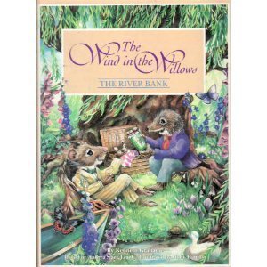


There is charm to the pictures, and Hannon portrays some of the iconic scenes very satisfactorily. She doesn't miss Mole's delight in the spring day. In Home Sweet Home, she shows the progress from abandoned, cold and musty dark house back to warm cheery and hospitable home. Her boat overturning scene is lots of fun, her water treatment is very good

and soggy Mole on the riverbank on the next page may be my favorite.
Here is her KGS page.
The only thing that puts me off is that the characters look too much like little stuffed dolls that you'd buy in a toy store. It diminishes them, taking away from their independent life. Does that make sense?
The abbreviated text is acceptable and keeps some of the good stuff.


There is charm to the pictures, and Hannon portrays some of the iconic scenes very satisfactorily. She doesn't miss Mole's delight in the spring day. In Home Sweet Home, she shows the progress from abandoned, cold and musty dark house back to warm cheery and hospitable home. Her boat overturning scene is lots of fun, her water treatment is very good

and soggy Mole on the riverbank on the next page may be my favorite.
Here is her KGS page.
The only thing that puts me off is that the characters look too much like little stuffed dolls that you'd buy in a toy store. It diminishes them, taking away from their independent life. Does that make sense?
2742wonderY
Somewhere above is a phone app. I don't remember if it's THIS ONE for the iPad. The art work is by Steve Dooley, and I highly approve of his characters!!
2752wonderY
Looking for cover images this morning, I stumbled upon this magazine article of miniaturist, David Hearn's work.
He is quoted "During the 45 years I have made approximately 200 houses (never kept a count of the grand total), but in that total are 5 Ratties Houses, 3 Moles, 2 Badgers."
There are example photos of several of these about mid-way down the page. I especially like how he's done Mole End.
He is quoted "During the 45 years I have made approximately 200 houses (never kept a count of the grand total), but in that total are 5 Ratties Houses, 3 Moles, 2 Badgers."
There are example photos of several of these about mid-way down the page. I especially like how he's done Mole End.
276fuzzi
>273 2wonderY: yes, and no. I don't think the illustrations are "too" cutsey, or that the illustrations diminish them.
Love your thread. I've been really busy and have not updated my own, but I will. :)
Addendum: >275 2wonderY: I love, what craft, art! Too bad the link to houses for sale is not working...not that I could afford one!
Love your thread. I've been really busy and have not updated my own, but I will. :)
Addendum: >275 2wonderY: I love, what craft, art! Too bad the link to houses for sale is not working...not that I could afford one!
2772wonderY
note to self: The David Roberts book lacks chapter 7 and need to be pulled from the main edition and disambigged.
2782wonderY
I came across this photo on Pinterest and had to look very close to determine whether it was photography or illustration. The rest of his set of Water Voles is enchanting as well. They reminded me so much of Paul Bransom's drawings, I just had to share them with you.
279BonnieJune54
>278 2wonderY: I really did LOL.
2802wonderY
Elsewhere on LT their talking about Penguin classics, so I went to do some research and stumbled upon this:
cover by Rachell Sumpter

Has anyone ever seen the book? Embroidered illustrations! How cool!
cover by Rachell Sumpter

Has anyone ever seen the book? Embroidered illustrations! How cool!

2822wonderY
O I like that! I had a time locating Mole in that melee.
Thank you Jerry, for helping me get to see what non-English illustrators have done.
Thank you Jerry, for helping me get to see what non-English illustrators have done.
283JerryMmm
Too bad that's the only Dutch illustrator I can find.
The Royal Library lists the following illustrators for the Dutch translations:
Ernest H. Shepard
Rene Cloke
Michael Hague
Michel Plessix
Inga Moore
David Roberts
With the vast majority being by Shepard.
These 2 don't have illustrators listed (orig. english titles):
Burglary at Toad Hall & Mole's Cousin.
The grand annual show & Buried treasure
English versions in the collection contain illustrations by:
Ernest H. Shepard
Arthur Rackham
Babette Cole (pop-up book)
Carolyn Beresford (Paths to the river bank: the origins of 'The wind in the willows')
2842wonderY
Most of whom we've seen already then. I do mourn not having access to the Babette Cole version, as she is a quirky hilarious story-teller.
285JerryMmm
I'd have to travel to The Hague and request access to the book in person there, they don't lend anymore to preserve the quality of the collection.
but perhaps you can get it from abebooks.


also on etsy
but perhaps you can get it from abebooks.


also on etsy
287JerryMmm
Do you have the Illustrators of The Wind in the Willows btw?
Do you know if it's focus lies on English illustrators or if there are any other translations mentioned?
Do you know if it's focus lies on English illustrators or if there are any other translations mentioned?
288maggie1944
bump
289maggie1944
"Heaven Help Me"
I've been bitten by the collectors bug. I have two authors whose books I'm collecting, and now after having pulled out my old copy of Wind (1964), illustrations by Ernest H Shepard, and read it in bed last night, I've decided I need to hold, admire, and love some more copies of this classic.
I just went to Amazon and purchased couple.
291maggie1944
I really am working blind, despite your lovely thread where I've stopped by once in a while. So, I felt it would be good to have The Illustrators of The Wind in the Willows 1908-2008 by Carolyn Hares-Stryker as a resource, and then I also purchased a "used but new" copy of The Wind in the Willows: Candlewick Illustrated Classic which is illustrated by Inga Moore.
The copy I already have is very tattered and loved, and I'm enjoying dipping my toes into the reading of it
The copy I already have is very tattered and loved, and I'm enjoying dipping my toes into the reading of it
292fuzzi
::waves at Karen::
I started collecting more editions of The Jungle Book after I read this thread.
And now, I'm also eyeing more editions of The Call of the Wild...help! Help!
I started collecting more editions of The Jungle Book after I read this thread.
And now, I'm also eyeing more editions of The Call of the Wild...help! Help!
293maggie1944
This is very dangerous territory for an addictive personality such as mine. ...... (~%
2942wonderY
I nearly forgot to mention that I acquired the 1995 animated film narrated by Vanessa Redgrave at the Trinity Book Sale. I still have a VCR, so I was able to view it and it is lovely.

The beginning and ending sequences are live human actors on the river in a tiny steam boat. The camera loves the scenery, and so do the un-named animation team.
--------
I saw this cover recently, and had to order it from the library:

Don Daily died in 2002. This version just came out this year. There doesn't seem to be much difference in illustrations from the version rated in >184 2wonderY: above. I'd have to do a side by side to be sure.
However, the new text adaptation stinks. And my cover says 'The Classic Edition' which is a downright lie. There are 9 chapters, and some of the best classic dialogue has been chopped. In very tiny print, (appropriate, as I'd be embarassed too!) is the adapter, Elizabeth Encarnacion.
And unfortunately, it's already been swept into the main work. I'll be trying to separate it out, but it won't stick, I'm sure. Many buyers and sellers don't discriminate adequately. When a work is so chopped, it's a shame to put the original author's name as author. Mr. Grahame would be horrified at what is attributed to him nowadays.
295fuzzi
>294 2wonderY: I've seen the adulteration/decapitation of classics, too, like The Jungle Book. Some publishers are so sneaky, they don't admit it is abridged. Grr.


297MarkHomer
2 illustrations. They are from a job lot of art works that I am sorting.
I think these likely to be for 'plates' rather than books but possibly same artist as the book version.
Real pleasure to handle these!
There are more book illustrations - will post names.
I think these likely to be for 'plates' rather than books but possibly same artist as the book version.
Real pleasure to handle these!
There are more book illustrations - will post names.
2982wonderY
New member, Mark, is asking for help identifying the illustrator. I've spent some time brushing up on my posts above and can't find who it might be, though they are maddeningly familiar looking.
I thought Eric Kincaid at first, and then Joanne Moss. But neither is just right.
Help!
I wonder if they are different illustrators. Look at the variations in Moley's costume and his hands, and most especially, the size of their feet.
I thought Eric Kincaid at first, and then Joanne Moss. But neither is just right.
Help!
I wonder if they are different illustrators. Look at the variations in Moley's costume and his hands, and most especially, the size of their feet.
299JerryMmm
Heh, I just finished going through the thread cause they looked familiar to me too. Then I started drifting off thinking it would be so nice to have a webpage with only mole, and a page with only ratty, and one with certain signature scenes...
The technique, particularly of the bottom one, looks very recent.
The technique, particularly of the bottom one, looks very recent.
300MarkHomer
They would have originated from the 'artist' agency. It is where art work is presented for use in books/ceramics/posters ect... They will be professional and 'worthy' of the status of producing the work for purpose. Thanks for assistance.
301MarkHomer
Names I have come across in this 'batch': Dick Twinney, Linda Worral, Norman Rockwell, John Finnie, R.D Gillion.
3032wonderY
> 299 Jerry, I actually did begin that sort of collection but it must be stored on my laptop. I'll check tonight.
3042wonderY
>296 MarkHomer: I was right! These are simplifications of the original Eric Kincaid illustrations.


I have never seen the actual book, I've had to collect Kincaid's images from Pinterest.


I have never seen the actual book, I've had to collect Kincaid's images from Pinterest.
305fuzzi
Good job, detectives!
And welcome @MarkHomer. :)
Could these have been simplified to use in animation, perhaps?
And welcome @MarkHomer. :)
Could these have been simplified to use in animation, perhaps?
306guido47
After more than a year, I finally received a crowd sourced illustration of TWITW
book
If interested I will post a few illustrations from the book. Which at the moment I seem to be the
only owner on LT.
book
If interested I will post a few illustrations from the book. Which at the moment I seem to be the
only owner on LT.
3072wonderY
Hey cool guido! And she's Australian. I'm adding links to Krista Brennan's page. One of them shows several of the illustrations. Her portrait of Pan is quite good. Love that sky.
3102wonderY
Do y'all think the illustrations stand so far from what has been done in the past that it warranted a new book title?
311guido47
>310 2wonderY: NO. But perhaps there were some legal ramifications, although she does cite Graham as the copyright holder of the text.
So NO again
ETA. Perhaps she had read this most marvellous tread, realized how many different illustrators of TWITW there have been and wanted to stand out from that mob :-)
So NO again
ETA. Perhaps she had read this most marvellous tread, realized how many different illustrators of TWITW there have been and wanted to stand out from that mob :-)
This topic was continued by the illustrators of The Wind in the Willows - part 2.

