1wcarter
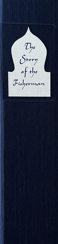
The Story of the Fisherman - FOOLSCAP PRESS 2015
A PICTORIAL REVIEW
LIMITED EDITION
No. 57 of 101 copies
Signed by the artist Brian Bowes.
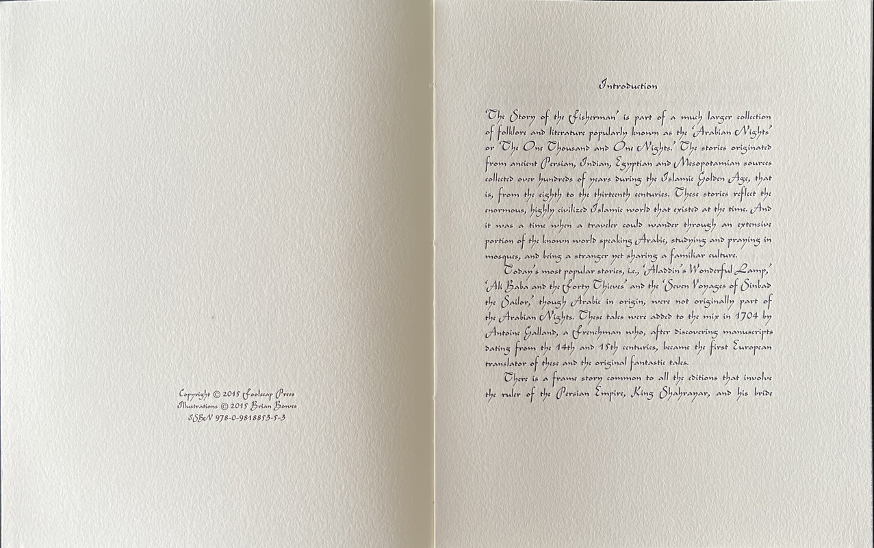
Translated by Edward William Lane.
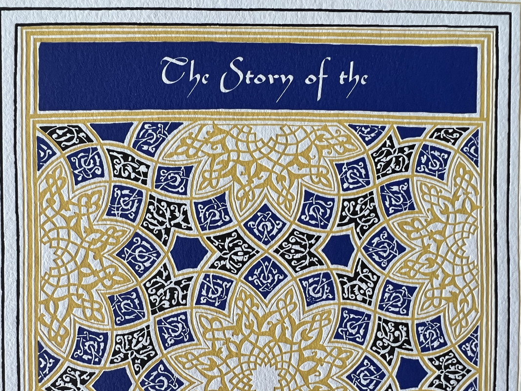
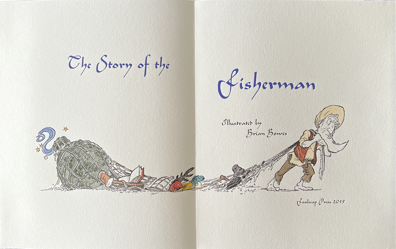
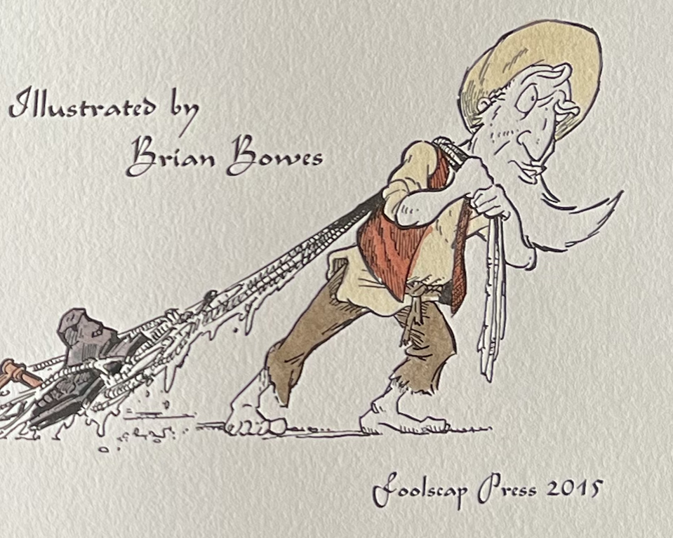
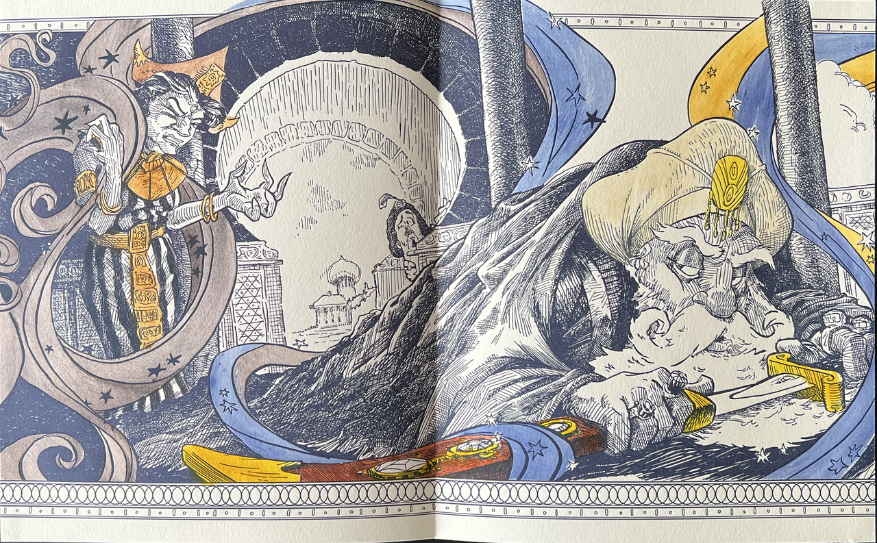
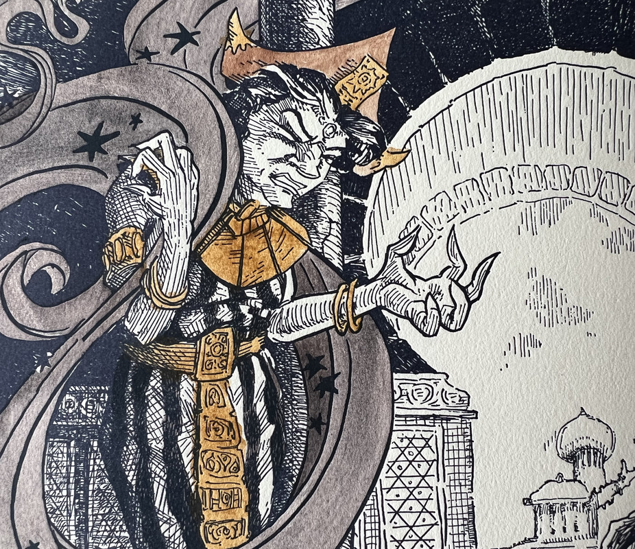
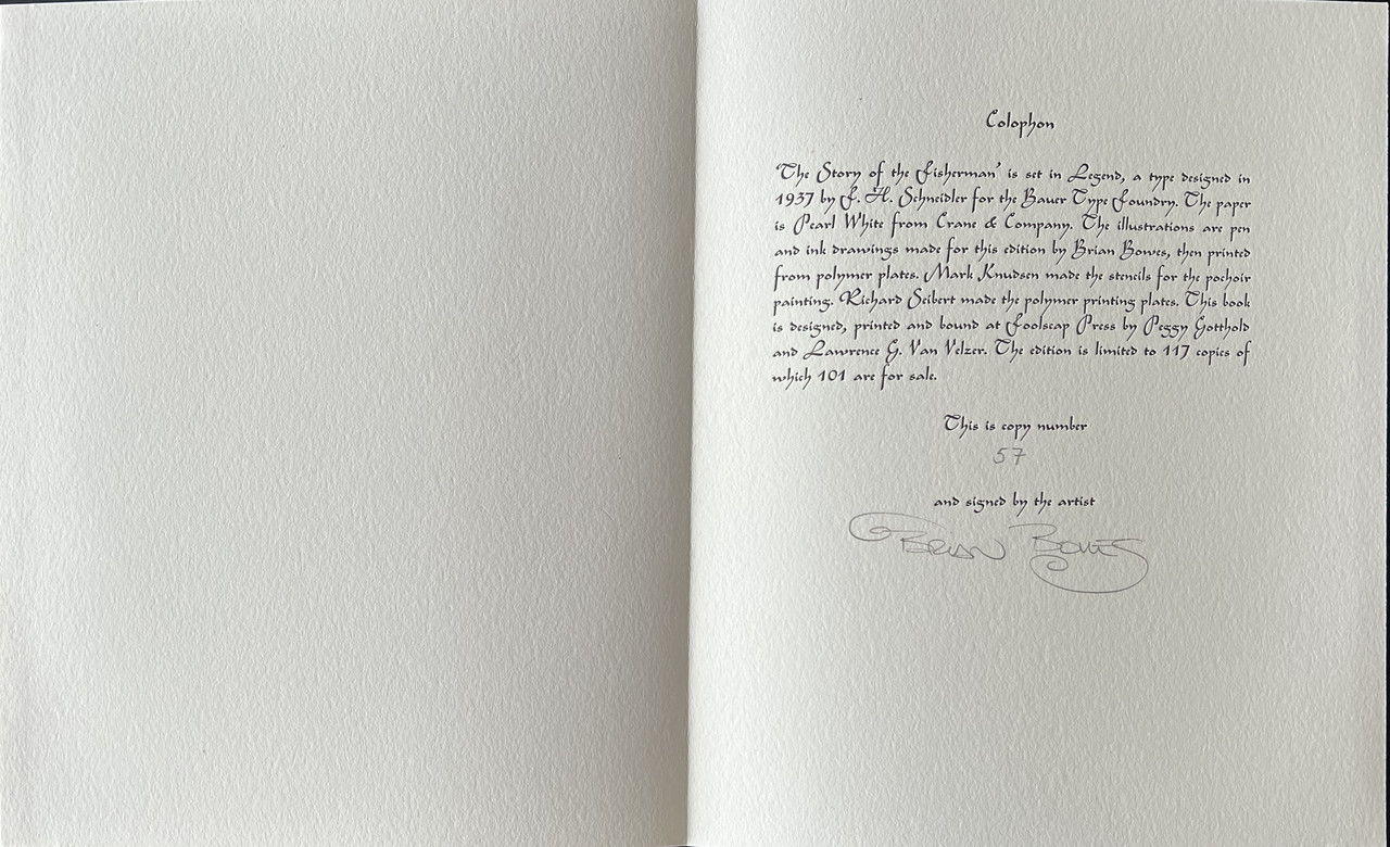
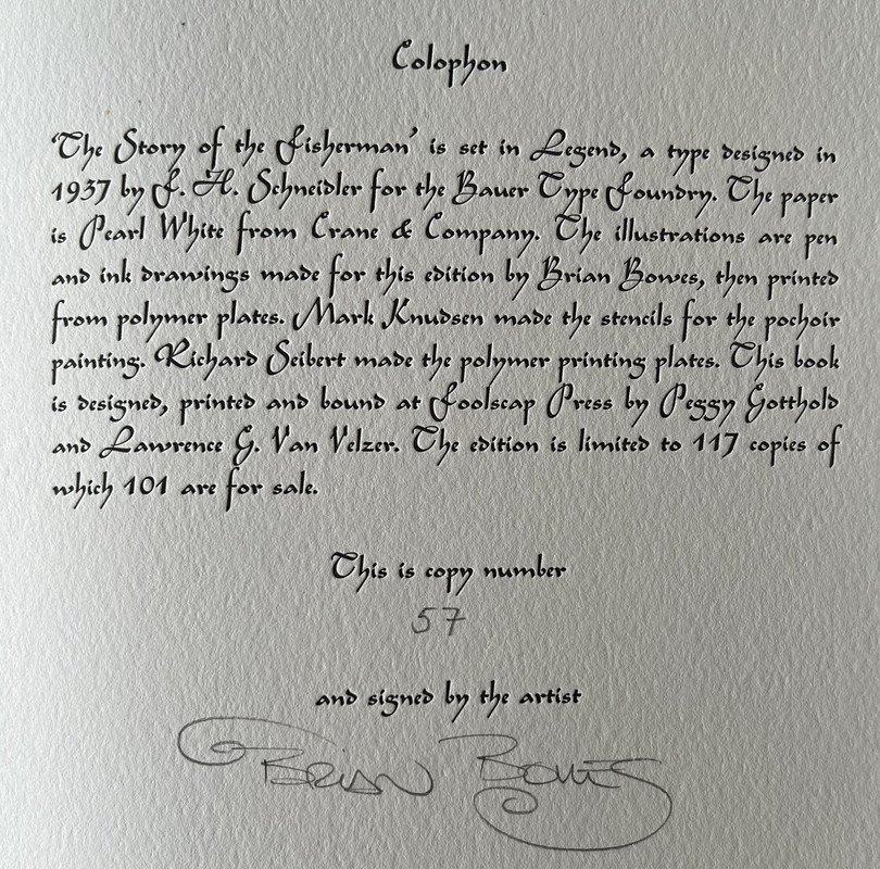
18 illustrations including the illustrated title page hand colored by the “pochoir” method
Printed on Lettra from Crane & Co.
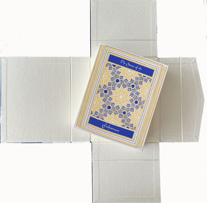
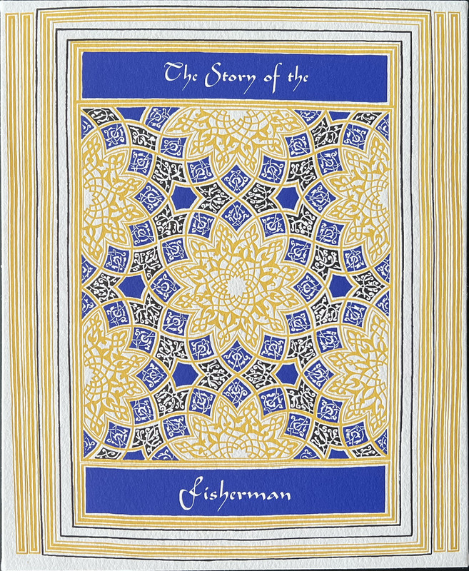
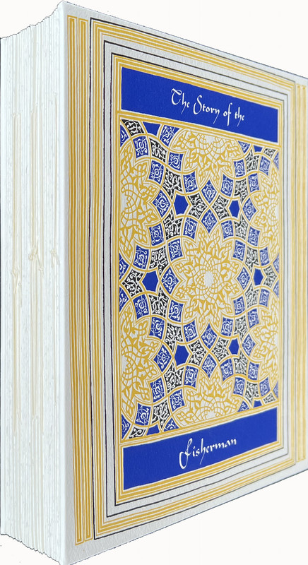
Hand bound in cream cloth decorated in blue and gold.
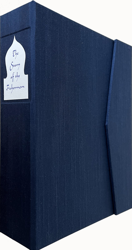
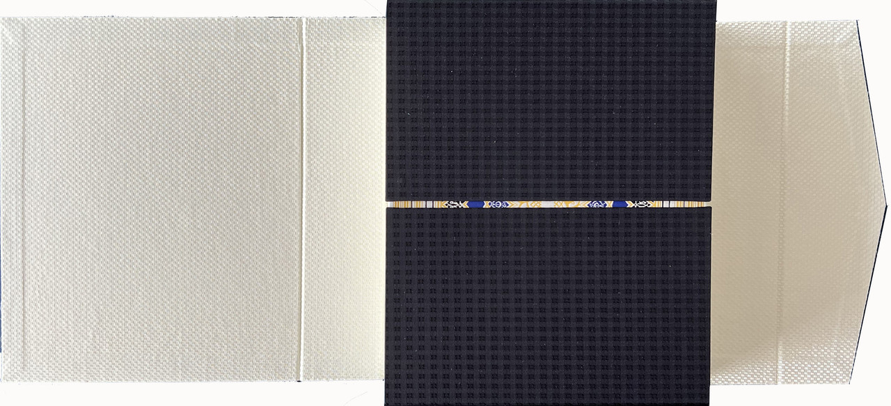
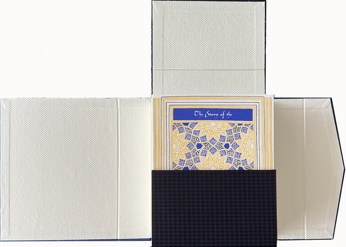
Housed in a dark blue cloth wrap-around chemise lined with gold patterned paper and sealed with a magnetic clasp.
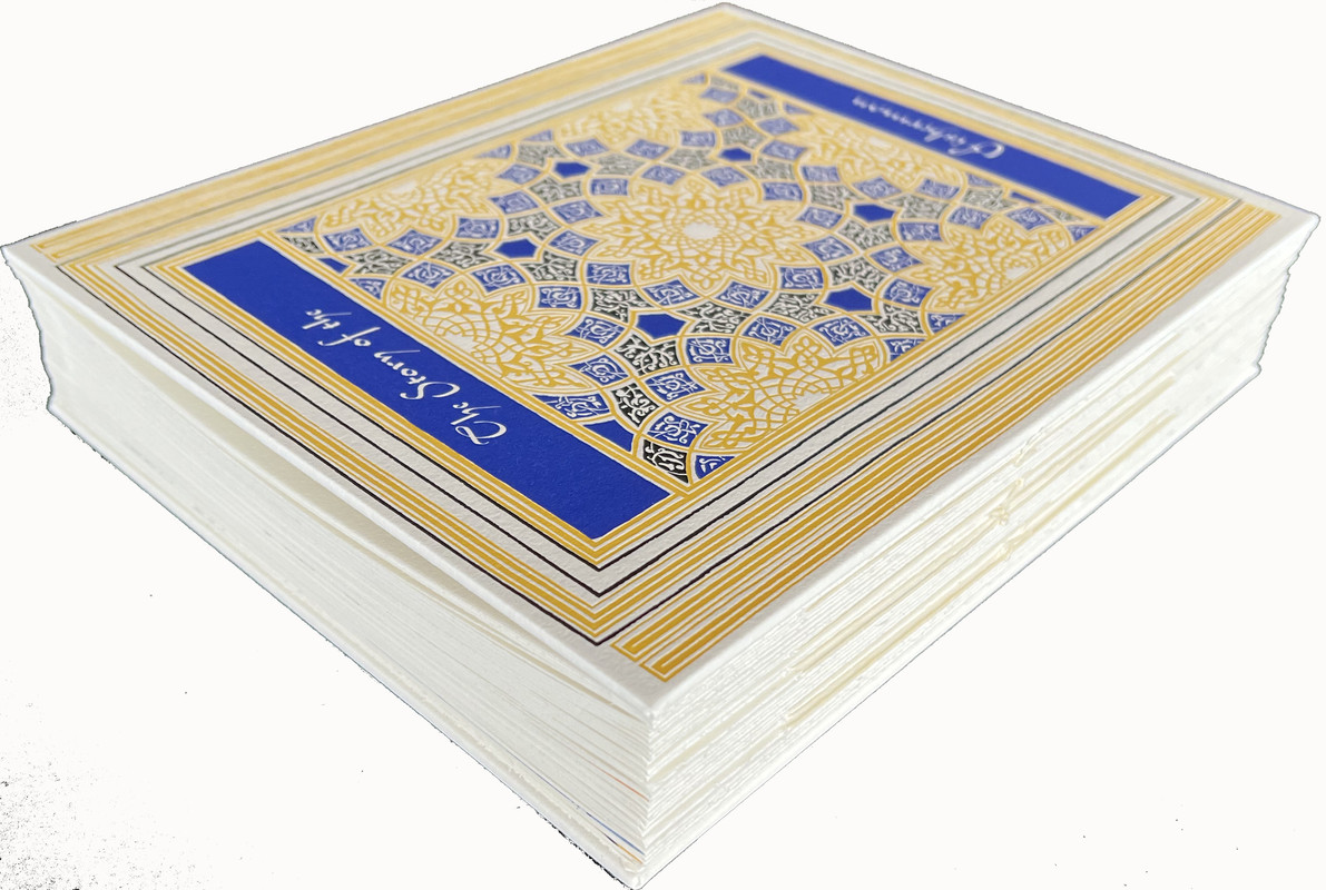
80 concertina pages.
25x21cm.
US$775
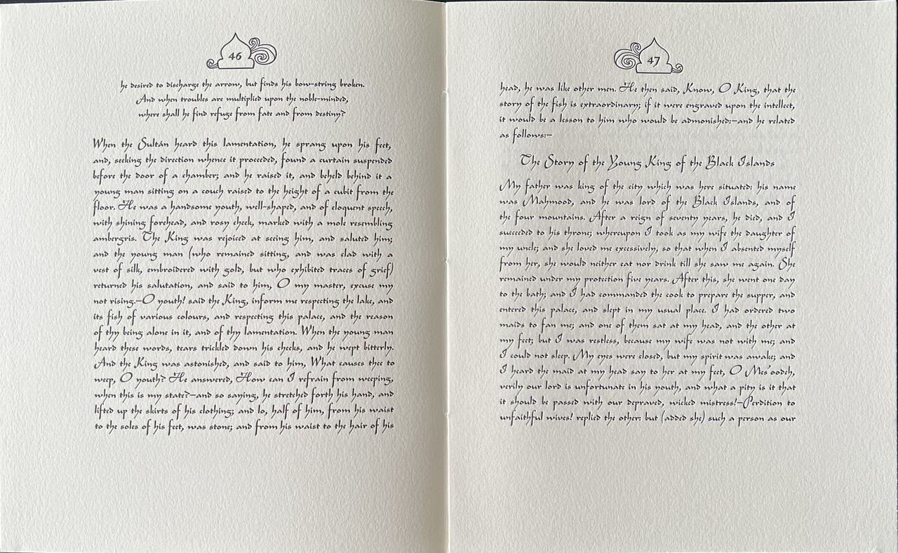
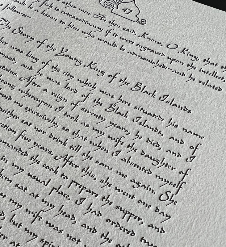
A story taken from the Arabian Nights The One Thousand and One Nights.
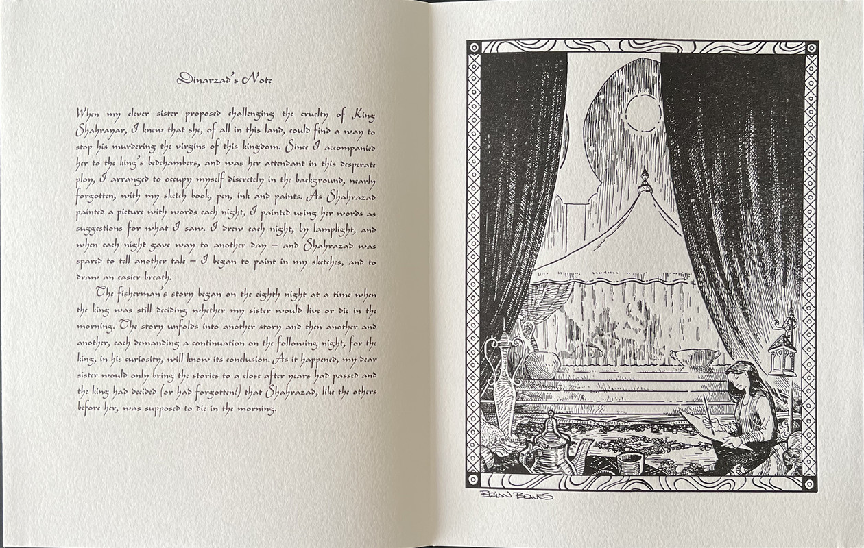
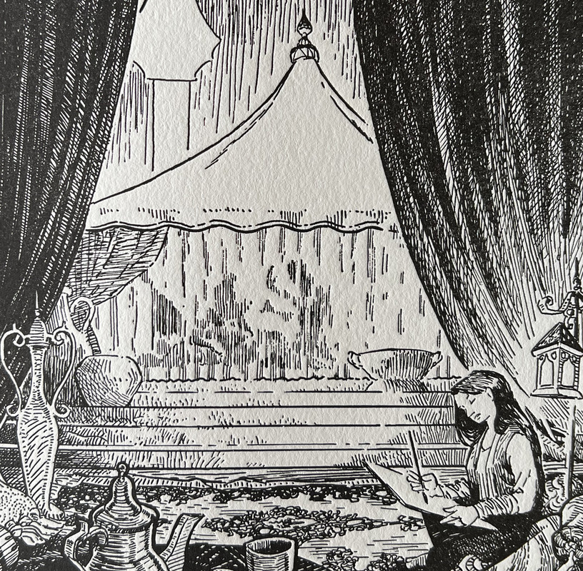
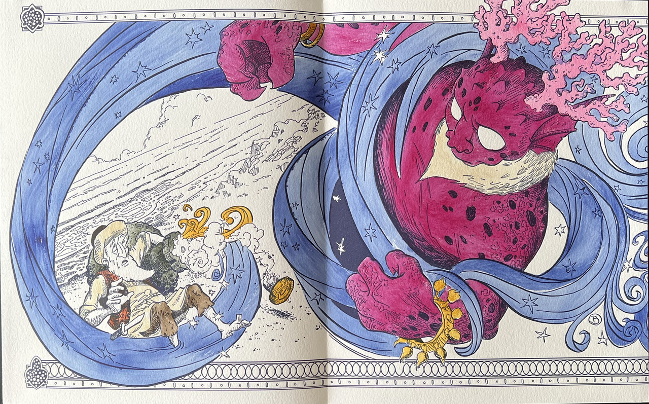
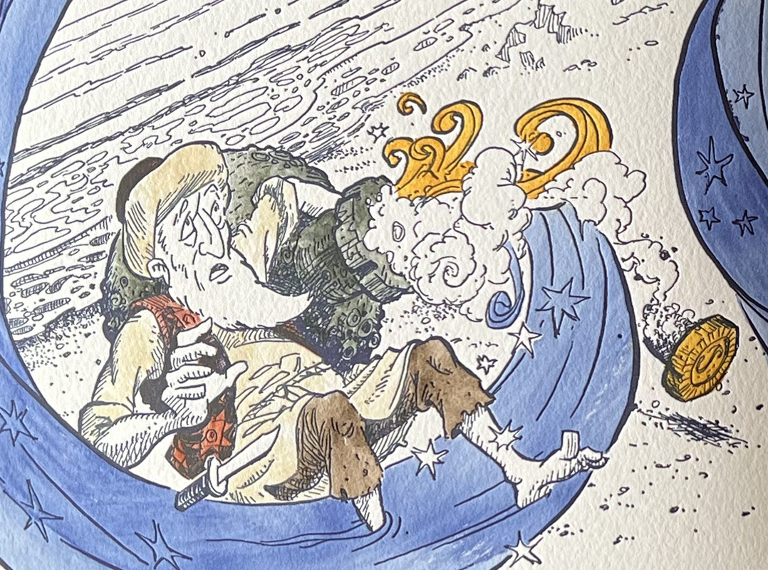
The accordion nature of the binding allows the book to be opened to display the story in images and the visual connections between the linked illustrations. The front and back covers are based on an illuminated page from a 1313 Koran.
An index of the other illustrated reviews in the this series can be viewed here.
A PICTORIAL REVIEW
LIMITED EDITION
No. 57 of 101 copies
Signed by the artist Brian Bowes.
Translated by Edward William Lane.
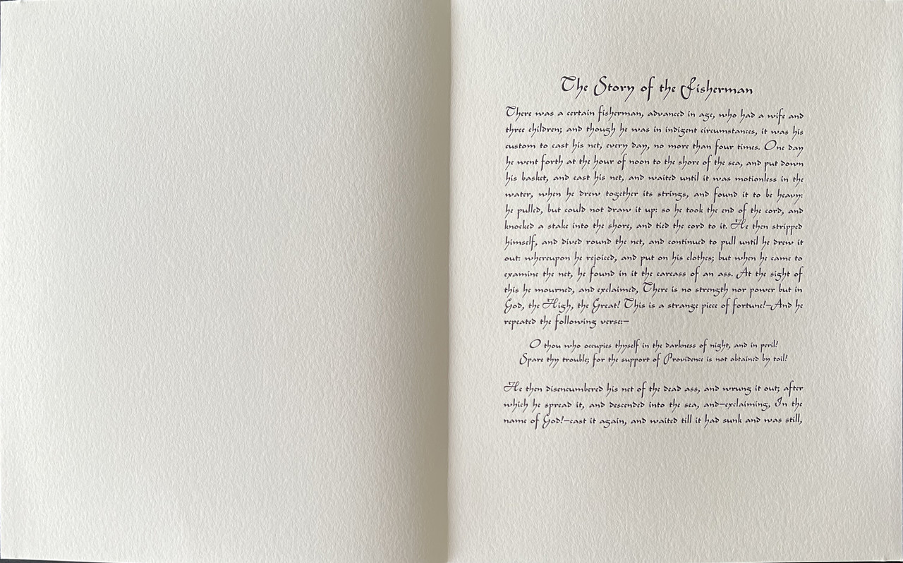
18 illustrations including the illustrated title page hand colored by the “pochoir” method
Printed on Lettra from Crane & Co.
Hand bound in cream cloth decorated in blue and gold.
Housed in a dark blue cloth wrap-around chemise lined with gold patterned paper and sealed with a magnetic clasp.
80 concertina pages.
25x21cm.
US$775
A story taken from the Arabian Nights The One Thousand and One Nights.
The accordion nature of the binding allows the book to be opened to display the story in images and the visual connections between the linked illustrations. The front and back covers are based on an illuminated page from a 1313 Koran.


An index of the other illustrated reviews in the this series can be viewed here.
3dlphcoracl
>1 wcarter:
Beautiful photos.
One of the finest and most original private press books of the past decade. The Foolscap Press is at the top of their game.
Quick reminder: Foolscap Press is currently working on a novel from Andrei Makine (a Russian expatriate living in Paris writing in the French language) entitled 'Brief Loves That Live Forever' with illustrations by Vladimir Zimakov, which they hope to publish toward the end of 2022.
6SebRinelli
>4 filox: I don‘t like either. Incredible craftsmanship displayed though.
Thanks for the pictutes, >1 wcarter:
Thanks for the pictutes, >1 wcarter:
8astropi
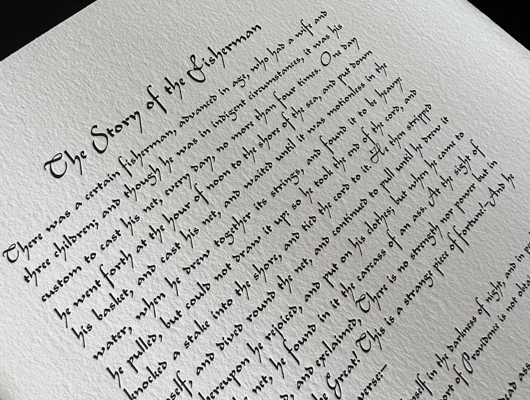
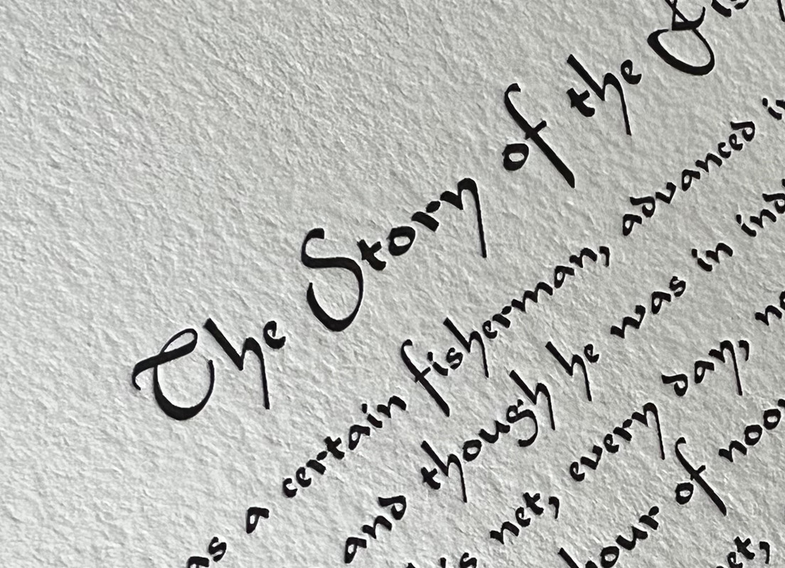
I LOVE the typeface! Most of the typefaces I see in fine press books are as exciting and original as vanilla ice cream topped with vanilla pieces and then blended with a bit of vanilla syrup. Here, we finally have something exciting and different! A gorgeous work, thanks for sharing.
Anyone know the price for their upcoming work?
Anyone know the price for their upcoming work?
9ultrarightist
>8 astropi: I agree. To me, it is a Latin font redolent of Arabic script.
10jveezer
I also love the typeface's resemblance to Arabic script. Perfect choice. Wish the NYU press would use Legend for some of their books in their Library of Arabic Literature series. I pay extra for the hardbacks over the paperbacks because they are printed en face with the Arabic. This type would make a beautiful spread.
Hoping I can afford the Makine as my first Foolscap book but I might have to continue living vicariously through this forum.
Hoping I can afford the Makine as my first Foolscap book but I might have to continue living vicariously through this forum.
11LBShoreBook
>4 filox: Agreed. The art is much better than I anticipated based on the few glimpses we can see on the website but the typeface is not to my taste. Definitely has me keeping an eye on future publications.
12NathanOv
>8 astropi: The typeface is stunning and beautifully printed, though definitely a little difficult to read but it fits the overall affect of the book very well. However, I did like how Mandeville used a very attractive type-face that was still quite readable.
On the upcoming publication price, a note I got from Larry & Peggy around the middle of January read: "Brief Loves That Live Forever will also be coming out in the first half of this year, we are working on copies now in the bindery. And we also are working on the prospectus where we will have to finally settle on the price."
This one has been in the works I believe since 2019, and I've gotten the impression it will be on the upper end of the Foolscap price range.
13abysswalker
>4 filox: >6 SebRinelli: regarding the typeface choice here, I think whether one likes this or not reflects a more general appreciation of "pretty" typography versus prioritization of book as tool of communication (which can also be highly aestheticized without compromising function, and in fact probably should be aestheticized to optimize function).
I also don't like this particular typography, though every other element is gorgeous. I can appreciate any of the pages as a visual expression, but I don't think I would want to read the story in this presentation.
I suspect that attitudes toward uncial script, and prioritizing the "allusive" school of book design above other aspects ("redolent of Arabic script" as >9 ultrarightist: writes is a compliment about the allusive qualities) might on average track appreciation of the typography here. (Tangent: Bruce Rogers initially made his name as an allusive designer, but he is such a master of the approach that I don't think I've yet come across an example of his work where the allusive design elements are in tension with the functional design elements.)
There's a good Mies van der Rohe quote about letting materials express their own purity rather than trying to get them to pretend to be something they are not (which I don't have the exact words for at the moment); when allusive design elements get in the way for me, I think it is often a similar sort of failing. English typography cannot be Arabic script, so it reads as pretense, ungenuine (the literal meaning of pretentious, divorced of all the status connotations that have accrued to that word). Perhaps it would be more successful as a display typeface, which works more to divide, punctuate, and categorize. (As someone who has studied Chinese characters in several East Asian languages, I also find latin typefaces that try to ape hanzi/kanji strokes to almost always be at least kitschy if not profoundly ugly.)
14SebRinelli
>13 abysswalker: I agree with every single word you wrote in your last paragraph. Your assessment is spot on in my opinion.
15edgeworn
This is a favourite book in our collection, and I share the sentiments of >8 astropi: about the typeface. For me it is well chosen to complement the exuberant design of the book and, at least in my personal experience, does not in any way make the book difficult to read.
Chacun à son goût.
Chacun à son goût.
16Dr.Fiddy
>1 wcarter: Again, thanks to your excellently illustrated review, a copy of The Story of the Fisherman (as well as a copy of Brief Loves That Live Forever) joined my small collection of Foolscap Press books yesterday. I don't think that I can say anything that hasn't already been said about Foolscap and their books; I'm just amazed 😊
Edited to add: Having read a bit in it, I really like the typeface. It's actually quite easy to read. Almost like someone's beautiful handwriting. I think it fits perfectly for this book.
Edited to add: Having read a bit in it, I really like the typeface. It's actually quite easy to read. Almost like someone's beautiful handwriting. I think it fits perfectly for this book.
17LT79-1
What is the paper thickness of this concertina book and how did Foolscap connect all the separate pieces together into one long chain without it adding bulk to the connected corner parts? From a construction perspective it interests me. Thanks
And just to note, the comments criticising the typeface used above totally miss the mark. This is a display piece. It needed something bold. A stripped down typeface combined with those images on a display piece wouldn't work for me.
And just to note, the comments criticising the typeface used above totally miss the mark. This is a display piece. It needed something bold. A stripped down typeface combined with those images on a display piece wouldn't work for me.
18LT79-1
>17 LT79-1: I think I've figured it out. I thought the threads were for the connection points but they are just for the text blocks which punctuate certain points on the chain. They must have used a lip for the other sections. Sometimes these constructions look more complicated than the actually are. Still it's impressive to plan it all out and get all the sequencing correct.
19NathanOv
>18 LT79-1: you are correct - there are simply some signatures sewn into the modified accordion structure, including the introduction. No sewing is used in the joining of the accordion itself.
The joints in the accordion are quite simple but elegant - no overlap, just a paper hinge pasted over the back of both pages.
See imgur gallery with the back and front of one of the hinges, as well as one of the seen in signatures: https://imgur.com/a/odqnkfU
The joints in the accordion are quite simple but elegant - no overlap, just a paper hinge pasted over the back of both pages.
See imgur gallery with the back and front of one of the hinges, as well as one of the seen in signatures: https://imgur.com/a/odqnkfU
20LBShoreBook
"And just to note, the comments criticising the typeface used above totally miss the mark. This is a display piece. It needed something bold. A stripped down typeface combined with those images on a display piece wouldn't work for me."
Nope. The typeface sucks.
Nope. The typeface sucks.
21NathanOv
>20 LBShoreBook: I disagree on it being a "display piece," but the typeface remains very readable while being styled to fit the overall design of the work.
There are plenty of options available for reading the book in more standard fonts, but this one sets a very particular mood without asking too much extra of the reader.
There are plenty of options available for reading the book in more standard fonts, but this one sets a very particular mood without asking too much extra of the reader.
22DMulvee
>21 NathanOv: I agree
23LT79-1
>20 LBShoreBook: what typeface would you suggest to use on a joyful and exuberant book like this? A very elegant typeface which would be totally overshadowed by the artwork when folded out? This is something kids will adore too. It's not a typeface I would be typically drawn to for sure but it suits this piece. I think it's important to give a counterpoint to the criticisms above.
>19 NathanOv: thanks for clarifying about the construction.
>19 NathanOv: thanks for clarifying about the construction.
24duncjl
To my eye the typeface resembles a slightly less cursive Granjon Civilite which is perfect for this nature of text.
But that is a digression, as what I really want to express is my pleasure (and sadly surprise) at the mention above of Andrei Makine, who I consider to be the greatest living writer.
But that is a digression, as what I really want to express is my pleasure (and sadly surprise) at the mention above of Andrei Makine, who I consider to be the greatest living writer.
25Transfixed
>24 duncjl: May I ask if you read Makine in French or in English translation? Which of his works would you recommend?
26duncjl
>25 Transfixed: I read him in English but as he's not stylistically innovative, just imaginatively profound, I don't think much is lost in translation.
If he is entirely new to you I suggest starting with A Life's Music: it is one of his finest works, but short so you will quickly get a feel if he's a writer for you.
Then try Le Testament Francais (yes, that is the title in UK, even in translation) which is the most acclaimed work. My Armenian Friend is much more recent and shows his powers are undiminished. The Earth and Sky of Jacques Dorme and The Crime of Olga Arbyelina are also particular favourites, but I haven't been disapointed by anything, even the non-fiction.
I don't tend to be a big re-reader so one of my regrets (when shelf space for press books was at a premium) was deciding to dispose of my almost complete run of Makine's first editions in English, along with a similarly complete run of my other favourite, W. G. Sebald.
27kdweber
>25 Transfixed: The Foolscap Press produced an impressive edition of Brief Loves That Live Forever.
28Transfixed
>27 kdweber: Thanks! I took a look at it, but the illustrations don't fully charm me. Not that I don't like Brezhnev's face…
29LT79-1
"the illustrations don't fully charm me" is a much better way of putting things than the "nope, it sucks" troll above.
30Transfixed
>29 LT79-1: I liked much more his illustrations for The Wind in the Willows.
31LT79-1
>30 Transfixed: yes some of his illustrations I like and others not so much. The Wind in the Willows puts a little bit of a dark spin on the illustrations I'm used to for that book.
32booksforreading
His illustrations in Brief Loves That Live Forever are the only ones that I like from this artist.
33Transfixed
>32 booksforreading: I consider them good, they just don't appeal so much to me personally. I appreciate the theme of that book, though. And it surely merits the fine edition.

