1astropi
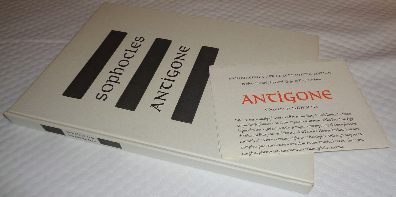
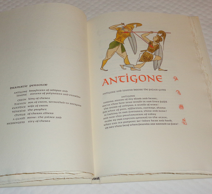
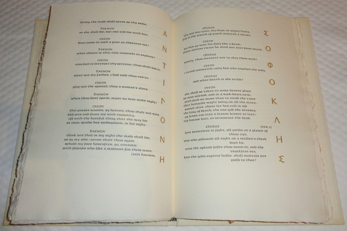
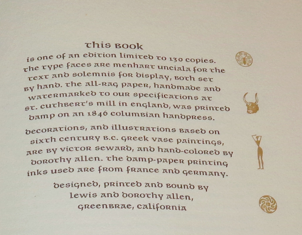
Published in 1978 at a cost of $120 (over $500 today), this 44th publication like all Allen Press books was produced entirely by hand! The all-rag paper is hand made in England, and the translator was (apparently) also hand made in England from Cambridge University - The result is the finest most beautiful edition of Antigone ever produced.
2yolana
Oh my, my favorite Greek play,and now my grabby hands have started to do their thing. I do wonder what effect the translator was going for, or is it just a very old translation they trotted out.
3astropi
>2 yolana: the translator is this guy, and it's from circa 1912
https://www.cambridge.org/core/journals/classical-review/article/abs/sophocles-w...
It's definitely a bit more archaic than a modern translation, and I'm happy with that! After all, Antigone is NOT a recent publication, and I think the language chosen is most beautiful and apropos.
I will say this, since Antigone is your favorite Greek play, you absolutely need to find this. I think you can find copies in the $300-400 range, and frankly, it's a steal. If I didn't already own this I would be scouring for a copy before they're eventually snatched up! This is one of my favorite Allen Press productions and one of their best in my opinion.
https://www.cambridge.org/core/journals/classical-review/article/abs/sophocles-w...
It's definitely a bit more archaic than a modern translation, and I'm happy with that! After all, Antigone is NOT a recent publication, and I think the language chosen is most beautiful and apropos.
I will say this, since Antigone is your favorite Greek play, you absolutely need to find this. I think you can find copies in the $300-400 range, and frankly, it's a steal. If I didn't already own this I would be scouring for a copy before they're eventually snatched up! This is one of my favorite Allen Press productions and one of their best in my opinion.
4Shadekeep
A beautiful book indeed, and the translation style is very appealing. Thanks for sharing!
6astropi
>5 kermaier: yes, the Uncial type is absolutely stunning, have to agree! Far more exciting and appropriate than the run-of-the-mill everyday type we see too often in fine press (yawn). I only wish other presses would actually bother doing something a bit more original and creative.
7yolana
>3 astropi: I’m going to track one down, I have several different translations and this strikes me as a must have.
8Shadekeep
>6 astropi: Agreed, it nice to see bold choices in typeface, especially when they work as well as the one here.
Was rather surprised to find multiple copies of this for sale, and quite reasonably priced. I would have thought from a small run of that vintage that I'd be lucky to locate even one. Now it's a question of whether or not to pry open the purse-strings, since I have a few other books vying for the same funds.
Was rather surprised to find multiple copies of this for sale, and quite reasonably priced. I would have thought from a small run of that vintage that I'd be lucky to locate even one. Now it's a question of whether or not to pry open the purse-strings, since I have a few other books vying for the same funds.
9astropi
>8 Shadekeep: I know. Every now and then I'm quite surprised at what's available on the second-hand market, and for fabulous prices too! Who knows where these come from - estate sales perhaps? I'm biased, but I don't think you're likely to find a book that's more worth your funds.
10filox
>5 kermaier: Yeah, really don't get this fascination with typefaces that one cannot easily read. I guess if one never wants to read their books, then I understand it...
11Shadekeep
>9 astropi: It's definitely calling to me, as I have a strong love of classical Greek plays. One of the available editions even has the prospectus laid in. Another mentions an acetate jacket, I'm guessing this was added later by the collector and was not part of the original release. Is that correct?
12astropi
>11 Shadekeep: I believe it originally came with an acetate jacket. My recollection is that many (most?) of their works included mylar dust jackets.
13ultrarightist
>12 astropi: I believe that is correct.
14Shadekeep
>12 astropi: Oh, cool, thanks again! That's probably the edition I'll get. While having the prospectus is nice, I don't see kicking in another $150 just for that in this case. That money will just about pay for my Suntup Blackwater. ^_^
15kermaier
>10 filox:
I understand typeface selection as part of the Art of the Book — and few would choose the Allen Press edition as their primary reading copy of Antigone. I’m ok with a variety of semi-readable fonts, such as Bibel Gotische, but Uncial fonts have usually been a bridge too far for me.
I understand typeface selection as part of the Art of the Book — and few would choose the Allen Press edition as their primary reading copy of Antigone. I’m ok with a variety of semi-readable fonts, such as Bibel Gotische, but Uncial fonts have usually been a bridge too far for me.
16astropi
>14 Shadekeep: happy to enable :)
Let us know when you get it!
In terms of Uncial, again, I love it. I don't find it hard to read, rather I find it a pleasure and the style is evocative of the Greek alphabet. To each their own of course.
Let us know when you get it!
In terms of Uncial, again, I love it. I don't find it hard to read, rather I find it a pleasure and the style is evocative of the Greek alphabet. To each their own of course.
17ultrarightist
>16 astropi: Same wrt Uncial fonts.
18Shadekeep
>16 astropi: I enjoy Uncial as well. I'm probably biased a bit because of my parallel passion for illuminated manuscripts.
19Shadekeep
Ah, I think someone beat me to the Antigone edition I was looking at. Possibly someone from here. ~_^
I'll keep checking, but it's vanished from one listing (though not yet from the vendor themself).
I'll keep checking, but it's vanished from one listing (though not yet from the vendor themself).
20kermaier
>19 Shadekeep:
Yes, that’s how it goes: Folks can think/dither about purchasing some book years, then a thread like this one pops up and all the reasonably priced copies disappear in a few hours. :-)
Yes, that’s how it goes: Folks can think/dither about purchasing some book years, then a thread like this one pops up and all the reasonably priced copies disappear in a few hours. :-)
21kermaier
>16 astropi:
I agree, Unciala does comport well with Greek. It’s things like lower-case “d” being rendered as a sigma that mars the reading experience for me.
I agree, Unciala does comport well with Greek. It’s things like lower-case “d” being rendered as a sigma that mars the reading experience for me.
22Shadekeep
>20 kermaier: So true. I bear no ill will, for it were I what shilly-shally'd. ^_^
23astropi
>20 kermaier: two copies appear to be left! Both are still great values :)
>22 Shadekeep: Give in to your heartfelt temptation... purchase your Antigone!
>22 Shadekeep: Give in to your heartfelt temptation... purchase your Antigone!
24kermaier
>23 astropi:
Indeed — I’ve had copies in my cart in various places for quite some time, weighing whether my moderate dislike of Unciala supersedes how beautiful the book is overall. Oh well — I try not to let suddenly-precipitated FOMO drive my buying decisions.
Indeed — I’ve had copies in my cart in various places for quite some time, weighing whether my moderate dislike of Unciala supersedes how beautiful the book is overall. Oh well — I try not to let suddenly-precipitated FOMO drive my buying decisions.
25Shadekeep
>23 astropi: This is a really hard call for me, because as much as I love the looks of this edition, I try to spend my money first on active presses whenever I can. I want to keep the art going. Though there is the equal counter-pressure that I'm unlikely to see this book again, almost certainly not in these conditions at these prices.
If I do miss out, at least there is still room on the Bookcase Of Books I Regret Not Buying in my mind castle. It's a very fine collection indeed.
If I do miss out, at least there is still room on the Bookcase Of Books I Regret Not Buying in my mind castle. It's a very fine collection indeed.
26DenimDan
On uncials generally: as a mentor told me once, literate people wrote and read uncials for the better part of 1000 years, so the script must have something going for it.
I've (almost) always accepted the Allen Press' eccentricities. Usually, they chose typefaces befitting the particular work. Every once in a while, they did something really odd. But they weren't one-trick ponies, either. I especially like their use of Garamont in Montaigne's Essays, and, IIRC, in their very undervalued edition of Robbe-Grillet's wonderfully weird novel Jealousy.
I've (almost) always accepted the Allen Press' eccentricities. Usually, they chose typefaces befitting the particular work. Every once in a while, they did something really odd. But they weren't one-trick ponies, either. I especially like their use of Garamont in Montaigne's Essays, and, IIRC, in their very undervalued edition of Robbe-Grillet's wonderfully weird novel Jealousy.
27affle
>26 DenimDan:
One of the delights of LibraryThing is the way kind people casually enable the acquisition of splendid books of which one was unaware. Thank you for the Robbe-Grillet - there was a copy handily available on the right side of the Atlantic, and I'm more than pleased with it.
As for uncials, your mentor might have said the same thing about runes, but they wouldn't have been a good choice for Antigone either.
One of the delights of LibraryThing is the way kind people casually enable the acquisition of splendid books of which one was unaware. Thank you for the Robbe-Grillet - there was a copy handily available on the right side of the Atlantic, and I'm more than pleased with it.
As for uncials, your mentor might have said the same thing about runes, but they wouldn't have been a good choice for Antigone either.
28dlphcoracl
>26 DenimDan:
If you are interested in the Allen Press and are not yet aware of Chris Adamson's inactive Books and Vines website, it contains 20 review articles with photographs of Allen Press editions. Link below.
https://booksandvines.com/index-of-book-reviews-by-publisher/
If you are interested in the Allen Press and are not yet aware of Chris Adamson's inactive Books and Vines website, it contains 20 review articles with photographs of Allen Press editions. Link below.
https://booksandvines.com/index-of-book-reviews-by-publisher/
29abysswalker
>27 affle: for another example, written or printed Chinese didn't get systematic punctuation until the 20th century.
Sometimes practice falls into a stable but non-optimal position in the cultural fitness landscape that can last for a long time.
Sometimes practice falls into a stable but non-optimal position in the cultural fitness landscape that can last for a long time.
30DenimDan
This is not directed specifically at the Allen Press' Antigone, but in this thread there's a bit of that overarching belief that easier-to-read fonts are better. I collect some printers' work that never gets any more exotic than Goudy Old Style or Romanee. And they use these types well for the works they're printing, usually some really sober modern poetry.
But if legibility were the primary factor in printers' choosing faces, how boring a world would that be?! My goodness, everything would be in Times New Roman, and I've seen enough poorly written student papers in that type to last us all our lifetimes. Of course, uncials are not appropriate for every text, and surely a couple titles in the Allen Press bibliography prove that point. Their three Greek tragedies, though, are absolutely perfect for Unciala.
If it were the case that uncials are nothing but an antiquated curiosity, then it must be true that Victor Hammer wasted his considerable talent, for he never designed another style (and, I strongly suspect, never printed in anything other than uncials). He's on record at length about the virtue of uncials, and I'm certainly not in a position to improve on what he wrote.
For me it boils down to this: why are we trying to read an entirely hand-made edition of Antigone as we would the same text in, say, a college anthology?
But if legibility were the primary factor in printers' choosing faces, how boring a world would that be?! My goodness, everything would be in Times New Roman, and I've seen enough poorly written student papers in that type to last us all our lifetimes. Of course, uncials are not appropriate for every text, and surely a couple titles in the Allen Press bibliography prove that point. Their three Greek tragedies, though, are absolutely perfect for Unciala.
If it were the case that uncials are nothing but an antiquated curiosity, then it must be true that Victor Hammer wasted his considerable talent, for he never designed another style (and, I strongly suspect, never printed in anything other than uncials). He's on record at length about the virtue of uncials, and I'm certainly not in a position to improve on what he wrote.
For me it boils down to this: why are we trying to read an entirely hand-made edition of Antigone as we would the same text in, say, a college anthology?
31DenimDan
>27 affle:
Glad to help anyone get a copy of that book in their hands. The text type, Univers, is so austere, almost cold, which fits the content of the novel perfectly. The illustrations are wonderfully bizarre, too.
I wouldn't advocate anyone's using runes. Even those of us who had to learn Futhark don't like remembering those days in Anglo-Saxon paleography!
>28 dlphcoracl:
I have long been quite a fan of Books & Vines. Chris (and you and the other contributors) did some fantastic write-ups on some of the best fine press books of the 20th century; I especially liked the ones I'd never heard of, and Chris' designer bindings from that Arizona bindery. It's always bittersweet to visit the site these days: the old reviews are still priceless, but it's sad to think that's the end of B&V. Actually, that's a big reason I started visiting this site!
Glad to help anyone get a copy of that book in their hands. The text type, Univers, is so austere, almost cold, which fits the content of the novel perfectly. The illustrations are wonderfully bizarre, too.
I wouldn't advocate anyone's using runes. Even those of us who had to learn Futhark don't like remembering those days in Anglo-Saxon paleography!
>28 dlphcoracl:
I have long been quite a fan of Books & Vines. Chris (and you and the other contributors) did some fantastic write-ups on some of the best fine press books of the 20th century; I especially liked the ones I'd never heard of, and Chris' designer bindings from that Arizona bindery. It's always bittersweet to visit the site these days: the old reviews are still priceless, but it's sad to think that's the end of B&V. Actually, that's a big reason I started visiting this site!
32ultrarightist
>30 DenimDan: "For me it boils down to this: why are we trying to read an entirely hand-made edition of Antigone as we would the same text in, say, a college anthology?"
Hear, hear!
Hear, hear!
33astropi
>30 DenimDan: For those people that think everything should be Times New Roman or something similar, I'm not even going to argue. In my mind, that's the same as trying to explain to someone why you would pay $300 for a beautifully crafted letterpress book, when you can purchase a cheap copy for $10. Some people just don't "get it" and that's fine. For people like you and I there's something truly fun and marvelous at finding a beautiful book that is different, imaginative, and has these lovely fonts :)

