Hand & Eye Wind in the Willows standard edition photo post
Talk Fine Press Forum
Join LibraryThing to post.
1abysswalker
I opted to create a separate photo post for this volume to avoid loading problems in the other topic. I will cross-link there momentarily.
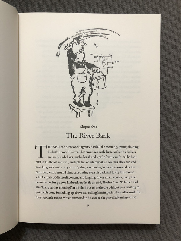
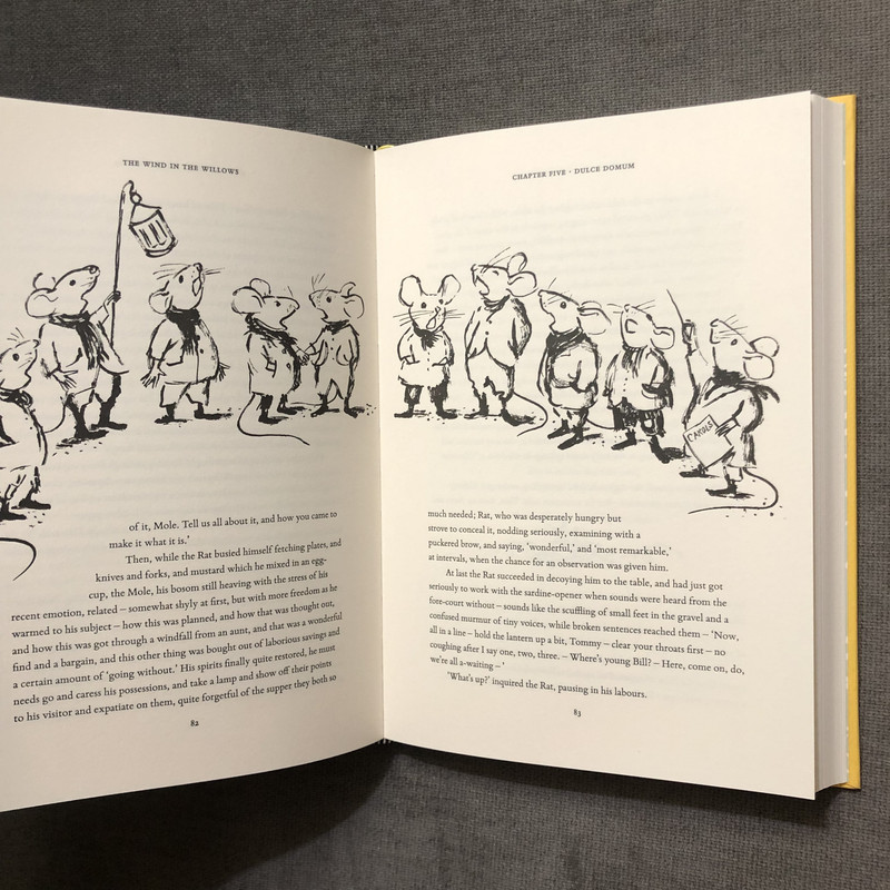
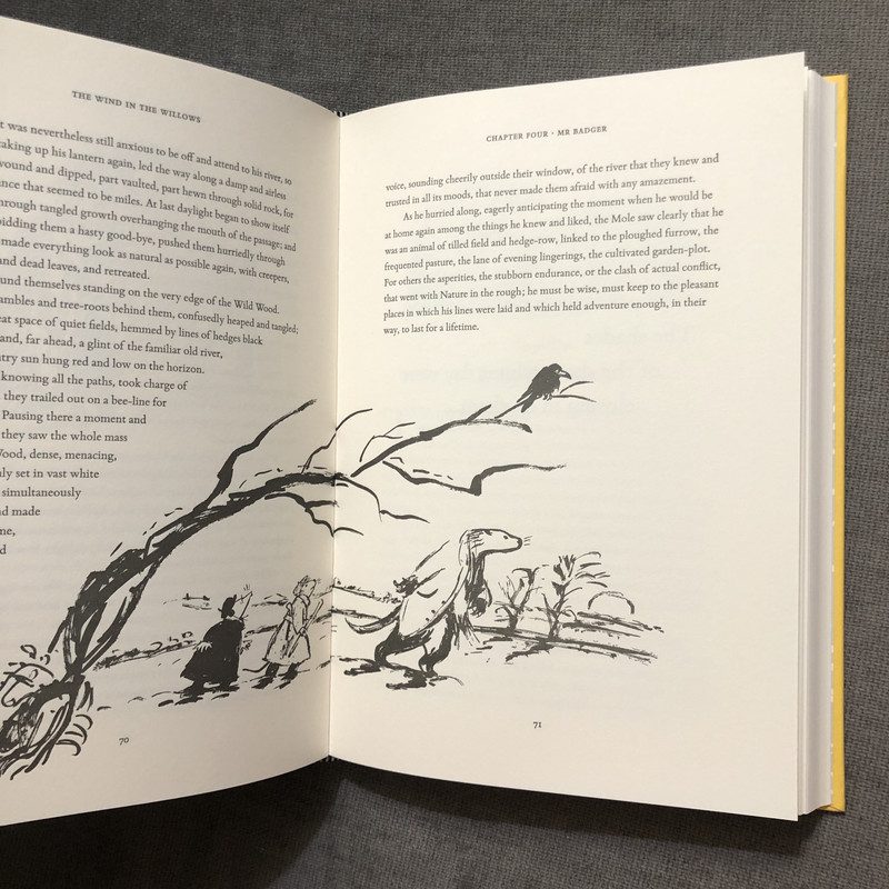
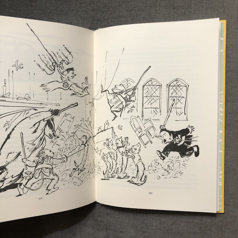
One aspect of the illustrations that I think comes across better in person than in the photos I've seen online is the brushwork, which lends an elegance that reminds me of Chinese calligraphy.
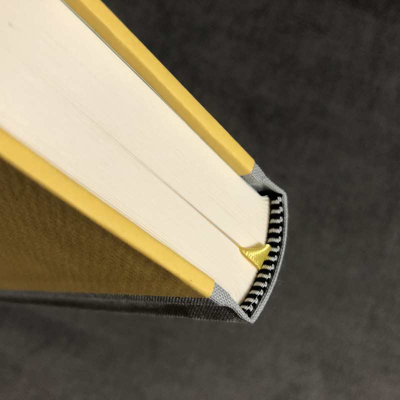
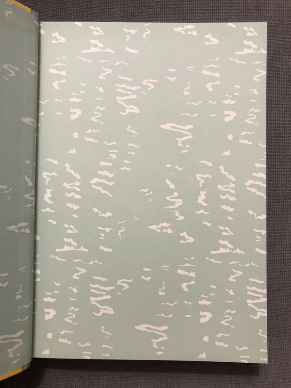
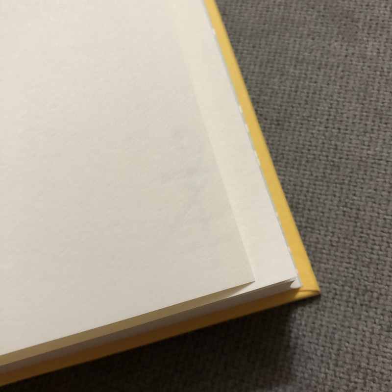
You can see the Zerkall watermark in one of the images below.
The overall weight and feeling of quality reminds me of the standard Lyra's Startdust. (I have the blue, for comparison.)
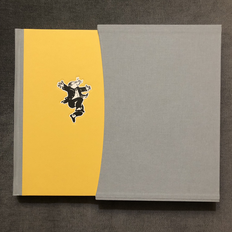
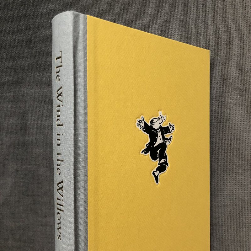
I did opt for the slipcase, despite the added cost, and I am glad I did.
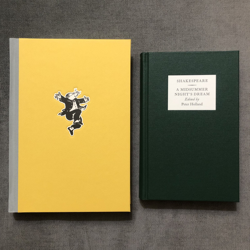
It is not exactly a small book (large octavo maybe?), but feels welcoming and like a nice reading size. I also included a picture next to the Oxford Letterpress Shakespeare companion volume that I happened to be reading now which should provide a comparison point for orientation.


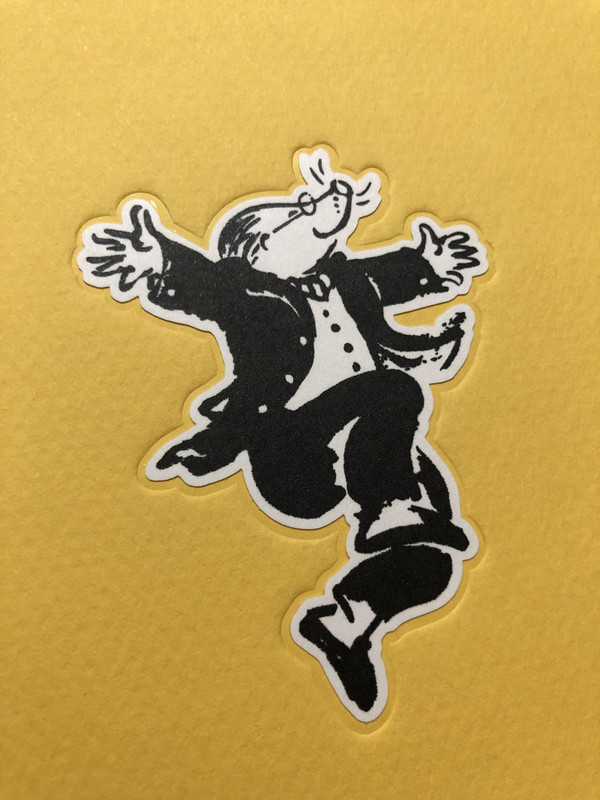
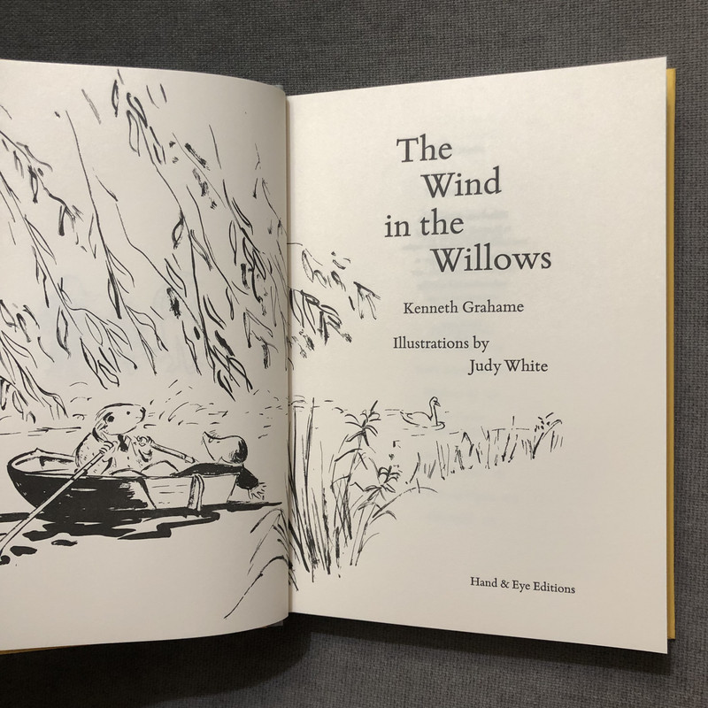

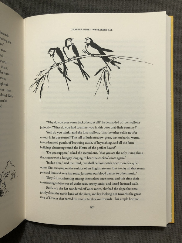

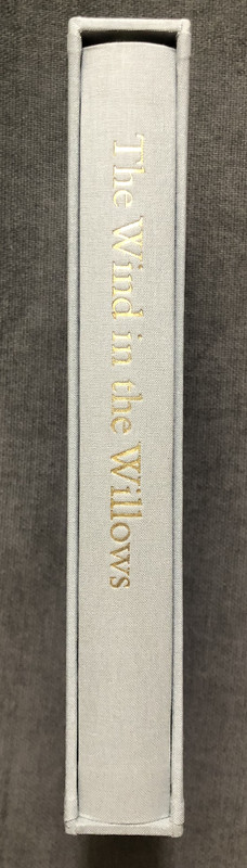
One aspect of the illustrations that I think comes across better in person than in the photos I've seen online is the brushwork, which lends an elegance that reminds me of Chinese calligraphy.
You can see the Zerkall watermark in one of the images below.
The overall weight and feeling of quality reminds me of the standard Lyra's Startdust. (I have the blue, for comparison.)
I did opt for the slipcase, despite the added cost, and I am glad I did.
It is not exactly a small book (large octavo maybe?), but feels welcoming and like a nice reading size. I also included a picture next to the Oxford Letterpress Shakespeare companion volume that I happened to be reading now which should provide a comparison point for orientation.


4Praveenna_Nagaratnam
lovely!
6antinous_in_london
>5 fp13: Though the illustrator herself seems to disagree with you & had said she prefers the illustrations in black & white, it obviously didn’t bother her too much as she agreed to hand-colour various illustrations on the other 2 non-standard editions. As this was one of the differentiating factors between the standard & the other editions, if you had gone for either of the non-standard editions you would have had colour illustrations galore.
7punkzip
I just saw a post on FB where someone who had ordered all 3 states (never understood this practice myself) posted pics of all three in one shot. I actually would have ordered the numbered if I had to chance to before it sold out, but now that I see it I'm glad I didn't. The black binding looks completely out of place for WiTW (and Mole does not stand out much against the black background) more so than I thought initially from the pic on the Hand and Eye website. The lettered at least has Mole in gold which really stands out from the black background, as well as the black suede looking more attractive.
8What_What
>6 antinous_in_london: 12 of the 80+ illustrations were hand coloured in the numbered state, of which there were 45 copies.
9fp13
>6 antinous_in_london: the illustrator of course can have her own opinion on the illustrations :)
10Shadekeep
I definitely think the standard edition has the best cover, so bright and jolly. This is the edition I would have gone for had I gone for any. I was surprised that I actually liked the colored illustrations, as I generally prefer black-and-white and didn't think color would work well with this somewhat spare calligraphic drawing style. But the illustrator did make it work, in spite of not caring for coloring herself.
11antinous_in_london
>8 What_What: Indeed, and 24 in the lettered, that’s why i said she had hand-coloured ‘various illustrations’ in the non-standard editions.
12jveezer
After thumbing through the edition, I am very satisfied with the standard, both from an overall design (I also like this binding the best with it's bright yellow cover) and with the wonderful black & white illustrations. And I have three other editions with color: the Easton Press, the Folio Society LE, and the Mad Parrot. So I'm good until the Limited Editions Club magically falls into my badger-like claws. (The badger's library seeming to be a safer place for books than the flighty toad's...)

