1conceptDawg
Member's Home Pages have been updated to LibraryThing's LT2 style. This update was months in the making (interrupted here and there by other features and projects) and touched more than 150 files of code. The main goal was, of course, to update the pages to use the LT2 modern layout engine. But the secondary goal was the keep the data density as close as possible to the original version. That included the introduction of the larger default font size which made it challenging—ignoring the fact that you can switch font sizes using our Style picker to get even more information on the page than before.
A quick comparison:
New
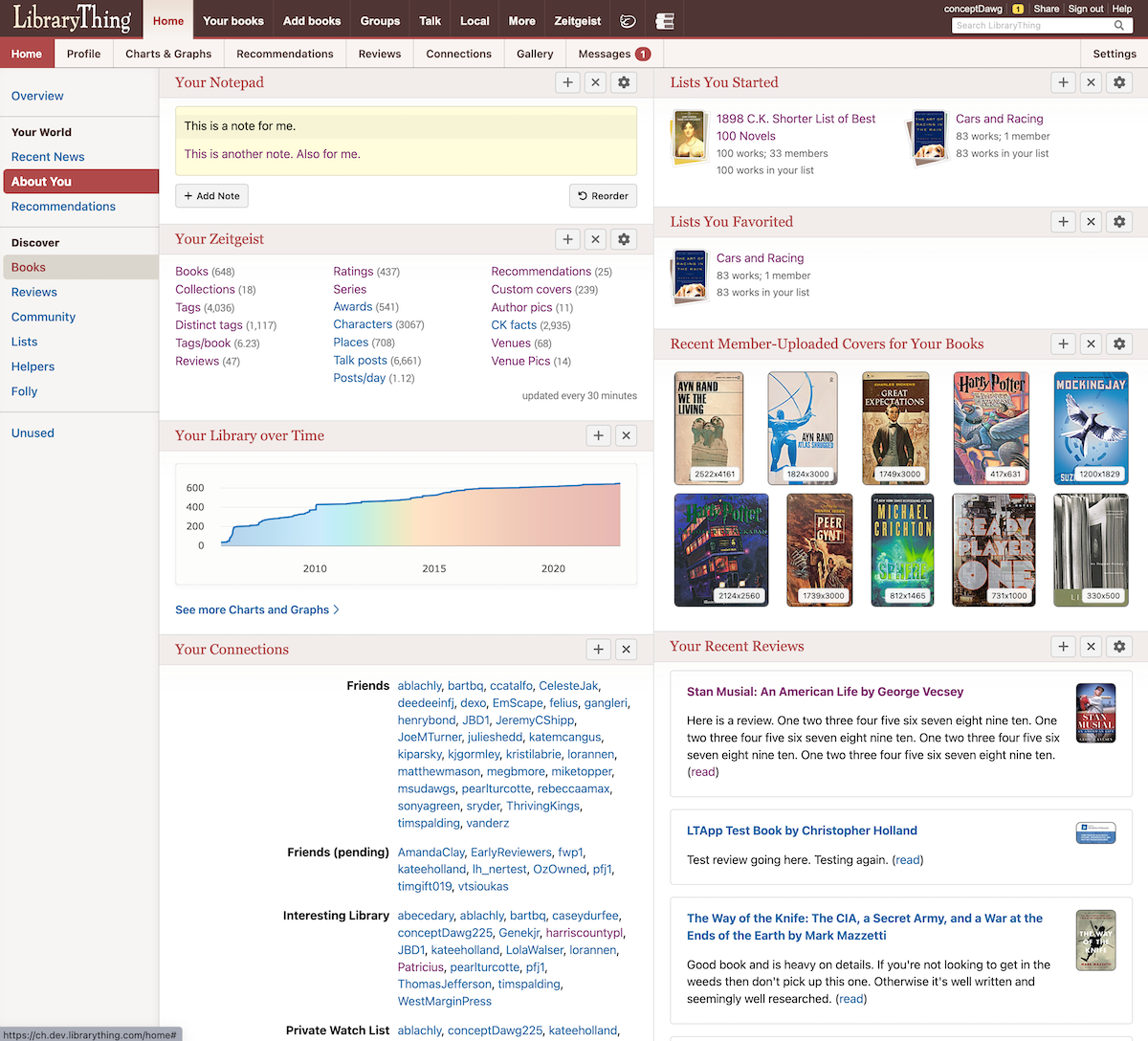
Old
Here's a brief list of some of the changes:
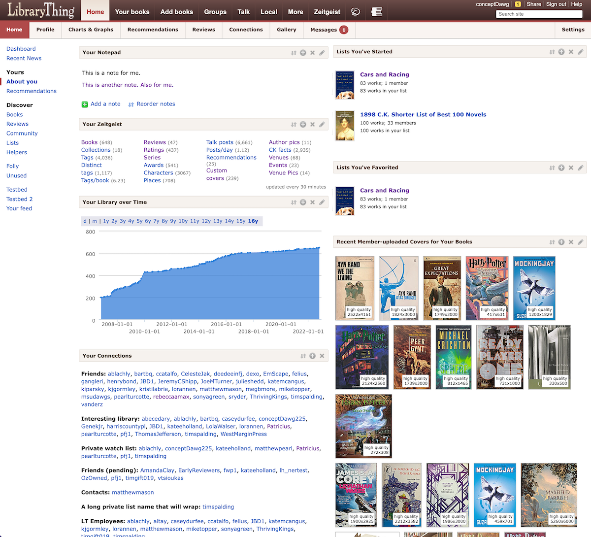
A quick comparison:
New

Old

Here's a brief list of some of the changes:
- Matches the styles of the LT2 design system to provide a more cohesive experience across LT.
- Page is more accessible (for screen readers, increased contrast ratios, minimum font sizes, etc.).
- It is now mobile-friendly, like all other LT2 pages.
- Faster, generally. Both to load and to display, but we are always looking to make improvements here.
- Nearly all modules have been given some attention and updates, some more than others (Tag watch, for example, was a complete rework). I don’t recall the exact count, but there are about 30 modules with their accompanying code (settings, alternate views, etc.).
- The modules now “fit” to the screen better at every possible screen size/orientation. This is especially important in multi-column mode so there is no overlapping or overflowing of data into adjacent modules. At very small screen sizes the multi-column mode will revert back to single column so that content can be properly displayed.
- Importantly, data density has been kept nearly identical (some modules are slightly larger, some are slightly smaller). And if you use the Lorax style you will likely see higher data density with the new design vs. the old. If it was “above the fold” before, it should continue to be so.
- The list modules have had a nice makeover: no longer spilling their contents over into other sections. Sample:

- The options to reorder, toggle columns, and restoration of default views have been moved to the bottom of each page where they belong instead of duplicated in each module header.

2Petroglyph
Neat!
Edit: this must have taken a lot of fiddly work and tedious code-watching. Well done!
Edit: this must have taken a lot of fiddly work and tedious code-watching. Well done!
3surly
And the first issue: Recent News has always been sorted by columns, left to right. Now it is sorted by rows, top to bottom. There is no way to change the sort and after almost 16 years on LT, my reflexes are too hard-coded to change.
Update: The sort seems to have returned to columns.
Update: The sort seems to have returned to columns.
4conceptDawg
>3 surly: Right now it is sorting across (by columns) first then down to the next row. We can change that, of course. This module had almost zero changes, other than changing the layout to enable handling various window sizes.
5anglemark
I've collected all the translations bloopers I'e found. (Generally, I find LT less translateable than LT1, sadly. I like the layout as such, though.)
https://www.librarything.com/gallery/member/anglemark/tag/LT2Home
https://www.librarything.com/gallery/member/anglemark/tag/LT2Home
6PawsforThought
Did this new update inadvertently (or non-inadvertently) also affect the Talk pages? Because Talk has been find, and now if looks weird - massive amounts of white space. I have a sneaky suspicion that it’s showing the mobile view even though I’m on an iPad. Never done that before.
7conceptDawg
>5 anglemark: How do you find it "less translateable?" It uses the exact same system.
We'll fix the ones you mentioned.
We'll fix the ones you mentioned.
8rosalita
First, I love the LT2 design and am looking forward to seeing it roll out across the rest of the site.
Second, the Notes module on my Home page is spilling over into the News column on the right, as seen here:

This is on a 27-inch iMac, with Safari browser (most recent build) set to half-screen width. If I pull the window wider, the text re-flows and ends up contained within the Notes module, but I don't want the window that wide.
Let me know if there are any other stats or information that would help you.
9cyderry
your screenshots show 2 columns but mine only shows everything in one column. How do I get 2? I have 40 collections, have designated 15 to show but it still shows all 40!
10conceptDawg
>6 PawsforThought: We did make some minor modifications to Talk code. Although it should be the complete opposite: they were to allow MORE screens to use the desktop mode down until you get to a paltry 600px wide screen. I can take a look though.
11conceptDawg
>9 cyderry: There is a button at the bottom of the screen to Toggle Multi-Column Mode.
12cyderry
>10 conceptDawg: This is what I have at the bottom
Change StyleDesktop View
HomeAboutContactPrivacyHelp
WikiThing
Common Knowledge
Early Reviewers
Legacy Libraries
Local
Change StyleDesktop View
HomeAboutContactPrivacyHelp
WikiThing
Common Knowledge
Early Reviewers
Legacy Libraries
Local
13lilithcat
Maybe it's because I use the page so infrequently, and have so few modules open, but it looks exactly the same to me!
14AnnieMod
>12 cyderry: Look directly above "Change Style"
You are not using the old salmon UI by any chance, right?
On mobile: the buttons are above "Top News" which shows up just above "Change Style" so scroll up if you are not seeing them where they are supposed to be
PS: I see only 2 buttons there - the Toggle for multi-column is missing (too small of a screen?)
15conceptDawg
>11 conceptDawg: Not quite that far "at the bottom." Just below all of your Home modules on the page you should have a bar that looks like this:

Now, if you are on a page with only one module you won't have that option.

Now, if you are on a page with only one module you won't have that option.
16conceptDawg
>14 AnnieMod: Correct. It's smart. It knows that if you only have room on your screen for a single column then you shouldn't see the option to have multiple columns.
17conceptDawg
>6 PawsforThought: There was a logic error in how it was picking up the sizing for Talk. Hopefully I've fixed that for you and your iPad now.
18conceptDawg
>8 rosalita: Ahhh.. It's because you have some long URLs in there and it's not letting the content wrap. I'll take care of that momentarily.
19cyderry
>14 AnnieMod: Directly above Change Style I have 2 buttons
Reorder Modules Restore Default View
I have tried both and neither gives me two columns. Even though when I click on Reorder Modules it states that Column Break (in 2 column mode)
Collections show in 4 columns in the module but still showing all 40, not just the 15 I want.
As for Salmon color, I don't know what that is.
20cyderry
>15 conceptDawg: I do not have the button for the TOGGLE MULTI-COLUMN LAYOUT.
21Stevil2001
Overall it looks good.
My only complaint is that in modules with covers (e.g., Recently Added and Recent Member-Uploaded Covers for Your Books) there are fewer covers visible than before. Only four in Recently Added and three Recent Member-Uploaded Covers. The spacing on Recently Added really looks like a fifth ought to fit, at least.
Also when I switched Recently Added to two rows to get some more covers, a box with the following appeared instead of my covers:
But when I refreshed, everything looked as expected.
My only complaint is that in modules with covers (e.g., Recently Added and Recent Member-Uploaded Covers for Your Books) there are fewer covers visible than before. Only four in Recently Added and three Recent Member-Uploaded Covers. The spacing on Recently Added really looks like a fifth ought to fit, at least.
Also when I switched Recently Added to two rows to get some more covers, a box with the following appeared instead of my covers:
var outA = {"text":"
<\/div>
<\/div><\/div><\/div>"}; $J("#recentlyadded_inside").html(outA.text); loadNewShelf("arbbooks","u_44134e2a",-1,0,0,0,651108797);
But when I refreshed, everything looked as expected.
23AnnieMod
One minor gripe: Because I can now see the news on the right on my laptop browsers, it shrank the other columns a bit so I see only 4 books per line in both the Recently added and in Recommendations (used to be 5 and 5) in Medium sized covers. I know I can switch to smaller covers but... any possibility to actually remove the news from the right somehow? The left menu and the News take half of my screen leaving the actual information I want to see to be squizzed in.
Another option - move the left menu to the top even for desktop thus reducing the white space and leaving space for actual contents?
Also a minor bug:
Go to the squiggly thingie on your "Recent Automatic Recommendations" module and change the cover size (does not matter from what to what). When you come back to the page after "Save", you see html code instead of the images. Page refresh fixes it but it is still ugly :)
24AnnieMod
>19 cyderry: On what device are you? The button will be there ONLY if you are on big enough screen for the server to think you can have 2 columns.
25cyderry
>24 AnnieMod: I am on a 17" laptop. The TOGGLE MULTI-COLUMN LAYOUT appears only when I'm looking at UNUSED modules.
26cyderry
I really don't want Top News/Recent News either. Is there some way to turn off that module?
27AnnieMod
>25 cyderry: How many modules do you have on your home page?
28conceptDawg
>22 coprime: Thanks. That is due to a change made in the last few minutes (so no real testing done). I'll get a fix out.
>23 AnnieMod: We will get more creative with the site-wide navigation once we complete the rollout of LT2. We kind of have to keep the two "sidebars" where they are until we can make every page uniform and using the LT2 system (because we can't change the LT1 pages in a single place...which is what LT2 is enabling us to do). Patience?
>23 AnnieMod: Thanks for the report about the Recent Auto recs. I'll get that fixed.
29AnnieMod
>26 cyderry: It was kinda hidden for a lot of us due to a bug in the old display :) I liked that bug... :)
30conceptDawg
>26 cyderry: Nope. Top News can't be removed. We don't inject ourselves into your experience often, but the Top News module is the one place where we can count on most members seeing something if we post it there. So for now, it stays.
I've been campaigning to make it a "normal" Home page module though so that it could be moved lower on your homepage and flow with the rest of the modules. But I can't promise anything.
I've been campaigning to make it a "normal" Home page module though so that it could be moved lower on your homepage and flow with the rest of the modules. But I can't promise anything.
31AnnieMod
>28 conceptDawg: You may also want to check the rest of the modules - I was just playing with that one.
If an update is coming later, I can wait for it :) But with the fixing of the bug that was hiding the right side panel, my "actual space" shrank by 1/3rd. Thus me mentioning it.
The side effect of that is that my Collections module looks really really bad because most of my collections are now taking 2 lines (where they fit into 1 before) in column enabled mode. Can we have control on how many columns it uses? If I can change that to 2 from the current 3, it will look better.
32cyderry
>27 AnnieMod: right now all I can see is 3 - Recently added (covers only), Your Collections (all of them, not only the ones selected, and Talk.
I should have graph of 1 collection, and reviews.
I should have graph of 1 collection, and reviews.
33AnnieMod
>32 cyderry: At what magnification are you looking at the site? 100% or more?
Can you try to force the browser to report different size to LT? Use "Ctrl" and "-" (different on Mac) to start shrinking your font and see if that won't make things reappear?
Can you try to force the browser to report different size to LT? Use "Ctrl" and "-" (different on Mac) to start shrinking your font and see if that won't make things reappear?
34conceptDawg
>32 cyderry: & >33 AnnieMod: Correct. The sizing logic is nuanced. It is all happening on your browser so it knows what size each column would be, if you have enough room for them, if you have zoomed in on the screen and everything is bigger (therefore there's less logical space to put things). So it is possible that you could be on a 65" wall-sized screen and have it zoomed in so that you have the same logical "space" as a person running a large cell phone.
You can zero-out your zoom with the keyboard shortcut: Command-0 (zero)
Or, on most browsers it's in the View menu as "Actual Size" or something similar.
You can zero-out your zoom with the keyboard shortcut: Command-0 (zero)
Or, on most browsers it's in the View menu as "Actual Size" or something similar.
35cyderry
>33 AnnieMod: at 100% shrunk it down (wouldn't have been able to read anything) but nothing else appeared.
>34 conceptDawg: What is Command key? I have no View Menu
>34 conceptDawg: What is Command key? I have no View Menu
36rosalita
>18 conceptDawg: It looks like you've fixed this — thanks!
37paradoxosalpha
I'm still not liking the LT2 use of "rounded" corners on cover images, making them look more like buttons and less like books. In my homepage, this style now appears on covers in Recent News and Hot Reviews, but not in Recently Added.
Mostly the update looks pretty good on my desktop, and I'm looking forward to giving it a spin on my phone.
Mostly the update looks pretty good on my desktop, and I'm looking forward to giving it a spin on my phone.
38conceptDawg
>35 cyderry: Sorry, I don't know the name of every menu item on every browser/platform. :) What browser are you using? Can you tell?
I know that it is the "View" menu for Chrome, Safari, and Firefox on the desktop platform (and you mentioned it's a 17" laptop). But you could be using your laptop in "touch" mode like a tablet and then all bets are off.
Of course, the zoom level also doesn't take into account your resolution setting on your screen. You could have a 17" laptop displaying at a resolution of 800 x 600. That's smaller than a cell phone too. It's hard to diagnose these things because of the number of variables.
Annnnnd. Now people have an insight into the things I think about when deciding at what "resolution" a certain module goes into various display modes. :)
39conceptDawg
>37 paradoxosalpha: Sorry about that. They had the wrong variable value set for the corner radius. They will still have a slight radius to them but half of what it was. We have no hard corners in LT2 at this point (that could change in the future...it's evolving).
40paradoxosalpha
>39 conceptDawg:
OK, that's an improvement. But the Recently Added covers still look sharper (and better) to me.
OK, that's an improvement. But the Recently Added covers still look sharper (and better) to me.
41cyderry
>38 conceptDawg: My browser is Chrome. I tried it in Edge and Firefox and have the same issues. Not in touch mode - use a mouse.
My resolution is 1920 X 1080 (recommended)
My resolution is 1920 X 1080 (recommended)
42conceptDawg
>41 cyderry: Thanks. I'll try and replicate your set up.
43cyderry
>42 conceptDawg: FYI - I do have my style set at System Large to help my old eyes. But changing to standard didn't do anything but make things smaller.
44conceptDawg
>5 anglemark: @anglemark
All of those have been updated. But let me know if you see any more that need attention.
All of those have been updated. But let me know if you see any more that need attention.
45conceptDawg
@cyderry
I'm assuming that you are using your browser at a zoom level around 175%. Because that's the point at which Chrome switches to a single-column setup when I am running the browser full-screen on a 1920x1080 display.
I have made some changes to allow multi-column mode at that combination. Please let me know if you can now see the option to toggle multiple columns.
I don't think I can make any more concessions to multi-column at columnsizes smaller than that: with that zoom and resolution each column only has about 300px of horizontal space to use. Much smaller than that and you just won't be able to see any content in a usable manner: text will wrap after about 10 characters, single images, etc.
Here is a video showing the zoom levels and when it switched to single vs. double columns before the most recent change.
https://youtu.be/tul8ntVNqR0
46coprime
>28 conceptDawg: Looks good now, thank you!
47Crypto-Willobie
I may be dense but do I really have to click away from the List of Topics in order to mark something Ignore? Previously there was an X on each topic I could just click,
48AnnieMod
>47 Crypto-Willobie: It is there in the desktop view (the last column) but not on mobile - it disappeared from mobile awhile back
49fuzzi
Is there any chance that a "Star This Topic" button could be added to the top of the mobile page? There are times when I want to star a thread without reading it all, or scrolling to the bottom, thanks.
50kac522
Two questions about the modules on the Home Page:
1. In the "Talk" module, where's the |-> icon on the header to put "Talk" into columns, like there is on the "Talk" page?
2. Anyway to turn off the yellow notebook background in "Your Notepad"?
1. In the "Talk" module, where's the |-> icon on the header to put "Talk" into columns, like there is on the "Talk" page?
2. Anyway to turn off the yellow notebook background in "Your Notepad"?
51lilithcat
Just noticed that in the "Your Collections" section, "All collections", "Read but Unowned", and "Bookbinding Projects" are split, so that they read:
"All collec- tions" , "Read but un- owned", and "Bookbinding {large space between words} projects".
(I don't know if this is new, because I don't generally use the Home page. so it may have been like this before.)
Also, in the Tag list, tags are split. So "Abraham Lincoln" has "Abraham" at the bottom of a column, and "Lincoln" at the top of the next one. (Same thing happens with "Accordion books", "African-American", "African-American Studies", "Alexander Calder", "Alexandria Quartet" If I "show all tags", though, it's fine.
Adding: In the "Recent Automatic Recommendations" module, the text is pushed so far to the left that the "1" in the number "10" disappears.
52AnnieMod
>51 lilithcat: see the last paragraph here: https://www.librarything.com/topic/345375#7961222
It is a side effect of the news now showing on the right which threw that module into a mess.
It is a side effect of the news now showing on the right which threw that module into a mess.
53jjmcgaffey
So the thing I do most on the Home page is work with Recent Member-Uploaded Covers. And the new update, though overall fine, seriously messed with my workflow there.
Currently, the only way to deal with the (many many) book covers in there is:
Click on a cover
Examine the cover, compare it to your current cover (small in the bottom right)
Either click Dismiss this cover or click Use this cover
Click OK.
My previous workflow included scrolling the page so that I barely had to move the mouse - I could click on a cover, without moving the mouse click on Dismiss (that's most of the answers I give - covers that are obviously not right for my books, or I already have a good cover on that book) and then click the OK with the spacebar, with my other hand.
The first problem is that the 'hide the topper' went away. There was a link in the footer that let me make the topper scroll with the page, so that I could scroll the webpage to the top of the RMUC module; then I could click on the second cover in the display and have my mouse directly over the Dismiss link. Now, if I go full screen, I only have to move the mouse a little - but I have to move it every time. If I don't go full screen I have to move it further.
Also, the dialog that opens when I click a cover often moves. It first comes out full size, then about 80% of the time it shifts size to smaller, hides most of my current cover (I'd have to scroll to see it), and moves the Use/Dismiss line down a bit - away from where it first appears. So I not only have to move the mouse, I have to wait until the full window loads before I know where I need to move the mouse to.
I think the dialogs are opening faster than before. But because of the newly-necessary movement, the overall use of the module is considerably slower.
Firefox, Windows 10, 1920x1080 on a 14" screen, 125% scaling in Windows, 100% in Firefox.
Tried it on a bigger screen - 1920x1080 on a 23" screen, 100% scaling in both Windows and Firefox. I can arrange the window so I don't have to move the mouse...except that the dialog still randomly moves. If it's large and I click Dismiss, I can click on the next cover without moving the mouse; and if the next one is large, I can click again without moving the mouse. But sometimes, for no reason I can see (it doesn't seem to relate to Original Size, or anything else I can see) the dialog shrinks, and I have to move the mouse down to Dismiss. I can click on a cover from there too, at the bottom of the image - and if the next dialog shrinks, I don't have to shift. But when it stays big, I have to move the mouse again.
I'd rather it didn't shrink - I don't know why it's doing it, anyway. I believe I was using Verdana Standard style to start with, but changing to Lorax, though it made text smaller, didn't make the dialog box stop changing size.
And if you're going to be messing with that code anyway - could we _please_ have the size on the current cover display? It's really hard to tell whether a thumbnail picture is tiny (125x300), or in the same category as the newly-uploaded larger cover (frequently 2000 or 3000 high, or even larger). It would save a lot of clicking through if along with, or instead of, the custom cover number (does that number have any use for the user? I suppose it might, for the developers, but not for me) we had the "original size" of the cover, just like the line for the newly-uploaded cover. I've requested this before, still hoping. But if only one thing can be fixed, tidying up the dialog location is more important.
54Stevil2001
Looked at it on mobile-- it looks great. Was so awkward before when I'd go from Talk on LT2 to Home on LT1 to Reviews on LT2, but now it is much more navigable.
55bnielsen
>1 conceptDawg: Nice! Huge thanks!
A couple of quirks with the Recently Added module:
I hate it that when I press Next for the first time, the position of the button Next is taken over by the button Previous. So I press Next and when I (in my head) press Next again I go back to the start again.
The Mouse Over text displays in Latin1 rather than UTF-8, so I hover over "Døden tager på udflugt" and it displays "DÃ,den tager pÃ¥ udflugt" which looks a bit ugly.
The quirks have been there all the time, so it is not something introduced by LT2.
56SirThomas
The new design looks very good, thank you.
The "Your Notepad" section is behaving a bit strange for me.
In the settings I have set 3 columns, Chrome and Edge also show three columns, Firefox shows only two columns, the right pane is empty. The second column is also placed a little lower.

I am working with Windows 10 with a resolution of 1920*1080.
57bnielsen
>55 bnielsen: I just noticed that when the Recently Added is freshly loaded the mouseover shows a pop-up with the cover of the book and the title displayed correctly. When I press Next and then Previous the mouseover is just the title text and with utf-8 displayed as latin1.
58PawsforThought
>17 conceptDawg: Thank you for fixing that - it was driving me a bit crazy.
And now that I'm not bothered by Talk looking weird I've actually had a look at Home - a few issues:
* When I try to reorder the modules, I'm presented with a list of the modules in a single column, even if I have multi-column toggled. That's a bit confusing since it means I don't know where things will actually end up.
* Recent News looks crazy - the text i spilling over and because the page is adapting to the length of the titles, there is no order.
* The list of "Your Helps" under Helpers is, frankly, ugly and difficult to read. It'd be better to have the titles of the types of help at the top of a column instead of on the side.
59anglemark
>7 conceptDawg: I'm not talking about the span tags, but that more strings than before seem to be unavailable for translation. But that's just a subjective feeling.
60anglemark
>44 conceptDawg: Thanks! Will do.
61birder4106
I like it. Thanks to the developers.
About translations
In "Home/Overview": The two topics "Your World" and "Discover" can't be translated into German.
And at the bottom at the far right side, Under: "Recent News", "September State of the Thing Is Out" is still being viewed.
About translations
In "Home/Overview": The two topics "Your World" and "Discover" can't be translated into German.
And at the bottom at the far right side, Under: "Recent News", "September State of the Thing Is Out" is still being viewed.
62anglemark
>61 birder4106: Yeah, that's part of what I meant in >59 anglemark:.
63birder4106
>59 anglemark:
Sorry for crossposting. I did not saw that.
Sorry for crossposting. I did not saw that.
64anglemark
>63 birder4106: No, you added good examples. I was just supporting what you said!
65AndreasJ
>30 conceptDawg:
I don't think you can count on most people seeing Top News. It's still hidden on my phone, and visible on the tablet only in landscape mode, which I rarely use. Haven't had the opportunity to check on a desktop yet, but the LT1 version didn't show with my preferred browser width (roughly half the screen width).
I've basically only seen it when making a special effort to see it.
66SandraArdnas
Can we please have the covers in 'recently added' spaced equally. It's not new, it had that weird spacing for some time (like justified text), but I was hoping it would be fixed with redesign
Edit: nevermind, it fixed itself on refresh. Weirder and weirder
Edit: nevermind, it fixed itself on refresh. Weirder and weirder
67conceptDawg
>49 fuzzi: ...Star This Topic" button could be added to the top of the mobile page...
Yes. I'd like to have that also. I've been meaning to go back to that code and add it but (obviously) have been busy. I'll see about doing so.
Yes. I'd like to have that also. I've been meaning to go back to that code and add it but (obviously) have been busy. I'll see about doing so.
68conceptDawg
>50 kac522: 1. In the "Talk" module, where's the |-> icon on the header to put "Talk" into columns, like there is on the "Talk" page?
Once talk module gets down to a certain width it removes that option in order to get more room to work with (the group name get stacked on top of the topic). There's just no space to have the long group--topic text.
Anyway to turn off the yellow notebook background in "Your Notepad"?
Not at the moment, but we'll think about it.

70conceptDawg
>59 anglemark: EVERY string should be available for translation. So if you find some that aren't, please, feel free to let us know. We'll be happy to fix the problem.
71conceptDawg
>69 SandraArdnas: This is a long-standing problem (not introduced by the recent update). The current code we use to create shelves tries to figure out how many books it can get on a line in the given space. Sometimes it gets the math wrong due to how it guesses the book widths are going to be. They also don't rework the math when you resize the page, so you'll get all kinds of strange things going on then too. These are known issues though.
Soon we are going to introduce all new shelf widgets that are more responsive and can grow/shrink as needed (as well as change size when you resize the page). They will also more tightly space the covers exactly to fit.
This update almost made the deadline for the Home release but I just couldn't make it happen.
72conceptDawg
>57 bnielsen: Thanks. I'll get that fixed.
73conceptDawg
>58 PawsforThought: When I try to reorder the modules, I'm presented with a list of the modules in a single column, even if I have multi-column toggled.
This is as it's always been. There is a "column break" item added there that lets you define where the split will happen. It's not perfect but it was an update that I could kick down the field and do after that release. It's a pretty minor UI ugliness that I'm kind of ok with being the way it is....but just for now.
* Recent News looks crazy - the text i spilling over and because the page is adapting to the length of the titles, there is no order.
I agree. This module is slated to get a rework and I didn't want to spend any more time than necessary updating it.
* The list of "Your Helps" under Helpers is, frankly, ugly and difficult to read. It'd be better to have the titles of the types of help at the top of a column instead of on the side.
I agree. I have to ride the line between updating things to look/work better and not angering people because things have changed. It's the least fun part of my job. ;)
While I take full responsibility for them, I am often not final arbiter of any of "my" changes.
74conceptDawg
>58 PawsforThought: * Recent News looks crazy
I was just thinking that this could also be a browser difference/version issue. Because, while I don't like the way it looks my version isn't spilling content or anything toooo ugly. I'll post a screenshot of what it's supposed to look like and you can tell me if that's what you are seeing. If not, I can work to get it fixed.
What you should see:

76fuzzi
>67 conceptDawg: thank you for getting to it when you can.
77anglemark
>70 conceptDawg: OK, I'll start doing that, then. There have been so many that I have simply given up but I'll try to muster the energy! :)
78Nevov
Something with this update seems to have (inadvertently?) affected the Groups pages which were already in 2.0 mode. Until today it did variable column-nising depending on how wide the window was, but now it seems fixed into one column no matter what the width.
For example:
https://www.librarything.com/ngroups
The different sections (Active this Week, Site Groups) used to each break into columns.
Similar on:
https://www.librarything.com/ngroups/newest
This page used to be more of a grid effect, 4 wide on a desktop, and then rows, letting you see many more than it currently does with just the one column.
79Foretopman
The "your library over time" module has changed. I really liked the ability in the old version to select a certain time span (e.g. 4 months, or 3 years). Has that feature gone away entirely, or is it still present somewhere in Charts & Graphs?
80PawsforThought
>74 conceptDawg: This is what I’m seeing (on iPad - I’ll have to wait until tomorrow to see what it looks like on the huge desktop screen).


812wonderY
Two issues with the view on my iphone.
1. There is no indication that I have a message. The little yellow box is still there on laptop view, but not on the phone. (My old eyes sure would like that notice more prominent, too.)
2. I don't want the 'Talk' button at the top of the Home page.
1. There is no indication that I have a message. The little yellow box is still there on laptop view, but not on the phone. (My old eyes sure would like that notice more prominent, too.)
2. I don't want the 'Talk' button at the top of the Home page.
82cyderry
>45 conceptDawg: was terribly busy today but when I came to LT tonight I do have 2 columns on my home page however, I am still missing several modules - Notes, graphs and my collections are still showing all 40 not the 15 I have checked. When I go to Unused the missing modules aren't there either.
What am I doing wrong?
What am I doing wrong?
84SirThomas
>56 SirThomas: Today it looks good in Firefox too , thanks!
85bnielsen
>72 conceptDawg: Nice! Thanks!
86PawsforThought
>74 conceptDawg: I've now checked at my very large screen at work and it looks even worse than in >80 PawsforThought:.
87bnielsen
>69 SandraArdnas: Argh. I hadn't noticed that before, but now I see it every time :-)
88conceptDawg
>80 PawsforThought: re: Text overruns in Connection news module
Hm. That looks like it's ignoring a rule (or doesn't yet have support for it, depending what version of the OS you're running). I'll see about fixing that.
>78 Nevov: ...now it seems fixed into one column no matter what the width
Ah..yes. A style is taking over there. Will be fixed.
>79 Foretopman: Your library over time
I'll ask Lucy about that. The new charts are her baby.
>81 2wonderY: New message indicator not visible when viewing on phone-sized screens.
This will be rectified very soon.
89knerd.knitter
>79 Foretopman: Yes, that feature has gone away with the new chart.
902wonderY
>81 2wonderY:. Oh, I was mistaken. The drop down says “All Topics” just like in Talk, but offers a homepage menu. ? Could you change the wording to avoid confusion?
91waltzmn
A strange phenomenon that may not be worth worrying about but might be easy to fix. :-) My LibraryThing bookmark goes directly to "Your Books," and I used it this morning and it had lost my custom view of my books. Went to Talk to mention it, and all my Talk settings were gone. Found this thread, went to post to it, and there was no "Post" button or even a way to reply to anything.
You've probably all guessed it by now. That last one finally did it for me. I wasn't logged in. Logged in and all the problems went away. But it looks as if the LT2 upgrade caused the cookie that lets me access my account without logging in to be trashed, or corrupted, or something. Don't know if that's just me or if it occurs for others also.
Macintosh, OS 12.6.1, Firefox 106.0.1.
92andyl
It looks like there are still some issues in the columnisation in places.
If you look at my Home Page you can see "Your Collections" which shows 5 collections in 5 columns. But 2 of the labels start in 1 column (below another label and total) and finish in a second.
If you look at my Home Page you can see "Your Collections" which shows 5 collections in 5 columns. But 2 of the labels start in 1 column (below another label and total) and finish in a second.
93conceptDawg
>91 waltzmn: It's possible that the cookie just expired today. But if it happens again let us know.
94conceptDawg
>92 andyl: Yeah. Thanks. I've been running down instances of this in various incantations.
95conceptDawg
>91 waltzmn: the menu
Thanks for mentioning this. I noticed it at some point but then got sidetracked and failed to follow up on it. This is a case of the Talk code overstepping it's bounds. We'll get that under control and have a serious conversation with Talk about boundaries.
Thanks for mentioning this. I noticed it at some point but then got sidetracked and failed to follow up on it. This is a case of the Talk code overstepping it's bounds. We'll get that under control and have a serious conversation with Talk about boundaries.
96Nevov
>78 Nevov: >88 conceptDawg:
Thanks, confirming that Groups pages reactive columns seem fixed and back working per how they were last week.
Thanks, confirming that Groups pages reactive columns seem fixed and back working per how they were last week.
97Crypto-Willobie
>48 AnnieMod:
I've never used mobile view. It has disappeared from my desktop.
I've never used mobile view. It has disappeared from my desktop.
98AnnieMod
>97 Crypto-Willobie: Do you see who the last comment is by in the list? If not, it had switched you to the mobile version because it thinks your screen is not wide enough... If not, no idea where it went - mine is there...
Maybe try to make the page smaller and see if it shows up (width recognition issues?)
Maybe try to make the page smaller and see if it shows up (width recognition issues?)
99cyderry
>45 conceptDawg: really would like to get my notes, graphs, and collections corrected.
100conceptDawg
I've pushed a lot of fixes for the above items today. In the process I've also made the talk module on the home page even more flexible down to smaller sizes. So you'll see more information.
1012wonderY
>98 AnnieMod: Sometimes turning the phone screen a quarter turn will show the rest of the page to left or right.
102Foretopman
>89 knerd.knitter: Darn. I'm going to miss it.
103AnnieMod
>28 conceptDawg: Just an addition and more details to what I said in >23 AnnieMod: (while patiently waiting)
It seems like the new UI needs a bit of a nudge to start behaving. If you open the edit option screen for Recently Added or Recent Automatic Recommendations (the squiggly button) and save without making any changes, it now recognizes the size of the icons better and shows 5 per line (on my screen, size set to Medium). It does not keep if you move away from the page though - but immediately after a 'save', it does show what I expect it to show.
Maybe there is a difference in the logic when the page loads initially and when it reloads the module when you save a new configuration?
104conceptDawg
>103 AnnieMod: Yeah. That code is exceptionally old. I'm not going to be fixing it since I'm almost finished with a complete update of the code. Now, if for some reason that gets delayed or cancelled then I'll roll back around and dig into the old code for some fixes.
So for now, you'll have to wait a little bit to get the new version of shelves. It should be coming soon.
So for now, you'll have to wait a little bit to get the new version of shelves. It should be coming soon.
105conceptDawg
>103 AnnieMod: Also, what you see as "fixing" the problem is just breaking in a completely different way (it's getting too many books and stacking them next to each other, running off the page). In that case it's not getting the correct numbers either but defaulting to the maximum number of books to get. You'll see that your prev/next buttons don't actually get the correct books. But this is why I have to move the logic off the server and onto your browser: we never really know how many books your browser is displaying. The update will take care of that.
106AnnieMod
>104 conceptDawg: No worries, I can wait - just wanted to mention that there is some code which actually appears to do what it is supposed to. Thanks for working on it! :)
>105 conceptDawg: Ah, I see :) Well - at least it makes it look nice enough for what I need from it.
>105 conceptDawg: Ah, I see :) Well - at least it makes it look nice enough for what I need from it.
107knerd.knitter
>99 cyderry: I'm not sure why those modules would have disappeared from your overview page, but you should be able to add them again. If they're not on the unused page then that means they're displayed on one of the other pages on the home page, so you can find them and add them back to your overview page.
108cyderry
>107 knerd.knitter: what other pages of my home page?
109Nevov
>108 cyderry:
>what other pages of my home page?
The other items listed below Overview in the left column: Your World (Recent News, About You, Recommendations) and Discover (Books, Reviews,... down to Folly) and then Unused.
If we wish a module to be moved it's a matter of finding wherever it currently is located, which will be on one of these other 'sub'pages, then hitting the + symbol ("Add to") over on the right side to select a different location for it.
Eg. in my Books subpage, my first module there is Early Reviewers. If I wanted I could press the + to move that onto my Overview.
(Edited: to fix an error & add bit more info)
110knerd.knitter
Fixed a problem with the Your Collections module on the home page not respecting the preferred collections from the settings
111AndreLorenz
It looks great! Thank you for updating the design!
But: How can I edit my collections now? I can't find any button to step into this section, to add collections or to rename them.
Thank your for your support!
Best André from Munich, Germany
But: How can I edit my collections now? I can't find any button to step into this section, to add collections or to rename them.
Thank your for your support!
Best André from Munich, Germany
112cyderry
>110 knerd.knitter: YES! Now if I could just get my graph fixed it would be perfect!
113knerd.knitter
>111 AndreLorenz: Do you mean editing which collections are shown on the "Your Collections" module? There is a button with a gear for the settings.
>112 cyderry: What is it about your graph that needs to be fixed?
>112 cyderry: What is it about your graph that needs to be fixed?
114conceptDawg
>111 AndreLorenz: Right now you can't edit collections on that page. You can from your Catalog or Add books.
Really this is a "me" problem. I just haven't updated the Collections Manager screen to be used on LT2 pages (it uses a library that we no longer support). It's on my very short list of things to fix and when it is finished then we can add it back into this module.
Really this is a "me" problem. I just haven't updated the Collections Manager screen to be used on LT2 pages (it uses a library that we no longer support). It's on my very short list of things to fix and when it is finished then we can add it back into this module.
115cyderry
>113 knerd.knitter: before all this change, my graph showed my TO READ collection but only for 2022 and I could toggle between 1 month to the entire year. Now the graph shows me from 2009 to 2022. I just want the current year.
116knerd.knitter
>115 cyderry: Those are changes to the chart display. You can see individual collections if you go to the charts & graphs pages.
117anglemark
My English home page looks completely wrecked. The Swedish one looks fine, though.
Firefox 106.0.1, Mac OS 12.6.
https://pics.cdn.librarything.com//picsizes/fb/34/fb34aeb0ec66103637670743251426...
https://pics.cdn.librarything.com//picsizes/c0/2a/c02a627f5039935637639743251426...
Firefox 106.0.1, Mac OS 12.6.
https://pics.cdn.librarything.com//picsizes/fb/34/fb34aeb0ec66103637670743251426...
https://pics.cdn.librarything.com//picsizes/c0/2a/c02a627f5039935637639743251426...
118conceptDawg
>117 anglemark: It looks like there is some page-level caching going on with those screenshots. Do you know if your VPN or internet provider cache web requests?
Because the main page you are showing there is still the LT1 version, but it is loading LT2 versions of all of the modules (but with the LT1 resources—CSS and Javascript).
All of this conjecture is just based off these screenshots
FWIW: I have this exact combination of OS and browser version on my computer here.
119davidgn
Nice work, @conceptDawg.
120VivienneR
>1 conceptDawg: Very nice job! Although I was disappointed when I first saw the large font. Thank you so very much for mentioning the availability of the style picker to adjust font size. I'm happy now.
121cyderry
>116 knerd.knitter: No, the charts and graphs pages does NOT give options to only show my TO READ collection as of 2022. It gives me options for READ IN (select a year) but if it hasn't been read that does nothing and CUSTOM isn't any good either only giving the choices of ADDED IN or READ IN select a year. I want my graph to show me how my TO READ collection has grown or shrunk this year. so Your Books Over Time doesn't do anything for me because it doesn't allow me to specify the timeframe I want only YEARS and only in a READ capacity.
ETA - I also noticed that when I was playing with the Your Books Over Time, if I clicked on the graph it would breakdown the books in my To Read collection by entry date - for example October 2008 - 4, November 2008 - 9 but when I click on the link it showed 4 books for October but only 5 books for November. Are the books being added together by month?
ETA - I also noticed that when I was playing with the Your Books Over Time, if I clicked on the graph it would breakdown the books in my To Read collection by entry date - for example October 2008 - 4, November 2008 - 9 but when I click on the link it showed 4 books for October but only 5 books for November. Are the books being added together by month?
122kac522
>121 cyderry: Yes, that's a feature I liked, too, and was mentioned in >79 Foretopman:. But I don't see that the loss of functionality has been addressed since then. It definitely is not in Charts & Graphs, as far as I can figure out. If it's there, it's well hidden.
123Nevov
>121 cyderry:
>for example October 2008 - 4, November 2008 - 9 but when I click on the link it showed 4 books for October but only 5 books for November. Are the books being added together by month?
Yes, the chart and related table are cumulative working up to our current total of books in the present month. Clicking through to a particular month in our catalogue shows only the specific month, as your example gives.
124anglemark
>118 conceptDawg: OK, everything looks fine here at work (Windows, Chrome), so I'm sure it will rectify itself at home as well in that case. Not that I usually use the English interface.
125knerd.knitter
>121 cyderry: I didn't say that it gave you the date options, only the collection options. The date filter is not implemented on the new charts.
126knerd.knitter
There was a bug on the Lists subpage with the Create New List button so it has temporarily been removed until we can resolve the issue. Lists can still be created by visiting a list's page and clicking the button in the top right.
127jjmcgaffey
>53 jjmcgaffey: Any chance of getting the "topper scrolls with page" link back in the footer? Or some equivalent, if that's no longer possible with the new code? It fixed a real problem, which is now back (with new twists) as described in the post I referenced.
1292wonderY
Was it always the case that the Add Books tab is not available from Home or Profile pages?
I can get there from a book page, but that’s an extra step that I don’t remember before.
I can get there from a book page, but that’s an extra step that I don’t remember before.
130MarthaJeanne
>129 2wonderY: I can get there from both. Are you looking high enough? It's in the chocolate bar, not the light one.
1312wonderY
>130 MarthaJeanne: Do you mean where Home/Profile/Charts & Graphs are? Not there for me.
133jjmcgaffey
>131 2wonderY: One row higher than that - the dark bar that starts with LibraryThing on the left.
1342wonderY
>133 jjmcgaffey: Aha! I’ve seen and used that menu symbol elsewhere. Just not here. Thanks!
136knerd.knitter
>135 Taliesien: Fixed.
138jjmcgaffey
>53 jjmcgaffey:, >127 jjmcgaffey:
Here's an example of one of the things I'm complaining about. What book is this? Yes, I can scroll down to see...but I didn't use to have to! This isn't even one of the small ones (that resize after they open), this is as big as the dialog gets now.

Here's an LT1 version of the same dialog, for comparison. Why does it go scroll bar now? And yes, it's the same computer, same screen, same zoom.

Huh. I hadn't even noticed that the title has actually moved - it used to be up next to the cover-in-current-use, now it's underneath. Is that the whole problem? It may be - or at least a huge chunk of it!
139SandraArdnas
If 'Recent Member Uploaded Covers' module is among the things this update includes, can I pretty please with cherry on top ask for a way to dismiss covers without opening the dialogue in >138 jjmcgaffey: examples. Just an x in the corner to dismiss those of obvious no interest outright. There are many, many cases when you see immediately it should be dismissed and this would greatly speed up the process.
140Bookmarque
Oh Jim that is so annoying so I'm with you begging for that as well as what SandraA describes.
141anglemark
>139 SandraArdnas: And the eternal RSI: Please show the resolution of the current cover in the dialog.
143SunUp
How do I turn off that left-hand 'Overview' panel? It takes up space and I find it unnecessary and intrusive.
144Bookmarque
You can't.
145Foretopman
>141 anglemark: Yes, please
146timspalding
It's how you choose the various subpages. It turns into a "hamburger menu" if your screen is too small—as, for example, on a phone. But if your screen is large enough to allow it, it's there.
147amanda4242
>146 timspalding: But if your screen is just barely large enough to allow it, it takes up a lot of space.
148jjmcgaffey
Thank you a million times! The quick dismiss makes RMUC _so_ much more useful!
One small problem - I just ran through 12-15 covers, and four times after I hit Dismiss and OK, the same cover popped back up in first spot. And then went away again, after a second or two, but it's a little awkward. Is that something that can be prevented? If not, no biggie, it's still a great improvement.
And I'd still like >141 anglemark: - I'll be opening the dialog far less often (so the resizing thing is much less of a problem - I won't be doing it as part of my quick flow), but it would be very useful to be able to see the size of the cover I currently have on my book as compared to the size of the one that's offered. _Especially_ if, as will be far more common now, they're the same cover, so size is the major differentiator. Does that "custom cover #xxxxxx" have any real function (for the users)? Could it be replaced with the h x w? Or another line added?
149jjmcgaffey
OK, and a WEIRD bug. I've got Chez Panisse Pasta, Pizza, Calzone as the first book in RMUC. The cover that's offered is completely different from the cover in the hover popup - see below.


Ah, and if I go to the Change Covers page, although I have the fuzzy pixelated pale cover (the last member-uploaded one) actually applied (as seen above), what shows as selected is an Amazon cover, that matches the hover. Is that where it's coming from?

Or is it the most popular cover? Or what?
The thing with an Amazon cover showing selected (green line around it) when I have a member-uploaded cover actually applied - either manually or automatically - has been around quite a while, but it hasn't really mattered (I only saw it if I was going to the Change Cover page, and generally I was doing something to fix that). If it's showing up in the hover on the homepage, that makes it more of a problem.
150Nevov
>149 jjmcgaffey:
The Amazon section of the cover gallery seems to add green borders to images that say "Cover from: Amazon (ASIN)", as opposed to "Cover from: Amazon (ISBN)".
If you try looking on a work you don't have cataloged, (eg. by going into a random work from the Zeitgeist page) you can spot this being a thing. I don't know whether it is deliberate.
151SandraArdnas
Oh, we got a quick dismiss. Thank you. I'll do my happy dance now if you don't mind.
152timspalding
>149 jjmcgaffey:
@conceptDawg: Let's remove the hover on Recent Member-Uploaded Covers for Your Books. It's confusing. These aren't works; they're only covers.
@conceptDawg: Let's remove the hover on Recent Member-Uploaded Covers for Your Books. It's confusing. These aren't works; they're only covers.
153SandraArdnas
>152 timspalding: Leave the title on hover, please. Those are useful to quickly scan what's there.
154timspalding
>153 SandraArdnas:
Thanks. Yeah. We'll have to think it through. Maybe we put "work cover" over the cover. Or we change it to the one in quesiton.
Thanks. Yeah. We'll have to think it through. Maybe we put "work cover" over the cover. Or we change it to the one in quesiton.
155Bookmarque
The quick dismiss is excellent! Thanks so much for this. So for some icing on that cake, is there any way the current dimension for our cover could be shown?
156humouress
I'm not sure where to post this but I assume it's related to the latest updates. Previously when looking at my catalogue pages, if I opened two tabs in, say, Safari and tried to look at 'Your Library' in one and another of my collections, say 'Paperback/ Hardback' they would revert to the same collection when I tried to switch back and forth. I discovered that I could open different collections using different browsers (Safari and Firefox). Today, however, I'm finding that when I switch between browsers LT reverts to the same collection.
So, even if I open 'Your Library' in Firefox and 'Paperback/ Hardback' in Safari, when I return to Firefox and refresh or search it goes to 'Paperback/ Hardback'.
Is it possible to go back to being able to open different collections in different browsers? I find it convenient for comparing collections or search for information in different collections without continually having to switch and search again.
157conceptDawg
>155 Bookmarque: The issue is that there are no known dimensions for Amazon covers, which is what people are seeing 95% of the time on LT (because they don't change the default source or covers). We should be able to do it for selected custom covers but then people are going to wonder why it shows up for some and not for others. But we'll think about it.
158conceptDawg
>156 humouress: I'm not sure what pages you are going "back" to in this case, so it's hard for me to tell you what is going on. We certainly didn't change anything related to home page navigation on purpose, though something could have changed without us realizing it.
And going between two different browsers should CERTAINLY not result in them changing, as that would be the purview of the browser cache.
And going between two different browsers should CERTAINLY not result in them changing, as that would be the purview of the browser cache.
159humouress
>158 conceptDawg: So, for instance, I have a tab open in Safari for my collection labelled 'Paperback/ hardback F&SF' and another tab open in Firefox for my collection labelled 'Book jackets' and I'm logged in on both browsers because there is information in the Private Comments column that I'm looking for. Just now in Firefox I was looking through 'Book jackets' but when I clicked on next page, it transferred me to the first page of 'Paperback/ hardback' so I had to reselect 'Book jackets' from the drop down menu. And then when I returned to Safari I came into Talk to post but when I hopped back to Your Books, I found myself in 'Book jackets' rather than 'Paperback/ hardback'.
I hope I've explained that clearly. And when you say 'browser cache' (I'm afraid you'll have to explain to me in words of one syllable because I'm not very tech savvy), since they're different browsers they shouldn't be talking to each other, should they?
I hope I've explained that clearly. And when you say 'browser cache' (I'm afraid you'll have to explain to me in words of one syllable because I'm not very tech savvy), since they're different browsers they shouldn't be talking to each other, should they?
160rosalita
>158 conceptDawg: I only use Safari on my iMac and my iPad, but which collection is currently displayed in Your Books will reflect what was most recently selected on either machine. So, using humouress' example, if I was looking at the Book Jackets collection on my iMac, when I open up LibraryThing in Safari on my iPad, it will change the catalog view to the Book Jackets collection when the tab refreshes, even if I had previously been looking at the Paperbacks collection on that device.
To be honest, I assumed this was intentional behavior and it doesn't particularly bother me, but it sounds like it's troublesome for other people's workflows.
To be honest, I assumed this was intentional behavior and it doesn't particularly bother me, but it sounds like it's troublesome for other people's workflows.
161conceptDawg
Ah...I thought this was about some issue with display of Collections on the Home Page. But this is about the selected collection in your Library (Your Books).
162conceptDawg
>159 humouress: You are correct. They shouldn't be talking to each other. In this case it's likely because we are storing that particular bit of information not in your browser, but on the server. I haven't looked but it certainly sounds like that's the case. I can't promise a quick fix but we can take a look. Your Library part of the site is due for a revamp soon anyway.
163humouress
>162 conceptDawg: Thanks. Any chance of one week instead of two? :0)
164civitas
>162 conceptDawg: They [browsers] shouldn't be talking to each other
Actually, pages within a browser instance shouldn't be talking to each other either.
The selected collection should be stored locally at the page/tab level within the browser allowing the user to work with (i.e., update) multiple collections simultaneously on a single browser. As it is now, updating a page with a view of the non-selected collection replaces it with a view of the current global selected collection. This happens to me all the time.
165LibraryCin
>9 cyderry: I only have one column, too. I wondered it if is because I don't have a widescreen monoitor?
By the way, I hadn't even noticed the change to the home page in all this time!
By the way, I hadn't even noticed the change to the home page in all this time!
166LibraryCin
>15 conceptDawg: Oh, I see the "Toggle Multi-Column" layout now. Thanks for that!
167CtrSacredSciences
Love the quick dismiss on the recently added covers! Except for one small thing: covers that are flagged. Would be nice to have some visual clue that one should click in and examine more closely. Some covers that I've had a lot of lately are volume one or two of Homer's Odyssey merged into the complete work, and Walden that also includes a second work where the title or volume number appears in print too small to read in the tumb nail. Wonder if you could add some visual clue like a red outline to the X or to the cover?
168SandraArdnas
>167 CtrSacredSciences: Honestly, flagging covers is futile. Nothing happens to them whatsoever
169waltzmn
>168 SandraArdnas: Honestly, flagging covers is futile. Nothing happens to them whatsoever.
This is true, but part of this is because almost none of them get sufficient votes to eliminate them. If enough people would visit the Helpers:Cover Flags page (https://www.librarything.com/helpers_covers.php) and vote on the flags, maybe something would happen.
It's not really a bug that only about a dozen of us work on that page, but it would help if the page got better coverage. :-)
170anglemark
>169 waltzmn: Really? When the feature was introduced, it did nothing, while Tim was waiting to make up his mind on rules, thresholds etc. Last time I looked this was still the case. When did the flags start to actually do something? I have completely missed that.
171SandraArdnas
>169 waltzmn: No, I mean those that have enough votes, nothing happens to them. Some have 40 votes for years and nothing. They are not even pushed to the bottom of the pile like flagged reviews. The only use I've found for flagged covers is that 'not applicable to this book' makes it easy to spot some wrongly combined ones since it is most often just miscombined. Perhaps it also eliminates them from 'recent member uploaded covers' module, can't really say, but on the 'change covers' page they sit there the same as before
172waltzmn
>171 SandraArdnas: No, I mean those that have enough votes, nothing happens to them. Some have 40 votes for years and nothing.
I think you're right (I can't prove it), but my point stands, too: If 99+% of correctly flagged covers get only one to four down-votes, then why bother writing code to deal with the minimal number of covers that do get voted down? It's a feature that there isn't much reason to implement because there isn't much to implement. If people would use the feature, it would surely go up the priority list.
Believe me, it bugs me too, as someone who has voted on more than 40,000 covers and flagged probably several hundred at least! But I'm also aware that hardly anything ever meets the threshold.
173SandraArdnas
>172 waltzmn: It works the other way around too. Why would I waste time on something that does absolutely nothing? I still flag and vote when I come across them, mainly when going through recent member uploaded covers because it takes a click and perhaps someday it will do something, but outside of that I don't bother because it's a waste of my time.
174MarthaJeanne
And to vote meaningfully, you have to check the work. Is there a stupid title entered in CK? Is something combined in that should be separated? This eats up a lot of time.
175waltzmn
>174 MarthaJeanne: And to vote meaningfully, you have to check the work. Is there a stupid title entered in CK? Is something combined in that should be separated? This eats up a lot of time.
It does, and I don't always vote on covers that come up for that reason. But if the title is different and the author is different, that's pretty indicative. :-) Or if the cover says "Alice in Wonderland" and the work name is "The Iliad," that too is indicative. :-) Most of the wrong covers seem to be on popular works, not the ones for obscure things that no one has ever heard of, so the errors are obvious.
The other thing is, if enough people were working on covers, then the few of us who are really trying (and I am pretty careful before I vote!) wouldn't have to do all the work! So I'm on both sides of this: I wish more people would work to flag covers -- and I wish LT would pay attention when we do.
176jjmcgaffey
I do a lot of "that's the wrong cover, it's flagged, but I bet it's a bad combination" and go look in Editions and separate out the bad one. If it's not in Editions, I'll flag but that's about all.
And now we have an entirely new, fancy dialog box when clicking on a cover in RMUC...and it _still_ doesn't have the dimensions. If the problem is that it's an Amazon cover, could it say that? Dimensions slot displays Amazon if it's Amazon, otherwise X by Y. Which will no doubt confuse people, but if the reason is known (as it is, to me, now - I had no idea Amazon covers didn't have readable dimensions) we (users in general) can pass it on when people are confused.
And now we have an entirely new, fancy dialog box when clicking on a cover in RMUC...and it _still_ doesn't have the dimensions. If the problem is that it's an Amazon cover, could it say that? Dimensions slot displays Amazon if it's Amazon, otherwise X by Y. Which will no doubt confuse people, but if the reason is known (as it is, to me, now - I had no idea Amazon covers didn't have readable dimensions) we (users in general) can pass it on when people are confused.
177conceptDawg
>176 jjmcgaffey: Or it's as simple as I pushed an update that wasn't quite finished because I thought you'd rather have some of the features now rather than wait. ;)
178Bookmarque
I see the new cover module and like it for the most part! Thanks a bunch for churning that out. I can see my cover's size/resolution and that's a big plus. Still not sure about the placement of the yes/no buttons, but it's an improvement. Woo hoo!
Btw the Admin/Original file link goes back to the homepage. Is it supposed to?
Btw the Admin/Original file link goes back to the homepage. Is it supposed to?
179conceptDawg
>178 Bookmarque: It is not. In fact it shouldn't even be there anymore. An oversight.
180Bookmarque
Hm...it doesn't always display the current cover size.
181conceptDawg
>180 Bookmarque: If you are talking about Amazon covers, you are correct. It tries to figure it out from the loaded Amazon cover but sometimes the timing just doesn't work quite right. I'll put more work into it later but for now this was a quick fix.
And some of our own covers don't have size information about them (based on when/how they were put in the system). There's a long explanation about why I can't just read the resolution of the original file on disk, but suffice to say that we don't keep the original files on disk locally.
So, improvements, but as with all large systems (LT has 25 MILLION covers) there are some limitations at the edges.
182SandraArdnas
Oh I like the new RMUC interface, very clean, but it's currently not showing the cover when you open the dialogue
Edit: Nevermind, it was just some hiccup, working now.
Edit: Nevermind, it was just some hiccup, working now.
183Bookmarque
Ah thanks for the explanation...it was for LT hosted covers that are probably old.
I'd love to be able to provide covers for books I don't have catalogued and know there was some discussion about this back in the mists of time. Any thought to making it viable?
I'd love to be able to provide covers for books I don't have catalogued and know there was some discussion about this back in the mists of time. Any thought to making it viable?
184conceptDawg
>183 Bookmarque: No current chatter about it among staff. But I can bring it up at some point.
185rosalita
>183 Bookmarque: I would appreciate this feature as well. For some of my old books, I'd like to provide cover images of more than just the edition that I happen to own, since mine is usually the only member-uploaded cover.
186conceptDawg
>183 Bookmarque: & >185 rosalita: Cover uploads for books/editions you don't have cataloged
We are currently working on a feature for our LT for Libraries product that is "adjacent" to this. So I'll bring it up as a possible pivot on that feature once it's done.
I make no promise on whether or not we do anything with it.
We are currently working on a feature for our LT for Libraries product that is "adjacent" to this. So I'll bring it up as a possible pivot on that feature once it's done.
I make no promise on whether or not we do anything with it.
187Bookmarque
Fair enough, thanks!
188Stevil2001
Love the additions to the covers interface. I am blazing through ones I have let pile up for years, and getting some good covers!
189rosalita
>186 conceptDawg: Thanks for considering it!
1902wonderY
>184 conceptDawg: You might consider a way to flag spam images uploaded as covers then. Most other data here can be removed by spam patrol. Covers are exempt from that protection.
191MarthaJeanne
>184 conceptDawg: You also need to bear in mind that currently if someone uploads a poor cover and then changes to a better one, if nobody else is using the first cover, it goes away. Letting people upload several covers that they do not use could make the the overwhelming number of covers on some works even worse.
If people really feel that uploading another cover is that important, shouldn't they find it important enough to enter the other edition, perhaps in an extra collection.
If people really feel that uploading another cover is that important, shouldn't they find it important enough to enter the other edition, perhaps in an extra collection.
192Bookmarque
Nope. I don't find it that important. However, if in my travels I see that there are no member loaded covers for a book and there are some available online, I'd add one. That's how I roll.
193rosalita
>191 MarthaJeanne: If people really feel that uploading another cover is that important, shouldn't they find it important enough to enter the other edition, perhaps in an extra collection.
Indeed, this is what I do now, and it works fine. Your observation about the proliferation of covers is a good one; I don't think it would be a concern in my case because I only do it for books with few or no other member covers, but of course once a feature is released there's no way to dictate how others would use it so your point is very much worth considering.
Indeed, this is what I do now, and it works fine. Your observation about the proliferation of covers is a good one; I don't think it would be a concern in my case because I only do it for books with few or no other member covers, but of course once a feature is released there's no way to dictate how others would use it so your point is very much worth considering.
194MarthaJeanne
>193 rosalita: It is important for the developers to think about, so that unused covers would be treated differently on works with different numbers of covers, and changed after combining.
195SandraArdnas
>194 MarthaJeanne: Or the prerogative to upload more covers should be given only to certified helpers. That would pretty much eliminate the possibility of proliferation of unneeded covers
196rosalita
>194 MarthaJeanne: Absolutely! I appreciate your raising it.
197AnnieMod
If covers get uploaded into works and not get connected to books, what happens if they get uploaded into the wrong book (or remain in one post separation)? Now covers follow books so as long as the books are combined properly, covers will sort themselves out. Allowing bookless covers will require a method for covers to be moved between works.
Just thinking aloud.
Just thinking aloud.
198LibraryCin
>195 SandraArdnas: I'm not crazy about it only being certified helpers (how does one become certified?). I don't add very many, but I certainly like the option to do so. The ones I've done are usually ones where I'm adding the book altogether (I have done a few with self-published, local books I've read.)
(But then, I'm also a real-life cataloguer, so I might be a bit more "picky" and careful about adding something or not.)
(But then, I'm also a real-life cataloguer, so I might be a bit more "picky" and careful about adding something or not.)
199SandraArdnas
>198 LibraryCin: I meant for adding more than one cover per book, not for a single one you can add now. Certified was just an expression. I imagine people who want to add covers for books they don't own would apply and someone from staff would look and see they've done a fair amount of helper work and give them the ability, much as now only some members can combine works with more than 200 copies. but everyone can combine straglers
200AnnieMod
>199 SandraArdnas: "a fair amount of helper work" does not necessarily mean the person understands how the site works -- we have a few examples of people with thousand of "helper" work, most of which had had to be undone. Just saying :)
The more the 200 copies combination has absolutely nothing to do with the staff vetting people or giving extra tools or anything like that - it is not a straight forward click-and-do thing but it is trivial if you are technically inclined and anyone can work it out if they want to.
The more the 200 copies combination has absolutely nothing to do with the staff vetting people or giving extra tools or anything like that - it is not a straight forward click-and-do thing but it is trivial if you are technically inclined and anyone can work it out if they want to.
201SandraArdnas
>200 AnnieMod: Again, a similar concept already works with combining so I don't see why it suddenly wouldn't work in another case. Seriously, raising issues why something shouldn't be done is a supower of this community. Are you genuinely convinced staff is unable to decide who to give or not give the ability? Who vets people who can combine works with 200 copies if not someone from staff and/or someone appointed to do so by staff? I refuse to nitpick this any further. The idea is there, that's it.
202AnnieMod
>201 SandraArdnas: No, it does not exist with combining. The over 200 copies combining is not a tool/knowledge/permissions the LT staff had provided to the members of the site who actually can do it. Noone vets who can do these - technically anyone who works out how to can do them. I keep forgetting the exact way and need to work it out again every few months. :)
Of course they can build a system which can do vetting and special permissions - like they do with the few people who help with sources. But the over 200 combining does not have a system like that.
Of course they can build a system which can do vetting and special permissions - like they do with the few people who help with sources. But the over 200 combining does not have a system like that.
203LibraryCin
>199 SandraArdnas: Oh, I get it! Thank you for clarification!
204SandraArdnas 
This message has been flagged by multiple users and is no longer displayed (show)
>202 AnnieMod: The system for combining works with more than 200 copies works. That is all that matters. It would work for covers too. You're nitpicking just to be nitpicking and contrarian. Bye
205MarthaJeanne
>204 SandraArdnas: I doubt that there is a method to upload an extra cover that people just have to figure out. If there was, they would already do it.
206AnnieMod
>204 SandraArdnas: Nope, I am pointing out that you misunderstand how the over 200 combinations system works. You are digging your heels and refusing to read the explanation.
I also pointed out that LT already have another system working the way you are proposing for the covers one to work - the sources updates one so it obviously can be done if they want to. But as you had decided that I am wrong and contrarian, you just ignore everything I say which does not fit your preconception. So be it. :)
I also pointed out that LT already have another system working the way you are proposing for the covers one to work - the sources updates one so it obviously can be done if they want to. But as you had decided that I am wrong and contrarian, you just ignore everything I say which does not fit your preconception. So be it. :)
207SandraArdnas
>205 MarthaJeanne: The issue is how to prevent erroneous double uploads IF it is implemented
208SandraArdnas
>206 AnnieMod: Nope, you have no point, you just refuse to understand. Are we finally done? You don't like the idea, I get it, move on.
209AnnieMod
>208 SandraArdnas: Nope, you are the one refusing to read and understand. But that is your choice - you cannot make people read and understand when they refuse to even contemplate the idea that they may have misunderstood how something works.
If me pointing out that another system in LT works exactly the way you want the new one to work (aka with stuff vetting and allowing people to use the system) and explaining that the one you give as an example actually works differently means not liking an idea, then so be it. What I said is on the record and everyone can read and make their own determination.
If me pointing out that another system in LT works exactly the way you want the new one to work (aka with stuff vetting and allowing people to use the system) and explaining that the one you give as an example actually works differently means not liking an idea, then so be it. What I said is on the record and everyone can read and make their own determination.
210SandraArdnas
This message has been flagged by multiple users and is no longer displayed (show)
>209 AnnieMod: Please stop harassing me. Move on.
211jjmcgaffey
>177 conceptDawg: Yay and thanks! It makes checking on covers where I have one but the new one might be better _so_much_easier_. Lots of great improvements to RMUC with this update. Thanks again.
212SandraArdnas
This message has been flagged by multiple users and is no longer displayed (show)
I am the one flagged after repeatedly failing to make someone stop highjacking my idea into something she feels compelled to make it about? No one even knows anymore what the idea was, least of all her, which is to make the ability to upload additional covers limited to some members, rather than universal. I took a break for a day from talk because my head would explode if I still failed to make it stop. Like it or not, repeated attempts to make someone stop bullying the discussion whichever way she wants is a form of harassment and next time I will report it to staff. 'You don't like the idea, I get it, move on' alone should suffice to have someone genuinely move on.
213MarthaJeanne
>212 SandraArdnas: You continue to attack another member after not getting the point that your assumption about combining is WRONG. Nobody has special permission to combine the large works. People who are techie are able to figure it out.
214r.orrison
The system for combining works with more than 200 copies works. That is all that matters. It would work for covers too.
There is currently no way, no matter how skilled you are or what type of user you are, to add a second cover to a book, or indeed any cover without a book record to attach it to. Not even staff can do it. It just can't be done without code changes by the LibraryThing developers. They could do it, and maybe they will, but it would be a change to the architecture of the site.
On the other hand, combining works with more than 200 copies is entirely possible with the site as it is, no code changes or special permissions are or ever were required. It wasn't designed or intentionally set up. There's no separate "system" for combining large works, it's just the way combining works works. Any user can do it, and the method can be figured out by anyone with sufficient understanding of how websites work.
And what this has to do with the topic of "Home Page LT2 Update" is beyond me.
215SandraArdnas
>214 r.orrison: Yes, I am aware of it and probably others too, though after being sidetracked to irrelevant quibbles no one seems to remember the original discussion. The idea of giving that ability to a limited group of people came after conceptdawg said they would consider the idea, but no promises
216humouress
>159 humouress: Still having this issue :0)
ie even if I select different collections in Safari and in Firefox at the same time, if I refresh the page it returns to whichever collection I was looking at last even if it was in the other browser.
ETA: also annoying as I am using the different browsers to sort by different criteria as well as different collections and they keep changing to whichever I was looking at last (which therefore makes opening the different collections and sort criteria in different browsers a bit redundant since I have to reselect them again anyway).
mac desktop OS Ventura 13.1
217jjmcgaffey
Small RMUC bug - I'll put it into Bug Collectors too.
When I click on a cover, for a book that I have a "most used for ISBN" cover on, I get the warning that Amazon could change the cover at any time, not the request to confirm I want the cover I've got, which is what's actually appropriate. The lozenge below the cover also says Amazon. It was in fact a member-uploaded cover. I've replaced the cover on the book that I saw this on, so can't point to any examples - sorry, should have saved it.
When I click on a cover, for a book that I have a "most used for ISBN" cover on, I get the warning that Amazon could change the cover at any time, not the request to confirm I want the cover I've got, which is what's actually appropriate. The lozenge below the cover also says Amazon. It was in fact a member-uploaded cover. I've replaced the cover on the book that I saw this on, so can't point to any examples - sorry, should have saved it.

