When strikes the Penguin
Talk Good Show Sir! — bad science fiction and fantasy covers
Join LibraryThing to post.
1bam2001
The Penguin science fiction line from the early 1960s on got rather creative with it's SF covers, and some of them are indubitably quite artistic. Others, however, are just plain goofy.
More art, good, bad, and huh? here: https://justseeds.org/267-penguin-science-fiction/


More art, good, bad, and huh? here: https://justseeds.org/267-penguin-science-fiction/
2MrsLee
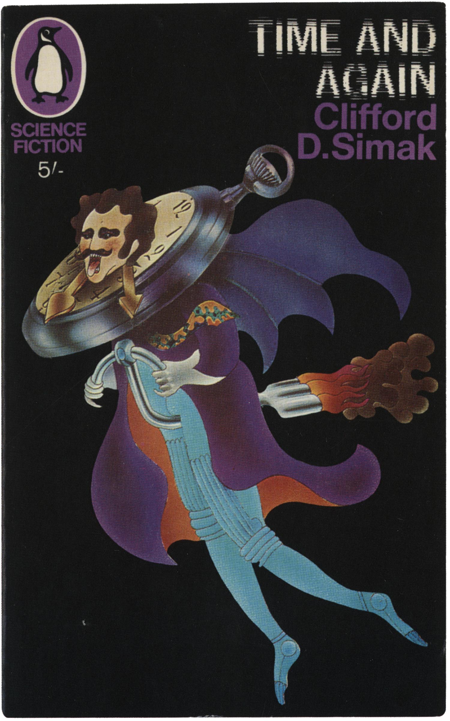
>1 bam2001: For Time and Again, is he traveling on "gas" power? A good use of resources, but it looks painful.
3bam2001
>2 MrsLee: He does seem to be in pain, but that might be because he's rammed his head through a watchmaker's store display.
4GSSex-noob
>2 MrsLee: Presumably the clock hands are pressing pointily on his neck too.
Even ignoring the horological bit, it's got to be uncomfortable to be sitting on that narrow tube. Which might be hot if the fuel isn't coming from Mr. Quilted Bodysuit.
Even ignoring the horological bit, it's got to be uncomfortable to be sitting on that narrow tube. Which might be hot if the fuel isn't coming from Mr. Quilted Bodysuit.
5GSSex-noob
The Seizure Sans font might look normal if you're on the drugs the artists were. These are so 60s they're self-parody at this point.
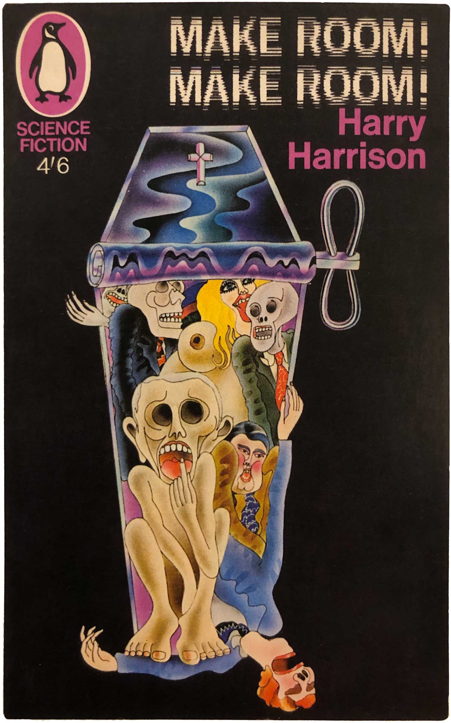
I get the metaphor for "Make Room", but the others baffle me not just with the art but with how they might relate to the plots. Especially the last.
Great find, Bruce.
Edit: Looked at the link. Our old pal "Tiger! Tiger!" is there, plus others. The grumpy cat-woman of "The Wanderer" is described as "amazingly creepy, but not so much in a good way." And there's Buttface Viking on his steed! Which gets "inscrutably terrible!"
6EndofDiskOne
The covers of the British science fiction novels of the 60s and 70s convinced a young me that the British lived in a very different world than anyone else. So off-putting, negative and weird, and even if the story inside was a good one, every time you set the book down you were instantly confronted with this sort of terrible, despairing nonsense.
No doubt I missed some good reading just because I quickly learned to identify the Penguin logo and skip whatever was inside.
No doubt I missed some good reading just because I quickly learned to identify the Penguin logo and skip whatever was inside.
7Bookmarque
Reminds me of Terry Gillian's work a bit...if he took more acid.
8haydninvienna
>1 bam2001: I remember almost all of the covers in the linked article and owned quite a few. And I was pleased to see Horsiesaurus and Arseface the Viking again.
9GSSex-noob
>6 EndofDiskOne: I guess they weren't off-putting to the British of the time? Our Brit friends seem to have declined to move here, so we can't ask. I can't keep up with the Green Dragon, but maybe someone there could answer this.
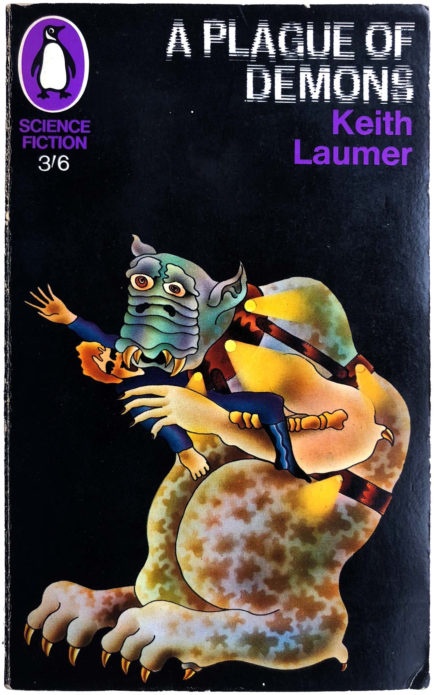
@Bookmarque: It makes Gillian's work look restrained and utterly logical. Though Plague of Demons would fit right in with Python, maybe with a different demon head.
(And, hello! How did you come to find us?)
@haydninvienna: Motion to officially dub that book "Horsiesaurus and Arseface the Viking". All in favor? AYE!
10paradoxosalpha
The illustrations are in a sort of naive surrealist style that I find somewhat endearing. On the other hand, that title font!!!
11GSSex-noob
Yes, you might spy one of these covers displayed on a bookstore shelf from across the room and it might draw your eye, even if it's just to go WTF over the details.
But Seizure Sans is never a good idea. It makes me squint involuntarily.
IIRC there was an American publisher later on that went with that font. It remained bad.
(can't check, there's another Database Error; thanks to @haydninvienna that we at least saved Sarnath)
But Seizure Sans is never a good idea. It makes me squint involuntarily.
IIRC there was an American publisher later on that went with that font. It remained bad.
(can't check, there's another Database Error; thanks to @haydninvienna that we at least saved Sarnath)
12haydninvienna
>11 GSSex-noob: Horsiesaurus and Arseface the Viking is here too: https://www.librarything.com/topic/362272#n8594490.
13GSSex-noob
>12 haydninvienna: Oooh, I forgot that. Soz. Thanks for reminding me.
14bam2001
These are apparently the work of Alan Aldridge, who is described in the blurb for the art book as "Over the course of his 40-year career, Alan Aldridge has been the design guru for the Beatles; a designer of gigs and album covers for the Rolling Stones, Elton John, the Who, Cream, and Led Zeppelin; the target of police prosecution for his notorious Chelsea Girls poster; the author of the bestselling children's book The Butterfly Ball; and a graphic designer for the Hard Rock Cafe, the House of Blues, and the New York Times."
The art book, and a number of samples including some more Penguin covers:
https://50wattsbooks.com/products/the-man-with-kaleidoscope-eyes
The art book, and a number of samples including some more Penguin covers:
https://50wattsbooks.com/products/the-man-with-kaleidoscope-eyes

16GSSex-noob
>15 bam2001: Looks more like it'd poke out your eye.
At least you can identify the pictured items, even in their (ahem) non-erect versions.
At least you can identify the pictured items, even in their (ahem) non-erect versions.

