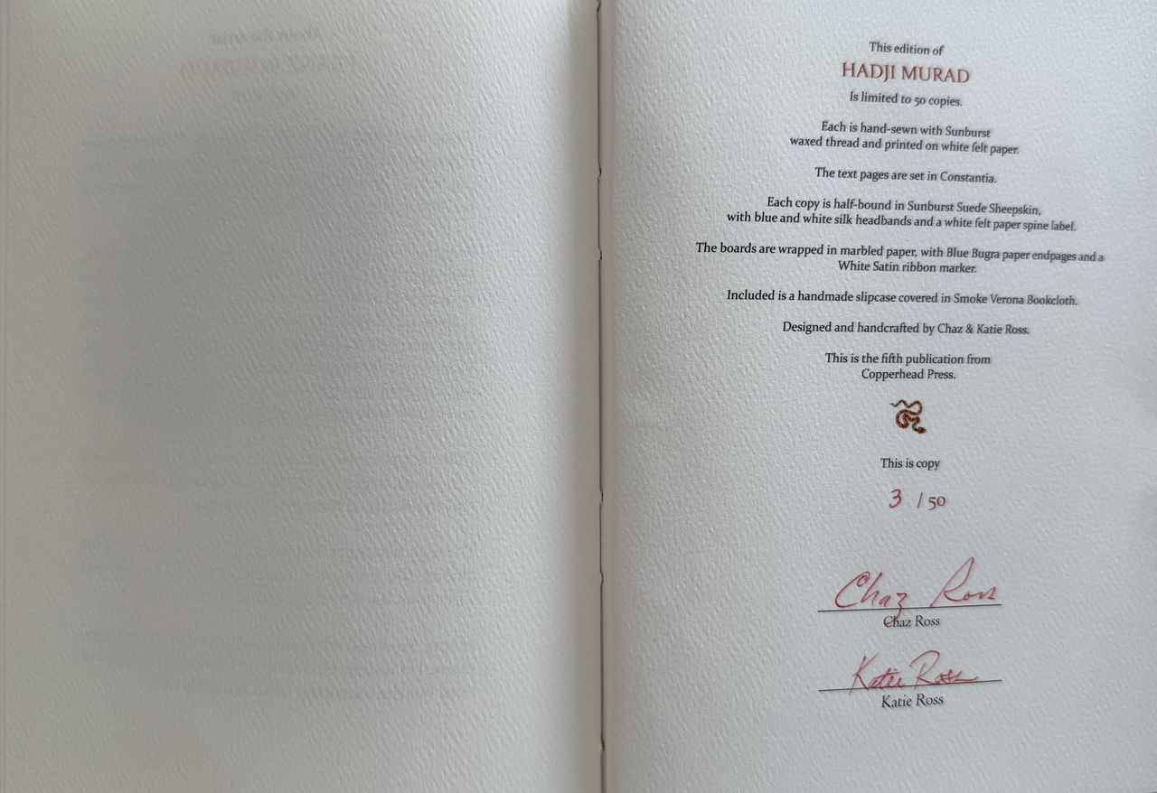
Hadji Murad by Leo Tolstoy - COPPERHEAD PRESS LE 2025
Talk Fine Press Forum
Join LibraryThing to post.
1wcarter
Hadji Murad by Leo Tolstoy - COPPERHEAD PRESS LIMITED EDITION 2025
A PICTORIAL REVIEW
No. 3 of 50 copies
Foreword by Chaz Ross.
Signed by designers and producers Chaz & Katie Ross.
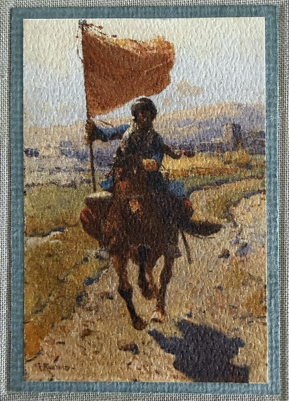
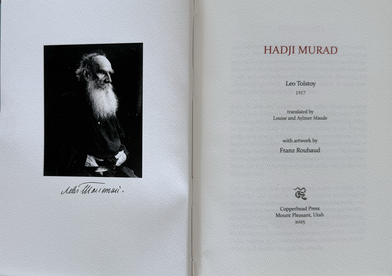
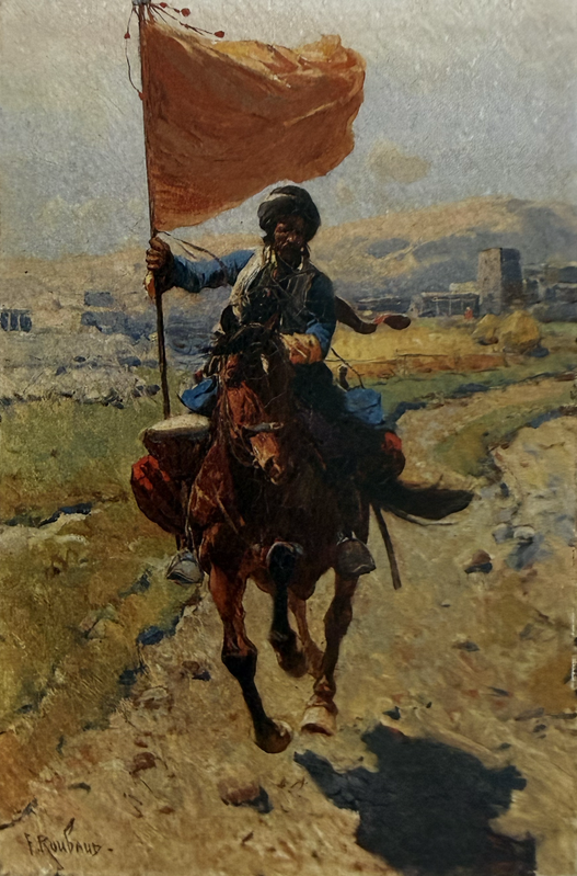
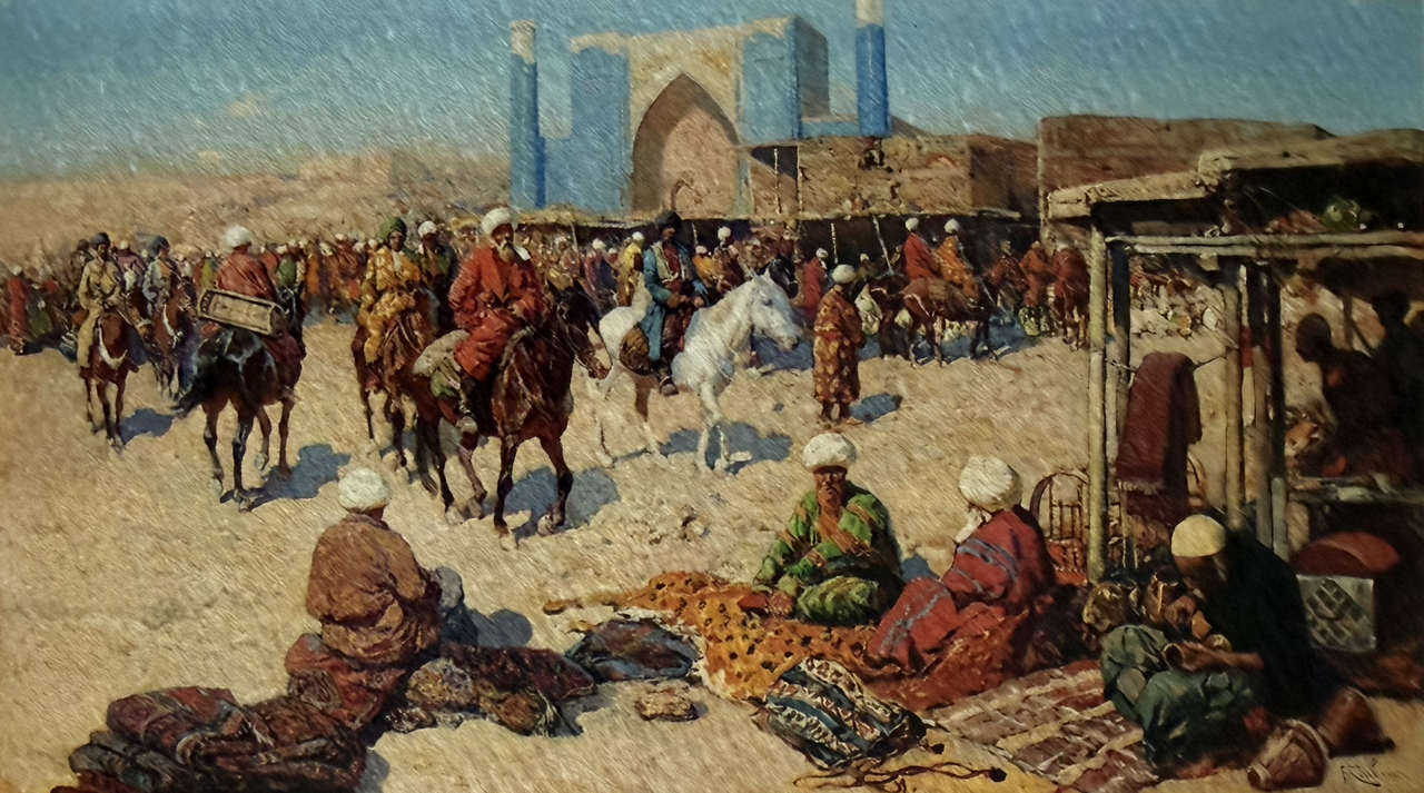
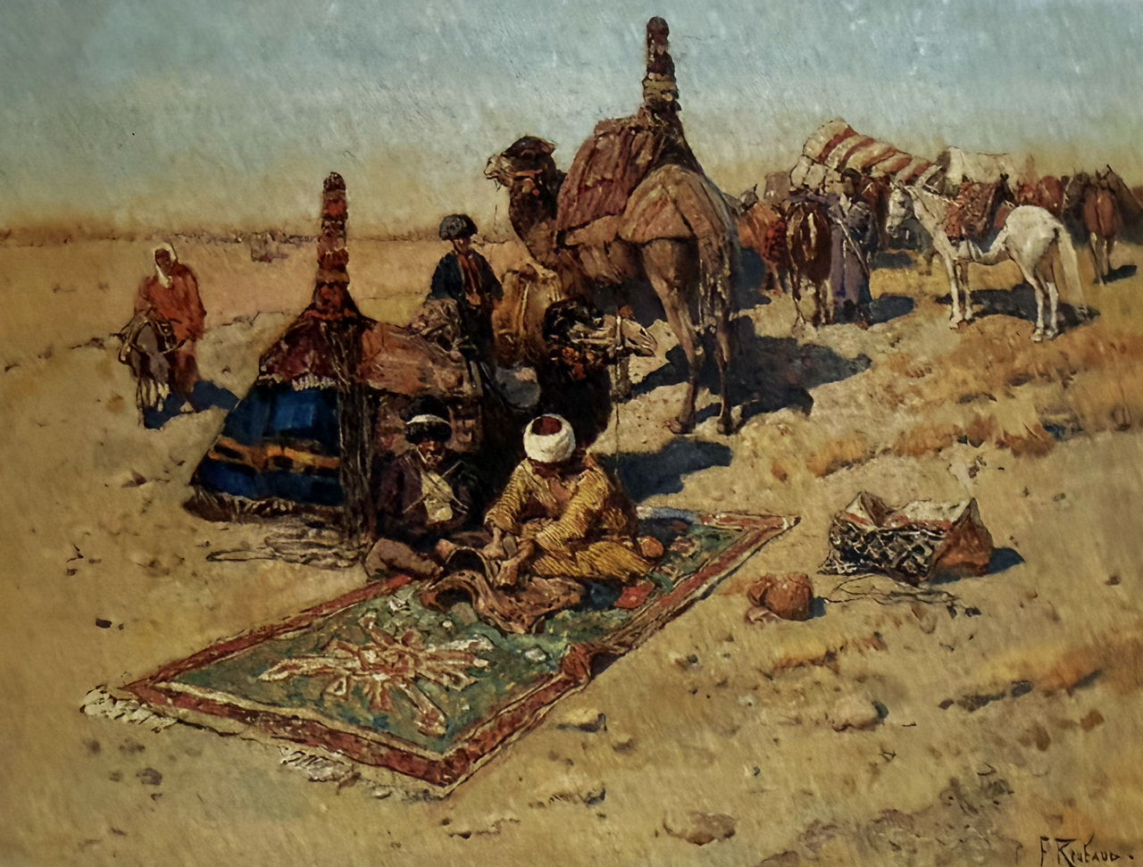
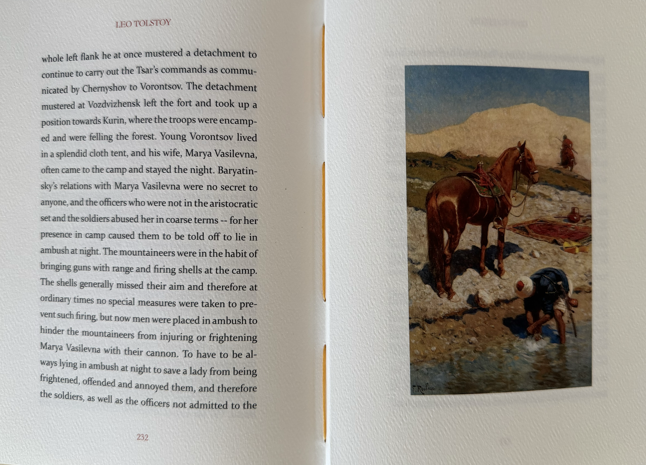
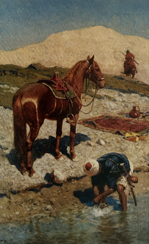
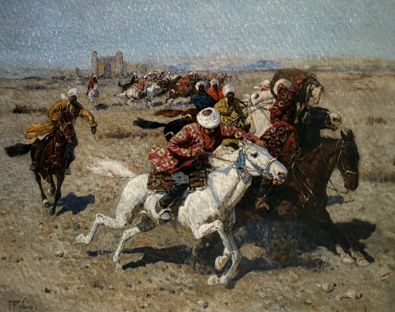
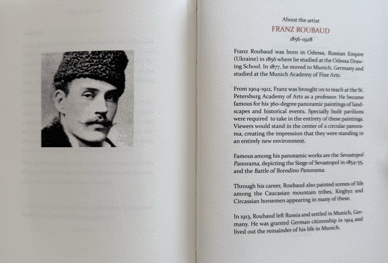
Thirteen colour illustrations by Franz Rimbaud.
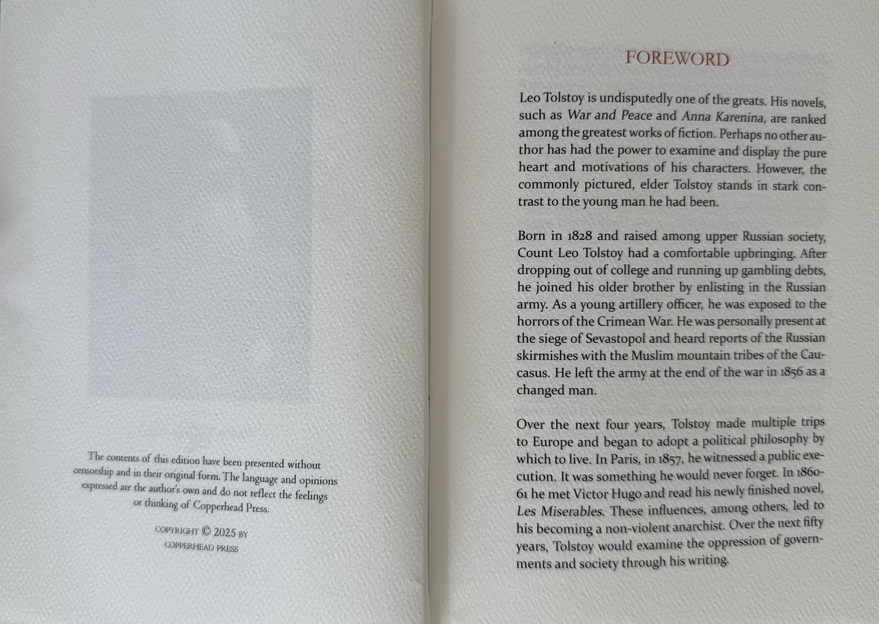
Printed off-set on white felt paper with chapter and page numbers printed in dark orange.
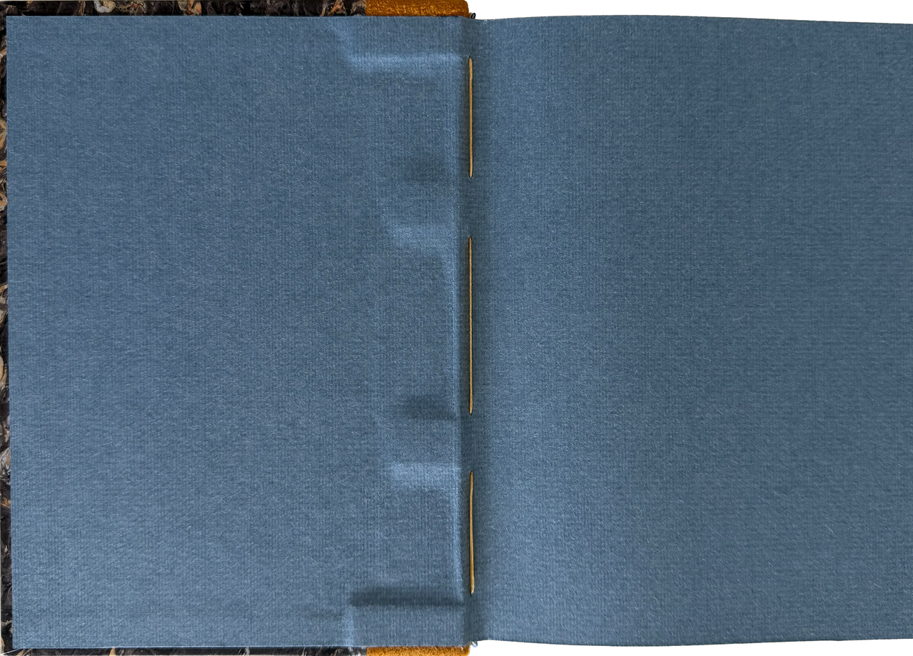
Endpapers are blue Bugra mould made paper made in the Hahnemuhle Mill in Germany.
Pale blue and white silk headbands.
White satin ribbon marker.
Hand-Sewn signatures.
Plain trimmed page edges.
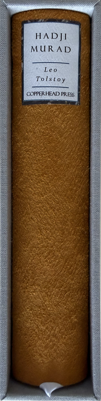
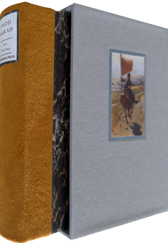
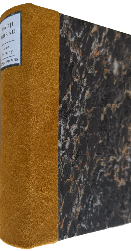
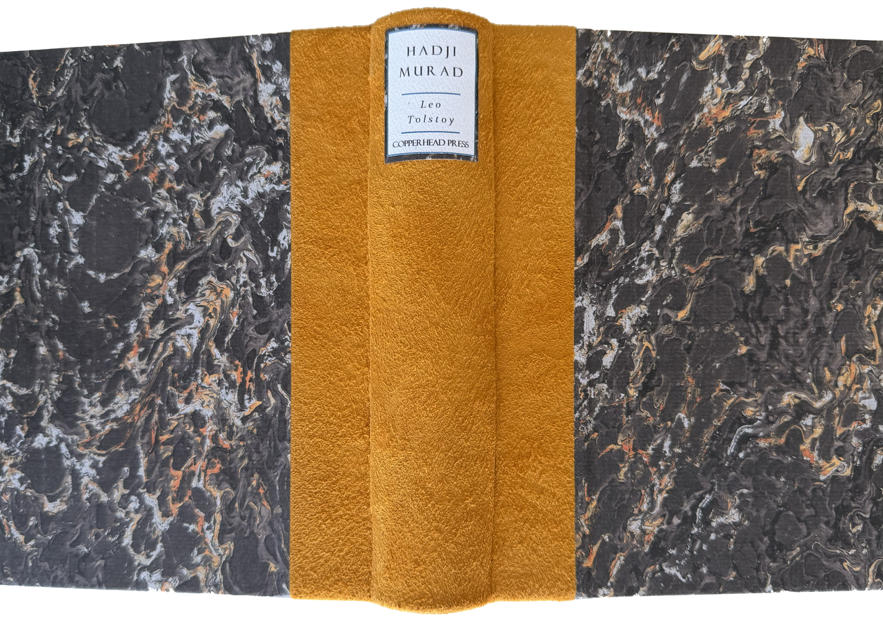
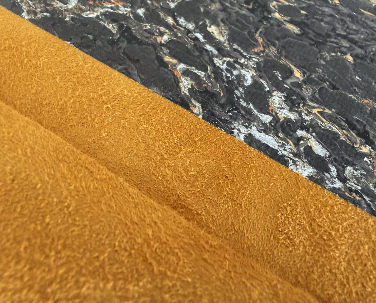
Half-bound with golden lambskin leather with marbled paper covers.
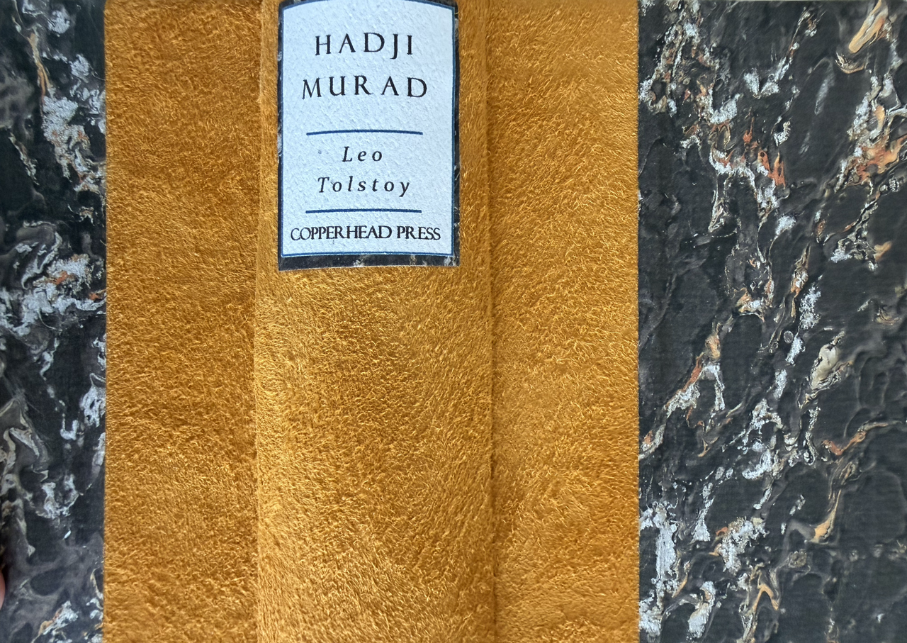
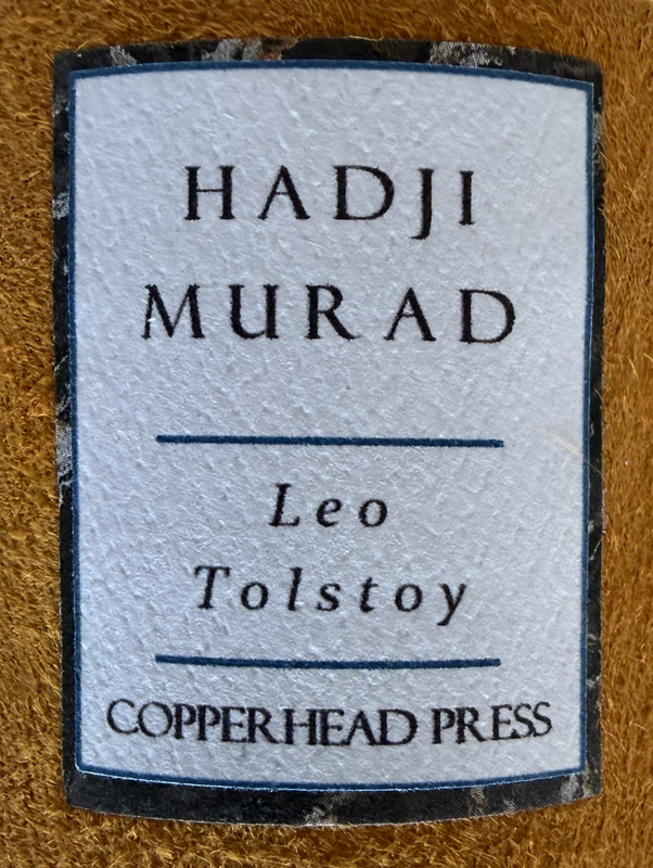
White felt paper spine label.
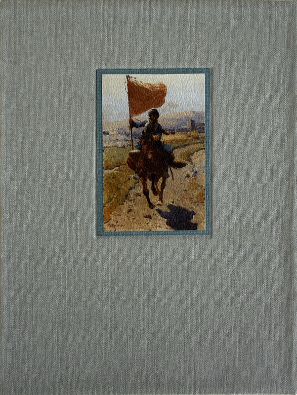
Slipcase handmade with high density book board, wrapped in grey book cloth and with a watercolour inset by Franz Rimbaud on front.
19.5x15cm.
288 pages
US$400 from publisher
An index of the other illustrated reviews in the this series can be viewed here.
A PICTORIAL REVIEW
No. 3 of 50 copies
Foreword by Chaz Ross.
Signed by designers and producers Chaz & Katie Ross.
Thirteen colour illustrations by Franz Rimbaud.
Printed off-set on white felt paper with chapter and page numbers printed in dark orange.
Endpapers are blue Bugra mould made paper made in the Hahnemuhle Mill in Germany.
Pale blue and white silk headbands.
White satin ribbon marker.
Hand-Sewn signatures.
Plain trimmed page edges.
Half-bound with golden lambskin leather with marbled paper covers.
White felt paper spine label.
Slipcase handmade with high density book board, wrapped in grey book cloth and with a watercolour inset by Franz Rimbaud on front.
19.5x15cm.
288 pages
US$400 from publisher


An index of the other illustrated reviews in the this series can be viewed here.
3AstulTheShepherd
The paper texture is interesting, what's it like on the fingers?
4Transfixed
>1 wcarter: It's a wonderful encounter with Roubaud's paintings. Unfortunately, these photos also demonstrate a lack of proofreading.
5CJR93
>1 wcarter: thanks for the post!
6yikou
>4 Transfixed: Can you elaborate on what you mean by the lack of proofreading? I was excited to see a fine edition of this story come out, but I immediately opted not to based on the paintings, so perhaps we mean the same thing?
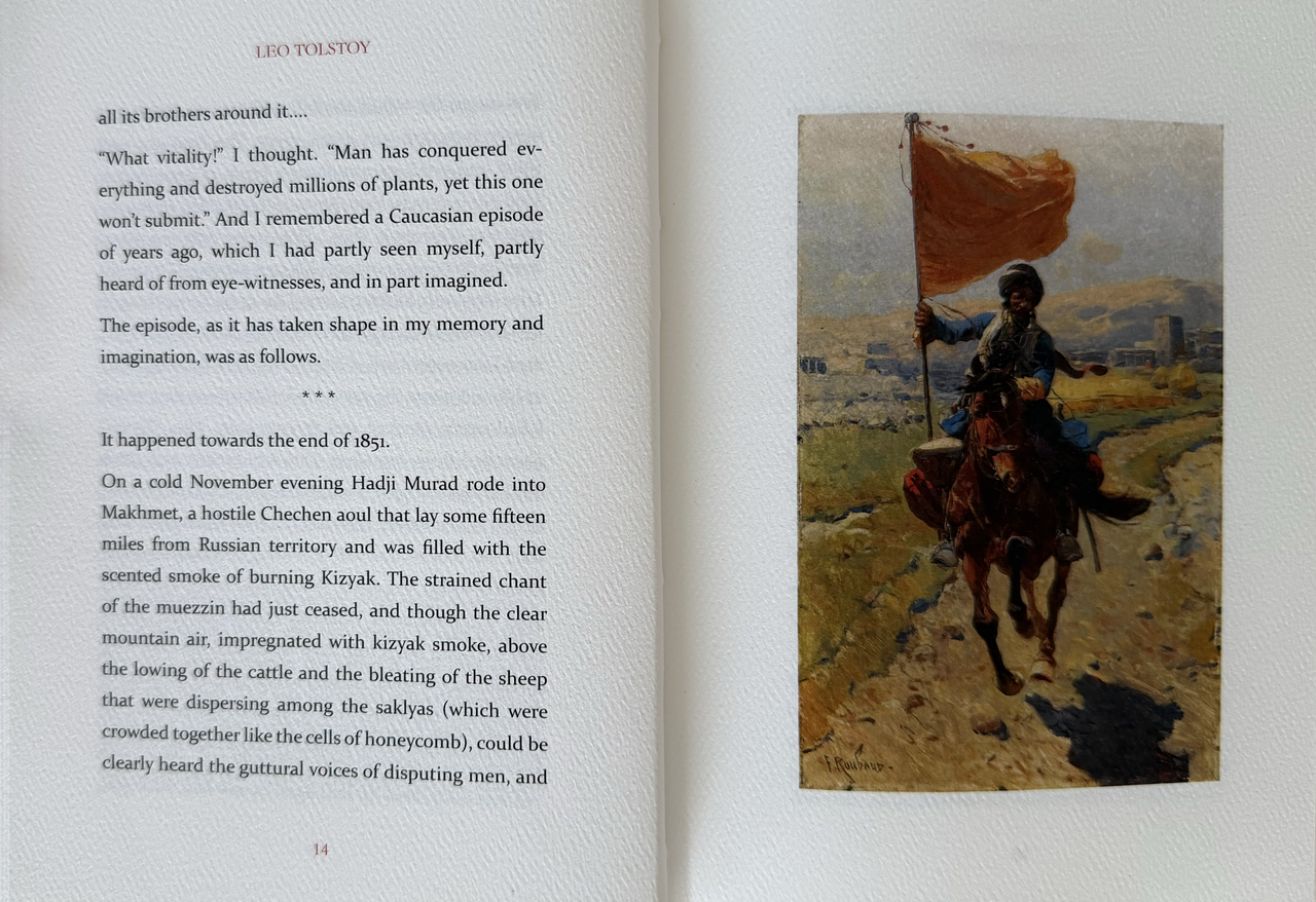
First, before my Gell-Mann Amnesia Effect nitpicking, credit where credit's due, the choice of using the suede side of the leather for the spine fits well with Roubaud's paintings (evocative of the coat of the horses) and the book looks like a solid production that likely feels nice in the hands to read. I too am curious about the paper used – it looks "felted" (either in reality or just in branding from the paper company), which I've always quite enjoyed as a style of hefty, tactile machine-made paper.
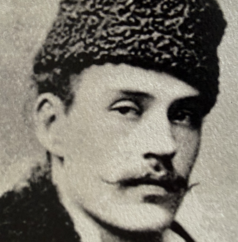
However, my nitpick: Hadji Murad was neither a Circassian, nor a Kalmyk horseman. He was an Avar and the steppes of Kalmykia are a far cry from the craggy mountain villages of Dagestan. So while the paintings are evocative, they are perhaps not the most faithful to the environment of the Avar's struggle against Russian imperialism. Compare, for example, M. Murad in Le Caucase Pittoresque.
I am also somewhat disappointed by the use of "tartar" in the glossary. That seems unnecessarily outdated for what I presume is the creation of the publisher, rather than Tolstoy himself.
First, before my Gell-Mann Amnesia Effect nitpicking, credit where credit's due, the choice of using the suede side of the leather for the spine fits well with Roubaud's paintings (evocative of the coat of the horses) and the book looks like a solid production that likely feels nice in the hands to read. I too am curious about the paper used – it looks "felted" (either in reality or just in branding from the paper company), which I've always quite enjoyed as a style of hefty, tactile machine-made paper.
However, my nitpick: Hadji Murad was neither a Circassian, nor a Kalmyk horseman. He was an Avar and the steppes of Kalmykia are a far cry from the craggy mountain villages of Dagestan. So while the paintings are evocative, they are perhaps not the most faithful to the environment of the Avar's struggle against Russian imperialism. Compare, for example, M. Murad in Le Caucase Pittoresque.
I am also somewhat disappointed by the use of "tartar" in the glossary. That seems unnecessarily outdated for what I presume is the creation of the publisher, rather than Tolstoy himself.
7Pendrainllwyn
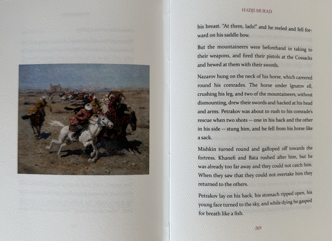
>6 yikou: Page 269. "The horse under Ignatov ell, crushing his leg, ..."
Not the first fine press book with some error of this nature. I don't know how it's done but I would have thought a spell-checker would pick up a number of the errors I have seen.
Not the first fine press book with some error of this nature. I don't know how it's done but I would have thought a spell-checker would pick up a number of the errors I have seen.
8CJR93
>7 Pendrainllwyn: Yeah… the typos are on me. It’s a gut punch to find any after printing. I was trying to do everything at the time we laid this edition out for design. Since then I’ve added another proofreader to our team.
9ambyrglow
The binding looks lovely, but there's definitely room for improvement with the typesetting, beyond the typoes. The hyphenation rules being used are visually jarring to me; "hon-/ey-scented" and "almond-scent-/ed" rather than adjusting kerning to allow for "honey-/scented" and "almond-/scented," for example. And "Kazi-Mul-/la" is particularly distracting, because since it's a foreign word I'm not 100% sure that the second hyphen is just for the line break and isn't innately part of the term. (Pretty sure, though.) I've done enough typesetting work in InDesign to know that avoiding these sort of breaks requires a certain amount of manual intervention, but IMO it's manual intervention worth doing.
Also, is the decision to use double hyphens in place of proper em-dashes deliberate?
Also, is the decision to use double hyphens in place of proper em-dashes deliberate?
10yikou
>7 Pendrainllwyn: Ah, thanks I was so hung up on the Roubaud paintings' juxtaposition that's what I assumed "photo" meant, not wcarter's photos of the pages. Thanks!
11Shotcaller
>9 ambyrglow: The typesetting is the only thing that gives me pause when looking at these editions. The bindings seem wonderful, and the art well-chosen. I can't quite discern what principles lay behind the typesetting choices.
12CJR93
>9 ambyrglow:
>11 Shotcaller:
I learned a lot with this and its somewhat companion edition, “Notes from the Underground”.
It was the first time publishing two editions at once, working with genuine suede, formatting a different size of textblock on InDesign, trying different things with the text/type, etc. The biggest first time: working with a commissioned artist on “Notes from the Underground”.
If I were to design them over again today, with more experience, I’d make adjustments. (I think every publisher would with every edition, given the chance.) But given where I was a few years ago while designing, I’m very happy with how they turned out. That’s a strange effect of working within a preorder model. I’m always facing the choices I made with 6-9 months less experience.
That being said, you’ll see our typesetting choices and layouts improving with the immediately subsequent editions of “The Sun Also Rises”, “Jacob’s Room”, and “Heart of Darkness”.
13jveezer
The problem is that "ell" is a word. So spellcheck wouldn't flag it. I have noticed that spell/grammar checkers have actually gone backwards with AS/AI (Artificial Stupidity/Intelligence) despite what the Tech Bros would have us believe, a big pet peeve of mine. What we need is AW, Artificial Wisdom. I don't hold out a lot of hope for that, so human proofreaders are still the best.
One model that might work for small fine/private presses might be to reach out to their interested customers, especially readers, to proofread and copy-edit. Dalkey Press did that for their reissue of Miss MacIntosh, My Darling after optically scanning in their out-of-print(OOP) edition. Optical scanners often see t for i, for example. I proofread 100 or so pages of the 1300 page novel. I had never read it before but it had always been on my TBR if I ran across a copy of the OOP editions. I got a free copy of the trade edition for my efforts. It was a bit weird to read a section in the middle of the book but I was glad to see that my section was clear of errors when I read the whole book in the new edition, although some slipped through in other sections.
While a free copy of a fine press book is a big ask for your troubles, a discount code would entice many. Some of us might do it for free in an edition we were interested in.
All that being said, the books look really nice. And I'm glad to see some women writers in there. Just need some BIPOC and other marginalized writers!
14Glacierman
>13 jveezer: Good idea. Consensus Press had some willing hands proof-read The Tale of Sinuhe in addition to Mark, Dr. Parkinson, Griffin and me. It was a big help. The proof-reading members did it for the pleasure of helping out and our undying gratitude. It is a good model, methinks, and worth considering.
15Shotcaller
>13 jveezer: My God, I can't imagine proofreading Miss MacIntosh, My Darling. They were wise to divide the task into sections. How long did it take you to proof yours?
16Shotcaller
>12 CJR93: Thanks for this insight. And don't get me wrong; it's good that you're out there. We need more fine press editions of really good books.
17Izdubar
>13 jveezer: The shameless hubris of telling a private press that they “need” to do something, rather than humbly recommending it, always makes me chuckle.
18jveezer
>17 Izdubar: Haha, hubris used to suggest BIPOC and other underrepresented writers should be published? Interesting gaslighting there. You might want to check the definition of hubris. And look at the stats about what privileged group(s) get published. Stats don't lie.
But to put some context around my use of the word "need," I actually meant that I am more likely to NEED (to purchase) a book from a press if it is by a writer from an underrepresented group rather than an writer/title I can probably get from another press. As tempted as I am for a fourth copy of A Portrait of the Artist as a Young Man, I'm not tempted enough to purchase.
But to put some context around my use of the word "need," I actually meant that I am more likely to NEED (to purchase) a book from a press if it is by a writer from an underrepresented group rather than an writer/title I can probably get from another press. As tempted as I am for a fourth copy of A Portrait of the Artist as a Young Man, I'm not tempted enough to purchase.
19jveezer
>15 Shotcaller: It was a joy, actually. And a bigger joy to read the whole book and see that I caught all the errors in my part (I think!). But we weren't correcting grammar or suggesting edits, we were strictly looking for mistakes in the scan. So no mistakes in their first edition were corrected, we were just trying not to add more.
20Izdubar
>18 jveezer: If a private press wants to publish nothing but literature written by men from the Sassanian empire in Pahlavi, that’s their prerogative. Presses publish according to their tastes and the tastes of the public.
21jveezer
>20 Izdubar: And I would buy from that press, especially if they started with Fortress of the Forgotten Ones, written by a woman in Urdu about the Sassanian empire. My point exactly. ;)
22wcarter
I have reviewed another book by Copperhead Press, In Our Time by Ernest Hemingway.
The review can be seen at https://www.librarything.com/topic/365678
The review can be seen at https://www.librarything.com/topic/365678

