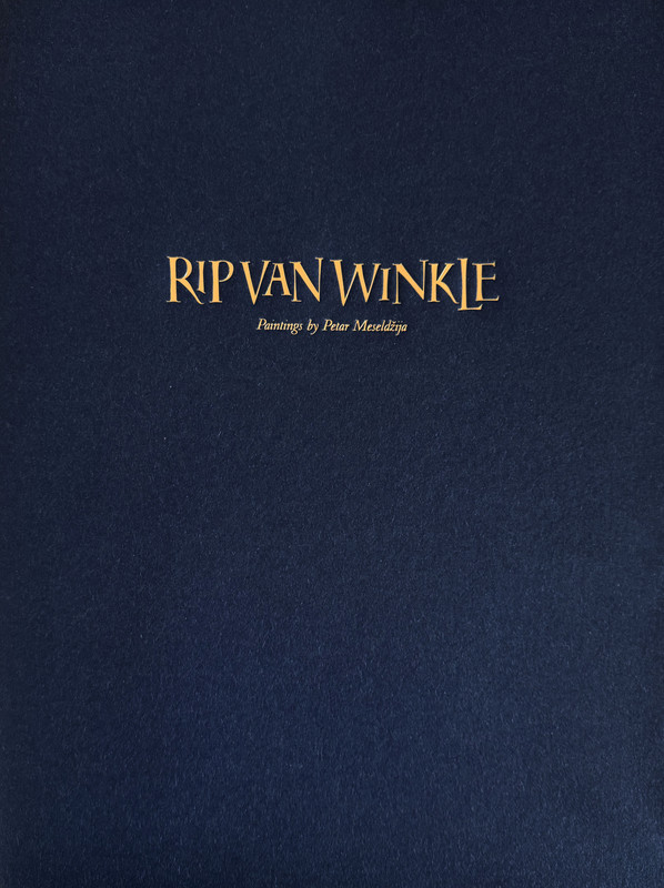
Rip van Winkle by Washington Irving – CONVERSATION TREE PRESS LE 2026
Talk Fine Press Forum
Join LibraryThing to post.
1wcarter
Rip van Winkle, A Posthumous Writing of Diedrich Knickerbocker by Washington Irving - CONVERSATION TREE PRESS DELUXE LIMITED EDITION 2026
A PICTORIAL REVIEW
No. 2 of 250 copies.
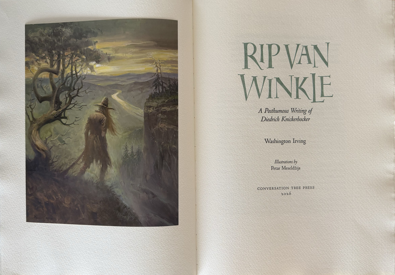
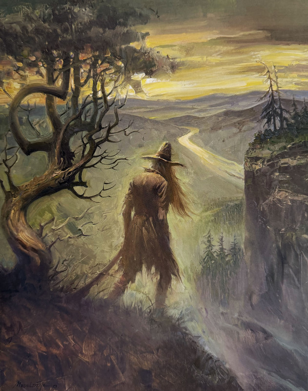
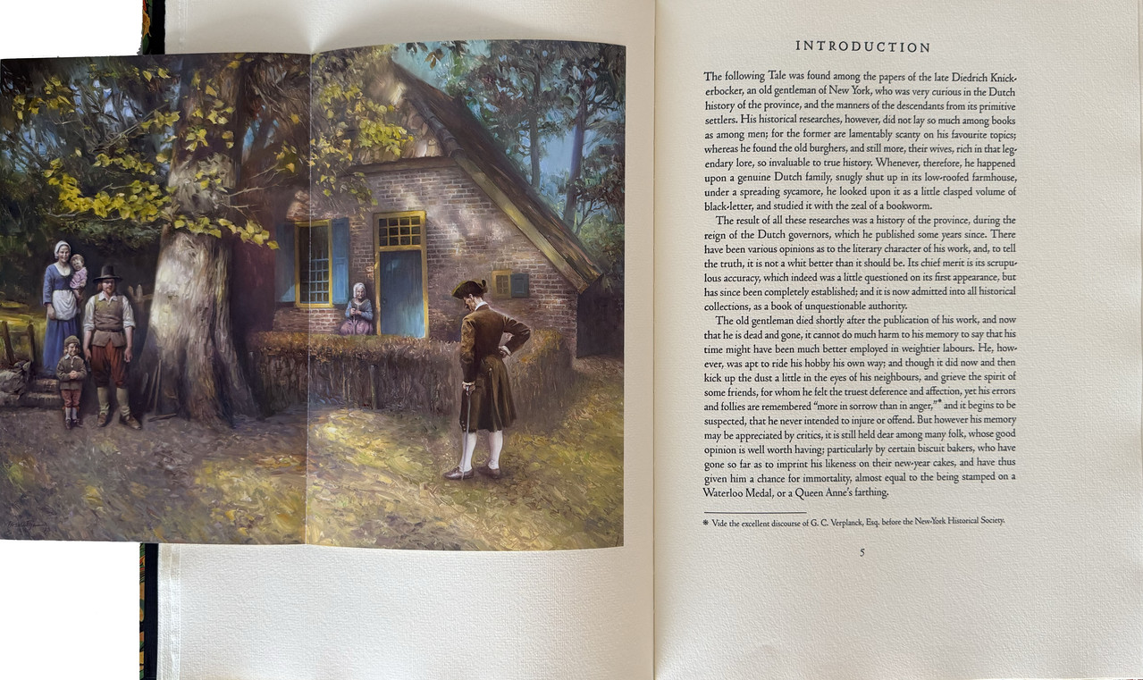
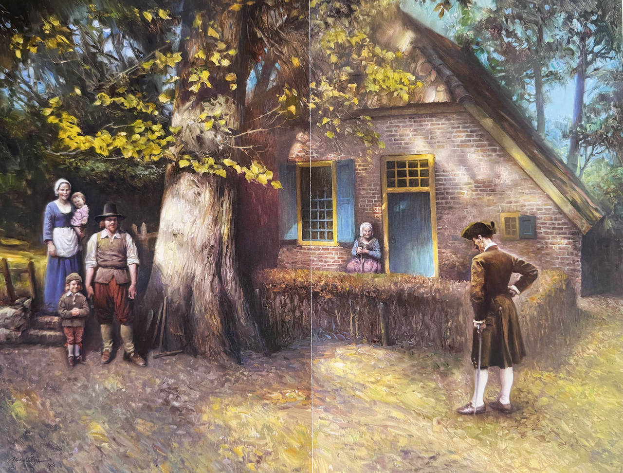
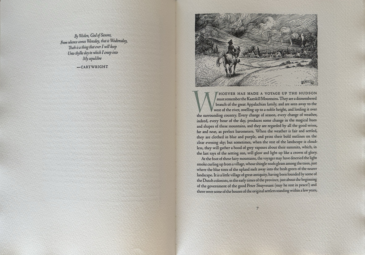
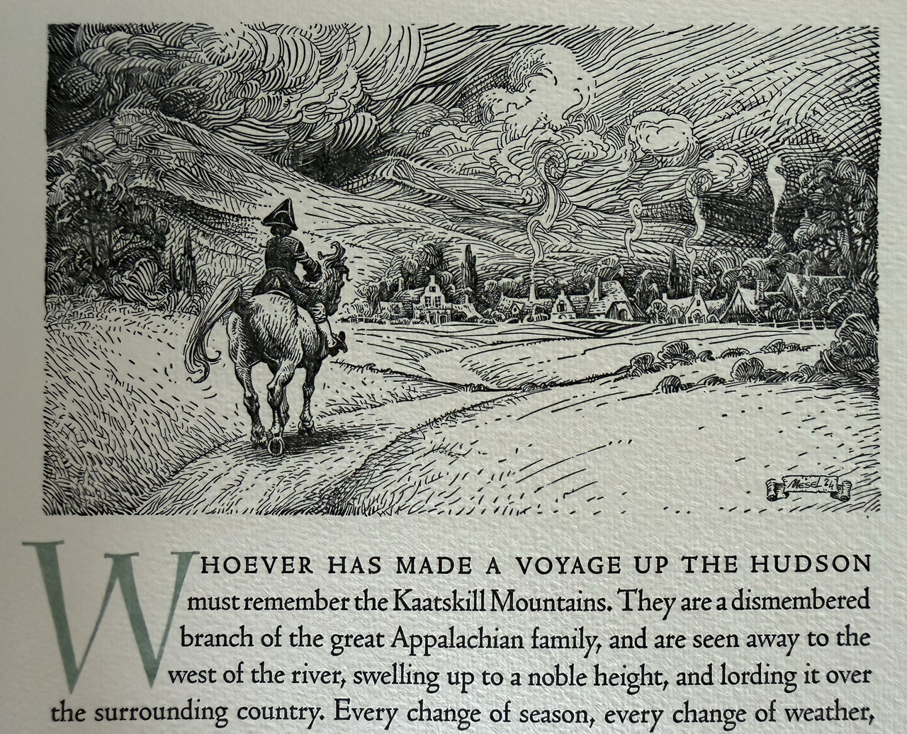
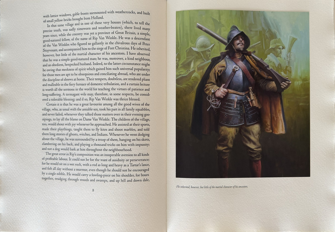
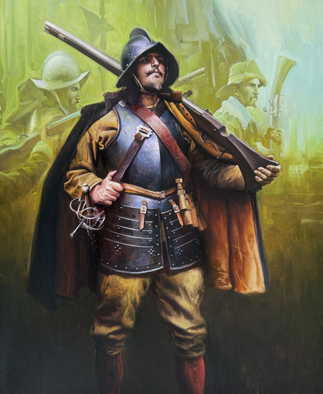
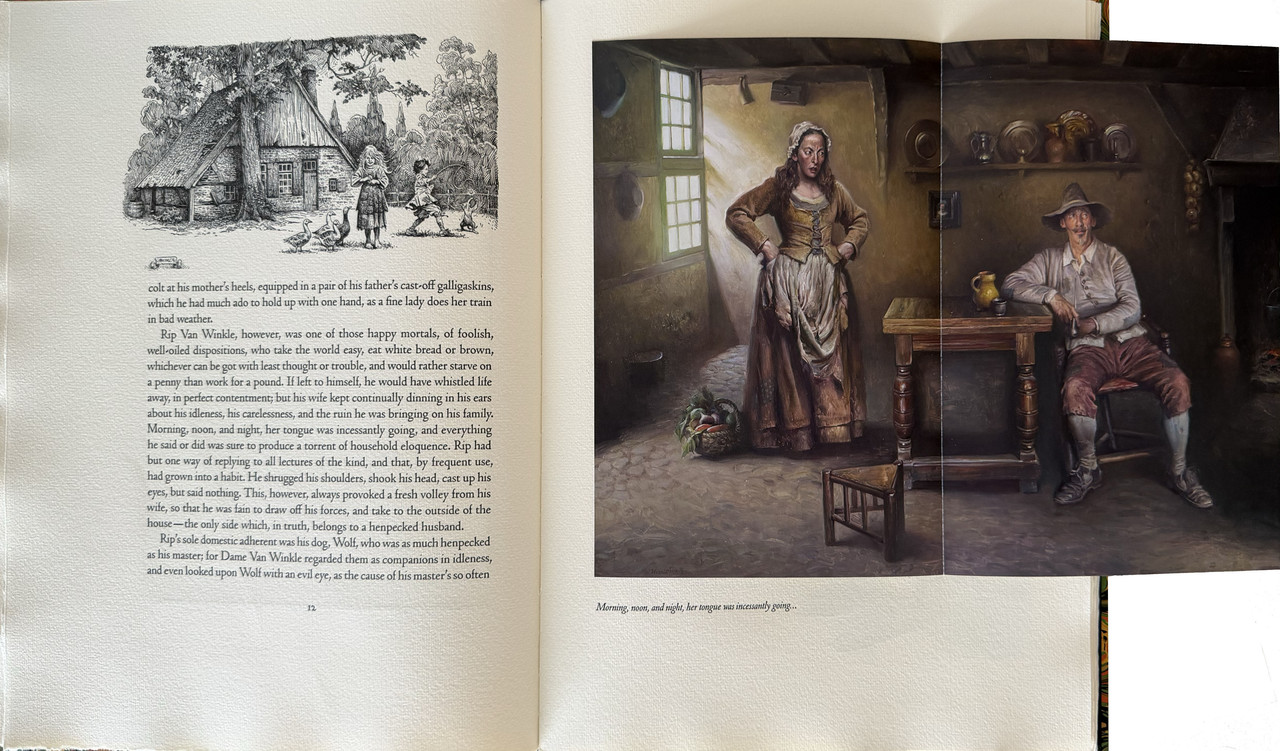
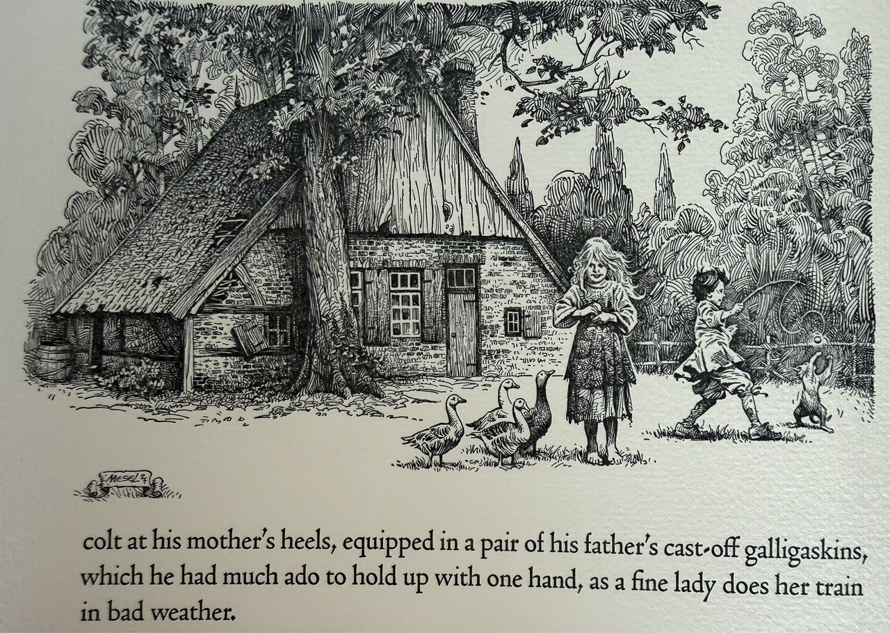
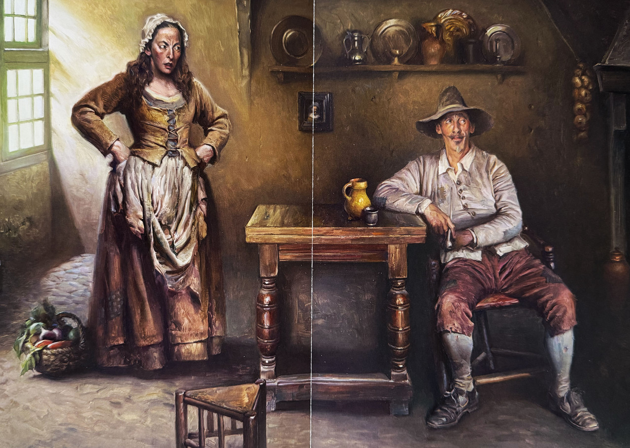
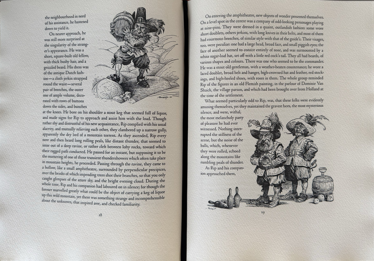
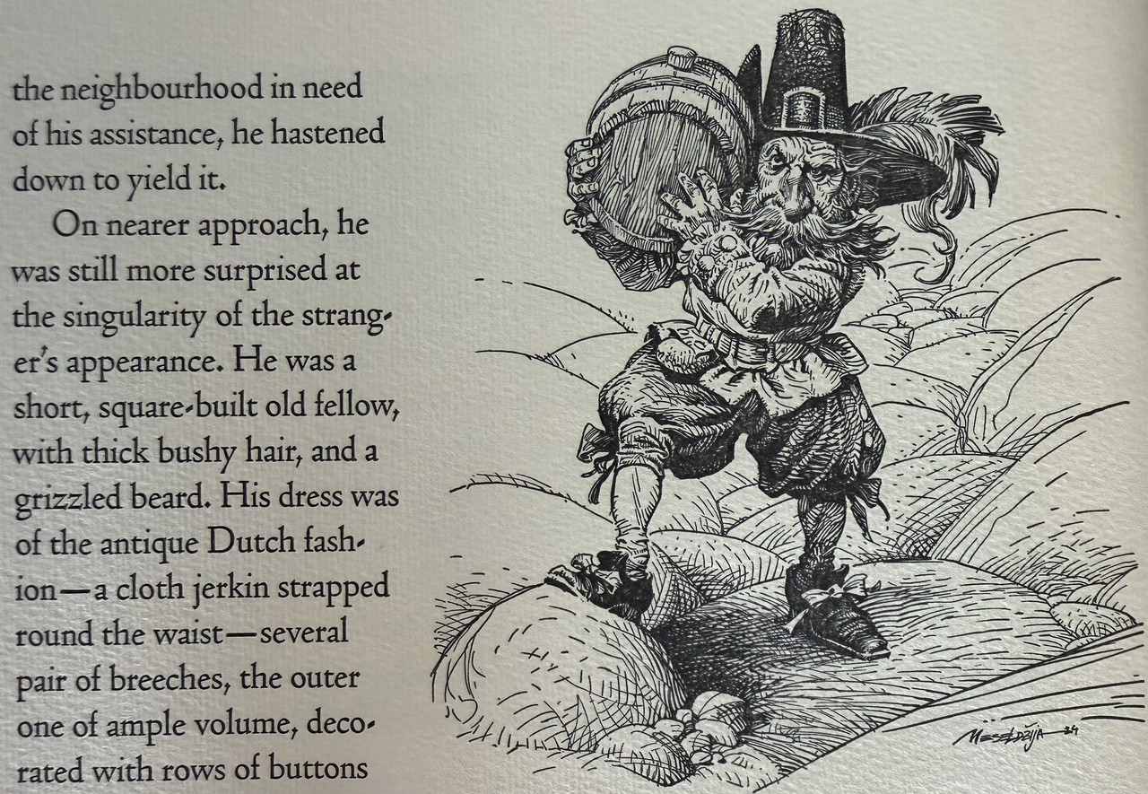
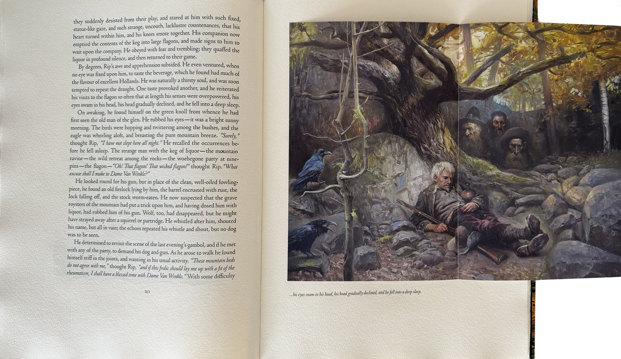
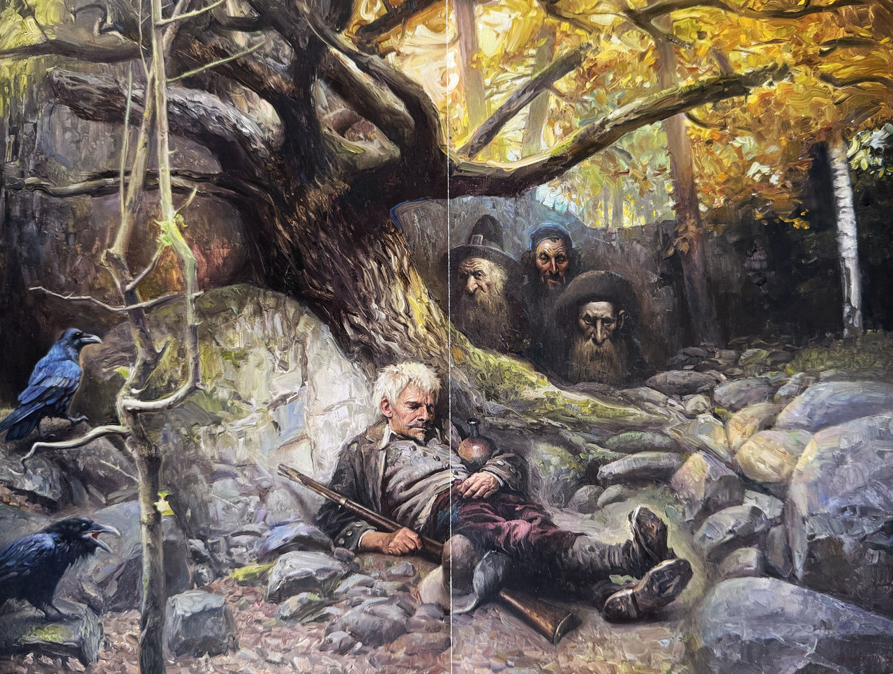
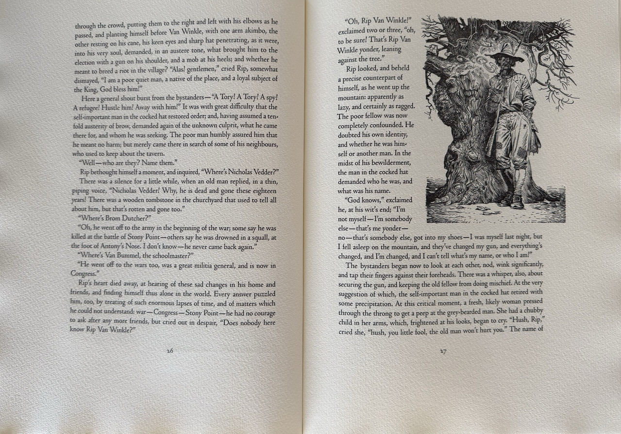
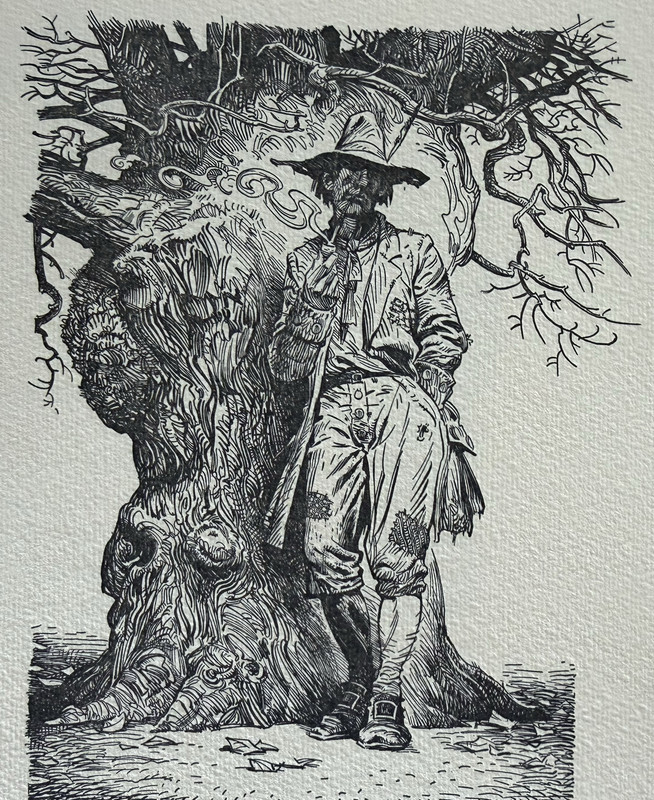
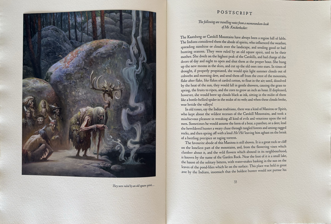
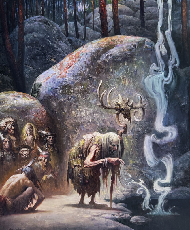
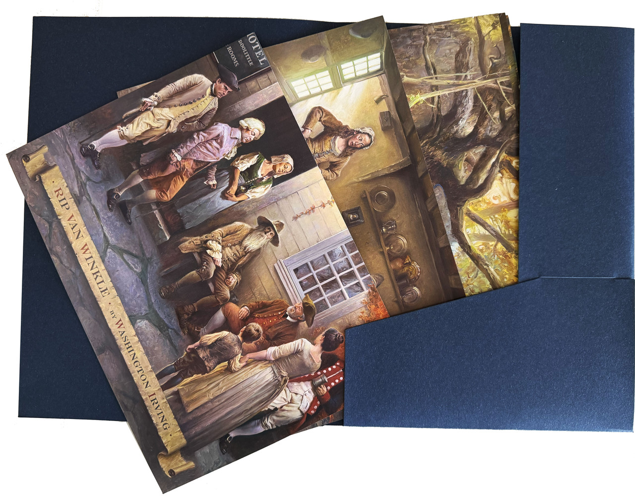
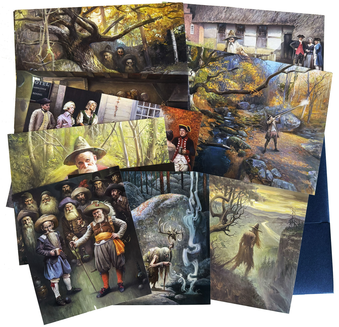
Nine tipped-in colour paintings (six fold-out) and 14 integrated monochrome line drawings by Petar Meseldžija.
Letterpress printing by Hand & Eye Letterpress.
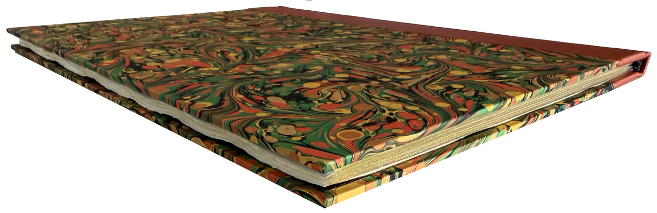
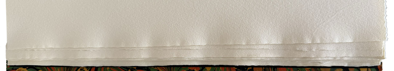
Hahnemühle mould-made papers with deckled edges.
Designed by Tony Geer and Danielle Mielcarek.
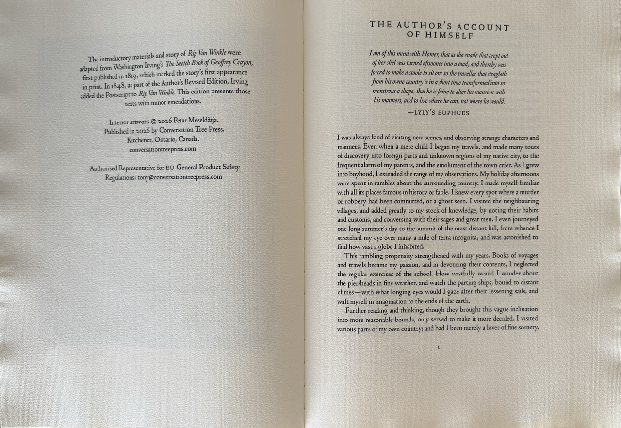
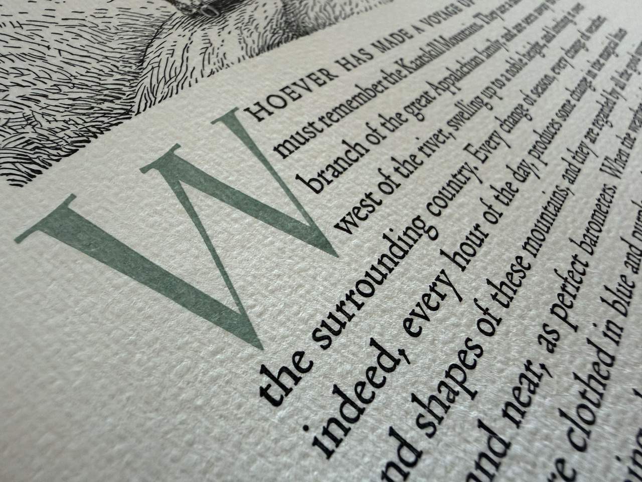
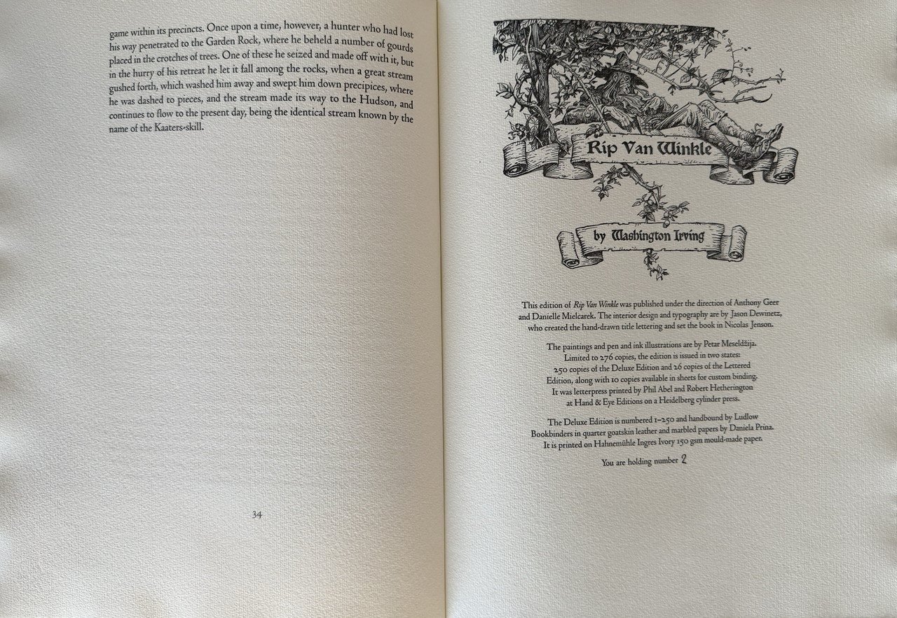
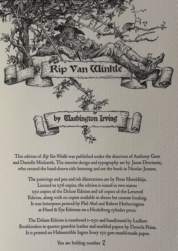
Interior design and typography by Jason Dewinetz of Greenboathouse Press.
One page introduction by the author.
Black ribbon marker and head- and tailbands.
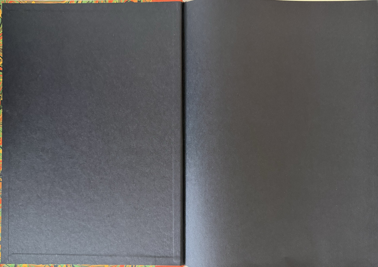
Black endpapers.
Deckled fore and lower edge of pages, upper page edge gilded.
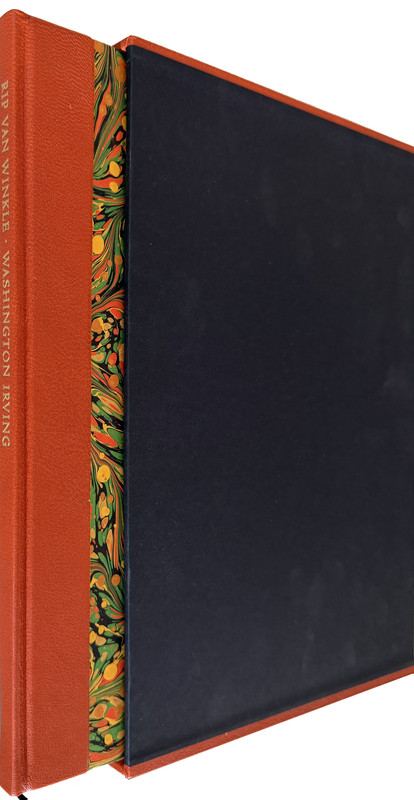
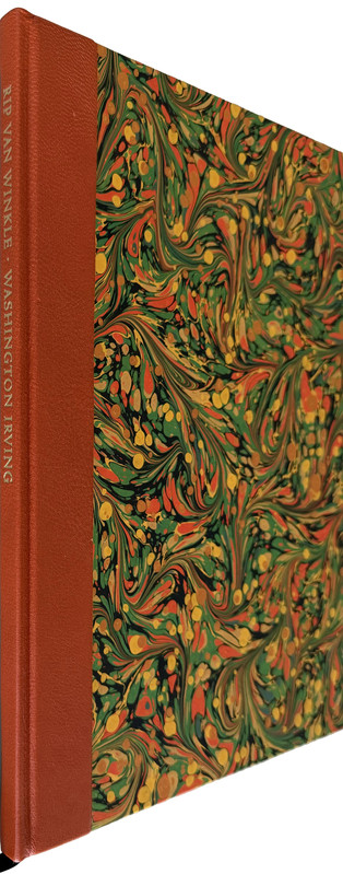
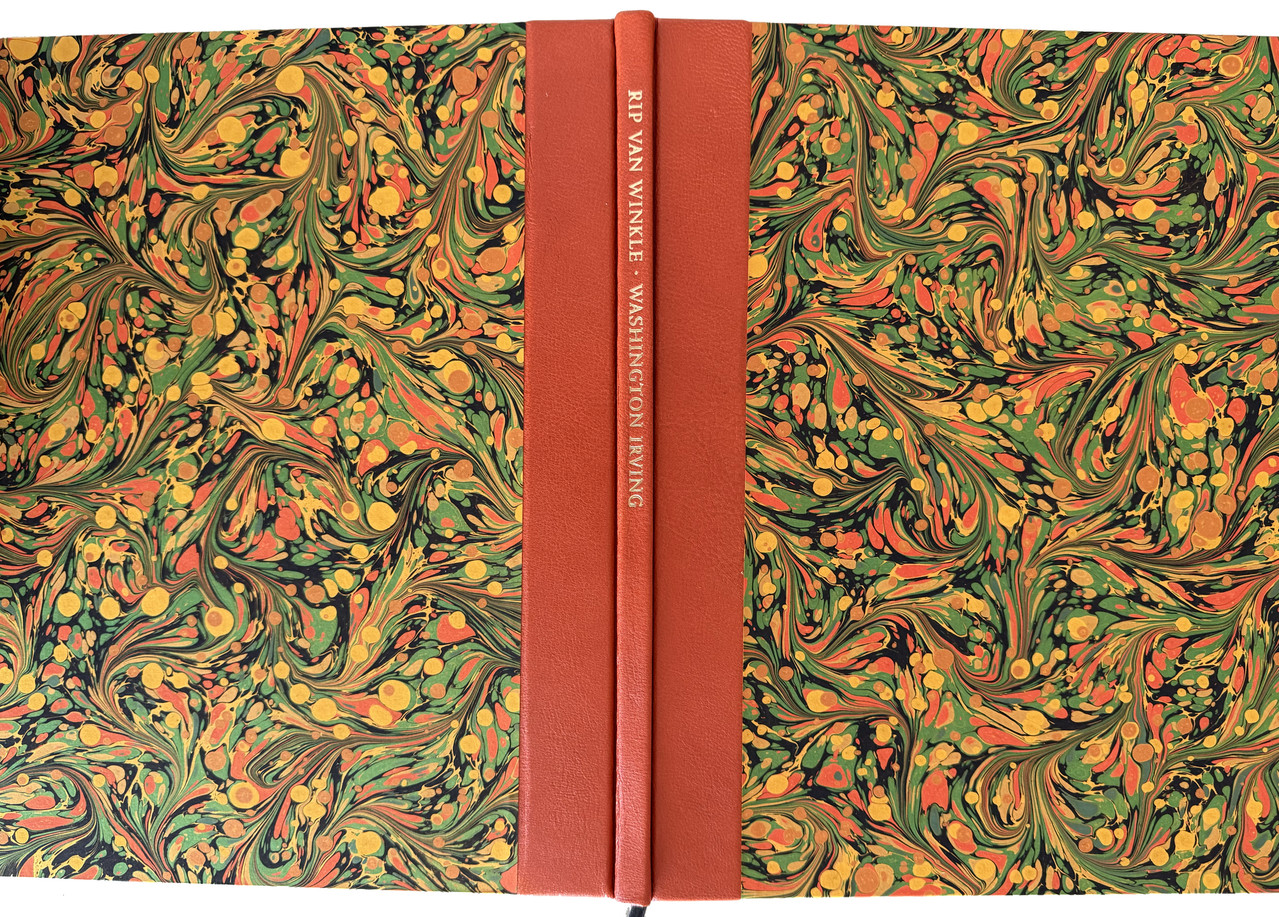
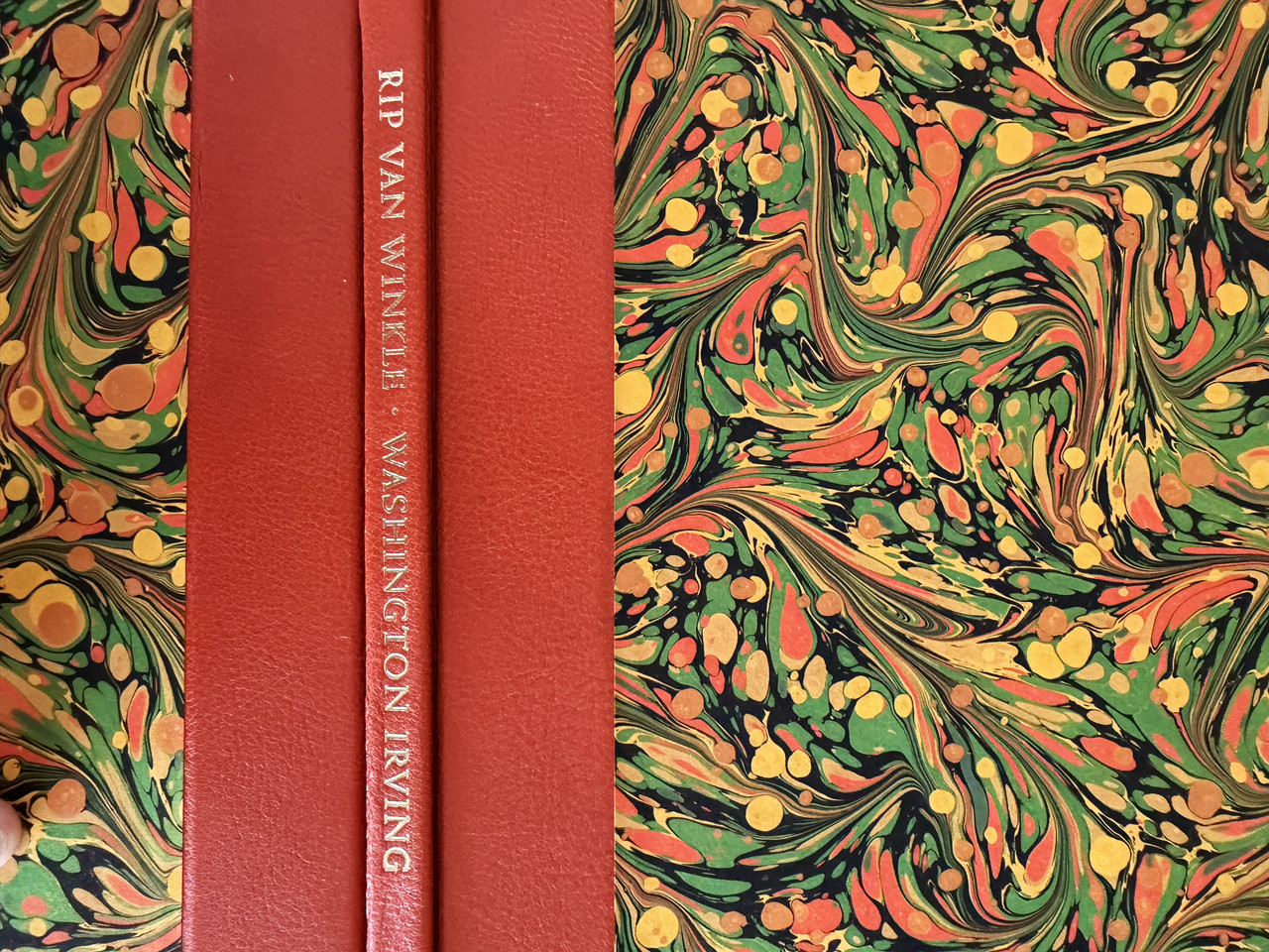
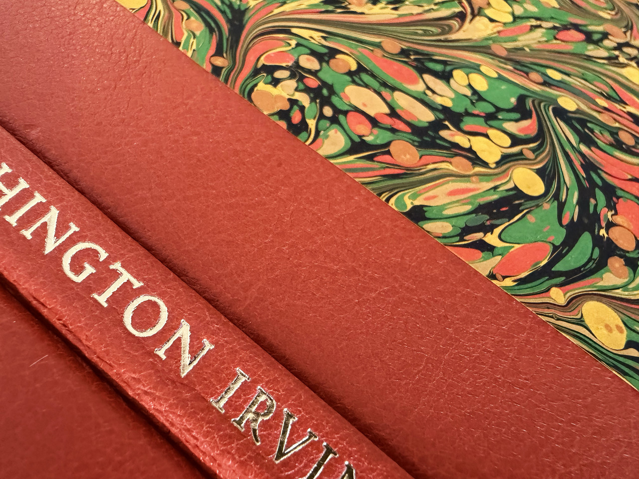
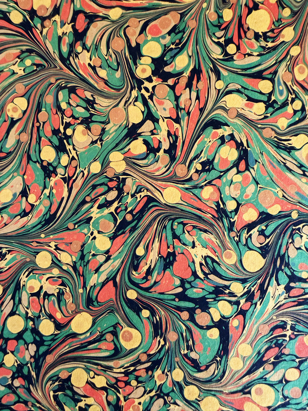
Quarter bound by Ludlow Bookbinders in orange full grain goatskin leather with orange and green hand-marbled paper covers.
Handmade black slipcase with orange caps, made of thick boards with the inside lined in black Suedel.
Portfolio of twelve unfolded reproductions of all of Petar’s Rip Van Winkle paintings, including those unable to be accommodated in the book.
36x26.6cm.
44 pages
US$575 from publisher.
This is a superb, lavishly illustrated book at that exemplifies the pinnacle of private press publishing.

Art portfolio
Easton Press also published a Deluxe Limited Edition of Rip van Winkle in 2012 which is reviewed HERE.
An index of the other illustrated reviews in the this series can be viewed here.
A PICTORIAL REVIEW
No. 2 of 250 copies.
Nine tipped-in colour paintings (six fold-out) and 14 integrated monochrome line drawings by Petar Meseldžija.
Letterpress printing by Hand & Eye Letterpress.
Hahnemühle mould-made papers with deckled edges.
Designed by Tony Geer and Danielle Mielcarek.
Interior design and typography by Jason Dewinetz of Greenboathouse Press.
One page introduction by the author.
Black ribbon marker and head- and tailbands.
Black endpapers.
Deckled fore and lower edge of pages, upper page edge gilded.
Quarter bound by Ludlow Bookbinders in orange full grain goatskin leather with orange and green hand-marbled paper covers.
Handmade black slipcase with orange caps, made of thick boards with the inside lined in black Suedel.
Portfolio of twelve unfolded reproductions of all of Petar’s Rip Van Winkle paintings, including those unable to be accommodated in the book.
36x26.6cm.
44 pages
US$575 from publisher.
This is a superb, lavishly illustrated book at that exemplifies the pinnacle of private press publishing.


Art portfolio


Easton Press also published a Deluxe Limited Edition of Rip van Winkle in 2012 which is reviewed HERE.
An index of the other illustrated reviews in the this series can be viewed here.
2duncjl
Leaving aside the exquisite binding (and check out the paper-marbler's Papiers Prina website) what this book most conjures to my mind, and it is by no means to its discredit, are the books produced by the Edinburgh firm T. N. Foulis in the early years of the 20th century.
3zorg2099
Wcarter's reviews are always very appreciated! I thought I might add a few pictures from my lettered edition for posterity even if the coverage from all angles isn't as comprehensive. These were previously posted on the CTP thread as well but I think perhaps it might be helpful to have here with the review for discoverability for anyone interested.
The lettered edition differs mainly in the following aspects:
- Solander box instead of slipcase
- Full goatskin leather binding in vibrant orange with inset giclée printed illustration.
- The same marbled papers used for the boards on the deluxe is used for the endpapers (I seem to have missed taking a photo of this)
- Zerkall 8888 White-Rough mould-made paper
- A unique tipped in remarque by the artist per each lettered book
- Priced at USD 1,695
There is an errata card noting that contrary to the colophon, printing on vellum for the front board insert was unsuccessful and so a giclée print was used instead.


47om
Thank you both for your reviews and photos.
This production from CTP and Tony looks amazing. Both the deluxe and the lettered, though I am seriously in love with the paper on the lettered. These illustrations from Mr. Meseldžija are stunning. I especially like the colophon page. I really wish I could make place for this book in my budget.
I also really enjoy Mr. Dewinetz's work here with the typography and interior design. Really makes me excited for CTP's Sea of Tranquility.
5zorg2099
>4 7om: I think a lot of CTP fans were quite taken with the choice on paper on the Deluxe and the highly textured look of the Hahnemühle does indeed look very attractive. However, with the shutdown of the Zerkall mill stockpiles of their paper has become quite a precious commodity and I am very pleased with the choice on the lettered even if it is a little more subtle. It does feel very nice indeed. I have a couple of other Zerkall paper books but I'm not sure of the exact stock used. I think the paper used on the Folio letterpress Shakespeares is similar.
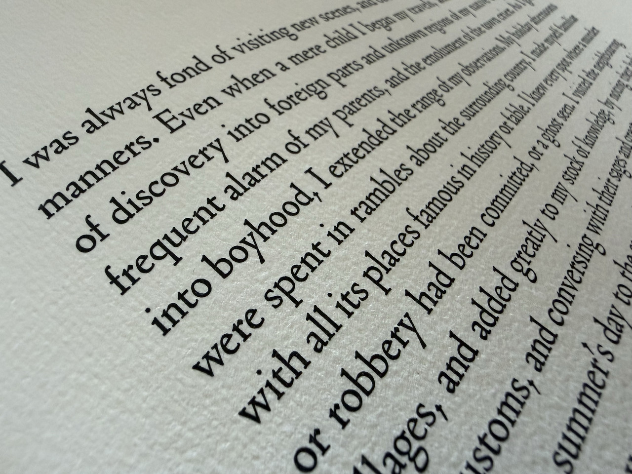
I would also second the point about the interior design layout and typography. I really like the Nicolas Jenson typeface, those Ys in particular look fantastic and the punctuation is quite fun and quirky especially in the large font size; just enough to delight when you pay particular attention but not overly distracting otherwise.
I would also second the point about the interior design layout and typography. I really like the Nicolas Jenson typeface, those Ys in particular look fantastic and the punctuation is quite fun and quirky especially in the large font size; just enough to delight when you pay particular attention but not overly distracting otherwise.
67om
>5 zorg2099: Yes, the Zerkall stock used on the lettered is definitely as stunning as it is scarce! Of course I haven't felt it personally, but examining the pictures it for sure is beatiful. You're lucky to own a copy!
I fully agree on the Ys, but I also highly enjoy the numbers and the commas, wow! Very striking indeed.
I fully agree on the Ys, but I also highly enjoy the numbers and the commas, wow! Very striking indeed.

