The Ethics of Ambiguity by Simone de Beauvoir – NO REPLY PRESS 2025
Talk Fine Press Forum
Join LibraryThing to post.
1wcarter
The Ethics of Ambiguity by Simone de Beauvoir – NO REPLY PRESS 2025
A PICTORIAL REVIEW

Limited edition
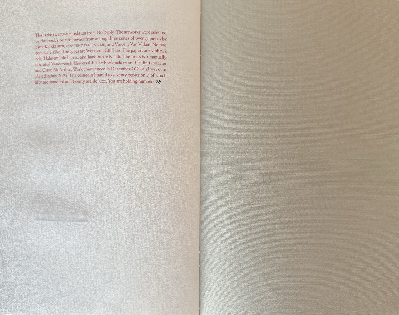
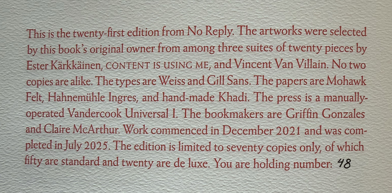
No. 48 of 50 copies.
Translated by Bernard Frechtman.
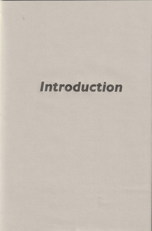
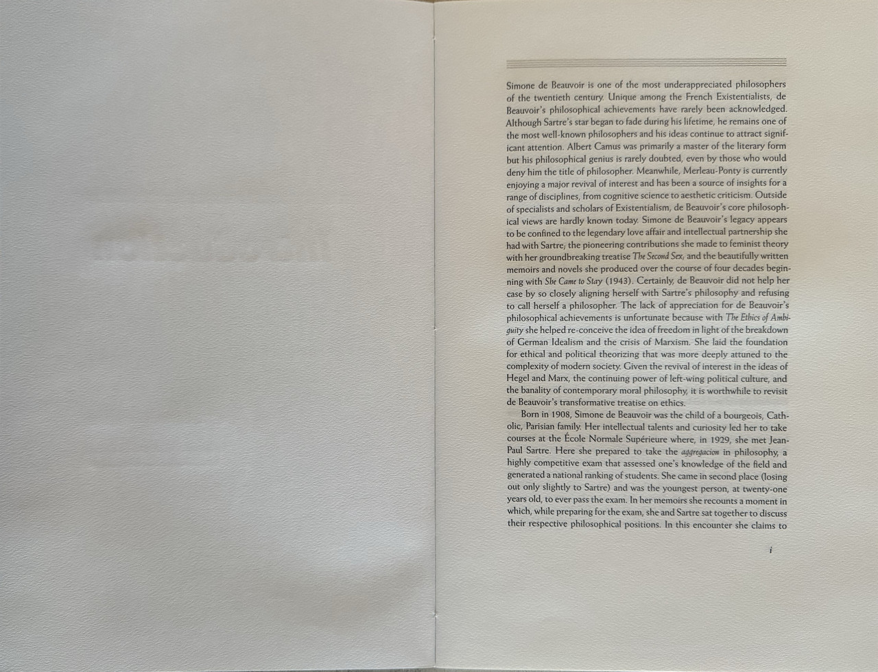
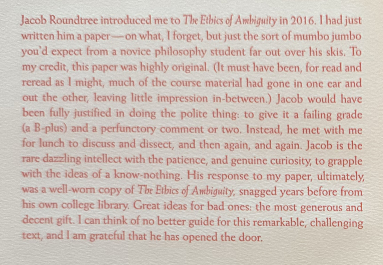
Separately bound 6000 word introduction by Jacob Roundtree printed letterpress and sewn into a handmade wrapper.
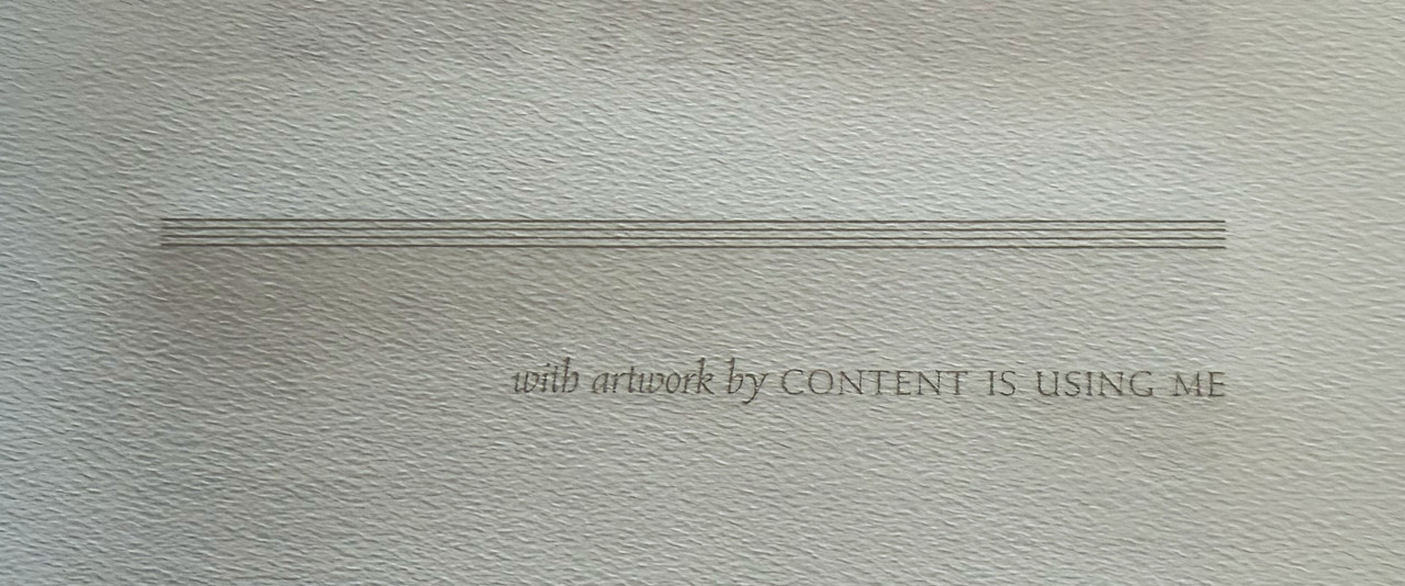
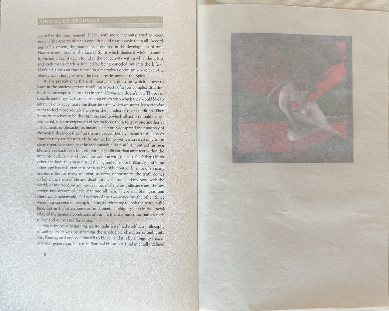
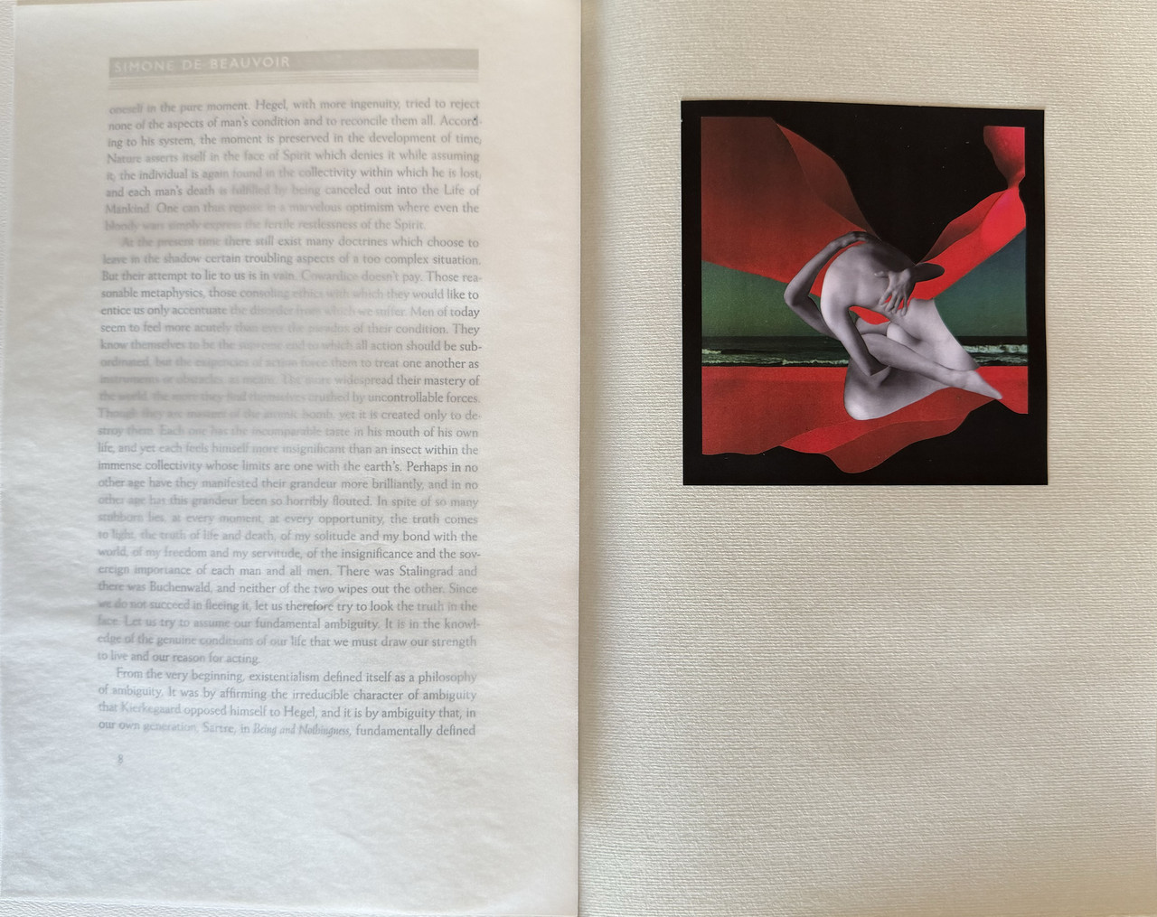
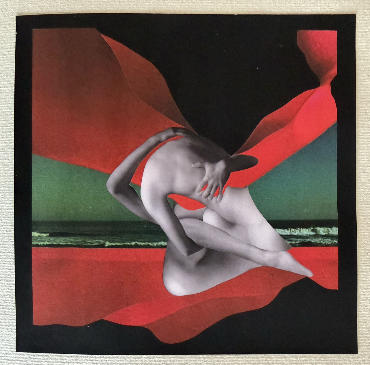
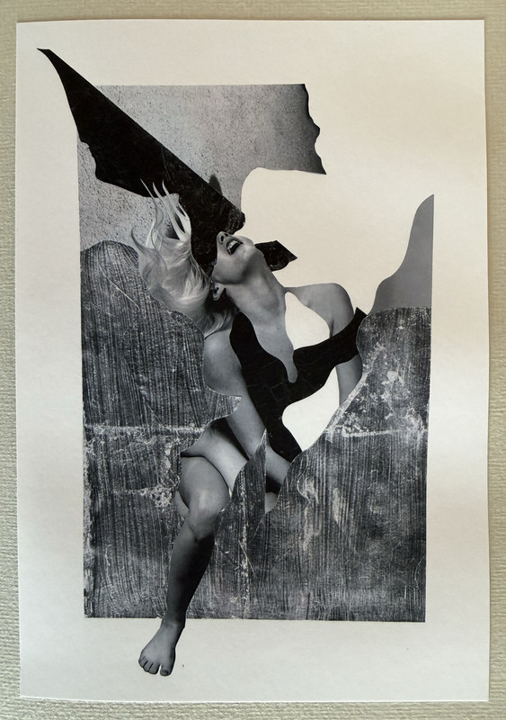
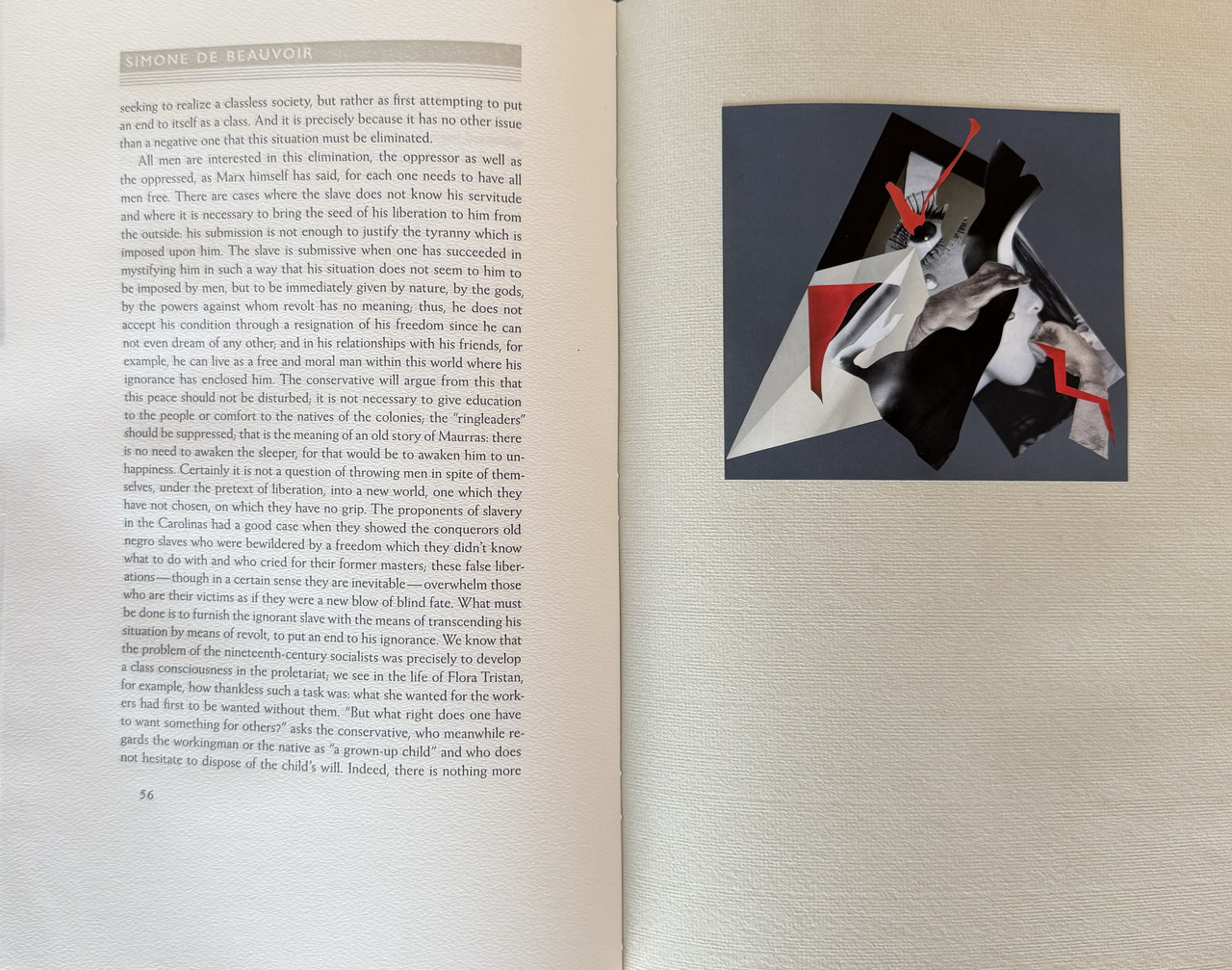
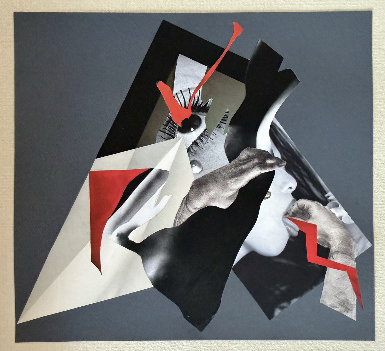
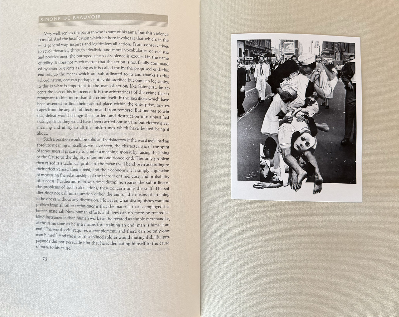
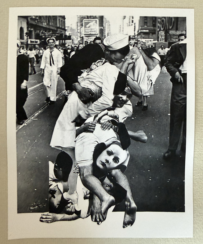
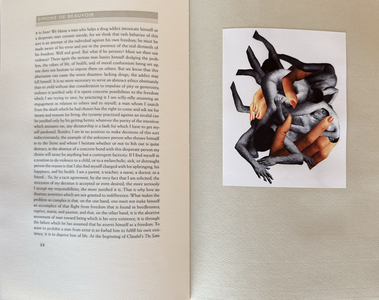
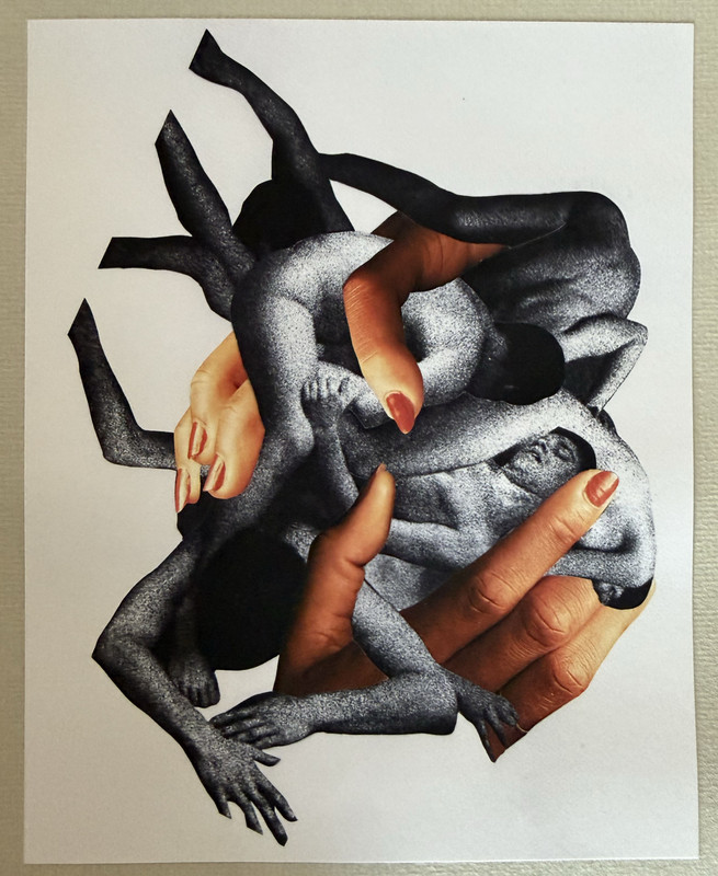
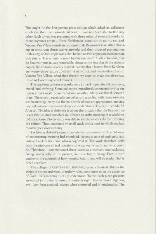
Three different artists are making twenty artworks each, but the edition has only room for twelve.
Each collector will be invited to privately view the whole suite, choose which artist they prefer, and choose twelve illustrations from that artist to be included in their copy.
THE PERMUTATIONS ARE SUCH THAT NO TWO COPIES WILL BE THE SAME.
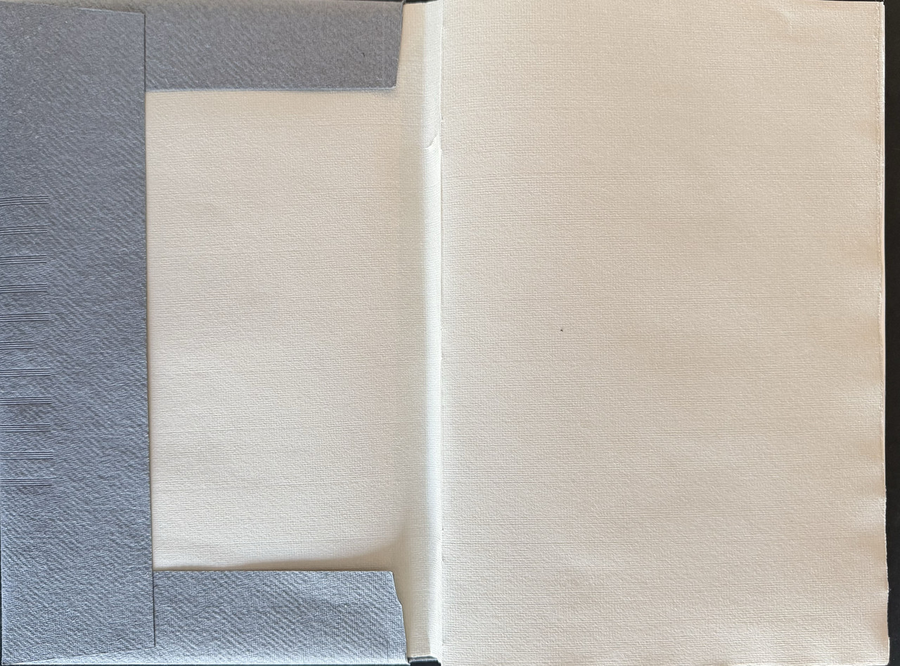
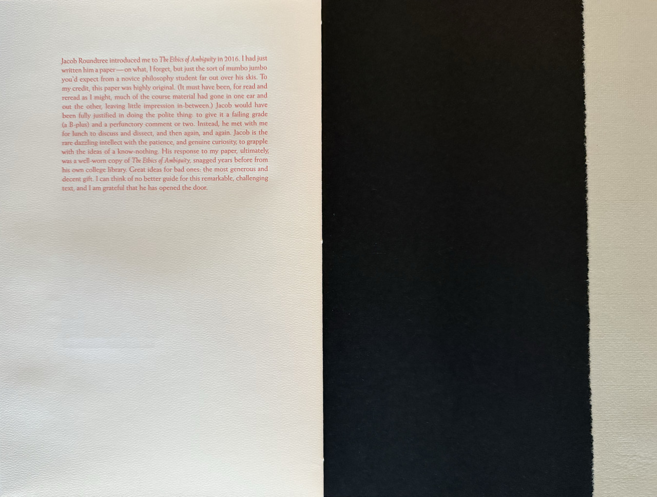
Laid-in tissue paper art protectors.
Ragged page fore-edges.
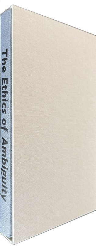
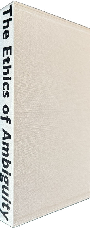
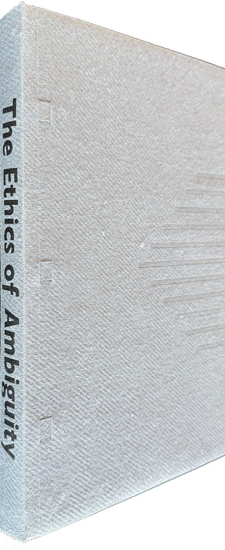
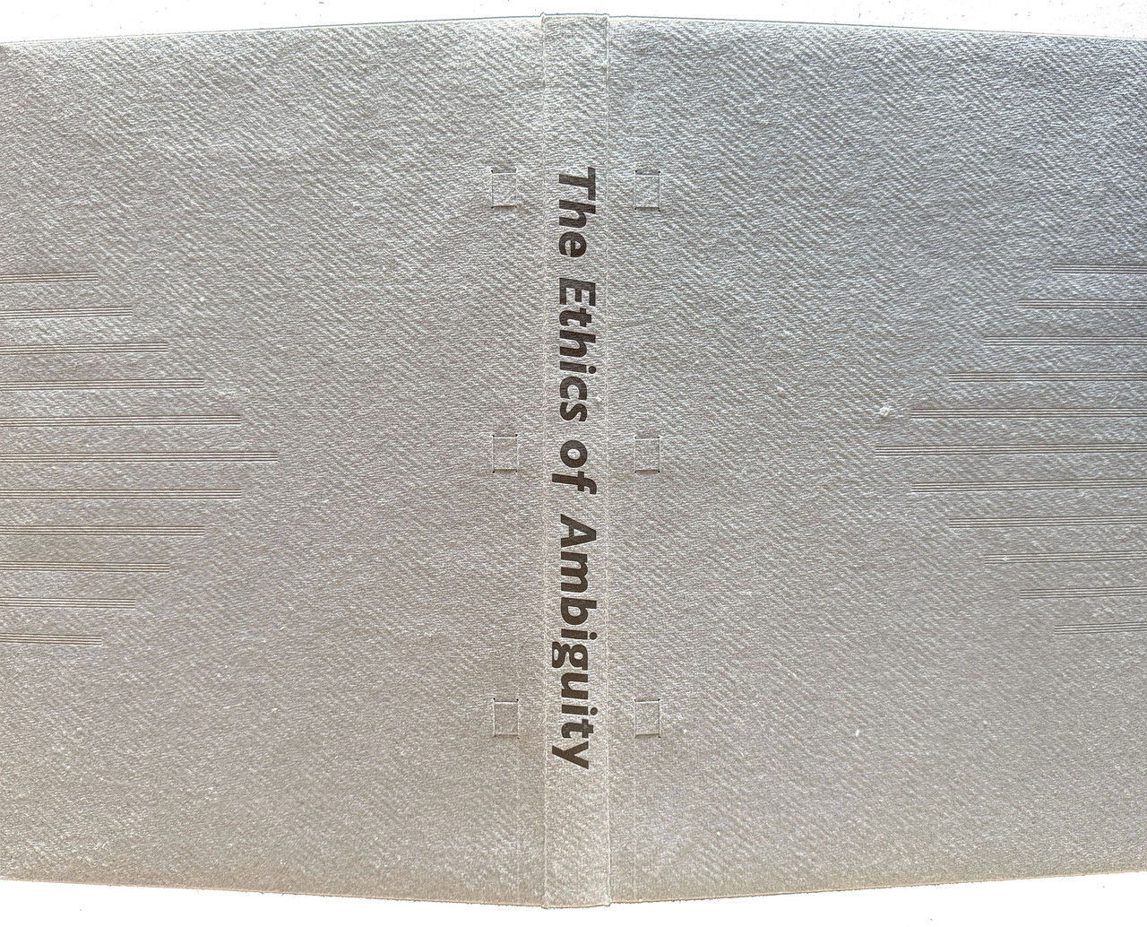
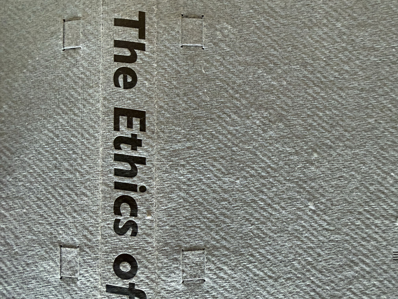
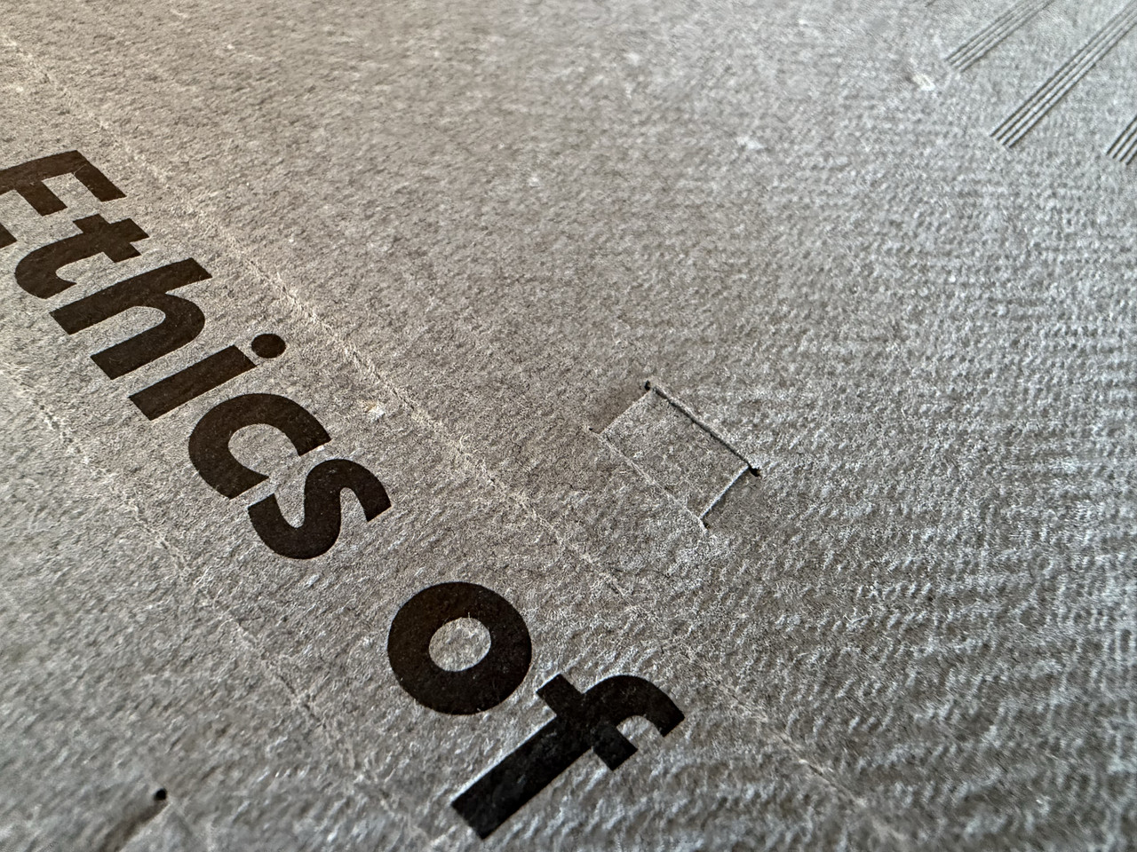
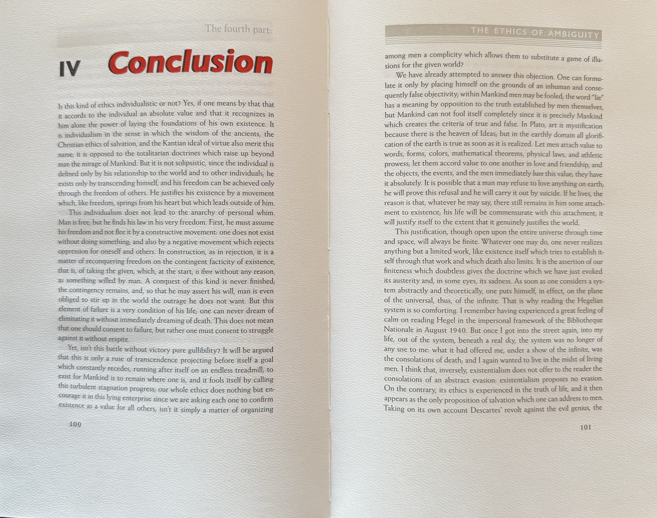
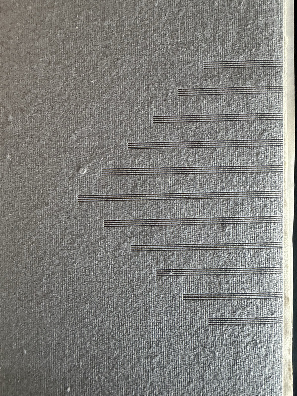
Hand-bound in mid-grey handmade paper with spine title in black and subtle grooving to covers.
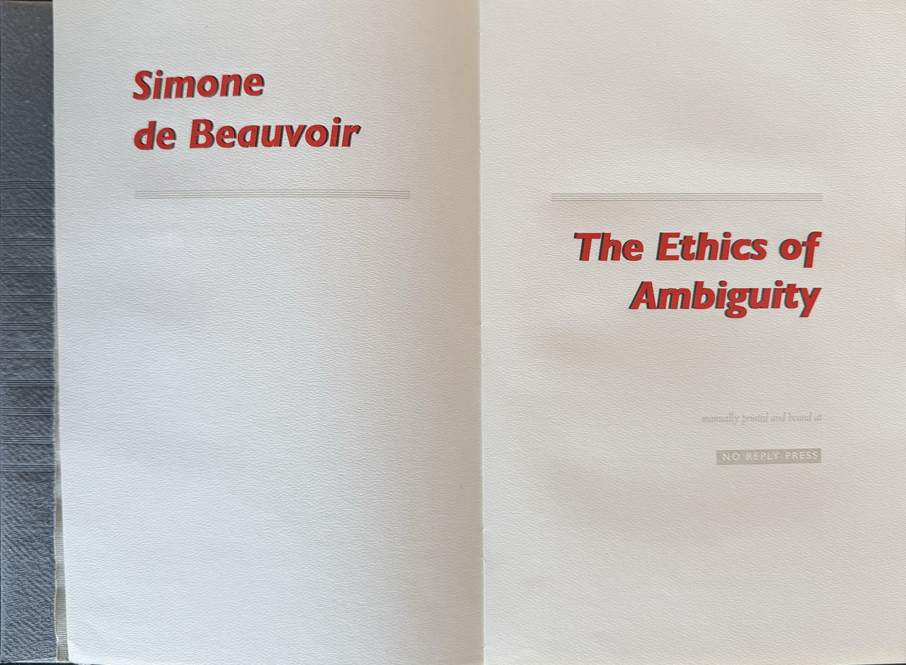
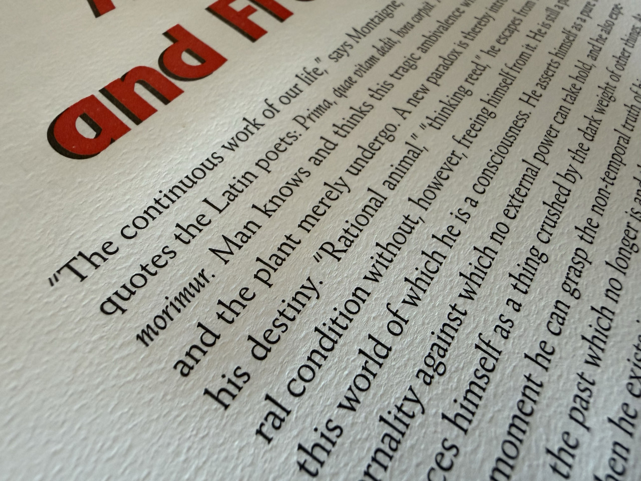
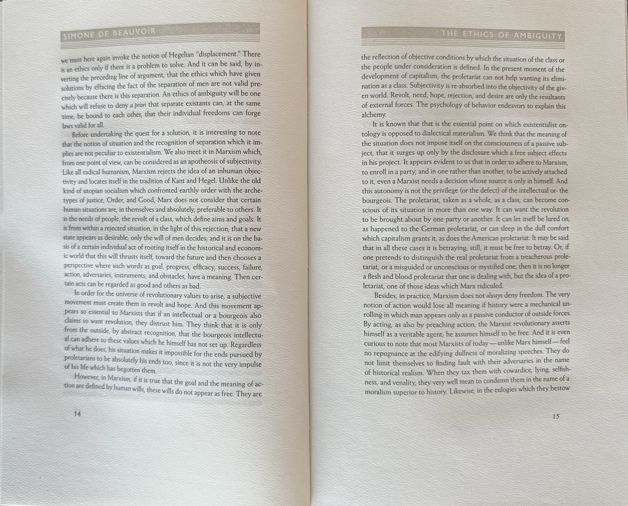
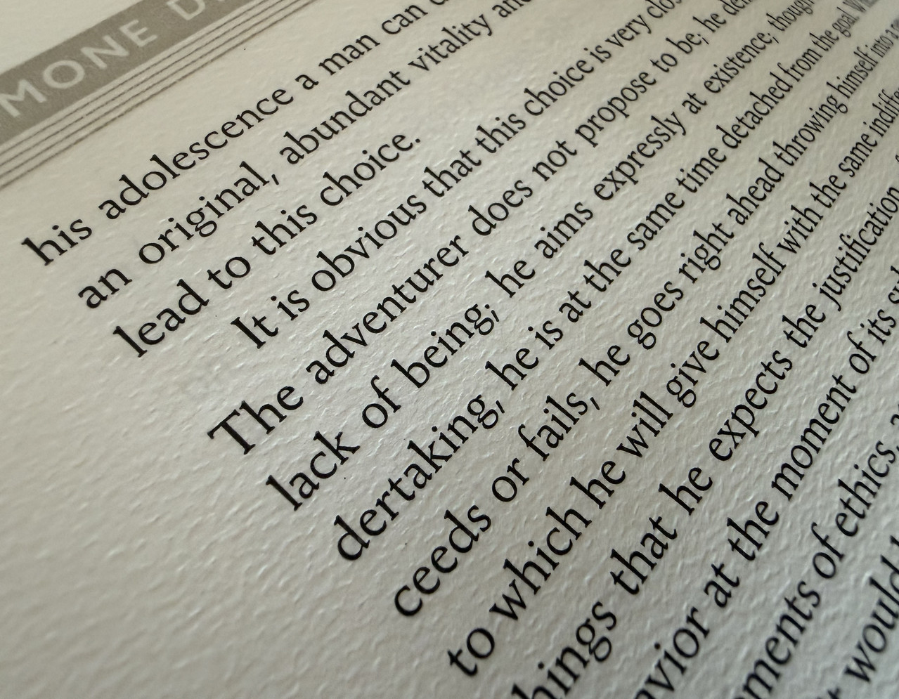
Printed on Hahnemühle mould-made paper using a hand-operatedVandercook Universal I cylinder press.
Pale grey slipcase with edge title in black.
102 pages.
30.7x20cm.
US$950
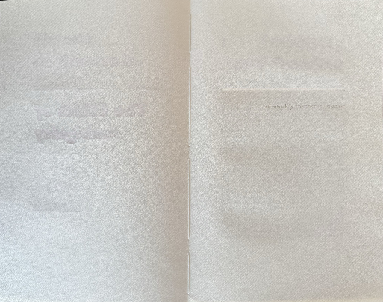
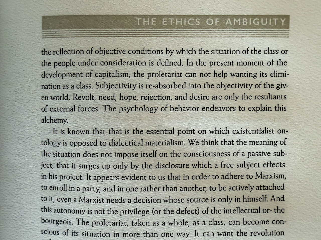
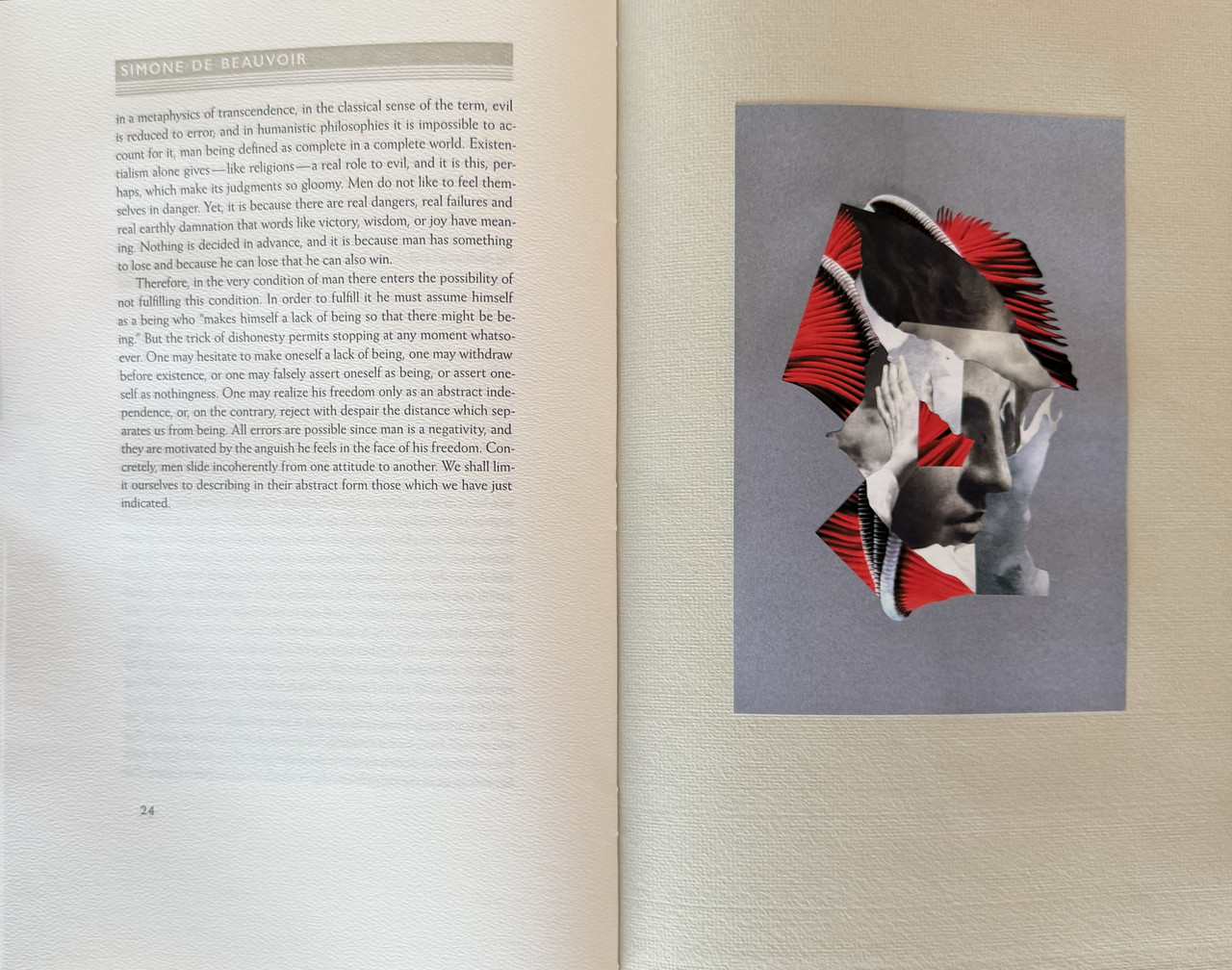
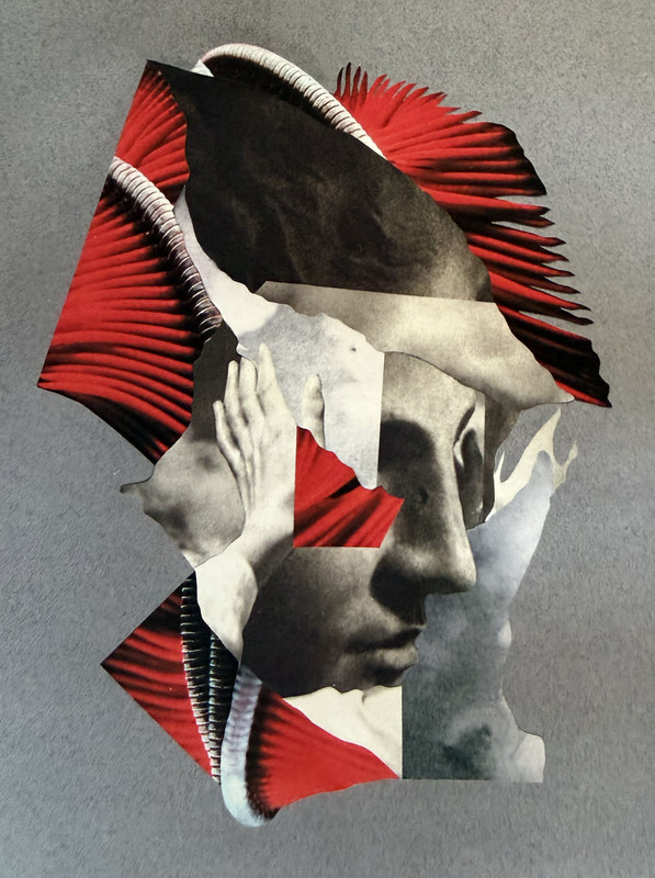
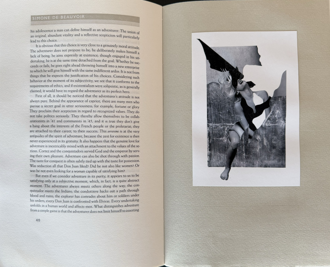
Laid-in leaflet
An index of the other illustrated reviews in the this series can be viewed here.
A PICTORIAL REVIEW
Limited edition
No. 48 of 50 copies.
Translated by Bernard Frechtman.
Separately bound 6000 word introduction by Jacob Roundtree printed letterpress and sewn into a handmade wrapper.
Three different artists are making twenty artworks each, but the edition has only room for twelve.
Each collector will be invited to privately view the whole suite, choose which artist they prefer, and choose twelve illustrations from that artist to be included in their copy.
THE PERMUTATIONS ARE SUCH THAT NO TWO COPIES WILL BE THE SAME.
Laid-in tissue paper art protectors.
Ragged page fore-edges.
Hand-bound in mid-grey handmade paper with spine title in black and subtle grooving to covers.
Printed on Hahnemühle mould-made paper using a hand-operatedVandercook Universal I cylinder press.
Pale grey slipcase with edge title in black.
102 pages.
30.7x20cm.
US$950
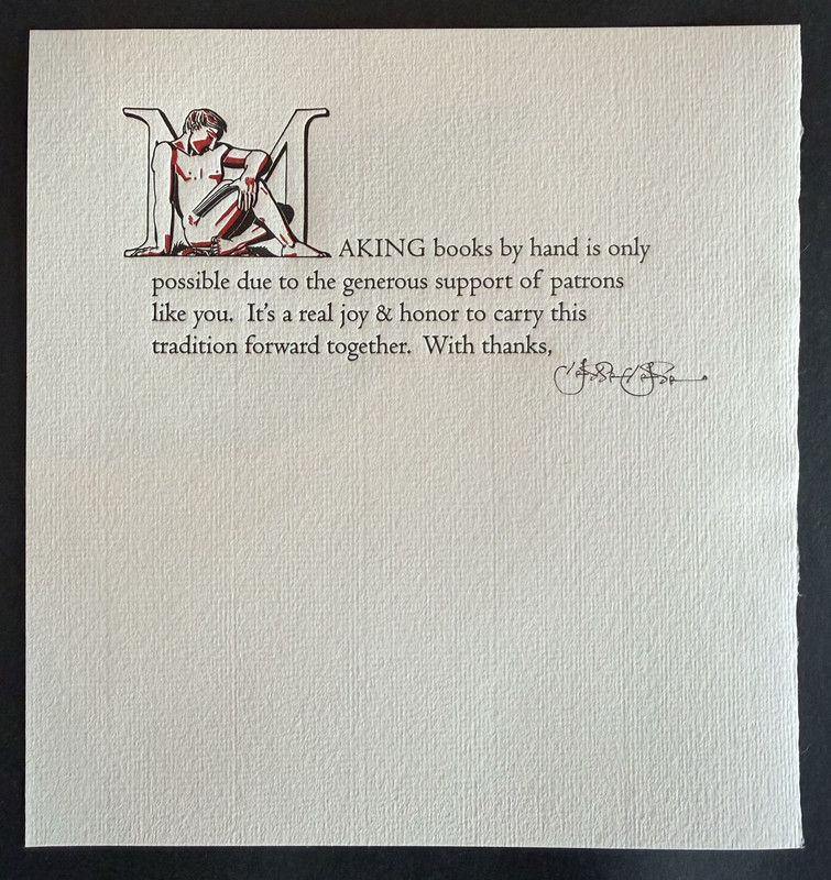
Laid-in leaflet
An index of the other illustrated reviews in the this series can be viewed here.
2A.Godhelm
Each collector will be invited to privately view the whole suite, choose which artist they prefer, and choose twelve illustrations from that artist to be included in their copy.
What an interesting conceit. Truly bespoke editions.
There's also something very 80s about the typesetting I can't put my finger on. I suppose that's its own vintage styling at this point, nearly half a century gone.
What an interesting conceit. Truly bespoke editions.
There's also something very 80s about the typesetting I can't put my finger on. I suppose that's its own vintage styling at this point, nearly half a century gone.
3greenwald1
Thanks for the review, always fascinating to read.
I love the standard binding and design, and fits the material well. Prefer it to the deluxe (based on pics).
I slightly prefer it to the Ilyich, which is obviously a very high bar.
I love the standard binding and design, and fits the material well. Prefer it to the deluxe (based on pics).
I slightly prefer it to the Ilyich, which is obviously a very high bar.
5LT79-1
>1 wcarter: so you whittled down from 60 to 12 artworks. Could you sequence them in any order? After reading the book, would you swap out the art for others or are you happy with your choices?
6wcarter
>5 LT79-1:
I can no longer remember what the choices were.
I can no longer remember what the choices were.
7LT79-1
>6 wcarter: I can't even remember which books I have on order so I see where you coming from. They turn up on the doorstep. Did I order this?
8kdweber
>3 greenwald1: Despite weighing in at 5 pounds, the biggest benefit of the deluxe edition is that it includes a portfolio of all the illustrations. Now every time you take a look at your copy you can rue your decision, though I’m still perfectly happy with my choices.
9greenwald1
This message has been deleted by its author.
10greenwald1
>8 kdweber: I don’t think there were any bad choices here!
11greenwald1
>7 LT79-1: it shipped a while ago so probably not
12jveezer
It'll be a while for a TWBE review of this book, as it's going to be a long read...
but it's especially cool to see pictorial reviews since each copy is unique.
>5 LT79-1: Yes, you could choose the sequencing. I sequenced my art from less to more ambiguous images, or vice versa, I can't remember without having the book in front of me.
but it's especially cool to see pictorial reviews since each copy is unique.
>5 LT79-1: Yes, you could choose the sequencing. I sequenced my art from less to more ambiguous images, or vice versa, I can't remember without having the book in front of me.
13LT79-1
>12 jveezer: It's a strange concept in some ways to select and sequence the artwork before reading the book. I mean, how would you know? I've not read the book though, so if the themes are freedom and ambiguity then it would be appropriate. I'm sure all this was well thought out.
14jveezer
>13 LT79-1: Agreed. It WAS a strange leap of faith to do it that way. But once I finish reading it, I'll probably be talking about whether or not my sequencing fit or didn't work in my TWBE review.
15JanPospisilCZ
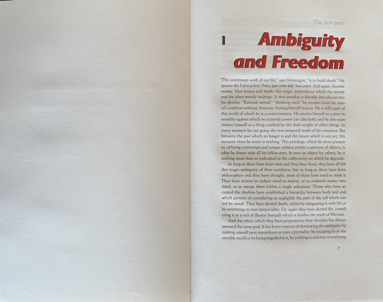
I'm not at all knowledgeable in typography, but the title font here makes me think of like...clipart Word document printouts we used to get in school, furniture sale fliers, or 90s printer manuals. It even has the drop shadow effect!
I don't want to be conservative like this, but it just feels odd on a fine press book.
I don't want to be conservative like this, but it just feels odd on a fine press book.
16abysswalker
>15 JanPospisilCZ: it's an interesting migration typefaces like that have had.
It fits Beauvoir because it seems modern without looking too mechanical. Gill Sans etc sans serifs break with classical authority in favor of function. But they became generic: manuals, flyers, office templates, sale signs, and cheap print effects, so they now carry multiple meanings.
It fits Beauvoir because it seems modern without looking too mechanical. Gill Sans etc sans serifs break with classical authority in favor of function. But they became generic: manuals, flyers, office templates, sale signs, and cheap print effects, so they now carry multiple meanings.
17LT79-1
>14 jveezer: I look forward to reading it.
>16 abysswalker: "they now carry multiple meanings".
A very nice way of putting it. I find all this quite interesting, the baggage the type accumulates over time after interacting with the culture.
>16 abysswalker: "they now carry multiple meanings".
A very nice way of putting it. I find all this quite interesting, the baggage the type accumulates over time after interacting with the culture.
18grifgon
>1 wcarter: Thanks for the photos as always, doc!
This was a fabulously fun experiment with art. As mentioned, no two copies are alike. In fact, the split between the three artists ended up perfectly even — 20-odd copies apiece. And of the 60 pieces, three appear in only one book. (Mazel tov to the collectors with the good taste and originality to choose the pieces that nobody else liked.) I loved hearing from everybody how they decided which artworks to include. Many read the text and then chose what they considered most suitable. Many simply picked what they found most visually striking before reading the text. (Nothing wrong with that!) One collector put the text and the artworks into Chat GBT and let the model decide. This won't be the last time I take an experimental approach to artwork. I've got another project cooking that will take a pretty kooky approach to the art. I think about 1/3rd will love it ands 2/3rds will hate it — just about the right ratio.
The wonderful thing about typefaces is that they are either inconspicuous or conspicuous. My favorite face is Weiss because I think it manages to sit on the knife's edge between the two; whenever I read Weiss I think "Well this is interesting..." and then promptly forget about it. Context, of course, is everything. I wonder if anybody here on the Fine Press Forum has ever given a passing thought to what face LibraryThing employs? (I think it's Verdana.) Completely inconspicuous on your screen, and yet if one of us set a book with it'd be the fine press equivalent of a sex scandal. An inconspicuous face will became conspicuous a generation later. An eighteenth century book set in Garamond (a sixteenth century face) would have been very loud. Yet today it'd be totally invisible, and the eighteenth century Baskerville a bit flashy. The sands of time, how cool!
This was a fabulously fun experiment with art. As mentioned, no two copies are alike. In fact, the split between the three artists ended up perfectly even — 20-odd copies apiece. And of the 60 pieces, three appear in only one book. (Mazel tov to the collectors with the good taste and originality to choose the pieces that nobody else liked.) I loved hearing from everybody how they decided which artworks to include. Many read the text and then chose what they considered most suitable. Many simply picked what they found most visually striking before reading the text. (Nothing wrong with that!) One collector put the text and the artworks into Chat GBT and let the model decide. This won't be the last time I take an experimental approach to artwork. I've got another project cooking that will take a pretty kooky approach to the art. I think about 1/3rd will love it ands 2/3rds will hate it — just about the right ratio.
The wonderful thing about typefaces is that they are either inconspicuous or conspicuous. My favorite face is Weiss because I think it manages to sit on the knife's edge between the two; whenever I read Weiss I think "Well this is interesting..." and then promptly forget about it. Context, of course, is everything. I wonder if anybody here on the Fine Press Forum has ever given a passing thought to what face LibraryThing employs? (I think it's Verdana.) Completely inconspicuous on your screen, and yet if one of us set a book with it'd be the fine press equivalent of a sex scandal. An inconspicuous face will became conspicuous a generation later. An eighteenth century book set in Garamond (a sixteenth century face) would have been very loud. Yet today it'd be totally invisible, and the eighteenth century Baskerville a bit flashy. The sands of time, how cool!

