1wcarter
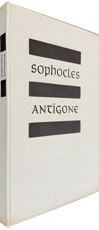
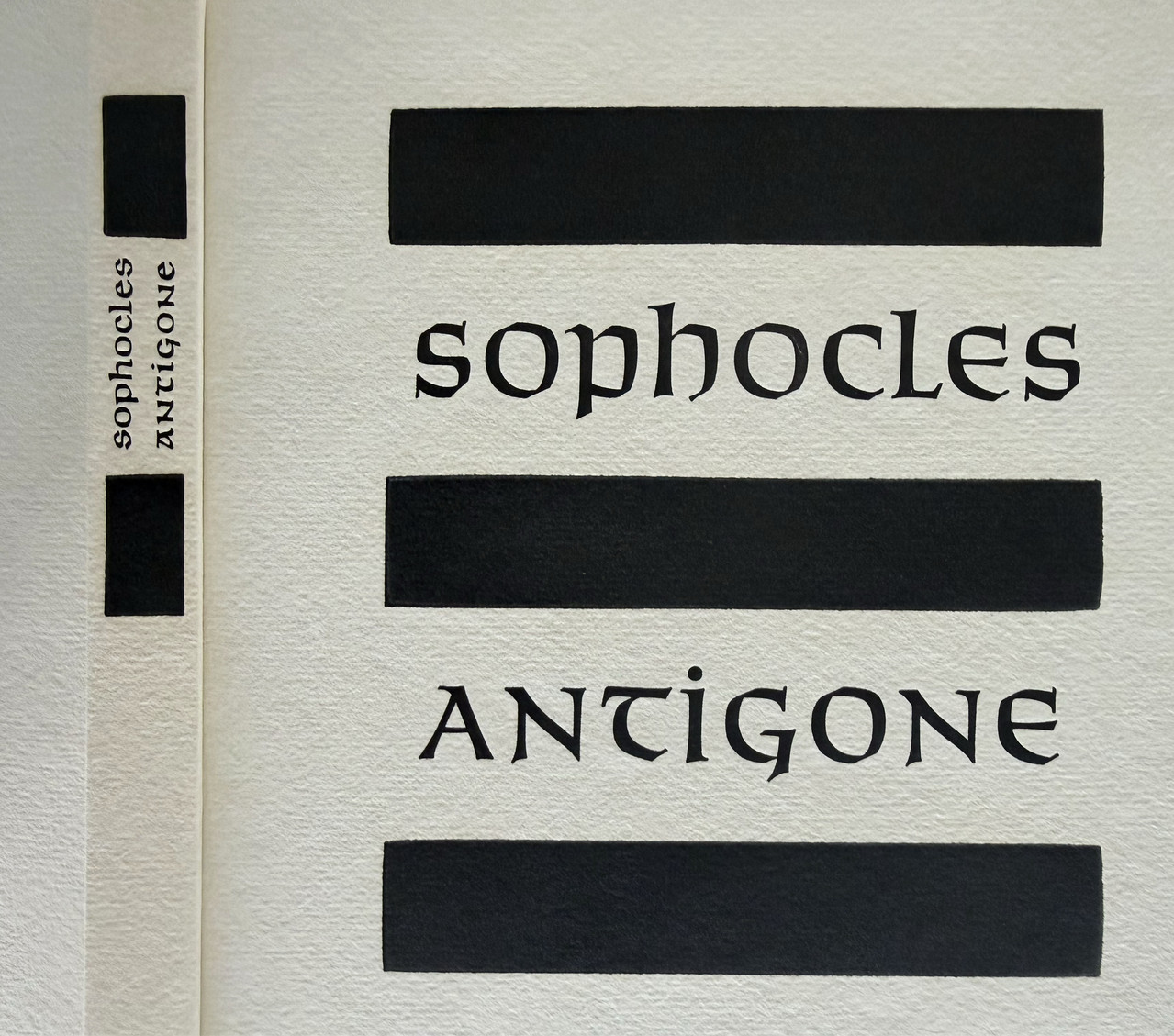
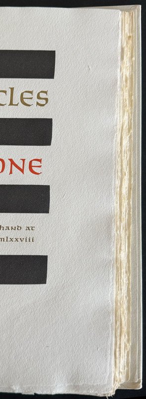
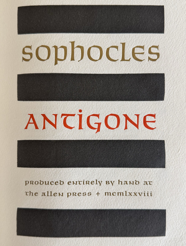
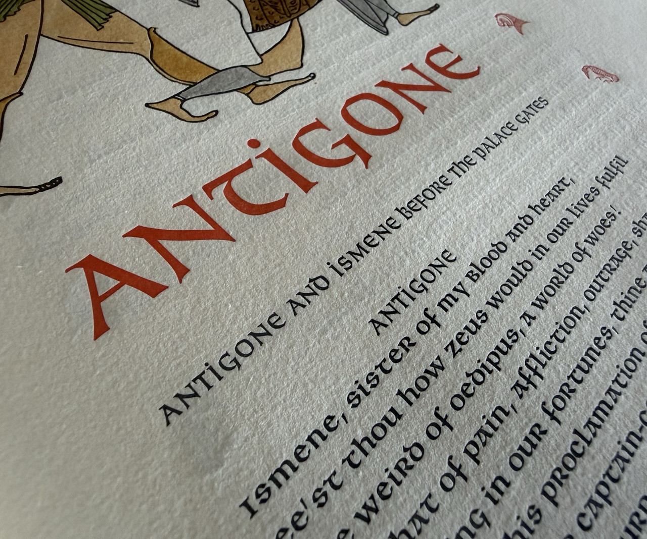
Antigone by Sophocles - ALLEN PRESS LIMITED EDITION 1978
A PICTORIAL REVIEW

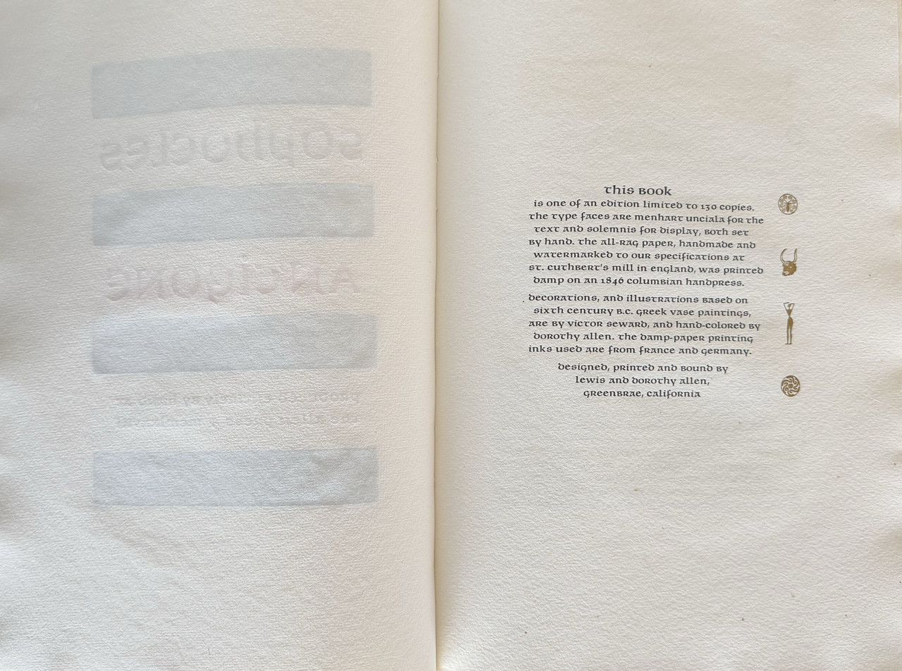
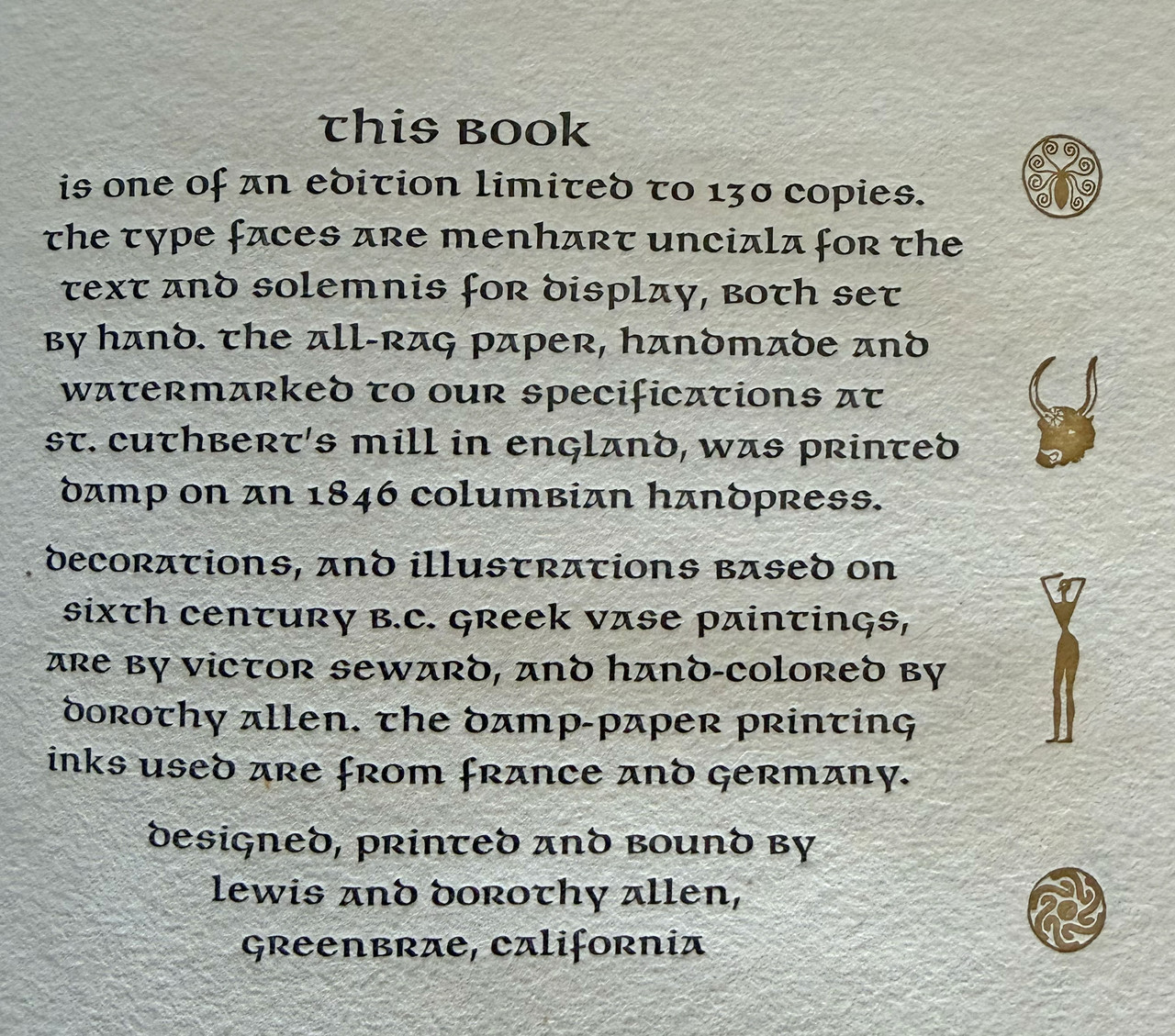
Limited edition of 130 un-numbered copies.
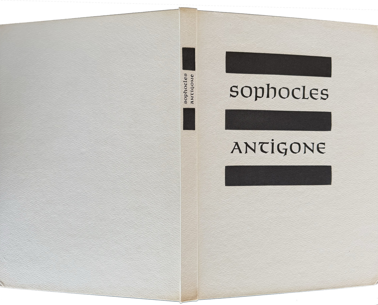
Designed, printed and bound by Lewis and Dorothy Allen.
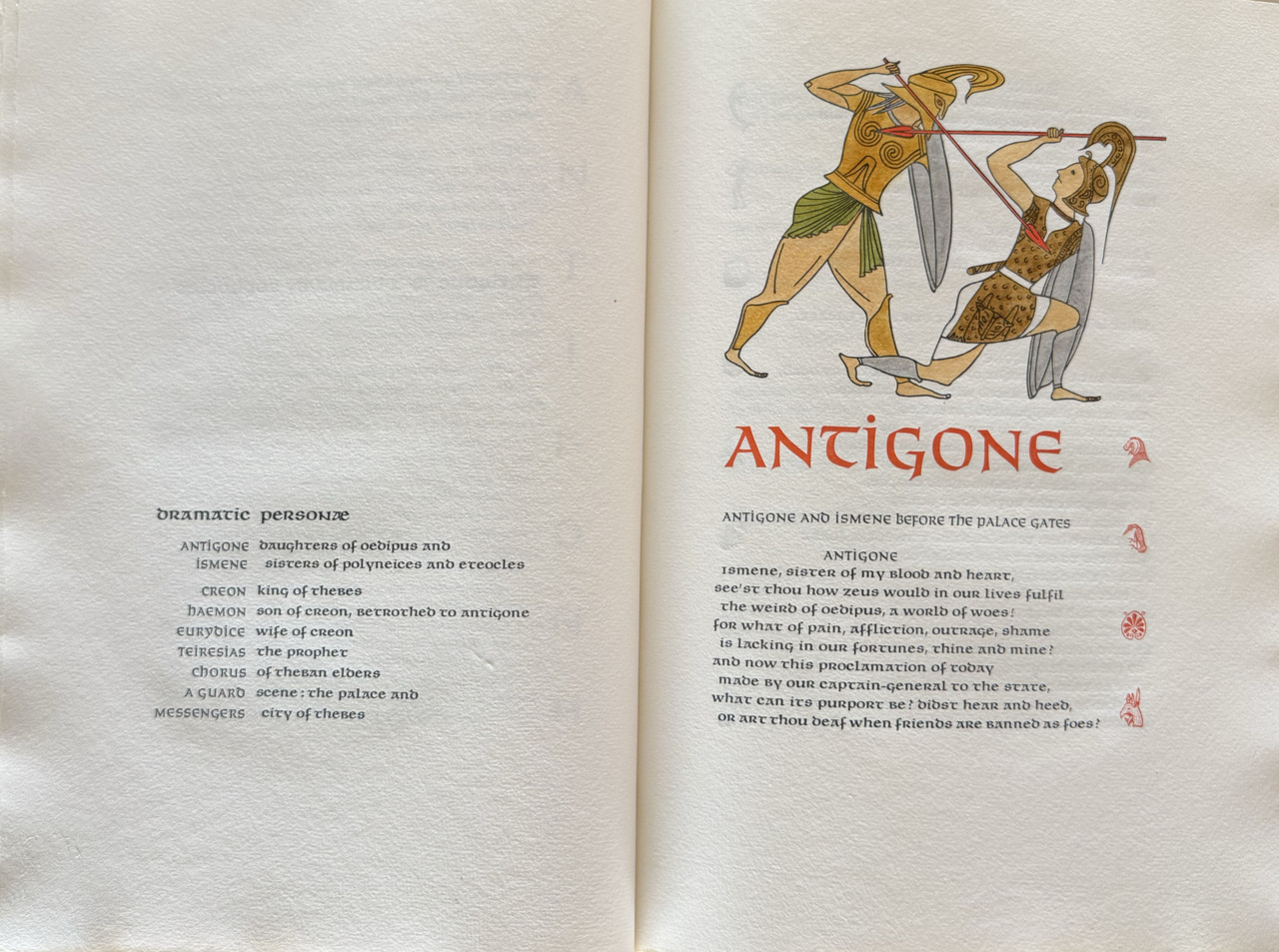
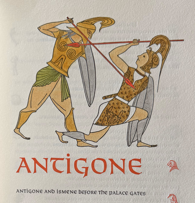
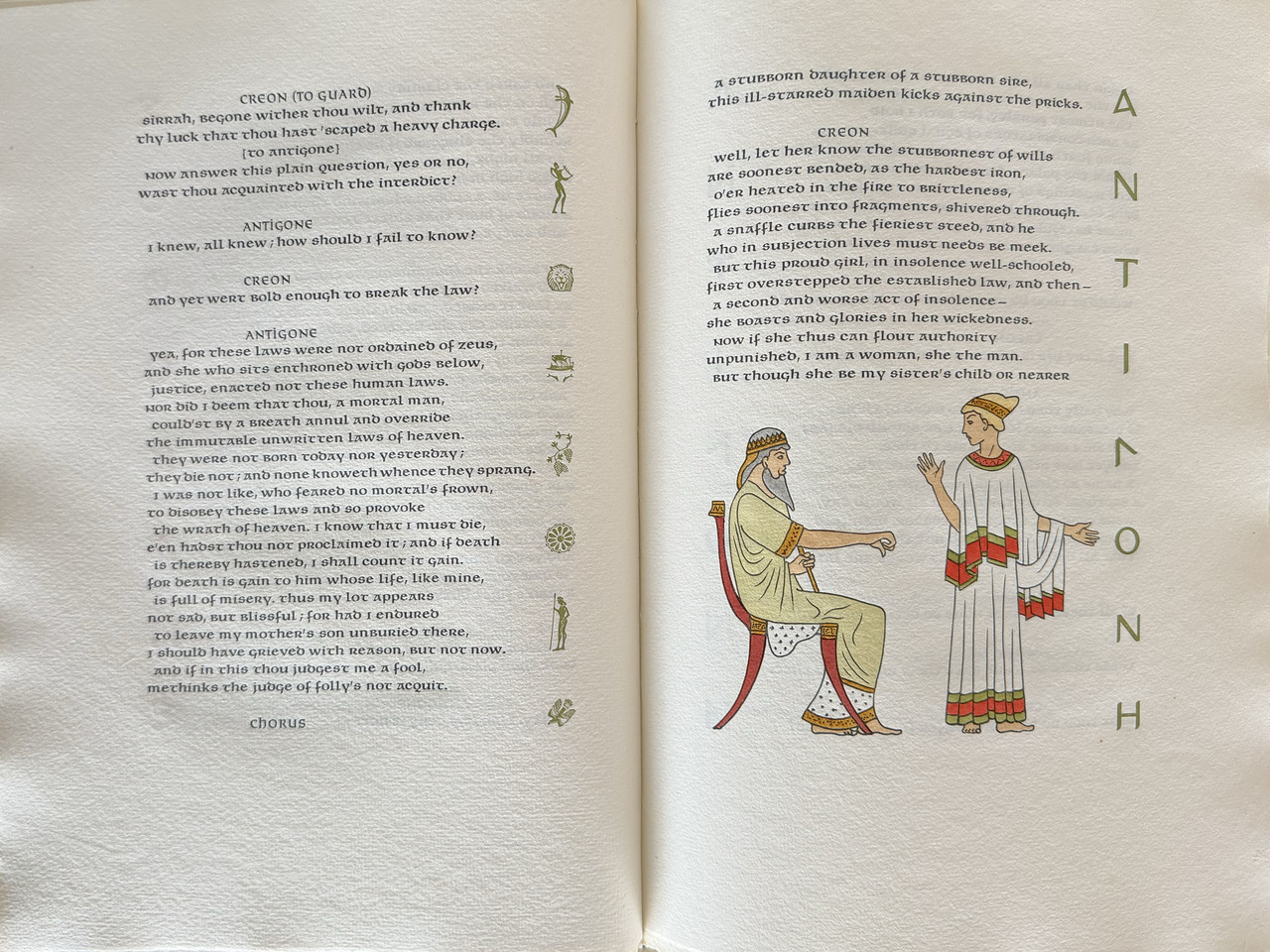
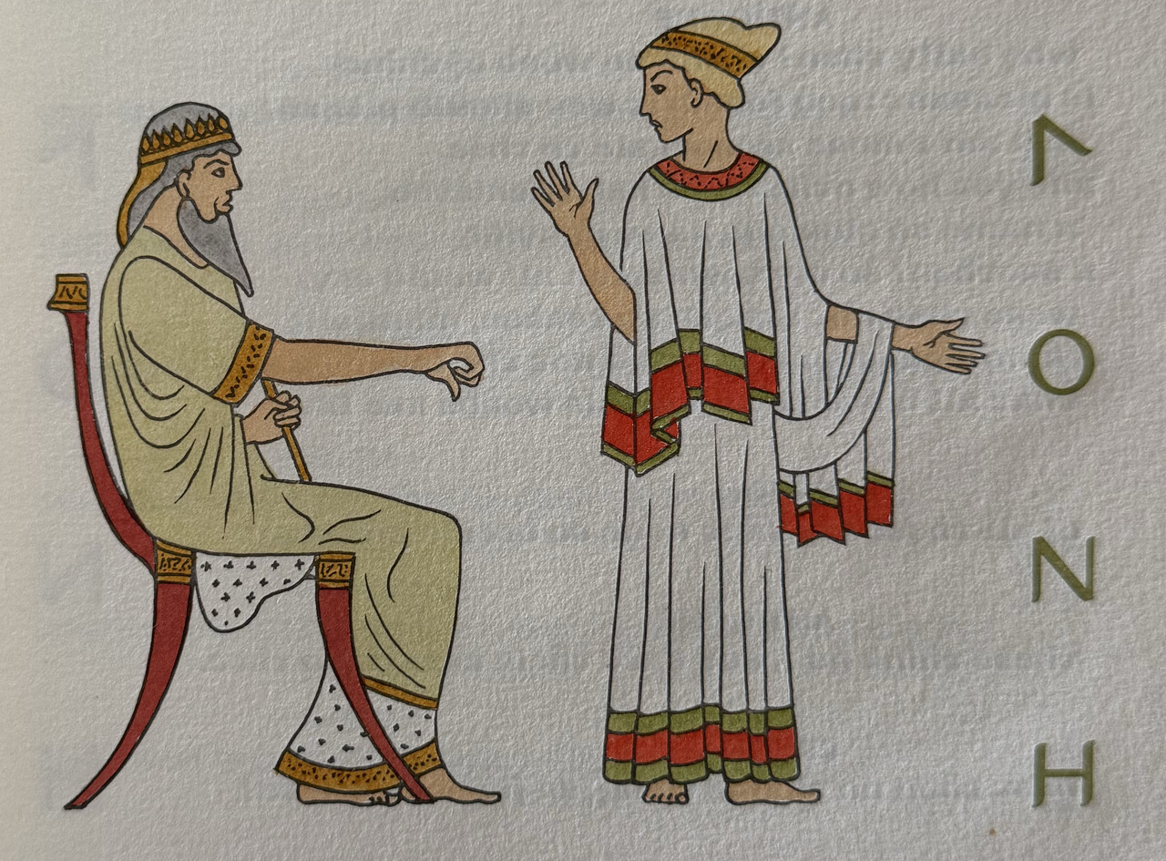
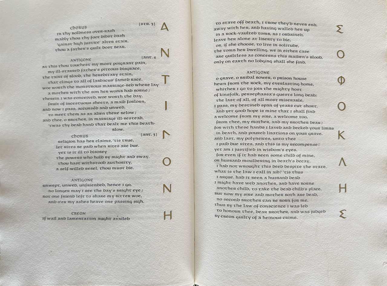
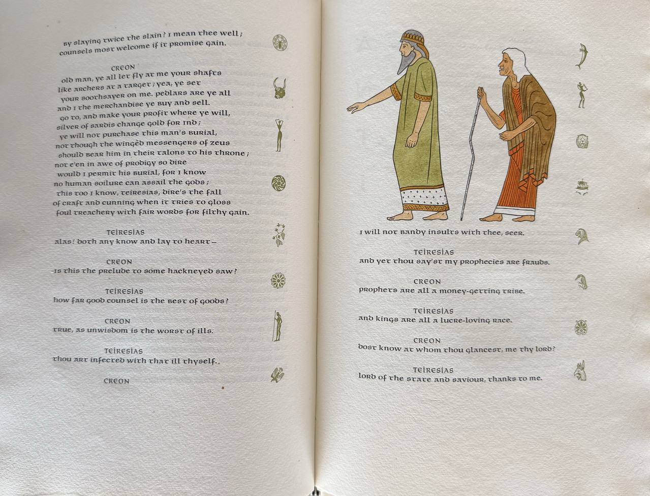
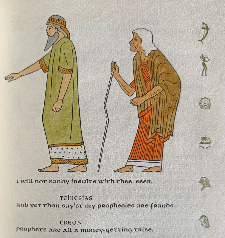
Three illustrations by Victor Seward, hand coloured by Dorothy Allen.
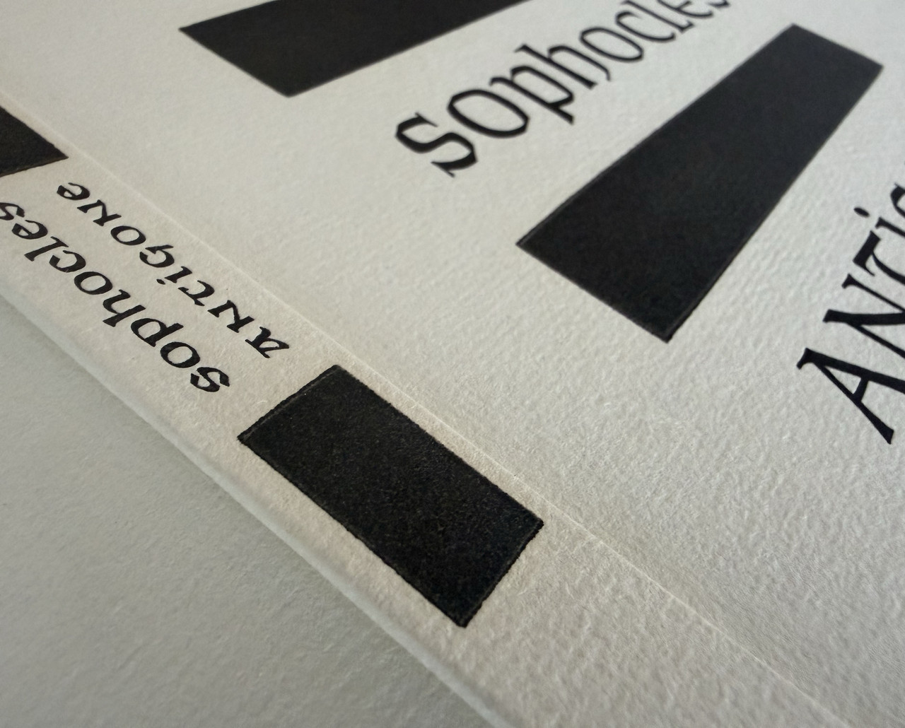
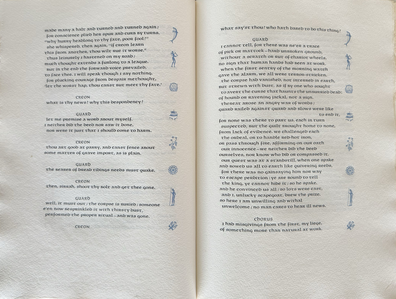
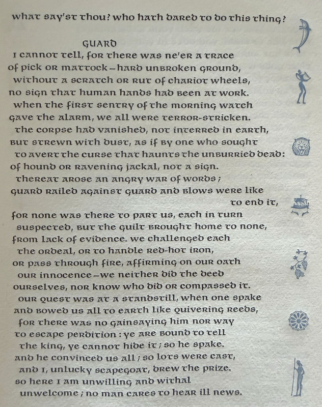
All text edges decorated with lettering or ornaments in red, brown or blue.
Printed damp on an 1846 Columbian hand-press on handmade rag paper.
Ragged outer and lower page edges, trimmed upper page edge.
Plain white endpapers.
Bound in white cloth with black titling on cover and spine.
Prospectus laid-in.
Mylar dust-jacket (removed for photography).
Not issued in a slipcase.
31.5x22.7cm.
90 pages
US$425
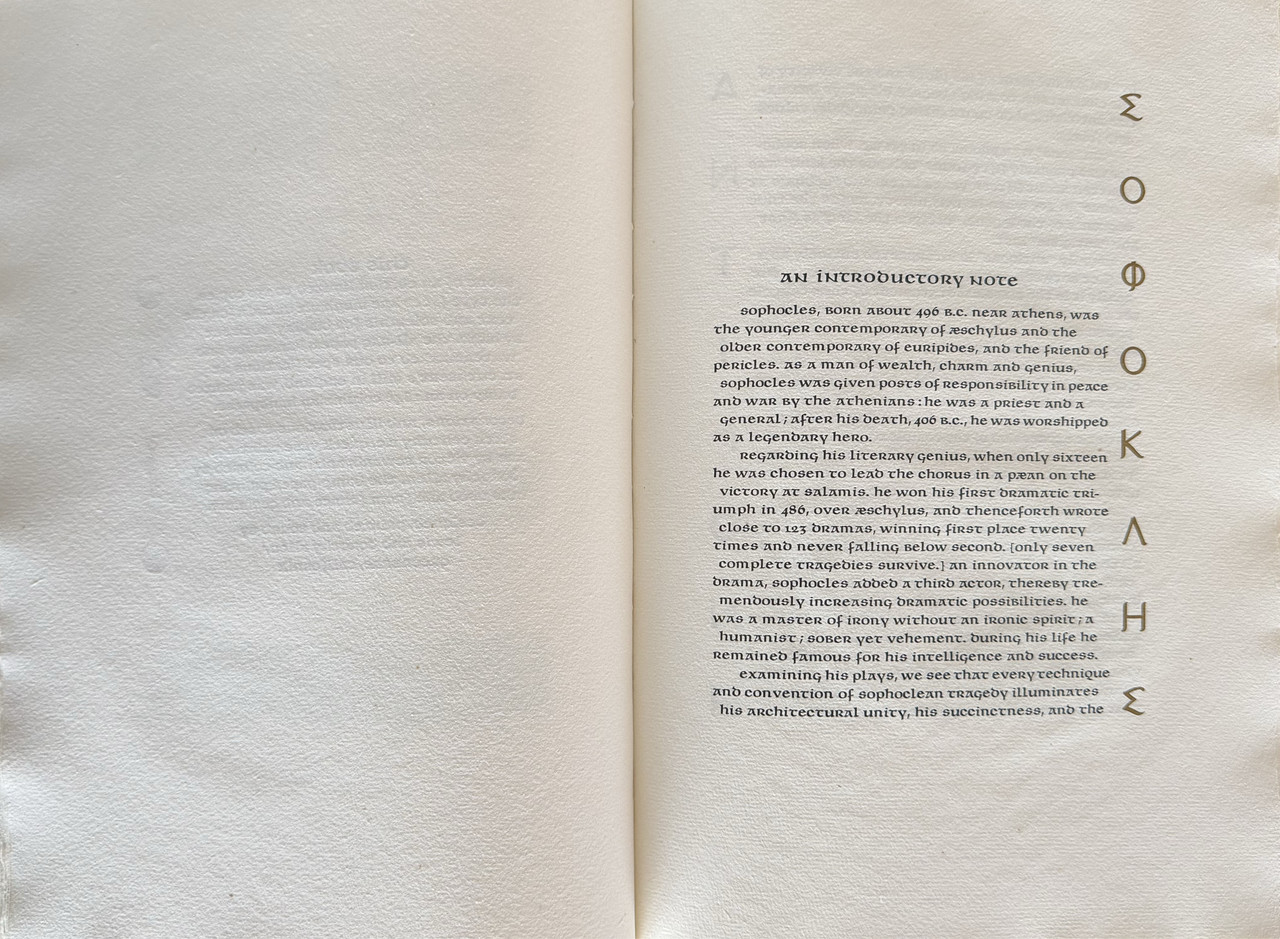
Sophocles (c. 497/496 – 406/405 BC) was a Greek writer of tragedies. He wrote more than 120 plays but only seven have survived. Antigone was written about 440 BC and first performed at the Festival of Dionysus that year. The play is the last of a triad of tragedies known as the Theban Plays and follows Oedipus Rex and Oedipus at Colonus, but can be read independently.
The plot starts after the self-exile of Oedipus when his sons (Eteocles and Polynoces) engage in a civil war for the throne of Thebes. This results in both brothers dying while fighting each other. Oedipus' brother-in-law and new Theban ruler, Creon, orders the public honouring of Eteocles and the public shaming of Thebes' traitor Polynices. The play follows the attempts of their sister Antigone to bury the body of Polynices, going against the decision of her uncle Creon and placing her relationship with her brother above human laws.

An index of the other illustrated reviews in the this series can be viewed here.
A PICTORIAL REVIEW

Limited edition of 130 un-numbered copies.
Designed, printed and bound by Lewis and Dorothy Allen.
Three illustrations by Victor Seward, hand coloured by Dorothy Allen.
All text edges decorated with lettering or ornaments in red, brown or blue.
Printed damp on an 1846 Columbian hand-press on handmade rag paper.
Ragged outer and lower page edges, trimmed upper page edge.
Plain white endpapers.
Bound in white cloth with black titling on cover and spine.
Prospectus laid-in.
Mylar dust-jacket (removed for photography).
Not issued in a slipcase.
31.5x22.7cm.
90 pages
US$425
Sophocles (c. 497/496 – 406/405 BC) was a Greek writer of tragedies. He wrote more than 120 plays but only seven have survived. Antigone was written about 440 BC and first performed at the Festival of Dionysus that year. The play is the last of a triad of tragedies known as the Theban Plays and follows Oedipus Rex and Oedipus at Colonus, but can be read independently.
The plot starts after the self-exile of Oedipus when his sons (Eteocles and Polynoces) engage in a civil war for the throne of Thebes. This results in both brothers dying while fighting each other. Oedipus' brother-in-law and new Theban ruler, Creon, orders the public honouring of Eteocles and the public shaming of Thebes' traitor Polynices. The play follows the attempts of their sister Antigone to bury the body of Polynices, going against the decision of her uncle Creon and placing her relationship with her brother above human laws.


An index of the other illustrated reviews in the this series can be viewed here.
2LT79-1
>1 wcarter: I'd like this one. I know many are not keen on the typeface but the book has character.
It's also surprising no modern press has tackled the three Theban plays.
It's also surprising no modern press has tackled the three Theban plays.
3duncjl
>2 LT79-1: I like Uncial faces but much prefer that of Victor Hammer; see below for comparative purposes (from William Wordsworth in Scotland, Black Pennell Press).


4LT79-1
>3 duncjl: Yes it's certainly not the easiest on the eye to read and there are more streamlined examples like the one you've pictured below but the pattern recognition in my mind kicks in after a certain time. There's a warmth to Allen Press which I think is their strength and shows up in quirks like this. By and large I prefer more elegant typefaces which don't draw so much attention to themselves. However, sometimes I like the processing speed of the language slowing down to take in each word and also a little character.
Just out of interest, what was the thinking behind using Uncial on the Wordsworth poem?
Just out of interest, what was the thinking behind using Uncial on the Wordsworth poem?
5duncjl
>4 LT79-1: The printer (Thomas Rae) had a high regard for Uncial faces and, for instance, their use in his edition of an 18th century text on the Death of Mary Queen of Scots seems entirely in keeping. Their use for a selection of Wordsworth poems I agree seems counter-intuitive and I don't know his thinking: but it succeeds.
6LT79-1
>5 duncjl: if it works, it works! It would be fun to do a topic at some point on books incorporating improbable typefaces which just seem to work even though in theory they shouldn't.
7ChestnutPress
A stunning book! I love the use of uncials, which I have always found handsome and legible. I think the only type styles that I have ever struggled with in the past are Civilité types, but even those I find beautiful on the page.
8duncjl
>7 ChestnutPress: Absolutely. Incline Press used a Civilité for display in The First Wife and it is perfectly legible; but the Granjon Civilité used in the two Bieler Press books for Gruffyground is like an exercise in cryptography!
9ChestnutPress
>8 duncjl: The Gruffyground Granjon Civilités are much closer to the handwriting they emulate (which is was quite a task to get used to reading), but I love that they are ‘authentic’ rather than some of the more recent versions that were created with far more legibility in mind. The great ‘Typefoundries of the Netherlands’ behemoth from Enschede has some great sample pages featuring them. But I wholeheartedly admit that they are difficult reading!
10BuzzBuzzard
An example from John Henry Nash 1934.


11ChestnutPress
>10 BuzzBuzzard: Assuming that you are using this as an example of a Civilité in use, the passionate typographer in me wishes to highlight that it actually isn’t. That ‘Nash’ type is a revival of one of Caxton’s types: what is probably best described as a Gros Batard – a gothic script that is somewhere between a formal Textura and cursive scripts.
Civilité, however, is quite a different beast – a type based on European cursive handwriting, in particular the ‘secretary’ formal hand. Here is a link to a prime example of one of the proper Civilite types designed by Granjon:
https://en.wikipedia.org/wiki/Civilité#/media/File:Dialogue_de_la_vie_et_de_la_...
12BuzzBuzzard
>11 ChestnutPress: Sorry for the confusion! I gave this as an example of Caxton type and realize now that it is probably neither Civilité nor Uncial...
13ChestnutPress
>12 BuzzBuzzard: Equally quirky, yet handsome!!
14astropi
My review isn't nearly as nice as @wcarter, but here it is in case you want another look :)
https://www.librarything.com/topic/339435
https://www.librarything.com/topic/339435
15kdweber
>11 ChestnutPress: Reads like French to me.
16Glacierman
>11 ChestnutPress: My eyes!
17ChestnutPress
>16 Glacierman: It’s hard work for a while, but you get an enormous sense of achievement when you crack reading it! 🤣

