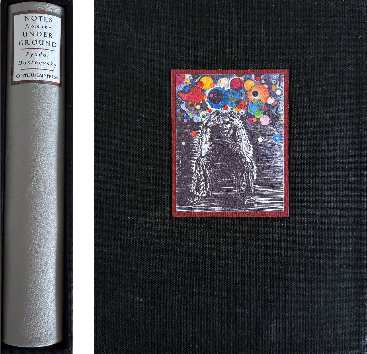
Notes from the Underground by Fyodor Dostoevsky - COPPERHEAD PRESS LE - 2025
Talk Fine Press Forum
Join LibraryThing to post.
1wcarter
Notes from the Underground by Fyodor Dostoevsky - COPPERHEAD PRESS LIMITED EDITION 2025
A PICTORIAL REVIEW
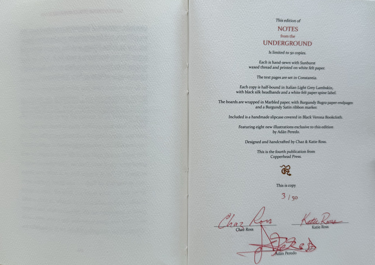
No. 3 of 50 copies
Designed, crafted and signed by Chaz Ross & Katie Ross.
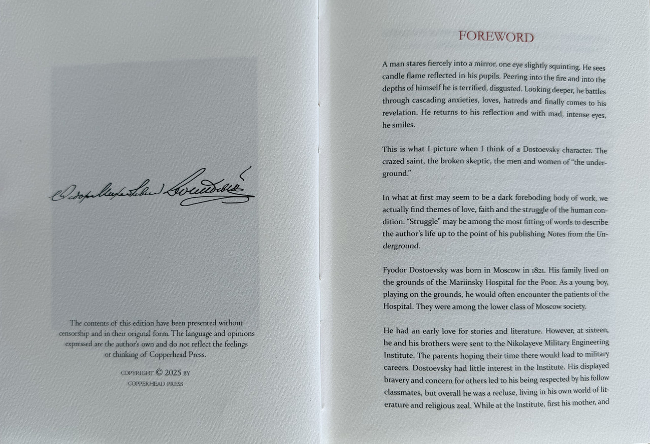
Foreword by Chaz Ross.
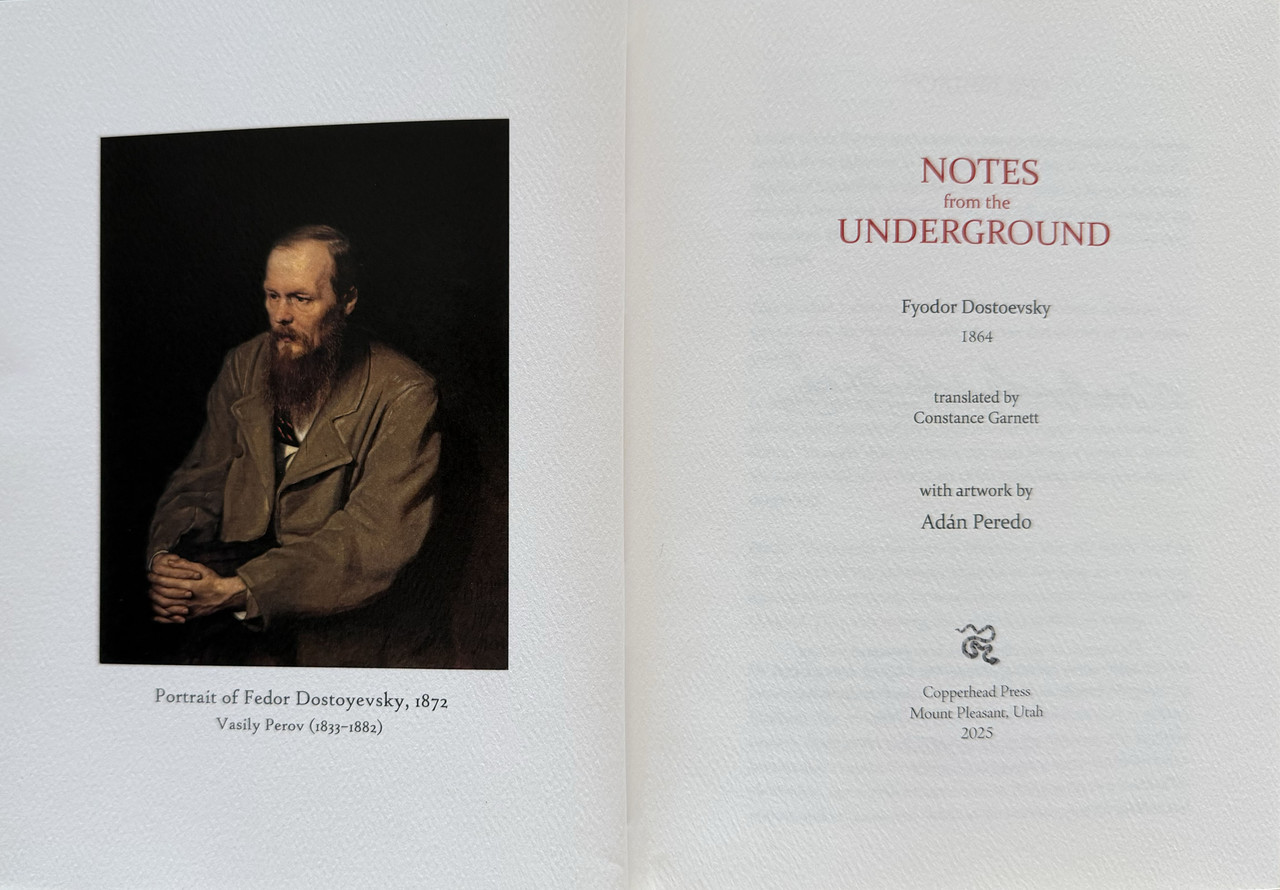
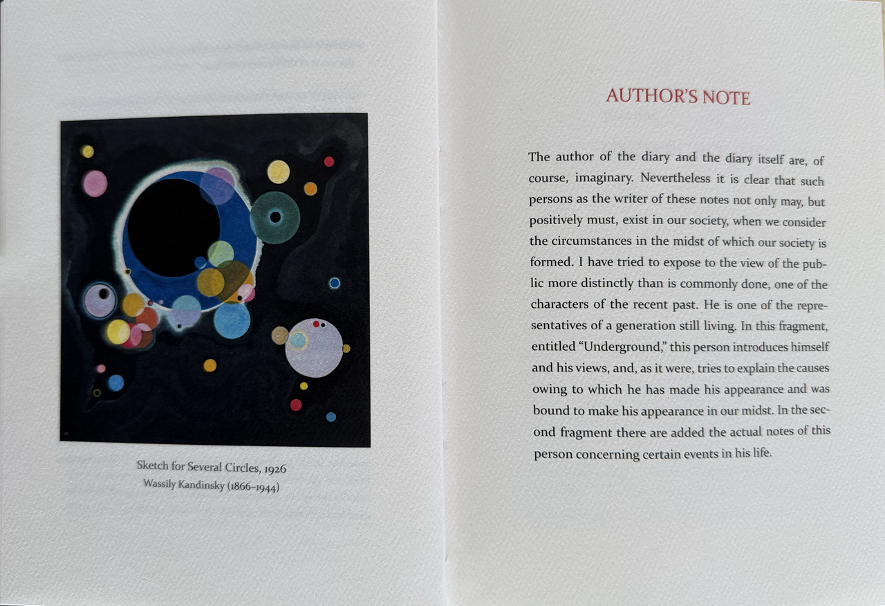
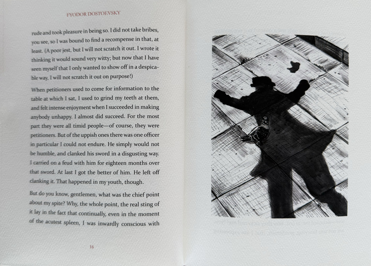
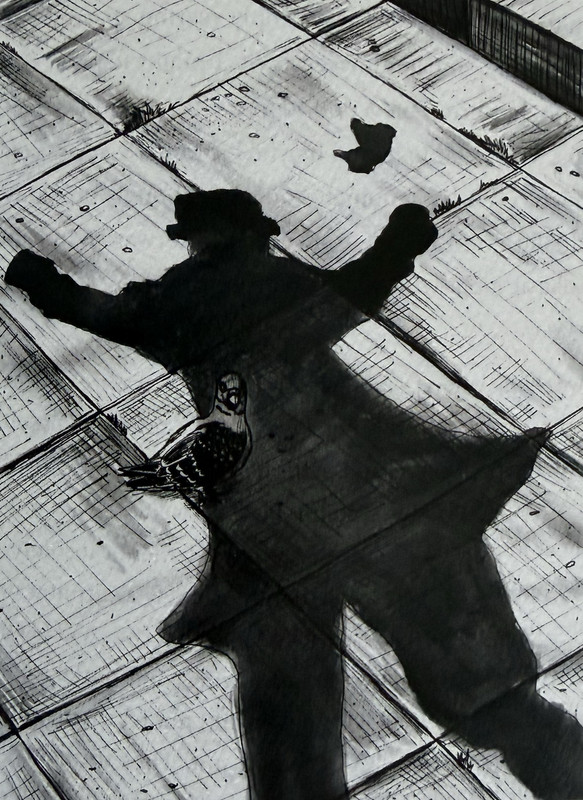
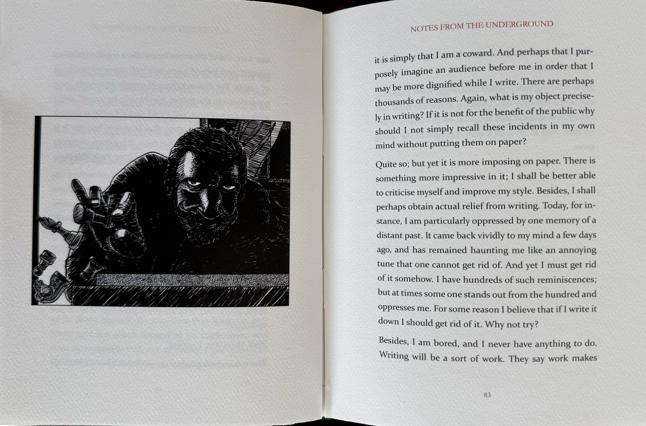
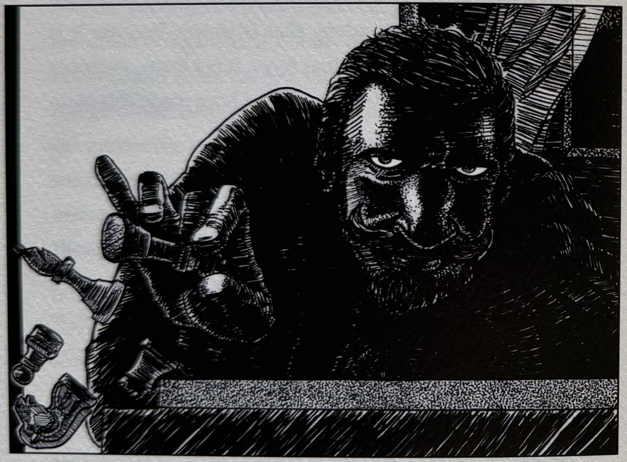
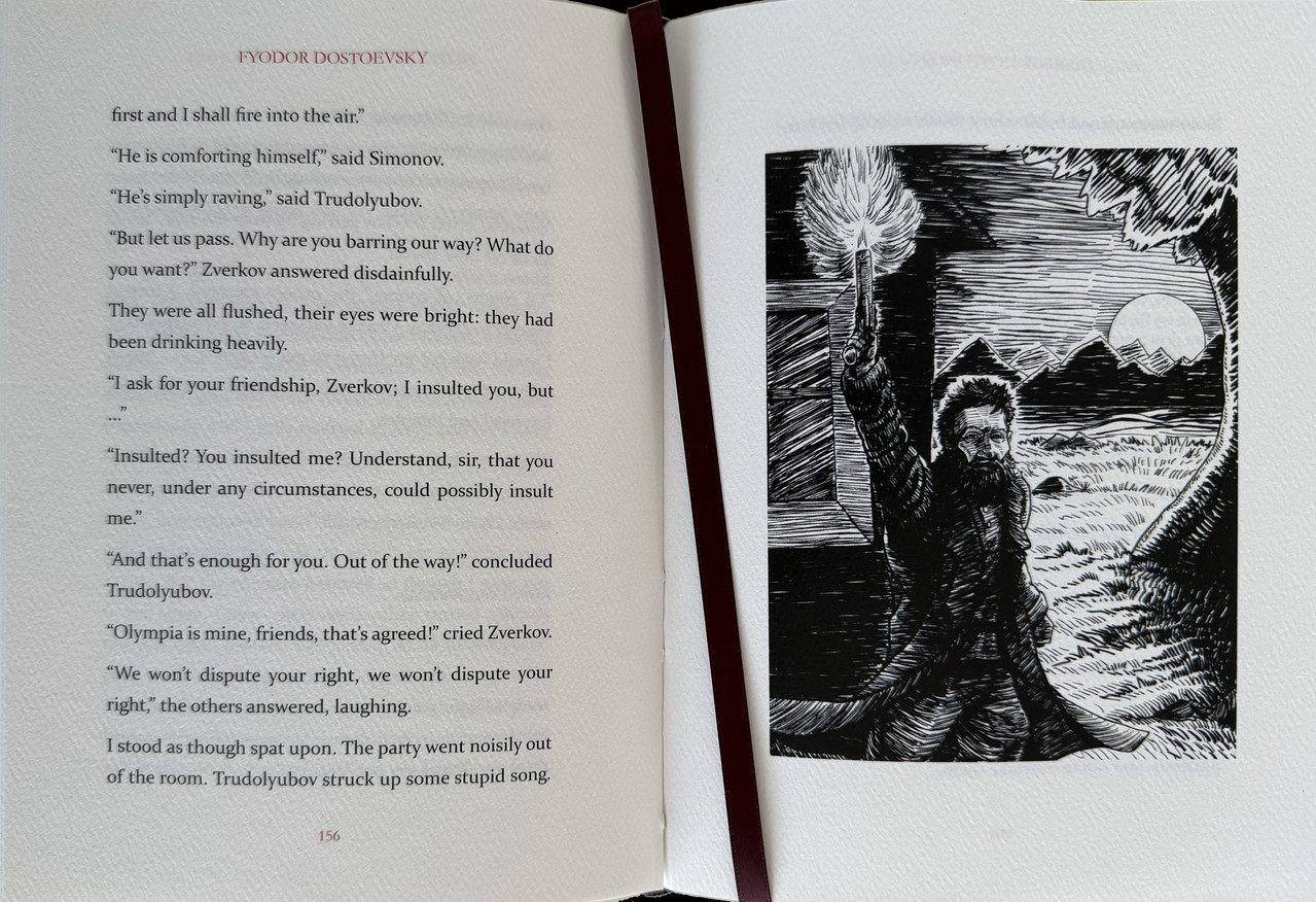
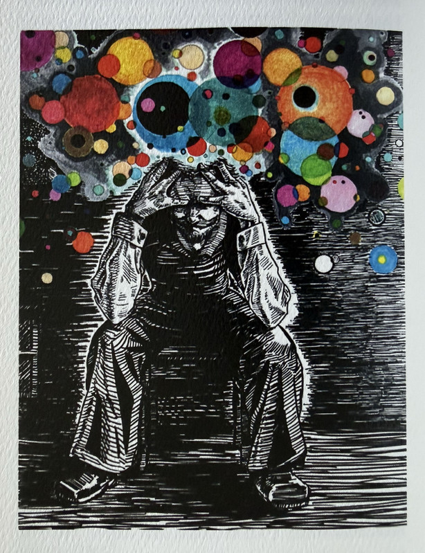
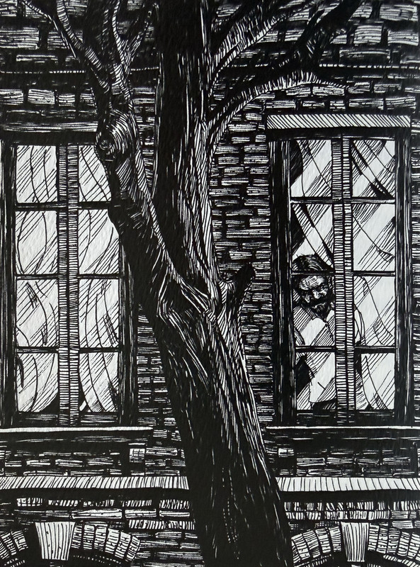
Eight monochrome illustrations (two with colour overlays) by Adán Peredo who signed the book.
Colour portrait of Dostoevsky as frontispiece.
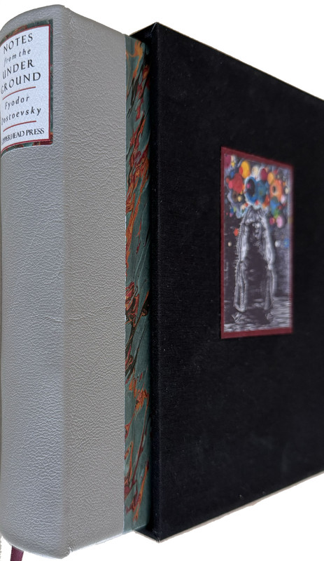
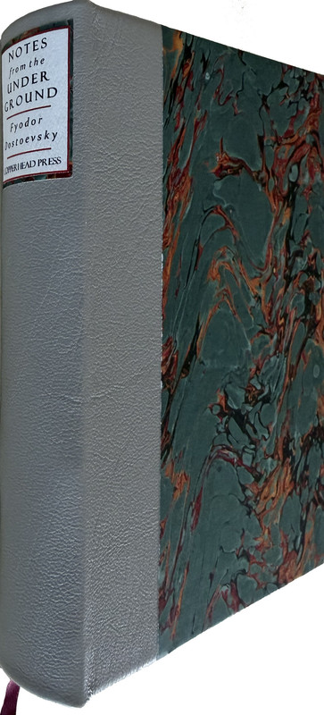
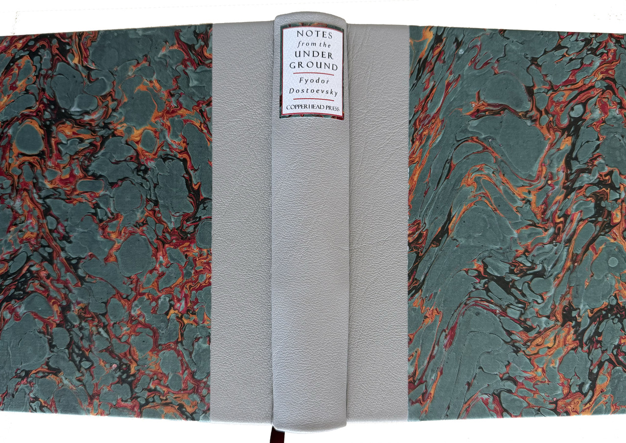
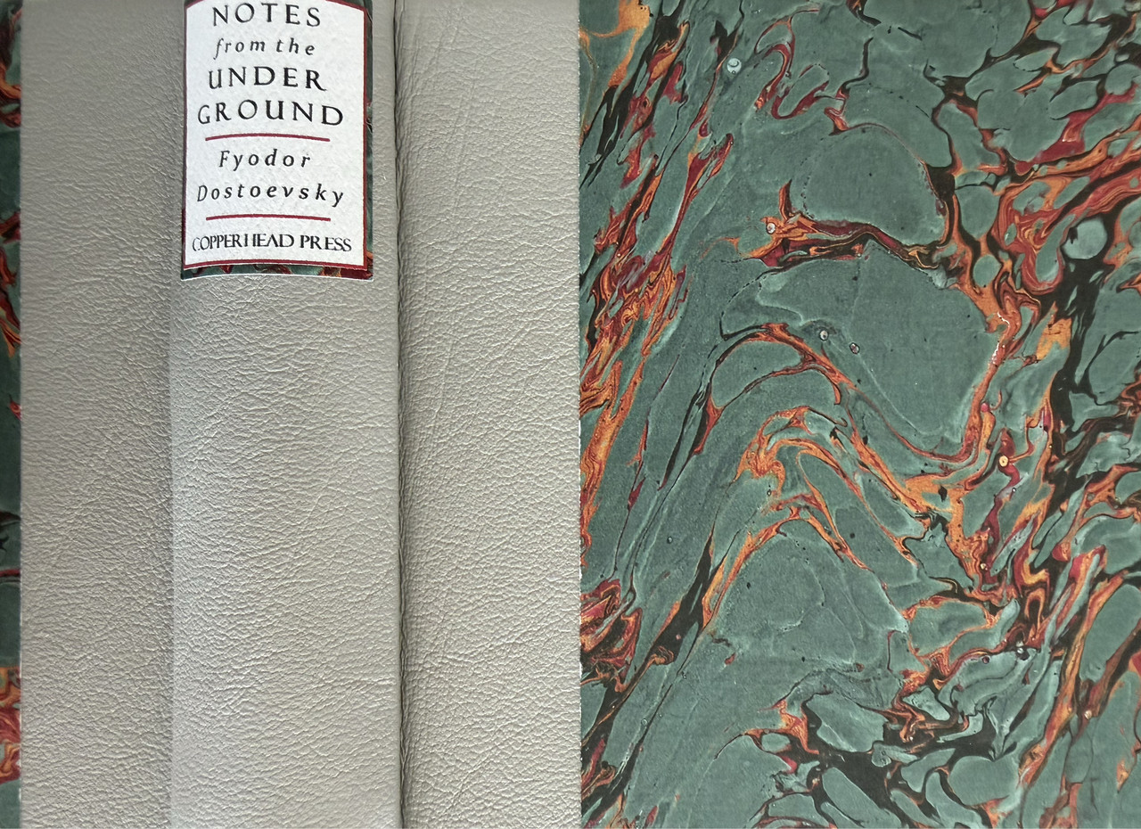
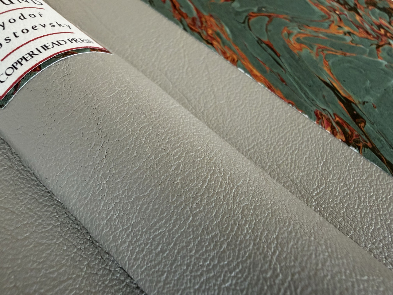
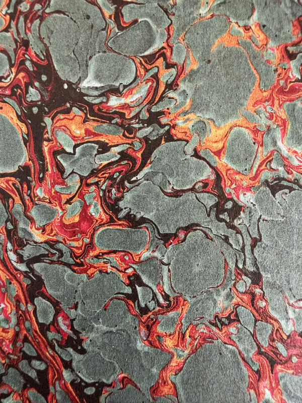
Half-bound with grey lambskin leather with marbled paper covers.
White felt paper spine label.
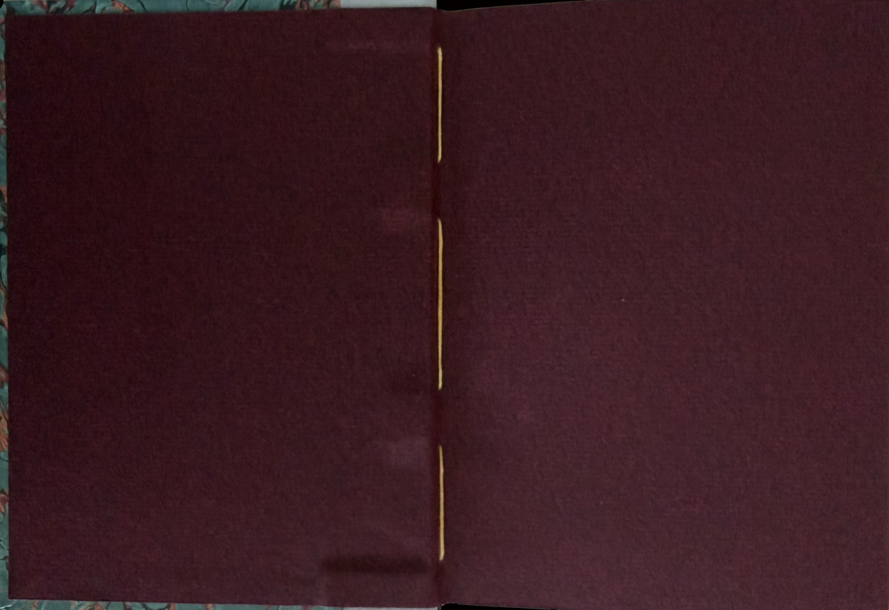
Endpapers are burgundy Bugra mould made paper made in the Hahnemuhle Mill in Germany.
Printed off-set on white felt paper with red chapter and page numbers.
Black silk headbands.
Burgundy satin ribbon marker.
Hand-Sewn with golden honey book thread.
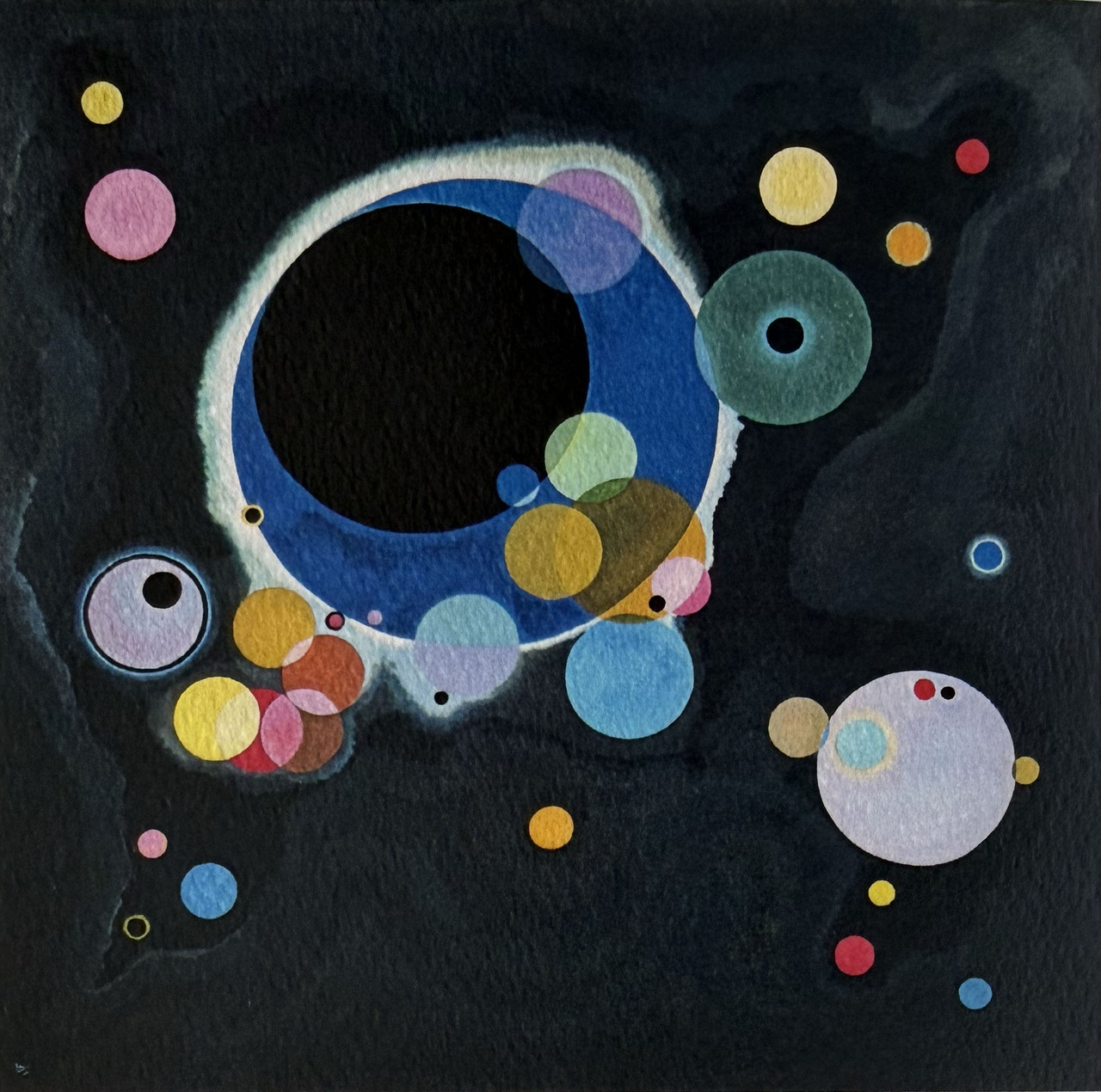
Slipcase handmade with high density book board, wrapped in black book cloth and with a watercolor inset by Adán Peredo on front.
19.5x15cm.
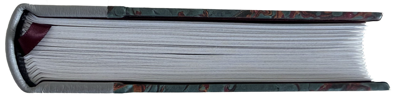
251 pages
US$400
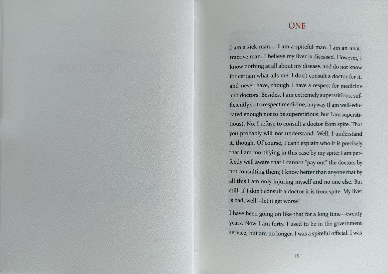
Written in 1864, this is a monologue on the philosophy of life with no real story line. It starts when the narrator is forty and constantly self-analysing himself, then in book two he is twenty-five, but already an inadequate, alienated egotist.
An index of the other illustrated reviews in the this series can be viewed here.
A PICTORIAL REVIEW
No. 3 of 50 copies
Designed, crafted and signed by Chaz Ross & Katie Ross.
Foreword by Chaz Ross.
Eight monochrome illustrations (two with colour overlays) by Adán Peredo who signed the book.
Colour portrait of Dostoevsky as frontispiece.
Half-bound with grey lambskin leather with marbled paper covers.
White felt paper spine label.
Endpapers are burgundy Bugra mould made paper made in the Hahnemuhle Mill in Germany.
Printed off-set on white felt paper with red chapter and page numbers.
Black silk headbands.
Burgundy satin ribbon marker.
Hand-Sewn with golden honey book thread.
Slipcase handmade with high density book board, wrapped in black book cloth and with a watercolor inset by Adán Peredo on front.
19.5x15cm.
251 pages
US$400
Written in 1864, this is a monologue on the philosophy of life with no real story line. It starts when the narrator is forty and constantly self-analysing himself, then in book two he is twenty-five, but already an inadequate, alienated egotist.


An index of the other illustrated reviews in the this series can be viewed here.
2duncjl
I'm loving the colour of the lambskin, is always a pleasant change when the leather is a softer tone than the ubiquitous crimsons and browns. But the spine label really touches a nerve: "underground" and "under ground" really aren't the same thing, and a hyphen should have been used, or a smaller font size to obviate the need.
3Shotcaller
>2 duncjl: Agreed on the spine. My other issue is the text layout. The spaces between paragraphs: can’t get behind that.
4DMulvee
>2 duncjl: I think I visually prefer the way it has been done, though I acknowledge the inaccuracy.
I like the text layout, I’m not sure if this is a sign of my aging, but I think it looks easier on the eye.
I like the text layout, I’m not sure if this is a sign of my aging, but I think it looks easier on the eye.
5Glacierman
Call me a Luddite or an old fossil, but that layout grates. Extra spacing between paragraphs and no indentation on the paragraphs . . . looks like an e-mail. It's just . . . wrong.
6Shotcaller
>5 Glacierman: I can’t help but agree. I think they should consider hiring a text designer.
7Another_Bibliomane
I wish they’d do some paring of the leather at head and tail so the spine turn-ins wouldn’t look so clunky. Also not sure about the choice of thread color, but that’s an aesthetic decision and I could land either way.
On the whole it’s a very handsome volume and Chaz should be proud of what he’s accomplished.
On the whole it’s a very handsome volume and Chaz should be proud of what he’s accomplished.
8LT79-1
If every book were bound at Ludlow and designed by Jason Dewinetz, and letterpress printed at Nomad Letterpress or by Scott Vile, sure it would be exceptional quality, but I also want books outside of this.. Many presses are starting to look like football teams at this point buying in the best players from around the world but where are they situated? What's their identity? It's everywhere and nowhere, everyone and no one. There needs to be a space outside of this cosmopolitan approach and it's inevitable it will come with a learning curve. That's not to say these kind of 'mistakes' shouldn't be commented on and discussed but in a charitable way with an understanding of the route a particular press is taking. I would have sworn CHP have addressed similar criticisms of their earlier books in recent posts.
9CJR93
>1 wcarter: thanks for sharing pics!
This was released at the same time and somewhat as a set alongside “Hadji Murad”. Same page layout, trim size, spine tag design, etc. Designed in 2024 and fulfilled in 2025.
It was the first time I commissioned an artist for a project. Also the first time I tried releasing two titles at once. All part of the learning curve as a publisher.
10yikou
>7 Another_Bibliomane: It's an unexpected place to put an aesthetic variation, but I think it's nice to see a change from the standard (and the yellow/gold recalls to mind the spine of Hadjii Murad, another color choice I am fond of). I think a dark grey/green (hard to tell what it is on my screen) to match the last throw of the marbled paper (or a black, to match the ground), would make a very compelling overall image.
On that note does anyone recognize who the paper marbler is? It looks like something a la Jason Umentum, but I don't recall him doing edition work.
On that note does anyone recognize who the paper marbler is? It looks like something a la Jason Umentum, but I don't recall him doing edition work.
13wcarter
Hadji Murad by Tolstoy and Copperhead Press was reviewed at:-
https://www.librarything.com/topic/379234
https://www.librarything.com/topic/379234
14Undergroundman
OMG!! How the hell did I miss this release? 😭
15Shotcaller
>8 LT79-1: A very fair point. I'd argue (and you might, too) that there's room for both: both for presses that hire great introducers (bad word, but you know what I mean), illustrators, designers, printers, and binders; and for those that do most or all of those things themselves.
Where we might part company is that you seem to not care much for that first group ("Many presses are starting to look like football teams at this point buying in the best players from around the world but where are they situated? What's their identity? It's everywhere and nowhere, everyone and no one"). Or am I reading too much into your comments? Perhaps you admire some of these presses.
Where we might part company is that you seem to not care much for that first group ("Many presses are starting to look like football teams at this point buying in the best players from around the world but where are they situated? What's their identity? It's everywhere and nowhere, everyone and no one"). Or am I reading too much into your comments? Perhaps you admire some of these presses.
16LT79-1
>15 Shotcaller: It's just starting to feel like everything is bound at Ludlow and designed by Jason Dewinetz. I get why they are so ubiquitous. It's because they are very very good at what they do. And I do enjoy all types of press including these. But there needs to be something outside the fine press dream teams constructing books a thousand miles apart in different time zones. I don't think the answer is for every single press to hire a designer or outsource the binding. Some should struggle, persevere and overcome.

