Bartleby the Scrivener -- White Beech Press -- Short Pictorial Review
Talk Fine Press Forum
Join LibraryThing to post.
1astropi
If you told me that White Beech Press has been around for years and this is just another wonderful book from them, I would not be surprised. What is surprising is that this is their FIRST publication! There's always a learning curve to everything, but wow, they really hit the nail on the head for a truly magnificent first publication. I could not think of a better American author than Herman Melville, and as far as I can tell this is the first and only fine press work of this classic short story, Bartleby, the Scrivener: A Story of Wall Street
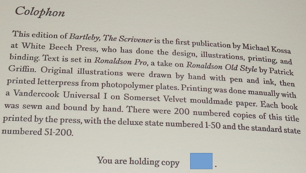
Two editions produced. The one I am showcasing is the Deluxe which is limited to 50 copies, retail was $295, and it's sold out. The Standard is $185 and is in stock. You can purchase the work here --
https://whitebeechpress.com/shop/
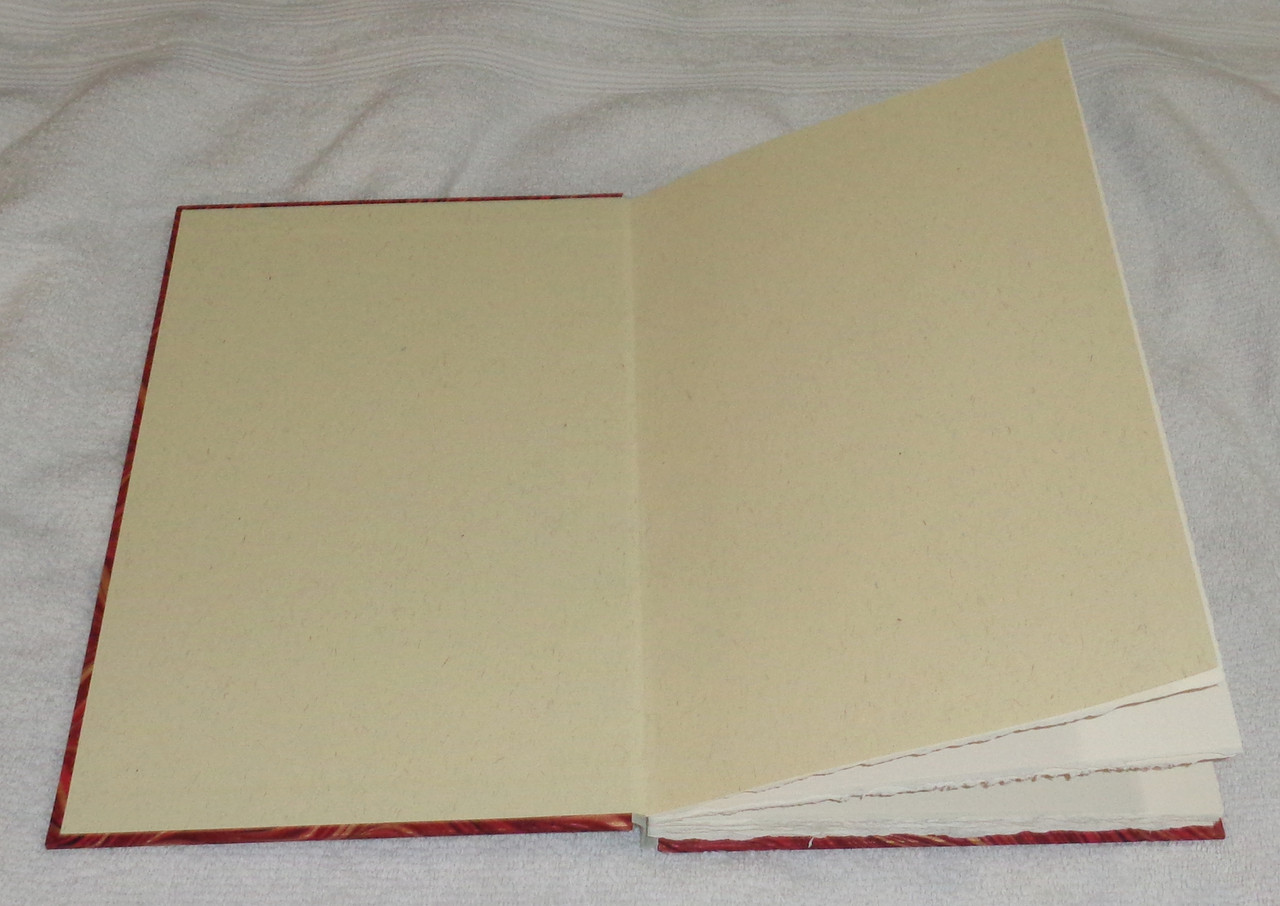
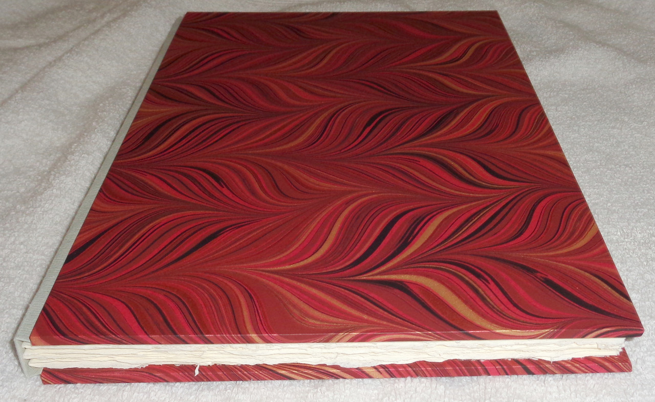
Needless to say, I think this is a wonderful publication and at $185 I would argue this is a "no-brainer". Per the website: Both states share a text block, which is 40pp printed letterpress on 250 gsm Somerset Velvet mouldmade paper and hand sewn on tapes. The spine is Khadi handmade paper with the title directly printed letterpress in each case. Original illustrations were drawn with pen and ink, and are letterpress printed from photopolymer plates.
The paper is absolutely luxurious. The binding is sublime -- again, it's almost shocking how good it is.
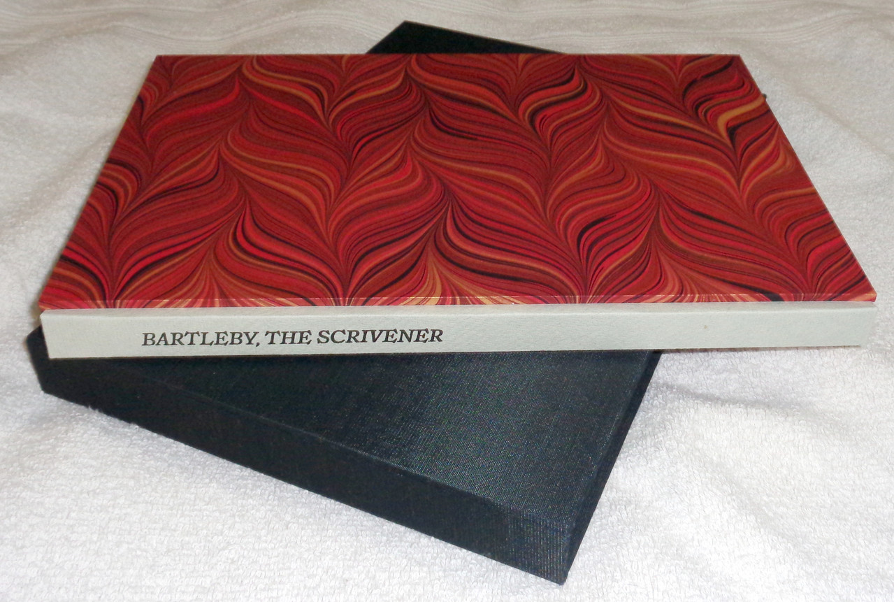
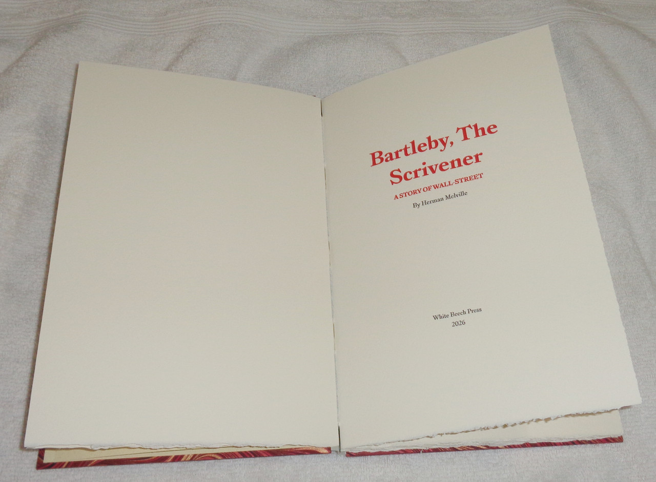
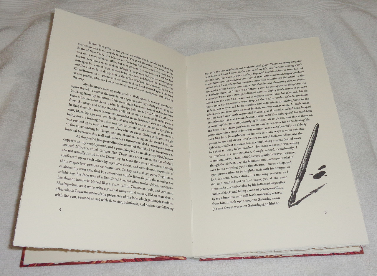
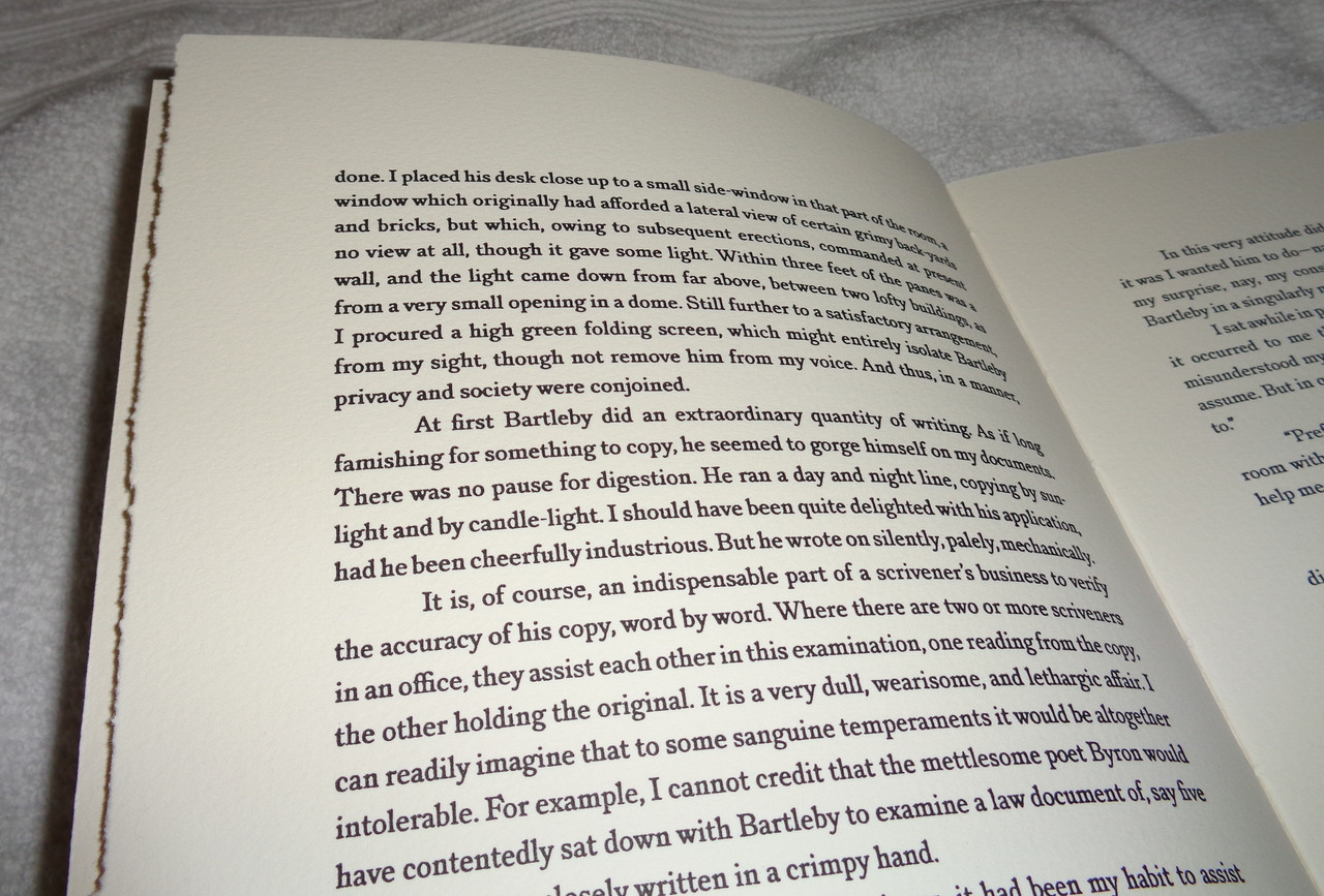
The ink is dark and rich -- you can easily tell this is a beautiful letterpress production. The illustrations are lovely -- the publisher has artistic talent! That said, one small quibble, the ink is not entirely even across all pages -- some pages are dimmer and some are darker. To be fair, this happens in many works and many fine presses. However, I just wanted to note this since I assume Michael Kossa would like some feedback. And a few suggestions -- the spine has the book's title, it would be good for the next publication to include the author's name as well. There is no introduction to the work. If you go to the website, you will see a Description that starts "Bartleby, The Scrivener is a story that means many things to many people, and much has been written about the enigmatic clerk since it’s publication in 1853..." in my mind, what was written on the website would have made a great introduction to the work! I personally do not feel that every publication needs a scholarly introduction (although that is okay too), but even a one-page introduction would have been a great addition. If I had my druther the top-edge of the book would have a nice top-stain (not necessarily gilt). With all that said, in summary I can easily recommend this production to my fellow bibliophiles and I really want this new press to thrive and continue producing such beautiful works.
Two editions produced. The one I am showcasing is the Deluxe which is limited to 50 copies, retail was $295, and it's sold out. The Standard is $185 and is in stock. You can purchase the work here --
https://whitebeechpress.com/shop/
Needless to say, I think this is a wonderful publication and at $185 I would argue this is a "no-brainer". Per the website: Both states share a text block, which is 40pp printed letterpress on 250 gsm Somerset Velvet mouldmade paper and hand sewn on tapes. The spine is Khadi handmade paper with the title directly printed letterpress in each case. Original illustrations were drawn with pen and ink, and are letterpress printed from photopolymer plates.
The paper is absolutely luxurious. The binding is sublime -- again, it's almost shocking how good it is.


The ink is dark and rich -- you can easily tell this is a beautiful letterpress production. The illustrations are lovely -- the publisher has artistic talent! That said, one small quibble, the ink is not entirely even across all pages -- some pages are dimmer and some are darker. To be fair, this happens in many works and many fine presses. However, I just wanted to note this since I assume Michael Kossa would like some feedback. And a few suggestions -- the spine has the book's title, it would be good for the next publication to include the author's name as well. There is no introduction to the work. If you go to the website, you will see a Description that starts "Bartleby, The Scrivener is a story that means many things to many people, and much has been written about the enigmatic clerk since it’s publication in 1853..." in my mind, what was written on the website would have made a great introduction to the work! I personally do not feel that every publication needs a scholarly introduction (although that is okay too), but even a one-page introduction would have been a great addition. If I had my druther the top-edge of the book would have a nice top-stain (not necessarily gilt). With all that said, in summary I can easily recommend this production to my fellow bibliophiles and I really want this new press to thrive and continue producing such beautiful works.
2ambyrglow
A minor addendum--Thornwillow did Bartleby, The Scrivener as well, as part of their Dispatches series. (This one is obviously a more elaborate production, just thought I'd mention.)
3LBShoreBook
>2 ambyrglow: + Indulgence Press (1995), as well as Wolfgang Buchta (2011)
4jveezer
...and there is a lovely 1995 edition by Indulgence Press.
https://www.thewholebookexperience.com/2018/10/18/bartleby-the-scrivenor-publish...
This edition looks quite nice, as well.
https://www.thewholebookexperience.com/2018/10/18/bartleby-the-scrivenor-publish...
This edition looks quite nice, as well.
7astropi
>2 ambyrglow: >3 LBShoreBook: >4 jveezer: Thanks all, I was not aware of the Indulgence Press (website is defunct). From @jveezer "This edition was begun as part of designer Wilbur Schilling’s MFA and later became the first letterpress book of his Indulgence Press" which begs the question how many fine press started off with Bartleby :)
For what it's worth, it sounds like the Wolfgang Buchta edition is not letterpress but printed using lithography --
https://booklyn.org/catalog/bartleby-the-scrivener-a-story-of-wall-street/
>5 A.Nobody: Thanks, it's interesting to note that Bartleby seems to have been well read in the UK -- there's a "well known" film from 1970 -- https://en.wikipedia.org/wiki/Bartleby_(1970_film)
>6 wcarter: That's the same one that >5 A.Nobody: noted. It does look nice and well done, although I personally will almost always prefer a letterpress edition given a choice.
Overall, I certainly encourage and hope people support White Beech Press -- especially if you're looking for a fine press Melville, the Standard is one heck of a deal!
8CJR93
Beautiful edition! Fantastic work, especially for a first release. Thanks for sharing the pics.
9A.Nobody
>7 astropi: I'll get the Standard at some point and I'm very interested to see what they produce next.
10kermaier
Looks great except (to my taste) the artwork. Since I have the Indulgence Press edition, I think I’ll pass on this one. Eager to see what they do next, though.
11filox
One issue with my copy is that there is a small pocket of air between the binding and the boards on the slipcase. Definitely not a huge issue, but noticeable. Looking forward to more books from this new press, I'm sure they will only get better over time.
12Another_Bibliomane
>11 filox: have you reached out to them? That’s a big enough issue that I’d request a replacement or a partial refund.
13Nightcrawl
Curious if there are any other illustrations. I’ve seen the one of the fountain pen posted multiple times.
14lemonjelleaux
>1 astropi: Thanks for the generous review, and sharing the pictures! I'm glad people are enjoying the book. To some of your other points, the lack of author on the spine was an aesthetic choice, but won't be a standard going forward. And I do agree with the ink variability, it's something I want to improve. To that end, I'm planning a shorter chapbook for my next release, where I can really focus on the text and printing process.
>11 filox: Shoot me a picture of the issue at michael@whitebeechpress.com, though I believe I know what you're seeing. I'm happy to address workmanship and shipping errors to get everyone what they paid for.
>13 Nightcrawl: There are five illustrations in total. Here's a quick phone photo I took of the ones I included a little while back.
15filox
>14 lemonjelleaux: It's really a minor thing -- the air pocket is maybe 2cm x 0.5cm. It's noticeable, but doesn't really bother me that much, definitely not enough to send the book back or anything. I chalk it up to a new press learning the ropes. As someone in another thread said, it's interesting to watch a press progress from their early books to the later ones.

