
Neville Brody
Author of The Graphic Language of Neville Brody
About the Author
Image credit: Credit: Reinhard Jahn, 2005, Font Shop Converence, Berlin
Works by Neville Brody
Associated Works
Up-Tight: The Velvet Underground Story (1983) — Cover designer, some editions — 228 copies, 2 reviews
Tagged
Common Knowledge
- Gender
- male
Members
Reviews
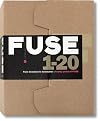
Launched by Neville Brody and Jon Wozencroft in 1991, FUSE was the groundbreaking publication that took design and typography into radically new and unforeseen spaces. The major influence of its revolutionary and experimental approach to typographic language reverberates still, and today—20 years after its launch—the explorations carried out by some of the most famous and influential names in the industry stand out as futuristic and ahead of their time.
Taking the alphabet as its base, show more and enabled by the advent of digital design, FUSE became a laboratory for new ideas and risks, as well as a hothouse of new thinking. Published over 20 editions, each issue was themed and included both fonts and posters by specially commissioned collaborators, all of which are on show here.To commemorate the release of issue 20, TASCHEN brings you a complete compendium of all the issues. Exclusive to this publication are FUSE19 and FUSE20, two newly commissioned and never-before-published issues, in the form of 10 A2 posters and 24 downloadable fonts, making this boxed edition a collector’s item. This is the legacy created by the best contemporary thinkers on typeface design: the list of contributors to FUSE reads like a who’s who of typographic design, from Erik Spiekermann to Stefan Sagmeister, Peter Saville, Jonathan Barnbrook and Tobias Frere-Jones, plus many more. Editorial contributors include Adrian Shaughnessy and Jon Wozencroft.Included in this special edition:
10 exclusive posters from the never-before-seen editions of FUSE19 and FUSE20
A compilation of the work of the most innovative and renowned typographic designers of the last two decades
Keycard with code to download fonts from issues 19 and 20
Complete out-of-print issues 1 to 18 compiled in a book designed by Neville Brody
In 1991 two of the most talented graphic designers of all time (Jon Wozencroft and Neville Brody) launched a unique experiment: FUSE, an annual publication packaged in a cardboard box that contained a printed zine with articles relating to typography culture, a floppy disk with four fonts and four posters that utilizedthe same fonts. In the middle of the IT revolution and just before internet for the masses, this production was a milestone in contemporary graphic design and a novel form of publishing (we would have said ‘multimedia’ at that time). Creative Review described it as “the magazine of the future” referring to the idea that the form was designed specifically for the content, which in turn was a tool for creating new (potentially disparate) content. Each issue had a theme such as “Codes”, “Religion” or “Pornography”, around which the article, the fonts and the posters were created. The alphabet started to be considered (together with the computer keyboard) as a medium for digitally coded sense. This anthology celebrates FUSE and acts as a form of preservation. It also includes unpublished issues #19 and #20. Aside from the two editors, several radical innovators were involved, such as Peter Saville, David Carson, the Tomato collective and many other designers keen on opening new conceptual windows between the machine and the printed page. The nineties aesthetic is easily recognizable (think techno flyers, for example), but in fifty years’ time this project is more than likely going to be labelled as avant-garde. show less

You May Also Like


Associated Authors
Statistics
- Works
- 16
- Also by
- 3
- Members
- 245
- Popularity
- #92,909
- Rating
- 3.7
- Reviews
- 2
- ISBNs
- 15
- Languages
- 2