Sherlock Holmes by Arthur Conan Doyle – AMARANTHINE 2023
Talk Fine Press Forum
Join LibraryThing to post.
1wcarter
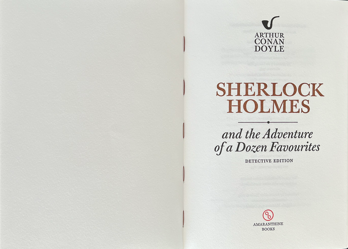
Sherlock Holmes and the Adventure of a Dozen Favourites by Arthur Conan Doyle - AMARANTHINE BOOKS DETECTIVE LIMITED EDITION 2023
A PICTORIAL REVIEW
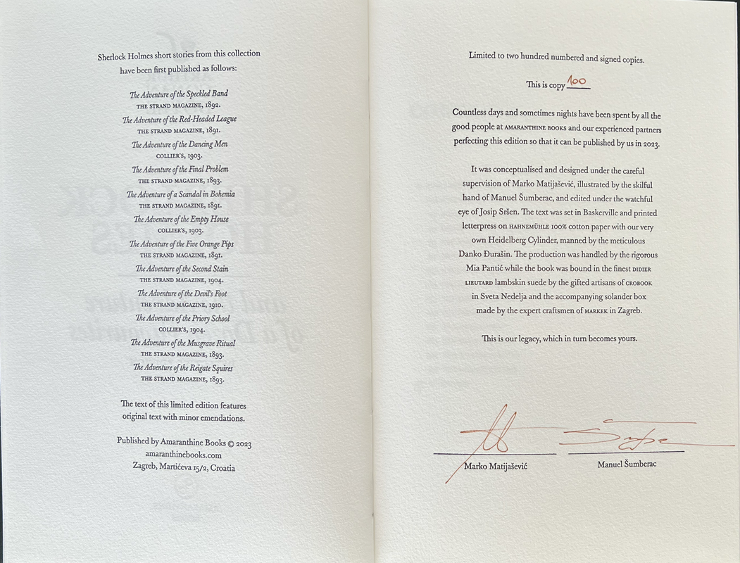
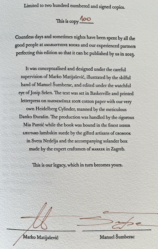
No. 100 of 260 copies
Signed by Marko Matijašević (creative concept) and Manuel Sumberac (illustrations).
Introduction by Arthur Conan Doyle.
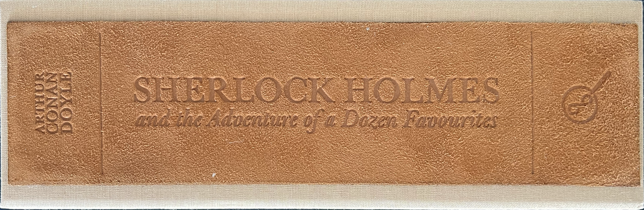
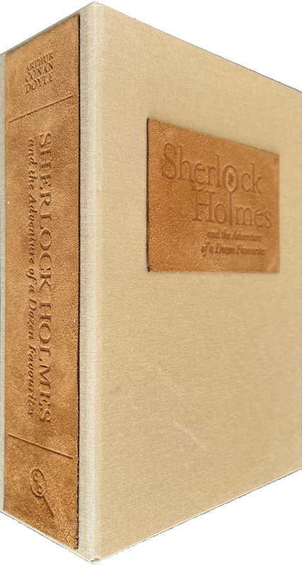
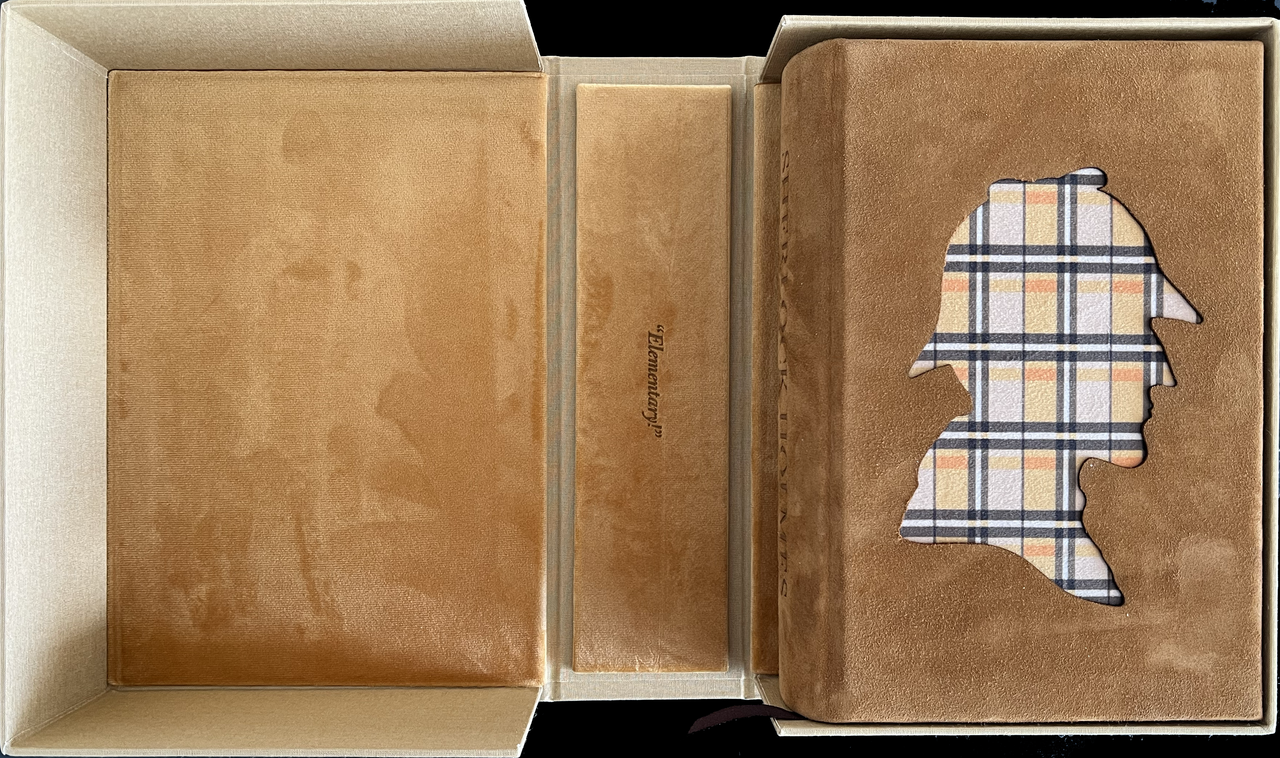
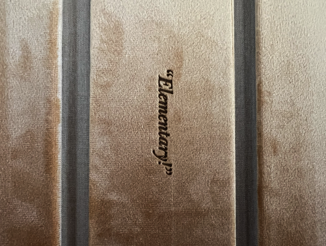
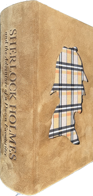
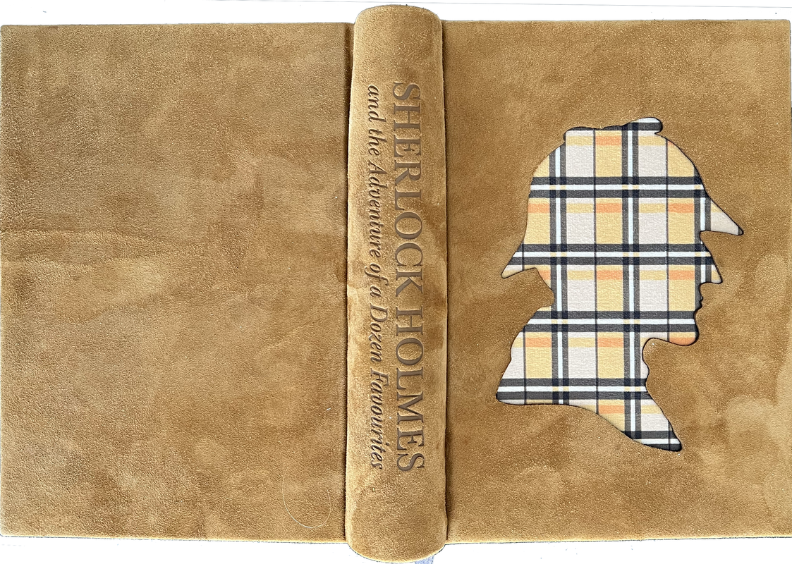
Cased in a light brown solander box bound in a premium book cloth with suede leather title label on cover and spine, and a beige plush lining featuring the laser-engraved word “Elementary”.
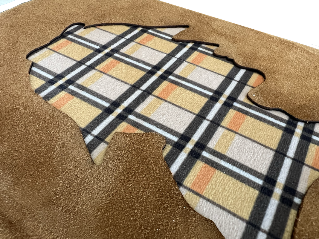
Bound in brown suede lambskin leather with a cutout in shape of Sherlock’s profile on the front cover, featuring a tartan fabric below.
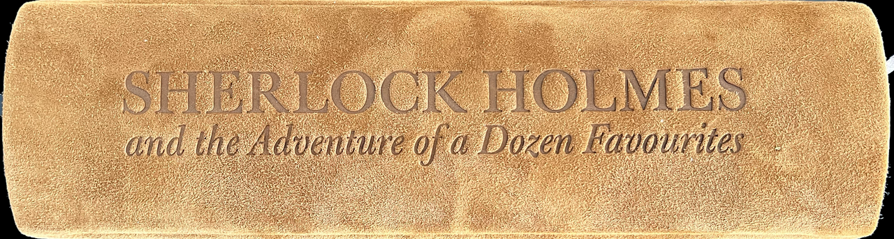
Spine engraved with title using laser.
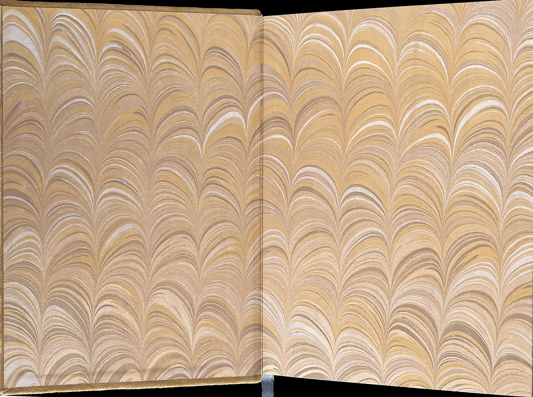
Handmade paste endpapers by Freya Scott.
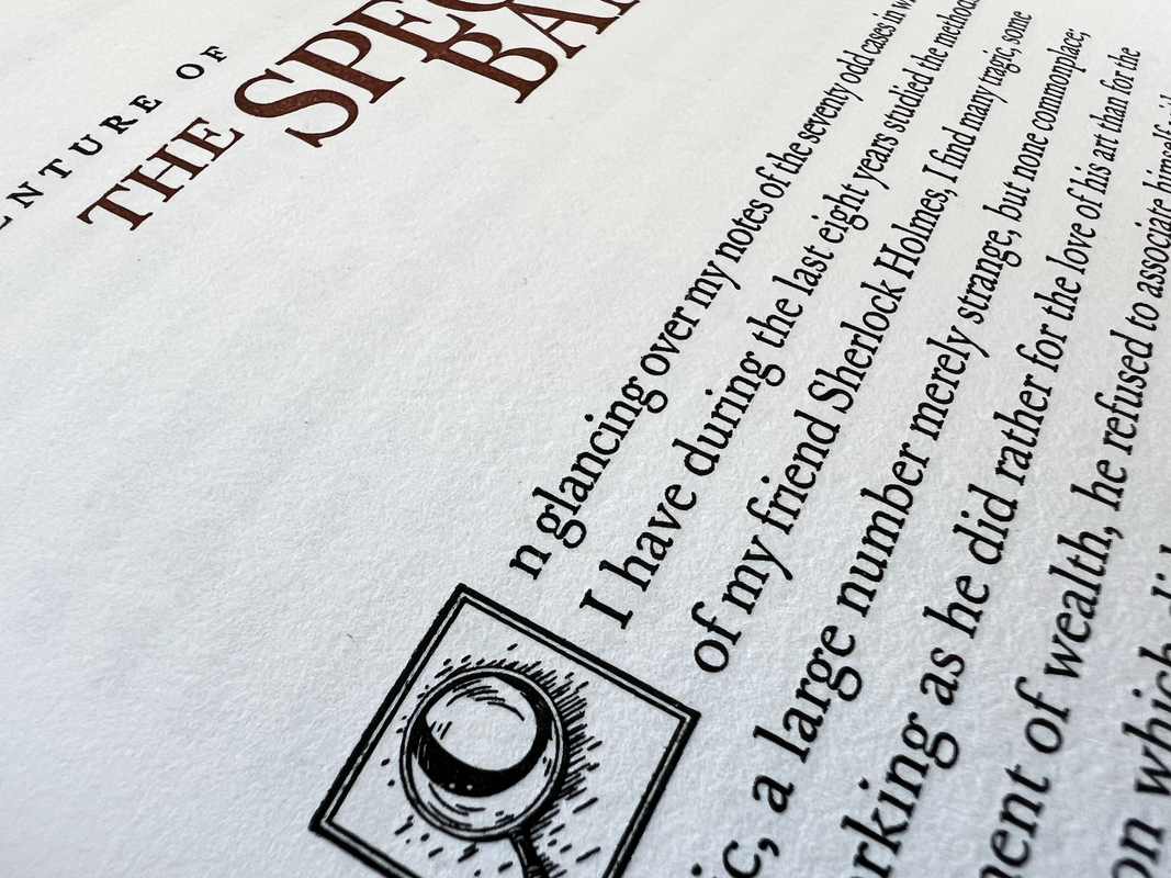
Printed letterpress on Hahnemühle 100% cotton paper.
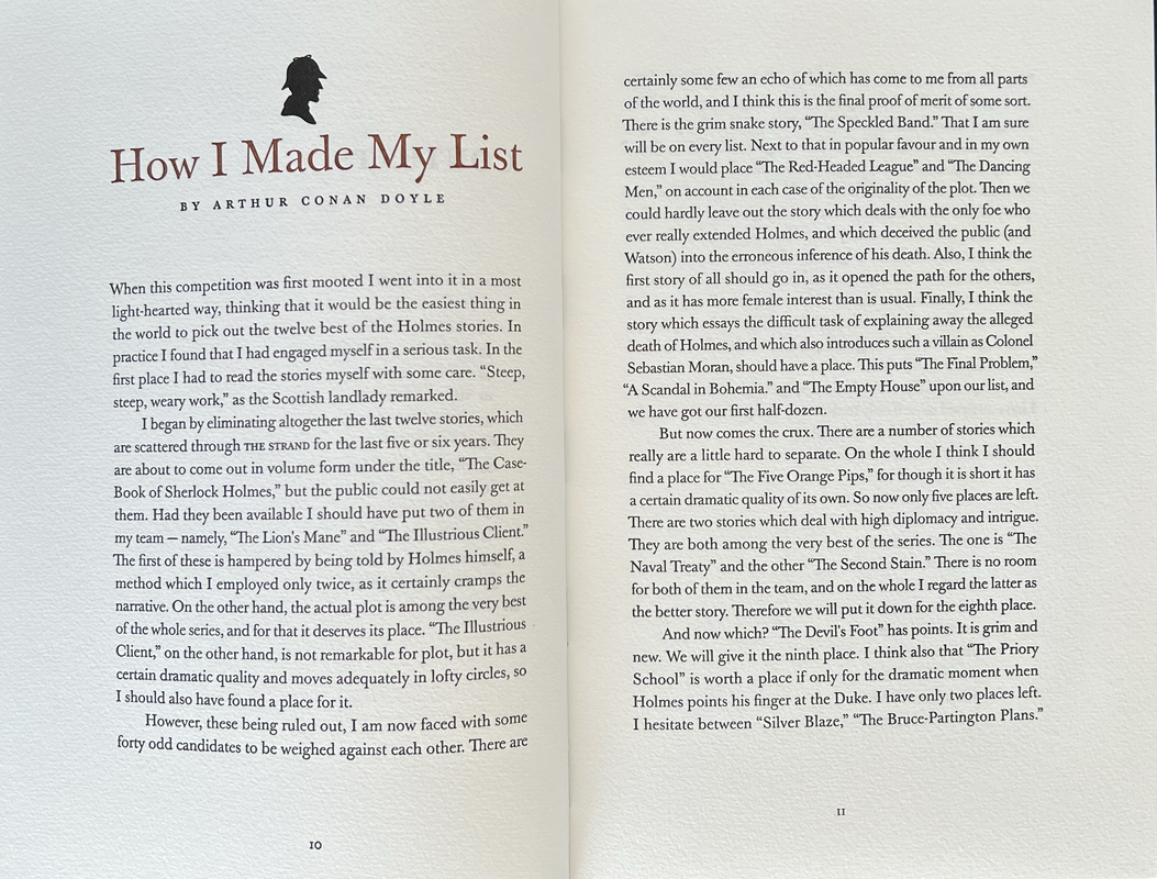
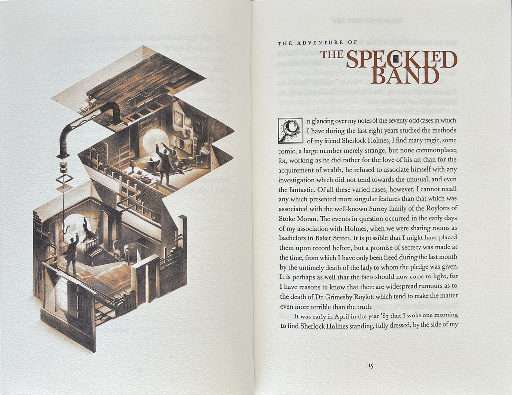
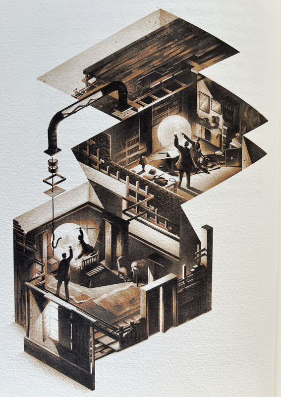
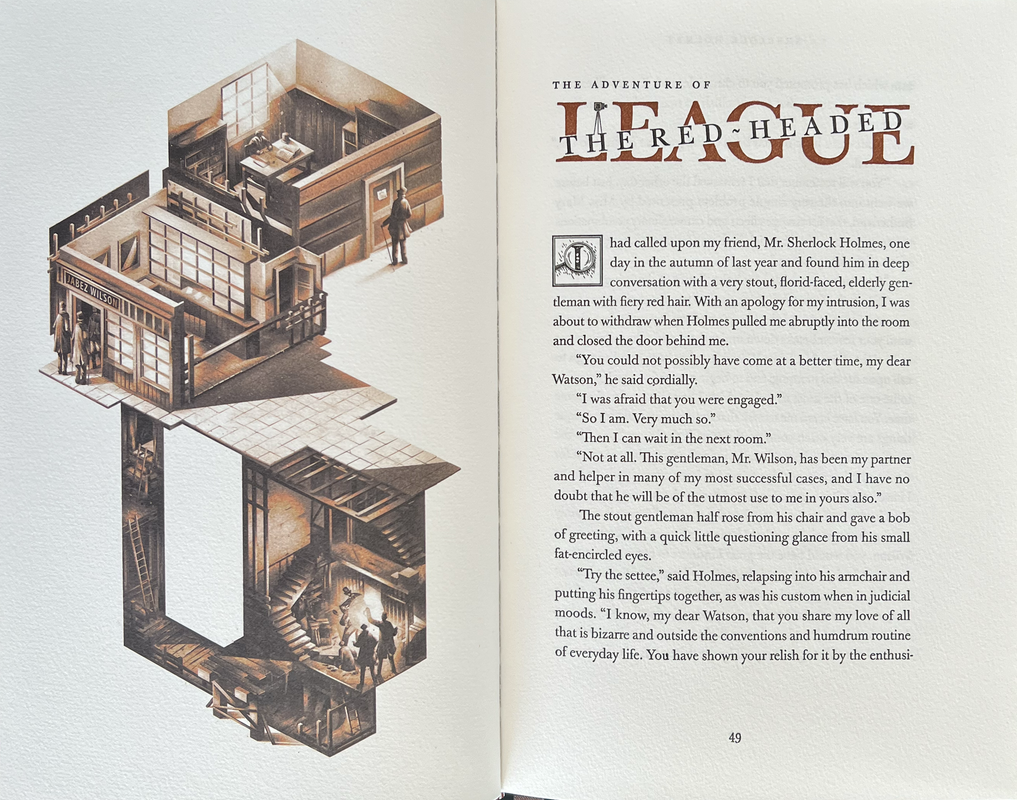
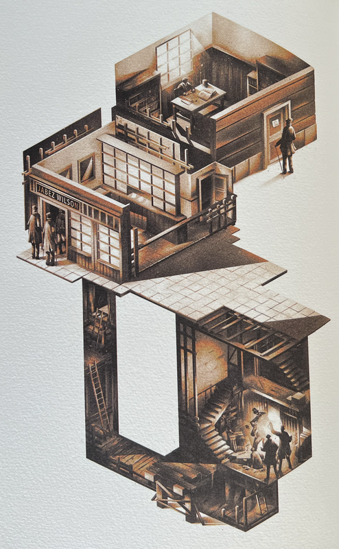
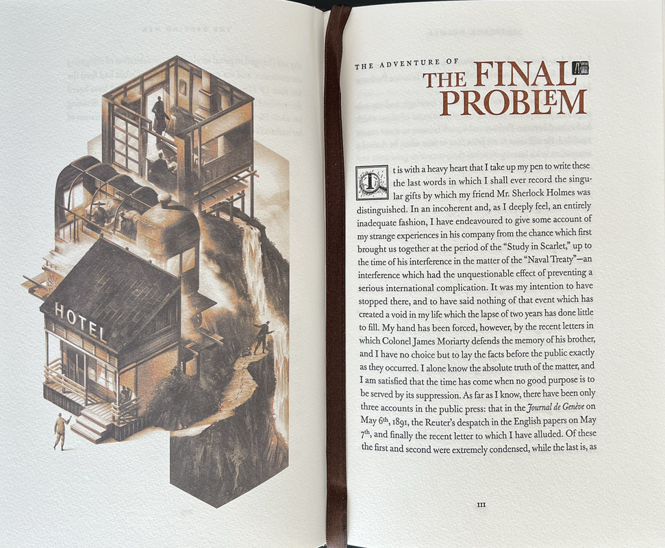
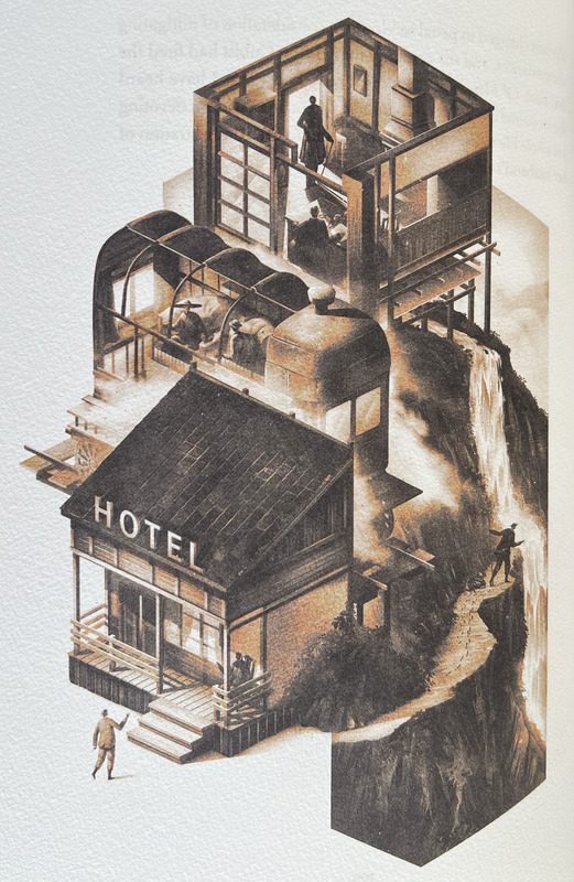
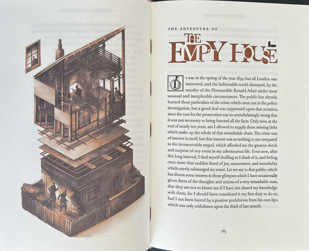
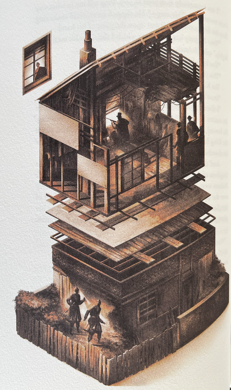
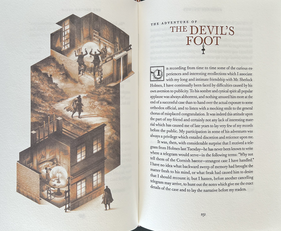
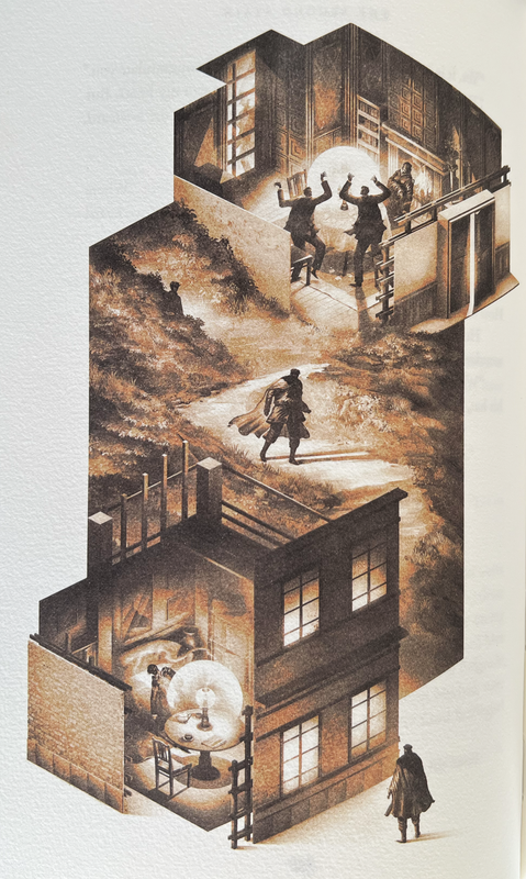
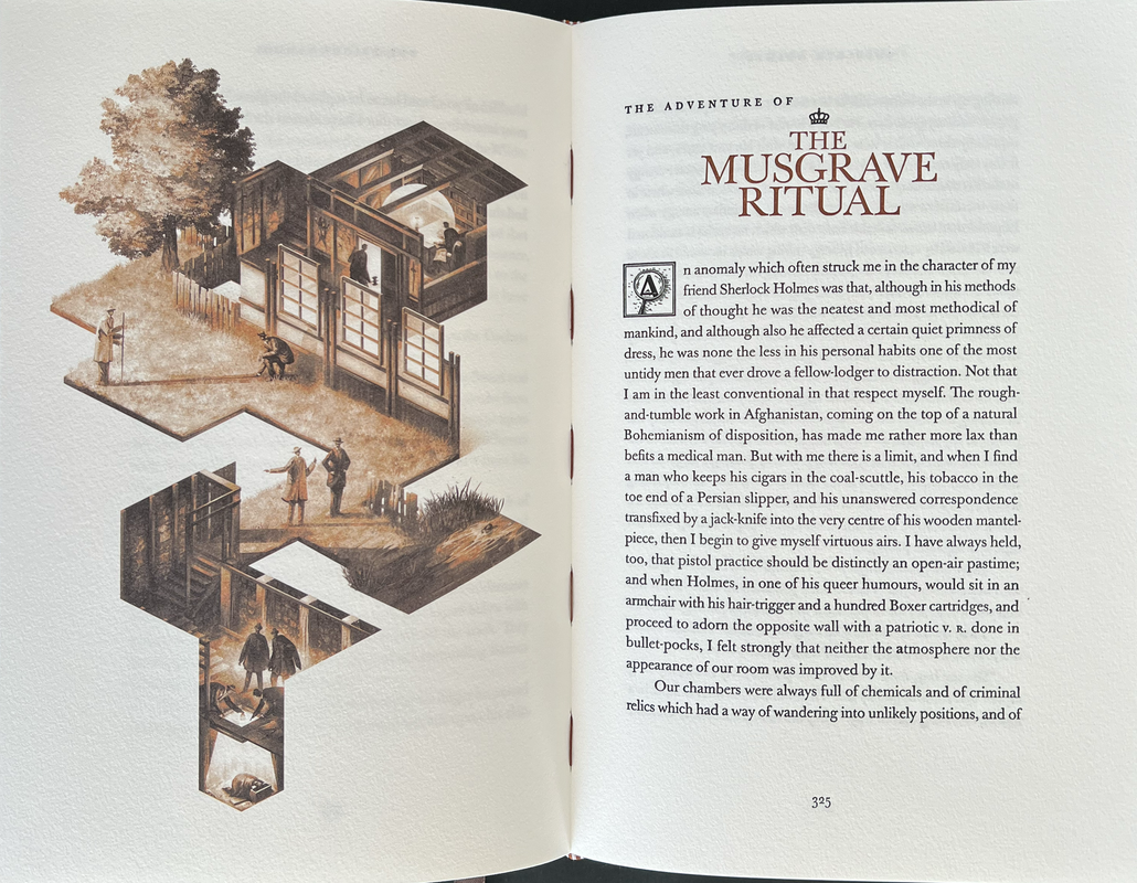
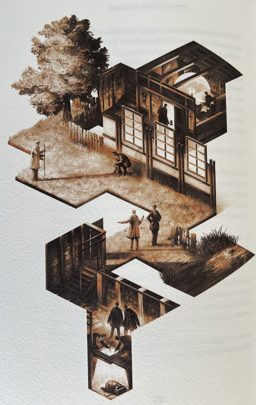
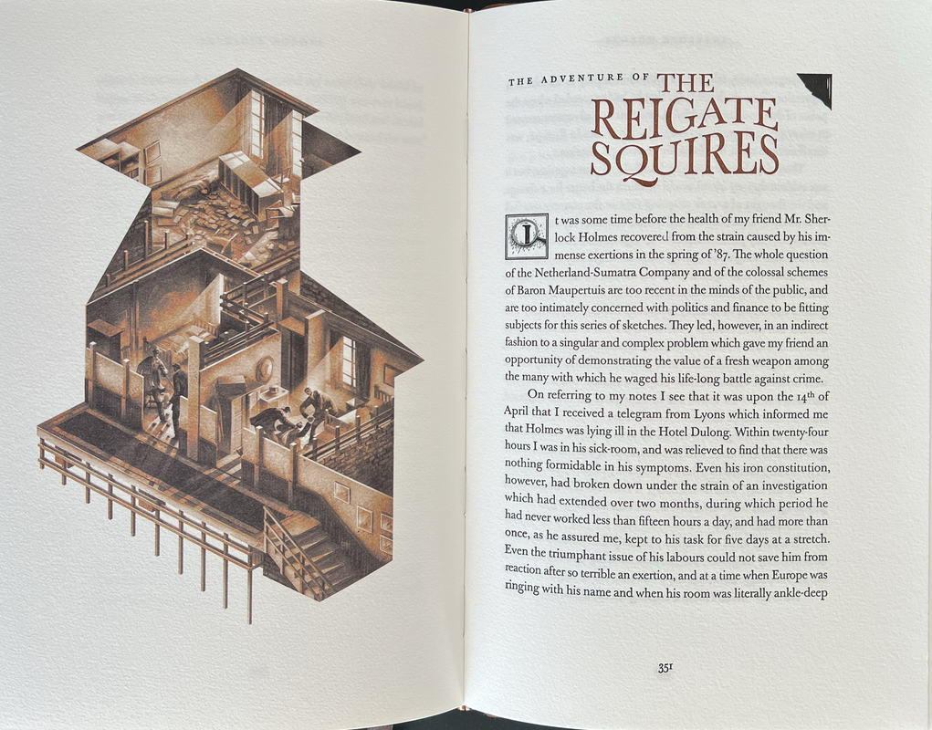
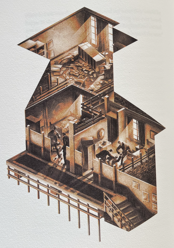
Twelve full page brown tinted coloured illustrations, one for each story and cleverly designed to show the plot.
Illustrated drop caps for every chapter.
Smyth sewn binding using brown thread.
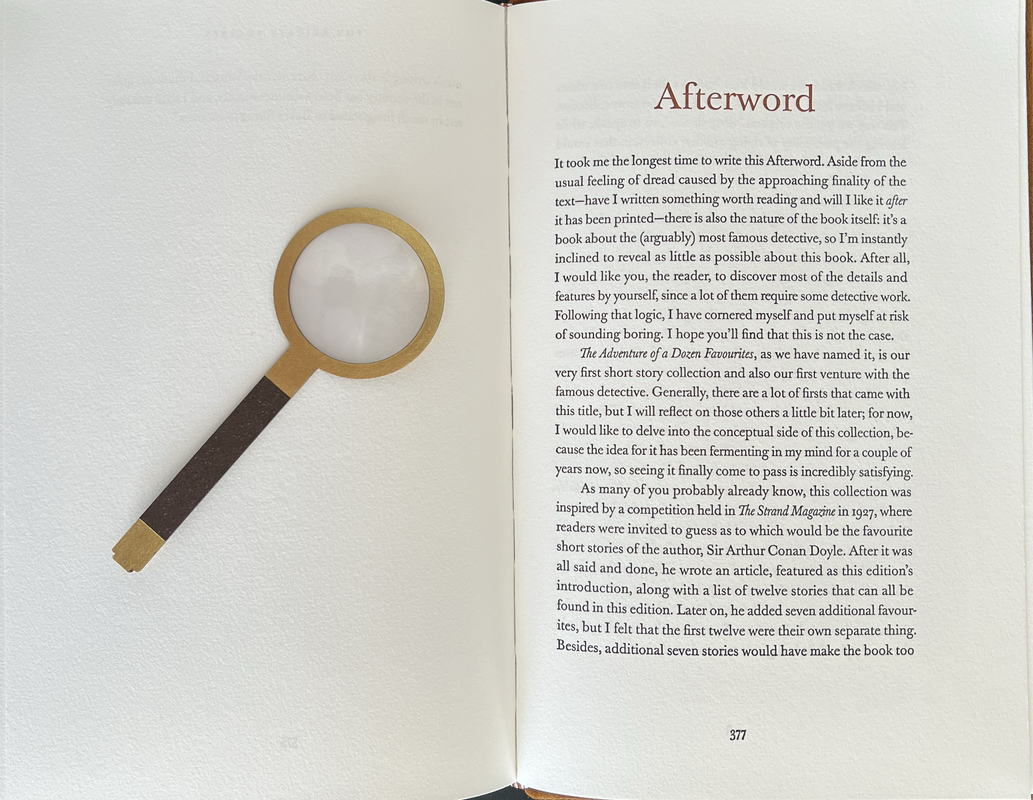
Bookmark in shape of a magnifying glass.
Brown ribbon page marker.
Solander case 26.9x19.2cm.
380 pages
€550
An index of the other illustrated reviews in the this series can be viewed here.
A PICTORIAL REVIEW
No. 100 of 260 copies
Signed by Marko Matijašević (creative concept) and Manuel Sumberac (illustrations).
Introduction by Arthur Conan Doyle.
Cased in a light brown solander box bound in a premium book cloth with suede leather title label on cover and spine, and a beige plush lining featuring the laser-engraved word “Elementary”.
Bound in brown suede lambskin leather with a cutout in shape of Sherlock’s profile on the front cover, featuring a tartan fabric below.
Spine engraved with title using laser.
Handmade paste endpapers by Freya Scott.
Printed letterpress on Hahnemühle 100% cotton paper.
Twelve full page brown tinted coloured illustrations, one for each story and cleverly designed to show the plot.
Illustrated drop caps for every chapter.
Smyth sewn binding using brown thread.
Bookmark in shape of a magnifying glass.
Brown ribbon page marker.
Solander case 26.9x19.2cm.
380 pages
€550


An index of the other illustrated reviews in the this series can be viewed here.
2cyber_naut
Thanks for this wcarter. I came quite late to the Amaranthine party but picked up an essential edition, which I am enjoying.
3ensuen
>2 cyber_naut: Same here, very pleased with the construction and printing. It’s also of a decent length which is fairly refreshing.
4cyber_naut
>3 ensuen: It’s also of a decent length which is fairly refreshing.
Have you seen the size of Catch-22? I’ve actually been put off buying as it looks very thick as a single volume edition. Plenty left so I’ll wait to hear from people once they get their hands on it.
Have you seen the size of Catch-22? I’ve actually been put off buying as it looks very thick as a single volume edition. Plenty left so I’ll wait to hear from people once they get their hands on it.
5ensuen
>4 cyber_naut: I actually picked up a copy! Sherlock handles fairly well so I am optimistic. It definitely is fairly large though, I have a table outside where I read most of my books that are not super expensive, so not the end of the world if it’s hard to hold.
7texntim
>4 cyber_naut: I received my Mission Edition of Catch-22 about two weeks ago. It is marvelous! Although it looks large, it's actually not that heavy and quite nice to handle. That having been said, I have not yet begun to sit with it to read, but I look forward to doing so.
8dlphcoracl
>1 wcarter:
Enabled.
Received my copy of the standard Essential Edition. Understated book design for the Amaranthine Press which makes this quite attractive. Very reminiscent of the best work from the Thornwillow Press. Price of $230. for the book AND speedy DHL shipping from Zagreb to the United States is an exceptional bargain and purchase is highly recommended before it goes OOP.
9ultrarightist
>8 dlphcoracl: Do you own the LEC Sherlock Holmes? If so, what are the features/aspects that set the Amaranthine apart to convince someone like me who owns the LEC edition to acquire it? Why should I purchase an offset edition?
10ensuen
>9 ultrarightist: It’s actually letterpress except for the illustration preceding each story, which is offset. Binding is quarter cloth, brown paper over boards, has a cut out plaid design in the shape of the pipe on the cover.
Paper is nice but fairly normal, printing is fairly good with a couple spots I would nitpick on a more expensive production. Overall construction feels pretty solid.
At the end of the day it’s up to you I guess.
Edit: typo
Paper is nice but fairly normal, printing is fairly good with a couple spots I would nitpick on a more expensive production. Overall construction feels pretty solid.
At the end of the day it’s up to you I guess.
Edit: typo
11dlphcoracl
>9 ultrarightist:
Do not own the LEC Sherlock. Printing is letterpress on a Heidelberg cylinder and, as mentioned, quite comparable to Thornwillow Press work. Attractive aspects of the Amaranthine Books edition are the harmonious, attractive design between book and slipcase and excellent selection of twelve classic Sherlock Holmes stories including many of A.C. Doyle's best.
Do not own the LEC Sherlock. Printing is letterpress on a Heidelberg cylinder and, as mentioned, quite comparable to Thornwillow Press work. Attractive aspects of the Amaranthine Books edition are the harmonious, attractive design between book and slipcase and excellent selection of twelve classic Sherlock Holmes stories including many of A.C. Doyle's best.
12ultrarightist
>10 ensuen: and >11 dlphcoracl: Thank you, and noted re: letterpress printing.
13DMulvee
I went for the Essential edition of this and was delighted with the quality and value. Previously I had picked up Amaranthine’s numbered edition of Dorian Grey, but that didn’t quite hit the spot for me, however Sherlock managed to be cheaper (and in my opinion) more impressive
14Maretzo
I have both editions: Detective et LEC. Frankly if I would have to choose one ...
They are very different in paper quality and typography. I love the way the stories are illustrated in the Amaranthine edition.
So I would probably keep both!
They are very different in paper quality and typography. I love the way the stories are illustrated in the Amaranthine edition.
So I would probably keep both!
15vremiaimir
I just checked the Amaranthine Books' webpage.
One of their titles is "THE Strange case of Dr. Jekyll & Mr. Hyde".
Personally, I would never buy a book from a publisher that doesn't even get the title of a book right.
One of their titles is "THE Strange case of Dr. Jekyll & Mr. Hyde".
Personally, I would never buy a book from a publisher that doesn't even get the title of a book right.
16bacchus.
>15 vremiaimir: I’m pretty sure it was a conscious decision - actually you’ll have a hard time finding a publisher who didn’t add “The” in front of the title.
17Pendrainllwyn
>15 vremiaimir: On Amazon today you can find books titled THE Strange case of Dr. Jekyll & Mr. Hyde being sold by more than 20 different publishers including Penguin and Barnes & Noble. I stopped counting. It seems commonplace to use this title. Indeed, at least on Amazon, more editions are titled this way than the original title. So Amaranthine is far from alone in this practice.

19bacchus.
>18 vremiaimir: Bravo :)
20curiousbooks
Amaranthine press books remind me of cheap kids’ toys. I know they letterpress now but their books design never appealed to me. That said, I really like Conversation press classic designs, without plastic toys to play with like Amaranthine press
21SF-72
I really like this edition, especially the illustrations. The style fits the content and the quality is quite good. I also like their creativity, even if it doesn't always work for me. (Dracula was a bit over the top for me.) I'm happy with my purchase of this edition and am looking forward to them continuing the Holmes books.
23curiousbooks
>21 SF-72: >22 Ragnaroekk: Enjoy your fine SH editions. I like all the stories that were selected in your edition. Letterpress is always very nice but I have to like entire book to purchase. I purchased ‘Creeping man” by Arete press and love it. Letterpress and a classic design plus affordability.
24David_Mauduit
>15 vremiaimir: Interesting. I just did the binding of this book and did not know that the title should not have the "The".
At Project Gutenberg it is with the "The": https://www.gutenberg.org/files/43/43-h/43-h.htm
Folio Society also published it under "The Strange case of Dr. Jekyll & Mr. Hyde".
In his introduction, Joe Hill also refers to it as "The ...".
Looks like everybody has it wrong.
At Project Gutenberg it is with the "The": https://www.gutenberg.org/files/43/43-h/43-h.htm
Folio Society also published it under "The Strange case of Dr. Jekyll & Mr. Hyde".
In his introduction, Joe Hill also refers to it as "The ...".
Looks like everybody has it wrong.
25TomsRiverNJ
>20 curiousbooks: agree. the selection of titles is so safe it is stale and the designs feel like they hired the head of the barnes & nobles leatherbound line. very kitschy.
the illustrations for the holmes are great but the titling is lame and some of the easter eggs are just lazy. foil stamping "elementary" on the inside of the clamshell box is very low hanging fruit that someone could find by flicking through the wiki page on the famous detective. the design throughout is loud and gimmicky not elegant and thoughtful.
for $600+shipping i would easily rather buy a shiff lec. i'm starting to think most new fine press publications aren't worth it when you look at how many older gems can be gotten for big bargains. of course stuff like the nawakum press bonsai or the saint james park press animal farm or whatever is worth it even at a higher price. maybe it's just the economy today but that doesn't stop me from seeing how much further my dollar goes on superior publications from the past
26SF-72
Some of the comments here are starting to sound like trolling to me. Otherwise some reactions seem a bit extreme for what is indeed a nice book that's actually not gimicky, unlike some others of the publisher. To each their own, but let's keep it civilised.
27SF-72
>1 wcarter:
Thank you for sharing this. I've got the Essential Edition and it was interesting to see the differences and what they have in common.
Thank you for sharing this. I've got the Essential Edition and it was interesting to see the differences and what they have in common.
28TomsRiverNJ
>26 SF-72: so you are an authority on both trolling and on what is seen as gimmicky by the same publisher? take your own advice. a happy meal magnifying glass is the definition of a gimmick
https://www.merriam-webster.com/dictionary/gimmick
"a trick or device used to attract business or attention"
wcarter even posted it as a part of the review L.O.L.
maybe i am overly harsh and i don't mean to be. i have been told by clients and colleagues that i am too blunt. i think the book is overpriced. that's all.
29bacchus.
>26 SF-72: Easier to block than argue.
30David_Mauduit
>28 TomsRiverNJ: that's just a book mark. If you don't like it just throw it away. I don't see how it can affect the perceived quality of the book.
32curiousbooks
I agree with TomsRiverNJ. Amaranthine press books are gimmicky, some more some less. What about their Frankenstein edition where Frankenstein illustrations changes from angry to smiling when you put your hand over the picture. Covers were made from stainless steel with needle attached. I think that was a definition of what gimmicky is.
33SDB2012
>24 David_Mauduit: there was a discussion on the use of the definitive article in the title of Strange Case... a while ago. The publisher chimed in on why they chose to do it that way. It may have been Amaranthine or one of the other publishers that did it recently. I couldn't find it searching from my phone.
34dlphcoracl
>33 SDB2012:
The Strange Case of Dr. Jekyll and Mr. Hyde, Hand & Eye Editions (2010). Illustrated by Angela Barrett.
The Strange Case of Dr. Jekyll and Mr. Hyde, Hand & Eye Editions (2010). Illustrated by Angela Barrett.
36vremiaimir 
This message has been flagged by multiple users and is no longer displayed (show)


37DMulvee
>36 vremiaimir: I think that the lettered case is beautiful. However initially it does feel that the way in which Amaranthine tried to stand apart from the crowd was slightly gimmicky. They appear to have moved away from this, and are looking at producing high quality products BUT when you read the description of the monolith 2001 (it includes a monolith that will have been launched into space) that surely meets the definition of a gimmick?
39ensuen
To throw my hat in the ring here, fine press books have their own design language that can come off as kitsch after a while. The constraints are what helps the medium over time, but there’s only so many ways to remix the standard elements.
The interesting thing about Amaranthine productions is that it feels very new, if not lacking a bit in restraint at times. In my opinion leather, solander with an extra print set, etc is as much of a gimmick as anything else.
The interesting thing about Amaranthine productions is that it feels very new, if not lacking a bit in restraint at times. In my opinion leather, solander with an extra print set, etc is as much of a gimmick as anything else.
40Glacierman
The thing about leather bindings is that is how books were bound long before they were cased in cloth and paper. Not so much gimmicky as traditional.
42ensuen
>41 Ragnaroekk: That’s a fair point, I think in my head gimmick had a more value neutral definition of something closer to “feature added to enhance appeal to a specific consumer segment”, rather than the slightly/moderately negative meaning it seems to actually have.
If you look at the tiers for most fine press releases you can almost guess the additions for each, where some of my favorites have just a single more authoritative version. In this case stuff going to space, does not have a huge appeal vs having some art or whatever, but it feels very interesting to have it existing in the scene.
I think the business aspect of price discrimination with tiers and the corresponding market expectations holds back some creativity in making the books. Like oh if we want to charge X,000 dollars we need to have this be leather, include this type of case, and if we want another tier it needs to be like this.
(I do buy the base tiers for titles I am less interested in, but what consumer actually behaves in a way that would bring about the idealized version of the market that they want.)
43What_What
>36 vremiaimir: Totally unnecessary. They’re making books you don’t like. Okay. We get it.
44TomsRiverNJ
>30 David_Mauduit: why would i pay for something just to throw out a piece of what i'm paying for
>31 Ragnaroekk: thanks for keeping your head. i don't want to compare those books to anything amaranthine has put out. but i don't think it's true that the materials are top-notch. i even disagree that it is top notch for the $600 or cheaper productions. where is the leather sourced from? hahnemule paper is nice and probably can't be beat by much at the price. the illustrations being printed offset is a minus especially when the text printing isn't special. there is at least one review in this thread that says it is being charitable about the letterpress and would be more critical at a higher price. it's only right to expect high quality letterpress at $600. you can buy a fleece press book for around that and the printing would be galaxies apart. plus you're only getting 12 stories. at that point just give me the same book in offset for $50.
amaranthine press seems to me to be a bit higher than century press in its skill level but it costs multiples more with a heavy premium for flash and bang
you can get the entire limited editions club holmes set which is like 8 volumes and a lot more stories and illustrations for around $500 on comparable paper, maybe better?, with full letterpress printing
45curiousbooks
>36 vremiaimir: lol I did not laugh so hard for a long time. Thank you!
46curiousbooks
>44 TomsRiverNJ: you’ve got to stop being right all the time. I completely agree with you
47vremiaimir
This message has been flagged by multiple users and is no longer displayed (show)
>43 What_What:
I just posted the standard edition, and still managed to get you upset, so now I'd better put on the safety belt.


I just posted the standard edition, and still managed to get you upset, so now I'd better put on the safety belt.


48Glacierman
>47 vremiaimir: ROTFLMAO!!!!!
50David_Mauduit
>44 TomsRiverNJ: "at that point just give me the same book in offset for $50"
$50 is almost the price of a basic hardcover and you expect to have a lambskin leather binding with commissioned illustrations and a paper that you describe yourself as "can't be beat by much at the price" of $600.
If that is not trolling I don't know what it is.
>41 Ragnaroekk: Well if you consider the definition given above: "a trick or device used to attract business or attention"
Leather is totally unnecessary for the binding of a book considering today's available materials. It is just a manufacturing "trick" that will add to the design, the same way other design details criticised above add to the design and feel of the book.
I think a lot about fine press relates to gimmicks and that is totally fine. Letterpress printing also is a manufacturing "trick" that attracts the attention of customers but is the text more readable than offset printing? And still many enjoy it a lot so I don't see why the "superfluous" design elements from Amaranthine could not be enjoyed the same way. In the end it is all about how you feel when you see and handle the book that matters, otherwise an ebook will do.
51bacchus.
>49 Ragnaroekk: It is a kindergarten:) if 3 people who have never posted anything of value anywhere, suddenly appear on the Amaranthine thread (which they never bought a book from) and start trashing the publisher, they are most probably trolls. Block and move on. I could even argue that two of them are the same person, with one being the troll’s doppelgänger, cheering on the original.
52curiousbooks
>47 vremiaimir: lol I can’t stop laughing. My wife thinks I’m losing it. This is so hilarious.
54TomsRiverNJ
>50 David_Mauduit: you're making a big assumption. nobody expects lambskin leather and good paper for $50. the book is not worth $600 especially with offset illustrations and only decent text printing at best so just get rid of all that and sell it for $50. you can still make mint on it at that price with the commissioned illustrations
you online people need to stop seeing every disagreement as trolling. everything is so feelings based these days. explain to me how 12 stories with the production we went over is worth more more than 8 volumes with better printing and more illustrations that are full letterpress et photograveure
>49 Ragnaroekk: >51 bacchus.: >>53 SF-72: i have said nothing to insult a person but my posts are worthless and troll. i imagine i'm talking to adult males here. take a breather
56David_Mauduit
>54 TomsRiverNJ: Is it possible to have this type of illustrations letterpress?
You are also making big assumptions regarding the quality of the letterpress printing and materials used without having seen the book in person.
Maybe >1 wcarter: (who knows a bit about it...) could tell us if the production is worth the cost of the book.
You are also making big assumptions regarding the quality of the letterpress printing and materials used without having seen the book in person.
Maybe >1 wcarter: (who knows a bit about it...) could tell us if the production is worth the cost of the book.
57CTPress-Tony
>1 wcarter: Thank you for taking the time to review this title. As usual, the pictures do a great job of showing what one can expect. I think the illustrations in particular are very well done.
58Levin40
Not sure why some are getting so worked up about this book. Yes, the Amaranthine lettered editions are a bit gimmicky; that's kind of their thing. Though I tend to find lettered editions from most publishers on the ostentatious side - not that I blame the publishers as that's the whole point of lettered editions. The market for such editions is small but it exists. I own the Essential Edition and I'm very happy with it. It's definitely worth it and the price even includes express courier delivery. I'm hoping the Essential Catch-22 arrives soon. I've been waiting patiently since July 2023...
59ultrarightist
>56 David_Mauduit: "Is it possible to have this type of illustrations letterpress?"
I'm wondering the same thing.
I'm wondering the same thing.
60What_What
This message has been flagged by multiple users and is no longer displayed (show)
>48 Glacierman: Ironic, considering your involvement in a press that can’t ship a book after two years of working on it. You think you’d grant a little more grace to someone else in the field, knowing all the effort that goes into putting together a book and shipping it.
61Glacierman
>60 What_What: No insult intended there. That post just struck me as quite humorous in a negative sort of way. Hard to explain. Amaranthine has a market for its products regardless of what you, I or anyone else thinks about them. Their output may not be my cup of tea, but others obviously like them and are willing to buy them and that is the way things ought to be. I wish them success in all their endeavors.
And taking two years or so to get a letterpress book finished when the principals are scattered all over the map isn't that unusual. Not ideal, certainly, but things rarely are.
And taking two years or so to get a letterpress book finished when the principals are scattered all over the map isn't that unusual. Not ideal, certainly, but things rarely are.
62curiousbooks
This message has been flagged by multiple users and is no longer displayed (show)
Is this a communist party run forum? I think everyone is allowed to express their opinion as long as they stay respectful. We found some funny things to laugh at the way Amaranthine press made some of their books. I find it funny the way they approach their books production and toys they attach. Let’s not use word gimmicky but they do look like badly designed toys from 80s.
64vremiaimir
This message has been flagged by multiple users and is no longer displayed (show)
>62 curiousbooks: Is this a communist party run forum?
Aah, I wondered what the red flags that have appeared on my posts meant.
https://www.researchgate.net/publication/299195254_The_laugh_trouble_in_The_name_of_the_rose_by_Umberto_Eco :
"Umberto Eco, in his outsdanding novel The Name of the Rose, explores the question referring to laughing, reproducing an old historical and philosophical discussion that reports to the second book of Aristotle's Poetics, considered lost, in which the philosopher, concerning to comedy, makes an apology of laughing and its virtues. Two tendencies are faced: the first, represented by the old librarian and monk Jorge de Burgos, who defines laughing as a source of doubt and defends that it can't be freely allowed as a way to face daily adversity; the second, represented by Guilherme de Baskerville, based in Aristotle and his commentators that considered laughing as "pertaining to man", signal of human rationality. This article proposes to explore the two tendencies, running lightly through the pages of the novel, inserting digressions of historical and philosophical orders."
65TomsRiverNJ
This message has been flagged by multiple users and is no longer displayed (show)
>62 curiousbooks: people are flagging you for respectfully saying all opinions should be heard if everyone is being respectful. i counter flagged you. that says everything that needs to be said about some people
>56 David_Mauduit: there are many other processes that would make the value proposition better than offset printing
>56 David_Mauduit: there are many other processes that would make the value proposition better than offset printing
66David_Mauduit
>65 TomsRiverNJ: That is a very vague answer. I don't know much about printing and I'm curious to know which processes would give a better reproduction of these illustrations compared to offset printing. For the 2001 edition they are using giclée printing. Would that have been better?
67wcarter
I think it is time to close down discussion on this thread for a while. The posts are becoming rather heated. Lets just wait a week before any more posts please.
68marceloanciano
>59 ultrarightist: No, it would have to be layers like a woodcut. Or if using photo-plates you would see it as having very small dots, like litho - but litho could only print those images in Sherlock. We use litho or Giclee digital for the paintings in Coraline, Oz, and many others that Arete and Lyra do when we print the images straight onto the page and then letterpress the text. Benjamin Button's images are all done letterpress even though McKean's images have tone (not the line work part), but they are still layers of colour that has NOT been created by cmyk litho. Sherlock's images are probably the best printing he could have done for the illustrations.
69marceloanciano
>67 wcarter: Sorry, only just got to this
70mr.philistine
>1 wcarter: Twelve full page brown tinted coloured illustrations, one for each story and cleverly designed to show the plot.
Before the week-long curfew kicks in, I just wanted to add that the illustrations - especially of The Speckled Band out of the 7 shared above, remind me of an exploded view diagram. I suppose the technical nature of the drawings complement Sherlock's skills of observation and reasoning.
Before the week-long curfew kicks in, I just wanted to add that the illustrations - especially of The Speckled Band out of the 7 shared above, remind me of an exploded view diagram. I suppose the technical nature of the drawings complement Sherlock's skills of observation and reasoning.

