1astropi
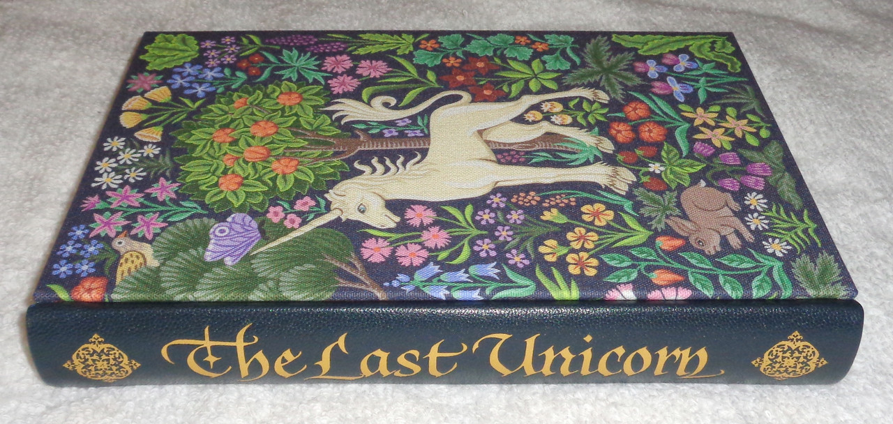
The recent discussion on the Suntup "The Last Unicorn" has me thinking -- What fine press books have the most beautiful covers?
For the purposes of this discussion, I think we can include the FS and similar publishers -- I refer to them as near-fine-press :)
So let me start with Suntup's The Last Unicorn Numbered Edition, which in my mind is the most beautiful and unique cover I have seen in years --
For the purposes of this discussion, I think we can include the FS and similar publishers -- I refer to them as near-fine-press :)
So let me start with Suntup's The Last Unicorn Numbered Edition, which in my mind is the most beautiful and unique cover I have seen in years --


3Chemren
>2 wcarter: I saw the original John Gould bird books (3 volumes) appear in an auction last year. The Folio LE binding is a very good facsimile of those original 19th century bindings.
4Tuna_Melon
I don't have any of my own photos, but I recall how elegantly stunning I thought the Deluxe 'Flowers for Algernon' (linked here) was as soon as I saw it previewed.
wcarter reviewed this version (linked here).
wcarter reviewed this version (linked here).
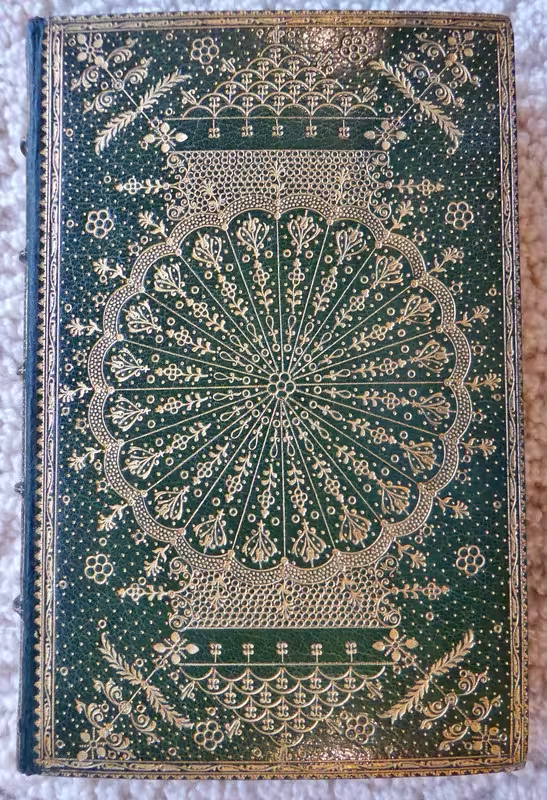
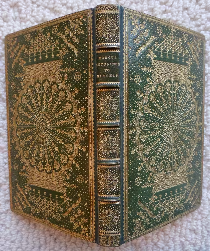
5Sport1963
"Sundrie Pieces" by George Herbert. Gwasg Gregynog, 2003.
Binding description: full multi-colored calf and goatskin, the calf dyed various shades of green, blue, purple, pink, and yellow, the pattern suggestive of a landscape with a small house in the foreground, spine and covers with goatskin inlay forming the shape of a cross when completely open, gilt halo radiating from behind the cross, smooth spine with gilt lettering.
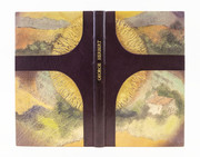
Binding description: full multi-colored calf and goatskin, the calf dyed various shades of green, blue, purple, pink, and yellow, the pattern suggestive of a landscape with a small house in the foreground, spine and covers with goatskin inlay forming the shape of a cross when completely open, gilt halo radiating from behind the cross, smooth spine with gilt lettering.

6Chemren
One of my favorites.

Urne Buriall and the Garden of Cyrus by Sir Thomas Browne, illustrated by Paul Nash, Curwen Press, London 1932.

Urne Buriall and the Garden of Cyrus by Sir Thomas Browne, illustrated by Paul Nash, Curwen Press, London 1932.
7Nightcrawl
>6 Chemren: Beat me to it. A true work of art.
8cottonoverwood
>1 astropi: Maybe not obvious, but another Suntup title: ‘Blood Meridian’. This may be simple, with a distressed leather binding, but the colour is perfect. The butterfly stitched signatures and the deeply debosed title (in reverse on the rear board) add to the overall success of this title’s aesthetic appeal.My tastes tend toward the modern when it comes to binding as many books that are internally stunning in terms of paper and print are somewhat dull externally, at least to me.
Another lovely edition that springs to mind is Folio’s LE Gormenghast Trilogy. I’ve toyed with selling this a couple of times as the standard is so good (although the illustrations are mildly less sharp in the standard) but every time I look at “the nature outside the castle/book” covers I smile and put the set safely back on the shelf.
Another lovely edition that springs to mind is Folio’s LE Gormenghast Trilogy. I’ve toyed with selling this a couple of times as the standard is so good (although the illustrations are mildly less sharp in the standard) but every time I look at “the nature outside the castle/book” covers I smile and put the set safely back on the shelf.
9Levin40
A few recent titles which come to mind, all have beautiful covers which perfectly reflect the subject matter: Lyra's Stardust (Numbered edition), CTP's Solaris (Deluxe edition) and NRP's The Death of Ivan Ilyich.
10EdmundRodriguez
>2 wcarter:
I'm a big fan of Lear's birds, the size of it really adds to the feeling of grandeur.
These two, from midnight paper sales and no reply press, are about as beautiful (to me) as books can be!

I'm a big fan of Lear's birds, the size of it really adds to the feeling of grandeur.
These two, from midnight paper sales and no reply press, are about as beautiful (to me) as books can be!

11abysswalker
I'd have to think harder for a full response, but the Conversation Tree Solaris is a top contender. There are lots of recent photos floating around, but this one is mine:

12Shotcaller
>5 Sport1963: This is really striking.
13Shotcaller
>1 astropi: Such a beautiful book that I'll forgive the errant apostrophe in your topic line. ;)
14cottonoverwood
>11 abysswalker: That’s stunning. I’ve the standard, having convinced myself the same text block wasn’t worth the extra several hundred £ for the leather binding. I stand corrected
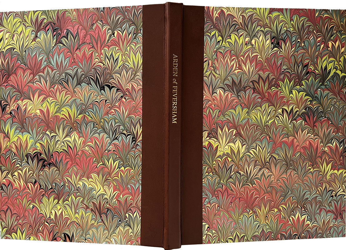
15Shadekeep
Hugh at Tudor Black Press always does wonderful binding, but perhaps his for Arden of Feversham is the most striking yet. (image shamelessly kyped from wcarter)
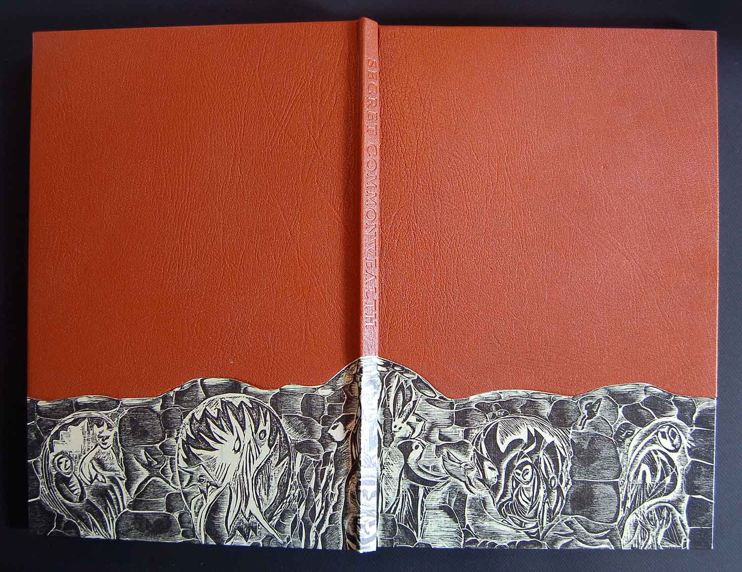
Also worthy of consideration is Old Stile Press's Secret Commonwealth, with Angela Lemaire's printed artwork set on the leather binding with embossed title.
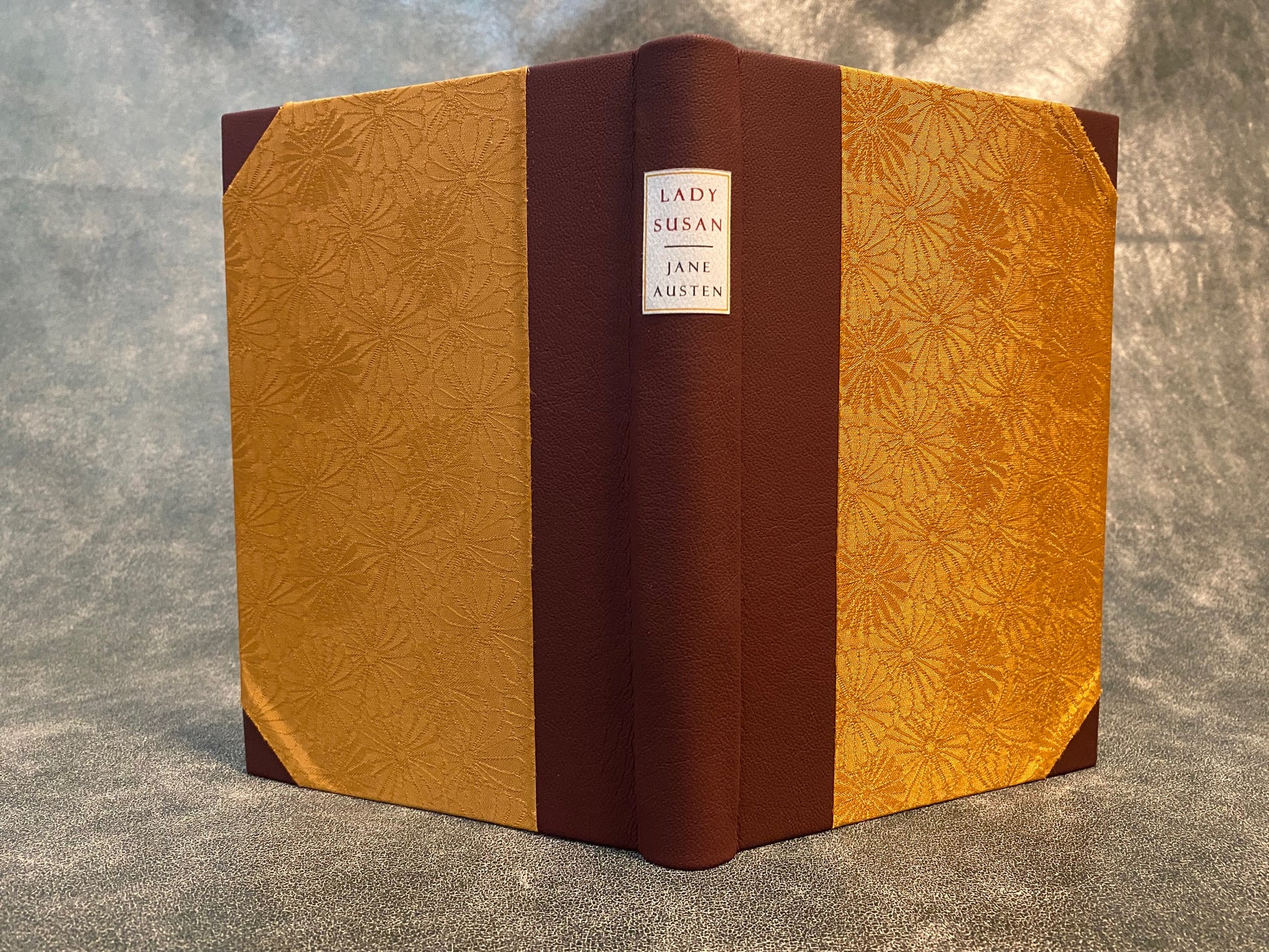
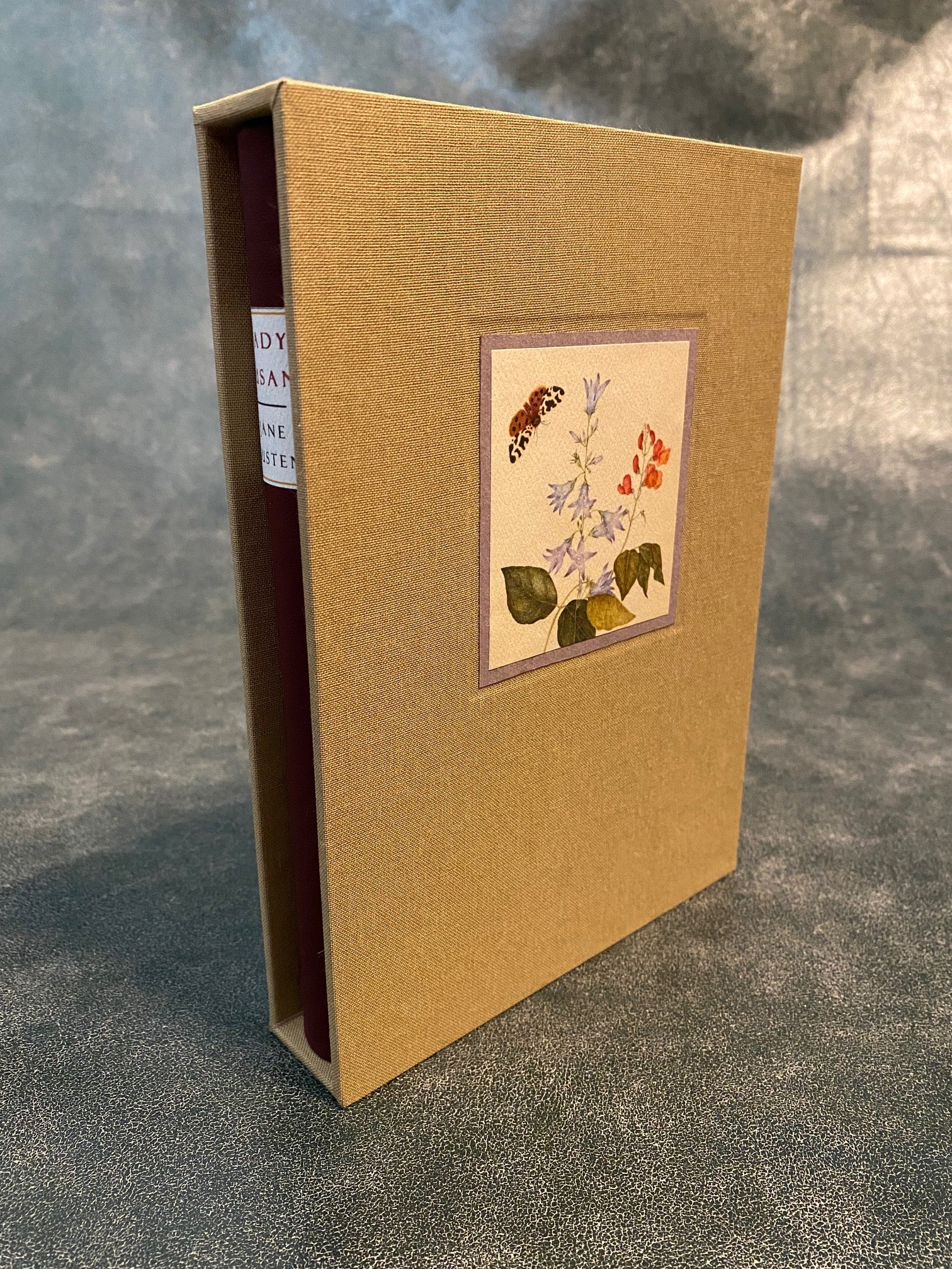
And while not strictly fine press, Lady Susan from Coppherhead Press sold me on their work with its design excellence, which includes its cover and slipcase.

Also worthy of consideration is Old Stile Press's Secret Commonwealth, with Angela Lemaire's printed artwork set on the leather binding with embossed title.

And while not strictly fine press, Lady Susan from Coppherhead Press sold me on their work with its design excellence, which includes its cover and slipcase.


17DMulvee
Personally, I find the lettered ‘Flowers for Algernon’ more attractive than the deluxe, and this is one of my favourite bindings by newer presses.
'If the Winds Come' in the deluxe binding by Greenboathouse (https://www.greenboathouse.com/books/if-the-winds-come.html) is attractive and inventive, I thought that 'The Poet' by Nawakum was striking especially with the detail on the slipcase (https://www.nawakumpress.com/book-collection/the-poet). From a marbling perspective I also like 'Zero to 44' from the Fleece Press, the de luxe 'The Great Man' from No Reply and also enjoy the special bindings that Corvus Works offers such as the 'Giovanbattista Palatino'
'If the Winds Come' in the deluxe binding by Greenboathouse (https://www.greenboathouse.com/books/if-the-winds-come.html) is attractive and inventive, I thought that 'The Poet' by Nawakum was striking especially with the detail on the slipcase (https://www.nawakumpress.com/book-collection/the-poet). From a marbling perspective I also like 'Zero to 44' from the Fleece Press, the de luxe 'The Great Man' from No Reply and also enjoy the special bindings that Corvus Works offers such as the 'Giovanbattista Palatino'
18Transfixed
The Wood Engravings of Frank Martin, Previous Parrot Press, 1998, exemplary copy in full leather.


19Glacierman
Don't know what edition it was (undoubtedly letterpress though), but there's this, the 'Great Omar' bound by Sangorski & Sutcliffe and sank with the Titanic.


20Sport1963
"The Stanbrook Abbey Press, 1956 - 1990", David Butcher. Whittington Press, 1992.
Binding description: full inlaid oasis leathers presenting the silhouette of a habited nun with bowed head.

Binding description: full inlaid oasis leathers presenting the silhouette of a habited nun with bowed head.

21A.Nobody
This probably shouldn't count because it is a one-off re-binding. I only wish more books looked like this.

From the AbeBooks listing: "Custom bound by Michael Wilcox in full dark red morocco gilt, gray and bright red onlays, gilt-tooled edges and turn-ins ... A masterpiece by Michael Wilcox, one of the greatest North American designer binders. Wilcox's output as a designer binder was exceptionally small. In his entire career he probably only created around one hundred designer bindings, most of which are now in institutions around the world. For this binding Wilcox personally created a number of special tools including a spear that he used in the frieze-like panels and on the edges of the boards, a shield and spear that he used on the doublures, and an eye used in the tableaus.
"Wilcox described the artistic conception behind the 'Thucydides' binding as follows: Because Thucydides book is, quite rightly, described as a moralist's work which does not contain the usual Greek obsession with gods and romantic heroes, I have tried, in my design, to avoid anything suggesting the outright glorification of war. Forming a somber background, the three-headed vulture, a monster with human-skull belly and wings that fan the burning crops of wheat, is intended to be an ashen symbol of the ravages of war the kind of greedy and immoral war which is folly and leads to the mass slaughtering of innocent people and the wanton destruction of the land. I have placed Thucydides in the center of things, calmly recording all that is reported to him by eyewitnesses. The frieze-like pictures within frames do not refer to specific events but are abbreviations for showing a variety of activities that recurred generally throughout the war. Thucydides invented the speeches of his orators. My orators, on the spine, are caricatures representing common types: the hawk, the dogged agitator, the quixotic campaigner, and the dove."
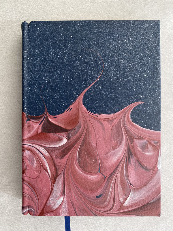
22Shotcaller
>21 A.Nobody: Now there's a gorgeous binding!
23Shadekeep
>21 A.Nobody: Spectacular! Artistry combined with storytelling in a beautiful way.
24A.Nobody
>22 Shotcaller: >23 Shadekeep: The original (Ashendene Press, 1930) is utterly different but also a real beauty in its own right with its basic white pigskin.


25ChestnutPress
Some really lovely covers coming up in this thread
26Shadekeep
>24 A.Nobody: Agreed, that's lovely as well. Almost seems cast from marble.
27Shotcaller
>24 A.Nobody: Beautiful, too
28Chemren
>24 A.Nobody: What a nice, clean copy!
29kermaier
Janus Press King Lear: White pigskin with exposed cords over hand-painted birch boards.
(Not my copy, but a better picture than I have at the moment.)

(Not my copy, but a better picture than I have at the moment.)

30anthonyfawkes
I thought folio did a wonderful job with the cover of the Mythago Wood LE that came out this year.
Also a big fan of the soft blue and white leather cover for Arêtes frozen hell.
Also a big fan of the soft blue and white leather cover for Arêtes frozen hell.
31ChestnutPress
>29 kermaier: This is such a beautiful binding
32ChestnutPress
Time to share some covers! This first one is a gorgeous hardcover vellum binding by Sangorski & Sutcliffe. I’m a sucker for a nice vellum binding!!


33ChestnutPress
Next up is the full leather binding by Boekbinderij Phoenix of one of the ten specials of ‘Murphy’s Bar’ from In de Bonnefant — a press that often makes a point of having exceptional bindings. This shows the front and back covers, each featuring a coloured leather rendition of Rigby Graham drawings.


34ChestnutPress
Last one (for now, at least), is probably my favourite binding — again by Boekbinderij Phoenix. They really do the best work! No particular bells or whistles, just understated class — an absolutely flawless piece of craftsmanship using exceptional materials. Again, this is another publication from In de Bonnefant — ‘How Weak Are My Performances’ by John Donne.

35Shadekeep
>33 ChestnutPress: These are particularly wonderful! The art style, the materials, the color choices, all come together brilliantly here.
36ChestnutPress
>35 Shadekeep: Thank you! I might put a few more up soon. Generally speaking, I am a less-is-more fan, and prefer exceptionally executed simplicity over anything else. While I certainly appreciate some of the really fancy pieces out there, it’s not aesthetically my favoured approach.
37Lukas1990
>32 ChestnutPress: Nice condition! One of my favorite bindings to. And the size is really huge!
38ChestnutPress
>37 Lukas1990: It’s simply gorgeous, isn’t it. A right thumper of a volume!
39ChestnutPress
Here’s what I describe as a simple pleasure of a binding. The craftsmanship is impeccable (that leather spine is lovely and sharp at the edges where it had been pared so thin) and the Richard de Bas handmade paper is wonderfully tactile. This is one of the specials of John Carey’s ‘Vegetable Gardening’ from Rampant Lions Press, bound by Boekbinderij Phoenix.


40ChestnutPress
I don’t think it always has to be about fine leathers and vellums either. Here is a lovely binding for one of the specials of ‘Out of The Cellar: A Garland for Cantina’, bound at master American binder David Bourbeau’s The Thistle Bindery. Clean, sharp and handsome.


41ChestnutPress
Next up, the work of The Thistle Bindery’s David Bourbeau, showcased here with his special binding for Eleanor Wilmer’s ‘Everything is Starting’ from Kat Ran Press. I think this is a great example of understated elegance. No trumpets, just ‘chef’s kiss’ craftsmanship and finest materials.


42ChestnutPress
Here’s another binding for In de Bonnefant by Bookbinderij Phoenix, with this a one-off vellum binding for one of the eight specials of ‘To Expresse This Eternity’ by John Donne. It’s only a little thing but I think the mottling of the skin that looks like a leaf is really stunning.


43ChestnutPress
Lastly, I leave you with my favourite binding from Griffin Gonzales at his No Reply Press. It’s crisp and tidy, looks sharp, and features letterpress cuneiform! I think this is a great example of restrained finesse.


44Glacierman
>43 ChestnutPress: Indeed it is! To me, that binding is drool-worthy in its simplicity.
45wcarter
In the Penal Colony by Franz Kafka - DEEP WOOD PRESS SPECIALLY BOUND LIMITED EDITION 2018
One of six specially bound copies.
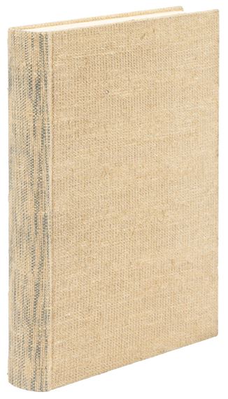
Full leather presentation binding in black, maroon and grey with onlays, underlays and much tooling.
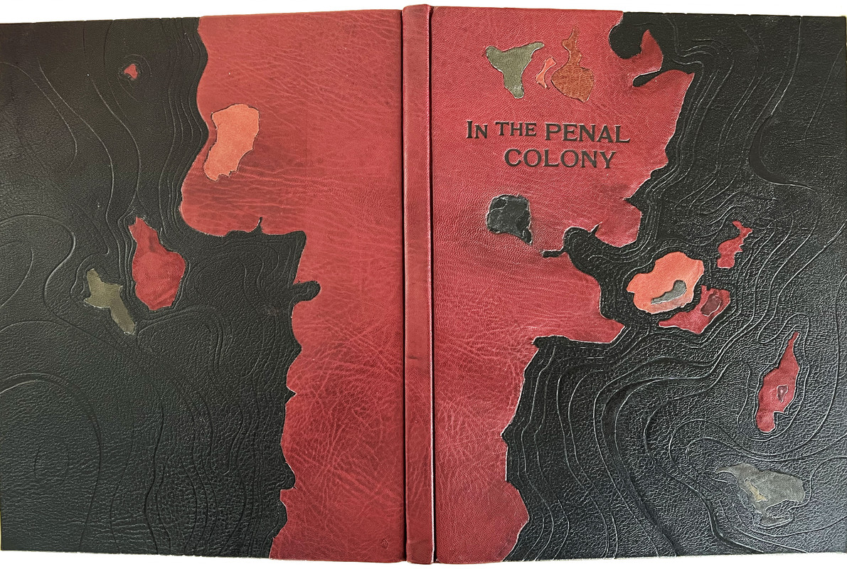
Reviewed here.
One of six specially bound copies.
Full leather presentation binding in black, maroon and grey with onlays, underlays and much tooling.

Reviewed here.
46cottonoverwood
>41 ChestnutPress: Thank you for all the pictures. Each is very fine but this, to me, is a debutante!
47GardenOfForkingPaths
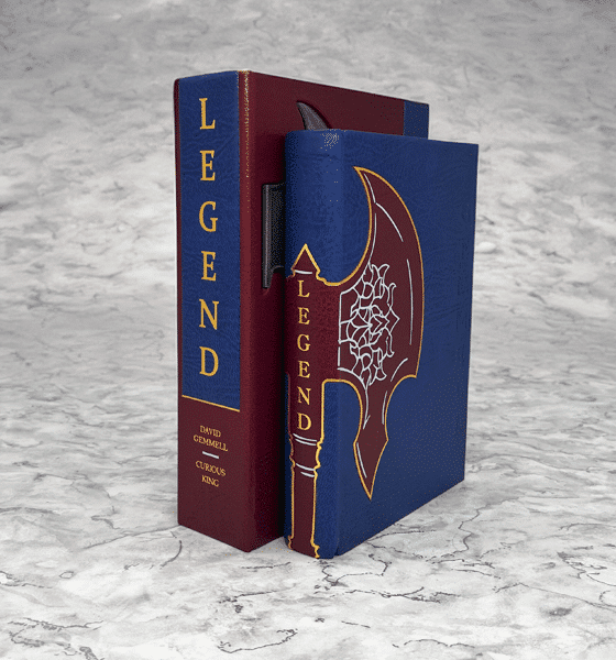
>40 ChestnutPress: A beautiful selection of bindings. Very tasteful, indeed. It seems like a lot of exquisite binding work happens in these small runs of special editions.
>45 wcarter: That's very striking!
>45 wcarter: That's very striking!
48Shadekeep
>43 ChestnutPress: More excellent selections (and Enūma Eliš is a winner on so many fronts, binding design included).
Here's another I really like, Creation Matters from Helen Moss at Awen Press. It has a jolly simplicity that matches wonderfully with the material within.

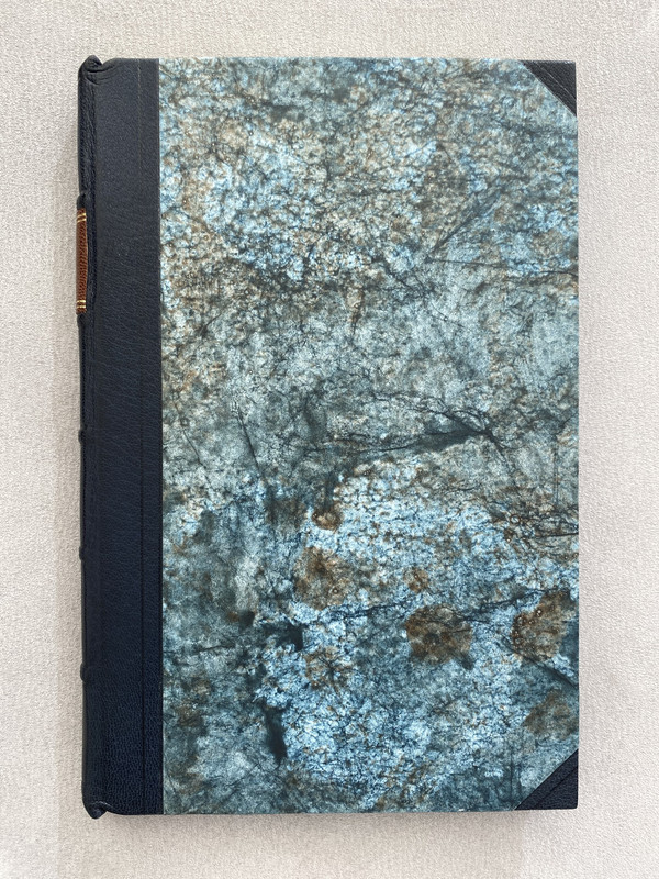
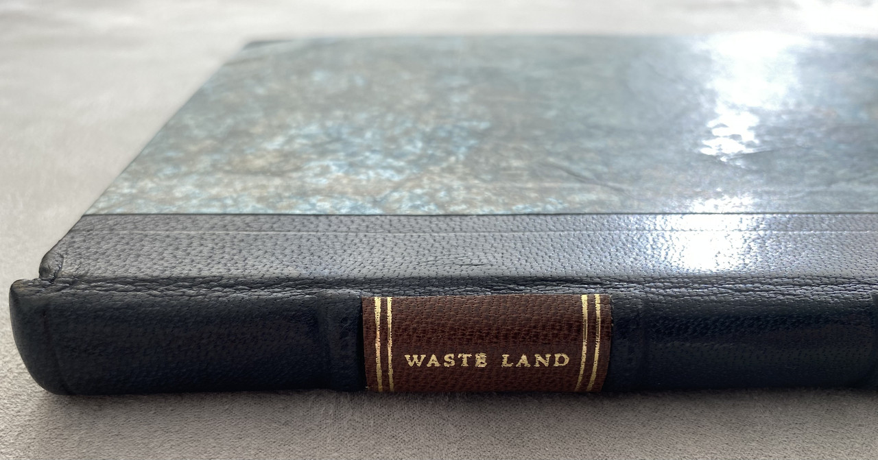
Here's another I really like, Creation Matters from Helen Moss at Awen Press. It has a jolly simplicity that matches wonderfully with the material within.

49abysswalker
>32 ChestnutPress: one of my favorites as well. You really have to see this one in person to get the full effect, as part of it comes from the folio page size scale, and the heaviness of the boards. The opposite of limp!
50ChestnutPress
>47 GardenOfForkingPaths: While it is true that some of the nicest bindings I have are special edition copies, there is no shortage of beautiful bindings to be found in the world of standard copies. I shall have to post a few!
51ChestnutPress
>49 abysswalker: It’s an absolutely gorgeous slab of a book!! I fell in love the first time I saw a copy but had to wait a while before I got one. I’m glad I waited, as mine was cheaper and in better condition!
52astropi
I need to add -- Stardust Numbered Edition by Lyra's Press. Here is a picture I found online that I believe is from the press --
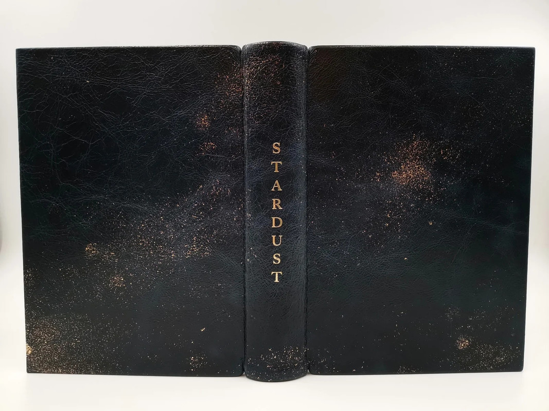
But @wcarter has a wonderful review with much better pics here --
https://www.librarything.com/topic/327085

But @wcarter has a wonderful review with much better pics here --
https://www.librarything.com/topic/327085
53kermaier
>43 ChestnutPress: I truly regret not springing for the vellum binding of Enuma Elis!
54ChestnutPress
>53 kermaier: At least you have a copy though. It’s a great book in any of its forms.
55ChestnutPress
>45 wcarter: This binding is awesome!
56edgeworn
Some magnificent examples of bindings being show here. At the more modest end I do like patterned cloth bindings (I like the feel of a cloth binding when reading a book). A few examples that we have:
Allen Press, Pictures from Italy

Allen Press Pushkin, Four Stories

Allen Press Edith Wharton, Quartet

Officina Bodoni, Songs from Shakespeare’s Plays

Officina Bodoni for LEC, The Little Flowers of St Francis

Allen Press, Pictures from Italy

Allen Press Pushkin, Four Stories

Allen Press Edith Wharton, Quartet

Officina Bodoni, Songs from Shakespeare’s Plays

Officina Bodoni for LEC, The Little Flowers of St Francis

57ChestnutPress
>56 edgeworn: Those are lovely examples of really handsome cloth bindings. The St Francis is gorgeous!
58dlphcoracl
>56 edgeworn:
Superb choices.
As an aside, the George Macy LEC editions printed by Giovanni (Hans) Mardersteig at his Officina Bodoni are superb and very affordable. The Little Flowers of St. Francis of Assisi shown above is an excellent example.
Superb choices.
As an aside, the George Macy LEC editions printed by Giovanni (Hans) Mardersteig at his Officina Bodoni are superb and very affordable. The Little Flowers of St. Francis of Assisi shown above is an excellent example.
59Shadekeep
>56 edgeworn: Quite lovely indeed! Another vote for The Little Flowers of St Francis here, and I also find the Songs from Shakespeare’s Plays very charming.
60ChestnutPress
>47 GardenOfForkingPaths: Just to show that it really isn’t just special edition bindings that are wonderful, here is what I think is a very fine piece that reflects the rural content matter — the standard edition of The Salvage Press’s ‘Haiku na Feirme’ by John Fitzgerald, bound by Duffy Bookbinders.


61ChestnutPress
Here’s another standard binding that I think is really stunning — ‘The Kelmscott and Doves Presses’ from Rollin Milroy at Heavenly Monkey. Unfortunately, the photo really doesn’t do justice to how lovely the subtly sparkling, multi-wash painted cover paper is. Rollin did a great job of creating this very special paper, as well as executing the binding.


62bacchus.
>60 ChestnutPress: This is exquisite. Are those paint drips?
63kdweber
>62 bacchus.: Painted Griffen Mill paper over boards.
64Chemren
I rather like this one from the Book Club of California.

Effectively puts one in mind of the ocean hitting the beach.

Effectively puts one in mind of the ocean hitting the beach.
65ChestnutPress
>62 bacchus.: Yes. Hand-spattered by the printer
66ChestnutPress
>64 Chemren: That’s gorgeous!
67GardenOfForkingPaths
>60 ChestnutPress: Beautiful. I'm fortunate to have Haiku on my shelves (I think I acquired it based on your recommendation last year!), and I like it a lot, inside and out. It feels like a really successful fusion of different styles and cultures. I always wondered what the 'altered goat' for the special looked like. Have you seen it?
That Heavenly Monkey binding is very attractive! I like the contrast between the softer blue wash and the cover title, which looks like it's etched in a slab of stone - monumental.
>64 Chemren: That's lovely. Would you recommend the book in general?
That Heavenly Monkey binding is very attractive! I like the contrast between the softer blue wash and the cover title, which looks like it's etched in a slab of stone - monumental.
>64 Chemren: That's lovely. Would you recommend the book in general?
68Chemren
>67 GardenOfForkingPaths: I would. It is an anthology of 5 California poets, each with a very different style. The book is organized by poet, with each getting 7 works. It was printed letterpress on Zerkall Frankfurt paper. I find the typology lovely (and also varying in layout between poets). Each poet has signed under their names at the start of their individual sections.
69Shadekeep
>64 Chemren: That is a lovely one, and as you say, a fine wedding of design and concept.
70GardenOfForkingPaths
>68 Chemren: Thank you - one for the wishlist!

72GardenOfForkingPaths
>71 ChestnutPress: I cannot see it, sir!
73sanvito
>71 ChestnutPress: I would love to see it too.
74sanvito
>42 ChestnutPress: The Phoenix bindery is one of my favourites too. Here is a very humble production, printed on an exquisite paper, and a text to suit, beautifully bound in vellum as one of the “specials”:
Exterior:
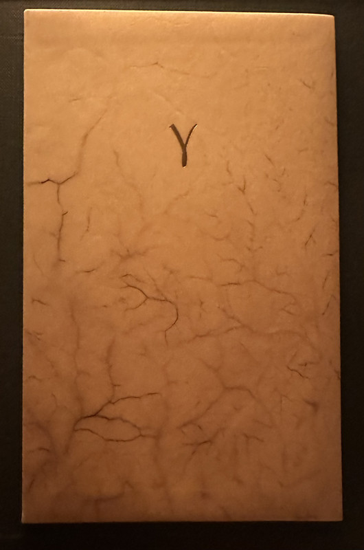
Interior:
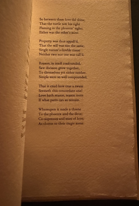
Exterior:

Interior:

75sanvito
As an aside, I think this book is an excellent argument for letterpress: the same simplicity of design would have nowhere near the impact of it had been printed offset. (Although, I believe design is usually what matters most, so offset etc. can be amazing in other contexts)
77SDB2012
>74 sanvito: What is the title and press?
78ensuen
>77 SDB2012: appears to be: SHAKESPEARE, William The Phoenix and the Turtle. Amsterdam, Phoenix editions, 1984 — matches the photo here https://fokas.nl/phoenix/
79sanvito
>78 ensuen: correct
80ChestnutPress
>74 sanvito: An impeccable piece of work!
81ChestnutPress
>72 GardenOfForkingPaths: Might help if I added the code! It’s there now.
82GardenOfForkingPaths
>76 Sport1963:
>81 ChestnutPress:
Thank you. That's very nice, and it seems fitting for the contents – it looks like it's gradually returning to nature.
>74 sanvito: beautiful!
>81 ChestnutPress:
Thank you. That's very nice, and it seems fitting for the contents – it looks like it's gradually returning to nature.
>74 sanvito: beautiful!
83SDB2012
>78 ensuen: Beautiful book, but the description creeped me out, vellum made from unborn calf skin.
84ChestnutPress
>83 SDB2012: That creeps me out too. I hadn’t realised it was slunk!
85SDB2012
>84 ChestnutPress: Slunk? Is that the technical term? EDIT- never mind. I looked it up.
86Pendrainllwyn
Some very beautiful covers. We will all have our favourites. I'll confess that some of the most understated designs make the deepest impression on me.
I find it interesting that of the 40 or so book covers shared above, only one, as far as I can tell, appears to have a marbled paper cover (The Death of Ivan Ilyich). There are some very nice marbled covers out there but in my honest opinion, they do seem a bit over used by some presses (even presses I like very much). This thread is a wonderful reminder of alternative options.
I find it interesting that of the 40 or so book covers shared above, only one, as far as I can tell, appears to have a marbled paper cover (The Death of Ivan Ilyich). There are some very nice marbled covers out there but in my honest opinion, they do seem a bit over used by some presses (even presses I like very much). This thread is a wonderful reminder of alternative options.
87ChestnutPress
>86 Pendrainllwyn: Yes, there is a distinct lack of marbled covers, along with other styles such as paste papers. I shall redress this and post a few!
88ChestnutPress
Here is one of the special bindings for the Corvus Works book on Claude Garamond, bound by Roger Grech. I love the richness of the blues in the marbling streaked with metallic gold.


89ChestnutPress
Here’s a wonderfully simple marbled cover treatment on St Brigid Press’s ‘Seven River Prayers’. Emily has used marbled papers for her bindings a few times, always picking exquisite patterns in the most gorgeous colours.


90ChestnutPress
I love this marble paper binding from The Salvage Press. It’s simple, clean and elegant. It’s also part of a clever design, where a transparent red Perspex slipcase totally hides all the red elements in the marbling when inside. It’s a very pleasing visual trick when the book slides out.


91ChestnutPress
Last cover for now — my favourite of my bindings that use paste papers. This is the wonderful Rampant Lions Press edition of Eliot’s ‘Four Quartets’, featuring a paste paper by the famed Victoria Hall.


92Pendrainllwyn
>88 ChestnutPress: I thought I might get that response! This one is very appealing. I do love some of your earlier more understated postings.
93ChestnutPress
>92 Pendrainllwyn: Happy to be of service!!
94ChestnutPress
Here’s another fine paste paper on a T.S. Eliot book — made by Griffin Gonzales at No Reply Press for his binding of his edition of Eliot’s ‘Preludes’.


95ChestnutPress
Here’s an interesting one. At first glance, I’d have said it was a marbled paper, but looking at it I would say the process for the pattern is a little different. It looks like air has been blown to bubble up the marbling bath and the paper laid on the bubbles. I could be wrong, but it’s an interesting idea. Regardless of process, the paper is gorgeous and the binding is a lovely piece of understated work. I love the subtle calf spine. The edition is James Reeves’s ‘The Closed Door’ from Janus Press.


96ChestnutPress
Next up, a beautiful little booklet from St Brigid Press. I love the label and the beautiful Nepali handmade paper that has been made using a sort of cyanotype process in the drying stage, where leaves and vegetation have been placed on the paper as it dries outside in the sun.


97ChestnutPress
Here is a much-loved binding from Barbarian Press, with their edition of Jan Zwicky’s ‘21 Small Songs’. The cover paper has had a lilac wash and then been painted at the press before being sewn on dyed vellum strips.


98ChestnutPress
Following on from the ‘sewn on vellum strips’ theme, here is a delightful imitation medieval limp vellum binding from Prelo Press. It’s done for their modern take on incunabula, ‘Aesop’s Fables’, which is about as authentic as a modern piece can be to the production processes of the 15th century. The binding is based on a really simple adhesive-free style from the period. It’s not a ‘fine’ binding, but rather a purposefully basic, rough around the edges one like the cheap, workaday bindings done back then. Regardless of this, the binding is gorgeous. The roughly treated vellum is so tactile and has so much character.


99ChestnutPress
And following on from the above limp vellum, here is one of my favourite limp vellum bindings — one of the special edition copies of Nonesuch Press’s ‘In Memoriam’.


100GardenOfForkingPaths
>97 ChestnutPress: That Barbarian binding is lovely - very delicately composed.
Another fine and eclectic selection of bindings. They really make me think about what a skill it is to choose the right materials, colours, decorations, titling, and to ensure all those elements remain in harmony; when to add another flourish, when to hold back.
I regret not acquiring the No Reply Preludes!

104Lukas1990

Frankenstein (Pennyroyal Press). One of only five copies in a sculpted interpretive binding by Daniel Kelm. The front cover panel of spray-cast abaca fiber with three-dimensional goatskin onlay of the monster’s hand, after an original wax sculpture by Barry Moser.
105ChestnutPress
>86 Pendrainllwyn: One last marbled cover I want to share, and that’s this minimal beauty from Dana Gioia’s ‘Journeys in Sunlight’. To get the desired depth and richness of colour in the marbling, the artist used very high pigment inks. The trade off was that the resulting marbling isn’t exactly fixed and can be smudged or transferred to fingers etc when handling. The edition, which comes in a protective glassine wrapper, includes a little printed slip that discusses the matter.


106Pendrainllwyn
>105 ChestnutPress: ooooh, that is nice. I wouldn't have guessed that was marbling if you hadn't pointed that out.
107Shadekeep
>90 ChestnutPress: That is one of my favorite Salvage designs, it is truly lovely and the slipcase does highlight it all the better.
108snottlebocket
He picked up the book and examined it from all sides. It was bound in copper-colored silk that shimmered when he moved it about. Leafing through the pages, he saw the book was printed in two colors. There seemed to be no pictures, but there were large, beautiful capital letters at the beginning of the chapters. Examining the binding more closely, he discovered two snakes on it, one light and one dark. They were biting each other’s tails, so forming an oval. And inside the oval, in strangely intricate letters, he saw the title:
The Neverending story
This is a book that holds great personal meaning to me. Having an edition that closely matches the description the book itself has in the story is lovely. And the slipcase showing Perilin the night forest, one of my favourite chapters, is just the cherry on top.


109ChestnutPress
>107 Shadekeep: It’s certainly my favourite TSP publication.
110Shadekeep
Just learned about this French press (mmm, coffee...). I have to say I like this eccentric binding quite a bit. (Click image for book page.)


111SDB2012
>110 Shadekeep: see - here's the thing. There have been so many French books shown on these pages over the years where I LOVE the design and am SMITTEN by the artwork, that I've been grateful that I DON'T read French. I do appreciate all the shares.
112edgeworn
Theseus by André Gide, Yolla Bolly Press 1998. This is a treasured book in our collection, fine printing and splendid illustrations by Sidney Goodman, but I have never been quite sure how I feel about the binding, which is quarter suede with the boards covered with thin cork sheets. Looks stunning and is sympathetic with the subject matter of the book but, for me, the combination of suede and cork results in a slightly distracting feel while reading the book.


113ChestnutPress
>112 edgeworn: I actually love the sound of this. For me, a big part of reading fine press is the extra dimension that the extra sensations bring to the experience. I love the look, feel, and even sound and smell sometimes (pages can have a really nice smell and make a great crackle when turned).
114gmacaree
>112 edgeworn: I love it, one of the highlights of my library
115edgeworn
>113 ChestnutPress: I completely agree about the sensory pleasures to be had from owning fine books. I myself have been known to run my fingers over a page just to feel the impression made by the printing process, and even (keep this to yourself) to sniff a leather binding. I haven’t yet tried tasting any part of a book but perhaps the day will come (edible pages perhaps?).
However, there is something about the combination of suede and cork in the hand which just doesn’t do it for me. Chacun à son goût.
However, there is something about the combination of suede and cork in the hand which just doesn’t do it for me. Chacun à son goût.
116ChestnutPress
>115 edgeworn: You’re just gonna have to put it in a mylar or glassine wrapper than!

118ChestnutPress
>117 edgeworn: that’s gonna take all the tactile fun out of the book. And give you prune fingers 🤣
119astropi
That reminds me, my favorite Yolla Bolly production --
My First Summer in the Sierra by John Muir
Perhaps the most "Earthy" binding I can think of -- well, I think Muir would have approved :)
My First Summer in the Sierra by John Muir


Perhaps the most "Earthy" binding I can think of -- well, I think Muir would have approved :)
120ChestnutPress
>119 astropi: I love plain natural / slubbed cloth bindings like this. I have a few on my shelves and for whatever reason they always please me immensely.
121wcarter
>112 edgeworn:
Enabled and purchased!
Enabled and purchased!
122Lukas1990
>121 wcarter: That copy was on ebay for ages! I considered buying it some day, so thanks for saving my wallet! The worst thing is that now I will tackle an even more expensive book on auction.
123wcarter
>122 Lukas1990:
They gave a significant discount when asked, so happy with my purchase.
They gave a significant discount when asked, so happy with my purchase.
124Lukas1990
>123 wcarter: Wow! That price was already good. Congrats!
125GardenOfForkingPaths
Here are some that jumped out at me when I had a look along the shelves:
1) A Descent into the Maelström, Nawakum Press, 2022
Paste papers and binding by Lisa Van Pelt.

2) Pastoral Elegies, Barbarian Press, 2024
Bound in half Japanese black silk and grey paper with green Bugra bordering slips. Bound by Alanna Simenson at the Mad Hatter Bookbinding Company.
Upright like a gravestone. The grey paper has a beautiful texture, and I think the green borders really make it.

3) Paradise Lost and Paradise Regain'd, John Henry Nash for the Limited Editions Club, 1936
Designed by Nash, and bound in linen and batik on the boards.

4) Palladio's Homes, The Old School Press, 2009
With a three pulp ‘Cloudy Sky’ paper handmade by Cave Paper. Very appropriate – it looks like a gently aged fresco. Bound by Ludlow Bookbinders.

5) A Bonsai Shaped Mind & Postures of the Heart, Nawakum Press, 2024
Leather spine, partial suminagashi paper and green cloth, with stamped kanji label inset.
Binding assistance by Sandy Tilcock of lonegoose press, and bound by Jace Graf at his Cloverleaf Studio.

6) Ask the Fellows Who Cut the Hay, Ploughman's Parrot Press, 199
Cover engraving by Harry Brockway. There’s no shortage of repeating patterns in fine press bindings, but I think this one works especially well.

Finally, a slight change of pace: three from the 1940s LEC:
7) The Red Badge of Courage, LEC, 1944
Bound in leather with an embossed scene in the style of a ‘Rogers group’.

8) Ivanhoe, LEC, 1940
Monthly Letter: "Unless you insist upon being realistic about it, the two volumes in this book are bound in chain-mail!”

9) Far Away and Long Ago, LEC, 1942
This was based on a style of binding that George Macy had seen in the Argentina pavilion at the World Fair in New York in 1939.
Bound in Argentina (arranged by Alberto Kraft), the lower half in Argentine steer “rough hide” (with the hair still on), the top half in parchment. Each section, and the edges, sewn with rawhide thongs. The spine and cover titling are branded onto the parchment.
An unusual, somewhat flawed binding, but interesting nonetheless!

126ChestnutPress
All of those are superb! I nearly posted ‘Ask The Fellows Who Cut The Hay’ myself.
127astropi
Curious King, Suntup, Conversation Tree Press, I appreciate that they are all publishing fine press editions of books that have been overlooked by the fine-press community! Namely science fiction and fantasy. The Curious King publication of Legend is one such example. All three covers for the different states are beautifully done - but the Lettered is the most beautiful. Alas, I do not own this book, but I still admire it's beauty and craftsmanship --

128Shadekeep
>125 GardenOfForkingPaths: I thought I replied to this, but I'm not seeing it now. Probably wrote and then navigated away without submitting.
Anyway, a splendid selection of covers, each a gem in its own way! I have a couple of those myself and heartily concur with their inclusion.
Anyway, a splendid selection of covers, each a gem in its own way! I have a couple of those myself and heartily concur with their inclusion.
129GardenOfForkingPaths
>126 ChestnutPress:
>128 Shadekeep:
Thank you. I had fun looking along the shelves and choosing them. I realised that my favourite modern bindings tend to use some type of paper on the boards. There are so many beautiful papers out there. I love a quality leather or cloth binding too, of course!
>128 Shadekeep:
Thank you. I had fun looking along the shelves and choosing them. I realised that my favourite modern bindings tend to use some type of paper on the boards. There are so many beautiful papers out there. I love a quality leather or cloth binding too, of course!
130ChestnutPress
>129 GardenOfForkingPaths: I’m all for a gorgeous paper used in binding, particularly toothy handmades or a nice paste paper
131Shadekeep
>129 GardenOfForkingPaths: I love inspired paper choices on covers. I still find many of the marbled papers to be enchanting, and there are other paper techniques which make great covers too. Some of the recent inspired work with paste papers is clever and charming as well!
132ChestnutPress
Got to go and consider my favourite paper binding now!
133abysswalker
>132 ChestnutPress: Thornwillow's half-leather Waste Land, more for the glorious paste paper than for the leather:


134ChestnutPress
>133 abysswalker: That is a lovely paste paper. Still considering my favourite paper binding.
135gmacaree
One book/series I'm surprised not to see here already is the Folio Society's quarter-vellum limited editions, which are characterised by absolutely extravagent foiling. My favourite is Harry Brockway's cover for The Rime of the Ancient Mariner:


136EdmundRodriguez
The only book I have bound in suminagashi marbled paper is Running Rings (Grapho Editions). Which works so well for the edition (given the similarity to tree rings). I'd love to see more suminagashi in fine press.


137LBShoreBook
>136 EdmundRodriguez: Washi Memories from Old School Press fits the bill. I think they still have copies.


138DMulvee
>136 EdmundRodriguez: Sensuous Lines from Fleece Press in the B edition has a Suminagashi pattern
139ChestnutPress
Both those covers are gorgeous. I agree there needs to be more suminagashi marbled papers used in binding
140astropi
>135 gmacaree: Agreed. Those were gorgeous, made during (arguably) the FS's Golden Age of Limited Editions. I don't own it, so obviously this is not my picture (found it online) - but at any rate, what a lovely cover --

141Shotcaller
>133 abysswalker: It’s beautiful but the missing “the” would irk me.
142DenimDan
This is the cover for "Epitalamium," a poem by Paul Muldoon in a book by Debra Weier, who publishes her editioned work as Emanon Press. Brilliant white paper (though it's cloudy here!) with an embossed knot. The "epithalimium" is a wedding-celebration, presented here in a fantastic seven-verse poem by Muldoon. The knot goes to support the poem's occasion. (also, it's in the box created for the edition by Judi Conant, a great bookbinder. Debra's books always have really nice, well-made boxes!)

Technically not the cover, but here's to judging a book by its binding. Weier is one of the best at incorporating pop-ups (and collage, and etchings) in her books, which are very often structurally complex. And the exposed binding here really showcases the beauty of the hand-sewn book. From the prospectus: "Knotted string holds three of the popouts in place and gives them their shape. A non-adhesive exposed spine binding is sewn onto nine hand-painted blue tapes, with the sewing weaving in and out of the popouts." This is a beautiful sight if you're a codex nerd like I am.

Now I'm stretching it with the endpapers (hey, it's attached to the cover that we're judging them by!), but these are cool and it's another to add to the beautiful Suminagashi papers posted above, This is Suminagashi on Thai Unryu endpapers, also by Debra Weier, who worked on this book over 4 years. She is now primarily a painter, often working in low relief. So if this does turn out to be her final editioned book, it's a monumental one to end on.

143ChestnutPress
Here’s a cover featuring something I don’t often see — hand block printing. This is one of 8 not-for-sale copies of Ruskin’s ‘Venice Approached’ from The Old School Press which the printer bound like this (the rest used marbled paper for the binding). The paper is one made by Venetian Alberto Valese


144Transfixed
>143 ChestnutPress: Who needs perfection when the imperfection is so beautiful,
145ChestnutPress
>144 Transfixed: Absolutely. Perfection is what we admire, imperfection is what we love.
146Shadekeep
>136 EdmundRodriguez: Splendid! I love how the greys balance each other throughout the binding. So subtle and pleasing.
>142 DenimDan: Great choices, each is a standout its own way. And Judi Conant is a wonderful binder and casemaker. I have some of her work as well.
>142 DenimDan: Great choices, each is a standout its own way. And Judi Conant is a wonderful binder and casemaker. I have some of her work as well.
147ChestnutPress
>142 DenimDan: This is an absolute stunner!!
148ChestnutPress
An unusual treatment for a cover — a paste paper overprinted with a wood engraving. I think it works well, plus I’m a sucker for Garrick Palmer’s artwork!


149Shadekeep
>148 ChestnutPress: I like that! The wood grain of the paper is brilliant as well.
PS - The Old Stile Press edition is no slouch either!

PS - The Old Stile Press edition is no slouch either!

150ChestnutPress
>149 Shadekeep: Mine IS the Old Stile Press edition. That pic must be a design binding of it.
151ChestnutPress
Following post 143 above, here is another cover featuring hand block printed paper by Alberto Valese. As with the previous cover, this is another edition from The Old School Press — ‘Venice Visited’.


152Shadekeep
>150 ChestnutPress: Interesting! Could also explain why the listing on the one I posted is around $7000.
153ChestnutPress
>152 Shadekeep: I much prefer the standard binding. That one you showed is just too much, plus the style isn’t really in keeping with the book.
154Shadekeep
>153 ChestnutPress: Agreed, I'm a fan of Old Stile's bindings. The bespoke job is nice, but a bit blingy as well.
155astropi
>152 Shadekeep: Could very likely be custom binding or rebinding. Perhaps someone purchased an unbound copy and then had it specially bound in that lovely design.
156ChestnutPress
This is a paired post with the ‘Title pages’ thread, as I think this is a beautifully cohesive production that merits the showing of both.


157Shadekeep
>156 ChestnutPress: What wonderful marbling! I like the spine work on that too.
158ChestnutPress
>157 Shadekeep: I think it’s a thing of great beauty too!
159sanvito
>151 ChestnutPress: I love paste-paper and block-printed bindings - this is easily one of the loveliest I’ve seen.
160ChestnutPress
>159 sanvito: Isn’t it gorgeous! I love Alberto Valese’s papers.
161Transfixed
>160 ChestnutPress: Deceased three years ago. Pity!
162ChestnutPress
I didn’t know that. A very sad loss!
163Transfixed
>162 ChestnutPress: An interesting obituary of Alberto Valese can be found here (in Italian, but you can have it translated).
His former shop can still be visited here in a 360° virtual view.
It seems that others are continuing his work in the same place at Campo Santo Stefano in Venice.
His former shop can still be visited here in a 360° virtual view.
It seems that others are continuing his work in the same place at Campo Santo Stefano in Venice.
164ChestnutPress
Here’s a little stiff vellum binding that I think is quite fine, plus it’s the only binding I can think of seeing that has a five-o’clock shadow! It’s one of the deluxe copies of ‘For Forty More’ by John Donne, printed by Bonnefant Press.


165ChestnutPress
Here’s a cover I have to share from Incline Press simply because the Mexican handmade Amate bark paper is beyond gorgeous! Most of the edition had salmon pink covers, but this is one of a handful that the much-missed Graham Moss decided to bind using this exquisite pale blue version.


166dlphcoracl
Late 19th century binding from the London bindery of W T. Morrell in the classic 'Scottish Wheel' pattern - full green crushed morocco with elaborate gilt design, elaborate gilt designs on the inner dentelles, endpapers and free endplates in silk moire.


167ChestnutPress
>166 dlphcoracl: Dang!!
168921Jack
Lots of photos of paste paper in bindings in this thread, but none using it to put the title on the book! I've only ever seen this on the cover of "The Bremen Town Musicians" by Chamberlain Press (not my photo, but its a book in my library).


169ChestnutPress
>168 921Jack: Nice!!
170BuzzBuzzard
This is the right place to showcase (again) three custom binding commissions by the now late member of our community Don. All are Limited Editions Club books. Original Moby Dick binding present for comparison.


171ChestnutPress
>170 BuzzBuzzard: Some lovely bindings there — very fine work.
172Shadekeep
>168 921Jack: That's a lovely effect, and certainly seems unique. The Chamberlain press put out very attractive volumes. (Side note: Griffin at NRP "inscribed" the cover of one of his paste-paper books to me in a similar way. It's an interesting effect.)
>170 BuzzBuzzard: Quality work there, and the marbled papers are a delight.
>170 BuzzBuzzard: Quality work there, and the marbled papers are a delight.
173Bibliophile-I
>19 Glacierman:, that’s a beauty!
174dlphcoracl
>173 Bibliophile-I:
'The Great Omar' (1911) was the costliest and most elaborate of the Sangorski & Sutciffe jeweled bindings and it was accursed, with several of its transactions ending poorly including the final one - its descent into the depths of the Atlantic Ocean aboard the Titanic.
Rob Shepherd (of Shepherds London and Shepherds Bookbinders) wrote a book entitled 'Lost on the Titanic', published in 2001 to celebrate the centenary of Sangorski & Sutcliffe in a limited edition of 750 copies. It utilizes archival information from the S & S records and it was printed letterpress by Phil Abel of Hand and Eye Letterpress. Shepherd was able to recreate what the original Omar looked like upon completion resulting in a magnificent full page color photo opposite the title page. Of the 750 copies, 250 were left unbound for collectors to design their own bindings.
175greenwald1
This message has been deleted by its author.
176astropi
A Folding Screen: Selected Chinese Lyrics from T'ang to Mao Tse-tung
Short Review here: https://www.librarything.com/topic/375516

Short Review here: https://www.librarything.com/topic/375516
177ChestnutPress
>176 astropi: That’s a strikingly gorgeous cover!
179hcm68
>1 astropi: What a great question, thank you for the tempting thread. I can't quite figure out how to add an image (although the link is sort of working) but my choice would be William Morris and Love is Enough, 1896
https://pics.cdn.librarything.com//picsizes/16/99/16995515-r-h400-w400-pv25_6372...
https://pics.cdn.librarything.com//picsizes/16/99/16995515-r-h400-w400-pv25_6372...
180Shadekeep
>176 astropi: Lovely! Also brings to mind the Tern Press cover for Prince Bluebeard's Castle And The Splendid Stags.

>179 hcm68: Unfortunately adding images is a pretty manual process. You have to place the image link inside an img tag, like so:
<img src="https://pics.cdn.librarything.com//picsizes/16/99/16995515-r-h400-w400-pv25_6372745541774751415a4142_v5.jpg" width="400"/>


>179 hcm68: Unfortunately adding images is a pretty manual process. You have to place the image link inside an img tag, like so:
<img src="https://pics.cdn.librarything.com//picsizes/16/99/16995515-r-h400-w400-pv25_6372745541774751415a4142_v5.jpg" width="400"/>

181Glacierman
>179 hcm68: I like that one. Simple, yet elegant. Very Morris.
182hcm68
>165 ChestnutPress: I have three full plan chests of Graham's pattern and handmade paper collection, including a big pile of this stuff left over in three colours. I have been trying to 'own' it, as it doesn't feel like my property. But also, he would have me use it, so I have a long list of projects that are stewing.
183ChestnutPress
>182 hcm68: Graham had some exquisite papers, now in your capable hands!
184hcm68
>183 ChestnutPress: Yes, I'm a bit scared to use them. I think some will never be made again and are very old, so there is something a bit destructive about ripping them up and making them into books. I do worry what might happen to his collection of papers and all the type and presses, if I croak any time soon. I've been thinking of ways to try and set the workshop up as some kind of trust, but I don't know anyone that would be mad enough to take it on or know what to do with it! Any ideas?
185ChestnutPress
>184 hcm68: That’s a big question, Helen. Letterpress is so niche that sometimes it is a problem to see big collections of things properly rehomed should they suddenly become available. But your present holdings, and the legacy they have, are truly important and I would like to think that the collection would find itself happily rehoused. The bigger question is whether it would all go to one place or whether it would need to be more widely dispersed. I would say that the latter is most realistic.

