
Mark Monmonier
Author of How to Lie with Maps
About the Author
Mark Monmonier is Distinguished Professor Emeritus of Geography and the Environment at Syracuse University's Maxwell School of Citizenship and Public Affairs. He has authored twenty books, including How to Lie with Maps. He lives in Syracuse, New York.
Works by Mark Monmonier
Mapping it Out: Expository Cartography for the Humanities and Social Sciences (1993) 90 copies, 1 review
Air Apparent: How Meteorologists Learned to Map, Predict, and Dramatize Weather (1999) 72 copies, 2 reviews
Bushmanders and Bullwinkles: How Politicians Manipulate Electronic Maps and Census Data to Win Elections (2001) 21 copies
Patents and Cartographic Inventions: A New Perspective for Map History (Palgrave Studies in the History of Science and Technology) (2017) 14 copies
Tagged
Common Knowledge
- Canonical name
- Monmonier, Mark
- Legal name
- Monmonier, Mark Stephen
- Birthdate
- 1943-02-02
- Gender
- male
- Education
- Johns Hopkins University (BA|1964)
Pennsylvania State University (MS|1967|Ph.D|1969) - Occupations
- professor (Geography)
geographer - Organizations
- Syracuse University
State University of New York, Albany
University of Rhode Island
Association of American Geographer
American Cartographic Association (vice president, 1982-83; president, 1983-84) - Awards and honors
- American Association of Geographers Lifetime Achievement Honors (2023)
Urban and Regional Information Systems Association's GIS Hall of Fame (2016)
Mercator Medal (2008)
O. M. Miller Medal (2001) - Nationality
- USA
- Birthplace
- Baltimore, Maryland, USA
- Places of residence
- Syracuse, New York, USA
- Associated Place (for map)
- USA
Members
Reviews
An engaging look at naming on maps, that is, applied toponymy. Focuses on controversies, which makes good sense and provides excellent, often amusing examples.
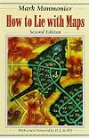
A worthy successor to the classic How to Lie with Statistics. Monmonier begins by pointing out that all maps, by necessity, tell lies, and proceeds to show us the different techniques of abstraction that can be used effectively to represent the truth-- or subverted to deceive the unwary. Most of the examples are quite clear, though toward the end of the book they begin to become more abstract and less gripping.
Note: I bought the second edition of this book before the 22-year-more-recent 3rd edition was released -- which I did not learn existed until I was all but done with the 2nd edition (thanks Amazon?). However, I had access to the 3rd edition through Scribd, so I read the updated last three chapters. I did lightly skim the earlier chapters and they looked mostly unchanged. So this review will be mostly of the 2nd edition, but I will say something about the new chapters of the 3rd edition.
The show more opening chapters that discuss the conventions and compromise of cartography were my favorite. Maps must necessarily distort reality. At a fundamental level, they are scaled representations of reality that must represent the world through symbols. They cannot show everything so the map maker must choose what to show based on the purpose of the map. They generally aim for accuracy, but that is within constraints. For example, if a road and railroad lie right next to each other, one or both lines may be slightly offset to allow both to be shown.
Many of the remaining chapters talk about ways that maps might be deceiving. The content of these chapters are good, but I'll admit that the "How to Lie with" framing is not one that resonates with me particularly well. I'd much rather have the author play it straight. That said, the framing was mostly subdued enough to not be too distracting.
A map can deceive through cartographic blunders, both from the cartographer and from unintentional sources like print quality. Maps used for advertising and maps used for political propaganda both capitalize on the ability of maps to evoke emotions, especially through the choice of imagery and color. Development maps, such as for neighborhood construction, aim to be more objective but can also try to evoke emotional reactions to use a point, such as showing trees as large and full grown.
Defense maps can be state secrets -- even just knowing where a country is interested in can reveal information -- but they can also be used to spread disinformation to the enemy (although this is harder now that high resolution current imagery is more available). Government maps are not actively deceptive, but they do have to make choices and compromises to create huge numbers of detailed maps on a budget.
My favorite chapter in the later part of the book was on data maps. When maps are representing aggregated data, the choice of how to aggregate the data can make a huge difference in the message delivered. For example, in single dimensional data, the number of buckets used, the boundaries between buckets, and the geographic boundaries of the buckets can result in dramatically different maps. Thinking about the data before placing it on a map, such as thinking about categorizations of are already recognized and looking for underlying, non-geographic patterns in the data, can help make a more honest data map.
The chapter on color was also interesting although the digression into color theory seemed largely unnecessary. The main takeaway is that color is better used to convey category. Using color for scale tends to be ambiguous since colors do not have a natural ordering. That doesn't mean scales should be greyscale, but scales should be a one or two color gradient rather than having a scale with many colors. A map specific challenge with color is that color also can be used to convey the nature of the natural landscape such as green for vegetation and blue for water. The symbolic use of color must be chosen carefully to compliment rather than conflict with this representative association.
The old chapter on multimedia maps was completely obsolete and is what was replaced in the 3rd edition. The 3rd edition adds additional chapters on image maps, prohibitive cartography, and fast maps. Image maps are maps created from overhead imagery, and Monmonier notes them as one of the huge innovations in maps in the twenty-first century. They are complementary to line maps: they contain more details (trees!) but they can be harder to interpret (where is the road through the trees?). The chapter on prohibitive cartography discusses how maps that encode boundaries become the source of truth for what those boundaries are; this can be a source of contention.
Fast maps is Monmonier's term for maps that change or are disseminated quickly. This includes fast spreading memes. It also includes interactive maps. Interactive maps can provide ways for users to inquire into the data more deeply and can move through many levels of detail. In fact, Monmonier brings up a suspiciously familiar 22 levels of detail. (Suspicious because that's what Google Maps uses, even though it's not mentioned by name in that section.)
Overall, this book was interesting, but I tend to be highly interested in maps. I don't have a good sense for how it would read to someone who is casually interested in maps. Probably interesting? But overall, the "How to lie" framing combined with many of the examples being rather dated (even in the 3rd edition, based on my skim) made the book less impactful than it might have been otherwise, so 3 stars overall. show less

Very interesting ideas and presentation. However, I repeatedly stumbled over - logic errors? Omissions? that detracted from the argument, or at least distracted. For instance, while discussing the Peters projection, at one point the author mentions a study that determined that Peters' parallels were off by 'as much as four millimeters, a huge distance in the world of cartometry'. But he never mentions at what scale they're displaced - a literal four millimeters is irrelevant, but if it's at show more a scale of 1mm=100 miles, that's considerably more important. We're never given the necessary information to determine the importance of the matter. In another vein, he describes a name-change after Pakistan became independent - 'Campbellpur thus became Attock City'. I'm not sure about the Attock - that could be a Pakistani word - but City is definitely not and would be difficult to say. Perhaps it became Attockabad, or Attockpur? Actually (I looked it up), the name of the city is Attock, which is also the name of the district - so in English 'city' is added to distinguish. The peculiar choice of names to highlight seriously distracted me from the points he was trying to make. Overall, I found his subjects interesting, his writing less than gripping, and his points of view on the various maps and matters variable and, for my taste, too firmly centered on the map itself and not enough on the broader subject. That might have been expected - it is his focus - but it made the book somewhat difficult to slog through for me. I thought I enjoyed maps - it seems I enjoy what maps can tell me, instead. I'm glad I read it, I doubt I'll reread, and I won't seek out other books by the author. show less
Lists
Evan's Wish List (1)
Awards

You May Also Like


Associated Authors
Statistics
- Works
- 32
- Members
- 1,681
- Popularity
- #15,291
- Rating
- 3.6
- Reviews
- 20
- ISBNs
- 63
- Languages
- 4