1Glacierman
Well, somebody has to start it! No entries until tomorrow, 1 Jan 2025, though.
"Well, jeez, Richard. Duh!"
"Well, jeez, Richard. Duh!"
2Lukas1990
The Bird Paintings of Henry Jones (Folio Fine Editions,1976). A huge book and might be actually signed by Prince Phillip.
Reviewed here by our one and only wcarter:
https://www.librarything.com/topic/299517
Reviewed here by our one and only wcarter:
https://www.librarything.com/topic/299517
4ChestnutPress
Today’s post brought me a copy of the Daniel Press edition of The Shorter Poems of Robert Bridges, in the very scarce form of all the original individual parts rather than being bound together as a book, as is usual. The old covers are a bit tatty, but the text pages are in great condition and hadn’t even been opened! I am a very happy chap!
5Lukas1990
>4 ChestnutPress: You got good taste, Sir!
6ChestnutPress
>5 Lukas1990: Thank you kindly. The same goes for yourself!
9Glacierman
Santa came a bit late to my home this year. I stopped by the PO today to pick up a parcel.
It contained, among other things, a lovely copy of No Reply Press' masterpiece, The Death of Ivan Ilyich and one of a very satisfying NRP Kafka, The Hunger Artist.
It contained, among other things, a lovely copy of No Reply Press' masterpiece, The Death of Ivan Ilyich and one of a very satisfying NRP Kafka, The Hunger Artist.
10ChestnutPress
>9 Glacierman: Both absolutely superb editions from Griffin!
12Lukas1990
Some very beautiful books that have been on my radar for quite some time. Very happy with these two!
Hamlet, Prince of Denmark (München, Paul Graupe, 1920). Reviewed here: https://booksandvines.com/2011/11/02/hamlet-by-william-shakespeare-1920-edition-...
The Case of the Wolf-Man (Arion Press, 1993).
Hamlet, Prince of Denmark (München, Paul Graupe, 1920). Reviewed here: https://booksandvines.com/2011/11/02/hamlet-by-william-shakespeare-1920-edition-...
The Case of the Wolf-Man (Arion Press, 1993).
13Shadekeep
>12 Lukas1990: The Case of the Wolf-Man (Arion Press, 1993)
I was looking at that one in the Kelmscott listings. Did you get a better deal on it? Not sure what a fair price at the moment is.
I was looking at that one in the Kelmscott listings. Did you get a better deal on it? Not sure what a fair price at the moment is.
14Lukas1990
>13 Shadekeep: I just won the PBA Galleries auction and will pay a total of 750$ which is not cheap. This book sold for less in a couple of previous auctions. It is quite a rare book on the market because the limitation was low. I think the 800$ price Kelmscott is asking for a fine condition copy is fair. There are a couple more copies I find available at the moment for 900$ each.
15SebRinelli
>12 Lukas1990: nice! Curious to hear whether your copy oh Hamlet exhibits some offsetting, especially to the endpapers
16Chemren
Just added The Mystery of Golf (Houghton Mifflin, 1908) to my Bruce Rogers collection. Also from today’s PBA Galleries auction. This one is interesting in that every one I’ve seen for sale has a unique cover.
17Shadekeep
>14 Lukas1990: Cheers, appreciate the insight!
18astropi
>12 Lukas1990: Congrats, that is a truly magnificent edition of Hamlet!! Might I ask for details, in what condition is it in? I'm curious how much it was, but of course no obligation to share details, I really am curious and I'm sure others that have it on their wishlist would love to know too.
19Shadekeep
>16 Chemren: Nice acquisition! I see what you mean about the variety - I did a search on the book and it has an incredible range of cover styles. Would be curious to see yours too.
20Lukas1990
>17 Shadekeep: Andrew Hoyem is selling his Arion books and asks 950 USD for the Wolf-Man. One more source for price.
Update: forgot to post the link: https://andrewhoyembooks.com/products/the-case-of-the-wolf-man?_pos=1&_psq=w...
Update: forgot to post the link: https://andrewhoyembooks.com/products/the-case-of-the-wolf-man?_pos=1&_psq=w...
21Shadekeep
>20 Lukas1990: Man, that's a fantastic spread. Some exceedingly tempting ones there...
22dlphcoracl
>20 Lukas1990:
>21 Shadekeep:
Andrew Hoyem's prices for his personal Arion Press books are unrealistic, well above the norm from professional booksellers.
Avoid.
>21 Shadekeep:
Andrew Hoyem's prices for his personal Arion Press books are unrealistic, well above the norm from professional booksellers.
Avoid.
23blinks112
>22 dlphcoracl: I was told by Arion that they only carry their backlog from #114 on, and the rest belong to Andrew. I assume he took ownership of all the older inventory as part of a deal when he left. So the books he is selling are probably all brand new at least... it looks like the less highly sought after copies are priced at or around the original non-subscriber price, which of course many (most?) would argue is too high.
To add to the subject of the thread, I received Kindred and Fables of Aesop from Arion this week. Aesop is an interesting one as it is a set of 41 individual single-fold folios in a case as opposed to a single bound book. The folios are pretty large and the whole thing together is quite heavy and substantial.
To add to the subject of the thread, I received Kindred and Fables of Aesop from Arion this week. Aesop is an interesting one as it is a set of 41 individual single-fold folios in a case as opposed to a single bound book. The folios are pretty large and the whole thing together is quite heavy and substantial.
24LBShoreBook
>22 dlphcoracl: Plus it's not clear what shape each book will be. On a FB fine press site (I believe purchaser is also on LT) someone purchased one of his books that had material flaws to them - in my opinion to the point of not being worth owning.
25dlphcoracl
>23 blinks112:
The recently pubished Fables of Aesop may be the first Arion Press book from the new (post-Hoyem) regime that I find appealing. It is a fresh and interesting take on a classic that has been given the private press treatment numerous times, with several, e.g., the Gregynog and the Officina Bodoni editions, representing high points in 20th century illustrated editions of Aesop.
The recently pubished Fables of Aesop may be the first Arion Press book from the new (post-Hoyem) regime that I find appealing. It is a fresh and interesting take on a classic that has been given the private press treatment numerous times, with several, e.g., the Gregynog and the Officina Bodoni editions, representing high points in 20th century illustrated editions of Aesop.
26Shadekeep
>23 blinks112: That's the impression I got too, that they are unsold stock, since they are touted as being in the original wrappers. Though I agree that even at original prices some are too dear.
Glad to hear the Aesop collection is good, that's one of the few titles they've released that interest me. Almost plumped for the subscription this time, if the other title had been just a bit more desirable it would have sold me.
Glad to hear the Aesop collection is good, that's one of the few titles they've released that interest me. Almost plumped for the subscription this time, if the other title had been just a bit more desirable it would have sold me.
27blinks112
A few quick pictures. Again, it's pretty substantial and weighs around 7-8 pounds.
I read somewhere that Arion published it in this format because they were moving to a new location this year and being able to do it in sections like this made production much more flexible.
Size compared to Thornwillow Pride and Prejudice:

Front of case with the top removed:

Stack of folios with title page:

First folio spread:

Basic folio layout - text printed with 3 colors (blue for first letter, black/grey for the fable, red for the "moral"). The stories without art prints each have different geometric designs in a fourth sort of dark gold color you can see here.

I read somewhere that Arion published it in this format because they were moving to a new location this year and being able to do it in sections like this made production much more flexible.
Size compared to Thornwillow Pride and Prejudice:

Front of case with the top removed:

Stack of folios with title page:

First folio spread:

Basic folio layout - text printed with 3 colors (blue for first letter, black/grey for the fable, red for the "moral"). The stories without art prints each have different geometric designs in a fourth sort of dark gold color you can see here.

28Shadekeep
>27 blinks112: Very attractive, thanks for sharing. The participation of Handler in this was the other big part of the appeal.
29Lukas1990
The Book of Common Prayer (The Merrymount Press,1928). It's not in stellar condition but the price I paid reflects this and I always use the opportunity to buy legendary books I can afford.
It will join this begemoth:
https://www.librarything.com/topic/357801#8383448
It will join this begemoth:
https://www.librarything.com/topic/357801#8383448
30NathanOv
>27 blinks112: Oh my! This may have to become my first Arion purchase in quite some time. Looks to be a very creative presentation that serves the content well, with excellent typography and design given lots of attention to detail.
31abysswalker
>30 NathanOv: (or anyone else); I am curious, what about the separate folded folio sheets portfolio presentation appeals to you?
I can imagine a few potential answers, such as lay flat presentation and some degree of interactivity. But I am curious also if there is some other aspect gained by the portfolio style that I am missing.
I can imagine a few potential answers, such as lay flat presentation and some degree of interactivity. But I am curious also if there is some other aspect gained by the portfolio style that I am missing.
32GardenOfForkingPaths
>29 Lukas1990: Congratulations. That's a beautiful book and one that I have coveted ever since seeing pictures here. Seems like you've made a teriffic start to 2025!
I have recently received the Book Club of California's wonderful From California, and I echo all the praise it has received on this forum! International shipping was surprisingly reasonable.
I have recently received the Book Club of California's wonderful From California, and I echo all the praise it has received on this forum! International shipping was surprisingly reasonable.
33NathanOv
>31 abysswalker: Well, I’d still be tempted without that aspect of the design, but I like out-of-the-mould presentations of texts, especially when they suit them well; in this case, because each folio appears to present a standalone piece of the larger work.
From the looks, you can just take one out at a time and enjoy it, and I imagine it’d be much less cumbersome than a bound book of this size. Altogether a different, and possibly superior reading experience.
From the looks, you can just take one out at a time and enjoy it, and I imagine it’d be much less cumbersome than a bound book of this size. Altogether a different, and possibly superior reading experience.
34LBShoreBook
First acquisition of the year is Interior Skies: Late Poems from Liguria by Two Ponds Press (2011). Anthony Hecht poems with two engravings by Abigail Rorer. Handmade paper from the Velke Losiny Paper Mill. Bound by Gray Parrot in quarter leather and handmade paste-paper boards. Beautiful production.
35Lukas1990
Apocalypse de Saint Jean. Illustrations gravées par André Collot aux dépens de Bibliophiles amis de l Artiste à Paris en l an 1942.
Photos here: https://www.librarything.com/topic/319747
Photos here: https://www.librarything.com/topic/319747
36chase.donaldson
>29 Lukas1990: what did you end up paying for it? This has been on my wish list for a while
37Lukas1990
>36 chase.donaldson: 500 USD
38Lukas1990
>29 Lukas1990: The Book of Common Prayer has arrived and it looks pretty good. The condition was as described. I always check all the pages of new arrivals and affer browsing through all 600 pages of this book I can asure you that Mr. Updike was a master printer.
Here's my copy:
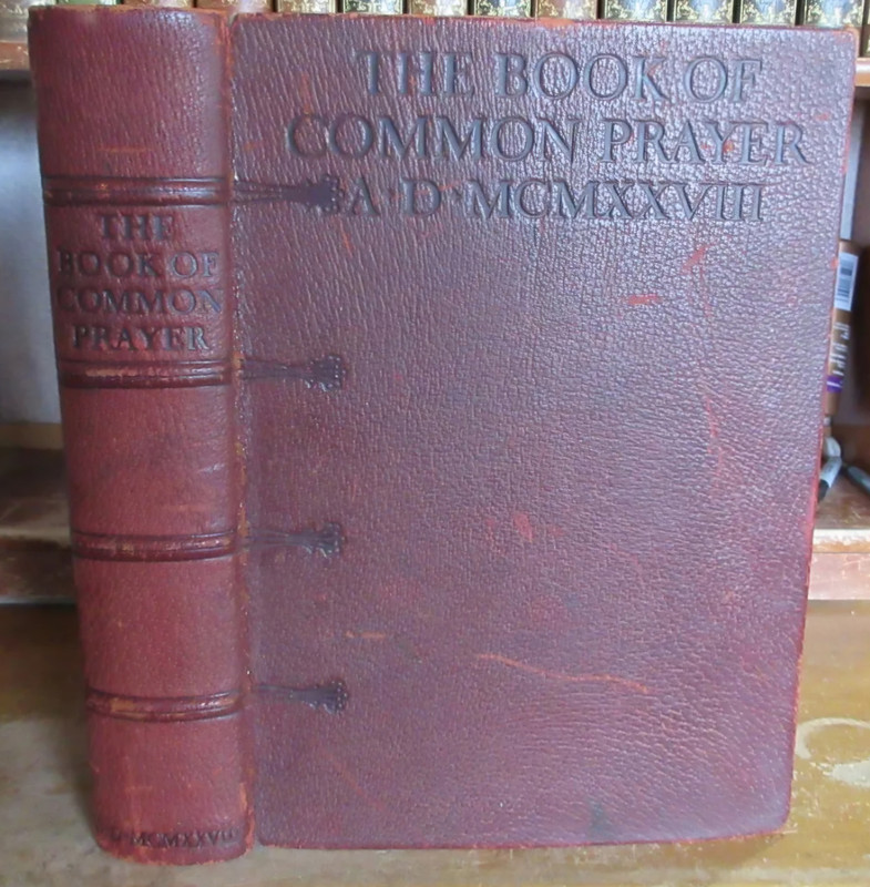
Here's my copy:
39Shadekeep
Just received (S)worn State(s) from Salvage Press (along with Nine Silences and a slew of ephemera and other materials). Will get into it later and try to share photos, but initial impressions are highly positive.
EDIT: The photos came out terrible so I won't be posting them, but both works are lovely. (S)worn State(s) is indeed suitably impressive, not just in mass but in content and production. One of the interesting ephemera items included is the huge prospectus for Carbon, which even contains its own forms of errata. Altogether a very rewarding acquisition from Jamie and his press.
EDIT: The photos came out terrible so I won't be posting them, but both works are lovely. (S)worn State(s) is indeed suitably impressive, not just in mass but in content and production. One of the interesting ephemera items included is the huge prospectus for Carbon, which even contains its own forms of errata. Altogether a very rewarding acquisition from Jamie and his press.
40ChestnutPress
>38 Lukas1990: A magnificent volume!
41ChestnutPress
>39 Shadekeep: Both are exceptional volumes. My copy of Sworn States turned up a couple of days ago and it’s fantastic. Jamie’s work has always been top tier and it just keeps on improving.
Today’s post brought me a wonderful Dana Gioia rarity that I never thought I’d find: one of the 15 deluxe quarter leather hardbound copies of the little ‘Summer’ booklet, which I believe was the first proper publication from Aralia Press.
Today’s post brought me a wonderful Dana Gioia rarity that I never thought I’d find: one of the 15 deluxe quarter leather hardbound copies of the little ‘Summer’ booklet, which I believe was the first proper publication from Aralia Press.
42DenimDan
>38 Lukas1990: Nice! I bought a copy years ago that is beauty on the inside but the beast in its binding: detached spine and front board, split hinge, the works! Thankfully it was only $300-400. I bought it for the printing and design. Every once in a while, I think about having it rebound, which will certainly cost exponentially more than the book did.
43Shadekeep
>41 ChestnutPress: Oo, nice! I've a few Aralia titles and they are excellent books indeed. Wonderful presswork by Michael Peich et al in those, kudos on the find!
44ChestnutPress
>43 Shadekeep: I’m a big fan of Michael Peich’s work (along with what he did for the state of poetry in America) and have a really good selection of his work. It’s always enjoyable to get Aralia pieces and I was very pleased with getting this copy of ‘Summer’. An impeccable jewel of a book!
45Shadekeep
Just received the most recent run of Quires which I had fallen behind on. And on top of it Chad threw in his newest work, Hairnets & Gloves. This is a scrumptious item, beautifully printed and ornamented, and cunningly assembled with a great selection of papers. A sterling example of the kind of chapbook artistry that got me into fine press collecting in the first place.
47Shadekeep
Received Poseidon from No Reply Press. Just wow. There's little I can add that hasn't already been said in the chorus of praise around this book on the forum, but the plaudits are entirely deserved. Once again Griffin goes beyond the expected to produce a stunner.
48Dr.Fiddy
>47 Shadekeep: I'm glad to hear and I'm not actually surprised. Griffin has indeed put the bar very high... My copy is scheduled to arrive on Friday :)
49Glacierman
Briefly noted.
Received today in an exchange with Chad Oness:
From The Last Press:
Hairnets & Gloves. A poem by Juan Delgado. (2025). This is still available from the Press. Inquire.
From Sutton Hoo Press:
Fire to Fire ● Poems by Mark Doty. With woodcuts by Lisa Schoenfielder. (2004). Still available from Chad. A stunner, I'll be doing a feature on this one in a few days.
Received today in an exchange with Chad Oness:
From The Last Press:
Hairnets & Gloves. A poem by Juan Delgado. (2025). This is still available from the Press. Inquire.
From Sutton Hoo Press:
Fire to Fire ● Poems by Mark Doty. With woodcuts by Lisa Schoenfielder. (2004). Still available from Chad. A stunner, I'll be doing a feature on this one in a few days.


51DMulvee
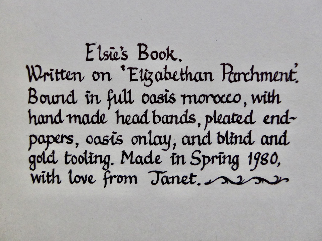
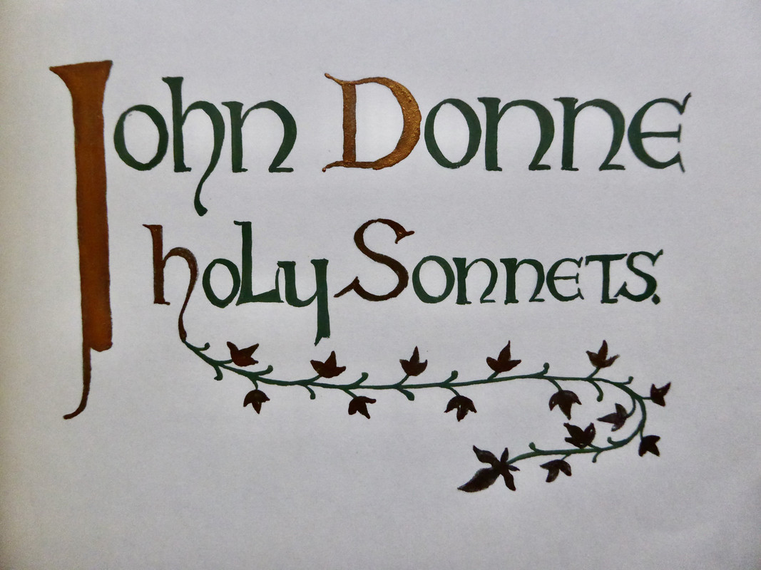
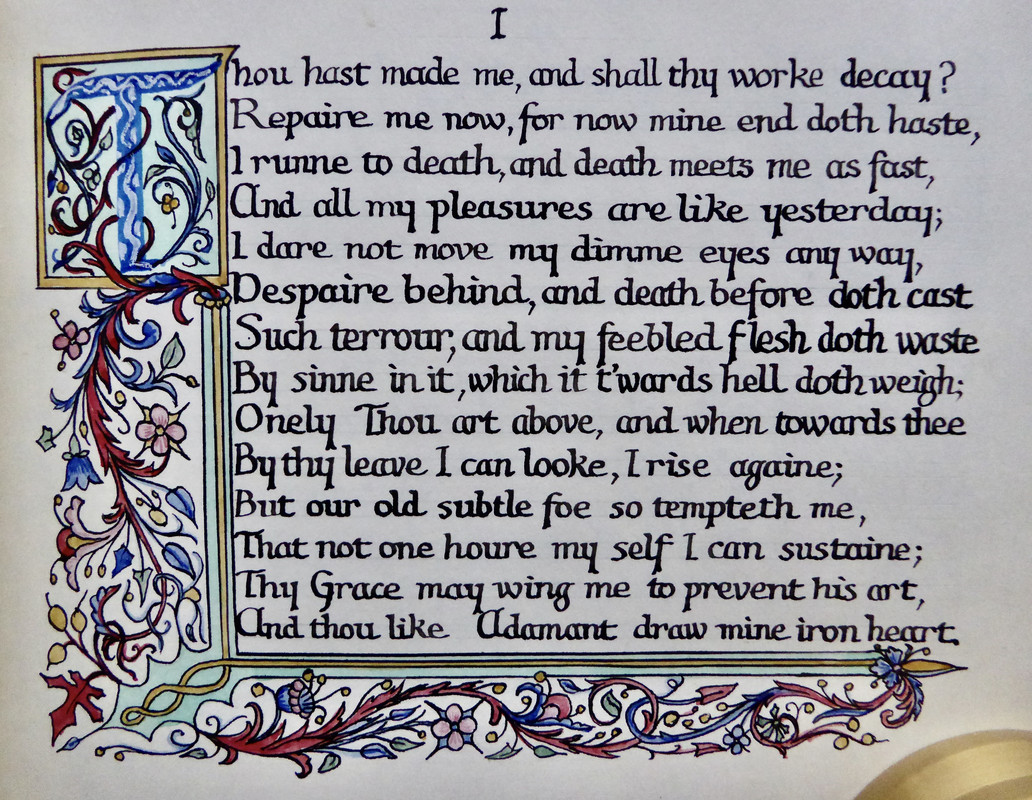
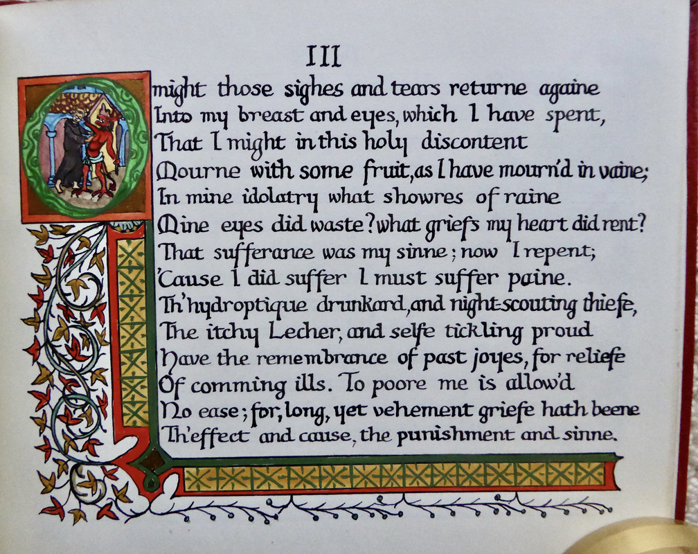
I was reading the catalogue of the Rampant Lions Press and decided to seek out a few that caught my eye. I found a Primrose Academy from their ‘The Engraver’s Cut’ series - Ian Stephens.
I picked up three works from the Sixth Chamber Press, the Nobel Lecture by William Golding, A Cluster of Clerihews by Gavin Ewart (a lettered copy) and Boris Godunov based on Pushkin but translated by D M Thomas.
Finally I acquired a copy of A Single Man from The Land Press, this is nominally one of the 25 that was bound in Morocco by James Brockman but the RLP catalogue informs me that only 17 of the 25 were actually bound.
I picked up three works from the Sixth Chamber Press, the Nobel Lecture by William Golding, A Cluster of Clerihews by Gavin Ewart (a lettered copy) and Boris Godunov based on Pushkin but translated by D M Thomas.
Finally I acquired a copy of A Single Man from The Land Press, this is nominally one of the 25 that was bound in Morocco by James Brockman but the RLP catalogue informs me that only 17 of the 25 were actually bound.
52ChestnutPress
>51 DMulvee: It’s difficult to go wrong with Rampant Lions Press!
53Lukas1990
The Voiage And Travaile of Sir John Maundevile (Random House, Grabhorn Press, 1928).
I'm glad I found this one for a reasonable price at auction.
I'm glad I found this one for a reasonable price at auction.
54ChestnutPress
>53 Lukas1990: Great purchase! I will always regret not picking this up for a really low price when the chance came.
55Glacierman
Got a nice parcel in the mail today. It spent 11 days sitting in a regional USPS center (not Indianapolis!) before finally getting shaken loose and wending its way here. The wait was worth it, though.
I have been blessed with two from Thornwillow (Leave it to Jeeves and Arson Plus; one from No Reply (Per Se Phone) and Conversation Tree's Peter Pan in the standard state.
I am content.
I have been blessed with two from Thornwillow (Leave it to Jeeves and Arson Plus; one from No Reply (Per Se Phone) and Conversation Tree's Peter Pan in the standard state.
I am content.
56astropi
>55 Glacierman: I think the Standard CTP Peter Pan is more appealing than the Deluxe :)
57GardenOfForkingPaths
An Eye Made Quiet from Barbarian Press has arrived. Just an absolutely lovely book in every respect. This is my third Barbarian acquisition, and it has cemented my feeling that as long as I have an interest in the content, publications from this press are not to be missed. I love this run of canonical poetry that they are currently on: Thomas Gray/Oliver Goldsmith, then the Wordsworth, with Hardy and John Donne/Gerard Manley Hopkins to follow.
The two Loose Canons chapbooks (Elinor Wylie and E.A. Robinson) should arrive soon too. These aren't poets I'm very familiar with, but I have a lot of confidence in a Barbarian curated selection of what they consider to be "unfairly neglected or forgotten" poets. I read a little bit of Robinson's Ben Jonson Entertains a Man from Stratford and was hooked.
The two Loose Canons chapbooks (Elinor Wylie and E.A. Robinson) should arrive soon too. These aren't poets I'm very familiar with, but I have a lot of confidence in a Barbarian curated selection of what they consider to be "unfairly neglected or forgotten" poets. I read a little bit of Robinson's Ben Jonson Entertains a Man from Stratford and was hooked.
58Shadekeep
>57 GardenOfForkingPaths: Very nice! I finally decided to stop my shilly-shallying recently and put in a Barbarian Press order myself. Hoping to get Pastoral Elegies, along with the two Loose Canons and the two Wayzgoose pamphlets.
59GardenOfForkingPaths
>58 Shadekeep: Great choices! I hope you can obtain the ones you want. I dithered a bit too on Pastoral Elegies, but very glad I relented in the end. It's a beautiful, very finely put together edition.
60Nightcrawl
>57 GardenOfForkingPaths: Great to hear about An Eye Made Quiet! Mine has been stuck in “inbound out of customs” for nine days now after almost a month in transit total now. I fear it may never make it to me at this point :(
61GardenOfForkingPaths
>60 Nightcrawl: Oh no, that’s so frustrating! Have you experienced a delay like that before? Is it just a case of waiting it out or is contacting the courier an option?
62ensuen
>61 GardenOfForkingPaths: Depending on the region it sometimes just happens, US customs did that to me once or twice on some smaller shipments. Sometimes it’s actually missing but that’s a little more rare.
63Shadekeep
>59 GardenOfForkingPaths: Thank you, that's great to hear. I feel even more pleased now that I've made the leap! And yes, they have all the titles in stock, happily.
65ensuen
In a previous thread I mentioned a desire for a fancy paper catalogue with printing examples, and having found a good match wanted to drop a note here; Specimen, Steven Nelson paper company. Full page paper examples with some sort of printing, with the name of the printer and a specimen number on the back. Lots of letterpress, but sometimes silkscreen or something else. Includes some nice stuff a John Depol woodcut and some other nice reproductions.
I’ll try to channel my inner wcarter this weekend or next month and post some photos for everyone.
I’ll try to channel my inner wcarter this weekend or next month and post some photos for everyone.
66sanvito
>65 ensuen: I have multiple copies of this book, it is one of the most beautiful paper specimen collections, besides representing typography of some of the best designers and presses of the time (think Rogers, Krimpen, Officina Bodoni, etc.) There are many other fine press publications of paper sample style books (especially Japanese papers), most of which fetch far higher prices, but the stevens Nelson is unique. Excellent choice.
68PBB
>65 ensuen: sounds very interesting. The copy I looked at on eBay says “17 viewed in the last 24 hours.” I bet your post is the driver of that.
69ensuen
>68 PBB: >67 LT79: At the price point it’s at I would seriously go for it. Between the age (1953 or so, it’s a catalog so not sure the limitation or manufacture timeline), the slipcase seemingly causing some damage itself, and it being a working book - most of the copies on the market have some damage, but seem to have the text block intact. I’ve noticed a few different papers and leathers used for the binding, maybe due to the construction timeframe.
>66 sanvito: Thanks for the note! It’s truly a very nice production. If you have other recs for sample books, please do reach out. I’m very thankful the listing I got it from took the time to explain it in more depth. Are there any difference to the copies internally? I noticed that the books all seem to be given to a named individual, but the descriptions of each seemed to be pretty similar on store listings (although I would propose they copy paste each other).
>66 sanvito: Thanks for the note! It’s truly a very nice production. If you have other recs for sample books, please do reach out. I’m very thankful the listing I got it from took the time to explain it in more depth. Are there any difference to the copies internally? I noticed that the books all seem to be given to a named individual, but the descriptions of each seemed to be pretty similar on store listings (although I would propose they copy paste each other).
73ChestnutPress
>72 LT79: Now you’ll need to start tracking down paper specimen packs from individual makers. Not necessarily easy to come by, but really nice to have when you find them
75ensuen
>74 LT79: Glad the peer pressure worked out, there’s a wood veneer sample near the back that’s quite unique too. I’m buying a few more here and there and will let you know if I find anything up to the same standard.

77rbee
>72 LT79: you might find Bird and Bull press intriguing. Henry Morris made his own paper which he printed many of his books on. He also provided a lot of ephemera with his press’s bibliographies. That includes many paper samples.
80wcarter
>76 Lukas1990:
Looks like a very nice find.
Looks like a very nice find.
81DenimDan
>79 LT79: Echoing >77 rbee: and >78 Lukas1990: , there are several books that might satisfy your interests. Henry Morris (Bird and Bull Press) handmade paper for many of his books, the last of which I think was his "Thirty-Three Years of Bird and Bull" (1988). That and his first bibliography "Twenty One Years of B and B" (1980) provide a thorough, comical look into one man's descent into papermaking madness. "21 Years" is especially affordable for a bibliography printed on Roma handmade paper.
Walter Hamady (Perishable P.) made his own paper (which he christened "Shadwell") for many/most of his 131 titles. He describes his own papermaking process in "Paper-Making by Hand" (1981), a book that also contains handmade papers from other makers. It's expensive, though many of his less expensive titles were printed on the same paper.
John Mason (12 by 8 Press) may be the oddest of the lot: he began making paper from weeds and rushes relatively late in his career, and there's a small catalogue of books printed on his papers, many by Will Carter. Similar to the Stevens-Nelson sampler, Mason compiled a "who's who" of printing on his papers in "More Hand-Made Papers by John Mason" (1966). Carter, Stanbrook Abbey Press, and others contributed to this quirky volume.
Walter Hamady (Perishable P.) made his own paper (which he christened "Shadwell") for many/most of his 131 titles. He describes his own papermaking process in "Paper-Making by Hand" (1981), a book that also contains handmade papers from other makers. It's expensive, though many of his less expensive titles were printed on the same paper.
John Mason (12 by 8 Press) may be the oddest of the lot: he began making paper from weeds and rushes relatively late in his career, and there's a small catalogue of books printed on his papers, many by Will Carter. Similar to the Stevens-Nelson sampler, Mason compiled a "who's who" of printing on his papers in "More Hand-Made Papers by John Mason" (1966). Carter, Stanbrook Abbey Press, and others contributed to this quirky volume.
82dlphcoracl
>65 ensuen:
>72 LT79:
Consider: Fine Papers at the Oxford University Press, Whittington Press, 1999.
The deluxe edition contains 40 tipped-in specimens of handmade papers and a separate portfolio of an additional 25 whole sheets of paper. Link below to Sophie Schneideman's listing is FYI, not necessarily for purchase.
https://www.ssrbooks.com/book/8744/whittington-press-bidwell-john/fine-papers-at...
>72 LT79:
Consider: Fine Papers at the Oxford University Press, Whittington Press, 1999.
The deluxe edition contains 40 tipped-in specimens of handmade papers and a separate portfolio of an additional 25 whole sheets of paper. Link below to Sophie Schneideman's listing is FYI, not necessarily for purchase.
https://www.ssrbooks.com/book/8744/whittington-press-bidwell-john/fine-papers-at...
83sanvito
I second the above recommendations. There are so many aspects to fine book making, & without a strong design nothing can work, (a good text helps too) and yet the mystery of beautiful paper, and how it responds to the type and work and etc. is probably the sine qua non of whatever makes a book enchanting. For all that, the Stevens Nelson catalogue is probably still the most delighting paper-first book that I’ve ever come across. The Perishable press and the Bird and bull (with some French catalogues and Dard Hunter) come second, but even then it is genuinely surprising how much this mere commercial “catalogue” achieved in terms of variety and quality. There are endless other interesting avenues in this line of collecting, mostly from the east-Asian diversity and beauty of paper, also the German festschrift tradition of honouring this-or-that with a gorgeous (but often exceedingly rare) assortment of broadside styles on various materials, the historical specimens, incunabula papers and calf and goat skins, French papier de chines and exotic japons, and then of course the particular volumes here and there as one-offs which happen to be printed on something intriguing. (Doves press Milton, and Nonesuch Don Quixote come to mind, but also the mere “mould-made” of the LEC Krimpen Homer, which is probably my favourite paper in any volume). All to say, I have no other book in my library which for paper’s sake is so enjoyable as this Steven's-Nelson catalogue.
85Sport1963
>76 Lukas1990: The definitive Cranach Press reference book, and you got it for a great price. If you want to learn even more about the fascinating man behind the Cranach Press, Count Harry Kessler, check out "The Red Count" by Laird Easton.
86Glacierman
> 76 >85 Sport1963: I can also recommend In the Twenties, the Diaries of Harry Kessler. There are other editions of his diaries as well, but this covers the main Cranach Press era. Long thought to be lost, his complete diaries were discovered in the 1980s, after this volume was published.
87Lukas1990
>85 Sport1963: Thanks. I need to save money and acquire my first Cranach press book. Wish it was Hamlet. 😄
88BillWoodbridge
>76 Lukas1990:
I can’t resist chipping in here, and apologies for doing so in a slightly negative way. The book is magnificently presented, and that is an equally magnificent price – congratulations! But I’d be interested to know your opinion of the content. Personally, I find it frustrating. Although it looks like a lavish bibliography in the grand manner, it’s principally a collection of essays on different aspects of the Press, many rather rambling, overlapping and not helped by stilted translation from the German, making it very difficult to search for any particular detail. More seriously, the bibliographic material is not done to a standard of rigour necessary to illuminate all the complexities of the Press’s output. I actually prefer using Muller-Krumbach for Cranach reference matters, a much more modest book and unfortunately not available in English translation.
Good luck with the search for your first Cranach! Of the three magna opera (Hamlet, Eclogues, Song of Solomon) I think the last represents the best value for money, but none are cheap of course. Jewel-like (to use that well-known book dealer’s cliché) and like all major Cranachs, it seems to have the air of a work of art more than of craft, to a greater degree than the other classic presses.
I can’t resist chipping in here, and apologies for doing so in a slightly negative way. The book is magnificently presented, and that is an equally magnificent price – congratulations! But I’d be interested to know your opinion of the content. Personally, I find it frustrating. Although it looks like a lavish bibliography in the grand manner, it’s principally a collection of essays on different aspects of the Press, many rather rambling, overlapping and not helped by stilted translation from the German, making it very difficult to search for any particular detail. More seriously, the bibliographic material is not done to a standard of rigour necessary to illuminate all the complexities of the Press’s output. I actually prefer using Muller-Krumbach for Cranach reference matters, a much more modest book and unfortunately not available in English translation.
Good luck with the search for your first Cranach! Of the three magna opera (Hamlet, Eclogues, Song of Solomon) I think the last represents the best value for money, but none are cheap of course. Jewel-like (to use that well-known book dealer’s cliché) and like all major Cranachs, it seems to have the air of a work of art more than of craft, to a greater degree than the other classic presses.
89dlphcoracl
>87 Lukas1990:
>88 BillWoodbridge:
The problem, of course, with acquiring Canticum Canticorum Salomonis is that the text is in Latin and cannot be read by most collectors. It is destined to sit on one's shelf unread. I greatly prefer the Cranach Press edition of Duino Elegies by Rainier Maria Rilke to fill out my Cranach triumvirate.
>88 BillWoodbridge:
The problem, of course, with acquiring Canticum Canticorum Salomonis is that the text is in Latin and cannot be read by most collectors. It is destined to sit on one's shelf unread. I greatly prefer the Cranach Press edition of Duino Elegies by Rainier Maria Rilke to fill out my Cranach triumvirate.
90Sport1963
>86 Glacierman: Thank you, sir.
91Sport1963
>88 BillWoodbridge: I have to chuckle as your post hits the mark. Reading Dieter Brinks book is akin to reading a German law book. There's a structure there, but one that appeals to native German speakers (which I am not). Somewhat along the lines of "Tell me the time, not how the watch is made..."
92Lukas1990
>88 BillWoodbridge: I have yet to read the book. But I perfectly understand what you mean and it sounds frustrating. Never judge a book by it's (lavish) cover (presentation), I guess. Did they translate the essay by John Dreyfus into German and then again into English? Haha.
Canticum Canticorum Solomonis sometimes appears on auctions and the price is not so extreme. Some of the wood engravings from the book are beautifully printed from the original blocks under Gill's supervision in Engravings 1928-1933 by Eric Gill (Faber & Faber, 1934) which I own and itself is not cheap.
I'll soon receive Nonesuch' Genesis with Paul Nash's woodcuts and Grabhorn's Mandeville and this probably means no books for me in the distant future :)
Canticum Canticorum Solomonis sometimes appears on auctions and the price is not so extreme. Some of the wood engravings from the book are beautifully printed from the original blocks under Gill's supervision in Engravings 1928-1933 by Eric Gill (Faber & Faber, 1934) which I own and itself is not cheap.
I'll soon receive Nonesuch' Genesis with Paul Nash's woodcuts and Grabhorn's Mandeville and this probably means no books for me in the distant future :)
93dlphcoracl
>92 Lukas1990:
Because the Nonesuch Press 'Genesis" is a very slim book containing only the first chapter of Genesis it is somewhat overlooked by many collectors. However, it is one of the most striking and original illustrated private press books of the twentieth century. Paul Nash's abstract wood engravings parallel the story of Genesis by evolving and slowly gaining complexity as the story of Genesis evolves in the text. Nash's first wood engraving entitled 'The Void' is a simple black square and each successive woodcut gains additional form and complexity . When combined with the stark Neuland type by Rudolf Koch, this edition assumes a mystery and other-worldliness appropriate to Genesis. Both the text and Nash woodcuts are centrally placed on each page with very wide margins, a 'void' in and of itself.
This is a private press masterpiece of book design and book illustration.
Because the Nonesuch Press 'Genesis" is a very slim book containing only the first chapter of Genesis it is somewhat overlooked by many collectors. However, it is one of the most striking and original illustrated private press books of the twentieth century. Paul Nash's abstract wood engravings parallel the story of Genesis by evolving and slowly gaining complexity as the story of Genesis evolves in the text. Nash's first wood engraving entitled 'The Void' is a simple black square and each successive woodcut gains additional form and complexity . When combined with the stark Neuland type by Rudolf Koch, this edition assumes a mystery and other-worldliness appropriate to Genesis. Both the text and Nash woodcuts are centrally placed on each page with very wide margins, a 'void' in and of itself.
This is a private press masterpiece of book design and book illustration.
94jsg1976
I received today two books illustrated by Mallette Dean - The Splended Idle Forties from the Allen Press, and The Captivity of the Oatman Girls from the Grabhorn Press. I bought them at auction, and while the hammer prices were reasonable, the other costs are getting out of control - particularly shipping. I got charged 3x what I would’ve paid to ship this by insured media mail if I could’ve done it myself. But I suppose that’s a minor quibble in the grand scheme of things.
I haven’t gotten to spend much time with them as I’ve been working all day, but the Allen Press book is really lovely. Fantastic paper, excellent printing, beautiful initials and ornaments, and a lovely patterned cloth binding. Some pictures (not of my copy, of course) can be found in the Books and Vines article by our esteemed >93 dlphcoracl: here: https://booksandvines.com/2011/09/21/allen-press-of-lewis-and-dorothy-allen/?amp...
As for the Grabhorn title, while the inside is in great shape, and I absolutely love how there’s a summary with a little illustration at the top of each page that seems to relate to that page’s text, plus some excellent larger woodcuts, I’ve now learned my lesson (thankfully not too expensively) not to rely solely on the pictures and to ask for condition reports - the edges of the back board make it look like the book was dropped on a gravel driveway.
I haven’t gotten to spend much time with them as I’ve been working all day, but the Allen Press book is really lovely. Fantastic paper, excellent printing, beautiful initials and ornaments, and a lovely patterned cloth binding. Some pictures (not of my copy, of course) can be found in the Books and Vines article by our esteemed >93 dlphcoracl: here: https://booksandvines.com/2011/09/21/allen-press-of-lewis-and-dorothy-allen/?amp...
As for the Grabhorn title, while the inside is in great shape, and I absolutely love how there’s a summary with a little illustration at the top of each page that seems to relate to that page’s text, plus some excellent larger woodcuts, I’ve now learned my lesson (thankfully not too expensively) not to rely solely on the pictures and to ask for condition reports - the edges of the back board make it look like the book was dropped on a gravel driveway.
95Sport1963
>94 jsg1976: Which auction house did you use? That Grabhorn title should have noted that back-board condition in the lot description and not required a condition inquiry. But as you say, lesson learned.
96jsg1976
>95 Sport1963: DuMochelles, in Detroit. They listed it as “good condition” but they were also using things like “excellent condition” as the alternative, rather than fine, very good, etc, so I assumed this would be a layman’s “good”. They didn’t show any pictures of the back board though, which makes me wonder if it was intentional.
97DenimDan
Neopostmodrinism or Dieser Rasen ist kein Hundeklo or Gabberjabb Number 6 (Perishable Press, 1988). Happened to see this one on the secondary market and snatched it up as quickly as I could. Everything about this book -- from the binding and "forwarding" and the page surfaces (lots of handmade paper in an array of colors, along with a spread printed on cloth hospital sheets), the impeccable typesetting and printing (there's a 1000-word essay on a picture of the Hamady grocery store, set in 6-point Clarendon), to the rubber-stamping, collage, and other hand applications-- it all brings me great joy.
98Shadekeep
Received my first Barbarian Press title, Pastoral Elegies (along with four pamphlets). A sterling example of traditional fine press, with an understated but still unique cover design and beautiful printing within. The inclusion of the engravings in a casebound portfolio alongside the book is an added pleasure. I would say if the contents interest you then this is an unmissable title.
Also received my first Melville Press title, Poems of Travel, an Emily Dickinson collection. This is from the run press owner Catherine Kanner could save from the Palisades Fire. The binding has a texture and slight opalescence unlike other books in my collection, and the interior fold-out illustrations are simply gorgeous. The printing is superb as well. Will be looking forward to what she does next.
Also received my first Melville Press title, Poems of Travel, an Emily Dickinson collection. This is from the run press owner Catherine Kanner could save from the Palisades Fire. The binding has a texture and slight opalescence unlike other books in my collection, and the interior fold-out illustrations are simply gorgeous. The printing is superb as well. Will be looking forward to what she does next.
99Lukas1990
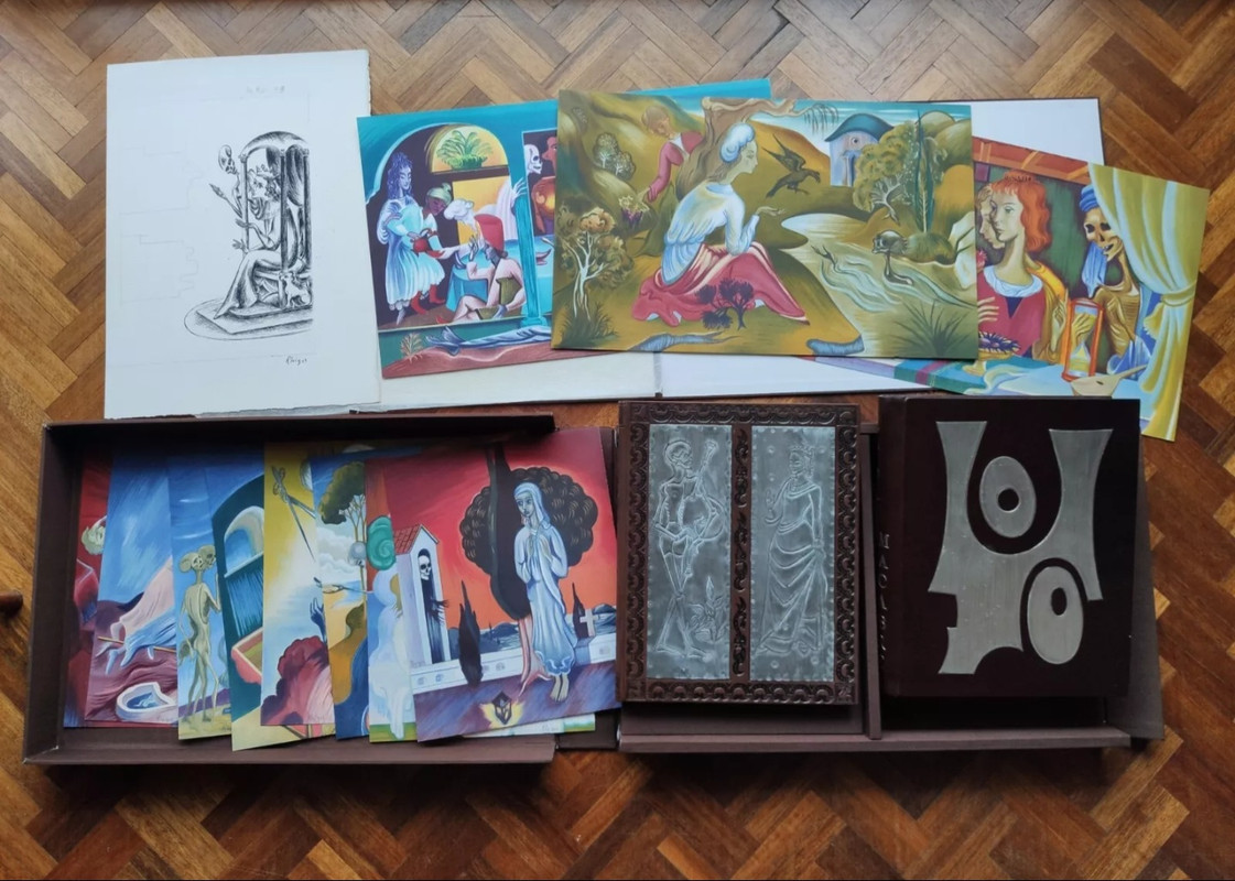
I consider this 2 volume set a real bargain which would cost thousands of dollars to make today. It is leaving France at the moment and I will make a review once it arrives. Here's a small teaser (both books on the lower-right corner):
100Shadekeep
Received a nice box of books from Poltroon Press, my first acquisitions from them. Alastair graciously included a number of extras, including some of the press's trade publications. Of especially note in this order are A Country of my Own (a collection of writings by Lucia Berlin), The Mutabilitie of the Englishe Lyrick, and a pair typeface surveys - Cyrillic & Oriental Typography in Rome at the End of the Sixteenth Century and Speculators in Elegant Typography. Quite pleased with the quality of the work and the contents, and the books are in great condition given the age of some of them. It's not often one gets a new book that almost a half-century old.
Also got a couple titles from Convivio Bookworks, a press recommended to me by @Glacierman. Delighted with A Whole Nother Kettle of Fish, an eclectic gathering of unusual fish-related tales, and Faded and Flown, a lovely set of stories by Bailey White. They're not a typical private press but seem to have a lot of irons in the fire, and it's nice seeing the variety of their creative output.
Also got a couple titles from Convivio Bookworks, a press recommended to me by @Glacierman. Delighted with A Whole Nother Kettle of Fish, an eclectic gathering of unusual fish-related tales, and Faded and Flown, a lovely set of stories by Bailey White. They're not a typical private press but seem to have a lot of irons in the fire, and it's nice seeing the variety of their creative output.
102dlphcoracl
>101 LT79:
"I'm at a loss (as to) why they are practically given away".
Frankly, that is easy to explain. Nearly everything the Stanbrook Abbey published dealt with overtly religious matter or statements of religious faith from obscure people that are of little interest to most fine & private press collectors. It is distinctly different from more classical religious-themed private press topics, e.g., the Book of Job, the Book of Genesis, the Book of Psalms, the Sermon on the Mount, etc. Do you really want to read:
1. In the Little Things by Alec Robertson
2. Interior Castle by Katherine Kendall
3. Moods That Endure by Samaan-Hanna
4. Ten Rules for the Spiritual Life by Diadochus of Photike
Additionally, the few non-religious Stanbrook Abbey publications are mostly minor league from a literary point of view.
"I'm at a loss (as to) why they are practically given away".
Frankly, that is easy to explain. Nearly everything the Stanbrook Abbey published dealt with overtly religious matter or statements of religious faith from obscure people that are of little interest to most fine & private press collectors. It is distinctly different from more classical religious-themed private press topics, e.g., the Book of Job, the Book of Genesis, the Book of Psalms, the Sermon on the Mount, etc. Do you really want to read:
1. In the Little Things by Alec Robertson
2. Interior Castle by Katherine Kendall
3. Moods That Endure by Samaan-Hanna
4. Ten Rules for the Spiritual Life by Diadochus of Photike
Additionally, the few non-religious Stanbrook Abbey publications are mostly minor league from a literary point of view.
103ChestnutPress
>102 dlphcoracl: Stanbrook Abbey work commands a decent premium regardless of literary content, simply because the work is top tier and beautiful. You list Interior Castle as a ‘do you really want to read this?’, but my answer would certainly be yes!
104dlphcoracl
>103 ChestnutPress:
We will have to cordially 'agree to disagree' on this. LT79 is (imho) correct and most of the Stanbrook Abbey publications "are practically being given away". No one is questioning the quality of their work, their letterpress printing and hand illumination. Ironically, the finest Stanbrook Abbey Press publication is the Whittington Press 'The Stanbrook Abbey Press Bibliography 1956-1990', not anything the SAP published. The one SAP edition I can wholeheartedly recommend is 'The Path to Piece: Selected Poems by Siegfried Sassoon.
We will have to cordially 'agree to disagree' on this. LT79 is (imho) correct and most of the Stanbrook Abbey publications "are practically being given away". No one is questioning the quality of their work, their letterpress printing and hand illumination. Ironically, the finest Stanbrook Abbey Press publication is the Whittington Press 'The Stanbrook Abbey Press Bibliography 1956-1990', not anything the SAP published. The one SAP edition I can wholeheartedly recommend is 'The Path to Piece: Selected Poems by Siegfried Sassoon.
105DenimDan
>101 LT79: >102 dlphcoracl: >103 ChestnutPress: You have to give it to the nuns at Stanbrook: they were really doing it for their higher purpose, and everything they published was either specifically Roman Catholic or (less often) generally Christian. In my mind, the best book they published was "Unless the Grain Die" (1961), two short homiletics by Augustine and Ignatius. I have a copy printed on John Mason's handmade paper, bound in full leather.
I think some of their more appealing productions are short broadsides and pamphlets, most of which are Biblical passages or short commentaries. They are/were relatively inexpensive, but they put the same care in materials and design as they did with longer, less accessible works.
>104 dlphcoracl: The Whittington SAP bibliography is indeed great. Highly recommend it to anyone who enjoys fine press bibliographies.
I think some of their more appealing productions are short broadsides and pamphlets, most of which are Biblical passages or short commentaries. They are/were relatively inexpensive, but they put the same care in materials and design as they did with longer, less accessible works.
>104 dlphcoracl: The Whittington SAP bibliography is indeed great. Highly recommend it to anyone who enjoys fine press bibliographies.
106ChestnutPress
>104 dlphcoracl: such cordial disagreement is perfectly fine with me, mate! My absolute favourite Stanbrook Abbey publication is the beautiful ‘Patriarch Tree’, which I happily admit can be picked up cheaply!
108dlphcoracl
>106 ChestnutPress:
>107 LT79:
"Don't get me wrong!!" 😊
In the case of the Stanbrook Abbey Press, I do NOT practice what I preach and the beauty of the SAP printing and illumination triumphed over my disinterest in most of their subject matter. I own several of their editions including Patriarch Tree and Unless the Grain Die, the latter an excellent recommendation from >107 LT79:. If you (LT79) wish to expand upon your Stanbrook Abbey collection, I recommend the Thomas Merton translation (with his preface) of 'A Prayer of Cassiodorus (bilingual in Latin and English) and 'The Solitary Life by Guigo (translated by Thomas Merton).
Last but not least, there is a stunning SAP edition many collectors are unaware of. It is entitled 'Earnest-Pennies', an anthology of prayers and meditations on the Holy Eucharist by Philip Martin, Chancellor of Wells. It was originally published by Mowbrays (London & Oxford) in an ordinary edition of 1,000 copies in 1973. However, this was also privately printed for Mowbray by the SAP in an edition of only 75 copies with a hand-gilded initial by Margaret Adams. The 75 copies were printed on two different handmade papers from Barcham Green:
Nos. 1 - 40 on 'Eltham'
Nos. 41 - 70 on 'Medway'
The text is set in Jan van Krimpen's 'Monotype' Spectrum, re-justified by hand & printed in three colors, bound in dark green quarter morocco & lime green Shiki silk over boards with a gilt illustration in the lower quadrant of the front board. If you have to own one SAP edition, this is the one 'to die for'.
Happy hunting!!
>107 LT79:
"Don't get me wrong!!" 😊
In the case of the Stanbrook Abbey Press, I do NOT practice what I preach and the beauty of the SAP printing and illumination triumphed over my disinterest in most of their subject matter. I own several of their editions including Patriarch Tree and Unless the Grain Die, the latter an excellent recommendation from >107 LT79:. If you (LT79) wish to expand upon your Stanbrook Abbey collection, I recommend the Thomas Merton translation (with his preface) of 'A Prayer of Cassiodorus (bilingual in Latin and English) and 'The Solitary Life by Guigo (translated by Thomas Merton).
Last but not least, there is a stunning SAP edition many collectors are unaware of. It is entitled 'Earnest-Pennies', an anthology of prayers and meditations on the Holy Eucharist by Philip Martin, Chancellor of Wells. It was originally published by Mowbrays (London & Oxford) in an ordinary edition of 1,000 copies in 1973. However, this was also privately printed for Mowbray by the SAP in an edition of only 75 copies with a hand-gilded initial by Margaret Adams. The 75 copies were printed on two different handmade papers from Barcham Green:
Nos. 1 - 40 on 'Eltham'
Nos. 41 - 70 on 'Medway'
The text is set in Jan van Krimpen's 'Monotype' Spectrum, re-justified by hand & printed in three colors, bound in dark green quarter morocco & lime green Shiki silk over boards with a gilt illustration in the lower quadrant of the front board. If you have to own one SAP edition, this is the one 'to die for'.
Happy hunting!!
110dlphcoracl
>109 LT79:
I wrote an addendum to my post above in >108 dlphcoracl:. Reread it to begin your SAP treasure hunt. 😊
I wrote an addendum to my post above in >108 dlphcoracl:. Reread it to begin your SAP treasure hunt. 😊
111Shadekeep
>109 LT79: Ha, The Lisping Goddess is the book I've had in my Abe cart for weeks, shilly-shallying over it. Finally went for it today.
112dlphcoracl
>109 LT79:
Last but certainly not least, if you wish to begin assembling an important SAP collection you should introduce yourself to Bill Woodbridge by sending him a PM via his post above in >88 BillWoodbridge:.
Bill is an expert in all things SAP and has one of the most complete collections of SAP editions and ephemera. He is both an avid collector and bookseller, specializing in the SAP and, to a lesser extent, the Whittington Press. Bill can find unusual SAP items and provide expert advice and guidance regading your SAP collecting.
Last but certainly not least, if you wish to begin assembling an important SAP collection you should introduce yourself to Bill Woodbridge by sending him a PM via his post above in >88 BillWoodbridge:.
Bill is an expert in all things SAP and has one of the most complete collections of SAP editions and ephemera. He is both an avid collector and bookseller, specializing in the SAP and, to a lesser extent, the Whittington Press. Bill can find unusual SAP items and provide expert advice and guidance regading your SAP collecting.
114dlphcoracl
>107 LT79:
".......because I do collect these kind of books."
Well, I have a treat for you!!
It is ironic that your search for a fine press edition of Interior Castle by Saint Teresa inadvertently led you to discovery of the Stanbrook Abbey Press because the SAP has a Little Sister private press with a similar mission, namely, the St. Teresa's Press. The press was founded in 1965 by a small group of Carmelite Nuns in Flemington, New Jersey, and began publishing hand-printed, hand-painted and hand-bound books in very small limitations. Their work is every bit the equal of the more widely known SAP, and then some. Between 1965 to 1975 they published 7 or 8 books which are little jewels. Unfortunately, there rarely appear in the marketplace.
It is a niche in my collection and I own several St. Teresa's Press editions. I highly recommend the following:
1. The Dream of the Rood. A re-printing of a 9th century Anglo Saxon poem.
2. Psalms of Praise
3. The Voice of the Prophets: Messianic Prophecies.
4. The Heart of Christmas. Twentieth Century Christmas Stories. Four inspirational stories from: Kahlil Gibran, Reverend Gereon Goldmann, Bill Lederer, and Taylor Caldwell. Issued in a full tan niger leather binding with gilt and green geometric design on the front cover, Gorgeous!
5. Last but not least- the Crown Jewel and the Holy Grail for St. Teresa's Press collectors - What Men Live By by Leo Tolstoy. This is one of Tolstoy's greatest religious parables.
".......because I do collect these kind of books."
Well, I have a treat for you!!
It is ironic that your search for a fine press edition of Interior Castle by Saint Teresa inadvertently led you to discovery of the Stanbrook Abbey Press because the SAP has a Little Sister private press with a similar mission, namely, the St. Teresa's Press. The press was founded in 1965 by a small group of Carmelite Nuns in Flemington, New Jersey, and began publishing hand-printed, hand-painted and hand-bound books in very small limitations. Their work is every bit the equal of the more widely known SAP, and then some. Between 1965 to 1975 they published 7 or 8 books which are little jewels. Unfortunately, there rarely appear in the marketplace.
It is a niche in my collection and I own several St. Teresa's Press editions. I highly recommend the following:
1. The Dream of the Rood. A re-printing of a 9th century Anglo Saxon poem.
2. Psalms of Praise
3. The Voice of the Prophets: Messianic Prophecies.
4. The Heart of Christmas. Twentieth Century Christmas Stories. Four inspirational stories from: Kahlil Gibran, Reverend Gereon Goldmann, Bill Lederer, and Taylor Caldwell. Issued in a full tan niger leather binding with gilt and green geometric design on the front cover, Gorgeous!
5. Last but not least- the Crown Jewel and the Holy Grail for St. Teresa's Press collectors - What Men Live By by Leo Tolstoy. This is one of Tolstoy's greatest religious parables.
116Shadekeep
>115 LT79: The Dream of the Rood is one I've been passively seeking for a while as well. I'd say good luck to us both in that particular quest.
117BillWoodbridge
>112 dlphcoracl: You're too generous - thanks for your kind words!
It's good to see a meaty discussion on Stanbrook, and I've been mulling over how best to contribute to it. But it's rather difficult because the best points have already been made very well.
I'll add a couple of my own thoughts for now, both (if I may be allowed) taken from my article a few years ago in 'The Private Library', on collecting Stanbrook.
>107 LT79: 'I quite like it when a press is uncompromising and their books are a labour of love working to their own centre of gravity rather than outside forces'
Here's my take on it:
Above and beyond … attributes concerning the design and production of the books, a private press to a greater or lesser extent has (or is at least expected to have) an overall ethos, or set of principles and ideals, which underlies its endeavours and sets it apart from the mere commercial considerations of the trade. Here, it suffices to say that the Stanbrook Abbey Press’s consistent level of aspiration and vision under Dame Hildelith Cumming at least equalled that of the founding fathers of the major twentieth-century private presses. With the Catholic faith as its raison d’être, it could easily be argued that the Press surpassed more secular presses in the directness of the path between its ideals and the physical creation of beautiful books. Dame Hildelith’s own thoughts on the matter (again to Beatrice Warde) are instructive: ‘… I say that typography is like plainchant: it is primarily a medium for something else. But the medium itself is an act in its own right and as such can be an act of praise. Thought of in that manner and used in special circumstances … it takes on its own special qualities and may at times overstep conventional limits.’
>102 dlphcoracl: Regarding content:
Content can often be the Achilles' heel of private press output and in the worst cases can tend towards the obscure and recherché. In Stanbrook's case, content must of course be considered in the context of its prime purpose; to publish religious or religiously-inspired material within the Benedictine monastic tradition. To the non-believer, some of this material might best be described as specialised. Having said this, much of the Press's output is, I believe, fully accessible to those of all faiths or none, whether it be an essay comparing the qualities of art and religion (Contrasts by Alec Robertson, 1989), or the poetic beauty of Siegfried Sassoon's The Path to Peace (1960) and Raïssa Maritain's bilingual Arbre Patriarche/Patriarch Tree (1965).
It's good to see a meaty discussion on Stanbrook, and I've been mulling over how best to contribute to it. But it's rather difficult because the best points have already been made very well.
I'll add a couple of my own thoughts for now, both (if I may be allowed) taken from my article a few years ago in 'The Private Library', on collecting Stanbrook.
>107 LT79: 'I quite like it when a press is uncompromising and their books are a labour of love working to their own centre of gravity rather than outside forces'
Here's my take on it:
Above and beyond … attributes concerning the design and production of the books, a private press to a greater or lesser extent has (or is at least expected to have) an overall ethos, or set of principles and ideals, which underlies its endeavours and sets it apart from the mere commercial considerations of the trade. Here, it suffices to say that the Stanbrook Abbey Press’s consistent level of aspiration and vision under Dame Hildelith Cumming at least equalled that of the founding fathers of the major twentieth-century private presses. With the Catholic faith as its raison d’être, it could easily be argued that the Press surpassed more secular presses in the directness of the path between its ideals and the physical creation of beautiful books. Dame Hildelith’s own thoughts on the matter (again to Beatrice Warde) are instructive: ‘… I say that typography is like plainchant: it is primarily a medium for something else. But the medium itself is an act in its own right and as such can be an act of praise. Thought of in that manner and used in special circumstances … it takes on its own special qualities and may at times overstep conventional limits.’
>102 dlphcoracl: Regarding content:
Content can often be the Achilles' heel of private press output and in the worst cases can tend towards the obscure and recherché. In Stanbrook's case, content must of course be considered in the context of its prime purpose; to publish religious or religiously-inspired material within the Benedictine monastic tradition. To the non-believer, some of this material might best be described as specialised. Having said this, much of the Press's output is, I believe, fully accessible to those of all faiths or none, whether it be an essay comparing the qualities of art and religion (Contrasts by Alec Robertson, 1989), or the poetic beauty of Siegfried Sassoon's The Path to Peace (1960) and Raïssa Maritain's bilingual Arbre Patriarche/Patriarch Tree (1965).
119BillWoodbridge
>118 LT79: Glad you enjoyed it, thanks. It's not online as far as I know, only in print (The Private Library, Sixth Series, Volume 10:2, Summer 2017) although the PLA website says back issues are available.
However, I'd be more than happy to send you one of my remaining complimentary copies if you wished, if you'd like to PM me.
However, I'd be more than happy to send you one of my remaining complimentary copies if you wished, if you'd like to PM me.
121ensuen
My copy of The Things just arrived really quite taken with it. Todd can get a lot out of polymer plates, the addition of UV sensitive printing really adds a lot. It is a gimmick, but it feels really well integrated into the book. You can see the UV sensitive ink without the UV light, almost like blind printing, but the flashlight really has it stand out. There’s photos on the store page that show the designs, but they are a touch more subtle in the actual book.
More info on the store page: https://www.angelbomb.com/shop-2
More info on the store page: https://www.angelbomb.com/shop-2
124ChestnutPress
>123 LT79: Both very fine items. That little Gregynog booklet is a delight!
Turkey Mill / Whatman papers are gorgeous, with Whatman responsible for some of the finest papers on my shelves.
Turkey Mill / Whatman papers are gorgeous, with Whatman responsible for some of the finest papers on my shelves.
126Lukas1990
Macbeth (P. Le Fuseau Chargé de Laine, 1931). Large quarto bound in full Bordeaux morocco, spine with raised bands, inner green morocco framed by five gilt fillets.
This is an illustrated edition with 112 original copper engravings by Albert Decaris. My copy is one of 65 copies on white Japan paper. There are also two original wash drawings by Decaris (in the book's format).
Lots of photos can be found here: https://www.librarything.com/topic/201909
This is an illustrated edition with 112 original copper engravings by Albert Decaris. My copy is one of 65 copies on white Japan paper. There are also two original wash drawings by Decaris (in the book's format).
Lots of photos can be found here: https://www.librarything.com/topic/201909
127Shadekeep
>123 LT79: Honeydew on the Wormwood has been on my wishlist for a while to help round out my GG collection. Unfortunately most available copies cost as much in shipping to the US as the book itself.
129Shadekeep
>128 LT79: Ah, t'would be fine if I did have a comprehensive GG collection! As it is, there are a number of titles I still covet. As for recommendations though foremost would be Princes and Castles. Anything with the work of Hilary Paynter is a treasure, but this one is superb from all perspectives. I'll probably spring for The Romantics in Wales at some point for the same reasons.
130ChestnutPress
>128 LT79: The Gregynog Poets box set is great. 12 chapbooks, each by a different poet (some in English and some in Welsh), illustrated with a wood engraving by a different artist.
Here’s the first set I found, so you can see:
https://www.abebooks.co.uk/BEIRDD-GREGYNOG-POETS-Alarch-Meaning-Fuchsias/3199457...
Here’s the first set I found, so you can see:
https://www.abebooks.co.uk/BEIRDD-GREGYNOG-POETS-Alarch-Meaning-Fuchsias/3199457...
132ChestnutPress
>131 LT79: It’s something that turns up reasonably frequently so I wouldn’t be too concerned at missing out. It will pop up again!
133paulm16
>131 LT79: there is a set up for grabs in a UK auction in a couple of weeks
https://auctions.rogersjones.co.uk/auctions/7713/rogers10570?categoryCode=BKP
https://auctions.rogersjones.co.uk/auctions/7713/rogers10570?categoryCode=BKP
135Shadekeep
>134 LT79: Indeed, a nice selection! That's a handsome Parzival on offer, and I wouldn't mind the Ryder Designer’s Notebook either.
136Shadekeep
My copy of The Lisping Goddess arrived and it was clearly well cared for by its original owner. The marbled slipcase is still in decent condition, and the book has a Brodart-style protective wrapper added. Apparently it originally had a tissue wrapper for protection, because that is folded up and stored inside the back cover. The book itself is a lovely production, glad I sprang for it in the end.
137DMulvee
Three books arrived today, 'The Fell Revival' by the Old School Press, 'Rose's Aga Recipes' from the Whittington and 'Letters to Oliver Simon' by Paul Nash from Front Street press.
ETA: And now a fourth arrived! It never rains but it pours. 'Emery Walker' by Colin Franklin
ETA: And now a fourth arrived! It never rains but it pours. 'Emery Walker' by Colin Franklin
138LBShoreBook
Grabbed a few new titles in the past month, still waiting on a few to arrive. Excited to acquire Barbarian Press's Inishbream (standard edition), released by a collector who found a special edition that just jumped near the top of my list for future acquisitions if circumstances align. I just purchased Eric Gill's On Typography, published in 1931 and signed by Gill and Hague. I was able to find an edition with the jacket cover still in great shape. I also repurchased Arion Press's Tono-Bungay, which I acquired directly from AP a few years ago, let go at a huge discount to my purchase price, and reacquired at a premium to my prior sale price due to regrets over said sale. I have a soft spot for Edwardian England on the even of WWI. Fortunately book collecting is my hobby, not source of revenue, or I'd be a pauper as I've yet to sell a book a premium to its acquisition price and purchases fly in the door much more quickly than sales. 😂
139ChestnutPress
Ellen Martin-Friel’s edition of Kafka’s ‘Great Wall of China’ has arrived on my shelves and it’s very fine indeed. Great work from a ‘new blood’ member of the fine press community who is designer in residence at Dublin’s Distillers Press and has learnt her trade with Jamie Murphy, working on a few of his Salvage Press books.
https://ellenmartin-friel.cargo.site/great-wall?fbclid=PAZXh0bgNhZW0CMTEAAadMBUD...
https://ellenmartin-friel.cargo.site/great-wall?fbclid=PAZXh0bgNhZW0CMTEAAadMBUD...
140SebRinelli
>139 ChestnutPress: Looks great! This isn‘t a bilingual version, is it?
141ChestnutPress
>140 SebRinelli: Nope, just the English translation by Ian Johnston
142DMulvee
>139 ChestnutPress: Enabled! Thank you
143Shadekeep
>139 ChestnutPress: >142 DMulvee: Reached out for a copy as well, thanks for the info!
EDIT: Added this book to the 2024 fine press thread as well, and her forthcoming The Bridge of Tears to the 2025 thread.
EDIT: Added this book to the 2024 fine press thread as well, and her forthcoming The Bridge of Tears to the 2025 thread.
144ChestnutPress
>142 DMulvee: Superb!
145ChestnutPress
>143 Shadekeep: Excellent! I shall be getting ‘The Bridge of Tears’ myself in due course
147wcarter
>146 guilloche:
Just WOW!
Just WOW!
148dlphcoracl
>146 guilloche:
Beautiful book, important provenance.
Congratulations on a major acquisition and addition to your library.
Beautiful book, important provenance.
Congratulations on a major acquisition and addition to your library.
149Sport1963
>146 guilloche: Fantastic! Great entrance to the Fine Press Forum. Welcome.
151jbrnewman
>150 guilloche: Those are indeed stunning. Congratulations on such worthy acquisitions!
152GardenOfForkingPaths
I was finally able to chase down one of my white whales a couple of weeks ago: the Ashendene Press History of the Pelopennesian War. It's a strange feeling to finally have in hand a book I have lusted after for years! I now fully appreciate all the praise that the book has received on this august forum. Page after huge page of beautiful typographic design and splendid printing.
My mind is blown.
My mind is blown.
153ChestnutPress
>152 GardenOfForkingPaths: That’s an epic splurge!!!*
Congratulations on obtaining that beauty.
*I’m simply assuming that it wasn’t ridiculously cheap or a freebie…
Congratulations on obtaining that beauty.
*I’m simply assuming that it wasn’t ridiculously cheap or a freebie…
154GardenOfForkingPaths
>153 ChestnutPress: Thank you! Alas, it was neither a freebie nor ridiculously cheap. Magnificent, though! Do they give out Ashendene Press freebies anywhere? :)
I've been trying to follow the excellent advice I have often read on this forum: to draw up a carefully considered wish list and prioritise those books above all others. Thucydides has been at the top for a while, and the timing was right. Very happy to have it on my shelves.
I've been trying to follow the excellent advice I have often read on this forum: to draw up a carefully considered wish list and prioritise those books above all others. Thucydides has been at the top for a while, and the timing was right. Very happy to have it on my shelves.
155ChestnutPress
>154 GardenOfForkingPaths: It’s always great to get such volumes on your shelves. It always brings me immense happiness when I finally get my hands on a long sought after item.
156Sport1963
>152 GardenOfForkingPaths: Congratulations. You will never regret acquiring this magnificent book.
157dlphcoracl
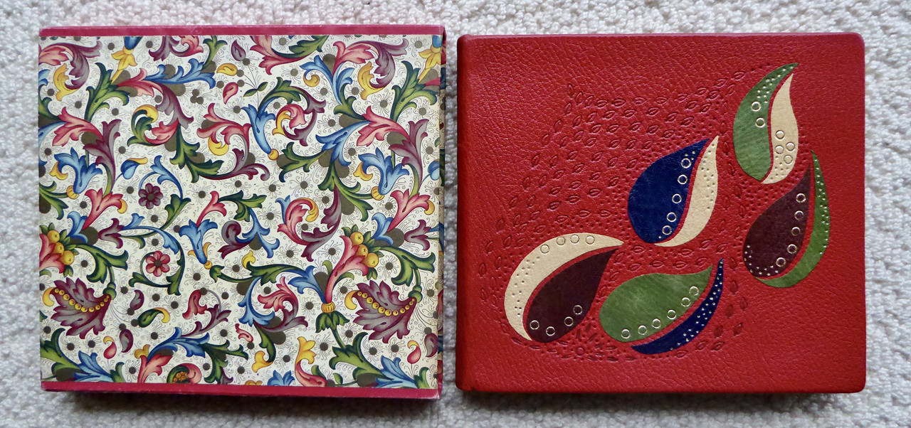
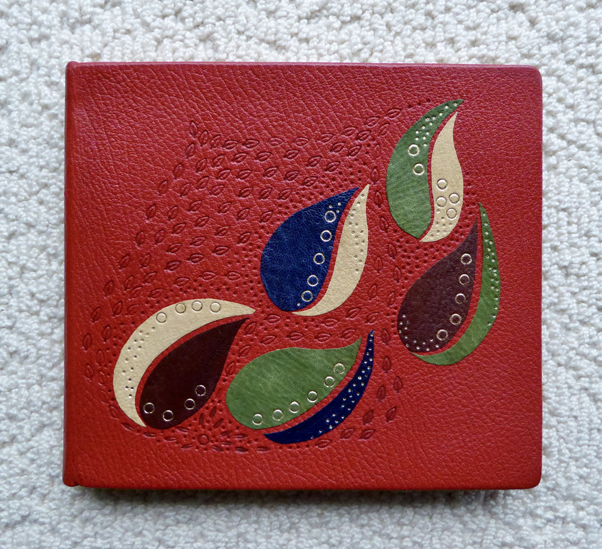
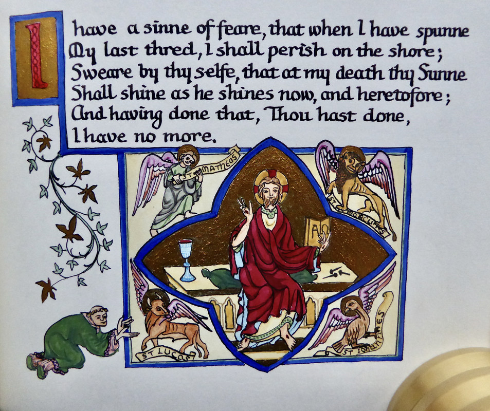
I recently acquired a 'unicorn' - a one-of-a-kind book which is a unique (only) copy. It is 'The Holy Sonnets' by John Donne created by one woman for a very close friend. This multi-talented individual wrote the text in calligraphy, illuminated and illustrated each page in gold and colors, then bound it in full red morocco with color onlays on the front cover.
158chase.donaldson
>152 GardenOfForkingPaths:
I mistakenly purchased 2 of the Ashendene Thucydides forgetting about my initial purchase. Poor form for sure and probably going to try to offload one of them soon. Not the first time I've bought a duplicate by mistake either. I need to keep track of my library better....
I mistakenly purchased 2 of the Ashendene Thucydides forgetting about my initial purchase. Poor form for sure and probably going to try to offload one of them soon. Not the first time I've bought a duplicate by mistake either. I need to keep track of my library better....
159wcarter
>157 dlphcoracl:
Extraordinarily beautiful!
Extraordinarily beautiful!
160Lukas1990
>157 dlphcoracl: Janet looks like a talented caligrapher and book binder!
161GardenOfForkingPaths
>155 ChestnutPress: Indeed!
>156 Sport1963: Thank you. No regrets at all.
>158 chase.donaldson: You must be blessed with more shelf space than me to accommodate 2 copies of this huge book! I had to squeeze in another shelf above some other books, so I could store it horizontally.
>157 dlphcoracl: Thats lovely. Congratulations. That was quite the gift for Elsie! What size is the book?
>156 Sport1963: Thank you. No regrets at all.
>158 chase.donaldson: You must be blessed with more shelf space than me to accommodate 2 copies of this huge book! I had to squeeze in another shelf above some other books, so I could store it horizontally.
>157 dlphcoracl: Thats lovely. Congratulations. That was quite the gift for Elsie! What size is the book?
163gmacaree
>158 chase.donaldson: Two Ashendene Thucydides! If I wasn't moving and about to spend a king's ransom in deposit, doubled rent, new furniture etc. I'd have been more than happy to be the offloadee.
164A.Nobody
>163 gmacaree: I'll hold off until I can afford this one. :)
166NathanOv
I don't typically post in this thread, but have to make an exception for Nawakum's latest masterpiece, The Poet:

The prospectus really underplayed the amount of art and illustration, as there are copious one and two color page decorations throughout in addition to the illustrations:


The German text in particular is essentially presented as a bound-in chapbook, in a slightly smaller trim size with it's own absolutely stunning botanical "covers."


And of course, the typography and printing are as exceptional as always, as is the additional content in support of the main text:


The prospectus really underplayed the amount of art and illustration, as there are copious one and two color page decorations throughout in addition to the illustrations:


The German text in particular is essentially presented as a bound-in chapbook, in a slightly smaller trim size with it's own absolutely stunning botanical "covers."


And of course, the typography and printing are as exceptional as always, as is the additional content in support of the main text:


167Lukas1990
>166 NathanOv: Very impressive. Thanks for sharing.
168Nightcrawl
>166 NathanOv: That’s gorgeous! Thanks for sharing.
169Shadekeep
>166 NathanOv: Nawakum truly does beautiful work. One day, says I, but not today, says the bank. ^_^
170Lukas1990
Eros and Psyche, a Poem in XII Measures.
(Gregynog Press, 1935). One of 300copies printed in black and red on Batchelor handmade paper, 24 wood-engravings by Loyd Haberly and John Beedham from original designs by Sir Edward Burne-Jones, large initial letters designed by Graily Hewitt and printed in green. For me it's like a Gregynog and Ashendene book bound in one with those Hewitt initial letters.
(Gregynog Press, 1935). One of 300copies printed in black and red on Batchelor handmade paper, 24 wood-engravings by Loyd Haberly and John Beedham from original designs by Sir Edward Burne-Jones, large initial letters designed by Graily Hewitt and printed in green. For me it's like a Gregynog and Ashendene book bound in one with those Hewitt initial letters.
171ChestnutPress
>170 Lukas1990: A beautiful acquisition! Bravo!!
172Shadekeep
>170 Lukas1990: Had to look up photos, it sounds lovely. And it certainly is! Kudos on the find.
173mr.philistine
>157 dlphcoracl: Wow! I'm afraid to ask but how much did you pay? If not a specific no., a ballpark figure will satisfy my curiosity. :)
174dlphcoracl
>173 mr.philistine:
$600. (including the 25% Buyer's Premium).
This was a recent purchase in a timed online Forum Auction (London) and the eventual price surprised me - I anticipated bidding much more. The recent prices at auction have confounded me, both positively and negatively.
$600. (including the 25% Buyer's Premium).
This was a recent purchase in a timed online Forum Auction (London) and the eventual price surprised me - I anticipated bidding much more. The recent prices at auction have confounded me, both positively and negatively.
175mr.philistine
>174 dlphcoracl: Your 'unicorn' is the most beautiful acquisition thus far in this thread. And your impeccable choices continue to enrich us!
176dotman
>157 dlphcoracl: completely exceptional. Doesn't belong here in the 21st century. Enjoy it!
178LBShoreBook
>166 NathanOv: I plumped for a Deluxe Bonsai and TBH this is far more interesting to me. Very well done.
179Lukas1990
Pseudodoxia Epidemica: Of Vnicornes Hornes
Browne, Sir Thomas (Cheloniidae Press, 1984).
Illustrated with sixteen wood engravings by Alan James Robinson, and finely printed by Harold P. McGrath (in my opinion probably the finest printer of XXth century in US).
One of 15 artist proof copies from a total edition of 225 copies. The book is bound in full white vellum by Gray Parrot, gilt title on the spine, signed and numbered by Robinson, printed on Whatman paper. Accompanied by a quarter vellum portfolio, with a unicorn horn in gilt on the spine; beige canvas cloth boards containing the proofs and drawings as follows: complete suite of prints, signed and numbered; frontispiece with three trial proofs and a final rendering, signed; 1 rejected print; signed; 28 work proofs, signed and labeled 'wp'; original drawing, signed. Everything is housed in a finely crafted clamshell case, vellum spine, gilt title, canvas sides.
Browne, Sir Thomas (Cheloniidae Press, 1984).
Illustrated with sixteen wood engravings by Alan James Robinson, and finely printed by Harold P. McGrath (in my opinion probably the finest printer of XXth century in US).
One of 15 artist proof copies from a total edition of 225 copies. The book is bound in full white vellum by Gray Parrot, gilt title on the spine, signed and numbered by Robinson, printed on Whatman paper. Accompanied by a quarter vellum portfolio, with a unicorn horn in gilt on the spine; beige canvas cloth boards containing the proofs and drawings as follows: complete suite of prints, signed and numbered; frontispiece with three trial proofs and a final rendering, signed; 1 rejected print; signed; 28 work proofs, signed and labeled 'wp'; original drawing, signed. Everything is housed in a finely crafted clamshell case, vellum spine, gilt title, canvas sides.
180BuzzBuzzard
From "John Henry Nash Printer (Legend and Fact in the Development of a Fine Press Intimately Reviewed by Joseph Fauntleroy)" The Westgate Press, 1948:
Many people were of the opinion that Mr. Nash set all the type for all of his books. It was a legend that it was profitable to perpetuate. During my years with him this was true of only one book of considerable size, "The Life of Dante," 1922. It is a book of fifty-three pages of text, 12.75x9 inches , set in 15-point Inkunabulen type, with the paragraphs in each chapter run in and marked by the denoting character. The chapter numbers are Caxton initials used as Roman numerals & printed in orange.


Many people were of the opinion that Mr. Nash set all the type for all of his books. It was a legend that it was profitable to perpetuate. During my years with him this was true of only one book of considerable size, "The Life of Dante," 1922. It is a book of fifty-three pages of text, 12.75x9 inches , set in 15-point Inkunabulen type, with the paragraphs in each chapter run in and marked by the denoting character. The chapter numbers are Caxton initials used as Roman numerals & printed in orange.


181SuttonHooPress
>180 BuzzBuzzard: Outstanding!
182PBB
>180 BuzzBuzzard: This looks great, I've never seen this before. Is that a custom watermark saying John Henry Nash? If you other Nash books, how does this compare to them?
183Shadekeep
>180 BuzzBuzzard: Beautiful work! I have to say, I like that lowercase "h" an awful lot.
184DenimDan
>180 BuzzBuzzard: Pretty awesome ligatures! And that display 'O' is fantastic. Much respect to Nash for handsetting that many lines of text in Inkunabulen (and doing a masterful job of it, from the pictures). Congrats on this one!
185BuzzBuzzard
>182 PBB: The paper is watermarked three different ways: John Henry Nash, picture of a unicorn, and initials that I can't quite figure out. Although it is not called out in the actual book, I suspect it is from Van Gelder Zonen of Holland. Mr. Nash selected it while touring Europe in 1921, and one of the first consignments was for the 1921 Quattrocentisteria, that he printed for the Grolier club. For this book Joseph Fauntleroy wrote:
It is printed in black, with opening initial and the colophon in red, Cloister Oldstyle type being used, 16-point for the text & 18-point Italic for the Proem. This book was printed on a platen press of the Colts Armory pattern. The paper is Van Gelder Zonen sheet, 17x22 inches, with deckle on four sides. Because of its limpness and rough edges, the pressman spoiled hundreds of sheet sin feeding them into the press.
>182 PBB: These are slim books on excellent paper, top notch typography and printing. I have some of Nash books he printed for the Limited Editions Club, and they are nice but different quality.


It is printed in black, with opening initial and the colophon in red, Cloister Oldstyle type being used, 16-point for the text & 18-point Italic for the Proem. This book was printed on a platen press of the Colts Armory pattern. The paper is Van Gelder Zonen sheet, 17x22 inches, with deckle on four sides. Because of its limpness and rough edges, the pressman spoiled hundreds of sheet sin feeding them into the press.
>182 PBB: These are slim books on excellent paper, top notch typography and printing. I have some of Nash books he printed for the Limited Editions Club, and they are nice but different quality.


186GardenOfForkingPaths
>185 BuzzBuzzard: I have the Nash Life of Dante, and I believe the watermarked initials are V, G, and Z: "Van Gelder Zonen", just as you suspected. On some of their papers the initials are stacked on top of each other, other times - as here - in a line. It's a lovely book. Thank you for highlighting it. Nash's printing on that paper is an excellent combination.
I first got into collecting JHN's books via the ones he did for the LEC, and then I became curious about what else he had done apart from the very famous books like his Divine Comedy. As I have explored, I have found that a fair number of titles are of quite niche interest, but there are some gems out there like the Boccaccio. Another that I really like is the 1923 Silverado Squatters for Scribner's (380 copies), which uses the same (or similar) Van Gelder paper.
Of all the fine press books on my shelves, I would say Nash has to be right near the very top for the crispness of the printing with a beautifully consistent and noticeable impression. A very fine printer, indeed!
Quattrocentisteria looks great. I'll have to keep an eye out for that one!
I first got into collecting JHN's books via the ones he did for the LEC, and then I became curious about what else he had done apart from the very famous books like his Divine Comedy. As I have explored, I have found that a fair number of titles are of quite niche interest, but there are some gems out there like the Boccaccio. Another that I really like is the 1923 Silverado Squatters for Scribner's (380 copies), which uses the same (or similar) Van Gelder paper.
Of all the fine press books on my shelves, I would say Nash has to be right near the very top for the crispness of the printing with a beautifully consistent and noticeable impression. A very fine printer, indeed!
Quattrocentisteria looks great. I'll have to keep an eye out for that one!
187SuttonHooPress
>185 BuzzBuzzard: So Beautiful. . . . He does not seem waste any coppers letter-spacing Capitals! I can relate to being thrown off on the press by the deckle edges. Great work!
188ChestnutPress
>186 GardenOfForkingPaths: can you post a pic of the unicorn watermark please? I’d like to confirm it to be a custom making of Van Gelder’s Eenhoorn mould-made paper.
EDIT: This was supposed to be a reply to 185, not 186!
EDIT: This was supposed to be a reply to 185, not 186!

190Shadekeep
>189 BuzzBuzzard: Looks a bit caprine, no? And it has toes. God bless the medieval animal aesthetic. ^_^
191BuzzBuzzard
>186 GardenOfForkingPaths: I believe you are correct about the "VGZ" watermark.
>190 Shadekeep: Not sure what to call this horned creature.

>190 Shadekeep: Not sure what to call this horned creature.

192Shadekeep
>191 BuzzBuzzard: I would say unicorn suffices, since it appears to be just as fanciful a being. Reminds one of those medieval depictions that were based on third-hand descriptions from travellers to distant lands.
193ChestnutPress
>189 BuzzBuzzard: Cheers! That sure is the Van Gelder Eenhoorn watermark. Such a lovely paper!
194ChestnutPress
>191 BuzzBuzzard: The horned creature is a badly drawn unicorn!!
195sanvito
On topic, I received my first Elston press work and the pages had this surprising watermark:
196ChestnutPress
>195 sanvito: That’s superb!!
197DenimDan
DeWayne Rail. “Going Home Again.” (Perishable Press, 1971). Printed in handset Palatino and Open Kapital by Walter Hamady on his own handmade paper, Shadwell. With a title-page illustration with an image from a sketchbook by surrealist painter John Wilde. Pretty nice book for $25


One of Hamady’s trademark moves in a lot of the late-60s/early-70s books was the copyright notice printed in a very light ink:


Hamady kept spacing to a minimum, yet it somehow remains entirely readable:


Finally, Hamady would use the colophon of his books to explain any number of facts pertaining to the printing of the book, family/press milestones, or some facet of his philosophy:


One of Hamady’s trademark moves in a lot of the late-60s/early-70s books was the copyright notice printed in a very light ink:


Hamady kept spacing to a minimum, yet it somehow remains entirely readable:


Finally, Hamady would use the colophon of his books to explain any number of facts pertaining to the printing of the book, family/press milestones, or some facet of his philosophy:

198ChestnutPress
>197 DenimDan: That’s an impeccable looking volume!!
200DenimDan
>199 LT79: Hamady would keep body text spacing to a minimum. His standard spacing for text was 5-Em, which is quite a bit smaller than the standard 3-Em. He taught his typography students the same. Lots more room to play around with display types on a title page. Later in his career, he had a tendency to letterspace and justify several of his title pages, to great effect.
(Edited to add): I realize I didn't answer the "why" question. I don't know that he was ever on record the reasons for his tight spacing, but I do remember his attributing the longevity of his type (he used Palatino for the text of about 60 books) to the tight packing. I will say that while his hairline spacing of "ch" and "ck" looks a bit awkward in isolation, across an entire volume, it isn't distracting.
>198 ChestnutPress: Thanks! Even though it's not one of his best works from the period, I couldn't pass it up. Especially with the interesting layout of the title-page spread and the Wilde illustration.
(Edited to add): I realize I didn't answer the "why" question. I don't know that he was ever on record the reasons for his tight spacing, but I do remember his attributing the longevity of his type (he used Palatino for the text of about 60 books) to the tight packing. I will say that while his hairline spacing of "ch" and "ck" looks a bit awkward in isolation, across an entire volume, it isn't distracting.
>198 ChestnutPress: Thanks! Even though it's not one of his best works from the period, I couldn't pass it up. Especially with the interesting layout of the title-page spread and the Wilde illustration.
201SuttonHooPress
I really dig that 'Shaving' poem.
203LBShoreBook
I just acquired a special edition of Gwasg Gregynog's Wrenching Times, reviewed by fp13 here: https://www.librarything.com/topic/317768
It is an extraordinary book. My backup plan if I could not get the full leather at a price that worked for me was a standard edition with quarter-leather binding. There are several in the market but many have discoloration on the paper boards. The edition linkied below is almost perfect condition and is cheaper than other examples of the standard edition on the market (the seller sent me photos of the cover and, aside from a small mark on the cover, the condition is fantastic). Sharing in case anyone might be interested in obtaining a great copy and a really good price.
https://www.reedcontemporarybooks.com/wrenching-times
It is an extraordinary book. My backup plan if I could not get the full leather at a price that worked for me was a standard edition with quarter-leather binding. There are several in the market but many have discoloration on the paper boards. The edition linkied below is almost perfect condition and is cheaper than other examples of the standard edition on the market (the seller sent me photos of the cover and, aside from a small mark on the cover, the condition is fantastic). Sharing in case anyone might be interested in obtaining a great copy and a really good price.
https://www.reedcontemporarybooks.com/wrenching-times
204Glacierman
A few things landed on my doorstep today:
The Book of Ebenezer LePage Extraordinary Editions. Nice book, not letterpress; looking forward to reading it. However, I do find the seemingly endless wordfall on the spine to be rather annoying, something of a typographical cacophony.
Alastair Johnson. Horror Vacuui. Jungle Garden Press
James L. Weil: Master of Fine Printing and Poetry. Grolier Club
The Book of Ebenezer LePage Extraordinary Editions. Nice book, not letterpress; looking forward to reading it. However, I do find the seemingly endless wordfall on the spine to be rather annoying, something of a typographical cacophony.
Alastair Johnson. Horror Vacuui. Jungle Garden Press
James L. Weil: Master of Fine Printing and Poetry. Grolier Club
205BillWoodbridge
>203 LBShoreBook: Fantastic, congratulations!
You're quite right about the 1/4 leather standards. The pale grey/blue paper-covered boards are vulnerable to fading to very pale and then very very pale. And it's a tall book, so more often than not the fading occurs in light-exposed areas at the top, so you get bands or patches of different colour which is more unsightly still.
You're quite right about the 1/4 leather standards. The pale grey/blue paper-covered boards are vulnerable to fading to very pale and then very very pale. And it's a tall book, so more often than not the fading occurs in light-exposed areas at the top, so you get bands or patches of different colour which is more unsightly still.
207Shadekeep
>204 Glacierman: While I do find the spine of Le Page a bit busy visually (and certainly not indicative to the casual viewer what book it is), I feel like the design choice is one intended to suck you into the book. It's the opening line of the novel, so technically you've begun reading it just by glancing at the spine. If those words resonate then you're pulled in for more. That's my take anyway, that there's another intent behind the design beyond just how it looks on the shelf.
208Glacierman
>207 Shadekeep: I see your point, but it still annoys me!
209Shadekeep
>208 Glacierman: Ha ha, fair dues, mate!
210DMulvee
A couple of stand outs from recent arrivals; 'from the Chronicles of Froissart' one of the seven specials from the Tern Press, and 'The Battle of the Frogs and Mice' one of the thirty specials from the Libanus press
211dlphcoracl
Received 'Fables for a Despot' from the Old School Press. It features:
1. Superb letterpress printing with a nice, distinct 'bite'.
2. Zapf's Hunt Roman type - a bold, crystal clear type that is a pleasure to read.
3. Ludlow binding with attractive paste paper over boards.
4. Tasteful ornaments in red ink designed by Bruce Rogers.
5. Best of all, printed on Finale Royal paper, the last paper made by J. Barcham Green (fabulous!).
All of this for 95 GBP. It has a small limitation of only 50 copies and purchase is strongly recommended before it goes OOP.
https://www.theoldschoolpress.com/bookpages/FFAD.htm
1. Superb letterpress printing with a nice, distinct 'bite'.
2. Zapf's Hunt Roman type - a bold, crystal clear type that is a pleasure to read.
3. Ludlow binding with attractive paste paper over boards.
4. Tasteful ornaments in red ink designed by Bruce Rogers.
5. Best of all, printed on Finale Royal paper, the last paper made by J. Barcham Green (fabulous!).
All of this for 95 GBP. It has a small limitation of only 50 copies and purchase is strongly recommended before it goes OOP.
https://www.theoldschoolpress.com/bookpages/FFAD.htm
212Shadekeep
>210 DMulvee: What fine acquisitions! Tern Press does such gorgeous medieval-inflected work. Wasn't aware of the Libanus edition of that title, adding that to my pursuit list.
214dlphcoracl
>213 LT79:
Cancel or reconsider something else. This one is not to be missed.
Added bonus: It is classical, yet timely reading - a selection of Aesop's fables which reflect on today's growing trend toward authoritarian regimes and right-wing political parties.
Cancel or reconsider something else. This one is not to be missed.
Added bonus: It is classical, yet timely reading - a selection of Aesop's fables which reflect on today's growing trend toward authoritarian regimes and right-wing political parties.
215LBShoreBook
>214 dlphcoracl: you got me off the sideline for this one.
216DenimDan
>211 dlphcoracl: If memory serves, Zapf had originally conceived of Hunt Roman as a display face. But it reads so well at smaller sizes that it's hard to imagine that! I really like what the Old School Press does, from their wonderful series on the Oxford University Press (and the Fell types/John Fell), to these small, limited editions using fine materials. Really impressive breadth for a small operation.
217dlphcoracl
>216 DenimDan:
The Zapf Hunt Roman typeface may have been originally designed and used as a display face but used a a primary typeface for text it is glorious. It bears more than a passing resemblance to the Golden Cockerel type that Eric Gill designed, cut and introduced in the GCP edition of The Four Gospels. See photos below.
Fables for a Despot
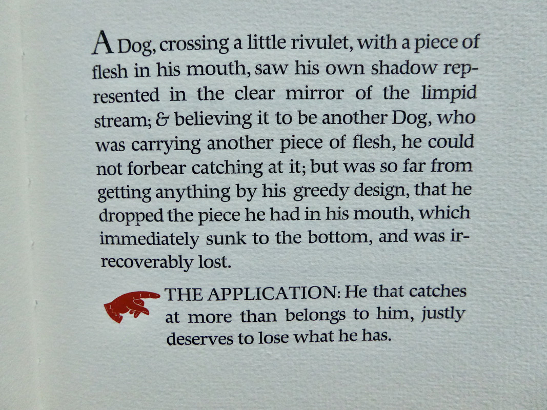
Golden Cockerel Press - The Four Gospels
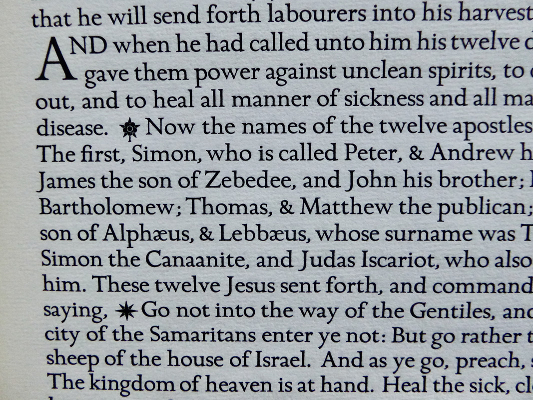
The Zapf Hunt Roman typeface may have been originally designed and used as a display face but used a a primary typeface for text it is glorious. It bears more than a passing resemblance to the Golden Cockerel type that Eric Gill designed, cut and introduced in the GCP edition of The Four Gospels. See photos below.
Fables for a Despot
Golden Cockerel Press - The Four Gospels
218kermaier
>211 dlphcoracl: I can always count on the Oracle for enablement! This will be my first from the Old School Press.
219Pendrainllwyn
>214 dlphcoracl: a selection of Aesop's fables which reflect on today's growing trend toward authoritarian regimes and right-wing political parties.
I hope we all have the humility to learn from Aesop's fables. It would be a mistake to think they only apply to the left or the right. I see learning in The Dog and his Reflection for all of us, me included.
I hope we all have the humility to learn from Aesop's fables. It would be a mistake to think they only apply to the left or the right. I see learning in The Dog and his Reflection for all of us, me included.
220SDB2012
>218 kermaier: Trust the Oracle. +) I have this book. It's great.
221kermaier
>220 SDB2012: I just received my copy, and it’s a delightful little volume. Love the bite of the printing on that paper!
222BuzzBuzzard
A couple of pictures from the 1937 Quattrocentisteria designed, decorated, & illuminated by Valenti Angelo. Printed by the Walpole Printing Office for the Golden Cross Press of New York. Limited to one hundred and seventy-five copies. Printed on C.P.M watermarked Fabriano Italy paper. Additional watermark of the house of Capuleti.


223ChestnutPress
>222 BuzzBuzzard: That’s a beauty!!!
224Lukas1990
My latest purchase is kind of an antique fine press book!
Athanasius Kircher’s Arca Noë (1675) and Turris Babel (1679) – first editions, bound as a single volume in a 1691 pigskin binding over wooden boards. Published in Amsterdam by Joannes Janssonius à Waesberge, these works explore the biblical Flood and Tower of Babel with Kircher’s signature blend of theology, science, and imagination. Lavishly illustrated with 25 copperplate engravings (some folded), 3 maps, and 152 woodcuts, including depictions of Noah’s Ark, the Seven Wonders, and detailed zoological illustrations.
Athanasius Kircher’s Arca Noë (1675) and Turris Babel (1679) – first editions, bound as a single volume in a 1691 pigskin binding over wooden boards. Published in Amsterdam by Joannes Janssonius à Waesberge, these works explore the biblical Flood and Tower of Babel with Kircher’s signature blend of theology, science, and imagination. Lavishly illustrated with 25 copperplate engravings (some folded), 3 maps, and 152 woodcuts, including depictions of Noah’s Ark, the Seven Wonders, and detailed zoological illustrations.
226jsg1976
>222 BuzzBuzzard: that’s lovely. Great purchase!
227Shadekeep
>222 BuzzBuzzard: That's sublime. Even the watermarks and pilcrows are lovely. Seeing a book like this takes me back to the times when both writing and bookmaking were patient, thoughtful art forms, resulting in something that was worth your time to read and consider.
228Shadekeep
Banner package day, as all the accumulated Old School Press stuff arrived. Mediocre photos below.
First up are the three latest releases, photographed together to give an idea of scale.
Plates for a Herbal, Twelve poems from the Manyoshu, Fables for a Despot

Plus three older books from the press that have been on my list a while.
Chesil Beach, On Books (with catalogue raisonné), A Long Story

Also arriving today was the the latest Conversation Tree Press Short Stop, Gibbet Hill. Shown here beside Fables for a Despot again for scale.

First up are the three latest releases, photographed together to give an idea of scale.
Plates for a Herbal, Twelve poems from the Manyoshu, Fables for a Despot

Plus three older books from the press that have been on my list a while.
Chesil Beach, On Books (with catalogue raisonné), A Long Story

Also arriving today was the the latest Conversation Tree Press Short Stop, Gibbet Hill. Shown here beside Fables for a Despot again for scale.

229GardenOfForkingPaths
>224 Lukas1990: I would love to see pictures of these. What I have seen online looks incredible.
>228 Shadekeep: Congratulations – that's a bumper haul! How do the botanical plates look in the flesh?
>228 Shadekeep: Congratulations – that's a bumper haul! How do the botanical plates look in the flesh?
230Dr.Fiddy
>228 Shadekeep: Wow! Looks like a great haul 😊
231Shadekeep
>229 GardenOfForkingPaths: The plates are superb. The details are wonderfully fresh and the printing expertly done. The paper chosen is a heavy stock that holds the images well. There is also a nice bite around the edge of each image where the metal plate has been impressed upon the paper. The richness of the illustrations is something that really needs to be seen in person, it doesn't carry over in photos or scans to the same degree.
I just noticed that my copy (#22) contains plates 1-5, which is quite nice. I'd be curious to hear what other kinds of distributions folks are getting.
I just noticed that my copy (#22) contains plates 1-5, which is quite nice. I'd be curious to hear what other kinds of distributions folks are getting.
232GardenOfForkingPaths
>231 Shadekeep: Wonderful. It looks a terrific publication, as you would expect from the Old School Press. Their standard of work always seems very high. Your photo really gives a sense of the scale, considering that Fables is a pretty normal sized fine press book!
233Shadekeep
>232 GardenOfForkingPaths: Aye, it's a big'un. In fact the tallest book on its shelf now, having surpassed Openbaring van Johannes by a centimeter or two. I'm weighing whether to have one of the prints framed or keep them all together in the case, though the anal-retentive in me strongly favors the latter.
234DMulvee
>231 Shadekeep: I have plates 1, 2, 10, 11, 12
ETA: I think that it is a wonderful production and the type of book that shines in a private press edition. It would have been one of my "25 books from the past 25 years".
ETA: I think that it is a wonderful production and the type of book that shines in a private press edition. It would have been one of my "25 books from the past 25 years".
235Shadekeep
>234 DMulvee: Interesting, a kind of "bookend" set. That's cool as well.
236TheTotalLibrarian
My copy of Plates for a Herbal is currently in the Marches. I'm guessing they mixed up the village with approximately the same name in mid-Wales for the one I live in West Wales! Postcodes people! Hopefully delivery will be made tomorrow.
"Sorry, your item went to Shrewsbury DO in error, so we re-routed it immediately. More information will be available as it travels through our network"
In other fine press news I've recently added to my collection:
A Pretty Mysterious Art (Fleece Press)
Printing Relief Illustrations. Kirkall to the Line Block (Plough Press).
"Sorry, your item went to Shrewsbury DO in error, so we re-routed it immediately. More information will be available as it travels through our network"
In other fine press news I've recently added to my collection:
A Pretty Mysterious Art (Fleece Press)
Printing Relief Illustrations. Kirkall to the Line Block (Plough Press).
237Shadekeep
>236 TheTotalLibrarian: Good luck, hope it arrives fine. And A Pretty Mysterious Art is a nice addition!
238DenimDan
A complete run of the book arts journal "Bookways," published by W. Thomas Taylor in Austin, Texas. Relatively short-lived, 14 issues in 12 volumes. Haven't done a deep dive into these yet, but at least some of the first issues were printed in Monotype Bembo. Seems like this was one of several such publications that came about in the wake of periodicals like Fine Print and Matrix.
239ChestnutPress
>224 Lukas1990: oooooooo nice!
240ChestnutPress
>228 Shadekeep: Choice purchase selection!
241edgeworn
>231 Shadekeep: plates 6,7,8,9 and 10 here. Perhaps a system is becoming visible.
242pythagoras
>241 edgeworn: I too have plates 6, 7, 8, 9 and 10.
243SuttonHooPress
>238 DenimDan: I have a run of these Bookways journals. I would let go of them if someone is interested.
244dotman
>222 BuzzBuzzard: Magnificently austere. The devil truly being in the details there with Angelo - the whites on that illum just seriously "pop"
245EdmundRodriguez
Just received The Mystique of Vellum published by Anne & David Bromer in 1984. I don't own any books printed on vellum, so this was largely a curiosity-driven purchase. It includes a page printed on vellum which is fun:

Rather ironically the thing that struck me first about the edition was how nice the paper was!

Rather ironically the thing that struck me first about the edition was how nice the paper was!
246EdmundRodriguez
As a big fan of Nabokov, I was excited to find this nice little book from Spectatorpers Aartswoud. Printed on zerkall by Bram de Does in 1987. It features a few early works (two short essays and a poem published in a magazine under various pseudonyms) and an introduction from his son.


247TheTotalLibrarian
>231 Shadekeep: After a slightly circuitous jaunt around England and Wales, Plates for a Herbal arrived. It's just fantastic. I got plates 6, 7, 8, 9, and 10.
248SuttonHooPress
>246 EdmundRodriguez: Those pages are really beautiful!
249Shadekeep
>241 edgeworn: >242 pythagoras: >247 TheTotalLibrarian: Interesting that all three of you got the same "second five" batch. One would have to compare the limitation numbers as well, but it seems like they perhaps did a run of first fives, then second fives, then gathered up the "odd lot" distributions which included the last two. Just a guess, as I say it's speculation without the individual numbers. (And glad to hear your copy made it to you at last @TheTotalLibrarian).
>245 EdmundRodriguez: >246 EdmundRodriguez: Both of those are lovely acquisitions! Am not familiar with Spectatorpers Aartswoud, sounds like a Dutch press. Will check Drukwerk in de Marge and see if they have a listing.
>245 EdmundRodriguez: >246 EdmundRodriguez: Both of those are lovely acquisitions! Am not familiar with Spectatorpers Aartswoud, sounds like a Dutch press. Will check Drukwerk in de Marge and see if they have a listing.
250ChestnutPress
>245 EdmundRodriguez: That’s a beautiful volume that I am pleased to also own. Great purchase!
251ChestnutPress
>246 EdmundRodriguez: Yet another item we also share. Spectatorpers is one of my favourite presses. Bram de Does was a masterful typographer and printer.
252ChestnutPress
>249 Shadekeep: It was indeed a Dutch Press. You are seriously missing out by not having any of their work on your shelves as Bram de Does was an absolute master typographer and printer. Do yourself a huge favour and pick up a couple of pieces. Two often easily and cheaply available books by him are ‘Romanée en Trinité
https://www.abebooks.co.uk/Roman%C3%A9e-Trinit%C3%A9-historisch-origineel-system...
and Orlando Furioso
https://www.abebooks.co.uk/book-search/kw/orlando-furioso-stichting/
Both are impeccable jewels!
Additionally, here is an article Sebastian Carter wrote on the press:
https://fpba.com/parenthesis/selected-articles/p14_the_spectatorpers_the_press_o...
https://www.abebooks.co.uk/Roman%C3%A9e-Trinit%C3%A9-historisch-origineel-system...
and Orlando Furioso
https://www.abebooks.co.uk/book-search/kw/orlando-furioso-stichting/
Both are impeccable jewels!
Additionally, here is an article Sebastian Carter wrote on the press:
https://fpba.com/parenthesis/selected-articles/p14_the_spectatorpers_the_press_o...
253Lukas1990
>252 ChestnutPress: Thanks! All what is needed in such a comment to taste the press.
254ChestnutPress
>253 Lukas1990: Delve into the world of Bram and enjoy!!
255kermaier
>210 DMulvee: Well, this is a bit of a disappointment: I just received a (standard) copy of the Libanus Press Frogs and Mice in very nice condition, but it's neither numbered nor hand-colored! The seller's description didn't say anything about that either way, but one would assume it's not an out-of-sequence/unfinished copy, right?
256wcarter
>255 kermaier:
Very disappointing! Can you return book for a refund?
My copy is certainly coloured. See https://www.librarything.com/topic/319790#
Very disappointing! Can you return book for a refund?
My copy is certainly coloured. See https://www.librarything.com/topic/319790#
257kermaier
>256 wcarter: I can probably return it, but it hurts to spend for round-trip shipping across the pond. :-(
258DMulvee
>255 kermaier: I'm sorry but I think that it is meant to be hand coloured if I read the colophon page
259BillWoodbridge
>257 kermaier: Apologies, as I’m probably teaching you to suck eggs, but if a book is misdescribed and you therefore wish to return it, then any trade / professional seller should pay for both outward and return shipping in addition to a full refund. If hand colouring was clearly ‘called for’ in the colophon (I don’t know the book personally) and your copy doesn’t have it, not mentioning that fact in the book’s description would fall well into the category of misdescription.
260kermaier
>258 DMulvee:
Yes, the colophon indicates hand-coloring; and the fact that this copy is not numbered leads me to surmise that it was a sample, a reject or some otherwise unfinished copy.
>259 BillWoodbridge:
I think you're right. The description just read:
Libanus Press, 1988. Folding text. Book is in nearly fine condition with only slightest signs of wear and/or age. . Hardback. nrFine/No DW.
It didn't occur to me to inquire as to whether there was something non-standard about it. I wouldn't expect anything underhanded on the part of the bookseller, probably just inattention when listing the book. Hopefully they'll be honorable about it.
Yes, the colophon indicates hand-coloring; and the fact that this copy is not numbered leads me to surmise that it was a sample, a reject or some otherwise unfinished copy.
>259 BillWoodbridge:
I think you're right. The description just read:
Libanus Press, 1988. Folding text. Book is in nearly fine condition with only slightest signs of wear and/or age. . Hardback. nrFine/No DW.
It didn't occur to me to inquire as to whether there was something non-standard about it. I wouldn't expect anything underhanded on the part of the bookseller, probably just inattention when listing the book. Hopefully they'll be honorable about it.
261Lukas1990
Two bargains for a total price of 150 USD. Very excited about My Colorful Career. It features a lot of Schanilec's work and was printed by him at his Midnight Paper Sales.
My Colorful Career (Bird & Bull Press, 1996). Gaylord Schanilec's recounting of his early years as a woodcut artist and printer illustrated with 20 wood engravings within the text that illustrate Schanilec's work.
Mr Gladstone's Washi. A survey of Reports on the Manufacture of Paper in Japan. The Parkes Report of 1871 (Bird & Bull Press, 1984). The title refers to the repeated efforts by Prime Minister W.E. Gladstone in the 1860s to obtain information on Japanese papermaking. Under the guidance of Sir Harry Parkes, England's envoy during the period of the transfer of power from the shoguns to Emperor Meiji, three consular reports and a varied collection of handmade Japanese paper were assembled. These were shipped to England in 1871. This book describes these efforts, provides a facsimile of the Parkes Report, and a facsimile of the Kamisuki Chohoki woodcut illustrations. The book is accompanied by a separate portfolio of a set of color prints
My Colorful Career (Bird & Bull Press, 1996). Gaylord Schanilec's recounting of his early years as a woodcut artist and printer illustrated with 20 wood engravings within the text that illustrate Schanilec's work.
Mr Gladstone's Washi. A survey of Reports on the Manufacture of Paper in Japan. The Parkes Report of 1871 (Bird & Bull Press, 1984). The title refers to the repeated efforts by Prime Minister W.E. Gladstone in the 1860s to obtain information on Japanese papermaking. Under the guidance of Sir Harry Parkes, England's envoy during the period of the transfer of power from the shoguns to Emperor Meiji, three consular reports and a varied collection of handmade Japanese paper were assembled. These were shipped to England in 1871. This book describes these efforts, provides a facsimile of the Parkes Report, and a facsimile of the Kamisuki Chohoki woodcut illustrations. The book is accompanied by a separate portfolio of a set of color prints
262BuzzBuzzard
Another work under the direction of John Henry Nash at the University of Oregon. This one is a class project printed on lovely Van Gelder Eenhoorn paper. Not sure what the type is. I suspect it is one of those that you either like or intensely dislike. Surely it is interesting and for a short work like this it kind of works.


264Glacierman
>262 BuzzBuzzard: This is a good example of allusive typography in that it seeks to emulate or allude to the works printed by Caxton himself. In that, it succeeds marvelous well; although many today will find the spiky type used difficult to read, it does look very much like Caxton's own work:

As far as the type used, it could be Caxton Black, but I'm no expert.
A revival of the type used by William Caxton around 1490. Issued in c. 1878 by the Johnson Type Foundry. Also cast as Altdeutsch (Bauer & Co, before 1898, later by Berthold), Angelsächsisch (AGfS), Caxton (Brendler, Flinsch, Stevens), Caxton Type (Krebs, before 1907), Gotico biblico (Augusta, before 1914), Old Text (Farmer, before 1895), Renaissance Schrift Serie 6 (Enschedé, before 1902). (Reichardt) It is not clear at which foundry the typeface originated. Harrild & Sons had a wood type version. (Letterform Archive)

As far as the type used, it could be Caxton Black, but I'm no expert.
A revival of the type used by William Caxton around 1490. Issued in c. 1878 by the Johnson Type Foundry. Also cast as Altdeutsch (Bauer & Co, before 1898, later by Berthold), Angelsächsisch (AGfS), Caxton (Brendler, Flinsch, Stevens), Caxton Type (Krebs, before 1907), Gotico biblico (Augusta, before 1914), Old Text (Farmer, before 1895), Renaissance Schrift Serie 6 (Enschedé, before 1902). (Reichardt) It is not clear at which foundry the typeface originated. Harrild & Sons had a wood type version. (Letterform Archive)
265Lukas1990
Das Blumenbuch (Mainzer Presse for Insel, 1929). With 250 original woodcut plates by Fritz Kredel after Rudolf Koch, all handcolored. One of 1000 copies. Splendid and accurate representations of local herbs and flowers, arranged according to the seasons or to their habitat. The book is included in the Grolier Club's Century for Century list. Mine was rebound in wooden boards and nice spine. Original consists of 3 volumes.
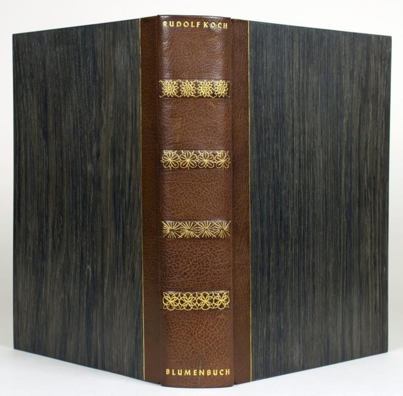
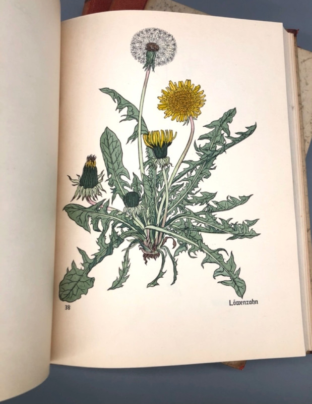
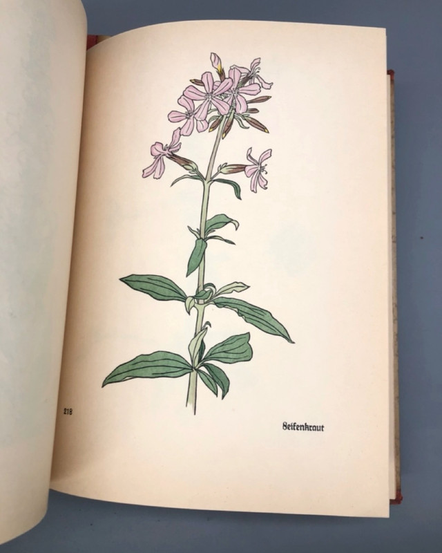
266ChestnutPress
>265 Lukas1990: That’s a beauty!
267Shadekeep
>265 Lukas1990: Brilliant! Excellent renderings, I do love a nice herbarium.
268TheTotalLibrarian
Francis Bacon, Of Gardens, by The Fleece Press arrived today. The paper, Velin Arches Blanc, is very pleasing to the hand.
269Shadekeep
>268 TheTotalLibrarian: Congrats, that is a lovely book.
270ensuen
My Abe want for “Harvesting Colour: The Year in a Marbler's workshop” by Incline Press finally hit a couple days ago. Really loving the book in person: something of a mix of marbled paper samples, and some biographical snippets about Ann Muir and their workshop. There’s a double marble (I think) example in there too which looks absolutely sublime.
272Lukas1990
>271 DMulvee: Congratulations! Must be a good one!
274Shadekeep
>271 DMulvee: The online photos of that are spectacular, I suspect it's even nicer in person. Kudos!
275DMulvee
>272 Lukas1990: >273 GardenOfForkingPaths: >274 Shadekeep: Thank you! It hadn’t been on my radar, but when I went to the Oxford book fair at the start of May, I also popped in to Blackwell’s and looked at their books. They had a copy (though the cover of that particular version was scratched), however after spending time with it, it moved towards the top of my wanted list.
276BuzzBuzzard
Sharing another book printed by John henry Nash. It is watermarked with "VGZ", "John Henry Nash", and bow and arrow. Does anyone know anything about this paper? It appears to be somewhat thicker and smoother than Van Gelder Eenhoorn paper. Very nice paper! The type is a recutting of William Bulmer's done by Morris Fuller Benton. The printing is not in the usual dense black color I have seen in other Nash books. I wonder if it is on purpose to match the grey of the initial caps.


277GardenOfForkingPaths
Recently arrived: The Cresset Press The Pilgrim's Progress, 2 volumes, printed at The Shakespeare Head Press, 1928. 195 copies on Batchelor's Kelmscott handmade paper. Engravings by Blair Hughes Stanton and Gertrude Hermes.
Before receiving this, I felt a little unsure about the layout with all the text enclosed in boxes, but it feels appropriate. The engravings are wonderful and quite strange. The paper is lovely, and the printing is magnificent. All in all, pretty epic. Pics below!
For anyone not familiar with this edition, and there's more info in dlphcoracl's Covid Eye Candy thread:
https://www.librarything.com/topic/317959#7100076
and on booksandvines:
https://booksandvines.com/2012/10/09/the-pilgrims-progress-john-bunyan-the-cress...
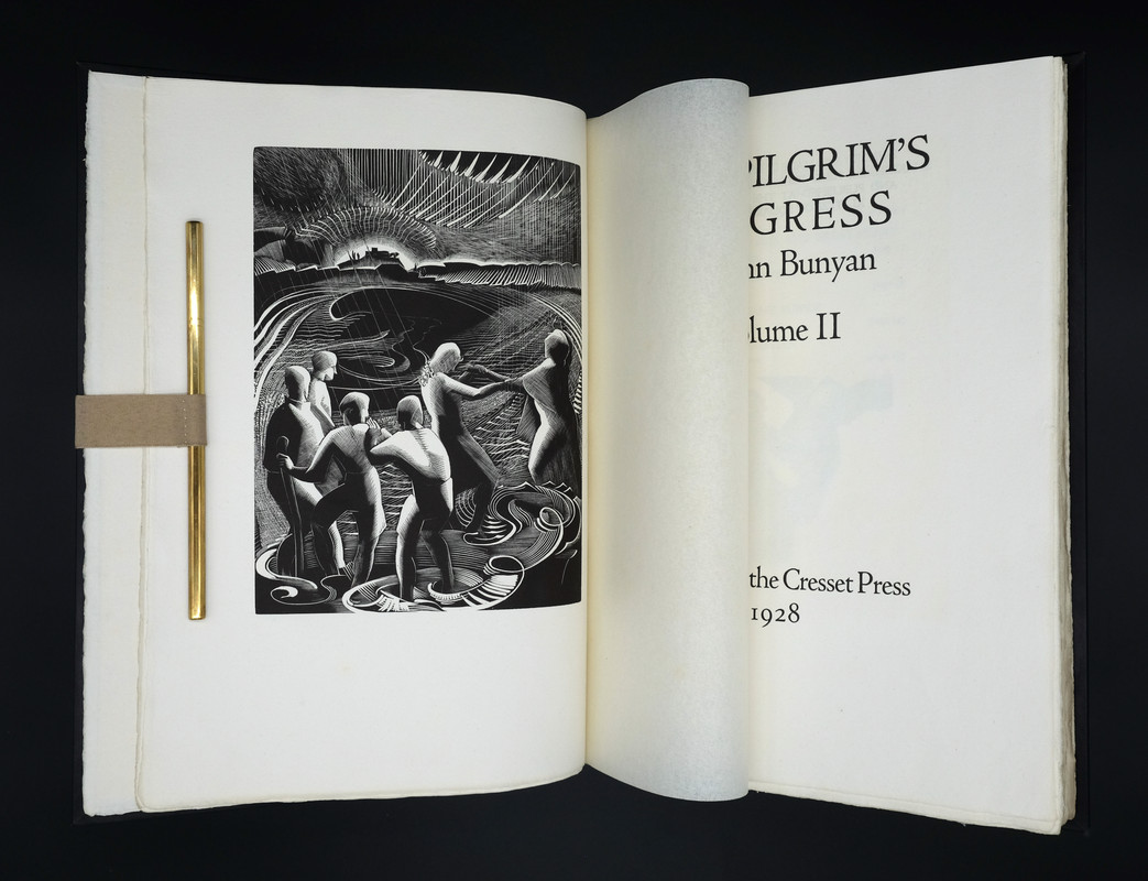
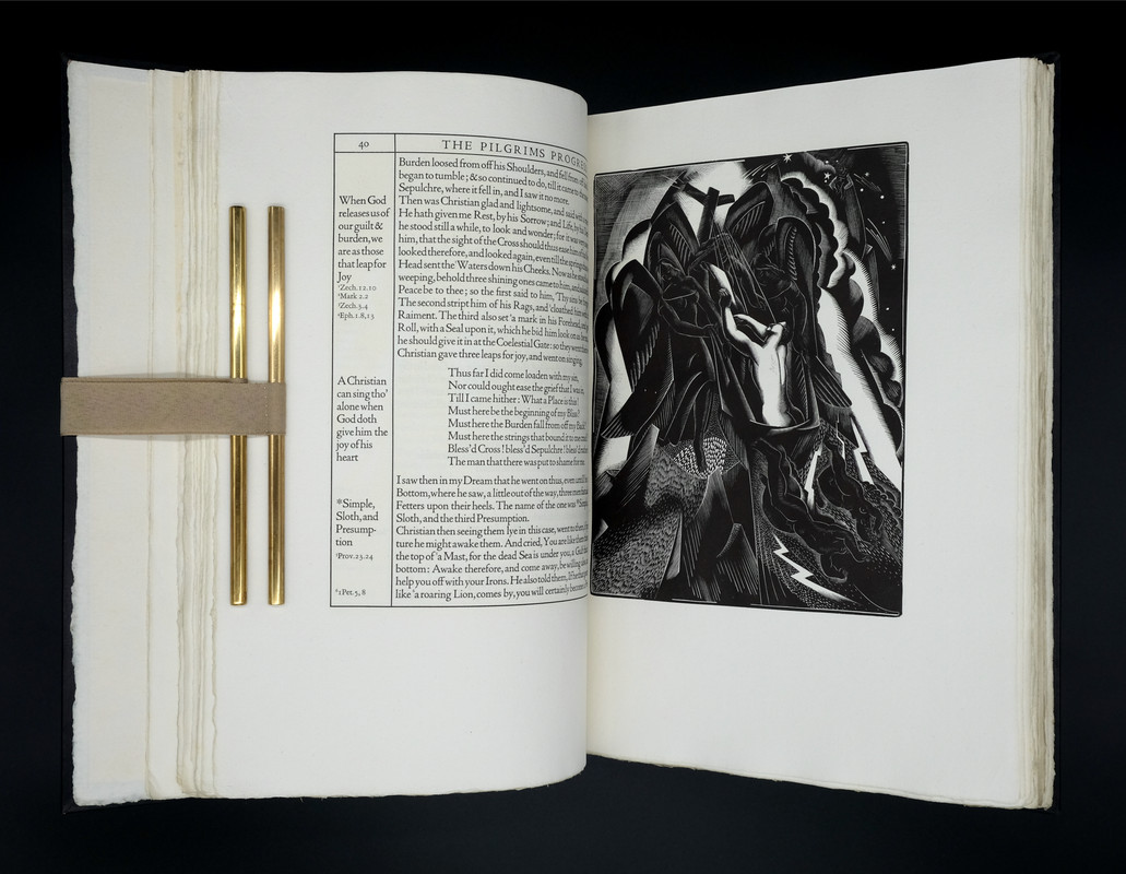
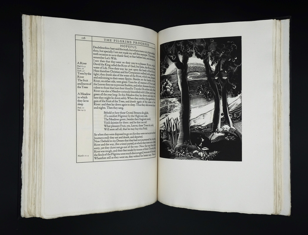
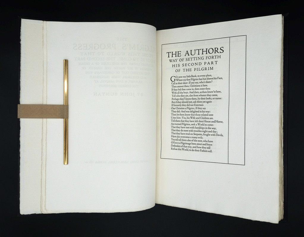
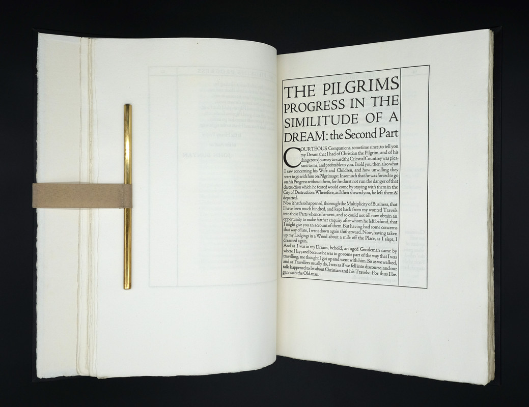
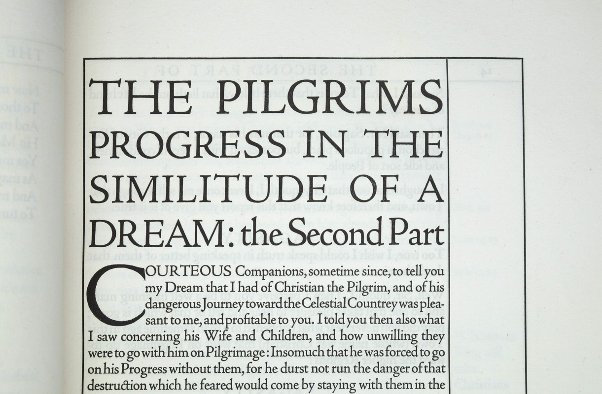
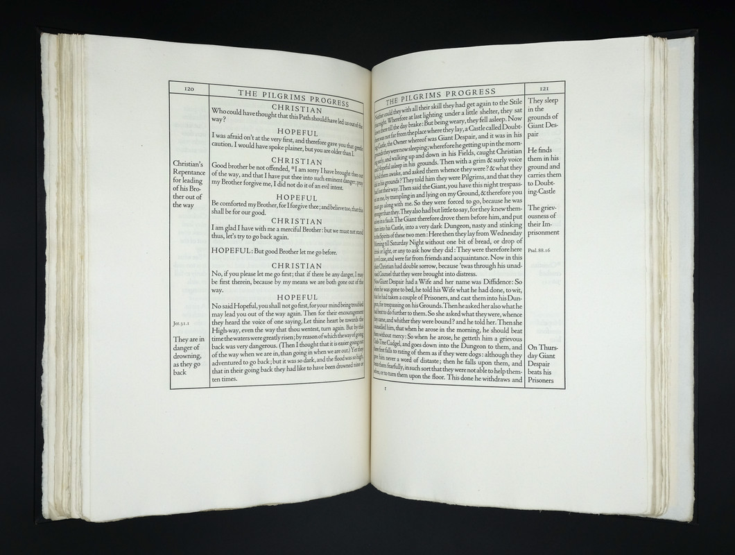
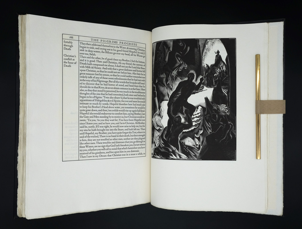
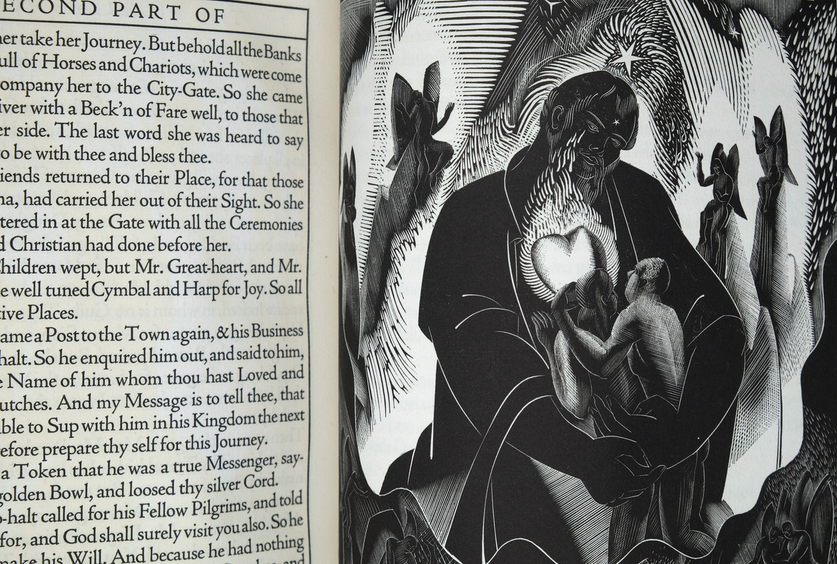
Before receiving this, I felt a little unsure about the layout with all the text enclosed in boxes, but it feels appropriate. The engravings are wonderful and quite strange. The paper is lovely, and the printing is magnificent. All in all, pretty epic. Pics below!
For anyone not familiar with this edition, and there's more info in dlphcoracl's Covid Eye Candy thread:
https://www.librarything.com/topic/317959#7100076
and on booksandvines:
https://booksandvines.com/2012/10/09/the-pilgrims-progress-john-bunyan-the-cress...
278Shadekeep
>277 GardenOfForkingPaths: Stunning! Those are powerful images. And I concur with you that the boxed text works here, especially with the sideline notes. It gives it a suitably concordance-like feel.
279DMulvee
>277 GardenOfForkingPaths: Congratulations! I think that is a wonderful edition
280Lukas1990
>277 GardenOfForkingPaths: Great acquisition, Sir! This is on my wish-list even though I own another edition printed by Essex House Press.
282Sport1963
>277 GardenOfForkingPaths: This is one of my favorite titles, but each time I take it off the shelf there is one aspect about the page design that nags me: Bernard Newdigate should have allowed for more generous inner margins. Even an 1/8" more would have allowed for easier reading of the text and more space to fully appreciate the illustrations. Thoughts?
283GardenOfForkingPaths
>282 Sport1963: I agree with you.
I think the tight inner margins do help to maintain a connection between the text on facing pages so that it almost feels like a book within a book, and doesn't end up looking like two isolated boxes of text floating in no-man's land. However, a small adjustment would have made it easier to read and benefitted the illustrations, just as you say. Perhaps there was a better balance that could have been achieved?
A book that comes to mind when I think of structuring text tightly within boxes is the first edition of the King James Bible. It had the same narrow columns for references, but they are on each side of a double column of body text, therefore avoiding the issue of the main text slipping into the gutter of the book.
I also wonder if, after almost 100 years, the paper in the Cresset Press edition has lost some its original pliability, which perhaps exacerbates the issue a bit. They are not books that seem to want to lay open easily, at least until you get towards the middle. (As a side note, I wish I had bought the heavier weights for my Stilt book cradle).
Beautiful books nonetheless!
I think the tight inner margins do help to maintain a connection between the text on facing pages so that it almost feels like a book within a book, and doesn't end up looking like two isolated boxes of text floating in no-man's land. However, a small adjustment would have made it easier to read and benefitted the illustrations, just as you say. Perhaps there was a better balance that could have been achieved?
A book that comes to mind when I think of structuring text tightly within boxes is the first edition of the King James Bible. It had the same narrow columns for references, but they are on each side of a double column of body text, therefore avoiding the issue of the main text slipping into the gutter of the book.
I also wonder if, after almost 100 years, the paper in the Cresset Press edition has lost some its original pliability, which perhaps exacerbates the issue a bit. They are not books that seem to want to lay open easily, at least until you get towards the middle. (As a side note, I wish I had bought the heavier weights for my Stilt book cradle).
Beautiful books nonetheless!
284Shadekeep
A nice smattering of titles landed over the past few days, though only one of which is properly fine press in the strictest terms.
Why Blue Paper? (Heavenly Monkey)
Alcestis, trans. Greene & Lovecraft (Helios House)
Lady Susan (Copperhead Press)
Nothing grand, but each a pleasure.
Why Blue Paper? (Heavenly Monkey)
Alcestis, trans. Greene & Lovecraft (Helios House)
Lady Susan (Copperhead Press)
Nothing grand, but each a pleasure.
285Lukas1990
>265 Lukas1990: Interesting video discussing different editions of the books, showing how hard was for Kredel to make woodcuts of the plants.
https://anrt-nancy.fr/fr/journal/o-offenbach
https://anrt-nancy.fr/fr/journal/o-offenbach
286Chemren
>285 Lukas1990: Thank you for the video reference. Is yours a copy of the final edition discussed in the video, with the additional plates, including brief words? Your original post inspired me to finally pull the trigger on a three volume set I had been mulling over for a while.
287Lukas1990
>286 Chemren: Mine is a rebound copy of the three volume set of the edition of 1000. So it is probably the same edition as your's (Mainzer presse for Insel). I have just received this book and maybe I will be able to unpack it today and take some photos.
288Lukas1990
The Golden Cockerel Greek Anthology (Golden Cockerel Press, 1937). One of 74 special copies from a total edition of 206. Bound by Zaehnsdorf in half-pigskin (the description of my won lot says "later half-morroco by Zaehnsdorf", the auctioneer probably didn't know that Zaehnsdorf did the original bindings for the specials and assumed the original bindery was Sangorski & Sutcliffe who actually did the bindings only of the regular copies, I will be surprised if the book was actually rebound later). With 20 zinc-engraved plates by Lettice Sandford. Probably one of the higlights of the press, two years in the making.
289Another_Bibliomane
A large stack of miniature artist's books by Gabrielle Fox, Nancy Leavitt, and Suzanne Moore. I went a little nuts and bought 11 total. I'm testing my ability to delay gratification by only opening one every day or two.
I've studied under both Gabrielle and Suzanne, so these books are now part of my mini-collection of artist's books and design bindings by my instructors, which also includes work by Sol Rebora and Dominic Riley.
I've studied under both Gabrielle and Suzanne, so these books are now part of my mini-collection of artist's books and design bindings by my instructors, which also includes work by Sol Rebora and Dominic Riley.
290ensuen
>289 Another_Bibliomane: What do you have by Sol Rebora? I have an upcoming binding commission from her that I’m excited about.
291astropi
>288 Lukas1990: Sounds amazing, I'd love to see pictures :)
292Another_Bibliomane
>290 ensuen: a lovely little mini that she did in the early 2000s with photos by her mother. You won't be disappointed -- she does beautiful work. I've heard her described by a prominent binder as the best living bookbinder, which is of course hyperbole but shows the respect other binders have for her.
What is she binding for you? How prescriptive were you vs giving her free reign?
What is she binding for you? How prescriptive were you vs giving her free reign?
293Lukas1990
>286 Chemren: You will have a wonderful time with this book! It is brilliant! It is hard to describe how delicate Kredel's woodcuts are and how vibrant is the hand-coloring. A book of the year for me! 250 woodcuts!
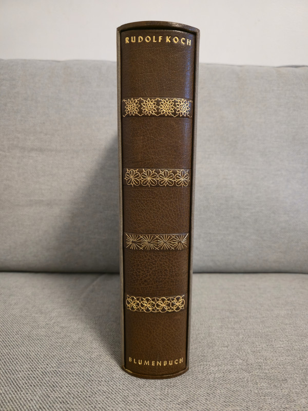
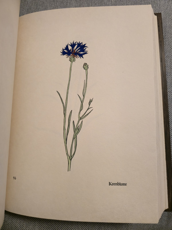
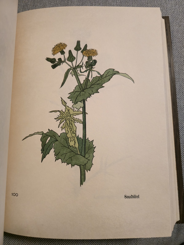
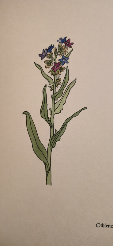
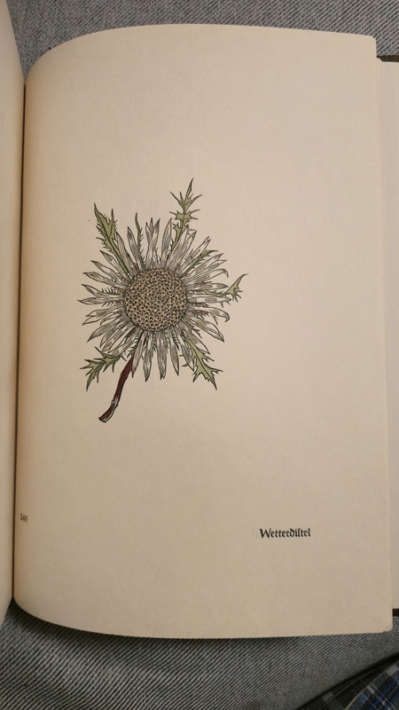
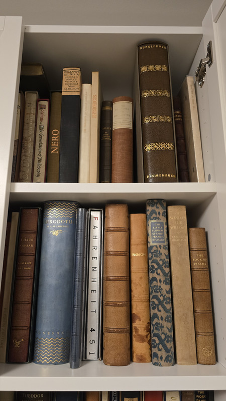
294ensuen
>292 Another_Bibliomane: One of my copies of the Steven’s Nelson paper companies catalogue “Specimens”. Which you can actually see me talking about earlier in the thread.
I haven’t been that prescriptive, we had a Zoom chat to talk about the project (and mostly IMO see if I was a real person). My only actual guidance was that the original stitching could be kept (because the book is all single sheets), not huge on florals, the original boards did not have to be preserved. I asked to see a sketch before the actual binding has started but aside from that it’s pretty hands off. Delivery is scheduled for next year, so still early days.
I can definitely see how she got that reputation. I’m a huge fan of what she’s published on her Instagram.
I haven’t been that prescriptive, we had a Zoom chat to talk about the project (and mostly IMO see if I was a real person). My only actual guidance was that the original stitching could be kept (because the book is all single sheets), not huge on florals, the original boards did not have to be preserved. I asked to see a sketch before the actual binding has started but aside from that it’s pretty hands off. Delivery is scheduled for next year, so still early days.
I can definitely see how she got that reputation. I’m a huge fan of what she’s published on her Instagram.


296ChestnutPress
>295 bacchus.: Neil Shaver made great books!
297bacchus.
>296 ChestnutPress: I only had a quick look but quite impressed. Any recommendations to follow up with?
298Shadekeep
>295 bacchus.: Those are lovely! I've only one from the press, it's much more understated. The bindings on these you shared are delicious!
299DenimDan
>297 bacchus.: Yellow Barn Press excelled in modest books that are quite affordable. Two of my favorites are "our Debt to Monkish Men" and "Does Literature Exist?" Their bibliography of the Red Ozier Press is fantastic, too.
300LBShoreBook
>295 bacchus.: I've got two from that press, both with John De Pol woodcut art in them - an Eric Gill essay (that also includes an original Gill) and a speech by Herbert Hoover on his childhood in Iowa. They deliver a lot of punch for the price point.
301Chemren
>293 Lukas1990: Mine has arrived and I am indeed very pleased. I am impressed by the delicate details of the woodcuts and how well the colorists did their job.
I had this one in my basket for almost a year, only not pulling the trigger because one of the 3 volumes was missing its slipcase. It was the thought of how bummed I’d be if you’d picked up “my copy” that made me finally pull the trigger. Very glad I did.
I had this one in my basket for almost a year, only not pulling the trigger because one of the 3 volumes was missing its slipcase. It was the thought of how bummed I’d be if you’d picked up “my copy” that made me finally pull the trigger. Very glad I did.
302ChestnutPress
>297 bacchus.: The below is a particular favourite (this is the first example of the correct version I found in a search, rather than a copy that’s a particular bargain! I have no idea of the going rate, but this shows plenty of pics). There are a few versions out there, but this is the original fine press one and it’s a beauty!
https://www.ebay.co.uk/itm/115252106917
https://www.ebay.co.uk/itm/115252106917
304DenimDan
>303 Lukas1990: Big congratulations on this one! I love Jim Dine's entire body of work. His assemblages are among my favorite pieces of the early 1960s. Though he is one of those rare artists whose reputation could have been made entirely by his printmaking, and his work was especially strong throughout the 1980s-90s. I'd love to hear your impressions of the Arion Apocalypse.
305GardenOfForkingPaths
>303 Lukas1990: That's a major acquisition! Congratulations!
306chase.donaldson
>303 Lukas1990: was this at auction today? I was one of your (losing) competition
307Lukas1990
>304 DenimDan:, >305 GardenOfForkingPaths: Thank you! This is only my second Arion Press book. The first is... The Case of the Wolf-Man, illustrated by Jim Dine! I wish the spine of the book was in better condition but it seems that this is a common problem with this book. What else can you expect from pigskin?
>306 chase.donaldson: Yes! A risky acquisition without having the possibility to inspect the whole book in-person but what else can we, overseas collectors, do? I noticed that they added the photo of the spine much later...
>306 chase.donaldson: Yes! A risky acquisition without having the possibility to inspect the whole book in-person but what else can we, overseas collectors, do? I noticed that they added the photo of the spine much later...
308abysswalker
>307 Lukas1990: "what else can we, overseas collectors, do?"
When considering a significant bid, I always contact the auctioneer in advance to request an official condition report and additional photos. They’ve consistently responded professionally. I also make a point of asking for close-ups of any noted wear and inquiring about foxing, even if it isn’t mentioned.
When considering a significant bid, I always contact the auctioneer in advance to request an official condition report and additional photos. They’ve consistently responded professionally. I also make a point of asking for close-ups of any noted wear and inquiring about foxing, even if it isn’t mentioned.
309chase.donaldson
>307 Lukas1990: I was a little shocked to see the condition of the spine and the very late addition of the condition of the spine. If these auction houses are going to be charging me 20 plus percent for an item the least they can do is describe it well and upload a few photos. I bought an Ashendene Thucysides from Forum Auctions and their condition report was a total misrepresentation of what I got, so much so that I emailed to complain and they just threw 100 pounds back at me.
310dlphcoracl
>307 Lukas1990:
>309 chase.donaldson:
Pay heed to the advice in >308 abysswalker:. Increasingly, the descriptions of book condition and accompanying photos in auction lots have become threadbare, serving as a mere 'calling card'.
>309 chase.donaldson:
Pay heed to the advice in >308 abysswalker:. Increasingly, the descriptions of book condition and accompanying photos in auction lots have become threadbare, serving as a mere 'calling card'.
311Lukas1990
>308 abysswalker: Yeah, it was a mistake on my part to not ask for more photos. The photo of the spine was added much later and from the provided photos the boards looked absolutely fine and I had no suspicions. I also didn't expect to win...
Seems like the auction house focuses on art and not books. During live auction they didn't even mention the publisher. It was something like 'next lot is the Jim Dine woodblock book". That's it! I can still live with that spine for the price I paid and if the interior is fine, OK then.
Seems like the auction house focuses on art and not books. During live auction they didn't even mention the publisher. It was something like 'next lot is the Jim Dine woodblock book". That's it! I can still live with that spine for the price I paid and if the interior is fine, OK then.
312CJR93
I was excited to find a copy of “The Maltese Falcon” from Arion Press on eBay for $85. It was missing the slipcase. But I can make a new one for it. My first book by Arion Press!
313bookist
>311 Lukas1990: I would never (again) spend 4 figures on a Forum lot without requesting extra photos first. I now know that “presents well on the shelf” means “only the spine is in good condition”.
To be fair, they do respond well to enquiries. I asked for a report on a recent lot and got 90 photos of it!
To be fair, they do respond well to enquiries. I asked for a report on a recent lot and got 90 photos of it!
314PBB
>65 ensuen: Just found a copy of this myself. I reserved it at the bookstore and will be going back tomorrow to get the cash/frequent customer discount when someone I know better will be working.
Been a long time since I found something this good in person. I've bought some great books online this year but nothing quite like stumbling upon a gem in store.
Been a long time since I found something this good in person. I've bought some great books online this year but nothing quite like stumbling upon a gem in store.
315GardenOfForkingPaths
I was able to acquire one from my wish-list that has eluded me at a fair price for the last couple of years: The Arion Press Thirty-Three Sonnets of Guido Cavalcanti (1991). Apart from using nice handmade paper and exhibiting the excellent printing you often find in Arion Press books from that era, it's also one of the most complete treatments of a selection of poetry that I have seen in a fine press book. For each poem there is the main Ezra Pound translation, the original Italian, a line-by-line English prose translation, plus a short commentary. Not only very helpful, but the different elements combine for an attractive typographic arrangement too. Recommended!
316Shadekeep
>315 GardenOfForkingPaths: Kudos, that does sound like a fine volume, and wonderfully complete.
317dlphcoracl
>315 GardenOfForkingPaths:
>316 Shadekeep:
That one is a gem, one of the most elegant and intelligently designed books in the Arion Press bibliography during Andrew Hoyem's tenure.
>316 Shadekeep:
That one is a gem, one of the most elegant and intelligently designed books in the Arion Press bibliography during Andrew Hoyem's tenure.
318Lukas1990
I own the Nonesuch Press Genesis for some time now and today took another look at this book. Rudolf Koch’s Neuland type and Paul Nash's woodcuts is a perfect pair and match. I catch myself with Rudolf Koch's work all year long - started with Offenbacher Haggadah, then got his beautiful Blumenbuch and also Genesis. Speaking about Paul Nash, I need that Urne Burial!
319abysswalker
>315 GardenOfForkingPaths: I would love to see a visual review of this one if you're open to taking some photos and posting a new thread.
320GardenOfForkingPaths
>317 dlphcoracl: Indeed!
>318 Lukas1990: It's nice when you return to a book you bought some time ago and it still wows you. I bought the FS facsimile when it was on sale, but definitely feel the pull to upgrade one day. I think seeing the facsimile and the original side by side would be a very illuminating exercise!
>319 abysswalker: I would be very happy to do that. I should have a bit of time to do so in the next few days.
>318 Lukas1990: It's nice when you return to a book you bought some time ago and it still wows you. I bought the FS facsimile when it was on sale, but definitely feel the pull to upgrade one day. I think seeing the facsimile and the original side by side would be a very illuminating exercise!
>319 abysswalker: I would be very happy to do that. I should have a bit of time to do so in the next few days.
321Lukas1990
>320 GardenOfForkingPaths: Folio Society did a good job with those facsimiles of Genesis/Song of Songs/Book of Noah. I have their facsimile of Golden Cockerel Press Four Gospels and it is a nice alternative to the very expensive original. Of course, all these pale in comparison with FS Luttrell Psalter! My copy is hidden somewhere deep so I won't open it and get lost for a couple of days just looking at all those magical creatures.
322Glacierman
Well, after a three year wait (what a project it was!), The Tale of Sinuhe from Consensus Press is now in hand. Decisions made along the way mean that the book isn't what I had originally envisioned, but it is still a lovely book---I just had to change my vision!
Received with it was No Reply's Poseidon. It is as handsome a volume as I knew it would be.
Received with it was No Reply's Poseidon. It is as handsome a volume as I knew it would be.
323SDB2012
>322 Glacierman: Congratulations!
324Pendrainllwyn
>322 Glacierman: Regrettably I discovered LibraryThing too late to participate in Consensus Press's first edition. I am not a very excitable person but I am genuinely excited for everyone who is finally getting their hands on The Tale of Sinhue. I expect it will be treasured and doubt we will see any being flipped in the secondary market!
325Glacierman
>324 Pendrainllwyn: Well, other than a few copies for the use of the Press (translator's copy, etc.), only members could get the book, so yeah, it'll be a while before it shows up on the aftermarket.
After the dust from this book settles down, CP will be moving forward and will, of course, make known its plans in due course.
After the dust from this book settles down, CP will be moving forward and will, of course, make known its plans in due course.
326Pendrainllwyn
>318 Lukas1990: Nash's woodcuts are outstanding. Art one can look at over and over. I would love to have a copy but even damaged copies sell for large sums.
327Lukas1990
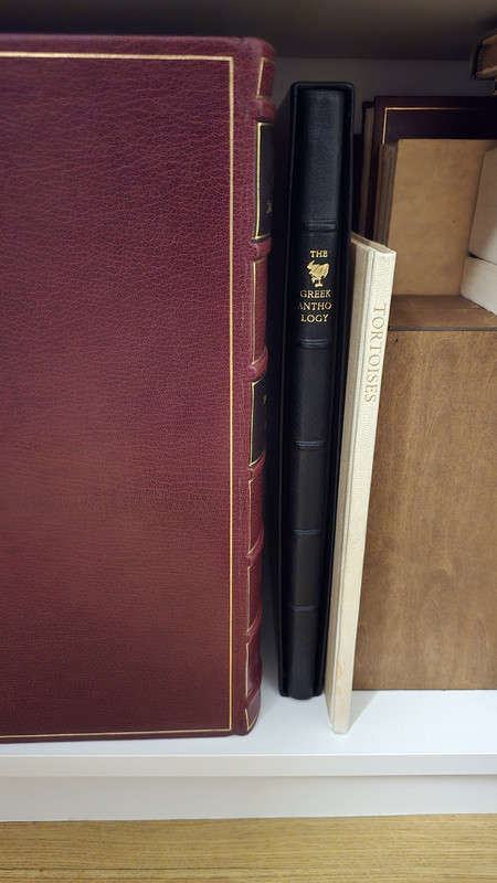
Golden Cockerel Greek Anthology has arrived. I will try to post more photos someday but for now I just want to show that beautiful spine (bound by Zaehnsdorf).
328Lukas1990
I am reading a biography of Erasmus and decided to order his Bellum: Two Statements on the Nature of War (Imprint Society). My copy is JWB from 1950 copies. Must be a collaborator or publisher, no idea yet. The book is illustrated with fifty etchings created in 1923 & 1924 by Otto Dix.
329Another_Bibliomane
The Doves Press Areopagitica, bound by the Doves Bindery in a gorgeous limp vellum binding in their classic style. LV bindings are a particular interest of mine but this is my first 'historic' binding of this type. Classic typography, beautiful paper w/ the Doves Press watermark. Spectacular book in a very understated sort of way.
I have the Ampersand Press edition of The Ideal Book and it's interesting to see how accurate the facsimile binding is.
Now I just need to get around to reading Tidcombe's history of the press, it's been in my stack for a while.
I have the Ampersand Press edition of The Ideal Book and it's interesting to see how accurate the facsimile binding is.
Now I just need to get around to reading Tidcombe's history of the press, it's been in my stack for a while.
330Sport1963
>329 Another_Bibliomane: Congrats on a terrific acquisition. The opening "T" works spectacularly.
331ChestnutPress
Latest beaut on my shelves is Stone Wall press edition of the poems of Weldon Kees. Masterful work, as ever, by Kim Merker!
332edgeworn
Very pleased to be able to add two recent purchases to our shelves:
Grabhorn Press Subtyl Historyes and Fables of Esope (this one has been on my wants list for quite a while)
Shanty Bay Press Homeric Hymn to Aphrodite (my first book from this press, and I am delighted with it).
Grabhorn Press Subtyl Historyes and Fables of Esope (this one has been on my wants list for quite a while)
Shanty Bay Press Homeric Hymn to Aphrodite (my first book from this press, and I am delighted with it).
333dlphcoracl
>329 Another_Bibliomane:
"LV bindings are a particular interest of mine."
Look at the deluxe editions of the books published by Philip Lee Warner / The Medici Society / Riccardi Press/ from 1907 to 1929.
"LV bindings are a particular interest of mine."
Look at the deluxe editions of the books published by Philip Lee Warner / The Medici Society / Riccardi Press/ from 1907 to 1929.
334Shadekeep
>332 edgeworn: Kudos! I'd love to collect Shanty Bay Press myself if finances allowed. Their work appears so distinctive and beautiful.
335Lukas1990
>332 edgeworn: Beautiful books. I need at least one Shanty Bay book in my modest collection. Those are rare.
336edgeworn
>334 Shadekeep:
>335 Lukas1990:
Thank you for your comments.
The Homeric Hymn to Aphrodite was the third book from the Shanty Bay Press, produced in 2003. It is a small folio sized book, and I was particularly drawn to it because of the nearly full page pochoir illustrations by Walter Bachinski:

I also like the printing, which is very clean and strong.

>335 Lukas1990:
Thank you for your comments.
The Homeric Hymn to Aphrodite was the third book from the Shanty Bay Press, produced in 2003. It is a small folio sized book, and I was particularly drawn to it because of the nearly full page pochoir illustrations by Walter Bachinski:

I also like the printing, which is very clean and strong.

337gmacaree
>336 edgeworn: That one has been on my list for many years; congratulations on the acquisition!
338Shadekeep
>336 edgeworn: Gorgeous! The pochoir has exquisite subtlety, with remarkable shading and texturing. The print is beautiful, too. A real gem of a find.
>335 Lukas1990: The Shanty Bay title that crops up the most for me is Georgics, and justifiably so from what what I seen of the book. It's one I'd love to own. Their new book Bucolic Poems seems very much in the same vein, and appears to still be on offer directly from the press (limitation of 30).
>335 Lukas1990: The Shanty Bay title that crops up the most for me is Georgics, and justifiably so from what what I seen of the book. It's one I'd love to own. Their new book Bucolic Poems seems very much in the same vein, and appears to still be on offer directly from the press (limitation of 30).
339ensuen
Picked up a copy of “The Ephemera of Adrian Wilson. An Annotated List 1944-1988”
Really nice book, bibliography with some printing examples and a portfolio of ephemera. I probably wouldn’t have gone for it, but it was in the Salmon half off sale so that pushed me a bit: https://www.salmonrarebooks.com/artworks/categories/39/.
It’s a lot better done than I expected (not that I thought otherwise), but it has a really nice feel from the paper selection. There’s a couple more copies on the more expensive side online but worth keeping an eye out.
Really nice book, bibliography with some printing examples and a portfolio of ephemera. I probably wouldn’t have gone for it, but it was in the Salmon half off sale so that pushed me a bit: https://www.salmonrarebooks.com/artworks/categories/39/.
It’s a lot better done than I expected (not that I thought otherwise), but it has a really nice feel from the paper selection. There’s a couple more copies on the more expensive side online but worth keeping an eye out.
340Lukas1990
The Poeticon Astronomicon (Allen Press).
The seller Laurelle Swan was very helpful and answered all my questions about it. Happy birthday to myself! :D
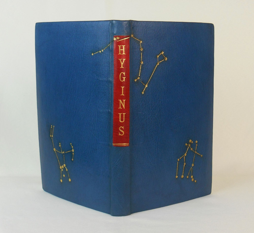
The seller Laurelle Swan was very helpful and answered all my questions about it. Happy birthday to myself! :D
341MyrddinWyllt
>340 Lukas1990: Congratulations, very pretty!
342kdweber
>340 Lukas1990: Who did the binding?
343GardenOfForkingPaths
>340 Lukas1990: Congratulations and happy birthday! It's always nice to do business with booksellers who will take the time to answer questions and give you the reassurance you need before making a major acquisition.
344dotman
>340 Lukas1990: Superb binding on that, makes it unusual in a good way - congrats. And one of my favorite titles from AP. Have also had fantastic experiences with Laurelle Swan - she's really one of the best in the biz.
345LBShoreBook
I've gone an an acquisition binge for Gehenna Press, one just arrived, three on the way. This one is Ted Hughes, A Primer of Birds, handmade paper with Baskin woodcut art, signed by Baskin and Hughes.


346grifgon
>345 LBShoreBook: I'm so jealous. I've resisted ordering even a single Gehana title because I know that, two months later, I'd have to declare bankruptcy.
347LBShoreBook
>346 grifgon: I hear you. One of the books en route is Florilegium, a Baskin/Anthony Hecht collaboration near the end of the press's run, that cost me 2x my previous high-water-mark outlay for a single book. I'm going to have to figure out a budgeting strategy to collect that press.
348Lukas1990
>342 kdweber: The binding is not signed. A customer of Allen Press ordered the sheets and either bound them himself or commisioned the binding. I like it. It is quite simple and fits the theme of the book well.
349kermaier
>346 grifgon:
The only ones I can afford are “Civil Disobedience” and “The Jolly Beggars” :-)
The only ones I can afford are “Civil Disobedience” and “The Jolly Beggars” :-)
350ensuen
Picked up the Whittington Press "Chinese Ceremonial Papers. An Illustrated Bibliography."
It's a nice book, very sample forward. First half or so is pages of samples each matched with a description. On the lighter side of texts for the subject, with a nice range of samples. Last half is a bibliography of related books and some commentary by the author regarding each. If you're interested in getting into this sort of thing this is a good book to start with.
It's a nice book, very sample forward. First half or so is pages of samples each matched with a description. On the lighter side of texts for the subject, with a nice range of samples. Last half is a bibliography of related books and some commentary by the author regarding each. If you're interested in getting into this sort of thing this is a good book to start with.
352ChestnutPress
>351 Lukas1990: It’s a handsome edition, but then Michael made some very fine books.
353ChestnutPress
Today’s post brought me the latest from Prelo — the final instalment of the Here be Dragons series.
354Lukas1990
Risky order from ThriftBooks: Paradise Lost (Arion Press) for 9 USD in what the seller calls acceptable condition. No photo. Positive signs: no ISBN number, weight is 4 lbs, publication year is right, the full title is the same as Arion's. We'll see :)
355Glacierman
>354 Lukas1990: At that price, it is well worth the risk.
356SDB2012
>354 Lukas1990: Please post pictures. It could be the deal of the century!
357Lukas1990
>355 Glacierman: Shipping was 24 USD :D
358Shadekeep
>354 Lukas1990: Hmm, "acceptable" as what? A doorstop? ;)
359Lukas1990
>358 Shadekeep: As a reading copy, I suppose. We'll see. There might be another author called Millton and another press called Arionn and they might have made a mistake in the description.
360ensuen
>354 Lukas1990: Best of luck, any book I've ordered under 10 dollars on Abe has had heartbreaking damage in shipping.
361Shadekeep
>359 Lukas1990: As long as they haven't mislabeled something from the Aryan Press, probably worth the gamble. Good luck and post pics!
362grifgon
>354 Lukas1990: Exciting!! I once found the famous Pride and Prejudice "Peacock Edition" in a library clearance box for a dollar.
363Glacierman
>357 Lukas1990: Ouch!
364Glacierman
>358 Shadekeep: That particular "descriptive" term has always bugged the cr*p out of me. Yes, acceptable to whom as what? Uber vague.
365BuzzBuzzard
A charming little book by the Book Club of California that is not going to break your bank. Illustrated, designed, and printed by Mallette Dean.


366ChestnutPress
>365 BuzzBuzzard: This is lovely!!
367NathanOv
>365 BuzzBuzzard: That is delightful - instant addition to my nature and travel collection.
368Shadekeep
>365 BuzzBuzzard: That's a beaut!
369ambyrglow
A nice mail day yesterday: both Subterranean's Story of Your Life and the final 2025 installment in Sarah Nicholls's Brain Washing from Phone Towers letterpress pamphlet series. Really enjoyed this year's affordable housing theme; can't wait to see what 2026 brings.
I found the format of Story of Your Life a pleasure to read. My aging eyes appreciate larger print and lots of white space!

I found the format of Story of Your Life a pleasure to read. My aging eyes appreciate larger print and lots of white space!

370Lukas1990
>354 Lukas1990: THE BOOK HAS ARRIVED... It is not published by Arion Press. But it is Milton and a hardcover :D Will try to get a refund.
371jbrnewman
>370 Lukas1990: A worthy venture! Even if success was unlikely at the outset. Here's hoping for your full refund.
372Lukas1990
>371 jbrnewman: Thank you! Ebay made a refund in seconds after I claimed for it!
On an even more positive note - I have received my Libanus Press Symposium and it is a beautiful well-printed book. I am glad I found the 1/4 leather version with a slipcase.
On an even more positive note - I have received my Libanus Press Symposium and it is a beautiful well-printed book. I am glad I found the 1/4 leather version with a slipcase.
373AdPacem
Received yesterday the sheepskin parchment edition of Thoughts From the Letters of Petrarch (Petrarch Press), my first book written in parchment and a beautiful production altogether.
374GardenOfForkingPaths
>373 AdPacem: Amazing! Many congratulations. I have never seen it in the flesh but have heard only great things about it. Having acquired this, can you imagine yourself being drawn to other editions printed on vellum/parchment?
375Lukas1990
>373 AdPacem: Well done! Would you like to share so.e photos of that crisp printing?
>374 GardenOfForkingPaths: A very dangerous question! Haha
>374 GardenOfForkingPaths: A very dangerous question! Haha
376GardenOfForkingPaths
>375 Lukas1990: Indeed! And that’s partly why I haven’t acquired anything on vellum… yet!
I would love to see photos too.
I would love to see photos too.
377AdPacem
>375 Lukas1990: I doubt my phone camera can do it justice, but I will share some attempts later today
>374 GardenOfForkingPaths: Thank you! A very dangerous question indeed, I can definitely see myself being drawn to them but will have to do my best to avoid actively seeking them out
>374 GardenOfForkingPaths: Thank you! A very dangerous question indeed, I can definitely see myself being drawn to them but will have to do my best to avoid actively seeking them out


379GardenOfForkingPaths
>378 AdPacem: Very nice! It really has a unique look. Lovely drop caps too.
It sounds like there are few practitioners of vellum printing, so I hope the craft and skills can stay alive into the future.
It sounds like there are few practitioners of vellum printing, so I hope the craft and skills can stay alive into the future.
380PBB
The Life of Saint George, Bruce Rogers 1957. Rogers' last book. With original glassine. $100 from Argosy, other copies I could find were over $200.
Four Studies by Norman Holmes Pearson. Stamperia Valdonega, 200 copies, this one signed and inscribed by the author. Nothing too special but just $35
Four Studies by Norman Holmes Pearson. Stamperia Valdonega, 200 copies, this one signed and inscribed by the author. Nothing too special but just $35
381Another_Bibliomane
>379 GardenOfForkingPaths: I'd love to learn the technique. I've worked with vellum bindings but never printed on it.
382Transfixed
A Venetian Story by Lord Byron from L-D Allen Press, 1963. For $389 from eBay. Box VG, inside near fine.
It feels like purchasing a small gallery.
It feels like purchasing a small gallery.
383kermaier
>382 Transfixed: Wow, that’s a deal!! Congrats!
Shockingly large, by the way, isn’t it?
Shockingly large, by the way, isn’t it?
384Transfixed
>383 kermaier: I knew how large it is and the format is necessary because of the images.
I guess it has to be stored flat.
I guess it has to be stored flat.
385LBShoreBook
Odd purchase experience - I found Pennyroyal Press Scarlet Letter for $70 on Ebay. Book arrived and I would say VG- condition for the slipcase but otherwise clean. I had to Google if Pennyroyal did an open edition given that the colophon does not reference a limit and is unsigned but that ties out. The Moser prints alone made it worth the punt at this price.
386Transfixed
Last Light by August Derleth, issued by the Perishable Press of Walter Hamady in 1978.
Beautiful last eight poems of August Derleth (1909-1971), on his walks through the nature when approaching his own death.
Three excellent wood engravings by his friend Frank Utpatel.
"Printed on the paper from elapsed clothing of author, artist, editor & printer recycled into the first sheets ever formed at Minor Confluence", binding sewn on hempen cords, goat vellum spine & tips with titling in gold down the spine, all dominated by a rhythmic paste board by the binder, Bill Anthony.
# 12 of 150, this one signed 'Walter Hamady 31 March 86'.
As often with Hamady, there's also the acrostic-forming colophon.
Photos can still be seen and all the book read at https://www.ebay.com/itm/356993380812.
Beautiful last eight poems of August Derleth (1909-1971), on his walks through the nature when approaching his own death.
Three excellent wood engravings by his friend Frank Utpatel.
"Printed on the paper from elapsed clothing of author, artist, editor & printer recycled into the first sheets ever formed at Minor Confluence", binding sewn on hempen cords, goat vellum spine & tips with titling in gold down the spine, all dominated by a rhythmic paste board by the binder, Bill Anthony.
# 12 of 150, this one signed 'Walter Hamady 31 March 86'.
As often with Hamady, there's also the acrostic-forming colophon.
Photos can still be seen and all the book read at https://www.ebay.com/itm/356993380812.
387DenimDan
>386 Transfixed: Fantastic book, one of the gems from the PP in the late 1970s. The colors of the Initials Cristal on the title page are mesmerizing.
388Transfixed
>387 DenimDan: Thanks! I am indebted to you for your covering of the Perishable Press on this forum.
Last Light is a book I'll cherish and I may keep it till the final of my life. I like its theme, its poetry and the whole very much.
The author, August Derleth, is also kind of near to my heart.
Another my recent purchase of a similar vein was Midwinter by Miriam Macgregor of the Whittington Press.
This is one of its wonderful wood-engravings:

Last Light is a book I'll cherish and I may keep it till the final of my life. I like its theme, its poetry and the whole very much.
The author, August Derleth, is also kind of near to my heart.
Another my recent purchase of a similar vein was Midwinter by Miriam Macgregor of the Whittington Press.
This is one of its wonderful wood-engravings:

389SebRinelli
>386 Transfixed: and >387 DenimDan:: thank you both! I just placed my order for another copy of this book.
390Transfixed
>389 SebRinelli: Congratulations!
The original price of $137.50 in 1978 is equivalent to $700 today. My copy came with an invoice from 1987 for $250, which would be $715 today.
So we both got bargains.
The original price of $137.50 in 1978 is equivalent to $700 today. My copy came with an invoice from 1987 for $250, which would be $715 today.
So we both got bargains.
391Transfixed
The Anglo-Saxon Elegies, The Folio Press, 1988, tr. & intro. Kevin Crossley-Holland, engravings Hannah Firmin, bilingual, printed letterpress on Van Gelder Old Dutch mould-made paper, top edge gilt, moire silk spine over hand-marbled paper sides from Mitchell & Malik.
For £66 + shipping cost from Australia. Very happy with the purchase!
For £66 + shipping cost from Australia. Very happy with the purchase!
392JanPospisilCZ
>391 Transfixed: I was wondering who grabbed that! I messaged the seller about postage costs and it sold that night (well, night for me). Enjoy!
(a good reminder to check Australian eBay from time to time, often their listings don't appear on the .com site.)
(a good reminder to check Australian eBay from time to time, often their listings don't appear on the .com site.)
393ChestnutPress
My copy of ‘Epilogue from War of the Worlds’, the new book from Rollin Milroy’s HM (formerly Heavenly Monkey), turned up today and it doesn’t disappoint. The design, typography, materials, illustrations and presswork are impeccable. Here’s a look at the frontispiece; a polymergravure intaglio of an altered photograph by Scott Morgan.


394Shadekeep
>393 ChestnutPress: Kudos, mate! I knew this one wouldn't disappoint.
395Transfixed
>392 JanPospisilCZ: It's a nice companion volume to The Wanderer & Other Old-English Poems by Folio Society, which I happened to find for €301 in 2020 on the German eBay. Different translations. Both books are beautiful.
396Transfixed
A special copy of Messer Pietro Mio: Letters between Lucrezia Borgia & Pietro Bembo, designed by Michael Mitchell and issued by Libanus Press in 1985.
The book is illustrated and decorated with wood engravings by Richard Shirley Smith.
This is a presentation copy (probably one of VII copies hors commerce according to the numbering of the extra set of signed prints), identical to the fifteen special copies lettered A-O. It's bound in full vellum, lettered and decorated in gilt, in a slipcase together with the prints in a separate folder. See https://www.ebay.co.uk/itm/236429031824.
Lucrezia mourning:

Detail of the spine:

The book is illustrated and decorated with wood engravings by Richard Shirley Smith.
This is a presentation copy (probably one of VII copies hors commerce according to the numbering of the extra set of signed prints), identical to the fifteen special copies lettered A-O. It's bound in full vellum, lettered and decorated in gilt, in a slipcase together with the prints in a separate folder. See https://www.ebay.co.uk/itm/236429031824.
Lucrezia mourning:

Detail of the spine:

397ChestnutPress
>396 Transfixed: Michael Mitchell made some wonderful books, and Richard has done some stunning engravings over the years.
398wcarter
Wonderful mail delivery today from No Reply Press - The Ethics of Ambiguity and five chapbooks (held back to be sent with a larger book due to exorbitant postage charges from USA to Australia).
All look wonderful, but I feel it is a pity that the slipcase for Ethics was not made slightly larger so that the separate Introduction book could not be housed in it. As a separate unslipcased book there is a significant risk that the two volumes will become separated in the future.
All look wonderful, but I feel it is a pity that the slipcase for Ethics was not made slightly larger so that the separate Introduction book could not be housed in it. As a separate unslipcased book there is a significant risk that the two volumes will become separated in the future.
399kdweber
>398 wcarter: The deluxe edition resolved this issue.
400What_What
>399 kdweber: What are the differences between the deluxe and standard editions?
401DMulvee
>400 What_What: 15 de luxe copies were offered an an upgrade. The description of the de luxe was:
“Bound in a hard Bradel binding, with a vellum spine, silk headbands, and handmade paper boards.
Accompanied by The Introduction and The Complete Artworks & Commentary. All three volumes will fit together in a single slipcase and chemise.”
“Bound in a hard Bradel binding, with a vellum spine, silk headbands, and handmade paper boards.
Accompanied by The Introduction and The Complete Artworks & Commentary. All three volumes will fit together in a single slipcase and chemise.”
402realto
I'm sorry if this isn't the correct thread for this question, but does anybody have recommendations for where to begin collecting books from Barbarian Press? It is considered among the best, but I cannot tell which of their more affordable books are good places to get a sense of their work.
403Shotcaller
>402 realto: Their Loose Canons chapbooks, available on their website, are a more affordable way to own some of their work.
There’s also a Facebook group called Barbarian Press Readers. If you’re on Facebook, it might be worth joining and asking there.
There’s also a Facebook group called Barbarian Press Readers. If you’re on Facebook, it might be worth joining and asking there.
404What_What
>401 DMulvee: Thank you!
>402 realto: There's a Barbarian Press thread on here somewhere, and you'll find a wealth of information either in there, or from readers here who can answer your questions.
Their celebrity as a press is in their press work and editorial decisions - you won't find elaborate bindings apart from a few exceptions.
As many of their books are harder to find, whatever is in print on their website is a great place to start, as you wouldn't want to pay a premium for something you are testing, so to speak.
>402 realto: There's a Barbarian Press thread on here somewhere, and you'll find a wealth of information either in there, or from readers here who can answer your questions.
Their celebrity as a press is in their press work and editorial decisions - you won't find elaborate bindings apart from a few exceptions.
As many of their books are harder to find, whatever is in print on their website is a great place to start, as you wouldn't want to pay a premium for something you are testing, so to speak.
405Shotcaller
>404 What_What: That’s very true.
And to add to that, if you do decide the press is something you’re interested, you can subscribe. You’d be agreeing to buy each book they put out, at a 30% discount. I believe they put out a book a year or thereabouts.
And to add to that, if you do decide the press is something you’re interested, you can subscribe. You’d be agreeing to buy each book they put out, at a 30% discount. I believe they put out a book a year or thereabouts.
406Transfixed
>270 ensuen: I just happened to find Harvesting Colour by Ann Muir for $39.99.
I have a weakness for marbled paper from when I found one of the 250 specially bound copies of The Art of Marbled Paper by Einen Miura. They were bound by Zaehnsdorf in full hand marbled leather. My copy came in an incredibly beautiful marbled-paper slipcase, which itself is the high point of the book.
I have a weakness for marbled paper from when I found one of the 250 specially bound copies of The Art of Marbled Paper by Einen Miura. They were bound by Zaehnsdorf in full hand marbled leather. My copy came in an incredibly beautiful marbled-paper slipcase, which itself is the high point of the book.
407ensuen
>406 Transfixed: Congrats! That's a fantastic deal, was it in a more normal bookstore or something? That's a crazy pricing miss.
Appreciate the extra book rec too.
Edit: In my head there's an employee thinking, hmm what's the most someone could ever pay for a book? 50 dollars? No that's too crazy, let's just put 40 for now.
Appreciate the extra book rec too.
Edit: In my head there's an employee thinking, hmm what's the most someone could ever pay for a book? 50 dollars? No that's too crazy, let's just put 40 for now.
408Transfixed
>407 ensuen: On eBay. It looks like AI fixing the price, but possibly they got confused by the prospectus price.
410kermaier
Just received beautiful copies of:
Robert the Devil, Windhover Press (not one of the specials, alas)
Common Sense, Thomas Paine, Colish Press
Printing with the Handpress, Allen Press (just the facsimile - can’t afford the original - but still nice)
Robert the Devil, Windhover Press (not one of the specials, alas)
Common Sense, Thomas Paine, Colish Press
Printing with the Handpress, Allen Press (just the facsimile - can’t afford the original - but still nice)
411Lukas1990
>410 kermaier: "Robert the Devil, Windhover Press (not one of the specials, alas)"
You can color the engravings by yourself haha. This is a nice book.
You can color the engravings by yourself haha. This is a nice book.
413PBB
Not a fine press book but a fine press connected book: From the library of CH St John Hornby with his bookplate in both volumes. Histoire Litteraire du Peuple Anglais par JJ Jusserand. May be his signature as well but I couldn't be certain. The book itself I cannot read because I do not speak French and it is in terrible shape but this is still one of the coolest things I've managed to find. I also purchased earlier this year a copy of Volpone published by the LEC that had George and Helen Macy's Rockwell Kent designed bookplate in it so this is the second major publisher's bookplate I've been able to acquire.


414Glacierman
>413 PBB: Verily, thou art blessed.
415Lukas1990
Wanted to avoid new purchases for a while but recent Thorn Books sale made me order! And that is a very interesting book.
The Stealing of the Mare (Little Press of Este Es, 1966). This 8vo volume (xi, 70, vi, 2 pp.) has a leather spine with gilt lettering and a pictorial paper-covered front board, with decorated endpapers and a color-printed title page. The type (Cortland text in Worrell Uncial) and illustrations were hand-set and printed by John R. Evans’s press. Notably, the book was issued in a run of only 100 numbered copies, each with gilt-illuminated initials and hand-colored woodcut illustrations by Robert Cormack (woodblocks cut by John R. Evans).
There is little information about the press and this edition. But the gilt illumination, hand-colored woodcuts, leather spine and handset type look really nice from the couple of photos I have.
There is a beautiful edition printed by Gregynog press. I will buy it in the future. Just need to find the right spine haha.
The Stealing of the Mare (Little Press of Este Es, 1966). This 8vo volume (xi, 70, vi, 2 pp.) has a leather spine with gilt lettering and a pictorial paper-covered front board, with decorated endpapers and a color-printed title page. The type (Cortland text in Worrell Uncial) and illustrations were hand-set and printed by John R. Evans’s press. Notably, the book was issued in a run of only 100 numbered copies, each with gilt-illuminated initials and hand-colored woodcut illustrations by Robert Cormack (woodblocks cut by John R. Evans).
There is little information about the press and this edition. But the gilt illumination, hand-colored woodcuts, leather spine and handset type look really nice from the couple of photos I have.
There is a beautiful edition printed by Gregynog press. I will buy it in the future. Just need to find the right spine haha.
416BillWoodbridge
>413 PBB: That's Hornby's signature alright. Well done!
417Nightcrawl
Just acquired one I’ve been on the hunt for quite a while now.
Beowulf with illustrations by Rockwell Kent, published in 1932 by Random House.
It’s a tough one to find in collectible condition as the book cloth is easily frayed and tarnished, and the paper seems to be prone to foxing, but it he right copy finally came along. It is a gorgeous book, and a very welcomed addition to my small Rockwell Kent collection.
Beowulf with illustrations by Rockwell Kent, published in 1932 by Random House.
It’s a tough one to find in collectible condition as the book cloth is easily frayed and tarnished, and the paper seems to be prone to foxing, but it he right copy finally came along. It is a gorgeous book, and a very welcomed addition to my small Rockwell Kent collection.
418Shadekeep
>417 Nightcrawl: Kudos! That's a peach of a title, especially in such condition.
419kdweber
>417 Nightcrawl: Congrats on a great pick up! May I suggest you add a Mylar dust jacket to protect that cloth cover.
420Nightcrawl
>419 kdweber: Thank you! A Mylar dj was actually included, along with a custom enclosure.
421Transfixed
Homage to Adana, a book of poetry of David Kherdian, issued by The Perishable Press of Walter Hamady in 1970. Dedicated to the memory of the poet's father born in Adana, Giligia (Cilicia). Kherdian was born in 1931, in Racine, Wisconsin, to Veron Duhmejian and Melkon Kherdian, both survivors of the Armenian genocide.
Another piece of Walter Hamady's artistry full of deeply interesting Armenian-American poetry. The price of $30 for such a well bound bunch of Shadwell seems quite a bargain.
Title-page with a line-block reproduction of a pen & ink drawing by Robert Totten. Printed letterpress in black & several colours from Palatino hand-set type on hand-made Shadwell paper on a Vandercook SP15 proofing press, 44 pp., bound by Elizabeth Kner in blue-grey cloth with gilt-pressed spine title & red-leather corner tips, limited to 120 copies, of which 95 were for sale for $35 (that is in 1970).

Another piece of Walter Hamady's artistry full of deeply interesting Armenian-American poetry. The price of $30 for such a well bound bunch of Shadwell seems quite a bargain.
Title-page with a line-block reproduction of a pen & ink drawing by Robert Totten. Printed letterpress in black & several colours from Palatino hand-set type on hand-made Shadwell paper on a Vandercook SP15 proofing press, 44 pp., bound by Elizabeth Kner in blue-grey cloth with gilt-pressed spine title & red-leather corner tips, limited to 120 copies, of which 95 were for sale for $35 (that is in 1970).

422ChestnutPress
>421 Transfixed: I love the title page!
423Transfixed
>422 ChestnutPress: The photo doesn't make justice to the title page. It is beautiful! Starting with the structure of the Shadwell paper & ending with the red colour of the corner tip of the binding visible at the top right corner of the photograph.
424Lukas1990
The Life of Christ (Pellegrini & Cudahy, New York, 1951). One of 150 copies, each signed by the Florentine wood-engraver Bruno Bramanti, and illustrated with 65 original wood engravings executed specifically for this edition. Printed in English Monotype Centaur on high-grade Basingwerk mould-made paper supplied by the Stevens-Nelson Paper Company.
65 original wood engravings by Bramanti, a collaborator with Giovanni Mardersteig, was enough for me to buy this edition. Any comments about the paper are welcome.
Pirages has a copy with a custom binding.
https://www.biblio.com/details.php?dcx=1717735328&aid=vialibri&utm_sourc...
There is also one copy on Ebay and they accept offers.
65 original wood engravings by Bramanti, a collaborator with Giovanni Mardersteig, was enough for me to buy this edition. Any comments about the paper are welcome.
Pirages has a copy with a custom binding.
https://www.biblio.com/details.php?dcx=1717735328&aid=vialibri&utm_sourc...
There is also one copy on Ebay and they accept offers.
425Transfixed
>424 Lukas1990: Thanks for the tip. It's very interesting.
The engravings of Bramanti are nice & beautiful, but I still much more prefer the woodcuts of James Reid made in 1930 for his book The Life of Christ in Woodcuts.
The engravings of Bramanti are nice & beautiful, but I still much more prefer the woodcuts of James Reid made in 1930 for his book The Life of Christ in Woodcuts.
426PBB
A follow up of sorts to my posts >314 PBB: and >413 PBB:.
Practical Remarks on Modern Paper, Bird and Bull Press 1981. From the library of David Godine with his bookplate. The Stevens Nelson Specimen I mention in 314 is also from Godine's library, however it does not have his bookplate. I also have the 1957 Cresset Press edition of Papermaking The History and Technique of an Ancient Craft by Dard Hunter that is from Godine's library, no bookplate though. So third publisher this year I have acquired the bookplate of, and third from Godine's library. The same bookstore also has Japonica: The Study and Appreciation of the Art of Japanese Paper from Godine's library but that one was a lot more expensive. Maybe if they still have it in a month or two I'll get it. They don't have an online presence so decent chance it'll still be there.

Practical Remarks on Modern Paper, Bird and Bull Press 1981. From the library of David Godine with his bookplate. The Stevens Nelson Specimen I mention in 314 is also from Godine's library, however it does not have his bookplate. I also have the 1957 Cresset Press edition of Papermaking The History and Technique of an Ancient Craft by Dard Hunter that is from Godine's library, no bookplate though. So third publisher this year I have acquired the bookplate of, and third from Godine's library. The same bookstore also has Japonica: The Study and Appreciation of the Art of Japanese Paper from Godine's library but that one was a lot more expensive. Maybe if they still have it in a month or two I'll get it. They don't have an online presence so decent chance it'll still be there.

427Transfixed
Odes, John Keats, Paris : Alberto Tallone dans la typographie de Maurice Darantiere, 1935, ed. B. Ifor Evans, one of 120 copies on vélin blanc de Hollande Pannekoek (there were other X and A-J copies on different kinds of paper), in the series Maestri Delle Umane Lettere editi da tipografi artisti, collana ideata e diretta da Alberto Tallone. In-4° (mm 335x235).
This is an eminently readable issue of Keat's Odes, some of the finest poems in the English language. The classic simplicity of the 20-point Caslon type is complemented by Talone's generous, airy use of white space.
Paperback only, worthy of design binding. Purchased from France for €150 in VG condition.
Small resolution photos don't do it justice, here is a bigger one.


This is an eminently readable issue of Keat's Odes, some of the finest poems in the English language. The classic simplicity of the 20-point Caslon type is complemented by Talone's generous, airy use of white space.
Paperback only, worthy of design binding. Purchased from France for €150 in VG condition.
Small resolution photos don't do it justice, here is a bigger one.


428ChestnutPress
>427 Transfixed: A very fine purchase. Unless the paper binding is particularly shoddy, I would suggest you keep it as is. I actually really like nice, simple paper bindings such as those used for editions from this press.
429Transfixed
>428 ChestnutPress: Not at all shoddy, much better then what resulted from its eBay photo. Quite clean and almost unharmed. Just very simple paperback outwards.
It was offered without any mention of Tallone in the description.
Sewn and when opened, lying flat, like usual with Tallone.
A judicious rebinding could extend its lifespan, though.
It was offered without any mention of Tallone in the description.
Sewn and when opened, lying flat, like usual with Tallone.
A judicious rebinding could extend its lifespan, though.
430Lukas1990
I just won this on auction:
Magnes sive de arte magnetica opus tripartitum quo universa magnetis natura, eiusque in omnibus scientiis & artibus usus, nova methodo explicatur
Rome, Biagio Diversin and Zanobio Masotti (printed by Vitale Mascardi), 1654
https://www.forumrarebooks.com/item/kircher_athanasius__magnes_sive_de_arte_magn...
Should count as antique fine press :)))
Magnes sive de arte magnetica opus tripartitum quo universa magnetis natura, eiusque in omnibus scientiis & artibus usus, nova methodo explicatur
Rome, Biagio Diversin and Zanobio Masotti (printed by Vitale Mascardi), 1654
https://www.forumrarebooks.com/item/kircher_athanasius__magnes_sive_de_arte_magn...
Should count as antique fine press :)))
431Transfixed
>430 Lukas1990: Beautiful. My fine press collection goes back only to John Baskerville. Sad.
432Lukas1990
In a French auction, full of designer bindings and books illustrated by Picasso, I got:
Longus – Daphnis and Chloé (Published by A. Zwemmer, London, 1937). Illustrated and signed by Aristide Maillol. One of only 250 numbered copies on vergé Arches printed on the hand-press by Philippe Gonin. Also one of the first 50 copies that include the separate suite of 50 full-page woodcuts on chine volant (loose in the original half-vellum chemise).
Longus – Daphnis and Chloé (Published by A. Zwemmer, London, 1937). Illustrated and signed by Aristide Maillol. One of only 250 numbered copies on vergé Arches printed on the hand-press by Philippe Gonin. Also one of the first 50 copies that include the separate suite of 50 full-page woodcuts on chine volant (loose in the original half-vellum chemise).
433Transfixed
>432 Lukas1990: Sincere congratulations! This is the beloved book in my collection. I have the French version, on chine, expertly bound.
Recently, I was perusing old posts of The Old Stile Press blog and found my taste confirmed in the following article: "How I wish this book was one of ours!", writes Nicolas McDowall and says: "This book has, for years, been a complete favourite."
Recently, I was perusing old posts of The Old Stile Press blog and found my taste confirmed in the following article: "How I wish this book was one of ours!", writes Nicolas McDowall and says: "This book has, for years, been a complete favourite."
434Lukas1990
>433 Transfixed: Thanks! I read the same article an hour ago! High praise indeed.
There is a legend that Picasso and Matisse both bought Maillol's woodblocks used fornthis and other editions after Gonin retired. Not much info on that though.
There is a legend that Picasso and Matisse both bought Maillol's woodblocks used fornthis and other editions after Gonin retired. Not much info on that though.
435BuzzBuzzard
1972 In Praise of Folly. Portfolio of ten signed wood engravings by Fritz Eichenberg published by Aquarius Press. Size of page is 20” by 14” with actual print around 18” by 12”. Spectacular them prints are. I wanted to share pics but pics just do not do justice to the scope and beauty of the art. Portfolio is limited to 150 with ten additional portfolios including an actual cancelled woodblock. Same was also issued as numbered and signed prints of 100. Seems like many are owned by art institutions where they justly belong.
436GusLogan
>435 BuzzBuzzard:
Congratulations!
Congratulations!
437Lukas1990
>435 BuzzBuzzard: Congrats! Saw one of these go on auction a couple of months ago. The final price was ridiculously low in my opinion. Something like a numbered Suntup. Crazy!
438Lukas1990
>432 Lukas1990: Won the item on Wednesday. Made payment Thursday afternoon. Friday the book is here! From Paris, France to Vilnius, Lithuania!
Review here: https://booksandvines.com/2014/06/12/more-daphnis-and-chloe-two-rare-editions-il...
Lots of photos here: https://www.librarything.com/topic/331319#7476693

Review here: https://booksandvines.com/2014/06/12/more-daphnis-and-chloe-two-rare-editions-il...
Lots of photos here: https://www.librarything.com/topic/331319#7476693

439Transfixed
>438 Lukas1990: Now just complement this pastoral & piratical romance by that nice edition of the Greek original printed in 1786 by Giambattista Bodoni.
440astropi
>438 Lukas1990: Awesome! Wow, what a find!
441Transfixed
This isn't your typical fine press, but I feel it belongs here:
The World Atlas, Moscow : Chief Administration of Geodesy and Cartography under the Council of Ministers of the USSR, 1967, 2nd rev. ed. (1st English ed.), 51 x 33 cm (20 x 13 in), + separate vol.: The World Atlas: Index of Geographical Names (title page: The World Atlas: Index - Gazetteer), 1968.
Have a look at David Rumsey Map Collection. The maps are gorgeous with very successful relief rendering. See a review here.
I've had a good luck to find a near fine copy together with the separate index volume.
It complements nicely the deluxe 1st ed. of the National Geographic Atlas of the World, National Geographic Society, 1963, which is somewhat smaller and slimmer at 48 x 30.5 cm (19 x 12 in).
The World Atlas, Moscow : Chief Administration of Geodesy and Cartography under the Council of Ministers of the USSR, 1967, 2nd rev. ed. (1st English ed.), 51 x 33 cm (20 x 13 in), + separate vol.: The World Atlas: Index of Geographical Names (title page: The World Atlas: Index - Gazetteer), 1968.
Have a look at David Rumsey Map Collection. The maps are gorgeous with very successful relief rendering. See a review here.
I've had a good luck to find a near fine copy together with the separate index volume.
It complements nicely the deluxe 1st ed. of the National Geographic Atlas of the World, National Geographic Society, 1963, which is somewhat smaller and slimmer at 48 x 30.5 cm (19 x 12 in).
442wcarter
>441 Transfixed:
I collect atlases, particularly pre 1850 hand coloured ones, but would love to get a copy of this too.
Congratulations on your purchase, they seem to be rare on the secondary market.
I collect atlases, particularly pre 1850 hand coloured ones, but would love to get a copy of this too.
Congratulations on your purchase, they seem to be rare on the secondary market.
443LT79-1
My first batch of Sutton Hoo Press books arrived yesterday. I'm new to the press. I've just started reading What a Word Dreamt. It's a superb book and I thoroughly recommend it.
In the introduction it mentions how the constraints of print can strip this kind of oral poetry of its rhythms and recitations. I think the subtle typographical choices in the book are carefully considered to temper these constraints and I hope to do a more complete review at some point as I think it deserves it.
In the introduction it mentions how the constraints of print can strip this kind of oral poetry of its rhythms and recitations. I think the subtle typographical choices in the book are carefully considered to temper these constraints and I hope to do a more complete review at some point as I think it deserves it.
444Glacierman
>443 LT79-1: You have a good one, but then, anything by Chad is worth owning & reading.
445ChestnutPress
>443 LT79-1: Chad’s work is exceptional!
446Chemren
>442 wcarter: I don't know if you are interested in maps of western America, but I find the 6 volume Mapping the Trans-Mississippi West a fantastic set of books. They span the development of cartographic knowledge of the area from 1540 to 1861 in 6 Folio sized volumes. The first, which set the design, was printed by the Grabhorn Press in 1957. The remaining 5 volumes were printed by Taylor and Taylor, following the design established by the Grabhorns. The prices on these span the gamut. I bought my set from Oak Knoll in their sale last summer and am very pleased with the purchase.
447wcarter
>446 Chemren:
Thanks for the heads-up, but because I am in Australia, atlases of the world, the Pacific and southeast Asia are of more interest to me.
Thanks for the heads-up, but because I am in Australia, atlases of the world, the Pacific and southeast Asia are of more interest to me.
448DenimDan
First new book in a while. Ruth Laxson, "Ho+Go^2=It" (Nexus Press, 1986). Edition of 500. This is my third title from Ruth Laxson, who took to making artist's books fairly late in her life/career. As with the others, this one is full of shaped typography, collage, and handwriting. If I get some free time, I'll write up a proper overview of her works.
449TheTotalLibrarian
With the threat of redundancy hanging over me for the last little while I’ve been slightly reluctant to spend too much money on fine press books, but with the help of our Union we have managed to save our jobs (for now!) To celebrate I’ve ordered the Whittington Press’ Steps to the River, which I think completes my collection of the three Roland Gant/Howard Phipps books. I’m very pleased to have them as it was Howard Phipps’ wood engravings which first got me into collecting fine press books.
I’ve also ordered some Fleece Press items. Ravilious for Curwen is on the way, and an ephemeral item, the introductory section of Mr Kilburn’s Calicos has arrived and is lovely. I am now just 30 items short (out of 249) of the entire set of Fleece Press ephemera!
I’ve also ordered some Fleece Press items. Ravilious for Curwen is on the way, and an ephemeral item, the introductory section of Mr Kilburn’s Calicos has arrived and is lovely. I am now just 30 items short (out of 249) of the entire set of Fleece Press ephemera!
450Transfixed
Found a presentation copy of In Memory of Water by Simon Armitage, issued by Andrew J. Moorhouse in 2013. See eBay photos: www.ebay.co.uk/itm/157419784257.
The edition, designed and printed by John Grice of the Evergreen Press, was printed from Centaur 16 point type on Zerkall paper. This is one of 10 presentation copies numbered I to X, bound in full Harmatan goatskin at the Fine Book Bindery, inlaid blue morocco wave design to front cover, 29 x 17 cm, presented in a solander box along with a portfolio containing six broadsides of the poems with the accompanying engraving, each leaf 37 x 24.5 cm. Each book and broadside in the edition is signed by both Simon Armitage & Hilary Paynter. Old archived page of the edition can be seen on Archive.org: andrewjmoorhouse.webs.com.
£300, offer accepted.
>428 ChestnutPress: Mark, tell me I'm not a spendthrift!
You can see a hi-resolution photo of the title page of another copy on the following image:

The edition, designed and printed by John Grice of the Evergreen Press, was printed from Centaur 16 point type on Zerkall paper. This is one of 10 presentation copies numbered I to X, bound in full Harmatan goatskin at the Fine Book Bindery, inlaid blue morocco wave design to front cover, 29 x 17 cm, presented in a solander box along with a portfolio containing six broadsides of the poems with the accompanying engraving, each leaf 37 x 24.5 cm. Each book and broadside in the edition is signed by both Simon Armitage & Hilary Paynter. Old archived page of the edition can be seen on Archive.org: andrewjmoorhouse.webs.com.
£300, offer accepted.
>428 ChestnutPress: Mark, tell me I'm not a spendthrift!
You can see a hi-resolution photo of the title page of another copy on the following image:

451ChestnutPress
>450 Transfixed: That’s a great buy! It’s easily worth double!!
452ambyrglow
James Thurber's Many Moons was a favorite of my childhood, so I was pleased to discover that a fine press edition exists. Published in 1958, it was printed by A.M. and Robert W. Roe, owners of the Davidson Company. This is a curious, because according to a contemporaneous article in the local paper, The Herald-Press, the Davidson Company's business at the time involved printing "ten monthly trade magazines, several professional society publications, a number horticultural (seed and flower) catalogues, plus a regular run of commercial printing for local industry and advertising agencies." How they ended up making this edition is a bit beyond me, but they clearly felt a close personal connection to the text, because the colophon notes that their daughter, "Miss Roberta Roe," "posed for the pictures of the little princess."
21 color illustrations were printed from woodcut blocks carved by Philip Reed of the Broadside Press, who also designed the interiors. The text was "set into type by hand in Caslon Old Face . . . on Mohawk Superfine text." 2000 trade copies were bound in cloth; 250 numbered copies were hand-bound in leather by Elizabeth Kner and signed by the illustrator. The numbered copies come in blue board clamshell boxes. My clamshell is battered, but the book inside is well-preserved, although there's some waviness to the pages.


21 color illustrations were printed from woodcut blocks carved by Philip Reed of the Broadside Press, who also designed the interiors. The text was "set into type by hand in Caslon Old Face . . . on Mohawk Superfine text." 2000 trade copies were bound in cloth; 250 numbered copies were hand-bound in leather by Elizabeth Kner and signed by the illustrator. The numbered copies come in blue board clamshell boxes. My clamshell is battered, but the book inside is well-preserved, although there's some waviness to the pages.


453DMulvee
The Leather Edition of Mr PYE has just been delivered and first glance looks very impressive! I'm not sure if copies remain, but for the price this looks like a bargain!
454Transfixed
>406 Transfixed: That copy of Harvesting Colour by Ann Muir, purchased for $39.99, has arrived today. I've unpacked it. It's fine in near fine slipcase.
I cannot believe my eyes.
I cannot believe my eyes.
455What_What
>406 Transfixed: So you’re the one that nabbed that! Almost daylight robbery. That seller also sold a copy of the Barbarian Press Pericles later on, amidst the used DVDs they also sell.
It is sad though. Someone’s fine press collection probably got unloaded after they passed away, and if that eBay seller’s wares are any indication, it went to someone who didn’t know what they had, and probably paid very little for it.
It is sad though. Someone’s fine press collection probably got unloaded after they passed away, and if that eBay seller’s wares are any indication, it went to someone who didn’t know what they had, and probably paid very little for it.
456Transfixed
>455 What_What: Yes, it must have been a nice and well-kept collection. That's good for all the copies that come from it.
457kermaier
>410 kermaier:
My copy of Robert the Devil arrived missing the errata slip. By way of consolation, the bookseller sent me a second, partially finished copy of the book, possibly Kim Merker's own file copy/mockup from a drawer in his library: sewn onto tapes, with a headband, but only laid into unlabeled boards (somewhat warped). It's a pretty cool artifact, but not 100% sure what to do with it. I suppose I could see about getting it bound nicely....
My copy of Robert the Devil arrived missing the errata slip. By way of consolation, the bookseller sent me a second, partially finished copy of the book, possibly Kim Merker's own file copy/mockup from a drawer in his library: sewn onto tapes, with a headband, but only laid into unlabeled boards (somewhat warped). It's a pretty cool artifact, but not 100% sure what to do with it. I suppose I could see about getting it bound nicely....
458AstulTheShepherd
How does one find editions? Theoretically, if I was looking for Wind in the Willows (I'm not), how do I know which pressed have made a version? Both defunct and extant presses. Is it a case of just asking on here or is there a database/website somewhere you can go to find this stuff.
Googling a book title and "fine press" or "letterpress" doesn't seem to deliver great results.
Googling a book title and "fine press" or "letterpress" doesn't seem to deliver great results.
459LT79-1
>458 AstulTheShepherd: I also use the 'search topic' on this forum with the book title.
460ambyrglow
>458 AstulTheShepherd: Sometimes I go to ABAA or Abebooks and search, sort by price, and then check the publishers of the most expensive options (which are mostly first edition trade copies but can include some more interesting variants).
For science fiction, ISFDB.org is very helpful.
For science fiction, ISFDB.org is very helpful.
461Chemren
>458 AstulTheShepherd: You might try the artunderwraps website. Not completist, but a place that flips bibliographies this way for many topics (and has many normal bibliographies).
462Glacierman
Well, Santa came early this year! He left me gobsmacked. He dumped numerous goodies under my tree, a veritable cornucopia of delights, but I will mention only two of them.
The first is a virtually pristine copy of The Psalms of David printed by Rampant Lions Press for Wm. Dawson & Sons, 1977. Vellum spine with decorated paper boards printed on Barcham Green paper. Lovely, just lovely.
The second is Sir Arthur Conan Doyle's Sherlock Holmes Hexalogy from Thornwillow Press in the half cloth edition with the paste paper endsheets. I love Holmes and this is a very nice collection.
Thank you, Santa!
The first is a virtually pristine copy of The Psalms of David printed by Rampant Lions Press for Wm. Dawson & Sons, 1977. Vellum spine with decorated paper boards printed on Barcham Green paper. Lovely, just lovely.
The second is Sir Arthur Conan Doyle's Sherlock Holmes Hexalogy from Thornwillow Press in the half cloth edition with the paste paper endsheets. I love Holmes and this is a very nice collection.
Thank you, Santa!
463GardenOfForkingPaths
>462 Glacierman: Congratulations! It sounds like Santa has great taste in fine press books! The RLP Psalms is lovely, indeed.
464SebRinelli
2025 was a good year for my slowly growing library. I wildly overspent my budget but gave my collection focus and direction.
These are my highlights:
Pablo Neruda, Summary, Tallone Editore. Set in their beautiful Tallone cursivo and printed on Sant'Ilario paper. It has a perfect restrained elegance that allows the poems to unfold their beauty. I had a wonderful visit to their tipografia and believe there are still copies left.
W.H. Auden, Lullaby / Berceuse, Éditions Petropolis. Pure private press glory. Michael Caine is a wonderful person to chat with. However, you might need a bit of perseverance to acquire one of his editions (L'amoureuse is equally charming).
Jorge Luis Borges, The Book of Sand, Nawakum Press. Outstanding concept and materials. I can look at this etching for hours.
I am looking very much forward to Carbon (The Salvage Press) and the Bridge of Tears (Ellen Martin-Friel).
2026 will be great!
These are my highlights:
Pablo Neruda, Summary, Tallone Editore. Set in their beautiful Tallone cursivo and printed on Sant'Ilario paper. It has a perfect restrained elegance that allows the poems to unfold their beauty. I had a wonderful visit to their tipografia and believe there are still copies left.
W.H. Auden, Lullaby / Berceuse, Éditions Petropolis. Pure private press glory. Michael Caine is a wonderful person to chat with. However, you might need a bit of perseverance to acquire one of his editions (L'amoureuse is equally charming).
Jorge Luis Borges, The Book of Sand, Nawakum Press. Outstanding concept and materials. I can look at this etching for hours.
I am looking very much forward to Carbon (The Salvage Press) and the Bridge of Tears (Ellen Martin-Friel).
2026 will be great!
465duncjl
>464 SebRinelli: I was also extremely pleased this year to acquire my first book printed by Michael Caine, and splendid it is too: Six Poems by Marina Tsvetaeva, printed in 1988 whilst he was studying at the Royal College of Art in London.
466greenwald1
>458 AstulTheShepherd: I mainly do four things:
(1) and (2) search by the title or author on eBay and abebooks, sort by highest price first. Scroll down a bit and see if anything shows up.
(3) google image search, author/book name + something like “limited edition.” Eyeball a few pages and if something looks special check it out.
(4) I’ve started using the LiveAuctioneers app which aggregates a lot of current auctions for bidding. What’s also great is you can run a search and then click to see what historical sales have happened. A lot of editions seem to show up there that I don’t find anywhere else. Then I know to keep an eye out.
It takes very little time to run these searches and often turns up cool stuff.
(1) and (2) search by the title or author on eBay and abebooks, sort by highest price first. Scroll down a bit and see if anything shows up.
(3) google image search, author/book name + something like “limited edition.” Eyeball a few pages and if something looks special check it out.
(4) I’ve started using the LiveAuctioneers app which aggregates a lot of current auctions for bidding. What’s also great is you can run a search and then click to see what historical sales have happened. A lot of editions seem to show up there that I don’t find anywhere else. Then I know to keep an eye out.
It takes very little time to run these searches and often turns up cool stuff.
467chase.donaldson
>464 SebRinelli: how did you get a copy of the Book of Sand!? Been looking for that forever. What did you pay if you don't mind my asking
468Lukas1990
Little Journey's into the Homes of Eminent Artists: Raphael (The Roycrofters, 1902).
Part of the edition of 940 copies hand illumined (brightly hand colored initials and other embellishments). A real treat for just 15 pounds from UK. The suede binding is in great condition on my copy.
Part of the edition of 940 copies hand illumined (brightly hand colored initials and other embellishments). A real treat for just 15 pounds from UK. The suede binding is in great condition on my copy.
469Glacierman
Sliding in just under the wire....
From Helen Moss' Awen Press, a copy of Grounding.
Well, it's been shipped, but I won't get it until next year . . . .
Time to start the 2026 thread.
From Helen Moss' Awen Press, a copy of Grounding.
Well, it's been shipped, but I won't get it until next year . . . .
Time to start the 2026 thread.
470duncjl
Last day of the year the post delivered a copy of Twins (Whittington Press,1991), John O'Connor's slight but delightful snapshot of memory, superbly illustrated and in immaculate condition.
471Transfixed
>452 ambyrglow: Thanks for reminding me of this edition.
I like Thurber's playfulness. The details about the publishers are also interesting.
I found a nice copy in the clamshell box that went on sale ten days ago. Thanks!
I like Thurber's playfulness. The details about the publishers are also interesting.
I found a nice copy in the clamshell box that went on sale ten days ago. Thanks!

