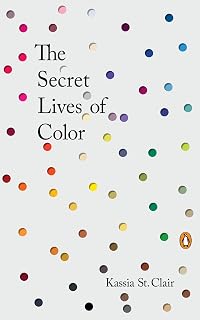
The Secret Lives of Color
by Kassia St Clair
On This Page
Description
"The unforgettable, unknown history of colors and the vivid stories behind them in a beautiful multi-colored volume The Secret Lives of Color tells the unusual stories of seventy-five fascinating shades, dyes and hues. From blonde to ginger, the brown that changed the way battles were fought to the white that protected against the plague, Picasso's blue period to the charcoal on the cave walls at Lascaux, acid yellow to kelly green, and from scarlet women to imperial purple, these surprising show more stories run like a bright thread throughout history. In this book, Kassia St. Clair has turned her lifelong obsession with colors and where they come from (whether Van Gogh's chrome yellow sunflowers or punk's fluorescent pink) into a unique study of human civilization. Across fashion and politics, art and war, the secret lives of color tell the vivid story of our culture. "A mind-expanding tour of the world without leaving your paintbox. Every color has a story, and here are some of the most alluring, alarming, and thought-provoking."--Simon Garfield,author ofJust My Type"-- show lessTags
Recommendations






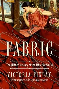
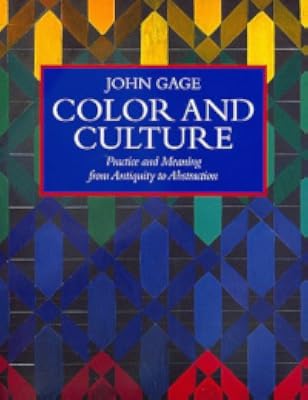




Member Recommendations
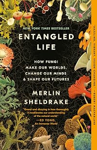
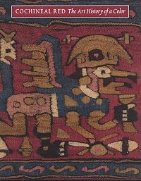
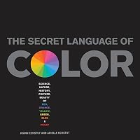
CGlanovsky Similarly structured, they actually arrive at a lot of the same historical reference points as they each present a portrait of human history and natural science through their own tiny lens.

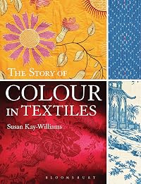
EMS_24 Also a book about all aspects of the use of paint by humans, written from the artist's perspective.
Member Reviews
Intriguing and enjoyable look at the history and provenance of 75 colors with special attention to their role in art: it shows how much of art was dependent upon what was available at the time. This book is beautifully designed, a visual work of art itself. Only quibble is it would’ve been nice to have a brief end chapter discussing the future of the use of colors in art and/or current debates as follow ups on points raised throughout the book.
Some examples of how color interacts with our world:
Sensationalist literature of 19C kept between yellow covers (yellow journalism) — the Middle Ages forced ostracized groups to wear yellow vs the ‘Yellow Nineties’ as artists adopted it in repudiation of Victorian values.
Orange was the show more star of Monet’s ‘Impression, Sunrise’ (plus color contrast theory, leading to a new movement. The orange-red minium is the color of illuminated manuscript capitals/pilcrows leading to our word ‘miniature’. New theories on shadows (they weren’t black or grey but actually colored) and complementary color schemes (violet complements yellow) ergo the shade depicted in a painting would be soft violet. 1881 Manet “Fresh air is violet”: This was exciting to read because I have always thought the same thing. show less
Some examples of how color interacts with our world:
Sensationalist literature of 19C kept between yellow covers (yellow journalism) — the Middle Ages forced ostracized groups to wear yellow vs the ‘Yellow Nineties’ as artists adopted it in repudiation of Victorian values.
Orange was the show more star of Monet’s ‘Impression, Sunrise’ (plus color contrast theory, leading to a new movement. The orange-red minium is the color of illuminated manuscript capitals/pilcrows leading to our word ‘miniature’. New theories on shadows (they weren’t black or grey but actually colored) and complementary color schemes (violet complements yellow) ergo the shade depicted in a painting would be soft violet. 1881 Manet “Fresh air is violet”: This was exciting to read because I have always thought the same thing. show less
A delightful little romp through the quirks of 75 colors. Additional colors get a color swatch and sentence in the back of the book
In looking at images of famous paintings, I had no idea that many of the colors they had to choose from were not permanent. Some of them would color shift just from being next to certain other colors. Sometimes artist would put a layer of varnish between colors that wanted to interact with each other - how tedious.
It was interesting to read about the discovery, manufacture, quirks, and life span of colors as laws changed, fashion changed, or when less finicky or less expensive alternatives became available.
The beautiful colors on the edge of the pages are often less vivid than the described color. (2017 show more Penguin hardcover edition) show less
In looking at images of famous paintings, I had no idea that many of the colors they had to choose from were not permanent. Some of them would color shift just from being next to certain other colors. Sometimes artist would put a layer of varnish between colors that wanted to interact with each other - how tedious.
It was interesting to read about the discovery, manufacture, quirks, and life span of colors as laws changed, fashion changed, or when less finicky or less expensive alternatives became available.
The beautiful colors on the edge of the pages are often less vivid than the described color. (2017 show more Penguin hardcover edition) show less
We take colour for granted these days; where ever you look you have garish clothing and brightly painted items competing for attention. But it was never like that, go back several hundred years ago, and lost people wore grey or brown cloth that had been dyed with the ochres and earth colours. Those that had some colour in their lives were the rich; they could afford the purples and reds that adorned their clothes and the rare blues and yellows that graced their artworks.
In this fascinating book, St Clair has uncovered the history behind 75 different colour shades and hues and tell their individual story. We find out where in the world these colours originated from, who made them popular, just how expensive a vivid blue like ultramarine show more was and the chemistry behind turning ground rock into artist’s paint and dyes for cloth. Modern colours are fairly robust, but it is a reminder just how lethal some colours were. The historical account of colour is enlightening too, as we find out which have come into fashion, why some prefer blondes, which colour was behind a notorious seduction and which have remained popular and those that currently don’t fit the bill.
Not only is it a nicely written and fascinating book, but it is a beautifully produced book too; each colour group is split into sections and the margins on each page are coloured to match the shade being written about. As you read though each page changes subtly in colour and tone. Just rippling through the pages you transcend from white to yellow to the reds, blues greens and end up at the black, it is a nice effect. The dots on the front are embossed making touching the cover a tactile experience. It was worth reading and would make a good companion volume to Bright Earth: The Invention of Colour by Philip Ball and Colour: A Natural History of the Palette by Victoria Finlay if you already have those. show less
In this fascinating book, St Clair has uncovered the history behind 75 different colour shades and hues and tell their individual story. We find out where in the world these colours originated from, who made them popular, just how expensive a vivid blue like ultramarine show more was and the chemistry behind turning ground rock into artist’s paint and dyes for cloth. Modern colours are fairly robust, but it is a reminder just how lethal some colours were. The historical account of colour is enlightening too, as we find out which have come into fashion, why some prefer blondes, which colour was behind a notorious seduction and which have remained popular and those that currently don’t fit the bill.
Not only is it a nicely written and fascinating book, but it is a beautifully produced book too; each colour group is split into sections and the margins on each page are coloured to match the shade being written about. As you read though each page changes subtly in colour and tone. Just rippling through the pages you transcend from white to yellow to the reds, blues greens and end up at the black, it is a nice effect. The dots on the front are embossed making touching the cover a tactile experience. It was worth reading and would make a good companion volume to Bright Earth: The Invention of Colour by Philip Ball and Colour: A Natural History of the Palette by Victoria Finlay if you already have those. show less
this is utterly fascinating. i absolutely loved this from the moment i laid eyes on it. the information itself is just so interesting, and the production value of this book completely enhances the reading of it. (if they ever make another edition of this book, it needs to resemble this one.) i found myself going into different lights to check the colors and how they appeared inside versus outside, and in low light versus strong light. each and every one of the short essays about each color are intriguing, and comparing the slight variations of color, while learning about how different their history and/or discovery, is totally riveting.
i wouldn't have even said that i care much at all about color or this idea. but other than the title show more and the cover, i loved everything about this.
Two particularly interesting or fun bits that i particularly enjoyed: "During the Middle Ages mixing colors at all was a taboo, believed to be against the natural order..." and "Kandinsky also described orange as 'red brought nearer to humanity by yellow.'" show less
i wouldn't have even said that i care much at all about color or this idea. but other than the title show more and the cover, i loved everything about this.
Two particularly interesting or fun bits that i particularly enjoyed: "During the Middle Ages mixing colors at all was a taboo, believed to be against the natural order..." and "Kandinsky also described orange as 'red brought nearer to humanity by yellow.'" show less
I was pleasantly surprised by this book. I wasn't expecting very much, but was surprised by the depth of research in each of the colors shown here. The information comes from art history, of course, but also includes military history (who knew Lord Mountbatten had a camouflage color named after him?); archaeology (Neolithic paintings with a description of the color palette used by stone age people) and chemistry (who knew that some of the chemical techniques to make colors were so complex or lengthy to complete?).
Each page has the color placed on the edge, and an anecdotal description and history of each color or shade. Each description is a page and a half or more, but each one did the best thing that an author can do- make the reader show more want to find out more. The old description of good writing, that it is "for provocation rather than information", is accomplished here, since the reader is provoked to find out more.
Recommended for larger libraries with reference sections; art libraries and collections; general humanities collections, and high school libraries. Not a good book for reading in one sitting, but it is a good travel book or one for reading with frequent interruptions (in short, a good bathroom book). I enjoyed it. show less
Each page has the color placed on the edge, and an anecdotal description and history of each color or shade. Each description is a page and a half or more, but each one did the best thing that an author can do- make the reader show more want to find out more. The old description of good writing, that it is "for provocation rather than information", is accomplished here, since the reader is provoked to find out more.
Recommended for larger libraries with reference sections; art libraries and collections; general humanities collections, and high school libraries. Not a good book for reading in one sitting, but it is a good travel book or one for reading with frequent interruptions (in short, a good bathroom book). I enjoyed it. show less
This is such a fun book! I had to have a physical copy—the pages are color coded. It’s like holding a rainbow in your hands. When my mom saw me reading it, she was enamored and encouraged me to send another copy to her mom as a Christmas gift (it was loved all around). It’s jam packed full of interesting details that I found myself sharing time and time again. It was especially fun as an artist to learn the stories and science behind classic paint colors like burnt umber and cerulean blue.
St. Clair makes it clear that the history of color is separate from, and larger than, the history of art, but the only tag given by Penguin on this is 'art.' The preface makes me think that it should also have 'science' and of course it should have 'history.' Also, my library shelved at 155.9114... 'art history' is 709, 'memory' and 'logic' bracket 155, hmm... 'psychology, adult' is at 155.6 so now we're getting somewhere, as I can see this being thought of as a psychology book because stuff like 'warm' and 'cool' colors is psychology (and tradition, and education).... I don't know. If you're a nerd like me about Dewey Classification, do you know what other books have been tagged 155.9? I did find this interesting list: show more target="_top">https://apl.org/dewey. Oh, just looked at it further and see 'stress' at 155.9042. Double hmm....
Anyway, the preface is comparatively extensive, but very readable. The book design is lovely, with fairly heavy paper, no dust jacket, plenty of appendices. I'm going to enjoy this read. :)
-----
I'd be enjoying it more if it were a coffee-table book, as it turns out. Too many references to works of art that I'll have to look up online. The various shades of white are shown on white pages, and are therefore darker than true. Other light colors are (or at least appear to be) darker than I know. I looked ahead to khaki and it's shown not as the color of Dockers' trousers, but much closer to a warm chocolate. Other examples don't match what I would define, either. Oh well; I guess I'm reading for the information.
-----
Welp, as I read along, I discover it is mostly about art, and the connections of art to fashion and history. The science, in the colors, is about how the pigments and dyes are made... so, usually, chemistry. An awful lot of them were killers: either of insects, or farmers, or artists.... or all of the above.
It's kinda like a trivia book, but the factoids aren't as trivial, and there is, obviously, an organizational pattern. Cool book for nerds who don't have a lot of experience with colors but I suspect people in the arts and professions would be more 'meh' and even nitpicky.
-----
Skips gray! There's a very dark "Payne's Gray" in the section on black, but no dove gray or fog or anything. Not in the index, not in the 'additional interesting colors' appendix, nowhere. Well, except for in the text itself, as it's used to modify so many other colors, such as a grayish purple or a grayed green or whatever.
Author credits Qadi Ahmad with "the ink of the scholar is holier than the blood of the martyr" but it's also said to be one of the "hadiths" ... don't ask me; I just like it as an Islamic version of "the pen is mightier than the sword."
An interesting thing I didn't know is that the Greek and Roman 'ruins' were originally painted. The "bleached bone" aesthetic is basically a mistake.
Remember, not too long ago, when "flesh" and "nude" were colors? For a gorgeous, revelatory, and important counter to that, check out the works at https://www.humanae.org/.
I dunno what to rate this. As a use of my own time, 3.5 rounded up. As something I'd recommend to those of you who I guess might be interested but who have less time than I do, 3.5 rounded down? show less
Anyway, the preface is comparatively extensive, but very readable. The book design is lovely, with fairly heavy paper, no dust jacket, plenty of appendices. I'm going to enjoy this read. :)
-----
I'd be enjoying it more if it were a coffee-table book, as it turns out. Too many references to works of art that I'll have to look up online. The various shades of white are shown on white pages, and are therefore darker than true. Other light colors are (or at least appear to be) darker than I know. I looked ahead to khaki and it's shown not as the color of Dockers' trousers, but much closer to a warm chocolate. Other examples don't match what I would define, either. Oh well; I guess I'm reading for the information.
-----
Welp, as I read along, I discover it is mostly about art, and the connections of art to fashion and history. The science, in the colors, is about how the pigments and dyes are made... so, usually, chemistry. An awful lot of them were killers: either of insects, or farmers, or artists.... or all of the above.
It's kinda like a trivia book, but the factoids aren't as trivial, and there is, obviously, an organizational pattern. Cool book for nerds who don't have a lot of experience with colors but I suspect people in the arts and professions would be more 'meh' and even nitpicky.
-----
Skips gray! There's a very dark "Payne's Gray" in the section on black, but no dove gray or fog or anything. Not in the index, not in the 'additional interesting colors' appendix, nowhere. Well, except for in the text itself, as it's used to modify so many other colors, such as a grayish purple or a grayed green or whatever.
Author credits Qadi Ahmad with "the ink of the scholar is holier than the blood of the martyr" but it's also said to be one of the "hadiths" ... don't ask me; I just like it as an Islamic version of "the pen is mightier than the sword."
An interesting thing I didn't know is that the Greek and Roman 'ruins' were originally painted. The "bleached bone" aesthetic is basically a mistake.
Remember, not too long ago, when "flesh" and "nude" were colors? For a gorgeous, revelatory, and important counter to that, check out the works at https://www.humanae.org/.
I dunno what to rate this. As a use of my own time, 3.5 rounded up. As something I'd recommend to those of you who I guess might be interested but who have less time than I do, 3.5 rounded down? show less
Members
- Recently Added By
Lists

Top Five Books of 2022
736 works; 272 members

Crafts & Hobbies
58 works; 1 member

The Great Courses: Visual Literacy Skills
53 works; 1 member
Author Information

7 Works 2,607 Members
Some Editions
Awards and Honors
Distinctions
Work Relationships
Common Knowledge
- Canonical title*
- Die Welt der Farben
- Original publication date
- 2016
- People/Characters
- George Field; Wassily Kandinsky; Leonardo da Vinci; Claude Monet; Isaac Newton; William Perkin (show all 9); Pliny the Elder; Carl Wilhelm Scheele; Vincent van Gogh
- Epigraph
- The purest and
most thoughtful
minds are those
which love color
the most.
John Ruskin, The Stones of Venice
(1851-3) - Dedication
- For Fallulah
- First words
- Preface
I fell in love with colors in the way most people fall in love: while concentrating on something else. - Last words
- (Click to show. Warning: May contain spoilers.)Long may such confusion reign if it provides such rich meat for our curiosity.
- Blurbers
- Garfield, Simon
- Original language
- English
*Some information comes from Common Knowledge in other languages. Click "Edit" for more information.
Classifications
Statistics
- Members
- 1,765
- Popularity
- 12,480
- Reviews
- 36
- Rating
- (4.10)
- Languages
- 7 — Dutch, English, French, German, Italian, Polish, Spanish
- Media
- Paper, Audiobook, Ebook
- ISBNs
- 19
- ASINs
- 8