This topic is currently marked as "dormant"—the last message is more than 90 days old. You can revive it by posting a reply.
1timspalding
Picking up from the color conversation of http://www.librarything.com/topic/92665 ...
Here it is. A thread to plop your ColourLovers palate in. And we can vote on it.
1. Go to http://www.colourlovers.com
2. Paste a link into a message
3. Type <vote>How about this?</vote> into the message
4. Add comments as desired.
Here it is. A thread to plop your ColourLovers palate in. And we can vote on it.
1. Go to http://www.colourlovers.com
2. Paste a link into a message
3. Type <vote>How about this?</vote> into the message
4. Add comments as desired.
2_Zoe_
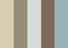
http://www.colourlovers.com/palette/77121/Good_FriendsI admit it, this is a boring palette. And that's deliberate. My idea of an interesting palette will be someone else's idea of a blindingly horrible palette.
I also tried to stay close to the current colour scheme, but with more brown than pink.
Vote: How about this?
Current tally: Yes 33, No 39, Undecided 7
I also tried to stay close to the current colour scheme, but with more brown than pink.
3_Zoe_
Oh, and for the record:
Vote: I like the current palette
Current tally: Yes 34, No 26, Undecided 9
4rsterling
http://www.colourlovers.com/palette/441526/In_the_WoodsIt's close to the brownish/pinkish parts of the color scheme, but keeping everything within similar tones, rather clashing with the blue and green.
edited to add color palette image

Vote: How about this one?
Current tally: Yes 20, No 47, Undecided 2
edited to add color palette image

5timspalding
Good Friends, above.


6rsterling
I tried my hand at making a palette - harder than it looks!
http://www.colourlovers.com/palette/1207233/earth_and_skyI was trying to find something related to what we have now, but warmer: so warmer brown tones rather than the pink, but alongside a couple of blues, for contrast. There might be other blue shades that would work better.
editing to try to add palette image here, per brightcopy's suggestion:

http://www.colourlovers.com/palette/1207233/earth_and_sky
Vote: How about this?
Current tally: Yes 40, No 21, Undecided 10
editing to try to add palette image here, per brightcopy's suggestion:

7brightcopy
Because I found it interesting, I've tried to document the current colors being used.
Here are the main colors:

(some of these look the same, but they're not)
Here are the less frequently used colors:

(first four are wishlist, last is the color for "Related" on series pages)
ETA: I didn't include the colors of text.
Here are the main colors:

(some of these look the same, but they're not)
Here are the less frequently used colors:

(first four are wishlist, last is the color for "Related" on series pages)
ETA: I didn't include the colors of text.
8timspalding
Earth and Sky:
 Ignore better fonts in the tab.
Vote: Better than now?
Current tally: Yes 21, No 74, Undecided 6
9brightcopy
It might be nice if people posted their color palette image into their post here. You can get a link pretty easy in the "Get this Palette Image" section, using the Preview link.
For example:
Good Friends
For example:
Good Friends

10rsterling
8 - I think a slightly lighter shade would be better for the tabs, to provide more contrast.
11keristars
8> I liked the earth & sky set, but not with the darkest brown as the bg in the header. The middle brown instead, maybe. I could get used to it, sure, but on first glance it's kind of...well, not a brown thing that I like to associate with books.
I did like the browns and darker blues that rsterling posted in the other thread named "norwegian woods", but the bright cyan-blue would have to go.
I did like the browns and darker blues that rsterling posted in the other thread named "norwegian woods", but the bright cyan-blue would have to go.
12vaneska
8: Colour is such a personal thing. I can't see how you can please people. I like this because you haven't included any of the blue. I dislike blue in a computer context and always adjust my screen colour theme to remove it (I currently live with a plummy/brownish/grey theme). I find the blue + beige + brown seen in 9 or 6 quite horrible. The minimal use of blue (message headers is quite OK) in the current LT colour scheme is an aspect that I find perfectly fine, unlike the dead salmon.
v
v
13rsterling
11. For quick reference, this is "Norwegian Woods"
http://www.colourlovers.com/palette/580619/Norwegian_WoodsI don't really like the bright blue either, but the other two blues could be nice for some of the boxes or other highlighted elements on LT. The browns are neutral enough to blend in with other shades.
It's possible to play around on Colourlovers, borrowing existing colors from various palettes and trying them out together, and then altering the colors if need be. To save a palette you have to create an account there.
http://www.colourlovers.com/palette/580619/Norwegian_Woods
Vote: What about this?
Current tally: Yes 9, No 35, Undecided 8
It's possible to play around on Colourlovers, borrowing existing colors from various palettes and trying them out together, and then altering the colors if need be. To save a palette you have to create an account there.
14etrainer
OK, just for fun:
http://www.colourlovers.com/palette/944817/Live
http://www.colourlovers.com/palette/944817/Live
Vote: Live, but probably too dark. Yet I like it.
Current tally: Yes 2, No 80

15rsterling
12 - I was thinking the blues in 6 would be more or less in the same places as the minimal uses of blue (and maybe green) on LT now - not that blue would become more dominant than it is now. Would some other contrast color work better than blue in those places where there's blue or blue-ish green now?
16keristars
IF Tim & co really want to change the overall look of the site and updating the color scheme is part of it... I'd like to see something moving away from blue-and-brown entirely, but only because lately I feel like that combination is everywhere - if there's a color palette that defines the 2003-2010 years, I'd say it's blue-and-brown (or perhaps pink-and-brown), the way avocado and mustard did the 1970s.
So in a departure, what about greys and purple? Probably it's too monochromatic without enough contrast for the site, but the grey navboxes got me thinking about greys and what looks nice with grey: http://www.colourlovers.com/palette/1207278/Smoked_Violet
 (I'm guessing it'll be mostly "no")
So in a departure, what about greys and purple? Probably it's too monochromatic without enough contrast for the site, but the grey navboxes got me thinking about greys and what looks nice with grey: http://www.colourlovers.com/palette/1207278/Smoked_Violet

Vote: This one?
Current tally: Yes 38, No 45, Undecided 9
18keristars
Oh, hm, "no" then?
I didn't make it thinking people would really like it, but to test the waters for not Brown and Blue, to see exactly where this process is going. (And, if i were to actually use that palette, it would be very minimal, with a lot of white...)
I didn't make it thinking people would really like it, but to test the waters for not Brown and Blue, to see exactly where this process is going. (And, if i were to actually use that palette, it would be very minimal, with a lot of white...)
19rsterling
Here's a variation on Earth and Sky, with a slightly lighter dark brown and another intermediate brown:
http://www.colourlovers.com/palette/1207285/earth_and_sky_2Unfortunately there are only 5 spaces in the palette; I was thinking of this one as supplementing the earlier one.

http://www.colourlovers.com/palette/1207285/earth_and_sky_2
Vote: How about this?
Current tally: Yes 15, No 39, Undecided 8

20rsterling
16 - Not sure how to vote on that one, with the double negative!
I've been working with the browns and blues because they're not too radical a change from what we have, and it seems a lot of people might be put off by too big a change. But I'd be interested to see some other color combinations too. Not that keen on the purple and gray though. Maybe too 80s? :) I'm all about the avocado and mustard though!
I've been working with the browns and blues because they're not too radical a change from what we have, and it seems a lot of people might be put off by too big a change. But I'd be interested to see some other color combinations too. Not that keen on the purple and gray though. Maybe too 80s? :) I'm all about the avocado and mustard though!
21awriterspen
Okay, I'm a blue lover here, but I don't mind the shades tending to grey.

Color by COLOURlovers

Color by COLOURlovers
Vote: How about this?
Current tally: Yes 9, No 61, Undecided 2

23_Zoe_
Another attempt at colours similar to LT's current ones, but without the pink:


Vote: How about this?
Current tally: Yes 7, No 63, Undecided 10
25SqueakyChu
Uh, this is fun!

Color by COLOURloversNot bad for a first try, eh? :)
ETA: Trying this out in a design:

Color by COLOURlovers
ETA (again!): That is one cool website. I might not be returning to LT for a while...

Color by COLOURlovers
Vote: Whatcha think?
Current tally: Yes 8, No 64, Undecided 5
ETA: Trying this out in a design:

Color by COLOURlovers
ETA (again!): That is one cool website. I might not be returning to LT for a while...
26Aerrin99
> 7 Wooow does seeing them all together like that make it really obvious how mismatched LT really is. Also how pastel-candy.
28keristars
24> I quite like the green and grey used there - it's the same idea as the navbox color choices, but without the sickeningly minty green+grey combo that reminds me of hospital gowns.
29Littlemissbashful
Trying to keep the current Brown/Putty

not sure it worked though

not sure it worked though
Vote: How about this?
Current tally: Yes 22, No 45, Undecided 12
30rsterling
Another contribution to the green theme:
http://www.colourlovers.com/palette/1207327/green_thumb
http://www.colourlovers.com/palette/1207327/green_thumb
Vote: How about this?
Current tally: Yes 7, No 66, Undecided 8

31rsterling
And now for something completely different. I feel it needs a contrast color, though:
http://www.colourlovers.com/palette/1207330/terra_cotta
http://www.colourlovers.com/palette/1207330/terra_cotta
Vote: How about this?
Current tally: Yes 10, No 69, Undecided 2

32lilithcat
The real difficulty here is that it's very hard to look at five color stripes and know how they will look on the website.
Which color will be used for what? Which is background color, which is text, which is bars, etc? How much of each will there be? How will they relate to each other?
Which color will be used for what? Which is background color, which is text, which is bars, etc? How much of each will there be? How will they relate to each other?
33_Zoe_
>32 lilithcat: That's true. I think Earth and Sky is a good palette, but not in the way Tim showed in #8.
Edit: I'd choose one of the lighter colours for the tabs.
Edit: I'd choose one of the lighter colours for the tabs.
34SqueakyChu
What's really interesting is to see how the color palettes are used on the web.
Take a look at this page. I like the website color palette for Wine Library TV. They took the "library brown" approach as opposed to the "LT Band-Aid" style and have come up with a more sophisticated color scheme related to books.
Forgive me. I don't mean to sound like a commercial. :)
Take a look at this page. I like the website color palette for Wine Library TV. They took the "library brown" approach as opposed to the "LT Band-Aid" style and have come up with a more sophisticated color scheme related to books.
Forgive me. I don't mean to sound like a commercial. :)
35casvelyn
I'd like to see more brown, but I know from experience that the "richness" of most browns is hard to duplicate on computers in a way that looks good on many different monitors. Therefore, my vote lies with earthy greens and turquoise-y blues, but nothing too pastel or bright. (But I hate reds, oranges, yellows, and pinks, so what do I know?).
Also, I assume these color proposals refer to headings, "trim", etc.? I really like that most of the site is black-on-white (or "hyperlink blue", in the case of links). It's very easy to read.
Also, I assume these color proposals refer to headings, "trim", etc.? I really like that most of the site is black-on-white (or "hyperlink blue", in the case of links). It's very easy to read.
36Aerrin99
> 32, 33
I agree, although I have to admit I like almost every single palate posted so far better than the strip we see in 7!
I agree, although I have to admit I like almost every single palate posted so far better than the strip we see in 7!
37Littlemissbashful
I agree with lilithcat also, without mock-ups its hard to imagine
...of the popular palettes on Colourlovers I quite liked this (but it may be too dark)

Type
...of the popular palettes on Colourlovers I quite liked this (but it may be too dark)

Type
Vote: How about this?
Current tally: Yes 20, No 34, Undecided 11
38rsterling
Also, I assume these color proposals refer to headings, "trim", etc.? I really like that most of the site is black-on-white (or "hyperlink blue", in the case of links). It's very easy to read.
Right. That's what I was assuming as well.
So, current color scheme shows up in these places:
1) the header bar at the top of every page - currently a deep salmon
2) tabs on every page, currently a light pink
3) bars separating different sections of a page
-- in talk threads: pink for "read" headings, blue for unread
-- on the homepage: minty green
4) boxes in the right-hand column - teal green on most pages (work, series, etc.)
5) other highlighted boxes, usually light pink: e.g. for "your book" on the work page, your information on the home page, some boxes on the profile page
6) blue and white lines on the main talk page
7) occasional gray boxes or columns
etc.
So, for something like Earth and Sky, I was thinking various shades of brown & beige for the base colors (header, tabs, some highlighted boxes, etc.), i.e. everywhere that we see shades of pink now, and a couple of shades of blue as contrast colors for the other highlighted/contrast areas - where we see blues and greens now. Gray could also work in unobtrusively.
39fredbacon
I'd really be happy to get rid of the green td.right h1 backgroundcolor on the right hand side of the home page. I'd replace it with something less obtrusive like a light brown.
Perhaps #F3EADB instead of the #CDF8CC which is there now.
The green just seems out of place on that page. The light blue used in the messagehead might also work. The green color just doesn't fit in with the rest of the color palette used on the page.
Perhaps #F3EADB instead of the #CDF8CC which is there now.
The green just seems out of place on that page. The light blue used in the messagehead might also work. The green color just doesn't fit in with the rest of the color palette used on the page.
41PhaedraB
5, 19 >
I have a real aversion to those muted blue/brown palettes. It's very trendy, but it hurts my eyes. It feels like I can't focus properly. Not enough contrast?
8> With the Earth and Sky, I get the somewhat the same "I can't focus" feeling. Maybe just more white type would help with the contrast.
I have a real aversion to those muted blue/brown palettes. It's very trendy, but it hurts my eyes. It feels like I can't focus properly. Not enough contrast?
8> With the Earth and Sky, I get the somewhat the same "I can't focus" feeling. Maybe just more white type would help with the contrast.
42brightcopy
40> The problem is that you've got a bunch that are all from the same part of the color palette. That's not very good for a user interface. At most, choose two or three that are really close together. Look at how existing websites do it:
http://www.colourlovers.com/web/trends/websites
http://www.colourlovers.com/web/trends/websites
43ty1997
32 > Agreed. I kinda liked the Good Friends palette linked in Message 2, but then when Tim applied to the site in Message 5, it didn't really look like what I would have expected.
I'm unclear on which of the five colors in each palette would feed the main color-using parts of the site (like the header), and which colors would be accent colors. That makes a world of difference in how I feel about a palette.
I'm unclear on which of the five colors in each palette would feed the main color-using parts of the site (like the header), and which colors would be accent colors. That makes a world of difference in how I feel about a palette.
44Mr.Durick
http://www.colourlovers.com/palette/1207438/gray_scale
Color by COLOURlovers
I miss the Hercules Graphics of my first computer: simple and clean. I like some colors. Red for emergencies is good.
Robert
Vote: How about this?
Current tally: Yes 7, No 57

Color by COLOURlovers
I miss the Hercules Graphics of my first computer: simple and clean. I like some colors. Red for emergencies is good.
Robert
45MarthaJeanne
I think one of the reason there are so many 'no's' is that it is very hard to guess how it would look from the bars, but it is easy to say that 'I don't like those colours at all.'
I don't want bright 'interesting' colours except for very small accents. (They work fine for checkmarks, small, meant to grab your attention.) Grey doesn't work well for type, even on white for legibility reasons (I find the touchstones description next to me as I type hard to read. OK, I read it once or twice in the beginning, and now ignore it. But not good for things I have to read every time I'm on the site.)
I don't want bright 'interesting' colours except for very small accents. (They work fine for checkmarks, small, meant to grab your attention.) Grey doesn't work well for type, even on white for legibility reasons (I find the touchstones description next to me as I type hard to read. OK, I read it once or twice in the beginning, and now ignore it. But not good for things I have to read every time I'm on the site.)
46_Zoe_
I'd like to see some more mock-ups using Earth and Sky, since I think it's the only one beating the current palette.
48keristars
The "bookshelf" one (greys and greens) is doing pretty well, too, though. At least, it has the same balance of votes as the current one, though more 'no' than the earth & sky one.
49_Zoe_
>47 klarusu: Sure, but there isn't full satisfaction with the current palette either. So if someone can come up with a palette that people like more, it makes sense to change even though it still won't satisfy everyone.
50rsterling
I've got a firefox plug-in ("Web Developer") which lets me edit the code on web pages I'm viewing, so I tried out a few colors..
I experimented with some of the shades of brown from Earth and Sky, and after seeing them mocked up, I'm not that happy with them. The brown just seems too dull.
For instance:

It's tough to find a color that works well for that top header bar. Maybe some kind of image or pattern would work better? Are those mock-ups from Alana Post still floating around somewhere, to compare the color schemes? (I dug up the old thread, but her website - where the mock-ups were - seems to be defunct.)
51richardderus
>27 rsterling: Wedding Mints ROFL
I myownself really, really like "Norwegian Woods" the best of all the options...cool, "cool", retro-chic-Eero-Saarinen colors do it for me, though. (Yes, I know he was a Finn.)
"Earth and Sky" wouldn't make me wince, however.
I myownself really, really like "Norwegian Woods" the best of all the options...cool, "cool", retro-chic-Eero-Saarinen colors do it for me, though. (Yes, I know he was a Finn.)
"Earth and Sky" wouldn't make me wince, however.
52_Zoe_
>50 rsterling: What about using the darker blue of Earth and Sky for the header?
53FicusFan
I will come out and say I like the current colors. I wouldn't want to see a change, especially not to drab browns, mustards or any form of yellow.
54brightcopy
Part of the problem here is the human instinct to tell when something is a bit "off." It's ingrained to us that the LT banner should be the color it is, probably even for those who don't even like it. So when you show a mockup of it in another color, especially another color that is close, it just fundamentally looks wrong.
55lisajoanne
Does brown have to be the main color? I mean, I know that it seems "library-esque" and therefore appropriate for LibraryThing, but it just seems boring. I'd personally vote for anything with more green in it (natural greens, not crazy greens), but as someone previously said, color choice is such a personal thing that I'd be amazed if you actually found a consensus.
56justjim
There really is a lot to be said for a benevolent dictatorship and against "lowest common denominator" democracy.
Appropriate content and usable features will beat flashy appearance every time.
Appropriate content and usable features will beat flashy appearance every time.
57lisajoanne
This is kind of what I was talking about ...http://www.colourlovers.com/palette/1207735/Corn_Field
Vote: How about this?
Current tally: Yes 6, No 39, Undecided 2
58rsterling
52 Here's a blue background, though not the one from Earth and Sky. It looks not quite right, partly because there's some pink around the edges of the logo.
(eta: I also changed the pinkish color on the tabs and talk header to something more like a beige)

eta again: The hex codes are 85AAA4 (blue) and F5F1B9 (beige)
By request, I'm adding a poll:The palette is in a post below,#67.
(eta: I also changed the pinkish color on the tabs and talk header to something more like a beige)

eta again: The hex codes are 85AAA4 (blue) and F5F1B9 (beige)
By request, I'm adding a poll:
Vote: How about this combination?
Current tally: Yes 27, No 18, Undecided 7
59DaynaRT
>58 rsterling:
I like that, a lot.
I like that, a lot.
60auntmarge64
me too
61majkia
>58 rsterling:. Moi aussi.
62keristars
A fourth vote for that grey-blue in the header.
If we one day get an option for color scheme themes, I'd like to see that done with this sort of palette:

...which is the same as in this reply earlier, in case you've forgotten.
If we one day get an option for color scheme themes, I'd like to see that done with this sort of palette:

...which is the same as in this reply earlier, in case you've forgotten.
63AnnaClaire
Yes, it's monochromatic, but as far as I'm concerned, it's only a first draft.

Color by COLOURlovers

Color by COLOURlovers
Vote: Like it?
Current tally: Yes 8, No 36, Undecided 4
64Littlemissbashful
I like #58 also
65lilithcat
> 58
That's rather muddy-looking. But, quite honestly, that seems to be a problem with most of the proposed palettes.
That's rather muddy-looking. But, quite honestly, that seems to be a problem with most of the proposed palettes.
66lisajoanne
I think #58 is better than the current colour scheme, but I prefer #62 of all the proposed palates so far.
67rsterling
65 - What do you mean by muddy? All the ones I've done have had some gray tones, so they're muffled a bit. Any bright or pure tones just jump out too much with the current design, I find.
I'm not sure this is exactly the same blue (and the hex code above might be slightly off), but this is roughly the palette used in 58.
http://www.colourlovers.com/palette/1207794/low_tide
I'm not sure this is exactly the same blue (and the hex code above might be slightly off), but this is roughly the palette used in 58.
http://www.colourlovers.com/palette/1207794/low_tide
Vote: How about this?
Current tally: Yes 41, No 11, Undecided 6

68brightcopy
66> And by #62 you mean #24.
keristars> I think it might be helpful if you took the color palette image out of yours and just referred back to #24. It's kind of confusing and looks like you're posting another one.
keristars> I think it might be helpful if you took the color palette image out of yours and just referred back to #24. It's kind of confusing and looks like you're posting another one.
69Aerrin99
I took some of the color palates with highest votes and ones I personally really liked and played with them in some examples. Note here that these are primarily 'inspired by' - when I needed a darker or lighter color to fit the contrast, I tried to find one which I thought fit the general tones and supplied what I needed.
This might give some idea of the general flexibility of a palate and design. I did three version of the purple palate in example.
If anyone has a palate they really want to see an example of, leave me a message and I'll see what I can do this afternoon!
Click for the full-sized image.
Bookshelf:

In the Woods:

Good Friends

Earth & Sky

Three variations on Smoked Violet


70Aerrin99
Looking at them all together, I think I very much like the first three. I like some of the colors in Earth & Sky, but prefer the Good Friends palate for a similar feel.
You'll also note that I trend toward basic neutrals as the main colors and brighter for the highlights - these palates certainly could have been done with brighter headers, etc!
You'll also note that I trend toward basic neutrals as the main colors and brighter for the highlights - these palates certainly could have been done with brighter headers, etc!
71majkia
>69 Aerrin99: Wow. thanks for that, it really helps. I think In The Woods looks pretty awesome even though I wasn't that crazy about it just looking at the palate.
Despite the fact I hate olive, Bookshelf looks pretty awesome too.
Despite the fact I hate olive, Bookshelf looks pretty awesome too.
72brightcopy
69> I think this, more than anything, points out that the LibraryThing logo using black for "Library" and white for "Thing" causes issues.
You really have to use a more neutral color (in terms of between light and dark) for the banner given that limitation.
You really have to use a more neutral color (in terms of between light and dark) for the banner given that limitation.
73Aerrin99
> 72 Yeah, and I'd assume that could be easily done, just not with firebug. ;)
The other thing I noticed that almost instantly gave the site a more professional look is moving away from the I AM A LINK YES I AM blue on things that are /obviously/ links, such as the nav tabs. When I flipped back over the to real page, I was actually taken aback. I'd forgotten they were that color!
The other thing I noticed that almost instantly gave the site a more professional look is moving away from the I AM A LINK YES I AM blue on things that are /obviously/ links, such as the nav tabs. When I flipped back over the to real page, I was actually taken aback. I'd forgotten they were that color!
74rsterling
72 - I'm sure that can be changed, though. Tim's mock-up of Earth and Sky seemed to use a dark brown.
Here are some versions of Bookshelf:
#1 (most shades)

#2 (minty)

#3 (olive/dark)

Here are some versions of Bookshelf:
#1 (most shades)

#2 (minty)

#3 (olive/dark)

76brightcopy
74> I generally like green, but... not a fan.
78Aerrin99
> 75 I used a less intense blue that's in the same family, but desaturated a bit, for Good Friends. I think it can definitely stay blue if people feel like they really need that 'cue' that it's a link, but exploring beyond the typical default bright blue would help.
79rsterling
76 - I agree. I wouldn't mind seeing something that uses green, but I don't think these are working for me. Too military/olive. Maybe something more in the warmer green and yellow range.
80_Zoe_
>69 Aerrin99: Thanks for doing that, Aerrin.
I think the issue with Earth and Sky is just that one medium brown used for the box in the top right. I don't like the way it looks with the darker one.
Also, rsterling, it might be worthwhile putting a poll in your #58.
Ultimately, I don't think the heading needs to stay black and white; it can be changed to two of the colours from whatever palette is chosen.
ETA message reference
81richardderus
>69 Aerrin99: Aerrin, thank you very much! Seeing them like that, I really like Bookshelf a lot.
>74 rsterling: Scheme #3 is a real winner.
>74 rsterling: Scheme #3 is a real winner.
83Aerrin99
> 80
I agree about Earth & Sky - I'm not too fond of the lighter browns in general, and I think I made up the darker brown for the main header.
Maybe seeing how things actually work can give people some better ideas of what to look for in creating palates.
Basically, in my opinion for LT you need:
- A dark neutralish color for the header
- A lighter complimentary color for the toolbox and probably for other boxes, such as that front page box
- A striking, bright highlight color for the 'announcement' bar, borders, and possibly to base link text color off of. This could even be two striking, bright colors (and probably would need ot be if I were doing more pages)
- A tab color, which /can/ be striking and bright or /can/ be neutral - there's a lot of flexibility there - but it almost certainly needs high contrast with the header background.
ETA: Since people seem to be liking Bookshelf, I'll note that it actually looks quite striking with some of the wine-colored highlights from In the Woods, and perhaps less military-olive with that addition. Perhaps after lunch I'll throw some together and see what folks think. Please don't hesitate to ask if there's something you'd like to see!
84rsterling
On Earth and Sky, I'm not that keen using the browns in the header now that I tried them out above. But for the mock-up I wouldn't use the colors in the same places that you are. I'd pick a very light beige for the tabs (and maybe the box) and something less fleshy for the upper right. And I'd use blue for the announcement bar, and maybe elsewhere.
85rsterling
I like some of the earthy green, and brown/maroon/wine tones generally (though not sure about the specific combinations so far), but I'd like to see some examples that move away from those natural tones. Can we try out more blues, purples, lighter/brighter greens, etc? And some less dark looks generally?
I think the header needs to be a rich color, but actually not too dark.
I think the header needs to be a rich color, but actually not too dark.
86vaneska
I like Good Friends in Aerrin's post 69 a lot. That is the most palatable shade of blue for my taste (as different as possible from Microsoft blue) and is used well. I don't like it in the tabs in the next one, Earth & Sky.
I have a feeling that green as a base colour isn't going to work but it may do as an accent colour.
v
I have a feeling that green as a base colour isn't going to work but it may do as an accent colour.
v
88SqueakyChu
I know we're librarian/bookish types here, but if we're going to subsitute drab for drab, let's just stick to the original colors. My opinion is that this website design needs to be jazzed up a bit.
:(
ETA: Pass me a few of those "pillow" candies, will you? Thanks!
:(
ETA: Pass me a few of those "pillow" candies, will you? Thanks!
89PhaedraB
Looking at that page of web palettes, few are as closely related as the ones that are being singled out here. We're not doing an interior, we're working for readability.
Contrast is really important for me and I'm sure for a lot of other folks with older eyes. The mock-ups in #69 are difficult for me to see. I can hardly read the tabs. The ones in #74 are much more legible.
Contrast is really important for me and I'm sure for a lot of other folks with older eyes. The mock-ups in #69 are difficult for me to see. I can hardly read the tabs. The ones in #74 are much more legible.
90lisajoanne
<69:
-The "In the Woods" mockup is my favorite, but I'd substitute a lighter color (sage green?) where the wine red color is ("Announcements," "Sign In," etc.) The colors in this palate are nice and rich.
-The "Bookshelf" theme is nice, too.
How about this?
http://www.colourlovers.com/palette/1207860/white_peonieshttp://www.colourlovers.com/palette/1207845/Digimon_OneSorry about the lack of pictures. Computers and me aren't all that friendly, so I don't know how to add the actual color palate to this post ... just the link. These colors are brighter re: rsterling, #85.
Aren't you glad ya'll asked for an opinion on this? ;)
-The "In the Woods" mockup is my favorite, but I'd substitute a lighter color (sage green?) where the wine red color is ("Announcements," "Sign In," etc.) The colors in this palate are nice and rich.
-The "Bookshelf" theme is nice, too.
How about this?
http://www.colourlovers.com/palette/1207860/white_peonies
Vote: How about this?
Current tally: Yes 6, No 34, Undecided 3
Vote: How about this?
Current tally: Yes 6, No 34, Undecided 3
Aren't you glad ya'll asked for an opinion on this? ;)
91FicusFan
I can't seem to vote in the 2nd poll in 90. It just changes the top poll to reflect what I click in the 2nd.
In looking at most of the suggestions, they all seem to be too dark and too drab.
I know people don't want their eyeballs to bleed with bright colors, but that is why the pastels work: they are light and not drab, but don't cause eye damage.
In looking at most of the suggestions, they all seem to be too dark and too drab.
I know people don't want their eyeballs to bleed with bright colors, but that is why the pastels work: they are light and not drab, but don't cause eye damage.
92brightcopy
90/91> I think when you include the exact same poll twice in one post, it just makes it the same poll. Try using different things for the text in each one and I bet it wouldn't do that.
93_Zoe_
>92 brightcopy: No, it's just not possible to have more than one poll in the same message.
94lisajoanne
Okay, here's the second color palate from 90:
http://www.colourlovers.com/palette/1207845/Digimon_One
http://www.colourlovers.com/palette/1207845/Digimon_One
Vote: How about this?
Current tally: Yes 5, No 28, Undecided 5
95lisajoanne
One more option with some not-too-bright but not drag colors:
http://www.colourlovers.com/palette/1207887/Arab_on_horse
http://www.colourlovers.com/palette/1207887/Arab_on_horse
Vote: How about this?
Current tally: Yes 2, No 31, Undecided 6
96rybie2
I like the blue palates offered when looking at them alone (looking at the little color sample), but put into practice this would actually MAKE me blue since all links on a page are blue anyway, plus my default IE bars on the top are blue. Thus, I'm voting against any options that are awash in blue.
I do like Bookshelf options (except the military olive version), but ask if it's necessary to have the pink outline/shadow?
I do like Bookshelf options (except the military olive version), but ask if it's necessary to have the pink outline/shadow?
97Aerrin99
> 96
The pink outline/shadow is because it's on the graphic - I would assume that we'd get a new (and possibly different-colored) graphic if colors actually changed. You just kind of have to pretend it doesn't exist for now, because it's not easily changeable.
Also pretend that the box in the upper right corner is still rounded instead of square.
I'll play with some of the brighter palates this afternoon.
> PhaedraB, 79 -
What parts aren't reading enough contrast for you to read once you zoom the image? I can see if I can keep them in mind for future ones I play with.
98auntmarge64
I especially like
Bookshelf original
Bookshelf #1
Smoked Violet #2/3 (they look alike to me)
Bookshelf original
Bookshelf #1
Smoked Violet #2/3 (they look alike to me)
99PhaedraB
97 >
Just about all the small print on the color backgrounds are not contrasty enough for me. The tabs and type across the top of the lower big rectangle are the worst offenders.
Just about all the small print on the color backgrounds are not contrasty enough for me. The tabs and type across the top of the lower big rectangle are the worst offenders.
100keristars
98> I think the difference in the two purples is the highlight color chosen for the label on the homepage module to the bottom right. (I really like this one, too, as it's how I imagined the colors being used when I made the palette.)
I like the "minty" version of Bookshelf (the middle one) because of the brighter green in the header. It doesn't have the drab feel of all the brown variations, but still seems like a slick, cohesive update while not being such a huge change as the purple/grey would be.
I like the "minty" version of Bookshelf (the middle one) because of the brighter green in the header. It doesn't have the drab feel of all the brown variations, but still seems like a slick, cohesive update while not being such a huge change as the purple/grey would be.
101jjwilson61
69> I'm liking the In The Woods mockup with the black top bar.
102Aerrin99
I've done up 12 new possibilities using much brighter colors (Digimon, Cornfield, Colour Lovers), including a neutral header, as people seemed to want to see. Lots of variations!
Because I'm wary of really spamming this thread with images (and also it's easier), I've put them all on my wiki page: http://www.librarything.com/wiki/index.php/User:Aerrin99
I've also numbered them so that hopefully it will be a bit clearer if people want to discuss!
Anything else people want to see? I've got half an hour to play!
ETA: If anyone wants to collect mine with others on a wiki page so that they can all be browsed together, feel more than welcome!
103rosalita
OK, we're 101 messages along and I can't hold it in any longer: it's palette, people!
In regards to the various palettes, I like Bookshelf, In the Woods, and Good Friends from #74.
In regards to the various palettes, I like Bookshelf, In the Woods, and Good Friends from #74.
104Aerrin99
> 103 Haha! You know, I /thought/ palate was wrong, but that's how everyone else was using and and FF didn't pick up the misspelling so I just...
Well now don't I feel silly.
Well now don't I feel silly.
105_Zoe_
>102 Aerrin99: Thanks again for doing all this!
I'd like to see what the various palettes would look like with black writing wherever possible, especially in the tabs, because I don't want people to be turned off unnecessarily by something that might be easily fixable.
I'd like to see what the various palettes would look like with black writing wherever possible, especially in the tabs, because I don't want people to be turned off unnecessarily by something that might be easily fixable.
106Aerrin99
> 105 I think all the newest ones I did have either black or white in the tabs, depending on the contrast needed - are there any specific older ones you'd like to see me redo?
I don't have these saved so I'd have to rebuild them, but they don't take that much time - but I'd rather limit to versions people are interested in seeing.
Also, you're welcome! I admit I'm kind of having fun, so...
I don't have these saved so I'd have to rebuild them, but they don't take that much time - but I'd rather limit to versions people are interested in seeing.
Also, you're welcome! I admit I'm kind of having fun, so...
107rosalita
>104 Aerrin99: Well, it's not that palate isn't a word, it's just that it's the word for the roof of your mouth. And why would you need new colors in there where it's dark?
I find myself strangely drawn to the various Cornfield mockups on your wiki page. I suspect it has less to do with website aesthetics and more to do with living in Iowa and seeing John Deere tractors every day on the way to and from work.
I find myself strangely drawn to the various Cornfield mockups on your wiki page. I suspect it has less to do with website aesthetics and more to do with living in Iowa and seeing John Deere tractors every day on the way to and from work.
108_Zoe_
>106 Aerrin99: Maybe Bookshelf, Good Friends, and (some of) the Smoked Violet ones?
109awriterspen
Aerrin99, thanks for posting all the mock-ups. It really helps.
110Aerrin99
> 108
Done, although they may not be /exactly/ the same. Also some more variations on Good Friends and Bookshelf, since they seem to be quite possible.
I haven't seen quite as much interest in Smoked Violet so I didn't recreate those - but please keep in mind everyone that the specific details, such as contrast, text color, etc, can all be changeable. If you like a general look but not a specific detail, those can be easily fixed in reality. These are just some general ideas of how these palettes translate to the actual webpage. Or the front page, anyway.
111DaynaRT
>110 Aerrin99:
After looking at all your mock-ups, I still like Good Friends the best.
After looking at all your mock-ups, I still like Good Friends the best.
112vaneska
Thanks for these mock-ups, Aerrin99 - they are most helpful.
My favourites, in order of preference, are:
Good Friends 2
Bookshelf 1
Smoked Violet 3 (but without the black used for Announcements etc)
I intensely dislike Colour Lovers and the yellow in the Corn Field ones.
v
My favourites, in order of preference, are:
Good Friends 2
Bookshelf 1
Smoked Violet 3 (but without the black used for Announcements etc)
I intensely dislike Colour Lovers and the yellow in the Corn Field ones.
v
113rybie2
Yes, these are very helpful Aerrin99 - nice work.
In no particular order, I like best:
Good Friends 2
Bookshelf 3
In no particular order, I like best:
Good Friends 2
Bookshelf 3
114lisajoanne
All of those mock-ups look really nice, Aerrin. I'm feeling intensely grateful for people who are infinitely more blessed with computer knowledge than I am!
My favorites:
Colour Lovers #1
Bookshelf #3
Cornfields #1, 4, & 6
I think the yellow in Cornfields provides a nice contrast, but it could be toned down a little if people are worried about it hurting their eyes.
My favorites:
Colour Lovers #1
Bookshelf #3
Cornfields #1, 4, & 6
I think the yellow in Cornfields provides a nice contrast, but it could be toned down a little if people are worried about it hurting their eyes.
115susiesharp
My Favorites:
Cornfield #4
Bookshelf #2
Earth & Sky
Cornfield #4
Bookshelf #2
Earth & Sky
116jjwilson61
I can go for:
In the Woods
Smoked Violet #2
In the Woods
Smoked Violet #2
117auntmarge64
Please, no green/yellow or blue/brown! Otherwise, I could live with any of them.
118rsterling
Not crazy about the Good Friends mock-ups - they feel a little too washed out, and in that, too similar to what we have now. Other variations of those colors, though, perhaps with some warmer or brighter ones mixed in, could work. I don't really like the gray-ish pink in the banner.
I like In the Woods, but again would like a richer and maybe slightly lighter color for the banner. Maybe work in some other stronger reddish tones. That could work with some beige as well.
I was experimenting with some blues - muted, not glaring - earlier:
http://pics.librarything.com/picsizes/40/03/40031fa0e49f627637469434167434b41716...
119staffordcastle
>103 rosalita: THANK YOU, Rosalita! It's been driving me buggy too!
Also more thanks to Aerrin99 - it helps enormously to see things "in the wild" instead of just a handful of color chips.
The ones with the pale backgrounds for the banner don't work for me at all, especially the yellow ones, but several of the very dark ones are problematic too. I suspect that using a color with the same value as the original (value is how light or dark it is) will be key in getting user acceptance.
120leahbird
as for the mock-ups, i like:
either of the 2 Tim posted in #5
Bookshelf and Good Friends from #69
and Bookshelf #1 from #74
either of the 2 Tim posted in #5
Bookshelf and Good Friends from #69
and Bookshelf #1 from #74
121_Zoe_
I also like:
Good Friends 2
Bookshelf 1 or 3
Smoked Violet 1 or 2
possibly Earth and Sky
Basically anything that's fairly muted is fine with me; I don't like the ones with very bright colours.
Good Friends 2
Bookshelf 1 or 3
Smoked Violet 1 or 2
possibly Earth and Sky
Basically anything that's fairly muted is fine with me; I don't like the ones with very bright colours.
125Heather19
..... I think Zoe and I have the same taste in website-colors.
Really, anything that's not shouting at me, anything that doesn't hurt my eyes, is fine with me. Although I personally like what we have right now.
Really, anything that's not shouting at me, anything that doesn't hurt my eyes, is fine with me. Although I personally like what we have right now.
126rsterling
I put some more mock-ups on the wiki, including the one I posted in 118 (I think I called that one Blues):
http://www.librarything.com/wiki/index.php/User:Rsterling/palettes
ETA: for my part, I think I like Blue Magenta 2 best out of those.
Neutral with Wine and Earth and Sky (on that page) are closest to the current LT tones, but taking away some of the clashing colors. "Blues" I like in theory, but I feel there's something just slightly off about the colors together, or maybe just the blue in the banner; so maybe those colors could use a slight adjustment.
127rsterling
I added a couple more mock-ups, this time of the Groups page, to see how things might look on another page. So far, I've just tried out some of the blue/gray colors.
http://www.librarything.com/wiki/index.php/User:Rsterling/palettes#Groups_page_m...
http://www.librarything.com/wiki/index.php/User:Rsterling/palettes#Groups_page_m...
128SylviaC
>127 rsterling: I really like the blue grey without mint.
As I see more and more colours, I am coming to the conclusion that I would be content with anything, as long as there was no mint.
As I see more and more colours, I am coming to the conclusion that I would be content with anything, as long as there was no mint.
129CDVicarage
I like any of the 3 bookshelfs from #102, but I'm also happy with what we have now.
130staffordcastle
The blue in the Blue Groups mock-ups is reading as a steel grey on my monitor; is that intended? I really dislike the combination of grey with any form of yellow.
131Littlemissbashful
I also like the blue/grey without Mint, I guess a yellowy colour is okay if pale enough.
Monitor and settings seems to matters a lot - This computer is running on two screens (well one is the TV) and since I've now become addicted to the Colourlover.com site I'm noticing how much the same colours differ between the two when they run simultaneously.
Monitor and settings seems to matters a lot - This computer is running on two screens (well one is the TV) and since I've now become addicted to the Colourlover.com site I'm noticing how much the same colours differ between the two when they run simultaneously.
132rsterling
130 - It's a kind of bluish gray, but I think what's happening is what 131 describes: the different monitor effect. It could be tried with a bluer blue.
133oregonobsessionz
Thanks to Aerrin and Rsterling for all the work on the mockups. I like Bookshelf 1 or 3 but not the minty version #2. Good Friends is OK. Into the Woods looks good except that it needs a brighter accent color than the burgundy.
I took a serious dislike to all of the Color Lover, Digimon, and especially the Cornfield palettes.
In the color schemes on Rsterling's wiki, the putty or yellow colors in the "customize this page" box seem to fight with the other colors.
I took a serious dislike to all of the Color Lover, Digimon, and especially the Cornfield palettes.
In the color schemes on Rsterling's wiki, the putty or yellow colors in the "customize this page" box seem to fight with the other colors.
134MarthaJeanne
The only one from >102 Aerrin99: that I find at all bearable is Bookshelf 2.
To SylviaC's 'no mint', I would add please 'no magenta'.
To SylviaC's 'no mint', I would add please 'no magenta'.
135Anneli
Colours do look different in different monitors. Therefore light colours are safer than darker or brighter colours. The colours of LT at the moment don't irritate me in any way, so I think that they are OK. But I probably get used to any light colours. My only wish is that the background stays white and text is black.
137lquilter
> 7 brightcopy: I love that chart. You missed the bright yellow "alert" background color we get on various alerts, e.g., on the "alert: new message" message.
138crazy4reading
After looking this thread over I am tired of all the different colors. I am seeing everything in rainbows now. I really can't choose just one. When I see them used in some of the posts they look worse then when I just look at them in the bars.
I like the greens, blues, browns or I should say the Earth Tone Colours. Those are my favorite colors..
I like the greens, blues, browns or I should say the Earth Tone Colours. Those are my favorite colors..
139brightcopy
138> The only solution - Tie Dye color scheme!
140rosalita
In Gmail, I have my themes setting on "Random." That means every time I log in, it's a different theme. Maybe Tim & Co. could do the same sort of thing -- pick a dozen or so of these color schemes and have them rotate every time someone comes to visit LT.
141VivienneR
> 134 To "no mint" and "no magenta" I add please, no brown!
I like the Bookshelf and Digimon variations. Thanks to Aerrin for making it easier to visualize.
edited to correct italics
I like the Bookshelf and Digimon variations. Thanks to Aerrin for making it easier to visualize.
edited to correct italics

